buildanything 1.8.0 → 2.1.1
This diff represents the content of publicly available package versions that have been released to one of the supported registries. The information contained in this diff is provided for informational purposes only and reflects changes between package versions as they appear in their respective public registries.
- package/.claude-plugin/marketplace.json +3 -3
- package/.claude-plugin/plugin.json +17 -3
- package/CHANGELOG.md +57 -0
- package/README.md +57 -61
- package/agents/a11y-architect.md +168 -0
- package/agents/briefing-officer.md +172 -0
- package/agents/business-model.md +82 -29
- package/agents/code-architect.md +80 -0
- package/agents/code-reviewer.md +256 -0
- package/agents/code-simplifier.md +72 -0
- package/agents/design-brand-guardian.md +312 -53
- package/agents/design-critic.md +144 -0
- package/agents/design-inclusive-visuals-specialist.md +8 -19
- package/agents/design-ui-designer.md +352 -56
- package/agents/design-ux-architect.md +418 -55
- package/agents/design-ux-researcher.md +359 -49
- package/agents/engineering-ai-engineer.md +28 -36
- package/agents/engineering-backend-architect.md +187 -36
- package/agents/engineering-data-engineer.md +227 -43
- package/agents/engineering-devops-automator.md +229 -74
- package/agents/engineering-frontend-developer.md +223 -34
- package/agents/engineering-mobile-app-builder.md +8 -1
- package/agents/engineering-rapid-prototyper.md +45 -11
- package/agents/engineering-security-engineer.md +265 -61
- package/agents/engineering-senior-developer.md +141 -19
- package/agents/engineering-sre.md +86 -0
- package/agents/engineering-technical-writer.md +287 -41
- package/agents/feature-intel.md +111 -0
- package/agents/ios-app-review-guardian.md +21 -2
- package/agents/ios-foundation-models-specialist.md +22 -2
- package/agents/ios-product-reality-auditor.md +292 -0
- package/agents/ios-storekit-specialist.md +11 -2
- package/agents/ios-swift-architect.md +29 -1
- package/agents/ios-swift-search.md +9 -1
- package/agents/ios-swift-ui-design.md +40 -5
- package/agents/marketing-app-store-optimizer.md +248 -64
- package/agents/planner.md +221 -0
- package/agents/pr-test-analyzer.md +64 -0
- package/agents/product-feedback-synthesizer.md +70 -2
- package/agents/product-owner.md +163 -0
- package/agents/product-reality-auditor.md +216 -0
- package/agents/product-spec-writer.md +176 -0
- package/agents/refactor-cleaner.md +110 -0
- package/agents/security-reviewer.md +129 -0
- package/agents/silent-failure-hunter.md +55 -0
- package/agents/swift-build-resolver.md +121 -0
- package/agents/swift-reviewer.md +113 -0
- package/agents/tech-feasibility.md +26 -4
- package/agents/testing-api-tester.md +238 -59
- package/agents/testing-evidence-collector.md +50 -1
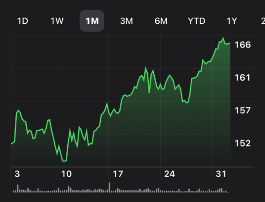
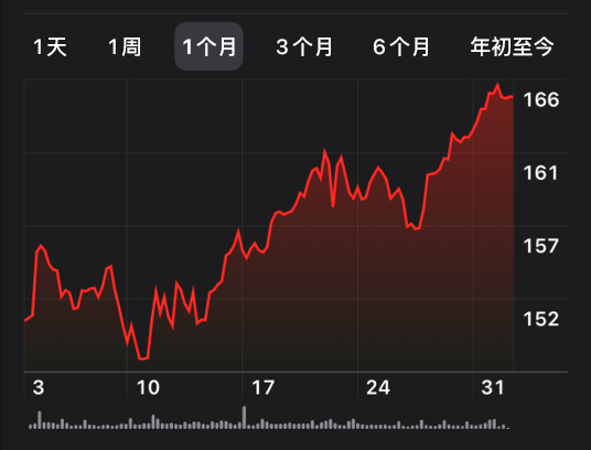
- package/agents/testing-performance-benchmarker.md +23 -1
- package/agents/testing-reality-checker.md +7 -1
- package/agents/visual-research.md +118 -0
- package/bin/adapters/cycle-counter-tool.ts +155 -0
- package/bin/adapters/scribe-tool.ts +73 -0
- package/bin/adapters/state-save-tool.ts +130 -0
- package/bin/adapters/write-lease-tool.ts +127 -0
- package/bin/buildanything-runtime.js +15 -0
- package/bin/buildanything-runtime.ts +241 -0
- package/bin/graph-index.js +24 -0
- package/bin/graph-index.ts +340 -0
- package/bin/mcp-servers/graph-mcp.js +26 -0
- package/bin/mcp-servers/graph-mcp.ts +481 -0
- package/bin/mcp-servers/orchestrator-mcp.js +26 -0
- package/bin/mcp-servers/orchestrator-mcp.ts +361 -0
- package/bin/setup.js +312 -76
- package/commands/add-feature.md +2 -0
- package/commands/build.md +994 -265
- package/commands/fix.md +1 -1
- package/commands/idea-sweep.md +2 -2
- package/commands/self-check.md +121 -0
- package/commands/setup.md +61 -9
- package/commands/ux-review.md +5 -5
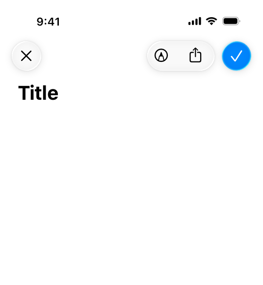
- package/commands/verify.md +9 -9
- package/docs/migration/agents.yaml +729 -0
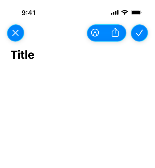
- package/docs/migration/phase-graph.yaml +1504 -0
- package/docs/migration/sdk-host-compat.md +18 -0
- package/hooks/compile-writer-owner-cache.ts +171 -0
- package/hooks/design-md-lint +4 -0
- package/hooks/design-md-lint.ts +295 -0
- package/hooks/hooks.json +36 -0
- package/hooks/pre-tool-use +19 -0
- package/hooks/pre-tool-use.ts +807 -0
- package/hooks/record-mode-transitions.ts +235 -0
- package/hooks/session-start +71 -1
- package/hooks/subagent-start +17 -0
- package/hooks/subagent-start.ts +472 -0
- package/hooks/subagent-stop +17 -0
- package/hooks/subagent-stop.ts +153 -0
- package/package.json +26 -4
- package/protocols/agent-prompt-authoring.md +165 -0
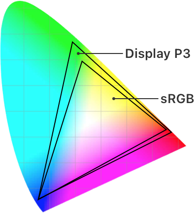
- package/protocols/architecture-schema.md +178 -0
- package/protocols/cleanup.md +4 -0
- package/protocols/decision-log.md +135 -0
- package/protocols/design-md-authoring.md +520 -0
- package/protocols/design-md-spec.md +362 -0
- package/protocols/fake-data-detector.md +1 -1
- package/protocols/ios-context.md +10 -11
- package/protocols/ios-fake-data-detector.md +65 -0
- package/protocols/ios-phase-branches.md +299 -39
- package/protocols/launch-readiness.md +262 -0
- package/protocols/metric-loop.md +62 -2
- package/protocols/page-spec-schema.md +234 -0
- package/protocols/product-spec-schema.md +354 -0
- package/protocols/smoke-test.md +9 -1
- package/protocols/sprint-tasks-schema.md +53 -0
- package/protocols/state-schema.json +423 -0
- package/protocols/state-schema.md +202 -0
- package/protocols/verify.md +91 -3
- package/protocols/web-phase-branches.md +395 -75
- package/skills/ios/_VENDORED.md +2 -0
- package/skills/ios/app-store-connect-metadata/SKILL.md +148 -0
- package/skills/ios/asc-privacy-manifest/SKILL.md +350 -0
- package/skills/ios/hig-components-content/SKILL.md +86 -0
- package/skills/ios/hig-components-content/references/activity-views.md +79 -0
- package/skills/ios/hig-components-content/references/charts.md +180 -0
- package/skills/ios/hig-components-content/references/collections.md +48 -0
- package/skills/ios/hig-components-content/references/color-wells.md +42 -0
- package/skills/ios/hig-components-content/references/image-views.md +82 -0
- package/skills/ios/hig-components-content/references/image-wells.md +34 -0
- package/skills/ios/hig-components-content/references/lockups.md +78 -0
- package/skills/ios/hig-components-content/references/web-views.md +36 -0
- package/skills/ios/hig-components-controls/SKILL.md +88 -0
- package/skills/ios/hig-components-controls/references/combo-boxes.md +40 -0
- package/skills/ios/hig-components-controls/references/controls.md +112 -0
- package/skills/ios/hig-components-controls/references/gauges.md +74 -0
- package/skills/ios/hig-components-controls/references/labels.md +92 -0
- package/skills/ios/hig-components-controls/references/pickers.md +128 -0
- package/skills/ios/hig-components-controls/references/rating-indicators.md +38 -0
- package/skills/ios/hig-components-controls/references/segmented-controls.md +94 -0
- package/skills/ios/hig-components-controls/references/sliders.md +92 -0
- package/skills/ios/hig-components-controls/references/steppers.md +40 -0
- package/skills/ios/hig-components-controls/references/text-fields.md +88 -0
- package/skills/ios/hig-components-controls/references/text-views.md +56 -0
- package/skills/ios/hig-components-controls/references/toggles.md +127 -0
- package/skills/ios/hig-components-controls/references/token-fields.md +48 -0
- package/skills/ios/hig-components-controls/references/virtual-keyboards.md +156 -0
- package/skills/ios/hig-components-dialogs/SKILL.md +76 -0
- package/skills/ios/hig-components-dialogs/references/action-sheets.md +74 -0
- package/skills/ios/hig-components-dialogs/references/alerts.md +158 -0
- package/skills/ios/hig-components-dialogs/references/digit-entry-views.md +32 -0
- package/skills/ios/hig-components-dialogs/references/popovers.md +81 -0
- package/skills/ios/hig-components-dialogs/references/sheets.md +157 -0
- package/skills/ios/hig-components-layout/SKILL.md +99 -0
- package/skills/ios/hig-components-layout/references/boxes.md +48 -0
- package/skills/ios/hig-components-layout/references/column-views.md +44 -0
- package/skills/ios/hig-components-layout/references/lists-and-tables.md +99 -0
- package/skills/ios/hig-components-layout/references/ornaments.md +56 -0
- package/skills/ios/hig-components-layout/references/outline-views.md +64 -0
- package/skills/ios/hig-components-layout/references/panels.md +75 -0
- package/skills/ios/hig-components-layout/references/scroll-views.md +123 -0
- package/skills/ios/hig-components-layout/references/sidebars.md +109 -0
- package/skills/ios/hig-components-layout/references/split-views.md +110 -0
- package/skills/ios/hig-components-layout/references/tab-bars.md +173 -0
- package/skills/ios/hig-components-layout/references/tab-views.md +68 -0
- package/skills/ios/hig-components-layout/references/windows.md +188 -0
- package/skills/ios/hig-components-menus/SKILL.md +81 -0
- package/skills/ios/hig-components-menus/references/action-button.md +61 -0
- package/skills/ios/hig-components-menus/references/buttons.md +261 -0
- package/skills/ios/hig-components-menus/references/context-menus.md +105 -0
- package/skills/ios/hig-components-menus/references/disclosure-controls.md +84 -0
- package/skills/ios/hig-components-menus/references/dock-menus.md +40 -0
- package/skills/ios/hig-components-menus/references/edit-menus.md +88 -0
- package/skills/ios/hig-components-menus/references/menus.md +171 -0
- package/skills/ios/hig-components-menus/references/pop-up-buttons.md +70 -0
- package/skills/ios/hig-components-menus/references/pull-down-buttons.md +77 -0
- package/skills/ios/hig-components-menus/references/the-menu-bar.md +303 -0
- package/skills/ios/hig-components-menus/references/toolbars.md +256 -0
- package/skills/ios/hig-components-search/SKILL.md +68 -0
- package/skills/ios/hig-components-search/references/page-controls.md +120 -0
- package/skills/ios/hig-components-search/references/path-controls.md +40 -0
- package/skills/ios/hig-components-search/references/search-fields.md +189 -0
- package/skills/ios/hig-components-status/SKILL.md +80 -0
- package/skills/ios/hig-components-status/references/activity-rings.md +105 -0
- package/skills/ios/hig-components-status/references/progress-indicators.md +116 -0
- package/skills/ios/hig-components-status/references/status-bars.md +38 -0
- package/skills/ios/hig-components-system/SKILL.md +88 -0
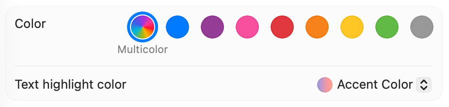
- package/skills/ios/hig-components-system/references/app-clips.md +387 -0
- package/skills/ios/hig-components-system/references/app-shortcuts.md +114 -0
- package/skills/ios/hig-components-system/references/complications.md +425 -0
- package/skills/ios/hig-components-system/references/home-screen-quick-actions.md +42 -0
- package/skills/ios/hig-components-system/references/live-activities.md +442 -0
- package/skills/ios/hig-components-system/references/notifications.md +153 -0
- package/skills/ios/hig-components-system/references/top-shelf.md +135 -0
- package/skills/ios/hig-components-system/references/watch-faces.md +40 -0
- package/skills/ios/hig-components-system/references/widgets.md +517 -0
- package/skills/ios/hig-foundations/SKILL.md +98 -0
- package/skills/ios/hig-foundations/references/accessibility.md +291 -0
- package/skills/ios/hig-foundations/references/app-icons.md +210 -0
- package/skills/ios/hig-foundations/references/branding.md +44 -0
- package/skills/ios/hig-foundations/references/color.md +274 -0
- package/skills/ios/hig-foundations/references/dark-mode.md +116 -0
- package/skills/ios/hig-foundations/references/icons.md +263 -0
- package/skills/ios/hig-foundations/references/images.md +176 -0
- package/skills/ios/hig-foundations/references/immersive-experiences.md +174 -0
- package/skills/ios/hig-foundations/references/inclusion.md +189 -0
- package/skills/ios/hig-foundations/references/layout.md +425 -0
- package/skills/ios/hig-foundations/references/materials.md +238 -0
- package/skills/ios/hig-foundations/references/motion.md +103 -0
- package/skills/ios/hig-foundations/references/privacy.md +231 -0
- package/skills/ios/hig-foundations/references/right-to-left.md +206 -0
- package/skills/ios/hig-foundations/references/sf-symbols.md +310 -0
- package/skills/ios/hig-foundations/references/spatial-layout.md +142 -0
- package/skills/ios/hig-foundations/references/typography.md +1146 -0
- package/skills/ios/hig-foundations/references/writing.md +91 -0
- package/skills/ios/hig-inputs/SKILL.md +94 -0
- package/skills/ios/hig-inputs/references/apple-pencil-and-scribble.md +148 -0
- package/skills/ios/hig-inputs/references/camera-control.md +107 -0
- package/skills/ios/hig-inputs/references/digital-crown.md +83 -0
- package/skills/ios/hig-inputs/references/eyes.md +120 -0
- package/skills/ios/hig-inputs/references/focus-and-selection.md +120 -0
- package/skills/ios/hig-inputs/references/game-controls.md +156 -0
- package/skills/ios/hig-inputs/references/gestures.md +208 -0
- package/skills/ios/hig-inputs/references/gyro-and-accelerometer.md +40 -0
- package/skills/ios/hig-inputs/references/keyboards.md +234 -0
- package/skills/ios/hig-inputs/references/nearby-interactions.md +70 -0
- package/skills/ios/hig-inputs/references/pointing-devices.md +237 -0
- package/skills/ios/hig-inputs/references/remotes.md +67 -0
- package/skills/ios/hig-inputs/references/spatial-interactions.md +70 -0
- package/skills/ios/hig-patterns/SKILL.md +104 -0
- package/skills/ios/hig-patterns/references/charting-data.md +81 -0
- package/skills/ios/hig-patterns/references/collaboration-and-sharing.md +86 -0
- package/skills/ios/hig-patterns/references/drag-and-drop.md +134 -0
- package/skills/ios/hig-patterns/references/entering-data.md +69 -0
- package/skills/ios/hig-patterns/references/feedback.md +67 -0
- package/skills/ios/hig-patterns/references/file-management.md +135 -0
- package/skills/ios/hig-patterns/references/going-full-screen.md +79 -0
- package/skills/ios/hig-patterns/references/launching.md +81 -0
- package/skills/ios/hig-patterns/references/live-viewing-apps.md +79 -0
- package/skills/ios/hig-patterns/references/loading.md +59 -0
- package/skills/ios/hig-patterns/references/managing-accounts.md +107 -0
- package/skills/ios/hig-patterns/references/managing-notifications.md +99 -0
- package/skills/ios/hig-patterns/references/modality.md +82 -0
- package/skills/ios/hig-patterns/references/multitasking.md +131 -0
- package/skills/ios/hig-patterns/references/offering-help.md +117 -0
- package/skills/ios/hig-patterns/references/onboarding.md +69 -0
- package/skills/ios/hig-patterns/references/playing-audio.md +124 -0
- package/skills/ios/hig-patterns/references/playing-haptics.md +280 -0
- package/skills/ios/hig-patterns/references/playing-video.md +180 -0
- package/skills/ios/hig-patterns/references/printing.md +50 -0
- package/skills/ios/hig-patterns/references/ratings-and-reviews.md +48 -0
- package/skills/ios/hig-patterns/references/searching.md +70 -0
- package/skills/ios/hig-patterns/references/settings.md +84 -0
- package/skills/ios/hig-patterns/references/undo-and-redo.md +58 -0
- package/skills/ios/hig-patterns/references/workouts.md +76 -0
- package/skills/ios/hig-platforms/SKILL.md +84 -0
- package/skills/ios/hig-platforms/references/designing-for-games.md +159 -0
- package/skills/ios/hig-platforms/references/designing-for-ios.md +66 -0
- package/skills/ios/hig-platforms/references/designing-for-ipados.md +64 -0
- package/skills/ios/hig-platforms/references/designing-for-macos.md +70 -0
- package/skills/ios/hig-platforms/references/designing-for-tvos.md +68 -0
- package/skills/ios/hig-platforms/references/designing-for-visionos.md +85 -0
- package/skills/ios/hig-platforms/references/designing-for-watchos.md +74 -0
- package/skills/ios/hig-project-context/SKILL.md +133 -0
- package/skills/ios/hig-technologies/SKILL.md +107 -0
- package/skills/ios/hig-technologies/references/airplay.md +125 -0
- package/skills/ios/hig-technologies/references/always-on.md +62 -0
- package/skills/ios/hig-technologies/references/apple-pay.md +441 -0
- package/skills/ios/hig-technologies/references/augmented-reality.md +247 -0
- package/skills/ios/hig-technologies/references/carekit.md +224 -0
- package/skills/ios/hig-technologies/references/carplay.md +119 -0
- package/skills/ios/hig-technologies/references/game-center.md +343 -0
- package/skills/ios/hig-technologies/references/generative-ai.md +110 -0
- package/skills/ios/hig-technologies/references/healthkit.md +120 -0
- package/skills/ios/hig-technologies/references/homekit.md +343 -0
- package/skills/ios/hig-technologies/references/icloud.md +52 -0
- package/skills/ios/hig-technologies/references/id-verifier.md +73 -0
- package/skills/ios/hig-technologies/references/imessage-apps-and-stickers.md +105 -0
- package/skills/ios/hig-technologies/references/in-app-purchase.md +263 -0
- package/skills/ios/hig-technologies/references/live-photos.md +54 -0
- package/skills/ios/hig-technologies/references/mac-catalyst.md +216 -0
- package/skills/ios/hig-technologies/references/machine-learning.md +394 -0
- package/skills/ios/hig-technologies/references/maps.md +221 -0
- package/skills/ios/hig-technologies/references/nfc.md +51 -0
- package/skills/ios/hig-technologies/references/photo-editing.md +40 -0
- package/skills/ios/hig-technologies/references/researchkit.md +134 -0
- package/skills/ios/hig-technologies/references/shareplay.md +142 -0
- package/skills/ios/hig-technologies/references/shazamkit.md +47 -0
- package/skills/ios/hig-technologies/references/sign-in-with-apple.md +288 -0
- package/skills/ios/hig-technologies/references/siri.md +523 -0
- package/skills/ios/hig-technologies/references/tap-to-pay-on-iphone.md +208 -0
- package/skills/ios/hig-technologies/references/voiceover.md +90 -0
- package/skills/ios/hig-technologies/references/wallet.md +420 -0
- package/skills/ios/ios-bootstrap/SKILL.md +17 -8
- package/skills/ios/swift-actor-persistence/SKILL.md +143 -0
- package/skills/ios/swift-concurrency-6-2/SKILL.md +216 -0
- package/skills/ios/swift-protocol-di-testing/SKILL.md +190 -0
- package/skills/ios/swiftui-design-tokens/SKILL.md +475 -0
- package/skills/ios/writing-for-interfaces/SKILL.md +75 -0
- package/skills/web/accessibility/SKILL.md +146 -0
- package/skills/web/aceternity-ui/SKILL.md +719 -0
- package/skills/web/aceternity-ui/metadata.json +10 -0
- package/skills/web/api-design/SKILL.md +523 -0
- package/skills/web/chart-accessibility/SKILL.md +332 -0
- package/skills/web/composition-patterns/AGENTS.md +946 -0
- package/skills/web/composition-patterns/README.md +60 -0
- package/skills/web/composition-patterns/SKILL.md +89 -0
- package/skills/web/composition-patterns/metadata.json +11 -0
- package/skills/web/composition-patterns/rules/_sections.md +29 -0
- package/skills/web/composition-patterns/rules/_template.md +24 -0
- package/skills/web/composition-patterns/rules/architecture-avoid-boolean-props.md +100 -0
- package/skills/web/composition-patterns/rules/architecture-compound-components.md +112 -0
- package/skills/web/composition-patterns/rules/patterns-children-over-render-props.md +87 -0
- package/skills/web/composition-patterns/rules/patterns-explicit-variants.md +100 -0
- package/skills/web/composition-patterns/rules/react19-no-forwardref.md +42 -0
- package/skills/web/composition-patterns/rules/state-context-interface.md +191 -0
- package/skills/web/composition-patterns/rules/state-decouple-implementation.md +113 -0
- package/skills/web/composition-patterns/rules/state-lift-state.md +125 -0
- package/skills/web/cost-aware-llm-pipeline/SKILL.md +183 -0
- package/skills/web/database-migrations/SKILL.md +429 -0
- package/skills/web/deployment-patterns/SKILL.md +427 -0
- package/skills/web/docker-patterns/SKILL.md +364 -0
- package/skills/web/e2e-testing/SKILL.md +326 -0
- package/skills/web/lighthouse-ci/SKILL.md +361 -0
- package/skills/web/mcp-server-patterns/SKILL.md +69 -0
- package/skills/web/next-best-practices/SKILL.md +153 -0
- package/skills/web/next-best-practices/async-patterns.md +87 -0
- package/skills/web/next-best-practices/bundling.md +180 -0
- package/skills/web/next-best-practices/data-patterns.md +297 -0
- package/skills/web/next-best-practices/debug-tricks.md +105 -0
- package/skills/web/next-best-practices/directives.md +73 -0
- package/skills/web/next-best-practices/error-handling.md +227 -0
- package/skills/web/next-best-practices/file-conventions.md +140 -0
- package/skills/web/next-best-practices/font.md +245 -0
- package/skills/web/next-best-practices/functions.md +108 -0
- package/skills/web/next-best-practices/hydration-error.md +91 -0
- package/skills/web/next-best-practices/image.md +173 -0
- package/skills/web/next-best-practices/metadata.md +301 -0
- package/skills/web/next-best-practices/parallel-routes.md +287 -0
- package/skills/web/next-best-practices/route-handlers.md +146 -0
- package/skills/web/next-best-practices/rsc-boundaries.md +159 -0
- package/skills/web/next-best-practices/runtime-selection.md +39 -0
- package/skills/web/next-best-practices/scripts.md +141 -0
- package/skills/web/next-best-practices/self-hosting.md +371 -0
- package/skills/web/next-best-practices/suspense-boundaries.md +67 -0
- package/skills/web/next-cache-components/SKILL.md +411 -0
- package/skills/web/postgres-best-practices/SKILL.md +14 -0
- package/skills/web/postgres-best-practices/references/schema-design.md +9 -0
- package/skills/web/react-best-practices/AGENTS.md +3810 -0
- package/skills/web/react-best-practices/README.md +123 -0
- package/skills/web/react-best-practices/SKILL.md +149 -0
- package/skills/web/react-best-practices/metadata.json +15 -0
- package/skills/web/react-best-practices/rules/_sections.md +46 -0
- package/skills/web/react-best-practices/rules/_template.md +28 -0
- package/skills/web/react-best-practices/rules/advanced-effect-event-deps.md +56 -0
- package/skills/web/react-best-practices/rules/advanced-event-handler-refs.md +55 -0
- package/skills/web/react-best-practices/rules/advanced-init-once.md +42 -0
- package/skills/web/react-best-practices/rules/advanced-use-latest.md +39 -0
- package/skills/web/react-best-practices/rules/async-api-routes.md +38 -0
- package/skills/web/react-best-practices/rules/async-cheap-condition-before-await.md +37 -0
- package/skills/web/react-best-practices/rules/async-defer-await.md +82 -0
- package/skills/web/react-best-practices/rules/async-dependencies.md +51 -0
- package/skills/web/react-best-practices/rules/async-parallel.md +28 -0
- package/skills/web/react-best-practices/rules/async-suspense-boundaries.md +99 -0
- package/skills/web/react-best-practices/rules/bundle-analyzable-paths.md +63 -0
- package/skills/web/react-best-practices/rules/bundle-barrel-imports.md +60 -0
- package/skills/web/react-best-practices/rules/bundle-conditional.md +31 -0
- package/skills/web/react-best-practices/rules/bundle-defer-third-party.md +49 -0
- package/skills/web/react-best-practices/rules/bundle-dynamic-imports.md +35 -0
- package/skills/web/react-best-practices/rules/bundle-preload.md +50 -0
- package/skills/web/react-best-practices/rules/client-event-listeners.md +74 -0
- package/skills/web/react-best-practices/rules/client-localstorage-schema.md +71 -0
- package/skills/web/react-best-practices/rules/client-passive-event-listeners.md +48 -0
- package/skills/web/react-best-practices/rules/client-swr-dedup.md +56 -0
- package/skills/web/react-best-practices/rules/js-batch-dom-css.md +107 -0
- package/skills/web/react-best-practices/rules/js-cache-function-results.md +80 -0
- package/skills/web/react-best-practices/rules/js-cache-property-access.md +28 -0
- package/skills/web/react-best-practices/rules/js-cache-storage.md +70 -0
- package/skills/web/react-best-practices/rules/js-combine-iterations.md +32 -0
- package/skills/web/react-best-practices/rules/js-early-exit.md +50 -0
- package/skills/web/react-best-practices/rules/js-flatmap-filter.md +60 -0
- package/skills/web/react-best-practices/rules/js-hoist-regexp.md +45 -0
- package/skills/web/react-best-practices/rules/js-index-maps.md +37 -0
- package/skills/web/react-best-practices/rules/js-length-check-first.md +49 -0
- package/skills/web/react-best-practices/rules/js-min-max-loop.md +82 -0
- package/skills/web/react-best-practices/rules/js-request-idle-callback.md +105 -0
- package/skills/web/react-best-practices/rules/js-set-map-lookups.md +24 -0
- package/skills/web/react-best-practices/rules/js-tosorted-immutable.md +57 -0
- package/skills/web/react-best-practices/rules/rendering-activity.md +26 -0
- package/skills/web/react-best-practices/rules/rendering-animate-svg-wrapper.md +47 -0
- package/skills/web/react-best-practices/rules/rendering-conditional-render.md +40 -0
- package/skills/web/react-best-practices/rules/rendering-content-visibility.md +38 -0
- package/skills/web/react-best-practices/rules/rendering-hoist-jsx.md +46 -0
- package/skills/web/react-best-practices/rules/rendering-hydration-no-flicker.md +82 -0
- package/skills/web/react-best-practices/rules/rendering-hydration-suppress-warning.md +30 -0
- package/skills/web/react-best-practices/rules/rendering-resource-hints.md +85 -0
- package/skills/web/react-best-practices/rules/rendering-script-defer-async.md +68 -0
- package/skills/web/react-best-practices/rules/rendering-svg-precision.md +28 -0
- package/skills/web/react-best-practices/rules/rendering-usetransition-loading.md +75 -0
- package/skills/web/react-best-practices/rules/rerender-defer-reads.md +39 -0
- package/skills/web/react-best-practices/rules/rerender-dependencies.md +45 -0
- package/skills/web/react-best-practices/rules/rerender-derived-state-no-effect.md +40 -0
- package/skills/web/react-best-practices/rules/rerender-derived-state.md +29 -0
- package/skills/web/react-best-practices/rules/rerender-functional-setstate.md +74 -0
- package/skills/web/react-best-practices/rules/rerender-lazy-state-init.md +58 -0
- package/skills/web/react-best-practices/rules/rerender-memo-with-default-value.md +38 -0
- package/skills/web/react-best-practices/rules/rerender-memo.md +44 -0
- package/skills/web/react-best-practices/rules/rerender-move-effect-to-event.md +45 -0
- package/skills/web/react-best-practices/rules/rerender-no-inline-components.md +82 -0
- package/skills/web/react-best-practices/rules/rerender-simple-expression-in-memo.md +35 -0
- package/skills/web/react-best-practices/rules/rerender-split-combined-hooks.md +64 -0
- package/skills/web/react-best-practices/rules/rerender-transitions.md +40 -0
- package/skills/web/react-best-practices/rules/rerender-use-deferred-value.md +59 -0
- package/skills/web/react-best-practices/rules/rerender-use-ref-transient-values.md +73 -0
- package/skills/web/react-best-practices/rules/server-after-nonblocking.md +73 -0
- package/skills/web/react-best-practices/rules/server-auth-actions.md +96 -0
- package/skills/web/react-best-practices/rules/server-cache-lru.md +41 -0
- package/skills/web/react-best-practices/rules/server-cache-react.md +76 -0
- package/skills/web/react-best-practices/rules/server-dedup-props.md +65 -0
- package/skills/web/react-best-practices/rules/server-hoist-static-io.md +149 -0
- package/skills/web/react-best-practices/rules/server-no-shared-module-state.md +50 -0
- package/skills/web/react-best-practices/rules/server-parallel-fetching.md +83 -0
- package/skills/web/react-best-practices/rules/server-parallel-nested-fetching.md +34 -0
- package/skills/web/react-best-practices/rules/server-serialization.md +38 -0
- package/skills/web/seo/SKILL.md +154 -0
- package/skills/web/web-design-guidelines/SKILL.md +39 -0
- package/skills/web/zap-scan-config/SKILL.md +444 -0
- package/skills/web/zap-scan-config/assets/.gitkeep +9 -0
- package/skills/web/zap-scan-config/assets/github_action.yml +207 -0
- package/skills/web/zap-scan-config/assets/gitlab_ci.yml +226 -0
- package/skills/web/zap-scan-config/assets/zap_automation.yaml +196 -0
- package/skills/web/zap-scan-config/assets/zap_context.xml +192 -0
- package/skills/web/zap-scan-config/references/EXAMPLE.md +40 -0
- package/skills/web/zap-scan-config/references/api_testing_guide.md +475 -0
- package/skills/web/zap-scan-config/references/authentication_guide.md +431 -0
- package/skills/web/zap-scan-config/references/false_positive_handling.md +427 -0
- package/skills/web/zap-scan-config/references/owasp_mapping.md +255 -0
- package/src/graph/ids.ts +86 -0
- package/src/graph/index.ts +32 -0
- package/src/graph/parser/architecture.ts +603 -0
- package/src/graph/parser/component-manifest.ts +268 -0
- package/src/graph/parser/decisions-jsonl.ts +407 -0
- package/src/graph/parser/design-md-pass2.ts +253 -0
- package/src/graph/parser/design-md.ts +477 -0
- package/src/graph/parser/page-spec.ts +496 -0
- package/src/graph/parser/product-spec.ts +930 -0
- package/src/graph/parser/screenshot.ts +342 -0
- package/src/graph/parser/sprint-tasks.ts +317 -0
- package/src/graph/storage/index.ts +1154 -0
- package/src/graph/types.ts +432 -0
- package/src/graph/util/dhash.ts +84 -0
- package/src/lrr/aggregator.ts +175 -0
- package/src/orchestrator/hooks/context-header.ts +119 -0
- package/src/orchestrator/hooks/token-accounting-emitter.ts +77 -0
- package/src/orchestrator/hooks/token-accounting.ts +112 -0
- package/src/orchestrator/mcp/cycle-counter.ts +130 -0
- package/src/orchestrator/mcp/scribe.ts +294 -0
- package/src/orchestrator/mcp/state-save.ts +149 -0
- package/src/orchestrator/mcp/write-lease.ts +184 -0
- package/src/orchestrator/phase4-shared-context.ts +57 -0
- package/src/orchestrator/schemas/backward-edge.ts +46 -0
- package/agents/agentic-identity-trust.md +0 -121
- package/agents/data-consolidation-agent.md +0 -39
- package/agents/design-image-prompt-engineer.md +0 -105
- package/agents/design-visual-storyteller.md +0 -147
- package/agents/design-whimsy-injector.md +0 -89
- package/agents/engineering-autonomous-optimization-architect.md +0 -105
- package/agents/market-intel.md +0 -35
- package/agents/marketing-instagram-curator.md +0 -111
- package/agents/marketing-reddit-community-builder.md +0 -121
- package/agents/marketing-social-media-strategist.md +0 -74
- package/agents/marketing-tiktok-strategist.md +0 -123
- package/agents/marketing-twitter-engager.md +0 -124
- package/agents/marketing-wechat-official-account.md +0 -143
- package/agents/marketing-xiaohongshu-specialist.md +0 -136
- package/agents/marketing-zhihu-strategist.md +0 -160
- package/agents/product-behavioral-nudge-engine.md +0 -78
- package/agents/project-management-experiment-tracker.md +0 -102
- package/agents/report-distribution-agent.md +0 -43
- package/agents/risk-analysis.md +0 -45
- package/agents/sales-data-extraction-agent.md +0 -46
- package/agents/specialized-cultural-intelligence-strategist.md +0 -65
- package/agents/specialized-developer-advocate.md +0 -146
- package/agents/support-analytics-reporter.md +0 -133
- package/agents/support-executive-summary-generator.md +0 -64
- package/agents/support-finance-tracker.md +0 -145
- package/agents/support-legal-compliance-checker.md +0 -129
- package/agents/support-support-responder.md +0 -91
- package/agents/testing-accessibility-auditor.md +0 -110
- package/agents/testing-test-results-analyzer.md +0 -97
- package/agents/testing-tool-evaluator.md +0 -76
- package/agents/testing-workflow-optimizer.md +0 -99
- package/agents/user-research.md +0 -40
- package/protocols/brainstorm.md +0 -99
- package/protocols/design.md +0 -269
- package/protocols/planning.md +0 -87
- package/skills/ios/ios-hig/SKILL.md +0 -41
- package/skills/ios/ios-hig/references/accessibility.md +0 -81
- package/skills/ios/ios-hig/references/content.md +0 -142
- package/skills/ios/ios-hig/references/feedback.md +0 -123
- package/skills/ios/ios-hig/references/interaction.md +0 -199
- package/skills/ios/ios-hig/references/performance-platform.md +0 -129
- package/skills/ios/ios-hig/references/privacy-permissions.md +0 -181
- package/skills/ios/ios-hig/references/visual-design.md +0 -84
|
@@ -0,0 +1,44 @@
|
|
|
1
|
+
---
|
|
2
|
+
title: "Branding | Apple Developer Documentation"
|
|
3
|
+
source: https://developer.apple.com/design/human-interface-guidelines/branding
|
|
4
|
+
|
|
5
|
+
# Branding
|
|
6
|
+
|
|
7
|
+
Apps and games express their unique brand identity in ways that make them instantly recognizable while feeling at home on the platform and giving people a consistent experience.
|
|
8
|
+
|
|
9
|
+

|
|
10
|
+
|
|
11
|
+
In addition to expressing your brand in your [app icon](https://developer.apple.com/design/human-interface-guidelines/app-icons) and throughout your experience, you have several opportunities to highlight it within the App Store. For guidance, see [App Store Marketing Guidelines](https://developer.apple.com/app-store/marketing/guidelines/).
|
|
12
|
+
|
|
13
|
+
## [Best practices](https://developer.apple.com/design/human-interface-guidelines/branding#Best-practices)
|
|
14
|
+
|
|
15
|
+
**Use your brand’s unique voice and tone in all the written communication you display.** For example, your brand might convey feelings of encouragement and optimism by using plain words, occasional exclamation marks and emoji, and simple sentence structures.
|
|
16
|
+
|
|
17
|
+
**Consider choosing an accent color.** On most platforms, you can specify a color that the system applies to app elements like interface icons, buttons, and text. In macOS, people can also choose their own accent color that the system can use in place of the color an app specifies. For guidance, see [Color](https://developer.apple.com/design/human-interface-guidelines/color).
|
|
18
|
+
|
|
19
|
+
**Consider using a custom font.** If your brand is strongly associated with a specific font, be sure that it’s legible at all sizes and supports accessibility features like bold text and larger type. It can work well to use a custom font for headlines and subheadings while using a system font for body copy and captions, because the system fonts are designed for optimal legibility at small sizes. For guidance, see [Typography](https://developer.apple.com/design/human-interface-guidelines/typography).
|
|
20
|
+
|
|
21
|
+
**Ensure branding always defers to content.** Using screen space for an element that does nothing but display a brand asset can mean there’s less room for the content people care about. Aim to incorporate branding in refined, unobtrusive ways that don’t distract people from your experience.
|
|
22
|
+
|
|
23
|
+
**Help people feel comfortable by using standard patterns consistently.** Even a highly stylized interface can be approachable if it maintains familiar behaviors. For example, place UI components in expected locations and use standard symbols to represent common actions.
|
|
24
|
+
|
|
25
|
+
**Resist the temptation to display your logo throughout your app or game unless it’s essential for providing context.** People seldom need to be reminded which app they’re using, and it’s usually better to use the space to give people valuable information and controls.
|
|
26
|
+
|
|
27
|
+
**Avoid using a launch screen as a branding opportunity.** Some platforms use a launch screen to minimize the startup experience, while simultaneously giving the app or game a little time to load resources (for guidance, see [Launch screens](https://developer.apple.com/design/human-interface-guidelines/launching#Launch-screens)). A launch screen disappears too quickly to convey any information, but you might consider displaying a welcome or onboarding screen that incorporates your branding content at the beginning of your experience. For guidance, see [Onboarding](https://developer.apple.com/design/human-interface-guidelines/onboarding).
|
|
28
|
+
|
|
29
|
+
**Follow Apple’s trademark guidelines.** Apple trademarks must not appear in your app name or images. See [Apple Trademark List](https://www.apple.com/legal/intellectual-property/trademark/appletmlist.html) and [Guidelines for Using Apple Trademarks](https://www.apple.com/legal/intellectual-property/guidelinesfor3rdparties.html).
|
|
30
|
+
|
|
31
|
+
## [Platform considerations](https://developer.apple.com/design/human-interface-guidelines/branding#Platform-considerations)
|
|
32
|
+
|
|
33
|
+
_No additional considerations for iOS, iPadOS, macOS, tvOS, visionOS, or watchOS._
|
|
34
|
+
|
|
35
|
+
## [Resources](https://developer.apple.com/design/human-interface-guidelines/branding#Resources)
|
|
36
|
+
|
|
37
|
+
#### [Related](https://developer.apple.com/design/human-interface-guidelines/branding#Related)
|
|
38
|
+
|
|
39
|
+
[Marketing resources and identity guidelines](https://developer.apple.com/app-store/marketing/guidelines/)
|
|
40
|
+
|
|
41
|
+
[Show more with app previews](https://developer.apple.com/app-store/app-previews/)
|
|
42
|
+
|
|
43
|
+
[Color](https://developer.apple.com/design/human-interface-guidelines/color)
|
|
44
|
+
|
|
@@ -0,0 +1,274 @@
|
|
|
1
|
+
---
|
|
2
|
+
title: "Color | Apple Developer Documentation"
|
|
3
|
+
source: https://developer.apple.com/design/human-interface-guidelines/color
|
|
4
|
+
|
|
5
|
+
# Color
|
|
6
|
+
|
|
7
|
+
Judicious use of color can enhance communication, evoke your brand, provide visual continuity, communicate status and feedback, and help people understand information.
|
|
8
|
+
|
|
9
|
+
|
|
10
|
+
|
|
11
|
+
The system defines colors that look good on various backgrounds and appearance modes, and can automatically adapt to vibrancy and accessibility settings. Using system colors is a convenient way to make your experience feel at home on the device.
|
|
12
|
+
|
|
13
|
+
You may also want to use custom colors to enhance the visual experience of your app or game and express its unique personality. The following guidelines can help you use color in ways that people appreciate, regardless of whether you use system-defined or custom colors.
|
|
14
|
+
|
|
15
|
+
## [Best practices](https://developer.apple.com/design/human-interface-guidelines/color#Best-practices)
|
|
16
|
+
|
|
17
|
+
**Avoid using the same color to mean different things.** Use color consistently throughout your interface, especially when you use it to help communicate information like status or interactivity. For example, if you use your brand color to indicate that a borderless button is interactive, using the same or similar color to stylize noninteractive text is confusing.
|
|
18
|
+
|
|
19
|
+
**Make sure all your app’s colors work well in light, dark, and increased contrast contexts.** iOS, iPadOS, macOS, and tvOS offer both light and [dark](https://developer.apple.com/design/human-interface-guidelines/dark-mode) appearance settings. [System colors](https://developer.apple.com/design/human-interface-guidelines/color#System-colors) vary subtly depending on the system appearance, adjusting to ensure proper color differentiation and contrast for text, symbols, and other elements. With the Increase Contrast setting turned on, the color differences become far more apparent. When possible, use system colors, which already define variants for all these contexts. If you define a custom color, make sure to supply light and dark variants, and an increased contrast option for each variant that provides a significantly higher amount of visual differentiation. Even if your app ships in a single appearance mode, provide both light and dark colors to support Liquid Glass adaptivity in these contexts.
|
|
20
|
+
|
|
21
|
+
|
|
22
|
+
|
|
23
|
+
Default (light)
|
|
24
|
+
|
|
25
|
+
|
|
26
|
+
|
|
27
|
+
Increased contrast (light)
|
|
28
|
+
|
|
29
|
+
|
|
30
|
+
|
|
31
|
+
Default (dark)
|
|
32
|
+
|
|
33
|
+
|
|
34
|
+
|
|
35
|
+
Increased contrast (dark)
|
|
36
|
+
|
|
37
|
+
**Test your app’s color scheme under a variety of lighting conditions.** Colors can look different when you view your app outside on a sunny day or in dim light. In bright surroundings, colors look darker and more muted. In dark environments, colors appear bright and saturated. In visionOS, colors can look different depending on the colors of a wall or object in a person’s physical surroundings and how it reflects light. Adjust app colors to provide an optimal viewing experience in the majority of use cases.
|
|
38
|
+
|
|
39
|
+
**Test your app on different devices.** For example, the True Tone display — available on certain iPhone, iPad, and Mac models — uses ambient light sensors to automatically adjust the white point of the display to adapt to the lighting conditions of the current environment. Apps that primarily support reading, photos, video, and gaming can strengthen or weaken this effect by specifying a white point adaptivity style (for developer guidance, see [`UIWhitePointAdaptivityStyle`](https://developer.apple.com/documentation/BundleResources/Information-Property-List/UIWhitePointAdaptivityStyle)). Test tvOS apps on multiple brands of HD and 4K TVs, and with different display settings. You can also test the appearance of your app using different color profiles on a Mac — such as P3 and Standard RGB (sRGB) — by choosing a profile in System Settings > Displays. For guidance, see [Color management](https://developer.apple.com/design/human-interface-guidelines/color#Color-management).
|
|
40
|
+
|
|
41
|
+
**Consider how artwork and translucency affect nearby colors.** Variations in artwork sometimes warrant changes to nearby colors to maintain visual continuity and prevent interface elements from becoming overpowering or underwhelming. Maps, for example, displays a light color scheme when in map mode but switches to a dark color scheme when in satellite mode. Colors can also appear different when placed behind or applied to a translucent element like a toolbar.
|
|
42
|
+
|
|
43
|
+
**If your app lets people choose colors, prefer system-provided color controls where available.** Using built-in color pickers provides a consistent user experience, in addition to letting people save a set of colors they can access from any app. For developer guidance, see [`ColorPicker`](https://developer.apple.com/documentation/SwiftUI/ColorPicker).
|
|
44
|
+
|
|
45
|
+
## [Inclusive color](https://developer.apple.com/design/human-interface-guidelines/color#Inclusive-color)
|
|
46
|
+
|
|
47
|
+
**Avoid relying solely on color to differentiate between objects, indicate interactivity, or communicate essential information.** When you use color to convey information, be sure to provide the same information in alternative ways so people with color blindness or other visual disabilities can understand it. For example, you can use text labels or glyph shapes to identify objects or states.
|
|
48
|
+
|
|
49
|
+
**Avoid using colors that make it hard to perceive content in your app.** For example, insufficient contrast can cause icons and text to blend with the background and make content hard to read, and people who are color blind might not be able to distinguish some color combinations. For guidance, see [Accessibility](https://developer.apple.com/design/human-interface-guidelines/accessibility).
|
|
50
|
+
|
|
51
|
+
**Consider how the colors you use might be perceived in other countries and cultures.** For example, red communicates danger in some cultures, but has positive connotations in other cultures. Make sure the colors in your app send the message you intend.
|
|
52
|
+
|
|
53
|
+
Green indicates a positive trend in the Stocks app in English.
|
|
54
|
+
|
|
55
|
+
Red indicates a positive trend in the Stocks app in Chinese.
|
|
56
|
+
|
|
57
|
+
## [System colors](https://developer.apple.com/design/human-interface-guidelines/color#System-colors)
|
|
58
|
+
|
|
59
|
+
**Avoid hard-coding system color values in your app.** Documented color values are for your reference during the app design process. The actual color values may fluctuate from release to release, based on a variety of environmental variables. Use APIs like [`Color`](https://developer.apple.com/documentation/SwiftUI/Color) to apply system colors.
|
|
60
|
+
|
|
61
|
+
iOS, iPadOS, macOS, and visionOS also define sets of _dynamic system colors_ that match the color schemes of standard UI components and automatically adapt to both light and dark contexts. Each dynamic color is semantically defined by its purpose, rather than its appearance or color values. For example, some colors represent view backgrounds at different levels of hierarchy and other colors represent foreground content, such as labels, links, and separators.
|
|
62
|
+
|
|
63
|
+
**Avoid redefining the semantic meanings of dynamic system colors.** To ensure a consistent experience and ensure your interface looks great when the appearance of the platform changes, use dynamic system colors as intended. For example, don’t use the [separator](https://developer.apple.com/documentation/uikit/uicolor/separator) color as a text color, or [secondary text label](https://developer.apple.com/documentation/uikit/uicolor/secondarylabel) color as a background color.
|
|
64
|
+
|
|
65
|
+
## [Liquid Glass color](https://developer.apple.com/design/human-interface-guidelines/color#Liquid-Glass-color)
|
|
66
|
+
|
|
67
|
+
By default, [Liquid Glass](https://developer.apple.com/design/human-interface-guidelines/materials#Liquid-Glass) has no inherent color, and instead takes on colors from the content directly behind it. You can apply color to some Liquid Glass elements, giving them the appearance of colored or stained glass. This is useful for drawing emphasis to a specific control, like a primary call to action, and is the approach the system uses for prominent button styling. Symbols or text labels on Liquid Glass controls can also have color.
|
|
68
|
+
|
|
69
|
+
Controls can use color in the Liquid Glass background, like in a primary action button.
|
|
70
|
+
|
|
71
|
+
Symbols and text that appear on Liquid Glass can have color, like in a selected tab bar item.
|
|
72
|
+
|
|
73
|
+
By default, Liquid Glass picks up the color from the content layer behind it.
|
|
74
|
+
|
|
75
|
+
For smaller elements like toolbars and tab bars, the system can adapt Liquid Glass between a light and dark appearance in response to the underlying content. By default, symbols and text on these elements follow a monochromatic color scheme, becoming darker when the underlying content is light, and lighter when it’s dark. Liquid Glass appears more opaque in larger elements like sidebars to preserve legibility over complex backgrounds and accommodate richer content on the material’s surface.
|
|
76
|
+
|
|
77
|
+
**Apply color sparingly to the Liquid Glass material, and to symbols or text on the material.** If you apply color, reserve it for elements that truly benefit from emphasis, such as status indicators or primary actions. To emphasize primary actions, apply color to the background rather than to symbols or text. For example, the system applies the app accent color to the background in prominent buttons — such as the Done button — to draw attention and elevate their visual prominence. Refrain from adding color to the background of multiple controls.
|
|
78
|
+
|
|
79
|
+
|
|
80
|
+
|
|
81
|
+

|
|
82
|
+
|
|
83
|
+
|
|
84
|
+
|
|
85
|
+

|
|
86
|
+
|
|
87
|
+
**Avoid using similar colors in control labels if your app has a colorful background.** While color can make apps more visually appealing, playful, or reflective of your brand, too much color can be overwhelming and make control labels more difficult to read. If your app features colorful backgrounds or visually rich content, prefer a monochromatic appearance for toolbars and tab bars, or choose an accent color with sufficient visual differentiation. By contrast, in apps with primarily monochromatic content or backgrounds, choosing your brand color as the app accent color can be an effective way to tailor your app experience and reflect your company’s identity.
|
|
88
|
+
|
|
89
|
+
**Be aware of the placement of color in the content layer.** Make sure your interface maintains sufficient contrast by avoiding overlap of similar colors in the content layer and controls when possible. Although colorful content might intermittently scroll underneath controls, make sure its default or resting state — like the top of a screen of scrollable content — maintains clear legibility.
|
|
90
|
+
|
|
91
|
+
## [Color management](https://developer.apple.com/design/human-interface-guidelines/color#Color-management)
|
|
92
|
+
|
|
93
|
+
A _color space_ represents the colors in a _color model_ like RGB or CMYK. Common color spaces — sometimes called _gamuts_ — are sRGB and Display P3.
|
|
94
|
+
|
|
95
|
+
|
|
96
|
+
|
|
97
|
+
A _color profile_ describes the colors in a color space using, for example, mathematical formulas or tables of data that map colors to numerical representations. An image embeds its color profile so that a device can interpret the image’s colors correctly and reproduce them on a display.
|
|
98
|
+
|
|
99
|
+
**Apply color profiles to your images.** Color profiles help ensure that your app’s colors appear as intended on different displays. The sRGB color space produces accurate colors on most displays.
|
|
100
|
+
|
|
101
|
+
**Use wide color to enhance the visual experience on compatible displays.** Wide color displays support a P3 color space, which can produce richer, more saturated colors than sRGB. As a result, photos and videos that use wide color are more lifelike, and visual data and status indicators that use wide color can be more meaningful. When appropriate, use the Display P3 color profile at 16 bits per pixel (per channel) and export images in PNG format. Note that you need to use a wide color display to design wide color images and select P3 colors.
|
|
102
|
+
|
|
103
|
+
**Provide color space–specific image and color variations if necessary.** In general, P3 colors and images appear fine on sRGB displays. Occasionally, it may be hard to distinguish two very similar P3 colors when viewing them on an sRGB display. Gradients that use P3 colors can also sometimes appear clipped on sRGB displays. To avoid these issues and to ensure visual fidelity on both wide color and sRGB displays, you can use the asset catalog of your Xcode project to provide different versions of images and colors for each color space.
|
|
104
|
+
|
|
105
|
+
## [Platform considerations](https://developer.apple.com/design/human-interface-guidelines/color#Platform-considerations)
|
|
106
|
+
|
|
107
|
+
### [iOS, iPadOS](https://developer.apple.com/design/human-interface-guidelines/color#iOS-iPadOS)
|
|
108
|
+
|
|
109
|
+
iOS defines two sets of dynamic background colors — _system_ and _grouped_ — each of which contains primary, secondary, and tertiary variants that help you convey a hierarchy of information. In general, use the grouped background colors ([`systemGroupedBackground`](https://developer.apple.com/documentation/UIKit/UIColor/systemGroupedBackground), [`secondarySystemGroupedBackground`](https://developer.apple.com/documentation/UIKit/UIColor/secondarySystemGroupedBackground), and [`tertiarySystemGroupedBackground`](https://developer.apple.com/documentation/UIKit/UIColor/tertiarySystemGroupedBackground)) when you have a grouped table view; otherwise, use the system set of background colors ([`systemBackground`](https://developer.apple.com/documentation/UIKit/UIColor/systemBackground), [`secondarySystemBackground`](https://developer.apple.com/documentation/UIKit/UIColor/secondarySystemBackground), and [`tertiarySystemBackground`](https://developer.apple.com/documentation/UIKit/UIColor/tertiarySystemBackground)).
|
|
110
|
+
|
|
111
|
+
With both sets of background colors, you generally use the variants to indicate hierarchy in the following ways:
|
|
112
|
+
|
|
113
|
+
* Primary for the overall view
|
|
114
|
+
|
|
115
|
+
* Secondary for grouping content or elements within the overall view
|
|
116
|
+
|
|
117
|
+
* Tertiary for grouping content or elements within secondary elements
|
|
118
|
+
|
|
119
|
+
|
|
120
|
+
|
|
121
|
+
|
|
122
|
+
For foreground content, iOS defines the following dynamic colors:
|
|
123
|
+
|
|
124
|
+
Color| Use for…| UIKit API
|
|
125
|
+
---|---|---
|
|
126
|
+
Label| A text label that contains primary content.| [`label`](https://developer.apple.com/documentation/UIKit/UIColor/label)
|
|
127
|
+
Secondary label| A text label that contains secondary content.| [`secondaryLabel`](https://developer.apple.com/documentation/UIKit/UIColor/secondaryLabel)
|
|
128
|
+
Tertiary label| A text label that contains tertiary content.| [`tertiaryLabel`](https://developer.apple.com/documentation/UIKit/UIColor/tertiaryLabel)
|
|
129
|
+
Quaternary label| A text label that contains quaternary content.| [`quaternaryLabel`](https://developer.apple.com/documentation/UIKit/UIColor/quaternaryLabel)
|
|
130
|
+
Placeholder text| Placeholder text in controls or text views.| [`placeholderText`](https://developer.apple.com/documentation/UIKit/UIColor/placeholderText)
|
|
131
|
+
Separator| A separator that allows some underlying content to be visible.| [`separator`](https://developer.apple.com/documentation/UIKit/UIColor/separator)
|
|
132
|
+
Opaque separator| A separator that doesn’t allow any underlying content to be visible.| [`opaqueSeparator`](https://developer.apple.com/documentation/UIKit/UIColor/opaqueSeparator)
|
|
133
|
+
Link| Text that functions as a link.| [`link`](https://developer.apple.com/documentation/UIKit/UIColor/link)
|
|
134
|
+
|
|
135
|
+
### [macOS](https://developer.apple.com/design/human-interface-guidelines/color#macOS)
|
|
136
|
+
|
|
137
|
+
macOS defines the following dynamic system colors (you can also view them in the Developer palette of the standard Color panel):
|
|
138
|
+
|
|
139
|
+
Color| Use for…| AppKit API
|
|
140
|
+
---|---|---
|
|
141
|
+
Alternate selected control text color| The text on a selected surface in a list or table.| [`alternateSelectedControlTextColor`](https://developer.apple.com/documentation/AppKit/NSColor/alternateSelectedControlTextColor)
|
|
142
|
+
Alternating content background colors| The backgrounds of alternating rows or columns in a list, table, or collection view.| [`alternatingContentBackgroundColors`](https://developer.apple.com/documentation/AppKit/NSColor/alternatingContentBackgroundColors)
|
|
143
|
+
Control accent| The accent color people select in System Settings.| [`controlAccentColor`](https://developer.apple.com/documentation/AppKit/NSColor/controlAccentColor)
|
|
144
|
+
Control background color| The background of a large interface element, such as a browser or table.| [`controlBackgroundColor`](https://developer.apple.com/documentation/AppKit/NSColor/controlBackgroundColor)
|
|
145
|
+
Control color| The surface of a control.| [`controlColor`](https://developer.apple.com/documentation/AppKit/NSColor/controlColor)
|
|
146
|
+
Control text color| The text of a control that is available.| [`controlTextColor`](https://developer.apple.com/documentation/AppKit/NSColor/controlTextColor)
|
|
147
|
+
Current control tint| The system-defined control tint.| [`currentControlTint`](https://developer.apple.com/documentation/AppKit/NSColor/currentControlTint)
|
|
148
|
+
Unavailable control text color| The text of a control that’s unavailable.| [`disabledControlTextColor`](https://developer.apple.com/documentation/AppKit/NSColor/disabledControlTextColor)
|
|
149
|
+
Find highlight color| The color of a find indicator.| [`findHighlightColor`](https://developer.apple.com/documentation/AppKit/NSColor/findHighlightColor)
|
|
150
|
+
Grid color| The gridlines of an interface element, such as a table.| [`gridColor`](https://developer.apple.com/documentation/AppKit/NSColor/gridColor)
|
|
151
|
+
Header text color| The text of a header cell in a table.| [`headerTextColor`](https://developer.apple.com/documentation/AppKit/NSColor/headerTextColor)
|
|
152
|
+
Highlight color| The virtual light source onscreen.| [`highlightColor`](https://developer.apple.com/documentation/AppKit/NSColor/highlightColor)
|
|
153
|
+
Keyboard focus indicator color| The ring that appears around the currently focused control when using the keyboard for interface navigation.| [`keyboardFocusIndicatorColor`](https://developer.apple.com/documentation/AppKit/NSColor/keyboardFocusIndicatorColor)
|
|
154
|
+
Label color| The text of a label containing primary content.| [`labelColor`](https://developer.apple.com/documentation/AppKit/NSColor/labelColor)
|
|
155
|
+
Link color| A link to other content.| [`linkColor`](https://developer.apple.com/documentation/AppKit/NSColor/linkColor)
|
|
156
|
+
Placeholder text color| A placeholder string in a control or text view.| [`placeholderTextColor`](https://developer.apple.com/documentation/AppKit/NSColor/placeholderTextColor)
|
|
157
|
+
Quaternary label color| The text of a label of lesser importance than a tertiary label, such as watermark text.| [`quaternaryLabelColor`](https://developer.apple.com/documentation/AppKit/NSColor/quaternaryLabelColor)
|
|
158
|
+
Secondary label color| The text of a label of lesser importance than a primary label, such as a label used to represent a subheading or additional information.| [`secondaryLabelColor`](https://developer.apple.com/documentation/AppKit/NSColor/secondaryLabelColor)
|
|
159
|
+
Selected content background color| The background for selected content in a key window or view.| [`selectedContentBackgroundColor`](https://developer.apple.com/documentation/AppKit/NSColor/selectedContentBackgroundColor)
|
|
160
|
+
Selected control color| The surface of a selected control.| [`selectedControlColor`](https://developer.apple.com/documentation/AppKit/NSColor/selectedControlColor)
|
|
161
|
+
Selected control text color| The text of a selected control.| [`selectedControlTextColor`](https://developer.apple.com/documentation/AppKit/NSColor/selectedControlTextColor)
|
|
162
|
+
Selected menu item text color| The text of a selected menu.| [`selectedMenuItemTextColor`](https://developer.apple.com/documentation/AppKit/NSColor/selectedMenuItemTextColor)
|
|
163
|
+
Selected text background color| The background of selected text.| [`selectedTextBackgroundColor`](https://developer.apple.com/documentation/AppKit/NSColor/selectedTextBackgroundColor)
|
|
164
|
+
Selected text color| The color for selected text.| [`selectedTextColor`](https://developer.apple.com/documentation/AppKit/NSColor/selectedTextColor)
|
|
165
|
+
Separator color| A separator between different sections of content.| [`separatorColor`](https://developer.apple.com/documentation/AppKit/NSColor/separatorColor)
|
|
166
|
+
Shadow color| The virtual shadow cast by a raised object onscreen.| [`shadowColor`](https://developer.apple.com/documentation/AppKit/NSColor/shadowColor)
|
|
167
|
+
Tertiary label color| The text of a label of lesser importance than a secondary label.| [`tertiaryLabelColor`](https://developer.apple.com/documentation/AppKit/NSColor/tertiaryLabelColor)
|
|
168
|
+
Text background color| The background color behind text.| [`textBackgroundColor`](https://developer.apple.com/documentation/AppKit/NSColor/textBackgroundColor)
|
|
169
|
+
Text color| The text in a document.| [`textColor`](https://developer.apple.com/documentation/AppKit/NSColor/textColor)
|
|
170
|
+
Under page background color| The background behind a document’s content.| [`underPageBackgroundColor`](https://developer.apple.com/documentation/AppKit/NSColor/underPageBackgroundColor)
|
|
171
|
+
Unemphasized selected content background color| The selected content in a non-key window or view.| [`unemphasizedSelectedContentBackgroundColor`](https://developer.apple.com/documentation/AppKit/NSColor/unemphasizedSelectedContentBackgroundColor)
|
|
172
|
+
Unemphasized selected text background color| A background for selected text in a non-key window or view.| [`unemphasizedSelectedTextBackgroundColor`](https://developer.apple.com/documentation/AppKit/NSColor/unemphasizedSelectedTextBackgroundColor)
|
|
173
|
+
Unemphasized selected text color| Selected text in a non-key window or view.| [`unemphasizedSelectedTextColor`](https://developer.apple.com/documentation/AppKit/NSColor/unemphasizedSelectedTextColor)
|
|
174
|
+
Window background color| The background of a window.| [`windowBackgroundColor`](https://developer.apple.com/documentation/AppKit/NSColor/windowBackgroundColor)
|
|
175
|
+
Window frame text color| The text in the window’s title bar area.| [`windowFrameTextColor`](https://developer.apple.com/documentation/AppKit/NSColor/windowFrameTextColor)
|
|
176
|
+
|
|
177
|
+
#### [App accent colors](https://developer.apple.com/design/human-interface-guidelines/color#App-accent-colors)
|
|
178
|
+
|
|
179
|
+
Beginning in macOS 11, you can specify an _accent color_ to customize the appearance of your app’s buttons, selection highlighting, and sidebar icons. The system applies your accent color when the current value in General > Accent color settings is _multicolor_.
|
|
180
|
+
|
|
181
|
+
|
|
182
|
+
|
|
183
|
+
If people set their accent color setting to a value other than multicolor, the system applies their chosen color to the relevant items throughout your app, replacing your accent color. The exception is a sidebar icon that uses a fixed color you specify. Because a fixed-color sidebar icon uses a specific color to provide meaning, the system doesn’t override its color when people change the value of accent color settings. For guidance, see [Sidebars](https://developer.apple.com/design/human-interface-guidelines/sidebars).
|
|
184
|
+
|
|
185
|
+
### [tvOS](https://developer.apple.com/design/human-interface-guidelines/color#tvOS)
|
|
186
|
+
|
|
187
|
+
**Consider choosing a limited color palette that coordinates with your app logo.** Subtle use of color can help you communicate your brand while deferring to the content.
|
|
188
|
+
|
|
189
|
+
**Avoid using only color to indicate focus.** Subtle scaling and responsive animation are the primary ways to denote interactivity when an element is in focus.
|
|
190
|
+
|
|
191
|
+
### [visionOS](https://developer.apple.com/design/human-interface-guidelines/color#visionOS)
|
|
192
|
+
|
|
193
|
+
**Use color sparingly, especially on glass.** Standard visionOS windows typically use the system-defined glass [material](https://developer.apple.com/design/human-interface-guidelines/materials), which lets light and objects from people’s physical surroundings and their space show through. Because the colors in these physical and virtual objects are visible through the glass, they can affect the legibility of colorful app content in the window. Prefer using color in places where it can help call attention to important information or show the relationship between parts of the interface.
|
|
194
|
+
|
|
195
|
+
**Prefer using color in bold text and large areas.** Color in lightweight text or small areas can make them harder to see and understand.
|
|
196
|
+
|
|
197
|
+
**In a fully immersive experience, help people maintain visual comfort by keeping brightness levels balanced.** Although using high contrast can help direct people’s attention to important content, it can also cause visual discomfort if people’s eyes have adjusted to low light or darkness. Consider making content fully bright only when the rest of the visual context is also bright. For example, avoid displaying a bright object on a very dark or black background, especially if the object flashes or moves.
|
|
198
|
+
|
|
199
|
+
### [watchOS](https://developer.apple.com/design/human-interface-guidelines/color#watchOS)
|
|
200
|
+
|
|
201
|
+
**Use background color to support existing content or supply additional information.** Background color can establish a sense of place and help people recognize key content. For example, in Activity, each infographic view for the Move, Exercise, and Stand Activity rings has a background that matches the color of the ring. Use background color when you have something to communicate, rather than as a solely visual flourish. Avoid using full-screen background color in views that are likely to remain onscreen for long periods of time, such as in a workout or audio-playing app.
|
|
202
|
+
|
|
203
|
+
**Recognize that people might prefer graphic complications to use tinted mode instead of full color.** The system can use a single color that’s based on the wearer’s selected color in a graphic complication’s images, gauges, and text. For guidance, see [Complications](https://developer.apple.com/design/human-interface-guidelines/complications).
|
|
204
|
+
|
|
205
|
+
## [Specifications](https://developer.apple.com/design/human-interface-guidelines/color#Specifications)
|
|
206
|
+
|
|
207
|
+
### [System colors](https://developer.apple.com/design/human-interface-guidelines/color#System-colors)
|
|
208
|
+
|
|
209
|
+
Name| SwiftUI API| Default (light)| Default (dark)| Increased contrast (light)| Increased contrast (dark)
|
|
210
|
+
---|---|---|---|---|---
|
|
211
|
+
Red| [`red`](https://developer.apple.com/documentation/SwiftUI/Color/red)| | | | 
|
|
212
|
+
Orange| [`orange`](https://developer.apple.com/documentation/SwiftUI/Color/orange)| | | | 
|
|
213
|
+
Yellow| [`yellow`](https://developer.apple.com/documentation/SwiftUI/Color/yellow)| | | | 
|
|
214
|
+
Green| [`green`](https://developer.apple.com/documentation/SwiftUI/Color/green)| | | | 
|
|
215
|
+
Mint| [`mint`](https://developer.apple.com/documentation/SwiftUI/Color/mint)| | | | 
|
|
216
|
+
Teal| [`teal`](https://developer.apple.com/documentation/SwiftUI/Color/teal)| | | | 
|
|
217
|
+
Cyan| [`cyan`](https://developer.apple.com/documentation/SwiftUI/Color/cyan)| | | | 
|
|
218
|
+
Blue| [`blue`](https://developer.apple.com/documentation/SwiftUI/Color/blue)| | | | 
|
|
219
|
+
Indigo| [`indigo`](https://developer.apple.com/documentation/SwiftUI/Color/indigo)| | | | 
|
|
220
|
+
Purple| [`purple`](https://developer.apple.com/documentation/SwiftUI/Color/purple)| | | | 
|
|
221
|
+
Pink| [`pink`](https://developer.apple.com/documentation/SwiftUI/Color/pink)| | | | 
|
|
222
|
+
Brown| [`brown`](https://developer.apple.com/documentation/SwiftUI/Color/brown)| | | | 
|
|
223
|
+
|
|
224
|
+
visionOS system colors use the default dark color values.
|
|
225
|
+
|
|
226
|
+
### [iOS, iPadOS system gray colors](https://developer.apple.com/design/human-interface-guidelines/color#iOS-iPadOS-system-gray-colors)
|
|
227
|
+
|
|
228
|
+
Name| UIKit API| Default (light)| Default (dark)| Increased contrast (light)| Increased contrast (dark)
|
|
229
|
+
---|---|---|---|---|---
|
|
230
|
+
Gray| [`systemGray`](https://developer.apple.com/documentation/UIKit/UIColor/systemGray)| | | | 
|
|
231
|
+
Gray (2)| [`systemGray2`](https://developer.apple.com/documentation/UIKit/UIColor/systemGray2)| | | | 
|
|
232
|
+
Gray (3)| [`systemGray3`](https://developer.apple.com/documentation/UIKit/UIColor/systemGray3)| | | | 
|
|
233
|
+
Gray (4)| [`systemGray4`](https://developer.apple.com/documentation/UIKit/UIColor/systemGray4)| | | | 
|
|
234
|
+
Gray (5)| [`systemGray5`](https://developer.apple.com/documentation/UIKit/UIColor/systemGray5)| | | | 
|
|
235
|
+
Gray (6)| [`systemGray6`](https://developer.apple.com/documentation/UIKit/UIColor/systemGray6)| | | | 
|
|
236
|
+
|
|
237
|
+
In SwiftUI, the equivalent of `systemGray` is [`gray`](https://developer.apple.com/documentation/SwiftUI/Color/gray).
|
|
238
|
+
|
|
239
|
+
## [Resources](https://developer.apple.com/design/human-interface-guidelines/color#Resources)
|
|
240
|
+
|
|
241
|
+
#### [Related](https://developer.apple.com/design/human-interface-guidelines/color#Related)
|
|
242
|
+
|
|
243
|
+
[Dark Mode](https://developer.apple.com/design/human-interface-guidelines/dark-mode)
|
|
244
|
+
|
|
245
|
+
[Accessibility](https://developer.apple.com/design/human-interface-guidelines/accessibility)
|
|
246
|
+
|
|
247
|
+
[Materials](https://developer.apple.com/design/human-interface-guidelines/materials)
|
|
248
|
+
|
|
249
|
+
[Apple Design Resources](https://developer.apple.com/design/resources/)
|
|
250
|
+
|
|
251
|
+
#### [Developer documentation](https://developer.apple.com/design/human-interface-guidelines/color#Developer-documentation)
|
|
252
|
+
|
|
253
|
+
[`Color`](https://developer.apple.com/documentation/SwiftUI/Color) — SwiftUI
|
|
254
|
+
|
|
255
|
+
[`UIColor`](https://developer.apple.com/documentation/UIKit/UIColor) — UIKit
|
|
256
|
+
|
|
257
|
+
[Color](https://developer.apple.com/documentation/AppKit/color) — AppKit
|
|
258
|
+
|
|
259
|
+
#### [Videos](https://developer.apple.com/design/human-interface-guidelines/color#Videos)
|
|
260
|
+
|
|
261
|
+
[ Meet Liquid Glass ](https://developer.apple.com/videos/play/wwdc2025/219)
|
|
262
|
+
|
|
263
|
+
## [Change log](https://developer.apple.com/design/human-interface-guidelines/color#Change-log)
|
|
264
|
+
|
|
265
|
+
Date| Changes
|
|
266
|
+
---|---
|
|
267
|
+
December 16, 2025| Updated guidance for Liquid Glass.
|
|
268
|
+
June 9, 2025| Updated system color values, and added guidance for Liquid Glass.
|
|
269
|
+
February 2, 2024| Distinguished UIKit and SwiftUI gray colors in iOS and iPadOS, and added guidance for balancing brightness levels in visionOS apps.
|
|
270
|
+
September 12, 2023| Enhanced guidance for using background color in watchOS views, and added color swatches for tvOS.
|
|
271
|
+
June 21, 2023| Updated to include guidance for visionOS.
|
|
272
|
+
June 5, 2023| Updated guidance for using background color in watchOS.
|
|
273
|
+
December 19, 2022| Corrected RGB values for system mint color (Dark Mode) in iOS and iPadOS.
|
|
274
|
+
|
|
@@ -0,0 +1,116 @@
|
|
|
1
|
+
---
|
|
2
|
+
title: "Dark Mode | Apple Developer Documentation"
|
|
3
|
+
source: https://developer.apple.com/design/human-interface-guidelines/dark-mode
|
|
4
|
+
|
|
5
|
+
# Dark Mode
|
|
6
|
+
|
|
7
|
+
Dark Mode is a systemwide appearance setting that uses a dark color palette to provide a comfortable viewing experience tailored for low-light environments.
|
|
8
|
+
|
|
9
|
+
|
|
10
|
+
|
|
11
|
+
In iOS, iPadOS, macOS, and tvOS, people often choose Dark Mode as their default interface style, and they generally expect all apps and games to respect their preference. In Dark Mode, the system uses a dark color palette for all screens, views, menus, and controls, and may also use greater perceptual contrast to make foreground content stand out against the darker backgrounds.
|
|
12
|
+
|
|
13
|
+
## [Best practices](https://developer.apple.com/design/human-interface-guidelines/dark-mode#Best-practices)
|
|
14
|
+
|
|
15
|
+
**Avoid offering an app-specific appearance setting.** An app-specific appearance mode option creates more work for people because they have to adjust more than one setting to get the appearance they want. Worse, they may think your app is broken because it doesn’t respond to their systemwide appearance choice.
|
|
16
|
+
|
|
17
|
+
**Ensure that your app looks good in both appearance modes.** In addition to using one mode or the other, people can choose the Auto appearance setting, which switches between the light and dark appearances as conditions change throughout the day, potentially while your app is running.
|
|
18
|
+
|
|
19
|
+
**Test your content to make sure that it remains comfortably legible in both appearance modes.** For example, in Dark Mode with Increase Contrast and Reduce Transparency turned on (both separately and together), you may find places where dark text is less legible when it’s on a dark background. You might also find that turning on Increase Contrast in Dark Mode can result in reduced visual contrast between dark text and a dark background. Although people with strong vision might still be able to read lower contrast text, such text could be illegible for many. For guidance, see [Accessibility](https://developer.apple.com/design/human-interface-guidelines/accessibility).
|
|
20
|
+
|
|
21
|
+
**In rare cases, consider using only a dark appearance in the interface.** For example, it can make sense for an app that supports immersive media viewing to use a permanently dark appearance that lets the UI recede and helps people focus on the media.
|
|
22
|
+
|
|
23
|
+
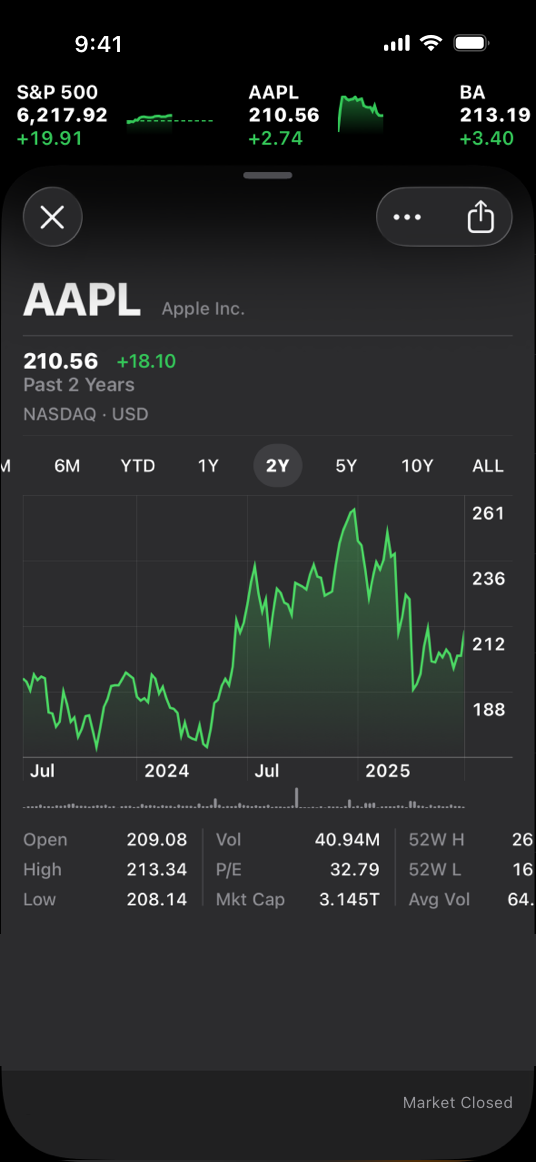
|
|
24
|
+
|
|
25
|
+
The Stocks app uses a dark-only appearance
|
|
26
|
+
|
|
27
|
+
## [Dark Mode colors](https://developer.apple.com/design/human-interface-guidelines/dark-mode#Dark-Mode-colors)
|
|
28
|
+
|
|
29
|
+
The color palette in Dark Mode includes dimmer background colors and brighter foreground colors. It’s important to realize that these colors aren’t necessarily inversions of their light counterparts: while many colors are inverted, some are not. For more information, see [Specifications](https://developer.apple.com/design/human-interface-guidelines/color#Specifications).
|
|
30
|
+
|
|
31
|
+
**Embrace colors that adapt to the current appearance.** Semantic colors (like [`labelColor`](https://developer.apple.com/documentation/AppKit/NSColor/labelColor) and [`controlColor`](https://developer.apple.com/documentation/AppKit/NSColor/controlColor) in macOS or [`separator`](https://developer.apple.com/documentation/UIKit/UIColor/separator) in iOS and iPadOS) automatically adapt to the current appearance. When you need a custom color, add a Color Set asset to your app’s asset catalog in Xcode, and specify the bright and dim variants of the color. Avoid using hard-coded color values or colors that don’t adapt.
|
|
32
|
+
|
|
33
|
+
System colors in the light appearance
|
|
34
|
+
|
|
35
|
+
System colors in the dark appearance
|
|
36
|
+
|
|
37
|
+
**Aim for sufficient color contrast in all appearances.** Using system-defined colors can help you achieve a good contrast ratio between your foreground and background content. At a minimum, make sure the contrast ratio between colors is no lower than 4.5:1. For custom foreground and background colors, strive for a contrast ratio of 7:1, especially in small text. This ratio ensures that your foreground content stands out from the background, and helps your content meet recommended accessibility guidelines.
|
|
38
|
+
|
|
39
|
+
**Soften the color of white backgrounds.** If you display a content image that includes a white background, consider slightly darkening the image to prevent the background from glowing in the surrounding Dark Mode context.
|
|
40
|
+
|
|
41
|
+
### [Icons and images](https://developer.apple.com/design/human-interface-guidelines/dark-mode#Icons-and-images)
|
|
42
|
+
|
|
43
|
+
The system uses [SF Symbols](https://developer.apple.com/design/human-interface-guidelines/sf-symbols) (which automatically adapt to Dark Mode) and full-color images that are optimized for both the light and dark appearances.
|
|
44
|
+
|
|
45
|
+
**Use SF Symbols wherever possible.** Symbols work well in both appearance modes when you use dynamic colors to tint them or when you add vibrancy. For guidance, see [Color](https://developer.apple.com/design/human-interface-guidelines/color).
|
|
46
|
+
|
|
47
|
+
**Design separate interface icons for the light and dark appearances if necessary.** For example, an icon that depicts a full moon might need a subtle dark outline to contrast well with a light background, but need no outline when it displays on a dark background. Similarly, an icon that represents a drop of oil might need a slight border to make the edge visible against a dark background.
|
|
48
|
+
|
|
49
|
+
Icon in the light appearance with no border
|
|
50
|
+
|
|
51
|
+
Icon in the dark appearance with border for better contrast
|
|
52
|
+
|
|
53
|
+
**Make sure full-color images and icons look good in both appearances.** Use the same asset if it looks good in both the light and dark appearances. If an asset looks good in only one mode, modify the asset or create separate light and dark assets. Use asset catalogs to combine your assets into a single named image.
|
|
54
|
+
|
|
55
|
+
Illustration on a light background
|
|
56
|
+
|
|
57
|
+
On a dark background, the same illustration has poor contrast and many details are lost
|
|
58
|
+
|
|
59
|
+
Illustration adjusted for better contrast on a dark background
|
|
60
|
+
|
|
61
|
+
### [Text](https://developer.apple.com/design/human-interface-guidelines/dark-mode#Text)
|
|
62
|
+
|
|
63
|
+
The system uses vibrancy and increased contrast to maintain the legibility of text on darker backgrounds.
|
|
64
|
+
|
|
65
|
+
**Use the system-provided label colors for labels.** The primary, secondary, tertiary, and quaternary label colors adapt automatically to the light and dark appearances.
|
|
66
|
+
|
|
67
|
+
Primary label in the light appearance
|
|
68
|
+
|
|
69
|
+
Secondary label in the dark appearance
|
|
70
|
+
|
|
71
|
+
**Use system views to draw text fields and text views.** System views and controls make your app’s text look good on all backgrounds, adjusting automatically for the presence or absence of vibrancy. When possible, use a system-provided view to display text instead of drawing the text yourself.
|
|
72
|
+
|
|
73
|
+
## [Platform considerations](https://developer.apple.com/design/human-interface-guidelines/dark-mode#Platform-considerations)
|
|
74
|
+
|
|
75
|
+
_No additional considerations for tvOS. Dark Mode isn’t supported in visionOS or watchOS._
|
|
76
|
+
|
|
77
|
+
### [iOS, iPadOS](https://developer.apple.com/design/human-interface-guidelines/dark-mode#iOS-iPadOS)
|
|
78
|
+
|
|
79
|
+
In Dark Mode, the system uses two sets of background colors — called _base_ and _elevated_ — to enhance the perception of depth when one dark interface is layered above another. The base colors are dimmer, making background interfaces appear to recede, and the elevated colors are brighter, making foreground interfaces appear to advance.
|
|
80
|
+
|
|
81
|
+
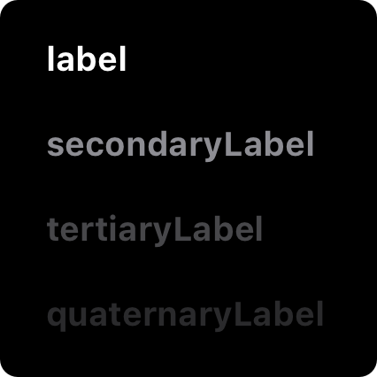Base
|
|
82
|
+
|
|
83
|
+
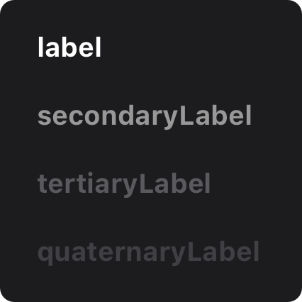Elevated
|
|
84
|
+
|
|
85
|
+
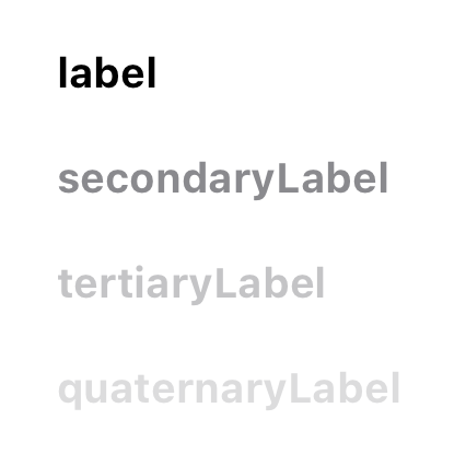Light
|
|
86
|
+
|
|
87
|
+
**Prefer the system background colors.** Dark Mode is dynamic, which means that the background color automatically changes from base to elevated when an interface is in the foreground, such as a popover or modal sheet. The system also uses the elevated background color to provide visual separation between apps in a multitasking environment and between windows in a multiple-window context. Using a custom background color can make it harder for people to perceive these system-provided visual distinctions.
|
|
88
|
+
|
|
89
|
+
### [macOS](https://developer.apple.com/design/human-interface-guidelines/dark-mode#macOS)
|
|
90
|
+
|
|
91
|
+
When people choose the graphite accent color in General settings, macOS causes window backgrounds to pick up color from the current desktop picture. The result — called _desktop tinting_ — is a subtle effect that helps windows blend more harmoniously with their surrounding content.
|
|
92
|
+
|
|
93
|
+
**Include some transparency in custom component backgrounds when appropriate.** Transparency lets your components pick up color from the window background when desktop tinting is active, creating a visual harmony that can persist even when the desktop picture changes. To help achieve this harmony, add transparency only to a custom component that has a visible background or bezel, and only when the component is in a neutral state, such as state that doesn’t use color. You don’t want to add transparency when the component is in a state that uses color, because doing so can cause the component’s color to fluctuate when the window background adjusts to a different location on the desktop or when the desktop picture changes.
|
|
94
|
+
|
|
95
|
+
## [Resources](https://developer.apple.com/design/human-interface-guidelines/dark-mode#Resources)
|
|
96
|
+
|
|
97
|
+
#### [Related](https://developer.apple.com/design/human-interface-guidelines/dark-mode#Related)
|
|
98
|
+
|
|
99
|
+
[Color](https://developer.apple.com/design/human-interface-guidelines/color)
|
|
100
|
+
|
|
101
|
+
[Materials](https://developer.apple.com/design/human-interface-guidelines/materials)
|
|
102
|
+
|
|
103
|
+
[Typography](https://developer.apple.com/design/human-interface-guidelines/typography)
|
|
104
|
+
|
|
105
|
+
#### [Videos](https://developer.apple.com/design/human-interface-guidelines/dark-mode#Videos)
|
|
106
|
+
|
|
107
|
+
[ Meet Liquid Glass ](https://developer.apple.com/videos/play/wwdc2025/219)
|
|
108
|
+
|
|
109
|
+
[ Implementing Dark Mode on iOS ](https://developer.apple.com/videos/play/wwdc2019/214)
|
|
110
|
+
|
|
111
|
+
## [Change log](https://developer.apple.com/design/human-interface-guidelines/dark-mode#Change-log)
|
|
112
|
+
|
|
113
|
+
Date| Changes
|
|
114
|
+
---|---
|
|
115
|
+
August 6, 2024| Added art contrasting the light and dark appearances.
|
|
116
|
+
|