@tencent-rtc/mcp 1.3.3 → 1.3.5
This diff represents the content of publicly available package versions that have been released to one of the supported registries. The information contained in this diff is provided for informational purposes only and reflects changes between package versions as they appear in their respective public registries.
- package/package.json +1 -1
- package/resource/doc/chatuikit/android/features/theme.md +363 -0
- package/resource/doc/chatuikit/{android/client_api_Android.md → faq/android_sdk/client-api.md} +0 -2
- package/resource/doc/chatuikit/faq/common/product.md +8 -0
- package/resource/doc/chatuikit/faq/flutter_sdk/faq.md +53 -0
- package/resource/doc/chatuikit/{iOS/client_api_iOS.md → faq/ios_sdk/client-api.md} +0 -2
- package/resource/doc/chatuikit/flutter/features/theme.md +379 -0
- package/resource/doc/chatuikit/flutter/integration.md +413 -0
- package/resource/doc/chatuikit/flutter/workflow.md +941 -0
- package/resource/doc/chatuikit/iOS/features/theme.md +416 -0
- package/resource/doc/chatuikit/iOS/workflow.md +0 -0
- package/resource/doc/chatuikit/react/components/chat-setting.md +86 -0
- package/resource/doc/chatuikit/react/components/contact-list.md +1093 -0
- package/resource/doc/chatuikit/react/components/search.md +745 -0
- package/resource/doc/chatuikit/vue/components/chat-setting.md +64 -0
- package/resource/doc/chatuikit/vue/components/contact-list.md +679 -0
- package/resource/doc/chatuikit/vue/components/search.md +1384 -0
- package/resource/doc/livekit/live/android/workflow.md +137 -6
- package/resource/doc/livekit/live/ios/live-audience-list.md +339 -0
- package/resource/doc/livekit/live/ios/live-audio-effect.md +370 -0
- package/resource/doc/livekit/live/ios/live-barrage.md +517 -0
- package/resource/doc/livekit/live/ios/live-base-beauty.md +247 -0
- package/resource/doc/livekit/live/ios/live-co-guest-interaction.md +518 -0
- package/resource/doc/livekit/live/ios/live-gift.md +783 -0
- package/resource/doc/livekit/live/ios/live-host-interaction.md +815 -0
- package/resource/doc/livekit/live/ios/live-integration.md +931 -0
- package/resource/doc/livekit/live/ios/live-live-list.md +485 -0
- package/resource/doc/livekit/live/ios/workflow.md +454 -0
- package/resource/doc/rtcengine/web/plugin/20-advanced-customized-capture-rendering.md +87 -0
- package/resource/doc/rtcengine/web/plugin/21-advanced-auto-play-policy.md +87 -0
- package/resource/doc/rtcengine/web/plugin/22-advanced-audio-mixer.md +175 -0
- package/resource/doc/rtcengine/web/plugin/23-advanced-support-detection.md +221 -0
- package/resource/doc/rtcengine/web/plugin/24-advanced-network-quality.md +140 -0
- package/resource/doc/rtcengine/web/plugin/25-advanced-device-change.md +99 -0
- package/resource/doc/rtcengine/web/plugin/26-advanced-publish-cdn-stream.md +451 -0
- package/resource/doc/rtcengine/web/plugin/27-advanced-small-stream.md +151 -0
- package/resource/doc/rtcengine/web/plugin/28-advanced-beauty.md +322 -0
- package/resource/doc/rtcengine/web/plugin/29-advanced-water-mark.md +149 -0
- package/resource/doc/rtcengine/web/plugin/30-advanced-cross-room-link.md +96 -0
- package/resource/doc/rtcengine/web/plugin/31-advanced-plugins-overview.md +330 -0
- package/resource/doc/rtcengine/web/plugin/34-advanced-proxy.md +248 -0
- package/resource/doc/rtcengine/web/plugin/35-advanced-ai-denoiser.md +81 -0
- package/resource/doc/rtcengine/web/plugin/36-advanced-virtual-background.md +242 -0
- package/resource/doc/rtcengine/web/plugin/37-advanced-voice-changer.md +99 -0
- package/resource/doc/rtcengine/web/plugin/39-advanced-video-decoder.md +33 -0
- package/resource/doc/rtcengine/web/plugin/40-advanced-video-mixer.md +379 -0
- package/resource/doc/rtcengine/web/plugin/41-advanced-small-stream-auto-switcher.md +91 -0
- package/resource/doc/rtcengine/web/plugin/42-advanced-realtime-transcriber.md +315 -0
- package/resource/doc/rtcengine/web/plugin/43-advanced-face-detection.md +180 -0
- package/tools/chat/get-native-chat-feature-detail.js +30 -0
- package/tools/chat/get-native-chat-feature-detail.js.map +1 -0
- package/tools/chat/get-native-chat-integration.js +30 -12
- package/tools/chat/get-native-chat-integration.js.map +1 -1
- package/tools/common/get-faq.js +2 -4
- package/tools/common/get-faq.js.map +1 -1
- package/tools/definitions/get_native_chat_feature_detail_def.js +32 -0
- package/tools/definitions/get_native_chat_feature_detail_def.js.map +1 -0
- package/tools/definitions/get_native_chat_uikit_integration_def.js +19 -7
- package/tools/definitions/get_native_chat_uikit_integration_def.js.map +1 -1
- package/tools/definitions/{get_native_live_extra_features_def.js → get_native_live_uikit_extra_features_def.js} +3 -3
- package/tools/definitions/get_native_live_uikit_extra_features_def.js.map +1 -0
- package/tools/definitions/{get_native_live_interaction_def.js → get_native_live_uikit_interaction_def.js} +3 -3
- package/tools/definitions/get_native_live_uikit_interaction_def.js.map +1 -0
- package/tools/definitions/get_web_chat_uikit_component_detail_def.js +49 -10
- package/tools/definitions/get_web_chat_uikit_component_detail_def.js.map +1 -1
- package/tools/definitions/record_prompt_def.js +42 -11
- package/tools/definitions/record_prompt_def.js.map +1 -1
- package/tools/definitions/record_result_def.js +1 -1
- package/tools/index.js +6 -4
- package/tools/index.js.map +1 -1
- package/tools/live/{get_native_live_extra_features.js → get_native_live_uikit_extra_features.js} +4 -4
- package/tools/live/get_native_live_uikit_extra_features.js.map +1 -0
- package/tools/live/{get_native_live_interaction.js → get_native_live_uikit_interaction.js} +4 -4
- package/tools/live/get_native_live_uikit_interaction.js.map +1 -0
- package/tools/rtcengine/get-rtcengine-web-sdk-integration.js.map +1 -1
- package/tools/rtcengine/get-trtc-sdk-faq.js +32 -0
- package/tools/rtcengine/get-trtc-sdk-faq.js.map +1 -0
- package/tools/rtcengine/get-trtc-web-sdk-faq.js +1 -1
- package/tools/rtcengine/get-trtc-web-sdk-integration.js.map +1 -1
- package/tools/rtcengine/get-trtc-web-sdk-plugin.js +45 -0
- package/tools/rtcengine/get-trtc-web-sdk-plugin.js.map +1 -0
- package/utils/handle-component-name.js +0 -16
- package/utils/handle-component-name.js.map +1 -1
- package/utils/report-cls-client.js +1 -1
- package/utils/report-es-client.js +1 -1
- package/resource/doc/chatuikit/android/generate_UserSig.md +0 -306
- package/resource/doc/chatuikit/android/integrarte_only_tuichat_Android.md +0 -290
- package/resource/doc/chatuikit/android/quick_start_Android.md +0 -138
- package/resource/doc/chatuikit/android/show_typing_Android.md +0 -43
- package/resource/doc/chatuikit/flutter/generate_UserSig.md +0 -306
- package/resource/doc/chatuikit/flutter/integrate_tuikit_Flutter.md +0 -133
- package/resource/doc/chatuikit/iOS/generate_UserSig.md +0 -306
- package/resource/doc/chatuikit/iOS/integrate_only_tuichat_iOS.md +0 -748
- package/resource/doc/chatuikit/iOS/quick_start_iOS.md +0 -163
- package/resource/doc/chatuikit/iOS/show_typing_iOS.md +0 -52
- package/tools/definitions/get_native_live_extra_features_def.js.map +0 -1
- package/tools/definitions/get_native_live_interaction_def.js.map +0 -1
- package/tools/live/get_native_live_extra_features.js.map +0 -1
- package/tools/live/get_native_live_interaction.js.map +0 -1
- /package/resource/doc/chatuikit/android/{integrate_tuikit_Android.md → integration.md} +0 -0
- /package/resource/doc/chatuikit/{faq/native_sdk/faq.md → android/workflow.md} +0 -0
- /package/resource/doc/chatuikit/{flutter/client_api_Flutter.md → faq/flutter_sdk/client-api.md} +0 -0
- /package/resource/doc/chatuikit/iOS/{integrate_tuikit_iOS.md → integration.md} +0 -0
- /package/resource/doc/chatuikit/react/components/{chatheader.md → chat-header.md} +0 -0
- /package/resource/doc/chatuikit/vue/components/{chatheader.md → chat-header.md} +0 -0
|
@@ -0,0 +1,416 @@
|
|
|
1
|
+
TUIKit SwiftUI provides powerful appearance customization capabilities, supporting custom theme modes (Light/Dark/Follow System) and theme colors for your application. Through simple configuration, developers can easily implement app-level theme switching and brand color customization.
|
|
2
|
+
|
|
3
|
+
Taking the message list as an example, the effects of custom theme modes and theme colors are shown below:
|
|
4
|
+
<table>
|
|
5
|
+
<tr>
|
|
6
|
+
<td rowspan="1" colSpan="1" >**Light + Default Color**</td>
|
|
7
|
+
|
|
8
|
+
<td rowspan="1" colSpan="1" >**Light + Orange**</td>
|
|
9
|
+
|
|
10
|
+
<td rowspan="1" colSpan="1" >**Dark + Default Color**</td>
|
|
11
|
+
|
|
12
|
+
<td rowspan="1" colSpan="1" >**Dark + Green Theme**</td>
|
|
13
|
+
</tr>
|
|
14
|
+
|
|
15
|
+
<tr>
|
|
16
|
+
<td rowspan="1" colSpan="1" >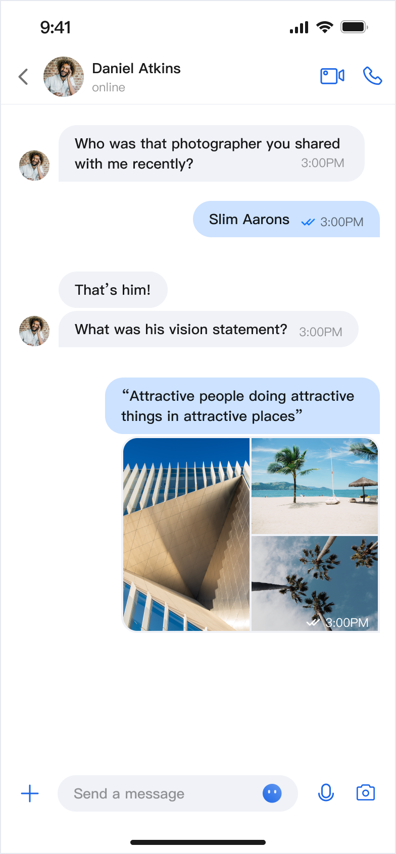</td>
|
|
17
|
+
|
|
18
|
+
<td rowspan="1" colSpan="1" ><br>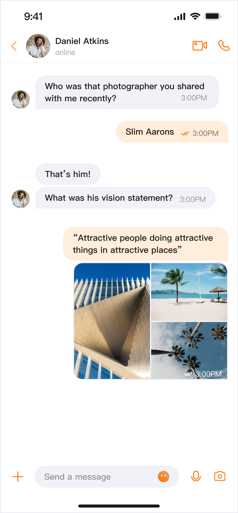</td>
|
|
19
|
+
|
|
20
|
+
<td rowspan="1" colSpan="1" >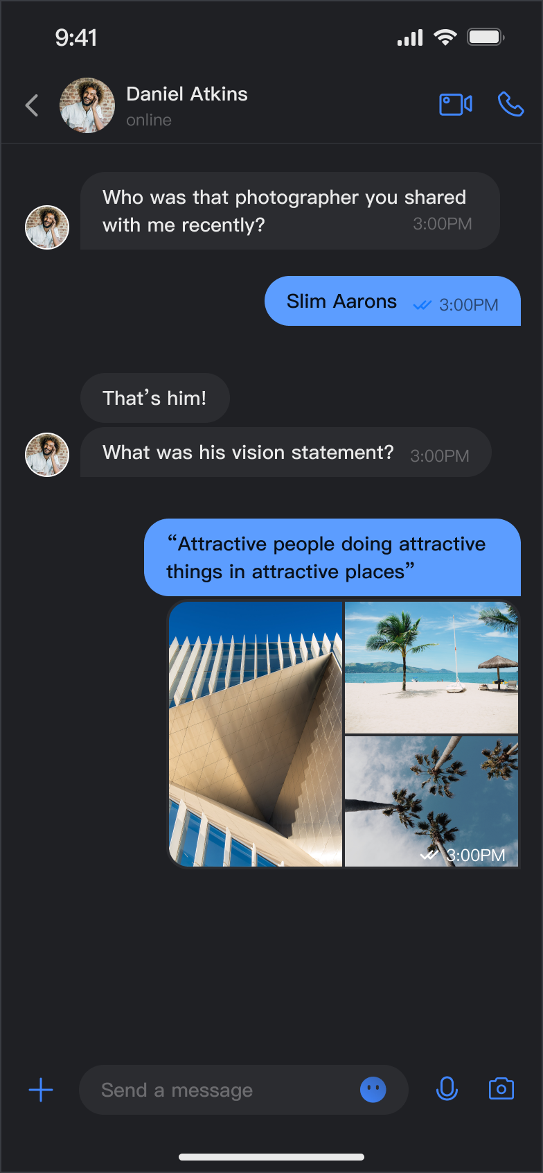</td>
|
|
21
|
+
|
|
22
|
+
<td rowspan="1" colSpan="1" >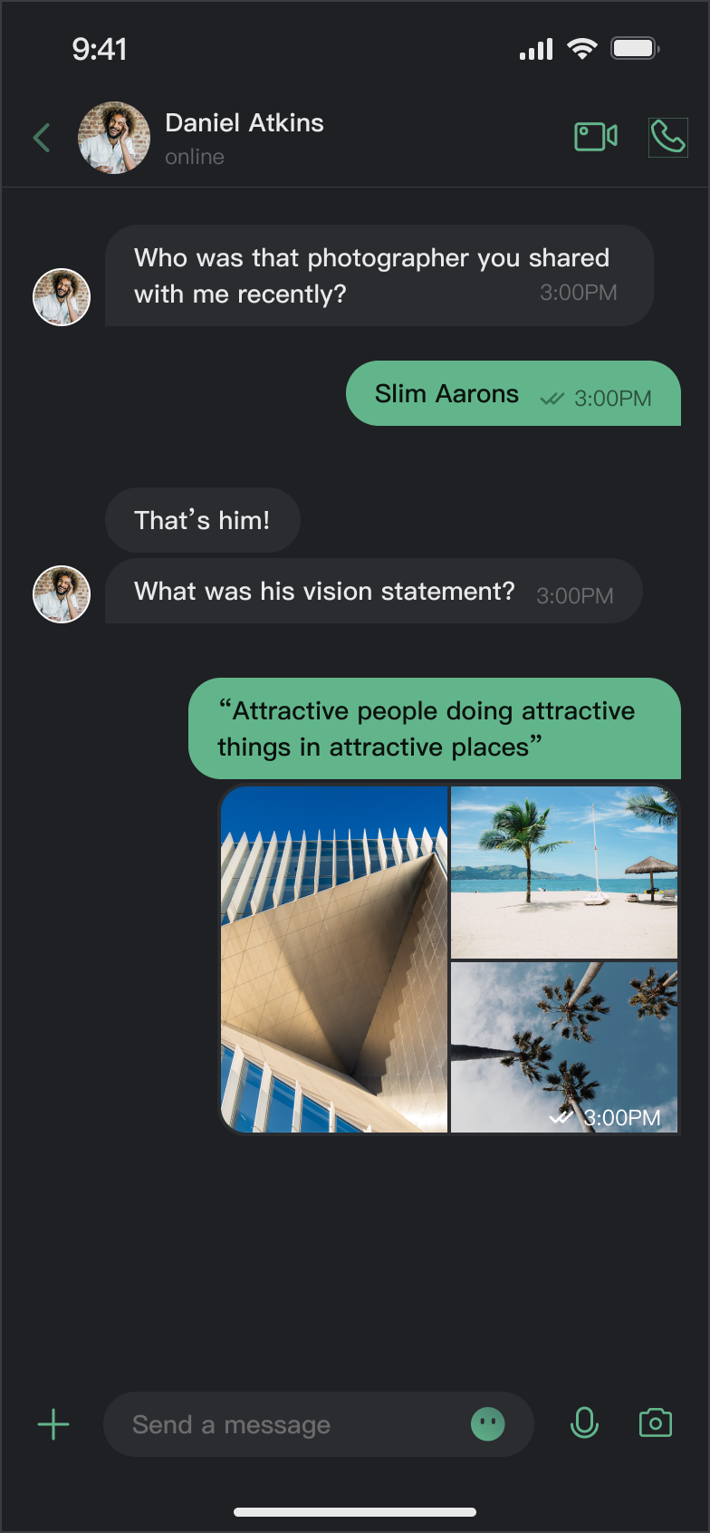</td>
|
|
23
|
+
</tr>
|
|
24
|
+
</table>
|
|
25
|
+
|
|
26
|
+
|
|
27
|
+
## Core Capabilities
|
|
28
|
+
|
|
29
|
+
**Mode Switching**
|
|
30
|
+
- Light Mode: Bright interface suitable for daytime use.
|
|
31
|
+
|
|
32
|
+
- Dark Mode: Dark interface suitable for nighttime use.
|
|
33
|
+
|
|
34
|
+
- Follow System: Automatically follows system appearance settings.
|
|
35
|
+
|
|
36
|
+
|
|
37
|
+
**Theme Color Customization**
|
|
38
|
+
|
|
39
|
+
- Preset Theme Colors: Provides standard colors like blue, green, red, orange, etc.
|
|
40
|
+
|
|
41
|
+
- Custom Theme Colors: Supports any Hex format color.
|
|
42
|
+
|
|
43
|
+
- Smart Palette Generation: Automatically generates a complete palette of 10 color shades.
|
|
44
|
+
|
|
45
|
+
- Clear Customization: One-click restore to default theme color.
|
|
46
|
+
|
|
47
|
+
|
|
48
|
+
## API Reference
|
|
49
|
+
|
|
50
|
+
The above functionalities are based on a set of concise APIs provided by `ThemeState` for theme configuration and information queries.
|
|
51
|
+
|
|
52
|
+
### Set Theme Mode
|
|
53
|
+
<table>
|
|
54
|
+
<tr>
|
|
55
|
+
<td rowspan="1" colSpan="1" >Method</td>
|
|
56
|
+
|
|
57
|
+
<td rowspan="1" colSpan="1" >Parameters</td>
|
|
58
|
+
|
|
59
|
+
<td rowspan="1" colSpan="1" >Return Value</td>
|
|
60
|
+
|
|
61
|
+
<td rowspan="1" colSpan="1" >Description</td>
|
|
62
|
+
</tr>
|
|
63
|
+
|
|
64
|
+
<tr>
|
|
65
|
+
<td rowspan="1" colSpan="1" >`setThemeMode(_:)`</td>
|
|
66
|
+
|
|
67
|
+
<td rowspan="1" colSpan="1" >`ThemeMode`</td>
|
|
68
|
+
|
|
69
|
+
<td rowspan="1" colSpan="1" >`Void`</td>
|
|
70
|
+
|
|
71
|
+
<td rowspan="1" colSpan="1" >Sets the display mode, automatically saves and refreshes.<br>• `.system`: Follow system appearance.<br>• `.light`: Force light mode.<br>• `.dark`: Force dark mode.</td>
|
|
72
|
+
</tr>
|
|
73
|
+
</table>
|
|
74
|
+
|
|
75
|
+
|
|
76
|
+
### Set Theme Color
|
|
77
|
+
<table>
|
|
78
|
+
<tr>
|
|
79
|
+
<td rowspan="1" colSpan="1" >Method</td>
|
|
80
|
+
|
|
81
|
+
<td rowspan="1" colSpan="1" >Parameters</td>
|
|
82
|
+
|
|
83
|
+
<td rowspan="1" colSpan="1" >Return Value</td>
|
|
84
|
+
|
|
85
|
+
<td rowspan="1" colSpan="1" >Description</td>
|
|
86
|
+
</tr>
|
|
87
|
+
|
|
88
|
+
<tr>
|
|
89
|
+
<td rowspan="1" colSpan="1" >`setPrimaryColor(_:)`</td>
|
|
90
|
+
|
|
91
|
+
<td rowspan="1" colSpan="1" >`String`</td>
|
|
92
|
+
|
|
93
|
+
<td rowspan="1" colSpan="1" >`Void`</td>
|
|
94
|
+
|
|
95
|
+
<td rowspan="1" colSpan="1" >Sets the theme color, requires Hex format (e.g., "#1C66E5").</td>
|
|
96
|
+
</tr>
|
|
97
|
+
|
|
98
|
+
<tr>
|
|
99
|
+
<td rowspan="1" colSpan="1" >`clearPrimaryColor()`</td>
|
|
100
|
+
|
|
101
|
+
<td rowspan="1" colSpan="1" >None</td>
|
|
102
|
+
|
|
103
|
+
<td rowspan="1" colSpan="1" >`Void`</td>
|
|
104
|
+
|
|
105
|
+
<td rowspan="1" colSpan="1" >Clears custom theme color and restores default blue.</td>
|
|
106
|
+
</tr>
|
|
107
|
+
</table>
|
|
108
|
+
|
|
109
|
+
|
|
110
|
+
> **Note:**
|
|
111
|
+
>
|
|
112
|
+
> 1. After calling `setThemeMode` or `setPrimaryColor`, the configuration is automatically saved to `UserDefaults` without manual saving. It will automatically load on next app launch.
|
|
113
|
+
> 2. Cache is automatically cleared when modifying theme configuration, ensuring the color scheme updates in real-time. Developers don't need to manage cache.
|
|
114
|
+
> 3. Avoid frequently switching themes when using settings APIs (e.g., calling in a loop).
|
|
115
|
+
|
|
116
|
+
|
|
117
|
+
### Query ThemeState Information
|
|
118
|
+
|
|
119
|
+
The following read-only properties can be used to query the current theme configuration status and information:
|
|
120
|
+
<table>
|
|
121
|
+
<tr>
|
|
122
|
+
<td rowspan="1" colSpan="1" >Property</td>
|
|
123
|
+
|
|
124
|
+
<td rowspan="1" colSpan="1" >Type</td>
|
|
125
|
+
|
|
126
|
+
<td rowspan="1" colSpan="1" >Description</td>
|
|
127
|
+
</tr>
|
|
128
|
+
|
|
129
|
+
<tr>
|
|
130
|
+
<td rowspan="1" colSpan="1" >`currentMode`</td>
|
|
131
|
+
|
|
132
|
+
<td rowspan="1" colSpan="1" >`ThemeMode`</td>
|
|
133
|
+
|
|
134
|
+
<td rowspan="1" colSpan="1" >Current theme mode.</td>
|
|
135
|
+
</tr>
|
|
136
|
+
|
|
137
|
+
<tr>
|
|
138
|
+
<td rowspan="1" colSpan="1" >`currentPrimaryColor`</td>
|
|
139
|
+
|
|
140
|
+
<td rowspan="1" colSpan="1" >`String?`</td>
|
|
141
|
+
|
|
142
|
+
<td rowspan="1" colSpan="1" >Current theme color (Hex format).</td>
|
|
143
|
+
</tr>
|
|
144
|
+
|
|
145
|
+
<tr>
|
|
146
|
+
<td rowspan="1" colSpan="1" >`hasCustomPrimaryColor`</td>
|
|
147
|
+
|
|
148
|
+
<td rowspan="1" colSpan="1" >`Bool`</td>
|
|
149
|
+
|
|
150
|
+
<td rowspan="1" colSpan="1" >Whether a custom theme color is set.</td>
|
|
151
|
+
</tr>
|
|
152
|
+
|
|
153
|
+
<tr>
|
|
154
|
+
<td rowspan="1" colSpan="1" >`isDarkMode`</td>
|
|
155
|
+
|
|
156
|
+
<td rowspan="1" colSpan="1" >`Bool`</td>
|
|
157
|
+
|
|
158
|
+
<td rowspan="1" colSpan="1" >Whether currently in dark mode.</td>
|
|
159
|
+
</tr>
|
|
160
|
+
</table>
|
|
161
|
+
|
|
162
|
+
|
|
163
|
+
## Usage
|
|
164
|
+
|
|
165
|
+
This section introduces how to integrate and use theme and theme color customization features in your application, providing three approaches from simple to complex.
|
|
166
|
+
|
|
167
|
+
### Approach 1: Using AppBuilder Configuration (Recommended)
|
|
168
|
+
|
|
169
|
+
AppBuilder is a convenient feature and UI customization configuration tool, managed through JSON configuration files, suitable for scenarios where Web + Native dual-platform applications need to maintain a unified appearance.
|
|
170
|
+
|
|
171
|
+
You can experience the AppBuilder feature at [Chat Web Demo](https://trtc.io/demo/homepage/#/detail?scene=messenger), experience entry:
|
|
172
|
+
|
|
173
|
+
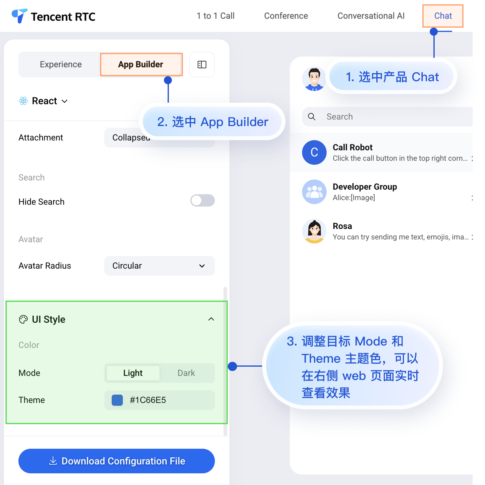
|
|
174
|
+
|
|
175
|
+
|
|
176
|
+
Although the Chat Web Demo currently cannot preview mobile configuration effects in real-time, mobile platforms already support AppBuilder's configuration capabilities.
|
|
177
|
+
|
|
178
|
+
Next, we'll introduce how to apply custom configurations to mobile projects after setting up AppBuilder in the Web demo. The process is quite simple, with only 3 steps:
|
|
179
|
+
1. Download the configuration file.
|
|
180
|
+
|
|
181
|
+
2. Drag the configuration file appConfig.json into your iOS project.
|
|
182
|
+
|
|
183
|
+
3. Load the configuration file at app launch.
|
|
184
|
+
|
|
185
|
+
|
|
186
|
+
#### Step 1: Download Configuration File
|
|
187
|
+
|
|
188
|
+
Visit [Chat Web Demo](https://trtc.io/demo/homepage/#/detail?scene=messenger) and download the appConfig.json configuration file. The download path is:
|
|
189
|
+
|
|
190
|
+
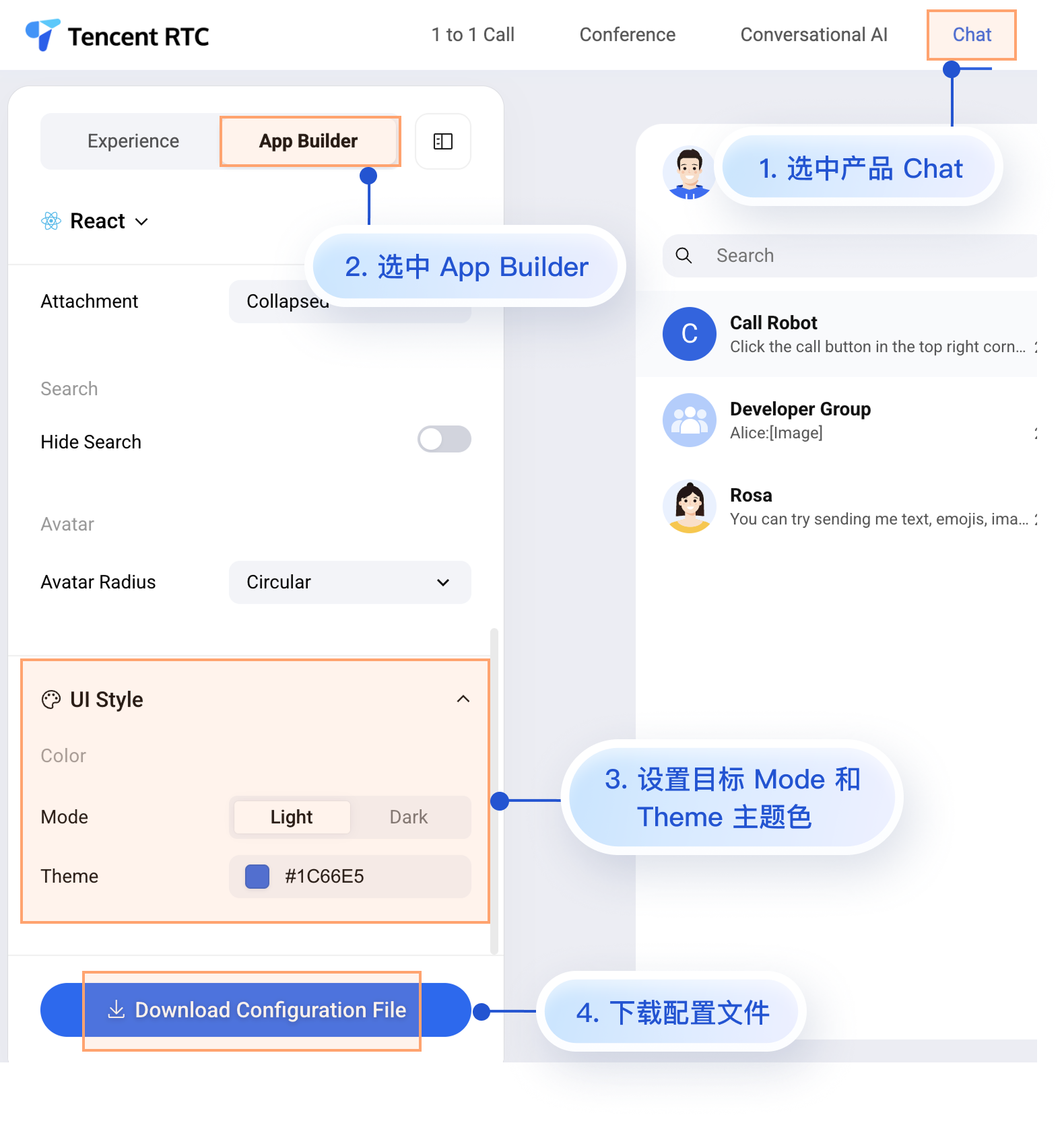
|
|
191
|
+
|
|
192
|
+
|
|
193
|
+
The `appConfig.json` file content is shown below, corresponding one-to-one with the configuration items on the AppBuilder page. The appearance-related configurations are `theme` and its subfields:
|
|
194
|
+
``` json
|
|
195
|
+
{
|
|
196
|
+
"theme": {
|
|
197
|
+
"mode": "light", // Theme mode: light-Light mode, dark-Dark mode, system-Follow system
|
|
198
|
+
"primaryColor": "#E65100" // Primary color, hex color value
|
|
199
|
+
},
|
|
200
|
+
"messageList": {
|
|
201
|
+
"alignment": "two-sided",
|
|
202
|
+
"enableReadReceipt": false,
|
|
203
|
+
"messageActionList": [
|
|
204
|
+
"copy",
|
|
205
|
+
"recall",
|
|
206
|
+
"quote",
|
|
207
|
+
"forward",
|
|
208
|
+
"delete"
|
|
209
|
+
]
|
|
210
|
+
},
|
|
211
|
+
"conversationList": {
|
|
212
|
+
"enableCreateConversation": true,
|
|
213
|
+
"conversationActionList": [
|
|
214
|
+
"delete",
|
|
215
|
+
"mute",
|
|
216
|
+
"pin",
|
|
217
|
+
"markUnread"
|
|
218
|
+
]
|
|
219
|
+
},
|
|
220
|
+
"messageInput": {
|
|
221
|
+
"hideSendButton": false,
|
|
222
|
+
"attachmentPickerMode": "collapsed"
|
|
223
|
+
},
|
|
224
|
+
"search": {
|
|
225
|
+
"hideSearch": false
|
|
226
|
+
},
|
|
227
|
+
"avatar": {
|
|
228
|
+
"shape": "circular"
|
|
229
|
+
}
|
|
230
|
+
}
|
|
231
|
+
```
|
|
232
|
+
|
|
233
|
+
**Configuration Options**
|
|
234
|
+
<table>
|
|
235
|
+
<tr>
|
|
236
|
+
<td rowspan="1" colSpan="1" >Parameter</td>
|
|
237
|
+
|
|
238
|
+
<td rowspan="1" colSpan="1" >Type</td>
|
|
239
|
+
|
|
240
|
+
<td rowspan="1" colSpan="1" >Options</td>
|
|
241
|
+
|
|
242
|
+
<td rowspan="1" colSpan="1" >Description</td>
|
|
243
|
+
</tr>
|
|
244
|
+
|
|
245
|
+
<tr>
|
|
246
|
+
<td rowspan="1" colSpan="1" >`mode`</td>
|
|
247
|
+
|
|
248
|
+
<td rowspan="1" colSpan="1" >String</td>
|
|
249
|
+
|
|
250
|
+
<td rowspan="1" colSpan="1" >`"system"`, `"light"`, `"dark"`</td>
|
|
251
|
+
|
|
252
|
+
<td rowspan="1" colSpan="1" >Theme mode.</td>
|
|
253
|
+
</tr>
|
|
254
|
+
|
|
255
|
+
<tr>
|
|
256
|
+
<td rowspan="1" colSpan="1" >`primaryColor`</td>
|
|
257
|
+
|
|
258
|
+
<td rowspan="1" colSpan="1" >String</td>
|
|
259
|
+
|
|
260
|
+
<td rowspan="1" colSpan="1" >Hex color value, e.g., `"#0ABF77"`</td>
|
|
261
|
+
|
|
262
|
+
<td rowspan="1" colSpan="1" >Theme color.</td>
|
|
263
|
+
</tr>
|
|
264
|
+
</table>
|
|
265
|
+
|
|
266
|
+
|
|
267
|
+
#### Step 2: Add Configuration File to Project
|
|
268
|
+
|
|
269
|
+
Drag appConfig.json into your project, ensuring the correct Target is selected and Copy Bundle Resources is properly checked.
|
|
270
|
+
|
|
271
|
+
Taking the GitHub open source Demo [TUIKit iOS SwiftUI](https://github.com/Tencent-RTC/TUIKit_iOS_SwiftUI/blob/main/chat/demo/ChatDemo/appConfig.json) project as an example, appConfig.json is located in the main bundle of demo/ChatDemo:
|
|
272
|
+
|
|
273
|
+
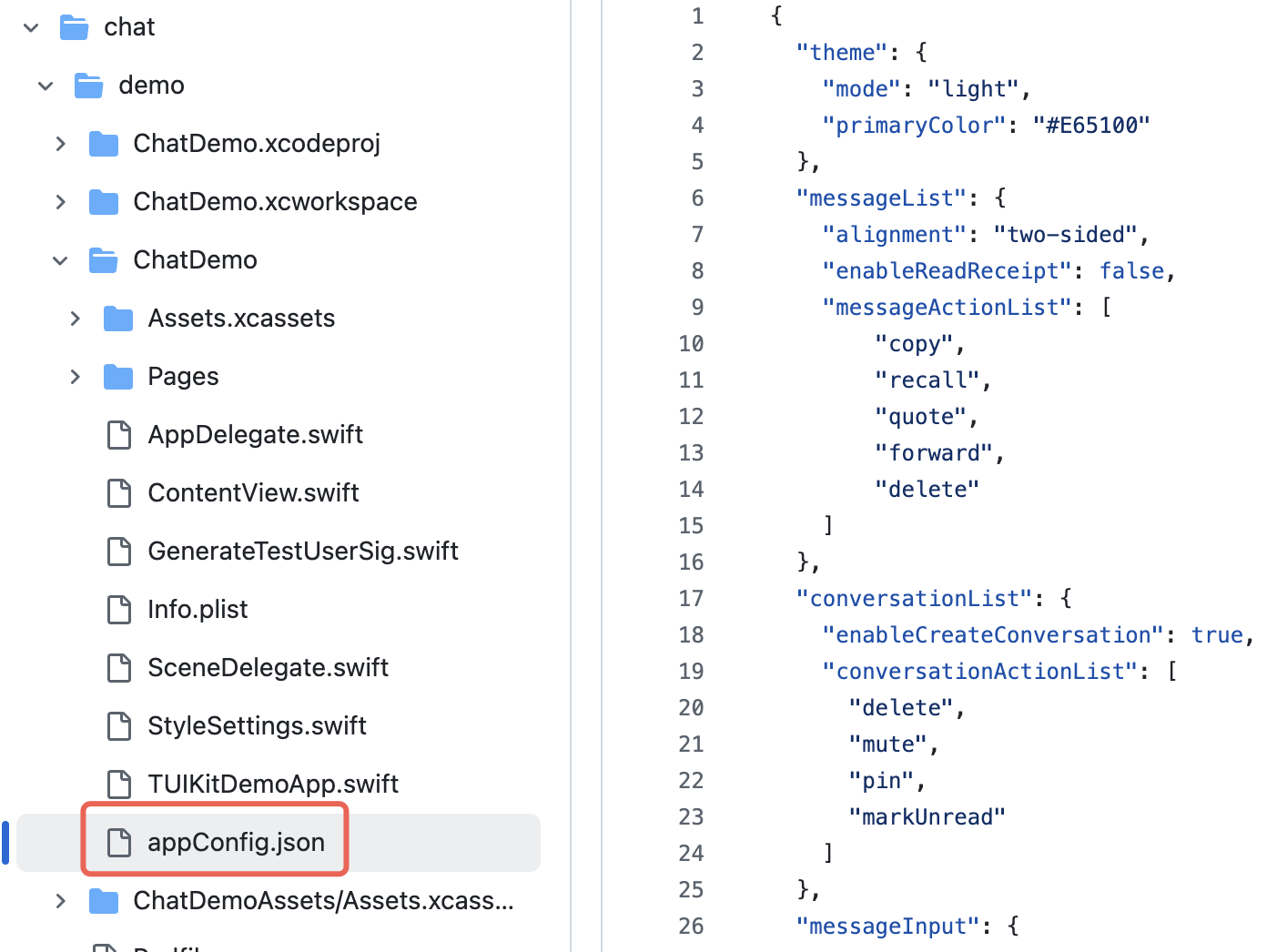
|
|
274
|
+
|
|
275
|
+
|
|
276
|
+
#### Step 3: Load Configuration File
|
|
277
|
+
|
|
278
|
+
Set the JSON file path at app launch to load the configuration file. If you also place appConfig.json in the app's main bundle, you can obtain the JSON file like this:
|
|
279
|
+
``` swift
|
|
280
|
+
import AtomicX
|
|
281
|
+
|
|
282
|
+
@main
|
|
283
|
+
struct MyApp: App {
|
|
284
|
+
init() {
|
|
285
|
+
// Load theme configuration file
|
|
286
|
+
if let path = Bundle.main.path(forResource: "appConfig", ofType: "json") {
|
|
287
|
+
AppBuilderHelper.setJsonPath(path: path)
|
|
288
|
+
}
|
|
289
|
+
}
|
|
290
|
+
|
|
291
|
+
var body: some Scene {
|
|
292
|
+
WindowGroup {
|
|
293
|
+
ContentView()
|
|
294
|
+
// Inject ThemeState.shared into the app's root view
|
|
295
|
+
.environmentObject(ThemeState.shared)
|
|
296
|
+
}
|
|
297
|
+
}
|
|
298
|
+
}
|
|
299
|
+
```
|
|
300
|
+
|
|
301
|
+
After this, without writing additional code, when you launch the app, the mode and theme color of TUIKit SwiftUI components will automatically display the values you set in appConfig.json.
|
|
302
|
+
|
|
303
|
+
### Approach 2: Set Theme Mode via Code
|
|
304
|
+
|
|
305
|
+
You can directly set the theme mode through the API `setThemeMode`, where themeState is the ThemeState.shared singleton object obtained from the environment. Example code:
|
|
306
|
+
``` swift
|
|
307
|
+
import SwiftUI
|
|
308
|
+
import AtomicX
|
|
309
|
+
|
|
310
|
+
struct SettingsView: View {
|
|
311
|
+
@EnvironmentObject var themeState: ThemeState
|
|
312
|
+
|
|
313
|
+
var body: some View {
|
|
314
|
+
List {
|
|
315
|
+
Section("Appearance Mode") {
|
|
316
|
+
Button("Follow System") {
|
|
317
|
+
themeState.setThemeMode(.system)
|
|
318
|
+
}
|
|
319
|
+
Button("Light Mode") {
|
|
320
|
+
themeState.setThemeMode(.light)
|
|
321
|
+
}
|
|
322
|
+
Button("Dark Mode") {
|
|
323
|
+
themeState.setThemeMode(.dark)
|
|
324
|
+
}
|
|
325
|
+
}
|
|
326
|
+
}
|
|
327
|
+
.navigationTitle("Settings")
|
|
328
|
+
}
|
|
329
|
+
}
|
|
330
|
+
```
|
|
331
|
+
|
|
332
|
+
### Approach 3: Set Theme Color via Code
|
|
333
|
+
|
|
334
|
+
You can set the theme color through the API `setPrimaryColor` by passing a primary color value. The entire TUIKit SwiftUI component will automatically adapt a set of similar color values in the same color scheme based on this primary color value to render the interface, without the need for manual UI adaptation. Example code:
|
|
335
|
+
``` swift
|
|
336
|
+
struct CustomColorPicker: View {
|
|
337
|
+
@EnvironmentObject var themeState: ThemeState
|
|
338
|
+
@State private var customColor = "#1C66E5"
|
|
339
|
+
|
|
340
|
+
var body: some View {
|
|
341
|
+
VStack(spacing: 20) {
|
|
342
|
+
TextField("Enter color value", text: $customColor)
|
|
343
|
+
.textFieldStyle(RoundedBorderTextFieldStyle())
|
|
344
|
+
.placeholder(when: customColor.isEmpty) {
|
|
345
|
+
Text("#1C66E5").foregroundColor(.gray)
|
|
346
|
+
}
|
|
347
|
+
|
|
348
|
+
Button("Apply Theme Color") {
|
|
349
|
+
themeState.setPrimaryColor(customColor)
|
|
350
|
+
}
|
|
351
|
+
.disabled(!isValidHexColor(customColor))
|
|
352
|
+
}
|
|
353
|
+
.padding()
|
|
354
|
+
}
|
|
355
|
+
|
|
356
|
+
private func isValidHexColor(_ hex: String) -> Bool {
|
|
357
|
+
let pattern = "^#[0-9A-Fa-f]{6}$"
|
|
358
|
+
return hex.range(of: pattern, options: .regularExpression) != nil
|
|
359
|
+
}
|
|
360
|
+
}
|
|
361
|
+
```
|
|
362
|
+
|
|
363
|
+
> **Usage Recommendations:**
|
|
364
|
+
>
|
|
365
|
+
> - For most applications, it's recommended to use the JSON configuration file approach, which is simple, reliable, and supports multi-platform uniformity.
|
|
366
|
+
> - Consistently use colors from `themeState.colors` throughout the application to ensure interface consistency when switching themes.
|
|
367
|
+
|
|
368
|
+
|
|
369
|
+
## FAQ
|
|
370
|
+
- **How to determine if currently in dark mode?**
|
|
371
|
+
|
|
372
|
+
``` swift
|
|
373
|
+
if themeState.isDarkMode {
|
|
374
|
+
// Currently in dark mode
|
|
375
|
+
} else {
|
|
376
|
+
// Currently in light mode
|
|
377
|
+
}
|
|
378
|
+
```
|
|
379
|
+
- **How to see effects immediately after setting theme color?**
|
|
380
|
+
|
|
381
|
+
|
|
382
|
+
The UI will automatically refresh after setting the theme color because `ThemeState` is an `ObservableObject`. Ensure your views use `@EnvironmentObject` or `@ObservedObject` to observe state changes.
|
|
383
|
+
|
|
384
|
+
- **Can I set transparency?**
|
|
385
|
+
|
|
386
|
+
|
|
387
|
+
Not supported. Theme colors only support 6-digit Hex format (RGB), not 8-digit format (RGBA). If you need transparency effects, add the `.opacity()` modifier when using colors.
|
|
388
|
+
|
|
389
|
+
- **How to restore default theme?**
|
|
390
|
+
|
|
391
|
+
``` swift
|
|
392
|
+
themeState.clearPrimaryColor() // Clear custom theme color
|
|
393
|
+
themeState.setThemeMode(.system) // Restore follow system
|
|
394
|
+
```
|
|
395
|
+
- **Where is theme configuration stored?**
|
|
396
|
+
|
|
397
|
+
|
|
398
|
+
Stored in `UserDefaults` with key `"BaseComponentThemeKey"`. It will be lost after uninstalling the app and will restore to default configuration after reinstalling.
|
|
399
|
+
|
|
400
|
+
- **How to get the complete current theme configuration?**
|
|
401
|
+
|
|
402
|
+
``` swift
|
|
403
|
+
let config = themeState.currentTheme
|
|
404
|
+
print("Mode: \(config.mode)")
|
|
405
|
+
print("Theme Color: \(config.primaryColor ?? "Default")")
|
|
406
|
+
```
|
|
407
|
+
- **Can I set mode and theme color simultaneously?**
|
|
408
|
+
|
|
409
|
+
|
|
410
|
+
Yes, you can call both methods separately, and the system will automatically merge the configurations:
|
|
411
|
+
|
|
412
|
+
``` swift
|
|
413
|
+
themeState.setThemeMode(.dark)
|
|
414
|
+
themeState.setPrimaryColor("#0ABF77")
|
|
415
|
+
```
|
|
416
|
+
|
|
File without changes
|
|
@@ -0,0 +1,86 @@
|
|
|
1
|
+
## Component Overview
|
|
2
|
+
|
|
3
|
+
`ChatSetting` is an intelligent chat settings component that can automatically render the appropriate settings interface based on the currently activated session type. This component internally integrates two modes: C2C (one-on-one) chat settings and group chat settings, providing users with a uniform chat settings portal.
|
|
4
|
+
|
|
5
|
+
Core features of components:
|
|
6
|
+
- **Automatic adaptation** - The settings interface is automatically switched based on session type
|
|
7
|
+
|
|
8
|
+
- **Status-driven** - Auto-update content based on the current active session status
|
|
9
|
+
|
|
10
|
+
|
|
11
|
+
## Props Parameters
|
|
12
|
+
<table>
|
|
13
|
+
<tr>
|
|
14
|
+
<td rowspan="1" colSpan="1" >Parameter</td>
|
|
15
|
+
|
|
16
|
+
<td rowspan="1" colSpan="1" >Type</td>
|
|
17
|
+
|
|
18
|
+
<td rowspan="1" colSpan="1" >Default Value</td>
|
|
19
|
+
|
|
20
|
+
<td rowspan="1" colSpan="1" >Description</td>
|
|
21
|
+
</tr>
|
|
22
|
+
|
|
23
|
+
<tr>
|
|
24
|
+
<td rowspan="1" colSpan="1" >className</td>
|
|
25
|
+
|
|
26
|
+
<td rowspan="1" colSpan="1" >string \| undefined</td>
|
|
27
|
+
|
|
28
|
+
<td rowspan="1" colSpan="1" >undefined</td>
|
|
29
|
+
|
|
30
|
+
<td rowspan="1" colSpan="1" >Custom CSS class name</td>
|
|
31
|
+
</tr>
|
|
32
|
+
|
|
33
|
+
<tr>
|
|
34
|
+
<td rowspan="1" colSpan="1" >style</td>
|
|
35
|
+
|
|
36
|
+
<td rowspan="1" colSpan="1" >React.CSSProperties \| undefined</td>
|
|
37
|
+
|
|
38
|
+
<td rowspan="1" colSpan="1" >undefined</td>
|
|
39
|
+
|
|
40
|
+
<td rowspan="1" colSpan="1" >Custom inline style</td>
|
|
41
|
+
</tr>
|
|
42
|
+
</table>
|
|
43
|
+
|
|
44
|
+
|
|
45
|
+
## Quick Usage
|
|
46
|
+
|
|
47
|
+
`ChatSetting` is an independent component that can be used freely. By default, the switch control is on the ChatHeader Component. Alternatively use the useUIOpenControlState Hook to customize the ChatSetting switch.
|
|
48
|
+
``` tsx
|
|
49
|
+
function App() {
|
|
50
|
+
const { isChatSettingOpen, setChatSettingOpen } = useUIOpenControlState();
|
|
51
|
+
|
|
52
|
+
function toggleChatSettingOpen() {
|
|
53
|
+
setChatSettingOpen(!isChatSettingOpen);
|
|
54
|
+
}
|
|
55
|
+
|
|
56
|
+
return (
|
|
57
|
+
<UIKitProvider>
|
|
58
|
+
<div style={{ maxWidth: '300px' }}>
|
|
59
|
+
<ConversationList />
|
|
60
|
+
</div>
|
|
61
|
+
<Chat
|
|
62
|
+
PlaceholderEmpty={null}
|
|
63
|
+
style={{
|
|
64
|
+
display: 'flex',
|
|
65
|
+
flexDirection: 'row',
|
|
66
|
+
flex: 1,
|
|
67
|
+
maxHeight: '100vh',
|
|
68
|
+
}}
|
|
69
|
+
>
|
|
70
|
+
<div style={{
|
|
71
|
+
display: 'flex',
|
|
72
|
+
flexDirection: 'column',
|
|
73
|
+
flex: 1,
|
|
74
|
+
minWidth: '0',
|
|
75
|
+
}}
|
|
76
|
+
>
|
|
77
|
+
<button onClick={toggleChatSetting}>toggle</button>
|
|
78
|
+
<MessageList />
|
|
79
|
+
<MessageInput />
|
|
80
|
+
</div>
|
|
81
|
+
{isChatSettingOpen && <ChatSetting style={{ width: '350px' }} />}
|
|
82
|
+
</Chat>
|
|
83
|
+
</UIKitProvider>
|
|
84
|
+
);
|
|
85
|
+
}
|
|
86
|
+
```
|