@primer/react-brand 0.69.1-rc.0a4e5ff5 → 0.70.0-rc.138127ad
This diff represents the content of publicly available package versions that have been released to one of the supported registries. The information contained in this diff is provided for informational purposes only and reflects changes between package versions as they appear in their respective public registries.
- package/README.md +19 -0
- package/docs/components/ActionMenu/index.md +156 -0
- package/docs/components/AnchorNav/index.md +220 -0
- package/docs/components/Avatar/index.md +30 -0
- package/docs/components/Avatar/react.md +71 -0
- package/docs/components/Bento/index.md +223 -0
- package/docs/components/Breadcrumbs/index.md +51 -0
- package/docs/components/Breadcrumbs/react.md +53 -0
- package/docs/components/BreakoutBanner/index.md +102 -0
- package/docs/components/BreakoutBanner/react.md +174 -0
- package/docs/components/Button/index.md +133 -0
- package/docs/components/Button/react.md +94 -0
- package/docs/components/ButtonGroup/index.md +62 -0
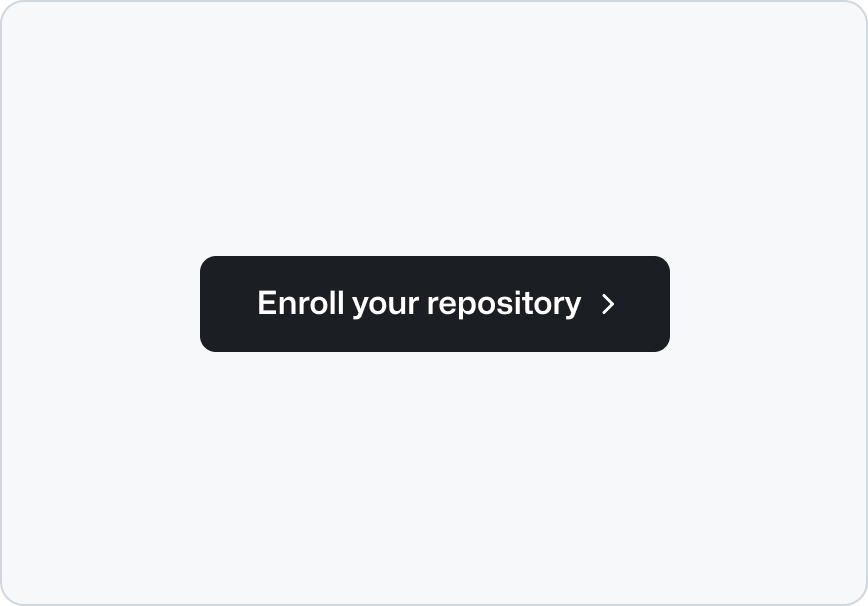
- package/docs/components/ButtonGroup/react.md +60 -0
- package/docs/components/CTABanner/index.md +114 -0
- package/docs/components/CTABanner/react.md +343 -0
- package/docs/components/CTAForm/index.md +95 -0
- package/docs/components/CTAForm/react.md +103 -0
- package/docs/components/Card/index.md +126 -0
- package/docs/components/Card/react.md +240 -0
- package/docs/components/ComparisonTable/index.md +381 -0
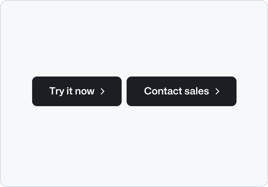
- package/docs/components/EyebrowBanner/index.md +153 -0
- package/docs/components/FAQ/index.md +66 -0
- package/docs/components/FAQ/react.md +477 -0
- package/docs/components/Footnotes/index.md +41 -0
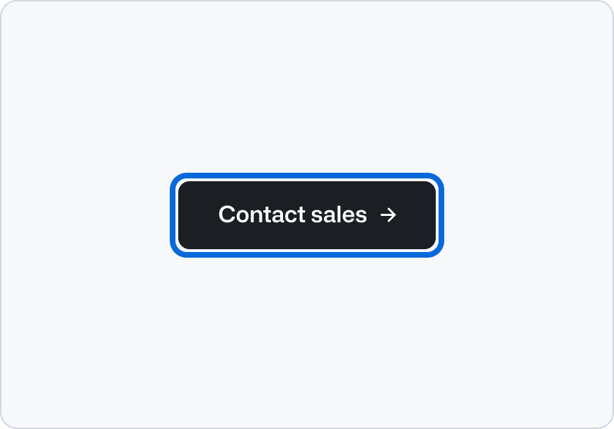
- package/docs/components/Footnotes/react.md +156 -0
- package/docs/components/Hero/index.md +65 -0
- package/docs/components/Hero/react.md +215 -0
- package/docs/components/IDE/index.md +278 -0
- package/docs/components/Icon/index.md +87 -0
- package/docs/components/Image/index.md +51 -0
- package/docs/components/Image/react.md +160 -0
- package/docs/components/Label/index.md +86 -0
- package/docs/components/Label/react.md +76 -0
- package/docs/components/LogoSuite/index.md +93 -0
- package/docs/components/LogoSuite/react.md +667 -0
- package/docs/components/MediaPlaylist/index.md +133 -0
- package/docs/components/MinimalFooter/index.md +94 -0
- package/docs/components/OrderedList/index.md +55 -0
- package/docs/components/OrderedList/react.md +41 -0
- package/docs/components/Pagination/index.md +80 -0
- package/docs/components/Pillar/index.md +114 -0
- package/docs/components/Pillar/react.md +175 -0
- package/docs/components/PricingOptions/index.md +509 -0
- package/docs/components/Prose/index.md +158 -0
- package/docs/components/River/index.md +190 -0
- package/docs/components/River/react.md +295 -0
- package/docs/components/RiverAccordion/index.md +200 -0
- package/docs/components/RiverBreakoutTabs/index.md +171 -0
- package/docs/components/Section/index.md +40 -0
- package/docs/components/Section/react.md +137 -0
- package/docs/components/SectionIntro/index.md +77 -0
- package/docs/components/SectionIntro/react.md +107 -0
- package/docs/components/SectionIntroStacked/index.md +226 -0
- package/docs/components/Statistic/index.md +111 -0
- package/docs/components/SubNav/index.md +156 -0
- package/docs/components/SubdomainNavBar/index.md +136 -0
- package/docs/components/Tabs/index.md +243 -0
- package/docs/components/Testimonial/index.md +138 -0
- package/docs/components/Testimonial/react.md +191 -0
- package/docs/components/Tiles/index.md +1441 -0
- package/docs/components/Timeline/index.md +68 -0
- package/docs/components/Token/index.md +86 -0
- package/docs/components/Tooltip/index.md +61 -0
- package/docs/components/UnorderedList/index.md +67 -0
- package/docs/components/UnorderedList/react.md +89 -0
- package/docs/components/VideoPlayer/index.md +234 -0
- package/docs/components/index.md +52 -0
- package/docs/forms/Checkbox/index.md +86 -0
- package/docs/forms/Checkbox/react.md +111 -0
- package/docs/forms/CheckboxGroup/index.md +37 -0
- package/docs/forms/CheckboxGroup/react.md +175 -0
- package/docs/forms/FormControl/index.md +404 -0
- package/docs/forms/Radio/index.md +63 -0
- package/docs/forms/Radio/react.md +68 -0
- package/docs/forms/RadioGroup/index.md +45 -0
- package/docs/forms/RadioGroup/react.md +151 -0
- package/docs/forms/Select/index.md +244 -0
- package/docs/forms/TextArea/index.md +126 -0
- package/docs/forms/TextInput/index.md +221 -0
- package/docs/forms/index.md +14 -0
- package/docs/getting-started/esm.md +49 -0
- package/docs/getting-started/index.md +95 -0
- package/docs/index.md +97 -0
- package/docs/introduction/animation.md +127 -0
- package/docs/introduction/index.md +9 -0
- package/docs/introduction/theming.md +132 -0
- package/docs/layout/Box/index.md +46 -0
- package/docs/layout/Box/react.md +284 -0
- package/docs/layout/Grid/index.md +132 -0
- package/docs/layout/Grid/react.md +117 -0
- package/docs/layout/Stack/index.md +60 -0
- package/docs/layout/Stack/react.md +166 -0
- package/docs/layout/index.md +9 -0
- package/docs/primitives/color.md +6 -0
- package/docs/primitives/index.md +8 -0
- package/docs/typography/Heading/index.md +53 -0
- package/docs/typography/Heading/react.md +182 -0
- package/docs/typography/Text/index.md +68 -0
- package/docs/typography/Text/react.md +125 -0
- package/docs/typography/index.md +8 -0
- package/lib/Grid/Grid.d.ts +1 -1
- package/lib/SubNav/SubNav.d.ts +1 -1
- package/lib/Token/Token.d.ts +1 -1
- package/lib/css/main.css +67 -67
- package/lib/design-tokens/css/tokens/base/colors/color-scales-with-modes.css +1 -1
- package/lib/design-tokens/css/tokens/base/colors/light.css +1 -1
- package/lib/design-tokens/css/tokens/base/size/size.css +1 -1
- package/lib/design-tokens/css/tokens/base/typography/typography.css +1 -1
- package/lib/design-tokens/css/tokens/functional/animation/base.css +1 -1
- package/lib/design-tokens/css/tokens/functional/colors/global-with-modes.css +1 -1
- package/lib/design-tokens/css/tokens/functional/colors/global.css +1 -1
- package/lib/design-tokens/css/tokens/functional/components/accordion/colors-with-modes.css +1 -1
- package/lib/design-tokens/css/tokens/functional/components/action-menu/colors-with-modes.css +1 -1
- package/lib/design-tokens/css/tokens/functional/components/anchor-nav/colors-with-modes.css +1 -1
- package/lib/design-tokens/css/tokens/functional/components/bento/base.css +1 -1
- package/lib/design-tokens/css/tokens/functional/components/blinking-cursor/colors-with-modes.css +1 -1
- package/lib/design-tokens/css/tokens/functional/components/breadcrumbs/colors-with-modes.css +1 -1
- package/lib/design-tokens/css/tokens/functional/components/button/colors-with-modes.css +1 -1
- package/lib/design-tokens/css/tokens/functional/components/card/base.css +1 -1
- package/lib/design-tokens/css/tokens/functional/components/card/colors-with-modes.css +1 -1
- package/lib/design-tokens/css/tokens/functional/components/card/colors.css +1 -1
- package/lib/design-tokens/css/tokens/functional/components/comparison-table/colors-with-modes.css +1 -1
- package/lib/design-tokens/css/tokens/functional/components/comparison-table/comparison-table.css +1 -1
- package/lib/design-tokens/css/tokens/functional/components/control/colors-with-modes.css +1 -1
- package/lib/design-tokens/css/tokens/functional/components/cta-banner/colors-with-modes.css +1 -1
- package/lib/design-tokens/css/tokens/functional/components/eyebrow-banner/colors-with-modes.css +1 -1
- package/lib/design-tokens/css/tokens/functional/components/eyebrow-banner/eyebrow-banner.css +1 -1
- package/lib/design-tokens/css/tokens/functional/components/faq/base.css +1 -1
- package/lib/design-tokens/css/tokens/functional/components/faq/colors-with-modes.css +1 -1
- package/lib/design-tokens/css/tokens/functional/components/faq/colors.css +1 -1
- package/lib/design-tokens/css/tokens/functional/components/faq/faq.css +1 -1
- package/lib/design-tokens/css/tokens/functional/components/footer/colors-with-modes.css +1 -1
- package/lib/design-tokens/css/tokens/functional/components/footer/colors.css +1 -1
- package/lib/design-tokens/css/tokens/functional/components/frosted-glass-vfx/base.css +1 -1
- package/lib/design-tokens/css/tokens/functional/components/frosted-glass-vfx/colors-with-modes.css +1 -1
- package/lib/design-tokens/css/tokens/functional/components/grid/colors-with-modes.css +1 -1
- package/lib/design-tokens/css/tokens/functional/components/grid/colors.css +1 -1
- package/lib/design-tokens/css/tokens/functional/components/grid/grid.css +1 -1
- package/lib/design-tokens/css/tokens/functional/components/hero/base.css +1 -1
- package/lib/design-tokens/css/tokens/functional/components/icon/colors-with-modes.css +1 -1
- package/lib/design-tokens/css/tokens/functional/components/icon/colors.css +1 -1
- package/lib/design-tokens/css/tokens/functional/components/ide/base.css +1 -1
- package/lib/design-tokens/css/tokens/functional/components/ide/colors-with-modes.css +1 -1
- package/lib/design-tokens/css/tokens/functional/components/image/base.css +1 -1
- package/lib/design-tokens/css/tokens/functional/components/inline-link/base.css +1 -1
- package/lib/design-tokens/css/tokens/functional/components/inline-link/colors-with-modes.css +1 -1
- package/lib/design-tokens/css/tokens/functional/components/inline-link/colors.css +1 -1
- package/lib/design-tokens/css/tokens/functional/components/label/colors-with-modes.css +1 -1
- package/lib/design-tokens/css/tokens/functional/components/label/colors.css +1 -1
- package/lib/design-tokens/css/tokens/functional/components/link/colors-with-modes.css +1 -1
- package/lib/design-tokens/css/tokens/functional/components/link/colors.css +1 -1
- package/lib/design-tokens/css/tokens/functional/components/logosuite/base.css +1 -1
- package/lib/design-tokens/css/tokens/functional/components/logosuite/colors-with-modes.css +1 -1
- package/lib/design-tokens/css/tokens/functional/components/logosuite/colors.css +1 -1
- package/lib/design-tokens/css/tokens/functional/components/media-playlist/colors-with-modes.css +1 -1
- package/lib/design-tokens/css/tokens/functional/components/media-playlist/colors.css +1 -1
- package/lib/design-tokens/css/tokens/functional/components/pricing-options/colors-with-modes.css +1 -1
- package/lib/design-tokens/css/tokens/functional/components/pricing-options/colors.css +1 -1
- package/lib/design-tokens/css/tokens/functional/components/pricing-options/pricing-options.css +1 -1
- package/lib/design-tokens/css/tokens/functional/components/prose/base.css +1 -1
- package/lib/design-tokens/css/tokens/functional/components/prose/colors-with-modes.css +1 -1
- package/lib/design-tokens/css/tokens/functional/components/river/base.css +1 -1
- package/lib/design-tokens/css/tokens/functional/components/river/river.css +1 -1
- package/lib/design-tokens/css/tokens/functional/components/river-story-scroll/colors-with-modes.css +1 -1
- package/lib/design-tokens/css/tokens/functional/components/section/section.css +1 -1
- package/lib/design-tokens/css/tokens/functional/components/statistic/base.css +1 -1
- package/lib/design-tokens/css/tokens/functional/components/sub-nav/base.css +1 -1
- package/lib/design-tokens/css/tokens/functional/components/sub-nav/colors-with-modes.css +1 -1
- package/lib/design-tokens/css/tokens/functional/components/subdomain-nav-bar/colors-with-modes.css +1 -1
- package/lib/design-tokens/css/tokens/functional/components/tabs/base.css +1 -1
- package/lib/design-tokens/css/tokens/functional/components/tabs/colors-with-modes.css +1 -1
- package/lib/design-tokens/css/tokens/functional/components/tabs/colors.css +1 -1
- package/lib/design-tokens/css/tokens/functional/components/testimonial/base.css +1 -1
- package/lib/design-tokens/css/tokens/functional/components/testimonial/colors-with-modes.css +1 -1
- package/lib/design-tokens/css/tokens/functional/components/testimonial/colors.css +1 -1
- package/lib/design-tokens/css/tokens/functional/components/text-cursor-animation/colors-with-modes.css +1 -1
- package/lib/design-tokens/css/tokens/functional/components/text-cursor-animation/colors.css +1 -1
- package/lib/design-tokens/css/tokens/functional/components/tiles/colors-with-modes.css +1 -1
- package/lib/design-tokens/css/tokens/functional/components/timeline/base.css +1 -1
- package/lib/design-tokens/css/tokens/functional/components/timeline/colors-with-modes.css +1 -1
- package/lib/design-tokens/css/tokens/functional/components/timeline/colors.css +1 -1
- package/lib/design-tokens/css/tokens/functional/components/token/colors-with-modes.css +1 -1
- package/lib/design-tokens/css/tokens/functional/components/token/colors.css +1 -1
- package/lib/design-tokens/css/tokens/functional/components/tooltip/colors-with-modes.css +1 -1
- package/lib/design-tokens/css/tokens/functional/components/tooltip/colors.css +1 -1
- package/lib/design-tokens/css/tokens/functional/components/video-player/base.css +1 -1
- package/lib/design-tokens/css/tokens/functional/components/video-player/colors-with-modes.css +1 -1
- package/lib/design-tokens/css/tokens/functional/size/border.css +1 -1
- package/lib/design-tokens/css/tokens/functional/size/breakpoints.css +1 -1
- package/lib/design-tokens/css/tokens/functional/size/size-coarse.css +1 -1
- package/lib/design-tokens/css/tokens/functional/size/size-fine.css +1 -1
- package/lib/design-tokens/css/tokens/functional/size/size.css +1 -1
- package/lib/design-tokens/css/tokens/functional/size/viewport.css +1 -1
- package/lib/design-tokens/css/tokens/functional/typography/typography-responsive.css +1 -1
- package/lib/design-tokens/css/tokens/functional/typography/typography.css +1 -1
- package/lib/design-tokens/js/module/tokens/base/colors/light.js +1 -1
- package/lib/design-tokens/js/module/tokens/base/size/size.js +1 -1
- package/lib/design-tokens/js/module/tokens/base/typography/typography.js +1 -1
- package/lib/design-tokens/js/module/tokens/functional/animation/base.js +1 -1
- package/lib/design-tokens/js/module/tokens/functional/colors/global.js +1 -1
- package/lib/design-tokens/js/module/tokens/functional/components/bento/base.js +1 -1
- package/lib/design-tokens/js/module/tokens/functional/components/card/base.js +1 -1
- package/lib/design-tokens/js/module/tokens/functional/components/card/colors.js +1 -1
- package/lib/design-tokens/js/module/tokens/functional/components/comparison-table/comparison-table.js +1 -1
- package/lib/design-tokens/js/module/tokens/functional/components/eyebrow-banner/eyebrow-banner.js +1 -1
- package/lib/design-tokens/js/module/tokens/functional/components/faq/base.js +1 -1
- package/lib/design-tokens/js/module/tokens/functional/components/faq/colors.js +1 -1
- package/lib/design-tokens/js/module/tokens/functional/components/faq/faq.js +1 -1
- package/lib/design-tokens/js/module/tokens/functional/components/footer/colors.js +1 -1
- package/lib/design-tokens/js/module/tokens/functional/components/frosted-glass-vfx/base.js +1 -1
- package/lib/design-tokens/js/module/tokens/functional/components/grid/colors.js +1 -1
- package/lib/design-tokens/js/module/tokens/functional/components/grid/grid.js +1 -1
- package/lib/design-tokens/js/module/tokens/functional/components/hero/base.js +1 -1
- package/lib/design-tokens/js/module/tokens/functional/components/icon/colors.js +1 -1
- package/lib/design-tokens/js/module/tokens/functional/components/ide/base.js +1 -1
- package/lib/design-tokens/js/module/tokens/functional/components/image/base.js +1 -1
- package/lib/design-tokens/js/module/tokens/functional/components/inline-link/base.js +1 -1
- package/lib/design-tokens/js/module/tokens/functional/components/inline-link/colors.js +1 -1
- package/lib/design-tokens/js/module/tokens/functional/components/label/colors.js +1 -1
- package/lib/design-tokens/js/module/tokens/functional/components/link/colors.js +1 -1
- package/lib/design-tokens/js/module/tokens/functional/components/logosuite/base.js +1 -1
- package/lib/design-tokens/js/module/tokens/functional/components/logosuite/colors.js +1 -1
- package/lib/design-tokens/js/module/tokens/functional/components/media-playlist/colors.js +1 -1
- package/lib/design-tokens/js/module/tokens/functional/components/pricing-options/colors.js +1 -1
- package/lib/design-tokens/js/module/tokens/functional/components/pricing-options/pricing-options.js +1 -1
- package/lib/design-tokens/js/module/tokens/functional/components/prose/base.js +1 -1
- package/lib/design-tokens/js/module/tokens/functional/components/river/base.js +1 -1
- package/lib/design-tokens/js/module/tokens/functional/components/river/river.js +1 -1
- package/lib/design-tokens/js/module/tokens/functional/components/section/section.js +1 -1
- package/lib/design-tokens/js/module/tokens/functional/components/statistic/base.js +1 -1
- package/lib/design-tokens/js/module/tokens/functional/components/sub-nav/base.js +1 -1
- package/lib/design-tokens/js/module/tokens/functional/components/tabs/base.js +1 -1
- package/lib/design-tokens/js/module/tokens/functional/components/tabs/colors.js +1 -1
- package/lib/design-tokens/js/module/tokens/functional/components/testimonial/base.js +1 -1
- package/lib/design-tokens/js/module/tokens/functional/components/testimonial/colors.js +1 -1
- package/lib/design-tokens/js/module/tokens/functional/components/text-cursor-animation/colors.js +1 -1
- package/lib/design-tokens/js/module/tokens/functional/components/timeline/base.js +1 -1
- package/lib/design-tokens/js/module/tokens/functional/components/timeline/colors.js +1 -1
- package/lib/design-tokens/js/module/tokens/functional/components/token/colors.js +1 -1
- package/lib/design-tokens/js/module/tokens/functional/components/tooltip/colors.js +1 -1
- package/lib/design-tokens/js/module/tokens/functional/components/video-player/base.js +1 -1
- package/lib/design-tokens/js/module/tokens/functional/size/border.js +1 -1
- package/lib/design-tokens/js/module/tokens/functional/size/breakpoints.js +1 -1
- package/lib/design-tokens/js/module/tokens/functional/size/size-coarse.js +1 -1
- package/lib/design-tokens/js/module/tokens/functional/size/size-fine.js +1 -1
- package/lib/design-tokens/js/module/tokens/functional/size/size.js +1 -1
- package/lib/design-tokens/js/module/tokens/functional/size/viewport.js +1 -1
- package/lib/design-tokens/js/module/tokens/functional/typography/typography-responsive.js +1 -1
- package/lib/design-tokens/js/module/tokens/functional/typography/typography.js +1 -1
- package/lib/design-tokens/js/tokens/base/colors/light.js +1 -1
- package/lib/design-tokens/js/tokens/base/size/size.js +1 -1
- package/lib/design-tokens/js/tokens/base/typography/typography.js +1 -1
- package/lib/design-tokens/js/tokens/functional/animation/base.js +1 -1
- package/lib/design-tokens/js/tokens/functional/colors/global.js +1 -1
- package/lib/design-tokens/js/tokens/functional/components/bento/base.js +1 -1
- package/lib/design-tokens/js/tokens/functional/components/card/base.js +1 -1
- package/lib/design-tokens/js/tokens/functional/components/card/colors.js +1 -1
- package/lib/design-tokens/js/tokens/functional/components/comparison-table/comparison-table.js +1 -1
- package/lib/design-tokens/js/tokens/functional/components/eyebrow-banner/eyebrow-banner.js +1 -1
- package/lib/design-tokens/js/tokens/functional/components/faq/base.js +1 -1
- package/lib/design-tokens/js/tokens/functional/components/faq/colors.js +1 -1
- package/lib/design-tokens/js/tokens/functional/components/faq/faq.js +1 -1
- package/lib/design-tokens/js/tokens/functional/components/footer/colors.js +1 -1
- package/lib/design-tokens/js/tokens/functional/components/frosted-glass-vfx/base.js +1 -1
- package/lib/design-tokens/js/tokens/functional/components/grid/colors.js +1 -1
- package/lib/design-tokens/js/tokens/functional/components/grid/grid.js +1 -1
- package/lib/design-tokens/js/tokens/functional/components/hero/base.js +1 -1
- package/lib/design-tokens/js/tokens/functional/components/icon/colors.js +1 -1
- package/lib/design-tokens/js/tokens/functional/components/ide/base.js +1 -1
- package/lib/design-tokens/js/tokens/functional/components/image/base.js +1 -1
- package/lib/design-tokens/js/tokens/functional/components/inline-link/base.js +1 -1
- package/lib/design-tokens/js/tokens/functional/components/inline-link/colors.js +1 -1
- package/lib/design-tokens/js/tokens/functional/components/label/colors.js +1 -1
- package/lib/design-tokens/js/tokens/functional/components/link/colors.js +1 -1
- package/lib/design-tokens/js/tokens/functional/components/logosuite/base.js +1 -1
- package/lib/design-tokens/js/tokens/functional/components/logosuite/colors.js +1 -1
- package/lib/design-tokens/js/tokens/functional/components/media-playlist/colors.js +1 -1
- package/lib/design-tokens/js/tokens/functional/components/pricing-options/colors.js +1 -1
- package/lib/design-tokens/js/tokens/functional/components/pricing-options/pricing-options.js +1 -1
- package/lib/design-tokens/js/tokens/functional/components/prose/base.js +1 -1
- package/lib/design-tokens/js/tokens/functional/components/river/base.js +1 -1
- package/lib/design-tokens/js/tokens/functional/components/river/river.js +1 -1
- package/lib/design-tokens/js/tokens/functional/components/section/section.js +1 -1
- package/lib/design-tokens/js/tokens/functional/components/statistic/base.js +1 -1
- package/lib/design-tokens/js/tokens/functional/components/sub-nav/base.js +1 -1
- package/lib/design-tokens/js/tokens/functional/components/tabs/base.js +1 -1
- package/lib/design-tokens/js/tokens/functional/components/tabs/colors.js +1 -1
- package/lib/design-tokens/js/tokens/functional/components/testimonial/base.js +1 -1
- package/lib/design-tokens/js/tokens/functional/components/testimonial/colors.js +1 -1
- package/lib/design-tokens/js/tokens/functional/components/text-cursor-animation/colors.js +1 -1
- package/lib/design-tokens/js/tokens/functional/components/timeline/base.js +1 -1
- package/lib/design-tokens/js/tokens/functional/components/timeline/colors.js +1 -1
- package/lib/design-tokens/js/tokens/functional/components/token/colors.js +1 -1
- package/lib/design-tokens/js/tokens/functional/components/tooltip/colors.js +1 -1
- package/lib/design-tokens/js/tokens/functional/components/video-player/base.js +1 -1
- package/lib/design-tokens/js/tokens/functional/size/border.js +1 -1
- package/lib/design-tokens/js/tokens/functional/size/breakpoints.js +1 -1
- package/lib/design-tokens/js/tokens/functional/size/size-coarse.js +1 -1
- package/lib/design-tokens/js/tokens/functional/size/size-fine.js +1 -1
- package/lib/design-tokens/js/tokens/functional/size/size.js +1 -1
- package/lib/design-tokens/js/tokens/functional/size/viewport.js +1 -1
- package/lib/design-tokens/js/tokens/functional/typography/typography-responsive.js +1 -1
- package/lib/design-tokens/js/tokens/functional/typography/typography.js +1 -1
- package/lib/design-tokens/scss/tokens/base/colors/light.scss +1 -1
- package/lib/design-tokens/scss/tokens/base/size/size.scss +1 -1
- package/lib/design-tokens/scss/tokens/base/typography/typography.scss +1 -1
- package/lib/design-tokens/scss/tokens/functional/animation/base.scss +1 -1
- package/lib/design-tokens/scss/tokens/functional/colors/global.scss +1 -1
- package/lib/design-tokens/scss/tokens/functional/components/bento/base.scss +1 -1
- package/lib/design-tokens/scss/tokens/functional/components/card/base.scss +1 -1
- package/lib/design-tokens/scss/tokens/functional/components/card/colors.scss +1 -1
- package/lib/design-tokens/scss/tokens/functional/components/comparison-table/comparison-table.scss +1 -1
- package/lib/design-tokens/scss/tokens/functional/components/eyebrow-banner/eyebrow-banner.scss +1 -1
- package/lib/design-tokens/scss/tokens/functional/components/faq/base.scss +1 -1
- package/lib/design-tokens/scss/tokens/functional/components/faq/colors.scss +1 -1
- package/lib/design-tokens/scss/tokens/functional/components/faq/faq.scss +1 -1
- package/lib/design-tokens/scss/tokens/functional/components/footer/colors.scss +1 -1
- package/lib/design-tokens/scss/tokens/functional/components/frosted-glass-vfx/base.scss +1 -1
- package/lib/design-tokens/scss/tokens/functional/components/grid/colors.scss +1 -1
- package/lib/design-tokens/scss/tokens/functional/components/grid/grid.scss +1 -1
- package/lib/design-tokens/scss/tokens/functional/components/hero/base.scss +1 -1
- package/lib/design-tokens/scss/tokens/functional/components/icon/colors.scss +1 -1
- package/lib/design-tokens/scss/tokens/functional/components/ide/base.scss +1 -1
- package/lib/design-tokens/scss/tokens/functional/components/image/base.scss +1 -1
- package/lib/design-tokens/scss/tokens/functional/components/inline-link/base.scss +1 -1
- package/lib/design-tokens/scss/tokens/functional/components/inline-link/colors.scss +1 -1
- package/lib/design-tokens/scss/tokens/functional/components/label/colors.scss +1 -1
- package/lib/design-tokens/scss/tokens/functional/components/link/colors.scss +1 -1
- package/lib/design-tokens/scss/tokens/functional/components/logosuite/base.scss +1 -1
- package/lib/design-tokens/scss/tokens/functional/components/logosuite/colors.scss +1 -1
- package/lib/design-tokens/scss/tokens/functional/components/media-playlist/colors.scss +1 -1
- package/lib/design-tokens/scss/tokens/functional/components/pricing-options/colors.scss +1 -1
- package/lib/design-tokens/scss/tokens/functional/components/pricing-options/pricing-options.scss +1 -1
- package/lib/design-tokens/scss/tokens/functional/components/prose/base.scss +1 -1
- package/lib/design-tokens/scss/tokens/functional/components/river/base.scss +1 -1
- package/lib/design-tokens/scss/tokens/functional/components/river/river.scss +1 -1
- package/lib/design-tokens/scss/tokens/functional/components/section/section.scss +1 -1
- package/lib/design-tokens/scss/tokens/functional/components/statistic/base.scss +1 -1
- package/lib/design-tokens/scss/tokens/functional/components/sub-nav/base.scss +1 -1
- package/lib/design-tokens/scss/tokens/functional/components/tabs/base.scss +1 -1
- package/lib/design-tokens/scss/tokens/functional/components/tabs/colors.scss +1 -1
- package/lib/design-tokens/scss/tokens/functional/components/testimonial/base.scss +1 -1
- package/lib/design-tokens/scss/tokens/functional/components/testimonial/colors.scss +1 -1
- package/lib/design-tokens/scss/tokens/functional/components/text-cursor-animation/colors.scss +1 -1
- package/lib/design-tokens/scss/tokens/functional/components/timeline/base.scss +1 -1
- package/lib/design-tokens/scss/tokens/functional/components/timeline/colors.scss +1 -1
- package/lib/design-tokens/scss/tokens/functional/components/token/colors.scss +1 -1
- package/lib/design-tokens/scss/tokens/functional/components/tooltip/colors.scss +1 -1
- package/lib/design-tokens/scss/tokens/functional/components/video-player/base.scss +1 -1
- package/lib/design-tokens/scss/tokens/functional/size/border.scss +1 -1
- package/lib/design-tokens/scss/tokens/functional/size/breakpoints.scss +1 -1
- package/lib/design-tokens/scss/tokens/functional/size/size-coarse.scss +1 -1
- package/lib/design-tokens/scss/tokens/functional/size/size-fine.scss +1 -1
- package/lib/design-tokens/scss/tokens/functional/size/size.scss +1 -1
- package/lib/design-tokens/scss/tokens/functional/size/viewport.scss +1 -1
- package/lib/design-tokens/scss/tokens/functional/typography/typography-responsive.scss +1 -1
- package/lib/design-tokens/scss/tokens/functional/typography/typography.scss +1 -1
- package/lib/design-tokens/ts/tokens/base/colors/light.d.ts +1 -1
- package/lib/design-tokens/ts/tokens/base/colors/light.js +1 -1
- package/lib/design-tokens/ts/tokens/base/size/size.d.ts +1 -1
- package/lib/design-tokens/ts/tokens/base/size/size.js +1 -1
- package/lib/design-tokens/ts/tokens/base/typography/typography.d.ts +1 -1
- package/lib/design-tokens/ts/tokens/base/typography/typography.js +1 -1
- package/lib/design-tokens/ts/tokens/functional/animation/base.d.ts +1 -1
- package/lib/design-tokens/ts/tokens/functional/animation/base.js +1 -1
- package/lib/design-tokens/ts/tokens/functional/colors/global.d.ts +1 -1
- package/lib/design-tokens/ts/tokens/functional/colors/global.js +1 -1
- package/lib/design-tokens/ts/tokens/functional/components/bento/base.d.ts +1 -1
- package/lib/design-tokens/ts/tokens/functional/components/bento/base.js +1 -1
- package/lib/design-tokens/ts/tokens/functional/components/card/base.d.ts +1 -1
- package/lib/design-tokens/ts/tokens/functional/components/card/base.js +1 -1
- package/lib/design-tokens/ts/tokens/functional/components/card/colors.d.ts +1 -1
- package/lib/design-tokens/ts/tokens/functional/components/card/colors.js +1 -1
- package/lib/design-tokens/ts/tokens/functional/components/comparison-table/comparison-table.d.ts +1 -1
- package/lib/design-tokens/ts/tokens/functional/components/comparison-table/comparison-table.js +1 -1
- package/lib/design-tokens/ts/tokens/functional/components/eyebrow-banner/eyebrow-banner.d.ts +1 -1
- package/lib/design-tokens/ts/tokens/functional/components/eyebrow-banner/eyebrow-banner.js +1 -1
- package/lib/design-tokens/ts/tokens/functional/components/faq/base.d.ts +1 -1
- package/lib/design-tokens/ts/tokens/functional/components/faq/base.js +1 -1
- package/lib/design-tokens/ts/tokens/functional/components/faq/colors.d.ts +1 -1
- package/lib/design-tokens/ts/tokens/functional/components/faq/colors.js +1 -1
- package/lib/design-tokens/ts/tokens/functional/components/faq/faq.d.ts +1 -1
- package/lib/design-tokens/ts/tokens/functional/components/faq/faq.js +1 -1
- package/lib/design-tokens/ts/tokens/functional/components/footer/colors.d.ts +1 -1
- package/lib/design-tokens/ts/tokens/functional/components/footer/colors.js +1 -1
- package/lib/design-tokens/ts/tokens/functional/components/frosted-glass-vfx/base.d.ts +1 -1
- package/lib/design-tokens/ts/tokens/functional/components/frosted-glass-vfx/base.js +1 -1
- package/lib/design-tokens/ts/tokens/functional/components/grid/colors.d.ts +1 -1
- package/lib/design-tokens/ts/tokens/functional/components/grid/colors.js +1 -1
- package/lib/design-tokens/ts/tokens/functional/components/grid/grid.d.ts +1 -1
- package/lib/design-tokens/ts/tokens/functional/components/grid/grid.js +1 -1
- package/lib/design-tokens/ts/tokens/functional/components/hero/base.d.ts +1 -1
- package/lib/design-tokens/ts/tokens/functional/components/hero/base.js +1 -1
- package/lib/design-tokens/ts/tokens/functional/components/icon/colors.d.ts +1 -1
- package/lib/design-tokens/ts/tokens/functional/components/icon/colors.js +1 -1
- package/lib/design-tokens/ts/tokens/functional/components/ide/base.d.ts +1 -1
- package/lib/design-tokens/ts/tokens/functional/components/ide/base.js +1 -1
- package/lib/design-tokens/ts/tokens/functional/components/image/base.d.ts +1 -1
- package/lib/design-tokens/ts/tokens/functional/components/image/base.js +1 -1
- package/lib/design-tokens/ts/tokens/functional/components/inline-link/base.d.ts +1 -1
- package/lib/design-tokens/ts/tokens/functional/components/inline-link/base.js +1 -1
- package/lib/design-tokens/ts/tokens/functional/components/inline-link/colors.d.ts +1 -1
- package/lib/design-tokens/ts/tokens/functional/components/inline-link/colors.js +1 -1
- package/lib/design-tokens/ts/tokens/functional/components/label/colors.d.ts +1 -1
- package/lib/design-tokens/ts/tokens/functional/components/label/colors.js +1 -1
- package/lib/design-tokens/ts/tokens/functional/components/link/colors.d.ts +1 -1
- package/lib/design-tokens/ts/tokens/functional/components/link/colors.js +1 -1
- package/lib/design-tokens/ts/tokens/functional/components/logosuite/base.d.ts +1 -1
- package/lib/design-tokens/ts/tokens/functional/components/logosuite/base.js +1 -1
- package/lib/design-tokens/ts/tokens/functional/components/logosuite/colors.d.ts +1 -1
- package/lib/design-tokens/ts/tokens/functional/components/logosuite/colors.js +1 -1
- package/lib/design-tokens/ts/tokens/functional/components/media-playlist/colors.d.ts +1 -1
- package/lib/design-tokens/ts/tokens/functional/components/media-playlist/colors.js +1 -1
- package/lib/design-tokens/ts/tokens/functional/components/pricing-options/colors.d.ts +1 -1
- package/lib/design-tokens/ts/tokens/functional/components/pricing-options/colors.js +1 -1
- package/lib/design-tokens/ts/tokens/functional/components/pricing-options/pricing-options.d.ts +1 -1
- package/lib/design-tokens/ts/tokens/functional/components/pricing-options/pricing-options.js +1 -1
- package/lib/design-tokens/ts/tokens/functional/components/prose/base.d.ts +1 -1
- package/lib/design-tokens/ts/tokens/functional/components/prose/base.js +1 -1
- package/lib/design-tokens/ts/tokens/functional/components/river/base.d.ts +1 -1
- package/lib/design-tokens/ts/tokens/functional/components/river/base.js +1 -1
- package/lib/design-tokens/ts/tokens/functional/components/river/river.d.ts +1 -1
- package/lib/design-tokens/ts/tokens/functional/components/river/river.js +1 -1
- package/lib/design-tokens/ts/tokens/functional/components/section/section.d.ts +1 -1
- package/lib/design-tokens/ts/tokens/functional/components/section/section.js +1 -1
- package/lib/design-tokens/ts/tokens/functional/components/statistic/base.d.ts +1 -1
- package/lib/design-tokens/ts/tokens/functional/components/statistic/base.js +1 -1
- package/lib/design-tokens/ts/tokens/functional/components/sub-nav/base.d.ts +1 -1
- package/lib/design-tokens/ts/tokens/functional/components/sub-nav/base.js +1 -1
- package/lib/design-tokens/ts/tokens/functional/components/tabs/base.d.ts +1 -1
- package/lib/design-tokens/ts/tokens/functional/components/tabs/base.js +1 -1
- package/lib/design-tokens/ts/tokens/functional/components/tabs/colors.d.ts +1 -1
- package/lib/design-tokens/ts/tokens/functional/components/tabs/colors.js +1 -1
- package/lib/design-tokens/ts/tokens/functional/components/testimonial/base.d.ts +1 -1
- package/lib/design-tokens/ts/tokens/functional/components/testimonial/base.js +1 -1
- package/lib/design-tokens/ts/tokens/functional/components/testimonial/colors.d.ts +1 -1
- package/lib/design-tokens/ts/tokens/functional/components/testimonial/colors.js +1 -1
- package/lib/design-tokens/ts/tokens/functional/components/text-cursor-animation/colors.d.ts +1 -1
- package/lib/design-tokens/ts/tokens/functional/components/text-cursor-animation/colors.js +1 -1
- package/lib/design-tokens/ts/tokens/functional/components/timeline/base.d.ts +1 -1
- package/lib/design-tokens/ts/tokens/functional/components/timeline/base.js +1 -1
- package/lib/design-tokens/ts/tokens/functional/components/timeline/colors.d.ts +1 -1
- package/lib/design-tokens/ts/tokens/functional/components/timeline/colors.js +1 -1
- package/lib/design-tokens/ts/tokens/functional/components/token/colors.d.ts +1 -1
- package/lib/design-tokens/ts/tokens/functional/components/token/colors.js +1 -1
- package/lib/design-tokens/ts/tokens/functional/components/tooltip/colors.d.ts +1 -1
- package/lib/design-tokens/ts/tokens/functional/components/tooltip/colors.js +1 -1
- package/lib/design-tokens/ts/tokens/functional/components/video-player/base.d.ts +1 -1
- package/lib/design-tokens/ts/tokens/functional/components/video-player/base.js +1 -1
- package/lib/design-tokens/ts/tokens/functional/size/border.d.ts +1 -1
- package/lib/design-tokens/ts/tokens/functional/size/border.js +1 -1
- package/lib/design-tokens/ts/tokens/functional/size/breakpoints.d.ts +1 -1
- package/lib/design-tokens/ts/tokens/functional/size/breakpoints.js +1 -1
- package/lib/design-tokens/ts/tokens/functional/size/size-coarse.d.ts +1 -1
- package/lib/design-tokens/ts/tokens/functional/size/size-coarse.js +1 -1
- package/lib/design-tokens/ts/tokens/functional/size/size-fine.d.ts +1 -1
- package/lib/design-tokens/ts/tokens/functional/size/size-fine.js +1 -1
- package/lib/design-tokens/ts/tokens/functional/size/size.d.ts +1 -1
- package/lib/design-tokens/ts/tokens/functional/size/size.js +1 -1
- package/lib/design-tokens/ts/tokens/functional/size/viewport.d.ts +1 -1
- package/lib/design-tokens/ts/tokens/functional/size/viewport.js +1 -1
- package/lib/design-tokens/ts/tokens/functional/typography/typography-responsive.d.ts +1 -1
- package/lib/design-tokens/ts/tokens/functional/typography/typography-responsive.js +1 -1
- package/lib/design-tokens/ts/tokens/functional/typography/typography.d.ts +1 -1
- package/lib/design-tokens/ts/tokens/functional/typography/typography.js +1 -1
- package/llms.txt +95 -0
- package/package.json +17 -5
- package/esm/Hero/Hero.figma.d.ts +0 -2
- package/esm/Hero/Hero.figma.d.ts.map +0 -1
- package/esm/IDE/fixtures/content.d.ts +0 -7
- package/esm/IDE/fixtures/content.d.ts.map +0 -1
- package/esm/LogoSuite/LogoSuite.figma.d.ts +0 -2
- package/esm/LogoSuite/LogoSuite.figma.d.ts.map +0 -1
- package/esm/LogoSuite/LogoSuite.fixtures.d.ts +0 -2
- package/esm/LogoSuite/LogoSuite.fixtures.d.ts.map +0 -1
- package/esm/MonaSans/MonaSans.d.ts +0 -11
- package/esm/MonaSans/MonaSans.d.ts.map +0 -1
- package/esm/MonaSans/index.d.ts +0 -2
- package/esm/MonaSans/index.d.ts.map +0 -1
- package/esm/PricingOptions/PricingOptions.figma.d.ts +0 -2
- package/esm/PricingOptions/PricingOptions.figma.d.ts.map +0 -1
- package/esm/Tiles/Tiles.fixtures.d.ts +0 -7
- package/esm/Tiles/Tiles.fixtures.d.ts.map +0 -1
- package/esm/fixtures/third-party-logos/AzureLogo.d.ts +0 -5
- package/esm/fixtures/third-party-logos/AzureLogo.d.ts.map +0 -1
- package/esm/fixtures/third-party-logos/JetBrainsLogo.d.ts +0 -5
- package/esm/fixtures/third-party-logos/JetBrainsLogo.d.ts.map +0 -1
- package/esm/fixtures/third-party-logos/MicrosoftCopilotLogo.d.ts +0 -5
- package/esm/fixtures/third-party-logos/MicrosoftCopilotLogo.d.ts.map +0 -1
- package/esm/fixtures/third-party-logos/MicrosoftLogo.d.ts +0 -5
- package/esm/fixtures/third-party-logos/MicrosoftLogo.d.ts.map +0 -1
- package/esm/fixtures/third-party-logos/NeoVimLogo.d.ts +0 -5
- package/esm/fixtures/third-party-logos/NeoVimLogo.d.ts.map +0 -1
- package/esm/fixtures/third-party-logos/VisualStudioCodeLogo.d.ts +0 -5
- package/esm/fixtures/third-party-logos/VisualStudioCodeLogo.d.ts.map +0 -1
- package/esm/fixtures/third-party-logos/VisualStudioLogo.d.ts +0 -5
- package/esm/fixtures/third-party-logos/VisualStudioLogo.d.ts.map +0 -1
- package/esm/list/ListItem/index.d.ts +0 -2
- package/esm/list/ListItem/index.d.ts.map +0 -1
- package/esm/recipes/FeaturePreviewLPs/FeaturePreviewLevelOne/FeaturePreviewLevelOne.d.ts +0 -13
- package/esm/recipes/FeaturePreviewLPs/FeaturePreviewLevelOne/FeaturePreviewLevelOne.d.ts.map +0 -1
- package/esm/recipes/FeaturePreviewLPs/FeaturePreviewLevelOne/FeaturePreviewLevelOneSideBySide.d.ts +0 -14
- package/esm/recipes/FeaturePreviewLPs/FeaturePreviewLevelOne/FeaturePreviewLevelOneSideBySide.d.ts.map +0 -1
- package/esm/recipes/FeaturePreviewLPs/FeaturePreviewLevelOne/components/FormExample.d.ts +0 -8
- package/esm/recipes/FeaturePreviewLPs/FeaturePreviewLevelOne/components/FormExample.d.ts.map +0 -1
- package/esm/recipes/FeaturePreviewLPs/FeaturePreviewLevelOne/index.d.ts +0 -2
- package/esm/recipes/FeaturePreviewLPs/FeaturePreviewLevelOne/index.d.ts.map +0 -1
- package/esm/recipes/FeaturePreviewLPs/FeaturePreviewLevelTwo/FeaturePreviewLevelTwo.d.ts +0 -49
- package/esm/recipes/FeaturePreviewLPs/FeaturePreviewLevelTwo/FeaturePreviewLevelTwo.d.ts.map +0 -1
- package/esm/recipes/FeaturePreviewLPs/FeaturePreviewLevelTwo/index.d.ts +0 -2
- package/esm/recipes/FeaturePreviewLPs/FeaturePreviewLevelTwo/index.d.ts.map +0 -1
- package/esm/recipes/FeaturePreviewLPs/FeaturePreviewLevelZero/FeaturePreviewLevelZero.d.ts +0 -17
- package/esm/recipes/FeaturePreviewLPs/FeaturePreviewLevelZero/FeaturePreviewLevelZero.d.ts.map +0 -1
- package/esm/recipes/FeaturePreviewLPs/FeaturePreviewLevelZero/index.d.ts +0 -2
- package/esm/recipes/FeaturePreviewLPs/FeaturePreviewLevelZero/index.d.ts.map +0 -1
- package/esm/recipes/FeaturePreviewLPs/helpers.d.ts +0 -30
- package/esm/recipes/FeaturePreviewLPs/helpers.d.ts.map +0 -1
- package/esm/recipes/FlexTemplate/FlexSection/FlexSection.d.ts +0 -8
- package/esm/recipes/FlexTemplate/FlexSection/FlexSection.d.ts.map +0 -1
- package/esm/recipes/FlexTemplate/FlexSection/components/ContentfulRiver.d.ts +0 -2
- package/esm/recipes/FlexTemplate/FlexSection/components/ContentfulRiver.d.ts.map +0 -1
- package/esm/recipes/FlexTemplate/FlexSection/components/ContentfulRiverAccordion.d.ts +0 -8
- package/esm/recipes/FlexTemplate/FlexSection/components/ContentfulRiverAccordion.d.ts.map +0 -1
- package/esm/recipes/FlexTemplate/FlexSection/components/ContentfulRiverBreakout.d.ts +0 -2
- package/esm/recipes/FlexTemplate/FlexSection/components/ContentfulRiverBreakout.d.ts.map +0 -1
- package/esm/recipes/FlexTemplate/FlexSection/components/ContentfulTestimonials.d.ts +0 -8
- package/esm/recipes/FlexTemplate/FlexSection/components/ContentfulTestimonials.d.ts.map +0 -1
- package/esm/recipes/FlexTemplate/FlexSection/components/FlexSectionTestimonials.d.ts +0 -8
- package/esm/recipes/FlexTemplate/FlexSection/components/FlexSectionTestimonials.d.ts.map +0 -1
- package/esm/recipes/FlexTemplate/FlexSection/components/index.d.ts +0 -6
- package/esm/recipes/FlexTemplate/FlexSection/components/index.d.ts.map +0 -1
- package/esm/recipes/FlexTemplate/FlexSection/index.d.ts +0 -2
- package/esm/recipes/FlexTemplate/FlexSection/index.d.ts.map +0 -1
- package/esm/recipes/FlexTemplate/FlexTemplate.d.ts +0 -7
- package/esm/recipes/FlexTemplate/FlexTemplate.d.ts.map +0 -1
- package/esm/recipes/FlexTemplate/FlexTemplate.types.d.ts +0 -318
- package/esm/recipes/FlexTemplate/FlexTemplate.types.d.ts.map +0 -1
- package/esm/recipes/FlexTemplate/FlexTemplateTrailingSection/FlexTemplateTrailingSection.d.ts +0 -6
- package/esm/recipes/FlexTemplate/FlexTemplateTrailingSection/FlexTemplateTrailingSection.d.ts.map +0 -1
- package/esm/recipes/FlexTemplate/FlexTemplateTrailingSection/index.d.ts +0 -3
- package/esm/recipes/FlexTemplate/FlexTemplateTrailingSection/index.d.ts.map +0 -1
- package/esm/recipes/FlexTemplate/fixtures/content.d.ts +0 -2
- package/esm/recipes/FlexTemplate/fixtures/content.d.ts.map +0 -1
- package/esm/recipes/FlexTemplate/index.d.ts +0 -4
- package/esm/recipes/FlexTemplate/index.d.ts.map +0 -1
- package/esm/recipes/Flexsuite/Category/FlexSuiteSecurityCategory/FlexSuiteSecurityCategory.content.d.ts +0 -68
- package/esm/recipes/Flexsuite/Category/FlexSuiteSecurityCategory/FlexSuiteSecurityCategory.content.d.ts.map +0 -1
- package/esm/recipes/Flexsuite/Category/FlexSuiteSecurityCategory/FlexSuiteSecurityCategory.d.ts +0 -7
- package/esm/recipes/Flexsuite/Category/FlexSuiteSecurityCategory/FlexSuiteSecurityCategory.d.ts.map +0 -1
- package/esm/recipes/Flexsuite/Category/index.d.ts +0 -2
- package/esm/recipes/Flexsuite/Category/index.d.ts.map +0 -1
- package/esm/recipes/Flexsuite/Details/FlexSuiteAIDetailsPlaylist/FlexSuiteAIDetailsPlaylist.content.d.ts +0 -49
- package/esm/recipes/Flexsuite/Details/FlexSuiteAIDetailsPlaylist/FlexSuiteAIDetailsPlaylist.content.d.ts.map +0 -1
- package/esm/recipes/Flexsuite/Details/FlexSuiteAIDetailsPlaylist/FlexSuiteAIDetailsPlaylist.d.ts +0 -7
- package/esm/recipes/Flexsuite/Details/FlexSuiteAIDetailsPlaylist/FlexSuiteAIDetailsPlaylist.d.ts.map +0 -1
- package/esm/recipes/Flexsuite/Details/index.d.ts +0 -4
- package/esm/recipes/Flexsuite/Details/index.d.ts.map +0 -1
- package/esm/recipes/Flexsuite/Overview/FlexSuiteAIOverview.content.d.ts +0 -101
- package/esm/recipes/Flexsuite/Overview/FlexSuiteAIOverview.content.d.ts.map +0 -1
- package/esm/recipes/Flexsuite/Overview/FlexSuiteAIOverview.d.ts +0 -7
- package/esm/recipes/Flexsuite/Overview/FlexSuiteAIOverview.d.ts.map +0 -1
- package/esm/recipes/Flexsuite/Overview/FlexSuiteOverview.content.d.ts +0 -5
- package/esm/recipes/Flexsuite/Overview/FlexSuiteOverview.content.d.ts.map +0 -1
- package/esm/recipes/Flexsuite/Overview/index.d.ts +0 -4
- package/esm/recipes/Flexsuite/Overview/index.d.ts.map +0 -1
- package/esm/recipes/SolutionTemplates/CategoryPage/CategoryPage.d.ts +0 -16
- package/esm/recipes/SolutionTemplates/CategoryPage/CategoryPage.d.ts.map +0 -1
- package/esm/recipes/SolutionTemplates/SolutionPage/SolutionPage.d.ts +0 -33
- package/esm/recipes/SolutionTemplates/SolutionPage/SolutionPage.d.ts.map +0 -1
- package/esm/recipes/SolutionTemplates/SolutionPage/index.d.ts +0 -2
- package/esm/recipes/SolutionTemplates/SolutionPage/index.d.ts.map +0 -1
- package/esm/recipes/SolutionTemplates/SolutionsOverview/SolutionsOverview.d.ts +0 -17
- package/esm/recipes/SolutionTemplates/SolutionsOverview/SolutionsOverview.d.ts.map +0 -1
- package/esm/recipes/SolutionTemplates/helpers.d.ts +0 -127
- package/esm/recipes/SolutionTemplates/helpers.d.ts.map +0 -1
- package/esm/recipes/SolutionTemplates/index.d.ts +0 -1
- package/esm/recipes/SolutionTemplates/index.d.ts.map +0 -1
- package/esm/recipes/seo/Article/Article.d.ts +0 -14
- package/esm/recipes/seo/Article/Article.d.ts.map +0 -1
- package/esm/recipes/seo/Article/ArticleToC.d.ts +0 -4
- package/esm/recipes/seo/Article/ArticleToC.d.ts.map +0 -1
- package/esm/recipes/seo/Article/article-shared.d.ts +0 -5
- package/esm/recipes/seo/Article/article-shared.d.ts.map +0 -1
- package/esm/recipes/seo/Article/index.d.ts +0 -2
- package/esm/recipes/seo/Article/index.d.ts.map +0 -1
- package/esm/recipes/seo/Category/CategoryPage.d.ts +0 -9
- package/esm/recipes/seo/Category/CategoryPage.d.ts.map +0 -1
- package/esm/recipes/seo/Category/index.d.ts +0 -2
- package/esm/recipes/seo/Category/index.d.ts.map +0 -1
- package/esm/recipes/seo/helpers.d.ts +0 -16
- package/esm/recipes/seo/helpers.d.ts.map +0 -1
- package/esm/recipes/seo/index.d.ts +0 -1
- package/esm/recipes/seo/index.d.ts.map +0 -1
- package/esm/river/River.figma.d.ts +0 -2
- package/esm/river/River.figma.d.ts.map +0 -1
- package/lib/Hero/Hero.figma.d.ts +0 -1
- package/lib/IDE/fixtures/content.d.ts +0 -6
- package/lib/LogoSuite/LogoSuite.figma.d.ts +0 -1
- package/lib/LogoSuite/LogoSuite.fixtures.d.ts +0 -1
- package/lib/MonaSans/MonaSans.d.ts +0 -10
- package/lib/MonaSans/index.d.ts +0 -1
- package/lib/PricingOptions/PricingOptions.figma.d.ts +0 -1
- package/lib/Tiles/Tiles.fixtures.d.ts +0 -6
- package/lib/fixtures/third-party-logos/AzureLogo.d.ts +0 -4
- package/lib/fixtures/third-party-logos/JetBrainsLogo.d.ts +0 -4
- package/lib/fixtures/third-party-logos/MicrosoftCopilotLogo.d.ts +0 -4
- package/lib/fixtures/third-party-logos/MicrosoftLogo.d.ts +0 -4
- package/lib/fixtures/third-party-logos/NeoVimLogo.d.ts +0 -4
- package/lib/fixtures/third-party-logos/VisualStudioCodeLogo.d.ts +0 -4
- package/lib/fixtures/third-party-logos/VisualStudioLogo.d.ts +0 -4
- package/lib/index.esm.d.ts +0 -7
- package/lib/list/ListItem/index.d.ts +0 -1
- package/lib/recipes/FeaturePreviewLPs/FeaturePreviewLevelOne/FeaturePreviewLevelOne.d.ts +0 -12
- package/lib/recipes/FeaturePreviewLPs/FeaturePreviewLevelOne/FeaturePreviewLevelOneSideBySide.d.ts +0 -13
- package/lib/recipes/FeaturePreviewLPs/FeaturePreviewLevelOne/components/FormExample.d.ts +0 -7
- package/lib/recipes/FeaturePreviewLPs/FeaturePreviewLevelOne/index.d.ts +0 -1
- package/lib/recipes/FeaturePreviewLPs/FeaturePreviewLevelTwo/FeaturePreviewLevelTwo.d.ts +0 -48
- package/lib/recipes/FeaturePreviewLPs/FeaturePreviewLevelTwo/index.d.ts +0 -1
- package/lib/recipes/FeaturePreviewLPs/FeaturePreviewLevelZero/FeaturePreviewLevelZero.d.ts +0 -16
- package/lib/recipes/FeaturePreviewLPs/FeaturePreviewLevelZero/index.d.ts +0 -1
- package/lib/recipes/FeaturePreviewLPs/helpers.d.ts +0 -29
- package/lib/recipes/FlexTemplate/FlexSection/FlexSection.d.ts +0 -7
- package/lib/recipes/FlexTemplate/FlexSection/components/ContentfulRiver.d.ts +0 -1
- package/lib/recipes/FlexTemplate/FlexSection/components/ContentfulRiverAccordion.d.ts +0 -7
- package/lib/recipes/FlexTemplate/FlexSection/components/ContentfulRiverBreakout.d.ts +0 -1
- package/lib/recipes/FlexTemplate/FlexSection/components/ContentfulTestimonials.d.ts +0 -7
- package/lib/recipes/FlexTemplate/FlexSection/components/FlexSectionTestimonials.d.ts +0 -7
- package/lib/recipes/FlexTemplate/FlexSection/components/index.d.ts +0 -5
- package/lib/recipes/FlexTemplate/FlexSection/index.d.ts +0 -1
- package/lib/recipes/FlexTemplate/FlexTemplate.d.ts +0 -6
- package/lib/recipes/FlexTemplate/FlexTemplate.types.d.ts +0 -317
- package/lib/recipes/FlexTemplate/FlexTemplateTrailingSection/FlexTemplateTrailingSection.d.ts +0 -5
- package/lib/recipes/FlexTemplate/FlexTemplateTrailingSection/index.d.ts +0 -2
- package/lib/recipes/FlexTemplate/fixtures/content.d.ts +0 -1
- package/lib/recipes/FlexTemplate/index.d.ts +0 -3
- package/lib/recipes/Flexsuite/Category/FlexSuiteSecurityCategory/FlexSuiteSecurityCategory.content.d.ts +0 -67
- package/lib/recipes/Flexsuite/Category/FlexSuiteSecurityCategory/FlexSuiteSecurityCategory.d.ts +0 -6
- package/lib/recipes/Flexsuite/Category/index.d.ts +0 -1
- package/lib/recipes/Flexsuite/Details/FlexSuiteAIDetailsPlaylist/FlexSuiteAIDetailsPlaylist.content.d.ts +0 -48
- package/lib/recipes/Flexsuite/Details/FlexSuiteAIDetailsPlaylist/FlexSuiteAIDetailsPlaylist.d.ts +0 -6
- package/lib/recipes/Flexsuite/Details/index.d.ts +0 -3
- package/lib/recipes/Flexsuite/Overview/FlexSuiteAIOverview.content.d.ts +0 -100
- package/lib/recipes/Flexsuite/Overview/FlexSuiteAIOverview.d.ts +0 -6
- package/lib/recipes/Flexsuite/Overview/FlexSuiteOverview.content.d.ts +0 -4
- package/lib/recipes/Flexsuite/Overview/index.d.ts +0 -3
- package/lib/recipes/SolutionTemplates/CategoryPage/CategoryPage.d.ts +0 -15
- package/lib/recipes/SolutionTemplates/SolutionPage/SolutionPage.d.ts +0 -32
- package/lib/recipes/SolutionTemplates/SolutionPage/index.d.ts +0 -1
- package/lib/recipes/SolutionTemplates/SolutionsOverview/SolutionsOverview.d.ts +0 -16
- package/lib/recipes/SolutionTemplates/helpers.d.ts +0 -126
- package/lib/recipes/SolutionTemplates/index.d.ts +0 -0
- package/lib/recipes/seo/Article/Article.d.ts +0 -13
- package/lib/recipes/seo/Article/ArticleToC.d.ts +0 -3
- package/lib/recipes/seo/Article/article-shared.d.ts +0 -4
- package/lib/recipes/seo/Article/index.d.ts +0 -1
- package/lib/recipes/seo/Category/CategoryPage.d.ts +0 -8
- package/lib/recipes/seo/Category/index.d.ts +0 -1
- package/lib/recipes/seo/helpers.d.ts +0 -15
- package/lib/recipes/seo/index.d.ts +0 -0
- package/lib/river/River.figma.d.ts +0 -1
|
@@ -0,0 +1,133 @@
|
|
|
1
|
+
---
|
|
2
|
+
title: Button
|
|
3
|
+
description: Use the button component for the main actions on a page or form.
|
|
4
|
+
keywords: ['action', 'cta', 'control', 'interactive', 'click']
|
|
5
|
+
---
|
|
6
|
+
|
|
7
|
+
## Usage
|
|
8
|
+
|
|
9
|
+
Buttons allow users to initiate an action or command when clicked. The button's label or text description indicates the purpose of the action to the user. Most of the time, we use the "Default" button type, but other types of buttons may be used to indicate something special about the button's hierarchy or functionality.
|
|
10
|
+
|
|
11
|
+
**✅ Do**
|
|
12
|
+
|
|
13
|
+
|
|
14
|
+
|
|
15
|
+
_Keep button labels succinct with no line breaks._
|
|
16
|
+
|
|
17
|
+
**❌ Don't**
|
|
18
|
+
|
|
19
|
+

|
|
20
|
+
|
|
21
|
+
_Buttons should never contain line breaks and lose their button shape._
|
|
22
|
+
|
|
23
|
+
**✅ Do**
|
|
24
|
+
|
|
25
|
+
|
|
26
|
+
|
|
27
|
+
_Show focus styles on keyboard :focus_
|
|
28
|
+
|
|
29
|
+
**❌ Don't**
|
|
30
|
+
|
|
31
|
+

|
|
32
|
+
|
|
33
|
+
_Don't remove default button :focus styles._
|
|
34
|
+
|
|
35
|
+
**✅ Do**
|
|
36
|
+
|
|
37
|
+

|
|
38
|
+
|
|
39
|
+
_Use sentence case for labels._
|
|
40
|
+
|
|
41
|
+
**❌ Don't**
|
|
42
|
+
|
|
43
|
+

|
|
44
|
+
|
|
45
|
+
_Don't use all-caps or other text formats._
|
|
46
|
+
|
|
47
|
+
## Anatomy
|
|
48
|
+
|
|
49
|
+
|
|
50
|
+
|
|
51
|
+
## Options
|
|
52
|
+
|
|
53
|
+
### Variants
|
|
54
|
+
|
|
55
|
+
#### Primary
|
|
56
|
+
|
|
57
|
+
Primary buttons have top priority in visual hierarchy, and using too many of them on a single view dilutes their effectiveness. We recommend to limit the primary button to one button per view, and place it in the visible section, whenever possible, to indicate its emphasis relative to other actions. Use multiple primary buttons only when the action is repeated in multiple places of the same page. E,g a "Log in" button in the header and in the footer area.
|
|
58
|
+
|
|
59
|
+
|
|
60
|
+
|
|
61
|
+
#### Secondary
|
|
62
|
+
|
|
63
|
+
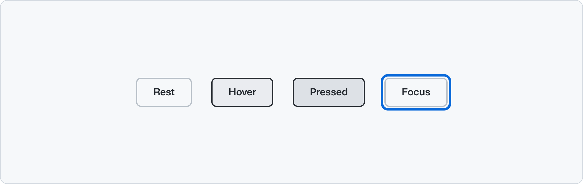
Secondary buttons are the default button type. Use them for the main actions on a page or form. Secondary buttons are the most common button type and should be used in most cases. They can be paired with a primary button to perform a secondary action, or used on their own.
|
|
64
|
+
|
|
65
|
+
|
|
66
|
+
|
|
67
|
+
#### Subtle
|
|
68
|
+
|
|
69
|
+
Subtle buttons have a transparent background with translucent hover and active states, making them useful for compound components like [Button Group](../ButtonGroup/index.md) when paired with secondary or primary variants.
|
|
70
|
+
|
|
71
|
+

|
|
72
|
+
|
|
73
|
+
#### Block
|
|
74
|
+
|
|
75
|
+
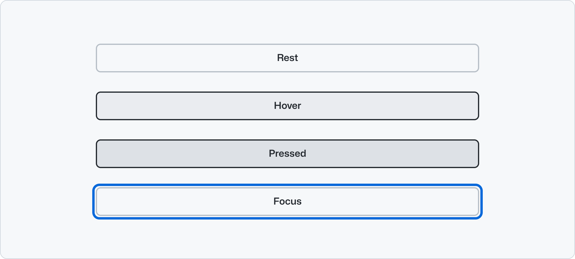
Turning on the block option for button allows the button to span the full width of its container. This feature can be particularly useful when you want the button to occupy more space. Block button can continue to pair with secondary or primary variants.
|
|
76
|
+
|
|
77
|
+
|
|
78
|
+
|
|
79
|
+
### Trailing and leading icons
|
|
80
|
+
|
|
81
|
+
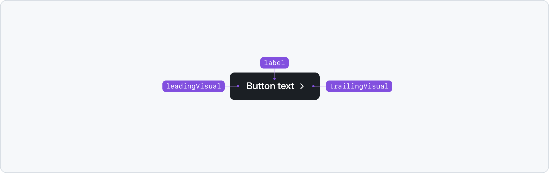
You can place an icon inside the button in either the leading or the trailing position to enhance the visual context. It is recommended to use an use an [Octicon](https://primer.style/octicons) here.
|
|
82
|
+
|
|
83
|
+
Use a trailing visual if the button action involves selecting items (dropdown, select, filter, etc), and a leading visual to provide visual context to the adjacent label. E.g. Use a search icon for a search field submit action.
|
|
84
|
+
|
|
85
|
+
**✅ Do**
|
|
86
|
+
|
|
87
|
+

|
|
88
|
+
|
|
89
|
+
_Use a leading icon that provides context and reinforces the label._
|
|
90
|
+
|
|
91
|
+
**❌ Don't**
|
|
92
|
+
|
|
93
|
+

|
|
94
|
+
|
|
95
|
+
_Don't use a trailing icons to add a visual cue to the label. Use the leading icon for better scanability._
|
|
96
|
+
|
|
97
|
+
**✅ Do**
|
|
98
|
+
|
|
99
|
+

|
|
100
|
+
|
|
101
|
+
_Use a trailing icon for select, dropdown, or filter actions to reinforce its direction._
|
|
102
|
+
|
|
103
|
+
**❌ Don't**
|
|
104
|
+
|
|
105
|
+

|
|
106
|
+
|
|
107
|
+
_Don't use a leading icon or the arrow for select, dropdown, or filter actions._
|
|
108
|
+
|
|
109
|
+
### Size
|
|
110
|
+
|
|
111
|
+
Button default to a medium size. Medium is suitable for most interfaces and is considered the preferred size.
|
|
112
|
+
|
|
113
|
+
Large buttons increase the significance of an action and should be used sparingly. Use the large option when you need to emphasize the button on a big sized heading, for example in a [Hero](../Hero/index.md) component.
|
|
114
|
+
|
|
115
|
+
Small buttons are meant to be used sparingly. Some use cases can be:
|
|
116
|
+
|
|
117
|
+
- Contained inside other components like dropdowns or small popups.
|
|
118
|
+
- Areas where very low priority information might display a CTA.
|
|
119
|
+
- Brand presence inside products where information is compact. For example for in-product banner.
|
|
120
|
+
|
|
121
|
+
## Accessibility
|
|
122
|
+
|
|
123
|
+
### Descriptive buttons
|
|
124
|
+
|
|
125
|
+
Labeling buttons properly lets users know what will happen when they activate the control, lessens errors, and increases confidence.
|
|
126
|
+
|
|
127
|
+
Read more about [descriptive buttons](https://primer.style/design/guides/accessibility/descriptive-buttons/).
|
|
128
|
+
|
|
129
|
+
## Related components
|
|
130
|
+
|
|
131
|
+
- [ButtonGroup](../ButtonGroup/index.md): To display a group of related buttons.
|
|
132
|
+
- Link: To display a link that navigates to another page.
|
|
133
|
+
- [Hero](../Hero/index.md): To display a large heading and a description with a ButtonGroup.
|
|
@@ -0,0 +1,94 @@
|
|
|
1
|
+
---
|
|
2
|
+
title: Button
|
|
3
|
+
description: Use the button component for the main actions on a page or form.
|
|
4
|
+
keywords: ['action', 'cta', 'control', 'interactive', 'click']
|
|
5
|
+
ready: true
|
|
6
|
+
a11yReviewed: true
|
|
7
|
+
figma: 'https://www.figma.com/file/BJ95AjraesmRCWsKA013GS/Primer-Brand?node-id=2931%3A30104'
|
|
8
|
+
source: https://github.com/primer/brand/blob/main/packages/react/src/Button/Button.tsx
|
|
9
|
+
storybook: '/brand/storybook/?path=/story/components-button--playground'
|
|
10
|
+
---
|
|
11
|
+
|
|
12
|
+
```js
|
|
13
|
+
import {Button} from '@primer/react-brand'
|
|
14
|
+
```
|
|
15
|
+
|
|
16
|
+
## Examples
|
|
17
|
+
|
|
18
|
+
### Default
|
|
19
|
+
|
|
20
|
+
This is the default variant for the Button component. It corresponds to the `secondary` variant appearance.
|
|
21
|
+
|
|
22
|
+
```jsx
|
|
23
|
+
<Button>Default</Button>
|
|
24
|
+
```
|
|
25
|
+
|
|
26
|
+
### Primary
|
|
27
|
+
|
|
28
|
+
The `primary` variant of `Button` indicates that the action is of high priority, and should be used sparingly.
|
|
29
|
+
|
|
30
|
+
```jsx
|
|
31
|
+
<Button variant="primary">Primary</Button>
|
|
32
|
+
```
|
|
33
|
+
|
|
34
|
+
### Subtle
|
|
35
|
+
|
|
36
|
+
The `subtle` variant of Button indicates that the action is a low priority one.
|
|
37
|
+
|
|
38
|
+
```jsx
|
|
39
|
+
<Button variant="subtle">Subtle</Button>
|
|
40
|
+
```
|
|
41
|
+
|
|
42
|
+
### Sizes
|
|
43
|
+
|
|
44
|
+
```jsx
|
|
45
|
+
<Stack direction="vertical" alignItems="flex-start">
|
|
46
|
+
<Button size="small">Register now</Button>
|
|
47
|
+
<Button size="medium">Register now</Button>
|
|
48
|
+
<Button size="large">Register now</Button>
|
|
49
|
+
</Stack>
|
|
50
|
+
```
|
|
51
|
+
|
|
52
|
+
### Block
|
|
53
|
+
|
|
54
|
+
```jsx
|
|
55
|
+
<Button block>Full-width button</Button>
|
|
56
|
+
```
|
|
57
|
+
|
|
58
|
+
### Using an icon
|
|
59
|
+
|
|
60
|
+
You can place an icon inside the `Button` in either the leading or the trailing position to enhance the visual context. It is recommended to use an [Octicon](https://primer.style/octicons) here.
|
|
61
|
+
|
|
62
|
+
```jsx
|
|
63
|
+
<Stack direction="vertical" alignItems="flex-start">
|
|
64
|
+
<Button leadingVisual={<SearchIcon />}>Search</Button>
|
|
65
|
+
<Button trailingVisual={<ChevronDownIcon />}>Select</Button>
|
|
66
|
+
<Button leadingVisual={<FilterIcon />} trailingVisual={<ChevronDownIcon />}>
|
|
67
|
+
Filter
|
|
68
|
+
</Button>
|
|
69
|
+
</Stack>
|
|
70
|
+
```
|
|
71
|
+
|
|
72
|
+
### Polymorphism
|
|
73
|
+
|
|
74
|
+
The `Button` component can render as a `button` or `a` HTML element. By default, it will render as a `button`.
|
|
75
|
+
|
|
76
|
+
```jsx
|
|
77
|
+
<Button as="a" href="https://github.com">
|
|
78
|
+
Register now
|
|
79
|
+
</Button>
|
|
80
|
+
```
|
|
81
|
+
|
|
82
|
+
## Component props
|
|
83
|
+
|
|
84
|
+
### Button
|
|
85
|
+
|
|
86
|
+
| Name | Type | Default | Description |
|
|
87
|
+
| :--------------- | :------------------------------------- | :-----------: | :------------------------------------------------------------------------------------------------------ |
|
|
88
|
+
| `leadingVisual` | `ReactElement` | `undefined` | The leading visual appears before the button content |
|
|
89
|
+
| `trailingVisual` | `ReactElement` | `undefined` | The trailing visual appears after the button content |
|
|
90
|
+
| `variants` | `'primary' \| 'secondary' \| 'subtle'` | `'secondary'` | The styling variations available in Button |
|
|
91
|
+
| `size` | `'small' \| 'medium' \| 'large'` | `'medium'` | The size variations available in Button |
|
|
92
|
+
| `block` | `boolean` | `false` | The full-width option available in Button |
|
|
93
|
+
| `hasArrow` | `boolean` | `false` | Deprecated. The `hasArrow` prop will be removed in a future release. |
|
|
94
|
+
| `disabled` | `boolean` | `false` | Disables the rendered element using `disabled` or `aria-disabled` attributes based on the element type. |
|
|
@@ -0,0 +1,62 @@
|
|
|
1
|
+
---
|
|
2
|
+
title: Button group
|
|
3
|
+
description: Use the button group component to group related buttons together.
|
|
4
|
+
keywords: ['buttons', 'control', 'action', 'group', 'paired']
|
|
5
|
+
---
|
|
6
|
+
|
|
7
|
+
|
|
8
|
+
|
|
9
|
+
## Usage
|
|
10
|
+
|
|
11
|
+
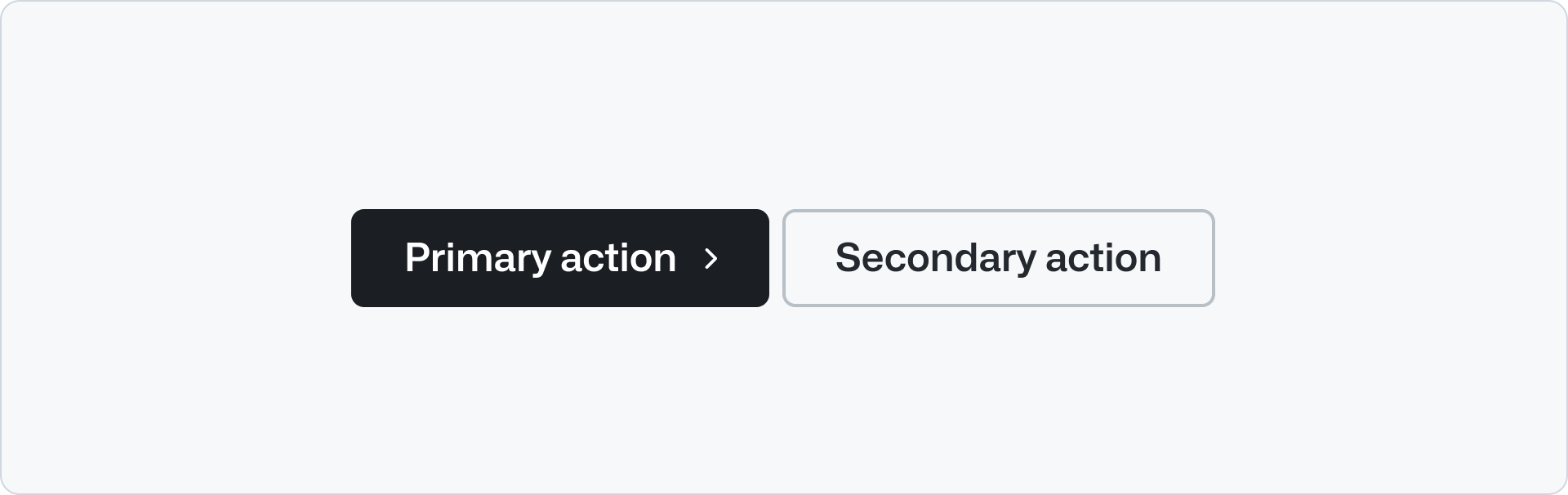
Use button group to group a set of actions that are related between them or to a single application. E,g, "Log in" and "Sign up" or "Try it out" and "Learn more".
|
|
12
|
+
|
|
13
|
+
Use button group to display a pair of primary and a secondary actions. The primary button is used for the main call to action while the secondary button is a related, less important action.
|
|
14
|
+
|
|
15
|
+
**✅ Do**
|
|
16
|
+
|
|
17
|
+
|
|
18
|
+
|
|
19
|
+
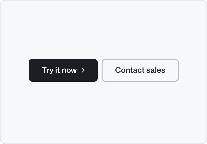
_Use a primary button with a secondary button._
|
|
20
|
+
|
|
21
|
+
**❌ Don't**
|
|
22
|
+
|
|
23
|
+
|
|
24
|
+
|
|
25
|
+
_Don’t place multiple primary buttons together._
|
|
26
|
+
|
|
27
|
+
**✅ Do**
|
|
28
|
+
|
|
29
|
+

|
|
30
|
+
|
|
31
|
+
_Place the primary button at the beginning of a button group._
|
|
32
|
+
|
|
33
|
+
**❌ Don't**
|
|
34
|
+
|
|
35
|
+

|
|
36
|
+
|
|
37
|
+
_Don't place the primary button at the end of a button group._
|
|
38
|
+
|
|
39
|
+
**✅ Do**
|
|
40
|
+
|
|
41
|
+

|
|
42
|
+
|
|
43
|
+
_Stack the buttons vertically when there's not enough horizontal space._
|
|
44
|
+
|
|
45
|
+
**❌ Don't**
|
|
46
|
+
|
|
47
|
+

|
|
48
|
+
|
|
49
|
+
_Don't stack the buttons horizontally when there's not enough space to avoid text wrapping._
|
|
50
|
+
|
|
51
|
+
## Options
|
|
52
|
+
|
|
53
|
+
### Size
|
|
54
|
+
|
|
55
|
+
The button group component has two sizes: `medium` and `large`. The `medium` size should be used for most cases. The `large` size should be used when the button group is used in large headings that introduces a page, as in the [Hero](../Hero/index.md) component.
|
|
56
|
+
|
|
57
|
+
## Related components
|
|
58
|
+
|
|
59
|
+
- [Button](../Button/index.md): To display a button that performs an action.
|
|
60
|
+
- Link: To display a link that navigates to another page.
|
|
61
|
+
- [Hero](../Hero/index.md): To display a large heading and a description with a button group.
|
|
62
|
+
- [CTA banner](../CTABanner/index.md): To draw attention to or create urgency around a user action.
|
|
@@ -0,0 +1,60 @@
|
|
|
1
|
+
---
|
|
2
|
+
title: Button group
|
|
3
|
+
description: Use the button group component to group related buttons together.
|
|
4
|
+
keywords: ['buttons', 'control', 'action', 'group', 'paired']
|
|
5
|
+
ready: true
|
|
6
|
+
source: https://github.com/primer/brand/blob/main/packages/react/src/ButtonGroup/ButtonGroup.tsx
|
|
7
|
+
storybook: '/brand/storybook/?path=/story/components-buttongroup--playground'
|
|
8
|
+
---
|
|
9
|
+
|
|
10
|
+
```js
|
|
11
|
+
import {ButtonGroup, Button} from '@primer/react-brand'
|
|
12
|
+
```
|
|
13
|
+
|
|
14
|
+
## Examples
|
|
15
|
+
|
|
16
|
+
### Default
|
|
17
|
+
|
|
18
|
+
This is the default variant for the ButtonGroup component. The first button in the group is the primary button and the second button is the secondary button.
|
|
19
|
+
|
|
20
|
+
```jsx
|
|
21
|
+
<ButtonGroup>
|
|
22
|
+
<Button>This is one button</Button>
|
|
23
|
+
<Button>This is another button</Button>
|
|
24
|
+
</ButtonGroup>
|
|
25
|
+
```
|
|
26
|
+
|
|
27
|
+
### Sizes
|
|
28
|
+
|
|
29
|
+
The ButtonGroup component can be rendered in different sizes in `medium` and `large` sizes. The default size is `medium`.
|
|
30
|
+
|
|
31
|
+
```jsx
|
|
32
|
+
<ButtonGroup buttonSize="large">
|
|
33
|
+
<Button>This is one large button</Button>
|
|
34
|
+
<Button>This is another large button</Button>
|
|
35
|
+
</ButtonGroup>
|
|
36
|
+
```
|
|
37
|
+
|
|
38
|
+
### Polymorphism
|
|
39
|
+
|
|
40
|
+
The `Button` component can render as a `button` or `a` HTML element. By default, it will render as a `button`.
|
|
41
|
+
|
|
42
|
+
```jsx
|
|
43
|
+
<ButtonGroup>
|
|
44
|
+
<Button as="a" href="#">
|
|
45
|
+
This is one link
|
|
46
|
+
</Button>
|
|
47
|
+
<Button as="a" href="#">
|
|
48
|
+
This is another link
|
|
49
|
+
</Button>
|
|
50
|
+
</ButtonGroup>
|
|
51
|
+
```
|
|
52
|
+
|
|
53
|
+
## Component props
|
|
54
|
+
|
|
55
|
+
### ButtonGroup
|
|
56
|
+
|
|
57
|
+
| Name | Type | Default | Description |
|
|
58
|
+
| :----------- | :-------------------- | :--------: | :-------------------------------------- |
|
|
59
|
+
| `buttonSize` | `'medium' \| 'large'` | `'medium'` | The size variations available in Button |
|
|
60
|
+
| `buttonsAs` | `'button' \| 'a'` | `'button'` | The HTML variations available in Button |
|
|
@@ -0,0 +1,114 @@
|
|
|
1
|
+
---
|
|
2
|
+
title: CTA banner
|
|
3
|
+
description: Use the CTA banner component to highlight and create urgency around user actions.
|
|
4
|
+
keywords: ['call to action', 'banner', 'conversion', 'highlight', 'urgent']
|
|
5
|
+
---
|
|
6
|
+
|
|
7
|
+
## Anatomy
|
|
8
|
+
|
|
9
|
+
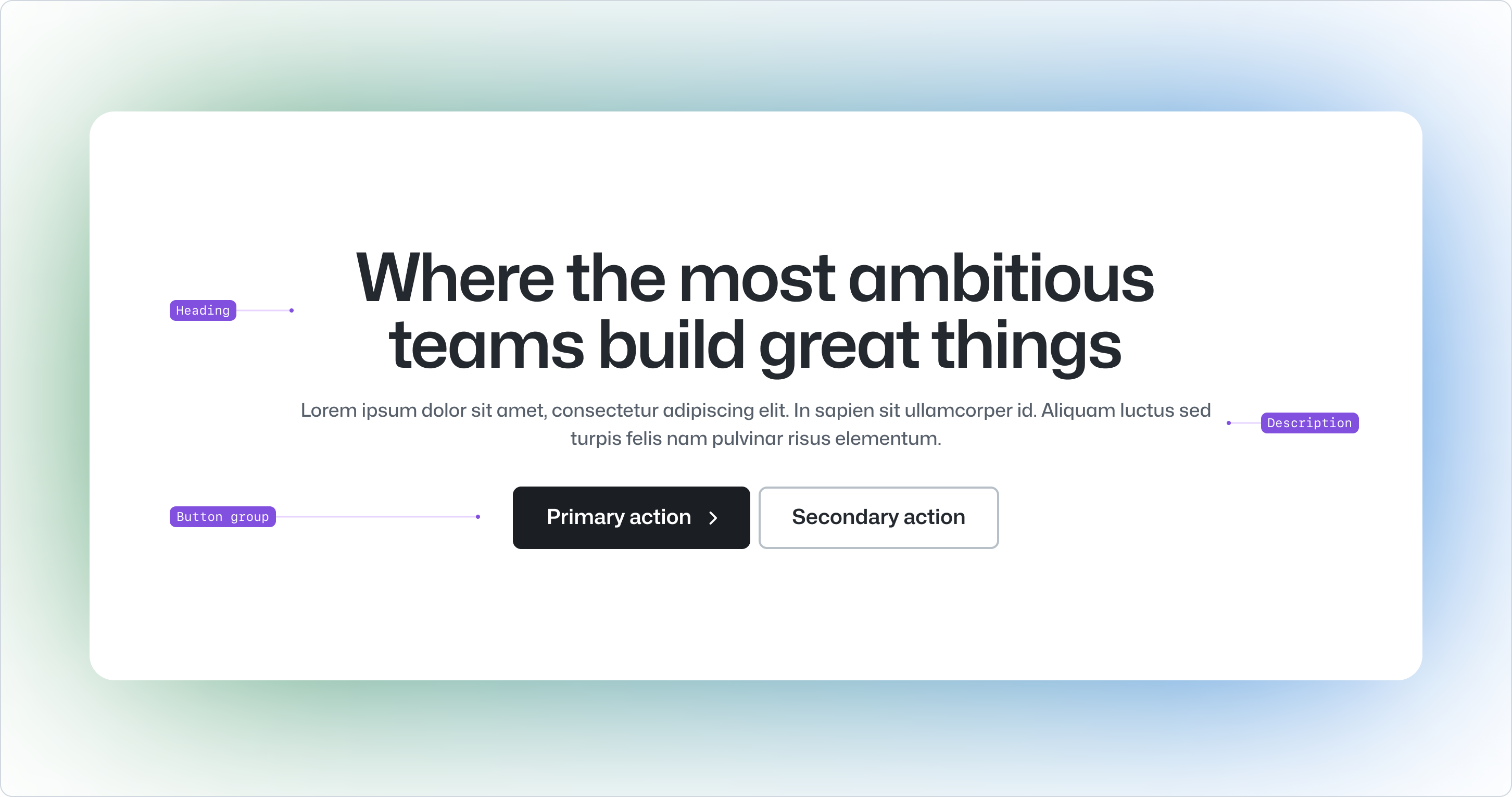
|
|
10
|
+
|
|
11
|
+
- Heading: The main title of the CTA banner. It should be short and concise.
|
|
12
|
+
- Description: Short text that extends the information provided by the heading.
|
|
13
|
+
- Button group: The call to actions available to users
|
|
14
|
+
|
|
15
|
+
## Usage
|
|
16
|
+
|
|
17
|
+
Use the CTA banner to draw attention around the main user actions. The CTA banner should be used sparingly and is typically placed at the bottom of the page to close the user journey,
|
|
18
|
+
make a short summary of the page, and to persist the main actions. The CTA banner can also be used between other sections on lengthy pages.
|
|
19
|
+
|
|
20
|
+
The CTA banner can include primary and secondary actions. These actions are rendered as a [button group](../ButtonGroup/index.md) and follow the same guidelines as the button group component.
|
|
21
|
+
|
|
22
|
+
The actions used in a CTA banner are normally the same as the ones used on the [hero](../Hero/index.md) component on the top of the page. This repetition provides consistency and helps the user to remember what the main actions are.
|
|
23
|
+
|
|
24
|
+
**✅ Do**
|
|
25
|
+
|
|
26
|
+

|
|
27
|
+
|
|
28
|
+
_Use the CTA banner on the bottom of the page to close the user journey and reinforce the main actions._
|
|
29
|
+
|
|
30
|
+
**❌ Don't**
|
|
31
|
+
|
|
32
|
+

|
|
33
|
+
|
|
34
|
+
_Don't use the CTA early on in the user journey, use a hero or a section intro component instead._
|
|
35
|
+
|
|
36
|
+
## Options
|
|
37
|
+
|
|
38
|
+
### Align
|
|
39
|
+
|
|
40
|
+
The CTA banner elements can be aligned to the start or center of the page. By default, the CTA banner is aligned to the start of the page. Use the center alignment if context calls for it. E.g. Use the left alignment if there's a background image on the right side of the page or center align if the CTA banner is placed between two sections that are centered aligned to not break the visual flow.
|
|
41
|
+
|
|
42
|
+
### Styles
|
|
43
|
+
|
|
44
|
+
#### Background
|
|
45
|
+
|
|
46
|
+
The CTA banner uses a solid background color by default. This is the recommended style for most cases. However, the background can be removed to allow the content to blend with the background of the page.
|
|
47
|
+
|
|
48
|
+
**✅ Do**
|
|
49
|
+
|
|
50
|
+

|
|
51
|
+
|
|
52
|
+
_Use the background by default to ensure that the content is legible._
|
|
53
|
+
|
|
54
|
+
**❌ Don't**
|
|
55
|
+
|
|
56
|
+

|
|
57
|
+
|
|
58
|
+
_Don't remove the background and keep the shadow, it will make the content hard to read._
|
|
59
|
+
|
|
60
|
+
Avoid using noisy or textured images that will make the content hard to read. Make sure that the combination of background and foreground guarantees compliance with WCAG contrast guidelines. Use an [online contrast checker](https://webaim.org/resources/contrastchecker/) or a [Figma plugin](https://primer.style/accessibility/tools-and-resources/#contrast-plugin) to test your contrast.
|
|
61
|
+
|
|
62
|
+
**✅ Do**
|
|
63
|
+
|
|
64
|
+

|
|
65
|
+
|
|
66
|
+
_Use background images or colors that guarantee optimal contrast between the background and the foreground._
|
|
67
|
+
|
|
68
|
+
**❌ Don't**
|
|
69
|
+
|
|
70
|
+

|
|
71
|
+
|
|
72
|
+
_Don't use images that interfere with the legibility of the content._
|
|
73
|
+
|
|
74
|
+
#### Shadow
|
|
75
|
+
|
|
76
|
+
The CTA banner has a shadow around the component to give it a sense of depth and separation from the background.
|
|
77
|
+
|
|
78
|
+
**✅ Do**
|
|
79
|
+
|
|
80
|
+
|
|
81
|
+
|
|
82
|
+
_Remove the shadow and the background to diminish the sense of depth and separation from the background or to allow
|
|
83
|
+
the content to blend with the background of the page._
|
|
84
|
+
|
|
85
|
+
**❌ Don't**
|
|
86
|
+
|
|
87
|
+
|
|
88
|
+
|
|
89
|
+
_Don't use the shadow and the background together if you want the content to blend with the background and the
|
|
90
|
+
sections that surround the CTA banner._
|
|
91
|
+
|
|
92
|
+
#### Border
|
|
93
|
+
|
|
94
|
+
The CTA banner can render a border around the component giving further separation between the foreground and background. This is especially useful when there is no shadow present on the background.
|
|
95
|
+
|
|
96
|
+
**✅ Do**
|
|
97
|
+
|
|
98
|
+

|
|
99
|
+
|
|
100
|
+
_Use the border only when there is no shadow present on the background._
|
|
101
|
+
|
|
102
|
+
**❌ Don't**
|
|
103
|
+
|
|
104
|
+

|
|
105
|
+
|
|
106
|
+
_Don't use the border when there is a shadow present on the background. The shadow will provide enough separation
|
|
107
|
+
between the foreground and background._
|
|
108
|
+
|
|
109
|
+
## Related components
|
|
110
|
+
|
|
111
|
+
- [BreakoutBanner](../BreakoutBanner/index.md): To break up content on longer pages and highlight important information.
|
|
112
|
+
- [Hero](../Hero/index.md): To display a large heading and a description with a button group.
|
|
113
|
+
- [Section intro](../SectionIntro/index.md): To provide a title, description and a link to a new section in the page.
|
|
114
|
+
- [River](../River/index.md): To display a list of content items with a visual asset.
|