@primer/react-brand 0.69.1-rc.0a4e5ff5 → 0.70.0-rc.138127ad
This diff represents the content of publicly available package versions that have been released to one of the supported registries. The information contained in this diff is provided for informational purposes only and reflects changes between package versions as they appear in their respective public registries.
- package/README.md +19 -0
- package/docs/components/ActionMenu/index.md +156 -0
- package/docs/components/AnchorNav/index.md +220 -0
- package/docs/components/Avatar/index.md +30 -0
- package/docs/components/Avatar/react.md +71 -0
- package/docs/components/Bento/index.md +223 -0
- package/docs/components/Breadcrumbs/index.md +51 -0
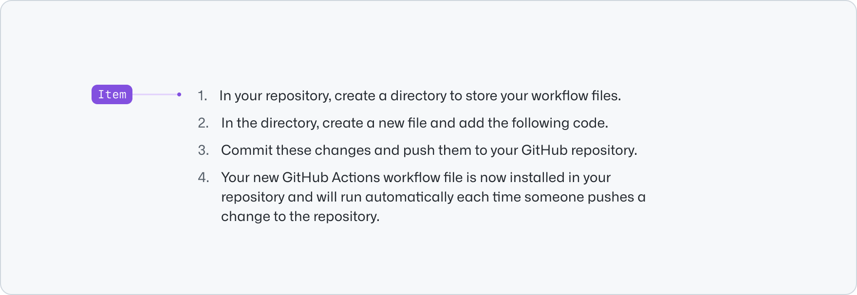
- package/docs/components/Breadcrumbs/react.md +53 -0
- package/docs/components/BreakoutBanner/index.md +102 -0
- package/docs/components/BreakoutBanner/react.md +174 -0
- package/docs/components/Button/index.md +133 -0
- package/docs/components/Button/react.md +94 -0
- package/docs/components/ButtonGroup/index.md +62 -0
- package/docs/components/ButtonGroup/react.md +60 -0
- package/docs/components/CTABanner/index.md +114 -0
- package/docs/components/CTABanner/react.md +343 -0
- package/docs/components/CTAForm/index.md +95 -0
- package/docs/components/CTAForm/react.md +103 -0
- package/docs/components/Card/index.md +126 -0
- package/docs/components/Card/react.md +240 -0
- package/docs/components/ComparisonTable/index.md +381 -0
- package/docs/components/EyebrowBanner/index.md +153 -0
- package/docs/components/FAQ/index.md +66 -0
- package/docs/components/FAQ/react.md +477 -0
- package/docs/components/Footnotes/index.md +41 -0
- package/docs/components/Footnotes/react.md +156 -0
- package/docs/components/Hero/index.md +65 -0
- package/docs/components/Hero/react.md +215 -0
- package/docs/components/IDE/index.md +278 -0
- package/docs/components/Icon/index.md +87 -0
- package/docs/components/Image/index.md +51 -0
- package/docs/components/Image/react.md +160 -0
- package/docs/components/Label/index.md +86 -0
- package/docs/components/Label/react.md +76 -0
- package/docs/components/LogoSuite/index.md +93 -0
- package/docs/components/LogoSuite/react.md +667 -0
- package/docs/components/MediaPlaylist/index.md +133 -0
- package/docs/components/MinimalFooter/index.md +94 -0
- package/docs/components/OrderedList/index.md +55 -0
- package/docs/components/OrderedList/react.md +41 -0
- package/docs/components/Pagination/index.md +80 -0
- package/docs/components/Pillar/index.md +114 -0
- package/docs/components/Pillar/react.md +175 -0
- package/docs/components/PricingOptions/index.md +509 -0
- package/docs/components/Prose/index.md +158 -0
- package/docs/components/River/index.md +190 -0
- package/docs/components/River/react.md +295 -0
- package/docs/components/RiverAccordion/index.md +200 -0
- package/docs/components/RiverBreakoutTabs/index.md +171 -0
- package/docs/components/Section/index.md +40 -0
- package/docs/components/Section/react.md +137 -0
- package/docs/components/SectionIntro/index.md +77 -0
- package/docs/components/SectionIntro/react.md +107 -0
- package/docs/components/SectionIntroStacked/index.md +226 -0
- package/docs/components/Statistic/index.md +111 -0
- package/docs/components/SubNav/index.md +156 -0
- package/docs/components/SubdomainNavBar/index.md +136 -0
- package/docs/components/Tabs/index.md +243 -0
- package/docs/components/Testimonial/index.md +138 -0
- package/docs/components/Testimonial/react.md +191 -0
- package/docs/components/Tiles/index.md +1441 -0
- package/docs/components/Timeline/index.md +68 -0
- package/docs/components/Token/index.md +86 -0
- package/docs/components/Tooltip/index.md +61 -0
- package/docs/components/UnorderedList/index.md +67 -0
- package/docs/components/UnorderedList/react.md +89 -0
- package/docs/components/VideoPlayer/index.md +234 -0
- package/docs/components/index.md +52 -0
- package/docs/forms/Checkbox/index.md +86 -0
- package/docs/forms/Checkbox/react.md +111 -0
- package/docs/forms/CheckboxGroup/index.md +37 -0
- package/docs/forms/CheckboxGroup/react.md +175 -0
- package/docs/forms/FormControl/index.md +404 -0
- package/docs/forms/Radio/index.md +63 -0
- package/docs/forms/Radio/react.md +68 -0
- package/docs/forms/RadioGroup/index.md +45 -0
- package/docs/forms/RadioGroup/react.md +151 -0
- package/docs/forms/Select/index.md +244 -0
- package/docs/forms/TextArea/index.md +126 -0
- package/docs/forms/TextInput/index.md +221 -0
- package/docs/forms/index.md +14 -0
- package/docs/getting-started/esm.md +49 -0
- package/docs/getting-started/index.md +95 -0
- package/docs/index.md +97 -0
- package/docs/introduction/animation.md +127 -0
- package/docs/introduction/index.md +9 -0
- package/docs/introduction/theming.md +132 -0
- package/docs/layout/Box/index.md +46 -0
- package/docs/layout/Box/react.md +284 -0
- package/docs/layout/Grid/index.md +132 -0
- package/docs/layout/Grid/react.md +117 -0
- package/docs/layout/Stack/index.md +60 -0
- package/docs/layout/Stack/react.md +166 -0
- package/docs/layout/index.md +9 -0
- package/docs/primitives/color.md +6 -0
- package/docs/primitives/index.md +8 -0
- package/docs/typography/Heading/index.md +53 -0
- package/docs/typography/Heading/react.md +182 -0
- package/docs/typography/Text/index.md +68 -0
- package/docs/typography/Text/react.md +125 -0
- package/docs/typography/index.md +8 -0
- package/lib/Grid/Grid.d.ts +1 -1
- package/lib/SubNav/SubNav.d.ts +1 -1
- package/lib/Token/Token.d.ts +1 -1
- package/lib/css/main.css +67 -67
- package/lib/design-tokens/css/tokens/base/colors/color-scales-with-modes.css +1 -1
- package/lib/design-tokens/css/tokens/base/colors/light.css +1 -1
- package/lib/design-tokens/css/tokens/base/size/size.css +1 -1
- package/lib/design-tokens/css/tokens/base/typography/typography.css +1 -1
- package/lib/design-tokens/css/tokens/functional/animation/base.css +1 -1
- package/lib/design-tokens/css/tokens/functional/colors/global-with-modes.css +1 -1
- package/lib/design-tokens/css/tokens/functional/colors/global.css +1 -1
- package/lib/design-tokens/css/tokens/functional/components/accordion/colors-with-modes.css +1 -1
- package/lib/design-tokens/css/tokens/functional/components/action-menu/colors-with-modes.css +1 -1
- package/lib/design-tokens/css/tokens/functional/components/anchor-nav/colors-with-modes.css +1 -1
- package/lib/design-tokens/css/tokens/functional/components/bento/base.css +1 -1
- package/lib/design-tokens/css/tokens/functional/components/blinking-cursor/colors-with-modes.css +1 -1
- package/lib/design-tokens/css/tokens/functional/components/breadcrumbs/colors-with-modes.css +1 -1
- package/lib/design-tokens/css/tokens/functional/components/button/colors-with-modes.css +1 -1
- package/lib/design-tokens/css/tokens/functional/components/card/base.css +1 -1
- package/lib/design-tokens/css/tokens/functional/components/card/colors-with-modes.css +1 -1
- package/lib/design-tokens/css/tokens/functional/components/card/colors.css +1 -1
- package/lib/design-tokens/css/tokens/functional/components/comparison-table/colors-with-modes.css +1 -1
- package/lib/design-tokens/css/tokens/functional/components/comparison-table/comparison-table.css +1 -1
- package/lib/design-tokens/css/tokens/functional/components/control/colors-with-modes.css +1 -1
- package/lib/design-tokens/css/tokens/functional/components/cta-banner/colors-with-modes.css +1 -1
- package/lib/design-tokens/css/tokens/functional/components/eyebrow-banner/colors-with-modes.css +1 -1
- package/lib/design-tokens/css/tokens/functional/components/eyebrow-banner/eyebrow-banner.css +1 -1
- package/lib/design-tokens/css/tokens/functional/components/faq/base.css +1 -1
- package/lib/design-tokens/css/tokens/functional/components/faq/colors-with-modes.css +1 -1
- package/lib/design-tokens/css/tokens/functional/components/faq/colors.css +1 -1
- package/lib/design-tokens/css/tokens/functional/components/faq/faq.css +1 -1
- package/lib/design-tokens/css/tokens/functional/components/footer/colors-with-modes.css +1 -1
- package/lib/design-tokens/css/tokens/functional/components/footer/colors.css +1 -1
- package/lib/design-tokens/css/tokens/functional/components/frosted-glass-vfx/base.css +1 -1
- package/lib/design-tokens/css/tokens/functional/components/frosted-glass-vfx/colors-with-modes.css +1 -1
- package/lib/design-tokens/css/tokens/functional/components/grid/colors-with-modes.css +1 -1
- package/lib/design-tokens/css/tokens/functional/components/grid/colors.css +1 -1
- package/lib/design-tokens/css/tokens/functional/components/grid/grid.css +1 -1
- package/lib/design-tokens/css/tokens/functional/components/hero/base.css +1 -1
- package/lib/design-tokens/css/tokens/functional/components/icon/colors-with-modes.css +1 -1
- package/lib/design-tokens/css/tokens/functional/components/icon/colors.css +1 -1
- package/lib/design-tokens/css/tokens/functional/components/ide/base.css +1 -1
- package/lib/design-tokens/css/tokens/functional/components/ide/colors-with-modes.css +1 -1
- package/lib/design-tokens/css/tokens/functional/components/image/base.css +1 -1
- package/lib/design-tokens/css/tokens/functional/components/inline-link/base.css +1 -1
- package/lib/design-tokens/css/tokens/functional/components/inline-link/colors-with-modes.css +1 -1
- package/lib/design-tokens/css/tokens/functional/components/inline-link/colors.css +1 -1
- package/lib/design-tokens/css/tokens/functional/components/label/colors-with-modes.css +1 -1
- package/lib/design-tokens/css/tokens/functional/components/label/colors.css +1 -1
- package/lib/design-tokens/css/tokens/functional/components/link/colors-with-modes.css +1 -1
- package/lib/design-tokens/css/tokens/functional/components/link/colors.css +1 -1
- package/lib/design-tokens/css/tokens/functional/components/logosuite/base.css +1 -1
- package/lib/design-tokens/css/tokens/functional/components/logosuite/colors-with-modes.css +1 -1
- package/lib/design-tokens/css/tokens/functional/components/logosuite/colors.css +1 -1
- package/lib/design-tokens/css/tokens/functional/components/media-playlist/colors-with-modes.css +1 -1
- package/lib/design-tokens/css/tokens/functional/components/media-playlist/colors.css +1 -1
- package/lib/design-tokens/css/tokens/functional/components/pricing-options/colors-with-modes.css +1 -1
- package/lib/design-tokens/css/tokens/functional/components/pricing-options/colors.css +1 -1
- package/lib/design-tokens/css/tokens/functional/components/pricing-options/pricing-options.css +1 -1
- package/lib/design-tokens/css/tokens/functional/components/prose/base.css +1 -1
- package/lib/design-tokens/css/tokens/functional/components/prose/colors-with-modes.css +1 -1
- package/lib/design-tokens/css/tokens/functional/components/river/base.css +1 -1
- package/lib/design-tokens/css/tokens/functional/components/river/river.css +1 -1
- package/lib/design-tokens/css/tokens/functional/components/river-story-scroll/colors-with-modes.css +1 -1
- package/lib/design-tokens/css/tokens/functional/components/section/section.css +1 -1
- package/lib/design-tokens/css/tokens/functional/components/statistic/base.css +1 -1
- package/lib/design-tokens/css/tokens/functional/components/sub-nav/base.css +1 -1
- package/lib/design-tokens/css/tokens/functional/components/sub-nav/colors-with-modes.css +1 -1
- package/lib/design-tokens/css/tokens/functional/components/subdomain-nav-bar/colors-with-modes.css +1 -1
- package/lib/design-tokens/css/tokens/functional/components/tabs/base.css +1 -1
- package/lib/design-tokens/css/tokens/functional/components/tabs/colors-with-modes.css +1 -1
- package/lib/design-tokens/css/tokens/functional/components/tabs/colors.css +1 -1
- package/lib/design-tokens/css/tokens/functional/components/testimonial/base.css +1 -1
- package/lib/design-tokens/css/tokens/functional/components/testimonial/colors-with-modes.css +1 -1
- package/lib/design-tokens/css/tokens/functional/components/testimonial/colors.css +1 -1
- package/lib/design-tokens/css/tokens/functional/components/text-cursor-animation/colors-with-modes.css +1 -1
- package/lib/design-tokens/css/tokens/functional/components/text-cursor-animation/colors.css +1 -1
- package/lib/design-tokens/css/tokens/functional/components/tiles/colors-with-modes.css +1 -1
- package/lib/design-tokens/css/tokens/functional/components/timeline/base.css +1 -1
- package/lib/design-tokens/css/tokens/functional/components/timeline/colors-with-modes.css +1 -1
- package/lib/design-tokens/css/tokens/functional/components/timeline/colors.css +1 -1
- package/lib/design-tokens/css/tokens/functional/components/token/colors-with-modes.css +1 -1
- package/lib/design-tokens/css/tokens/functional/components/token/colors.css +1 -1
- package/lib/design-tokens/css/tokens/functional/components/tooltip/colors-with-modes.css +1 -1
- package/lib/design-tokens/css/tokens/functional/components/tooltip/colors.css +1 -1
- package/lib/design-tokens/css/tokens/functional/components/video-player/base.css +1 -1
- package/lib/design-tokens/css/tokens/functional/components/video-player/colors-with-modes.css +1 -1
- package/lib/design-tokens/css/tokens/functional/size/border.css +1 -1
- package/lib/design-tokens/css/tokens/functional/size/breakpoints.css +1 -1
- package/lib/design-tokens/css/tokens/functional/size/size-coarse.css +1 -1
- package/lib/design-tokens/css/tokens/functional/size/size-fine.css +1 -1
- package/lib/design-tokens/css/tokens/functional/size/size.css +1 -1
- package/lib/design-tokens/css/tokens/functional/size/viewport.css +1 -1
- package/lib/design-tokens/css/tokens/functional/typography/typography-responsive.css +1 -1
- package/lib/design-tokens/css/tokens/functional/typography/typography.css +1 -1
- package/lib/design-tokens/js/module/tokens/base/colors/light.js +1 -1
- package/lib/design-tokens/js/module/tokens/base/size/size.js +1 -1
- package/lib/design-tokens/js/module/tokens/base/typography/typography.js +1 -1
- package/lib/design-tokens/js/module/tokens/functional/animation/base.js +1 -1
- package/lib/design-tokens/js/module/tokens/functional/colors/global.js +1 -1
- package/lib/design-tokens/js/module/tokens/functional/components/bento/base.js +1 -1
- package/lib/design-tokens/js/module/tokens/functional/components/card/base.js +1 -1
- package/lib/design-tokens/js/module/tokens/functional/components/card/colors.js +1 -1
- package/lib/design-tokens/js/module/tokens/functional/components/comparison-table/comparison-table.js +1 -1
- package/lib/design-tokens/js/module/tokens/functional/components/eyebrow-banner/eyebrow-banner.js +1 -1
- package/lib/design-tokens/js/module/tokens/functional/components/faq/base.js +1 -1
- package/lib/design-tokens/js/module/tokens/functional/components/faq/colors.js +1 -1
- package/lib/design-tokens/js/module/tokens/functional/components/faq/faq.js +1 -1
- package/lib/design-tokens/js/module/tokens/functional/components/footer/colors.js +1 -1
- package/lib/design-tokens/js/module/tokens/functional/components/frosted-glass-vfx/base.js +1 -1
- package/lib/design-tokens/js/module/tokens/functional/components/grid/colors.js +1 -1
- package/lib/design-tokens/js/module/tokens/functional/components/grid/grid.js +1 -1
- package/lib/design-tokens/js/module/tokens/functional/components/hero/base.js +1 -1
- package/lib/design-tokens/js/module/tokens/functional/components/icon/colors.js +1 -1
- package/lib/design-tokens/js/module/tokens/functional/components/ide/base.js +1 -1
- package/lib/design-tokens/js/module/tokens/functional/components/image/base.js +1 -1
- package/lib/design-tokens/js/module/tokens/functional/components/inline-link/base.js +1 -1
- package/lib/design-tokens/js/module/tokens/functional/components/inline-link/colors.js +1 -1
- package/lib/design-tokens/js/module/tokens/functional/components/label/colors.js +1 -1
- package/lib/design-tokens/js/module/tokens/functional/components/link/colors.js +1 -1
- package/lib/design-tokens/js/module/tokens/functional/components/logosuite/base.js +1 -1
- package/lib/design-tokens/js/module/tokens/functional/components/logosuite/colors.js +1 -1
- package/lib/design-tokens/js/module/tokens/functional/components/media-playlist/colors.js +1 -1
- package/lib/design-tokens/js/module/tokens/functional/components/pricing-options/colors.js +1 -1
- package/lib/design-tokens/js/module/tokens/functional/components/pricing-options/pricing-options.js +1 -1
- package/lib/design-tokens/js/module/tokens/functional/components/prose/base.js +1 -1
- package/lib/design-tokens/js/module/tokens/functional/components/river/base.js +1 -1
- package/lib/design-tokens/js/module/tokens/functional/components/river/river.js +1 -1
- package/lib/design-tokens/js/module/tokens/functional/components/section/section.js +1 -1
- package/lib/design-tokens/js/module/tokens/functional/components/statistic/base.js +1 -1
- package/lib/design-tokens/js/module/tokens/functional/components/sub-nav/base.js +1 -1
- package/lib/design-tokens/js/module/tokens/functional/components/tabs/base.js +1 -1
- package/lib/design-tokens/js/module/tokens/functional/components/tabs/colors.js +1 -1
- package/lib/design-tokens/js/module/tokens/functional/components/testimonial/base.js +1 -1
- package/lib/design-tokens/js/module/tokens/functional/components/testimonial/colors.js +1 -1
- package/lib/design-tokens/js/module/tokens/functional/components/text-cursor-animation/colors.js +1 -1
- package/lib/design-tokens/js/module/tokens/functional/components/timeline/base.js +1 -1
- package/lib/design-tokens/js/module/tokens/functional/components/timeline/colors.js +1 -1
- package/lib/design-tokens/js/module/tokens/functional/components/token/colors.js +1 -1
- package/lib/design-tokens/js/module/tokens/functional/components/tooltip/colors.js +1 -1
- package/lib/design-tokens/js/module/tokens/functional/components/video-player/base.js +1 -1
- package/lib/design-tokens/js/module/tokens/functional/size/border.js +1 -1
- package/lib/design-tokens/js/module/tokens/functional/size/breakpoints.js +1 -1
- package/lib/design-tokens/js/module/tokens/functional/size/size-coarse.js +1 -1
- package/lib/design-tokens/js/module/tokens/functional/size/size-fine.js +1 -1
- package/lib/design-tokens/js/module/tokens/functional/size/size.js +1 -1
- package/lib/design-tokens/js/module/tokens/functional/size/viewport.js +1 -1
- package/lib/design-tokens/js/module/tokens/functional/typography/typography-responsive.js +1 -1
- package/lib/design-tokens/js/module/tokens/functional/typography/typography.js +1 -1
- package/lib/design-tokens/js/tokens/base/colors/light.js +1 -1
- package/lib/design-tokens/js/tokens/base/size/size.js +1 -1
- package/lib/design-tokens/js/tokens/base/typography/typography.js +1 -1
- package/lib/design-tokens/js/tokens/functional/animation/base.js +1 -1
- package/lib/design-tokens/js/tokens/functional/colors/global.js +1 -1
- package/lib/design-tokens/js/tokens/functional/components/bento/base.js +1 -1
- package/lib/design-tokens/js/tokens/functional/components/card/base.js +1 -1
- package/lib/design-tokens/js/tokens/functional/components/card/colors.js +1 -1
- package/lib/design-tokens/js/tokens/functional/components/comparison-table/comparison-table.js +1 -1
- package/lib/design-tokens/js/tokens/functional/components/eyebrow-banner/eyebrow-banner.js +1 -1
- package/lib/design-tokens/js/tokens/functional/components/faq/base.js +1 -1
- package/lib/design-tokens/js/tokens/functional/components/faq/colors.js +1 -1
- package/lib/design-tokens/js/tokens/functional/components/faq/faq.js +1 -1
- package/lib/design-tokens/js/tokens/functional/components/footer/colors.js +1 -1
- package/lib/design-tokens/js/tokens/functional/components/frosted-glass-vfx/base.js +1 -1
- package/lib/design-tokens/js/tokens/functional/components/grid/colors.js +1 -1
- package/lib/design-tokens/js/tokens/functional/components/grid/grid.js +1 -1
- package/lib/design-tokens/js/tokens/functional/components/hero/base.js +1 -1
- package/lib/design-tokens/js/tokens/functional/components/icon/colors.js +1 -1
- package/lib/design-tokens/js/tokens/functional/components/ide/base.js +1 -1
- package/lib/design-tokens/js/tokens/functional/components/image/base.js +1 -1
- package/lib/design-tokens/js/tokens/functional/components/inline-link/base.js +1 -1
- package/lib/design-tokens/js/tokens/functional/components/inline-link/colors.js +1 -1
- package/lib/design-tokens/js/tokens/functional/components/label/colors.js +1 -1
- package/lib/design-tokens/js/tokens/functional/components/link/colors.js +1 -1
- package/lib/design-tokens/js/tokens/functional/components/logosuite/base.js +1 -1
- package/lib/design-tokens/js/tokens/functional/components/logosuite/colors.js +1 -1
- package/lib/design-tokens/js/tokens/functional/components/media-playlist/colors.js +1 -1
- package/lib/design-tokens/js/tokens/functional/components/pricing-options/colors.js +1 -1
- package/lib/design-tokens/js/tokens/functional/components/pricing-options/pricing-options.js +1 -1
- package/lib/design-tokens/js/tokens/functional/components/prose/base.js +1 -1
- package/lib/design-tokens/js/tokens/functional/components/river/base.js +1 -1
- package/lib/design-tokens/js/tokens/functional/components/river/river.js +1 -1
- package/lib/design-tokens/js/tokens/functional/components/section/section.js +1 -1
- package/lib/design-tokens/js/tokens/functional/components/statistic/base.js +1 -1
- package/lib/design-tokens/js/tokens/functional/components/sub-nav/base.js +1 -1
- package/lib/design-tokens/js/tokens/functional/components/tabs/base.js +1 -1
- package/lib/design-tokens/js/tokens/functional/components/tabs/colors.js +1 -1
- package/lib/design-tokens/js/tokens/functional/components/testimonial/base.js +1 -1
- package/lib/design-tokens/js/tokens/functional/components/testimonial/colors.js +1 -1
- package/lib/design-tokens/js/tokens/functional/components/text-cursor-animation/colors.js +1 -1
- package/lib/design-tokens/js/tokens/functional/components/timeline/base.js +1 -1
- package/lib/design-tokens/js/tokens/functional/components/timeline/colors.js +1 -1
- package/lib/design-tokens/js/tokens/functional/components/token/colors.js +1 -1
- package/lib/design-tokens/js/tokens/functional/components/tooltip/colors.js +1 -1
- package/lib/design-tokens/js/tokens/functional/components/video-player/base.js +1 -1
- package/lib/design-tokens/js/tokens/functional/size/border.js +1 -1
- package/lib/design-tokens/js/tokens/functional/size/breakpoints.js +1 -1
- package/lib/design-tokens/js/tokens/functional/size/size-coarse.js +1 -1
- package/lib/design-tokens/js/tokens/functional/size/size-fine.js +1 -1
- package/lib/design-tokens/js/tokens/functional/size/size.js +1 -1
- package/lib/design-tokens/js/tokens/functional/size/viewport.js +1 -1
- package/lib/design-tokens/js/tokens/functional/typography/typography-responsive.js +1 -1
- package/lib/design-tokens/js/tokens/functional/typography/typography.js +1 -1
- package/lib/design-tokens/scss/tokens/base/colors/light.scss +1 -1
- package/lib/design-tokens/scss/tokens/base/size/size.scss +1 -1
- package/lib/design-tokens/scss/tokens/base/typography/typography.scss +1 -1
- package/lib/design-tokens/scss/tokens/functional/animation/base.scss +1 -1
- package/lib/design-tokens/scss/tokens/functional/colors/global.scss +1 -1
- package/lib/design-tokens/scss/tokens/functional/components/bento/base.scss +1 -1
- package/lib/design-tokens/scss/tokens/functional/components/card/base.scss +1 -1
- package/lib/design-tokens/scss/tokens/functional/components/card/colors.scss +1 -1
- package/lib/design-tokens/scss/tokens/functional/components/comparison-table/comparison-table.scss +1 -1
- package/lib/design-tokens/scss/tokens/functional/components/eyebrow-banner/eyebrow-banner.scss +1 -1
- package/lib/design-tokens/scss/tokens/functional/components/faq/base.scss +1 -1
- package/lib/design-tokens/scss/tokens/functional/components/faq/colors.scss +1 -1
- package/lib/design-tokens/scss/tokens/functional/components/faq/faq.scss +1 -1
- package/lib/design-tokens/scss/tokens/functional/components/footer/colors.scss +1 -1
- package/lib/design-tokens/scss/tokens/functional/components/frosted-glass-vfx/base.scss +1 -1
- package/lib/design-tokens/scss/tokens/functional/components/grid/colors.scss +1 -1
- package/lib/design-tokens/scss/tokens/functional/components/grid/grid.scss +1 -1
- package/lib/design-tokens/scss/tokens/functional/components/hero/base.scss +1 -1
- package/lib/design-tokens/scss/tokens/functional/components/icon/colors.scss +1 -1
- package/lib/design-tokens/scss/tokens/functional/components/ide/base.scss +1 -1
- package/lib/design-tokens/scss/tokens/functional/components/image/base.scss +1 -1
- package/lib/design-tokens/scss/tokens/functional/components/inline-link/base.scss +1 -1
- package/lib/design-tokens/scss/tokens/functional/components/inline-link/colors.scss +1 -1
- package/lib/design-tokens/scss/tokens/functional/components/label/colors.scss +1 -1
- package/lib/design-tokens/scss/tokens/functional/components/link/colors.scss +1 -1
- package/lib/design-tokens/scss/tokens/functional/components/logosuite/base.scss +1 -1
- package/lib/design-tokens/scss/tokens/functional/components/logosuite/colors.scss +1 -1
- package/lib/design-tokens/scss/tokens/functional/components/media-playlist/colors.scss +1 -1
- package/lib/design-tokens/scss/tokens/functional/components/pricing-options/colors.scss +1 -1
- package/lib/design-tokens/scss/tokens/functional/components/pricing-options/pricing-options.scss +1 -1
- package/lib/design-tokens/scss/tokens/functional/components/prose/base.scss +1 -1
- package/lib/design-tokens/scss/tokens/functional/components/river/base.scss +1 -1
- package/lib/design-tokens/scss/tokens/functional/components/river/river.scss +1 -1
- package/lib/design-tokens/scss/tokens/functional/components/section/section.scss +1 -1
- package/lib/design-tokens/scss/tokens/functional/components/statistic/base.scss +1 -1
- package/lib/design-tokens/scss/tokens/functional/components/sub-nav/base.scss +1 -1
- package/lib/design-tokens/scss/tokens/functional/components/tabs/base.scss +1 -1
- package/lib/design-tokens/scss/tokens/functional/components/tabs/colors.scss +1 -1
- package/lib/design-tokens/scss/tokens/functional/components/testimonial/base.scss +1 -1
- package/lib/design-tokens/scss/tokens/functional/components/testimonial/colors.scss +1 -1
- package/lib/design-tokens/scss/tokens/functional/components/text-cursor-animation/colors.scss +1 -1
- package/lib/design-tokens/scss/tokens/functional/components/timeline/base.scss +1 -1
- package/lib/design-tokens/scss/tokens/functional/components/timeline/colors.scss +1 -1
- package/lib/design-tokens/scss/tokens/functional/components/token/colors.scss +1 -1
- package/lib/design-tokens/scss/tokens/functional/components/tooltip/colors.scss +1 -1
- package/lib/design-tokens/scss/tokens/functional/components/video-player/base.scss +1 -1
- package/lib/design-tokens/scss/tokens/functional/size/border.scss +1 -1
- package/lib/design-tokens/scss/tokens/functional/size/breakpoints.scss +1 -1
- package/lib/design-tokens/scss/tokens/functional/size/size-coarse.scss +1 -1
- package/lib/design-tokens/scss/tokens/functional/size/size-fine.scss +1 -1
- package/lib/design-tokens/scss/tokens/functional/size/size.scss +1 -1
- package/lib/design-tokens/scss/tokens/functional/size/viewport.scss +1 -1
- package/lib/design-tokens/scss/tokens/functional/typography/typography-responsive.scss +1 -1
- package/lib/design-tokens/scss/tokens/functional/typography/typography.scss +1 -1
- package/lib/design-tokens/ts/tokens/base/colors/light.d.ts +1 -1
- package/lib/design-tokens/ts/tokens/base/colors/light.js +1 -1
- package/lib/design-tokens/ts/tokens/base/size/size.d.ts +1 -1
- package/lib/design-tokens/ts/tokens/base/size/size.js +1 -1
- package/lib/design-tokens/ts/tokens/base/typography/typography.d.ts +1 -1
- package/lib/design-tokens/ts/tokens/base/typography/typography.js +1 -1
- package/lib/design-tokens/ts/tokens/functional/animation/base.d.ts +1 -1
- package/lib/design-tokens/ts/tokens/functional/animation/base.js +1 -1
- package/lib/design-tokens/ts/tokens/functional/colors/global.d.ts +1 -1
- package/lib/design-tokens/ts/tokens/functional/colors/global.js +1 -1
- package/lib/design-tokens/ts/tokens/functional/components/bento/base.d.ts +1 -1
- package/lib/design-tokens/ts/tokens/functional/components/bento/base.js +1 -1
- package/lib/design-tokens/ts/tokens/functional/components/card/base.d.ts +1 -1
- package/lib/design-tokens/ts/tokens/functional/components/card/base.js +1 -1
- package/lib/design-tokens/ts/tokens/functional/components/card/colors.d.ts +1 -1
- package/lib/design-tokens/ts/tokens/functional/components/card/colors.js +1 -1
- package/lib/design-tokens/ts/tokens/functional/components/comparison-table/comparison-table.d.ts +1 -1
- package/lib/design-tokens/ts/tokens/functional/components/comparison-table/comparison-table.js +1 -1
- package/lib/design-tokens/ts/tokens/functional/components/eyebrow-banner/eyebrow-banner.d.ts +1 -1
- package/lib/design-tokens/ts/tokens/functional/components/eyebrow-banner/eyebrow-banner.js +1 -1
- package/lib/design-tokens/ts/tokens/functional/components/faq/base.d.ts +1 -1
- package/lib/design-tokens/ts/tokens/functional/components/faq/base.js +1 -1
- package/lib/design-tokens/ts/tokens/functional/components/faq/colors.d.ts +1 -1
- package/lib/design-tokens/ts/tokens/functional/components/faq/colors.js +1 -1
- package/lib/design-tokens/ts/tokens/functional/components/faq/faq.d.ts +1 -1
- package/lib/design-tokens/ts/tokens/functional/components/faq/faq.js +1 -1
- package/lib/design-tokens/ts/tokens/functional/components/footer/colors.d.ts +1 -1
- package/lib/design-tokens/ts/tokens/functional/components/footer/colors.js +1 -1
- package/lib/design-tokens/ts/tokens/functional/components/frosted-glass-vfx/base.d.ts +1 -1
- package/lib/design-tokens/ts/tokens/functional/components/frosted-glass-vfx/base.js +1 -1
- package/lib/design-tokens/ts/tokens/functional/components/grid/colors.d.ts +1 -1
- package/lib/design-tokens/ts/tokens/functional/components/grid/colors.js +1 -1
- package/lib/design-tokens/ts/tokens/functional/components/grid/grid.d.ts +1 -1
- package/lib/design-tokens/ts/tokens/functional/components/grid/grid.js +1 -1
- package/lib/design-tokens/ts/tokens/functional/components/hero/base.d.ts +1 -1
- package/lib/design-tokens/ts/tokens/functional/components/hero/base.js +1 -1
- package/lib/design-tokens/ts/tokens/functional/components/icon/colors.d.ts +1 -1
- package/lib/design-tokens/ts/tokens/functional/components/icon/colors.js +1 -1
- package/lib/design-tokens/ts/tokens/functional/components/ide/base.d.ts +1 -1
- package/lib/design-tokens/ts/tokens/functional/components/ide/base.js +1 -1
- package/lib/design-tokens/ts/tokens/functional/components/image/base.d.ts +1 -1
- package/lib/design-tokens/ts/tokens/functional/components/image/base.js +1 -1
- package/lib/design-tokens/ts/tokens/functional/components/inline-link/base.d.ts +1 -1
- package/lib/design-tokens/ts/tokens/functional/components/inline-link/base.js +1 -1
- package/lib/design-tokens/ts/tokens/functional/components/inline-link/colors.d.ts +1 -1
- package/lib/design-tokens/ts/tokens/functional/components/inline-link/colors.js +1 -1
- package/lib/design-tokens/ts/tokens/functional/components/label/colors.d.ts +1 -1
- package/lib/design-tokens/ts/tokens/functional/components/label/colors.js +1 -1
- package/lib/design-tokens/ts/tokens/functional/components/link/colors.d.ts +1 -1
- package/lib/design-tokens/ts/tokens/functional/components/link/colors.js +1 -1
- package/lib/design-tokens/ts/tokens/functional/components/logosuite/base.d.ts +1 -1
- package/lib/design-tokens/ts/tokens/functional/components/logosuite/base.js +1 -1
- package/lib/design-tokens/ts/tokens/functional/components/logosuite/colors.d.ts +1 -1
- package/lib/design-tokens/ts/tokens/functional/components/logosuite/colors.js +1 -1
- package/lib/design-tokens/ts/tokens/functional/components/media-playlist/colors.d.ts +1 -1
- package/lib/design-tokens/ts/tokens/functional/components/media-playlist/colors.js +1 -1
- package/lib/design-tokens/ts/tokens/functional/components/pricing-options/colors.d.ts +1 -1
- package/lib/design-tokens/ts/tokens/functional/components/pricing-options/colors.js +1 -1
- package/lib/design-tokens/ts/tokens/functional/components/pricing-options/pricing-options.d.ts +1 -1
- package/lib/design-tokens/ts/tokens/functional/components/pricing-options/pricing-options.js +1 -1
- package/lib/design-tokens/ts/tokens/functional/components/prose/base.d.ts +1 -1
- package/lib/design-tokens/ts/tokens/functional/components/prose/base.js +1 -1
- package/lib/design-tokens/ts/tokens/functional/components/river/base.d.ts +1 -1
- package/lib/design-tokens/ts/tokens/functional/components/river/base.js +1 -1
- package/lib/design-tokens/ts/tokens/functional/components/river/river.d.ts +1 -1
- package/lib/design-tokens/ts/tokens/functional/components/river/river.js +1 -1
- package/lib/design-tokens/ts/tokens/functional/components/section/section.d.ts +1 -1
- package/lib/design-tokens/ts/tokens/functional/components/section/section.js +1 -1
- package/lib/design-tokens/ts/tokens/functional/components/statistic/base.d.ts +1 -1
- package/lib/design-tokens/ts/tokens/functional/components/statistic/base.js +1 -1
- package/lib/design-tokens/ts/tokens/functional/components/sub-nav/base.d.ts +1 -1
- package/lib/design-tokens/ts/tokens/functional/components/sub-nav/base.js +1 -1
- package/lib/design-tokens/ts/tokens/functional/components/tabs/base.d.ts +1 -1
- package/lib/design-tokens/ts/tokens/functional/components/tabs/base.js +1 -1
- package/lib/design-tokens/ts/tokens/functional/components/tabs/colors.d.ts +1 -1
- package/lib/design-tokens/ts/tokens/functional/components/tabs/colors.js +1 -1
- package/lib/design-tokens/ts/tokens/functional/components/testimonial/base.d.ts +1 -1
- package/lib/design-tokens/ts/tokens/functional/components/testimonial/base.js +1 -1
- package/lib/design-tokens/ts/tokens/functional/components/testimonial/colors.d.ts +1 -1
- package/lib/design-tokens/ts/tokens/functional/components/testimonial/colors.js +1 -1
- package/lib/design-tokens/ts/tokens/functional/components/text-cursor-animation/colors.d.ts +1 -1
- package/lib/design-tokens/ts/tokens/functional/components/text-cursor-animation/colors.js +1 -1
- package/lib/design-tokens/ts/tokens/functional/components/timeline/base.d.ts +1 -1
- package/lib/design-tokens/ts/tokens/functional/components/timeline/base.js +1 -1
- package/lib/design-tokens/ts/tokens/functional/components/timeline/colors.d.ts +1 -1
- package/lib/design-tokens/ts/tokens/functional/components/timeline/colors.js +1 -1
- package/lib/design-tokens/ts/tokens/functional/components/token/colors.d.ts +1 -1
- package/lib/design-tokens/ts/tokens/functional/components/token/colors.js +1 -1
- package/lib/design-tokens/ts/tokens/functional/components/tooltip/colors.d.ts +1 -1
- package/lib/design-tokens/ts/tokens/functional/components/tooltip/colors.js +1 -1
- package/lib/design-tokens/ts/tokens/functional/components/video-player/base.d.ts +1 -1
- package/lib/design-tokens/ts/tokens/functional/components/video-player/base.js +1 -1
- package/lib/design-tokens/ts/tokens/functional/size/border.d.ts +1 -1
- package/lib/design-tokens/ts/tokens/functional/size/border.js +1 -1
- package/lib/design-tokens/ts/tokens/functional/size/breakpoints.d.ts +1 -1
- package/lib/design-tokens/ts/tokens/functional/size/breakpoints.js +1 -1
- package/lib/design-tokens/ts/tokens/functional/size/size-coarse.d.ts +1 -1
- package/lib/design-tokens/ts/tokens/functional/size/size-coarse.js +1 -1
- package/lib/design-tokens/ts/tokens/functional/size/size-fine.d.ts +1 -1
- package/lib/design-tokens/ts/tokens/functional/size/size-fine.js +1 -1
- package/lib/design-tokens/ts/tokens/functional/size/size.d.ts +1 -1
- package/lib/design-tokens/ts/tokens/functional/size/size.js +1 -1
- package/lib/design-tokens/ts/tokens/functional/size/viewport.d.ts +1 -1
- package/lib/design-tokens/ts/tokens/functional/size/viewport.js +1 -1
- package/lib/design-tokens/ts/tokens/functional/typography/typography-responsive.d.ts +1 -1
- package/lib/design-tokens/ts/tokens/functional/typography/typography-responsive.js +1 -1
- package/lib/design-tokens/ts/tokens/functional/typography/typography.d.ts +1 -1
- package/lib/design-tokens/ts/tokens/functional/typography/typography.js +1 -1
- package/llms.txt +95 -0
- package/package.json +17 -5
- package/esm/Hero/Hero.figma.d.ts +0 -2
- package/esm/Hero/Hero.figma.d.ts.map +0 -1
- package/esm/IDE/fixtures/content.d.ts +0 -7
- package/esm/IDE/fixtures/content.d.ts.map +0 -1
- package/esm/LogoSuite/LogoSuite.figma.d.ts +0 -2
- package/esm/LogoSuite/LogoSuite.figma.d.ts.map +0 -1
- package/esm/LogoSuite/LogoSuite.fixtures.d.ts +0 -2
- package/esm/LogoSuite/LogoSuite.fixtures.d.ts.map +0 -1
- package/esm/MonaSans/MonaSans.d.ts +0 -11
- package/esm/MonaSans/MonaSans.d.ts.map +0 -1
- package/esm/MonaSans/index.d.ts +0 -2
- package/esm/MonaSans/index.d.ts.map +0 -1
- package/esm/PricingOptions/PricingOptions.figma.d.ts +0 -2
- package/esm/PricingOptions/PricingOptions.figma.d.ts.map +0 -1
- package/esm/Tiles/Tiles.fixtures.d.ts +0 -7
- package/esm/Tiles/Tiles.fixtures.d.ts.map +0 -1
- package/esm/fixtures/third-party-logos/AzureLogo.d.ts +0 -5
- package/esm/fixtures/third-party-logos/AzureLogo.d.ts.map +0 -1
- package/esm/fixtures/third-party-logos/JetBrainsLogo.d.ts +0 -5
- package/esm/fixtures/third-party-logos/JetBrainsLogo.d.ts.map +0 -1
- package/esm/fixtures/third-party-logos/MicrosoftCopilotLogo.d.ts +0 -5
- package/esm/fixtures/third-party-logos/MicrosoftCopilotLogo.d.ts.map +0 -1
- package/esm/fixtures/third-party-logos/MicrosoftLogo.d.ts +0 -5
- package/esm/fixtures/third-party-logos/MicrosoftLogo.d.ts.map +0 -1
- package/esm/fixtures/third-party-logos/NeoVimLogo.d.ts +0 -5
- package/esm/fixtures/third-party-logos/NeoVimLogo.d.ts.map +0 -1
- package/esm/fixtures/third-party-logos/VisualStudioCodeLogo.d.ts +0 -5
- package/esm/fixtures/third-party-logos/VisualStudioCodeLogo.d.ts.map +0 -1
- package/esm/fixtures/third-party-logos/VisualStudioLogo.d.ts +0 -5
- package/esm/fixtures/third-party-logos/VisualStudioLogo.d.ts.map +0 -1
- package/esm/list/ListItem/index.d.ts +0 -2
- package/esm/list/ListItem/index.d.ts.map +0 -1
- package/esm/recipes/FeaturePreviewLPs/FeaturePreviewLevelOne/FeaturePreviewLevelOne.d.ts +0 -13
- package/esm/recipes/FeaturePreviewLPs/FeaturePreviewLevelOne/FeaturePreviewLevelOne.d.ts.map +0 -1
- package/esm/recipes/FeaturePreviewLPs/FeaturePreviewLevelOne/FeaturePreviewLevelOneSideBySide.d.ts +0 -14
- package/esm/recipes/FeaturePreviewLPs/FeaturePreviewLevelOne/FeaturePreviewLevelOneSideBySide.d.ts.map +0 -1
- package/esm/recipes/FeaturePreviewLPs/FeaturePreviewLevelOne/components/FormExample.d.ts +0 -8
- package/esm/recipes/FeaturePreviewLPs/FeaturePreviewLevelOne/components/FormExample.d.ts.map +0 -1
- package/esm/recipes/FeaturePreviewLPs/FeaturePreviewLevelOne/index.d.ts +0 -2
- package/esm/recipes/FeaturePreviewLPs/FeaturePreviewLevelOne/index.d.ts.map +0 -1
- package/esm/recipes/FeaturePreviewLPs/FeaturePreviewLevelTwo/FeaturePreviewLevelTwo.d.ts +0 -49
- package/esm/recipes/FeaturePreviewLPs/FeaturePreviewLevelTwo/FeaturePreviewLevelTwo.d.ts.map +0 -1
- package/esm/recipes/FeaturePreviewLPs/FeaturePreviewLevelTwo/index.d.ts +0 -2
- package/esm/recipes/FeaturePreviewLPs/FeaturePreviewLevelTwo/index.d.ts.map +0 -1
- package/esm/recipes/FeaturePreviewLPs/FeaturePreviewLevelZero/FeaturePreviewLevelZero.d.ts +0 -17
- package/esm/recipes/FeaturePreviewLPs/FeaturePreviewLevelZero/FeaturePreviewLevelZero.d.ts.map +0 -1
- package/esm/recipes/FeaturePreviewLPs/FeaturePreviewLevelZero/index.d.ts +0 -2
- package/esm/recipes/FeaturePreviewLPs/FeaturePreviewLevelZero/index.d.ts.map +0 -1
- package/esm/recipes/FeaturePreviewLPs/helpers.d.ts +0 -30
- package/esm/recipes/FeaturePreviewLPs/helpers.d.ts.map +0 -1
- package/esm/recipes/FlexTemplate/FlexSection/FlexSection.d.ts +0 -8
- package/esm/recipes/FlexTemplate/FlexSection/FlexSection.d.ts.map +0 -1
- package/esm/recipes/FlexTemplate/FlexSection/components/ContentfulRiver.d.ts +0 -2
- package/esm/recipes/FlexTemplate/FlexSection/components/ContentfulRiver.d.ts.map +0 -1
- package/esm/recipes/FlexTemplate/FlexSection/components/ContentfulRiverAccordion.d.ts +0 -8
- package/esm/recipes/FlexTemplate/FlexSection/components/ContentfulRiverAccordion.d.ts.map +0 -1
- package/esm/recipes/FlexTemplate/FlexSection/components/ContentfulRiverBreakout.d.ts +0 -2
- package/esm/recipes/FlexTemplate/FlexSection/components/ContentfulRiverBreakout.d.ts.map +0 -1
- package/esm/recipes/FlexTemplate/FlexSection/components/ContentfulTestimonials.d.ts +0 -8
- package/esm/recipes/FlexTemplate/FlexSection/components/ContentfulTestimonials.d.ts.map +0 -1
- package/esm/recipes/FlexTemplate/FlexSection/components/FlexSectionTestimonials.d.ts +0 -8
- package/esm/recipes/FlexTemplate/FlexSection/components/FlexSectionTestimonials.d.ts.map +0 -1
- package/esm/recipes/FlexTemplate/FlexSection/components/index.d.ts +0 -6
- package/esm/recipes/FlexTemplate/FlexSection/components/index.d.ts.map +0 -1
- package/esm/recipes/FlexTemplate/FlexSection/index.d.ts +0 -2
- package/esm/recipes/FlexTemplate/FlexSection/index.d.ts.map +0 -1
- package/esm/recipes/FlexTemplate/FlexTemplate.d.ts +0 -7
- package/esm/recipes/FlexTemplate/FlexTemplate.d.ts.map +0 -1
- package/esm/recipes/FlexTemplate/FlexTemplate.types.d.ts +0 -318
- package/esm/recipes/FlexTemplate/FlexTemplate.types.d.ts.map +0 -1
- package/esm/recipes/FlexTemplate/FlexTemplateTrailingSection/FlexTemplateTrailingSection.d.ts +0 -6
- package/esm/recipes/FlexTemplate/FlexTemplateTrailingSection/FlexTemplateTrailingSection.d.ts.map +0 -1
- package/esm/recipes/FlexTemplate/FlexTemplateTrailingSection/index.d.ts +0 -3
- package/esm/recipes/FlexTemplate/FlexTemplateTrailingSection/index.d.ts.map +0 -1
- package/esm/recipes/FlexTemplate/fixtures/content.d.ts +0 -2
- package/esm/recipes/FlexTemplate/fixtures/content.d.ts.map +0 -1
- package/esm/recipes/FlexTemplate/index.d.ts +0 -4
- package/esm/recipes/FlexTemplate/index.d.ts.map +0 -1
- package/esm/recipes/Flexsuite/Category/FlexSuiteSecurityCategory/FlexSuiteSecurityCategory.content.d.ts +0 -68
- package/esm/recipes/Flexsuite/Category/FlexSuiteSecurityCategory/FlexSuiteSecurityCategory.content.d.ts.map +0 -1
- package/esm/recipes/Flexsuite/Category/FlexSuiteSecurityCategory/FlexSuiteSecurityCategory.d.ts +0 -7
- package/esm/recipes/Flexsuite/Category/FlexSuiteSecurityCategory/FlexSuiteSecurityCategory.d.ts.map +0 -1
- package/esm/recipes/Flexsuite/Category/index.d.ts +0 -2
- package/esm/recipes/Flexsuite/Category/index.d.ts.map +0 -1
- package/esm/recipes/Flexsuite/Details/FlexSuiteAIDetailsPlaylist/FlexSuiteAIDetailsPlaylist.content.d.ts +0 -49
- package/esm/recipes/Flexsuite/Details/FlexSuiteAIDetailsPlaylist/FlexSuiteAIDetailsPlaylist.content.d.ts.map +0 -1
- package/esm/recipes/Flexsuite/Details/FlexSuiteAIDetailsPlaylist/FlexSuiteAIDetailsPlaylist.d.ts +0 -7
- package/esm/recipes/Flexsuite/Details/FlexSuiteAIDetailsPlaylist/FlexSuiteAIDetailsPlaylist.d.ts.map +0 -1
- package/esm/recipes/Flexsuite/Details/index.d.ts +0 -4
- package/esm/recipes/Flexsuite/Details/index.d.ts.map +0 -1
- package/esm/recipes/Flexsuite/Overview/FlexSuiteAIOverview.content.d.ts +0 -101
- package/esm/recipes/Flexsuite/Overview/FlexSuiteAIOverview.content.d.ts.map +0 -1
- package/esm/recipes/Flexsuite/Overview/FlexSuiteAIOverview.d.ts +0 -7
- package/esm/recipes/Flexsuite/Overview/FlexSuiteAIOverview.d.ts.map +0 -1
- package/esm/recipes/Flexsuite/Overview/FlexSuiteOverview.content.d.ts +0 -5
- package/esm/recipes/Flexsuite/Overview/FlexSuiteOverview.content.d.ts.map +0 -1
- package/esm/recipes/Flexsuite/Overview/index.d.ts +0 -4
- package/esm/recipes/Flexsuite/Overview/index.d.ts.map +0 -1
- package/esm/recipes/SolutionTemplates/CategoryPage/CategoryPage.d.ts +0 -16
- package/esm/recipes/SolutionTemplates/CategoryPage/CategoryPage.d.ts.map +0 -1
- package/esm/recipes/SolutionTemplates/SolutionPage/SolutionPage.d.ts +0 -33
- package/esm/recipes/SolutionTemplates/SolutionPage/SolutionPage.d.ts.map +0 -1
- package/esm/recipes/SolutionTemplates/SolutionPage/index.d.ts +0 -2
- package/esm/recipes/SolutionTemplates/SolutionPage/index.d.ts.map +0 -1
- package/esm/recipes/SolutionTemplates/SolutionsOverview/SolutionsOverview.d.ts +0 -17
- package/esm/recipes/SolutionTemplates/SolutionsOverview/SolutionsOverview.d.ts.map +0 -1
- package/esm/recipes/SolutionTemplates/helpers.d.ts +0 -127
- package/esm/recipes/SolutionTemplates/helpers.d.ts.map +0 -1
- package/esm/recipes/SolutionTemplates/index.d.ts +0 -1
- package/esm/recipes/SolutionTemplates/index.d.ts.map +0 -1
- package/esm/recipes/seo/Article/Article.d.ts +0 -14
- package/esm/recipes/seo/Article/Article.d.ts.map +0 -1
- package/esm/recipes/seo/Article/ArticleToC.d.ts +0 -4
- package/esm/recipes/seo/Article/ArticleToC.d.ts.map +0 -1
- package/esm/recipes/seo/Article/article-shared.d.ts +0 -5
- package/esm/recipes/seo/Article/article-shared.d.ts.map +0 -1
- package/esm/recipes/seo/Article/index.d.ts +0 -2
- package/esm/recipes/seo/Article/index.d.ts.map +0 -1
- package/esm/recipes/seo/Category/CategoryPage.d.ts +0 -9
- package/esm/recipes/seo/Category/CategoryPage.d.ts.map +0 -1
- package/esm/recipes/seo/Category/index.d.ts +0 -2
- package/esm/recipes/seo/Category/index.d.ts.map +0 -1
- package/esm/recipes/seo/helpers.d.ts +0 -16
- package/esm/recipes/seo/helpers.d.ts.map +0 -1
- package/esm/recipes/seo/index.d.ts +0 -1
- package/esm/recipes/seo/index.d.ts.map +0 -1
- package/esm/river/River.figma.d.ts +0 -2
- package/esm/river/River.figma.d.ts.map +0 -1
- package/lib/Hero/Hero.figma.d.ts +0 -1
- package/lib/IDE/fixtures/content.d.ts +0 -6
- package/lib/LogoSuite/LogoSuite.figma.d.ts +0 -1
- package/lib/LogoSuite/LogoSuite.fixtures.d.ts +0 -1
- package/lib/MonaSans/MonaSans.d.ts +0 -10
- package/lib/MonaSans/index.d.ts +0 -1
- package/lib/PricingOptions/PricingOptions.figma.d.ts +0 -1
- package/lib/Tiles/Tiles.fixtures.d.ts +0 -6
- package/lib/fixtures/third-party-logos/AzureLogo.d.ts +0 -4
- package/lib/fixtures/third-party-logos/JetBrainsLogo.d.ts +0 -4
- package/lib/fixtures/third-party-logos/MicrosoftCopilotLogo.d.ts +0 -4
- package/lib/fixtures/third-party-logos/MicrosoftLogo.d.ts +0 -4
- package/lib/fixtures/third-party-logos/NeoVimLogo.d.ts +0 -4
- package/lib/fixtures/third-party-logos/VisualStudioCodeLogo.d.ts +0 -4
- package/lib/fixtures/third-party-logos/VisualStudioLogo.d.ts +0 -4
- package/lib/index.esm.d.ts +0 -7
- package/lib/list/ListItem/index.d.ts +0 -1
- package/lib/recipes/FeaturePreviewLPs/FeaturePreviewLevelOne/FeaturePreviewLevelOne.d.ts +0 -12
- package/lib/recipes/FeaturePreviewLPs/FeaturePreviewLevelOne/FeaturePreviewLevelOneSideBySide.d.ts +0 -13
- package/lib/recipes/FeaturePreviewLPs/FeaturePreviewLevelOne/components/FormExample.d.ts +0 -7
- package/lib/recipes/FeaturePreviewLPs/FeaturePreviewLevelOne/index.d.ts +0 -1
- package/lib/recipes/FeaturePreviewLPs/FeaturePreviewLevelTwo/FeaturePreviewLevelTwo.d.ts +0 -48
- package/lib/recipes/FeaturePreviewLPs/FeaturePreviewLevelTwo/index.d.ts +0 -1
- package/lib/recipes/FeaturePreviewLPs/FeaturePreviewLevelZero/FeaturePreviewLevelZero.d.ts +0 -16
- package/lib/recipes/FeaturePreviewLPs/FeaturePreviewLevelZero/index.d.ts +0 -1
- package/lib/recipes/FeaturePreviewLPs/helpers.d.ts +0 -29
- package/lib/recipes/FlexTemplate/FlexSection/FlexSection.d.ts +0 -7
- package/lib/recipes/FlexTemplate/FlexSection/components/ContentfulRiver.d.ts +0 -1
- package/lib/recipes/FlexTemplate/FlexSection/components/ContentfulRiverAccordion.d.ts +0 -7
- package/lib/recipes/FlexTemplate/FlexSection/components/ContentfulRiverBreakout.d.ts +0 -1
- package/lib/recipes/FlexTemplate/FlexSection/components/ContentfulTestimonials.d.ts +0 -7
- package/lib/recipes/FlexTemplate/FlexSection/components/FlexSectionTestimonials.d.ts +0 -7
- package/lib/recipes/FlexTemplate/FlexSection/components/index.d.ts +0 -5
- package/lib/recipes/FlexTemplate/FlexSection/index.d.ts +0 -1
- package/lib/recipes/FlexTemplate/FlexTemplate.d.ts +0 -6
- package/lib/recipes/FlexTemplate/FlexTemplate.types.d.ts +0 -317
- package/lib/recipes/FlexTemplate/FlexTemplateTrailingSection/FlexTemplateTrailingSection.d.ts +0 -5
- package/lib/recipes/FlexTemplate/FlexTemplateTrailingSection/index.d.ts +0 -2
- package/lib/recipes/FlexTemplate/fixtures/content.d.ts +0 -1
- package/lib/recipes/FlexTemplate/index.d.ts +0 -3
- package/lib/recipes/Flexsuite/Category/FlexSuiteSecurityCategory/FlexSuiteSecurityCategory.content.d.ts +0 -67
- package/lib/recipes/Flexsuite/Category/FlexSuiteSecurityCategory/FlexSuiteSecurityCategory.d.ts +0 -6
- package/lib/recipes/Flexsuite/Category/index.d.ts +0 -1
- package/lib/recipes/Flexsuite/Details/FlexSuiteAIDetailsPlaylist/FlexSuiteAIDetailsPlaylist.content.d.ts +0 -48
- package/lib/recipes/Flexsuite/Details/FlexSuiteAIDetailsPlaylist/FlexSuiteAIDetailsPlaylist.d.ts +0 -6
- package/lib/recipes/Flexsuite/Details/index.d.ts +0 -3
- package/lib/recipes/Flexsuite/Overview/FlexSuiteAIOverview.content.d.ts +0 -100
- package/lib/recipes/Flexsuite/Overview/FlexSuiteAIOverview.d.ts +0 -6
- package/lib/recipes/Flexsuite/Overview/FlexSuiteOverview.content.d.ts +0 -4
- package/lib/recipes/Flexsuite/Overview/index.d.ts +0 -3
- package/lib/recipes/SolutionTemplates/CategoryPage/CategoryPage.d.ts +0 -15
- package/lib/recipes/SolutionTemplates/SolutionPage/SolutionPage.d.ts +0 -32
- package/lib/recipes/SolutionTemplates/SolutionPage/index.d.ts +0 -1
- package/lib/recipes/SolutionTemplates/SolutionsOverview/SolutionsOverview.d.ts +0 -16
- package/lib/recipes/SolutionTemplates/helpers.d.ts +0 -126
- package/lib/recipes/SolutionTemplates/index.d.ts +0 -0
- package/lib/recipes/seo/Article/Article.d.ts +0 -13
- package/lib/recipes/seo/Article/ArticleToC.d.ts +0 -3
- package/lib/recipes/seo/Article/article-shared.d.ts +0 -4
- package/lib/recipes/seo/Article/index.d.ts +0 -1
- package/lib/recipes/seo/Category/CategoryPage.d.ts +0 -8
- package/lib/recipes/seo/Category/index.d.ts +0 -1
- package/lib/recipes/seo/helpers.d.ts +0 -15
- package/lib/recipes/seo/index.d.ts +0 -0
- package/lib/river/River.figma.d.ts +0 -1
|
@@ -0,0 +1,133 @@
|
|
|
1
|
+
---
|
|
2
|
+
title: Media playlist
|
|
3
|
+
description: Use MediaPlaylist to pair thumbnail-backed media items with a shared playback or media area.
|
|
4
|
+
keywords: ['media', 'playlist', 'tabs', 'video', 'youtube']
|
|
5
|
+
ready: true
|
|
6
|
+
source: https://github.com/primer/brand/blob/main/packages/react/src/MediaPlaylist/MediaPlaylist.tsx
|
|
7
|
+
storybook: '/brand/storybook/?path=/story/components-mediaplaylist--default'
|
|
8
|
+
---
|
|
9
|
+
|
|
10
|
+
```js
|
|
11
|
+
import {MediaPlaylist} from '@primer/react-brand'
|
|
12
|
+
```
|
|
13
|
+
|
|
14
|
+
## Examples
|
|
15
|
+
|
|
16
|
+
### Default
|
|
17
|
+
|
|
18
|
+
```jsx
|
|
19
|
+
<MediaPlaylist>
|
|
20
|
+
<MediaPlaylist.Heading>Latest videos</MediaPlaylist.Heading>
|
|
21
|
+
|
|
22
|
+
<MediaPlaylist.Item thumbnail={<img src="https://i.ytimg.com/vi/ITxzBiTBZW0/hqdefault.jpg" alt="" loading="lazy" />}>
|
|
23
|
+
<MediaPlaylist.ItemHeading title="Getting More from Every Copilot Interaction" description="10:57" />
|
|
24
|
+
<MediaPlaylist.ItemContent>
|
|
25
|
+
<Text as="p" variant="muted">
|
|
26
|
+
See workflows for scoping context, choosing the right mode, and getting more focused Copilot answers.
|
|
27
|
+
</Text>
|
|
28
|
+
</MediaPlaylist.ItemContent>
|
|
29
|
+
<MediaPlaylist.ItemMedia>
|
|
30
|
+
<iframe
|
|
31
|
+
src="https://www.youtube-nocookie.com/embed/ITxzBiTBZW0"
|
|
32
|
+
title="Getting More from Every Copilot Interaction"
|
|
33
|
+
loading="lazy"
|
|
34
|
+
allow="accelerometer; autoplay; clipboard-write; encrypted-media; gyroscope; picture-in-picture; web-share"
|
|
35
|
+
allowFullScreen
|
|
36
|
+
/>
|
|
37
|
+
</MediaPlaylist.ItemMedia>
|
|
38
|
+
</MediaPlaylist.Item>
|
|
39
|
+
|
|
40
|
+
<MediaPlaylist.Item thumbnail={<img src="https://i.ytimg.com/vi/CIgdAO8mbw0/hqdefault.jpg" alt="" loading="lazy" />}>
|
|
41
|
+
<MediaPlaylist.ItemHeading title="How to plan projects with GitHub Copilot CLI" description="08:35" />
|
|
42
|
+
<MediaPlaylist.ItemContent>
|
|
43
|
+
<Text as="p" variant="muted">
|
|
44
|
+
Use GitHub Copilot CLI planning to clarify goals, map an approach, and prepare implementation work.
|
|
45
|
+
</Text>
|
|
46
|
+
</MediaPlaylist.ItemContent>
|
|
47
|
+
<MediaPlaylist.ItemMedia>
|
|
48
|
+
<iframe
|
|
49
|
+
src="https://www.youtube-nocookie.com/embed/CIgdAO8mbw0"
|
|
50
|
+
title="How to plan projects with GitHub Copilot CLI"
|
|
51
|
+
loading="lazy"
|
|
52
|
+
allow="accelerometer; autoplay; clipboard-write; encrypted-media; gyroscope; picture-in-picture; web-share"
|
|
53
|
+
allowFullScreen
|
|
54
|
+
/>
|
|
55
|
+
</MediaPlaylist.ItemMedia>
|
|
56
|
+
</MediaPlaylist.Item>
|
|
57
|
+
|
|
58
|
+
<MediaPlaylist.Item thumbnail={<img src="https://i.ytimg.com/vi/wS8CV85RTO8/hqdefault.jpg" alt="" loading="lazy" />}>
|
|
59
|
+
<MediaPlaylist.ItemHeading title="What is TanStack AI? The new open source toolkit" description="12:04" />
|
|
60
|
+
<MediaPlaylist.ItemContent>
|
|
61
|
+
<Text as="p" variant="muted">
|
|
62
|
+
Get a quick look at TanStack AI and its open source approach to framework-agnostic AI tooling.
|
|
63
|
+
</Text>
|
|
64
|
+
</MediaPlaylist.ItemContent>
|
|
65
|
+
<MediaPlaylist.ItemMedia>
|
|
66
|
+
<iframe
|
|
67
|
+
src="https://www.youtube-nocookie.com/embed/wS8CV85RTO8"
|
|
68
|
+
title="What is TanStack AI? The new open source toolkit"
|
|
69
|
+
loading="lazy"
|
|
70
|
+
allow="accelerometer; autoplay; clipboard-write; encrypted-media; gyroscope; picture-in-picture; web-share"
|
|
71
|
+
allowFullScreen
|
|
72
|
+
/>
|
|
73
|
+
</MediaPlaylist.ItemMedia>
|
|
74
|
+
</MediaPlaylist.Item>
|
|
75
|
+
</MediaPlaylist>
|
|
76
|
+
```
|
|
77
|
+
|
|
78
|
+
## Component props
|
|
79
|
+
|
|
80
|
+
### MediaPlaylist `Required`
|
|
81
|
+
|
|
82
|
+
| Name | Type | Default | Description |
|
|
83
|
+
| :--------------------- | :-------------------------------- | :-----: | :------------------------------------------------------------------ |
|
|
84
|
+
| `children` | `ReactNode` | | Includes one required `MediaPlaylist.Heading` and one or more items |
|
|
85
|
+
| `defaultSelectedIndex` | `number` | `0` | Default selected index for uncontrolled mode |
|
|
86
|
+
| `selectedIndex` | `number` | | Selected index for controlled mode |
|
|
87
|
+
| `onChange` | `(selectedIndex: number) => void` | | Callback called when selected index changes |
|
|
88
|
+
|
|
89
|
+
`MediaPlaylist` extends the HTML `div` element and supports all `div` props.
|
|
90
|
+
|
|
91
|
+
### MediaPlaylist.Heading `Required`
|
|
92
|
+
|
|
93
|
+
| Name | Type | Default | Description |
|
|
94
|
+
| :--------- | :------------------------------------- | :-----: | :--------------------------------------------------------------------- |
|
|
95
|
+
| `children` | `ReactNode` | | Visible playlist heading and accessible label for the playlist items |
|
|
96
|
+
| `as` | `'h2' \| 'h3' \| 'h4' \| 'h5' \| 'h6'` | `'h3'` | Semantic heading level |
|
|
97
|
+
| `id` | `string` | | Optional custom ID used for the tablist `aria-labelledby` relationship |
|
|
98
|
+
|
|
99
|
+
`MediaPlaylist.Heading` renders a visible heading and active item counter.
|
|
100
|
+
|
|
101
|
+
### MediaPlaylist.Item `Required`
|
|
102
|
+
|
|
103
|
+
| Name | Type | Default | Description |
|
|
104
|
+
| :---------- | :--------------------- | :-----: | :---------------------------------------------------- |
|
|
105
|
+
| `children` | `React.ReactElement[]` | | Must include ItemHeading, ItemContent, and ItemMedia |
|
|
106
|
+
| `thumbnail` | `ReactNode` | | Thumbnail media displayed in the playlist item button |
|
|
107
|
+
| `className` | `string` | | Optional custom class |
|
|
108
|
+
|
|
109
|
+
### MediaPlaylist.ItemHeading `Required`
|
|
110
|
+
|
|
111
|
+
| Name | Type | Default | Description |
|
|
112
|
+
| :------------ | :---------- | :-----: | :-------------------------------------------------------------------- |
|
|
113
|
+
| `title` | `ReactNode` | | Item title text |
|
|
114
|
+
| `description` | `ReactNode` | | Optional metadata rendered under the title, such as a video duration |
|
|
115
|
+
| `children` | `ReactNode` | | Custom item heading content when title/description props are not used |
|
|
116
|
+
|
|
117
|
+
`MediaPlaylist.ItemHeading` renders as a `span` and extends the [`Text`](../../typography/Text/index.md) component, excluding the `as` prop.
|
|
118
|
+
|
|
119
|
+
### MediaPlaylist.ItemContent `Required`
|
|
120
|
+
|
|
121
|
+
| Name | Type | Default | Description |
|
|
122
|
+
| :--------- | :---------- | :-----: | :---------------- |
|
|
123
|
+
| `children` | `ReactNode` | | Item body content |
|
|
124
|
+
|
|
125
|
+
`MediaPlaylist.ItemContent` extends the HTML `div` element and supports all `div` props.
|
|
126
|
+
|
|
127
|
+
### MediaPlaylist.ItemMedia `Required`
|
|
128
|
+
|
|
129
|
+
| Name | Type | Default | Description |
|
|
130
|
+
| :--------- | :------------------- | :-----: | :---------- |
|
|
131
|
+
| `children` | `React.ReactElement` | | Item media |
|
|
132
|
+
|
|
133
|
+
`MediaPlaylist.ItemMedia` extends the HTML `div` element and supports all `div` props.
|
|
@@ -0,0 +1,94 @@
|
|
|
1
|
+
---
|
|
2
|
+
title: Minimal footer
|
|
3
|
+
description: Use the minimal footer component to provide a global footer featuring legal links, GitHub logomarks and footnotes.
|
|
4
|
+
keywords: ['legal', 'copyright', 'social', 'links', 'footnotes']
|
|
5
|
+
ready: true
|
|
6
|
+
source: https://github.com/primer/brand/blob/main/packages/react/src/MinimalFooter/MinimalFooter.tsx
|
|
7
|
+
figma: https://www.figma.com/file/BJ95AjraesmRCWsKA013GS/Primer-Brand?node-id=4686%3A30927&t=QKh20cPDVIFtBCHj-0
|
|
8
|
+
storybook: '/brand/storybook/?path=/story/components-minimalfooter--playground'
|
|
9
|
+
---
|
|
10
|
+
|
|
11
|
+
```js
|
|
12
|
+
import {MinimalFooter} from '@primer/react-brand'
|
|
13
|
+
```
|
|
14
|
+
|
|
15
|
+
## Examples
|
|
16
|
+
|
|
17
|
+
### Default
|
|
18
|
+
|
|
19
|
+
```jsx
|
|
20
|
+
<MinimalFooter />
|
|
21
|
+
```
|
|
22
|
+
|
|
23
|
+
### Footer links
|
|
24
|
+
|
|
25
|
+
```jsx
|
|
26
|
+
<MinimalFooter>
|
|
27
|
+
<MinimalFooter.Link href="https://github.com/organizations/enterprise_plan">Try GitHub for free</MinimalFooter.Link>
|
|
28
|
+
<MinimalFooter.Link href="https://github.com/enterprise">Enterprise</MinimalFooter.Link>
|
|
29
|
+
<MinimalFooter.Link href="https://github.com/enterprise/contact">Email us</MinimalFooter.Link>
|
|
30
|
+
</MinimalFooter>
|
|
31
|
+
```
|
|
32
|
+
|
|
33
|
+
### Footnotes
|
|
34
|
+
|
|
35
|
+
```jsx
|
|
36
|
+
<MinimalFooter>
|
|
37
|
+
<MinimalFooter.Footnotes>
|
|
38
|
+
<Text>
|
|
39
|
+
<sup>1</sup>By signing up, GitHub may use your information to personalize and measure the effectiveness of
|
|
40
|
+
enterprise business ads, including those you see off of GitHub, promotional communications or marketing you
|
|
41
|
+
receive related to the Enterprise Marketing Pages. We will send you relevant emails and promotional information
|
|
42
|
+
based on your GitHub profile and any additional information provided in the sign-up form. If you change your mind,
|
|
43
|
+
you can unsubscribe at any time (an unsubscribe link is provided in every email). For more information on how
|
|
44
|
+
GitHub uses your personal information, please see the{' '}
|
|
45
|
+
<InlineLink
|
|
46
|
+
href="https://docs.github.com/en/site-policy/privacy-policies/github-privacy-statement"
|
|
47
|
+
target="_blank"
|
|
48
|
+
>
|
|
49
|
+
GitHub Privacy Statement
|
|
50
|
+
</InlineLink>
|
|
51
|
+
.
|
|
52
|
+
</Text>
|
|
53
|
+
</MinimalFooter.Footnotes>
|
|
54
|
+
</MinimalFooter>
|
|
55
|
+
```
|
|
56
|
+
|
|
57
|
+
### Footer social links
|
|
58
|
+
|
|
59
|
+
`MinimalFooter` will render all supported social links by default. Social links can be removed however, by passing `socialLinks={false}`. Alteratively, pass an array of valid social links to filter the default list.
|
|
60
|
+
|
|
61
|
+
```jsx
|
|
62
|
+
<Stack>
|
|
63
|
+
Hide all social links:
|
|
64
|
+
<MinimalFooter socialLinks={false} />
|
|
65
|
+
<br />
|
|
66
|
+
Only show GitHub social link:
|
|
67
|
+
<MinimalFooter socialLinks={['github']} />
|
|
68
|
+
</Stack>
|
|
69
|
+
```
|
|
70
|
+
|
|
71
|
+
## Component props
|
|
72
|
+
|
|
73
|
+
### MinimalFooter
|
|
74
|
+
|
|
75
|
+
| Name | Type | Default | Description |
|
|
76
|
+
| :------------------- | :----------------------------------------------------------------------------------------------- | :-----------------------------------------------------------------------------------: | :----------------------------------------------------- |
|
|
77
|
+
| `className` | `string` | | Sets a custom class on the root element |
|
|
78
|
+
| `children` | `'MinimalFooter.Link' \| 'MinimalFooter.Footnotes'` | `undefined` | Valid child components |
|
|
79
|
+
| `copyrightStatement` | `string` \| `ReactElement` | | The copyright statement to be displayed in the footer. |
|
|
80
|
+
| `logoHref` | `string` | `'https://github.com'` | The href for the GitHub logo. |
|
|
81
|
+
| `socialLinks` | `['x', 'github', 'linkedin', 'youtube', 'facebook', 'twitch', 'tiktok', 'instagram']` \| `false` | `['x', 'github', 'linkedin', 'youtube', 'facebook', 'twitch', 'tiktok', 'instagram']` | Array of valid strings or `false` to hide all links |
|
|
82
|
+
|
|
83
|
+
### MinimalFooter.Link
|
|
84
|
+
|
|
85
|
+
| Name | Type | Default | Description |
|
|
86
|
+
| :--------- | :---------------- | :---------: | :---------------------------------- |
|
|
87
|
+
| `as` | `'a'`, `'button'` | `'a'` | Applies the underlying HTML element |
|
|
88
|
+
| `children` | `string` | `undefined` | Link label text |
|
|
89
|
+
|
|
90
|
+
### MinimalFooter.Footnotes
|
|
91
|
+
|
|
92
|
+
| Name | Type | Default | Description |
|
|
93
|
+
| :--------- | :----------- | :---------: | :-------------------------------------------------------------------- |
|
|
94
|
+
| `children` | ReactElement | `undefined` | Use Primer Brand `Text` components to benefit from inherited styling. |
|
|
@@ -0,0 +1,55 @@
|
|
|
1
|
+
---
|
|
2
|
+
title: Ordered list
|
|
3
|
+
description: Use the ordered list component to display a list of numbered items.
|
|
4
|
+
keywords: ['numbered list', 'sequence']
|
|
5
|
+
---
|
|
6
|
+
|
|
7
|
+
## Anatomy
|
|
8
|
+
|
|
9
|
+
|
|
10
|
+
|
|
11
|
+
## Usage
|
|
12
|
+
|
|
13
|
+
Use an ordered list to represent a list of items in a numerical order.
|
|
14
|
+
|
|
15
|
+
A number indicating the items relative position in the sequence will be prepended to each item in the list.
|
|
16
|
+
|
|
17
|
+
The ordered list is commonly used when presenting sequential or step-by-step information. It is suitable for instructions, procedures, tutorials, or any content that follows a specific order. Ensure that the items in the ordered list are logically organized and follow a clear progression. This helps readers understand the sequence of information and makes it easier to follow.
|
|
18
|
+
|
|
19
|
+
Avoid overusing ordered lists. Reserve them for situations where the order of items is genuinely meaningful or where a clear sequence needs to be conveyed. For
|
|
20
|
+
lists that don't require a specific order, consider using an [unordered list](../UnorderedList/index.md) instead.
|
|
21
|
+
|
|
22
|
+
**✅ Do**
|
|
23
|
+
|
|
24
|
+

|
|
25
|
+
|
|
26
|
+
_Use an ordered list to present a sequence of steps._
|
|
27
|
+
|
|
28
|
+
**❌ Don't**
|
|
29
|
+
|
|
30
|
+

|
|
31
|
+
|
|
32
|
+
_Don't use an ordered list to present a list of items that don't require a specific order. Use an unordered list
|
|
33
|
+
instead._
|
|
34
|
+
|
|
35
|
+
The ordered list should have concise and short items. Avoid using long sentences or paragraphs as they can be difficult to scan and comprehend. If you need to include a long item or even headings and links, consider using a [pillar](../Pillar/index.md), a [card](../Card/index.md) or a [river](../River/index.md) instead.
|
|
36
|
+
|
|
37
|
+
**✅ Do**
|
|
38
|
+
|
|
39
|
+

|
|
40
|
+
|
|
41
|
+
_Use an ordered list for short and concise content items._
|
|
42
|
+
|
|
43
|
+
**❌ Don't**
|
|
44
|
+
|
|
45
|
+

|
|
46
|
+
|
|
47
|
+
_Don't use an ordered list for long and rich sentences, paragraphs, headings or links. Use a pillar, card or river
|
|
48
|
+
components instead._
|
|
49
|
+
|
|
50
|
+
## Related components
|
|
51
|
+
|
|
52
|
+
- [Unordered list](../UnorderedList/index.md): to display a list of plain content items.
|
|
53
|
+
- [Pillar](../Pillar/index.md): To display related content with less visual emphasis.
|
|
54
|
+
- [Card](../Card/index.md): to display navigational related content with higher visual weight.
|
|
55
|
+
- [River](../River/index.md): To display a list of content items with a visual asset.
|
|
@@ -0,0 +1,41 @@
|
|
|
1
|
+
---
|
|
2
|
+
title: Ordered list
|
|
3
|
+
figma: https://www.figma.com/file/BJ95AjraesmRCWsKA013GS/branch/NzBMPIfPrFU9I87d3k7KVq/Primer-Brand?node-id=4045%3A17560&t=W8B9ArDngbzJCC2m-0
|
|
4
|
+
source: https://github.com/primer/brand/blob/main/packages/react/src/list/OrderedList/OrderedList.tsx
|
|
5
|
+
storybook: '/brand/storybook/?path=/story/components-orderedlist--playground'
|
|
6
|
+
description: Use the ordered list component to display a list of numbered items.
|
|
7
|
+
---
|
|
8
|
+
|
|
9
|
+
```js
|
|
10
|
+
import {OrderedList} from '@primer/react-brand'
|
|
11
|
+
```
|
|
12
|
+
|
|
13
|
+
## Examples
|
|
14
|
+
|
|
15
|
+
### Default
|
|
16
|
+
|
|
17
|
+
```jsx
|
|
18
|
+
<OrderedList>
|
|
19
|
+
<OrderedList.Item>Automatic security and version updates</OrderedList.Item>
|
|
20
|
+
<OrderedList.Item>GitHub Security Advisories</OrderedList.Item>
|
|
21
|
+
<OrderedList.Item>Code and secret scanning</OrderedList.Item>
|
|
22
|
+
<OrderedList.Item>Dependency review</OrderedList.Item>
|
|
23
|
+
<OrderedList.Item>Automated authentication and identity management</OrderedList.Item>
|
|
24
|
+
</OrderedList>
|
|
25
|
+
```
|
|
26
|
+
|
|
27
|
+
## Component props
|
|
28
|
+
|
|
29
|
+
### OrderedList
|
|
30
|
+
|
|
31
|
+
| Name | Type | Default | Description |
|
|
32
|
+
| :---------- | :------------------------------------- | :-------: | :------------------------------------------------------- |
|
|
33
|
+
| `className` | `string` | | Sets a custom class on the root element |
|
|
34
|
+
| `children` | `React.ReactNode`, `React.ReactNode[]` | `default` | Content to be displayed within the OrderedList component |
|
|
35
|
+
|
|
36
|
+
### OrderedList.Item
|
|
37
|
+
|
|
38
|
+
| Name | Type | Default | Description |
|
|
39
|
+
| :---------- | :------------------------------------- | :-------: | :------------------------------------------------------- |
|
|
40
|
+
| `className` | `string` | | Sets a custom class on the root element |
|
|
41
|
+
| `children` | `React.ReactNode`, `React.ReactNode[]` | `default` | Content to be displayed within the OrderedList component |
|
|
@@ -0,0 +1,80 @@
|
|
|
1
|
+
---
|
|
2
|
+
title: Pagination
|
|
3
|
+
description: Use Pagination to display a sequence of links that allow navigation to discrete, related pages.
|
|
4
|
+
keywords: ['page numbers', 'page navigation']
|
|
5
|
+
ready: true
|
|
6
|
+
source: https://github.com/primer/brand/blob/main/packages/react/src/Pagination/Pagination.tsx
|
|
7
|
+
storybook: '/brand/storybook/?path=/story/components-pagination--playground'
|
|
8
|
+
---
|
|
9
|
+
|
|
10
|
+
```js
|
|
11
|
+
import {Pagination} from '@primer/react-brand'
|
|
12
|
+
```
|
|
13
|
+
|
|
14
|
+
## Examples
|
|
15
|
+
|
|
16
|
+
### Default
|
|
17
|
+
|
|
18
|
+
```jsx filename="noinline"
|
|
19
|
+
const App = () => {
|
|
20
|
+
const [currentPage, setCurrentPage] = React.useState(5)
|
|
21
|
+
const totalPages = 10
|
|
22
|
+
|
|
23
|
+
const handlePageChange = (e, pageNumber) => {
|
|
24
|
+
if (pageNumber === currentPage + 1 && currentPage < totalPages) {
|
|
25
|
+
// Next page handler
|
|
26
|
+
setCurrentPage(currentPage + 1)
|
|
27
|
+
} else if (pageNumber === currentPage - 1 && currentPage > 1) {
|
|
28
|
+
// Previous page handler
|
|
29
|
+
setCurrentPage(currentPage - 1)
|
|
30
|
+
} else if (pageNumber >= 1 && pageNumber <= totalPages) {
|
|
31
|
+
setCurrentPage(pageNumber)
|
|
32
|
+
}
|
|
33
|
+
}
|
|
34
|
+
|
|
35
|
+
return <Pagination pageCount={10} currentPage={currentPage} onPageChange={handlePageChange} />
|
|
36
|
+
}
|
|
37
|
+
|
|
38
|
+
render(<App />)
|
|
39
|
+
```
|
|
40
|
+
|
|
41
|
+
### Hide page numbers
|
|
42
|
+
|
|
43
|
+
```jsx
|
|
44
|
+
<Pagination pageCount={15} currentPage={5} showPages={false} />
|
|
45
|
+
```
|
|
46
|
+
|
|
47
|
+
### Custom href
|
|
48
|
+
|
|
49
|
+
```jsx
|
|
50
|
+
<Pagination pageCount={3} currentPage={1} hrefBuilder={n => `https://primer.style/brand/page/${n}`} />
|
|
51
|
+
```
|
|
52
|
+
|
|
53
|
+
### Custom data attributes
|
|
54
|
+
|
|
55
|
+
```jsx
|
|
56
|
+
<Pagination
|
|
57
|
+
pageCount={3}
|
|
58
|
+
currentPage={1}
|
|
59
|
+
pageAttributesBuilder={n => {
|
|
60
|
+
return {
|
|
61
|
+
'data-custom-attribute': `custom-attribute-${n}`,
|
|
62
|
+
}
|
|
63
|
+
}}
|
|
64
|
+
/>
|
|
65
|
+
```
|
|
66
|
+
|
|
67
|
+
## Component props
|
|
68
|
+
|
|
69
|
+
### Pagination `Required`
|
|
70
|
+
|
|
71
|
+
| name | type | default | required | description |
|
|
72
|
+
| ----------------------- | ---------------------------------------------------------------------------- | ------- | -------- | ----------------------------------------------------------------------------------------------------------------------- |
|
|
73
|
+
| `pageCount` | `number` | | `true` | The total number of pages |
|
|
74
|
+
| `currentPage` | `number` | | `true` | The current page number |
|
|
75
|
+
| `onPageChange` | `(e: React.MouseEvent, n: number) => void` | | `false` | Callback function for when the page changes |
|
|
76
|
+
| `hrefBuilder` | `(n: number) => string` | | `false` | Function to build the href for each page |
|
|
77
|
+
| `pageAttributesBuilder` | `(n: number, page: PaginationPageType) => {[attributeName: string]: string}` | | `false` | Forward custom attributes to pagination items. |
|
|
78
|
+
| `marginPageCount` | `number` | | `false` | Defines how many pages are to be displayed on the left and right of the component. Will be reduced on narrow viewports. |
|
|
79
|
+
| `showPages` | `boolean` | | `false` | Whether to show the page numbers |
|
|
80
|
+
| `surroundingPageCount` | `number` | | `false` | The number of pages to show on each side of the current page. Will be hidden on narrow viewports. |
|
|
@@ -0,0 +1,114 @@
|
|
|
1
|
+
---
|
|
2
|
+
title: Pillar
|
|
3
|
+
description: Use the pillar component to group related content together.
|
|
4
|
+
keywords: ['feature', 'benefit', 'icon']
|
|
5
|
+
---
|
|
6
|
+
|
|
7
|
+
## Anatomy
|
|
8
|
+
|
|
9
|
+
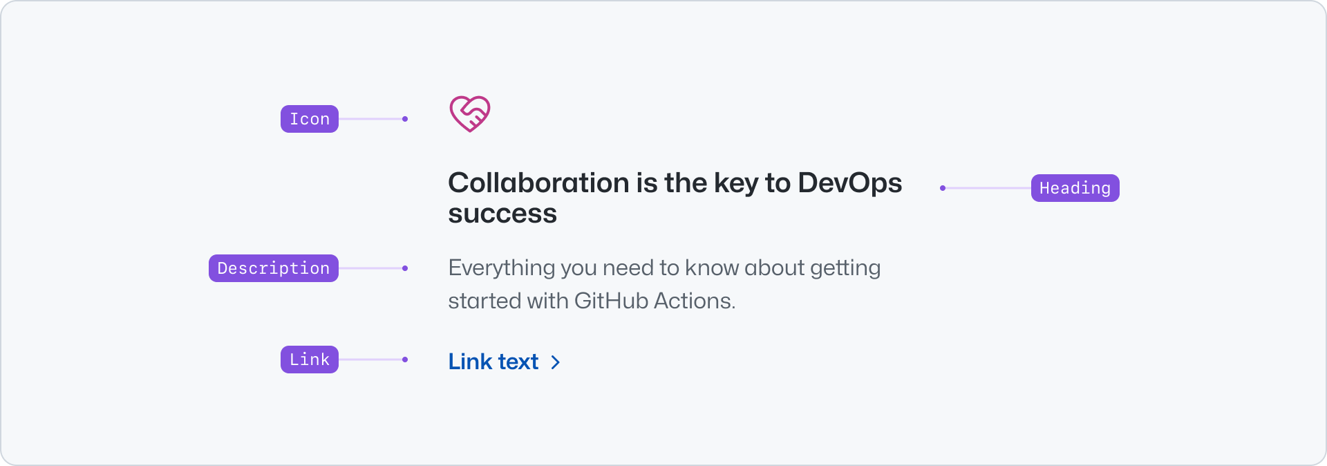
|
|
10
|
+
|
|
11
|
+
- Icon: An optional visual cue related to the content of the Pillar.
|
|
12
|
+
- Heading: The main title of the Pillar. It should be short and concise.
|
|
13
|
+
- Description: Short text that extends the information provided by the heading.
|
|
14
|
+
- Link: An optional link to extended the information.
|
|
15
|
+
|
|
16
|
+
## Usage
|
|
17
|
+
|
|
18
|
+
Use pillars to display a collection of features or benefits, making them easier to scan and read. Pillars present content in a familiar and recognizable style.
|
|
19
|
+
|
|
20
|
+
### Stacked
|
|
21
|
+
|
|
22
|
+
Stack multiple pillars to create a collection of items. Ensure that all the items in a group have consistent content lengths so that their width and height match, making the content more visually appealing. When displaying a visual, create a balanced layout by using the same type for each pillar, either an icon or an image.
|
|
23
|
+
|
|
24
|
+
**✅ Do**
|
|
25
|
+
|
|
26
|
+
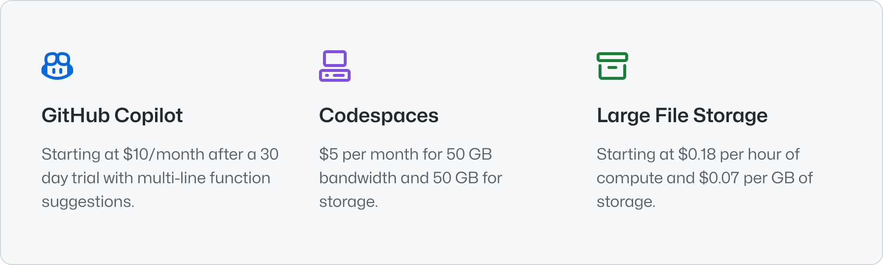
|
|
27
|
+
|
|
28
|
+
_Use similar character counts to achieve a visually balanced layout._
|
|
29
|
+
|
|
30
|
+
**❌ Don't**
|
|
31
|
+
|
|
32
|
+

|
|
33
|
+
|
|
34
|
+
_Avoid varying content lengths for the title and description._
|
|
35
|
+
|
|
36
|
+
> Use pillars with images only for groups of a maximum of three to six items. Avoid stacking multiple sections that each
|
|
37
|
+
> contain groups of six pillars.
|
|
38
|
+
|
|
39
|
+
**✅ Do**
|
|
40
|
+
|
|
41
|
+

|
|
42
|
+
|
|
43
|
+
_When using icons, add them to all pillars to create a visually balanced layout._
|
|
44
|
+
|
|
45
|
+
**❌ Don't**
|
|
46
|
+
|
|
47
|
+

|
|
48
|
+
|
|
49
|
+
_Don't use icons sparingly._
|
|
50
|
+
|
|
51
|
+
**✅ Do**
|
|
52
|
+
|
|
53
|
+
_When using images, add them to all pillars to create a visually balanced layout._
|
|
54
|
+
|
|
55
|
+
**❌ Don't**
|
|
56
|
+
|
|
57
|
+
_Don't use images with different aspect ratios._
|
|
58
|
+
|
|
59
|
+
When presenting more than four pillars, we recommend displaying them in multiple rows. You can use the [Grid](../../layout/Grid/index.md) or the [Stack](../../layout/Stack/index.md) component to achieve this. We recommend using a grid with three or four columns and balancing the number of pillars on each row.
|
|
60
|
+
|
|
61
|
+
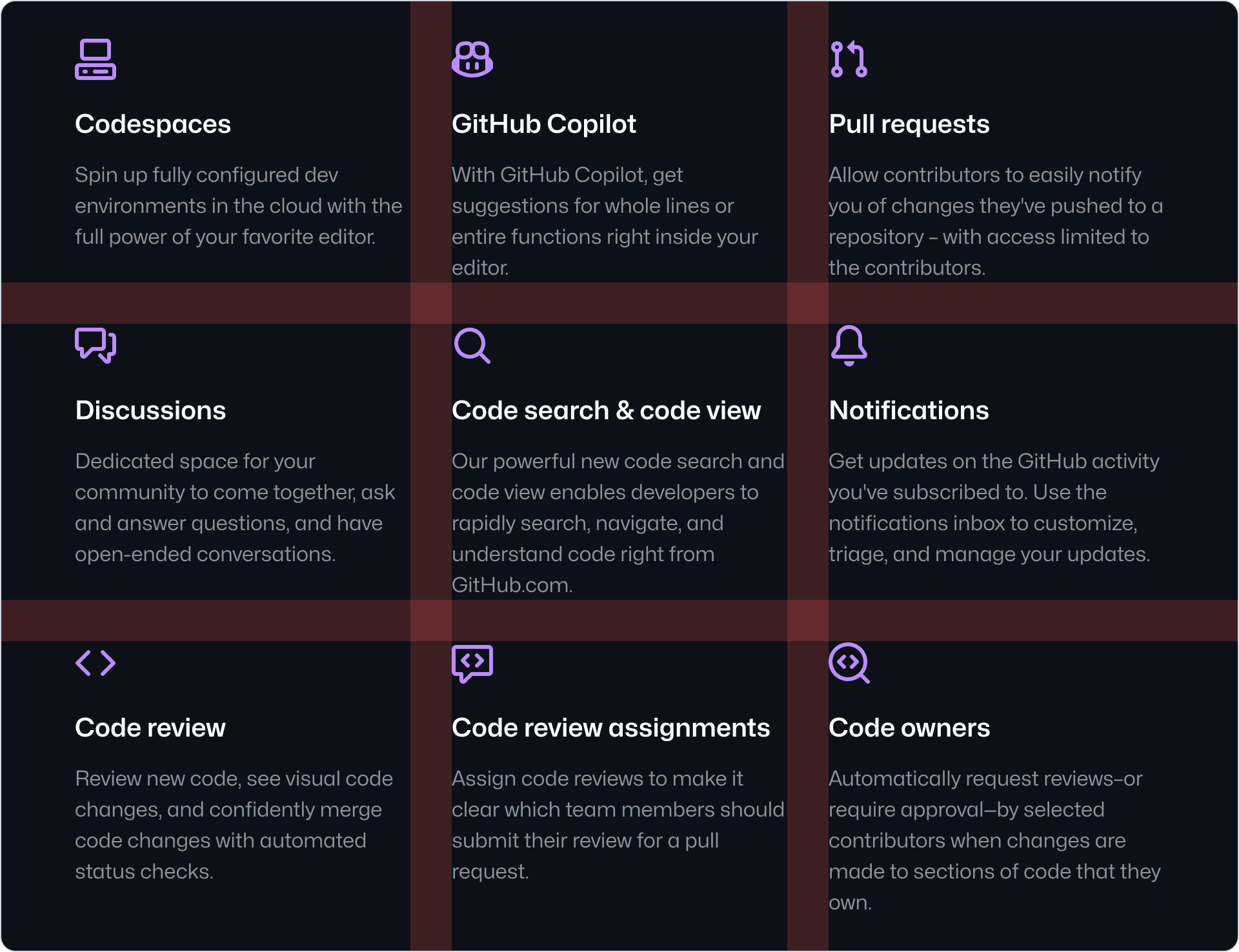
|
|
62
|
+
|
|
63
|
+
### Pillar and Card
|
|
64
|
+
|
|
65
|
+
Pillar and Card are both components that are used to present related and/or condensed information. They have distinct use-cases however, with the main differences between them being:
|
|
66
|
+
|
|
67
|
+
#### Interaction
|
|
68
|
+
|
|
69
|
+
Pillars are used mainly for non-interactive content and might include an optional link for extended information. On the other hand, Cards are primarily navigational elements.
|
|
70
|
+
|
|
71
|
+
#### Hierarchy
|
|
72
|
+
|
|
73
|
+
Cards should be used for noteworthy information to immediately draw user attention. Pillars, on the other hand, should be used for lower priority information compared to Cards.
|
|
74
|
+
|
|
75
|
+
#### Group size
|
|
76
|
+
|
|
77
|
+
Cards should be used in small groups of three to five items, while Pillars can accommodate larger groups of up to nine items, or six if using images. The more items in a group, the less distinctive each individual element becomes.
|
|
78
|
+
|
|
79
|
+
**✅ Do**
|
|
80
|
+
|
|
81
|
+
|
|
82
|
+
|
|
83
|
+
_Pillars are suitable for groups of up to six items._
|
|
84
|
+
|
|
85
|
+
**❌ Don't**
|
|
86
|
+
|
|
87
|
+

|
|
88
|
+
|
|
89
|
+
_Don't use Cards for groups of five or more items. Use them sparingly in groups of three or four._
|
|
90
|
+
|
|
91
|
+
## Options
|
|
92
|
+
|
|
93
|
+
### Align
|
|
94
|
+
|
|
95
|
+
Pillars can be aligned to the start or center of the container. Aligning to the start is the default and recommended behavior. Use center alignment only when displaying a maximum of 4 pillars and the overall page design calls for this alignment, so that the content is visually balanced and easy to scan.
|
|
96
|
+
|
|
97
|
+
**✅ Do**
|
|
98
|
+
|
|
99
|
+
|
|
100
|
+
|
|
101
|
+
_Center align pillars when in groups of 3 or 4 and if their title and descriptions are short._
|
|
102
|
+
|
|
103
|
+
**❌ Don't**
|
|
104
|
+
|
|
105
|
+

|
|
106
|
+
|
|
107
|
+
_Don't use center alignment when in groups of 5 or more._
|
|
108
|
+
|
|
109
|
+
## Related components
|
|
110
|
+
|
|
111
|
+
- [Card](../Card/index.md): To display navigational related content with higher visual weight.
|
|
112
|
+
- [River](../River/index.md): To display a list of content items with a visual asset.
|
|
113
|
+
- [CTABanner](../CTABanner/index.md): To display a single block of content to draw attention or create urgency around a user action.
|
|
114
|
+
- [UnorderedList](../UnorderedList/index.md) or the [OrderedList](../OrderedList/index.md): To display a list of plain content items.
|