@planningcenter/tapestry 4.14.0-rc.0 → 4.14.0
This diff represents the content of publicly available package versions that have been released to one of the supported registries. The information contained in this diff is provided for informational purposes only and reflects changes between package versions as they appear in their respective public registries.
- package/dist/components/DataTable/ActiveFilterInstance.d.ts +3 -3
- package/dist/components/DataTable/ActiveFilterInstance.d.ts.map +1 -1
- package/dist/components/DataTable/ActiveFilterInstance.js +5 -5
- package/dist/components/DataTable/ActiveFilterInstance.js.map +1 -1
- package/dist/components/DataTable/ActiveFilters.d.ts.map +1 -1
- package/dist/components/DataTable/ActiveFilters.js +3 -1
- package/dist/components/DataTable/ActiveFilters.js.map +1 -1
- package/dist/components/DataTable/DataTable.d.ts +27 -7
- package/dist/components/DataTable/DataTable.d.ts.map +1 -1
- package/dist/components/DataTable/DataTable.js +34 -5
- package/dist/components/DataTable/DataTable.js.map +1 -1
- package/dist/components/DataTable/DataTableColumn.d.ts +15 -3
- package/dist/components/DataTable/DataTableColumn.d.ts.map +1 -1
- package/dist/components/DataTable/DataTableColumnTypes.d.ts +2 -2
- package/dist/components/DataTable/DataTableColumnTypes.d.ts.map +1 -1
- package/dist/components/DataTable/DataTableColumnTypes.js +6 -12
- package/dist/components/DataTable/DataTableColumnTypes.js.map +1 -1
- package/dist/components/DataTable/FilterTypes.d.ts +2 -0
- package/dist/components/DataTable/FilterTypes.d.ts.map +1 -1
- package/dist/components/DataTable/RowActions.d.ts +7 -0
- package/dist/components/DataTable/RowActions.d.ts.map +1 -1
- package/dist/components/DataTable/RowActions.js +6 -3
- package/dist/components/DataTable/RowActions.js.map +1 -1
- package/dist/components/DataTable/TableActions.d.ts +5 -0
- package/dist/components/DataTable/TableActions.d.ts.map +1 -1
- package/dist/components/DataTable/TableActions.js +2 -1
- package/dist/components/DataTable/TableActions.js.map +1 -1
- package/dist/components/DataTable/ViewsBar.d.ts.map +1 -1
- package/dist/components/DataTable/ViewsBar.js +7 -1
- package/dist/components/DataTable/ViewsBar.js.map +1 -1
- package/dist/components/DataTable/dateFilter.d.ts +4 -2
- package/dist/components/DataTable/dateFilter.d.ts.map +1 -1
- package/dist/components/DataTable/dateFilter.js +22 -13
- package/dist/components/DataTable/dateFilter.js.map +1 -1
- package/dist/components/DataTable/dayFilter.d.ts.map +1 -1
- package/dist/components/DataTable/dayFilter.js +25 -22
- package/dist/components/DataTable/dayFilter.js.map +1 -1
- package/dist/components/DataTable/scopedFilter.d.ts +1 -1
- package/dist/components/DataTable/scopedFilter.d.ts.map +1 -1
- package/dist/components/DataTable/scopedFilter.js +56 -35
- package/dist/components/DataTable/scopedFilter.js.map +1 -1
- package/dist/components/DataTable/useSearchFilter.d.ts.map +1 -1
- package/dist/components/DataTable/useSearchFilter.js +2 -1
- package/dist/components/DataTable/useSearchFilter.js.map +1 -1
- package/dist/components/page-header/defineElements.js +1 -1
- package/dist/components/sidenav/defineElements.js +1 -1
- package/dist/index.d.ts +1 -0
- package/dist/index.d.ts.map +1 -1
- package/dist/index.js +1 -0
- package/dist/index.js.map +1 -1
- package/dist/packages/tapestry-wc/dist/components/{p-CBFtMIxJ.js → p-Bw5XJ46l.js} +2 -2
- package/dist/packages/tapestry-wc/dist/components/{p-CBFtMIxJ.js.map → p-Bw5XJ46l.js.map} +1 -1
- package/dist/packages/tapestry-wc/dist/components/{p-BbuNAv9q.js → p-C5B21uv6.js} +3 -3
- package/dist/packages/tapestry-wc/dist/components/{p-BbuNAv9q.js.map → p-C5B21uv6.js.map} +1 -1
- package/dist/packages/tapestry-wc/dist/components/{p-DNHgMtxw.js → p-D4oSihjy.js} +2 -2
- package/dist/packages/tapestry-wc/dist/components/{p-DNHgMtxw.js.map → p-D4oSihjy.js.map} +1 -1
- package/dist/packages/tapestry-wc/dist/components/{p-A1JK45WV.js → p-DZA99jMW.js} +3 -3
- package/dist/packages/tapestry-wc/dist/components/{p-A1JK45WV.js.map → p-DZA99jMW.js.map} +1 -1
- package/dist/packages/tapestry-wc/dist/components/{p-CY_DC4d_.js → p-Dt250a7E.js} +3 -3
- package/dist/packages/tapestry-wc/dist/components/{p-CY_DC4d_.js.map → p-Dt250a7E.js.map} +1 -1
- package/dist/packages/tapestry-wc/dist/components/tds-page-header-nav.js +2 -2
- package/dist/packages/tapestry-wc/dist/components/tds-page-header-nav.js.map +1 -1
- package/dist/packages/tapestry-wc/dist/components/tds-page-header.js +3 -3
- package/dist/packages/tapestry-wc/dist/components/tds-page-header.js.map +1 -1
- package/dist/packages/tapestry-wc/dist/components/tds-sidenav-item.js +3 -3
- package/dist/packages/tapestry-wc/dist/components/tds-sidenav-item.js.map +1 -1
- package/dist/packages/tapestry-wc/dist/components/tds-sidenav-responsive-header.js +2 -2
- package/dist/packages/tapestry-wc/dist/components/tds-sidenav-responsive-header.js.map +1 -1
- package/dist/packages/tapestry-wc/dist/components/tds-sidenav-section.js +3 -3
- package/dist/packages/tapestry-wc/dist/components/tds-sidenav-section.js.map +1 -1
- package/dist/packages/tapestry-wc/dist/components/tds-sidenav.js +5 -5
- package/dist/packages/tapestry-wc/dist/components/tds-sidenav.js.map +1 -1
- package/dist/reactRender.css +1629 -1629
- package/dist/reactRender.css.map +1 -1
- package/dist/reactRenderLegacy.css +1629 -1629
- package/dist/reactRenderLegacy.css.map +1 -1
- package/dist/tapestryMount.css +1629 -1629
- package/dist/tapestryMount.css.map +1 -1
- package/dist/tapestryMountLegacy.css +1629 -1629
- package/dist/tapestryMountLegacy.css.map +1 -1
- package/dist/unstable.js +1 -0
- package/dist/unstable.js.map +1 -1
- package/dist/utilities/dataHooks.d.ts +8 -0
- package/dist/utilities/dataHooks.d.ts.map +1 -0
- package/dist/utilities/dataHooks.js +7 -0
- package/dist/utilities/dataHooks.js.map +1 -0
- package/dist/utilities/locale.d.ts +25 -0
- package/dist/utilities/locale.d.ts.map +1 -0
- package/dist/utilities/locale.js +48 -0
- package/dist/utilities/locale.js.map +1 -0
- package/docs/accessibility/accessibility.md +62 -0
- package/docs/components/button-group.md +44 -0
- package/docs/components/button.md +78 -0
- package/docs/components/checkbox-group.md +51 -0
- package/docs/components/checkbox.md +55 -0
- package/docs/components/combo-box.md +68 -0
- package/docs/components/currency-input.md +50 -0
- package/docs/components/date-picker.md +67 -0
- package/docs/components/dropdown.md +74 -0
- package/docs/components/field.md +44 -0
- package/docs/components/flex.md +66 -0
- package/docs/components/input.md +62 -0
- package/docs/components/link.md +46 -0
- package/docs/components/modal.md +59 -0
- package/docs/components/number-stepper.md +50 -0
- package/docs/components/page-header.md +48 -0
- package/docs/components/popover.md +45 -0
- package/docs/components/radio-group.md +47 -0
- package/docs/components/radio.md +62 -0
- package/docs/components/search-input.md +46 -0
- package/docs/components/segmented-control.md +60 -0
- package/docs/components/select.md +62 -0
- package/docs/components/sidenav.md +36 -0
- package/docs/components/text-area.md +65 -0
- package/docs/components/time-field.md +62 -0
- package/docs/components/toggle-switch.md +56 -0
- package/docs/content/addressing-users-in-products.md +153 -0
- package/docs/content/browser-tabs.md +59 -0
- package/docs/content/capitalization.md +69 -0
- package/docs/content/date-formatting.md +145 -0
- package/docs/content/displaying-names.md +139 -0
- package/docs/content/editing-and-saving.md +95 -0
- package/docs/content/file-size-formatting.md +44 -0
- package/docs/content/household-ordering.md +127 -0
- package/docs/content/micro-copy.md +135 -0
- package/docs/content/prompts.md +271 -0
- package/docs/content/punctuation.md +71 -0
- package/docs/content/sharing-nomenclature.md +67 -0
- package/docs/content/timezones.md +108 -0
- package/docs/content/tooltip-usage.md +49 -0
- package/docs/content/use-of-emoji.md +63 -0
- package/docs/content/voice-and-tone.md +251 -0
- package/docs/design/design-tokens.md +70 -0
- package/docs/design/iconography.md +60 -0
- package/docs/design/layout.md +237 -0
- package/docs/design/mobile-design-principles.md +109 -0
- package/docs/design/pca-design-language.md +78 -0
- package/docs/design/typography.md +94 -0
- package/docs/get-started/design-system-philosophy.md +33 -0
- package/docs/llms.txt +119 -0
- package/package.json +7 -5
|
@@ -0,0 +1,237 @@
|
|
|
1
|
+
---
|
|
2
|
+
title: Layout
|
|
3
|
+
description: Layout foundations for Planning Center products, covering the 8px spacing grid, control heights, borders, responsive breakpoints, and the anatomy of a Rails view.
|
|
4
|
+
order: 40
|
|
5
|
+
---
|
|
6
|
+
|
|
7
|
+
# Layout
|
|
8
|
+
|
|
9
|
+
## Rules
|
|
10
|
+
|
|
11
|
+
- **Do** use the spacing tokens (`--t-spacing-*`) for padding, margins, and gaps.
|
|
12
|
+
- **Do** use the container size tokens (`--t-container-size-*`) for the height of controls.
|
|
13
|
+
- **Do** add borders on top of on-grid padding. Keep the padding at its token value.
|
|
14
|
+
- **Do** write media queries mobile-first with `min-width` at the Tapestry breakpoints.
|
|
15
|
+
- **Do** subtract 1px from the breakpoint value when you must use `max-width`.
|
|
16
|
+
- **Do** wrap Rails views in `.view`, keeping these containers limited to structure.
|
|
17
|
+
- **Don’t** use arbitrary off-grid spacing like 3px, 5px, 7px, or 9px. Pick the nearest spacing token instead.
|
|
18
|
+
- **Don’t** shave padding down to make room for a border. Let the border sit outside the grid.
|
|
19
|
+
|
|
20
|
+
## 8px grid
|
|
21
|
+
|
|
22
|
+
### Overview
|
|
23
|
+
|
|
24
|
+
Spacing in Planning Center products is built on an 8px grid. Using a shared scale gives layouts a consistent rhythm and makes components line up with each other.
|
|
25
|
+
|
|
26
|
+
### Spacing scale
|
|
27
|
+
|
|
28
|
+
Use the spacing tokens rather than raw pixel values. Most of the scale is a multiple of 8px. A few smaller steps cover the tight spots where 8px is too much.
|
|
29
|
+
|
|
30
|
+
| Token | Value |
|
|
31
|
+
| -------------------- | ----- |
|
|
32
|
+
| `--t-spacing-fourth` | 2px |
|
|
33
|
+
| `--t-spacing-half` | 4px |
|
|
34
|
+
| `--t-spacing-1` | 8px |
|
|
35
|
+
| `--t-spacing-1-half` | 12px |
|
|
36
|
+
| `--t-spacing-2` | 16px |
|
|
37
|
+
| `--t-spacing-3` | 24px |
|
|
38
|
+
| `--t-spacing-4` | 32px |
|
|
39
|
+
| `--t-spacing-5` | 40px |
|
|
40
|
+
| `--t-spacing-6` | 48px |
|
|
41
|
+
| `--t-spacing-7` | 56px |
|
|
42
|
+
|
|
43
|
+
The `Flex` component’s `gap` and padding props use this same scale (`0.25`, `0.5`, `1`, `1.5`, `2` … `7`).
|
|
44
|
+
|
|
45
|
+
### Control heights
|
|
46
|
+
|
|
47
|
+
Buttons, inputs, selects, and other single-line controls snap to fixed heights from the container size tokens. They set the height with `min-height` under `box-sizing: border-box`, so the border is included in the total.
|
|
48
|
+
|
|
49
|
+
| Token | Value |
|
|
50
|
+
| ----------------------- | ----- |
|
|
51
|
+
| `--t-container-size-xs` | 20px |
|
|
52
|
+
| `--t-container-size-sm` | 24px |
|
|
53
|
+
| `--t-container-size-md` | 32px |
|
|
54
|
+
| `--t-container-size-lg` | 40px |
|
|
55
|
+
| `--t-container-size-xl` | 48px |
|
|
56
|
+
|
|
57
|
+
The height is what lands on the grid. The text inside is vertically centered, and line-heights are unitless ratios (like `1.35` or `1.5`) set for readability, not for grid alignment.
|
|
58
|
+
|
|
59
|
+
### Borders
|
|
60
|
+
|
|
61
|
+
Borders sit on top of the grid. Padding keeps its spacing token value and the border adds to it.
|
|
62
|
+
|
|
63
|
+
For example, a `Pane` has a 1px border and `--t-spacing-3` (24px) of body padding, so its content starts 25px from the outer edge. A text input has `--t-spacing-1` (8px) of inline padding plus its 1px border.
|
|
64
|
+
|
|
65
|
+
We do this because:
|
|
66
|
+
|
|
67
|
+
- Padding values stay readable as tokens. There are no `calc(var(--t-spacing-1) - 1px)` adjustments to maintain.
|
|
68
|
+
- Border width can change, for a theme or a state, without touching spacing.
|
|
69
|
+
- At 1px, the extra offset isn’t noticeable. Alignment between neighboring components comes from shared tokens, not from pixel-perfect totals.
|
|
70
|
+
|
|
71
|
+
When a fixed outer size matters, like a control’s height, set it with a container size token and let `border-box` absorb the border.
|
|
72
|
+
|
|
73
|
+
👍 _Do_ keep padding on the token and add the border:
|
|
74
|
+
|
|
75
|
+
```css
|
|
76
|
+
.card {
|
|
77
|
+
padding: var(--t-spacing-3);
|
|
78
|
+
border: var(--t-border-width) solid var(--t-border-color);
|
|
79
|
+
}
|
|
80
|
+
```
|
|
81
|
+
|
|
82
|
+
👎 _Don’t_ subtract the border from the padding:
|
|
83
|
+
|
|
84
|
+
```css
|
|
85
|
+
.card {
|
|
86
|
+
padding: calc(var(--t-spacing-3) - 1px);
|
|
87
|
+
border: 1px solid var(--t-border-color);
|
|
88
|
+
}
|
|
89
|
+
```
|
|
90
|
+
|
|
91
|
+
### Status
|
|
92
|
+
|
|
93
|
+
_Progressive_: Use the spacing tokens on new work. Some older layouts use off-grid values. Update them when you’re already working in that area rather than retrofitting them on their own.
|
|
94
|
+
|
|
95
|
+
## Responsive breakpoints
|
|
96
|
+
|
|
97
|
+
Breakpoints are a set of minimum widths for various viewport sizes that we might want to apply layout changes to for responsive UI.
|
|
98
|
+
|
|
99
|
+
### Default breakpoints
|
|
100
|
+
|
|
101
|
+
Tapestry defines five mobile-first, responsive breakpoints:
|
|
102
|
+
|
|
103
|
+
| Size | Width |
|
|
104
|
+
| ---- | ------ |
|
|
105
|
+
| xs | 480px |
|
|
106
|
+
| sm | 600px |
|
|
107
|
+
| md | 720px |
|
|
108
|
+
| lg | 960px |
|
|
109
|
+
| xl | 1200px |
|
|
110
|
+
|
|
111
|
+
These are _simplified_ [Material breakpoints](https://material.io/design/layout/responsive-layout-grid.html#breakpoints). In React, the `Flex` component’s `responsive` prop takes overrides keyed by these sizes.
|
|
112
|
+
|
|
113
|
+
**Status: progressive.** Design and develop new layouts with these breakpoints. Some apps still use the old [Interfaces breakpoints](https://github.com/ministrycentered/interfaces/blob/master/app/assets/stylesheets/interfaces/mixin/respond.scss#L1-L6). Move to the Tapestry breakpoints on new layouts.
|
|
114
|
+
|
|
115
|
+
### Media queries
|
|
116
|
+
|
|
117
|
+
CSS Media Queries are the practical way of making your UI responsive. Because the breakpoints are mobile-first, they should be used with `min-width`.
|
|
118
|
+
|
|
119
|
+
```plain
|
|
120
|
+
@media (min-width: 480px)
|
|
121
|
+
@media (min-width: 600px)
|
|
122
|
+
@media (min-width: 720px)
|
|
123
|
+
@media (min-width: 960px)
|
|
124
|
+
@media (min-width: 1200px)
|
|
125
|
+
```
|
|
126
|
+
|
|
127
|
+
However, if you find yourself needing to reach for `max-width`, remember to subtract `1px` from the breakpoint value:
|
|
128
|
+
|
|
129
|
+
```plain
|
|
130
|
+
@media (max-width: 479px)
|
|
131
|
+
@media (max-width: 599px)
|
|
132
|
+
@media (max-width: 719px)
|
|
133
|
+
@media (max-width: 959px)
|
|
134
|
+
@media (max-width: 1199px)
|
|
135
|
+
```
|
|
136
|
+
|
|
137
|
+
## Anatomy of a view
|
|
138
|
+
|
|
139
|
+
### What’s a view?
|
|
140
|
+
|
|
141
|
+
The idea of a view should map pretty well to Rails view. Where a layout controls the shared UI of your application, views are the single pages set inside them.
|
|
142
|
+
The relationship looks like this, which shouldn’t be a surprise:
|
|
143
|
+
|
|
144
|
+
```plain
|
|
145
|
+
.layout
|
|
146
|
+
+-------------------------------------+
|
|
147
|
+
| .topbar |
|
|
148
|
+
+-------------------------------------+
|
|
149
|
+
| .view |
|
|
150
|
+
|+------------------------------------+
|
|
151
|
+
|| header |
|
|
152
|
+
|+-------------+----------------------+
|
|
153
|
+
|| .view_body |
|
|
154
|
+
||+-------------+---------------------+
|
|
155
|
+
||| aside | .view_content |
|
|
156
|
+
+++-------------+---------------------+
|
|
157
|
+
```
|
|
158
|
+
|
|
159
|
+
Let’s focus on the anatomy of a view:
|
|
160
|
+
|
|
161
|
+
```plain
|
|
162
|
+
.view
|
|
163
|
+
+------------------------------------+
|
|
164
|
+
| header |
|
|
165
|
+
+-------------+----------------------+
|
|
166
|
+
| .view_body |
|
|
167
|
+
|+-------------+---------------------+
|
|
168
|
+
|| aside | .view_content |
|
|
169
|
+
++-------------+---------------------+
|
|
170
|
+
```
|
|
171
|
+
|
|
172
|
+
#### `.view`
|
|
173
|
+
|
|
174
|
+
A dumb `flex` container. It _must_ wrap your view for the whole thing to work.
|
|
175
|
+
|
|
176
|
+
#### `header`
|
|
177
|
+
|
|
178
|
+
_Optional_ and can be any block element.
|
|
179
|
+
|
|
180
|
+
#### `view_body`
|
|
181
|
+
|
|
182
|
+
Another dumb container with smarts about `flex-direction` at the mobile breakpoint.
|
|
183
|
+
|
|
184
|
+
#### `aside`
|
|
185
|
+
|
|
186
|
+
_Optional_ and can be any block element.
|
|
187
|
+
|
|
188
|
+
#### `view_content`
|
|
189
|
+
|
|
190
|
+
Another dumb container that grows to fit any available space not claimed sibling block elements.
|
|
191
|
+
|
|
192
|
+
### What it used for?
|
|
193
|
+
|
|
194
|
+
The View object is a structure object for laying out a Rails views responsively. They may be used recursively.
|
|
195
|
+
|
|
196
|
+
#### “…structure object…”
|
|
197
|
+
|
|
198
|
+
Styles are limited to structure only. These containers do not concern themselves with content. Likewise, content should be self-containing and designed to put the full space of the bounding structure.
|
|
199
|
+
|
|
200
|
+
#### “…laying out Rails views”
|
|
201
|
+
|
|
202
|
+
This is the eventual container for _all_ Rails views, much like all Modal partials use the `.modal` container.
|
|
203
|
+
|
|
204
|
+
#### “…responsively”
|
|
205
|
+
|
|
206
|
+
```plain
|
|
207
|
+
.view (non-mobile) .view (mobile)
|
|
208
|
+
+------------------------------------+ +-------------------+
|
|
209
|
+
| header | | .view_header |
|
|
210
|
+
+------------------------------------+ +-------------------+
|
|
211
|
+
| .view_body | | .view_body |
|
|
212
|
+
|+-------------+---------------------+ |+------------------+
|
|
213
|
+
|| aside | .view_content | || aside |
|
|
214
|
+
|| | | |+------------------+
|
|
215
|
+
|| | | || .view_content |
|
|
216
|
+
++-------------+---------------------+ || |
|
|
217
|
+
|| |
|
|
218
|
+
++------------------+
|
|
219
|
+
```
|
|
220
|
+
|
|
221
|
+
#### “…used recursively”
|
|
222
|
+
|
|
223
|
+
```plain
|
|
224
|
+
.view
|
|
225
|
+
+----------------------------------------+
|
|
226
|
+
| header |
|
|
227
|
+
+-------------+--------------------------+
|
|
228
|
+
| .view_body |
|
|
229
|
+
|+-------------+-------------------------+
|
|
230
|
+
| aside | .view_content |
|
|
231
|
+
| |+------------------------+
|
|
232
|
+
| || .view |
|
|
233
|
+
| ||+-------+---------------+
|
|
234
|
+
| ||| aside | .view_body |
|
|
235
|
+
| ||| | |
|
|
236
|
+
++-------------+++-------+---------------+
|
|
237
|
+
```
|
|
@@ -0,0 +1,109 @@
|
|
|
1
|
+
---
|
|
2
|
+
title: Mobile design principles
|
|
3
|
+
description: A framework for deciding when Planning Center mobile apps should follow native platform patterns and when they should follow Planning Center conventions.
|
|
4
|
+
order: 50
|
|
5
|
+
---
|
|
6
|
+
|
|
7
|
+
# Mobile design principles
|
|
8
|
+
|
|
9
|
+
## Rules
|
|
10
|
+
|
|
11
|
+
- **Do** go native for navigation, system interactions, system dialogs, permissions, and settings.
|
|
12
|
+
- **Do** keep content, feature UI, workflows, terminology, and branding consistent with Planning Center.
|
|
13
|
+
- **Do** keep one primary button per view in a consistent location, generally fixed to the footer.
|
|
14
|
+
- **Do** maintain a minimum touch target of 48px, especially for icon buttons.
|
|
15
|
+
- **Do** match type scales, color tokens, and spacing between native and web views.
|
|
16
|
+
- **Don’t** stack bottom sheets or modals.
|
|
17
|
+
- **Don’t** use more than one floating action button per screen.
|
|
18
|
+
- **Don’t** add drag handles to bottom sheets except in extreme cases — size the sheet to its content.
|
|
19
|
+
|
|
20
|
+
## Native Patterns vs. Planning Center Consistency
|
|
21
|
+
|
|
22
|
+
### Core Decision Principles
|
|
23
|
+
|
|
24
|
+
#### 1. Navigation & System Interactions: Go Native
|
|
25
|
+
|
|
26
|
+
- Tab bars (iOS) vs bottom navigation (Android)
|
|
27
|
+
- Back button placement and behavior
|
|
28
|
+
- System-level gestures (swipe back on iOS)
|
|
29
|
+
- Share sheets and action menus
|
|
30
|
+
- Pull-to-refresh mechanics
|
|
31
|
+
- Materials, controls, and app icons
|
|
32
|
+
- Provide a universal navigation and search experience across platforms
|
|
33
|
+
- Adopt standard iconography and predictable action placement across platforms.
|
|
34
|
+
- FAB (floating action buttons) limit 1 per screen
|
|
35
|
+
|
|
36
|
+
_Why:_ Users have muscle memory for these patterns. Fighting them creates friction and feels broken.
|
|
37
|
+
|
|
38
|
+
#### 2. Content & Feature UI: Planning Center Way
|
|
39
|
+
|
|
40
|
+
- Card designs and layouts
|
|
41
|
+
- Data visualization styles
|
|
42
|
+
- Custom components (event cards, giving forms, check-in flows)
|
|
43
|
+
- Iconography within content areas
|
|
44
|
+
- Color usage and branding elements
|
|
45
|
+
|
|
46
|
+
_Why:_ This is where our product identity lives and where consistency can reduce cognitive load across platforms.
|
|
47
|
+
|
|
48
|
+
#### 3. Web Views: Acknowledge the Limitation
|
|
49
|
+
|
|
50
|
+
_Be transparent about transitions:_ Add subtle visual cues when moving between native and web views (even if it’s just a loading state that maintains native navigation).
|
|
51
|
+
|
|
52
|
+
_Optimize what you can control:_
|
|
53
|
+
|
|
54
|
+
- Match type scales between native and web
|
|
55
|
+
- Align color tokens between native and web
|
|
56
|
+
- Keep padding and spacing ratios consistent
|
|
57
|
+
- Ensure touch targets meet mobile minimums
|
|
58
|
+
|
|
59
|
+
## The Practical Framework
|
|
60
|
+
|
|
61
|
+
### Always Native
|
|
62
|
+
|
|
63
|
+
- _System bars_ (status, navigation)
|
|
64
|
+
- _Keyboards and input methods_
|
|
65
|
+
- _Alerts and system dialogs_
|
|
66
|
+
- _Permission requests_
|
|
67
|
+
- _App-level navigation_ (tabs, menu drawers)
|
|
68
|
+
- _Settings screens_
|
|
69
|
+
- _Platform-specific features_ (Face ID vs fingerprint, share extensions)
|
|
70
|
+
|
|
71
|
+
### Planning Center Consistent
|
|
72
|
+
|
|
73
|
+
- _Information architecture_ (same features in same places)
|
|
74
|
+
- _Core workflows_ (checking in a child should feel familiar regardless of platform)
|
|
75
|
+
- _Business logic and rules_
|
|
76
|
+
- _Terminology and labeling_
|
|
77
|
+
- _Data presentation formats_
|
|
78
|
+
- _Custom illustrations and empty states_
|
|
79
|
+
- _Feature-specific interactions_ (your unique swipe actions on lists, custom toggles)
|
|
80
|
+
|
|
81
|
+
### The Gray Zone (Case-by-Case)
|
|
82
|
+
|
|
83
|
+
- _Lists and tables:_ Use native list styles but Planning Center content styling
|
|
84
|
+
- _Forms:_ Native inputs with Planning Center validation and helper patterns
|
|
85
|
+
- _Modals vs sheets:_ Native presentation style, Planning Center content design
|
|
86
|
+
- _Loading states:_ Native spinners for system operations, custom for feature-specific loads
|
|
87
|
+
|
|
88
|
+
### Best practices
|
|
89
|
+
|
|
90
|
+
- Don’t stack bottom sheets or modals
|
|
91
|
+
- If you feel the need to stack sheets or modals, consider moving the contents of the first sheet to it’s own view or page
|
|
92
|
+
- Use drag handles on bottom sheets only in extreme cases. Size the sheet to the content.
|
|
93
|
+
- 1 primary button per view. Keep it in a consistent location (generally fixed to the footer).
|
|
94
|
+
- This is tricky with wrapped web views as the mobile context doesn’t control those contents. But we should maintain consistency of the mobile wrapper.
|
|
95
|
+
- Maintain a minimum touch target of 48px (a must for icon buttons). Apple HIG calls for 44px but we’ve opted for 48 for simplicity in designing across platforms.
|
|
96
|
+
- Keeping frequently used/primary actions thumb-reachable
|
|
97
|
+
- Touch interactions: pressed state for buttons (color change or reduced opacity), potentially using a loader in buttons when a longer load time is anticipated
|
|
98
|
+
|
|
99
|
+
### The One-Page Cheat Sheet
|
|
100
|
+
|
|
101
|
+
> “If the OS would reject our app for not doing it their way: Go Native”
|
|
102
|
+
>
|
|
103
|
+
> “If a customer would say ‘this is how Planning Center works’: **Planning Center Way**”
|
|
104
|
+
>
|
|
105
|
+
> _“If it’s in a web view: Make it the best mobile web it can be”_
|
|
106
|
+
|
|
107
|
+
## Real world
|
|
108
|
+
|
|
109
|
+
[PCA design language](https://planningcenter.github.io/tapestry/?path=/docs/design-pca-design-language--docs)
|
|
@@ -0,0 +1,78 @@
|
|
|
1
|
+
---
|
|
2
|
+
title: PCA design language
|
|
3
|
+
description: A mobile-first extension of Tapestry that gives native Planning Center app screens a distinct visual identity using gradients and translucency.
|
|
4
|
+
order: 60
|
|
5
|
+
---
|
|
6
|
+
|
|
7
|
+
# PCA design language
|
|
8
|
+
|
|
9
|
+
## Rules
|
|
10
|
+
|
|
11
|
+
- **Do** use this design language for native app screens and core mobile-first experiences.
|
|
12
|
+
- **Do** inherit Tapestry’s color tokens, typography scale, spacing, and interaction patterns (adapted for touch).
|
|
13
|
+
- **Do** use gradients in content areas and translucent tokens to create depth over them.
|
|
14
|
+
- **Do** keep native screens visually distinct from embedded web content.
|
|
15
|
+
- **Don’t** use this design language for product web views or complex administrative interfaces.
|
|
16
|
+
- **Don’t** treat it as a replacement for Tapestry — it extends it.
|
|
17
|
+
|
|
18
|
+
## Overview
|
|
19
|
+
|
|
20
|
+
The Planning Center app design language extends our Tapestry design system to create a distinct, mobile-first visual identity for native Planning Center experiences. While Tapestry was built primarily for desktop web applications, this mobile design language maintains visual coherence with Tapestry while adapting it for mobile-specific patterns and usability.
|
|
21
|
+
|
|
22
|
+
### Core concept
|
|
23
|
+
|
|
24
|
+
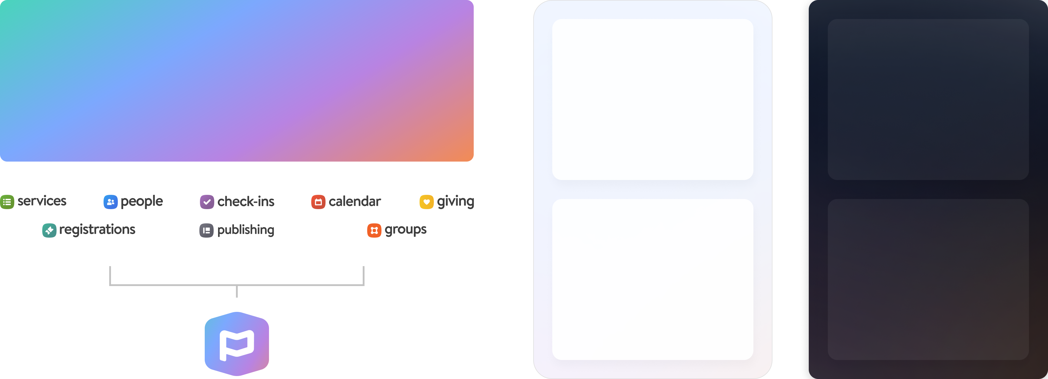
Native mobile screens sit a layer above web view pages, creating a hierarchy that distinguishes app-native experiences from embedded web content.
|
|
25
|
+
|
|
26
|
+
## Relationship to Tapestry
|
|
27
|
+
|
|
28
|
+
### What is inherited from Tapestry
|
|
29
|
+
|
|
30
|
+
- Core color tokens and semantic naming
|
|
31
|
+
- Typography scale and font families
|
|
32
|
+
- Fundamental spacing and layout principles
|
|
33
|
+
- Component interaction patterns (adapted for touch)
|
|
34
|
+
|
|
35
|
+
### What is different from Tapestry
|
|
36
|
+
|
|
37
|
+
- _Gradient integration_: Gradients are used throughout content areas, not just in branding moments
|
|
38
|
+
- _Translucency_: Translucent tokens create depth and layering over gradients
|
|
39
|
+
- _Mobile-specific patterns_: Follows our mobile design patterns
|
|
40
|
+
|
|
41
|
+
|
|
42
|
+
|
|
43
|
+
## Implementation principles
|
|
44
|
+
|
|
45
|
+
### When to use this design language
|
|
46
|
+
|
|
47
|
+
✅ _Use for:_
|
|
48
|
+
|
|
49
|
+
- Native app screens and features
|
|
50
|
+
- Core mobile-first experiences
|
|
51
|
+
|
|
52
|
+
❌ _Don’t use for:_
|
|
53
|
+
|
|
54
|
+
- Product web views
|
|
55
|
+
- Complex administrative interfaces
|
|
56
|
+
|
|
57
|
+
### Design Decisions Framework
|
|
58
|
+
|
|
59
|
+
When designing a new mobile screen, ask:
|
|
60
|
+
|
|
61
|
+
1. Is this a native mobile experience?
|
|
62
|
+
2. Would this screen benefit from mobile-specific styling or interaction patterns?
|
|
63
|
+
3. Does this screen have sufficient usage to warrant native mobile investment?
|
|
64
|
+
|
|
65
|
+
## Goals & success criteria
|
|
66
|
+
|
|
67
|
+
### What this design language hopes to achieve
|
|
68
|
+
|
|
69
|
+
- _Brand distinction_: Planning Center mobile experiences feel cohesive and premium
|
|
70
|
+
- _Visual hierarchy_: Clear separation between native and web content
|
|
71
|
+
- _Mobile optimization_: All patterns built for touch-first interaction
|
|
72
|
+
- _System coherence_: Extends rather than replaces Tapestry
|
|
73
|
+
|
|
74
|
+
### What Success Looks Like
|
|
75
|
+
|
|
76
|
+
- Users recognize Planning Center mobile experiences as distinct and polished
|
|
77
|
+
- Engineers can implement with clear token guidance
|
|
78
|
+
- Design scales consistently across new mobile features
|
|
@@ -0,0 +1,94 @@
|
|
|
1
|
+
---
|
|
2
|
+
title: Typography
|
|
3
|
+
description: Planning Center’s progressive font scale and font weight guidelines for creating consistent visual hierarchy and readability.
|
|
4
|
+
order: 20
|
|
5
|
+
---
|
|
6
|
+
|
|
7
|
+
# Typography
|
|
8
|
+
|
|
9
|
+
## Rules
|
|
10
|
+
|
|
11
|
+
- **Do** use the progressive font scale from the Figma library for standard text hierarchy.
|
|
12
|
+
- **Do** use 400 (Normal) for body text and 700 (Strong) for headings and emphasis.
|
|
13
|
+
- **Do** use 500 or 600 when 700 feels too heavy, such as in small titles.
|
|
14
|
+
- **Do** handle hero text above 28px with inline styles, using 8px increments when possible.
|
|
15
|
+
- **Do** shift the scale base for compressed views while keeping the progressive increments.
|
|
16
|
+
- **Don’t** use font sizes off the scale unless you are handling an exception.
|
|
17
|
+
- **Don’t** use weights below 400 or above 700 for standard UI text.
|
|
18
|
+
- **Don’t** retrofit old layouts — apply the scale to new work.
|
|
19
|
+
|
|
20
|
+
## Overview
|
|
21
|
+
|
|
22
|
+
Planning Center’s typography system creates visual hierarchy and readability through a consistent font scale and weight system. The progressive scale ensures predictable sizing across products while allowing flexibility for special cases and alternate contexts.
|
|
23
|
+
|
|
24
|
+
## Principles
|
|
25
|
+
|
|
26
|
+
- Use the progressive font scale based on stepped increments
|
|
27
|
+
- Maintain minimum weight of 400 (Normal) and maximum weight of 700 (Strong) for most cases
|
|
28
|
+
- Apply progressively to new layouts without retrofitting old ones
|
|
29
|
+
- Allow exceptions for hero text and compressed views with inline styles or alternate scales
|
|
30
|
+
|
|
31
|
+
## Font Scale
|
|
32
|
+
|
|
33
|
+
### Titles
|
|
34
|
+
|
|
35
|
+
| Style | Size | Line height | Weights |
|
|
36
|
+
| ------------------------------------------------------------------ | ---------------------------- | ----------- | -------------------------- |
|
|
37
|
+
| <span style="font-size: 28px; line-height: 1.4em;">Title LG</span> | `28px` (`--t-font-size-3xl`) | `1.4em` | `400`, `500`, `600`, `700` |
|
|
38
|
+
| <span style="font-size: 24px; line-height: 1.4em;">Title MD</span> | `24px` (`--t-font-size-2xl`) | `1.4em` | `400`, `500`, `600`, `700` |
|
|
39
|
+
| <span style="font-size: 20px; line-height: 1.4em;">Title SM</span> | `20px` (`--t-font-size-xl`) | `1.4em` | `400`, `500`, `600`, `700` |
|
|
40
|
+
| <span style="font-size: 18px; line-height: 1.4em;">Title XS</span> | `18px` (`--t-font-size-lg`) | `1.4em` | `400`, `500`, `600`, `700` |
|
|
41
|
+
|
|
42
|
+
### Text
|
|
43
|
+
|
|
44
|
+
| Style | Size | Line height | Weights |
|
|
45
|
+
| ------------------------------------------------------------------- | ---------------------------- | ----------- | -------------------------- |
|
|
46
|
+
| <span style="font-size: 18px; line-height: 1.4em;">Text LG</span> | `18px` (`--t-font-size-lg`) | `1.4em` | `400`, `500`, `600`, `700` |
|
|
47
|
+
| <span style="font-size: 16px; line-height: 1.4em;">Text MD</span> | `16px` (`--t-font-size-md`) | `1.4em` | `400`, `500`, `600`, `700` |
|
|
48
|
+
| <span style="font-size: 14px; line-height: 1.35em;">Text SM</span> | `14px` (`--t-font-size-sm`) | `1.35em` | `400`, `500`, `600`, `700` |
|
|
49
|
+
| <span style="font-size: 12px; line-height: 1.3em;">Text XS</span> | `12px` (`--t-font-size-xs`) | `1.3em` | `400`, `500`, `600`, `700` |
|
|
50
|
+
| <span style="font-size: 10px; line-height: 1.25em;">Text XXS</span> | `10px` (`--t-font-size-2xs`) | `1.25em` | `400`, `500`, `600`, `700` |
|
|
51
|
+
|
|
52
|
+
### Subtitles (exploratory)
|
|
53
|
+
|
|
54
|
+
| Style | Size | Line height | Weights |
|
|
55
|
+
| --------------------------------------------------------------------- | ---------------------------- | ----------- | ------------------- |
|
|
56
|
+
| <span style="font-size: 24px; line-height: 1.4em;">Subtitle LG</span> | `24px` (`--t-font-size-2xl`) | `1.4em` | `400`, `500`, `600` |
|
|
57
|
+
| <span style="font-size: 20px; line-height: 1.4em;">Subtitle MD</span> | `20px` (`--t-font-size-xl`) | `1.4em` | `400`, `500`, `600` |
|
|
58
|
+
| <span style="font-size: 18px; line-height: 1.4em;">Subtitle SM</span> | `18px` (`--t-font-size-lg`) | `1.4em` | `400`, `500`, `600` |
|
|
59
|
+
| <span style="font-size: 16px; line-height: 1.4em;">Subtitle XS</span> | `16px` (`--t-font-size-md`) | `1.4em` | `400`, `500`, `600` |
|
|
60
|
+
|
|
61
|
+
### Monospace
|
|
62
|
+
|
|
63
|
+
| Style | Size | Line height | Weights |
|
|
64
|
+
| ------------------------------------------------------------------------------------------------------------ | --------------------------- | ----------- | ------- |
|
|
65
|
+
| <span style="font-size: 18px; line-height: 1.4em; font-family: var(--t-font-monospace);">Text Mono LG</span> | `18px` (`--t-font-size-lg`) | `1.4em` | `400` |
|
|
66
|
+
| <span style="font-size: 16px; line-height: 1.4em; font-family: var(--t-font-monospace);">Text Mono MD</span> | `16px` (`--t-font-size-md`) | `1.4em` | `400` |
|
|
67
|
+
| <span style="font-size: 14px; line-height: 1.4em; font-family: var(--t-font-monospace);">Text Mono SM</span> | `14px` (`--t-font-size-sm`) | `1.4em` | `400` |
|
|
68
|
+
| <span style="font-size: 12px; line-height: 1.4em; font-family: var(--t-font-monospace);">Text Mono XS</span> | `12px` (`--t-font-size-xs`) | `1.4em` | `400` |
|
|
69
|
+
|
|
70
|
+
## Usage
|
|
71
|
+
|
|
72
|
+
### Guidelines
|
|
73
|
+
|
|
74
|
+
#### Standard font scale
|
|
75
|
+
|
|
76
|
+
Use the progressive font scale from the Figma library for consistent hierarchy. The scale provides stepped increments that create clear visual relationships between heading levels, body text, and supporting text.
|
|
77
|
+
|
|
78
|
+
#### Exceptions for hero text
|
|
79
|
+
|
|
80
|
+
Hero text and other large display text can exceed the largest size on the scale, 28px. Handle these exceptions with inline styles (e.g., `style="font-size: 54px"`). For sizes larger than the listed scale, stick to 8px increments when possible, though designers have latitude to use judgment based on context.
|
|
81
|
+
|
|
82
|
+
#### Alternate scales for compressed views
|
|
83
|
+
|
|
84
|
+
When a different base is required (such as compressed views), shift the base within the provided values while maintaining the progressive increments. For example, in a compressed view, your base could be 14px with the scale continuing as [0] 14px Base, [1] 16px, [2] 18px, and so on.
|
|
85
|
+
|
|
86
|
+
#### Font weight guidelines
|
|
87
|
+
|
|
88
|
+
Font weight selection depends on context, contrast, and color. These are suggestions rather than rigid rules:
|
|
89
|
+
|
|
90
|
+
_Normal (400):_ Recommended for standard body text and the minimum overall weight used in products.
|
|
91
|
+
|
|
92
|
+
_Strong (700):_ Recommended for strong body text, headings, and the maximum overall weight used in products.
|
|
93
|
+
|
|
94
|
+
_Medium (500) and Semibold (600):_ May be used on a case-by-case basis, especially in smaller titles where 700 may feel too heavy or when additional hierarchy is needed between 400 and 700.
|
|
@@ -0,0 +1,33 @@
|
|
|
1
|
+
---
|
|
2
|
+
title: Design system philosophy
|
|
3
|
+
description: How to treat Planning Center’s design systems as guidelines rather than rigid constraints, and when and how to propose work outside them.
|
|
4
|
+
order: 20
|
|
5
|
+
---
|
|
6
|
+
|
|
7
|
+
# Design system philosophy
|
|
8
|
+
|
|
9
|
+
## Rules
|
|
10
|
+
|
|
11
|
+
- **Do** start with existing components and in-product patterns.
|
|
12
|
+
- **Do** propose a new pattern when it would better serve users, and bring it up for discussion with the right people for your role.
|
|
13
|
+
- **Do** focus on solving real customer problems so the system evolves meaningfully.
|
|
14
|
+
- **Do** treat the shipped product as the source of truth, not Figma.
|
|
15
|
+
- **Don’t** treat the system as rigid rules or expect it to cover every use case.
|
|
16
|
+
- **Don’t** break patterns alone — evaluate it with your team.
|
|
17
|
+
|
|
18
|
+
## Guidelines, not rigid constraints
|
|
19
|
+
|
|
20
|
+
Our design systems (Tapestry, Doxy) are meant to empower, not restrict. The system should solve most use cases, but it isn’t meant to cover everything. It’s a living thing that we expect to change with technology and user needs.
|
|
21
|
+
|
|
22
|
+
## Who to talk to
|
|
23
|
+
|
|
24
|
+
When a new pattern would better serve users, bring it up for discussion:
|
|
25
|
+
|
|
26
|
+
- Triad or UXE? Discuss with your product UXD.
|
|
27
|
+
- UXD? Discuss with the UX team in a review, or in the #ux-designers Slack channel.
|
|
28
|
+
- DE? Discuss with the UX System lead for Tapestry.
|
|
29
|
+
|
|
30
|
+
## Figma and the product
|
|
31
|
+
|
|
32
|
+
- Figma is one communication tool among many. It shows a UX and product vision, but what customers use is the source of truth.
|
|
33
|
+
- Design implementation needs ongoing conversation between designers and developers.
|