playbook_ui_docs 13.10.0 → 13.11.1.pre.alpha.play900startratingasinput1530
This diff represents the content of publicly available package versions that have been released to one of the supported registries. The information contained in this diff is provided for informational purposes only and reflects changes between package versions as they appear in their respective public registries.
- checksums.yaml +4 -4
- data/app/pb_kits/playbook/pb_button/docs/_button_circle_swift.md +28 -0
- data/app/pb_kits/playbook/pb_button/docs/_button_default_swift.md +23 -0
- data/app/pb_kits/playbook/pb_button/docs/_button_full_width_swift.md +9 -0
- data/app/pb_kits/playbook/pb_button/docs/_button_icon_options_swift.md +18 -0
- data/app/pb_kits/playbook/pb_button/docs/_button_props_swift.md +11 -0
- data/app/pb_kits/playbook/pb_button/docs/_button_size_swift.md +20 -0
- data/app/pb_kits/playbook/pb_button/docs/example.yml +8 -0
- data/app/pb_kits/playbook/pb_card/docs/_card_background_swift.md +29 -0
- data/app/pb_kits/playbook/pb_card/docs/_card_border_none_swift.md +7 -0
- data/app/pb_kits/playbook/pb_card/docs/_card_border_radius_swift.md +33 -0
- data/app/pb_kits/playbook/pb_card/docs/_card_header_swift.md +33 -0
- data/app/pb_kits/playbook/pb_card/docs/_card_highlight_swift.md +17 -0
- data/app/pb_kits/playbook/pb_card/docs/_card_light_swift.md +7 -0
- data/app/pb_kits/playbook/pb_card/docs/_card_padding_swift.md +33 -0
- data/app/pb_kits/playbook/pb_card/docs/_card_props_swift.md +10 -0
- data/app/pb_kits/playbook/pb_card/docs/_card_selected_swift.md +0 -0
- data/app/pb_kits/playbook/pb_card/docs/_card_separator_swift.md +11 -0
- data/app/pb_kits/playbook/pb_card/docs/_card_shadow_swift.md +21 -0
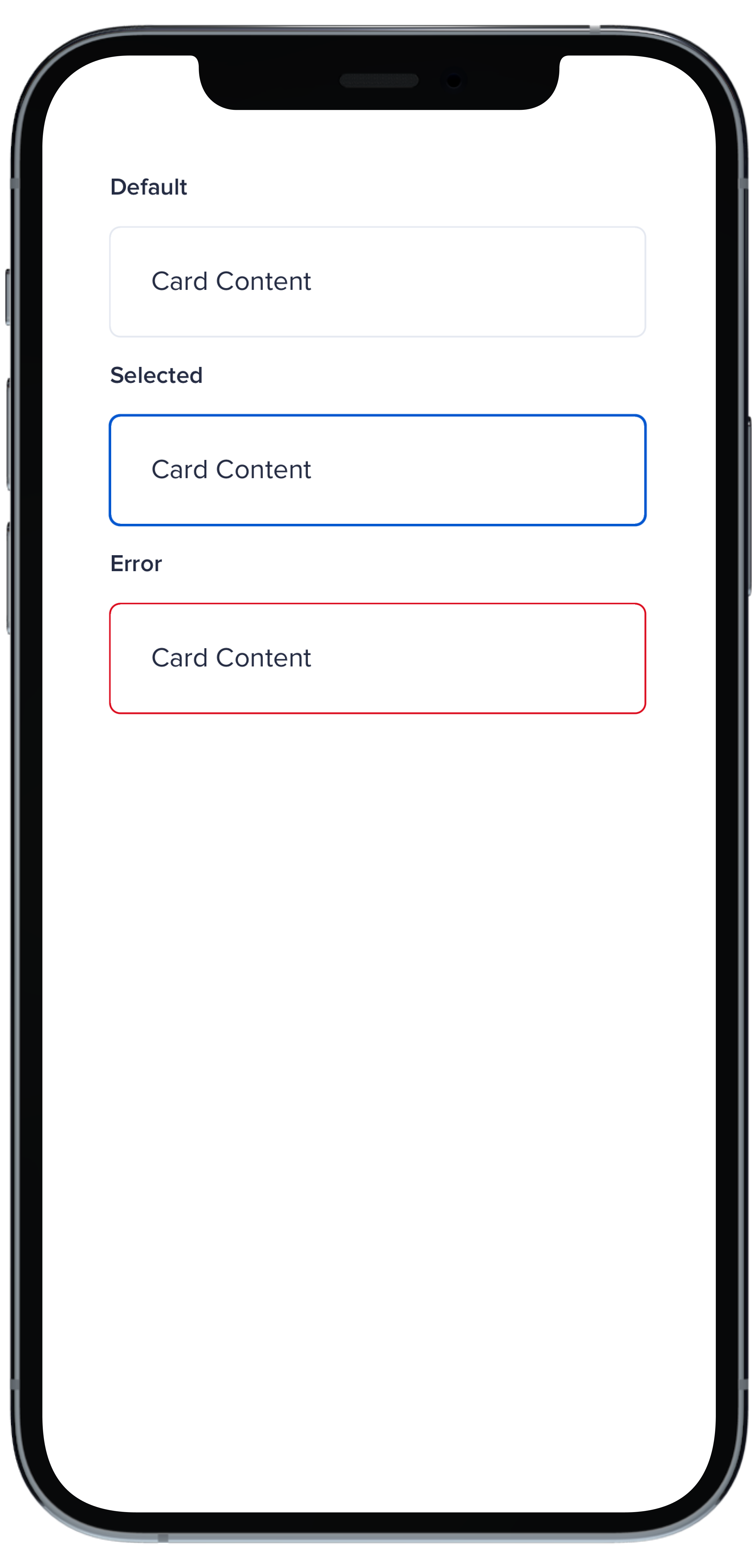
- data/app/pb_kits/playbook/pb_card/docs/_card_styles_swift.md +17 -0
- data/app/pb_kits/playbook/pb_card/docs/_card_tag_swift.md +0 -0
- data/app/pb_kits/playbook/pb_card/docs/example.yml +12 -0
- data/app/pb_kits/playbook/pb_checkbox/docs/_checkbox_default_swift.md +10 -0
- data/app/pb_kits/playbook/pb_checkbox/docs/_checkbox_error_swift.md +12 -0
- data/app/pb_kits/playbook/pb_checkbox/docs/_checkbox_indeterminate_swift.md +12 -0
- data/app/pb_kits/playbook/pb_checkbox/docs/_checkbox_props_swift.md +7 -0
- data/app/pb_kits/playbook/pb_checkbox/docs/example.yml +7 -0
- data/app/pb_kits/playbook/pb_collapsible/docs/_collapsible_external_controls.html.erb +22 -0
- data/app/pb_kits/playbook/pb_collapsible/docs/_collapsible_external_controls.md +3 -0
- data/app/pb_kits/playbook/pb_collapsible/docs/_collapsible_external_controls_multiple.html.erb +40 -0
- data/app/pb_kits/playbook/pb_collapsible/docs/_collapsible_external_controls_multiple.md +1 -0
- data/app/pb_kits/playbook/pb_collapsible/docs/example.yml +2 -0
- data/app/pb_kits/playbook/pb_icon/docs/_icon_border_swift.md +7 -0
- data/app/pb_kits/playbook/pb_icon/docs/_icon_default_swift.md +7 -0
- data/app/pb_kits/playbook/pb_icon/docs/_icon_flip_swift.md +11 -0
- data/app/pb_kits/playbook/pb_icon/docs/_icon_props_swift.md +8 -0
- data/app/pb_kits/playbook/pb_icon/docs/_icon_rotate_swift.md +11 -0
- data/app/pb_kits/playbook/pb_icon/docs/_icon_sizes_swift.md +46 -0
- data/app/pb_kits/playbook/pb_icon/docs/example.yml +8 -0
- data/app/pb_kits/playbook/pb_icon_circle/docs/_icon_circle_color_props.md +6 -0
- data/app/pb_kits/playbook/pb_icon_circle/docs/_icon_circle_color_swift.md +16 -0
- data/app/pb_kits/playbook/pb_icon_circle/docs/_icon_circle_defaul_swift.md +7 -0
- data/app/pb_kits/playbook/pb_icon_circle/docs/_icon_circle_sizes_swift.md +11 -0
- data/app/pb_kits/playbook/pb_icon_circle/docs/example.yml +7 -0
- data/app/pb_kits/playbook/pb_image/docs/_image_props_swift.md +7 -0
- data/app/pb_kits/playbook/pb_image/docs/_rounded_image_swift.md +47 -0
- data/app/pb_kits/playbook/pb_image/docs/_size_image_swift.md +47 -0
- data/app/pb_kits/playbook/pb_image/docs/_size_none_image_swift.md +15 -0
- data/app/pb_kits/playbook/pb_image/docs/example.yml +5 -0
- data/app/pb_kits/playbook/pb_label_value/docs/_label_value_default_swift.md +11 -0
- data/app/pb_kits/playbook/pb_label_value/docs/_label_value_details_examples_swift.md +72 -0
- data/app/pb_kits/playbook/pb_label_value/docs/_label_value_details_swift.md +41 -0
- data/app/pb_kits/playbook/pb_label_value/docs/_label_value_props_swift.md +11 -0
- data/app/pb_kits/playbook/pb_label_value/docs/example.yml +6 -0
- data/app/pb_kits/playbook/pb_message/docs/_message_default_swift.md +57 -0
- data/app/pb_kits/playbook/pb_message/docs/_message_props_swift.md +12 -0
- data/app/pb_kits/playbook/pb_message/docs/example.yml +4 -0
- data/app/pb_kits/playbook/pb_multi_level_select/docs/_multi_level_select_selected_ids.html.erb +0 -1
- data/app/pb_kits/playbook/pb_multi_level_select/docs/_multi_level_select_single.html.erb +104 -45
- data/app/pb_kits/playbook/pb_multi_level_select/docs/_multi_level_select_single.jsx +100 -43
- data/app/pb_kits/playbook/pb_multi_level_select/docs/_multi_level_select_single.md +1 -0
- data/app/pb_kits/playbook/pb_multi_level_select/docs/_multi_level_select_single_children_only.html.erb +138 -0
- data/app/pb_kits/playbook/pb_multi_level_select/docs/_multi_level_select_single_children_only.jsx +150 -0
- data/app/pb_kits/playbook/pb_multi_level_select/docs/_multi_level_select_single_children_only.md +1 -0
- data/app/pb_kits/playbook/pb_multi_level_select/docs/example.yml +2 -0
- data/app/pb_kits/playbook/pb_multi_level_select/docs/index.js +1 -0
- data/app/pb_kits/playbook/pb_rich_text_editor/docs/_rich_text_editor_toolbar_disabled.jsx +33 -0
- data/app/pb_kits/playbook/pb_rich_text_editor/docs/_rich_text_editor_toolbar_disabled.md +3 -0
- data/app/pb_kits/playbook/pb_rich_text_editor/docs/example.yml +1 -0
- data/app/pb_kits/playbook/pb_rich_text_editor/docs/index.js +2 -1
- data/app/pb_kits/playbook/pb_star_rating/docs/_star_rating_color_options.html.erb +7 -0
- data/app/pb_kits/playbook/pb_star_rating/docs/_star_rating_color_options.jsx +40 -0
- data/app/pb_kits/playbook/pb_star_rating/docs/_star_rating_default.html.erb +11 -1
- data/app/pb_kits/playbook/pb_star_rating/docs/_star_rating_default.jsx +17 -2
- data/app/pb_kits/playbook/pb_star_rating/docs/_star_rating_hide.html.erb +6 -1
- data/app/pb_kits/playbook/pb_star_rating/docs/_star_rating_hide.jsx +22 -5
- data/app/pb_kits/playbook/pb_star_rating/docs/_star_rating_number_config.html.erb +12 -0
- data/app/pb_kits/playbook/pb_star_rating/docs/_star_rating_number_config.jsx +57 -0
- data/app/pb_kits/playbook/pb_star_rating/docs/_star_rating_size_options.html.erb +23 -0
- data/app/pb_kits/playbook/pb_star_rating/docs/_star_rating_size_options.jsx +59 -0
- data/app/pb_kits/playbook/pb_star_rating/docs/example.yml +10 -5
- data/app/pb_kits/playbook/pb_star_rating/docs/index.js +6 -0
- data/app/pb_kits/playbook/pb_table/docs/_table_header.html.erb +47 -31
- data/app/pb_kits/playbook/pb_table/docs/_table_header.md +5 -0
- data/app/pb_kits/playbook/pb_tooltip/docs/_tooltip_default.html.erb +1 -1
- data/app/pb_kits/playbook/pb_tooltip/docs/_tooltip_default_react.jsx +0 -2
- data/app/pb_kits/playbook/pb_tooltip/docs/_tooltip_delay.jsx +0 -1
- data/app/pb_kits/playbook/pb_tooltip/docs/_tooltip_interaction.jsx +0 -1
- data/app/pb_kits/playbook/pb_tooltip/docs/_tooltip_margin.jsx +0 -1
- data/app/pb_kits/playbook/pb_tooltip/docs/_tooltip_selectors.html.erb +1 -1
- data/app/pb_kits/playbook/pb_tooltip/docs/_tooltip_show_tooltip.html.erb +39 -0
- data/app/pb_kits/playbook/pb_tooltip/docs/_tooltip_show_tooltip.md +5 -0
- data/app/pb_kits/playbook/pb_tooltip/docs/_tooltip_show_tooltip_react.jsx +45 -0
- data/app/pb_kits/playbook/pb_tooltip/docs/_tooltip_show_tooltip_react.md +3 -0
- data/app/pb_kits/playbook/pb_tooltip/docs/example.yml +3 -0
- data/app/pb_kits/playbook/pb_tooltip/docs/index.js +1 -0
- data/dist/app/components/playbook/pb_docs/kit_example.html.erb +3 -3
- data/dist/menu.yml +284 -110
- data/dist/pb_doc_helper.rb +5 -5
- data/dist/playbook-doc.js +8 -8
- metadata +70 -7
checksums.yaml
CHANGED
|
@@ -1,7 +1,7 @@
|
|
|
1
1
|
---
|
|
2
2
|
SHA256:
|
|
3
|
-
metadata.gz:
|
|
4
|
-
data.tar.gz:
|
|
3
|
+
metadata.gz: bcb6e2d4e402fb9dc2a31c2ed7f4de54261939ac25ed748bf940d9a886842806
|
|
4
|
+
data.tar.gz: b71718f353abc27312a7365debd7d21be1180f42d7fb36edf33b4eceb6411ed1
|
|
5
5
|
SHA512:
|
|
6
|
-
metadata.gz:
|
|
7
|
-
data.tar.gz:
|
|
6
|
+
metadata.gz: d19bed2d987dbd19b39fded39bad4e08b138eb68d75f94b884dbf8c30e7194069f9809f3721be611a60c02e7259265b3b02910465ff7f3a4e7ba5665c2e84af2
|
|
7
|
+
data.tar.gz: 217a761c4352a139e8636f7ed6161bdb91e8f1740c7f57ad2316e63469b7e797ea2cdc064e296b0621ceac4930e43b5fa33dbdaf4122e832dd321cdfa56ee271
|
|
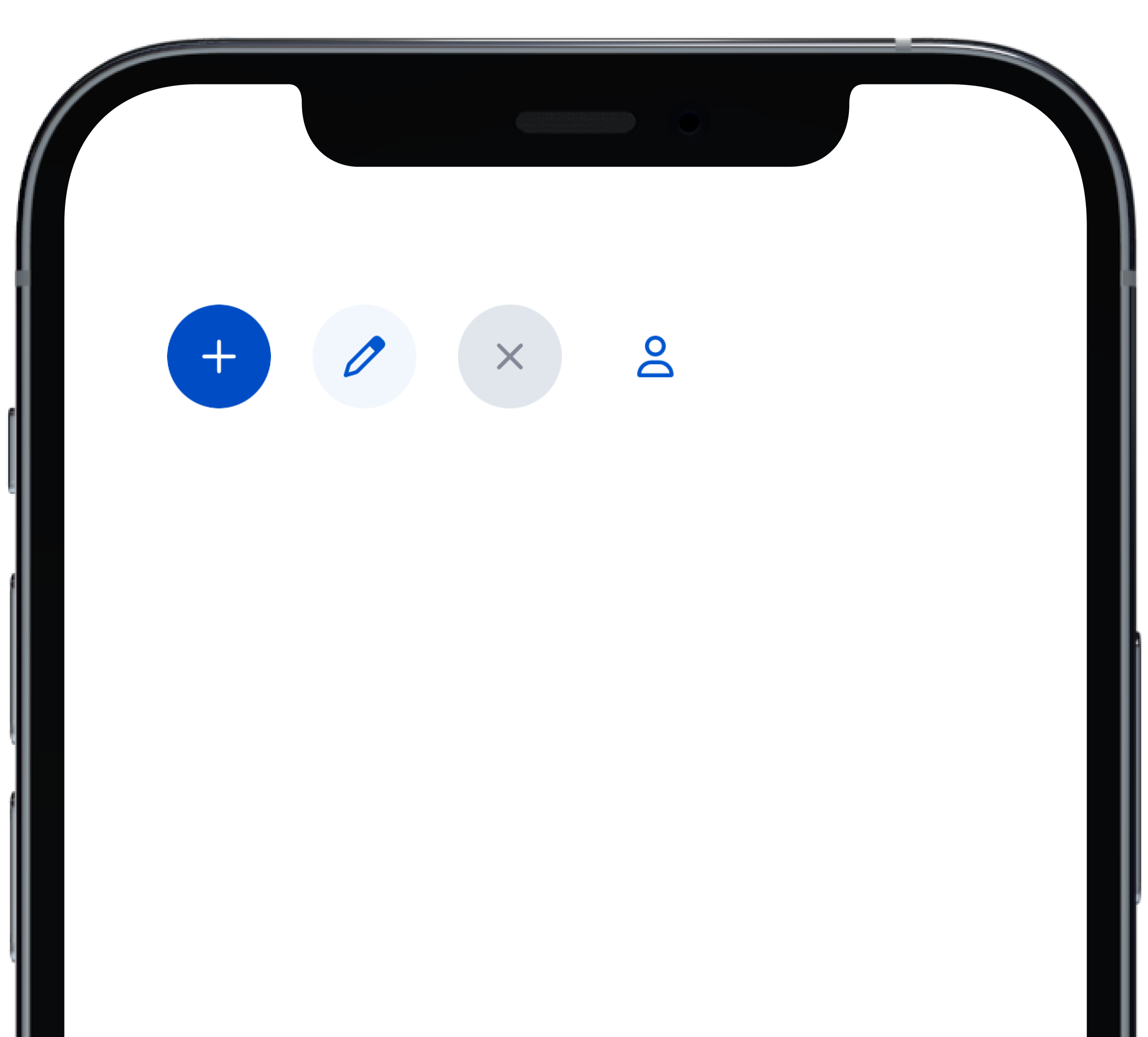
@@ -0,0 +1,28 @@
|
|
|
1
|
+
|
|
2
|
+
|
|
3
|
+
```swift
|
|
4
|
+
VStack(alignment: .leading, spacing: Spacing.small) {
|
|
5
|
+
PBButton(
|
|
6
|
+
shape: .circle,
|
|
7
|
+
icon: PBIcon.fontAwesome(.plus, size: .x1),
|
|
8
|
+
action: {}
|
|
9
|
+
)
|
|
10
|
+
PBButton(
|
|
11
|
+
variant: .secondary,
|
|
12
|
+
shape: .circle,
|
|
13
|
+
icon: PBIcon.fontAwesome(.pen, size: .x1),
|
|
14
|
+
action: {}
|
|
15
|
+
)
|
|
16
|
+
PBButton(
|
|
17
|
+
variant: .disabled,
|
|
18
|
+
shape: .circle,
|
|
19
|
+
icon: PBIcon.fontAwesome(.times, size: .x1)
|
|
20
|
+
)
|
|
21
|
+
PBButton(
|
|
22
|
+
variant: .link,
|
|
23
|
+
shape: .circle,
|
|
24
|
+
icon: PBIcon.fontAwesome(.user, size: .x1),
|
|
25
|
+
action: {}
|
|
26
|
+
)
|
|
27
|
+
}
|
|
28
|
+
```
|
|
@@ -0,0 +1,23 @@
|
|
|
1
|
+

|
|
2
|
+
|
|
3
|
+
```swift
|
|
4
|
+
VStack(alignment: .leading, spacing: Spacing.small) {
|
|
5
|
+
PBButton(
|
|
6
|
+
title: "Button Primary",
|
|
7
|
+
action: {}
|
|
8
|
+
)
|
|
9
|
+
PBButton(
|
|
10
|
+
variant: .secondary,
|
|
11
|
+
title: "Button Secondary",
|
|
12
|
+
action: {})
|
|
13
|
+
PBButton(
|
|
14
|
+
variant: .link,
|
|
15
|
+
title: "Button Link",
|
|
16
|
+
action: {}
|
|
17
|
+
)
|
|
18
|
+
PBButton(
|
|
19
|
+
variant: .disabled,
|
|
20
|
+
title: "Button Disabled"
|
|
21
|
+
)
|
|
22
|
+
}
|
|
23
|
+
```
|
|
@@ -0,0 +1,18 @@
|
|
|
1
|
+

|
|
2
|
+
|
|
3
|
+
|
|
4
|
+
```swift
|
|
5
|
+
VStack(alignment: .leading, spacing: Spacing.small) {
|
|
6
|
+
PBButton(
|
|
7
|
+
title: "Button with Icon on Left",
|
|
8
|
+
icon: PBIcon.fontAwesome(.user, size: .x1),
|
|
9
|
+
action: {}
|
|
10
|
+
)
|
|
11
|
+
PBButton(
|
|
12
|
+
title: "Button with Icon on Right",
|
|
13
|
+
icon: PBIcon.fontAwesome(.user, size: .x1),
|
|
14
|
+
iconPosition: .right,
|
|
15
|
+
action: {}
|
|
16
|
+
)
|
|
17
|
+
}
|
|
18
|
+
```
|
|
@@ -0,0 +1,11 @@
|
|
|
1
|
+
### Props
|
|
2
|
+
| Name | Type | Description | Default | Values |
|
|
3
|
+
| --- | ----------- | --------- | --------- | --------- |
|
|
4
|
+
| **Full Width** | `Bool` | Sets Button to full width | `false` | `true` `false` |
|
|
5
|
+
| **Variant** | `PBButtonVariant` | Changes the color of the Button | ` .primary` | `.primary` `.secondary` `.link` `.disabled` |
|
|
6
|
+
| **Size** | `Size` | Adjusts Button size | `.medium` | `.small` `.medium` `.large` |
|
|
7
|
+
| **Shape** | `Shape` | Changes the shape of the Button | `.primary` | `.primary` `.circle` |
|
|
8
|
+
| **Title** | `String` | Sets Button text | `nil` | |
|
|
9
|
+
| **Icon** | `PBIcon` | Adds an icon to the Button | `nil` | |
|
|
10
|
+
| **Icon Position** | `IconPosition` | Adjusts the icon's position | `.left` | `.left` `.right` |
|
|
11
|
+
| **Action** | `(() -> Void)` | Adds an action for the Button to perform | `{}` | |
|
|
@@ -0,0 +1,20 @@
|
|
|
1
|
+
|
|
2
|
+
|
|
3
|
+
```swift
|
|
4
|
+
VStack(alignment: .leading, spacing: Spacing.small) {
|
|
5
|
+
PBButton(
|
|
6
|
+
size: .small,
|
|
7
|
+
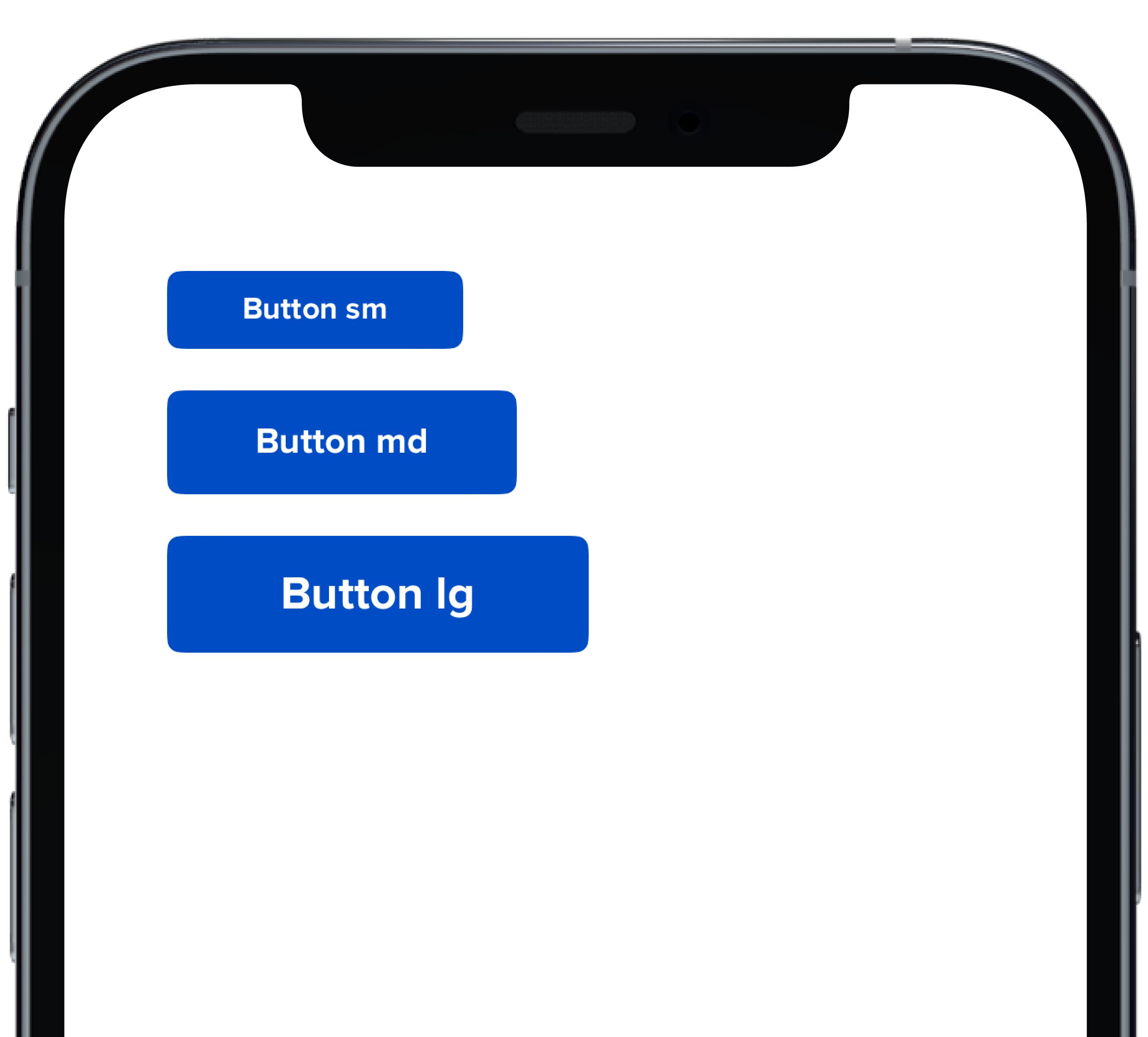
title: "Button sm",
|
|
8
|
+
action: {}
|
|
9
|
+
)
|
|
10
|
+
PBButton(
|
|
11
|
+
title: "Button md",
|
|
12
|
+
action: {}
|
|
13
|
+
)
|
|
14
|
+
PBButton(
|
|
15
|
+
size: .large,
|
|
16
|
+
title: "Button lg",
|
|
17
|
+
action: {}
|
|
18
|
+
)
|
|
19
|
+
}
|
|
20
|
+
```
|
|
@@ -25,3 +25,11 @@ examples:
|
|
|
25
25
|
- button_size: Button Size
|
|
26
26
|
- button_form: Button Form Attribute
|
|
27
27
|
- button_hover: Button Hover
|
|
28
|
+
|
|
29
|
+
swift:
|
|
30
|
+
- button_default_swift: Button Variants
|
|
31
|
+
- button_full_width_swift: Button Full Width
|
|
32
|
+
- button_icon_options_swift: Button Icon Options
|
|
33
|
+
- button_circle_swift: Circle Button
|
|
34
|
+
- button_size_swift: Button Size
|
|
35
|
+
- button_props_swift: ""
|
|
@@ -0,0 +1,29 @@
|
|
|
1
|
+
|
|
2
|
+
|
|
3
|
+
```swift
|
|
4
|
+
VStack(alignment: .leading, spacing: Spacing.small) {
|
|
5
|
+
PBCard {
|
|
6
|
+
Text(text).pbFont(.body)
|
|
7
|
+
}
|
|
8
|
+
|
|
9
|
+
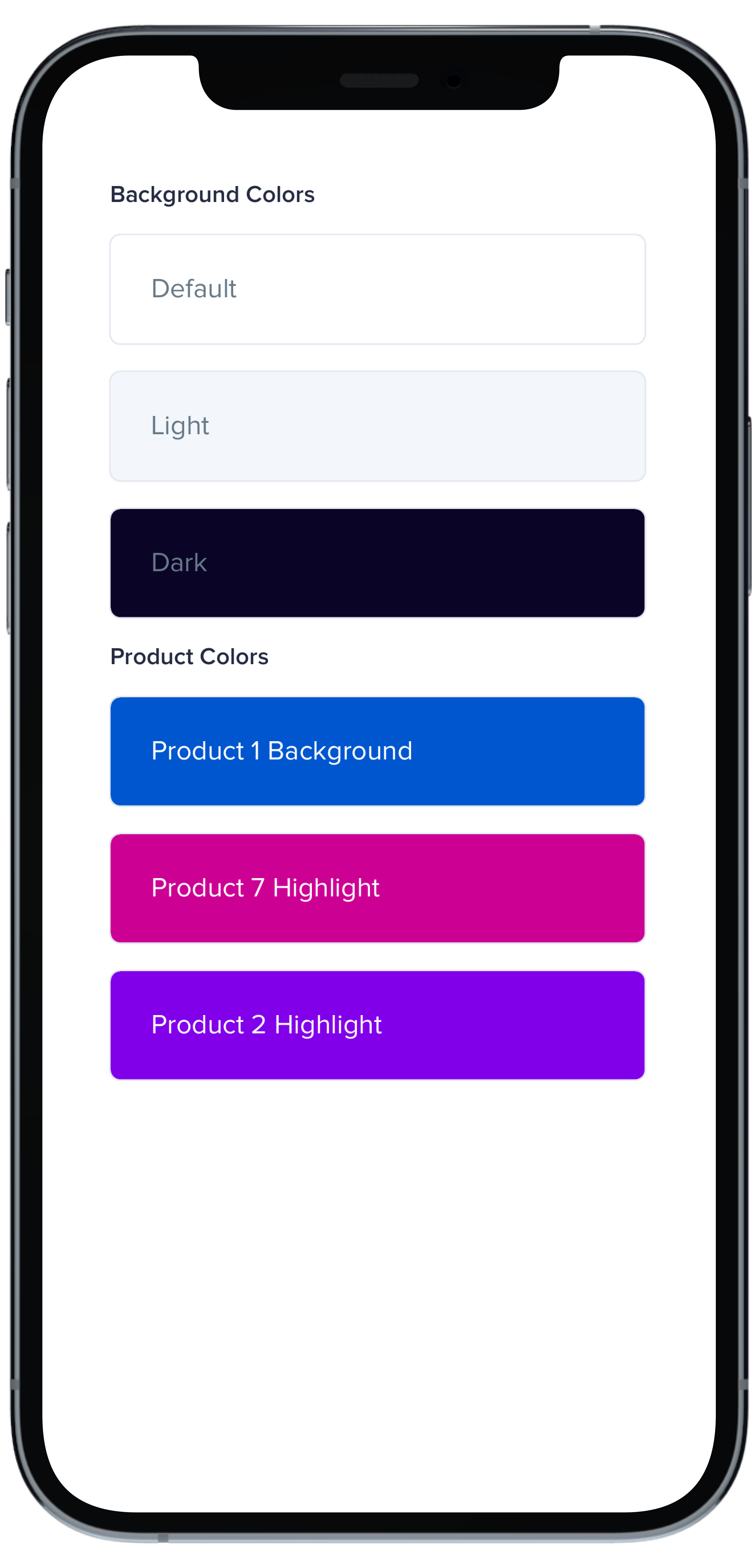
PBCard(backgroundColor: .background(.light)) {
|
|
10
|
+
Text("Light").pbFont(.body, color: .text(.light))
|
|
11
|
+
}
|
|
12
|
+
|
|
13
|
+
PBCard(backgroundColor: .background(.dark)) {
|
|
14
|
+
Text("Dark").pbFont(.body, color: .text(.light))
|
|
15
|
+
}
|
|
16
|
+
|
|
17
|
+
PBCard(backgroundColor: .product(.product1, category: .background)) {
|
|
18
|
+
Text("Product 1 Background").pbFont(.body, color: .white)
|
|
19
|
+
}
|
|
20
|
+
|
|
21
|
+
PBCard(backgroundColor: .product(.product7, category: .highlight)) {
|
|
22
|
+
Text("Product 7 Highlight").pbFont(.body, color: .white)
|
|
23
|
+
}
|
|
24
|
+
|
|
25
|
+
PBCard(backgroundColor: .product(.product2, category: .highlight)) {
|
|
26
|
+
Text("Product 2 Highlight").pbFont(.body, color: .white)
|
|
27
|
+
}
|
|
28
|
+
}
|
|
29
|
+
```
|
|
@@ -0,0 +1,33 @@
|
|
|
1
|
+
|
|
2
|
+
|
|
3
|
+
```swift
|
|
4
|
+
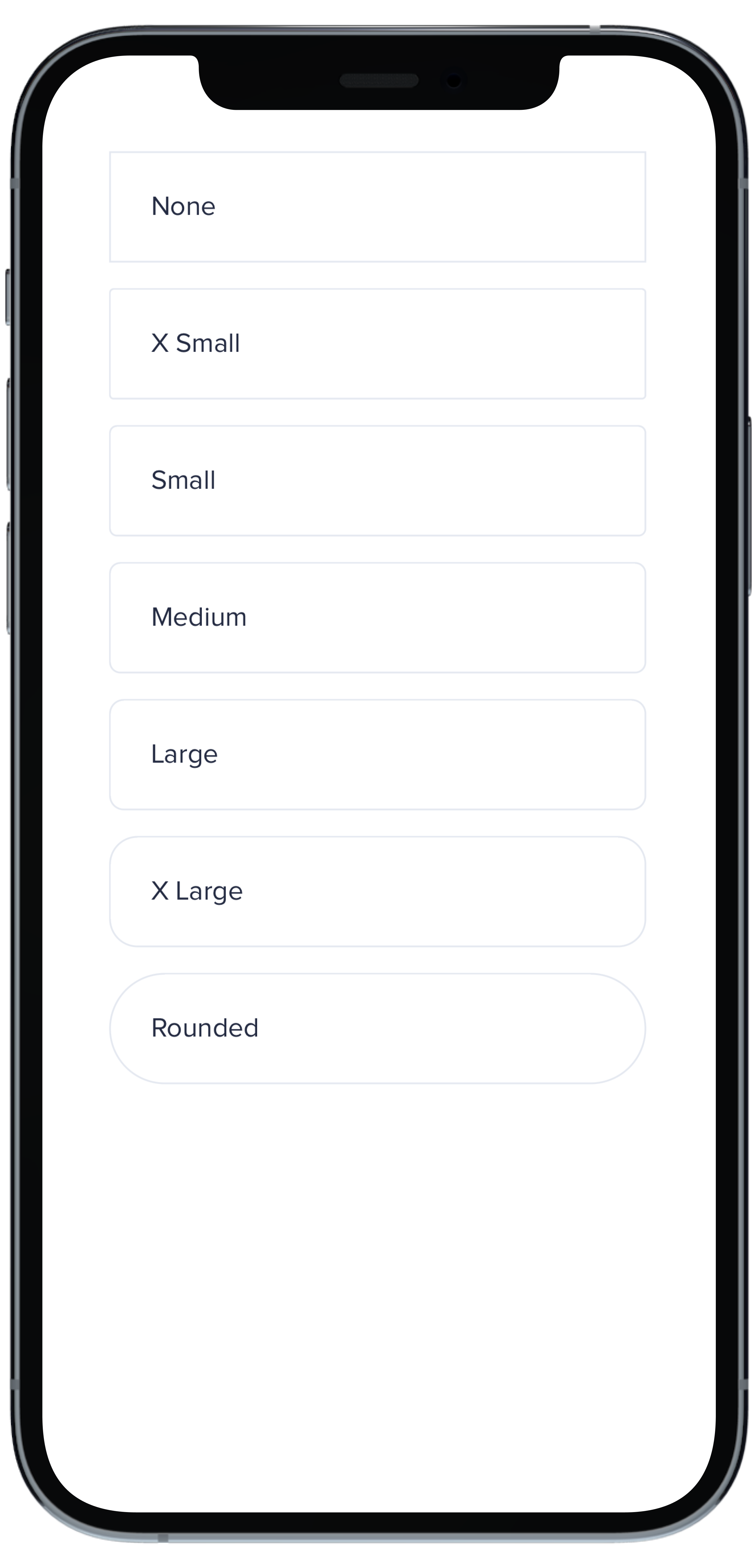
VStack(spacing: Spacing.small) {
|
|
5
|
+
PBCard(borderRadius: BorderRadius.none) {
|
|
6
|
+
Text("None").pbFont(.body)
|
|
7
|
+
}
|
|
8
|
+
|
|
9
|
+
PBCard(borderRadius: BorderRadius.xSmall) {
|
|
10
|
+
Text("X Small").pbFont(.body)
|
|
11
|
+
}
|
|
12
|
+
|
|
13
|
+
PBCard(borderRadius: BorderRadius.small) {
|
|
14
|
+
Text("Small").pbFont(.body)
|
|
15
|
+
}
|
|
16
|
+
|
|
17
|
+
PBCard(borderRadius: BorderRadius.medium) {
|
|
18
|
+
Text("Medium").pbFont(.body)
|
|
19
|
+
}
|
|
20
|
+
|
|
21
|
+
PBCard(borderRadius: BorderRadius.large) {
|
|
22
|
+
Text("Large").pbFont(.body)
|
|
23
|
+
}
|
|
24
|
+
|
|
25
|
+
PBCard(borderRadius: BorderRadius.xLarge) {
|
|
26
|
+
Text("X Large").pbFont(.body)
|
|
27
|
+
}
|
|
28
|
+
|
|
29
|
+
PBCard(borderRadius: BorderRadius.rounded) {
|
|
30
|
+
Text("Rounded").pbFont(.body)
|
|
31
|
+
}
|
|
32
|
+
}
|
|
33
|
+
``````
|
|
@@ -0,0 +1,33 @@
|
|
|
1
|
+
|
|
2
|
+
|
|
3
|
+
```swift
|
|
4
|
+
Stack(spacing: Spacing.small) {
|
|
5
|
+
PBCard(padding: Spacing.none) {
|
|
6
|
+
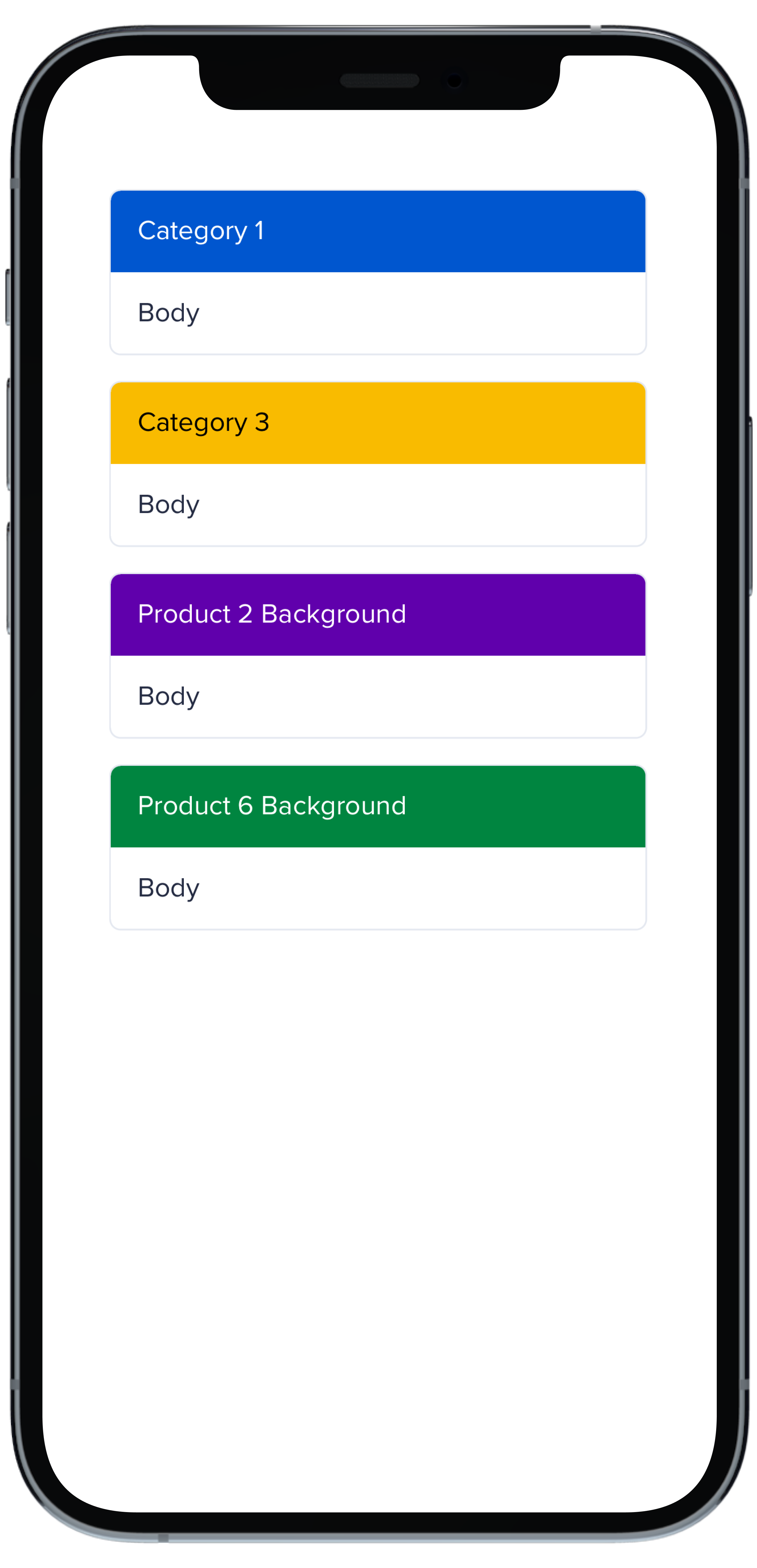
PBCardHeader(color: .category(.category1)) {
|
|
7
|
+
Text("Category 1").pbFont(.body, color: .white).padding(Spacing.small)
|
|
8
|
+
}
|
|
9
|
+
Text("Body").pbFont(.body, color: .text(.default)).padding(Spacing.small)
|
|
10
|
+
}
|
|
11
|
+
|
|
12
|
+
PBCard(padding: Spacing.none) {
|
|
13
|
+
PBCardHeader(color: .category(.category3)) {
|
|
14
|
+
Text("Category 3").pbFont(.body, color: .black).padding(Spacing.small)
|
|
15
|
+
}
|
|
16
|
+
Text("Body").pbFont(.body, color: .text(.default)).padding(Spacing.small)
|
|
17
|
+
}
|
|
18
|
+
|
|
19
|
+
PBCard(padding: Spacing.none) {
|
|
20
|
+
PBCardHeader(color: .product(.product2, category: .background)) {
|
|
21
|
+
Text("Product 2 Background").pbFont(.body, color: .white).padding(Spacing.small)
|
|
22
|
+
}
|
|
23
|
+
Text("Body").pbFont(.body, color: .text(.default)).padding(Spacing.small)
|
|
24
|
+
}
|
|
25
|
+
|
|
26
|
+
PBCard(padding: Spacing.none) {
|
|
27
|
+
PBCardHeader(color: .product(.product6, category: .background)) {
|
|
28
|
+
Text("Product 6 Background").pbFont(.body, color: .white).padding(Spacing.small)
|
|
29
|
+
}
|
|
30
|
+
Text("Body").pbFont(.body, color: .text(.default)).padding(Spacing.small)
|
|
31
|
+
}
|
|
32
|
+
}
|
|
33
|
+
```
|
|
@@ -0,0 +1,17 @@
|
|
|
1
|
+
|
|
2
|
+
|
|
3
|
+
```swift
|
|
4
|
+
VStack(spacing: Spacing.small) {
|
|
5
|
+
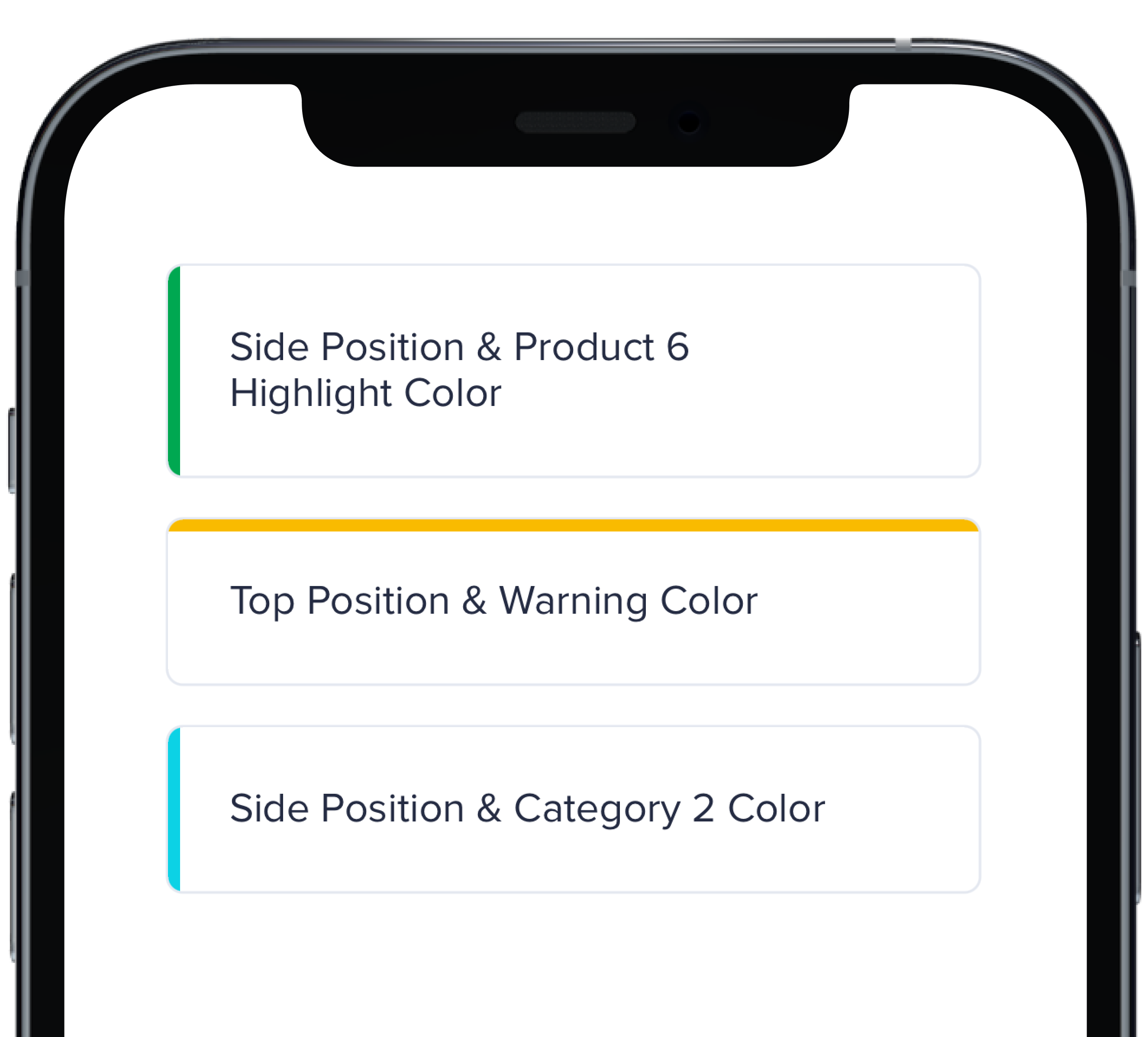
PBCard(highlight: .side(.product(.product6, category: .highlight))) {
|
|
6
|
+
Text("Side Position & Product 6 Highlight Color").pbFont(.body)
|
|
7
|
+
}
|
|
8
|
+
|
|
9
|
+
PBCard(highlight: .top(.status(.warning))) {
|
|
10
|
+
Text("Top Position & Warning Color").pbFont(.body)
|
|
11
|
+
}
|
|
12
|
+
|
|
13
|
+
PBCard(highlight: .side(.category(.category2))) {
|
|
14
|
+
Text("Side Position & Category 2 Color").pbFont(.body)
|
|
15
|
+
}
|
|
16
|
+
}
|
|
17
|
+
```
|
|
@@ -0,0 +1,33 @@
|
|
|
1
|
+
|
|
2
|
+
|
|
3
|
+
```swift
|
|
4
|
+
VStack(spacing: Spacing.small) {
|
|
5
|
+
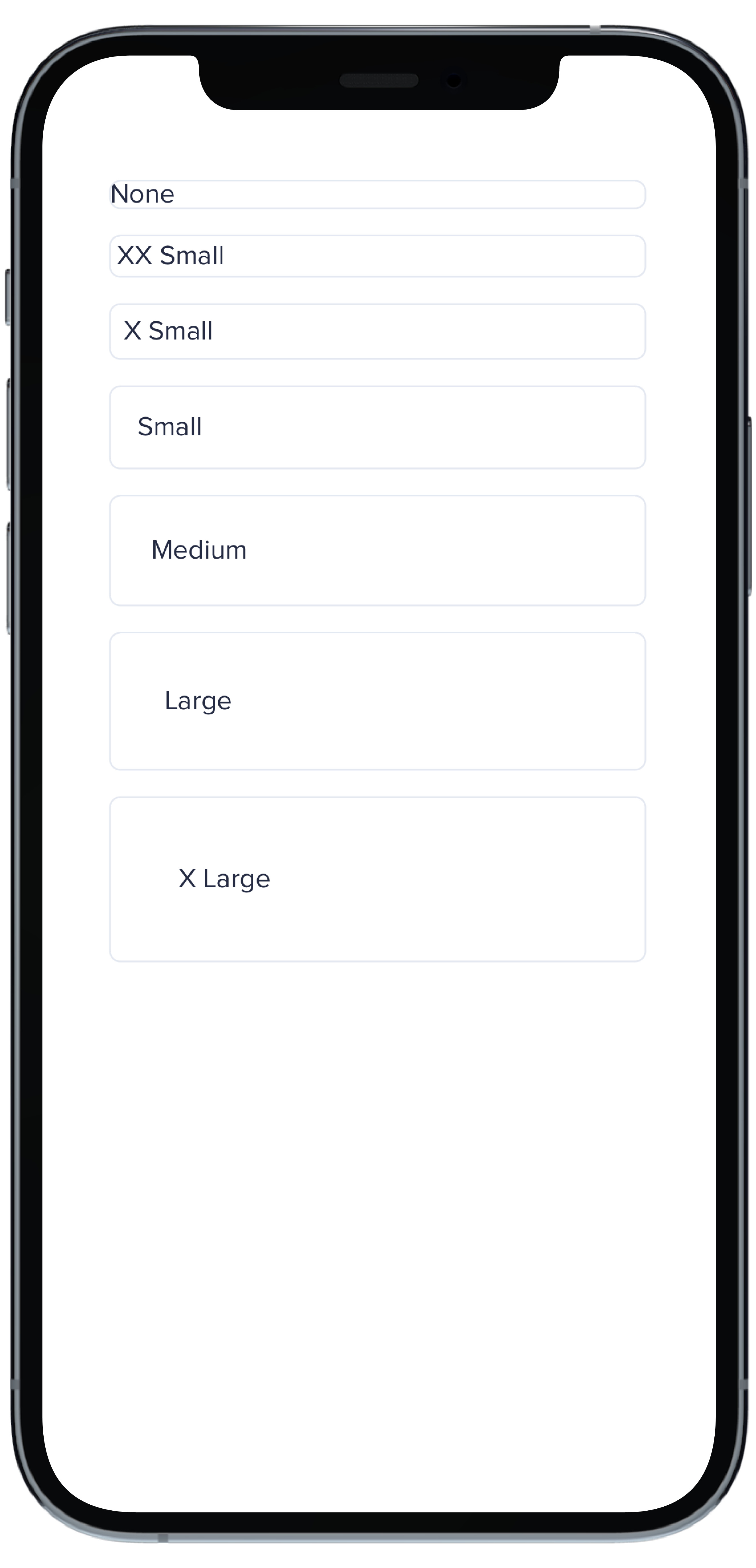
PBCard(padding: Spacing.none) {
|
|
6
|
+
Text("None").pbFont(.body)
|
|
7
|
+
}
|
|
8
|
+
|
|
9
|
+
PBCard(padding: Spacing.xxSmall) {
|
|
10
|
+
Text("XX Small").pbFont(.body)
|
|
11
|
+
}
|
|
12
|
+
|
|
13
|
+
PBCard(padding: Spacing.xSmall) {
|
|
14
|
+
Text("X Small").pbFont(.body)
|
|
15
|
+
}
|
|
16
|
+
|
|
17
|
+
PBCard(padding: Spacing.small) {
|
|
18
|
+
Text("Small").pbFont(.body)
|
|
19
|
+
}
|
|
20
|
+
|
|
21
|
+
PBCard(padding: Spacing.medium) {
|
|
22
|
+
Text("Medium").pbFont(.body)
|
|
23
|
+
}
|
|
24
|
+
|
|
25
|
+
PBCard(padding: Spacing.large) {
|
|
26
|
+
Text("Large").pbFont(.body)
|
|
27
|
+
}
|
|
28
|
+
|
|
29
|
+
PBCard(padding: Spacing.xLarge) {
|
|
30
|
+
Text("X Large").pbFont(.body)
|
|
31
|
+
}
|
|
32
|
+
}
|
|
33
|
+
```
|
|
@@ -0,0 +1,10 @@
|
|
|
1
|
+
### Props
|
|
2
|
+
| Name | Type | Description | Default | Values |
|
|
3
|
+
| --- | ----------- | --------- | --------- | --------- |
|
|
4
|
+
| **Background Color** | `Color` | Changes background color | `.card` | `Color` |
|
|
5
|
+
| **Border** | `Bool` | Adds border around the Card | `true` | `true` `false` |
|
|
6
|
+
| **Border Radius** | `CGFloat` | Specifies the roundness of the Card | `BorderRadius.medium` | `BorderRadius.none` `BorderRadius.xSmall` `BorderRadius.small` `BorderRadius.medium` `BorderRadius.large` `BorderRadius.xLarge` `BorderRadius.rounded` |
|
|
7
|
+
| **Highlight** | `Highlight` | Adds a border accent color | `.none` | `Color` |
|
|
8
|
+
| **Padding** | `CGFloat` | Applies padding between text and border | `Spacing.medium` | `Spacing.none` `Spacing.xxSmall` `Spacing.xSmall` `Spacing.small` `Spacing.medium` `Spacing.large` `Spacing.xLarge` |
|
|
9
|
+
| **Style** | `PBCardStyle` | Specifies the color of the border | `.default` | `.default` `.selected` `.error` `.inline` |
|
|
10
|
+
| **Shadow** | `Shadow` | Applies shadow | `nil` | `Shadow.deep` `Shadow.deeper` `Shadow.deepest` `Shadow.none` |
|
|
File without changes
|
|
@@ -0,0 +1,11 @@
|
|
|
1
|
+
|
|
2
|
+
|
|
3
|
+
```swift
|
|
4
|
+
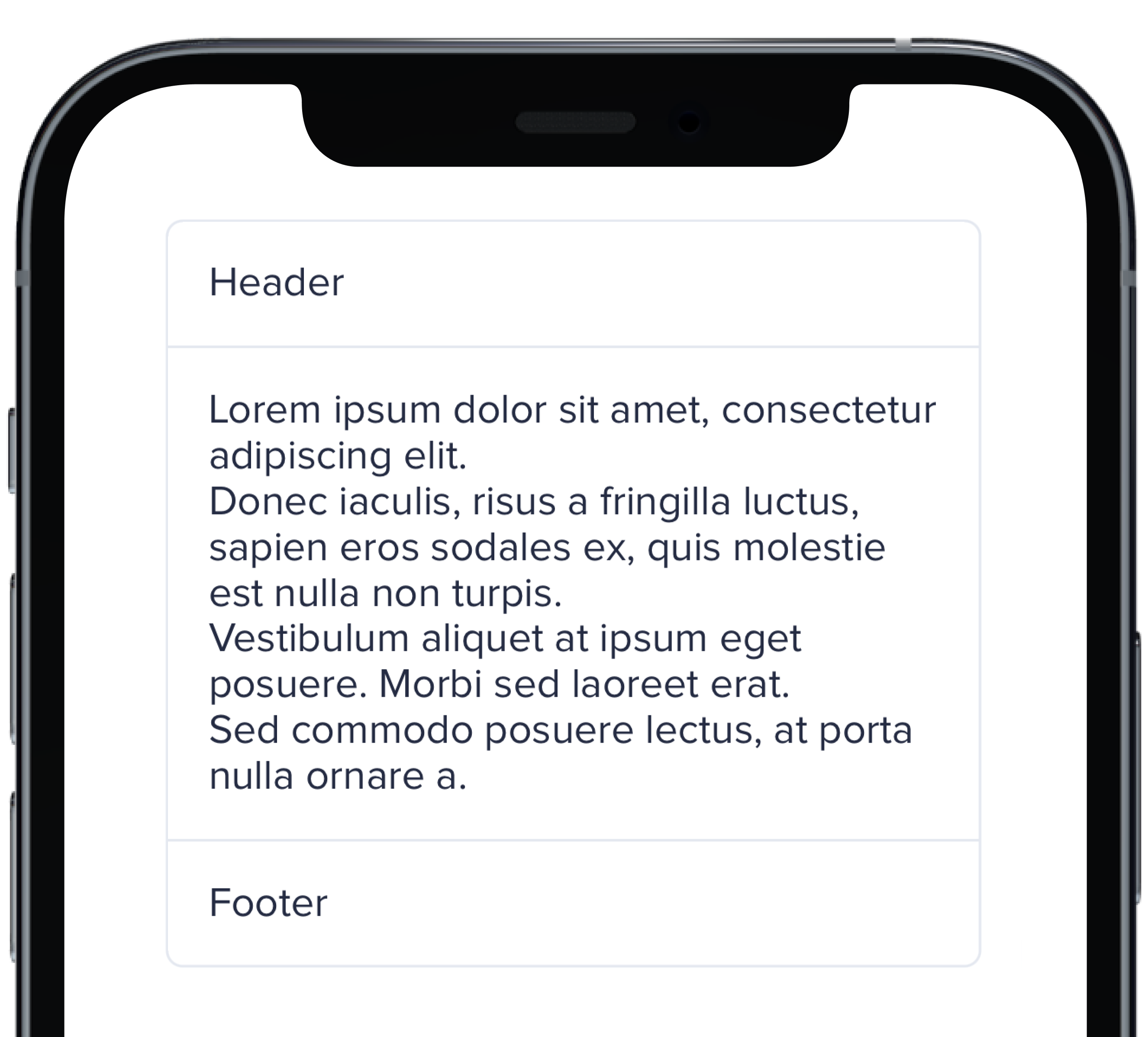
PBCard(padding: Spacing.none) {
|
|
5
|
+
Text("Header").pbFont(.body).padding(Spacing.small)
|
|
6
|
+
PBSectionSeparator()
|
|
7
|
+
Text(loremIpsum).pbFont(.body).padding(Spacing.small)
|
|
8
|
+
PBSectionSeparator()
|
|
9
|
+
Text("Footer").pbFont(.body).padding(Spacing.small)
|
|
10
|
+
}
|
|
11
|
+
```
|
|
@@ -0,0 +1,21 @@
|
|
|
1
|
+

|
|
2
|
+
|
|
3
|
+
```swift
|
|
4
|
+
VStack(spacing: Spacing.small) {
|
|
5
|
+
PBCard(shadow: Shadow.deep) {
|
|
6
|
+
Text("Deep").pbFont(.body)
|
|
7
|
+
}
|
|
8
|
+
|
|
9
|
+
PBCard(shadow: Shadow.deeper) {
|
|
10
|
+
Text("Deeper").pbFont(.body)
|
|
11
|
+
}
|
|
12
|
+
|
|
13
|
+
PBCard(shadow: Shadow.deepest) {
|
|
14
|
+
Text("Deepest").pbFont(.body)
|
|
15
|
+
}
|
|
16
|
+
|
|
17
|
+
PBCard(shadow: Shadow.none) {
|
|
18
|
+
Text("None").pbFont(.body)
|
|
19
|
+
}
|
|
20
|
+
}
|
|
21
|
+
```
|
|
@@ -0,0 +1,17 @@
|
|
|
1
|
+
|
|
2
|
+
|
|
3
|
+
```swift
|
|
4
|
+
VStack(alignment: .leading, spacing: Spacing.small) {
|
|
5
|
+
PBCard {
|
|
6
|
+
Text("Card Context").pbFont(.body)
|
|
7
|
+
}
|
|
8
|
+
|
|
9
|
+
PBCard(style: .selected()) {
|
|
10
|
+
Text("Card Context").pbFont(.body)
|
|
11
|
+
}
|
|
12
|
+
|
|
13
|
+
PBCard(style: .error) {
|
|
14
|
+
Text("Card Context").pbFont(.body)
|
|
15
|
+
}
|
|
16
|
+
}
|
|
17
|
+
```
|
|
File without changes
|
|
@@ -25,3 +25,15 @@ examples:
|
|
|
25
25
|
- card_separator: Separator Card
|
|
26
26
|
- card_border_none: No Border
|
|
27
27
|
- card_border_radius: Border Radius
|
|
28
|
+
swift:
|
|
29
|
+
- card_light_swift: Default
|
|
30
|
+
- card_background_swift: Card Backgrounds
|
|
31
|
+
- card_highlight_swift: Highlight Cards
|
|
32
|
+
- card_header_swift: Header Cards
|
|
33
|
+
- card_padding_swift: Padding Size
|
|
34
|
+
- card_shadow_swift: Shadow Size
|
|
35
|
+
- card_separator_swift: Separator Card
|
|
36
|
+
- card_border_none_swift: No Border
|
|
37
|
+
- card_border_radius_swift: Border Radius
|
|
38
|
+
- card_styles_swift: Styles
|
|
39
|
+
- card_props_swift: ""
|
|
@@ -0,0 +1,10 @@
|
|
|
1
|
+

|
|
2
|
+
|
|
3
|
+
```swift
|
|
4
|
+
|
|
5
|
+
PBCheckbox(checked: false, text: "Unchecked", action: {})
|
|
6
|
+
.padding(.bottom, Spacing.small)
|
|
7
|
+
|
|
8
|
+
PBCheckbox(checked: true, text: "Checked", action: {})
|
|
9
|
+
|
|
10
|
+
```
|
|
@@ -0,0 +1,7 @@
|
|
|
1
|
+
### Props
|
|
2
|
+
| Name | Type | Description | Default | Values |
|
|
3
|
+
| --- | ----------- | --------- | --------- | --------- |
|
|
4
|
+
| **Checked** | `Bool` | Adds a check to the Checkbox | `false` | `true` `false` |
|
|
5
|
+
| **Checkbox Type** | `CheckboxType` | Changes the style of the Checkbox | `default` | `default` `error` `indeterminate` |
|
|
6
|
+
| **Text** | `String` | Adds a text label | `nil` | |
|
|
7
|
+
| **Action** | `(() -> Void)` | Adds an action | `{}` | |
|
|
@@ -13,3 +13,10 @@ examples:
|
|
|
13
13
|
- checkbox_custom: Custom Checkbox
|
|
14
14
|
- checkbox_error: Default w/ Error
|
|
15
15
|
- checkbox_indeterminate: Indeterminate Checkbox
|
|
16
|
+
|
|
17
|
+
swift:
|
|
18
|
+
- checkbox_default_swift: Default
|
|
19
|
+
- checkbox_error_swift: Default w/ Error
|
|
20
|
+
- checkbox_indeterminate_swift: Indeterminate Checkbox
|
|
21
|
+
- checkbox_props_swift: ""
|
|
22
|
+
|
|
@@ -0,0 +1,22 @@
|
|
|
1
|
+
<div onclick="toggleCollapsibleById('collapsed-toggle')">
|
|
2
|
+
<%= pb_rails("button", props: { text: "Toggle Collapsible", variant:"link"}) %>
|
|
3
|
+
</div>
|
|
4
|
+
|
|
5
|
+
<%= pb_rails("collapsible", props: { name: "default-example" }) do %>
|
|
6
|
+
<%= pb_rails("collapsible/collapsible_main", props: { padding: "md", name: "default-main"}) do %>
|
|
7
|
+
<%= pb_rails("body", props: { text: "Main Section"}) %>
|
|
8
|
+
<% end %>
|
|
9
|
+
<%= pb_rails("collapsible/collapsible_content", props: { padding: "md", collapsed: false, id:"collapsed-toggle" }) do %>
|
|
10
|
+
Lorem ipsum dolor sit amet, consectetur adipiscing elit. Donec iaculis, risus a fringilla luctus, sapien eros sodales ex, quis molestie est nulla non turpis. Vestibulum aliquet at ipsum eget posuere. Morbi sed laoreet erat. Sed commodo posuere lectus, at porta nulla ornare a. Suspendisse quam est, sollicitudin ut enim sit amet, commodo placerat enim. Donec laoreet metus ac mauris pellentesque mattis. Pellentesque luctus vel mauris non aliquam. Mauris hendrerit mattis porttitor. Curabitur vehicula justo non ex consectetur commodo. Quisque posuere aliquet quam. Maecenas malesuada magna mauris, ac tempor metus euismod at.
|
|
11
|
+
<br><br>
|
|
12
|
+
Cras ornare fermentum magna mollis efficitur. Sed vitae nulla vel purus ultrices mollis. Maecenas id nulla id libero faucibus feugiat quis sit amet turpis. In commodo pellentesque risus at fringilla. Integer non interdum leo, non commodo ante. Lorem ipsum dolor sit amet, consectetur adipiscing elit. Ut mi augue, dignissim at orci vel, egestas aliquam mi. Proin finibus aliquet tempor. Integer cursus, ex quis gravida rhoncus, nisi elit viverra ipsum, non efficitur est ex ac tortor. Praesent vitae odio massa.
|
|
13
|
+
<% end %>
|
|
14
|
+
<% end %>
|
|
15
|
+
|
|
16
|
+
|
|
17
|
+
|
|
18
|
+
<script>
|
|
19
|
+
const toggleCollapsibleById = (id) => {
|
|
20
|
+
document.dispatchEvent(new CustomEvent(id));
|
|
21
|
+
};
|
|
22
|
+
</script>
|
|
@@ -0,0 +1,3 @@
|
|
|
1
|
+
The `collapsed` prop (boolean; default = true) handles the collapsed state of a collapsible. Set it to 'false' and the collapsible will render in an expanded state on page load.
|
|
2
|
+
|
|
3
|
+
You can also control the collapsed state using an external control (like a button). To do this, you must first apply a unique id to the collapsible/collapsible_content child element. You can then attach an eventListner to the external control of your choice, pass it the id as an argument and use `document.dispatchEvent(new CustomEvent(id))` to trigger the action. See the code example below for details.
|
data/app/pb_kits/playbook/pb_collapsible/docs/_collapsible_external_controls_multiple.html.erb
ADDED
|
@@ -0,0 +1,40 @@
|
|
|
1
|
+
<%= pb_rails("button", props: { variant:"link", text: "Toggle All", id: "toggle-button-example"}) %>
|
|
2
|
+
|
|
3
|
+
<%= pb_rails("collapsible", props: { name: "default-example" }) do %>
|
|
4
|
+
<%= pb_rails("collapsible/collapsible_main", props: { padding: "xs", name: "default-main"}) do %>
|
|
5
|
+
<%= pb_rails("body", props: { text: "Main Section"}) %>
|
|
6
|
+
<% end %>
|
|
7
|
+
<%= pb_rails("collapsible/collapsible_content", props: { padding: "md", id:"collapse-toggle-1" }) do %>
|
|
8
|
+
Cras ornare fermentum magna mollis efficitur. Sed vitae nulla vel purus ultrices mollis. Maecenas id nulla id libero faucibus feugiat quis sit amet turpis. In commodo pellentesque risus at fringilla. Integer non interdum leo, non commodo ante. Lorem ipsum dolor sit amet, consectetur adipiscing elit. Ut mi augue, dignissim at orci vel, egestas aliquam mi. Proin finibus aliquet tempor. Integer cursus, ex quis gravida rhoncus, nisi elit viverra ipsum, non efficitur est ex ac tortor. Praesent vitae odio massa.
|
|
9
|
+
<% end %>
|
|
10
|
+
<% end %>
|
|
11
|
+
<%= pb_rails("collapsible", props: { name: "default-example-2" }) do %>
|
|
12
|
+
<%= pb_rails("collapsible/collapsible_main", props: { padding: "xs", name: "default-main"}) do %>
|
|
13
|
+
<%= pb_rails("body", props: { text: "Main Section"}) %>
|
|
14
|
+
<% end %>
|
|
15
|
+
<%= pb_rails("collapsible/collapsible_content", props: { padding: "md", id:"collapse-toggle-2" }) do %>
|
|
16
|
+
Cras ornare fermentum magna mollis efficitur. Sed vitae nulla vel purus ultrices mollis. Maecenas id nulla id libero faucibus feugiat quis sit amet turpis. In commodo pellentesque risus at fringilla. Integer non interdum leo, non commodo ante. Lorem ipsum dolor sit amet, consectetur adipiscing elit. Ut mi augue, dignissim at orci vel, egestas aliquam mi. Proin finibus aliquet tempor. Integer cursus, ex quis gravida rhoncus, nisi elit viverra ipsum, non efficitur est ex ac tortor. Praesent vitae odio massa.
|
|
17
|
+
<% end %>
|
|
18
|
+
<% end %>
|
|
19
|
+
<%= pb_rails("collapsible", props: { name: "default-example-3" }) do %>
|
|
20
|
+
<%= pb_rails("collapsible/collapsible_main", props: { padding: "xs", name: "default-main"}) do %>
|
|
21
|
+
<%= pb_rails("body", props: { text: "Main Section"}) %>
|
|
22
|
+
<% end %>
|
|
23
|
+
<%= pb_rails("collapsible/collapsible_content", props: { padding: "md", id:"collapse-toggle-3" }) do %>
|
|
24
|
+
Cras ornare fermentum magna mollis efficitur. Sed vitae nulla vel purus ultrices mollis. Maecenas id nulla id libero faucibus feugiat quis sit amet turpis. In commodo pellentesque risus at fringilla. Integer non interdum leo, non commodo ante. Lorem ipsum dolor sit amet, consectetur adipiscing elit. Ut mi augue, dignissim at orci vel, egestas aliquam mi. Proin finibus aliquet tempor. Integer cursus, ex quis gravida rhoncus, nisi elit viverra ipsum, non efficitur est ex ac tortor. Praesent vitae odio massa.
|
|
25
|
+
<% end %>
|
|
26
|
+
<% end %>
|
|
27
|
+
|
|
28
|
+
|
|
29
|
+
|
|
30
|
+
<script>
|
|
31
|
+
window.addEventListener('DOMContentLoaded', () => {
|
|
32
|
+
const collapsibles = document.querySelectorAll('[id^="collapse-toggle"]');
|
|
33
|
+
const button = document.querySelector("#toggle-button-example");
|
|
34
|
+
button.addEventListener("click", () => {
|
|
35
|
+
collapsibles.forEach(collapsible => {
|
|
36
|
+
document.dispatchEvent(new CustomEvent(collapsible.id));
|
|
37
|
+
})
|
|
38
|
+
})
|
|
39
|
+
})
|
|
40
|
+
</script>
|
|
@@ -0,0 +1 @@
|
|
|
1
|
+
The external control functionality can also be used to toggle multiple collapsibles with the same control. See the code example below to see this in action.
|
|
@@ -5,6 +5,8 @@ examples:
|
|
|
5
5
|
- collapsible_size: Icon Size
|
|
6
6
|
- collapsible_color: Icon Color
|
|
7
7
|
- collapsible_icons: Custom Icons
|
|
8
|
+
- collapsible_external_controls: Toggle Collapsible With External Controls
|
|
9
|
+
- collapsible_external_controls_multiple: Toggle All Collapsibles With One Control
|
|
8
10
|
|
|
9
11
|
react:
|
|
10
12
|
- collapsible_default: Default
|
|
@@ -0,0 +1,11 @@
|
|
|
1
|
+

|
|
2
|
+
|
|
3
|
+
```swift
|
|
4
|
+
|
|
5
|
+
HStack(spacing: Spacing.xSmall) {
|
|
6
|
+
PBIcon(FontAwesome.questionCircle, flipped: [.horizontal])
|
|
7
|
+
PBIcon(FontAwesome.questionCircle, flipped: [.vertical])
|
|
8
|
+
PBIcon(FontAwesome.questionCircle, flipped: [.horizontal, .vertical])
|
|
9
|
+
}
|
|
10
|
+
|
|
11
|
+
```
|
|
@@ -0,0 +1,8 @@
|
|
|
1
|
+
### Props
|
|
2
|
+
| Name | Type | Description | Default | Values |
|
|
3
|
+
| --- | ----------- | --------- | --------- | --------- |
|
|
4
|
+
| **Icon** | `PlaybookGenericIcon` | Sets the kit's Icon | | |
|
|
5
|
+
| **Size** | `IconSize` | Changes the size of the Icon | `.x1` | `xSmall` `small` `large` `x1` `x2` `x3` `x4` `x5` `x6` `x7` `x8` `x9` `x10` |
|
|
6
|
+
| **Rotation** | `IconRotation` | Rotates the Icon | `.zero` | `.zero` `.right` `.straight` `.obtuse` |
|
|
7
|
+
| **Border** | `Bool` | Adds a border | `false` | `true` `false` |
|
|
8
|
+
| **Flipped** | `[Axis]` | Flips the Icon | `nil` | `[.horizontal]` `[.vertical]` `[.horizontal, .vertical]` |
|
|
@@ -0,0 +1,11 @@
|
|
|
1
|
+

|
|
2
|
+
|
|
3
|
+
```swift
|
|
4
|
+
|
|
5
|
+
HStack(spacing: Spacing.xSmall) {
|
|
6
|
+
PBIcon(FontAwesome.user, rotation: .right)
|
|
7
|
+
PBIcon(FontAwesome.user, rotation: .zero)
|
|
8
|
+
PBIcon(FontAwesome.user, rotation: .obtuse)
|
|
9
|
+
}
|
|
10
|
+
|
|
11
|
+
```
|
|
@@ -0,0 +1,46 @@
|
|
|
1
|
+

|
|
2
|
+
|
|
3
|
+
```swift
|
|
4
|
+
|
|
5
|
+
HStack(spacing: Spacing.xSmall) {
|
|
6
|
+
PBIcon.fontAwesome(.atlas, size: .xSmall)
|
|
7
|
+
Text("xSmall")
|
|
8
|
+
|
|
9
|
+
PBIcon.fontAwesome(.atlas, size: .small)
|
|
10
|
+
Text("small")
|
|
11
|
+
|
|
12
|
+
PBIcon.fontAwesome(.atlas, size: .large)
|
|
13
|
+
Text("large")
|
|
14
|
+
|
|
15
|
+
PBIcon.fontAwesome(.atlas, size: .x1)
|
|
16
|
+
Text("x1")
|
|
17
|
+
|
|
18
|
+
PBIcon.fontAwesome(.atlas, size: .x2)
|
|
19
|
+
Text("x2")
|
|
20
|
+
|
|
21
|
+
PBIcon.fontAwesome(.atlas, size: .x3)
|
|
22
|
+
Text("x3")
|
|
23
|
+
|
|
24
|
+
PBIcon.fontAwesome(.atlas, size: .x4)
|
|
25
|
+
Text("x4")
|
|
26
|
+
|
|
27
|
+
PBIcon.fontAwesome(.atlas, size: .x5)
|
|
28
|
+
Text("x5")
|
|
29
|
+
|
|
30
|
+
PBIcon.fontAwesome(.atlas, size: .x6)
|
|
31
|
+
Text("x6")
|
|
32
|
+
|
|
33
|
+
PBIcon.fontAwesome(.atlas, size: .x7)
|
|
34
|
+
Text("x7")
|
|
35
|
+
|
|
36
|
+
PBIcon.fontAwesome(.atlas, size: .x8)
|
|
37
|
+
Text("x8")
|
|
38
|
+
|
|
39
|
+
PBIcon.fontAwesome(.atlas, size: .x9)
|
|
40
|
+
Text("x9")
|
|
41
|
+
|
|
42
|
+
PBIcon.fontAwesome(.atlas, size: .x10)
|
|
43
|
+
Text("x10")
|
|
44
|
+
}
|
|
45
|
+
|
|
46
|
+
```
|