playbook_ui 13.14.0 → 13.15.0.pre.alpha.PLAY10831873
This diff represents the content of publicly available package versions that have been released to one of the supported registries. The information contained in this diff is provided for informational purposes only and reflects changes between package versions as they appear in their respective public registries.
- checksums.yaml +4 -4
- data/app/pb_kits/playbook/_playbook.scss +1 -0
- data/app/pb_kits/playbook/pb_avatar/_avatar.tsx +5 -5
- data/app/pb_kits/playbook/pb_avatar_action_button/_avatar_action_button.tsx +3 -3
- data/app/pb_kits/playbook/pb_background/_background.tsx +9 -9
- data/app/pb_kits/playbook/pb_badge/_badge.tsx +2 -2
- data/app/pb_kits/playbook/pb_bar_graph/_bar_graph.tsx +3 -3
- data/app/pb_kits/playbook/pb_body/_body.scss +0 -5
- data/app/pb_kits/playbook/pb_body/_body.tsx +5 -9
- data/app/pb_kits/playbook/pb_body/_body_mixins.scss +0 -20
- data/app/pb_kits/playbook/pb_body/body.rb +1 -8
- data/app/pb_kits/playbook/pb_bread_crumbs/_bread_crumb_item.tsx +3 -4
- data/app/pb_kits/playbook/pb_bread_crumbs/_bread_crumbs.tsx +3 -3
- data/app/pb_kits/playbook/pb_button/_button.tsx +40 -37
- data/app/pb_kits/playbook/pb_button/docs/_button_props_swift.md +11 -0
- data/app/pb_kits/playbook/pb_button/docs/_button_reaction_swift.md +26 -0
- data/app/pb_kits/playbook/pb_button/docs/example.yml +1 -0
- data/app/pb_kits/playbook/pb_button_toolbar/_button_toolbar.tsx +3 -3
- data/app/pb_kits/playbook/pb_caption/_caption.tsx +1 -1
- data/app/pb_kits/playbook/pb_card/_card.tsx +2 -2
- data/app/pb_kits/playbook/pb_card/docs/_card_background.jsx +5 -4
- data/app/pb_kits/playbook/pb_checkbox/_checkbox.tsx +3 -3
- data/app/pb_kits/playbook/pb_circle_chart/_circle_chart.tsx +9 -9
- data/app/pb_kits/playbook/pb_circle_icon_button/_circle_icon_button.tsx +1 -1
- data/app/pb_kits/playbook/pb_collapsible/_collapsible.tsx +5 -7
- data/app/pb_kits/playbook/pb_collapsible/_helper_functions.ts +2 -2
- data/app/pb_kits/playbook/pb_collapsible/child_kits/CollapsibleContent.tsx +5 -4
- data/app/pb_kits/playbook/pb_collapsible/child_kits/CollapsibleMain.tsx +16 -12
- data/app/pb_kits/playbook/pb_collapsible/docs/_collapsible_colors_swift.md +27 -0
- data/app/pb_kits/playbook/pb_collapsible/docs/_collapsible_default_swift.md +22 -0
- data/app/pb_kits/playbook/pb_collapsible/docs/_collapsible_props_table.md +8 -0
- data/app/pb_kits/playbook/pb_collapsible/docs/_collapsible_sizes_swift.md +26 -0
- data/app/pb_kits/playbook/pb_collapsible/docs/example.yml +6 -0
- data/app/pb_kits/playbook/pb_contact/_contact.tsx +3 -3
- data/app/pb_kits/playbook/pb_currency/_currency.tsx +2 -2
- data/app/pb_kits/playbook/pb_dashboard/pbChartsColorsHelper.ts +1 -1
- data/app/pb_kits/playbook/pb_dashboard/pbChartsDarkTheme.ts +4 -57
- data/app/pb_kits/playbook/pb_dashboard/pbChartsLightTheme.ts +4 -57
- data/app/pb_kits/playbook/pb_dashboard/themeTypes.ts +20 -16
- data/app/pb_kits/playbook/pb_dashboard_value/_dashboard_value.tsx +1 -1
- data/app/pb_kits/playbook/pb_date/_date.tsx +7 -7
- data/app/pb_kits/playbook/pb_date_picker/_date_picker.tsx +1 -1
- data/app/pb_kits/playbook/pb_date_range_inline/_date_range_inline.tsx +2 -2
- data/app/pb_kits/playbook/pb_date_range_stacked/_date_range_stacked.tsx +2 -2
- data/app/pb_kits/playbook/pb_date_stacked/_date_stacked.tsx +8 -8
- data/app/pb_kits/playbook/pb_date_time/_date_time.tsx +2 -2
- data/app/pb_kits/playbook/pb_date_time_stacked/_date_time_stacked.tsx +1 -1
- data/app/pb_kits/playbook/pb_date_year_stacked/_date_year_stacked.tsx +2 -2
- data/app/pb_kits/playbook/pb_date_year_stacked/date_year_stacked.test.js +6 -3
- data/app/pb_kits/playbook/pb_detail/_detail.scss +2 -2
- data/app/pb_kits/playbook/pb_detail/_detail.tsx +5 -5
- data/app/pb_kits/playbook/pb_detail/detail.rb +1 -1
- data/app/pb_kits/playbook/pb_detail/detail.test.jsx +2 -2
- data/app/pb_kits/playbook/pb_dialog/_close_icon.tsx +2 -2
- data/app/pb_kits/playbook/pb_dialog/_dialog.tsx +42 -34
- data/app/pb_kits/playbook/pb_dialog/child_kits/_dialog_body.tsx +1 -1
- data/app/pb_kits/playbook/pb_dialog/child_kits/_dialog_footer.tsx +4 -5
- data/app/pb_kits/playbook/pb_dialog/child_kits/_dialog_header.tsx +4 -4
- data/app/pb_kits/playbook/pb_dialog/docs/_dialog_default_swift.md +11 -0
- data/app/pb_kits/playbook/pb_dialog/docs/_dialog_full_height.jsx +8 -4
- data/app/pb_kits/playbook/pb_dialog/docs/_dialog_full_height_placement.jsx +8 -4
- data/app/pb_kits/playbook/pb_dialog/docs/_dialog_props_table.md +13 -0
- data/app/pb_kits/playbook/pb_dialog/docs/_dialog_scrollable.jsx +4 -2
- data/app/pb_kits/playbook/pb_dialog/docs/_dialog_sizes_swift.md +18 -0
- data/app/pb_kits/playbook/pb_dialog/docs/_dialog_status.jsx +1 -1
- data/app/pb_kits/playbook/pb_dialog/docs/_dialog_status_swift.md +14 -0
- data/app/pb_kits/playbook/pb_dialog/docs/example.yml +7 -0
- data/app/pb_kits/playbook/pb_distribution_bar/_distribution_bar.tsx +5 -5
- data/app/pb_kits/playbook/pb_file_upload/_file_upload.tsx +1 -1
- data/app/pb_kits/playbook/pb_fixed_confirmation_toast/_fixed_confirmation_toast.tsx +44 -30
- data/app/pb_kits/playbook/pb_flex/_flex.tsx +5 -5
- data/app/pb_kits/playbook/pb_flex/_flex_item.tsx +1 -1
- data/app/pb_kits/playbook/pb_form_group/_form_group.tsx +4 -3
- data/app/pb_kits/playbook/pb_form_pill/_form_pill.tsx +8 -5
- data/app/pb_kits/playbook/pb_gauge/_gauge.tsx +11 -11
- data/app/pb_kits/playbook/pb_hashtag/_hashtag.tsx +1 -1
- data/app/pb_kits/playbook/pb_highlight/_highlight.tsx +1 -1
- data/app/pb_kits/playbook/pb_home_address_street/_home_address_street.tsx +11 -10
- data/app/pb_kits/playbook/pb_icon/_icon.tsx +1 -1
- data/app/pb_kits/playbook/pb_icon_circle/_icon_circle.tsx +1 -1
- data/app/pb_kits/playbook/pb_icon_stat_value/_icon_stat_value.tsx +4 -3
- data/app/pb_kits/playbook/pb_icon_value/_icon_value.tsx +4 -3
- data/app/pb_kits/playbook/pb_image/_image.tsx +1 -1
- data/app/pb_kits/playbook/pb_label_pill/_label_pill.tsx +1 -1
- data/app/pb_kits/playbook/pb_label_value/_label_value.tsx +1 -1
- data/app/pb_kits/playbook/pb_layout/_layout.tsx +1 -1
- data/app/pb_kits/playbook/pb_legend/_legend.tsx +1 -1
- data/app/pb_kits/playbook/pb_lightbox/Header/_lightbox_header.tsx +1 -1
- data/app/pb_kits/playbook/pb_lightbox/_lightbox.tsx +1 -1
- data/app/pb_kits/playbook/pb_line_graph/_line_graph.tsx +1 -1
- data/app/pb_kits/playbook/pb_list/_list.tsx +1 -1
- data/app/pb_kits/playbook/pb_list/_list_item.tsx +1 -1
- data/app/pb_kits/playbook/pb_loading_inline/_loading_inline.tsx +1 -1
- data/app/pb_kits/playbook/pb_map/_map.tsx +1 -1
- data/app/pb_kits/playbook/pb_message/_message.tsx +1 -1
- data/app/pb_kits/playbook/pb_message/_message_mention.tsx +1 -1
- data/app/pb_kits/playbook/pb_multi_level_select/_multi_level_select.tsx +1 -1
- data/app/pb_kits/playbook/pb_multiple_users/_multiple_users.tsx +1 -1
- data/app/pb_kits/playbook/pb_multiple_users_stacked/_multiple_users_stacked.tsx +1 -1
- data/app/pb_kits/playbook/pb_nav/_item.tsx +1 -1
- data/app/pb_kits/playbook/pb_nav/_nav.tsx +1 -1
- data/app/pb_kits/playbook/pb_nav/docs/_nav_horizontal_bold_swift.md +17 -0
- data/app/pb_kits/playbook/pb_nav/docs/_nav_horizontal_default_swift.md +17 -0
- data/app/pb_kits/playbook/pb_nav/docs/_nav_horizontal_subtle_no_highlight_swift.md +18 -0
- data/app/pb_kits/playbook/pb_nav/docs/_nav_horizontal_subtle_swift.md +18 -0
- data/app/pb_kits/playbook/pb_nav/docs/_nav_props_swift.md +11 -0
- data/app/pb_kits/playbook/pb_nav/docs/_nav_vertical_bold_swift.md +18 -0
- data/app/pb_kits/playbook/pb_nav/docs/_nav_vertical_default_swift.md +18 -0
- data/app/pb_kits/playbook/pb_nav/docs/_nav_vertical_subtle_no_highlight_swift.md +19 -0
- data/app/pb_kits/playbook/pb_nav/docs/_nav_vertical_subtle_swift.md +17 -0
- data/app/pb_kits/playbook/pb_nav/docs/example.yml +17 -0
- data/app/pb_kits/playbook/pb_online_status/_online_status.tsx +1 -1
- data/app/pb_kits/playbook/pb_passphrase/_passphrase.tsx +1 -1
- data/app/pb_kits/playbook/pb_person/_person.tsx +1 -1
- data/app/pb_kits/playbook/pb_person/docs/_person_default_swift.md +8 -0
- data/app/pb_kits/playbook/pb_person/docs/_person_props_swift.md +5 -0
- data/app/pb_kits/playbook/pb_person/docs/example.yml +4 -0
- data/app/pb_kits/playbook/pb_person_contact/_person_contact.tsx +1 -1
- data/app/pb_kits/playbook/pb_phone_number_input/_phone_number_input.tsx +1 -1
- data/app/pb_kits/playbook/pb_pill/_pill.tsx +1 -1
- data/app/pb_kits/playbook/pb_popover/_popover.tsx +1 -1
- data/app/pb_kits/playbook/pb_progress_pills/_progress_pills.tsx +1 -1
- data/app/pb_kits/playbook/pb_progress_simple/_progress_simple.tsx +1 -1
- data/app/pb_kits/playbook/pb_progress_step/_progress_step.tsx +1 -1
- data/app/pb_kits/playbook/pb_progress_step/_progress_step_item.tsx +1 -1
- data/app/pb_kits/playbook/pb_radio/_radio.tsx +1 -1
- data/app/pb_kits/playbook/pb_rich_text_editor/_rich_text_editor.tsx +1 -1
- data/app/pb_kits/playbook/pb_section_separator/_section_separator.tsx +1 -1
- data/app/pb_kits/playbook/pb_select/_select.tsx +1 -1
- data/app/pb_kits/playbook/pb_select/docs/_select_default_swift.md +15 -0
- data/app/pb_kits/playbook/pb_select/docs/_select_error_swift.md +18 -0
- data/app/pb_kits/playbook/pb_select/docs/_select_props_table.md +8 -0
- data/app/pb_kits/playbook/pb_select/docs/example.yml +5 -0
- data/app/pb_kits/playbook/pb_selectable_card/_selectable_card.tsx +1 -1
- data/app/pb_kits/playbook/pb_selectable_card_icon/_selectable_card_icon.tsx +1 -1
- data/app/pb_kits/playbook/pb_selectable_icon/_selectable_icon.tsx +1 -1
- data/app/pb_kits/playbook/pb_selectable_list/_item.tsx +1 -1
- data/app/pb_kits/playbook/pb_selectable_list/_selectable_list.tsx +1 -1
- data/app/pb_kits/playbook/pb_source/_source.tsx +1 -1
- data/app/pb_kits/playbook/pb_star_rating/_star_rating.tsx +1 -1
- data/app/pb_kits/playbook/pb_stat_change/_stat_change.tsx +1 -1
- data/app/pb_kits/playbook/pb_stat_value/_stat_value.tsx +1 -1
- data/app/pb_kits/playbook/pb_table/_table.tsx +1 -1
- data/app/pb_kits/playbook/pb_table/_table_row.tsx +1 -1
- data/app/pb_kits/playbook/pb_text_input/_text_input.tsx +1 -1
- data/app/pb_kits/playbook/pb_textarea/_textarea.tsx +1 -1
- data/app/pb_kits/playbook/pb_time/_time.tsx +1 -1
- data/app/pb_kits/playbook/pb_time_range_inline/_time_range_inline.tsx +1 -1
- data/app/pb_kits/playbook/pb_time_stacked/_time_stacked.tsx +1 -1
- data/app/pb_kits/playbook/pb_timeline/_item.tsx +1 -1
- data/app/pb_kits/playbook/pb_timeline/_timeline.tsx +1 -1
- data/app/pb_kits/playbook/pb_timestamp/_timestamp.tsx +1 -1
- data/app/pb_kits/playbook/pb_title/_title.scss +0 -5
- data/app/pb_kits/playbook/pb_title/_title.tsx +2 -5
- data/app/pb_kits/playbook/pb_title/_title_mixin.scss +0 -19
- data/app/pb_kits/playbook/pb_title/title.rb +2 -9
- data/app/pb_kits/playbook/pb_title_count/_title_count.tsx +1 -1
- data/app/pb_kits/playbook/pb_title_detail/_title_detail.tsx +1 -1
- data/app/pb_kits/playbook/pb_toggle/_toggle.tsx +1 -1
- data/app/pb_kits/playbook/pb_tooltip/_tooltip.tsx +1 -1
- data/app/pb_kits/playbook/pb_treemap_chart/_treemap_chart.tsx +1 -1
- data/app/pb_kits/playbook/pb_typeahead/_typeahead.tsx +1 -1
- data/app/pb_kits/playbook/pb_user/_user.tsx +1 -1
- data/app/pb_kits/playbook/pb_user/docs/_user_horizontal_swift.md +37 -0
- data/app/pb_kits/playbook/pb_user/docs/_user_props_table.md +10 -0
- data/app/pb_kits/playbook/pb_user/docs/_user_size_swift.md +35 -0
- data/app/pb_kits/playbook/pb_user/docs/_user_text_only_swift.md +27 -0
- data/app/pb_kits/playbook/pb_user/docs/_user_vertical_size_swift.md +35 -0
- data/app/pb_kits/playbook/pb_user/docs/example.yml +7 -0
- data/app/pb_kits/playbook/pb_user_badge/_user_badge.tsx +1 -1
- data/app/pb_kits/playbook/pb_walkthrough/_walkthrough.tsx +1 -1
- data/app/pb_kits/playbook/pb_weekday_stacked/_weekday_stacked.tsx +1 -1
- data/app/pb_kits/playbook/tokens/exports/exports.d.ts +1 -0
- data/app/pb_kits/playbook/utilities/_truncate.scss +20 -0
- data/app/pb_kits/playbook/utilities/globalProps.ts +13 -2
- data/app/pb_kits/playbook/utilities/props.ts +2 -2
- data/app/pb_kits/playbook/utilities/test/globalProps/truncate.test.js +21 -0
- data/dist/playbook-rails.js +4 -4
- data/lib/playbook/classnames.rb +1 -0
- data/lib/playbook/kit_base.rb +2 -0
- data/lib/playbook/truncate.rb +29 -0
- data/lib/playbook/version.rb +2 -2
- metadata +39 -7
|
@@ -12,22 +12,20 @@ import { IconSizes } from "../pb_icon/_icon"
|
|
|
12
12
|
|
|
13
13
|
|
|
14
14
|
type CollapsibleProps = {
|
|
15
|
-
children?:
|
|
15
|
+
children?: React.ReactElement | [] | any,
|
|
16
16
|
aria?: {[key: string]: string},
|
|
17
17
|
className?: string,
|
|
18
18
|
collapsed?: boolean,
|
|
19
|
-
data?:
|
|
19
|
+
data?: {[key: string]: string},
|
|
20
20
|
icon?: string | string[],
|
|
21
21
|
iconColor?: 'default' | 'light' | 'lighter' | 'link' | 'error' | 'success',
|
|
22
22
|
iconSize?: IconSizes,
|
|
23
23
|
onIconClick?: ()=> void,
|
|
24
24
|
onClick?: ()=> void,
|
|
25
|
-
htmlOptions?: {[key: string]: string | number | boolean |
|
|
25
|
+
htmlOptions?: {[key: string]: string | number | boolean | (() => void)},
|
|
26
26
|
id?: string,
|
|
27
27
|
}
|
|
28
28
|
|
|
29
|
-
|
|
30
|
-
|
|
31
29
|
const Collapsible = ({
|
|
32
30
|
aria = {},
|
|
33
31
|
className,
|
|
@@ -42,14 +40,14 @@ const Collapsible = ({
|
|
|
42
40
|
onClick,
|
|
43
41
|
id,
|
|
44
42
|
...props
|
|
45
|
-
}: CollapsibleProps) => {
|
|
43
|
+
}: CollapsibleProps): React.ReactElement => {
|
|
46
44
|
const [isCollapsed, toggle, setIsCollapsed] = useCollapsible(collapsed)
|
|
47
45
|
|
|
48
46
|
useEffect(()=> {
|
|
49
47
|
setIsCollapsed(collapsed)
|
|
50
48
|
},[collapsed])
|
|
51
49
|
|
|
52
|
-
const CollapsibleParent = React.Children.toArray(children) as
|
|
50
|
+
const CollapsibleParent = React.Children.toArray(children) as React.ReactElement[]
|
|
53
51
|
|
|
54
52
|
if (CollapsibleParent.length !== 2) {
|
|
55
53
|
throw new Error('Collapsible requires <CollapsibleMain> and <CollapsibleContent> to function properly.')
|
|
@@ -1,4 +1,4 @@
|
|
|
1
|
-
export const showElement = (elem:
|
|
1
|
+
export const showElement = (elem: HTMLElement) => {
|
|
2
2
|
elem.style.display = 'block';
|
|
3
3
|
const height = elem.scrollHeight + 'px'; // Get its height
|
|
4
4
|
elem.style.height = height; // Update the max-height
|
|
@@ -11,7 +11,7 @@ export const showElement = (elem:any) => {
|
|
|
11
11
|
}, 300);
|
|
12
12
|
};
|
|
13
13
|
|
|
14
|
-
export const hideElement = (elem:
|
|
14
|
+
export const hideElement = (elem: HTMLElement) => {
|
|
15
15
|
elem.style.height = elem.scrollHeight + 'px';
|
|
16
16
|
|
|
17
17
|
window.setTimeout(() => {
|
|
@@ -15,7 +15,7 @@ const CollapsibleContent = ({
|
|
|
15
15
|
children,
|
|
16
16
|
className,
|
|
17
17
|
...props
|
|
18
|
-
}: CollapsibleContentProps) => {
|
|
18
|
+
}: CollapsibleContentProps): React.ReactElement => {
|
|
19
19
|
const context: {[key: string]: boolean | string} = useContext(CollapsibleContext)
|
|
20
20
|
const contentCSS = buildCss('pb_collapsible_content_kit')
|
|
21
21
|
const contentSpacing = globalProps(props)
|
|
@@ -33,9 +33,10 @@ const CollapsibleContent = ({
|
|
|
33
33
|
}, [context.collapsed]);
|
|
34
34
|
|
|
35
35
|
return (
|
|
36
|
-
<div
|
|
37
|
-
|
|
38
|
-
|
|
36
|
+
<div className={classnames(contentCSS, contentSpacing, "toggle-content", className)}
|
|
37
|
+
data-collapsible-content="true"
|
|
38
|
+
ref={contentRef}
|
|
39
|
+
>
|
|
39
40
|
{children}
|
|
40
41
|
</div>
|
|
41
42
|
)
|
|
@@ -56,7 +56,7 @@ const ToggleIcon = ({ collapsed, icon, iconSize, iconColor, onIconClick }: IconP
|
|
|
56
56
|
return icon
|
|
57
57
|
}
|
|
58
58
|
|
|
59
|
-
const handleIconClick = (e:
|
|
59
|
+
const handleIconClick = (e: React.MouseEvent<HTMLElement>) => {
|
|
60
60
|
if (onIconClick) {
|
|
61
61
|
e.stopPropagation();
|
|
62
62
|
onIconClick()
|
|
@@ -67,21 +67,25 @@ const ToggleIcon = ({ collapsed, icon, iconSize, iconColor, onIconClick }: IconP
|
|
|
67
67
|
<>
|
|
68
68
|
{collapsed ? (
|
|
69
69
|
<div
|
|
70
|
-
|
|
71
|
-
|
|
72
|
-
|
|
73
|
-
|
|
70
|
+
className="icon_wrapper"
|
|
71
|
+
key={icon ? showIcon(icon)[0] : "chevron-down"}
|
|
72
|
+
onClick={(e)=> handleIconClick(e)}
|
|
73
|
+
style={{ verticalAlign: "middle", color: color }}
|
|
74
74
|
>
|
|
75
|
-
<Icon icon={icon ? showIcon(icon)[0] : "chevron-down"}
|
|
75
|
+
<Icon icon={icon ? showIcon(icon)[0] : "chevron-down"}
|
|
76
|
+
size={iconSize}
|
|
77
|
+
/>
|
|
76
78
|
</div>
|
|
77
79
|
) : (
|
|
78
80
|
<div
|
|
79
|
-
|
|
80
|
-
|
|
81
|
-
|
|
82
|
-
|
|
81
|
+
className="icon_wrapper"
|
|
82
|
+
key={icon ? showIcon(icon)[1] : "chevron-up"}
|
|
83
|
+
onClick={(e)=> handleIconClick(e)}
|
|
84
|
+
style={{ verticalAlign: "middle", color: color }}
|
|
83
85
|
>
|
|
84
|
-
<Icon icon={icon ? showIcon(icon)[1] : "chevron-up"}
|
|
86
|
+
<Icon icon={icon ? showIcon(icon)[1] : "chevron-up"}
|
|
87
|
+
size={iconSize}
|
|
88
|
+
/>
|
|
85
89
|
</div>
|
|
86
90
|
)}
|
|
87
91
|
</>
|
|
@@ -118,9 +122,9 @@ const CollapsibleMain = ({
|
|
|
118
122
|
<FlexItem>
|
|
119
123
|
<ToggleIcon
|
|
120
124
|
collapsed={collapsed as () => void}
|
|
125
|
+
icon={icon as string[] | string}
|
|
121
126
|
iconColor={iconColor as IconColors}
|
|
122
127
|
iconSize={iconSize as IconSizes}
|
|
123
|
-
icon={icon as string[] | string}
|
|
124
128
|
onIconClick={onIconClick}
|
|
125
129
|
/>
|
|
126
130
|
</FlexItem>
|
|
@@ -0,0 +1,27 @@
|
|
|
1
|
+

|
|
2
|
+
|
|
3
|
+
```swift
|
|
4
|
+
let iconSize: PBIcon.IconSize
|
|
5
|
+
let iconColor: CollapsibleIconColor
|
|
6
|
+
let text: String
|
|
7
|
+
@State private var isCollapsed = true
|
|
8
|
+
let lorem =
|
|
9
|
+
"
|
|
10
|
+
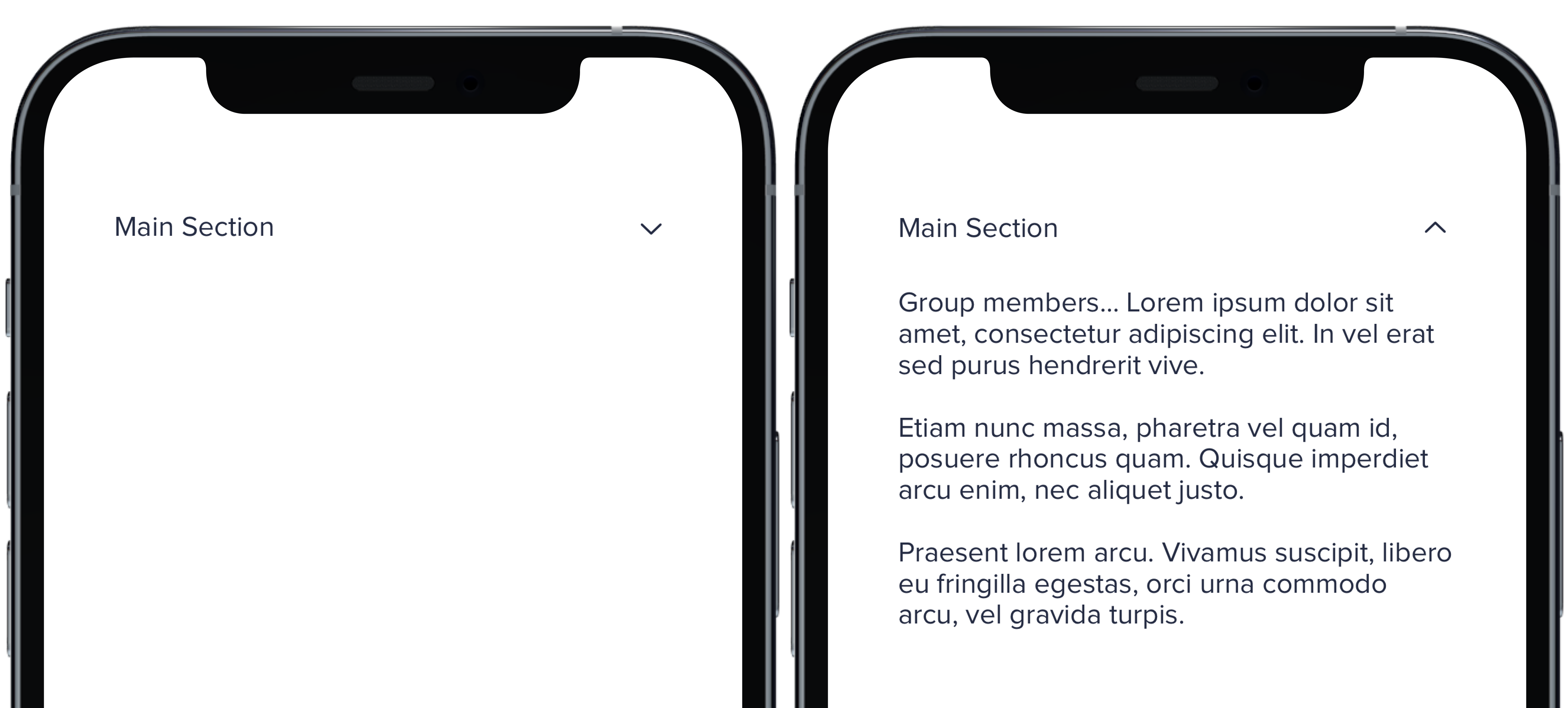
Group members... Lorem ipsum dolor sit amet, consectetur adipiscing elit. In vel erat sed purus hendrerit vive.
|
|
11
|
+
Etiam nunc massa, pharetra vel quam id, posuere rhoncus quam. Quisque imperdiet arcu enim, nec aliquet justo.
|
|
12
|
+
Praesent lorem arcu. Vivamus suscipit, libero eu fringilla egestas, orci urna commodo arcu, vel gravida turpis.
|
|
13
|
+
"
|
|
14
|
+
PBCollapsible(isCollapsed: $isCollapsed, iconSize: iconSize, iconColor: iconColor) {
|
|
15
|
+
VStack(spacing: Spacing.medium) {
|
|
16
|
+
CollapsibleDoc(iconColor: .default, text: "Default Section")
|
|
17
|
+
CollapsibleDoc(iconColor: .light, text: "Light Section")
|
|
18
|
+
CollapsibleDoc(iconColor: .lighter, text: "Lighter Section")
|
|
19
|
+
CollapsibleDoc(iconColor: .link, text: "Link Section")
|
|
20
|
+
CollapsibleDoc(iconColor: .error, text: "Error Section")
|
|
21
|
+
CollapsibleDoc(iconColor: .success, text: "Success Section")
|
|
22
|
+
}
|
|
23
|
+
} content: {
|
|
24
|
+
Text(lorem).pbFont(.body)
|
|
25
|
+
}
|
|
26
|
+
|
|
27
|
+
```
|
|
@@ -0,0 +1,22 @@
|
|
|
1
|
+
|
|
2
|
+
|
|
3
|
+
|
|
4
|
+
```swift
|
|
5
|
+
let iconSize: PBIcon.IconSize
|
|
6
|
+
let iconColor: CollapsibleIconColor
|
|
7
|
+
let text: String
|
|
8
|
+
@State private var isCollapsed = true
|
|
9
|
+
let lorem =
|
|
10
|
+
"
|
|
11
|
+
Group members... Lorem ipsum dolor sit amet, consectetur adipiscing elit. In vel erat sed purus hendrerit vive.
|
|
12
|
+
Etiam nunc massa, pharetra vel quam id, posuere rhoncus quam. Quisque imperdiet arcu enim, nec aliquet justo.
|
|
13
|
+
Praesent lorem arcu. Vivamus suscipit, libero eu fringilla egestas, orci urna commodo arcu, vel gravida turpis.
|
|
14
|
+
"
|
|
15
|
+
|
|
16
|
+
PBCollapsible(isCollapsed: $isCollapsed, iconSize: iconSize, iconColor: iconColor) {
|
|
17
|
+
CollapsibleDoc(text: "Main Section")
|
|
18
|
+
} content: {
|
|
19
|
+
Text(lorem).pbFont(.body)
|
|
20
|
+
}
|
|
21
|
+
|
|
22
|
+
```
|
|
@@ -0,0 +1,8 @@
|
|
|
1
|
+
### Props
|
|
2
|
+
| Name | Type | Description | Default | Values |
|
|
3
|
+
| --- | ----------- | --------- | --------- | --------- |
|
|
4
|
+
| **isCollapsed** | `Bool` | Value for whether or not the dropdown is closed or open | `false` | `true` `false` |
|
|
5
|
+
| **headerView** | `View` | Title of dropdown | | |
|
|
6
|
+
| **contentView** | `View` | Content of dropdown | | |
|
|
7
|
+
| **iconSize** | `PBIcon.IconSize` | Sets size of chevron icon | `.small` | `xSmall` `small` `large` `x1` `x2` `x3` `x4` `x5` `x6` `x7` `x8` `x9` `x10` |
|
|
8
|
+
| **iconColor** | `CollapsibleIconColor` | Sets color of chevron icon | `.default` | `default` `light` `lighter` `link` `error` `success` |
|
|
@@ -0,0 +1,26 @@
|
|
|
1
|
+

|
|
2
|
+
|
|
3
|
+
```swift
|
|
4
|
+
let iconSize: PBIcon.IconSize
|
|
5
|
+
let iconColor: CollapsibleIconColor
|
|
6
|
+
let text: String
|
|
7
|
+
@State private var isCollapsed = true
|
|
8
|
+
let lorem =
|
|
9
|
+
"
|
|
10
|
+
Group members... Lorem ipsum dolor sit amet, consectetur adipiscing elit. In vel erat sed purus hendrerit vive.
|
|
11
|
+
Etiam nunc massa, pharetra vel quam id, posuere rhoncus quam. Quisque imperdiet arcu enim, nec aliquet justo.
|
|
12
|
+
Praesent lorem arcu. Vivamus suscipit, libero eu fringilla egestas, orci urna commodo arcu, vel gravida turpis.
|
|
13
|
+
"
|
|
14
|
+
|
|
15
|
+
PBCollapsible(isCollapsed: $isCollapsed, iconSize: iconSize, iconColor: iconColor) {
|
|
16
|
+
VStack(spacing: Spacing.medium) {
|
|
17
|
+
CollapsibleDoc(iconSize: .xSmall, text: "Extra Small Section")
|
|
18
|
+
CollapsibleDoc(iconSize: .small, text: "Small Section")
|
|
19
|
+
CollapsibleDoc(text: "Default Section")
|
|
20
|
+
CollapsibleDoc(iconSize: .large, text: "Large Section")
|
|
21
|
+
}
|
|
22
|
+
} content: {
|
|
23
|
+
Text(lorem).pbFont(.body)
|
|
24
|
+
}
|
|
25
|
+
|
|
26
|
+
```
|
|
@@ -14,3 +14,9 @@ examples:
|
|
|
14
14
|
- collapsible_color: Icon Color
|
|
15
15
|
- collapsible_icons: Custom Icons
|
|
16
16
|
- collapsible_state: useCollapsible Hook
|
|
17
|
+
|
|
18
|
+
swift:
|
|
19
|
+
- collapsible_default_swift: Default
|
|
20
|
+
- collapsible_sizes_swift: Sizes
|
|
21
|
+
- collapsible_colors_swift: Colors
|
|
22
|
+
- collapsible_props_table: ""
|
|
@@ -50,12 +50,12 @@ type ContactProps = {
|
|
|
50
50
|
contactDetail?: string,
|
|
51
51
|
contactType?: string,
|
|
52
52
|
contactValue: string,
|
|
53
|
-
data?:
|
|
54
|
-
htmlOptions?: {[key: string]: string | number | boolean |
|
|
53
|
+
data?: {[key: string]: string},
|
|
54
|
+
htmlOptions?: {[key: string]: string | number | boolean | (() => void)},
|
|
55
55
|
id?: string,
|
|
56
56
|
}
|
|
57
57
|
|
|
58
|
-
const Contact = (props: ContactProps) => {
|
|
58
|
+
const Contact = (props: ContactProps): React.ReactElement => {
|
|
59
59
|
const {
|
|
60
60
|
aria = {},
|
|
61
61
|
className,
|
|
@@ -18,7 +18,7 @@ type CurrencyProps = {
|
|
|
18
18
|
data?: {[key:string]:string},
|
|
19
19
|
decimals?: 'default' | 'matching',
|
|
20
20
|
emphasized?: boolean,
|
|
21
|
-
htmlOptions?: {[key: string]: string | number | boolean |
|
|
21
|
+
htmlOptions?: {[key: string]: string | number | boolean | (() => void)},
|
|
22
22
|
id?: string,
|
|
23
23
|
label?: string,
|
|
24
24
|
size?: 'sm' | 'md' | 'lg',
|
|
@@ -34,7 +34,7 @@ const sizes: {lg: 1, md: 3, sm: 4} = {
|
|
|
34
34
|
sm: 4,
|
|
35
35
|
}
|
|
36
36
|
|
|
37
|
-
const Currency = (props: CurrencyProps) => {
|
|
37
|
+
const Currency = (props: CurrencyProps): React.ReactElement => {
|
|
38
38
|
const {
|
|
39
39
|
abbreviate = false,
|
|
40
40
|
align = 'left',
|
|
@@ -2,7 +2,7 @@ import colors from "../tokens/exports/_colors.scss";
|
|
|
2
2
|
|
|
3
3
|
|
|
4
4
|
// Map Data Color String Props to our SCSS Variables
|
|
5
|
-
const mapColors = (array: string[]) => {
|
|
5
|
+
const mapColors = (array: string[]): string[] => {
|
|
6
6
|
const regex = /(data)\-[1-8]/; //eslint-disable-line
|
|
7
7
|
|
|
8
8
|
const newArray = array.map((item) => {
|
|
@@ -3,9 +3,6 @@ import typography from '../tokens/exports/_typography.scss'
|
|
|
3
3
|
|
|
4
4
|
import { ThemeProps } from './themeTypes'
|
|
5
5
|
|
|
6
|
-
import Highcharts from 'highcharts'
|
|
7
|
-
|
|
8
|
-
const pbButtonHoverColor = '#004ebb'
|
|
9
6
|
const highchartsDarkTheme: ThemeProps = {
|
|
10
7
|
lang: {
|
|
11
8
|
thousandsSep: ',',
|
|
@@ -22,7 +19,7 @@ const highchartsDarkTheme: ThemeProps = {
|
|
|
22
19
|
chart: {
|
|
23
20
|
borderWidth: 0,
|
|
24
21
|
borderRadius: 0,
|
|
25
|
-
plotBackgroundColor:
|
|
22
|
+
plotBackgroundColor: undefined,
|
|
26
23
|
plotShadow: false,
|
|
27
24
|
plotBorderWidth: 0,
|
|
28
25
|
},
|
|
@@ -64,7 +61,7 @@ const highchartsDarkTheme: ThemeProps = {
|
|
|
64
61
|
},
|
|
65
62
|
},
|
|
66
63
|
yAxis: {
|
|
67
|
-
alternateGridColor:
|
|
64
|
+
alternateGridColor: undefined,
|
|
68
65
|
minorTickInterval: null,
|
|
69
66
|
gridLineColor: colors.border_dark,
|
|
70
67
|
minorGridLineColor: colors.border_dark,
|
|
@@ -104,11 +101,6 @@ const highchartsDarkTheme: ThemeProps = {
|
|
|
104
101
|
color: colors.text_dk_lighter,
|
|
105
102
|
},
|
|
106
103
|
},
|
|
107
|
-
labels: {
|
|
108
|
-
style: {
|
|
109
|
-
color: colors.primary,
|
|
110
|
-
},
|
|
111
|
-
},
|
|
112
104
|
tooltip: {
|
|
113
105
|
backgroundColor: {
|
|
114
106
|
linearGradient: { x1: 0, y1: 0, x2: 0, y2: 1 },
|
|
@@ -130,29 +122,15 @@ const highchartsDarkTheme: ThemeProps = {
|
|
|
130
122
|
// specific to gauge
|
|
131
123
|
// unfilled gauge color
|
|
132
124
|
pane: {
|
|
133
|
-
background: {
|
|
125
|
+
background: [{
|
|
134
126
|
borderColor: colors.border_dark,
|
|
135
|
-
},
|
|
127
|
+
}],
|
|
136
128
|
},
|
|
137
129
|
|
|
138
130
|
plotOptions: {
|
|
139
131
|
series: {
|
|
140
132
|
borderColor: colors.bg_dark_card,
|
|
141
133
|
borderWidth: 2,
|
|
142
|
-
type: 'area',
|
|
143
|
-
nullColor: colors.text_dk_lighter,
|
|
144
|
-
fillColor: {
|
|
145
|
-
linearGradient: {
|
|
146
|
-
x1: 0,
|
|
147
|
-
y1: 0,
|
|
148
|
-
x2: 0,
|
|
149
|
-
y2: 1,
|
|
150
|
-
},
|
|
151
|
-
stops: [
|
|
152
|
-
[0, Highcharts.getOptions().colors[0]],
|
|
153
|
-
[1, 'white'],
|
|
154
|
-
],
|
|
155
|
-
},
|
|
156
134
|
threshold: null,
|
|
157
135
|
},
|
|
158
136
|
// PIE STYLES
|
|
@@ -184,15 +162,6 @@ const highchartsDarkTheme: ThemeProps = {
|
|
|
184
162
|
marker: {
|
|
185
163
|
lineColor: colors.border_dark,
|
|
186
164
|
},
|
|
187
|
-
area: {
|
|
188
|
-
shadow: false,
|
|
189
|
-
states: {
|
|
190
|
-
hover: {
|
|
191
|
-
lineWidth: 1,
|
|
192
|
-
},
|
|
193
|
-
},
|
|
194
|
-
threshold: null,
|
|
195
|
-
},
|
|
196
165
|
},
|
|
197
166
|
|
|
198
167
|
//TREEMAP CHART STYLES
|
|
@@ -210,7 +179,6 @@ const highchartsDarkTheme: ThemeProps = {
|
|
|
210
179
|
colors.data_7,
|
|
211
180
|
colors.data_8,
|
|
212
181
|
],
|
|
213
|
-
colorByPoint: true,
|
|
214
182
|
dataLabels: {
|
|
215
183
|
enabled: true,
|
|
216
184
|
style: {
|
|
@@ -229,27 +197,6 @@ const highchartsDarkTheme: ThemeProps = {
|
|
|
229
197
|
],
|
|
230
198
|
traverseUpButton: {
|
|
231
199
|
position: { y: -50 },
|
|
232
|
-
text: '< Back',
|
|
233
|
-
theme: {
|
|
234
|
-
r: 4,
|
|
235
|
-
states: {
|
|
236
|
-
hover: {
|
|
237
|
-
style: {
|
|
238
|
-
fill: pbButtonHoverColor,
|
|
239
|
-
},
|
|
240
|
-
},
|
|
241
|
-
},
|
|
242
|
-
style: {
|
|
243
|
-
fill: colors.royal,
|
|
244
|
-
color: colors.white,
|
|
245
|
-
fontSize: `${typography.text_small}`,
|
|
246
|
-
fontWeight: typography.bold,
|
|
247
|
-
fontFamily: `${typography.font_family_base}`,
|
|
248
|
-
},
|
|
249
|
-
stroke: colors.royal,
|
|
250
|
-
height: 24,
|
|
251
|
-
width: 90,
|
|
252
|
-
},
|
|
253
200
|
},
|
|
254
201
|
},
|
|
255
202
|
},
|
|
@@ -3,9 +3,6 @@ import typography from '../tokens/exports/_typography.scss'
|
|
|
3
3
|
|
|
4
4
|
import { ThemeProps } from './themeTypes'
|
|
5
5
|
|
|
6
|
-
import Highcharts from 'highcharts'
|
|
7
|
-
|
|
8
|
-
const pbButtonHoverColor = '#004ebb'
|
|
9
6
|
const highchartsTheme: ThemeProps = {
|
|
10
7
|
lang: {
|
|
11
8
|
thousandsSep: ',',
|
|
@@ -22,7 +19,7 @@ const highchartsTheme: ThemeProps = {
|
|
|
22
19
|
chart: {
|
|
23
20
|
borderWidth: 0,
|
|
24
21
|
borderRadius: 0,
|
|
25
|
-
plotBackgroundColor:
|
|
22
|
+
plotBackgroundColor: undefined,
|
|
26
23
|
plotShadow: false,
|
|
27
24
|
plotBorderWidth: 0,
|
|
28
25
|
},
|
|
@@ -64,7 +61,7 @@ const highchartsTheme: ThemeProps = {
|
|
|
64
61
|
},
|
|
65
62
|
},
|
|
66
63
|
yAxis: {
|
|
67
|
-
alternateGridColor:
|
|
64
|
+
alternateGridColor: undefined,
|
|
68
65
|
minorTickInterval: null,
|
|
69
66
|
gridLineColor: colors.border_light,
|
|
70
67
|
minorGridLineColor: colors.border_light,
|
|
@@ -104,11 +101,6 @@ const highchartsTheme: ThemeProps = {
|
|
|
104
101
|
color: colors.text_lt_lighter,
|
|
105
102
|
},
|
|
106
103
|
},
|
|
107
|
-
labels: {
|
|
108
|
-
style: {
|
|
109
|
-
color: colors.primary,
|
|
110
|
-
},
|
|
111
|
-
},
|
|
112
104
|
tooltip: {
|
|
113
105
|
backgroundColor: {
|
|
114
106
|
linearGradient: { x1: 0, y1: 0, x2: 0, y2: 1 },
|
|
@@ -130,27 +122,13 @@ const highchartsTheme: ThemeProps = {
|
|
|
130
122
|
// specific to gauge
|
|
131
123
|
// unfilled gauge color
|
|
132
124
|
pane: {
|
|
133
|
-
background: {
|
|
125
|
+
background: [{
|
|
134
126
|
borderColor: colors.border_light,
|
|
135
|
-
},
|
|
127
|
+
}],
|
|
136
128
|
},
|
|
137
129
|
|
|
138
130
|
plotOptions: {
|
|
139
131
|
series: {
|
|
140
|
-
type: 'area',
|
|
141
|
-
nullColor: colors.text_lt_lighter,
|
|
142
|
-
fillColor: {
|
|
143
|
-
linearGradient: {
|
|
144
|
-
x1: 0,
|
|
145
|
-
y1: 0,
|
|
146
|
-
x2: 0,
|
|
147
|
-
y2: 1,
|
|
148
|
-
},
|
|
149
|
-
stops: [
|
|
150
|
-
[0, Highcharts.getOptions().colors[0]],
|
|
151
|
-
[1, 'white'],
|
|
152
|
-
],
|
|
153
|
-
},
|
|
154
132
|
threshold: null,
|
|
155
133
|
},
|
|
156
134
|
// PIE STYLES
|
|
@@ -182,15 +160,6 @@ const highchartsTheme: ThemeProps = {
|
|
|
182
160
|
marker: {
|
|
183
161
|
lineColor: '#333',
|
|
184
162
|
},
|
|
185
|
-
area: {
|
|
186
|
-
shadow: false,
|
|
187
|
-
states: {
|
|
188
|
-
hover: {
|
|
189
|
-
lineWidth: 1,
|
|
190
|
-
},
|
|
191
|
-
},
|
|
192
|
-
threshold: null,
|
|
193
|
-
},
|
|
194
163
|
},
|
|
195
164
|
|
|
196
165
|
//TREEMAP CHART STYLES
|
|
@@ -208,7 +177,6 @@ const highchartsTheme: ThemeProps = {
|
|
|
208
177
|
colors.data_7,
|
|
209
178
|
colors.data_8,
|
|
210
179
|
],
|
|
211
|
-
colorByPoint: true,
|
|
212
180
|
dataLabels: {
|
|
213
181
|
enabled: true,
|
|
214
182
|
style: {
|
|
@@ -227,27 +195,6 @@ const highchartsTheme: ThemeProps = {
|
|
|
227
195
|
],
|
|
228
196
|
traverseUpButton: {
|
|
229
197
|
position: { y: -50 },
|
|
230
|
-
text: '< Back',
|
|
231
|
-
theme: {
|
|
232
|
-
r: 4,
|
|
233
|
-
states: {
|
|
234
|
-
hover: {
|
|
235
|
-
style: {
|
|
236
|
-
fill: pbButtonHoverColor,
|
|
237
|
-
},
|
|
238
|
-
},
|
|
239
|
-
},
|
|
240
|
-
style: {
|
|
241
|
-
fill: colors.royal,
|
|
242
|
-
color: colors.white,
|
|
243
|
-
fontSize: `${typography.text_small}`,
|
|
244
|
-
fontWeight: typography.bold,
|
|
245
|
-
fontFamily: `${typography.font_family_base}`,
|
|
246
|
-
},
|
|
247
|
-
stroke: colors.royal,
|
|
248
|
-
height: 24,
|
|
249
|
-
width: 90,
|
|
250
|
-
},
|
|
251
198
|
},
|
|
252
199
|
},
|
|
253
200
|
},
|
|
@@ -1,16 +1,20 @@
|
|
|
1
|
-
|
|
2
|
-
|
|
3
|
-
|
|
4
|
-
|
|
5
|
-
|
|
6
|
-
|
|
7
|
-
|
|
8
|
-
|
|
9
|
-
|
|
10
|
-
|
|
11
|
-
|
|
12
|
-
|
|
13
|
-
|
|
14
|
-
|
|
15
|
-
|
|
16
|
-
|
|
1
|
+
import { Options, LegendOptions } from "highcharts";
|
|
2
|
+
export interface ThemeProps
|
|
3
|
+
extends Pick<
|
|
4
|
+
Options,
|
|
5
|
+
| "credits"
|
|
6
|
+
| "chart"
|
|
7
|
+
| "colors"
|
|
8
|
+
| "lang"
|
|
9
|
+
| "title"
|
|
10
|
+
| "subtitle"
|
|
11
|
+
| "xAxis"
|
|
12
|
+
| "yAxis"
|
|
13
|
+
| "legend"
|
|
14
|
+
| "tooltip"
|
|
15
|
+
| "pane"
|
|
16
|
+
| "plotOptions"
|
|
17
|
+
> {
|
|
18
|
+
colorKey?: string;
|
|
19
|
+
legend?: LegendOptions;
|
|
20
|
+
}
|
|
@@ -12,7 +12,7 @@ type DashboardValueProps = {
|
|
|
12
12
|
aria?: { [key: string]: string },
|
|
13
13
|
className?: string,
|
|
14
14
|
data?: { [key: string]: string },
|
|
15
|
-
htmlOptions?: {[key: string]: string | number | boolean |
|
|
15
|
+
htmlOptions?: {[key: string]: string | number | boolean | (() => void)},
|
|
16
16
|
id?: string,
|
|
17
17
|
statChange?: {
|
|
18
18
|
change? : 'increase' | 'decrease' | 'neutral',
|
|
@@ -15,7 +15,7 @@ type PbDateProps = {
|
|
|
15
15
|
aria?: { [key: string]: string };
|
|
16
16
|
className?: string;
|
|
17
17
|
data?: { [key: string]: string };
|
|
18
|
-
htmlOptions?: { [key: string]: string | number | boolean |
|
|
18
|
+
htmlOptions?: { [key: string]: string | number | boolean | (() => void) };
|
|
19
19
|
id?: string;
|
|
20
20
|
showDayOfWeek?: boolean;
|
|
21
21
|
showIcon?: boolean;
|
|
@@ -24,7 +24,7 @@ type PbDateProps = {
|
|
|
24
24
|
value: Date;
|
|
25
25
|
};
|
|
26
26
|
|
|
27
|
-
const PbDate = (props: PbDateProps) => {
|
|
27
|
+
const PbDate = (props: PbDateProps): React.ReactElement => {
|
|
28
28
|
const {
|
|
29
29
|
aria = {},
|
|
30
30
|
alignment = "left",
|
|
@@ -57,11 +57,11 @@ const PbDate = (props: PbDateProps) => {
|
|
|
57
57
|
|
|
58
58
|
return (
|
|
59
59
|
<div
|
|
60
|
-
|
|
61
|
-
|
|
62
|
-
|
|
63
|
-
|
|
64
|
-
|
|
60
|
+
{...ariaProps}
|
|
61
|
+
{...dataProps}
|
|
62
|
+
{...htmlProps}
|
|
63
|
+
className={classes}
|
|
64
|
+
id={id}
|
|
65
65
|
>
|
|
66
66
|
{unstyled
|
|
67
67
|
? <>
|
|
@@ -26,7 +26,7 @@ type DatePickerProps = {
|
|
|
26
26
|
format?: string,
|
|
27
27
|
hideIcon?: boolean,
|
|
28
28
|
hideLabel?: boolean,
|
|
29
|
-
htmlOptions?: {[key: string]: string | number | boolean |
|
|
29
|
+
htmlOptions?: {[key: string]: string | number | boolean | (() => void)},
|
|
30
30
|
id?: string,
|
|
31
31
|
inLine?: boolean,
|
|
32
32
|
inputAria?: { [key: string]: string },
|
|
@@ -16,7 +16,7 @@ type DateRangeInlineProps = {
|
|
|
16
16
|
align?: "left" | "center" | "vertical";
|
|
17
17
|
size?: "sm" | "xs";
|
|
18
18
|
dark?: boolean;
|
|
19
|
-
htmlOptions?: {[key: string]: string | number | boolean |
|
|
19
|
+
htmlOptions?: {[key: string]: string | number | boolean | (() => any)};
|
|
20
20
|
icon?: boolean;
|
|
21
21
|
startDate?: Date;
|
|
22
22
|
endDate?: Date;
|
|
@@ -34,7 +34,7 @@ const dateTimeIso = (dateValue: Date) => {
|
|
|
34
34
|
return DateTime.toIso(dateValue);
|
|
35
35
|
};
|
|
36
36
|
|
|
37
|
-
const DateRangeInline = (props: DateRangeInlineProps) => {
|
|
37
|
+
const DateRangeInline = (props: DateRangeInlineProps): React.ReactElement => {
|
|
38
38
|
const {
|
|
39
39
|
icon = false,
|
|
40
40
|
dark = false,
|
|
@@ -15,12 +15,12 @@ type DateRangeStackedProps = {
|
|
|
15
15
|
data?: string,
|
|
16
16
|
dark?: boolean,
|
|
17
17
|
endDate: Date,
|
|
18
|
-
htmlOptions?: {[key: string]: string | number | boolean |
|
|
18
|
+
htmlOptions?: {[key: string]: string | number | boolean | (() => void)},
|
|
19
19
|
id?: string,
|
|
20
20
|
startDate: Date,
|
|
21
21
|
}
|
|
22
22
|
|
|
23
|
-
const DateRangeStacked = (props: DateRangeStackedProps) => {
|
|
23
|
+
const DateRangeStacked = (props: DateRangeStackedProps): React.ReactElement => {
|
|
24
24
|
const {
|
|
25
25
|
className,
|
|
26
26
|
dark = false,
|