playbook_ui 13.12.0 → 13.13.0.pre.alpha.PLAY1097linterenhancedelement1728
Sign up to get free protection for your applications and to get access to all the features.
- checksums.yaml +4 -4
- data/app/pb_kits/playbook/pb_avatar/_avatar.tsx +5 -1
- data/app/pb_kits/playbook/pb_avatar_action_button/_avatar_action_button.tsx +6 -2
- data/app/pb_kits/playbook/pb_background/_background.tsx +9 -5
- data/app/pb_kits/playbook/pb_badge/_badge.tsx +5 -1
- data/app/pb_kits/playbook/pb_bar_graph/_bar_graph.tsx +6 -2
- data/app/pb_kits/playbook/pb_body/_body.tsx +5 -1
- data/app/pb_kits/playbook/pb_bread_crumbs/_bread_crumb_item.tsx +5 -1
- data/app/pb_kits/playbook/pb_bread_crumbs/_bread_crumbs.tsx +5 -2
- data/app/pb_kits/playbook/pb_button/_button.tsx +8 -1
- data/app/pb_kits/playbook/pb_button_toolbar/_button_toolbar.tsx +5 -1
- data/app/pb_kits/playbook/pb_caption/_caption.tsx +6 -1
- data/app/pb_kits/playbook/pb_card/_card.tsx +5 -1
- data/app/pb_kits/playbook/pb_checkbox/_checkbox.tsx +7 -2
- data/app/pb_kits/playbook/pb_circle_chart/_circle_chart.tsx +7 -2
- data/app/pb_kits/playbook/pb_circle_icon_button/_circle_icon_button.tsx +5 -3
- data/app/pb_kits/playbook/pb_collapsible/_collapsible.tsx +5 -1
- data/app/pb_kits/playbook/pb_contact/_contact.tsx +5 -1
- data/app/pb_kits/playbook/pb_contact/docs/_contact_default_swift.md +14 -0
- data/app/pb_kits/playbook/pb_contact/docs/_contact_props_swift.md +6 -0
- data/app/pb_kits/playbook/pb_contact/docs/_contact_with_detail_swift.md +14 -0
- data/app/pb_kits/playbook/pb_contact/docs/example.yml +6 -0
- data/app/pb_kits/playbook/pb_currency/_currency.tsx +5 -1
- data/app/pb_kits/playbook/pb_dashboard_value/_dashboard_value.tsx +5 -1
- data/app/pb_kits/playbook/pb_date/_date.tsx +12 -7
- data/app/pb_kits/playbook/pb_date/docs/_date_alignment_swift.md +11 -0
- data/app/pb_kits/playbook/pb_date/docs/_date_default_swift.md +16 -0
- data/app/pb_kits/playbook/pb_date/docs/_date_props_swift.md +8 -0
- data/app/pb_kits/playbook/pb_date/docs/_date_unstyled_swift.md +11 -0
- data/app/pb_kits/playbook/pb_date/docs/_date_variants_swift.md +14 -0
- data/app/pb_kits/playbook/pb_date/docs/example.yml +7 -0
- data/app/pb_kits/playbook/pb_date_picker/_date_picker.tsx +5 -1
- data/app/pb_kits/playbook/pb_date_range_inline/_date_range_inline.tsx +5 -1
- data/app/pb_kits/playbook/pb_date_range_stacked/_date_range_stacked.tsx +15 -4
- data/app/pb_kits/playbook/pb_date_stacked/_date_stacked.tsx +12 -5
- data/app/pb_kits/playbook/pb_date_time/_date_time.tsx +5 -1
- data/app/pb_kits/playbook/pb_date_time_stacked/_date_time_stacked.tsx +5 -1
- data/app/pb_kits/playbook/pb_date_year_stacked/_date_year_stacked.tsx +15 -4
- data/app/pb_kits/playbook/pb_detail/_detail.tsx +5 -1
- data/app/pb_kits/playbook/pb_dialog/_dialog.tsx +11 -3
- data/app/pb_kits/playbook/pb_dialog/child_kits/_dialog_footer.tsx +8 -3
- data/app/pb_kits/playbook/pb_dialog/child_kits/_dialog_header.tsx +5 -1
- data/app/pb_kits/playbook/pb_distribution_bar/_distribution_bar.tsx +8 -1
- data/app/pb_kits/playbook/pb_enhanced_element/element_observer.ts +1 -1
- data/app/pb_kits/playbook/pb_enhanced_element/index.ts +1 -1
- data/app/pb_kits/playbook/pb_file_upload/_file_upload.tsx +6 -2
- data/app/pb_kits/playbook/pb_filter/docs/_filter_default.md +1 -0
- data/app/pb_kits/playbook/pb_fixed_confirmation_toast/_fixed_confirmation_toast.tsx +6 -1
- data/app/pb_kits/playbook/pb_flex/_flex.tsx +6 -1
- data/app/pb_kits/playbook/pb_flex/_flex_item.tsx +6 -1
- data/app/pb_kits/playbook/pb_form_group/_form_group.tsx +5 -1
- data/app/pb_kits/playbook/pb_form_pill/_form_pill.tsx +7 -1
- data/app/pb_kits/playbook/pb_gauge/_gauge.tsx +6 -2
- data/app/pb_kits/playbook/pb_hashtag/_hashtag.tsx +5 -1
- data/app/pb_kits/playbook/pb_highlight/_highlight.tsx +5 -0
- data/app/pb_kits/playbook/pb_home_address_street/_home_address_street.tsx +10 -3
- data/app/pb_kits/playbook/pb_home_address_street/docs/_home_address_street_default_swift.md +18 -0
- data/app/pb_kits/playbook/pb_home_address_street/docs/_home_address_street_emphasis_swift.md +34 -0
- data/app/pb_kits/playbook/pb_home_address_street/docs/_home_address_street_link_swift.md +18 -0
- data/app/pb_kits/playbook/pb_home_address_street/docs/_home_address_street_modified_swift.md +13 -0
- data/app/pb_kits/playbook/pb_home_address_street/docs/_home_address_street_props_swift.md +14 -0
- data/app/pb_kits/playbook/pb_home_address_street/docs/example.yml +6 -0
- data/app/pb_kits/playbook/pb_icon/_icon.tsx +7 -1
- data/app/pb_kits/playbook/pb_icon_circle/_icon_circle.tsx +5 -1
- data/app/pb_kits/playbook/pb_icon_stat_value/_icon_stat_value.tsx +5 -1
- data/app/pb_kits/playbook/pb_icon_value/_icon_value.tsx +5 -1
- data/app/pb_kits/playbook/pb_image/_image.tsx +6 -1
- data/app/pb_kits/playbook/pb_label_pill/_label_pill.tsx +5 -1
- data/app/pb_kits/playbook/pb_label_value/_label_value.tsx +6 -2
- data/app/pb_kits/playbook/pb_layout/_layout.tsx +6 -1
- data/app/pb_kits/playbook/pb_legend/_legend.tsx +5 -1
- data/app/pb_kits/playbook/pb_lightbox/Header/_lightbox_header.tsx +6 -1
- data/app/pb_kits/playbook/pb_lightbox/_lightbox.tsx +5 -1
- data/app/pb_kits/playbook/pb_line_graph/_line_graph.tsx +9 -3
- data/app/pb_kits/playbook/pb_list/_list.tsx +7 -2
- data/app/pb_kits/playbook/pb_list/_list_item.tsx +5 -1
- data/app/pb_kits/playbook/pb_loading_inline/_loading_inline.tsx +5 -1
- data/app/pb_kits/playbook/pb_map/_map.tsx +6 -1
- data/app/pb_kits/playbook/pb_message/_message.tsx +5 -1
- data/app/pb_kits/playbook/pb_message/_message_mention.tsx +5 -1
- data/app/pb_kits/playbook/pb_multi_level_select/_multi_level_select.tsx +5 -1
- data/app/pb_kits/playbook/pb_multiple_users/_multiple_users.tsx +5 -1
- data/app/pb_kits/playbook/pb_multiple_users/docs/_multiple_users_default_swift.md +11 -0
- data/app/pb_kits/playbook/pb_multiple_users/docs/_multiple_users_props_swift.md +7 -0
- data/app/pb_kits/playbook/pb_multiple_users/docs/_multiple_users_reverse_swift.md +13 -0
- data/app/pb_kits/playbook/pb_multiple_users/docs/_multiple_users_size_swift.md +11 -0
- data/app/pb_kits/playbook/pb_multiple_users/docs/example.yml +6 -0
- data/app/pb_kits/playbook/pb_multiple_users_stacked/_multiple_users_stacked.tsx +5 -1
- data/app/pb_kits/playbook/pb_multiple_users_stacked/docs/_multiple_users_stacked_default_swift.md +15 -0
- data/app/pb_kits/playbook/pb_multiple_users_stacked/docs/_multiple_users_stacked_props_swift.md +5 -0
- data/app/pb_kits/playbook/pb_multiple_users_stacked/docs/_multiple_users_stacked_small_swift.md +15 -0
- data/app/pb_kits/playbook/pb_multiple_users_stacked/docs/_multiple_users_stacked_xsmall_swift.md +15 -0
- data/app/pb_kits/playbook/pb_multiple_users_stacked/docs/example.yml +6 -0
- data/app/pb_kits/playbook/pb_nav/_item.tsx +7 -2
- data/app/pb_kits/playbook/pb_nav/_nav.tsx +5 -1
- data/app/pb_kits/playbook/pb_online_status/_online_status.tsx +5 -1
- data/app/pb_kits/playbook/pb_passphrase/_passphrase.tsx +6 -2
- data/app/pb_kits/playbook/pb_person/_person.tsx +5 -0
- data/app/pb_kits/playbook/pb_person_contact/_person_contact.tsx +5 -1
- data/app/pb_kits/playbook/pb_phone_number_input/_phone_number_input.tsx +8 -2
- data/app/pb_kits/playbook/pb_pill/_pill.tsx +5 -1
- data/app/pb_kits/playbook/pb_popover/_popover.tsx +6 -1
- data/app/pb_kits/playbook/pb_progress_pills/_progress_pills.tsx +5 -1
- data/app/pb_kits/playbook/pb_progress_simple/_progress_simple.tsx +9 -3
- data/app/pb_kits/playbook/pb_progress_step/_progress_step.tsx +5 -1
- data/app/pb_kits/playbook/pb_progress_step/_progress_step_item.tsx +6 -2
- data/app/pb_kits/playbook/pb_radio/_radio.tsx +5 -1
- data/app/pb_kits/playbook/pb_rich_text_editor/_rich_text_editor.tsx +7 -1
- data/app/pb_kits/playbook/pb_section_separator/_section_separator.tsx +5 -1
- data/app/pb_kits/playbook/pb_section_separator/docs/_section_separator_children_swift.md +14 -0
- data/app/pb_kits/playbook/pb_section_separator/docs/_section_separator_dashed_swift.md +7 -0
- data/app/pb_kits/playbook/pb_section_separator/docs/_section_separator_line_swift.md +8 -0
- data/app/pb_kits/playbook/pb_section_separator/docs/_section_separator_props_swift.md +8 -0
- data/app/pb_kits/playbook/pb_section_separator/docs/_section_separator_text_swift.md +7 -0
- data/app/pb_kits/playbook/pb_section_separator/docs/_section_separator_vertical_swift.md +18 -0
- data/app/pb_kits/playbook/pb_section_separator/docs/example.yml +8 -0
- data/app/pb_kits/playbook/pb_select/_select.tsx +6 -1
- data/app/pb_kits/playbook/pb_selectable_card/_selectable_card.tsx +6 -2
- data/app/pb_kits/playbook/pb_selectable_card_icon/_selectable_card_icon.tsx +5 -0
- data/app/pb_kits/playbook/pb_selectable_icon/_selectable_icon.tsx +5 -0
- data/app/pb_kits/playbook/pb_selectable_list/_item.tsx +11 -3
- data/app/pb_kits/playbook/pb_selectable_list/_selectable_list.tsx +5 -1
- data/app/pb_kits/playbook/pb_source/_source.tsx +5 -1
- data/app/pb_kits/playbook/pb_star_rating/_star_rating.tsx +5 -1
- data/app/pb_kits/playbook/pb_stat_change/_stat_change.tsx +14 -2
- data/app/pb_kits/playbook/pb_stat_value/_stat_value.tsx +6 -0
- data/app/pb_kits/playbook/pb_table/_table.tsx +5 -1
- data/app/pb_kits/playbook/pb_table/_table_row.tsx +5 -1
- data/app/pb_kits/playbook/pb_text_input/_text_input.tsx +5 -1
- data/app/pb_kits/playbook/pb_text_input/docs/_text_input_add_on_swift.md +35 -0
- data/app/pb_kits/playbook/pb_text_input/docs/_text_input_default_swift.md +29 -0
- data/app/pb_kits/playbook/pb_text_input/docs/_text_input_disabled_swift.md +13 -0
- data/app/pb_kits/playbook/pb_text_input/docs/_text_input_error_swift.md +24 -0
- data/app/pb_kits/playbook/pb_text_input/docs/_text_input_props_swift.md +13 -0
- data/app/pb_kits/playbook/pb_text_input/docs/example.yml +7 -0
- data/app/pb_kits/playbook/pb_textarea/_textarea.tsx +5 -2
- data/app/pb_kits/playbook/pb_textarea/docs/_textarea_default_swift.md +27 -0
- data/app/pb_kits/playbook/pb_textarea/docs/_textarea_error_swift.md +11 -0
- data/app/pb_kits/playbook/pb_textarea/docs/_textarea_props_swift.md +9 -0
- data/app/pb_kits/playbook/pb_textarea/docs/example.yml +5 -0
- data/app/pb_kits/playbook/pb_time/_time.tsx +9 -2
- data/app/pb_kits/playbook/pb_time_range_inline/_time_range_inline.tsx +5 -1
- data/app/pb_kits/playbook/pb_time_stacked/_time_stacked.tsx +6 -2
- data/app/pb_kits/playbook/pb_timeline/_item.tsx +9 -2
- data/app/pb_kits/playbook/pb_timeline/_timeline.tsx +5 -1
- data/app/pb_kits/playbook/pb_timestamp/_timestamp.tsx +5 -1
- data/app/pb_kits/playbook/pb_title/_title.tsx +5 -1
- data/app/pb_kits/playbook/pb_title_count/_title_count.tsx +5 -1
- data/app/pb_kits/playbook/pb_title_detail/_title_detail.tsx +16 -3
- data/app/pb_kits/playbook/pb_toggle/_toggle.tsx +5 -0
- data/app/pb_kits/playbook/pb_toggle/docs/_toggle_default_swift.md +11 -0
- data/app/pb_kits/playbook/pb_toggle/docs/_toggle_name_swift.md +10 -0
- data/app/pb_kits/playbook/pb_toggle/docs/_toggle_props_swift.md +6 -0
- data/app/pb_kits/playbook/pb_toggle/docs/example.yml +4 -0
- data/app/pb_kits/playbook/pb_tooltip/_tooltip.tsx +5 -1
- data/app/pb_kits/playbook/pb_treemap_chart/_treemap_chart.tsx +9 -3
- data/app/pb_kits/playbook/pb_typeahead/_typeahead.tsx +7 -2
- data/app/pb_kits/playbook/pb_typeahead/docs/_typeahead_with_highlight.jsx +2 -2
- data/app/pb_kits/playbook/pb_user/_user.tsx +5 -1
- data/app/pb_kits/playbook/pb_user_badge/_user_badge.tsx +5 -1
- data/app/pb_kits/playbook/pb_walkthrough/_walkthrough.tsx +5 -1
- data/app/pb_kits/playbook/pb_weekday_stacked/_weekday_stacked.tsx +5 -1
- data/app/pb_kits/playbook/utilities/props.ts +16 -0
- data/dist/menu.yml +240 -168
- data/dist/playbook-rails.js +5 -5
- data/lib/playbook/version.rb +2 -2
- metadata +46 -7
|
@@ -1,6 +1,6 @@
|
|
|
1
1
|
import React from 'react'
|
|
2
2
|
import classnames from 'classnames'
|
|
3
|
-
import { buildAriaProps, buildCss, buildDataProps } from '../utilities/props'
|
|
3
|
+
import { buildAriaProps, buildCss, buildDataProps, buildHtmlProps } from '../utilities/props'
|
|
4
4
|
import { globalProps, GlobalProps } from '../utilities/globalProps'
|
|
5
5
|
|
|
6
6
|
type DetailProps = {
|
|
@@ -11,6 +11,7 @@ type DetailProps = {
|
|
|
11
11
|
color?: 'light' | 'default' | 'lighter' | 'link' | 'error' | 'success',
|
|
12
12
|
dark?: boolean,
|
|
13
13
|
data?: { [key: string]: string },
|
|
14
|
+
htmlOptions?: {[key: string]: string | number | boolean | Function},
|
|
14
15
|
id?: string,
|
|
15
16
|
tag?: 'h1' | 'h2' | 'h3' | 'h4' | 'h5' | 'h6' | 'p' | 'span' | 'div',
|
|
16
17
|
text?: string,
|
|
@@ -24,6 +25,7 @@ const Detail = (props: DetailProps) => {
|
|
|
24
25
|
className,
|
|
25
26
|
color = 'light',
|
|
26
27
|
data = {},
|
|
28
|
+
htmlOptions = {},
|
|
27
29
|
id = '',
|
|
28
30
|
tag = 'div',
|
|
29
31
|
text= ''
|
|
@@ -31,6 +33,7 @@ const Detail = (props: DetailProps) => {
|
|
|
31
33
|
|
|
32
34
|
const ariaProps: {[key: string]: any} = buildAriaProps(aria)
|
|
33
35
|
const dataProps: {[key: string]: any} = buildDataProps(data)
|
|
36
|
+
const htmlProps = buildHtmlProps(htmlOptions);
|
|
34
37
|
const isBold = bold ? "bold" : null
|
|
35
38
|
const classes = classnames(
|
|
36
39
|
buildCss('pb_detail_kit', color),
|
|
@@ -44,6 +47,7 @@ const Detail = (props: DetailProps) => {
|
|
|
44
47
|
<Tag
|
|
45
48
|
{...ariaProps}
|
|
46
49
|
{...dataProps}
|
|
50
|
+
{...htmlProps}
|
|
47
51
|
className={classes}
|
|
48
52
|
id={id}
|
|
49
53
|
>
|
|
@@ -5,7 +5,7 @@ import React, { useState } from "react";
|
|
|
5
5
|
import classnames from "classnames";
|
|
6
6
|
import Modal from "react-modal";
|
|
7
7
|
|
|
8
|
-
import { buildAriaProps, buildCss, buildDataProps } from "../utilities/props";
|
|
8
|
+
import { buildAriaProps, buildCss, buildDataProps, buildHtmlProps } from "../utilities/props";
|
|
9
9
|
import { globalProps } from "../utilities/globalProps";
|
|
10
10
|
|
|
11
11
|
import Body from "../pb_body/_body";
|
|
@@ -26,6 +26,7 @@ type DialogProps = {
|
|
|
26
26
|
closeable: boolean;
|
|
27
27
|
confirmButton?: string;
|
|
28
28
|
data?: object;
|
|
29
|
+
htmlOptions?: { [key: string]: string | number | boolean | Function };
|
|
29
30
|
id?: string;
|
|
30
31
|
fullHeight?: boolean;
|
|
31
32
|
loading?: boolean;
|
|
@@ -51,6 +52,7 @@ const Dialog = (props: DialogProps) => {
|
|
|
51
52
|
confirmButton,
|
|
52
53
|
className,
|
|
53
54
|
data = {},
|
|
55
|
+
htmlOptions = {},
|
|
54
56
|
id,
|
|
55
57
|
size = "md",
|
|
56
58
|
children,
|
|
@@ -69,7 +71,8 @@ const Dialog = (props: DialogProps) => {
|
|
|
69
71
|
trigger,
|
|
70
72
|
} = props;
|
|
71
73
|
const ariaProps = buildAriaProps(aria);
|
|
72
|
-
|
|
74
|
+
const dataProps = buildDataProps(data)
|
|
75
|
+
const htmlProps = buildHtmlProps(htmlOptions);
|
|
73
76
|
const dialogClassNames = {
|
|
74
77
|
base: classnames("pb_dialog", buildCss("pb_dialog", size, placement)),
|
|
75
78
|
afterOpen: "pb_dialog_after_open",
|
|
@@ -164,7 +167,12 @@ const Dialog = (props: DialogProps) => {
|
|
|
164
167
|
|
|
165
168
|
return (
|
|
166
169
|
<DialogContext.Provider value={api}>
|
|
167
|
-
<div
|
|
170
|
+
<div
|
|
171
|
+
{...ariaProps}
|
|
172
|
+
{...dataProps}
|
|
173
|
+
{...htmlProps}
|
|
174
|
+
className={classes}
|
|
175
|
+
>
|
|
168
176
|
<Modal
|
|
169
177
|
ariaHideApp={false}
|
|
170
178
|
className={dialogClassNames}
|
|
@@ -1,7 +1,7 @@
|
|
|
1
1
|
import React from 'react'
|
|
2
2
|
import classnames from 'classnames'
|
|
3
3
|
|
|
4
|
-
import { buildCss } from '../../utilities/props'
|
|
4
|
+
import { buildCss, buildHtmlProps } from '../../utilities/props'
|
|
5
5
|
import { GlobalProps, globalProps } from '../../utilities/globalProps'
|
|
6
6
|
|
|
7
7
|
import Flex from '../../pb_flex/_flex'
|
|
@@ -13,6 +13,7 @@ type DialogFooterProps = {
|
|
|
13
13
|
children: React.ReactChild[] | React.ReactChild | string,
|
|
14
14
|
className?: string,
|
|
15
15
|
data?: {[key: string]: string},
|
|
16
|
+
htmlOptions?: {[key: string]: string | number | boolean | Function},
|
|
16
17
|
id?: string,
|
|
17
18
|
padding?: string,
|
|
18
19
|
paddingBottom?: string,
|
|
@@ -26,15 +27,19 @@ const DialogFooter = (props: DialogFooterProps) => {
|
|
|
26
27
|
const {
|
|
27
28
|
children,
|
|
28
29
|
className,
|
|
30
|
+
htmlOptions = {},
|
|
29
31
|
spacing = "between",
|
|
30
32
|
separator = false,
|
|
31
33
|
} = props
|
|
32
34
|
|
|
33
35
|
const footerCSS = buildCss("dialog_footer")
|
|
34
36
|
const footerSpacing = globalProps(props)
|
|
37
|
+
const htmlProps = buildHtmlProps(htmlOptions)
|
|
35
38
|
|
|
36
39
|
return (
|
|
37
|
-
|
|
40
|
+
<div
|
|
41
|
+
{...htmlProps}
|
|
42
|
+
>
|
|
38
43
|
{separator &&
|
|
39
44
|
<SectionSeparator />
|
|
40
45
|
}
|
|
@@ -46,7 +51,7 @@ const DialogFooter = (props: DialogFooterProps) => {
|
|
|
46
51
|
>
|
|
47
52
|
{children}
|
|
48
53
|
</Flex>
|
|
49
|
-
|
|
54
|
+
</div>
|
|
50
55
|
)
|
|
51
56
|
}
|
|
52
57
|
|
|
@@ -1,6 +1,6 @@
|
|
|
1
1
|
import React, { useContext } from 'react'
|
|
2
2
|
import classnames from 'classnames'
|
|
3
|
-
import { buildAriaProps, buildCss, buildDataProps } from '../../utilities/props'
|
|
3
|
+
import { buildAriaProps, buildCss, buildDataProps, buildHtmlProps } from '../../utilities/props'
|
|
4
4
|
import { globalProps, GlobalProps } from '../../utilities/globalProps'
|
|
5
5
|
|
|
6
6
|
import { CloseIcon } from '../_close_icon'
|
|
@@ -14,6 +14,7 @@ type DialogHeaderProps = {
|
|
|
14
14
|
className?: string,
|
|
15
15
|
closeable?: boolean,
|
|
16
16
|
data?: object,
|
|
17
|
+
htmlOptions?: {[key: string]: string | number | boolean | Function},
|
|
17
18
|
id?: string,
|
|
18
19
|
padding?: string,
|
|
19
20
|
separator?: boolean,
|
|
@@ -28,6 +29,7 @@ const DialogHeader = (props: DialogHeaderProps) => {
|
|
|
28
29
|
children,
|
|
29
30
|
className,
|
|
30
31
|
data = {},
|
|
32
|
+
htmlOptions = {},
|
|
31
33
|
spacing = "between",
|
|
32
34
|
closeable = true,
|
|
33
35
|
separator = true,
|
|
@@ -35,6 +37,7 @@ const DialogHeader = (props: DialogHeaderProps) => {
|
|
|
35
37
|
|
|
36
38
|
const ariaProps = buildAriaProps(aria)
|
|
37
39
|
const dataProps = buildDataProps(data)
|
|
40
|
+
const htmlProps = buildHtmlProps(htmlOptions)
|
|
38
41
|
const api = useContext(DialogContext)
|
|
39
42
|
const headerCSS = buildCss("dialog_header")
|
|
40
43
|
const headerSpacing = globalProps(props)
|
|
@@ -46,6 +49,7 @@ const DialogHeader = (props: DialogHeaderProps) => {
|
|
|
46
49
|
<Flex
|
|
47
50
|
{...ariaProps}
|
|
48
51
|
{...dataProps}
|
|
52
|
+
{...htmlProps}
|
|
49
53
|
className={classnames(headerCSS, headerSpacing, className)}
|
|
50
54
|
spacing={spacing}
|
|
51
55
|
>
|
|
@@ -1,11 +1,13 @@
|
|
|
1
1
|
import React from 'react'
|
|
2
2
|
import classnames from 'classnames'
|
|
3
3
|
import { globalProps } from '../utilities/globalProps'
|
|
4
|
+
import { buildHtmlProps } from '../utilities/props'
|
|
4
5
|
|
|
5
6
|
type DistributionBarProps = {
|
|
6
7
|
className?: string,
|
|
7
8
|
colors: [],
|
|
8
9
|
data?: string,
|
|
10
|
+
htmlOptions?: {[key: string]: string | number | boolean | Function},
|
|
9
11
|
id?: string,
|
|
10
12
|
size?: "lg" | "sm",
|
|
11
13
|
widths?: number[],
|
|
@@ -33,14 +35,19 @@ const barValues = (normalizedValues: number[], colors: []) => {
|
|
|
33
35
|
|
|
34
36
|
const DistributionBar = (props: DistributionBarProps) => {
|
|
35
37
|
const {
|
|
38
|
+
htmlOptions = {},
|
|
36
39
|
size = 'lg',
|
|
37
40
|
widths = [1],
|
|
38
41
|
colors = [],
|
|
39
42
|
} = props
|
|
40
43
|
const normalizedValues = normalizeCharacters(widths)
|
|
44
|
+
const htmlProps = buildHtmlProps(htmlOptions)
|
|
41
45
|
|
|
42
46
|
return (
|
|
43
|
-
<div
|
|
47
|
+
<div
|
|
48
|
+
className={classnames(`pb_distribution_bar_${size}`, globalProps(props))}
|
|
49
|
+
{...htmlProps}
|
|
50
|
+
>
|
|
44
51
|
{barValues(normalizedValues, colors)}
|
|
45
52
|
</div>
|
|
46
53
|
)
|
|
@@ -2,7 +2,7 @@ import React, { useEffect, useCallback, useRef } from 'react'
|
|
|
2
2
|
import { useDropzone, DropzoneInputProps, DropzoneRootProps } from 'react-dropzone'
|
|
3
3
|
import classnames from 'classnames'
|
|
4
4
|
|
|
5
|
-
import { buildCss, buildDataProps, noop } from '../utilities/props'
|
|
5
|
+
import { buildCss, buildDataProps, noop, buildHtmlProps } from '../utilities/props'
|
|
6
6
|
import { globalProps } from '../utilities/globalProps'
|
|
7
7
|
import type { Callback } from '../types'
|
|
8
8
|
|
|
@@ -14,6 +14,7 @@ type FileUploadProps = {
|
|
|
14
14
|
className?: string,
|
|
15
15
|
customMessage?: string,
|
|
16
16
|
data?: {[key: string]: string | number},
|
|
17
|
+
htmlOptions?: {[key: string]: string | number | boolean | Function},
|
|
17
18
|
acceptedFilesDescription?: string,
|
|
18
19
|
maxSize?: number,
|
|
19
20
|
onFilesAccepted: Callback<File, File>,
|
|
@@ -31,6 +32,7 @@ const FileUpload = (props: FileUploadProps): React.ReactElement => {
|
|
|
31
32
|
className,
|
|
32
33
|
customMessage,
|
|
33
34
|
data = {},
|
|
35
|
+
htmlOptions = {},
|
|
34
36
|
maxSize,
|
|
35
37
|
onFilesAccepted = noop,
|
|
36
38
|
onFilesRejected = noop,
|
|
@@ -76,7 +78,8 @@ const FileUpload = (props: FileUploadProps): React.ReactElement => {
|
|
|
76
78
|
})
|
|
77
79
|
}
|
|
78
80
|
|
|
79
|
-
|
|
81
|
+
const dataProps = buildDataProps(data)
|
|
82
|
+
const htmlProps = buildHtmlProps(htmlOptions)
|
|
80
83
|
|
|
81
84
|
const getDescription = () => {
|
|
82
85
|
return customMessage
|
|
@@ -88,6 +91,7 @@ const FileUpload = (props: FileUploadProps): React.ReactElement => {
|
|
|
88
91
|
<div
|
|
89
92
|
className={classnames(buildCss('pb_file_upload_kit'), globalProps(props), className)}
|
|
90
93
|
{...dataProps}
|
|
94
|
+
{...htmlProps}
|
|
91
95
|
{...getRootProps()}
|
|
92
96
|
>
|
|
93
97
|
<Card>
|
|
@@ -0,0 +1 @@
|
|
|
1
|
+
To display the "No Filters Selected" text, the `filters` prop must be `null`. As a suggestion, check the values of each key in your filters object. If they are all falsy, return `null`.
|
|
@@ -2,6 +2,7 @@ import React, { useEffect, useState } from "react";
|
|
|
2
2
|
import classnames from "classnames";
|
|
3
3
|
|
|
4
4
|
import { globalProps } from "../utilities/globalProps";
|
|
5
|
+
import { buildHtmlProps } from '../utilities/props'
|
|
5
6
|
|
|
6
7
|
import Icon from "../pb_icon/_icon";
|
|
7
8
|
import Title from "../pb_title/_title";
|
|
@@ -20,6 +21,7 @@ type FixedConfirmationToastProps = {
|
|
|
20
21
|
closeable?: boolean,
|
|
21
22
|
data?: string,
|
|
22
23
|
horizontal?: "right" | "left" | "center",
|
|
24
|
+
htmlOptions?: {[key: string]: string | number | boolean | Function},
|
|
23
25
|
id?: string,
|
|
24
26
|
multiLine?: boolean,
|
|
25
27
|
onClose?: () => void,
|
|
@@ -37,6 +39,7 @@ const FixedConfirmationToast = (props: FixedConfirmationToastProps) => {
|
|
|
37
39
|
className,
|
|
38
40
|
closeable = false,
|
|
39
41
|
horizontal,
|
|
42
|
+
htmlOptions = {},
|
|
40
43
|
multiLine = false,
|
|
41
44
|
onClose = () => { },
|
|
42
45
|
open = true,
|
|
@@ -53,6 +56,8 @@ const FixedConfirmationToast = (props: FixedConfirmationToastProps) => {
|
|
|
53
56
|
);
|
|
54
57
|
const icon = iconMap[status];
|
|
55
58
|
|
|
59
|
+
const htmlProps = buildHtmlProps(htmlOptions);
|
|
60
|
+
|
|
56
61
|
const autoCloseToast = () => {
|
|
57
62
|
if (autoClose && open) {
|
|
58
63
|
setTimeout(() => {
|
|
@@ -75,7 +80,7 @@ const FixedConfirmationToast = (props: FixedConfirmationToastProps) => {
|
|
|
75
80
|
return (
|
|
76
81
|
<>
|
|
77
82
|
{showToast && (
|
|
78
|
-
<div className={css} onClick={handleClick}>
|
|
83
|
+
<div className={css} onClick={handleClick} {...htmlProps}>
|
|
79
84
|
{icon && <Icon className="pb_icon" fixedWidth icon={icon} />}
|
|
80
85
|
|
|
81
86
|
{
|
|
@@ -1,6 +1,6 @@
|
|
|
1
1
|
import React from 'react'
|
|
2
2
|
import classnames from 'classnames'
|
|
3
|
-
import { buildCss, buildDataProps } from '../utilities/props'
|
|
3
|
+
import { buildCss, buildDataProps, buildHtmlProps } from '../utilities/props'
|
|
4
4
|
import { GlobalProps, globalProps } from '../utilities/globalProps'
|
|
5
5
|
import { Sizes } from '../types'
|
|
6
6
|
|
|
@@ -10,6 +10,7 @@ type FlexProps = {
|
|
|
10
10
|
data?: object,
|
|
11
11
|
horizontal?: "left" | "center" | "right" | "stretch" | "none",
|
|
12
12
|
justify?: "start" | "center" | "end" | "around" | "between" | "evenly" | "none",
|
|
13
|
+
htmlOptions?: {[key: string]: string | number | boolean | Function},
|
|
13
14
|
id?: string,
|
|
14
15
|
inline?: boolean,
|
|
15
16
|
orientation?: "row" | "column",
|
|
@@ -32,6 +33,7 @@ const Flex = (props: FlexProps) => {
|
|
|
32
33
|
data = {},
|
|
33
34
|
inline = false,
|
|
34
35
|
horizontal = 'left',
|
|
36
|
+
htmlOptions = {},
|
|
35
37
|
justify = 'none',
|
|
36
38
|
orientation = 'row',
|
|
37
39
|
spacing = 'none',
|
|
@@ -58,6 +60,8 @@ const Flex = (props: FlexProps) => {
|
|
|
58
60
|
const reverseClass = reverse === true ? 'reverse' : ''
|
|
59
61
|
const alignSelfClass = alignSelf !== 'none' ? `align_self_${alignSelf}` : ''
|
|
60
62
|
const dataProps = buildDataProps(data)
|
|
63
|
+
const htmlProps = buildHtmlProps(htmlOptions)
|
|
64
|
+
|
|
61
65
|
|
|
62
66
|
return (
|
|
63
67
|
<div
|
|
@@ -80,6 +84,7 @@ const Flex = (props: FlexProps) => {
|
|
|
80
84
|
className
|
|
81
85
|
)}
|
|
82
86
|
{...dataProps}
|
|
87
|
+
{...htmlProps}
|
|
83
88
|
>
|
|
84
89
|
{children}
|
|
85
90
|
</div>
|
|
@@ -1,11 +1,12 @@
|
|
|
1
1
|
import React from 'react'
|
|
2
2
|
import classnames from 'classnames'
|
|
3
|
-
import { buildCss } from '../utilities/props'
|
|
3
|
+
import { buildCss, buildHtmlProps } from '../utilities/props'
|
|
4
4
|
import { globalProps, GlobalProps } from '../utilities/globalProps'
|
|
5
5
|
type FlexItemPropTypes = {
|
|
6
6
|
children: React.ReactNode[] | React.ReactNode,
|
|
7
7
|
fixedSize?: string,
|
|
8
8
|
grow?: boolean,
|
|
9
|
+
htmlOptions?: { [key: string]: string | number | boolean | Function },
|
|
9
10
|
shrink?: boolean,
|
|
10
11
|
className?: string,
|
|
11
12
|
order?: 1 | 2 | 3 | 4 | 5 | 6 | 7 | 8 | 9 | 10 | 11 | 12 | 'first' | 'none',
|
|
@@ -19,6 +20,7 @@ const FlexItem = (props: FlexItemPropTypes): React.ReactElement => {
|
|
|
19
20
|
className,
|
|
20
21
|
fixedSize,
|
|
21
22
|
grow,
|
|
23
|
+
htmlOptions = {},
|
|
22
24
|
shrink,
|
|
23
25
|
flex = 'none',
|
|
24
26
|
order = 'none',
|
|
@@ -34,8 +36,11 @@ const FlexItem = (props: FlexItemPropTypes): React.ReactElement => {
|
|
|
34
36
|
fixedSize !== undefined ? { flexBasis: `${fixedSize}` } : null
|
|
35
37
|
const orderClass = order !== 'none' ? `order_${order}` : null
|
|
36
38
|
|
|
39
|
+
const htmlProps = buildHtmlProps(htmlOptions)
|
|
40
|
+
|
|
37
41
|
return (
|
|
38
42
|
<div
|
|
43
|
+
{...htmlProps}
|
|
39
44
|
className={classnames(buildCss('pb_flex_item_kit', growClass, shrinkClass, flexClass, displayFlexClass), orderClass, alignSelfClass, globalProps(props), className)}
|
|
40
45
|
style={fixedStyle}
|
|
41
46
|
>
|
|
@@ -1,6 +1,6 @@
|
|
|
1
1
|
import React from 'react'
|
|
2
2
|
import classnames from 'classnames'
|
|
3
|
-
import { buildAriaProps, buildCss, buildDataProps } from '../utilities/props'
|
|
3
|
+
import { buildAriaProps, buildCss, buildDataProps, buildHtmlProps } from '../utilities/props'
|
|
4
4
|
import { globalProps } from '../utilities/globalProps'
|
|
5
5
|
|
|
6
6
|
type FormGroupProps = {
|
|
@@ -9,6 +9,7 @@ type FormGroupProps = {
|
|
|
9
9
|
className?: string,
|
|
10
10
|
data?: object,
|
|
11
11
|
fullWidth?: boolean,
|
|
12
|
+
htmlOptions?: {[key: string]: string | number | boolean | Function},
|
|
12
13
|
id?: string,
|
|
13
14
|
}
|
|
14
15
|
|
|
@@ -18,17 +19,20 @@ const FormGroup = (props: FormGroupProps) => {
|
|
|
18
19
|
className,
|
|
19
20
|
data = {},
|
|
20
21
|
fullWidth = false,
|
|
22
|
+
htmlOptions = {},
|
|
21
23
|
id,
|
|
22
24
|
children,
|
|
23
25
|
} = props
|
|
24
26
|
|
|
25
27
|
const ariaProps = buildAriaProps(aria)
|
|
26
28
|
const dataProps = buildDataProps(data)
|
|
29
|
+
const htmlProps = buildHtmlProps(htmlOptions)
|
|
27
30
|
const classes = classnames(buildCss('pb_form_group_kit', { full: fullWidth }), globalProps(props), className)
|
|
28
31
|
return (
|
|
29
32
|
<div
|
|
30
33
|
{...ariaProps}
|
|
31
34
|
{...dataProps}
|
|
35
|
+
{...htmlProps}
|
|
32
36
|
className={classes}
|
|
33
37
|
id={id}
|
|
34
38
|
>
|
|
@@ -5,9 +5,11 @@ import Title from '../pb_title/_title'
|
|
|
5
5
|
import Icon from '../pb_icon/_icon'
|
|
6
6
|
import Avatar from '../pb_avatar/_avatar'
|
|
7
7
|
import { globalProps, GlobalProps } from '../utilities/globalProps'
|
|
8
|
+
import { buildHtmlProps } from '../utilities/props'
|
|
8
9
|
|
|
9
10
|
type FormPillProps = {
|
|
10
11
|
className?: string,
|
|
12
|
+
htmlOptions?: {[key: string]: string | number | boolean | Function},
|
|
11
13
|
id?: string,
|
|
12
14
|
text: string,
|
|
13
15
|
name?: string,
|
|
@@ -25,6 +27,7 @@ type FormPillProps = {
|
|
|
25
27
|
const FormPill = (props: FormPillProps) => {
|
|
26
28
|
const {
|
|
27
29
|
className,
|
|
30
|
+
htmlOptions = {},
|
|
28
31
|
id,
|
|
29
32
|
text,
|
|
30
33
|
name,
|
|
@@ -41,8 +44,11 @@ const FormPill = (props: FormPillProps) => {
|
|
|
41
44
|
size === 'small' ? 'small' : null,
|
|
42
45
|
textTransform,
|
|
43
46
|
)
|
|
47
|
+
|
|
48
|
+
const htmlProps = buildHtmlProps(htmlOptions)
|
|
49
|
+
|
|
44
50
|
return (
|
|
45
|
-
<div className={css} id={id}>
|
|
51
|
+
<div className={css} id={id} {...htmlProps}>
|
|
46
52
|
{name &&
|
|
47
53
|
<>
|
|
48
54
|
<Avatar
|
|
@@ -10,7 +10,7 @@ import solidGauge from "highcharts/modules/solid-gauge";
|
|
|
10
10
|
import defaultColors from "../tokens/exports/_colors.scss";
|
|
11
11
|
import typography from "../tokens/exports/_typography.scss";
|
|
12
12
|
|
|
13
|
-
import { buildAriaProps, buildCss, buildDataProps } from "../utilities/props";
|
|
13
|
+
import { buildAriaProps, buildCss, buildDataProps, buildHtmlProps } from "../utilities/props";
|
|
14
14
|
import { globalProps } from "../utilities/globalProps";
|
|
15
15
|
|
|
16
16
|
type GaugeProps = {
|
|
@@ -22,6 +22,7 @@ type GaugeProps = {
|
|
|
22
22
|
disableAnimation?: boolean;
|
|
23
23
|
fullCircle?: boolean;
|
|
24
24
|
height?: string;
|
|
25
|
+
htmlOptions?: {[key: string]: string | number | boolean | Function},
|
|
25
26
|
id?: string;
|
|
26
27
|
max?: number;
|
|
27
28
|
min?: number;
|
|
@@ -45,6 +46,7 @@ const Gauge = ({
|
|
|
45
46
|
disableAnimation = false,
|
|
46
47
|
fullCircle = false,
|
|
47
48
|
height = null,
|
|
49
|
+
htmlOptions = {},
|
|
48
50
|
id,
|
|
49
51
|
max = 100,
|
|
50
52
|
min = 0,
|
|
@@ -61,7 +63,8 @@ const Gauge = ({
|
|
|
61
63
|
...props
|
|
62
64
|
}: GaugeProps) => {
|
|
63
65
|
const ariaProps = buildAriaProps(aria);
|
|
64
|
-
|
|
66
|
+
const dataProps = buildDataProps(data)
|
|
67
|
+
const htmlProps = buildHtmlProps(htmlOptions);
|
|
65
68
|
highchartsMore(Highcharts);
|
|
66
69
|
solidGauge(Highcharts);
|
|
67
70
|
const setupTheme = () => {
|
|
@@ -192,6 +195,7 @@ const Gauge = ({
|
|
|
192
195
|
id: id,
|
|
193
196
|
...ariaProps,
|
|
194
197
|
...dataProps,
|
|
198
|
+
...htmlProps,
|
|
195
199
|
}}
|
|
196
200
|
highcharts={Highcharts}
|
|
197
201
|
options={options}
|
|
@@ -4,7 +4,7 @@
|
|
|
4
4
|
import React from 'react'
|
|
5
5
|
import classnames from 'classnames'
|
|
6
6
|
|
|
7
|
-
import { buildAriaProps, buildCss, buildDataProps } from '../utilities/props'
|
|
7
|
+
import { buildAriaProps, buildCss, buildDataProps, buildHtmlProps } from '../utilities/props'
|
|
8
8
|
import { globalProps, GlobalProps } from '../utilities/globalProps'
|
|
9
9
|
|
|
10
10
|
import Badge from '../pb_badge/_badge'
|
|
@@ -14,6 +14,7 @@ type HashtagProps = {
|
|
|
14
14
|
className?: string,
|
|
15
15
|
dark?: boolean,
|
|
16
16
|
data?: string,
|
|
17
|
+
htmlOptions?: {[key: string]: string | number | boolean | Function},
|
|
17
18
|
id?: string,
|
|
18
19
|
newWindow?: boolean,
|
|
19
20
|
rel?: string,
|
|
@@ -35,6 +36,7 @@ const Hashtag = (props: HashtagProps) => {
|
|
|
35
36
|
className,
|
|
36
37
|
dark = false,
|
|
37
38
|
data = {},
|
|
39
|
+
htmlOptions = {},
|
|
38
40
|
id,
|
|
39
41
|
newWindow,
|
|
40
42
|
rel,
|
|
@@ -45,12 +47,14 @@ const Hashtag = (props: HashtagProps) => {
|
|
|
45
47
|
|
|
46
48
|
const ariaProps = buildAriaProps(aria)
|
|
47
49
|
const dataProps = buildDataProps(data)
|
|
50
|
+
const htmlProps = buildHtmlProps(htmlOptions)
|
|
48
51
|
const classes = classnames(buildCss('pb_hashtag_kit'), globalProps(props), className)
|
|
49
52
|
|
|
50
53
|
return (
|
|
51
54
|
<span
|
|
52
55
|
{...ariaProps}
|
|
53
56
|
{...dataProps}
|
|
57
|
+
{...htmlProps}
|
|
54
58
|
className={classes}
|
|
55
59
|
id={id}
|
|
56
60
|
>
|
|
@@ -3,10 +3,12 @@ import Highlighter from 'react-highlight-words'
|
|
|
3
3
|
import React from 'react'
|
|
4
4
|
import classnames from 'classnames'
|
|
5
5
|
import { globalProps, GlobalProps } from '../utilities/globalProps'
|
|
6
|
+
import { buildHtmlProps } from '../utilities/props'
|
|
6
7
|
|
|
7
8
|
type HighlightProps = {
|
|
8
9
|
className?: string,
|
|
9
10
|
data?: {[key: string]: string},
|
|
11
|
+
htmlOptions?: {[key: string]: string | number | boolean | Function},
|
|
10
12
|
id?: string,
|
|
11
13
|
children?: React.ReactChild[] | React.ReactChild | string,
|
|
12
14
|
text?: string,
|
|
@@ -19,10 +21,12 @@ const Highlight = (props: HighlightProps): React.ReactElement => {
|
|
|
19
21
|
className = 'pb_highlight_kit',
|
|
20
22
|
data = {},
|
|
21
23
|
highlightedText = ['highlight'],
|
|
24
|
+
htmlOptions = {},
|
|
22
25
|
id = '',
|
|
23
26
|
text = '',
|
|
24
27
|
} = props
|
|
25
28
|
|
|
29
|
+
const htmlProps = buildHtmlProps(htmlOptions)
|
|
26
30
|
const highlightContent: any = text || children;
|
|
27
31
|
|
|
28
32
|
return (
|
|
@@ -34,6 +38,7 @@ const Highlight = (props: HighlightProps): React.ReactElement => {
|
|
|
34
38
|
id={id}
|
|
35
39
|
searchWords={highlightedText}
|
|
36
40
|
textToHighlight={highlightContent}
|
|
41
|
+
{...htmlProps}
|
|
37
42
|
/>
|
|
38
43
|
)
|
|
39
44
|
}
|
|
@@ -7,7 +7,7 @@ import { globalProps } from '../utilities/globalProps'
|
|
|
7
7
|
import Body from '../pb_body/_body'
|
|
8
8
|
import Hashtag from '../pb_hashtag/_hashtag'
|
|
9
9
|
import Title from '../pb_title/_title'
|
|
10
|
-
import { buildAriaProps, buildDataProps } from '../utilities/props'
|
|
10
|
+
import { buildAriaProps, buildDataProps, buildHtmlProps } from '../utilities/props'
|
|
11
11
|
|
|
12
12
|
type HomeAddressStreetProps = {
|
|
13
13
|
aria?: { [key: string]: string },
|
|
@@ -18,6 +18,7 @@ type HomeAddressStreetProps = {
|
|
|
18
18
|
data?: { [key: string]: string },
|
|
19
19
|
dark?: boolean,
|
|
20
20
|
emphasis: "street" | "city",
|
|
21
|
+
htmlOptions?: {[key: string]: string | number | boolean | Function},
|
|
21
22
|
homeId: string,
|
|
22
23
|
houseStyle: string,
|
|
23
24
|
homeUrl: string,
|
|
@@ -37,6 +38,7 @@ const HomeAddressStreet = (props: HomeAddressStreetProps) => {
|
|
|
37
38
|
data = {},
|
|
38
39
|
dark = false,
|
|
39
40
|
emphasis = 'street',
|
|
41
|
+
htmlOptions = {},
|
|
40
42
|
homeId,
|
|
41
43
|
homeUrl,
|
|
42
44
|
newWindow,
|
|
@@ -58,9 +60,14 @@ const HomeAddressStreet = (props: HomeAddressStreetProps) => {
|
|
|
58
60
|
|
|
59
61
|
const dataProps: { [key: string]: any } = buildDataProps(data)
|
|
60
62
|
const ariaProps: { [key: string]: any } = buildAriaProps(aria)
|
|
61
|
-
|
|
63
|
+
const htmlProps = buildHtmlProps(htmlOptions)
|
|
62
64
|
return (
|
|
63
|
-
<div
|
|
65
|
+
<div
|
|
66
|
+
className={classes(className, dark)}
|
|
67
|
+
{...ariaProps}
|
|
68
|
+
{...dataProps}
|
|
69
|
+
{...htmlProps}
|
|
70
|
+
>
|
|
64
71
|
{emphasis == 'street' &&
|
|
65
72
|
<div>
|
|
66
73
|
<Title
|
|
@@ -0,0 +1,18 @@
|
|
|
1
|
+
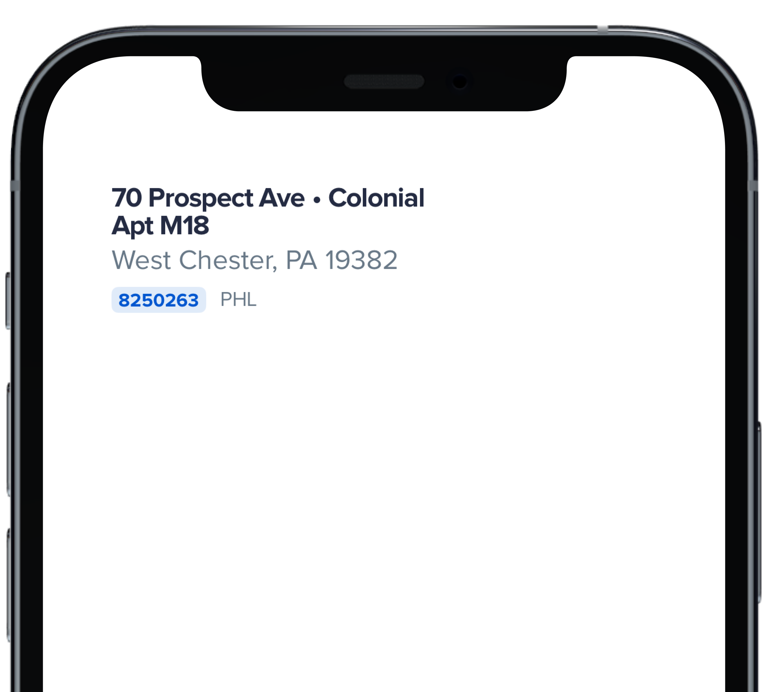
|
|
2
|
+
|
|
3
|
+
```swift
|
|
4
|
+
|
|
5
|
+
PBHomeAddressStreet(
|
|
6
|
+
address: "70 Prospect Ave",
|
|
7
|
+
withBullet: true,
|
|
8
|
+
houseStyle: "Colonial",
|
|
9
|
+
addressCont: "Apt M18",
|
|
10
|
+
city: "West Chester",
|
|
11
|
+
homeId: "8250263",
|
|
12
|
+
homeUrl: "https://powerhrg.com/",
|
|
13
|
+
state: "PA",
|
|
14
|
+
territory: "PHL",
|
|
15
|
+
zipcode: "19382"
|
|
16
|
+
)
|
|
17
|
+
|
|
18
|
+
```
|
|
@@ -0,0 +1,34 @@
|
|
|
1
|
+
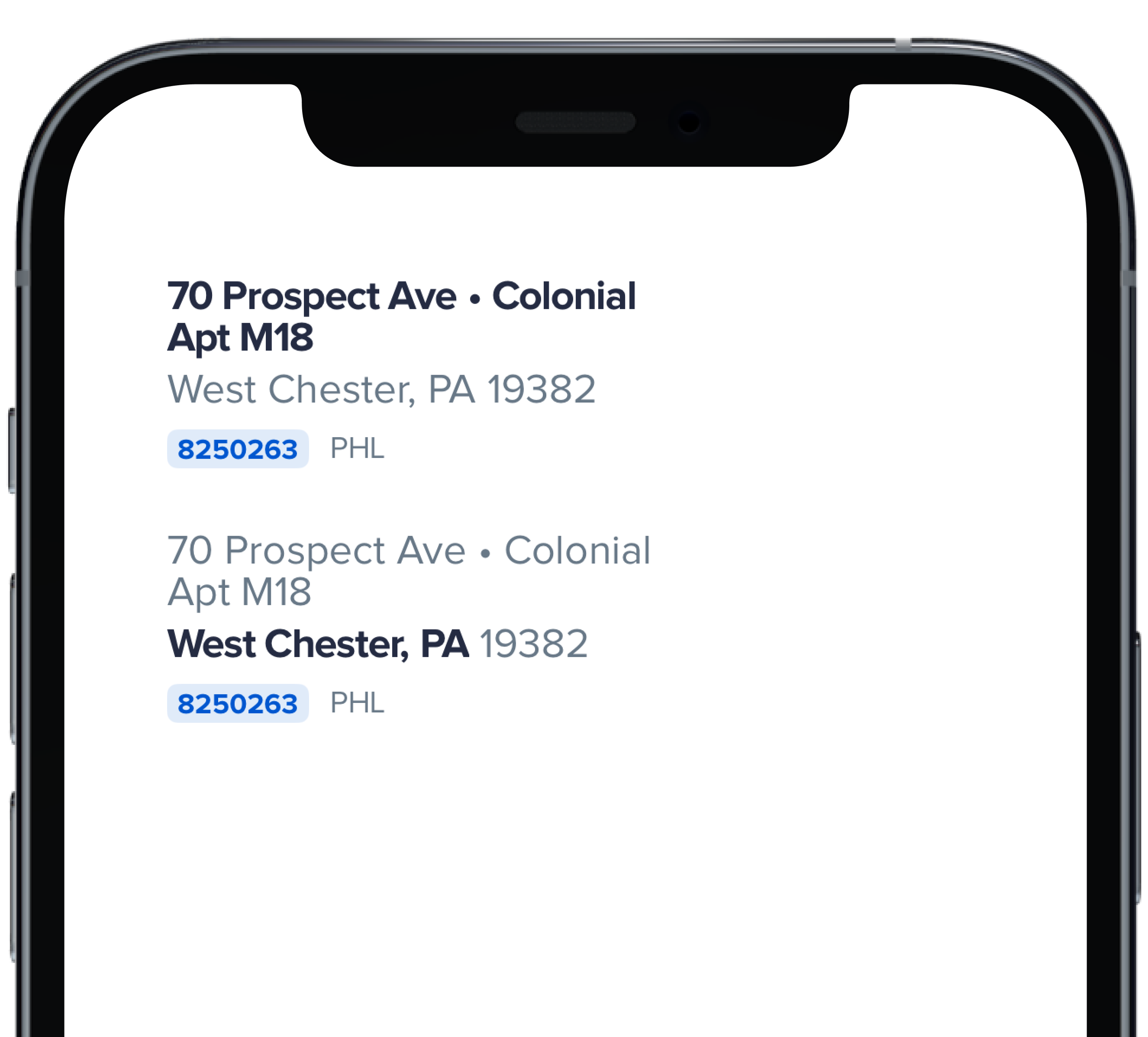
|
|
2
|
+
|
|
3
|
+
```swift
|
|
4
|
+
|
|
5
|
+
PBHomeAddressStreet(
|
|
6
|
+
address: "70 Prospect Ave",
|
|
7
|
+
withBullet: true,
|
|
8
|
+
houseStyle: "Colonial",
|
|
9
|
+
addressCont: "Apt M18",
|
|
10
|
+
city: "West Chester",
|
|
11
|
+
homeId: "8250263",
|
|
12
|
+
homeUrl: "https://powerhrg.com/",
|
|
13
|
+
state: "PA",
|
|
14
|
+
territory: "PHL",
|
|
15
|
+
zipcode: "19382"
|
|
16
|
+
)
|
|
17
|
+
|
|
18
|
+
Spacer(minLength: Spacing.medium)
|
|
19
|
+
|
|
20
|
+
PBHomeAddressStreet(
|
|
21
|
+
address: "70 Prospect Ave",
|
|
22
|
+
withBullet: true,
|
|
23
|
+
houseStyle: "Colonial",
|
|
24
|
+
addressCont: "Apt M18",
|
|
25
|
+
city: "West Chester",
|
|
26
|
+
homeId: "8250263",
|
|
27
|
+
homeUrl: "https://powerhrg.com/",
|
|
28
|
+
state: "PA",
|
|
29
|
+
territory: "PHL",
|
|
30
|
+
zipcode: "19382",
|
|
31
|
+
emphasize: .city
|
|
32
|
+
)
|
|
33
|
+
|
|
34
|
+
```
|