yymini-pop-content 1.0.3 → 1.0.5
This diff represents the content of publicly available package versions that have been released to one of the supported registries. The information contained in this diff is provided for informational purposes only and reflects changes between package versions as they appear in their respective public registries.
- package/README.md +6 -2
- package/package.json +2 -3
- package/pop-content.js +1 -7
- package/pop-content.ttml +3 -3
- package/pop-content.wxml +3 -3
package/README.md
CHANGED
|
@@ -16,8 +16,9 @@ or
|
|
|
16
16
|
yarn add yymini-pop-content
|
|
17
17
|
|
|
18
18
|
然后在 开发者工具中 构建 NPM
|
|
19
|
+
```
|
|
19
20
|
|
|
20
|
-
## 引用
|
|
21
|
+
## 🎨 引用
|
|
21
22
|
```json
|
|
22
23
|
{
|
|
23
24
|
"usingComponents": {
|
|
@@ -25,8 +26,11 @@ yarn add yymini-pop-content
|
|
|
25
26
|
}
|
|
26
27
|
}
|
|
27
28
|
|
|
28
|
-
|
|
29
|
+
```
|
|
30
|
+
## ▶️ use
|
|
29
31
|
```ttml / wxml
|
|
30
32
|
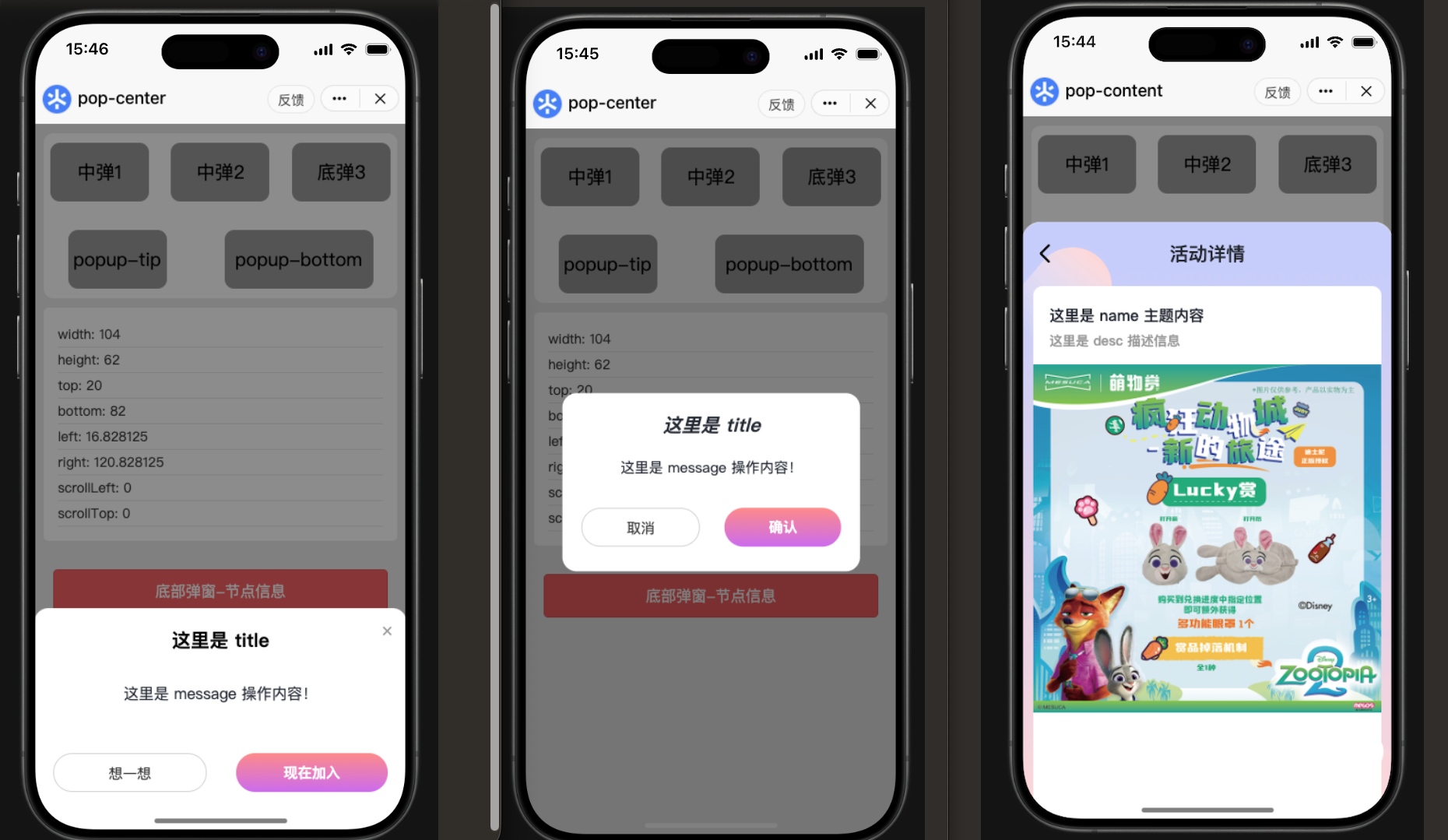
<pop-content visible="{{true}}" title="这里是 title" name="这里是主题 name" desc="这里是描述 desc" bind:close="onClose" />
|
|
33
|
+
```
|
|
31
34
|
|
|
35
|
+
## 👀 示例效果
|
|
32
36
|
|
package/package.json
CHANGED
|
@@ -1,6 +1,6 @@
|
|
|
1
1
|
{
|
|
2
2
|
"name": "yymini-pop-content",
|
|
3
|
-
"version": "1.0.
|
|
3
|
+
"version": "1.0.5",
|
|
4
4
|
"description": "小程序(抖音、微信)-底部内容弹出框 自定义组件",
|
|
5
5
|
"main": "pop-content.js",
|
|
6
6
|
"miniprogram": ".",
|
|
@@ -27,8 +27,7 @@
|
|
|
27
27
|
"homepage": "",
|
|
28
28
|
"private": false,
|
|
29
29
|
"files": [
|
|
30
|
-
"
|
|
31
|
-
"bgSrc.png",
|
|
30
|
+
"*.png",
|
|
32
31
|
"pop-content.*",
|
|
33
32
|
"README.md"
|
|
34
33
|
],
|
package/pop-content.js
CHANGED
|
@@ -77,7 +77,6 @@ Component({
|
|
|
77
77
|
this.triggerEvent('close', {
|
|
78
78
|
type: 'mask'
|
|
79
79
|
});
|
|
80
|
-
this.triggerEvent('cancel');
|
|
81
80
|
}
|
|
82
81
|
},
|
|
83
82
|
|
|
@@ -94,7 +93,6 @@ Component({
|
|
|
94
93
|
this.triggerEvent('close', {
|
|
95
94
|
type: 'cancel'
|
|
96
95
|
});
|
|
97
|
-
this.triggerEvent('cancel');
|
|
98
96
|
},
|
|
99
97
|
|
|
100
98
|
// 确认按钮:透传参数给业务组件
|
|
@@ -102,11 +100,8 @@ Component({
|
|
|
102
100
|
this.setData({
|
|
103
101
|
show: false
|
|
104
102
|
})
|
|
105
|
-
this.triggerEvent('close', {
|
|
106
|
-
type: 'confirm'
|
|
107
|
-
});
|
|
108
103
|
this.triggerEvent('confirm', {
|
|
109
|
-
from: '
|
|
104
|
+
from: 'confirm'
|
|
110
105
|
});
|
|
111
106
|
},
|
|
112
107
|
|
|
@@ -118,7 +113,6 @@ Component({
|
|
|
118
113
|
this.triggerEvent('close', {
|
|
119
114
|
type: 'close'
|
|
120
115
|
});
|
|
121
|
-
this.triggerEvent('cancel');
|
|
122
116
|
}
|
|
123
117
|
|
|
124
118
|
}
|
package/pop-content.ttml
CHANGED
|
@@ -7,12 +7,12 @@
|
|
|
7
7
|
|
|
8
8
|
<view class="view-area">
|
|
9
9
|
<!-- 返回按钮左上角 -->
|
|
10
|
-
<view class="popup-close" bindtap="
|
|
10
|
+
<view class="popup-close" bindtap="onClose">
|
|
11
11
|
<image src="back.png" class="comment_zuo"></image>
|
|
12
12
|
</view>
|
|
13
13
|
|
|
14
14
|
<!-- 标题 -->
|
|
15
|
-
<view tt:if="{{title}}" class="popup-title" bindtap="
|
|
15
|
+
<view tt:if="{{title}}" class="popup-title" bindtap="onClose">
|
|
16
16
|
{{title}}
|
|
17
17
|
</view>
|
|
18
18
|
|
|
@@ -25,7 +25,7 @@
|
|
|
25
25
|
|
|
26
26
|
<!-- 底部按钮区:可选 -->
|
|
27
27
|
<view class="popup-footer" tt:if="{{!hideFooter}}">
|
|
28
|
-
<button class="btn cancel" bindtap="
|
|
28
|
+
<button class="btn cancel" bindtap="onClose" tt:if="{{showCancel}}">{{cancelText}}</button>
|
|
29
29
|
<button class="btn confirm" bindtap="onConfirm">{{confirmText}}</button>
|
|
30
30
|
</view>
|
|
31
31
|
</view>
|
package/pop-content.wxml
CHANGED
|
@@ -7,12 +7,12 @@
|
|
|
7
7
|
|
|
8
8
|
<view class="view-area">
|
|
9
9
|
<!-- 返回按钮左上角 -->
|
|
10
|
-
<view class="popup-close" bindtap="
|
|
10
|
+
<view class="popup-close" bindtap="onClose">
|
|
11
11
|
<image src="back.png" class="comment_zuo"></image>
|
|
12
12
|
</view>
|
|
13
13
|
|
|
14
14
|
<!-- 标题 -->
|
|
15
|
-
<view wx:if="{{title}}" class="popup-title" bindtap="
|
|
15
|
+
<view wx:if="{{title}}" class="popup-title" bindtap="onClose">
|
|
16
16
|
{{title}}
|
|
17
17
|
</view>
|
|
18
18
|
|
|
@@ -25,7 +25,7 @@
|
|
|
25
25
|
|
|
26
26
|
<!-- 底部按钮区:可选 -->
|
|
27
27
|
<view class="popup-footer" wx:if="{{!hideFooter}}">
|
|
28
|
-
<button class="btn cancel" bindtap="
|
|
28
|
+
<button class="btn cancel" bindtap="onClose" wx:if="{{showCancel}}">{{cancelText}}</button>
|
|
29
29
|
<button class="btn confirm" bindtap="onConfirm">{{confirmText}}</button>
|
|
30
30
|
</view>
|
|
31
31
|
</view>
|