vuetiwatch 0.1.1 → 0.2.1
This diff represents the content of publicly available package versions that have been released to one of the supported registries. The information contained in this diff is provided for informational purposes only and reflects changes between package versions as they appear in their respective public registries.
- package/README.md +266 -17
- package/dist/index.d.ts +6 -6
- package/dist/index.d.ts.map +1 -1
- package/dist/index.js +3 -3
- package/dist/index.js.map +1 -1
- package/dist/plugin.d.ts +77 -7
- package/dist/plugin.d.ts.map +1 -1
- package/dist/plugin.js +120 -15
- package/dist/plugin.js.map +1 -1
- package/dist/registry.d.ts +1 -1
- package/dist/registry.d.ts.map +1 -1
- package/dist/registry.js +6 -1
- package/dist/registry.js.map +1 -1
- package/dist/styles/atlas.css +99 -0
- package/dist/styles/atlas.min.css +1 -0
- package/dist/styles/atlasDark.css +99 -0
- package/dist/styles/atlasDark.min.css +1 -0
- package/dist/styles/atlasSepia.css +99 -0
- package/dist/styles/atlasSepia.min.css +1 -0
- package/dist/styles/aurora.css +98 -5
- package/dist/styles/aurora.min.css +1 -1
- package/dist/styles/brutalist.css +6 -1
- package/dist/styles/brutalist.min.css +1 -1
- package/dist/styles/calm.css +1 -5
- package/dist/styles/calm.min.css +1 -1
- package/dist/styles/candy.css +68 -0
- package/dist/styles/candy.min.css +1 -0
- package/dist/styles/clay.css +10 -1
- package/dist/styles/clay.min.css +1 -1
- package/dist/styles/core.css +273 -41
- package/dist/styles/core.min.css +1 -1
- package/dist/styles/darkGlass.css +1 -1
- package/dist/styles/darkGlass.min.css +1 -1
- package/dist/styles/graphite.css +29 -0
- package/dist/styles/graphite.min.css +1 -0
- package/dist/styles/liquidGlass.css +10 -1
- package/dist/styles/liquidGlass.min.css +1 -1
- package/dist/styles/lux.css +1 -1
- package/dist/styles/lux.min.css +1 -1
- package/dist/styles/morph.css +8 -0
- package/dist/styles/morph.min.css +1 -1
- package/dist/styles/neon.css +9 -1
- package/dist/styles/neon.min.css +1 -1
- package/dist/styles/sketchy.css +4 -0
- package/dist/styles/sketchy.min.css +1 -1
- package/dist/styles/slate.css +1 -1
- package/dist/styles/slate.min.css +1 -1
- package/dist/styles/soft.css +4 -14
- package/dist/styles/soft.min.css +1 -1
- package/dist/styles.css +621 -68
- package/dist/styles.min.css +1 -1
- package/dist/themes/atlas.d.ts +73 -0
- package/dist/themes/atlas.d.ts.map +1 -0
- package/dist/themes/atlas.js +277 -0
- package/dist/themes/atlas.js.map +1 -0
- package/dist/themes/atlasDark.d.ts +8 -0
- package/dist/themes/atlasDark.d.ts.map +1 -0
- package/dist/themes/atlasDark.js +69 -0
- package/dist/themes/atlasDark.js.map +1 -0
- package/dist/themes/atlasSepia.d.ts +11 -0
- package/dist/themes/atlasSepia.d.ts.map +1 -0
- package/dist/themes/atlasSepia.js +65 -0
- package/dist/themes/atlasSepia.js.map +1 -0
- package/dist/themes/aurora.d.ts.map +1 -1
- package/dist/themes/aurora.js +47 -3
- package/dist/themes/aurora.js.map +1 -1
- package/dist/themes/brutalist.d.ts.map +1 -1
- package/dist/themes/brutalist.js +85 -1
- package/dist/themes/brutalist.js.map +1 -1
- package/dist/themes/calm.d.ts.map +1 -1
- package/dist/themes/calm.js +44 -3
- package/dist/themes/calm.js.map +1 -1
- package/dist/themes/candy.d.ts +20 -0
- package/dist/themes/candy.d.ts.map +1 -0
- package/dist/themes/candy.js +164 -0
- package/dist/themes/candy.js.map +1 -0
- package/dist/themes/classic.d.ts.map +1 -1
- package/dist/themes/classic.js +2 -0
- package/dist/themes/classic.js.map +1 -1
- package/dist/themes/clay.d.ts.map +1 -1
- package/dist/themes/clay.js +34 -3
- package/dist/themes/clay.js.map +1 -1
- package/dist/themes/darkGlass.d.ts.map +1 -1
- package/dist/themes/darkGlass.js +34 -1
- package/dist/themes/darkGlass.js.map +1 -1
- package/dist/themes/graphite.d.ts +13 -0
- package/dist/themes/graphite.d.ts.map +1 -0
- package/dist/themes/graphite.js +182 -0
- package/dist/themes/graphite.js.map +1 -0
- package/dist/themes/index.d.ts +5 -0
- package/dist/themes/index.d.ts.map +1 -1
- package/dist/themes/index.js +5 -0
- package/dist/themes/index.js.map +1 -1
- package/dist/themes/liquidGlass.d.ts.map +1 -1
- package/dist/themes/liquidGlass.js +64 -4
- package/dist/themes/liquidGlass.js.map +1 -1
- package/dist/themes/lux.d.ts.map +1 -1
- package/dist/themes/lux.js +65 -4
- package/dist/themes/lux.js.map +1 -1
- package/dist/themes/morph.d.ts.map +1 -1
- package/dist/themes/morph.js +42 -6
- package/dist/themes/morph.js.map +1 -1
- package/dist/themes/neon.d.ts.map +1 -1
- package/dist/themes/neon.js +57 -1
- package/dist/themes/neon.js.map +1 -1
- package/dist/themes/paper.d.ts.map +1 -1
- package/dist/themes/paper.js +54 -1
- package/dist/themes/paper.js.map +1 -1
- package/dist/themes/sketchy.d.ts.map +1 -1
- package/dist/themes/sketchy.js +44 -1
- package/dist/themes/sketchy.js.map +1 -1
- package/dist/themes/slate.d.ts.map +1 -1
- package/dist/themes/slate.js +60 -3
- package/dist/themes/slate.js.map +1 -1
- package/dist/themes/soft.d.ts.map +1 -1
- package/dist/themes/soft.js +62 -3
- package/dist/themes/soft.js.map +1 -1
- package/dist/types.d.ts +40 -0
- package/dist/types.d.ts.map +1 -1
- package/dist/util/defaults.d.ts +35 -0
- package/dist/util/defaults.d.ts.map +1 -1
- package/dist/util/defaults.js +62 -1
- package/dist/util/defaults.js.map +1 -1
- package/dist/util/defineTheme.d.ts.map +1 -1
- package/dist/util/defineTheme.js +11 -5
- package/dist/util/defineTheme.js.map +1 -1
- package/package.json +3 -2
- package/src/index.ts +10 -4
- package/src/plugin.ts +231 -21
- package/src/registry.ts +10 -0
- package/src/styles/core.css +674 -41
- package/src/styles/index.css +4 -0
- package/src/styles/themes/_atlas.css +194 -0
- package/src/styles/themes/atlas.css +2 -0
- package/src/styles/themes/atlasDark.css +2 -0
- package/src/styles/themes/atlasSepia.css +2 -0
- package/src/styles/themes/aurora.css +152 -7
- package/src/styles/themes/brutalist.css +6 -3
- package/src/styles/themes/calm.css +1 -13
- package/src/styles/themes/candy.css +118 -0
- package/src/styles/themes/clay.css +12 -0
- package/src/styles/themes/darkGlass.css +1 -0
- package/src/styles/themes/graphite.css +63 -0
- package/src/styles/themes/liquidGlass.css +41 -2
- package/src/styles/themes/lux.css +1 -4
- package/src/styles/themes/morph.css +9 -0
- package/src/styles/themes/neon.css +9 -3
- package/src/styles/themes/paper.css +0 -2
- package/src/styles/themes/sketchy.css +9 -0
- package/src/styles/themes/slate.css +1 -4
- package/src/styles/themes/soft.css +11 -12
- package/src/themes/atlas.ts +286 -0
- package/src/themes/atlasDark.ts +69 -0
- package/src/themes/atlasSepia.ts +65 -0
- package/src/themes/aurora.ts +51 -3
- package/src/themes/brutalist.ts +90 -1
- package/src/themes/calm.ts +48 -3
- package/src/themes/candy.ts +167 -0
- package/src/themes/classic.ts +3 -0
- package/src/themes/clay.ts +37 -3
- package/src/themes/darkGlass.ts +38 -1
- package/src/themes/graphite.ts +187 -0
- package/src/themes/index.ts +5 -0
- package/src/themes/liquidGlass.ts +68 -4
- package/src/themes/lux.ts +70 -4
- package/src/themes/morph.ts +45 -6
- package/src/themes/neon.ts +62 -1
- package/src/themes/paper.ts +59 -1
- package/src/themes/sketchy.ts +49 -1
- package/src/themes/slate.ts +64 -3
- package/src/themes/soft.ts +66 -3
- package/src/types.ts +41 -0
- package/src/util/defaults.ts +96 -1
- package/src/util/defineTheme.ts +11 -5
package/README.md
CHANGED
|
@@ -7,11 +7,13 @@
|
|
|
7
7
|
🎨 Free, plug-and-play themes for **[Vuetify 4](https://vuetifyjs.com/)** — what [Bootswatch](https://bootswatch.com/)
|
|
8
8
|
is to Bootstrap.
|
|
9
9
|
|
|
10
|
-
|
|
10
|
+
[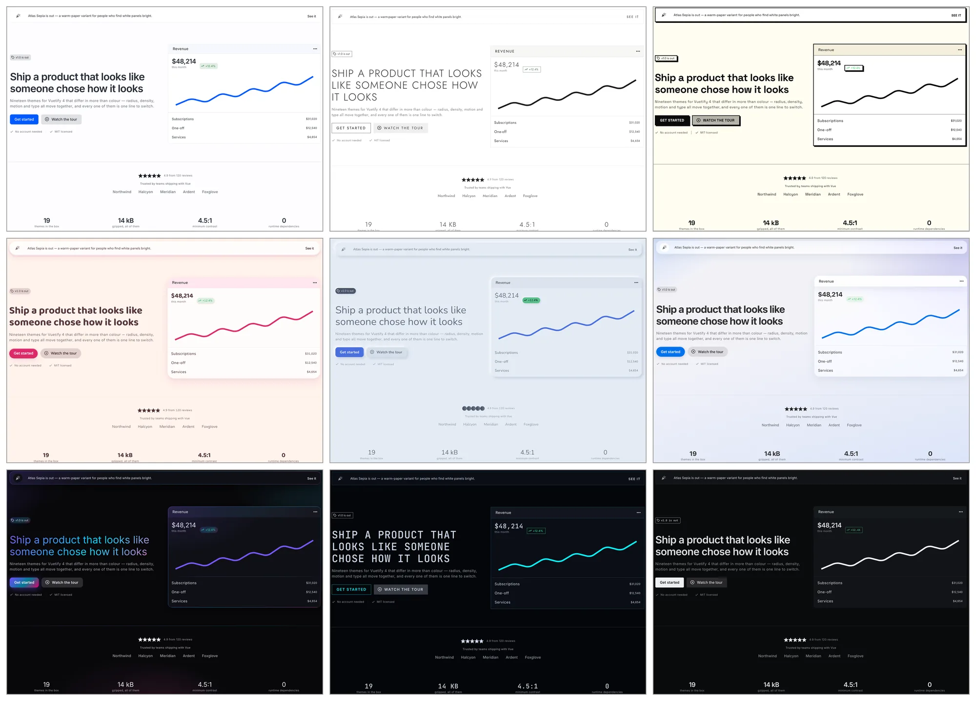](https://j-tap.github.io/vuetiwatch/)
|
|
11
11
|
|
|
12
|
-
|
|
13
|
-
|
|
14
|
-
|
|
12
|
+
**[See all nineteen themes →](https://j-tap.github.io/vuetiwatch/)**
|
|
13
|
+
|
|
14
|
+
Vuetify ships one look. Vuetiwatch ships nineteen, and they differ in more
|
|
15
|
+
than hue: radius, border weight, density, component variants, typography,
|
|
16
|
+
icons and motion all move together.
|
|
15
17
|
|
|
16
18
|
```sh
|
|
17
19
|
npm i vuetiwatch # or: bun add / yarn add / pnpm add
|
|
@@ -24,9 +26,13 @@ npm i vuetiwatch # or: bun add / yarn add / pnpm add
|
|
|
24
26
|
| `classic` | light | Stock Vuetify. Material Design, Roboto, familiar elevation |
|
|
25
27
|
| `paper` | light | Flat editorial — warm paper, ink accents, hairline borders, serif headings |
|
|
26
28
|
| `slate` | light | Dense dashboard — muted slate blue, compact density, outlined cards |
|
|
29
|
+
| `atlas` | light | Calm admin — soft neutrals, one cool accent, dense tables, hairlines not shadows |
|
|
30
|
+
| `atlasDark` | dark | The same panel after dark — soft greys, never pure black |
|
|
31
|
+
| `atlasSepia` | light | The same panel on warm paper and brown ink, for tired eyes |
|
|
27
32
|
| `calm` | light | Low contrast, desaturated naturals, no shadows, a lot of air |
|
|
28
33
|
| `lux` | light | Editorial luxury — hairline rules, wide tracking, small caps, muted gold |
|
|
29
34
|
| `soft` | light | Pastel and generous — large radii, diffuse tinted shadows, hearts for stars |
|
|
35
|
+
| `candy` | light | Plush and pillowy — warm cream, padded shapes, controls that squash |
|
|
30
36
|
| `clay` | light | Inflated pastel shapes with a triple shadow. Toy-like |
|
|
31
37
|
| `morph` | light | Neumorphic — one continuous surface, shaped only by light and shadow |
|
|
32
38
|
| `sketchy` | light | Hand-drawn wobble and pencil greys, for mockups and mirth |
|
|
@@ -36,7 +42,14 @@ npm i vuetiwatch # or: bun add / yarn add / pnpm add
|
|
|
36
42
|
| `aurora` | dark | Iridescent gradients on near-black — the showcase theme |
|
|
37
43
|
| `neon` | dark | Terminal black, cyan and magenta glow, zero radius, monospace headings |
|
|
38
44
|
|
|
39
|
-
|
|
45
|
+
`classic` is the control. It opts out of the core stylesheet entirely — not
|
|
46
|
+
one rule in this package matches a page running it — so switching to it
|
|
47
|
+
shows exactly what the other eighteen add.
|
|
48
|
+
|
|
49
|
+
## How to install and apply a theme in Vuetify 4
|
|
50
|
+
|
|
51
|
+
Register the themes in `createVuetify`, then add the plugin. `defaultTheme`
|
|
52
|
+
picks the one that loads; `useTheme().change(name)` switches at runtime.
|
|
40
53
|
|
|
41
54
|
**1. Register the themes.** They are plain Vuetify `ThemeDefinition`s.
|
|
42
55
|
|
|
@@ -72,27 +85,101 @@ treatment.
|
|
|
72
85
|
|
|
73
86
|
The plugin swaps Vuetify's **global component defaults** when the theme
|
|
74
87
|
changes, since those are global rather than per-theme. Your own
|
|
75
|
-
`createVuetify({ defaults })` is preserved; theme defaults layer on top.
|
|
88
|
+
`createVuetify({ defaults })` is preserved; theme defaults layer on top. It
|
|
89
|
+
also exposes `useVuetiwatch()` — see [switching themes](#switching-themes) —
|
|
90
|
+
and accepts `defaults`, `attribute` and `transitions` to turn any of it off.
|
|
76
91
|
|
|
77
92
|
### Switching themes
|
|
78
93
|
|
|
79
|
-
|
|
94
|
+
Vuetify's own `theme.change()` works as it always did. The plugin adds one
|
|
95
|
+
thing on top of it:
|
|
80
96
|
|
|
81
97
|
```vue
|
|
82
98
|
<script setup lang="ts">
|
|
83
|
-
import {
|
|
84
|
-
import { themeList } from 'vuetiwatch'
|
|
99
|
+
import { useVuetiwatch } from 'vuetiwatch'
|
|
85
100
|
|
|
86
|
-
const
|
|
101
|
+
const { themes, current, change } = useVuetiwatch()
|
|
87
102
|
</script>
|
|
88
103
|
|
|
89
104
|
<template>
|
|
90
|
-
<button v-for="t in
|
|
105
|
+
<button v-for="t in themes" :key="t.name" @click="change(t.name, $event)">
|
|
91
106
|
{{ t.meta.title }}
|
|
92
107
|
</button>
|
|
93
108
|
</template>
|
|
94
109
|
```
|
|
95
110
|
|
|
111
|
+
`useVuetiwatch()` also returns `siblings`: the variants of the theme that is
|
|
112
|
+
running, or an empty array when it has none. A theme declares what it belongs
|
|
113
|
+
to through `meta.family`, so a light/dark switch never has to know which
|
|
114
|
+
themes go together:
|
|
115
|
+
|
|
116
|
+
```vue
|
|
117
|
+
<script setup lang="ts">
|
|
118
|
+
const { siblings, current, change } = useVuetiwatch()
|
|
119
|
+
</script>
|
|
120
|
+
|
|
121
|
+
<template>
|
|
122
|
+
<v-btn-toggle v-if="siblings.length > 1" :model-value="current?.name">
|
|
123
|
+
<v-btn
|
|
124
|
+
v-for="t in siblings"
|
|
125
|
+
:key="t.name"
|
|
126
|
+
:value="t.name"
|
|
127
|
+
:text="t.meta.variant"
|
|
128
|
+
@click="change(t.name, $event)"
|
|
129
|
+
/>
|
|
130
|
+
</v-btn-toggle>
|
|
131
|
+
</template>
|
|
132
|
+
```
|
|
133
|
+
|
|
134
|
+
A theme can also offer **accents** — named colour sets it repaints itself
|
|
135
|
+
in, declared in `meta.accents` and applied through `setAccent()`:
|
|
136
|
+
|
|
137
|
+
```vue
|
|
138
|
+
<script setup lang="ts">
|
|
139
|
+
const { accents, accent, setAccent } = useVuetiwatch()
|
|
140
|
+
</script>
|
|
141
|
+
|
|
142
|
+
<template>
|
|
143
|
+
<button
|
|
144
|
+
v-for="item in accents"
|
|
145
|
+
:key="item.id"
|
|
146
|
+
:style="{ background: item.colors.primary }"
|
|
147
|
+
@click="setAccent(item.id)"
|
|
148
|
+
/>
|
|
149
|
+
</template>
|
|
150
|
+
```
|
|
151
|
+
|
|
152
|
+
Presets rather than a colour picker, because every one of them is measured
|
|
153
|
+
against the theme's ground — the Atlas accents run 5.8:1 to 8.3:1 on filled
|
|
154
|
+
controls across all three variants, which a dragged slider cannot promise.
|
|
155
|
+
The id is shared across the family, so the choice survives a light/dark
|
|
156
|
+
switch: each variant carries its own tone of the same accent.
|
|
157
|
+
|
|
158
|
+
`atlas`, `atlasDark` and `atlasSepia` are one family today. Vuetify's
|
|
159
|
+
`ThemeDefinition` is a single mode by definition, so a registered pair is
|
|
160
|
+
how a light/dark switch is built — the design lives in one place and only
|
|
161
|
+
the ground changes.
|
|
162
|
+
|
|
163
|
+
Pass the event and the new theme opens as a circle from the control that was
|
|
164
|
+
pressed, through the View Transitions API — Baseline since October 2025.
|
|
165
|
+
Where the API is missing, where the visitor asked for reduced motion, or
|
|
166
|
+
where you passed `transitions: false`, the same call switches instantly, so
|
|
167
|
+
it is always safe to use. Each theme sets its own pace through
|
|
168
|
+
`vw-theme-transition`: `neon` repaints in 180 ms, `calm` takes 560.
|
|
169
|
+
|
|
170
|
+
### Motion
|
|
171
|
+
|
|
172
|
+
Movement is the fourth axis these themes travel on, after colour, shape and
|
|
173
|
+
type. `brutalist` snaps in two steps, `lux` eases over a quarter-second,
|
|
174
|
+
`candy` overshoots and settles — and a checkbox, a toggle button or a rating
|
|
175
|
+
star pops when it turns on, the way a like button does.
|
|
176
|
+
|
|
177
|
+
None of it costs a byte of JavaScript: themes state a character in a handful
|
|
178
|
+
of variables and the core layer spends it on the same interactions
|
|
179
|
+
everywhere. Only `transform` is animated, so it stays on the compositor.
|
|
180
|
+
`prefers-reduced-motion: reduce` zeroes the variables themselves in one
|
|
181
|
+
place, which covers every theme at once — including one you wrote yourself.
|
|
182
|
+
|
|
96
183
|
### Fonts
|
|
97
184
|
|
|
98
185
|
Themes name the families they want but never load them — that stays your
|
|
@@ -107,7 +194,8 @@ fallback, so skipping this degrades gracefully rather than breaking.
|
|
|
107
194
|
### Shipping only a few themes
|
|
108
195
|
|
|
109
196
|
Pass just those to the plugin and import their stylesheets instead of the
|
|
110
|
-
combined one.
|
|
197
|
+
combined one. The whole stylesheet is about 6.6 kB gzipped; the core layer
|
|
198
|
+
plus one theme is under 3 kB.
|
|
111
199
|
|
|
112
200
|
```ts
|
|
113
201
|
import { createVuetiwatch, paper } from 'vuetiwatch'
|
|
@@ -166,29 +254,190 @@ Vuetify's own, it reads:
|
|
|
166
254
|
|
|
167
255
|
| Variable | Default | Effect |
|
|
168
256
|
| --- | --- | --- |
|
|
169
|
-
| `vw-radius` | `4px` | Fields, alerts, lists, menus, snackbars, slider track |
|
|
170
|
-
| `vw-radius-btn` | `vw-radius` | Buttons
|
|
257
|
+
| `vw-radius` | `4px` | Fields, alerts, lists, menus, snackbars, slider track, progress bars |
|
|
258
|
+
| `vw-radius-btn` | `vw-radius` | Buttons and button groups, for themes whose controls are capsules |
|
|
171
259
|
| `vw-radius-lg` | `vw-radius` | Cards, tables, expansion panels |
|
|
172
|
-
| `vw-radius-chip` | `9999px` | Chips |
|
|
260
|
+
| `vw-radius-chip` | `9999px` | Chips and badges |
|
|
173
261
|
| `vw-radius-thumb` | `50%` | Slider thumb |
|
|
262
|
+
| `vw-radius-icon-btn` | `50%` | Icon buttons, for themes with no curve anywhere |
|
|
263
|
+
| `vw-radius-avatar` / `-dot` | `50%` | Avatars, and the dot on a timeline |
|
|
174
264
|
| `vw-border-width` | `thin` | Outlined variants and field outlines |
|
|
265
|
+
| `vw-outlined-fill` | `surface` | What an outlined card paints — `transparent` for themes whose surface is the ground |
|
|
266
|
+
| `vw-panel-border` / `-shadow` / `-fill` | Vuetify's | A panel standing on its own: a bare list, sheet, banner or table |
|
|
267
|
+
| `vw-panel-image` / `-filter` | none | The same panel's gradient and backdrop filter, for the gradient and glass themes |
|
|
268
|
+
| `vw-outline-opacity` | `border-opacity` | The line around an outlined card, which Vuetify draws in the ink of its own text |
|
|
269
|
+
| `vw-skeleton-opacity` | clamped | The bones of a loading placeholder, which Vuetify ties to `border-opacity` |
|
|
270
|
+
| `vw-field-border-opacity` | `0.38` | The resting outline of a field — Vuetify's default reads about 2.3:1 |
|
|
175
271
|
| `vw-btn-weight` / `-tracking` / `-transform` | Vuetify's | Button typography |
|
|
176
272
|
| `vw-heading-weight` / `-tracking` / `-transform` | Vuetify's | Headings and the display / headline / title-large scale |
|
|
177
273
|
| `vw-th-weight` / `-tracking` / `-transform` | Vuetify's | Table headers |
|
|
274
|
+
| `vw-numeric` | `normal` | Figures in tables and pagination — `tabular-nums` lines columns up |
|
|
178
275
|
| `vw-tab-slider-height` | `2px` | Active tab indicator |
|
|
276
|
+
| `vw-tab-size` | `0.875rem` | Tab labels, which Vuetify builds out of buttons and sizes like body text |
|
|
277
|
+
| `vw-avatar-ratio` | `0.4` | Initials inside an avatar, as a share of its height |
|
|
278
|
+
| `vw-timeline-line` / `-width` | hairline | The timeline connector — any background, so a repeating gradient makes it dashed |
|
|
279
|
+
| `vw-timeline-line-opacity` | `border-opacity` | The connector's fade, when `vw-timeline-line` is left alone |
|
|
280
|
+
| `vw-relief-inset` | `0` | Padding inside chip groups, room for controls that lift |
|
|
179
281
|
| `vw-overlay-shadow` / `-border` | Vuetify's | Menus, dialogs and tooltips |
|
|
180
282
|
| `vw-list-bar` / `-color` | `0` | Accent bar on the active list item, leading edge |
|
|
181
283
|
| `vw-pagination-active-color` / `-opacity` | Vuetify's | The current page |
|
|
182
284
|
| `vw-link-decoration` | `underline` | Bare `<a>` elements |
|
|
183
285
|
| `font-body` / `font-heading` | Roboto | Native to Vuetify 4 |
|
|
184
|
-
|
|
185
|
-
|
|
286
|
+
| `vw-gradient` / `-btn` | none | A theme's gradient, and the deeper one used where text sits on it |
|
|
287
|
+
| `vw-motion-duration` / `-ease` | `160ms` / standard | Press, hover lift, tab slider |
|
|
288
|
+
| `vw-press-scale` / `-shift` | `0.98` / `0` | How far a control squashes and sinks under a press |
|
|
289
|
+
| `vw-hover-lift` | `0` | How far a linked card rises on hover |
|
|
290
|
+
| `vw-pop-scale` / `-duration` | `1.18` / `220ms` | The overshoot when a checkbox, toggle or star turns on |
|
|
291
|
+
| `vw-focus-ring` / `-offset` | `2px solid primary` / `2px` | `:focus-visible` on buttons, tabs, chips, list items |
|
|
292
|
+
| `vw-theme-transition` | `420ms` | The wipe when `change()` switches theme |
|
|
186
293
|
|
|
187
294
|
`font-heading` reaches `text-display-*`, `text-headline-*`, `text-title-large`
|
|
188
295
|
and bare `<h1>`–`<h6>`; the rest of the scale takes `font-body`. Vuetify 4
|
|
189
296
|
uses the Material 3 names — `text-h1`…`text-h6`, `text-body-1`, `text-caption`
|
|
190
297
|
and `text-overline` no longer exist.
|
|
191
298
|
|
|
299
|
+
### What wins
|
|
300
|
+
|
|
301
|
+
These variables set the *default* a component draws with — the same job
|
|
302
|
+
Vuetify's SASS variables do at build time, moved to runtime so the look can
|
|
303
|
+
be swapped without recompiling. Vuetify draws the same line itself: it ships
|
|
304
|
+
`$button-border-radius` for the default and `$button-rounded-border-radius`
|
|
305
|
+
for what the `rounded` prop asks for.
|
|
306
|
+
|
|
307
|
+
Four levels, loudest first:
|
|
308
|
+
|
|
309
|
+
| | Set by | Example |
|
|
310
|
+
| --- | --- | --- |
|
|
311
|
+
| **1. A prop or utility class** | the component's author | `<v-card rounded="xl">`, `class="rounded-0"` |
|
|
312
|
+
| **2. The theme's component defaults** | the theme | `candy` making every `VBtn` `size="large"` |
|
|
313
|
+
| **3. Your `createVuetify({ defaults })`** | you, once | `VDataTable: { hover: true }` |
|
|
314
|
+
| **4. Vuetify** | the framework | the 4px corner every component ships with |
|
|
315
|
+
|
|
316
|
+
Level 1 is why every rule in the core layer carries `:not([class*='rounded-'])`:
|
|
317
|
+
a component whose author asked for a corner keeps it whatever the theme says.
|
|
318
|
+
Level 2 sits above level 3 on purpose — a theme that could not change a
|
|
319
|
+
variant would not be a theme — and `createVuetiwatch(vuetify, { defaults:
|
|
320
|
+
'under' })` swaps the two when the app owns a decision the theme also has an
|
|
321
|
+
opinion on, an admin panel with its own density switch being the usual case.
|
|
322
|
+
It overrides only the keys it actually
|
|
323
|
+
sets, so the rest of your configuration survives every switch, including
|
|
324
|
+
defaults you assign at runtime. Level 4 holds because every declaration
|
|
325
|
+
falls back to Vuetify's own value, which is why importing the stylesheet
|
|
326
|
+
cannot change an app that is not running a Vuetiwatch theme.
|
|
327
|
+
|
|
328
|
+
A fifth level sits underneath, in CSS rather than in props: your own
|
|
329
|
+
stylesheet. Vuetify ships every rule inside `@layer vuetify-*`, and an
|
|
330
|
+
unlayered rule outranks a layered one whatever its specificity, so the core
|
|
331
|
+
layer needs no weight of its own to beat it — and takes none. Its scope is a
|
|
332
|
+
`:where()`, which leaves each rule weighing the component selector and its
|
|
333
|
+
guard, two classes at most. Anything with a second selector of its own clears
|
|
334
|
+
it:
|
|
335
|
+
|
|
336
|
+
```css
|
|
337
|
+
/* wins over the theme */
|
|
338
|
+
.v-application .v-btn { border-radius: 0 }
|
|
339
|
+
```
|
|
340
|
+
|
|
341
|
+
A theme file, which carries its own theme class, clears it the same way —
|
|
342
|
+
which is what makes a theme an opinion over the defaults rather than a peer
|
|
343
|
+
of them. The one exception is marked as such in the stylesheet: a short block
|
|
344
|
+
of corrections that has to outrank a theme, because a theme's own rule does
|
|
345
|
+
damage in a context it never considered — a per-button shadow drawing a seam
|
|
346
|
+
down every join of a button group.
|
|
347
|
+
|
|
348
|
+
The practical version: if a component looks wrong under a theme, look for a
|
|
349
|
+
`rounded`, `variant`, `elevation` or `density` prop on it first. That prop is
|
|
350
|
+
doing exactly what it is meant to do, and the theme is standing aside.
|
|
351
|
+
|
|
352
|
+
### Contrast
|
|
353
|
+
|
|
354
|
+
Vuetify picks the label colour for a filled control automatically, by
|
|
355
|
+
whichever of black or white scores higher on [APCA](https://github.com/Myndex/apca-w3) —
|
|
356
|
+
the WCAG 3 draft algorithm. It optimises, but it does not clear a bar: on
|
|
357
|
+
Vuetify's own light theme the filled `warning` button lands at 2.4:1 against
|
|
358
|
+
WCAG 2's 4.5:1 for label text.
|
|
359
|
+
|
|
360
|
+
Every theme here is measured against both, and states `on-*` explicitly
|
|
361
|
+
wherever the automatic pick falls short — which is the documented way to
|
|
362
|
+
control it. Where the two models disagreed the colour was deepened a few
|
|
363
|
+
points of lightness instead of flipping the label, so the hue survives and
|
|
364
|
+
both models pass; `aurora` keeps its bright gradient for decoration and
|
|
365
|
+
carries a deeper one behind anything with text on it.
|
|
366
|
+
|
|
367
|
+
The result: in seventeen of the eighteen non-stock themes every filled control
|
|
368
|
+
clears 4.5:1. `classic` does not, and that is the point of it — it is stock
|
|
369
|
+
Vuetify, including this.
|
|
370
|
+
|
|
371
|
+
`npm run audit` measures all of it and fails on anything unexplained, so the
|
|
372
|
+
next palette change cannot quietly walk this back. Exceptions live in that
|
|
373
|
+
script with their reason attached, which is the only way a later reader can
|
|
374
|
+
tell a decision from an oversight.
|
|
375
|
+
|
|
376
|
+
`soft` is the one stated exception. Its filled controls carry white labels on
|
|
377
|
+
pastel grounds, which measures between 1.77:1 and 2.84:1 — under the bar, by
|
|
378
|
+
both models. Nothing about that is accidental: white is what the palette wants,
|
|
379
|
+
and the only way to earn it is to take the hues down by a third, at which point
|
|
380
|
+
the theme is no longer pastel and no longer itself. If a screen has to be legible
|
|
381
|
+
to everyone, pick a theme that measures — `atlas` and `graphite` are built for
|
|
382
|
+
exactly that. `soft` is for the places where the palette is the point.
|
|
383
|
+
|
|
384
|
+
### Motion
|
|
385
|
+
|
|
386
|
+
Which transition a floating surface uses is an ordinary prop too, so a theme
|
|
387
|
+
owns how its overlays arrive as well as how they look. `overlays()` states it
|
|
388
|
+
once for the dialog, the menu, the tooltip and the snackbar — `menu` reaches
|
|
389
|
+
the select, the autocomplete and the combobox with it.
|
|
390
|
+
|
|
391
|
+
```ts
|
|
392
|
+
import { overlays, ripple } from 'vuetiwatch'
|
|
393
|
+
|
|
394
|
+
defineTheme({
|
|
395
|
+
// …
|
|
396
|
+
defaults: [
|
|
397
|
+
overlays({
|
|
398
|
+
dialog: 'fade-transition',
|
|
399
|
+
menu: 'slide-y-transition',
|
|
400
|
+
tooltip: 'fade-transition',
|
|
401
|
+
}),
|
|
402
|
+
ripple(false),
|
|
403
|
+
],
|
|
404
|
+
})
|
|
405
|
+
```
|
|
406
|
+
|
|
407
|
+
`false` means no animation at all, which is the honest answer for a theme
|
|
408
|
+
that draws no depth for a surface to arrive through — `brutalist` uses it.
|
|
409
|
+
|
|
410
|
+
Vuetify bakes the *timing* of each named transition into its own stylesheet,
|
|
411
|
+
so naming one only half moves it: a fade takes 300ms whether it belongs to a
|
|
412
|
+
theme that settles slowly or to one that repaints instantly. Two variables
|
|
413
|
+
take that back, and default to Vuetify's own numbers so a theme that says
|
|
414
|
+
nothing changes nothing:
|
|
415
|
+
|
|
416
|
+
| Variable | What it sets |
|
|
417
|
+
| --- | --- |
|
|
418
|
+
| `--v-vw-overlay-duration` | How long a surface takes to arrive |
|
|
419
|
+
| `--v-vw-overlay-exit` | How long it takes to leave; falls through to the above |
|
|
420
|
+
|
|
421
|
+
The easing follows `--v-vw-motion-ease`, so a theme that already stated its
|
|
422
|
+
curve gets its overlays eased the same way for free.
|
|
423
|
+
|
|
424
|
+
`ripple(false)` turns off the Material ripple everywhere one is drawn — the
|
|
425
|
+
tab, the app-bar nav icon and every tick box included, each of which is its
|
|
426
|
+
own defaults key and would otherwise be missed.
|
|
427
|
+
|
|
428
|
+
### Selection
|
|
429
|
+
|
|
430
|
+
Dragging across text is answered in the browser's own blue, which belongs to
|
|
431
|
+
no palette. Every non-stock theme replaces it with its accent at 24%, which
|
|
432
|
+
costs a theme nothing and follows `setAccent()` when one repaints. A theme
|
|
433
|
+
that wants a solid highlight states both halves and takes responsibility for
|
|
434
|
+
the ink on top:
|
|
435
|
+
|
|
436
|
+
| Variable | What it sets |
|
|
437
|
+
| --- | --- |
|
|
438
|
+
| `--v-vw-selection-fill` | The highlight behind selected text |
|
|
439
|
+
| `--v-vw-selection-color` | The text on it; defaults to the text's own colour |
|
|
440
|
+
|
|
192
441
|
### Icons
|
|
193
442
|
|
|
194
443
|
Vuetify's icon *set* is global and cannot vary per theme, but which glyph a
|
package/dist/index.d.ts
CHANGED
|
@@ -1,11 +1,11 @@
|
|
|
1
|
-
export { aurora, brutalist, calm, classic, clay, darkGlass, liquidGlass, lux, morph, neon, paper, sketchy, slate, soft, } from './themes/index.js';
|
|
1
|
+
export { atlas, atlasDark, atlasSepia, aurora, brutalist, calm, candy, classic, clay, darkGlass, graphite, liquidGlass, lux, morph, neon, paper, sketchy, slate, soft, } from './themes/index.js';
|
|
2
2
|
export { themeList, vuetiwatchDefaults, vuetiwatchMeta, vuetiwatchThemes, } from './registry.js';
|
|
3
|
-
export { createVuetiwatch } from './plugin.js';
|
|
3
|
+
export { createVuetiwatch, useVuetiwatch } from './plugin.js';
|
|
4
4
|
export { defineTheme } from './util/defineTheme.js';
|
|
5
|
-
export { bars, combine, controls, fields, icons, surfaces, tables } from './util/defaults.js';
|
|
6
|
-
export type { VuetiwatchOptions } from './plugin.js';
|
|
5
|
+
export { bars, combine, controls, fields, icons, overlays, ripple, surfaces, tables } from './util/defaults.js';
|
|
6
|
+
export type { Vuetiwatch, VuetiwatchOptions } from './plugin.js';
|
|
7
7
|
export type { VuetiwatchThemeName } from './registry.js';
|
|
8
8
|
export type { DefineThemeOptions } from './util/defineTheme.js';
|
|
9
|
-
export type { VuetiwatchIcons } from './util/defaults.js';
|
|
10
|
-
export type { VuetiwatchDefaults, VuetiwatchMeta, VuetiwatchTheme, } from './types.js';
|
|
9
|
+
export type { VuetiwatchIcons, VuetiwatchOverlays } from './util/defaults.js';
|
|
10
|
+
export type { VuetiwatchAccent, VuetiwatchDefaults, VuetiwatchMeta, VuetiwatchTheme, } from './types.js';
|
|
11
11
|
//# sourceMappingURL=index.d.ts.map
|
package/dist/index.d.ts.map
CHANGED
|
@@ -1 +1 @@
|
|
|
1
|
-
{"version":3,"file":"index.d.ts","sourceRoot":"","sources":["../src/index.ts"],"names":[],"mappings":"AAAA,OAAO,EACL,MAAM,EACN,SAAS,EACT,IAAI,EACJ,OAAO,EACP,IAAI,EACJ,SAAS,EACT,WAAW,EACX,GAAG,EACH,KAAK,EACL,IAAI,EACJ,KAAK,EACL,OAAO,EACP,KAAK,EACL,IAAI,GACL,MAAM,mBAAmB,CAAA;AAC1B,OAAO,EACL,SAAS,EACT,kBAAkB,EAClB,cAAc,EACd,gBAAgB,GACjB,MAAM,eAAe,CAAA;AACtB,OAAO,EAAE,gBAAgB,EAAE,MAAM,aAAa,CAAA;
|
|
1
|
+
{"version":3,"file":"index.d.ts","sourceRoot":"","sources":["../src/index.ts"],"names":[],"mappings":"AAAA,OAAO,EACL,KAAK,EACL,SAAS,EACT,UAAU,EACV,MAAM,EACN,SAAS,EACT,IAAI,EACJ,KAAK,EACL,OAAO,EACP,IAAI,EACJ,SAAS,EACT,QAAQ,EACR,WAAW,EACX,GAAG,EACH,KAAK,EACL,IAAI,EACJ,KAAK,EACL,OAAO,EACP,KAAK,EACL,IAAI,GACL,MAAM,mBAAmB,CAAA;AAC1B,OAAO,EACL,SAAS,EACT,kBAAkB,EAClB,cAAc,EACd,gBAAgB,GACjB,MAAM,eAAe,CAAA;AACtB,OAAO,EAAE,gBAAgB,EAAE,aAAa,EAAE,MAAM,aAAa,CAAA;AAC7D,OAAO,EAAE,WAAW,EAAE,MAAM,uBAAuB,CAAA;AACnD,OAAO,EAAE,IAAI,EAAE,OAAO,EAAE,QAAQ,EAAE,MAAM,EAAE,KAAK,EAAE,QAAQ,EAAE,MAAM,EAAE,QAAQ,EAAE,MAAM,EAAE,MAAM,oBAAoB,CAAA;AAE/G,YAAY,EAAE,UAAU,EAAE,iBAAiB,EAAE,MAAM,aAAa,CAAA;AAChE,YAAY,EAAE,mBAAmB,EAAE,MAAM,eAAe,CAAA;AACxD,YAAY,EAAE,kBAAkB,EAAE,MAAM,uBAAuB,CAAA;AAC/D,YAAY,EAAE,eAAe,EAAE,kBAAkB,EAAE,MAAM,oBAAoB,CAAA;AAC7E,YAAY,EACV,gBAAgB,EAChB,kBAAkB,EAClB,cAAc,EACd,eAAe,GAChB,MAAM,YAAY,CAAA"}
|
package/dist/index.js
CHANGED
|
@@ -1,6 +1,6 @@
|
|
|
1
|
-
export { aurora, brutalist, calm, classic, clay, darkGlass, liquidGlass, lux, morph, neon, paper, sketchy, slate, soft, } from './themes/index.js';
|
|
1
|
+
export { atlas, atlasDark, atlasSepia, aurora, brutalist, calm, candy, classic, clay, darkGlass, graphite, liquidGlass, lux, morph, neon, paper, sketchy, slate, soft, } from './themes/index.js';
|
|
2
2
|
export { themeList, vuetiwatchDefaults, vuetiwatchMeta, vuetiwatchThemes, } from './registry.js';
|
|
3
|
-
export { createVuetiwatch } from './plugin.js';
|
|
3
|
+
export { createVuetiwatch, useVuetiwatch } from './plugin.js';
|
|
4
4
|
export { defineTheme } from './util/defineTheme.js';
|
|
5
|
-
export { bars, combine, controls, fields, icons, surfaces, tables } from './util/defaults.js';
|
|
5
|
+
export { bars, combine, controls, fields, icons, overlays, ripple, surfaces, tables } from './util/defaults.js';
|
|
6
6
|
//# sourceMappingURL=index.js.map
|
package/dist/index.js.map
CHANGED
|
@@ -1 +1 @@
|
|
|
1
|
-
{"version":3,"file":"index.js","sourceRoot":"","sources":["../src/index.ts"],"names":[],"mappings":"AAAA,OAAO,EACL,MAAM,EACN,SAAS,EACT,IAAI,EACJ,OAAO,EACP,IAAI,EACJ,SAAS,EACT,WAAW,EACX,GAAG,EACH,KAAK,EACL,IAAI,EACJ,KAAK,EACL,OAAO,EACP,KAAK,EACL,IAAI,GACL,MAAM,mBAAmB,CAAA;AAC1B,OAAO,EACL,SAAS,EACT,kBAAkB,EAClB,cAAc,EACd,gBAAgB,GACjB,MAAM,eAAe,CAAA;AACtB,OAAO,EAAE,gBAAgB,EAAE,MAAM,aAAa,CAAA;
|
|
1
|
+
{"version":3,"file":"index.js","sourceRoot":"","sources":["../src/index.ts"],"names":[],"mappings":"AAAA,OAAO,EACL,KAAK,EACL,SAAS,EACT,UAAU,EACV,MAAM,EACN,SAAS,EACT,IAAI,EACJ,KAAK,EACL,OAAO,EACP,IAAI,EACJ,SAAS,EACT,QAAQ,EACR,WAAW,EACX,GAAG,EACH,KAAK,EACL,IAAI,EACJ,KAAK,EACL,OAAO,EACP,KAAK,EACL,IAAI,GACL,MAAM,mBAAmB,CAAA;AAC1B,OAAO,EACL,SAAS,EACT,kBAAkB,EAClB,cAAc,EACd,gBAAgB,GACjB,MAAM,eAAe,CAAA;AACtB,OAAO,EAAE,gBAAgB,EAAE,aAAa,EAAE,MAAM,aAAa,CAAA;AAC7D,OAAO,EAAE,WAAW,EAAE,MAAM,uBAAuB,CAAA;AACnD,OAAO,EAAE,IAAI,EAAE,OAAO,EAAE,QAAQ,EAAE,MAAM,EAAE,KAAK,EAAE,QAAQ,EAAE,MAAM,EAAE,QAAQ,EAAE,MAAM,EAAE,MAAM,oBAAoB,CAAA"}
|
package/dist/plugin.d.ts
CHANGED
|
@@ -1,5 +1,58 @@
|
|
|
1
|
-
import type { Plugin } from 'vue';
|
|
2
|
-
import type { VuetiwatchTheme } from './types.js';
|
|
1
|
+
import type { ComputedRef, Plugin, Ref } from 'vue';
|
|
2
|
+
import type { VuetiwatchAccent, VuetiwatchTheme } from './types.js';
|
|
3
|
+
/**
|
|
4
|
+
* Anything that might carry viewport coordinates. Partial on purpose: a
|
|
5
|
+
* list item hands its handler `MouseEvent | KeyboardEvent`, and a keyboard
|
|
6
|
+
* activation should not have to be filtered out by every caller.
|
|
7
|
+
*/
|
|
8
|
+
interface Point {
|
|
9
|
+
clientX?: number;
|
|
10
|
+
clientY?: number;
|
|
11
|
+
}
|
|
12
|
+
export interface Vuetiwatch {
|
|
13
|
+
/** The themes handed to the plugin, in the order a picker should show them. */
|
|
14
|
+
themes: readonly VuetiwatchTheme[];
|
|
15
|
+
/** The active theme, or `undefined` while a theme outside the list is on. */
|
|
16
|
+
current: ComputedRef<VuetiwatchTheme | undefined>;
|
|
17
|
+
/**
|
|
18
|
+
* The variants of the active theme's family, in registration order, or an
|
|
19
|
+
* empty array when it has none. This is what a light/dark switch iterates
|
|
20
|
+
* over — the family is declared in each theme's `meta`, so the app never
|
|
21
|
+
* has to know which themes belong together.
|
|
22
|
+
*/
|
|
23
|
+
siblings: ComputedRef<readonly VuetiwatchTheme[]>;
|
|
24
|
+
/**
|
|
25
|
+
* Switches theme through a view transition when the browser has one.
|
|
26
|
+
*
|
|
27
|
+
* Pass the event that triggered it and the new theme opens as a circle
|
|
28
|
+
* from the pointer; without one it opens from the centre of the screen.
|
|
29
|
+
* Falls back to an instant change where the API is missing, where the
|
|
30
|
+
* user asked for reduced motion, or where `transitions` is off — so it is
|
|
31
|
+
* always safe to call.
|
|
32
|
+
*/
|
|
33
|
+
change: (name: string, event?: Point | Event | null) => void;
|
|
34
|
+
/** The accents the active theme offers, or an empty array. */
|
|
35
|
+
accents: ComputedRef<readonly VuetiwatchAccent[]>;
|
|
36
|
+
/** The accent in use, by id. `undefined` until one is chosen. */
|
|
37
|
+
accent: Readonly<Ref<string | undefined>>;
|
|
38
|
+
/**
|
|
39
|
+
* Repaints the theme in one of its accents.
|
|
40
|
+
*
|
|
41
|
+
* The colours are written into Vuetify's live definitions, which are
|
|
42
|
+
* reactive, so every surface follows within the frame. It is applied to
|
|
43
|
+
* the whole family at once — each variant has its own tone of the same
|
|
44
|
+
* accent — so the choice survives a light/dark switch.
|
|
45
|
+
*/
|
|
46
|
+
setAccent: (id: string) => void;
|
|
47
|
+
}
|
|
48
|
+
/**
|
|
49
|
+
* The plugin's API, for switching themes and reading the active one.
|
|
50
|
+
*
|
|
51
|
+
* ```ts
|
|
52
|
+
* const { themes, current, change } = useVuetiwatch()
|
|
53
|
+
* ```
|
|
54
|
+
*/
|
|
55
|
+
export declare function useVuetiwatch(): Vuetiwatch;
|
|
3
56
|
export interface VuetiwatchOptions {
|
|
4
57
|
/**
|
|
5
58
|
* Themes to manage — normally the package's `themeList`, or just the ones
|
|
@@ -7,20 +60,36 @@ export interface VuetiwatchOptions {
|
|
|
7
60
|
*
|
|
8
61
|
* Required rather than defaulted, because a default would mean importing
|
|
9
62
|
* the registry here, and a static import cannot be shaken out: every app
|
|
10
|
-
* would carry all
|
|
63
|
+
* would carry all sixteen themes even after passing one.
|
|
11
64
|
*/
|
|
12
65
|
themes: readonly VuetiwatchTheme[];
|
|
13
66
|
/**
|
|
14
|
-
* Apply each theme's component defaults
|
|
15
|
-
*
|
|
67
|
+
* Apply each theme's component defaults.
|
|
68
|
+
*
|
|
69
|
+
* - `'over'` (or `true`) — the theme's values win, so a theme can restyle
|
|
70
|
+
* a component the app never thought about.
|
|
71
|
+
* - `'under'` — yours win, and the theme fills in only what you left
|
|
72
|
+
* unset. Use it when the app owns a decision the theme also has an
|
|
73
|
+
* opinion on: an admin panel with its own density switch, say.
|
|
74
|
+
* - `false` — no theme defaults at all.
|
|
75
|
+
*
|
|
76
|
+
* @default 'over'
|
|
16
77
|
*/
|
|
17
|
-
defaults?: boolean;
|
|
78
|
+
defaults?: boolean | 'over' | 'under';
|
|
18
79
|
/**
|
|
19
80
|
* Mirror the active theme name onto `<html data-vuetiwatch="...">`, so
|
|
20
81
|
* you can hang your own CSS off it.
|
|
21
82
|
* @default true
|
|
22
83
|
*/
|
|
23
84
|
attribute?: boolean;
|
|
85
|
+
/**
|
|
86
|
+
* Animate theme changes made through `useVuetiwatch().change()`.
|
|
87
|
+
*
|
|
88
|
+
* Only that call is affected — an app switching through Vuetify's own
|
|
89
|
+
* `theme.change()` keeps the instant swap it has today.
|
|
90
|
+
* @default true
|
|
91
|
+
*/
|
|
92
|
+
transitions?: boolean;
|
|
24
93
|
}
|
|
25
94
|
/**
|
|
26
95
|
* Keeps Vuetify's global component defaults in sync with the active theme.
|
|
@@ -34,8 +103,9 @@ export interface VuetiwatchOptions {
|
|
|
34
103
|
* Install it after Vuetify:
|
|
35
104
|
*
|
|
36
105
|
* ```ts
|
|
37
|
-
* app.use(vuetify).use(createVuetiwatch(vuetify))
|
|
106
|
+
* app.use(vuetify).use(createVuetiwatch(vuetify, { themes: themeList }))
|
|
38
107
|
* ```
|
|
39
108
|
*/
|
|
40
109
|
export declare function createVuetiwatch(vuetify: unknown, options: VuetiwatchOptions): Plugin;
|
|
110
|
+
export {};
|
|
41
111
|
//# sourceMappingURL=plugin.d.ts.map
|
package/dist/plugin.d.ts.map
CHANGED
|
@@ -1 +1 @@
|
|
|
1
|
-
{"version":3,"file":"plugin.d.ts","sourceRoot":"","sources":["../src/plugin.ts"],"names":[],"mappings":"AACA,OAAO,KAAK,EAAO,MAAM,EAAE,MAAM,KAAK,CAAA;
|
|
1
|
+
{"version":3,"file":"plugin.d.ts","sourceRoot":"","sources":["../src/plugin.ts"],"names":[],"mappings":"AACA,OAAO,KAAK,EAAO,WAAW,EAAE,MAAM,EAAE,GAAG,EAAE,MAAM,KAAK,CAAA;AACxD,OAAO,KAAK,EAAE,gBAAgB,EAAsB,eAAe,EAAE,MAAM,YAAY,CAAA;AAmBvF;;;;GAIG;AACH,UAAU,KAAK;IACb,OAAO,CAAC,EAAE,MAAM,CAAA;IAChB,OAAO,CAAC,EAAE,MAAM,CAAA;CACjB;AAcD,MAAM,WAAW,UAAU;IACzB,+EAA+E;IAC/E,MAAM,EAAE,SAAS,eAAe,EAAE,CAAA;IAClC,6EAA6E;IAC7E,OAAO,EAAE,WAAW,CAAC,eAAe,GAAG,SAAS,CAAC,CAAA;IACjD;;;;;OAKG;IACH,QAAQ,EAAE,WAAW,CAAC,SAAS,eAAe,EAAE,CAAC,CAAA;IACjD;;;;;;;;OAQG;IACH,MAAM,EAAE,CAAC,IAAI,EAAE,MAAM,EAAE,KAAK,CAAC,EAAE,KAAK,GAAG,KAAK,GAAG,IAAI,KAAK,IAAI,CAAA;IAC5D,8DAA8D;IAC9D,OAAO,EAAE,WAAW,CAAC,SAAS,gBAAgB,EAAE,CAAC,CAAA;IACjD,iEAAiE;IACjE,MAAM,EAAE,QAAQ,CAAC,GAAG,CAAC,MAAM,GAAG,SAAS,CAAC,CAAC,CAAA;IACzC;;;;;;;OAOG;IACH,SAAS,EAAE,CAAC,EAAE,EAAE,MAAM,KAAK,IAAI,CAAA;CAChC;AAID;;;;;;GAMG;AACH,wBAAgB,aAAa,IAAK,UAAU,CAW3C;AAMD,MAAM,WAAW,iBAAiB;IAChC;;;;;;;OAOG;IACH,MAAM,EAAE,SAAS,eAAe,EAAE,CAAA;IAClC;;;;;;;;;;;OAWG;IACH,QAAQ,CAAC,EAAE,OAAO,GAAG,MAAM,GAAG,OAAO,CAAA;IACrC;;;;OAIG;IACH,SAAS,CAAC,EAAE,OAAO,CAAA;IACnB;;;;;;OAMG;IACH,WAAW,CAAC,EAAE,OAAO,CAAA;CACtB;AAED;;;;;;;;;;;;;;GAcG;AACH,wBAAgB,gBAAgB,CAC9B,OAAO,EAAE,OAAO,EAChB,OAAO,EAAE,iBAAiB,GACzB,MAAM,CAkKR"}
|