uxml-preview 0.6.1 → 0.7.0
This diff represents the content of publicly available package versions that have been released to one of the supported registries. The information contained in this diff is provided for informational purposes only and reflects changes between package versions as they appear in their respective public registries.
- package/CHANGELOG.md +250 -0
- package/README.ja.md +7 -2
- package/README.ko.md +7 -2
- package/README.md +7 -2
- package/README.zh-CN.md +7 -2
- package/dist/controls/registry.d.ts +34 -6
- package/dist/controls/theme.d.ts +52 -76
- package/dist/index.d.ts +12 -0
- package/dist/index.js +2715 -1905
- package/dist/known-divergences.d.ts +2 -2
- package/dist/layout/yoga.d.ts +12 -3
- package/dist/render/fonts.d.ts +2 -1
- package/dist/render/measure.d.ts +9 -1
- package/dist/render/paint.d.ts +3 -0
- package/dist/style/resolve.d.ts +5 -0
- package/package.json +2 -2
package/CHANGELOG.md
CHANGED
|
@@ -1,5 +1,255 @@
|
|
|
1
1
|
# Changelog
|
|
2
2
|
|
|
3
|
+
## 0.7.0 — 2026-10-21
|
|
4
|
+
|
|
5
|
+
Unity's runtime theme, by default. A preview of a game screen now looks like the
|
|
6
|
+
game: the values come from a real runtime panel (PanelSettings + UIDocument in
|
|
7
|
+
Play mode) on Unity 6.3, and the editor theme stays one option away.
|
|
8
|
+
|
|
9
|
+
### Behavior changes
|
|
10
|
+
|
|
11
|
+
- **The default theme is `'runtime'`.** `render`, `resolveStyles` and
|
|
12
|
+
`layoutDocument` take `theme: 'runtime' | 'editor'`; `RenderResult.theme`
|
|
13
|
+
says which was drawn. Without the option, every render changes:
|
|
14
|
+
- text: 14px, colour #1b1b1b (editor: 12px, #d2d2d2)
|
|
15
|
+
- Label: margin 4 4 2 2, padding 4 2 4 1 (editor: 0; 0 2 0 1)
|
|
16
|
+
- Button: margin 2 4, padding 10 12, border 1 #959595, background #bcbcbc,
|
|
17
|
+
radius 0 (editor: margin 1 3, padding 1 6, border 1 #303030 with a
|
|
18
|
+
#242424 bottom, background #585858, radius 3, text #eeeeee)
|
|
19
|
+
- a scrolling ScrollView reserves 24px for its scroller (editor: 13px)
|
|
20
|
+
- the core paints nothing behind the panel, as Unity paints nothing behind
|
|
21
|
+
a runtime panel. Runtime text is dark: a host drawing on a dark backdrop
|
|
22
|
+
has to supply one. Pass `theme: 'editor'` for the 0.6.x drawing plus the
|
|
23
|
+
values below.
|
|
24
|
+
- **Both themes now carry their measured values**, where 0.6.x had only the
|
|
25
|
+
Button margin and text alignment: panel text size and colour (inherited by
|
|
26
|
+
every element, origin `builtin-theme`), Label padding, Button padding,
|
|
27
|
+
border, colours and `:hover` / `:active` / `:focus` / `:disabled` colours.
|
|
28
|
+
- **Label and Button do not shrink** (`flex-shrink: 0`, measured on both
|
|
29
|
+
themes). `inventory`'s `ItemDesc` now lands where Unity puts it.
|
|
30
|
+
- **Only the element written `enabled="false"` is dimmed.** Unity gives that
|
|
31
|
+
element `unity-disabled` and opacity 0.5 and leaves its descendants at 1; a
|
|
32
|
+
disabled button inside a disabled panel was 0.25 here. A `disabled` forced
|
|
33
|
+
through `states` does not dim at all (see "A state forced through `states`
|
|
34
|
+
stays on that element" below).
|
|
35
|
+
- **The runtime theme paints CJK without kinsoku**, as Unity's runtime panel
|
|
36
|
+
does. The editor theme keeps the browser's line breaking (a known
|
|
37
|
+
difference at one 60px Chinese case, Unity 6.3 editor).
|
|
38
|
+
- An unknown `theme` value warns (`malformed`, reason `invalid-value`) and
|
|
39
|
+
draws the default.
|
|
40
|
+
- **Applying the theme is no longer a warning.** "Built-in control defaults
|
|
41
|
+
applied, as measured on Unity <version>" and "<ScrollView> drawn with built-in
|
|
42
|
+
child elements measured on Unity <version>" are gone: a measured theme value
|
|
43
|
+
is not a difference from Unity, and both were measured the same on
|
|
44
|
+
6000.0.40f1 and 6.3. `version-dependent` now comes only from values the dumps
|
|
45
|
+
show differ by version, both on the editor theme:
|
|
46
|
+
- a Button with no text: 4px high on 6000.0.40f1, 19px on 6000.3.25f1 (the
|
|
47
|
+
editor theme draws 6000.0.40f1's)
|
|
48
|
+
- letter- or word-spacing with no `-unity-text-generator`: the editor theme's
|
|
49
|
+
default generator is standard on 6000.0.40f1 and advanced on 6000.3.25f1
|
|
50
|
+
(drawn as advanced)
|
|
51
|
+
- a GroupBox whose `text` is only spaces: its title is 0px high on 6000.0.40f1
|
|
52
|
+
and 15px on 6000.3.25f1 (advanced generator; drawn as 15). Under an explicit
|
|
53
|
+
standard generator both versions measure 0 and nothing is warned. The runtime
|
|
54
|
+
theme draws that title 0px high on both versions, unwarned. The same holds for
|
|
55
|
+
a Label or Button whose text is only spaces (Label 0px vs 15px, Button 4px
|
|
56
|
+
vs 19px; the runtime theme draws the text 0px high)
|
|
57
|
+
A host that keyed anything off the removed warnings loses that signal.
|
|
58
|
+
- **Text is measured by its generator's rules.** The runtime theme resolves
|
|
59
|
+
`-unity-text-generator: standard`, as Unity's runtime panel does on both
|
|
60
|
+
versions; the editor theme resolves advanced (the 6.3 editor's default). The
|
|
61
|
+
resolved value — not the theme — now picks the rules, measured on the text
|
|
62
|
+
cohort: Standard text is `floor(fs·r + (n−1)·fs·lineHeight/pointSize) + 1`
|
|
63
|
+
high (r = (ascent − descent) / pointSize) and measured and painted without
|
|
64
|
+
kerning (`font-kerning: none`); Advanced keeps `ceil(n·fs·r)` and kerning.
|
|
65
|
+
On the runtime theme a whole-number line height gains 1px, later lines
|
|
66
|
+
advance by `lineHeight`, and kerned pairs (Jua's English, 2–4px) widen. An
|
|
67
|
+
author's `-unity-text-generator: standard` on the editor theme measures the
|
|
68
|
+
same way. `textHeight` takes the generator as an optional sixth argument
|
|
69
|
+
(advanced when left out).
|
|
70
|
+
- **A text wider than the width it is offered is clipped to it**, as Unity
|
|
71
|
+
does (measured, `g-clamp`, both versions and themes): in a row, in a column
|
|
72
|
+
with `align-items: flex-start`, with or without `overflow: hidden`. An
|
|
73
|
+
absolutely placed text and a TextField's inner text are not clipped, as in
|
|
74
|
+
Unity. A long no-wrap Label in a narrow box now has the box's width instead
|
|
75
|
+
of overflowing it. No accuracy figure moved. The same holds for the height
|
|
76
|
+
(`g-clamp-h`): a text offered a smaller height is clipped to it, down to its
|
|
77
|
+
padding and border — a TextField's inner text included.
|
|
78
|
+
- **A focused TextField's label takes the focus colour** (runtime #00526a,
|
|
79
|
+
editor #81b4ff), as Toggle and RadioButton labels do.
|
|
80
|
+
|
|
81
|
+
### New controls
|
|
82
|
+
|
|
83
|
+
- **GroupBox and Box are drawn** instead of falling back with an
|
|
84
|
+
`unsupported-control` warning (bundle B). GroupBox builds Unity's title
|
|
85
|
+
Label before its children when it has `text` (a part named
|
|
86
|
+
`unity-group-box__label`, reachable from author USS by that class); Box
|
|
87
|
+
carries its border and background. Both match the `c07-GroupBox` and
|
|
88
|
+
`c07-Box` dumps on both themes.
|
|
89
|
+
- **TextField is drawn** (bundle C): single-line and multiline, placeholder,
|
|
90
|
+
password (the mask only; the value never reaches the DOM), disabled, with or
|
|
91
|
+
without a label. It builds Unity's parts — the label (`unity-text-field__label`),
|
|
92
|
+
`#unity-text-input`, the multiline container and the inner text
|
|
93
|
+
(`unity-text-element--inner-input-field-component`) — which author USS reaches
|
|
94
|
+
by Unity's names. Matches the 6.3 `c07-TextField`, `c-textfield` and
|
|
95
|
+
`c-textfield-hook` dumps on both themes. The caret, the selection and editing
|
|
96
|
+
are not drawn. A host that counted TextField's `unsupported-control` warning
|
|
97
|
+
loses it.
|
|
98
|
+
- **Toggle and RadioButton are drawn** (bundle E): label, text, checked
|
|
99
|
+
(`value="true"`), disabled. Checked is the `:checked` state on the control and
|
|
100
|
+
its input part, as in Unity; the radio checkmark appears only when checked.
|
|
101
|
+
The check mark is this preview's drawing (Unity's textures cannot be loaded).
|
|
102
|
+
- **A state forced through `states` stays on that element.** Measured
|
|
103
|
+
(e-disabled, both versions): a forced `disabled` neither dims (no
|
|
104
|
+
`unity-disabled`) nor reaches the element's parts or children; forced
|
|
105
|
+
hover/focus/active do not reach parts either. 0.7.0's earlier handling dimmed
|
|
106
|
+
a forced-disabled element at 0.5 (an inference, now reversed).
|
|
107
|
+
`enabled="false"` still disables the whole subtree and dims once.
|
|
108
|
+
- **Slider and SliderInt are drawn** (bundle D): label, input, drag container,
|
|
109
|
+
tracker, dragger and its border, and with `show-input-field` a TextField
|
|
110
|
+
showing the value. The dragger sits where Unity puts it for any value —
|
|
111
|
+
t = clamp((value - low) / (high - low), 0, 1) along the drag container less
|
|
112
|
+
the dragger, upward for `direction="Vertical"` — measured in eleven steps
|
|
113
|
+
both ways, a range, a reversed range and an out-of-range value. Dragging is
|
|
114
|
+
not drawn. A host that used Slider as its example of an unsupported
|
|
115
|
+
control loses that example.
|
|
116
|
+
- **ProgressBar, TextElement and RepeatButton are drawn** (bundle F).
|
|
117
|
+
ProgressBar builds Unity's container, background, bar and title; the bar
|
|
118
|
+
width follows Unity's rule, floor(background width - 2) x clamp(value) /
|
|
119
|
+
high-value, measured on fourteen values, ranges and widths. On the editor
|
|
120
|
+
theme a bar at or below low-value warns `version-dependent` (1px on
|
|
121
|
+
6000.0.40f1, 0 on 6.3; drawn as 6.3). TextElement and RepeatButton are plain
|
|
122
|
+
text, as in Unity — a RepeatButton does not look like a button. A host that
|
|
123
|
+
counted their `unsupported-control` warnings loses them.
|
|
124
|
+
- **The editor theme's Toggle box is drawn** (E2): Unity draws it from a
|
|
125
|
+
built-in texture; the preview paints it in colours measured off Unity's
|
|
126
|
+
screen, so an unchecked Toggle no longer disappears on the editor theme.
|
|
127
|
+
|
|
128
|
+
### Classes
|
|
129
|
+
|
|
130
|
+
- **Every drawn control carries Unity's classes**, parts included (A2, held by
|
|
131
|
+
`tests/contract-070/classes.test.ts` against every 0.7.0 dump). Label and
|
|
132
|
+
Button gain `unity-text-element`, so an author rule on that class now reaches
|
|
133
|
+
them as it does in Unity. ScrollView gains `unity-scroll-view--scroll` and a
|
|
134
|
+
`mode` class (`--vertical`, `--horizontal`, `--vertical-horizontal`), and its
|
|
135
|
+
three parts their `unity-scroll-view__*` classes. Classes only: no coordinate
|
|
136
|
+
moved. The scrollers inside a ScrollView are still not built.
|
|
137
|
+
|
|
138
|
+
### Review fixes (adversarial review, 2026-10-21)
|
|
139
|
+
|
|
140
|
+
Each found by the review or while fixing it, measured on Unity where Unity
|
|
141
|
+
decides it, and pinned (`tests/contract-070/review-*.test.ts`,
|
|
142
|
+
`c1-nowrap.test.ts`, `n3-part-fonts.test.ts`, and in a real browser
|
|
143
|
+
`tests/text-cohort/paint-r15.mjs`, now part of `pnpm test:text`).
|
|
144
|
+
|
|
145
|
+
- **A Label or Button does not wrap unless the author says so.** Unity
|
|
146
|
+
resolves `white-space: nowrap` on both; the theme sheets now give it to
|
|
147
|
+
`.unity-label` and `.unity-button`. A long label in a narrow column is one
|
|
148
|
+
clipped line, as in Unity, not several. TextElement and RepeatButton still
|
|
149
|
+
wrap.
|
|
150
|
+
- **Text is painted where it was measured.** A line break (`
|
|
151
|
+
`) is a painted
|
|
152
|
+
line whatever the `white-space`; the painted line height is the measured
|
|
153
|
+
advance (Standard `lineHeight`, Advanced ascent − descent); kerning follows
|
|
154
|
+
each text's own generator; `pre-wrap` keeps runs of spaces when it wraps.
|
|
155
|
+
- **A wrapping text is as wide as Unity makes it.** The editor theme
|
|
156
|
+
(Advanced) takes its longest line; the runtime theme (Standard) takes the
|
|
157
|
+
width up to the last glyph that fit where a line broke — the line, its space
|
|
158
|
+
and the start of the next word — floor + 1. Both used to take the longest
|
|
159
|
+
line. Measured on probes that use each sentence once (`r1w-wrap`,
|
|
160
|
+
`r1w-wrap2`): 22 of 24 texts match, two are known differences (below).
|
|
161
|
+
- **A word longer than the line breaks between characters**, Latin and Hangul,
|
|
162
|
+
measured and painted, in a TextElement, a Label with `white-space: normal`
|
|
163
|
+
and a multiline TextField (`r1w-long`, both versions and themes). It used to
|
|
164
|
+
overflow the line as one piece. See Corrections.
|
|
165
|
+
- **A TextField keeps runs of spaces in its value**, measured and painted.
|
|
166
|
+
- **An author font reaches a control's part text** (field labels, the
|
|
167
|
+
TextField's text, GroupBox and ProgressBar titles), as Unity draws them.
|
|
168
|
+
- **Attribute values are read as Unity reads them:** booleans ignore case
|
|
169
|
+
(`"True"`; `"1"` is not true), `direction` ignores case, `inverted` mirrors a
|
|
170
|
+
slider, SliderInt takes whole numbers, a value that is not a number falls back
|
|
171
|
+
to the default and is warned (`malformed`, `invalid-value`), `Infinity` is
|
|
172
|
+
clamped, the old names `text=` and `maskCharacter=` work.
|
|
173
|
+
- **ProgressBar:** the fill is `width × clamp(value, low, high) / high` (it was
|
|
174
|
+
empty whenever the value was at low).
|
|
175
|
+
- **Text edges:** absolutely placed text is not wrapped; an empty TextField is
|
|
176
|
+
clipped like one with a value; a multiline TextField's text keeps its
|
|
177
|
+
wrapped height in a fixed-height field.
|
|
178
|
+
- **States:** a forced `disabled` no longer matches `:enabled`; a state USS
|
|
179
|
+
does not have (`:selected`) is warned and not applied; a forced `:checked`
|
|
180
|
+
reaches the input part and draws the check mark.
|
|
181
|
+
- **Author rules beat the painter's stand-ins** for the editor check box
|
|
182
|
+
(background, radius, tint).
|
|
183
|
+
- **Warnings that were missing:** a non-px `font-size`; an unknown
|
|
184
|
+
`-unity-text-generator` (the theme's generator stands); an inherited author
|
|
185
|
+
generator no longer reads as "drawn as advanced"; a host font without a
|
|
186
|
+
FaceInfo under the Standard generator; a FaceInfo with no usable
|
|
187
|
+
`pointSize`.
|
|
188
|
+
- **Yoga nodes are freed when layout throws** (a host measure function that
|
|
189
|
+
throws used to leave the tree allocated).
|
|
190
|
+
|
|
191
|
+
### Accuracy — previous and new figures
|
|
192
|
+
|
|
193
|
+
| Set | 0.6.1 | 0.7.0 | Why |
|
|
194
|
+
|---|---:|---:|---|
|
|
195
|
+
| Runtime theme coordinates (Unity 6.3 runtime panel) | — | 1122 / 1148 | new set (662/676 on the original 40 cases); the settings screen adds 472 values and 12 text-width mismatches; the 26 left are the editor set's known divergences |
|
|
196
|
+
| Editor theme coordinates (Unity 6000.0.40f1) | 660 / 676 | 1122 / 1148 | Label `flex-shrink: 0` (`ItemDesc` y, height) gave 662/676; the settings screen (two cases, all 15 drawn controls) adds 472 values, 12 of them the footer's text widths |
|
|
197
|
+
| Template cohort | 215 / 220 | 215 / 220 | unchanged; G3-4 text-width deltas moved by the Label padding |
|
|
198
|
+
| Text cohort, editor (Chromium vs Unity) | 92/92 · 84/92 · 92/92 · 157/159 | unchanged | |
|
|
199
|
+
| Text cohort, runtime panel (new set) | — | 92/92 · 84/92 · 92/92 · 159/159 (both versions) | measured with the Standard rules (before them: 60/92 heights, 89/92 widths); the 8 plain heights left are Inter's Hangul fallback rows, as on the editor; `noto-jp-zh-20-w60` (203 vs 201) is a fallback glyph starting the last line, a known difference. None unexplained |
|
|
200
|
+
|
|
201
|
+
Every Unity baseline is now a solo dump, each probe or case in its own Unity
|
|
202
|
+
process: under the Standard text generator a text's width depends on what the
|
|
203
|
+
same process drew before (0-2px). The inventory's nine text-metric values moved
|
|
204
|
+
by 1px on Unity's side (291/93 -> 292/92), still counted as mismatches.
|
|
205
|
+
|
|
206
|
+
The acceptance screen (`settings`, `settings-ko`: every drawn control on one
|
|
207
|
+
screen, design section 6) is in both golden sets, and a contract test judges
|
|
208
|
+
the same screen with Unity's own text sizes (the dump's `MeasureTextSize`, or
|
|
209
|
+
Unity's layout width where that is 1-2px wider): every box and part matches but
|
|
210
|
+
one half-pixel title. It checks the boxes given the text sizes, not the text
|
|
211
|
+
widths (`docs/accuracy.md`).
|
|
212
|
+
|
|
213
|
+
### Known differences
|
|
214
|
+
|
|
215
|
+
- Scrollbars reserve their width and are not drawn.
|
|
216
|
+
- Half-pixel rounding: a centred text whose position falls on a half pixel is
|
|
217
|
+
rounded up by Unity and down by this preview (a ProgressBar title, 1px in x).
|
|
218
|
+
Decided after measuring per alignment.
|
|
219
|
+
- A glyph the given font does not have, starting the last line: the runtime
|
|
220
|
+
preview's box can be taller than Unity's (2px in the measured pair). The text
|
|
221
|
+
cohort's `noto-jp-zh-20-w60` is this case: Noto Sans JP has no `张`, Unity draws
|
|
222
|
+
it with a fallback font, 201 against the Standard rule's 203. Thirteen probes
|
|
223
|
+
dumped alone (`tests/text-cohort/fallback-zh/`) show the 2px only when the
|
|
224
|
+
fallback glyph starts the last line. Not reproduced: the preview does not know
|
|
225
|
+
a font's glyph coverage.
|
|
226
|
+
- Unity side: on the runtime panel, writing the same text earlier in a
|
|
227
|
+
document with a different wrap setting makes a later copy of it shorter.
|
|
228
|
+
Not reproduced.
|
|
229
|
+
- The editor theme's kinsoku (one 60px Chinese case on the 6.3 editor).
|
|
230
|
+
- The runtime theme's wrapping width, in two of 24 measured texts: a Korean
|
|
231
|
+
sentence in 100px is 4px wider than Unity's 83 (Unity takes its longest line
|
|
232
|
+
there), and a 10px sentence 2px wider than Unity's 77. Heights match.
|
|
233
|
+
|
|
234
|
+
### For consumers
|
|
235
|
+
|
|
236
|
+
`docs/design/0.7.0-handoff.md` lists what changes, every consumer task, and the
|
|
237
|
+
classified failures of the consumers' own tests against this core:
|
|
238
|
+
vscode-uxml-preview 4 (1 already on 0.6.1, 3 using a now-drawn control as the
|
|
239
|
+
unsupported example), uxml-author 32 (17 already on 0.6.1; 3 such examples, 1
|
|
240
|
+
`version-dependent` sample that no longer warns, 11 skill-document lists and
|
|
241
|
+
"cannot draw" sentences).
|
|
242
|
+
|
|
243
|
+
### Corrections
|
|
244
|
+
|
|
245
|
+
- `white-space: pre` does not wrap to the width in Unity either. 0.6.0 said it
|
|
246
|
+
did, from evidence that could not tell the two apart (`pre-wrap2`).
|
|
247
|
+
- 0.6.1's "a Korean or Latin word wider than the box is not split" was
|
|
248
|
+
inferred, not measured: none of the cohort's cases had a word wider than its
|
|
249
|
+
box. Measured, Unity breaks a word longer than the line between characters
|
|
250
|
+
(`r1w-wrap2`, `r1w-long`, both versions and themes), and the preview now
|
|
251
|
+
follows it.
|
|
252
|
+
|
|
3
253
|
## 0.6.1 — 2026-10-16
|
|
4
254
|
|
|
5
255
|
Japanese and Chinese text, first. The Japanese and Simplified Chinese READMEs
|
package/README.ja.md
CHANGED
|
@@ -5,6 +5,8 @@
|
|
|
5
5
|
**Unity UI Toolkit の UXML/USS を、Unity エディタなしでブラウザ上に描画します。レイアウトには
|
|
6
6
|
UI Toolkit 自身が使用する Yoga エンジンを採用し、描画結果は実際の Unity と突き合わせて検証しています。**
|
|
7
7
|
|
|
8
|
+
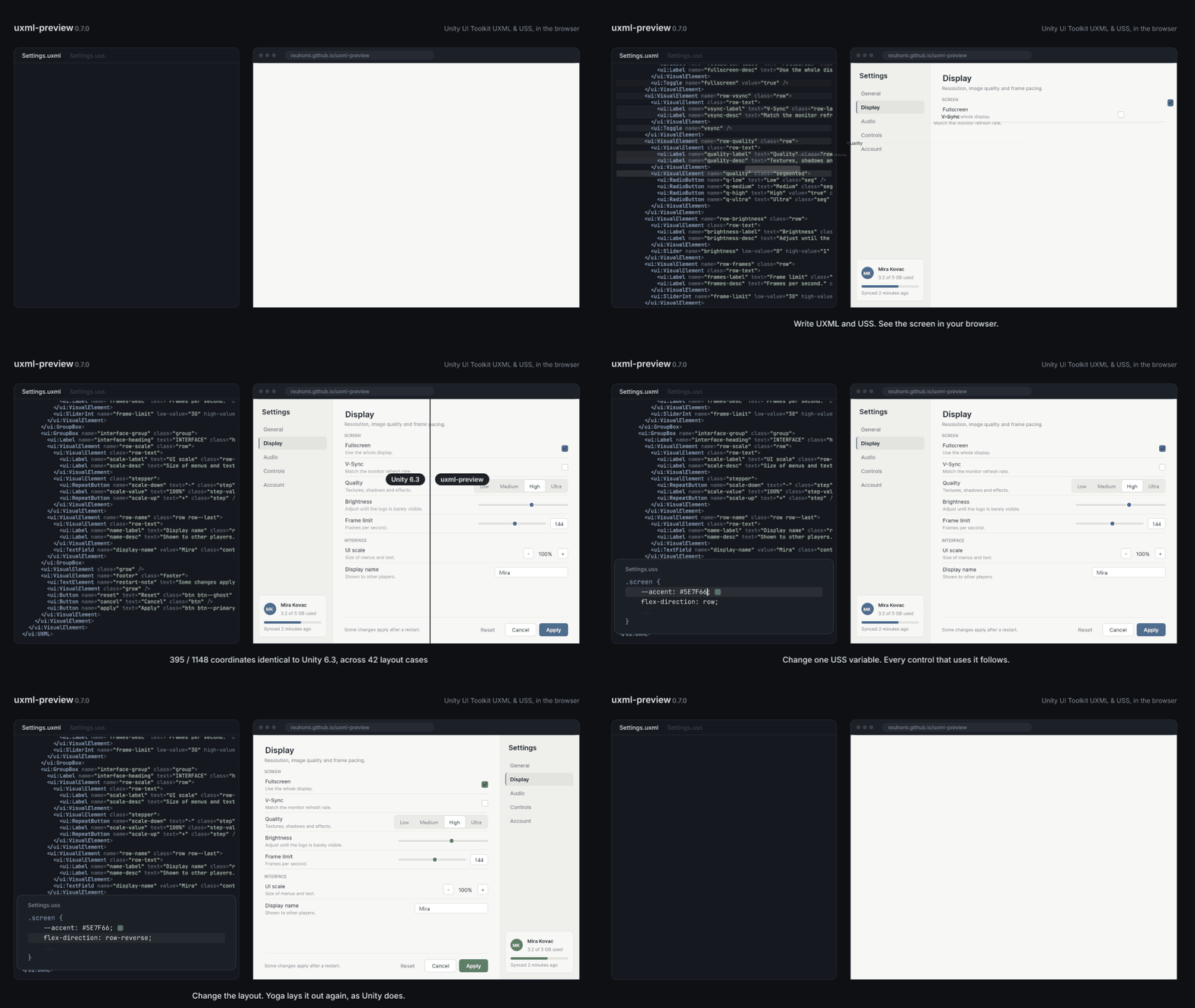
|
|
9
|
+
|
|
8
10
|
[](https://reuhomi.github.io/uxml-preview/)
|
|
9
11
|
|
|
10
12
|
### ▶ [プレイグラウンドを開く](https://reuhomi.github.io/uxml-preview/)
|
|
@@ -18,8 +20,11 @@ UI Toolkit 自身が使用する Yoga エンジンを採用し、描画結果は
|
|
|
18
20
|
|
|
19
21
|
## 検証方法
|
|
20
22
|
|
|
21
|
-
-
|
|
22
|
-
-
|
|
23
|
+
- **座標・ランタイムテーマ(既定):** 同じ42個のレイアウトケースにおいて、要素の座標値 1122 / 1148 が実際の Unity 6.3 ランタイムパネル(6000.3.25f1、PanelSettings + UIDocument、Play モード)と一致しています。残る差異はすべてエディターテーマにもあるものです。[測定方法 →](https://github.com/ReuHomi/uxml-preview/blob/main/docs/accuracy.en.md#runtime-theme-separate-set-measured-2026-10-17)
|
|
24
|
+
- **座標・エディターテーマ:** 完成画面3件(インベントリ、描画する15種のコントロールをすべて使った設定画面の英語版・韓国語版)を含む42個のレイアウトケースにおいて、要素の座標値 1122 / 1148 が Unity 6000.0.40f1 と一致しています。[すべての差異とその内訳 →](https://github.com/ReuHomi/uxml-preview/blob/main/docs/accuracy.en.md) 同じケースを Unity 6.3(6000.3.25f1)で再ダンプしたところ、同日に取得した 6000.0.40f1 のダンプとすべての配置が一致しました。[6.3 での再測定 →](https://github.com/ReuHomi/uxml-preview/blob/main/docs/accuracy.en.md#unity-63-lts-re-measurement-2026-10-15)
|
|
25
|
+
- **テキスト、ランタイムテーマ(既定):** 実際のブラウザで描画し、実際の Unity ランタイムパネル(6000.0.40f1 と 6000.3.25f1、プローブごとに別の Unity プロセス)と Label 単位で比較しました。行数 92 / 92、高さ 84 / 92、幅 92 / 92(誤差 1px または 1% 以内)、ボックス境界での改行ケース 159 / 159。高さが異なるケースはすべて、ハングルを含まない欧文フォント Inter で韓国語、または韓国語と欧文が混在するテキストを指定したものです。Unity はこれをフォールバックフォントで描画しますが、本プレビューではまさにその状況を警告として通知します。[ランタイムのテキストセット →](https://github.com/ReuHomi/uxml-preview/blob/main/docs/accuracy.en.md#runtime-panel-separate-set-measured-2026-10-19--item-t)
|
|
26
|
+
- **テキスト、エディターテーマ:** 同じ 92 個の Label を Unity 6000.3.25f1 のエディターと比較 — 92 / 92、84 / 92、92 / 92、改行ケース 157 / 159(残る 2 件:中国語 1 ケースでのエディターの禁則処理と、ボックス境界での 1px の自然幅の差)。[テキスト検証セット →](https://github.com/ReuHomi/uxml-preview/blob/main/docs/accuracy.en.md#text-cohort-separate-set-measured-2026-10-16)
|
|
27
|
+
- **測定条件:** 座標の数値は、テキストサイズを与えたときのレイアウトを測っています(ハーネスはテキストを固定関数で測り、テキスト計測はテキストの数値が別に測ります)。テキストの数値は Unity と同じフォントファイルを渡した条件での値です。フォントを渡さない場合はブラウザーの既定フォントで測るため、文字幅が数 px 異なり、複数行のテキストでは行数が変わることがあります。[条件 →](https://github.com/ReuHomi/uxml-preview/blob/main/docs/accuracy.en.md)
|
|
23
28
|
- **Unity バージョン:** 基準バージョンは Unity 6.3 LTS です。USS プロパティかどうかの判定は Unity 公式のプロパティ一覧(6.6 まで)に基づいており、6.7 は LTS になるまでサポート対象外です。[サポート範囲 →](https://github.com/ReuHomi/uxml-preview/blob/main/docs/supported.en.md)
|
|
24
29
|
- **一致しない箇所は見過ごさず、警告として報告します。** 未サポートのコントロール・プロパティ・値は、その理由とともに(測定済みの場合は Unity 側が代わりにどう振る舞うかも含めて)警告として返されます。[警告について →](https://github.com/ReuHomi/uxml-preview/blob/main/docs/api.en.md#warnings)
|
|
25
30
|
|
package/README.ko.md
CHANGED
|
@@ -5,6 +5,8 @@
|
|
|
5
5
|
**Unity UI Toolkit의 UXML/USS를 Unity 에디터 없이 브라우저에서 그립니다. 배치는 UI Toolkit이
|
|
6
6
|
쓰는 엔진인 Yoga가 하고, 결과는 Unity와 대조해 측정했습니다.**
|
|
7
7
|
|
|
8
|
+

|
|
9
|
+
|
|
8
10
|
[](https://reuhomi.github.io/uxml-preview/)
|
|
9
11
|
|
|
10
12
|
### ▶ [놀이터 열기](https://reuhomi.github.io/uxml-preview/)
|
|
@@ -18,8 +20,11 @@
|
|
|
18
20
|
|
|
19
21
|
## 어떻게 확인했나
|
|
20
22
|
|
|
21
|
-
-
|
|
22
|
-
-
|
|
23
|
+
- **좌표, 런타임 테마(기본값):** 같은 배치 케이스 42개에서 요소 좌표 값 1122 / 1148이 실제 Unity 6.3 런타임 패널(6000.3.25f1, PanelSettings + UIDocument, Play 모드)과 같습니다. 남은 차이는 모두 에디터 테마에도 있는 것입니다. [어떻게 쟀나 →](https://github.com/ReuHomi/uxml-preview/blob/main/docs/accuracy.md#런타임-테마-별도-세트-2026-10-17-측정)
|
|
24
|
+
- **좌표, 에디터 테마:** 완성된 화면 셋(인벤토리, 그리는 컨트롤 15종을 모두 쓴 설정 화면의 영어·한국어판)을 포함한 배치 케이스 42개에서, 요소 좌표 값 1122 / 1148이 Unity 6000.0.40f1과 같습니다. [다른 곳은 전부 이름을 붙여 적었습니다 →](https://github.com/ReuHomi/uxml-preview/blob/main/docs/accuracy.md) 같은 케이스를 Unity 6.3(6000.3.25f1)에서 다시 덤프했더니, 같은 날 다시 뜬 6000.0.40f1 덤프와 배치가 모두 같았습니다. [6.3 재측정 →](https://github.com/ReuHomi/uxml-preview/blob/main/docs/accuracy.md#unity-63-lts-재측정-2026-10-15)
|
|
25
|
+
- **텍스트, 런타임 테마(기본):** 실제 브라우저에서 그려 실제 Unity 런타임 패널(6000.0.40f1과 6000.3.25f1, 프로브마다 따로 띄운 Unity)과 Label 단위로 대조했습니다. 줄 수 92 / 92, 높이 84 / 92, 너비 92 / 92(1px 또는 1% 이내), 상자 경계의 줄바꿈 케이스 159 / 159. 높이가 다른 것은 모두 라틴 글꼴 Inter로 쓴 한글·혼합 문장입니다 — Inter에 한글이 없어 Unity가 대체 폰트로 그리고, 미리보기는 바로 그 경우에 경고합니다. [런타임 텍스트 세트 →](https://github.com/ReuHomi/uxml-preview/blob/main/docs/accuracy.md#런타임-패널-별도-세트-2026-10-19-측정--항목-t)
|
|
26
|
+
- **텍스트, 에디터 테마:** 같은 92개 Label을 Unity 6000.3.25f1 에디터와 대조 — 92 / 92, 84 / 92, 92 / 92, 줄바꿈 케이스 157 / 159(남은 둘: 중국어 한 케이스의 에디터 금칙, 상자 경계에서 1px 다른 자연 폭). [텍스트 코호트 →](https://github.com/ReuHomi/uxml-preview/blob/main/docs/accuracy.md#텍스트-코호트-별도-검증-세트-2026-10-16-측정)
|
|
27
|
+
- **어떤 조건에서 쟀나:** 좌표 수치는 글 크기가 주어졌을 때의 배치를 잽니다 — 하네스는 글을 고정 함수로 재고, 글 측정은 텍스트 수치가 따로 잽니다. 텍스트 수치는 Unity와 같은 글꼴 파일을 넘겨준 조건에서 잰 값입니다. 글꼴을 넘기지 않으면 브라우저 기본 글꼴로 재며, 글자 폭이 몇 px 다르고 여러 줄 글의 줄 수가 달라질 수 있습니다. [조건 →](https://github.com/ReuHomi/uxml-preview/blob/main/docs/accuracy.md)
|
|
23
28
|
- **Unity 버전:** 기준은 Unity 6.3 LTS입니다. USS 속성인지는 Unity 공식 속성표(6.6까지)로 판정하고, 6.7은 LTS가 나올 때까지 지원하지 않습니다. [지원 범위 →](https://github.com/ReuHomi/uxml-preview/blob/main/docs/supported.md)
|
|
24
29
|
- **맞지 않는 곳은 조용히 넘기지 않고 경고로 알립니다.** 지원하지 않는 컨트롤·속성·값은 이유와 함께, 측정한 경우에는 Unity가 대신 어떻게 하는지까지 경고로 돌아옵니다. [경고 →](https://github.com/ReuHomi/uxml-preview/blob/main/docs/api.md#경고)
|
|
25
30
|
|
package/README.md
CHANGED
|
@@ -5,6 +5,8 @@
|
|
|
5
5
|
**Render Unity UI Toolkit UXML/USS in a browser, without the Unity Editor — laid
|
|
6
6
|
out by Yoga, the engine UI Toolkit itself uses, and measured against Unity.**
|
|
7
7
|
|
|
8
|
+

|
|
9
|
+
|
|
8
10
|
[](https://reuhomi.github.io/uxml-preview/)
|
|
9
11
|
|
|
10
12
|
### ▶ [Open the playground](https://reuhomi.github.io/uxml-preview/)
|
|
@@ -18,8 +20,11 @@ all runs in the page.
|
|
|
18
20
|
|
|
19
21
|
## How it is verified
|
|
20
22
|
|
|
21
|
-
- **Coordinates:**
|
|
22
|
-
- **
|
|
23
|
+
- **Coordinates, runtime theme (the default):** 1122 / 1148 element coordinate values identical to a real Unity 6.3 runtime panel (6000.3.25f1, PanelSettings + UIDocument in Play mode), over the same 42 layout cases. Every value left over is one the editor theme also has. [How it was measured →](https://github.com/ReuHomi/uxml-preview/blob/main/docs/accuracy.en.md#runtime-theme-separate-set-measured-2026-10-17)
|
|
24
|
+
- **Coordinates, editor theme:** 1122 / 1148 element coordinate values identical to Unity 6000.0.40f1, over 42 layout cases including three complete screens (an inventory, and a settings screen with all 15 drawn controls, in English and Korean). [Every difference, named →](https://github.com/ReuHomi/uxml-preview/blob/main/docs/accuracy.en.md) Re-dumped on Unity 6.3 (6000.3.25f1), every one of those cases laid out exactly as in a 6000.0.40f1 dump taken the same day. [The 6.3 re-measurement →](https://github.com/ReuHomi/uxml-preview/blob/main/docs/accuracy.en.md#unity-63-lts-re-measurement-2026-10-15)
|
|
25
|
+
- **Text, runtime theme (the default):** drawn in a real browser and compared Label by Label with a real Unity runtime panel (6000.0.40f1 and 6000.3.25f1, each probe in its own Unity process) — line count 92 / 92, height 84 / 92, width 92 / 92 within 1px or 1%, and 159 / 159 line-break cases at box edges. Every height that differs is Korean or mixed text set in Inter, a Latin font with no Hangul, which Unity draws with a fallback font; the preview warns about exactly that. [The runtime text set →](https://github.com/ReuHomi/uxml-preview/blob/main/docs/accuracy.en.md#runtime-panel-separate-set-measured-2026-10-19--item-t)
|
|
26
|
+
- **Text, editor theme:** the same 92 Labels against Unity 6000.3.25f1's editor — 92 / 92, 84 / 92, 92 / 92, and 157 / 159 line-break cases (the two left: the editor's kinsoku in one Chinese case, and a 1px natural width at a box edge). [The text cohort →](https://github.com/ReuHomi/uxml-preview/blob/main/docs/accuracy.en.md#text-cohort-separate-set-measured-2026-10-16)
|
|
27
|
+
- **Under what conditions:** the coordinate figures measure layout given the text sizes — the harness measures text with a fixed function, and the text figures measure text separately. The text figures are measured with the same font file Unity uses passed to the preview; without a font, the preview measures with the browser's default font, so text widths can differ by a few pixels and wrapped text can break into a different number of lines. [Conditions →](https://github.com/ReuHomi/uxml-preview/blob/main/docs/accuracy.en.md)
|
|
23
28
|
- **Unity version:** the reference is Unity 6.3 LTS. A property is USS if Unity's official property table lists it, up to 6.6; 6.7 is not supported until it is an LTS. [What is supported →](https://github.com/ReuHomi/uxml-preview/blob/main/docs/supported.en.md)
|
|
24
29
|
- **What does not match is reported, not glossed over.** An unsupported control, property or value comes back as a warning that says why, and — where it was measured — what Unity does instead. [Warnings →](https://github.com/ReuHomi/uxml-preview/blob/main/docs/api.en.md#warnings)
|
|
25
30
|
|
package/README.zh-CN.md
CHANGED
|
@@ -5,6 +5,8 @@
|
|
|
5
5
|
**无需 Unity 编辑器,即可在浏览器中渲染 Unity UI Toolkit 的 UXML/USS——由 UI Toolkit 自身使用的
|
|
6
6
|
Yoga 引擎负责布局,并与 Unity 实测结果进行了比对验证。**
|
|
7
7
|
|
|
8
|
+

|
|
9
|
+
|
|
8
10
|
[](https://reuhomi.github.io/uxml-preview/)
|
|
9
11
|
|
|
10
12
|
### ▶ [打开在线体验 (Playground)](https://reuhomi.github.io/uxml-preview/)
|
|
@@ -18,8 +20,11 @@ Yoga 引擎负责布局,并与 Unity 实测结果进行了比对验证。**
|
|
|
18
20
|
|
|
19
21
|
## 验证方式
|
|
20
22
|
|
|
21
|
-
-
|
|
22
|
-
-
|
|
23
|
+
- **坐标·运行时主题(默认):** 在同样的 42 个布局用例中,1122 / 1148 个元素坐标值与真实的 Unity 6.3 运行时面板(6000.3.25f1,PanelSettings + UIDocument,Play 模式)完全一致。剩余差异均为编辑器主题同样存在的差异。[测量方法 →](https://github.com/ReuHomi/uxml-preview/blob/main/docs/accuracy.en.md#runtime-theme-separate-set-measured-2026-10-17)
|
|
24
|
+
- **坐标·编辑器主题:** 在包含三个完整界面(物品栏,以及使用全部 15 种已绘制控件的设置界面英文版和韩文版)在内的 42 个布局用例中,1122 / 1148 个元素坐标值与 Unity 6000.0.40f1 完全一致。[查看全部差异明细 →](https://github.com/ReuHomi/uxml-preview/blob/main/docs/accuracy.en.md) 在 Unity 6.3(6000.3.25f1)中重新导出这批用例后,所有布局结果均与当天导出的 6000.0.40f1 结果一致。[6.3 重新测量结果 →](https://github.com/ReuHomi/uxml-preview/blob/main/docs/accuracy.en.md#unity-63-lts-re-measurement-2026-10-15)
|
|
25
|
+
- **文本,运行时主题(默认):** 在真实浏览器中绘制,并与真实的 Unity 运行时面板(6000.0.40f1 与 6000.3.25f1,每个探针单独启动一个 Unity 进程)逐个 Label 进行比对——行数 92 / 92、高度 84 / 92、宽度 92 / 92(误差在 1px 或 1% 以内),框边界处的换行用例 159 / 159。所有高度存在差异的用例,均是使用了不含韩文字符的拉丁字体 Inter 来排版韩文或混排文本;此时 Unity 会改用回退字体绘制,而本预览工具会针对该情况发出明确警告。[运行时文本测试集 →](https://github.com/ReuHomi/uxml-preview/blob/main/docs/accuracy.en.md#runtime-panel-separate-set-measured-2026-10-19--item-t)
|
|
26
|
+
- **文本,编辑器主题:** 同样的 92 个 Label 与 Unity 6000.3.25f1 编辑器比对——92 / 92、84 / 92、92 / 92,换行用例 157 / 159(其余 2 个:一个中文用例中编辑器的禁则处理,以及框边界处 1px 的自然宽度差)。[文本测试集 →](https://github.com/ReuHomi/uxml-preview/blob/main/docs/accuracy.en.md#text-cohort-separate-set-measured-2026-10-16)
|
|
27
|
+
- **测量条件:** 坐标数值测量的是给定文字尺寸时的布局(测试工具用固定函数测量文字,文字测量由文本数值单独衡量)。文本数值是在向预览传入与 Unity 相同的字体文件的条件下测得的。若不传入字体,预览会用浏览器默认字体测量,文字宽度可能相差几个像素,多行文本的行数也可能不同。[条件 →](https://github.com/ReuHomi/uxml-preview/blob/main/docs/accuracy.en.md)
|
|
23
28
|
- **Unity 版本:** 基准版本为 Unity 6.3 LTS。某项属性是否属于 USS,依据 Unity 官方属性表(截至 6.6)判定;6.7 在推出 LTS 版本之前暂不支持。[支持范围 →](https://github.com/ReuHomi/uxml-preview/blob/main/docs/supported.en.md)
|
|
24
29
|
- **不一致之处会明确报告,绝不静默忽略。** 遇到不支持的控件、属性或值时,工具会返回警告并说明原因;对于已实测的情况,还会一并告知 Unity 的实际处理方式。[警告说明 →](https://github.com/ReuHomi/uxml-preview/blob/main/docs/api.en.md#warnings)
|
|
25
30
|
|
|
@@ -1,4 +1,16 @@
|
|
|
1
1
|
import { ElementNode } from '../model/types';
|
|
2
|
+
export declare function uxmlBoolean(value: string | undefined): boolean | undefined;
|
|
3
|
+
export declare function isVertical(value: string | undefined): boolean;
|
|
4
|
+
/**
|
|
5
|
+
* Purpose: match k-slider/k-progress dumps (bundle-A plan §32) for display and layout.
|
|
6
|
+
* Ensures: values are finite and clamped; invalid input retains the attribute default.
|
|
7
|
+
*/
|
|
8
|
+
export declare function numericControlValue(node: ElementNode): {
|
|
9
|
+
low: number;
|
|
10
|
+
high: number;
|
|
11
|
+
value: number;
|
|
12
|
+
invalid: boolean;
|
|
13
|
+
};
|
|
2
14
|
/**
|
|
3
15
|
* An element a control builds for itself, which the file never mentions.
|
|
4
16
|
*
|
|
@@ -11,8 +23,18 @@ import { ElementNode } from '../model/types';
|
|
|
11
23
|
* observed in `tests/golden/unity/scrollview-*.json`, not invented.
|
|
12
24
|
*/
|
|
13
25
|
export interface ControlPart {
|
|
14
|
-
/** Unity
|
|
26
|
+
/** Unity name, or class identity for the unnamed GroupBox title. */
|
|
15
27
|
name: string;
|
|
28
|
+
/** Earlier part index, or null for the owner; omitted preserves the wrapper chain. */
|
|
29
|
+
parent?: number | null;
|
|
30
|
+
textValue?: string;
|
|
31
|
+
/** Text parts are measured leaves; a leading Label is a sibling of the wrapper chain. */
|
|
32
|
+
kind?: 'leading-text' | 'text';
|
|
33
|
+
/** Attribute text is decoded only for the derived rendering, never in the AST. */
|
|
34
|
+
textAttribute?: 'text' | 'label' | 'value' | 'title';
|
|
35
|
+
typeName?: string;
|
|
36
|
+
unnamed?: boolean;
|
|
37
|
+
classes?: readonly string[];
|
|
16
38
|
/**
|
|
17
39
|
* USS this part always carries, because the control fixes it.
|
|
18
40
|
*
|
|
@@ -26,10 +48,14 @@ export interface ControlSpec {
|
|
|
26
48
|
/** Renders the `text` attribute as its own content. */
|
|
27
49
|
hasText: boolean;
|
|
28
50
|
/**
|
|
29
|
-
*
|
|
30
|
-
*
|
|
51
|
+
* Parts are parent-before-child. Explicit parent indices describe branches.
|
|
52
|
+
* Otherwise these are elements inserted between the control and file children,
|
|
53
|
+
* outermost first. File children go inside the last wrapper; leading text
|
|
54
|
+
* parts are siblings before them and exist only for non-empty owner text.
|
|
31
55
|
*/
|
|
32
56
|
parts: readonly ControlPart[];
|
|
57
|
+
/** File children follow all parts; omitted uses the last non-text part, or owner. */
|
|
58
|
+
fileChildrenHost?: 'owner' | 'last-part';
|
|
33
59
|
/**
|
|
34
60
|
* USS classes Unity's own constructor puts on this control, which the theme
|
|
35
61
|
* stylesheet then targets. Not in the `class` attribute and not in the model:
|
|
@@ -58,10 +84,12 @@ export declare function resolveControl(node: ElementNode): ResolvedControl;
|
|
|
58
84
|
export declare function isRoot(node: ElementNode): boolean;
|
|
59
85
|
/**
|
|
60
86
|
* Purpose: the USS classes Unity would have added to this element.
|
|
61
|
-
* Ensures:
|
|
62
|
-
* must not pick up theme styling meant for a control we do not
|
|
63
|
-
* actually draw.
|
|
87
|
+
* Ensures: control classes and own disabled class remain outside the model.
|
|
64
88
|
*/
|
|
65
89
|
export declare function implicitClassesOf(node: ElementNode): readonly string[];
|
|
66
90
|
/** Controls with a renderer of their own. Everything else still draws. */
|
|
67
91
|
export declare function supportedControlNames(): string[];
|
|
92
|
+
/** Ensures: password values are masked before measurement or DOM painting. */
|
|
93
|
+
export declare function partTextOf(node: ElementNode, part: ControlPart): string | undefined;
|
|
94
|
+
/** Ensures: legacy wrapper chains and explicit part trees share one parent contract. */
|
|
95
|
+
export declare function partParentIndex(parts: readonly ControlPart[], index: number): number | null;
|
package/dist/controls/theme.d.ts
CHANGED
|
@@ -1,87 +1,63 @@
|
|
|
1
1
|
/**
|
|
2
2
|
* Unity's control defaults, as far as we have measured them.
|
|
3
3
|
*
|
|
4
|
-
* Unity
|
|
5
|
-
*
|
|
6
|
-
*
|
|
7
|
-
*
|
|
8
|
-
*
|
|
9
|
-
*
|
|
10
|
-
*
|
|
11
|
-
*
|
|
12
|
-
*
|
|
13
|
-
*
|
|
14
|
-
*
|
|
15
|
-
*
|
|
16
|
-
*
|
|
17
|
-
*
|
|
18
|
-
*
|
|
19
|
-
*
|
|
20
|
-
*
|
|
21
|
-
*
|
|
22
|
-
*
|
|
23
|
-
*
|
|
24
|
-
*
|
|
25
|
-
*
|
|
26
|
-
*
|
|
27
|
-
*
|
|
28
|
-
*
|
|
29
|
-
*
|
|
30
|
-
*
|
|
31
|
-
*
|
|
32
|
-
*
|
|
33
|
-
*
|
|
34
|
-
*
|
|
35
|
-
*
|
|
36
|
-
*
|
|
37
|
-
*
|
|
38
|
-
*
|
|
39
|
-
*
|
|
40
|
-
*
|
|
41
|
-
* reports x=0 y=0. Nothing to add is a result, not an omission.
|
|
42
|
-
* - padding, border, font — invisible to the cases we have. Every compared
|
|
43
|
-
* element is explicitly sized, and USS is border-box, so padding and border
|
|
44
|
-
* do not move the outer rectangle. They are unmeasured, so they are not here.
|
|
45
|
-
* - `Label`'s text alignment — the eye check could not separate it from the
|
|
46
|
-
* box at this size. Unmeasured, so absent.
|
|
47
|
-
*
|
|
48
|
-
* The class names were a separate claim from the values, and are now measured
|
|
49
|
-
* too. `unity-button` came from Unity's documented `Button.ussClassName`, which
|
|
50
|
-
* the margin dumps said nothing about — they proved the spacing, not the
|
|
51
|
-
* selector delivering it. The golden case `theme-class-hook` was written to
|
|
52
|
-
* settle exactly that, and Unity answered on 2026-08-05: a `.unity-button` rule
|
|
53
|
-
* in author USS reaches a bare `<ui:Button>`, sizing it 120×40 in both engines.
|
|
54
|
-
* The selector below is therefore measured, not assumed.
|
|
55
|
-
*/
|
|
56
|
-
/** Where every value in this file was measured. Theme values move between versions. */
|
|
57
|
-
export declare const THEME_UNITY_VERSION = "6000.0.40f1";
|
|
58
|
-
/**
|
|
59
|
-
* Parsed once and spliced in ahead of author sheets, so an author rule of equal
|
|
60
|
-
* specificity wins on order — which is how a theme stylesheet behaves in Unity.
|
|
61
|
-
*
|
|
62
|
-
* Class selectors rather than type selectors, also for Unity's reasons: a theme
|
|
63
|
-
* rule at `.unity-button` (0,1,0) beats an author's `Button { }` (0,0,1), and
|
|
64
|
-
* that is a real Unity gotcha worth reproducing rather than smoothing over.
|
|
4
|
+
* Unity supplies control spacing before author USS runs; omitting it once put
|
|
5
|
+
* every Button 3px left and 1px high, compounding across a row. Only measured
|
|
6
|
+
* values live here. Values copied from Unity's source could look just as
|
|
7
|
+
* authoritative while being wrong without appearing in the unmeasured list.
|
|
8
|
+
*
|
|
9
|
+
* There are two measured themes: editor in an EditorWindow on 6000.0.40f1
|
|
10
|
+
* (tests/layout/unity/6000.0.40f1/probe-editor-070/), runtime on a real runtime
|
|
11
|
+
* panel on 6000.3.25f1 (tests/layout/unity/6000.3.25f1/probe-panel/), with
|
|
12
|
+
* identical runtime values on 6000.0.40f1. Geometry comes from coordinate dumps.
|
|
13
|
+
* `-unity-text-align` came from the Step 6 eye check: a glyph's position inside
|
|
14
|
+
* its box does not move the box, so 368 matching coordinates could not reveal
|
|
15
|
+
* that Unity centred Button text while this renderer put it at the top left.
|
|
16
|
+
*
|
|
17
|
+
* Opacity 0.5 was established by pixel arithmetic: Unity's disabled Drop button
|
|
18
|
+
* is rgb(41,50,67); its base rgb(58,74,104) composited at half over the footer's
|
|
19
|
+
* rgb(24,26,31) gives (41,50,67.5). It is measured, not chosen by appearance.
|
|
20
|
+
* `nested-disabled` now places it on `.unity-disabled`, which Unity adds only
|
|
21
|
+
* where enabled="false" was written. This replaces the earlier `:disabled`
|
|
22
|
+
* rule that applied half opacity at every disabled level and dimmed twice.
|
|
23
|
+
*
|
|
24
|
+
* Two wrong turns preceded that result. The author's `Button:disabled` rule
|
|
25
|
+
* was first blamed for not applying, but `#DropButton` outranks it in both
|
|
26
|
+
* engines. Then state rules were thought to outrank specificity; `state-vs-id`
|
|
27
|
+
* and `state-vs-inline` both returned 40 in Unity, refuting that explanation.
|
|
28
|
+
* The dimming was never a cascade defect.
|
|
29
|
+
*
|
|
30
|
+
* Earlier omissions, superseded by c07-existing and c07-states:
|
|
31
|
+
* - "Label has nothing" described only its measured editor margin; Label and
|
|
32
|
+
* Button spacing and flex-shrink are now measured for both themes.
|
|
33
|
+
* - "Padding, border, font deliberately absent" is superseded by measured
|
|
34
|
+
* padding, borders, colours and font size; Label text alignment stays absent.
|
|
35
|
+
*
|
|
36
|
+
* Class hooks are a separate claim from values: margin dumps proved spacing,
|
|
37
|
+
* not the selector delivering it. `unity-button` began with the documented
|
|
38
|
+
* Button.ussClassName; `theme-class-hook` then confirmed on 2026-08-05 that
|
|
39
|
+
* author `.unity-button` reaches a bare <ui:Button>, sizing it 120×40 in Unity
|
|
40
|
+
* and this renderer. The hook is measured, not assumed.
|
|
65
41
|
*/
|
|
66
|
-
export
|
|
42
|
+
export type Theme = 'runtime' | 'editor';
|
|
43
|
+
export declare const DEFAULT_THEME: Theme;
|
|
44
|
+
/** Unity version used to measure the editor theme. */
|
|
45
|
+
export declare const THEME_UNITY_VERSION: string;
|
|
46
|
+
/** Unity measurement version for each theme. */
|
|
47
|
+
export declare const THEME_UNITY_VERSIONS: Readonly<Record<Theme, string>>;
|
|
48
|
+
/** Panel defaults inherited by the rendered elements. */
|
|
49
|
+
export declare const PANEL_TEXT_DEFAULTS_SELECTOR = "UXML";
|
|
67
50
|
/**
|
|
68
|
-
*
|
|
69
|
-
*
|
|
70
|
-
*
|
|
71
|
-
* `
|
|
72
|
-
* `opacity: 0.5`, and CSS multiplies them, so a disabled button inside a
|
|
73
|
-
* disabled panel comes out at a quarter. Unity almost certainly dims once.
|
|
74
|
-
*
|
|
75
|
-
* Not guessed at, because the fix has a choice inside it — dim only where
|
|
76
|
-
* `enabled="false"` was written, or suppress the inherited one — and picking
|
|
77
|
-
* without evidence is how the `.unity-button` selector became a hypothesis
|
|
78
|
-
* nobody noticed for a day. Opacity leaves no trace in a coordinate dump, so
|
|
79
|
-
* settling it needs a screenshot of a nested case. Recorded in
|
|
80
|
-
* `docs/backlog.md` and visible in `visual-nested-disabled`.
|
|
51
|
+
* Editor theme stylesheet; kept as the legacy editor-sheet export.
|
|
52
|
+
* Parsed once and spliced in ahead of author sheets, so equal specificity lets
|
|
53
|
+
* author rules win on order, as in Unity. Class selectors also preserve Unity's
|
|
54
|
+
* specificity: `.unity-button` (0,1,0) beats an author `Button {}` (0,0,1).
|
|
81
55
|
*/
|
|
56
|
+
export declare const THEME_USS: string;
|
|
57
|
+
export declare const THEME_SHEETS: Readonly<Record<Theme, string>>;
|
|
82
58
|
/**
|
|
83
59
|
* Purpose: how much width a vertical scrollbar claims, given whether it shows.
|
|
84
60
|
* Ensures: 0 when the content fits — Unity hides the scroller rather than
|
|
85
61
|
* shrinking the viewport for a bar nobody can see.
|
|
86
62
|
*/
|
|
87
|
-
export declare function verticalScrollbarWidth(overflows: boolean): number;
|
|
63
|
+
export declare function verticalScrollbarWidth(overflows: boolean, theme?: Theme): number;
|