use-password-policy 2.0.0 → 3.0.0
This diff represents the content of publicly available package versions that have been released to one of the supported registries. The information contained in this diff is provided for informational purposes only and reflects changes between package versions as they appear in their respective public registries.
- package/CHANGELOG.md +37 -0
- package/LICENSE +21 -0
- package/README.md +232 -135
- package/dist/core.d.mts +255 -0
- package/dist/core.d.ts +255 -0
- package/dist/core.js +468 -0
- package/dist/core.mjs +431 -0
- package/dist/index.d.mts +292 -9
- package/dist/index.d.ts +292 -9
- package/dist/index.js +635 -190
- package/dist/index.mjs +621 -188
- package/dist/styles.css +80 -0
- package/package.json +93 -27
package/CHANGELOG.md
ADDED
|
@@ -0,0 +1,37 @@
|
|
|
1
|
+
# Changelog
|
|
2
|
+
|
|
3
|
+
## 3.0.0
|
|
4
|
+
|
|
5
|
+
### Added
|
|
6
|
+
- **`use-password-policy/core`**: a framework-free `validatePassword(password, options)` for running the same policy on the server (Node, edge, API routes). It doesn't import React.
|
|
7
|
+
- **Presets**: `presets.nist` and `presets.nistMfa`, following NIST SP 800-63B-4, plus `presets.classic`.
|
|
8
|
+
- **New rules**: `maxLength`, `commonPasswordCheck` (a built-in blocklist that also catches decorated variants like `P@ssw0rd123!`), and `confirmPassword` (a "passwords match" rule).
|
|
9
|
+
- **Breach checks**: `checkPwnedPassword()` and a `usePwnedPassword()` hook using Have I Been Pwned k-anonymity. Only a 5-character hash prefix is sent.
|
|
10
|
+
- **Real strength scoring**: a `strengthEstimator` option and a `fromZxcvbn()` adapter (zxcvbn and @zxcvbn-ts v3/v4), plus `minStrength`.
|
|
11
|
+
- **Integrations**: `zodPasswordRule()` for Zod `superRefine` and `passwordValidator()` for react-hook-form `validate`. Neither adds a dependency.
|
|
12
|
+
- **Messages & i18n**: every requirement has readable text, and `messages` overrides it.
|
|
13
|
+
- The result now includes `requirements`, `errors`, `strengthPercent` and `estimate`.
|
|
14
|
+
- Component: controlled mode (`value`/`onChange`), `ref` forwarding, `inputClassName`, `showStrengthLabel`, `toggleLabels`, `unstyled`, and the `use-password-policy/styles.css` export.
|
|
15
|
+
- Accessibility: `aria-describedby` checklist, `role="meter"`, `aria-invalid`, labelled toggle button, and "met"/"not met" text for screen readers.
|
|
16
|
+
- The React entry is marked `'use client'` for the Next.js App Router.
|
|
17
|
+
- Tests (Vitest + Testing Library), with CI on React 18 and 19.
|
|
18
|
+
|
|
19
|
+
### Changed (breaking)
|
|
20
|
+
- **Dropped the `styled-components` peer dependency.** The component now ships plain, low-specificity CSS, themeable through the same `--rpp-*` variables.
|
|
21
|
+
- Component DOM and class names changed to `.rpp-*`.
|
|
22
|
+
- `onPasswordChange` no longer fires on mount.
|
|
23
|
+
- `react-dom` is no longer a peer dependency, and `react` is optional (only needed for the hook and component).
|
|
24
|
+
|
|
25
|
+
### Fixed
|
|
26
|
+
- Passing `onChange` or `value` to `<PasswordPolicyInput />` used to break it. Both now work.
|
|
27
|
+
- The strength meter can now fill completely when fewer than five rules are active.
|
|
28
|
+
- `--rpp-bg` and `--rpp-text` now actually style the input.
|
|
29
|
+
- Options explicitly set to `undefined` no longer override the defaults.
|
|
30
|
+
- The npm README no longer shows leftover placeholder notes. The LICENSE file is added and the license link fixed.
|
|
31
|
+
- The demo deploy workflow now runs on `master`, which was the actual default branch.
|
|
32
|
+
|
|
33
|
+
## 2.0.0
|
|
34
|
+
- Added the `<PasswordPolicyInput />` component (styled-components) and custom rules.
|
|
35
|
+
|
|
36
|
+
## 1.x
|
|
37
|
+
- First release of the `usePasswordPolicy` hook.
|
package/LICENSE
ADDED
|
@@ -0,0 +1,21 @@
|
|
|
1
|
+
MIT License
|
|
2
|
+
|
|
3
|
+
Copyright (c) 2024 Rahul Patwa
|
|
4
|
+
|
|
5
|
+
Permission is hereby granted, free of charge, to any person obtaining a copy
|
|
6
|
+
of this software and associated documentation files (the "Software"), to deal
|
|
7
|
+
in the Software without restriction, including without limitation the rights
|
|
8
|
+
to use, copy, modify, merge, publish, distribute, sublicense, and/or sell
|
|
9
|
+
copies of the Software, and to permit persons to whom the Software is
|
|
10
|
+
furnished to do so, subject to the following conditions:
|
|
11
|
+
|
|
12
|
+
The above copyright notice and this permission notice shall be included in all
|
|
13
|
+
copies or substantial portions of the Software.
|
|
14
|
+
|
|
15
|
+
THE SOFTWARE IS PROVIDED "AS IS", WITHOUT WARRANTY OF ANY KIND, EXPRESS OR
|
|
16
|
+
IMPLIED, INCLUDING BUT NOT LIMITED TO THE WARRANTIES OF MERCHANTABILITY,
|
|
17
|
+
FITNESS FOR A PARTICULAR PURPOSE AND NONINFRINGEMENT. IN NO EVENT SHALL THE
|
|
18
|
+
AUTHORS OR COPYRIGHT HOLDERS BE LIABLE FOR ANY CLAIM, DAMAGES OR OTHER
|
|
19
|
+
LIABILITY, WHETHER IN AN ACTION OF CONTRACT, TORT OR OTHERWISE, ARISING FROM,
|
|
20
|
+
OUT OF OR IN CONNECTION WITH THE SOFTWARE OR THE USE OR OTHER DEALINGS IN THE
|
|
21
|
+
SOFTWARE.
|
package/README.md
CHANGED
|
@@ -1,204 +1,301 @@
|
|
|
1
1
|
# use-password-policy
|
|
2
2
|
|
|
3
3
|
[](https://www.npmjs.com/package/use-password-policy)
|
|
4
|
-
[](https://github.com/rahulpatwa1303/use-password-policy/actions/workflows/ci.yml)
|
|
5
|
+
[](https://bundlephobia.com/package/use-password-policy)
|
|
6
|
+
[](./LICENSE)
|
|
7
7
|
|
|
8
|
-
|
|
8
|
+
**Write your password rules once. Use them in your React form and on your server.**
|
|
9
9
|
|
|
10
|
-
|
|
11
|
-
|
|
12
|
-
|
|
13
|
-
|
|
14
|
-
|
|
10
|
+
- A hook and an accessible drop-in `<PasswordPolicyInput />`
|
|
11
|
+
- A framework-free `validatePassword()` for Node, edge functions and API routes
|
|
12
|
+
- A **NIST SP 800-63B** preset, a common-password blocklist and **Have I Been Pwned** breach checks
|
|
13
|
+
- Optional **zxcvbn** scoring, so "strength" means how hard a password is to guess, not how many boxes it ticks
|
|
14
|
+
- **Zod** and **react-hook-form** helpers
|
|
15
|
+
- No runtime dependencies. About 3 KB gzipped for the core, about 5.5 KB with the React parts.
|
|
15
16
|
|
|
17
|
+
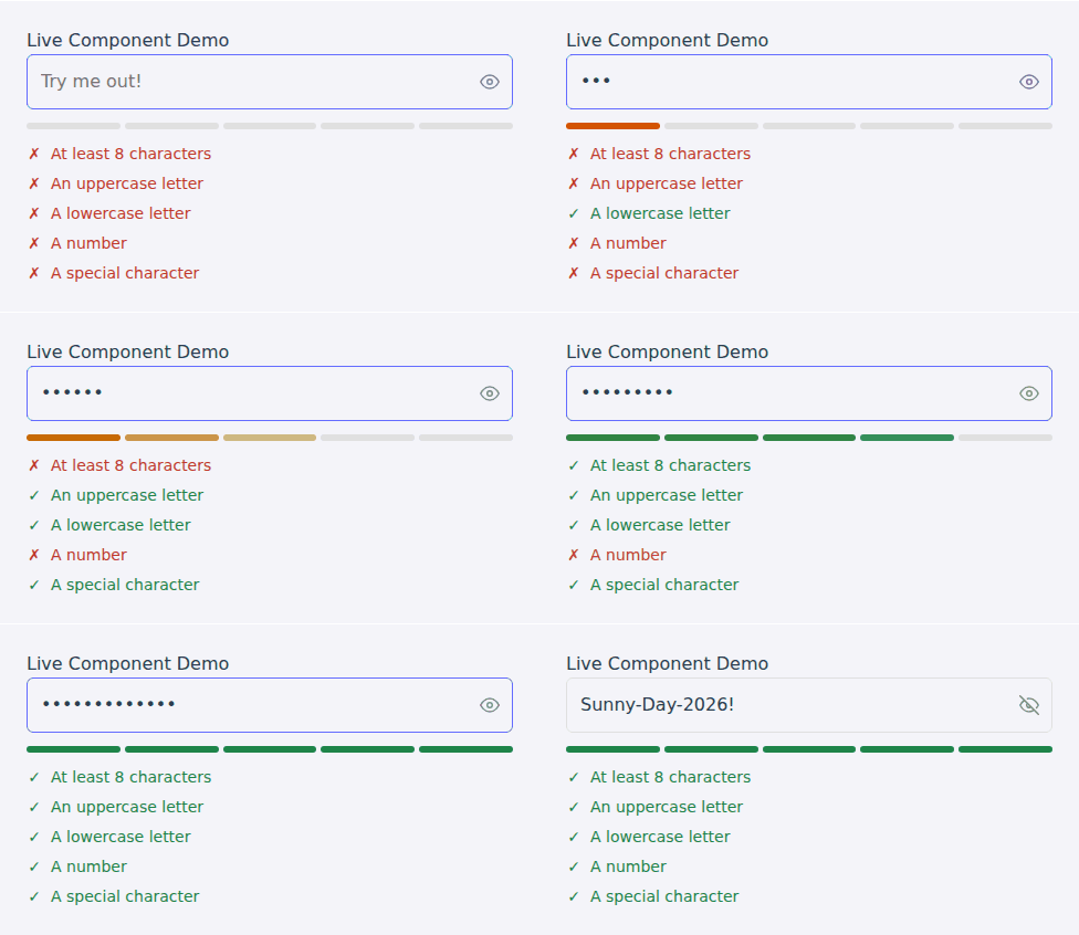
### [➡️ Live demo & playground](https://rahulpatwa1303.github.io/use-password-policy/)
|
|
16
18
|
|
|
17
|
-
|
|
19
|
+
|
|
18
20
|
|
|
19
21
|
---
|
|
20
22
|
|
|
21
|
-
##
|
|
22
|
-
|
|
23
|
-
- **🚀 Two Ways to Use:** Get full control with the `usePasswordPolicy` hook, or get running in seconds with the drop-in `<PasswordPolicyInput />` component.
|
|
24
|
-
- **🔧 Fully Customizable:** Easily configure policies like min-length, character requirements, and even add your own complex rules with custom functions or regex.
|
|
25
|
-
- **💅 Zero-Config Styling:** The UI component works out-of-the-box with self-contained styles, but is easily overridable.
|
|
26
|
-
- **✅ Rich & Reactive Feedback:** Provides a simple `isValid` boolean, a detailed `policyState` object, and a `strengthScore` to easily build any UI you can imagine.
|
|
27
|
-
- **♿ Accessibility First:** The component is designed with accessibility in mind, ready to be paired with a `<label>`.
|
|
28
|
-
- **📦 Tiny & Performant:** Zero dependencies and built with performance in mind, using `useMemo` to prevent unnecessary recalculations.
|
|
29
|
-
|
|
30
|
-
## 💾 Installation
|
|
23
|
+
## Install
|
|
31
24
|
|
|
32
25
|
```bash
|
|
33
26
|
npm install use-password-policy
|
|
34
|
-
# or
|
|
35
|
-
yarn add use-password-policy
|
|
36
27
|
```
|
|
37
28
|
|
|
38
|
-
|
|
39
|
-
|
|
40
|
-
You have two great ways to implement password validation.
|
|
29
|
+
React 16.8+ is needed for the hook and component. It is tested on React 18 and 19. The `use-password-policy/core` entry doesn't need React at all.
|
|
41
30
|
|
|
42
|
-
|
|
31
|
+
## Quick start
|
|
43
32
|
|
|
44
|
-
|
|
33
|
+
### 1. Drop-in component
|
|
45
34
|
|
|
46
35
|
```tsx
|
|
47
36
|
import { PasswordPolicyInput } from 'use-password-policy';
|
|
48
37
|
|
|
49
|
-
function
|
|
38
|
+
function SignUp() {
|
|
50
39
|
const [isValid, setIsValid] = useState(false);
|
|
51
40
|
|
|
52
41
|
return (
|
|
53
42
|
<form>
|
|
54
|
-
<label htmlFor="
|
|
43
|
+
<label htmlFor="password">Password</label>
|
|
55
44
|
<PasswordPolicyInput
|
|
56
|
-
id="
|
|
45
|
+
id="password"
|
|
57
46
|
name="password"
|
|
58
|
-
|
|
59
|
-
onPasswordChange={(_,
|
|
60
|
-
setIsValid(validation.isValid);
|
|
61
|
-
}}
|
|
62
|
-
policyOptions={{ minLength: 8, numberCheck: true, specialCharCheck: true }}
|
|
47
|
+
policyOptions={{ minLength: 10 }}
|
|
48
|
+
onPasswordChange={(_, v) => setIsValid(v.isValid)}
|
|
63
49
|
/>
|
|
64
|
-
<button
|
|
65
|
-
Sign Up
|
|
66
|
-
</button>
|
|
50
|
+
<button disabled={!isValid}>Sign up</button>
|
|
67
51
|
</form>
|
|
68
52
|
);
|
|
69
53
|
}
|
|
70
54
|
```
|
|
71
55
|
|
|
72
|
-
|
|
56
|
+
The component comes with its own styles, a strength meter, a checklist, and a show/hide button that screen readers can use.
|
|
73
57
|
|
|
74
|
-
|
|
58
|
+
### 2. Hook (build your own UI)
|
|
75
59
|
|
|
76
60
|
```tsx
|
|
77
61
|
import { usePasswordPolicy } from 'use-password-policy';
|
|
78
62
|
|
|
79
|
-
|
|
80
|
-
|
|
81
|
-
|
|
82
|
-
|
|
83
|
-
|
|
84
|
-
|
|
85
|
-
|
|
86
|
-
|
|
63
|
+
const { isValid, requirements, strengthLabel, strengthPercent } = usePasswordPolicy({
|
|
64
|
+
password,
|
|
65
|
+
minLength: 10,
|
|
66
|
+
customRules: [{ name: 'noSpaces', message: 'No spaces', test: (p) => !/\s/.test(p) }],
|
|
67
|
+
});
|
|
68
|
+
|
|
69
|
+
<ul>
|
|
70
|
+
{requirements.map((r) => (
|
|
71
|
+
<li key={r.name} style={{ color: r.passed ? 'green' : 'crimson' }}>{r.message}</li>
|
|
72
|
+
))}
|
|
73
|
+
</ul>
|
|
74
|
+
```
|
|
87
75
|
|
|
88
|
-
|
|
89
|
-
|
|
90
|
-
|
|
91
|
-
|
|
92
|
-
|
|
93
|
-
|
|
94
|
-
/>
|
|
95
|
-
<div>Strength: {strengthLabel}</div>
|
|
96
|
-
<ul>
|
|
97
|
-
{Object.entries(policyState).map(([rule, passed]) => (
|
|
98
|
-
<li key={rule} style={{ color: passed ? 'green' : 'red' }}>
|
|
99
|
-
{rule}
|
|
100
|
-
</li>
|
|
101
|
-
))}
|
|
102
|
-
</ul>
|
|
103
|
-
<button type="submit" disabled={!isValid}>
|
|
104
|
-
Submit
|
|
105
|
-
</button>
|
|
106
|
-
</form>
|
|
107
|
-
);
|
|
108
|
-
}
|
|
76
|
+
### 3. The same policy on the server
|
|
77
|
+
|
|
78
|
+
```ts
|
|
79
|
+
// password-policy.ts — shared by client and server
|
|
80
|
+
import { presets, type PasswordPolicyOptions } from 'use-password-policy/core';
|
|
81
|
+
export const policy: PasswordPolicyOptions = { ...presets.nist };
|
|
109
82
|
```
|
|
110
83
|
|
|
111
|
-
|
|
84
|
+
```ts
|
|
85
|
+
// api/sign-up.ts (Node, Next.js route handler, Express, Cloudflare Worker…)
|
|
86
|
+
import { validatePassword } from 'use-password-policy/core';
|
|
87
|
+
import { policy } from './password-policy';
|
|
112
88
|
|
|
113
|
-
|
|
89
|
+
const { isValid, errors } = validatePassword(body.password, policy);
|
|
90
|
+
if (!isValid) return Response.json({ errors }, { status: 400 });
|
|
91
|
+
```
|
|
114
92
|
|
|
115
|
-
|
|
116
|
-
| ---------------------- | ---------------------------------------------------------- | ------- | ------------------------------------------------------------------------- |
|
|
117
|
-
| `policyOptions` | `PasswordPolicyOptions` | `{}` | Same options as the `usePasswordPolicy` hook to control validation logic. |
|
|
118
|
-
| `onPasswordChange` | `(password: string, validation: HookReturnValue) => void` | `null` | Callback fired on change, providing the password and full validation state. |
|
|
119
|
-
| `showStrengthMeter` | `boolean` | `true` | Toggles the visibility of the strength meter bar. |
|
|
120
|
-
| `showRequirementsList` | `boolean` | `true` | Toggles the visibility of the pass/fail requirements list. |
|
|
121
|
-
| `showToggleButton` | `boolean` | `true` | Toggles the visibility of the show/hide password button. |
|
|
122
|
-
| `...restInputProps` | `React.InputHTMLAttributes` | | All other standard input props (`id`, `name`, `placeholder`, etc.) are passed to the `<input>`. |
|
|
93
|
+
`use-password-policy/core` doesn't import React, so it's safe in server bundles.
|
|
123
94
|
|
|
124
|
-
|
|
95
|
+
## Presets
|
|
125
96
|
|
|
126
|
-
|
|
97
|
+
```ts
|
|
98
|
+
import { presets } from 'use-password-policy';
|
|
127
99
|
|
|
128
|
-
|
|
100
|
+
usePasswordPolicy({ ...presets.nist, password }); // NIST, password used on its own
|
|
101
|
+
usePasswordPolicy({ ...presets.nistMfa, password }); // NIST, password is one factor of MFA
|
|
102
|
+
usePasswordPolicy({ ...presets.classic, password }); // 8+ chars, upper, lower, number, symbol (the default)
|
|
103
|
+
```
|
|
129
104
|
|
|
130
|
-
|
|
|
131
|
-
|
|
|
132
|
-
| `
|
|
133
|
-
| `
|
|
134
|
-
| `
|
|
135
|
-
| `uppercaseCheck` | `boolean` | `true` | Requires at least one uppercase letter. |
|
|
136
|
-
| `numberCheck` | `boolean` | `true` | Requires at least one number. |
|
|
137
|
-
| `specialCharCheck` | `boolean` | `true` | Requires at least one special character. |
|
|
138
|
-
| `customRules` | `PolicyRule[]` | `[]` | An array of custom validation rules. |
|
|
105
|
+
| Preset | Min | Max | Composition rules | Blocks common passwords |
|
|
106
|
+
| --- | --- | --- | --- | --- |
|
|
107
|
+
| `classic` (default) | 8 | – | upper, lower, number, symbol | no |
|
|
108
|
+
| `nist` | 15 | 64 | none | yes |
|
|
109
|
+
| `nistMfa` | 8 | 64 | none | yes |
|
|
139
110
|
|
|
140
|
-
|
|
111
|
+
The NIST presets follow [SP 800-63B-4](https://pages.nist.gov/800-63-4/sp800-63b.html). It asks for length and a blocklist check, and says not to require "mixtures of different character types".
|
|
141
112
|
|
|
142
|
-
|
|
143
|
-
| --------------- | ------------------------------------------------------------ | ------------------------------------------------------------------------- |
|
|
144
|
-
| `isValid` | `boolean` | `true` only if all active policies are met. |
|
|
145
|
-
| `strengthScore` | `number` | The number of policies that have passed. |
|
|
146
|
-
| `strengthLabel` | `'Very Weak' \| 'Weak' \| 'Medium' \| 'Strong' \| 'Very Strong'` | A human-readable strength label. |
|
|
147
|
-
| `policyState` | `object` | An object with boolean flags for each active policy (`{ minLength: true, uppercase: false, ... }`). |
|
|
113
|
+
## Security add-ons
|
|
148
114
|
|
|
149
|
-
|
|
115
|
+
### Block common passwords
|
|
150
116
|
|
|
151
|
-
|
|
117
|
+
```ts
|
|
118
|
+
usePasswordPolicy({ password, commonPasswordCheck: true });
|
|
119
|
+
```
|
|
152
120
|
|
|
153
|
-
|
|
121
|
+
This uses a small built-in list of the most common passwords and base words. It also catches simple variations such as `Password123!`, `P@ssw0rd`, `123qwerty` and `Monkey!!`. Pass `commonPasswords: [...]` to use your own list, for example your product name.
|
|
154
122
|
|
|
155
|
-
|
|
123
|
+
### Check breached passwords (Have I Been Pwned)
|
|
156
124
|
|
|
157
|
-
```
|
|
158
|
-
import
|
|
159
|
-
|
|
125
|
+
```tsx
|
|
126
|
+
import { usePwnedPassword } from 'use-password-policy';
|
|
127
|
+
|
|
128
|
+
const pwned = usePwnedPassword(password, { enabled: isValid }); // debounced, cancels stale requests
|
|
129
|
+
// pwned.status: 'idle' | 'checking' | 'safe' | 'pwned' | 'error'
|
|
130
|
+
{pwned.isPwned && <p>Seen {pwned.count.toLocaleString()} times in data breaches. Pick another.</p>}
|
|
131
|
+
```
|
|
132
|
+
|
|
133
|
+
On the server: `await checkPwnedPassword(password)` from `use-password-policy/core` returns the breach count.
|
|
134
|
+
Only the first 5 characters of the password's SHA-1 hash are sent ([k-anonymity](https://haveibeenpwned.com/API/v3#SearchingPwnedPasswordsByRange)), never the password. It needs `crypto.subtle`, which means HTTPS or `localhost` in browsers and Node 20+ on the server.
|
|
135
|
+
|
|
136
|
+
### Real strength scoring with zxcvbn
|
|
137
|
+
|
|
138
|
+
A checklist can't tell `Password1!` apart from a strong password. [zxcvbn](https://github.com/zxcvbn-ts/zxcvbn) can. Add it yourself (it's large, so it isn't bundled) and wrap it with `fromZxcvbn`:
|
|
160
139
|
|
|
161
|
-
|
|
162
|
-
|
|
163
|
-
|
|
140
|
+
```ts
|
|
141
|
+
import { ZxcvbnFactory } from '@zxcvbn-ts/core';
|
|
142
|
+
import * as common from '@zxcvbn-ts/language-common';
|
|
143
|
+
import * as en from '@zxcvbn-ts/language-en';
|
|
144
|
+
import { fromZxcvbn } from 'use-password-policy';
|
|
164
145
|
|
|
165
|
-
|
|
166
|
-
|
|
167
|
-
|
|
168
|
-
|
|
169
|
-
|
|
146
|
+
const zxcvbn = new ZxcvbnFactory({
|
|
147
|
+
dictionary: { ...common.dictionary, ...en.dictionary },
|
|
148
|
+
graphs: common.adjacencyGraphs,
|
|
149
|
+
translations: en.translations,
|
|
150
|
+
});
|
|
151
|
+
const strengthEstimator = fromZxcvbn(zxcvbn); // create once, outside your component
|
|
170
152
|
|
|
171
|
-
|
|
153
|
+
usePasswordPolicy({ password, strengthEstimator, minStrength: 3 });
|
|
172
154
|
```
|
|
173
155
|
|
|
174
|
-
|
|
156
|
+
With an estimator, `strengthLabel` and `strengthPercent` come from its score (0–4). `minStrength` adds a "Hard to guess" requirement, and `estimate.feedback` gives you a hint to show the user. `fromZxcvbn` also accepts a plain function, such as the original `zxcvbn` package.
|
|
175
157
|
|
|
176
|
-
|
|
177
|
-
| ----------------- | ---------- | ---------------------------------- |
|
|
178
|
-
| `--rpp-accent` | `#646cff` | Accent color for focus, buttons. |
|
|
179
|
-
| `--rpp-success` | `#27ae60` | Color for passed requirements. |
|
|
180
|
-
| `--rpp-danger` | `#c0392b` | Color for failed requirements. |
|
|
181
|
-
| `--rpp-weak` | `#f39c12` | Strength meter color for weak. |
|
|
182
|
-
| `--rpp-medium` | `#d35400` | Strength meter color for medium. |
|
|
183
|
-
| `--rpp-bg` | `#f9f9f9` | Component's background color. |
|
|
184
|
-
| `--rpp-border` | `#e0e0e0` | Component's border color. |
|
|
185
|
-
| `--rpp-text` | `#333` | Component's main text color. |
|
|
158
|
+
## Form libraries
|
|
186
159
|
|
|
187
|
-
|
|
160
|
+
```ts
|
|
161
|
+
import { z } from 'zod';
|
|
162
|
+
import { zodPasswordRule, passwordValidator } from 'use-password-policy/core';
|
|
188
163
|
|
|
189
|
-
|
|
164
|
+
// Zod 3 or 4: one issue per failed rule
|
|
165
|
+
const schema = z.object({ password: z.string().superRefine(zodPasswordRule(policy)) });
|
|
190
166
|
|
|
191
|
-
|
|
192
|
-
|
|
167
|
+
// react-hook-form: returns true or the first error message
|
|
168
|
+
register('password', { validate: passwordValidator(policy) });
|
|
169
|
+
```
|
|
170
|
+
|
|
171
|
+
Neither helper imports Zod or react-hook-form, so they add no dependencies.
|
|
172
|
+
|
|
173
|
+
## Confirm-password field
|
|
174
|
+
|
|
175
|
+
```ts
|
|
176
|
+
usePasswordPolicy({ password, confirmPassword }); // adds a "Passwords match" requirement
|
|
177
|
+
```
|
|
193
178
|
|
|
194
|
-
|
|
195
|
-
|
|
179
|
+
## Custom messages & i18n
|
|
180
|
+
|
|
181
|
+
Every requirement has a readable message. You can override any of them with a string or a function:
|
|
182
|
+
|
|
183
|
+
```ts
|
|
184
|
+
usePasswordPolicy({
|
|
185
|
+
password,
|
|
186
|
+
messages: {
|
|
187
|
+
minLength: (o) => `Mindestens ${o.minLength} Zeichen`,
|
|
188
|
+
uppercase: 'Ein Großbuchstabe',
|
|
189
|
+
},
|
|
190
|
+
});
|
|
196
191
|
```
|
|
197
192
|
|
|
198
|
-
|
|
193
|
+
Rule names: `minLength`, `maxLength`, `uppercase`, `lowercase`, `number`, `specialChar`, `notCommon`, `match`, `strength`, plus your custom rule names.
|
|
194
|
+
|
|
195
|
+
## API
|
|
196
|
+
|
|
197
|
+
### Options (`PasswordPolicyOptions`)
|
|
198
|
+
|
|
199
|
+
| Option | Type | Default | Description |
|
|
200
|
+
| --- | --- | --- | --- |
|
|
201
|
+
| `password` | `string` | `''` | Password to check (hook only). |
|
|
202
|
+
| `minLength` | `number` | `8` | Minimum length. `0` turns it off. |
|
|
203
|
+
| `maxLength` | `number` | `0` | Maximum length. `0` means no maximum. |
|
|
204
|
+
| `lowercaseCheck` | `boolean` | `true` | Require a lowercase letter. |
|
|
205
|
+
| `uppercaseCheck` | `boolean` | `true` | Require an uppercase letter. |
|
|
206
|
+
| `numberCheck` | `boolean` | `true` | Require a digit. |
|
|
207
|
+
| `specialCharCheck` | `boolean` | `true` | Require a special character. |
|
|
208
|
+
| `commonPasswordCheck` | `boolean` | `false` | Reject common passwords. |
|
|
209
|
+
| `commonPasswords` | `string[]` | built-in | Replace the blocklist. |
|
|
210
|
+
| `confirmPassword` | `string` | – | Adds a `match` rule when set. |
|
|
211
|
+
| `strengthEstimator` | `(pw) => { score, feedback? }` | – | For example `fromZxcvbn(zxcvbn)`. |
|
|
212
|
+
| `minStrength` | `0–4` | – | With an estimator: minimum score required. |
|
|
213
|
+
| `customRules` | `PolicyRule[]` | `[]` | `{ name, test, message? }` |
|
|
214
|
+
| `messages` | `Record<string, string \| (o) => string>` | – | Override requirement text. |
|
|
215
|
+
| `lowercaseRegex` / `uppercaseRegex` / `numberRegex` / `specialCharRegex` | `RegExp` | – | Change what counts as each character type. |
|
|
216
|
+
|
|
217
|
+
### Result (hook and `validatePassword`)
|
|
218
|
+
|
|
219
|
+
| Key | Type | Description |
|
|
220
|
+
| --- | --- | --- |
|
|
221
|
+
| `isValid` | `boolean` | `true` only when every active rule passes. |
|
|
222
|
+
| `requirements` | `{ name, passed, message }[]` | Ordered checklist, ready to render. |
|
|
223
|
+
| `errors` | `string[]` | Messages of the failed rules. |
|
|
224
|
+
| `policyState` | `Record<string, boolean>` | Pass/fail by rule name. |
|
|
225
|
+
| `strengthLabel` | `'Very Weak' \| 'Weak' \| 'Medium' \| 'Strong' \| 'Very Strong'` | |
|
|
226
|
+
| `strengthPercent` | `number` (0–1) | Fill for a meter. |
|
|
227
|
+
| `strengthScore` | `number` | Number of rules passed. |
|
|
228
|
+
| `estimate` | `{ score, feedback? }` | Only with `strengthEstimator`. |
|
|
229
|
+
|
|
230
|
+
### `<PasswordPolicyInput />` props
|
|
231
|
+
|
|
232
|
+
It accepts every normal `<input>` prop (`id`, `name`, `placeholder`, `autoComplete`, `onBlur`, and so on) and forwards `ref` to the input. It also takes:
|
|
233
|
+
|
|
234
|
+
| Prop | Type | Default | Description |
|
|
235
|
+
| --- | --- | --- | --- |
|
|
236
|
+
| `policyOptions` | `PasswordPolicyOptions` | `{}` | Same options as the hook. |
|
|
237
|
+
| `onPasswordChange` | `(password, validation) => void` | – | Called on every change with the fresh result. |
|
|
238
|
+
| `value` / `defaultValue` | `string` | – | Controlled or uncontrolled. `onChange` works as usual. |
|
|
239
|
+
| `showStrengthMeter` | `boolean` | `true` | |
|
|
240
|
+
| `showStrengthLabel` | `boolean` | `false` | Shows the label ("Strong") under the meter. |
|
|
241
|
+
| `showRequirementsList` | `boolean` | `true` | |
|
|
242
|
+
| `showToggleButton` | `boolean` | `true` | Show/hide password button. |
|
|
243
|
+
| `toggleLabels` | `{ show, hide }` | `Show password` / `Hide password` | Accessible labels for the button. |
|
|
244
|
+
| `className` | `string` | – | Class on the wrapper. |
|
|
245
|
+
| `inputClassName` | `string` | – | Class on the `<input>`. |
|
|
246
|
+
| `unstyled` | `boolean` | `false` | Leaves out the built-in CSS. |
|
|
247
|
+
|
|
248
|
+
Accessibility: the checklist is linked to the input with `aria-describedby`, the meter has `role="meter"`, `aria-invalid` is set once the user types an invalid password, and each item announces "met" or "not met".
|
|
249
|
+
|
|
250
|
+
## Styling
|
|
251
|
+
|
|
252
|
+
The component ships plain CSS with no CSS-in-JS. Theme it with CSS variables from any class:
|
|
253
|
+
|
|
254
|
+
```css
|
|
255
|
+
.my-password {
|
|
256
|
+
--rpp-accent: #0ea5e9;
|
|
257
|
+
--rpp-success: #16a34a;
|
|
258
|
+
--rpp-danger: #dc2626;
|
|
259
|
+
--rpp-weak: #ea580c;
|
|
260
|
+
--rpp-medium: #ca8a04;
|
|
261
|
+
--rpp-bg: #fff;
|
|
262
|
+
--rpp-border: #d4d4d8;
|
|
263
|
+
--rpp-text: #18181b;
|
|
264
|
+
--rpp-muted: #71717a;
|
|
265
|
+
--rpp-radius: 8px;
|
|
266
|
+
}
|
|
267
|
+
```
|
|
199
268
|
|
|
200
|
-
|
|
269
|
+
```tsx
|
|
270
|
+
<PasswordPolicyInput className="my-password" />
|
|
271
|
+
```
|
|
272
|
+
|
|
273
|
+
Each part has a stable class you can target: `.rpp-root`, `.rpp-input`, `.rpp-toggle`, `.rpp-meter`, `.rpp-segment`, `.rpp-requirements`, `.rpp-requirement` (with `[data-passed]`). The built-in selectors have low specificity, so `.my-password .rpp-input { … }` always wins. This works with Tailwind, CSS Modules and styled-components (`styled(PasswordPolicyInput)` still works).
|
|
274
|
+
|
|
275
|
+
To use your own stylesheet instead of the built-in one, pass `unstyled` and optionally start from the shipped file: `import 'use-password-policy/styles.css'`.
|
|
276
|
+
|
|
277
|
+
For **Next.js App Router**, the React entry is marked `'use client'`, and `use-password-policy/core` can be used in Server Components and route handlers.
|
|
278
|
+
|
|
279
|
+
## Upgrading from v2
|
|
280
|
+
|
|
281
|
+
- **`styled-components` is no longer required.** You can uninstall it if nothing else in your app uses it.
|
|
282
|
+
- The component's DOM and class names changed (`.rpp-*`). The `--rpp-*` theme variables still work.
|
|
283
|
+
- `onPasswordChange` now runs on user changes only, not on mount.
|
|
284
|
+
- The hook's options and return values are backward compatible. New fields were added: `requirements`, `errors`, `strengthPercent`, `estimate`.
|
|
285
|
+
|
|
286
|
+
See the [CHANGELOG](./CHANGELOG.md).
|
|
287
|
+
|
|
288
|
+
## Contributing
|
|
289
|
+
|
|
290
|
+
Issues and PRs are welcome. To get started:
|
|
291
|
+
|
|
292
|
+
```bash
|
|
293
|
+
npm install
|
|
294
|
+
npm test # vitest
|
|
295
|
+
npm run build # tsup
|
|
296
|
+
npm run dev -w demo
|
|
297
|
+
```
|
|
201
298
|
|
|
202
|
-
##
|
|
299
|
+
## License
|
|
203
300
|
|
|
204
|
-
|
|
301
|
+
[MIT](./LICENSE) © Rahul Patwa
|