uni-select-field 1.0.0
This diff represents the content of publicly available package versions that have been released to one of the supported registries. The information contained in this diff is provided for informational purposes only and reflects changes between package versions as they appear in their respective public registries.
- package/LICENSE +21 -0
- package/README.md +268 -0
- package/index.html +382 -0
- package/mjs/common-css.js +171 -0
- package/mjs/common-lib.js +1158 -0
- package/mjs/uni-css.js +586 -0
- package/mjs/wc-uni-select-field.js +496 -0
- package/mjs/wc-uni-select-field.min.js +258 -0
- package/package.json +23 -0
package/LICENSE
ADDED
|
@@ -0,0 +1,21 @@
|
|
|
1
|
+
MIT License
|
|
2
|
+
|
|
3
|
+
Copyright (c) 2026 Paul
|
|
4
|
+
|
|
5
|
+
Permission is hereby granted, free of charge, to any person obtaining a copy
|
|
6
|
+
of this software and associated documentation files (the "Software"), to deal
|
|
7
|
+
in the Software without restriction, including without limitation the rights
|
|
8
|
+
to use, copy, modify, merge, publish, distribute, sublicense, and/or sell
|
|
9
|
+
copies of the Software, and to permit persons to whom the Software is
|
|
10
|
+
furnished to do so, subject to the following conditions:
|
|
11
|
+
|
|
12
|
+
The above copyright notice and this permission notice shall be included in all
|
|
13
|
+
copies or substantial portions of the Software.
|
|
14
|
+
|
|
15
|
+
THE SOFTWARE IS PROVIDED "AS IS", WITHOUT WARRANTY OF ANY KIND, EXPRESS OR
|
|
16
|
+
IMPLIED, INCLUDING BUT NOT LIMITED TO THE WARRANTIES OF MERCHANTABILITY,
|
|
17
|
+
FITNESS FOR A PARTICULAR PURPOSE AND NONINFRINGEMENT. IN NO EVENT SHALL THE
|
|
18
|
+
AUTHORS OR COPYRIGHT HOLDERS BE LIABLE FOR ANY CLAIM, DAMAGES OR OTHER
|
|
19
|
+
LIABILITY, WHETHER IN AN ACTION OF CONTRACT, TORT OR OTHERWISE, ARISING FROM,
|
|
20
|
+
OUT OF OR IN CONNECTION WITH THE SOFTWARE OR THE USE OR OTHER DEALINGS IN THE
|
|
21
|
+
SOFTWARE.
|
package/README.md
ADDED
|
@@ -0,0 +1,268 @@
|
|
|
1
|
+
# uni-select-field
|
|
2
|
+
|
|
3
|
+
[](https://www.webcomponents.org/element/uni-select-field) [](https://deepscan.io/dashboard#view=project&tid=16372&pid=31958&bid=1037935)
|
|
4
|
+
|
|
5
|
+
<uni-select-field /> is an encapsulated Web Component built upon the foundation of the uniopen design language.
|
|
6
|
+
|
|
7
|
+
Implementation is straightforward: simply slot a standard `select` element inside <uni-select-field />. The component instantly applies a user interface that aligns seamlessly with the uniopen design language guidelines. Furthermore, its visual styles can be dynamically adapted via native HTML attributes or JavaScript properties.
|
|
8
|
+
|
|
9
|
+
|
|
10
|
+
|
|
11
|
+
## Basic Usage
|
|
12
|
+
|
|
13
|
+
<uni-select-field /> is a web component. All we need to do is put the required script into your HTML document. Then follow <uni-select-field />'s html structure and everything will be all set.
|
|
14
|
+
|
|
15
|
+
|
|
16
|
+
- Required Script
|
|
17
|
+
|
|
18
|
+
```html
|
|
19
|
+
<script
|
|
20
|
+
type="module"
|
|
21
|
+
src="https://unpkg.com/uni-select-field/mjs/wc-uni-select-field.js">
|
|
22
|
+
</script>
|
|
23
|
+
```
|
|
24
|
+
|
|
25
|
+
- Structure
|
|
26
|
+
|
|
27
|
+
Put <uni-select-field /> into HTML document. It will have different functions and looks with attribute mutation.
|
|
28
|
+
|
|
29
|
+
```html
|
|
30
|
+
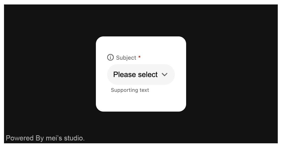
<uni-select-field subject="Subject" message="Supporting text">
|
|
31
|
+
<select
|
|
32
|
+
slot="select"
|
|
33
|
+
name="my-select"
|
|
34
|
+
required
|
|
35
|
+
>
|
|
36
|
+
<option value="" disabled selected>Please select</option>
|
|
37
|
+
<hr />
|
|
38
|
+
<option value="first">First Value</option>
|
|
39
|
+
<option value="second">Second Value</option>
|
|
40
|
+
<option value="third">Third Value</option>
|
|
41
|
+
<option value="third">Fourth Value (make it longer)</option>
|
|
42
|
+
</select>
|
|
43
|
+
</uni-select-field>
|
|
44
|
+
```
|
|
45
|
+
|
|
46
|
+
<uni-select-field /> dynamically adjusts its user interface and core functionality by strictly adhering to the attributes of the encapsulated `select` element. Developers can leverage these capabilities and observe the corresponding behavioral shifts by modifying standard attributes—such as `disabled`, and `required`—directly on the select element.
|
|
47
|
+
|
|
48
|
+
```html
|
|
49
|
+
<uni-select-field>
|
|
50
|
+
<select
|
|
51
|
+
slot="select"
|
|
52
|
+
name="my-select"
|
|
53
|
+
required
|
|
54
|
+
>
|
|
55
|
+
<option value="" disabled selected>Please select</option>
|
|
56
|
+
<hr />
|
|
57
|
+
<option value="first">First Value</option>
|
|
58
|
+
<option value="second">Second Value</option>
|
|
59
|
+
<option value="third">Third Value</option>
|
|
60
|
+
<option value="third">Fourth Value (make it longer)</option>
|
|
61
|
+
</select>
|
|
62
|
+
</uni-select-field>
|
|
63
|
+
```
|
|
64
|
+
|
|
65
|
+
## JavaScript Instantiation
|
|
66
|
+
|
|
67
|
+
<uni-select-field /> could also use JavaScript to create DOM element. Here comes some examples.
|
|
68
|
+
|
|
69
|
+
```html
|
|
70
|
+
<script type="module">
|
|
71
|
+
import { UniSelectField } from 'https://unpkg.com/uni-select-field/mjs/wc-uni-select-field.js';
|
|
72
|
+
|
|
73
|
+
const selectTemplate = document.querySelector('.my-select-template');
|
|
74
|
+
|
|
75
|
+
// use DOM api
|
|
76
|
+
const nodeA = document.createElement('uni-select-field');
|
|
77
|
+
document.body.appendChild(nodeA);
|
|
78
|
+
nodeA.appendChild(selectTemplate.content.cloneNode(true));
|
|
79
|
+
|
|
80
|
+
// new instance with Class
|
|
81
|
+
const nodeB = new UniSelectField();
|
|
82
|
+
document.body.appendChild(nodeB);
|
|
83
|
+
nodeB.appendChild(selectTemplate.content.cloneNode(true));
|
|
84
|
+
</script>
|
|
85
|
+
```
|
|
86
|
+
|
|
87
|
+
## Style Customization
|
|
88
|
+
|
|
89
|
+
Developers could apply styles to decorate <uni-select-field />'s looking.
|
|
90
|
+
|
|
91
|
+
```html
|
|
92
|
+
<style>
|
|
93
|
+
uni-select-field {
|
|
94
|
+
--uni-select-field-border-color-normal: transparent;
|
|
95
|
+
--uni-select-field-border-color-disabled: var(--ct_input-general_dim_container_default);
|
|
96
|
+
--uni-select-field-border-color-valid: var(--ct_text_success_general);
|
|
97
|
+
--uni-select-field-border-color-invalid: var(--ct_text_danger_general);
|
|
98
|
+
--uni-select-field-border-color-outline: var(--ct_input-general_main_stroke_default);
|
|
99
|
+
|
|
100
|
+
--uni-select-field-background-color-normal: var(--ct_input-general_dim_container_default);
|
|
101
|
+
--uni-select-field-background-color-readonly: var(--ct_input-general_dim_container_default);
|
|
102
|
+
--uni-select-field-background-color-disabled: var(--ct_input-general_dim_container_default);
|
|
103
|
+
|
|
104
|
+
--uni-select-field-text-color-normal: var(--ct_text_main_general);
|
|
105
|
+
--uni-select-field-text-color-readonly: var(--ct_text_main_general);
|
|
106
|
+
--uni-select-field-text-color-disabled: var(--ct_text_main_pale);
|
|
107
|
+
--uni-select-field-text-color-invalid: var(--ct_text_danger_general);
|
|
108
|
+
|
|
109
|
+
--uni-select-field-message-color-normal: var(--ct_text_main_subtle);
|
|
110
|
+
--uni-select-field-message-color-valid: var(--ct_text_success_general);
|
|
111
|
+
--uni-select-field-message-color-invalid: var(--ct_text_danger_general);
|
|
112
|
+
|
|
113
|
+
--uni-select-field-caret-color-normal: var(--ct_icon_main_subtle);
|
|
114
|
+
--uni-select-field-caret-color-disabled: var(--ct_icon_main_pale);
|
|
115
|
+
|
|
116
|
+
--uni-select-field-subject-color: var(--ct_text_main_subtle);
|
|
117
|
+
}
|
|
118
|
+
</style>
|
|
119
|
+
```
|
|
120
|
+
|
|
121
|
+
<uni-select-field /> also leverages the CSS ::part() selector, enabling developers to directly customize and style the icon.
|
|
122
|
+
|
|
123
|
+
```html
|
|
124
|
+
<style>
|
|
125
|
+
uni-select-field {
|
|
126
|
+
&::part(icon-subject) {
|
|
127
|
+
...
|
|
128
|
+
}
|
|
129
|
+
}
|
|
130
|
+
</style>
|
|
131
|
+
```
|
|
132
|
+
|
|
133
|
+
## Attributes
|
|
134
|
+
|
|
135
|
+
<uni-select-field /> component exposes a curated set of attributes, enabling developers to dynamically adjust the user interface. This provides the flexibility to tailor the component’s appearance to seamlessly adapt to any given context.
|
|
136
|
+
|
|
137
|
+
- **size**
|
|
138
|
+
|
|
139
|
+
The `size` attribute configures the overall dimensions of <uni-select-field />. The component currently supports three standard options: `large`, `medium`, and `small`, defaulting to `medium`.
|
|
140
|
+
|
|
141
|
+
```html
|
|
142
|
+
<uni-select-field
|
|
143
|
+
size="large"
|
|
144
|
+
>
|
|
145
|
+
<select
|
|
146
|
+
slot="select"
|
|
147
|
+
name="my-select"
|
|
148
|
+
required
|
|
149
|
+
>
|
|
150
|
+
<option value="" disabled selected>Please select</option>
|
|
151
|
+
<hr />
|
|
152
|
+
<option value="first">First Value</option>
|
|
153
|
+
<option value="second">Second Value</option>
|
|
154
|
+
<option value="third">Third Value</option>
|
|
155
|
+
<option value="third">Fourth Value (make it longer)</option>
|
|
156
|
+
</select>
|
|
157
|
+
</uni-select-field>
|
|
158
|
+
```
|
|
159
|
+
|
|
160
|
+
- **subject**
|
|
161
|
+
|
|
162
|
+
The `subject` attribute controls the dynamic rendering of the subject content on <uni-select-field />. By default, it is set to an empty string, meaning no content will be displayed.
|
|
163
|
+
|
|
164
|
+
```html
|
|
165
|
+
<uni-select-field
|
|
166
|
+
subject="Your subject"
|
|
167
|
+
>
|
|
168
|
+
<select
|
|
169
|
+
slot="select"
|
|
170
|
+
name="my-select"
|
|
171
|
+
required
|
|
172
|
+
>
|
|
173
|
+
<option value="" disabled selected>Please select</option>
|
|
174
|
+
<hr />
|
|
175
|
+
<option value="first">First Value</option>
|
|
176
|
+
<option value="second">Second Value</option>
|
|
177
|
+
<option value="third">Third Value</option>
|
|
178
|
+
<option value="third">Fourth Value (make it longer)</option>
|
|
179
|
+
</select>
|
|
180
|
+
</uni-select-field>
|
|
181
|
+
```
|
|
182
|
+
|
|
183
|
+
- **message**
|
|
184
|
+
|
|
185
|
+
The `message` attribute controls the dynamic rendering of the message content on <uni-select-field />. By default, it is set to an empty string, meaning no content will be displayed.
|
|
186
|
+
|
|
187
|
+
```html
|
|
188
|
+
<uni-select-field
|
|
189
|
+
message="Your message content"
|
|
190
|
+
>
|
|
191
|
+
<select
|
|
192
|
+
slot="select"
|
|
193
|
+
name="my-select"
|
|
194
|
+
required
|
|
195
|
+
>
|
|
196
|
+
<option value="" disabled selected>Please select</option>
|
|
197
|
+
<hr />
|
|
198
|
+
<option value="first">First Value</option>
|
|
199
|
+
<option value="second">Second Value</option>
|
|
200
|
+
<option value="third">Third Value</option>
|
|
201
|
+
<option value="third">Fourth Value (make it longer)</option>
|
|
202
|
+
</select>
|
|
203
|
+
</uni-select-field>
|
|
204
|
+
```
|
|
205
|
+
|
|
206
|
+
- **stat**
|
|
207
|
+
|
|
208
|
+
Through variations in the `stat` attribute, <uni-select-field /> can dynamically transition between `valid` and `invalid` visual states, providing users with clear feedback on input correctness. By default, it is set to an empty string, which represents the standard, neutral state.
|
|
209
|
+
|
|
210
|
+
```html
|
|
211
|
+
<uni-select-field
|
|
212
|
+
stat="invalid"
|
|
213
|
+
>
|
|
214
|
+
<select
|
|
215
|
+
slot="select"
|
|
216
|
+
name="my-select"
|
|
217
|
+
required
|
|
218
|
+
>
|
|
219
|
+
<option value="" disabled selected>Please select</option>
|
|
220
|
+
<hr />
|
|
221
|
+
<option value="first">First Value</option>
|
|
222
|
+
<option value="second">Second Value</option>
|
|
223
|
+
<option value="third">Third Value</option>
|
|
224
|
+
<option value="third">Fourth Value (make it longer)</option>
|
|
225
|
+
</select>
|
|
226
|
+
</uni-select-field>
|
|
227
|
+
```
|
|
228
|
+
|
|
229
|
+
- **appearance**
|
|
230
|
+
|
|
231
|
+
Currently, <uni-select-field /> supports two distinct visual variants: `filled` and `outlined`. Developers can utilize the appearance attribute to configure the desired layout, which defaults to `filled`.
|
|
232
|
+
|
|
233
|
+
```html
|
|
234
|
+
<uni-select-field
|
|
235
|
+
appearance="outlined"
|
|
236
|
+
>
|
|
237
|
+
<select
|
|
238
|
+
slot="select"
|
|
239
|
+
name="my-select"
|
|
240
|
+
required
|
|
241
|
+
>
|
|
242
|
+
<option value="" disabled selected>Please select</option>
|
|
243
|
+
<hr />
|
|
244
|
+
<option value="first">First Value</option>
|
|
245
|
+
<option value="second">Second Value</option>
|
|
246
|
+
<option value="third">Third Value</option>
|
|
247
|
+
<option value="third">Fourth Value (make it longer)</option>
|
|
248
|
+
</select>
|
|
249
|
+
</uni-select-field>
|
|
250
|
+
```
|
|
251
|
+
|
|
252
|
+
## Properties
|
|
253
|
+
|
|
254
|
+
| Property Name | Type | Description |
|
|
255
|
+
| ----------- | ----------- | ----------- |
|
|
256
|
+
| size | String | Getter / Setter size. `size` configures the overall dimensions of <uni-select-field />. The component currently supports three standard options: `large`, `medium`, and `small`, defaulting to `medium`. |
|
|
257
|
+
| subject| String | Getter / Setter subject. `subject` controls the dynamic rendering of the subject content on <uni-select-field />. By default, it is set to an empty string, meaning no content will be displayed. |
|
|
258
|
+
| message| String | Getter / Setter message. `message` controls the dynamic rendering of the message content on <uni-select-field />. By default, it is set to an empty string, meaning no content will be displayed. |
|
|
259
|
+
| stat| String | Getter / Setter stat. `stat` can dynamically transition between `valid` and `invalid` visual states, providing users with clear feedback on input correctness. By default, it is set to an empty string, which represents the standard, neutral state. |
|
|
260
|
+
| appearance| String | Getter / Setter appearance. `appearance` supports two distinct visual variants: `filled` and `outlined`. Developers can utilize the appearance attribute to configure the desired layout, which defaults to `filled`. |
|
|
261
|
+
|
|
262
|
+
## Method
|
|
263
|
+
| Mathod Signature | Description |
|
|
264
|
+
| ----------- | ----------- |
|
|
265
|
+
| refresh() | Force a UI refresh on <uni-select-field />. |
|
|
266
|
+
|
|
267
|
+
## Reference
|
|
268
|
+
- [<uni-select-field /> demo](https://blog.lalacube.com/mei/webComponent_uni-select-field.html)
|
package/index.html
ADDED
|
@@ -0,0 +1,382 @@
|
|
|
1
|
+
<!DOCTYPE html>
|
|
2
|
+
<html>
|
|
3
|
+
<head>
|
|
4
|
+
<meta http-equiv="Content-Type" content="text/html; charset=utf-8">
|
|
5
|
+
<title>Web Component: <uni-select-field /> - a web component based on uniopen design language</title>
|
|
6
|
+
<meta name="description" content="uni-select-field is an encapsulated Web Component built upon the foundation of the uniopen design language. Implementation is straightforward: simply slot a standard select element inside uni-select-field. The component instantly applies a user interface that aligns seamlessly with the uniopen design language guidelines. Furthermore, its visual styles can be dynamically adapted via native HTML attributes or JavaScript properties." />
|
|
7
|
+
<script type="module" src="mjs/wc-uni-select-field.js"></script>
|
|
8
|
+
<link rel="stylesheet" href="https://blog.lalacube.com/mei/css/wc-base.css">
|
|
9
|
+
<link rel="stylesheet" href="https://blog.lalacube.com/mei/css/layers/radio-set.css">
|
|
10
|
+
<link rel="stylesheet" href="https://blog.lalacube.com/mei/css/layers/defaults.css">
|
|
11
|
+
<style>
|
|
12
|
+
#hd,#ft{display:none;}
|
|
13
|
+
body{position:relative;inline-size:100vw;block-size:100vh;margin:0;}
|
|
14
|
+
|
|
15
|
+
.wrap {
|
|
16
|
+
inline-size: 100%;
|
|
17
|
+
max-inline-size: min(800px, calc(100% - 2em));
|
|
18
|
+
box-sizing: border-box;
|
|
19
|
+
}
|
|
20
|
+
|
|
21
|
+
.demo-wrap {
|
|
22
|
+
position: relative;
|
|
23
|
+
inline-size: min(100%, 800px);
|
|
24
|
+
block-size: 160px;
|
|
25
|
+
background-color: rgba(var(--white));
|
|
26
|
+
margin: 6em auto 1em;
|
|
27
|
+
padding: 1.5em;
|
|
28
|
+
box-sizing: border-box;
|
|
29
|
+
border-radius: 1em;
|
|
30
|
+
display: flex;
|
|
31
|
+
align-items: center;
|
|
32
|
+
|
|
33
|
+
&+.setting-form {
|
|
34
|
+
--subject-inline-size: auto;
|
|
35
|
+
margin-block-start: 1em;
|
|
36
|
+
}
|
|
37
|
+
}
|
|
38
|
+
|
|
39
|
+
uni-select-field {
|
|
40
|
+
&::part(icon-subject) {
|
|
41
|
+
/*background-color: red;*/
|
|
42
|
+
}
|
|
43
|
+
|
|
44
|
+
&[data-hide-icon]::part(icon-subject) {
|
|
45
|
+
display: none;
|
|
46
|
+
}
|
|
47
|
+
}
|
|
48
|
+
|
|
49
|
+
[inert] uni-select-field {
|
|
50
|
+
--interactivity: inert;
|
|
51
|
+
}
|
|
52
|
+
</style>
|
|
53
|
+
</head>
|
|
54
|
+
|
|
55
|
+
<body class="flex-center">
|
|
56
|
+
<div class="wrap">
|
|
57
|
+
<div class="demo-wrap">
|
|
58
|
+
<uni-select-field subject="Subject" message="Supporting text">
|
|
59
|
+
<select
|
|
60
|
+
slot="select"
|
|
61
|
+
required
|
|
62
|
+
>
|
|
63
|
+
<option value="" disabled selected>Please select</option>
|
|
64
|
+
<hr />
|
|
65
|
+
<option value="first">First Value</option>
|
|
66
|
+
<option value="second">Second Value</option>
|
|
67
|
+
<option value="third">Third Value</option>
|
|
68
|
+
<option value="third">Fourth Value (make it longer)</option>
|
|
69
|
+
</select>
|
|
70
|
+
</uni-select-field>
|
|
71
|
+
</div>
|
|
72
|
+
|
|
73
|
+
<form class="setting-form">
|
|
74
|
+
<ul class="adjustments">
|
|
75
|
+
<li class="adjustments__row">
|
|
76
|
+
<p class="adjustments__row__subject">size:</p>
|
|
77
|
+
<div class="adjustments__row__content">
|
|
78
|
+
<div class="il-pair a11y-block-link">
|
|
79
|
+
<div class="radio-set">
|
|
80
|
+
<input id="size-0" type="radio" name="size" value="large" />
|
|
81
|
+
<label class="radio-set__label" for="size-0"></label>
|
|
82
|
+
</div>
|
|
83
|
+
|
|
84
|
+
<label for="size-0">
|
|
85
|
+
large
|
|
86
|
+
</label>
|
|
87
|
+
</div>
|
|
88
|
+
|
|
89
|
+
<div class="il-pair a11y-block-link">
|
|
90
|
+
<div class="radio-set">
|
|
91
|
+
<input id="size-1" type="radio" name="size" value="medium" checked />
|
|
92
|
+
<label class="radio-set__label" for="size-1"></label>
|
|
93
|
+
</div>
|
|
94
|
+
|
|
95
|
+
<label for="size-1">
|
|
96
|
+
medium
|
|
97
|
+
</label>
|
|
98
|
+
</div>
|
|
99
|
+
|
|
100
|
+
<div class="il-pair a11y-block-link">
|
|
101
|
+
<div class="radio-set">
|
|
102
|
+
<input id="size-2" type="radio" name="size" value="small" />
|
|
103
|
+
<label class="radio-set__label" for="size-2"></label>
|
|
104
|
+
</div>
|
|
105
|
+
|
|
106
|
+
<label for="size-2">
|
|
107
|
+
small
|
|
108
|
+
</label>
|
|
109
|
+
</div>
|
|
110
|
+
</div>
|
|
111
|
+
</li>
|
|
112
|
+
|
|
113
|
+
<li class="adjustments__row">
|
|
114
|
+
<p class="adjustments__row__subject">appearance:</p>
|
|
115
|
+
<div class="adjustments__row__content">
|
|
116
|
+
<div class="il-pair a11y-block-link">
|
|
117
|
+
<div class="radio-set">
|
|
118
|
+
<input id="appearance-0" type="radio" name="appearance" value="filled" checked />
|
|
119
|
+
<label class="radio-set__label" for="appearance-0"></label>
|
|
120
|
+
</div>
|
|
121
|
+
|
|
122
|
+
<label for="appearance-0">
|
|
123
|
+
filled
|
|
124
|
+
</label>
|
|
125
|
+
</div>
|
|
126
|
+
|
|
127
|
+
<div class="il-pair a11y-block-link">
|
|
128
|
+
<div class="radio-set">
|
|
129
|
+
<input id="appearance-1" type="radio" name="appearance" value="outlined" />
|
|
130
|
+
<label class="radio-set__label" for="appearance-1"></label>
|
|
131
|
+
</div>
|
|
132
|
+
|
|
133
|
+
<label for="appearance-1">
|
|
134
|
+
outlined
|
|
135
|
+
</label>
|
|
136
|
+
</div>
|
|
137
|
+
</div>
|
|
138
|
+
</li>
|
|
139
|
+
|
|
140
|
+
<li class="adjustments__row">
|
|
141
|
+
<p class="adjustments__row__subject">stat:</p>
|
|
142
|
+
<div class="adjustments__row__content">
|
|
143
|
+
<div class="il-pair a11y-block-link">
|
|
144
|
+
<div class="radio-set">
|
|
145
|
+
<input id="stat-0" type="radio" name="stat" value="normal" checked />
|
|
146
|
+
<label class="radio-set__label" for="stat-0"></label>
|
|
147
|
+
</div>
|
|
148
|
+
|
|
149
|
+
<label for="stat-0">
|
|
150
|
+
normal
|
|
151
|
+
</label>
|
|
152
|
+
</div>
|
|
153
|
+
|
|
154
|
+
<div class="il-pair a11y-block-link">
|
|
155
|
+
<div class="radio-set">
|
|
156
|
+
<input id="stat-1" type="radio" name="stat" value="valid" />
|
|
157
|
+
<label class="radio-set__label" for="stat-1"></label>
|
|
158
|
+
</div>
|
|
159
|
+
|
|
160
|
+
<label for="stat-1">
|
|
161
|
+
valid
|
|
162
|
+
</label>
|
|
163
|
+
</div>
|
|
164
|
+
|
|
165
|
+
<div class="il-pair a11y-block-link">
|
|
166
|
+
<div class="radio-set">
|
|
167
|
+
<input id="stat-2" type="radio" name="stat" value="invalid" />
|
|
168
|
+
<label class="radio-set__label" for="stat-2"></label>
|
|
169
|
+
</div>
|
|
170
|
+
|
|
171
|
+
<label for="stat-2">
|
|
172
|
+
invalid
|
|
173
|
+
</label>
|
|
174
|
+
</div>
|
|
175
|
+
|
|
176
|
+
</div>
|
|
177
|
+
</li>
|
|
178
|
+
|
|
179
|
+
<li class="adjustments__row">
|
|
180
|
+
<p class="adjustments__row__subject">subject:</p>
|
|
181
|
+
<div class="adjustments__row__content">
|
|
182
|
+
<div class="il-pair a11y-block-link">
|
|
183
|
+
<div class="radio-set">
|
|
184
|
+
<input id="subject-0" type="radio" name="subject" value="show" checked />
|
|
185
|
+
<label class="radio-set__label" for="subject-0"></label>
|
|
186
|
+
</div>
|
|
187
|
+
|
|
188
|
+
<label for="subject-0">
|
|
189
|
+
show
|
|
190
|
+
</label>
|
|
191
|
+
</div>
|
|
192
|
+
|
|
193
|
+
<div class="il-pair a11y-block-link">
|
|
194
|
+
<div class="radio-set">
|
|
195
|
+
<input id="subject-1" type="radio" name="subject" value="hide" />
|
|
196
|
+
<label class="radio-set__label" for="subject-1"></label>
|
|
197
|
+
</div>
|
|
198
|
+
|
|
199
|
+
<label for="subject-1">
|
|
200
|
+
hide
|
|
201
|
+
</label>
|
|
202
|
+
</div>
|
|
203
|
+
</div>
|
|
204
|
+
</li>
|
|
205
|
+
|
|
206
|
+
<li class="adjustments__row">
|
|
207
|
+
<p class="adjustments__row__subject">subject icon:</p>
|
|
208
|
+
<div class="adjustments__row__content">
|
|
209
|
+
<div class="il-pair a11y-block-link">
|
|
210
|
+
<div class="radio-set">
|
|
211
|
+
<input id="subject-icon-0" type="radio" name="icon" value="show" checked />
|
|
212
|
+
<label class="radio-set__label" for="subject-icon-0"></label>
|
|
213
|
+
</div>
|
|
214
|
+
|
|
215
|
+
<label for="subject-icon-0">
|
|
216
|
+
show
|
|
217
|
+
</label>
|
|
218
|
+
</div>
|
|
219
|
+
|
|
220
|
+
<div class="il-pair a11y-block-link">
|
|
221
|
+
<div class="radio-set">
|
|
222
|
+
<input id="subject-icon-1" type="radio" name="icon" value="hide" />
|
|
223
|
+
<label class="radio-set__label" for="subject-icon-1"></label>
|
|
224
|
+
</div>
|
|
225
|
+
|
|
226
|
+
<label for="subject-icon-1">
|
|
227
|
+
hide
|
|
228
|
+
</label>
|
|
229
|
+
</div>
|
|
230
|
+
</div>
|
|
231
|
+
</li>
|
|
232
|
+
|
|
233
|
+
<li class="adjustments__row">
|
|
234
|
+
<p class="adjustments__row__subject">message:</p>
|
|
235
|
+
<div class="adjustments__row__content">
|
|
236
|
+
<div class="il-pair a11y-block-link">
|
|
237
|
+
<div class="radio-set">
|
|
238
|
+
<input id="message-0" type="radio" name="message" value="show" checked />
|
|
239
|
+
<label class="radio-set__label" for="message-0"></label>
|
|
240
|
+
</div>
|
|
241
|
+
|
|
242
|
+
<label for="message-0">
|
|
243
|
+
show
|
|
244
|
+
</label>
|
|
245
|
+
</div>
|
|
246
|
+
|
|
247
|
+
<div class="il-pair a11y-block-link">
|
|
248
|
+
<div class="radio-set">
|
|
249
|
+
<input id="message-1" type="radio" name="message" value="hide" />
|
|
250
|
+
<label class="radio-set__label" for="message-1"></label>
|
|
251
|
+
</div>
|
|
252
|
+
|
|
253
|
+
<label for="message-1">
|
|
254
|
+
hide
|
|
255
|
+
</label>
|
|
256
|
+
</div>
|
|
257
|
+
</div>
|
|
258
|
+
</li>
|
|
259
|
+
|
|
260
|
+
<li class="adjustments__row">
|
|
261
|
+
<p class="adjustments__row__subject">required:</p>
|
|
262
|
+
<div class="adjustments__row__content">
|
|
263
|
+
<div class="il-pair a11y-block-link">
|
|
264
|
+
<div class="radio-set">
|
|
265
|
+
<input id="required-0" type="radio" name="required" value="y" checked />
|
|
266
|
+
<label class="radio-set__label" for="required-0"></label>
|
|
267
|
+
</div>
|
|
268
|
+
|
|
269
|
+
<label for="required-0">
|
|
270
|
+
yes
|
|
271
|
+
</label>
|
|
272
|
+
</div>
|
|
273
|
+
|
|
274
|
+
<div class="il-pair a11y-block-link">
|
|
275
|
+
<div class="radio-set">
|
|
276
|
+
<input id="required-1" type="radio" name="required" value="n" />
|
|
277
|
+
<label class="radio-set__label" for="required-1"></label>
|
|
278
|
+
</div>
|
|
279
|
+
|
|
280
|
+
<label for="required-1">
|
|
281
|
+
no
|
|
282
|
+
</label>
|
|
283
|
+
</div>
|
|
284
|
+
</div>
|
|
285
|
+
</li>
|
|
286
|
+
|
|
287
|
+
<li class="adjustments__row">
|
|
288
|
+
<p class="adjustments__row__subject">disabled:</p>
|
|
289
|
+
<div class="adjustments__row__content">
|
|
290
|
+
<div class="il-pair a11y-block-link">
|
|
291
|
+
<div class="radio-set">
|
|
292
|
+
<input id="disabled-0" type="radio" name="disabled" value="y" />
|
|
293
|
+
<label class="radio-set__label" for="disabled-0"></label>
|
|
294
|
+
</div>
|
|
295
|
+
|
|
296
|
+
<label for="disabled-0">
|
|
297
|
+
yes
|
|
298
|
+
</label>
|
|
299
|
+
</div>
|
|
300
|
+
|
|
301
|
+
<div class="il-pair a11y-block-link">
|
|
302
|
+
<div class="radio-set">
|
|
303
|
+
<input id="disabled-1" type="radio" name="disabled" value="n" checked />
|
|
304
|
+
<label class="radio-set__label" for="disabled-1"></label>
|
|
305
|
+
</div>
|
|
306
|
+
|
|
307
|
+
<label for="disabled-1">
|
|
308
|
+
no
|
|
309
|
+
</label>
|
|
310
|
+
</div>
|
|
311
|
+
</div>
|
|
312
|
+
</li>
|
|
313
|
+
</ul>
|
|
314
|
+
</form>
|
|
315
|
+
</div>
|
|
316
|
+
|
|
317
|
+
<script type="module">
|
|
318
|
+
await customElements.whenDefined('uni-select-field');
|
|
319
|
+
|
|
320
|
+
const wrap = document.querySelector('.demo-wrap');
|
|
321
|
+
const uniSelectField = document.querySelector('.demo-wrap uni-select-field');
|
|
322
|
+
const select = uniSelectField.querySelector('select');
|
|
323
|
+
const form = document.querySelector('.setting-form');
|
|
324
|
+
|
|
325
|
+
const handler = (evt) => {
|
|
326
|
+
const { target } = evt;
|
|
327
|
+
const formData = new FormData(form);
|
|
328
|
+
const fd = Object.fromEntries(formData.entries());
|
|
329
|
+
|
|
330
|
+
switch (target.name) {
|
|
331
|
+
case 'size': {
|
|
332
|
+
uniSelectField.size = fd['size'];
|
|
333
|
+
break;
|
|
334
|
+
}
|
|
335
|
+
|
|
336
|
+
case 'appearance': {
|
|
337
|
+
uniSelectField.appearance = fd['appearance'];
|
|
338
|
+
break;
|
|
339
|
+
}
|
|
340
|
+
|
|
341
|
+
case 'stat': {
|
|
342
|
+
uniSelectField.stat = fd['stat'] === 'normal' ? '' : fd['stat'];
|
|
343
|
+
break;
|
|
344
|
+
}
|
|
345
|
+
|
|
346
|
+
case 'subject': {
|
|
347
|
+
uniSelectField.subject = fd['subject'] === 'show' ? 'Subject' : '';
|
|
348
|
+
break;
|
|
349
|
+
}
|
|
350
|
+
|
|
351
|
+
case 'message': {
|
|
352
|
+
uniSelectField.message = fd['message'] === 'show' ? 'Supporting text' : '';
|
|
353
|
+
break;
|
|
354
|
+
}
|
|
355
|
+
|
|
356
|
+
case 'required': {
|
|
357
|
+
select.required = fd['required'] === 'y';
|
|
358
|
+
|
|
359
|
+
uniSelectField.refresh();
|
|
360
|
+
break;
|
|
361
|
+
}
|
|
362
|
+
|
|
363
|
+
case 'disabled': {
|
|
364
|
+
select.disabled = fd['disabled'] === 'y';
|
|
365
|
+
|
|
366
|
+
uniSelectField.refresh();
|
|
367
|
+
break;
|
|
368
|
+
}
|
|
369
|
+
|
|
370
|
+
case 'icon': {
|
|
371
|
+
uniSelectField.toggleAttribute('data-hide-icon', fd['icon'] === 'hide')
|
|
372
|
+
break;
|
|
373
|
+
}
|
|
374
|
+
}
|
|
375
|
+
};
|
|
376
|
+
|
|
377
|
+
form.addEventListener('input', handler);
|
|
378
|
+
</script>
|
|
379
|
+
|
|
380
|
+
</body>
|
|
381
|
+
|
|
382
|
+
</html>
|