tf-checkout-react-native 1.0.10 → 1.0.13
This diff represents the content of publicly available package versions that have been released to one of the supported registries. The information contained in this diff is provided for informational purposes only and reflects changes between package versions as they appear in their respective public registries.
- package/README.md +271 -147
- package/lib/api/ApiClient.js +4 -1
- package/lib/api/ApiClient.js.map +1 -1
- package/lib/components/login/Login.d.ts +1 -1
- package/lib/components/login/Login.js +2 -2
- package/lib/components/login/Login.js.map +1 -1
- package/lib/components/login/LoginView.d.ts +1 -1
- package/lib/components/login/LoginView.js +16 -13
- package/lib/components/login/LoginView.js.map +1 -1
- package/lib/components/login/styles.d.ts +2 -1
- package/lib/components/login/styles.js +2 -1
- package/lib/components/login/styles.js.map +1 -1
- package/lib/components/login/types.d.ts +12 -2
- package/lib/containers/billingInfo/Billing.js +12 -18
- package/lib/containers/billingInfo/Billing.js.map +1 -1
- package/lib/containers/billingInfo/types.d.ts +21 -83
- package/lib/containers/checkout/Checkout.d.ts +1 -1
- package/lib/containers/checkout/Checkout.js +88 -27
- package/lib/containers/checkout/Checkout.js.map +1 -1
- package/lib/containers/checkout/styles.js +1 -1
- package/lib/containers/checkout/styles.js.map +1 -1
- package/lib/containers/checkout/types.d.ts +6 -1
- package/lib/containers/myOrders/MyOrders.js +1 -1
- package/lib/containers/purchaseConfirmation/PurchaseConfirmation.d.ts +1 -1
- package/lib/containers/purchaseConfirmation/PurchaseConfirmation.js +2 -2
- package/lib/containers/purchaseConfirmation/PurchaseConfirmation.js.map +1 -1
- package/lib/containers/purchaseConfirmation/PurchaseConfirmationView.d.ts +2 -2
- package/lib/containers/purchaseConfirmation/PurchaseConfirmationView.js.map +1 -1
- package/lib/containers/purchaseConfirmation/types.d.ts +4 -1
- package/lib/containers/tickets/Tickets.d.ts +1 -1
- package/lib/containers/tickets/Tickets.js +23 -1
- package/lib/containers/tickets/Tickets.js.map +1 -1
- package/lib/containers/tickets/components/TicketListItem.js +2 -2
- package/lib/containers/tickets/components/TicketListItem.js.map +1 -1
- package/lib/containers/tickets/types.d.ts +10 -0
- package/lib/helpers/Config.d.ts +1 -0
- package/lib/helpers/Config.js +3 -0
- package/lib/helpers/Config.js.map +1 -1
- package/package.json +1 -1
- package/lib/containers/checkout/CheckoutView.d.ts +0 -3
- package/lib/containers/checkout/CheckoutView.js +0 -48
- package/lib/containers/checkout/CheckoutView.js.map +0 -1
package/README.md
CHANGED
|
@@ -6,7 +6,13 @@ React Native library for Ticket Fairy checkout.
|
|
|
6
6
|
|
|
7
7
|
Configure [ReactNative environment](https://reactnative.dev/docs/environment-setup) for desired platforms (iOS, Android or both).
|
|
8
8
|
|
|
9
|
-
|
|
9
|
+
### React Native
|
|
10
|
+
|
|
11
|
+
- Suggested ReactNative version `0.66.3`
|
|
12
|
+
- Suggested Flipper version `0.66`
|
|
13
|
+
- React version `0.17.1`
|
|
14
|
+
|
|
15
|
+
### Android
|
|
10
16
|
|
|
11
17
|
- Android 5.0 (API level 21) and above
|
|
12
18
|
- Minimum Gradle plugin version `4.2.2`
|
|
@@ -26,30 +32,34 @@ To download the PDFs, add the `WRITE_EXTERNAL_STORAGE` permission to the Android
|
|
|
26
32
|
<uses-permission android:name="android.permission.WRITE_EXTERNAL_STORAGE"/>
|
|
27
33
|
```
|
|
28
34
|
|
|
29
|
-
|
|
35
|
+
### iOS
|
|
30
36
|
|
|
31
37
|
- Compatible with apps targeting iOS 11 or above.
|
|
38
|
+
- Pods version `1.10.1`
|
|
39
|
+
- Command Line Tools version `13.0`
|
|
32
40
|
|
|
33
41
|
To download the PDFs, add the following flags to `Info.plist` file:
|
|
34
42
|
|
|
43
|
+
```
|
|
35
44
|
- UIFileSharingEnabled: Application supports iTunes file sharing
|
|
36
45
|
- LSSupportsOpeningDocumentsInPlace: Supports opening documents in place
|
|
46
|
+
```
|
|
37
47
|
|
|
38
48
|
# Installation
|
|
39
49
|
|
|
40
|
-
```
|
|
50
|
+
```sh
|
|
41
51
|
yarn add tf-checkout-react-native
|
|
42
52
|
```
|
|
43
53
|
|
|
44
54
|
or
|
|
45
55
|
|
|
46
|
-
```
|
|
56
|
+
```sh
|
|
47
57
|
npm install tf-checkout-react-native
|
|
48
58
|
```
|
|
49
59
|
|
|
50
60
|
Make sure to install all the required dependencies in your project.
|
|
51
61
|
|
|
52
|
-
|
|
62
|
+
### Required for Android
|
|
53
63
|
|
|
54
64
|
Add below dependency to your `app/build.gradle` file with specified version (in our example we are using `1.4.0`).
|
|
55
65
|
|
|
@@ -61,7 +71,7 @@ Set appropriate style in your styles.xml file.
|
|
|
61
71
|
|
|
62
72
|
```xml
|
|
63
73
|
<style name="Theme.MyApp" parent="Theme.MaterialComponents.DayNight.NoActionBar">
|
|
64
|
-
|
|
74
|
+
<!-- ... -->
|
|
65
75
|
</style>
|
|
66
76
|
```
|
|
67
77
|
|
|
@@ -79,7 +89,6 @@ Use it in your initial useEffect function:
|
|
|
79
89
|
useEffect(() => {
|
|
80
90
|
setConfig({
|
|
81
91
|
DOMAIN: 'https://yourdomain.mx',
|
|
82
|
-
IS_BILLING_STREET_NAME_REQUIRED: false,
|
|
83
92
|
})
|
|
84
93
|
}, [])
|
|
85
94
|
```
|
|
@@ -94,27 +103,26 @@ useEffect(() => {
|
|
|
94
103
|
CLIENT_SECRET?: string,
|
|
95
104
|
TIMEOUT?: number,
|
|
96
105
|
BRAND?: string,
|
|
106
|
+
ARE_SUB_BRANDS_INCLUDED?: boolean
|
|
97
107
|
}
|
|
98
108
|
```
|
|
99
|
-
|
|
100
|
-
|
|
101
|
-
|
|
102
|
-
`
|
|
103
|
-
|
|
104
|
-
|
|
105
|
-
|
|
106
|
-
|
|
107
|
-
|
|
108
|
-
|
|
109
|
-
|
|
110
|
-
`TIMEOUT` Set custom timeout for the APIs requests.
|
|
109
|
+
### Props
|
|
110
|
+
| Property | Description |
|
|
111
|
+
| -------- | ----------- |
|
|
112
|
+
| DOMAIN | Specify your domains name example: `https://google.com` this is important to maintain cart session active and prevent it from expiring when user login in the BillingInfo component. |
|
|
113
|
+
| BASE_URL | If our dev team gives you a custom BASE_URL.|
|
|
114
|
+
| CLIENT_ID | Set your CLIENT_ID. |
|
|
115
|
+
| CLIENT_SECRET | Set your CLIENT_SECRET. |
|
|
116
|
+
| BRAND | Set your BRAND so users can only see this brand in their orders. |
|
|
117
|
+
| TIMEOUT | Set custom timeout for the APIs requests. |
|
|
118
|
+
| ARE_SUB_BRANDS_INCLUDED | If true will include orders from the `BRAND` sub-brands. Default `false`. |
|
|
111
119
|
|
|
112
120
|
# Run the example app
|
|
113
121
|
|
|
114
122
|
1. Clone this repo.
|
|
115
123
|
2. In the App.tsx file, update the `EVENT_ID` const with the assigned ID to be able to retrieve data from the server.
|
|
116
|
-
3. cd into the
|
|
117
|
-
4. cd into the
|
|
124
|
+
3. cd into the _root project_ folder and `yarn` or `npm install`.
|
|
125
|
+
4. cd into the _example_ folder and `yarn` or `npm install`.
|
|
118
126
|
- If running on iOS, cd into ios folder and `pod install && cd ..`.
|
|
119
127
|
5. Run `yarn ios` or `npm run ios` to initialize and run in the iPhone simulator.
|
|
120
128
|
6. If running on Android, run `yarn android` or `npm run android` to run it in the Android emulator or connected physical device.
|
|
@@ -123,41 +131,61 @@ useEffect(() => {
|
|
|
123
131
|
|
|
124
132
|
This library exports the following components:
|
|
125
133
|
|
|
126
|
-
|
|
134
|
+
### Login
|
|
127
135
|
|
|
128
136
|
Used to authenticate the user.
|
|
129
137
|
|
|
130
|
-
|
|
138
|
+
### Tickets
|
|
131
139
|
|
|
132
140
|
Will retrieve and show a list of tickets corresponding to `eventId`. It also includes a PromoCode component that validates it and updates the tickets list.
|
|
133
141
|
|
|
134
142
|
User can select what ticket type wants to buy and the quantity of tickets.
|
|
135
143
|
|
|
136
|
-
|
|
144
|
+
### Billing information
|
|
137
145
|
|
|
138
146
|
User will need to enter its data into a form to create a Ticket Fairy account. Also, depending on the number of tickets selected, will need to fill the information of each one of them.
|
|
139
147
|
|
|
140
|
-
|
|
148
|
+
### Checkout
|
|
141
149
|
|
|
142
150
|
Will show the order details and a card form that the user will need to fill with its card details.
|
|
143
151
|
|
|
144
152
|
TicketFairy doesn't store any card related data, we use [Stripe](https://stripe.com/) as payments solution.
|
|
145
153
|
|
|
146
|
-
|
|
154
|
+
### Purchase confirmation
|
|
147
155
|
|
|
148
156
|
This is shown once the payment is successfully completed, could show components to share the purchase in social media or refer it with friends to get discounts on the purchase.
|
|
149
157
|
|
|
150
|
-
|
|
158
|
+
### My Orders
|
|
151
159
|
|
|
152
160
|
Will show the purchased orders for the logged user.
|
|
153
161
|
|
|
154
|
-
|
|
162
|
+
### My Order details
|
|
155
163
|
|
|
156
164
|
Will show the details for the selected Order, it also allows the user to download the Ticket PDF.
|
|
157
165
|
|
|
158
|
-
#
|
|
159
|
-
|
|
160
|
-
|
|
166
|
+
# Component styling
|
|
167
|
+
### Button
|
|
168
|
+
```js
|
|
169
|
+
interface IButtonStyles {
|
|
170
|
+
container?: StyleProp<ViewStyle>
|
|
171
|
+
button?: StyleProp<ViewStyle>
|
|
172
|
+
text?: StyleProp<TextStyle>
|
|
173
|
+
}
|
|
174
|
+
```
|
|
175
|
+
### Input
|
|
176
|
+
```js
|
|
177
|
+
interface IInputStyles {
|
|
178
|
+
color?: ColorValue
|
|
179
|
+
container?: StyleProp<ViewStyle>
|
|
180
|
+
input?: StyleProp<TextStyle>
|
|
181
|
+
lineWidth?: number
|
|
182
|
+
activeLineWidth?: number
|
|
183
|
+
baseColor?: ColorValue
|
|
184
|
+
errorColor?: ColorValue
|
|
185
|
+
}
|
|
186
|
+
```
|
|
187
|
+
# Exported components
|
|
188
|
+
## Login
|
|
161
189
|
|
|
162
190
|
Import the component from the library
|
|
163
191
|
|
|
@@ -186,48 +214,34 @@ Then add it to the render function.
|
|
|
186
214
|
activityIndicator?: any
|
|
187
215
|
loadingText?: any
|
|
188
216
|
}}
|
|
217
|
+
brandImages={
|
|
218
|
+
containerStyle?: StyleProp<ViewStyle>
|
|
219
|
+
image1?: ImageSourcePropType
|
|
220
|
+
image1Style?: StyleProp<ImageStyle>
|
|
221
|
+
image2?: ImageSourcePropType
|
|
222
|
+
image2Style?: StyleProp<ImageStyle>
|
|
223
|
+
}
|
|
189
224
|
/>
|
|
190
225
|
```
|
|
191
226
|
|
|
192
|
-
|
|
193
|
-
|
|
194
|
-
|
|
195
|
-
When login was successful, return userProfile data and the access token to use if for future API requests.
|
|
196
|
-
|
|
197
|
-
|
|
198
|
-
|
|
199
|
-
|
|
200
|
-
|
|
201
|
-
|
|
202
|
-
|
|
203
|
-
|
|
204
|
-
|
|
205
|
-
|
|
206
|
-
|
|
207
|
-
|
|
208
|
-
|
|
209
|
-
`showLoginDialog: () => void`
|
|
210
|
-
Callback to show the Login dialog.
|
|
211
|
-
|
|
212
|
-
`hideLoginDialog: () => void`
|
|
213
|
-
Callback to hide the login dialog.
|
|
214
|
-
|
|
215
|
-
`onLogoutSuccess?: () => void`
|
|
216
|
-
Use it to logout the authenticated user. It will delete all the stored data, including access token. Please make sure to update the `userFirstName` prop so the component will show the logged out view.
|
|
217
|
-
|
|
218
|
-
`onLogoutFail?: () => void`
|
|
219
|
-
Will be called if something went wrong while deleting the local data.
|
|
220
|
-
|
|
221
|
-
`styles?: ILoginViewStyles`
|
|
222
|
-
Use this to style your components.
|
|
223
|
-
|
|
224
|
-
`texts?: ILoginViewTexts`
|
|
225
|
-
Use this to change some texts that appear in this component.
|
|
226
|
-
|
|
227
|
-
`userFirstName?: string`
|
|
228
|
-
Once authenticated send the received firstName data to this prop, so the component can render the Logged in view.
|
|
227
|
+
### Props
|
|
228
|
+
| Property | Description |
|
|
229
|
+
|----------|-------------|
|
|
230
|
+
| onLoginSuccessful: (userProfile: IUserProfile, accessToken: string)` |When login was successful, return userProfile data and the access token to use if for future API requests.
|
|
231
|
+
| onLoginFailure?: (error: string) | When login fails will return the error received. |
|
|
232
|
+
| onFetchUserProfileFailure?: (error: string) | This is used if the authentication worked but the fetch of the userProfile failed. |
|
|
233
|
+
| onFetchAccessTokenFailure?: (error: string) | When the fetch of the access token failed. |
|
|
234
|
+
| isLoginDialogVisible: boolean | Flag to show or hide the login dialog. |
|
|
235
|
+
| showLoginDialog: () => void | Callback to show the Login dialog. |
|
|
236
|
+
| hideLoginDialog: () => void | Callback to hide the Login dialog. |
|
|
237
|
+
| onLogoutSuccess?: () => void | Use it to logout the authenticated user. It will delete all the stored data, including access token. Please make sure to update the `userFirstName` prop so the component will show the logged out view. |
|
|
238
|
+
|onLogoutFail?: () => void | Will be called if something went wrong while deleting the local data. |
|
|
239
|
+
|styles?: ILoginViewStyles | Use this to style your components. |
|
|
240
|
+
|texts?: ILoginViewTexts | Use this to change some texts that appear in this component. |
|
|
241
|
+
|userFirstName?: string | Once authenticated send the received firstName data to this prop, so the component can render the Logged in view. |
|
|
242
|
+
|brandImages?: ILoginBrandImages | Receives up to 2 images with their styles and the container style for the images. |
|
|
229
243
|
|
|
230
|
-
|
|
244
|
+
### styles
|
|
231
245
|
|
|
232
246
|
```js
|
|
233
247
|
interface ILoginViewStyles {
|
|
@@ -245,7 +259,6 @@ interface ILoginViewStyles {
|
|
|
245
259
|
input?: IInputStyles
|
|
246
260
|
title?: StyleProp<TextStyle>
|
|
247
261
|
message?: StyleProp<TextStyle>
|
|
248
|
-
logo?: StyleProp<ImageStyle>
|
|
249
262
|
}
|
|
250
263
|
loggedIn?: {
|
|
251
264
|
container?: StyleProp<ViewStyle>
|
|
@@ -255,12 +268,29 @@ interface ILoginViewStyles {
|
|
|
255
268
|
message?: StyleProp<TextStyle>
|
|
256
269
|
}
|
|
257
270
|
}
|
|
258
|
-
|
|
259
271
|
```
|
|
260
272
|
|
|
261
|
-
|
|
273
|
+
\*Note: Logos images styles are passed from the `brandImages` prop.
|
|
262
274
|
|
|
263
|
-
|
|
275
|
+
### texts
|
|
276
|
+
```js
|
|
277
|
+
{
|
|
278
|
+
loginButton?: string
|
|
279
|
+
logoutButton?: string
|
|
280
|
+
line1?: string
|
|
281
|
+
line2?: string
|
|
282
|
+
message?: string
|
|
283
|
+
dialog?: {
|
|
284
|
+
loginButton?: string
|
|
285
|
+
message?: string
|
|
286
|
+
}
|
|
287
|
+
logoutDialog?: {
|
|
288
|
+
title?: string
|
|
289
|
+
message?: string
|
|
290
|
+
confirm?: string
|
|
291
|
+
cancel?: string
|
|
292
|
+
}
|
|
293
|
+
```
|
|
264
294
|
|
|
265
295
|
# Tickets
|
|
266
296
|
|
|
@@ -280,6 +310,35 @@ Then add it to the render function.
|
|
|
280
310
|
|
|
281
311
|
## Props
|
|
282
312
|
|
|
313
|
+
```js
|
|
314
|
+
{
|
|
315
|
+
eventId: number
|
|
316
|
+
|
|
317
|
+
onAddToCartSuccess: (data: IAddToCartSuccess) => void
|
|
318
|
+
onAddToCartError?: (error: any) => void
|
|
319
|
+
onFetchTicketsError?: (error: any) => void
|
|
320
|
+
onFetchTicketsSuccess?: (data: {
|
|
321
|
+
tickets: ITicket[]
|
|
322
|
+
promoCodeResponse: {
|
|
323
|
+
success?: boolean
|
|
324
|
+
message?: string
|
|
325
|
+
}
|
|
326
|
+
isInWaitingList: boolean
|
|
327
|
+
isAccessCodeRequired: boolean
|
|
328
|
+
}) => void
|
|
329
|
+
onFetchEventError?: (error: string) => void
|
|
330
|
+
|
|
331
|
+
styles?: ITicketsViewStyles
|
|
332
|
+
texts?: ITicketsViewTexts
|
|
333
|
+
|
|
334
|
+
isPromoEnabled?: boolean
|
|
335
|
+
isAccessCodeEnabled?: boolean
|
|
336
|
+
|
|
337
|
+
onPressMyOrders: () => void
|
|
338
|
+
onPressLogout?: () => void
|
|
339
|
+
}
|
|
340
|
+
```
|
|
341
|
+
|
|
283
342
|
`eventId` is required in order to fetch the tickets from this event.
|
|
284
343
|
`onAddToCartSuccess` is called after the Add to Cart was completed successfully, it will return the following data:
|
|
285
344
|
|
|
@@ -293,6 +352,8 @@ Then add it to the render function.
|
|
|
293
352
|
|
|
294
353
|
You can then call the `BillingInfo` component and pass them as props in the `cartProps` prop.
|
|
295
354
|
|
|
355
|
+
`onFetchTicketsSuccess` When tickets fetching was successful, will return fetched data, including `promoCodeResponse`.
|
|
356
|
+
|
|
296
357
|
## styles
|
|
297
358
|
|
|
298
359
|
Receives several props to style its sub-components.
|
|
@@ -318,7 +379,6 @@ Receives several props to style its sub-components.
|
|
|
318
379
|
|
|
319
380
|
<img width="682" alt="image" src="https://user-images.githubusercontent.com/66479719/154126406-101af4ca-7586-4686-9a93-88ef0375968e.png">
|
|
320
381
|
|
|
321
|
-
---
|
|
322
382
|
|
|
323
383
|
# BillingInfo
|
|
324
384
|
|
|
@@ -332,11 +392,22 @@ Add it to the render function.
|
|
|
332
392
|
|
|
333
393
|
```js
|
|
334
394
|
<BillingInfo
|
|
335
|
-
cartProps:
|
|
395
|
+
cartProps: {
|
|
396
|
+
isBillingRequired: boolean
|
|
397
|
+
isNameRequired: boolean
|
|
398
|
+
isAgeRequired: boolean
|
|
399
|
+
isPhoneRequired: boolean
|
|
400
|
+
minimumAge: number
|
|
401
|
+
}
|
|
336
402
|
onRegisterSuccess?: (tokens: ITokens) => void
|
|
337
403
|
onRegisterFail?: (error: string) => void
|
|
338
404
|
|
|
339
|
-
onCheckoutSuccess: (data:
|
|
405
|
+
onCheckoutSuccess: (data: {
|
|
406
|
+
id: string
|
|
407
|
+
hash: string
|
|
408
|
+
total: string
|
|
409
|
+
status: string
|
|
410
|
+
}) => void
|
|
340
411
|
onCheckoutFail?: (error: string) => void
|
|
341
412
|
|
|
342
413
|
onLoginSuccess: (data: any) => void
|
|
@@ -357,46 +428,40 @@ Add it to the render function.
|
|
|
357
428
|
|
|
358
429
|
styles?: IBillingInfoViewStyles
|
|
359
430
|
texts?: IBillingInfoViewTexts
|
|
360
|
-
/>
|
|
361
|
-
```
|
|
362
|
-
|
|
363
|
-
## Props
|
|
364
|
-
|
|
365
|
-
### cartProps
|
|
366
|
-
|
|
367
|
-
will receive
|
|
368
|
-
|
|
369
|
-
```js
|
|
370
|
-
{
|
|
371
|
-
isBillingRequired: boolean
|
|
372
|
-
isNameRequired: boolean
|
|
373
|
-
isAgeRequired: boolean
|
|
374
|
-
}
|
|
375
|
-
```
|
|
376
431
|
|
|
377
|
-
|
|
378
|
-
|
|
379
|
-
|
|
432
|
+
// Configure the skipping component visible, when isBillingRequired is false
|
|
433
|
+
skipBillingConfig?: {
|
|
434
|
+
styles?: {
|
|
435
|
+
rootContainer?: StyleProp<ViewStyle>
|
|
436
|
+
dialogContainer?: StyleProp<ViewStyle>
|
|
437
|
+
brandImage?: StyleProp<ImageStyle>
|
|
438
|
+
text?: StyleProp<TextStyle>
|
|
439
|
+
activityIndicator?: {
|
|
440
|
+
color?: ColorValue
|
|
441
|
+
size?: 'large' | 'small'
|
|
442
|
+
}
|
|
443
|
+
}
|
|
444
|
+
brandImage?: ImageSourcePropType
|
|
445
|
+
isActivityIndicatorVisible?: boolean
|
|
446
|
+
}
|
|
380
447
|
|
|
381
|
-
|
|
382
|
-
|
|
383
|
-
|
|
384
|
-
|
|
385
|
-
|
|
386
|
-
|
|
387
|
-
}
|
|
448
|
+
loginBrandImages?: {
|
|
449
|
+
containerStyle?: StyleProp<ViewStyle>
|
|
450
|
+
image1?: ImageSourcePropType
|
|
451
|
+
image1Style?: StyleProp<ImageStyle>
|
|
452
|
+
image2?: ImageSourcePropType
|
|
453
|
+
image2Style?: StyleProp<ImageStyle>
|
|
454
|
+
}
|
|
455
|
+
/>
|
|
388
456
|
```
|
|
389
457
|
|
|
390
|
-
|
|
391
|
-
|
|
392
|
-
|
|
393
|
-
|
|
394
|
-
|
|
395
|
-
|
|
396
|
-
|
|
397
|
-
|
|
398
|
-
Will skip the need of holder names information and will be automatically filled with the logged user data.
|
|
399
|
-
|
|
458
|
+
### Props
|
|
459
|
+
| Property | Description |
|
|
460
|
+
|----------|-------------|
|
|
461
|
+
| cartProps | Received from the Tickets component |
|
|
462
|
+
| onCheckoutSuccess | Will return Order data from the Checkout action |
|
|
463
|
+
| loginBrandImages | Receives styles and images sources to show in the `Login` component |
|
|
464
|
+
| skipBillingConfig | Configure the skipping component, visible when `isBillingRequired` is set to false |
|
|
400
465
|
### texts
|
|
401
466
|
|
|
402
467
|
```js
|
|
@@ -448,28 +513,20 @@ interface IBillingInfoViewStyles {
|
|
|
448
513
|
dropdownStyles?: IDropdownStyles
|
|
449
514
|
checkboxStyles?: ICheckboxStyles
|
|
450
515
|
|
|
451
|
-
|
|
452
|
-
|
|
516
|
+
screenTitle?: StyleProp<TextStyle>
|
|
517
|
+
ticketHoldersTitle?: StyleProp<TextStyle>
|
|
518
|
+
ticketHolderItemHeader?: StyleProp<TextStyle>
|
|
519
|
+
|
|
453
520
|
texts?: StyleProp<TextStyle>
|
|
454
521
|
customCheckbox?: ICheckboxStyles
|
|
455
522
|
|
|
456
523
|
datePicker?: IDatePickerStyles
|
|
457
|
-
skippingDialog?: {
|
|
458
|
-
rootContainer?: StyleProp<ViewStyle>
|
|
459
|
-
dialogContainer?: StyleProp<ViewStyle>
|
|
460
|
-
brandImage?: StyleProp<ImageStyle>
|
|
461
|
-
message?: StyleProp<TextStyle>
|
|
462
|
-
spinner?: {
|
|
463
|
-
color: ColorValue
|
|
464
|
-
size: 'large' | 'small'
|
|
465
|
-
}
|
|
466
|
-
}
|
|
467
524
|
}
|
|
468
525
|
```
|
|
469
526
|
|
|
470
527
|
---
|
|
471
528
|
|
|
472
|
-
|
|
529
|
+
## Checkout
|
|
473
530
|
|
|
474
531
|
Import the component from the library
|
|
475
532
|
|
|
@@ -479,26 +536,58 @@ import { Checkout } from 'tf-checkout-react-native'
|
|
|
479
536
|
|
|
480
537
|
Add it to the render function.
|
|
481
538
|
|
|
539
|
+
### Props
|
|
540
|
+
|
|
482
541
|
```js
|
|
483
|
-
|
|
484
|
-
eventId
|
|
485
|
-
hash
|
|
486
|
-
total
|
|
487
|
-
|
|
488
|
-
|
|
489
|
-
|
|
542
|
+
{
|
|
543
|
+
eventId: number
|
|
544
|
+
hash: string
|
|
545
|
+
total: string
|
|
546
|
+
|
|
547
|
+
onFetchOrderReviewFail?: (error: string) => void
|
|
548
|
+
onFetchOrderReviewSuccess?: (data: any) => void
|
|
490
549
|
|
|
491
|
-
|
|
550
|
+
onFetchEventConditionsFail?: (error: string) => void
|
|
551
|
+
onFetchEventConditionsSuccess?: (data: any) => void
|
|
492
552
|
|
|
493
|
-
|
|
553
|
+
onCheckoutCompletedSuccess?: (data: any) => void
|
|
554
|
+
onCheckoutCompletedFail?: (error: string) => void
|
|
494
555
|
|
|
495
|
-
|
|
556
|
+
onPaymentSuccess: (data: any) => void
|
|
557
|
+
onPaymentError?: (error: string) => void
|
|
496
558
|
|
|
497
|
-
|
|
559
|
+
onStripeInitializeError?: (error: string) => void
|
|
498
560
|
|
|
499
|
-
|
|
561
|
+
onPressExit: () => void
|
|
500
562
|
|
|
501
|
-
|
|
563
|
+
texts?: {
|
|
564
|
+
title?: string
|
|
565
|
+
subTitle?: string
|
|
566
|
+
missingStripeConfigMessage?: string
|
|
567
|
+
exitButton?: string
|
|
568
|
+
payButton?: string
|
|
569
|
+
freeRegistrationButton?: string
|
|
570
|
+
}
|
|
571
|
+
|
|
572
|
+
styles?: ICheckoutStyles
|
|
573
|
+
|
|
574
|
+
onLoadingChange?: (isLoading: boolean) => void
|
|
575
|
+
areAlertsEnabled?: boolean
|
|
576
|
+
areLoadingIndicatorsEnabled?: boolean
|
|
577
|
+
}
|
|
578
|
+
```
|
|
579
|
+
| Property | Description |
|
|
580
|
+
|----------|-------------|
|
|
581
|
+
| eventId | Same as used in the `Tickets` component. |
|
|
582
|
+
| hash | retrieved from the `onCheckoutSuccess` callback in the `BillingInfo`component. |
|
|
583
|
+
| total | retrieved from the `onCheckoutSuccess` callback in the `BillingInfo` component. |
|
|
584
|
+
| onPaymentSuccess | will handle the success in the payment process. Will return the `hash`. |
|
|
585
|
+
| areLoadingIndicatorsEnabled | whether or not show the Loading Indicator, `default: true`. |
|
|
586
|
+
| areAlertsEnabled | whether or not show the Error Alerts, `default: true`. |
|
|
587
|
+
|
|
588
|
+
*Note: If the you need to modify the card container, use the `styles.payment.cardContainer` prop. Useful if the card is to short and the zip code is not visible.*
|
|
589
|
+
|
|
590
|
+
### styles
|
|
502
591
|
|
|
503
592
|
```js
|
|
504
593
|
{
|
|
@@ -522,9 +611,17 @@ If the you need to modify the card container, use the `styles.payment.cardContai
|
|
|
522
611
|
}
|
|
523
612
|
```
|
|
524
613
|
|
|
525
|
-
|
|
614
|
+
### Stripe
|
|
615
|
+
|
|
616
|
+
Currently, Stripe card is not customizable. Please see the open issues in their Github.
|
|
617
|
+
|
|
618
|
+
- [563](https://github.com/stripe/stripe-react-native/issues/563)
|
|
619
|
+
- [285](https://github.com/stripe/stripe-react-native/issues/285)
|
|
620
|
+
|
|
621
|
+
Additionally, if you are encountering problems with building your project, please take a look at the [Stripe troubleshooting](https://github.com/stripe/stripe-react-native#troubleshooting).
|
|
622
|
+
|
|
526
623
|
|
|
527
|
-
|
|
624
|
+
## Purchase Confirmation
|
|
528
625
|
|
|
529
626
|
Import the component from the library
|
|
530
627
|
|
|
@@ -538,13 +635,40 @@ Add it to the render function.
|
|
|
538
635
|
<PurchaseConfirmation
|
|
539
636
|
orderHash={checkoutProps!.hash}
|
|
540
637
|
onComplete={handleOnComplete}
|
|
541
|
-
/>
|
|
542
|
-
```
|
|
543
638
|
|
|
544
|
-
|
|
639
|
+
styles?: {
|
|
640
|
+
rootContainer?: StyleProp<ViewStyle>
|
|
641
|
+
title?: StyleProp<TextStyle>
|
|
545
642
|
|
|
546
|
-
|
|
643
|
+
message?: {
|
|
644
|
+
container?: StyleProp<ViewStyle>
|
|
645
|
+
line1?: StyleProp<TextStyle>
|
|
646
|
+
line2?: StyleProp<TextStyle>
|
|
647
|
+
}
|
|
648
|
+
exitButton?: {
|
|
649
|
+
container?: StyleProp<ViewStyle>
|
|
650
|
+
button?: StyleProp<ViewStyle>
|
|
651
|
+
text?: StyleProp<TextStyle>
|
|
652
|
+
}
|
|
653
|
+
}
|
|
547
654
|
|
|
655
|
+
texts?: {
|
|
656
|
+
title?: string
|
|
657
|
+
message?: {
|
|
658
|
+
line1?: string
|
|
659
|
+
line2?: string
|
|
660
|
+
}
|
|
661
|
+
exitButton?: string
|
|
662
|
+
}
|
|
663
|
+
/>
|
|
664
|
+
```
|
|
665
|
+
### Props
|
|
666
|
+
| Property | Description |
|
|
667
|
+
|----------|-------------|
|
|
668
|
+
| orderHash | The `hash` returned in the `BillingInfo` component |
|
|
669
|
+
| onComplete | To handle the completion of the flow. Here you can handle the unmount of the component or navigate to another screen |
|
|
670
|
+
| styles | Styles for the component |
|
|
671
|
+
| texts | Texts for the component |
|
|
548
672
|
---
|
|
549
673
|
|
|
550
674
|
## MyOrders
|
|
@@ -628,7 +752,7 @@ export interface IMyOrdersStyles {
|
|
|
628
752
|
|
|
629
753
|
---
|
|
630
754
|
|
|
631
|
-
|
|
755
|
+
## MyOrderDetails
|
|
632
756
|
|
|
633
757
|
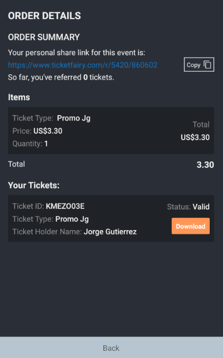
|
|
634
758
|
|
|
@@ -676,7 +800,7 @@ order: {
|
|
|
676
800
|
}
|
|
677
801
|
```
|
|
678
802
|
|
|
679
|
-
|
|
803
|
+
### styles
|
|
680
804
|
|
|
681
805
|
```
|
|
682
806
|
styles?: {
|
|
@@ -725,7 +849,7 @@ styles?: {
|
|
|
725
849
|
}
|
|
726
850
|
```
|
|
727
851
|
|
|
728
|
-
|
|
852
|
+
### texts
|
|
729
853
|
|
|
730
854
|
```js
|
|
731
855
|
texts?: {
|
package/lib/api/ApiClient.js
CHANGED
|
@@ -175,7 +175,10 @@ export const fetchMyOrders = async (page = 1, filter = '') => {
|
|
|
175
175
|
let responseError = '';
|
|
176
176
|
const withFilterEvent = filter ? `&filter[event]=${filter}` : '';
|
|
177
177
|
const withBrand = Config.BRAND ? `&filter[brand]=${Config.BRAND}` : '';
|
|
178
|
-
const
|
|
178
|
+
const withSubBrands = Config.ARE_SUB_BRANDS_INCLUDED
|
|
179
|
+
? `&filter[subbrands]=${Config.ARE_SUB_BRANDS_INCLUDED}`
|
|
180
|
+
: '';
|
|
181
|
+
const endpoint = `/v1/account/orders/?page=${page}&limit=${limit}${withFilterEvent}${withBrand}${withSubBrands}`;
|
|
179
182
|
const response = await Client.get(endpoint).catch((error) => {
|
|
180
183
|
var _a;
|
|
181
184
|
responseError = ((_a = error.response) === null || _a === void 0 ? void 0 : _a.data.message) || 'Error fetching My Orders';
|