tech-stack-icons 3.2.0 → 3.2.1
This diff represents the content of publicly available package versions that have been released to one of the supported registries. The information contained in this diff is provided for informational purposes only and reflects changes between package versions as they appear in their respective public registries.
- package/README.md +87 -20
- package/package.json +1 -1
package/README.md
CHANGED
|
@@ -1,22 +1,31 @@
|
|
|
1
1
|
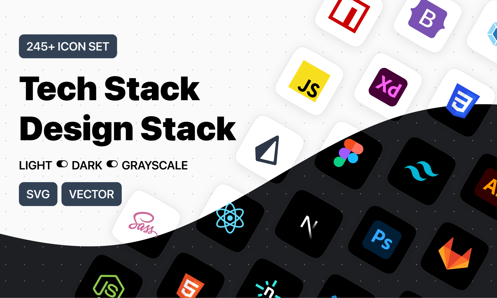
# Tech Stack Icons
|
|
2
2
|
|
|
3
|
-
|
|
3
|
+
A Typesafe React component for rendering over **265+ original SVG icons** for the most-used design & development tools, frameworks, and AI services.
|
|
4
4
|
|
|
5
|
-
|
|
5
|
+
---
|
|
6
6
|
|
|
7
|
-
-
|
|
8
|
-
- [**Install Figma Drag & Drop plugin**](https://www.figma.com/community/plugin/1292847256216210035/iconstack-pro) (Use it on your design files)
|
|
9
|
-
- [**Figma Components File**](https://www.figma.com/community/file/1095337897898466786/tech-stack-icons-design-stack-icons) (Duplicate all the icons)
|
|
7
|
+
|
|
10
8
|
|
|
11
|
-
|
|
9
|
+
- 🌐 [**tech-stack-icons.com**](https://tech-stack-icons.com/) — live search, preview, copy JSX/SVG
|
|
10
|
+
- 🎨 [**Figma Drag & Drop Plugin**](https://www.figma.com/community/plugin/1292847256216210035/tech-stack-design-stack-icons)
|
|
11
|
+
- 📁 [**Figma File of Icons**](https://www.figma.com/community/file/1095337897898466786/tech-stack-icons-design-stack-icons)
|
|
12
12
|
|
|
13
|
-
|
|
14
|
-
✓ Light mode
|
|
15
|
-
✓ Grayscale
|
|
13
|
+
---
|
|
16
14
|
|
|
17
|
-
##
|
|
15
|
+
## ✨ Features
|
|
18
16
|
|
|
19
|
-
|
|
17
|
+
- 265+ original SVG icons
|
|
18
|
+
- Light, Dark, and Grayscale variants
|
|
19
|
+
- Fully typed with TypeScript autocomplete
|
|
20
|
+
- Zero dependencies
|
|
21
|
+
- Optimized for 100% width and height scaling
|
|
22
|
+
- Works out of the box with Tailwind CSS and styled-components
|
|
23
|
+
|
|
24
|
+
---
|
|
25
|
+
|
|
26
|
+
## 📦 Installation
|
|
27
|
+
|
|
28
|
+
```bash
|
|
20
29
|
npm install tech-stack-icons
|
|
21
30
|
# or
|
|
22
31
|
pnpm add tech-stack-icons
|
|
@@ -24,17 +33,75 @@ pnpm add tech-stack-icons
|
|
|
24
33
|
yarn add tech-stack-icons
|
|
25
34
|
```
|
|
26
35
|
|
|
36
|
+
---
|
|
37
|
+
|
|
38
|
+
## 🧱 Usage
|
|
39
|
+
|
|
27
40
|
```tsx
|
|
28
|
-
import StackIcon from "tech-stack-icons";
|
|
41
|
+
import StackIcon from "tech-stack-icons";
|
|
42
|
+
|
|
43
|
+
export default function Example() {
|
|
44
|
+
return (
|
|
45
|
+
<div style={{ width: 40, height: 40 }}>
|
|
46
|
+
<StackIcon name="nextjs" />
|
|
47
|
+
</div>
|
|
48
|
+
);
|
|
49
|
+
}
|
|
50
|
+
```
|
|
29
51
|
|
|
30
|
-
|
|
52
|
+
---
|
|
53
|
+
|
|
54
|
+
## 🧩 Props
|
|
55
|
+
|
|
56
|
+
| Prop | Type | Required | Description |
|
|
57
|
+
| ----------- | -------------------------------------- | -------- | ------------------------------------------------ |
|
|
58
|
+
| `name` | `IconName` | ✅ Yes | The ID of the icon (autocompletes in TypeScript) |
|
|
59
|
+
| `variant` | `"light"` \| `"dark"` \| `"grayscale"` | ❌ No | Defaults to `"light"` |
|
|
60
|
+
| `className` | `string` | ❌ No | CSS class for the wrapping `<span>` |
|
|
61
|
+
| `style` | `React.CSSProperties` | ❌ No | Inline styles for the wrapper `<span>` |
|
|
62
|
+
|
|
63
|
+
---
|
|
64
|
+
|
|
65
|
+
## 🎨 Variants
|
|
66
|
+
```tsx
|
|
67
|
+
<StackIcon name="react" variant="dark" />
|
|
68
|
+
<StackIcon name="github" variant="grayscale" />
|
|
31
69
|
```
|
|
32
70
|
|
|
33
|
-
|
|
71
|
+
---
|
|
72
|
+
|
|
73
|
+
## ✅ TypeScript Autocomplete
|
|
74
|
+
When using in a TypeScript project, the `name` prop autocompletes based on the internal icon list:
|
|
75
|
+
|
|
76
|
+
```tsx
|
|
77
|
+
import StackIcon, { IconName } from "tech-stack-icons";
|
|
78
|
+
|
|
79
|
+
const myIcon: IconName = "typescript";
|
|
80
|
+
|
|
81
|
+
```
|
|
82
|
+
|
|
83
|
+
---
|
|
84
|
+
|
|
85
|
+
# 🧪 Example: Styled with Tailwind
|
|
86
|
+
```tsx
|
|
87
|
+
<StackIcon name="tailwindcss" className="w-8 h-8 rounded" />
|
|
88
|
+
```
|
|
89
|
+
|
|
90
|
+
# 🪄 Accessibility
|
|
91
|
+
Icons are inserted as `dangerouslySetInnerHTML` inside a `<span>`, and are decorative by default.
|
|
92
|
+
If needed, you can wrap it in a `<figure>` or manually add ARIA attributes like:
|
|
93
|
+
|
|
94
|
+
```jsx
|
|
95
|
+
<figure role="img" aria-label="React logo">
|
|
96
|
+
<StackIcon name="react" />
|
|
97
|
+
</figure>
|
|
98
|
+
```
|
|
99
|
+
---
|
|
100
|
+
|
|
101
|
+
## 📂 Folder structure
|
|
102
|
+
Icons are embedded inline (no file loading needed). You do not need to manage separate assets.
|
|
103
|
+
|
|
104
|
+
---
|
|
34
105
|
|
|
35
|
-
|
|
36
|
-
|
|
37
|
-
| `name` | `string` | **Required** |
|
|
38
|
-
| `className` | `string` | _optional_ |
|
|
39
|
-
| `style` | `CSSProperties` | _optional_ |
|
|
40
|
-
| `grayscale` | `boolean` | _optional_ |
|
|
106
|
+
## 📄 License
|
|
107
|
+
MIT — Made by [Eugenio Ciccale](https://www.plusuidesign.com/about/)
|