storybook-addon-sdc 0.9.4 → 0.9.6
This diff represents the content of publicly available package versions that have been released to one of the supported registries. The information contained in this diff is provided for informational purposes only and reflects changes between package versions as they appear in their respective public registries.
- package/README.md +202 -186
- package/dist/preset.js +3 -3
- package/package.json +1 -1
package/README.md
CHANGED
|
@@ -9,14 +9,14 @@ This addon streamlines the integration of Drupal Single Directory Components (SD
|
|
|
9
9
|
- [Overview](#overview)
|
|
10
10
|
- [Storybook Example Live](#storybook-example-live)
|
|
11
11
|
- [Features of the Addon](#features-of-the-addon)
|
|
12
|
-
- [Why Choose SDC Storybook Over Alternatives?](#why-choose-sdc-storybook-over-alternatives)
|
|
13
12
|
- [Quickstart Guide](#quickstart-guide)
|
|
14
13
|
- [Configuration](#configuration)
|
|
15
|
-
- [Setting Default Values](#setting-default-values)
|
|
16
14
|
- [Creating Experimental Stories](#creating-experimental-stories)
|
|
17
15
|
- [Support for Single Story Files (\*.story.yml)](#support-for-single-story-files-storyyml)
|
|
18
16
|
- [Regular Storybook](#regular-storybook)
|
|
19
17
|
- [Configuration Options](#configuration-options)
|
|
18
|
+
- [Setting Default Values](#setting-default-values)
|
|
19
|
+
- [Why Choose SDC Storybook Over Alternatives?](#why-choose-sdc-storybook-over-alternatives)
|
|
20
20
|
- [Dependencies](#dependencies)
|
|
21
21
|
- [Known Issues](#known-issues)
|
|
22
22
|
- [UI Patterns](#ui-patterns)
|
|
@@ -43,49 +43,7 @@ The SDC Storybook Addon simplifies the integration of Drupal Single Directory Co
|
|
|
43
43
|
- **JSON Schema Support**: Supports JSON Schema for props and slots, enabling the generation of mock data for missing values and ensuring data consistency.
|
|
44
44
|
- **Drupal Behavior Embedding**: Allows you to directly embed Drupal behaviors like `Drupal.attachBehaviors()` into Storybook previews, ensuring components behave similarly to their Drupal counterparts.
|
|
45
45
|
- **Custom and External Schema Definitions**: Supports custom and external JSON schema definitions to validate components based on Drupal-specific configurations (e.g., UI Patterns, Experience Builder).
|
|
46
|
-
|
|
47
|
-
## Why Choose SDC Storybook Over Alternatives?
|
|
48
|
-
|
|
49
|
-
While solutions like [SDC Styleguide](https://www.drupal.org/project/sdc_styleguide) and [Drupal Storybook](https://www.drupal.org/project/storybook) are valuable, the SDC Storybook addon offers distinct advantages:
|
|
50
|
-
|
|
51
|
-
### 1. Component Independence and Modularity
|
|
52
|
-
|
|
53
|
-
- Following the **BEM (Block Element Modifier)** methodology, a component should work independently across environments.
|
|
54
|
-
- The functionality of your component must not depend on the **Drupal version**, or the active **Drupal theme** — it should be portable to **any** system.
|
|
55
|
-
|
|
56
|
-
### 2. No Complex Drupal Setup Required
|
|
57
|
-
|
|
58
|
-
- No need to install or configure Drupal dependencies for component development.
|
|
59
|
-
- Work faster by developing frontend components in Storybook without running a heavy Drupal instance.
|
|
60
|
-
|
|
61
|
-
### 3. Simplifies DevOps and CI/CD Pipelines
|
|
62
|
-
|
|
63
|
-
- Since components are isolated, **testing and deployments** are simplified.
|
|
64
|
-
- You can **avoid Drupal-specific configuration** in CI pipelines, leading to more efficient and maintainable workflows.
|
|
65
|
-
|
|
66
|
-
### 4. Scalability and Flexibility with Faker.js and JSON Schema
|
|
67
|
-
|
|
68
|
-
- Tools like **Faker.js** let you generate test data for components without needing real content.
|
|
69
|
-
- **JSON Schema** defines component data clearly and consistently, helping maintain data integrity.
|
|
70
|
-
|
|
71
|
-
### 5. Industry-Standard Tool for Frontend Development
|
|
72
|
-
|
|
73
|
-
- **Storybook is widely adopted** in frontend development, which makes onboarding easier, even for developers unfamiliar with Drupal.
|
|
74
|
-
- JSON Schema enables work on components without deep Drupal knowledge, opening the project to a wider developer base.
|
|
75
|
-
|
|
76
|
-
### 6. Drupal-Specific Behavior Embedded in Components
|
|
77
|
-
|
|
78
|
-
- Embed **Drupal behaviors** (like `Drupal.attachBehaviors()`) directly into Storybook previews, ensuring consistent component behavior between Storybook and production.
|
|
79
|
-
- Supports `drupalSettings` and `once.js`, so components in Storybook behave identically to their Drupal counterparts.
|
|
80
|
-
|
|
81
|
-
### 7. Twig.js, Twing, and Drupal Twig
|
|
82
|
-
|
|
83
|
-
While using Drupal to render components offers tighter integration, there are strong reasons to use Twig.js or Twing in many scenarios:
|
|
84
|
-
|
|
85
|
-
- Many components **don’t need full Drupal logic**. Basic components (buttons, cards, lists) rely on simple HTML and CSS, not on complex template logic. For such components, Twig.js or Twing provide sufficient rendering without the need for full Drupal preprocessing.
|
|
86
|
-
- **Twig.js** works well for most frontend-focused use cases.
|
|
87
|
-
- **Twing** is a modern, actively maintained Twig implementation for Node.js that offers better compatibility with Drupal's Twig features and syntax.
|
|
88
|
-
- Styling and behavior mismatches can be managed separately in the Drupal implementation phase.
|
|
46
|
+
- **Default and Custom Story Rendering**: Use `type: component` to nest components, `type: element` for HTML markup, and `type: image` for images within stories. Or create your own custom renderers.
|
|
89
47
|
|
|
90
48
|
## Quickstart Guide
|
|
91
49
|
|
|
@@ -134,9 +92,7 @@ While using Drupal to render components offers tighter integration, there are st
|
|
|
134
92
|
## Configuration
|
|
135
93
|
|
|
136
94
|
To configure the addon, update `.storybook/main.js` as shown below:
|
|
137
|
-
You can use this plugin either with [Twig.js](https://github.com/twigjs/twig.js) or [Twing.js](https://twing.nightlycommit.com/).
|
|
138
|
-
|
|
139
|
-
#### [Twig.js](https://github.com/twigjs/twig.js)
|
|
95
|
+
You can use this plugin either with [Twig.js](https://github.com/twigjs/twig.js) or [Twing.js](https://twing.nightlycommit.com/) by setting the `twigLib` option to `'twig'` or `'twing'` in your configuration. Only one of vitePluginTwigDrupalOptions or vitePluginTwingDrupalOptions should be active, depending on your twigLib setting.
|
|
140
96
|
|
|
141
97
|
```js
|
|
142
98
|
import { join } from 'node:path' // 1. Add dependencies.
|
|
@@ -149,51 +105,24 @@ const config = {
|
|
|
149
105
|
name: 'storybook-addon-sdc', // 3. Configure addon.
|
|
150
106
|
options: {
|
|
151
107
|
sdcStorybookOptions: {
|
|
108
|
+
twigLib: 'twig', // 'twig' for Twig.js or 'twing' for Twing.
|
|
152
109
|
namespace: 'umami', // Your namespace.
|
|
153
110
|
},
|
|
111
|
+
|
|
112
|
+
// vite-plugin-twig-drupal options. Comment if using Twing.
|
|
154
113
|
vitePluginTwigDrupalOptions: {
|
|
155
|
-
// vite-plugin-twig-drupal options.
|
|
156
114
|
namespaces: {
|
|
157
115
|
umami: join(cwd(), './components'), // Your namespace and path to components.
|
|
158
116
|
},
|
|
159
117
|
},
|
|
160
|
-
jsonSchemaFakerOptions: {}, // json-schema-faker options.
|
|
161
|
-
},
|
|
162
|
-
},
|
|
163
|
-
// Any other addons.
|
|
164
|
-
'@chromatic-com/storybook',
|
|
165
|
-
],
|
|
166
|
-
framework: {
|
|
167
|
-
name: '@storybook/html-vite',
|
|
168
|
-
options: {},
|
|
169
|
-
},
|
|
170
|
-
}
|
|
171
|
-
export default config
|
|
172
|
-
```
|
|
173
118
|
|
|
174
|
-
|
|
119
|
+
// vite-plugin-twing-drupal options. Uncomment if using Twing.
|
|
120
|
+
// vitePluginTwingDrupalOptions: {
|
|
121
|
+
// namespaces: {
|
|
122
|
+
// umami: [join(cwd(), './components')],
|
|
123
|
+
// },
|
|
124
|
+
// },
|
|
175
125
|
|
|
176
|
-
```js
|
|
177
|
-
import { join } from 'node:path' // 1. Add dependencies.
|
|
178
|
-
import { cwd } from 'node:process'
|
|
179
|
-
|
|
180
|
-
const config = {
|
|
181
|
-
stories: ['../components/**/*.component.yml'], // 2. Set components glob.
|
|
182
|
-
addons: [
|
|
183
|
-
{
|
|
184
|
-
name: 'storybook-addon-sdc', // 3. Configure addon.
|
|
185
|
-
options: {
|
|
186
|
-
sdcStorybookOptions: {
|
|
187
|
-
twigLib: 'twing',
|
|
188
|
-
namespace: 'umami', // Your namespace.
|
|
189
|
-
},
|
|
190
|
-
vitePluginTwingDrupalOptions: {
|
|
191
|
-
namespaces: {
|
|
192
|
-
umami: [join(cwd(), './components')],
|
|
193
|
-
},
|
|
194
|
-
// (Optional) With twing hooks you can adjust twing environment.
|
|
195
|
-
hooks: join(cwd(), '.storybook/twing-hooks.js'),
|
|
196
|
-
},
|
|
197
126
|
jsonSchemaFakerOptions: {}, // json-schema-faker options.
|
|
198
127
|
},
|
|
199
128
|
},
|
|
@@ -208,50 +137,6 @@ const config = {
|
|
|
208
137
|
export default config
|
|
209
138
|
```
|
|
210
139
|
|
|
211
|
-
Sample twing hook file. See [twing.js documentation](https://twing.nightlycommit.com/) for more infos.
|
|
212
|
-
|
|
213
|
-
```js
|
|
214
|
-
import { createSynchronousFunction } from 'twing'
|
|
215
|
-
|
|
216
|
-
/**
|
|
217
|
-
* Simple test function.
|
|
218
|
-
*/
|
|
219
|
-
function testFunction() {
|
|
220
|
-
return 'IT WORKS!'
|
|
221
|
-
}
|
|
222
|
-
|
|
223
|
-
export function initEnvironment(twingEnvironment, config = {}) {
|
|
224
|
-
const func = createSynchronousFunction('testFunction', testFunction, [])
|
|
225
|
-
twingEnvironment.addFunction(func)
|
|
226
|
-
}
|
|
227
|
-
```
|
|
228
|
-
|
|
229
|
-
## Setting Default Values
|
|
230
|
-
|
|
231
|
-
For `json-schema-faker` to generate reliable data, use `default` or `examples` in your SDC schema:
|
|
232
|
-
|
|
233
|
-
```yaml
|
|
234
|
-
props:
|
|
235
|
-
type: object
|
|
236
|
-
properties:
|
|
237
|
-
html_tag:
|
|
238
|
-
type: string
|
|
239
|
-
enum:
|
|
240
|
-
- article
|
|
241
|
-
- div
|
|
242
|
-
default: article
|
|
243
|
-
slots:
|
|
244
|
-
content:
|
|
245
|
-
title: Content
|
|
246
|
-
examples:
|
|
247
|
-
- Hello! I'm card content
|
|
248
|
-
```
|
|
249
|
-
|
|
250
|
-
Refer to:
|
|
251
|
-
|
|
252
|
-
- [Drupal SDC Documentation](https://www.drupal.org/docs/develop/theming-drupal/using-single-directory-components/annotated-example-componentyml)
|
|
253
|
-
- [JSON Schema Documentation](https://json-schema.org/understanding-json-schema/reference/annotations)
|
|
254
|
-
|
|
255
140
|
## Creating Experimental Stories
|
|
256
141
|
|
|
257
142
|
The `sdcStorybook` configuration in the SDC YAML file provides a flexible way to define custom stories for your components. This feature allows you to use predefined props, custom slots, or even reuse stories defined elsewhere. Here's how it works:
|
|
@@ -302,50 +187,87 @@ The addon dynamically renders the components and stories as defined:
|
|
|
302
187
|
|
|
303
188
|
[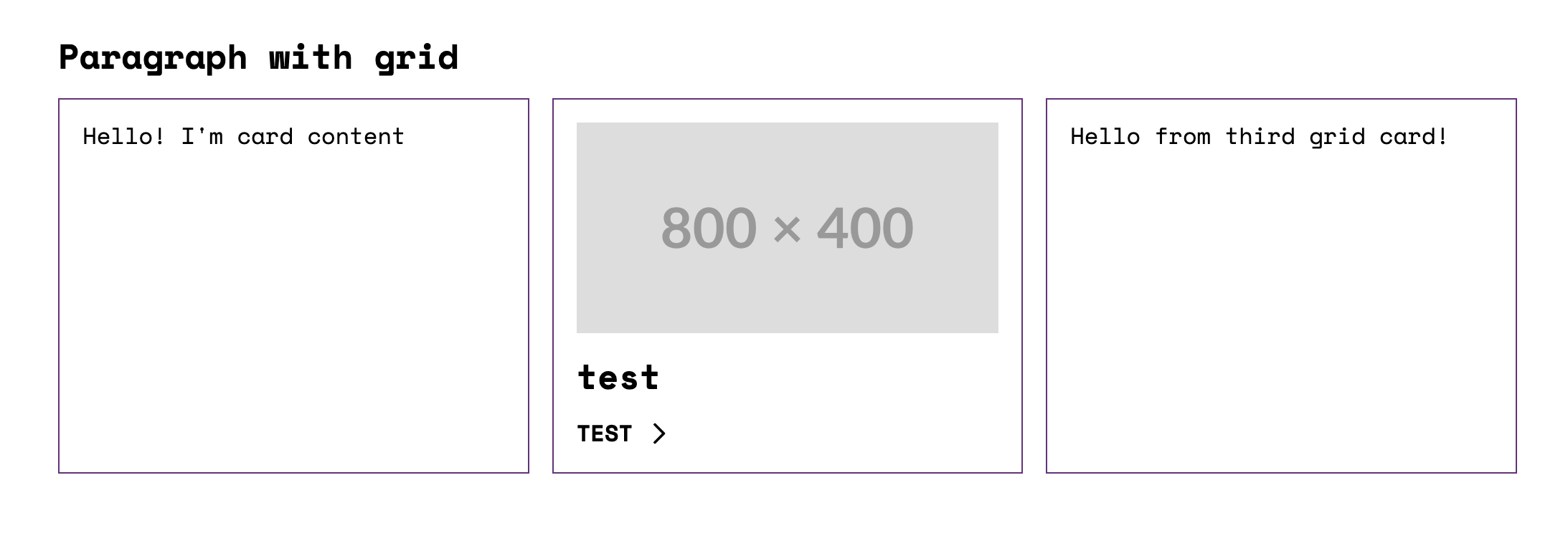](https://gyazo.com/7212a3f44052ebde34b59a1555d96afe)
|
|
304
189
|
|
|
305
|
-
|
|
190
|
+
## Core and custom story node types
|
|
306
191
|
|
|
307
|
-
|
|
192
|
+
Plugin supports 3 core story node types: `component`, `element`, and `image`.
|
|
308
193
|
|
|
309
194
|
Use `component` to nest other components within your story.
|
|
310
195
|
|
|
311
196
|
```yaml
|
|
312
197
|
type: component
|
|
313
198
|
component: 'umami:badge'
|
|
314
|
-
props:
|
|
315
|
-
icon: serves
|
|
316
|
-
slots:
|
|
317
|
-
text:
|
|
318
|
-
type: component
|
|
319
|
-
component: 'umami:title'
|
|
320
199
|
```
|
|
321
200
|
|
|
322
|
-
|
|
201
|
+
Use `element` to embed HTML markup within a specific tag.
|
|
323
202
|
|
|
324
|
-
|
|
203
|
+
```yaml
|
|
204
|
+
type: element
|
|
205
|
+
value: 'Hello World!'
|
|
206
|
+
attributes:
|
|
207
|
+
class: custom-class
|
|
208
|
+
```
|
|
325
209
|
|
|
326
|
-
Use `
|
|
210
|
+
Use `image` to embed images into your story.
|
|
327
211
|
|
|
328
212
|
```yaml
|
|
329
|
-
type:
|
|
330
|
-
|
|
213
|
+
type: image
|
|
214
|
+
uri: https://placehold.co/1200x400
|
|
331
215
|
attributes:
|
|
332
|
-
class: class
|
|
216
|
+
class: custom-class
|
|
333
217
|
```
|
|
334
218
|
|
|
335
|
-
|
|
219
|
+
Example of using `element` and `image` in a story:
|
|
336
220
|
|
|
337
|
-
|
|
221
|
+
```yaml
|
|
222
|
+
thirdPartySettings:
|
|
223
|
+
sdcStorybook:
|
|
224
|
+
stories:
|
|
225
|
+
preview:
|
|
226
|
+
slots:
|
|
227
|
+
content:
|
|
228
|
+
# Result:
|
|
229
|
+
# <h2 class="custom-class"><span>Hello</span></h2>
|
|
230
|
+
- type: element
|
|
231
|
+
tag: 'h2'
|
|
232
|
+
value: '<span>Hello</span>'
|
|
233
|
+
attributes:
|
|
234
|
+
class: 'custom-class'
|
|
235
|
+
|
|
236
|
+
# Result:
|
|
237
|
+
# <img class="custom-class" src="https://placehold.co/600x400" />
|
|
238
|
+
- type: image
|
|
239
|
+
uri: 'https://placehold.co/600x400'
|
|
240
|
+
attributes:
|
|
241
|
+
class: 'custom-class'
|
|
242
|
+
```
|
|
338
243
|
|
|
339
|
-
|
|
244
|
+
### You can add custom renderers for additional `story` node types.
|
|
245
|
+
|
|
246
|
+
For example, to render a custom `icon` type:
|
|
340
247
|
|
|
341
248
|
```yaml
|
|
342
|
-
type:
|
|
343
|
-
|
|
344
|
-
attributes:
|
|
345
|
-
class: class-1
|
|
249
|
+
- type: icon
|
|
250
|
+
icon: arrow
|
|
346
251
|
```
|
|
347
252
|
|
|
348
|
-
|
|
253
|
+
Add the following to your `sdcStorybookOptions`:
|
|
254
|
+
|
|
255
|
+
```js
|
|
256
|
+
sdcStorybookOptions: {
|
|
257
|
+
...
|
|
258
|
+
storyNodesRenderer: [
|
|
259
|
+
{
|
|
260
|
+
appliesTo: item => item?.type === 'icon',
|
|
261
|
+
render: item =>
|
|
262
|
+
JSON.stringify(
|
|
263
|
+
`<svg class="icon" aria-hidden="true"><use xlink:href="#${item.icon}"></use></svg>`
|
|
264
|
+
),
|
|
265
|
+
priority: -4,
|
|
266
|
+
},
|
|
267
|
+
],
|
|
268
|
+
...
|
|
269
|
+
}
|
|
270
|
+
```
|
|
349
271
|
|
|
350
272
|
## Support for Single Story Files (`*.story.yml`)
|
|
351
273
|
|
|
@@ -365,10 +287,7 @@ props:
|
|
|
365
287
|
props:
|
|
366
288
|
icon: timer
|
|
367
289
|
slots:
|
|
368
|
-
text:
|
|
369
|
-
type: html_tag
|
|
370
|
-
tag: span
|
|
371
|
-
value: Test
|
|
290
|
+
text: Hello
|
|
372
291
|
- type: component
|
|
373
292
|
component: 'umami:badge'
|
|
374
293
|
props:
|
|
@@ -383,42 +302,13 @@ props:
|
|
|
383
302
|
text: Ciao
|
|
384
303
|
```
|
|
385
304
|
|
|
386
|
-
## Extending SDC Story Rendering
|
|
387
|
-
|
|
388
|
-
You can add custom renderers for additional `story` node types.
|
|
389
|
-
For example, to render a custom `icon` type:
|
|
390
|
-
|
|
391
|
-
```yaml
|
|
392
|
-
- type: icon
|
|
393
|
-
icon: arrow
|
|
394
|
-
```
|
|
395
|
-
|
|
396
|
-
Add the following to your `sdcStorybookOptions`:
|
|
397
|
-
|
|
398
|
-
```ts
|
|
399
|
-
const sdcStorybookOptions: SDCStorybookOptions = {
|
|
400
|
-
...
|
|
401
|
-
storyNodesRenderer: [
|
|
402
|
-
{
|
|
403
|
-
appliesTo: item => item?.type === 'icon',
|
|
404
|
-
render: item =>
|
|
405
|
-
Json.toString(
|
|
406
|
-
`<svg class="icon" aria-hidden="true"><use xlink:href="#${item.icon}"></use></svg>`
|
|
407
|
-
),
|
|
408
|
-
priority: -4,
|
|
409
|
-
},
|
|
410
|
-
],
|
|
411
|
-
...
|
|
412
|
-
}
|
|
413
|
-
```
|
|
414
|
-
|
|
415
305
|
### Why stories experimental?
|
|
416
306
|
|
|
417
307
|
The [community will have to decide](https://docs.google.com/document/d/1wCQLXrK1lrV2gYlqmqD2pybTql6_H1dByWIKB5xQFcQ/edit?tab=t.0#heading=h.3949vjfiqczr) what format the YAML stories should be.
|
|
418
308
|
|
|
419
309
|
## Regular storybook
|
|
420
310
|
|
|
421
|
-
All
|
|
311
|
+
All Storybook functions work as usual, and you can import SDC YAML into `.stories.js` files.
|
|
422
312
|
|
|
423
313
|
[example](https://github.com/iberdinsky-skilld/sdc-addon/blob/main/stories/page-example.stories.js)
|
|
424
314
|
|
|
@@ -450,6 +340,63 @@ export const Basic = {}
|
|
|
450
340
|
|
|
451
341
|
In addition to the standard configuration options, you can also specify customDefs and externalDefs to provide additional schema definitions. These options are optional and can be used to extend or override the default definitions.
|
|
452
342
|
|
|
343
|
+
### Twig.js with `vitePluginTwigDrupalOptions`
|
|
344
|
+
|
|
345
|
+
It is possible to pass options to the underlying `vite-plugin-twig-drupal` plugin. See [vite-plugin-twig-drupal](https://github.com/larowlan/vite-plugin-twig-drupal/blob/main/README.md#installation)
|
|
346
|
+
|
|
347
|
+
```js
|
|
348
|
+
vitePluginTwigDrupalOptions: {
|
|
349
|
+
namespaces: {
|
|
350
|
+
umami: join(cwd(), './components'), // Your namespace and path to components.
|
|
351
|
+
},
|
|
352
|
+
functions: {
|
|
353
|
+
// You can add custom functions - each is a function that is passed the active Twig instance and should call
|
|
354
|
+
// e.g. extendFunction to register a function
|
|
355
|
+
reverse: (twigInstance) => twigInstance.extendFunction("reverse", () => (text) => text.split(' ').reverse().join(' ')),
|
|
356
|
+
// e.g. extendFilter to register a filter
|
|
357
|
+
clean_unique_id: (twigInstance) => twigInstance.extendFilter("clean_unique_id", () => (text) => text.split(' ').reverse().join(' ')),
|
|
358
|
+
},
|
|
359
|
+
globalContext: {
|
|
360
|
+
// Global variables that should be present in all templates.
|
|
361
|
+
active_theme: 'my_super_theme',
|
|
362
|
+
is_front_page: false,
|
|
363
|
+
},
|
|
364
|
+
},
|
|
365
|
+
```
|
|
366
|
+
|
|
367
|
+
### Twing with `vitePluginTwingDrupalOptions`
|
|
368
|
+
|
|
369
|
+
It is possible to pass options to the underlying `vite-plugin-twing-drupal` plugin. See [Twing documentation](https://twing.nightlycommit.com/) for more information.
|
|
370
|
+
|
|
371
|
+
```js
|
|
372
|
+
vitePluginTwingDrupalOptions: {
|
|
373
|
+
namespaces: {
|
|
374
|
+
umami: [join(cwd(), './components')],
|
|
375
|
+
},
|
|
376
|
+
// (Optional) With twing hooks you can adjust twing environment.
|
|
377
|
+
hooks: join(cwd(), '.storybook/twing-hooks.js'),
|
|
378
|
+
},
|
|
379
|
+
```
|
|
380
|
+
|
|
381
|
+
Sample twing hook file.
|
|
382
|
+
|
|
383
|
+
```js
|
|
384
|
+
// .storybook/twing-hooks.js
|
|
385
|
+
import { createSynchronousFunction } from 'twing'
|
|
386
|
+
|
|
387
|
+
/**
|
|
388
|
+
* Simple test function.
|
|
389
|
+
*/
|
|
390
|
+
function testFunction() {
|
|
391
|
+
return 'IT WORKS!'
|
|
392
|
+
}
|
|
393
|
+
|
|
394
|
+
export function initEnvironment(twingEnvironment, config = {}) {
|
|
395
|
+
const func = createSynchronousFunction('testFunction', testFunction, [])
|
|
396
|
+
twingEnvironment.addFunction(func)
|
|
397
|
+
}
|
|
398
|
+
```
|
|
399
|
+
|
|
453
400
|
### `customDefs`
|
|
454
401
|
|
|
455
402
|
The `customDefs` option allows you to define custom schema definitions directly within your configuration. This can be object with custom definitions.
|
|
@@ -525,11 +472,80 @@ const config = {
|
|
|
525
472
|
}
|
|
526
473
|
```
|
|
527
474
|
|
|
475
|
+
## Setting Default Values
|
|
476
|
+
|
|
477
|
+
For `json-schema-faker` to generate reliable data, use `default` or `examples` in your SDC schema:
|
|
478
|
+
|
|
479
|
+
```yaml
|
|
480
|
+
props:
|
|
481
|
+
type: object
|
|
482
|
+
properties:
|
|
483
|
+
html_tag:
|
|
484
|
+
type: string
|
|
485
|
+
enum:
|
|
486
|
+
- article
|
|
487
|
+
- div
|
|
488
|
+
default: article
|
|
489
|
+
slots:
|
|
490
|
+
content:
|
|
491
|
+
title: Content
|
|
492
|
+
examples:
|
|
493
|
+
- Hello! I'm card content
|
|
494
|
+
```
|
|
495
|
+
|
|
496
|
+
Refer to:
|
|
497
|
+
|
|
498
|
+
- [Drupal SDC Documentation](https://www.drupal.org/docs/develop/theming-drupal/using-single-directory-components/annotated-example-componentyml)
|
|
499
|
+
- [JSON Schema Documentation](https://json-schema.org/understanding-json-schema/reference/annotations)
|
|
500
|
+
|
|
501
|
+
## Why Choose SDC Storybook Over Alternatives?
|
|
502
|
+
|
|
503
|
+
While solutions like [SDC Styleguide](https://www.drupal.org/project/sdc_styleguide) and [Drupal Storybook](https://www.drupal.org/project/storybook) are valuable, the SDC Storybook addon offers distinct advantages:
|
|
504
|
+
|
|
505
|
+
### 1. Component Independence and Modularity
|
|
506
|
+
|
|
507
|
+
- Following the **BEM (Block Element Modifier)** methodology, a component should work independently across environments.
|
|
508
|
+
- The functionality of your component must not depend on the **Drupal version**, or the active **Drupal theme** — it should be portable to **any** system.
|
|
509
|
+
|
|
510
|
+
### 2. No Complex Drupal Setup Required
|
|
511
|
+
|
|
512
|
+
- No need to install or configure Drupal dependencies for component development.
|
|
513
|
+
- Work faster by developing frontend components in Storybook without running a heavy Drupal instance.
|
|
514
|
+
|
|
515
|
+
### 3. Simplifies DevOps and CI/CD Pipelines
|
|
516
|
+
|
|
517
|
+
- Since components are isolated, **testing and deployments** are simplified.
|
|
518
|
+
- You can **avoid Drupal-specific configuration** in CI pipelines, leading to more efficient and maintainable workflows.
|
|
519
|
+
|
|
520
|
+
### 4. Scalability and Flexibility with Faker.js and JSON Schema
|
|
521
|
+
|
|
522
|
+
- Tools like **Faker.js** let you generate test data for components without needing real content.
|
|
523
|
+
- **JSON Schema** defines component data clearly and consistently, helping maintain data integrity.
|
|
524
|
+
|
|
525
|
+
### 5. Industry-Standard Tool for Frontend Development
|
|
526
|
+
|
|
527
|
+
- **Storybook is widely adopted** in frontend development, which makes onboarding easier, even for developers unfamiliar with Drupal.
|
|
528
|
+
- JSON Schema enables working on components without deep Drupal knowledge, opening the project to a wider developer base.
|
|
529
|
+
|
|
530
|
+
### 6. Drupal-Specific Behavior Embedded in Components
|
|
531
|
+
|
|
532
|
+
- Embed **Drupal behaviors** (like `Drupal.attachBehaviors()`) directly into Storybook previews, ensuring consistent component behavior between Storybook and production.
|
|
533
|
+
- Supports `drupalSettings` and `once.js`, so components in Storybook behave identically to their Drupal counterparts.
|
|
534
|
+
|
|
535
|
+
### 7. Twig.js, Twing, and Drupal Twig
|
|
536
|
+
|
|
537
|
+
While using Drupal to render components offers tighter integration, there are strong reasons to use Twig.js or Twing in many scenarios:
|
|
538
|
+
|
|
539
|
+
- Many components **don’t need full Drupal logic**. Basic components (buttons, cards, lists) rely on simple HTML and CSS, not on complex template logic. For such components, Twig.js or Twing provide sufficient rendering without the need for full Drupal preprocessing.
|
|
540
|
+
- **Twig.js** works well for most frontend-focused use cases.
|
|
541
|
+
- **Twing** is a modern, actively maintained Twig implementation for Node.js that offers better compatibility with Drupal's Twig features and syntax.
|
|
542
|
+
- Styling and behavior mismatches can be managed separately in the Drupal implementation phase.
|
|
543
|
+
|
|
528
544
|
## Dependencies
|
|
529
545
|
|
|
530
546
|
- [vite-plugin-twig-drupal](https://github.com/larowlan/vite-plugin-twig-drupal): Loads Twig with Drupal functions in twig.js.
|
|
531
547
|
- [vite-plugin-twing-drupal](https://github.com/christianwiedemann/vite-plugin-twing-drupal): Loads Twig with Drupal functions in Twing.
|
|
532
|
-
- [json-schema-faker](https://github.com/json-schema-faker/json-schema-faker): Generates mock data for missing props and
|
|
548
|
+
- [json-schema-faker](https://github.com/json-schema-faker/json-schema-faker): Generates mock data for missing props and slots.
|
|
533
549
|
- [JSON Schema validator](https://www.npmjs.com/package/jsonschema)
|
|
534
550
|
|
|
535
551
|
## Known Issues
|
|
@@ -538,5 +554,5 @@ const config = {
|
|
|
538
554
|
|
|
539
555
|
## UI Patterns
|
|
540
556
|
|
|
541
|
-
- Variants partially supported ([Issue 3390712](https://www.drupal.org/project/drupal/issues/3390712)).
|
|
557
|
+
- Variants are partially supported ([Issue 3390712](https://www.drupal.org/project/drupal/issues/3390712)).
|
|
542
558
|
- Custom Twig filters and functions are not supported ([UI Patterns TwigExtension](https://git.drupalcode.org/project/ui_patterns/-/blob/8.x-1.x/src/Template/TwigExtension.php)).
|
package/dist/preset.js
CHANGED
|
@@ -112,7 +112,7 @@ var renderImage = (item) => {
|
|
|
112
112
|
`<img src="${item.uri}"${toAttributes(item.attributes)}>`
|
|
113
113
|
);
|
|
114
114
|
};
|
|
115
|
-
var
|
|
115
|
+
var renderElement = (item) => {
|
|
116
116
|
return JSON.stringify(
|
|
117
117
|
`<${item.tag ?? "div"}${toAttributes(item.attributes)}> ${item.value} </${item.tag ?? "div"}>`
|
|
118
118
|
);
|
|
@@ -132,8 +132,8 @@ var defaultStoryNodes = [
|
|
|
132
132
|
priority: -1
|
|
133
133
|
},
|
|
134
134
|
{
|
|
135
|
-
appliesTo: (item) => item?.type === "
|
|
136
|
-
render: (item) =>
|
|
135
|
+
appliesTo: (item) => item?.type === "element" || item?.theme === "element",
|
|
136
|
+
render: (item) => renderElement(item),
|
|
137
137
|
priority: -2
|
|
138
138
|
},
|
|
139
139
|
{
|