storybook-addon-sdc 0.27.1 → 0.28.0
This diff represents the content of publicly available package versions that have been released to one of the supported registries. The information contained in this diff is provided for informational purposes only and reflects changes between package versions as they appear in their respective public registries.
- package/README.md +126 -846
- package/dist/index.d.ts +3 -0
- package/dist/preset.js +262 -46
- package/dist/renderer/twig.js +94 -3
- package/dist/renderer/twing.js +81 -3
- package/package.json +3 -1
package/README.md
CHANGED
|
@@ -1,134 +1,71 @@
|
|
|
1
1
|
# Storybook SDC Addon
|
|
2
2
|
|
|
3
|
-
|
|
3
|
+
Drupal [Single Directory Components](https://www.drupal.org/docs/develop/theming-drupal/using-single-directory-components) (SDC) in Storybook, without a Drupal site. Every `*.component.yml` becomes stories, its props and slots become Controls, and its Twig template renders with Drupal's Twig functions and filters, in Twig.js or Twing.
|
|
4
|
+
|
|
5
|
+
**[Live demo and feature guide](https://iberdinsky-skilld.github.io/sdc-addon)**: every feature has a page with an explanation and a working example.
|
|
4
6
|
|
|
5
7
|
[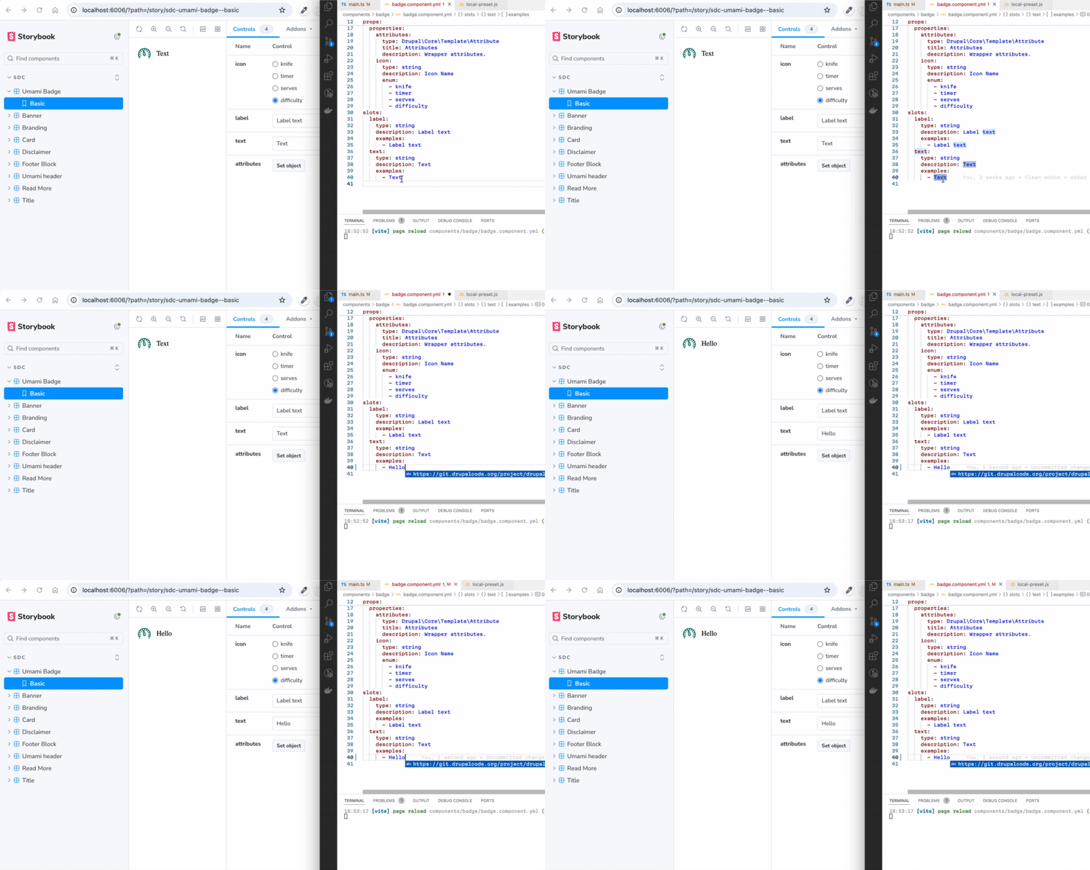](https://gyazo.com/2dcfa650c961679430d45eef24a82ab8)
|
|
6
8
|
|
|
7
9
|
## Table of Contents
|
|
8
10
|
|
|
9
|
-
- [
|
|
10
|
-
- [Storybook Example Live](#storybook-example-live)
|
|
11
|
-
- [Features of the Addon](#features-of-the-addon)
|
|
12
|
-
- [Quickstart Guide](#quickstart-guide)
|
|
11
|
+
- [Quickstart](#quickstart)
|
|
13
12
|
- [Configuration](#configuration)
|
|
14
|
-
- [
|
|
15
|
-
- [
|
|
16
|
-
- [
|
|
17
|
-
- [
|
|
18
|
-
- [Advanced Grouping and Nesting](#advanced-grouping-and-nesting)
|
|
19
|
-
- [Regular Storybook](#regular-storybook)
|
|
20
|
-
- [Configuration Options](#configuration-options)
|
|
21
|
-
- [Setting Default Values](#setting-default-values)
|
|
22
|
-
- [`dependencyMap`](#dependencymap)
|
|
23
|
-
- [Story Configuration via thirdPartySettings.sdcStorybook](#story-configuration-via-thirdpartysettingssdcstorybook)
|
|
24
|
-
- [UI Patterns](#ui-patterns)
|
|
25
|
-
- [Why Choose SDC Storybook Over Alternatives?](#why-choose-sdc-storybook-over-alternatives)
|
|
13
|
+
- [Features](#features)
|
|
14
|
+
- [Addon options](#addon-options)
|
|
15
|
+
- [Story options](#story-options)
|
|
16
|
+
- [Production static build](#production-static-build)
|
|
26
17
|
- [Dependencies](#dependencies)
|
|
27
|
-
- [Known
|
|
28
|
-
|
|
29
|
-
---
|
|
30
|
-
|
|
31
|
-
## Overview
|
|
32
|
-
|
|
33
|
-
This Storybook addon makes it easy to integrate Drupal Single Directory Components (SDC) into Storybook using YAML configurations and Twig templates. It dynamically loads components, allowing you to quickly create and manage stories with minimal configuration.
|
|
34
|
-
|
|
35
|
-
**It is still regular Storybook** but now with the added option to import and manage Drupal Single Directory Components (SDC).
|
|
36
|
-
|
|
37
|
-
## Storybook Example Live
|
|
38
|
-
|
|
39
|
-
You can view a [live example of the SDC Addon in Storybook](https://iberdinsky-skilld.github.io/sdc-addon), hosted on GitHub Pages, showcasing components in the `/components` directory of that repository.
|
|
40
|
-
|
|
41
|
-
## Features of the Addon
|
|
42
|
-
|
|
43
|
-
The SDC Storybook Addon simplifies the integration of Drupal Single Directory Components (SDC) into Storybook, offering several key features:
|
|
44
|
-
|
|
45
|
-
- **Vite Plugin Integration**: You can use either the vite-plugin-twig-drupal plugin (Twig.js) or the vite-plugin-twing-drupal plugin (Twing) to load and process Twig templates in SDC components.
|
|
46
|
-
- **Dynamic Path Resolution**: Utilizes namespaces to dynamically discover components within your project structure, eliminating the need for manual configuration.
|
|
47
|
-
- **Story Generation**: Automatically creates stories based on the YAML configurations of your SDC components, streamlining the story creation process.
|
|
48
|
-
- **JSON Schema Support**: Supports JSON Schema for props and slots, enabling the generation of mock data for missing values and ensuring data consistency.
|
|
49
|
-
- **Drupal Behavior Embedding**: Allows you to directly embed Drupal behaviors like `Drupal.attachBehaviors()` into Storybook previews, ensuring components behave similarly to their Drupal counterparts.
|
|
50
|
-
- **Custom and External Schema Definitions**: Supports custom and external JSON schema definitions to validate components based on Drupal-specific configurations (e.g., UI Patterns, Experience Builder).
|
|
51
|
-
- **Default and Custom Story Rendering**: Use `type: component` to nest components, `type: element` for HTML markup, and `type: image` for images within stories. Or create your own custom renderers.
|
|
52
|
-
- **Namespaces**: Supports multiple namespaces, allowing you to use components from different(parent/sibling) directories or packages.
|
|
53
|
-
- **Drupal Icon API**: Automatically detects `*.icons.yml` files in registered namespaces and makes `{{ icon('pack_id', 'icon_id', settings) }}` available in every Twig template. Supports `svg_sprite`, `svg` (inline), and `path` extractors with no configuration required.
|
|
54
|
-
- **Drupal Library CDN Resolution**: Resolves Drupal library dependencies (e.g. `core/jquery`) to CDN assets via `dependencyMap`. Assets are injected per-component — only when a story uses a component that declares the dependency in `libraryOverrides.dependencies`. Built-in defaults cover the Drupal runtime (`core/drupal`, `core/once`, etc.).
|
|
18
|
+
- [Known issues](#known-issues)
|
|
55
19
|
|
|
56
|
-
## Quickstart
|
|
20
|
+
## Quickstart
|
|
57
21
|
|
|
58
|
-
1.
|
|
22
|
+
1. In a theme, a module or an empty folder, create `package.json` if there is none:
|
|
59
23
|
|
|
60
24
|
```bash
|
|
61
25
|
npm init
|
|
62
26
|
echo "node_modules/" >> .gitignore
|
|
63
27
|
```
|
|
64
28
|
|
|
65
|
-
2.
|
|
29
|
+
2. Install the addon, Vite and a Twig engine (`twig` for Twig.js, or `twing`):
|
|
66
30
|
|
|
67
31
|
```bash
|
|
68
32
|
npm i vite twig storybook-addon-sdc --save-dev
|
|
69
33
|
```
|
|
70
34
|
|
|
71
|
-
3.
|
|
35
|
+
3. Initialize Storybook and remove its example stories:
|
|
72
36
|
|
|
73
37
|
```bash
|
|
74
38
|
npx storybook@latest init --builder vite --type html --no-dev
|
|
75
|
-
```
|
|
76
|
-
|
|
77
|
-
4. **Remove default storybook boilerplate stories (Optional)**:
|
|
78
|
-
|
|
79
|
-
```bash
|
|
80
39
|
rm -rf ./stories
|
|
81
40
|
```
|
|
82
41
|
|
|
83
|
-
|
|
84
|
-
|
|
85
|
-
6. **Add components to the `components` directory** (or copy from this [repository](https://github.com/iberdinsky-skilld/sdc-addon/tree/main/components)).
|
|
42
|
+
4. Set [`"type": "module"`](https://nodejs.org/api/packages.html#type) in `package.json`.
|
|
86
43
|
|
|
87
|
-
|
|
88
|
-
|
|
89
|
-
```json
|
|
90
|
-
{
|
|
91
|
-
"type": "module"
|
|
92
|
-
}
|
|
93
|
-
```
|
|
94
|
-
|
|
95
|
-
8. **Start Storybook**:
|
|
96
|
-
```bash
|
|
97
|
-
npm run storybook
|
|
98
|
-
```
|
|
44
|
+
5. Configure `.storybook/main.js` as below, then run `npm run storybook`.
|
|
99
45
|
|
|
100
46
|
## Configuration
|
|
101
47
|
|
|
102
|
-
To configure the addon, update `.storybook/main.js` as shown below:
|
|
103
|
-
You can use this plugin either with [Twig.js](https://github.com/twigjs/twig.js) or [Twing.js](https://twing.nightlycommit.com/) by setting the `twigLib` option to `'twig'` or `'twing'` in your configuration.
|
|
104
|
-
|
|
105
48
|
```js
|
|
106
|
-
|
|
107
|
-
|
|
108
|
-
|
|
109
|
-
const config = {
|
|
110
|
-
stories: ['../components/**/*.component.yml'], // 2. Set components glob.
|
|
49
|
+
// .storybook/main.js
|
|
50
|
+
export default {
|
|
51
|
+
stories: ['../components/**/*.component.yml'],
|
|
111
52
|
addons: [
|
|
112
53
|
{
|
|
113
|
-
name: 'storybook-addon-sdc',
|
|
54
|
+
name: 'storybook-addon-sdc',
|
|
114
55
|
options: {
|
|
115
56
|
sdcStorybookOptions: {
|
|
116
|
-
twigLib: 'twig', //
|
|
57
|
+
twigLib: 'twig', // or 'twing'
|
|
117
58
|
},
|
|
118
59
|
},
|
|
119
60
|
},
|
|
120
|
-
// Any other addons.
|
|
121
|
-
'@chromatic-com/storybook',
|
|
122
61
|
],
|
|
123
|
-
framework: {
|
|
124
|
-
name: '@storybook/html-vite',
|
|
125
|
-
options: {},
|
|
126
|
-
},
|
|
62
|
+
framework: { name: '@storybook/html-vite', options: {} },
|
|
127
63
|
}
|
|
128
|
-
export default config
|
|
129
64
|
```
|
|
130
65
|
|
|
131
|
-
|
|
66
|
+
Without options, `addons: ['storybook-addon-sdc']` uses Twig.js and the folder name as the namespace.
|
|
67
|
+
|
|
68
|
+
In `.storybook/main.ts` the options are typed:
|
|
132
69
|
|
|
133
70
|
```ts
|
|
134
71
|
import type { StorybookConfig } from '@storybook/html-vite'
|
|
@@ -146,759 +83,155 @@ const config: StorybookConfig = {
|
|
|
146
83
|
export default config
|
|
147
84
|
```
|
|
148
85
|
|
|
149
|
-
##
|
|
150
|
-
|
|
151
|
-
The `sdcStorybook` configuration in the SDC YAML file provides a flexible way to define custom stories for your components. This feature allows you to use predefined props, custom slots, or even reuse stories defined elsewhere. Here's how it works:
|
|
152
|
-
|
|
153
|
-
### Example Configuration
|
|
154
|
-
|
|
155
|
-
```yaml
|
|
156
|
-
thirdPartySettings:
|
|
157
|
-
sdcStorybook:
|
|
158
|
-
stories:
|
|
159
|
-
grid:
|
|
160
|
-
props:
|
|
161
|
-
label: Paragraph with grid
|
|
162
|
-
extra_classes:
|
|
163
|
-
- m-paragraph--grid
|
|
164
|
-
slots:
|
|
165
|
-
content:
|
|
166
|
-
# 1. Basic Props and Slots
|
|
167
|
-
# This card uses only the basic default props and slots defined in the component YAML.
|
|
168
|
-
- type: component
|
|
169
|
-
component: 'umami:card'
|
|
170
|
-
|
|
171
|
-
# 2. Predefined Story
|
|
172
|
-
# This card references an existing story (e.g., "Preview")
|
|
173
|
-
# from the component YAML, which includes predefined props and slots.
|
|
174
|
-
- type: component
|
|
175
|
-
component: 'umami:card'
|
|
176
|
-
story: Preview
|
|
177
|
-
|
|
178
|
-
# 3. Custom Props and Slots
|
|
179
|
-
# This card defines custom props to modify its behavior (e.g., setting
|
|
180
|
-
# the HTML tag to 'div') and custom slots to override specific content.
|
|
181
|
-
- type: component
|
|
182
|
-
component: 'umami:card'
|
|
183
|
-
props:
|
|
184
|
-
html_tag: 'div' # Custom HTML tag for the card container
|
|
185
|
-
slots:
|
|
186
|
-
content: 'Hello from third grid card!'
|
|
187
|
-
```
|
|
188
|
-
|
|
189
|
-
### How It Works in Practice
|
|
190
|
-
|
|
191
|
-
The addon dynamically renders the components and stories as defined:
|
|
192
|
-
|
|
193
|
-
- **Basic Args:** The default `Basic.args` of the `umami:card` component are used.
|
|
194
|
-
- **Existing Story:** The `Preview` story is loaded, ensuring consistency across the Storybook environment.
|
|
195
|
-
- **Custom Slots and Props:** Overrides the default slots and props behavior with unique content for that instance.
|
|
196
|
-
|
|
197
|
-
[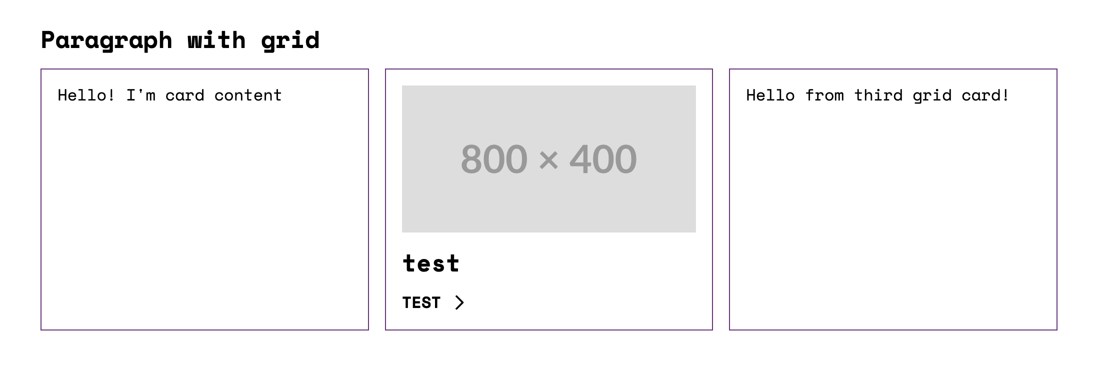](https://gyazo.com/7212a3f44052ebde34b59a1555d96afe)
|
|
198
|
-
|
|
199
|
-
## Core and custom story node types
|
|
200
|
-
|
|
201
|
-
Plugin supports these core story node types: `component`, `element`, `image`, and `icon`.
|
|
202
|
-
|
|
203
|
-
Use `component` to nest other components within your story.
|
|
204
|
-
|
|
205
|
-
```yaml
|
|
206
|
-
type: component
|
|
207
|
-
component: 'umami:badge'
|
|
208
|
-
```
|
|
209
|
-
|
|
210
|
-
Use `element` to embed HTML markup within a specific tag.
|
|
211
|
-
|
|
212
|
-
```yaml
|
|
213
|
-
type: element
|
|
214
|
-
value: 'Hello World!'
|
|
215
|
-
attributes:
|
|
216
|
-
class: custom-class
|
|
217
|
-
```
|
|
218
|
-
|
|
219
|
-
Use `image` to embed images into your story.
|
|
220
|
-
|
|
221
|
-
```yaml
|
|
222
|
-
type: image
|
|
223
|
-
uri: https://placehold.co/1200x400
|
|
224
|
-
attributes:
|
|
225
|
-
class: custom-class
|
|
226
|
-
```
|
|
227
|
-
|
|
228
|
-
Example of using `element` and `image` in a story:
|
|
229
|
-
|
|
230
|
-
```yaml
|
|
231
|
-
thirdPartySettings:
|
|
232
|
-
sdcStorybook:
|
|
233
|
-
stories:
|
|
234
|
-
preview:
|
|
235
|
-
slots:
|
|
236
|
-
content:
|
|
237
|
-
# Result:
|
|
238
|
-
# <h2 class="custom-class"><span>Hello</span></h2>
|
|
239
|
-
- type: element
|
|
240
|
-
tag: 'h2'
|
|
241
|
-
value: '<span>Hello</span>'
|
|
242
|
-
attributes:
|
|
243
|
-
class: 'custom-class'
|
|
244
|
-
|
|
245
|
-
# Result:
|
|
246
|
-
# <img class="custom-class" src="https://placehold.co/600x400" />
|
|
247
|
-
- type: image
|
|
248
|
-
uri: 'https://placehold.co/600x400'
|
|
249
|
-
attributes:
|
|
250
|
-
class: 'custom-class'
|
|
251
|
-
```
|
|
252
|
-
|
|
253
|
-
Use `icon` to render an icon from the [Drupal Icon API](#drupal-icon-api). It is
|
|
254
|
-
a built-in node type — `{ pack_id, icon_id }` is rendered through the same
|
|
255
|
-
pipeline as the `icon()` Twig function (inline SVG, recolorable):
|
|
256
|
-
|
|
257
|
-
```yaml
|
|
258
|
-
- type: icon
|
|
259
|
-
pack_id: my_svg
|
|
260
|
-
icon_id: star
|
|
261
|
-
settings:
|
|
262
|
-
color: '#e53935'
|
|
263
|
-
```
|
|
264
|
-
|
|
265
|
-
### Custom node types
|
|
266
|
-
|
|
267
|
-
Story slots are filled with **render-array nodes** — the built-in `component`,
|
|
268
|
-
`element`, `image`, `icon` and `markup` types you saw above. `customNodes` lets
|
|
269
|
-
you teach the addon **your own node type**, so a recurring piece of markup
|
|
270
|
-
becomes a short, declarative node instead of raw HTML copy-pasted into every
|
|
271
|
-
story.
|
|
272
|
-
|
|
273
|
-
`match` decides which nodes a renderer handles. `render` returns **either an
|
|
274
|
-
HTML string** (a leaf) **or another node** — a built-in node or array — which the
|
|
275
|
-
addon resolves the same way as everything else. Because it goes through the same
|
|
276
|
-
pipeline, a custom type works wherever a node can appear and supports nesting.
|
|
277
|
-
|
|
278
|
-
A leaf, returning HTML — e.g. a YouTube embed reused across stories:
|
|
279
|
-
|
|
280
|
-
```js
|
|
281
|
-
sdcStorybookOptions: {
|
|
282
|
-
customNodes: [
|
|
283
|
-
{
|
|
284
|
-
match: (item) => item.type === 'youtube',
|
|
285
|
-
render: item =>
|
|
286
|
-
`<iframe src="https://www.youtube.com/embed/${item.id}" allowfullscreen></iframe>`,
|
|
287
|
-
},
|
|
288
|
-
],
|
|
289
|
-
}
|
|
290
|
-
```
|
|
291
|
-
|
|
292
|
-
```yaml
|
|
293
|
-
- type: youtube
|
|
294
|
-
id: aqz-KE-bpKQ
|
|
295
|
-
```
|
|
296
|
-
|
|
297
|
-
A structural node, returning another node — its `value` may hold nested
|
|
298
|
-
render-array content (a string plus an `icon`, another component, …), resolved by
|
|
299
|
-
the pipeline:
|
|
300
|
-
|
|
301
|
-
```js
|
|
302
|
-
customNodes: [
|
|
303
|
-
{
|
|
304
|
-
match: (item) => item.type === 'link',
|
|
305
|
-
render: (item) => ({
|
|
306
|
-
type: 'element',
|
|
307
|
-
tag: 'a',
|
|
308
|
-
attributes: { class: 'custom-link', href: item.url ?? '#' },
|
|
309
|
-
value: item.value,
|
|
310
|
-
}),
|
|
311
|
-
},
|
|
312
|
-
]
|
|
313
|
-
```
|
|
314
|
-
|
|
315
|
-
```yaml
|
|
316
|
-
- type: link
|
|
317
|
-
url: 'https://example.com'
|
|
318
|
-
value:
|
|
319
|
-
- 'Read the docs '
|
|
320
|
-
- type: icon
|
|
321
|
-
pack_id: heroicons_cdn
|
|
322
|
-
icon_id: arrow-long-right
|
|
323
|
-
```
|
|
324
|
-
|
|
325
|
-
> **Deprecated:** the previous `storyNodesRenderer` option has been replaced by `customNodes`.
|
|
326
|
-
|
|
327
|
-
## Docs addon?
|
|
328
|
-
|
|
329
|
-
The storybook docs addon works out of the box.
|
|
330
|
-
|
|
331
|
-
## Support for Single Story Files (`*.story.yml`)
|
|
332
|
-
|
|
333
|
-
In addition to stories defined inside `*.component.yml` files, the addon now supports standalone story files with the `.story.yml` extension.
|
|
334
|
-
|
|
335
|
-
This means you can create independent stories for your components by simply adding a `.story.yml` file in your component directory. These files are automatically discovered and indexed by Storybook, allowing you to organize and share stories outside of the main component YAML.
|
|
336
|
-
|
|
337
|
-
**Example:**
|
|
338
|
-
|
|
339
|
-
```yaml
|
|
340
|
-
# components/slider/slider.badges.story.yml
|
|
341
|
-
name: Badges
|
|
342
|
-
slots:
|
|
343
|
-
slides:
|
|
344
|
-
- type: component
|
|
345
|
-
component: 'umami:badge'
|
|
346
|
-
props:
|
|
347
|
-
icon: timer
|
|
348
|
-
slots:
|
|
349
|
-
text: Hello
|
|
350
|
-
- type: component
|
|
351
|
-
component: 'umami:badge'
|
|
352
|
-
props:
|
|
353
|
-
icon: serves
|
|
354
|
-
slots:
|
|
355
|
-
text: Bonjour
|
|
356
|
-
- type: component
|
|
357
|
-
component: 'umami:badge'
|
|
358
|
-
props:
|
|
359
|
-
icon: difficulty
|
|
360
|
-
slots:
|
|
361
|
-
text: Ciao
|
|
362
|
-
```
|
|
363
|
-
|
|
364
|
-
## Namespaces
|
|
365
|
-
|
|
366
|
-
Namespace logic mirrors the behavior of Drupal themes and modules. This means your namespaces can be used:
|
|
367
|
-
|
|
368
|
-
In Twig as `namespace:component`:
|
|
369
|
-
|
|
370
|
-
```twig
|
|
371
|
-
{% include 'umami:title' %}
|
|
372
|
-
```
|
|
373
|
-
|
|
374
|
-
And in story definitions within YAML files:
|
|
375
|
-
|
|
376
|
-
```yaml
|
|
377
|
-
- type: component
|
|
378
|
-
component: 'umami:title'
|
|
379
|
-
```
|
|
380
|
-
|
|
381
|
-
### Namespace definitions:
|
|
382
|
-
|
|
383
|
-
- **Default Namespace**: The addon works out of the box without requiring namespace configuration and will use the current directory name as the default namespace, mirroring the behavior of a Drupal theme or module.
|
|
384
|
-
For example, if your `package.json` is in the `my-theme` directory, the default namespace will be `my-theme`, and this namespace will be linked to the `./components` directory.
|
|
385
|
-
|
|
386
|
-
- **Custom Namespace**: If you want to use a custom namespace or explicitly set the namespace, you can specify it in the plugin configuration:
|
|
387
|
-
|
|
388
|
-
```js
|
|
389
|
-
sdcStorybookOptions: {
|
|
390
|
-
...
|
|
391
|
-
namespace: 'umami',
|
|
392
|
-
},
|
|
393
|
-
```
|
|
394
|
-
|
|
395
|
-
- **Multiple Namespaces**: The most powerful feature is the ability to use multiple namespaces.
|
|
396
|
-
This allows you to use components from other directories (parent or sibling).
|
|
397
|
-
These directories must also contain a `/components` directory with SDC components.
|
|
398
|
-
|
|
399
|
-
```js
|
|
400
|
-
import { resolve } from 'node:path'
|
|
401
|
-
sdcStorybookOptions: {
|
|
402
|
-
namespaces: {
|
|
403
|
-
'parent-namespace': resolve('../parent-namespace'),
|
|
404
|
-
'grandparent-namespace': resolve('../../grandparent-namespace'),
|
|
405
|
-
},
|
|
406
|
-
},
|
|
407
|
-
```
|
|
408
|
-
|
|
409
|
-
Due to the specifics of the indexer implementation, you also need to duplicate the component paths in the `stories` array:
|
|
410
|
-
|
|
411
|
-
```js
|
|
412
|
-
stories: [
|
|
413
|
-
'../components/**/*.component.yml',
|
|
414
|
-
'../../parent-namespace/components/**/*.component.yml',
|
|
415
|
-
'../../../grandparent-namespace/components/**/*.component.yml',
|
|
416
|
-
],
|
|
417
|
-
```
|
|
418
|
-
|
|
419
|
-
- **Non Component Namespaces**: If you want to use components from a directory that does not follow the SDC structure (i.e., does not have a `components` directory), you can define a namespace that points directly to that directory. For example, if you have an `assets` directory with SVG icons:
|
|
420
|
-
|
|
421
|
-
```js
|
|
422
|
-
sdcStorybookOptions: {
|
|
423
|
-
namespaces: {
|
|
424
|
-
'assets': join(cwd(), './assets'),
|
|
425
|
-
},
|
|
426
|
-
},
|
|
427
|
-
```
|
|
428
|
-
|
|
429
|
-
In this case, the addon will look for components directly in the specified directory.
|
|
430
|
-
And you can use them in twig and stories as usual:
|
|
431
|
-
|
|
432
|
-
```twig
|
|
433
|
-
{% include '@assets/icons/example.svg' %}
|
|
434
|
-
```
|
|
435
|
-
|
|
436
|
-
## Drupal Icon API
|
|
437
|
-
|
|
438
|
-
The addon automatically supports Drupal's [Icon API](https://www.drupal.org/docs/develop/drupal-apis/icon-api) (introduced in Drupal 11.1). No configuration is required — as soon as a `{namespace}.icons.yml` file is found next to the `components/` directory of any registered namespace, the `icon()` Twig function becomes available in every template.
|
|
439
|
-
|
|
440
|
-
```twig
|
|
441
|
-
{{ icon('pack_id', 'icon_id') }}
|
|
442
|
-
{{ icon('pack_id', 'icon_id', { size: 'sm', class: 'my-icon' }) }}
|
|
443
|
-
```
|
|
444
|
-
|
|
445
|
-
### `{namespace}.icons.yml`
|
|
446
|
-
|
|
447
|
-
Place the file alongside the `components/` directory (i.e. the theme/module root):
|
|
448
|
-
|
|
449
|
-
```
|
|
450
|
-
my-theme/
|
|
451
|
-
├── components/
|
|
452
|
-
│ └── button/
|
|
453
|
-
│ └── button.component.yml
|
|
454
|
-
├── icons/
|
|
455
|
-
│ ├── sprite.svg
|
|
456
|
-
│ └── svg/
|
|
457
|
-
│ ├── home.svg
|
|
458
|
-
│ └── star.svg
|
|
459
|
-
└── my-theme.icons.yml ← discovered automatically
|
|
460
|
-
```
|
|
461
|
-
|
|
462
|
-
### Extractors
|
|
463
|
-
|
|
464
|
-
Three extractors are supported, matching Drupal core. A single pack file can contain any mix:
|
|
465
|
-
|
|
466
|
-
```yaml
|
|
467
|
-
# my-theme.icons.yml
|
|
468
|
-
|
|
469
|
-
# svg_sprite — single sprite file; icons referenced via <use href="{{ source }}#{{ icon_id }}">.
|
|
470
|
-
# content is empty — the template constructs <use> itself.
|
|
471
|
-
# Template context: icon_id, source (sprite URL), attributes (empty), group, settings.
|
|
472
|
-
my_sprite:
|
|
473
|
-
label: 'My Icons (Sprite)'
|
|
474
|
-
extractor: svg_sprite
|
|
475
|
-
config:
|
|
476
|
-
sources:
|
|
477
|
-
- icons/sprite.svg
|
|
478
|
-
settings:
|
|
479
|
-
size:
|
|
480
|
-
type: string
|
|
481
|
-
default: md
|
|
482
|
-
template: >
|
|
483
|
-
<svg {{ attributes
|
|
484
|
-
.setAttribute('width', size == 'sm' ? '16' : (size == 'lg' ? '32' : '24'))
|
|
485
|
-
.setAttribute('height', size == 'sm' ? '16' : (size == 'lg' ? '32' : '24'))
|
|
486
|
-
.setAttribute('aria-hidden', 'true')
|
|
487
|
-
}}>
|
|
488
|
-
<use href="{{ source }}#{{ icon_id }}"></use>
|
|
489
|
-
</svg>
|
|
490
|
-
|
|
491
|
-
# svg — individual SVG files inlined at build time; inner markup provided as content.
|
|
492
|
-
# Template context: icon_id, source (file URL), content (inner markup, no <svg> wrapper),
|
|
493
|
-
# attributes (DrupalAttribute pre-populated from the original <svg> element), group, settings.
|
|
494
|
-
my_svg:
|
|
495
|
-
label: 'My Icons (Inline SVG)'
|
|
496
|
-
extractor: svg
|
|
497
|
-
config:
|
|
498
|
-
sources:
|
|
499
|
-
- icons/svg
|
|
500
|
-
- icons/social/*.svg
|
|
501
|
-
settings:
|
|
502
|
-
color:
|
|
503
|
-
type: string
|
|
504
|
-
default: currentColor
|
|
505
|
-
template: >
|
|
506
|
-
<svg {{ attributes
|
|
507
|
-
.setAttribute('fill', color)
|
|
508
|
-
.setAttribute('aria-hidden', 'true')
|
|
509
|
-
}}>{{ content }}</svg>
|
|
510
|
-
|
|
511
|
-
# path — files served by URL; use source as img src or CSS background-image.
|
|
512
|
-
# content is empty. Remote URLs (http://…) are supported.
|
|
513
|
-
# Template context: icon_id, source (file URL), attributes (empty), group, settings.
|
|
514
|
-
my_path:
|
|
515
|
-
label: 'My Icons (Path)'
|
|
516
|
-
extractor: path
|
|
517
|
-
config:
|
|
518
|
-
sources:
|
|
519
|
-
- icons/png/*.png
|
|
520
|
-
template: '<img src="{{ source }}" alt="{{ icon_id }}" aria-hidden="true">'
|
|
521
|
-
```
|
|
522
|
-
|
|
523
|
-
### Settings
|
|
524
|
-
|
|
525
|
-
Settings defined in `*.icons.yml` are exposed as template variables. Default values are applied automatically; the third argument to `icon()` overrides them at call time.
|
|
526
|
-
|
|
527
|
-
```yaml
|
|
528
|
-
settings:
|
|
529
|
-
size:
|
|
530
|
-
type: string # string | number | integer | boolean
|
|
531
|
-
default: md
|
|
532
|
-
color:
|
|
533
|
-
type: string
|
|
534
|
-
default: currentColor
|
|
535
|
-
```
|
|
536
|
-
|
|
537
|
-
### Production static build
|
|
538
|
-
|
|
539
|
-
For `storybook build`, add icon asset directories to `staticDirs` in `.storybook/main.js` so the files are copied into the build output:
|
|
86
|
+
## Features
|
|
540
87
|
|
|
541
|
-
|
|
542
|
-
staticDirs: [
|
|
543
|
-
{ from: '../components', to: '/components' },
|
|
544
|
-
{ from: '../icons', to: '/icons' }, // ← icon assets
|
|
545
|
-
],
|
|
546
|
-
```
|
|
88
|
+
Each link opens the feature's page in the live demo.
|
|
547
89
|
|
|
548
|
-
|
|
90
|
+
Writing stories:
|
|
549
91
|
|
|
550
|
-
|
|
92
|
+
- [Stories in YAML](https://iberdinsky-skilld.github.io/sdc-addon/?path=/docs/features-stories-in-yaml--docs): more stories in the component YAML or in `*.story.yml` files, parameters, globals, `library_wrapper`.
|
|
93
|
+
- [Story nodes](https://iberdinsky-skilld.github.io/sdc-addon/?path=/docs/features-story-nodes--docs): fill slots with components, HTML, images and icons.
|
|
94
|
+
- [Custom nodes](https://iberdinsky-skilld.github.io/sdc-addon/?path=/docs/features-custom-nodes--docs): your own node types for repeated markup.
|
|
95
|
+
- [Schemas and mock data](https://iberdinsky-skilld.github.io/sdc-addon/?path=/docs/features-schemas-and-mock-data--docs): default values, generated values, Controls, shared definitions.
|
|
551
96
|
|
|
552
|
-
|
|
97
|
+
Drupal APIs:
|
|
553
98
|
|
|
554
|
-
|
|
99
|
+
- [Namespaces](https://iberdinsky-skilld.github.io/sdc-addon/?path=/docs/features-namespaces--docs): components from base themes, modules and other folders.
|
|
100
|
+
- [Icon API](https://iberdinsky-skilld.github.io/sdc-addon/?path=/docs/features-icon-api--docs): `{theme}.icons.yml` and `icon()`, Drupal 11.1.
|
|
101
|
+
- [Design tokens](https://iberdinsky-skilld.github.io/sdc-addon/?path=/docs/features-design-tokens--docs): `{theme}.tokens.yml` as CSS variables, experimental.
|
|
102
|
+
- [Variants and html_cva()](https://iberdinsky-skilld.github.io/sdc-addon/?path=/docs/features-variants-and-html-cva--docs): component variants (Drupal 11.2) and `html_cva()` (Drupal 11.4).
|
|
103
|
+
- [Form elements](https://iberdinsky-skilld.github.io/sdc-addon/?path=/docs/features-form-elements--docs): `form_state` for components used as form fields, Drupal 11.4.
|
|
104
|
+
- [Libraries and CDN](https://iberdinsky-skilld.github.io/sdc-addon/?path=/docs/features-libraries-and-cdn--docs): library dependencies from a CDN, Drupal behaviors.
|
|
555
105
|
|
|
556
|
-
|
|
106
|
+
Storybook:
|
|
557
107
|
|
|
558
|
-
|
|
108
|
+
- [Sidebar and noUi](https://iberdinsky-skilld.github.io/sdc-addon/?path=/docs/features-sidebar-and-noui--docs): grouping, folders and the `no-ui` tag, Drupal 11.3.
|
|
109
|
+
- [SDC in CSF stories](https://iberdinsky-skilld.github.io/sdc-addon/?path=/docs/features-sdc-in-csf-stories--docs): components in regular `.stories.js` files.
|
|
110
|
+
- [Accessibility](https://iberdinsky-skilld.github.io/sdc-addon/?path=/docs/features-accessibility--docs): the a11y addon on SDC stories.
|
|
559
111
|
|
|
560
|
-
|
|
112
|
+
## Addon options
|
|
561
113
|
|
|
562
|
-
|
|
114
|
+
### `sdcStorybookOptions`
|
|
563
115
|
|
|
564
|
-
|
|
565
|
-
components
|
|
566
|
-
|
|
567
|
-
|
|
568
|
-
|
|
569
|
-
|
|
570
|
-
|
|
571
|
-
|
|
572
|
-
|
|
573
|
-
|
|
574
|
-
```
|
|
116
|
+
- `twigLib`: `'twig'` (Twig.js, default) or `'twing'`.
|
|
117
|
+
- `namespace`: the name of your own namespace. Default: the name of the folder that holds `components/`.
|
|
118
|
+
- `namespaces`: other namespaces, `{ name: path }`. Add their component folders to `stories` too. A path without a `components/` folder is a plain Twig namespace, `@name/file.svg`.
|
|
119
|
+
- `customNodes`: your own story node types, `[{ match(node), render(node) }]`.
|
|
120
|
+
- `resolveIconSource`: `(source) => url`, rewrites icon sources such as `/libraries/...`.
|
|
121
|
+
- `dependencyMap`: Drupal library names to CDN assets, `{ 'core/jquery': [{ type: 'js', url }] }`. See below.
|
|
122
|
+
- `externalDefs`: URLs or paths of schema definition files for `$ref`.
|
|
123
|
+
- `customDefs`: schema definitions keyed by their `$ref`.
|
|
124
|
+
- `validate`: `true` checks component YAML against Drupal's metadata schema, or pass the URL of another schema. Problems are logged as warnings.
|
|
125
|
+
- `useBasicArgsForStories`: `true` (default) starts every story from the Basic story's values.
|
|
575
126
|
|
|
576
|
-
|
|
127
|
+
#### `dependencyMap`
|
|
577
128
|
|
|
578
|
-
|
|
129
|
+
These are always loaded, so Drupal behaviors work:
|
|
579
130
|
|
|
580
|
-
|
|
131
|
+
| Key | Assets |
|
|
132
|
+
| --------------------- | ------------------------------------------------ |
|
|
133
|
+
| `system/base/hidden` | `hidden.module.css` (`.visually-hidden` utility) |
|
|
134
|
+
| `core/drupalSettings` | `drupalSettingsLoader.js` |
|
|
135
|
+
| `core/drupal` | `drupal.js`, `drupal.init.js` |
|
|
136
|
+
| `core/once` | `once.min.js` |
|
|
581
137
|
|
|
582
|
-
|
|
138
|
+
Other entries load only for stories of components that list them in `libraryOverrides.dependencies`.
|
|
583
139
|
|
|
584
140
|
```js
|
|
585
|
-
|
|
586
|
-
|
|
587
|
-
|
|
588
|
-
|
|
589
|
-
|
|
590
|
-
|
|
591
|
-
|
|
592
|
-
|
|
593
|
-
title: 'Regular Storybook Page',
|
|
594
|
-
render: () => {
|
|
595
|
-
return `
|
|
596
|
-
${header.component({ ...HeaderPreview.args })}
|
|
597
|
-
${banner.component({ ...BannerPreview.args })}
|
|
598
|
-
`
|
|
599
|
-
},
|
|
600
|
-
play: async ({ canvasElement }) => {
|
|
601
|
-
Drupal.attachBehaviors(canvasElement, window.drupalSettings)
|
|
602
|
-
},
|
|
603
|
-
}
|
|
604
|
-
|
|
605
|
-
export const Basic = {}
|
|
141
|
+
dependencyMap: {
|
|
142
|
+
// Add a dependency
|
|
143
|
+
'core/jquery': [{ type: 'js', url: 'https://cdn.jsdelivr.net/npm/jquery@3/dist/jquery.min.js' }],
|
|
144
|
+
// Replace a built-in one
|
|
145
|
+
'core/once': [{ type: 'js', url: 'https://cdn.example.com/once@2.min.js' }],
|
|
146
|
+
// Turn a built-in one off
|
|
147
|
+
'system/base/hidden': [],
|
|
148
|
+
},
|
|
606
149
|
```
|
|
607
150
|
|
|
608
|
-
|
|
609
|
-
|
|
610
|
-
- **vitePluginTwigDrupalOptions**: Options for [vite-plugin-twig-drupal](https://github.com/larowlan/vite-plugin-twig-drupal) (Twig.js). Use when `twigLib` is set to `'twig'`.
|
|
611
|
-
- **vitePluginTwingDrupalOptions**: Options for [vite-plugin-twing-drupal](https://github.com/christianwiedemann/vite-plugin-twing-drupal) (Twing). Use when `twigLib` is set to `'twing'`.
|
|
612
|
-
- **customDefs**: An object with custom JSON schema definitions for your components.
|
|
613
|
-
- **externalDefs**: An array of URLs or local file paths to external schema definition files.
|
|
614
|
-
- **validate**: A URL or path to a JSON schema for validating your SDC components.
|
|
615
|
-
- **useBasicArgsForStories**: Boolean. When `true` (default) generated stories inherit `...Basic.args` from the component; set to `false` to prevent automatic spreading of `Basic.args`.
|
|
616
|
-
- **dependencyMap**: Maps Drupal library names to CDN assets. See [`dependencyMap`](#dependencymap).
|
|
617
|
-
|
|
618
|
-
### Twig.js with `vitePluginTwigDrupalOptions`
|
|
151
|
+
### `vitePluginTwigDrupalOptions`
|
|
619
152
|
|
|
620
|
-
|
|
153
|
+
Options for [vite-plugin-twig-drupal](https://github.com/larowlan/vite-plugin-twig-drupal) when `twigLib` is `'twig'`, such as extra Twig functions and global variables:
|
|
621
154
|
|
|
622
155
|
```js
|
|
623
156
|
vitePluginTwigDrupalOptions: {
|
|
624
157
|
functions: {
|
|
625
|
-
|
|
626
|
-
|
|
627
|
-
reverse: (twigInstance) => twigInstance.extendFunction("reverse", () => (text) => text.split(' ').reverse().join(' ')),
|
|
628
|
-
// e.g. extendFilter to register a filter
|
|
629
|
-
clean_unique_id: (twigInstance) => twigInstance.extendFilter("clean_unique_id", () => (text) => text.split(' ').reverse().join(' ')),
|
|
158
|
+
reverse: (twig) =>
|
|
159
|
+
twig.extendFunction('reverse', () => (text) => text.split(' ').reverse().join(' ')),
|
|
630
160
|
},
|
|
631
161
|
globalContext: {
|
|
632
|
-
|
|
633
|
-
active_theme: 'my_super_theme',
|
|
162
|
+
active_theme: 'my_theme',
|
|
634
163
|
is_front_page: false,
|
|
635
164
|
},
|
|
636
165
|
},
|
|
637
166
|
```
|
|
638
167
|
|
|
639
|
-
###
|
|
168
|
+
### `vitePluginTwingDrupalOptions`
|
|
640
169
|
|
|
641
|
-
|
|
170
|
+
Options for [vite-plugin-twing-drupal](https://github.com/christianwiedemann/vite-plugin-twing-drupal) when `twigLib` is `'twing'`. `hooks` points to a module that can change the Twing environment:
|
|
642
171
|
|
|
643
172
|
```js
|
|
644
173
|
vitePluginTwingDrupalOptions: {
|
|
645
|
-
// (Optional) With twing hooks you can adjust twing environment.
|
|
646
174
|
hooks: join(cwd(), '.storybook/twing-hooks.js'),
|
|
647
175
|
},
|
|
648
176
|
```
|
|
649
177
|
|
|
650
|
-
Sample twing hook file.
|
|
651
|
-
|
|
652
178
|
```js
|
|
653
179
|
// .storybook/twing-hooks.js
|
|
654
180
|
import { createSynchronousFunction } from 'twing'
|
|
655
181
|
|
|
656
|
-
|
|
657
|
-
|
|
658
|
-
|
|
659
|
-
|
|
660
|
-
|
|
661
|
-
|
|
662
|
-
|
|
663
|
-
export function initEnvironment(twingEnvironment) {
|
|
664
|
-
const func = createSynchronousFunction('testFunction', testFunction, [
|
|
665
|
-
'parameter',
|
|
666
|
-
])
|
|
667
|
-
twingEnvironment.addFunction(func)
|
|
668
|
-
}
|
|
669
|
-
```
|
|
670
|
-
|
|
671
|
-
### `customDefs`
|
|
672
|
-
|
|
673
|
-
The `customDefs` option allows you to define custom schema definitions directly within your configuration. This can be object with custom definitions.
|
|
674
|
-
|
|
675
|
-
Example:
|
|
676
|
-
|
|
677
|
-
```typescript
|
|
678
|
-
const options = {
|
|
679
|
-
sdcStorybookOptions: {
|
|
680
|
-
customDefs: {
|
|
681
|
-
'json-schema-definitions://experience_builder.module/column-width': {
|
|
682
|
-
title: 'Column Width',
|
|
683
|
-
type: 'integer',
|
|
684
|
-
enum: [25, 33, 50],
|
|
685
|
-
},
|
|
686
|
-
},
|
|
687
|
-
},
|
|
182
|
+
export function initEnvironment(env) {
|
|
183
|
+
env.addFunction(
|
|
184
|
+
createSynchronousFunction('shout', (_context, text) => `${text}!`, [
|
|
185
|
+
{ name: 'text' },
|
|
186
|
+
])
|
|
187
|
+
)
|
|
688
188
|
}
|
|
689
189
|
```
|
|
690
190
|
|
|
691
|
-
### `
|
|
191
|
+
### `jsonSchemaFakerOptions`
|
|
692
192
|
|
|
693
|
-
|
|
193
|
+
Options for [json-schema-faker](https://github.com/json-schema-faker/json-schema-faker), which fills props and slots that have no `default` or `examples`.
|
|
694
194
|
|
|
695
|
-
|
|
195
|
+
## Story options
|
|
696
196
|
|
|
697
|
-
|
|
698
|
-
const options = {
|
|
699
|
-
sdcStorybookOptions: {
|
|
700
|
-
externalDefs: [
|
|
701
|
-
'https://cdn.jsdelivr.net/gh/iberdinsky-skilld/sdc-addon@v0.4.3/drupal-defs/uiPatternsSchema.yml',
|
|
702
|
-
'https://example.com/path/to/definitions.yml',
|
|
703
|
-
'./local/path/to/definitions.yml',
|
|
704
|
-
],
|
|
705
|
-
},
|
|
706
|
-
}
|
|
707
|
-
```
|
|
708
|
-
|
|
709
|
-
When using externalDefs, the definitions will be fetched and registered automatically.
|
|
710
|
-
|
|
711
|
-
### `validate`
|
|
712
|
-
|
|
713
|
-
The `validate` option enables schema validation for SDC components using the [JSON Schema](https://www.npmjs.com/package/jsonschema) validator. By default, the validator checks the component configurations against the global schema located at:
|
|
714
|
-
|
|
715
|
-
```
|
|
716
|
-
$schema: https://git.drupalcode.org/project/drupal/-/raw/HEAD/core/assets/schemas/v1/metadata.schema.json
|
|
717
|
-
```
|
|
718
|
-
|
|
719
|
-
#### How It Works:
|
|
720
|
-
|
|
721
|
-
- **Global Schema Validation (Default):** The addon uses the default global schema for validation. This schema is provided by Drupal and ensures that SDC components conform to the expected structure with the correct data types and properties.
|
|
722
|
-
|
|
723
|
-
- **Custom Component Schema:** If a specific SDC component includes its own `$schema` field pointing to a custom schema, the validator will use that schema for validation instead of the global one. This allows for more flexibility and component-specific validation, especially when components have custom requirements.
|
|
724
|
-
|
|
725
|
-
- **Validation Warnings:** Validation errors or warnings are logged to the console, helping developers identify any issues with component configurations. **Note:** Validation will not break the rendering of the components. Even if a validation error occurs, the component will still appear in Storybook, and the warning will be logged for review.
|
|
726
|
-
|
|
727
|
-
To enable validation, set `validate: true` (Drupal core's schema) or pass the URL of your own default schema:
|
|
728
|
-
|
|
729
|
-
```js
|
|
730
|
-
const config = {
|
|
731
|
-
stories: ['../components/**/*.component.yml'],
|
|
732
|
-
addons: [
|
|
733
|
-
{
|
|
734
|
-
name: 'storybook-addon-sdc',
|
|
735
|
-
options: {
|
|
736
|
-
sdcStorybookOptions: {
|
|
737
|
-
// true = https://git.drupalcode.org/project/drupal/-/raw/HEAD/core/assets/schemas/v1/metadata.schema.json
|
|
738
|
-
validate: true,
|
|
739
|
-
},
|
|
740
|
-
},
|
|
741
|
-
},
|
|
742
|
-
],
|
|
743
|
-
}
|
|
744
|
-
```
|
|
745
|
-
|
|
746
|
-
A component's own `$schema` always takes precedence over the default. Validation only warns: a failing or unreachable schema never removes a component from Storybook.
|
|
747
|
-
|
|
748
|
-
### `useBasicArgsForStories`
|
|
749
|
-
|
|
750
|
-
By default, when generating stories for your SDC components, the addon automatically spreads the `Basic.args` into each generated story. This behavior can be controlled using the `useBasicArgsForStories` option.
|
|
751
|
-
|
|
752
|
-
```js
|
|
753
|
-
useBasicArgsForStories: false,
|
|
754
|
-
```
|
|
755
|
-
|
|
756
|
-
When set to `false`, the generated stories will not inherit the `Basic.args`, allowing you to define story-specific arguments without the influence of the default `Basic` configuration.
|
|
757
|
-
|
|
758
|
-
### `dependencyMap`
|
|
759
|
-
|
|
760
|
-
Maps Drupal library dependency names to CDN assets to inject into the Storybook preview.
|
|
761
|
-
|
|
762
|
-
The addon ships with a built-in `DEFAULT_DEPENDENCY_MAP` covering the Drupal runtime — these are always injected into every preview page:
|
|
763
|
-
|
|
764
|
-
| Key | Assets |
|
|
765
|
-
| --------------------- | ------------------------------------------------ |
|
|
766
|
-
| `system/base/hidden` | `hidden.module.css` (`.visually-hidden` utility) |
|
|
767
|
-
| `core/drupalSettings` | `drupalSettingsLoader.js` |
|
|
768
|
-
| `core/drupal` | `drupal.js`, `drupal.init.js` |
|
|
769
|
-
| `core/once` | `once.min.js` |
|
|
770
|
-
|
|
771
|
-
User-provided entries are injected **per-component** — only when a component declares that dependency in `libraryOverrides.dependencies`. This means `core/jquery` only loads when a story actually uses a component that needs it.
|
|
772
|
-
|
|
773
|
-
```js
|
|
774
|
-
sdcStorybookOptions: {
|
|
775
|
-
dependencyMap: {
|
|
776
|
-
// Add a new dependency
|
|
777
|
-
'core/jquery': [{ type: 'js', url: 'https://cdn.jsdelivr.net/npm/jquery@3/dist/jquery.min.js' }],
|
|
778
|
-
// Override a built-in default
|
|
779
|
-
'core/once': [{ type: 'js', url: 'https://cdn.example.com/once@2.min.js' }],
|
|
780
|
-
// Disable a built-in default
|
|
781
|
-
'system/base/hidden': [],
|
|
782
|
-
},
|
|
783
|
-
}
|
|
784
|
-
```
|
|
785
|
-
|
|
786
|
-
In the component YAML, declare the dependency as usual:
|
|
787
|
-
|
|
788
|
-
```yaml
|
|
789
|
-
libraryOverrides:
|
|
790
|
-
dependencies:
|
|
791
|
-
- core/jquery
|
|
792
|
-
```
|
|
793
|
-
|
|
794
|
-
---
|
|
795
|
-
|
|
796
|
-
## Setting Default Values
|
|
797
|
-
|
|
798
|
-
For `json-schema-faker` to generate reliable data, use `default` or `examples` in your SDC schema:
|
|
799
|
-
|
|
800
|
-
```yaml
|
|
801
|
-
props:
|
|
802
|
-
type: object
|
|
803
|
-
properties:
|
|
804
|
-
html_tag:
|
|
805
|
-
type: string
|
|
806
|
-
enum:
|
|
807
|
-
- article
|
|
808
|
-
- div
|
|
809
|
-
default: article
|
|
810
|
-
slots:
|
|
811
|
-
content:
|
|
812
|
-
title: Content
|
|
813
|
-
examples:
|
|
814
|
-
- Hello! I'm card content
|
|
815
|
-
```
|
|
816
|
-
|
|
817
|
-
Refer to:
|
|
818
|
-
|
|
819
|
-
- [Drupal SDC Documentation](https://www.drupal.org/docs/develop/theming-drupal/using-single-directory-components/annotated-example-componentyml)
|
|
820
|
-
- [JSON Schema Documentation](https://json-schema.org/understanding-json-schema/reference/annotations)
|
|
821
|
-
|
|
822
|
-
## Story Configuration via `thirdPartySettings.sdcStorybook`
|
|
823
|
-
|
|
824
|
-
The **sdc-addon** now supports configuring how stories are generated from your `component.yml` file.
|
|
825
|
-
You can use the new key `thirdPartySettings.sdcStorybook` to define Storybook-specific settings and control which stories are created.
|
|
826
|
-
|
|
827
|
-
### Example
|
|
197
|
+
Story settings live in the component YAML under `thirdPartySettings.sdcStorybook`:
|
|
828
198
|
|
|
829
199
|
```yaml
|
|
830
200
|
thirdPartySettings:
|
|
831
201
|
sdcStorybook:
|
|
832
|
-
tags:
|
|
833
|
-
|
|
834
|
-
disabledStories:
|
|
835
|
-
- basic
|
|
202
|
+
tags: [autodocs]
|
|
203
|
+
disabledStories: [basic]
|
|
836
204
|
parameters:
|
|
837
|
-
layout:
|
|
205
|
+
layout: centered
|
|
838
206
|
globals:
|
|
839
|
-
theme:
|
|
207
|
+
theme: dark
|
|
840
208
|
stories:
|
|
841
209
|
preview:
|
|
210
|
+
name: Preview
|
|
211
|
+
description: Card with an image.
|
|
842
212
|
props:
|
|
843
|
-
|
|
844
|
-
|
|
845
|
-
|
|
846
|
-
|
|
847
|
-
globals:
|
|
848
|
-
|
|
849
|
-
```
|
|
850
|
-
|
|
851
|
-
### Option Reference
|
|
852
|
-
|
|
853
|
-
Below is a list of all available configuration options for `thirdPartySettings.sdcStorybook`:
|
|
854
|
-
|
|
855
|
-
| Key | Type | Description |
|
|
856
|
-
| ----------------- | -------- | ------------------------------------------------------------------------------------------------------------------------------------------------------------------------------------------------------------------------ |
|
|
857
|
-
| `tags` | `array` | Optional. Adds additional [Storybook tags](https://storybook.js.org/docs/writing-docs/autodocs) (e.g. `autodocs`). |
|
|
858
|
-
| `disabledStories` | `array` | Optional. Array of story names to disable. Supports `basic`, `preview`, or any custom story name. Use `all` to disable all stories. |
|
|
859
|
-
| `parameters` | `object` | Global [Storybook parameters](https://storybook.js.org/docs/writing-stories/parameters) applied to all generated stories. |
|
|
860
|
-
| `globals` | `object` | Global [Storybook globals](https://storybook.js.org/docs/essentials/toolbars-and-globals) applied to all generated stories. Story-level `globals` override component-level values. |
|
|
861
|
-
| `stories` | `object` | Allows defining or overriding specific stories. Each key (e.g. `preview`) represents a story. Within each story, you can define `props`, `slots`, `parameters`, `globals`, `description`, `name`, and `library_wrapper`. |
|
|
862
|
-
|
|
863
|
-
### Disabled Stories Examples
|
|
864
|
-
|
|
865
|
-
```yaml
|
|
866
|
-
# Disable only the basic story
|
|
867
|
-
disabledStories:
|
|
868
|
-
- basic
|
|
869
|
-
|
|
870
|
-
# Disable basic and preview stories
|
|
871
|
-
disabledStories:
|
|
872
|
-
- basic
|
|
873
|
-
- preview
|
|
874
|
-
|
|
875
|
-
# Disable all stories
|
|
876
|
-
disabledStories:
|
|
877
|
-
- all
|
|
213
|
+
html_tag: div
|
|
214
|
+
slots:
|
|
215
|
+
content: Hello!
|
|
216
|
+
parameters: {}
|
|
217
|
+
globals: {}
|
|
218
|
+
library_wrapper: '<div class="wrapper">{{ _story }}</div>'
|
|
878
219
|
```
|
|
879
220
|
|
|
880
|
-
|
|
221
|
+
- `tags`: [Storybook tags](https://storybook.js.org/docs/writing-docs/autodocs), such as `autodocs`.
|
|
222
|
+
- `disabledStories`: story keys to hide, `basic` for the Basic story, or `all`.
|
|
223
|
+
- `parameters` and `globals`: for every story of the component; a story's own values win.
|
|
224
|
+
- `stories`: extra stories by key. A story can set `name`, `description`, `props`, `slots`, `parameters`, `globals` and `library_wrapper`.
|
|
881
225
|
|
|
882
|
-
|
|
883
|
-
thirdPartySettings:
|
|
884
|
-
sdcStorybook:
|
|
885
|
-
stories:
|
|
886
|
-
preview:
|
|
887
|
-
props:
|
|
888
|
-
variant: 'compact'
|
|
889
|
-
parameters:
|
|
890
|
-
layout: 'padded'
|
|
891
|
-
```
|
|
226
|
+
A story can also be its own file, `{component}.{story}.story.yml`, in the component folder or below it, with the same keys as one entry of `stories`.
|
|
892
227
|
|
|
893
|
-
|
|
228
|
+
### Globals
|
|
894
229
|
|
|
895
|
-
|
|
896
|
-
|
|
897
|
-
To use globals, define `globalTypes` in Storybook preview and set per-component globals in `component.yml`.
|
|
230
|
+
Globals need `globalTypes` in `.storybook/preview.js`. This demo's `theme`:
|
|
898
231
|
|
|
899
232
|
```js
|
|
900
233
|
// .storybook/preview.js
|
|
901
|
-
|
|
234
|
+
export default {
|
|
902
235
|
globalTypes: {
|
|
903
236
|
theme: {
|
|
904
237
|
description: 'Global theme for components',
|
|
@@ -910,91 +243,38 @@ const preview = {
|
|
|
910
243
|
},
|
|
911
244
|
},
|
|
912
245
|
},
|
|
913
|
-
initialGlobals: {
|
|
914
|
-
theme: 'light',
|
|
915
|
-
},
|
|
246
|
+
initialGlobals: { theme: 'light' },
|
|
916
247
|
decorators: [
|
|
917
248
|
(Story, context) => {
|
|
918
|
-
|
|
919
|
-
document.documentElement.dataset.theme = theme
|
|
249
|
+
document.documentElement.dataset.theme = context.globals.theme || 'light'
|
|
920
250
|
return Story()
|
|
921
251
|
},
|
|
922
252
|
],
|
|
923
253
|
}
|
|
924
|
-
export default preview
|
|
925
|
-
```
|
|
926
|
-
|
|
927
|
-
```yaml
|
|
928
|
-
thirdPartySettings:
|
|
929
|
-
sdcStorybook:
|
|
930
|
-
# For all stories of this component:
|
|
931
|
-
globals:
|
|
932
|
-
theme: dark
|
|
933
|
-
stories:
|
|
934
|
-
previewDark:
|
|
935
|
-
# Or on story level:
|
|
936
|
-
globals:
|
|
937
|
-
theme: dark
|
|
938
254
|
```
|
|
939
255
|
|
|
940
|
-
##
|
|
256
|
+
## Production static build
|
|
941
257
|
|
|
942
|
-
|
|
258
|
+
Icon pack sources are copied into the build automatically.
|
|
943
259
|
|
|
944
|
-
|
|
260
|
+
With Twig.js, if templates read component files with `source(componentMetadata.path ~ '/icons/x.svg')`, add the component folders to `staticDirs` for production builds:
|
|
945
261
|
|
|
946
|
-
|
|
947
|
-
|
|
948
|
-
|
|
949
|
-
|
|
950
|
-
|
|
951
|
-
|
|
952
|
-
### 1. Component Independence and Modularity
|
|
953
|
-
|
|
954
|
-
- Following the **BEM (Block Element Modifier)** methodology, a component should work independently across environments.
|
|
955
|
-
- The functionality of your component must not depend on the **Drupal version**, or the active **Drupal theme** — it should be portable to **any** system.
|
|
956
|
-
|
|
957
|
-
### 2. No Complex Drupal Setup Required
|
|
958
|
-
|
|
959
|
-
- No need to install or configure Drupal dependencies for component development.
|
|
960
|
-
- Work faster by developing frontend components in Storybook without running a heavy Drupal instance.
|
|
961
|
-
|
|
962
|
-
### 3. Simplifies DevOps and CI/CD Pipelines
|
|
963
|
-
|
|
964
|
-
- Since components are isolated, **testing and deployments** are simplified.
|
|
965
|
-
- You can **avoid Drupal-specific configuration** in CI pipelines, leading to more efficient and maintainable workflows.
|
|
966
|
-
|
|
967
|
-
### 4. Scalability and Flexibility with Faker.js and JSON Schema
|
|
968
|
-
|
|
969
|
-
- Tools like **Faker.js** let you generate test data for components without needing real content.
|
|
970
|
-
- **JSON Schema** defines component data clearly and consistently, helping maintain data integrity.
|
|
971
|
-
|
|
972
|
-
### 5. Industry-Standard Tool for Frontend Development
|
|
973
|
-
|
|
974
|
-
- **Storybook is widely adopted** in frontend development, which makes onboarding easier, even for developers unfamiliar with Drupal.
|
|
975
|
-
- JSON Schema enables working on components without deep Drupal knowledge, opening the project to a wider developer base.
|
|
976
|
-
|
|
977
|
-
### 6. Drupal-Specific Behavior Embedded in Components
|
|
978
|
-
|
|
979
|
-
- Embed **Drupal behaviors** (like `Drupal.attachBehaviors()`) directly into Storybook previews, ensuring consistent component behavior between Storybook and production.
|
|
980
|
-
- Supports `drupalSettings` and `once.js`, so components in Storybook behave identically to their Drupal counterparts.
|
|
981
|
-
|
|
982
|
-
### 7. Twig.js, Twing, and Drupal Twig
|
|
983
|
-
|
|
984
|
-
While using Drupal to render components offers tighter integration, there are strong reasons to use Twig.js or Twing in many scenarios:
|
|
262
|
+
```js
|
|
263
|
+
...(process.env.NODE_ENV === 'production'
|
|
264
|
+
? { staticDirs: [{ from: '../components', to: '/components' }] }
|
|
265
|
+
: {}),
|
|
266
|
+
```
|
|
985
267
|
|
|
986
|
-
|
|
987
|
-
- **Twig.js** works well for most frontend-focused use cases.
|
|
988
|
-
- **Twing** is a modern, actively maintained Twig implementation for Node.js that offers better compatibility with Drupal's Twig features and syntax.
|
|
989
|
-
- Styling and behavior mismatches can be managed separately in the Drupal implementation phase.
|
|
268
|
+
Twing needs no setup, and is the engine to use when a base theme lives outside the Storybook project.
|
|
990
269
|
|
|
991
270
|
## Dependencies
|
|
992
271
|
|
|
993
|
-
- [vite-plugin-twig-drupal](https://github.com/larowlan/vite-plugin-twig-drupal):
|
|
994
|
-
- [vite-plugin-twing-drupal](https://github.com/christianwiedemann/vite-plugin-twing-drupal):
|
|
995
|
-
- [json-schema-faker](https://github.com/json-schema-faker/json-schema-faker):
|
|
996
|
-
- [
|
|
272
|
+
- [vite-plugin-twig-drupal](https://github.com/larowlan/vite-plugin-twig-drupal): Twig.js with Drupal functions.
|
|
273
|
+
- [vite-plugin-twing-drupal](https://github.com/christianwiedemann/vite-plugin-twing-drupal): Twing with Drupal functions.
|
|
274
|
+
- [json-schema-faker](https://github.com/json-schema-faker/json-schema-faker): values for props and slots without `default` or `examples`.
|
|
275
|
+
- [jsonschema](https://www.npmjs.com/package/jsonschema): the `validate` option.
|
|
997
276
|
|
|
998
|
-
## Known
|
|
277
|
+
## Known issues
|
|
999
278
|
|
|
1000
|
-
- The addon relies on [
|
|
279
|
+
- The addon relies on Storybook's [experimental indexers](https://storybook.js.org/docs/api/main-config/main-config-indexers).
|
|
280
|
+
- A component included in Twig with `only` and without `attributes` gets no `attributes` object. Pass `attributes: create_attribute()`.
|