slim-select 3.6.1 → 4.0.1
This diff represents the content of publicly available package versions that have been released to one of the supported registries. The information contained in this diff is provided for informational purposes only and reflects changes between package versions as they appear in their respective public registries.
- package/README.md +166 -147
- package/dist/animations.d.ts +37 -0
- package/dist/classes.d.ts +5 -0
- package/dist/events.d.ts +26 -0
- package/dist/helpers.d.ts +19 -0
- package/dist/index.d.ts +14 -8
- package/dist/lifecycle.d.ts +53 -0
- package/dist/mutations.d.ts +31 -0
- package/dist/react/index.js +998 -487
- package/dist/react/index.umd.js +1 -6
- package/dist/react/react.d.ts +1 -2
- package/dist/render.d.ts +58 -4
- package/dist/settings.d.ts +4 -1
- package/dist/slimselect.cjs.js +1 -1
- package/dist/slimselect.cjs.js.map +1 -1
- package/dist/slimselect.css +1 -1
- package/dist/slimselect.css.map +1 -1
- package/dist/slimselect.es.js +969 -292
- package/dist/slimselect.es.js.map +1 -1
- package/dist/slimselect.iife.js +1 -1
- package/dist/slimselect.iife.js.map +1 -1
- package/dist/slimselect.js +1 -1
- package/dist/slimselect.js.map +1 -1
- package/dist/src/docs/nav.d.ts +20 -0
- package/dist/store.d.ts +13 -4
- package/dist/sync.d.ts +78 -0
- package/dist/vue/helpers.d.ts +2 -0
- package/dist/vue/index.js +1000 -299
- package/dist/vue/index.umd.js +1 -1
- package/package.json +12 -9
- package/src/slim-select/slimselect.scss +223 -67
package/README.md
CHANGED
|
@@ -1,51 +1,58 @@
|
|
|
1
1
|
# Slim Select
|
|
2
2
|
|
|
3
|
-
|
|
3
|
+
**The select dropdown, reimagined.**
|
|
4
|
+
|
|
5
|
+
A lightweight, dependency-free replacement for the native `<select>` — single and multi-select, search, optgroups,
|
|
6
|
+
remote data, modal mode on mobile, and full theming through CSS variables. Drop it into any stack, or use the official
|
|
7
|
+
Vue and React wrappers.
|
|
4
8
|
|
|
5
|
-
|
|
9
|
+
## [slimselectjs.com](https://slimselectjs.com)
|
|
6
10
|
|
|
7
11
|
[](https://www.npmjs.com/package/slim-select)
|
|
8
|
-

|
|
12
|
+

|
|
13
|
+

|
|
9
14
|
|
|
10
|
-
|
|
15
|
+
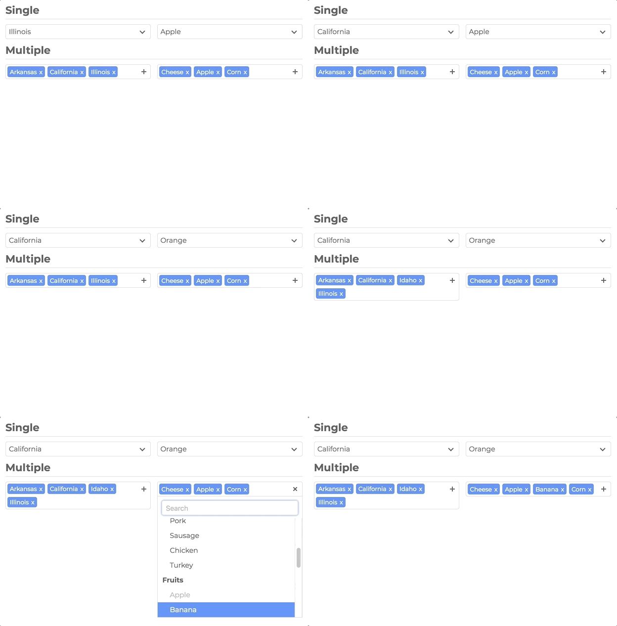
|
|
11
16
|
|
|
12
|
-
|
|
17
|
+
## Documentation
|
|
13
18
|
|
|
14
|
-
|
|
19
|
+
Full docs, live demos, and copy-paste examples: **[slimselectjs.com](https://slimselectjs.com)**
|
|
15
20
|
|
|
16
|
-
|
|
21
|
+
- [Get started](https://slimselectjs.com/get-started)
|
|
22
|
+
- [Settings](https://slimselectjs.com/settings)
|
|
23
|
+
- [Methods](https://slimselectjs.com/methods)
|
|
24
|
+
- [Events](https://slimselectjs.com/events)
|
|
25
|
+
- [Styling](https://slimselectjs.com/style)
|
|
17
26
|
|
|
18
|
-
|
|
27
|
+
## Features
|
|
19
28
|
|
|
20
|
-
|
|
29
|
+
**Select, upgraded**
|
|
21
30
|
|
|
22
|
-
|
|
31
|
+
- Single and multi-select with tags, placeholders, and deselect
|
|
32
|
+
- Search with highlighting, remote/API search, and user-addable options
|
|
33
|
+
- Optgroups with select-all and closable accordion groups
|
|
34
|
+
- HTML options, tooltips, min/max selection limits, and disabled options
|
|
35
|
+
- Modal mode (`off` | `on` | `mobile`) — centered panel with backdrop; mobile-friendly by default
|
|
36
|
+
|
|
37
|
+
**Looks like your product**
|
|
38
|
+
|
|
39
|
+
- Theme entirely with `--ss-*` CSS custom properties — no fighting class specificity
|
|
40
|
+
- Import plain CSS or SCSS; inherit styles and classes from the native `<select>`
|
|
41
|
+
|
|
42
|
+
**Built to ship**
|
|
43
|
+
|
|
44
|
+
- Zero runtime dependencies
|
|
45
|
+
- ~66KB JS (~16KB gzip) · ~12KB CSS (~2KB gzip)
|
|
46
|
+
- TypeScript types included
|
|
47
|
+
- WCAG 2.1 Level AA accessibility (ARIA, keyboard, screen reader support)
|
|
48
|
+
- `prefers-reduced-motion` respected
|
|
49
|
+
- 477 unit tests + 46 Playwright E2E tests
|
|
23
50
|
|
|
24
|
-
|
|
25
|
-
|
|
26
|
-
-
|
|
27
|
-
-
|
|
28
|
-
-
|
|
29
|
-
- User Addable Options
|
|
30
|
-
- Html Options
|
|
31
|
-
- Settable Data
|
|
32
|
-
- Callback Events
|
|
33
|
-
- Label Support
|
|
34
|
-
- Placeholders
|
|
35
|
-
- Search
|
|
36
|
-
- Disable Options
|
|
37
|
-
- Light CSS
|
|
38
|
-
- Light Color Scheme
|
|
39
|
-
- Style and Class Inheritance
|
|
40
|
-
- Clean Animations
|
|
41
|
-
- Performant
|
|
42
|
-
- Typescript
|
|
43
|
-
- ARIA Accessibility (WCAG 2.1 Level AA compliant)
|
|
44
|
-
|
|
45
|
-
## Frameworks
|
|
46
|
-
|
|
47
|
-
- [Vue](#vue)
|
|
48
|
-
- [React](#react)
|
|
51
|
+
**Framework ready**
|
|
52
|
+
|
|
53
|
+
- Vanilla JS
|
|
54
|
+
- [Vue 3](#vue) component with `v-model`
|
|
55
|
+
- [React](#react) component with hooks and ref access
|
|
49
56
|
|
|
50
57
|
## Installation
|
|
51
58
|
|
|
@@ -53,19 +60,18 @@ See [website](https://slimselectjs.com) for the full list of [settings](https://
|
|
|
53
60
|
npm install slim-select
|
|
54
61
|
```
|
|
55
62
|
|
|
56
|
-
###
|
|
63
|
+
### CDN
|
|
57
64
|
|
|
58
65
|
```html
|
|
59
66
|
<script src="https://unpkg.com/slim-select@latest/dist/slimselect.js"></script>
|
|
60
67
|
<link rel="stylesheet" href="https://unpkg.com/slim-select@latest/dist/slimselect.css" />
|
|
61
68
|
```
|
|
62
69
|
|
|
63
|
-
##
|
|
70
|
+
## Quick start
|
|
64
71
|
|
|
65
72
|
```javascript
|
|
66
73
|
import SlimSelect from 'slim-select'
|
|
67
|
-
import 'slim-select/styles' //
|
|
68
|
-
import 'slim-select/scss' // optional scss import method
|
|
74
|
+
import 'slim-select/styles' // or: import 'slim-select/scss'
|
|
69
75
|
|
|
70
76
|
new SlimSelect({
|
|
71
77
|
select: '#selectElement'
|
|
@@ -78,133 +84,151 @@ new SlimSelect({
|
|
|
78
84
|
</select>
|
|
79
85
|
```
|
|
80
86
|
|
|
81
|
-
##
|
|
87
|
+
## Styling
|
|
82
88
|
|
|
83
|
-
|
|
89
|
+
Slim Select is styled with CSS variables. Set them on a wrapper around your select (or on `:root` for a global theme):
|
|
84
90
|
|
|
85
|
-
|
|
91
|
+
```css
|
|
92
|
+
.my-form {
|
|
93
|
+
--ss-primary-color: #2563eb;
|
|
94
|
+
--ss-bg-color: #ffffff;
|
|
95
|
+
--ss-font-color: #1e293b;
|
|
96
|
+
--ss-border-color: #e2e8f0;
|
|
97
|
+
--ss-border-radius: 8px;
|
|
98
|
+
--ss-main-height: 44px;
|
|
99
|
+
}
|
|
100
|
+
```
|
|
101
|
+
|
|
102
|
+
See the full token list and live themes on the [Style docs](https://slimselectjs.com/style).
|
|
103
|
+
|
|
104
|
+
## Data
|
|
105
|
+
|
|
106
|
+
Pass an array of options and optgroups instead of (or in addition to) native `<option>` elements:
|
|
86
107
|
|
|
87
108
|
```javascript
|
|
88
109
|
new SlimSelect({
|
|
89
110
|
select: '#selectElement',
|
|
90
111
|
|
|
91
|
-
|
|
92
|
-
|
|
93
|
-
|
|
94
|
-
|
|
95
|
-
|
|
96
|
-
|
|
97
|
-
|
|
112
|
+
data: [
|
|
113
|
+
{ text: 'Value 1', value: 'value1' },
|
|
114
|
+
{
|
|
115
|
+
label: 'Group label',
|
|
116
|
+
options: [
|
|
117
|
+
{ text: 'Value 2', value: 'value2' },
|
|
118
|
+
{ text: 'Value 3', value: 'value3' }
|
|
119
|
+
]
|
|
120
|
+
}
|
|
121
|
+
]
|
|
98
122
|
})
|
|
99
123
|
```
|
|
100
124
|
|
|
101
|
-
|
|
125
|
+
### Data types
|
|
102
126
|
|
|
103
127
|
```javascript
|
|
104
128
|
// <optgroup>
|
|
105
|
-
|
|
129
|
+
const optgroup = {
|
|
106
130
|
label: 'label', // Required
|
|
107
|
-
selectAll: false, // Optional
|
|
108
|
-
closable: 'off', // Optional
|
|
109
|
-
options: [] // Required
|
|
131
|
+
selectAll: false, // Optional — default false
|
|
132
|
+
closable: 'off', // Optional — 'off' | 'open' | 'close'
|
|
133
|
+
options: [] // Required — array of options
|
|
110
134
|
}
|
|
111
135
|
|
|
112
136
|
// <option>
|
|
113
|
-
|
|
137
|
+
const option = {
|
|
114
138
|
text: 'text', // Required
|
|
115
|
-
value: 'value', // Optional
|
|
116
|
-
html: '<b>Html</b>', // Optional
|
|
117
|
-
selected: false,
|
|
118
|
-
display: true,
|
|
119
|
-
disabled: false,
|
|
120
|
-
mandatory: false,
|
|
121
|
-
placeholder: false,
|
|
122
|
-
class: '',
|
|
123
|
-
style: '',
|
|
124
|
-
data: {} //
|
|
139
|
+
value: 'value', // Optional — defaults to text
|
|
140
|
+
html: '<b>Html</b>', // Optional — used for display when set
|
|
141
|
+
selected: false,
|
|
142
|
+
display: true,
|
|
143
|
+
disabled: false,
|
|
144
|
+
mandatory: false,
|
|
145
|
+
placeholder: false,
|
|
146
|
+
class: '',
|
|
147
|
+
style: '',
|
|
148
|
+
data: {} // Plain object for data-* attributes
|
|
125
149
|
}
|
|
126
150
|
```
|
|
127
151
|
|
|
128
152
|
## Settings
|
|
129
153
|
|
|
130
|
-
|
|
154
|
+
All fields are optional. Values shown are defaults.
|
|
131
155
|
|
|
132
|
-
[Full
|
|
156
|
+
[Full settings documentation](https://slimselectjs.com/settings)
|
|
133
157
|
|
|
134
158
|
```javascript
|
|
135
159
|
new SlimSelect({
|
|
136
160
|
select: '#selectElement',
|
|
137
161
|
|
|
138
162
|
settings: {
|
|
139
|
-
disabled: false,
|
|
140
|
-
alwaysOpen: false,
|
|
141
|
-
showSearch: true,
|
|
142
|
-
focusSearch: true,
|
|
143
|
-
keepSearch: false,
|
|
144
|
-
ariaLabel: 'Combobox',
|
|
145
|
-
searchPlaceholder: 'Search',
|
|
146
|
-
searchText: 'No Results',
|
|
147
|
-
searchingText: 'Searching...',
|
|
148
|
-
|
|
149
|
-
|
|
150
|
-
|
|
151
|
-
|
|
152
|
-
|
|
153
|
-
|
|
154
|
-
|
|
155
|
-
|
|
156
|
-
|
|
157
|
-
|
|
158
|
-
|
|
159
|
-
|
|
160
|
-
|
|
161
|
-
|
|
162
|
-
|
|
163
|
-
|
|
164
|
-
|
|
163
|
+
disabled: false,
|
|
164
|
+
alwaysOpen: false,
|
|
165
|
+
showSearch: true,
|
|
166
|
+
focusSearch: true,
|
|
167
|
+
keepSearch: false,
|
|
168
|
+
ariaLabel: 'Combobox',
|
|
169
|
+
searchPlaceholder: 'Search...',
|
|
170
|
+
searchText: 'No Results',
|
|
171
|
+
searchingText: 'Searching...',
|
|
172
|
+
resultsText: '{count} results available',
|
|
173
|
+
deselectText: 'Clear',
|
|
174
|
+
removeText: 'Remove',
|
|
175
|
+
searchHighlight: false,
|
|
176
|
+
closeOnSelect: true,
|
|
177
|
+
contentLocation: document.body,
|
|
178
|
+
contentPosition: 'absolute', // 'absolute' | 'relative' | 'fixed'
|
|
179
|
+
contentWidth: '', // e.g. '500px', '>500px', '<500px'
|
|
180
|
+
openPosition: 'auto', // 'auto' | 'up' | 'down'
|
|
181
|
+
placeholderText: 'Select Value',
|
|
182
|
+
allowDeselect: false,
|
|
183
|
+
hideSelected: false,
|
|
184
|
+
multiString: false,
|
|
185
|
+
keepOrder: false,
|
|
186
|
+
showOptionTooltips: false,
|
|
187
|
+
minSelected: 0,
|
|
188
|
+
maxSelected: 1000,
|
|
189
|
+
timeoutDelay: 200,
|
|
190
|
+
maxValuesShown: 20,
|
|
191
|
+
maxValuesMessage: '{number} selected',
|
|
192
|
+
addableText: 'Press "Enter" to add {value}',
|
|
193
|
+
modal: 'mobile', // 'off' | 'on' | 'mobile'
|
|
194
|
+
modalTitle: '' // Header above the option list in modal view
|
|
165
195
|
}
|
|
166
196
|
})
|
|
167
197
|
```
|
|
168
198
|
|
|
169
199
|
## Events
|
|
170
200
|
|
|
171
|
-
|
|
172
|
-
|
|
173
|
-
[Full Events Documentation](https://slimselectjs.com/events)
|
|
201
|
+
[Full events documentation](https://slimselectjs.com/events)
|
|
174
202
|
|
|
175
203
|
```javascript
|
|
176
204
|
new SlimSelect({
|
|
177
205
|
select: '#selectElement',
|
|
178
206
|
|
|
179
207
|
events: {
|
|
180
|
-
//
|
|
181
|
-
|
|
182
|
-
|
|
183
|
-
//
|
|
208
|
+
// Remote/API search — return a Promise or data array
|
|
209
|
+
// searchValue: current input text
|
|
210
|
+
// selected: currently selected Option[]
|
|
211
|
+
// catalog: baseline list restored when search clears
|
|
212
|
+
search: (
|
|
213
|
+
searchValue: string,
|
|
214
|
+
selected: Option[],
|
|
215
|
+
catalog?: (Option | Optgroup)[]
|
|
216
|
+
) =>
|
|
217
|
+
Promise<(Partial<Option> | Partial<Optgroup>)[]> |
|
|
218
|
+
(Partial<Option> | Partial<Optgroup>)[],
|
|
219
|
+
|
|
220
|
+
// Local filter when events.search is not set
|
|
184
221
|
searchFilter: (option: Option, search: string) => boolean,
|
|
185
222
|
|
|
186
|
-
//
|
|
223
|
+
// User-added options — return the new option or an Error
|
|
187
224
|
addable: (value: string) => Promise<Partial<Option> | string> | Partial<Option> | string | Error,
|
|
188
225
|
|
|
189
|
-
// Before selection changes - return false to prevent change
|
|
190
226
|
beforeChange: (newVal: Option[], oldVal: Option[]) => boolean | void,
|
|
191
|
-
|
|
192
|
-
// After selection changes
|
|
193
227
|
afterChange: (newVal: Option[]) => void,
|
|
194
|
-
|
|
195
|
-
// Before dropdown opens
|
|
196
228
|
beforeOpen: () => void,
|
|
197
|
-
|
|
198
|
-
// After dropdown opens
|
|
199
229
|
afterOpen: () => void,
|
|
200
|
-
|
|
201
|
-
// Before dropdown closes
|
|
202
230
|
beforeClose: () => void,
|
|
203
|
-
|
|
204
|
-
// After dropdown closes
|
|
205
231
|
afterClose: () => void,
|
|
206
|
-
|
|
207
|
-
// Error handler
|
|
208
232
|
error: (err: Error) => void
|
|
209
233
|
}
|
|
210
234
|
})
|
|
@@ -212,40 +236,34 @@ new SlimSelect({
|
|
|
212
236
|
|
|
213
237
|
## Methods
|
|
214
238
|
|
|
215
|
-
|
|
216
|
-
|
|
217
|
-
[Full Methods Documentation](https://slimselectjs.com/methods)
|
|
239
|
+
[Full methods documentation](https://slimselectjs.com/methods)
|
|
218
240
|
|
|
219
241
|
```javascript
|
|
220
242
|
const slim = new SlimSelect({ select: '#selectElement' })
|
|
221
243
|
|
|
222
|
-
slim.enable()
|
|
223
|
-
slim.disable()
|
|
224
|
-
slim.getData()
|
|
225
|
-
slim.setData(data)
|
|
226
|
-
slim.getSelected() //
|
|
227
|
-
slim.setSelected(['value1', 'value2'])
|
|
228
|
-
slim.addOption(option)
|
|
229
|
-
slim.open()
|
|
230
|
-
slim.close()
|
|
231
|
-
slim.search('searchValue')
|
|
232
|
-
slim.destroy()
|
|
244
|
+
slim.enable()
|
|
245
|
+
slim.disable()
|
|
246
|
+
slim.getData()
|
|
247
|
+
slim.setData(data)
|
|
248
|
+
slim.getSelected() // string[]
|
|
249
|
+
slim.setSelected(['value1', 'value2'])
|
|
250
|
+
slim.addOption(option)
|
|
251
|
+
slim.open()
|
|
252
|
+
slim.close()
|
|
253
|
+
slim.search('searchValue')
|
|
254
|
+
slim.destroy()
|
|
233
255
|
```
|
|
234
256
|
|
|
235
257
|
## Vue
|
|
236
258
|
|
|
237
|
-
|
|
238
|
-
|
|
239
|
-
For more Vue examples and advanced usage, see the [Vue documentation](https://slimselectjs.com/vue).
|
|
259
|
+
Official Vue 3 component with `v-model` and full TypeScript support.
|
|
240
260
|
|
|
241
|
-
|
|
261
|
+
[Vue documentation](https://slimselectjs.com/vue)
|
|
242
262
|
|
|
243
263
|
```bash
|
|
244
264
|
npm install slim-select
|
|
245
265
|
```
|
|
246
266
|
|
|
247
|
-
### Usage
|
|
248
|
-
|
|
249
267
|
```vue
|
|
250
268
|
<script lang="ts">
|
|
251
269
|
import SlimSelect from 'slim-select/vue'
|
|
@@ -271,20 +289,18 @@ export default {
|
|
|
271
289
|
</template>
|
|
272
290
|
```
|
|
273
291
|
|
|
274
|
-
|
|
292
|
+
> **Note:** Pass options via the `:data` prop. Native `<option>` slot children are not supported in the Vue wrapper.
|
|
275
293
|
|
|
276
|
-
|
|
294
|
+
## React
|
|
277
295
|
|
|
278
|
-
|
|
296
|
+
Official React component with hooks and ref access to the underlying instance.
|
|
279
297
|
|
|
280
|
-
|
|
298
|
+
[React documentation](https://slimselectjs.com/react)
|
|
281
299
|
|
|
282
300
|
```bash
|
|
283
301
|
npm install slim-select
|
|
284
302
|
```
|
|
285
303
|
|
|
286
|
-
### Usage
|
|
287
|
-
|
|
288
304
|
```tsx
|
|
289
305
|
import { useState } from 'react'
|
|
290
306
|
import SlimSelect from 'slim-select/react'
|
|
@@ -302,7 +318,9 @@ function MyComponent() {
|
|
|
302
318
|
}
|
|
303
319
|
```
|
|
304
320
|
|
|
305
|
-
|
|
321
|
+
> **Note:** Pass options via the `data` prop. Native `<option>` children are not supported in the React wrapper.
|
|
322
|
+
|
|
323
|
+
### Ref access
|
|
306
324
|
|
|
307
325
|
```tsx
|
|
308
326
|
import { useRef } from 'react'
|
|
@@ -312,16 +330,17 @@ import 'slim-select/styles'
|
|
|
312
330
|
function MyComponent() {
|
|
313
331
|
const slimRef = useRef<SlimSelectRef>(null)
|
|
314
332
|
|
|
315
|
-
const handleClick = () => {
|
|
316
|
-
// Access SlimSelect methods via ref
|
|
317
|
-
slimRef.current?.slimSelect?.open()
|
|
318
|
-
}
|
|
319
|
-
|
|
320
333
|
return (
|
|
321
334
|
<>
|
|
322
335
|
<SlimSelect ref={slimRef} data={options} />
|
|
323
|
-
<button onClick={
|
|
336
|
+
<button onClick={() => slimRef.current?.slimSelect?.open()}>Open</button>
|
|
324
337
|
</>
|
|
325
338
|
)
|
|
326
339
|
}
|
|
327
340
|
```
|
|
341
|
+
|
|
342
|
+
## Support
|
|
343
|
+
|
|
344
|
+
[](https://github.com/sponsors/brianvoe)
|
|
345
|
+
|
|
346
|
+
<a href="https://www.buymeacoffee.com/brianvoe" target="_blank"><img src="https://www.buymeacoffee.com/assets/img/custom_images/orange_img.png" alt="Buy Me A Coffee" style="height: auto !important;width: auto !important;" ></a>
|
|
@@ -0,0 +1,37 @@
|
|
|
1
|
+
/**
|
|
2
|
+
* Animation timing helpers.
|
|
3
|
+
*
|
|
4
|
+
* CSS still runs the motion — these keep lifecycle and DOM cleanup aligned with
|
|
5
|
+
* --ss-animation-timing so we are not guessing with hardcoded setTimeout values.
|
|
6
|
+
*/
|
|
7
|
+
/** Extra ms added to CSS duration for transitionend/animationend safety-net timeouts. */
|
|
8
|
+
export declare const ANIMATION_TIMEOUT_BUFFER_MS = 50;
|
|
9
|
+
/** .ss-content open/close transitions — wait for both before lifecycle continues. */
|
|
10
|
+
export declare const CONTENT_PANEL_TRANSITION_PROPERTIES: readonly ["transform", "opacity"];
|
|
11
|
+
/** Parse a CSS time value (e.g. "0.2s", "200ms") into milliseconds. */
|
|
12
|
+
export declare function parseAnimationDuration(cssValue: string, fallback?: number): number;
|
|
13
|
+
/** Read --ss-animation-timing from an element's computed styles. */
|
|
14
|
+
export declare function getAnimationDuration(element: HTMLElement, fallback?: number): number;
|
|
15
|
+
/**
|
|
16
|
+
* Safety-net timeout for animation waits.
|
|
17
|
+
* Derived from --ss-animation-timing (+ buffer). An explicit settings.timeoutDelay
|
|
18
|
+
* is treated as a minimum — never shorter than the CSS-driven duration.
|
|
19
|
+
*/
|
|
20
|
+
export declare function getAnimationTimeout(element: HTMLElement, userTimeout?: number, fallback?: number): number;
|
|
21
|
+
/** Respect user OS accessibility preference and jsdom (no matchMedia). */
|
|
22
|
+
export declare function prefersReducedMotion(): boolean;
|
|
23
|
+
/**
|
|
24
|
+
* Wait for CSS transition(s) to finish, with a timeout fallback.
|
|
25
|
+
*
|
|
26
|
+
* Pass a single property name to resolve on that transitionend, or an array to
|
|
27
|
+
* wait until every listed property has fired (e.g. transform + opacity on .ss-content).
|
|
28
|
+
* Optional AbortSignal cleans up listeners when lifecycle cancels a rapid toggle.
|
|
29
|
+
*/
|
|
30
|
+
export declare function waitForTransitionEnd(element: HTMLElement, propertyNames?: string | readonly string[], timeoutMs?: number, signal?: AbortSignal): Promise<void>;
|
|
31
|
+
/**
|
|
32
|
+
* Wait for a CSS @keyframes animation to finish, with a timeout fallback.
|
|
33
|
+
*
|
|
34
|
+
* Used when removing multi-select value chips (.ss-value-out). jsdom does not
|
|
35
|
+
* fire animationend, so the timeout wins in unit tests.
|
|
36
|
+
*/
|
|
37
|
+
export declare function waitForAnimationEnd(element: HTMLElement, animationName?: string, timeoutMs?: number, signal?: AbortSignal): Promise<void>;
|
package/dist/classes.d.ts
CHANGED
|
@@ -36,6 +36,11 @@ export default class CssClasses {
|
|
|
36
36
|
option: string;
|
|
37
37
|
optionDelete: string;
|
|
38
38
|
highlighted: string;
|
|
39
|
+
modalOverlay: string;
|
|
40
|
+
modalDialog: string;
|
|
41
|
+
modalTitle: string;
|
|
42
|
+
modalClose: string;
|
|
43
|
+
modalContent: string;
|
|
39
44
|
mainOpen: string;
|
|
40
45
|
close: string;
|
|
41
46
|
selected: string;
|
package/dist/events.d.ts
ADDED
|
@@ -0,0 +1,26 @@
|
|
|
1
|
+
import { hasClassInTree } from './helpers';
|
|
2
|
+
export interface GlobalEventHandlers {
|
|
3
|
+
onDocumentClick: (e: Event) => void;
|
|
4
|
+
onWindowResize: () => void;
|
|
5
|
+
onWindowScroll: () => void;
|
|
6
|
+
onVisibilityChange: () => void;
|
|
7
|
+
}
|
|
8
|
+
export default class GlobalEvents {
|
|
9
|
+
private handlers;
|
|
10
|
+
private attached;
|
|
11
|
+
constructor(handlers: GlobalEventHandlers);
|
|
12
|
+
/** Attach long-lived listeners for the SlimSelect instance lifetime. */
|
|
13
|
+
attach(options: {
|
|
14
|
+
listenScroll: boolean;
|
|
15
|
+
}): void;
|
|
16
|
+
/** Attached after open animation completes — closes on outside click. */
|
|
17
|
+
attachDocumentClick(): void;
|
|
18
|
+
detachDocumentClick(): void;
|
|
19
|
+
detach(options: {
|
|
20
|
+
listenScroll: boolean;
|
|
21
|
+
}): void;
|
|
22
|
+
private resizeHandler;
|
|
23
|
+
private scrollHandler;
|
|
24
|
+
private visibilityHandler;
|
|
25
|
+
}
|
|
26
|
+
export { hasClassInTree };
|
package/dist/helpers.d.ts
CHANGED
|
@@ -1,5 +1,24 @@
|
|
|
1
|
+
import { Optgroup, Option } from './store';
|
|
2
|
+
import { ModalSetting } from './settings';
|
|
3
|
+
type DataItem = Partial<Option> | Partial<Optgroup>;
|
|
4
|
+
/** Copy option data attributes into a plain object (not a live DOMStringMap). */
|
|
5
|
+
export declare function copyOptionData(data?: {
|
|
6
|
+
[key: string]: string;
|
|
7
|
+
} | DOMStringMap | null): {
|
|
8
|
+
[key: string]: string;
|
|
9
|
+
};
|
|
10
|
+
/** Label text only — excludes nested form controls (e.g. wrapped select options). */
|
|
11
|
+
export declare function getLabelElementText(label: HTMLLabelElement): string;
|
|
12
|
+
/** Associated label text for a select, or its aria-label when no label is linked. */
|
|
13
|
+
export declare function getAssociatedLabelText(select: HTMLSelectElement): string;
|
|
1
14
|
export declare function generateID(): string;
|
|
2
15
|
export declare function hasClassInTree(element: HTMLElement, className: string): HTMLElement | null;
|
|
3
16
|
export declare function debounce<T extends (...args: any[]) => void>(func: T, wait?: number, immediate?: boolean): () => void;
|
|
4
17
|
export declare function isEqual(a: any, b: any): boolean;
|
|
18
|
+
/** Compare selected id sets regardless of order (multi-select). */
|
|
19
|
+
export declare function selectedIdsEqual(a: string[], b: string[]): boolean;
|
|
20
|
+
/** Compare option/optgroup arrays without JSON.stringify. */
|
|
21
|
+
export declare function dataStructureEqual(a: DataItem[], b: DataItem[]): boolean;
|
|
5
22
|
export declare function kebabCase(str: string): string;
|
|
23
|
+
export declare function shouldUseModalView(modal: ModalSetting, viewportWidth?: number): boolean;
|
|
24
|
+
export {};
|
package/dist/index.d.ts
CHANGED
|
@@ -1,9 +1,12 @@
|
|
|
1
1
|
import { default as CssClasses } from './classes';
|
|
2
|
+
import { default as Lifecycle } from './lifecycle';
|
|
2
3
|
import { default as Render } from './render';
|
|
3
4
|
import { default as Select } from './select';
|
|
4
|
-
import { default as Settings } from './settings';
|
|
5
|
+
import { default as Settings, MODAL_MOBILE_BREAKPOINT } from './settings';
|
|
5
6
|
import { default as Store, Option, Optgroup } from './store';
|
|
6
|
-
|
|
7
|
+
import { default as SyncCoordinator } from './sync';
|
|
8
|
+
export { Settings, Option, Optgroup, MODAL_MOBILE_BREAKPOINT };
|
|
9
|
+
export type { ModalSetting } from './settings';
|
|
7
10
|
export type { Main, Content, Search } from './render';
|
|
8
11
|
export interface Config {
|
|
9
12
|
select: string | Element;
|
|
@@ -13,7 +16,7 @@ export interface Config {
|
|
|
13
16
|
events?: Events;
|
|
14
17
|
}
|
|
15
18
|
export interface Events {
|
|
16
|
-
search?: (searchValue: string,
|
|
19
|
+
search?: (searchValue: string, selected: Option[], catalog?: (Option | Optgroup)[]) => Promise<(Partial<Option> | Partial<Optgroup>)[]> | (Partial<Option> | Partial<Optgroup>)[];
|
|
17
20
|
searchFilter?: (option: Option, search: string) => boolean;
|
|
18
21
|
addable?: (value: string) => Promise<Partial<Option> | string> | Partial<Option> | string | false | null | undefined | Error;
|
|
19
22
|
beforeChange?: (newVal: Option[], oldVal: Option[]) => boolean | void;
|
|
@@ -31,8 +34,11 @@ export default class SlimSelect {
|
|
|
31
34
|
select: Select;
|
|
32
35
|
store: Store;
|
|
33
36
|
render: Render;
|
|
34
|
-
|
|
35
|
-
|
|
37
|
+
sync: SyncCoordinator;
|
|
38
|
+
lifecycle: Lifecycle;
|
|
39
|
+
private globalEvents;
|
|
40
|
+
/** Invalidates in-flight API search responses when the query changes or clears. */
|
|
41
|
+
private searchGeneration;
|
|
36
42
|
events: Events;
|
|
37
43
|
constructor(config: Config);
|
|
38
44
|
enable(): void;
|
|
@@ -45,9 +51,9 @@ export default class SlimSelect {
|
|
|
45
51
|
open(): void;
|
|
46
52
|
close(eventType?: string | null): void;
|
|
47
53
|
search(value: string): void;
|
|
54
|
+
private clearSearch;
|
|
55
|
+
private runLocalSearch;
|
|
56
|
+
private runApiSearch;
|
|
48
57
|
destroy(): void;
|
|
49
|
-
private windowResize;
|
|
50
|
-
private windowScroll;
|
|
51
58
|
private documentClick;
|
|
52
|
-
private windowVisibilityChange;
|
|
53
59
|
}
|
|
@@ -0,0 +1,53 @@
|
|
|
1
|
+
/**
|
|
2
|
+
* Open/close state machine for SlimSelect.
|
|
3
|
+
*
|
|
4
|
+
* Replaces scattered openTimeout/closeTimeout in index.ts with a single flow:
|
|
5
|
+
* closed → opening → open → closing → closed
|
|
6
|
+
*
|
|
7
|
+
* Maps to settings consumers expect:
|
|
8
|
+
* - isOpen: true during opening + open
|
|
9
|
+
* - isFullOpen: true only in open state (after animation / afterOpen)
|
|
10
|
+
*
|
|
11
|
+
* Lifecycle waits for render.waitForAnimation() before firing afterOpen/afterClose.
|
|
12
|
+
* When no animation waiter is provided, falls back to settings.timeoutDelay.
|
|
13
|
+
*/
|
|
14
|
+
export type LifecycleState = 'closed' | 'opening' | 'open' | 'closing';
|
|
15
|
+
export interface LifecycleHandlers {
|
|
16
|
+
beforeOpen?: () => void;
|
|
17
|
+
afterOpen?: () => void;
|
|
18
|
+
beforeClose?: () => void;
|
|
19
|
+
afterClose?: () => void;
|
|
20
|
+
/** Fires when fully open — used to attach document click-outside listener. */
|
|
21
|
+
onOpenReady?: () => void;
|
|
22
|
+
/** Fires when fully closed — used to detach document click-outside listener. */
|
|
23
|
+
onCloseReady?: () => void;
|
|
24
|
+
}
|
|
25
|
+
export interface LifecycleOptions {
|
|
26
|
+
/** Fallback when waitForAnimation is not provided (no CSS element yet). */
|
|
27
|
+
timeoutDelay: number;
|
|
28
|
+
waitForAnimation?: (phase: 'open' | 'close', signal?: AbortSignal) => Promise<void>;
|
|
29
|
+
}
|
|
30
|
+
export default class Lifecycle {
|
|
31
|
+
private handlers;
|
|
32
|
+
private options;
|
|
33
|
+
state: LifecycleState;
|
|
34
|
+
private pendingTimer;
|
|
35
|
+
/** Resolvers for in-flight waitForPhase promises — cancelled on rapid toggle. */
|
|
36
|
+
private waitResolvers;
|
|
37
|
+
/** Incremented on cancelPending(); stale async completions check this before firing handlers. */
|
|
38
|
+
private generation;
|
|
39
|
+
private animationAbort;
|
|
40
|
+
constructor(handlers: LifecycleHandlers, options: LifecycleOptions);
|
|
41
|
+
get isOpen(): boolean;
|
|
42
|
+
get isFullOpen(): boolean;
|
|
43
|
+
requestOpen(): Promise<void>;
|
|
44
|
+
requestClose(): Promise<void>;
|
|
45
|
+
/** Cancel timers and resolve waiting phases — called when open/close race each other. */
|
|
46
|
+
cancelPending(): void;
|
|
47
|
+
destroy(): void;
|
|
48
|
+
/**
|
|
49
|
+
* Wait for the CSS animation to finish (or timeoutDelay when no waiter exists).
|
|
50
|
+
* cancelPending() resolves the wait early for rapid open/close toggles.
|
|
51
|
+
*/
|
|
52
|
+
private waitForPhase;
|
|
53
|
+
}
|