shap-svg 0.2.3 → 0.3.0
This diff represents the content of publicly available package versions that have been released to one of the supported registries. The information contained in this diff is provided for informational purposes only and reflects changes between package versions as they appear in their respective public registries.
- package/README.md +95 -13
- package/dist/{chunk-UVIVTJK3.js → chunk-JQBQSWIU.js} +927 -5
- package/dist/chunk-JQBQSWIU.js.map +1 -0
- package/dist/{labels-7wofev8M.d.cts → colormap-ChkaoIeg.d.cts} +88 -39
- package/dist/{labels-7wofev8M.d.ts → colormap-ChkaoIeg.d.ts} +88 -39
- package/dist/index.cjs +962 -5
- package/dist/index.cjs.map +1 -1
- package/dist/index.d.cts +463 -7
- package/dist/index.d.ts +463 -7
- package/dist/index.js +73 -3
- package/dist/react.cjs +1865 -14
- package/dist/react.cjs.map +1 -1
- package/dist/react.d.cts +99 -5
- package/dist/react.d.ts +99 -5
- package/dist/react.js +985 -8
- package/dist/react.js.map +1 -1
- package/package.json +2 -2
- package/dist/chunk-UVIVTJK3.js.map +0 -1
package/README.md
CHANGED
|
@@ -1,12 +1,39 @@
|
|
|
1
1
|
# shap-svg
|
|
2
2
|
|
|
3
|
-
|
|
4
|
-
|
|
3
|
+
`shap-svg` is a browser rendering layer for the [`shap.plots`](https://shap.readthedocs.io/en/latest/api.html#plots)
|
|
4
|
+
API. It reimplements eight SHAP plots as interactive SVG charts, exposed as React components through
|
|
5
|
+
`shap-svg/react`, so web applications can present SHAP explanations without server-side matplotlib
|
|
6
|
+
rendering.
|
|
7
|
+
|
|
8
|
+
It is a rendering library only. SHAP values must still be computed with the
|
|
9
|
+
[`shap`](https://github.com/shap/shap) Python package and delivered to the client as JSON.
|
|
5
10
|
|
|
6
11
|
```bash
|
|
7
12
|
npm install shap-svg
|
|
8
13
|
```
|
|
9
14
|
|
|
15
|
+
## In action
|
|
16
|
+
|
|
17
|
+
Recorded in the
|
|
18
|
+
[Explainable AI Microbiome Platform](https://github.com/princepongsakorn/explainable-ai-microbiome-platform),
|
|
19
|
+
which draws its SHAP charts with `shap-svg`.
|
|
20
|
+
|
|
21
|
+
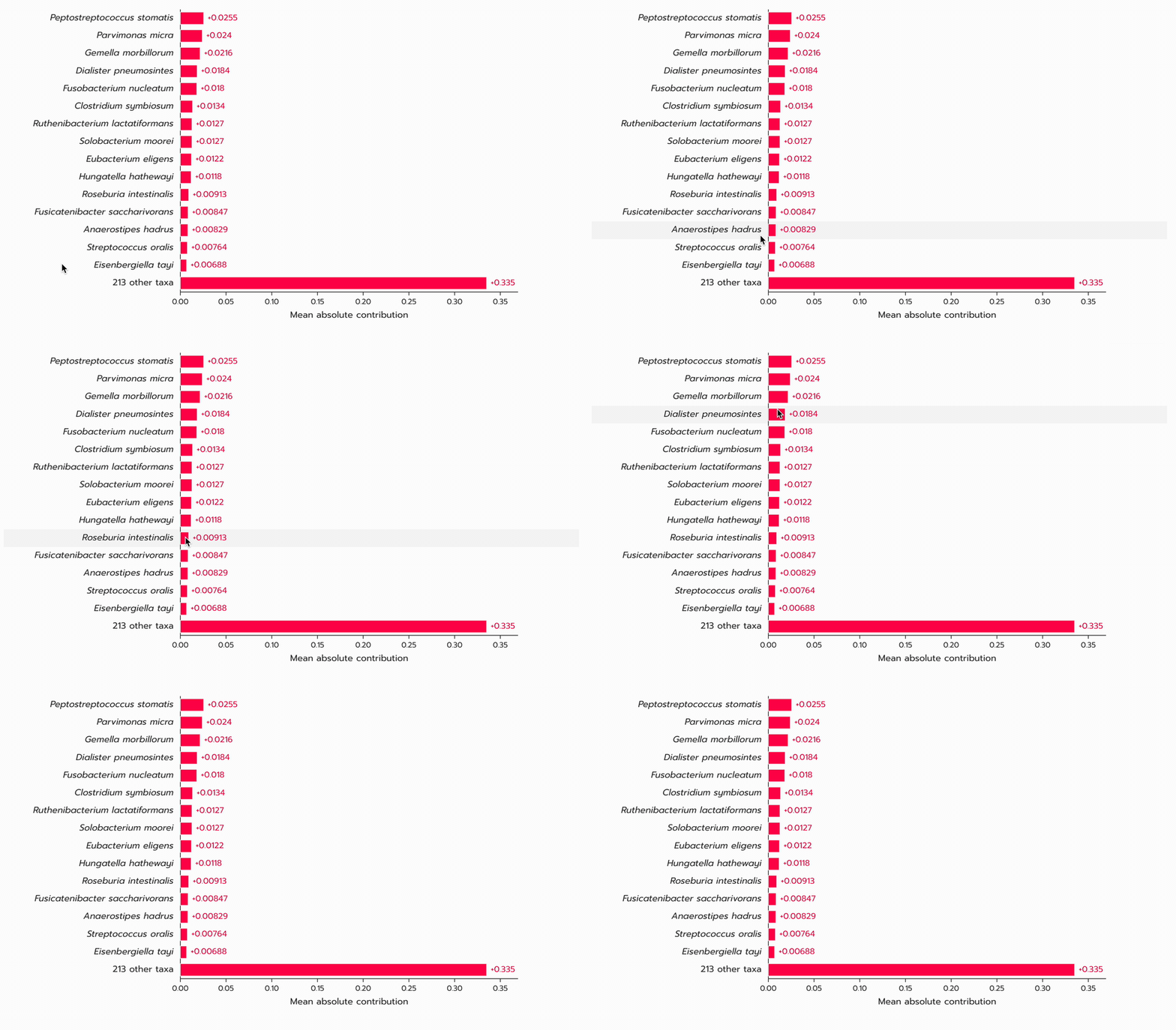
### `Plots.bar`
|
|
22
|
+
|
|
23
|
+
|
|
24
|
+
|
|
25
|
+
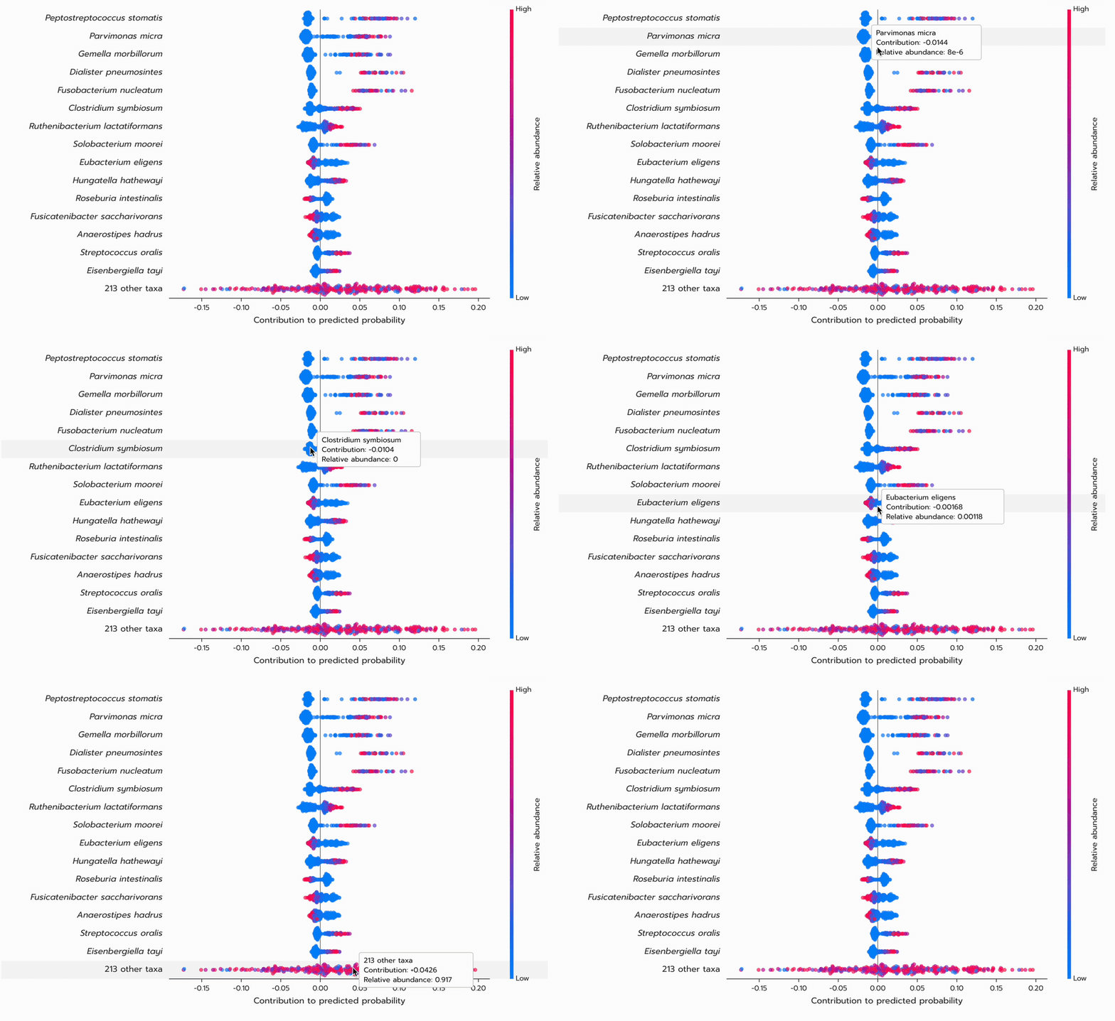
### `Plots.beeswarm`
|
|
26
|
+
|
|
27
|
+
|
|
28
|
+
|
|
29
|
+
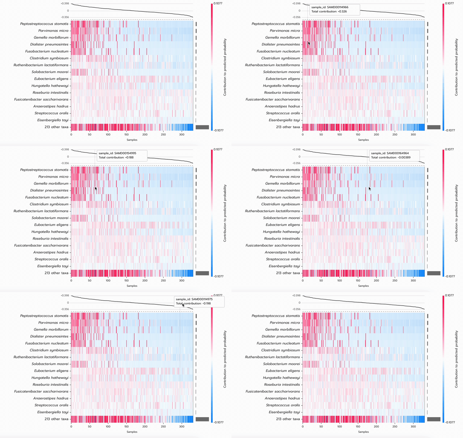
### `Plots.heatmap`
|
|
30
|
+
|
|
31
|
+
|
|
32
|
+
|
|
33
|
+
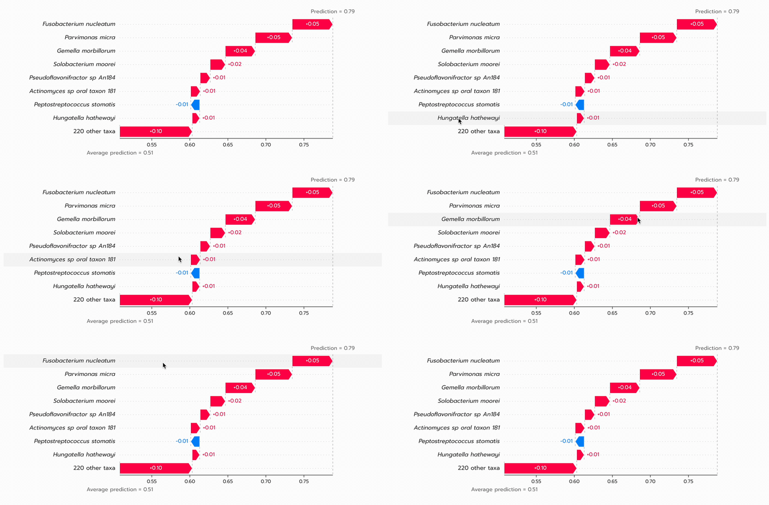
### `Plots.waterfall`
|
|
34
|
+
|
|
35
|
+
|
|
36
|
+
|
|
10
37
|
## Why this exists, and why the name
|
|
11
38
|
|
|
12
39
|
SHAP draws its plots with matplotlib, on the machine that computed the values. A web application
|
|
@@ -26,10 +53,14 @@ affiliated with the SHAP authors.
|
|
|
26
53
|
|
|
27
54
|
| Component | SHAP counterpart | Shows |
|
|
28
55
|
| --- | --- | --- |
|
|
29
|
-
| `Plots.bar` | `shap.plots.bar` | mean(\|SHAP value\|) per
|
|
30
|
-
| `Plots.beeswarm` | `shap.plots.beeswarm` | one dot per
|
|
31
|
-
| `Plots.heatmap` | `shap.plots.heatmap` |
|
|
32
|
-
| `Plots.waterfall` | `shap.plots.waterfall` | how one
|
|
56
|
+
| [`Plots.bar`](https://github.com/princepongsakorn/shap-svg/blob/main/docs/BAR.md) | `shap.plots.bar` | mean(\|SHAP value\|) per Feature across Samples |
|
|
57
|
+
| `Plots.beeswarm` | `shap.plots.beeswarm` | one dot per Sample per Feature, coloured by Feature value |
|
|
58
|
+
| `Plots.heatmap` | `shap.plots.heatmap` | Samples × Features coloured by SHAP value, with the Model output line above |
|
|
59
|
+
| `Plots.waterfall` | `shap.plots.waterfall` | how one Sample's prediction is built from the Base value to the Model output |
|
|
60
|
+
| [`Plots.scatter`](https://github.com/princepongsakorn/shap-svg/blob/main/docs/SCATTER.md) | `shap.plots.scatter` | one Feature's value against its SHAP value across Samples |
|
|
61
|
+
| [`Plots.embedding`](https://github.com/princepongsakorn/shap-svg/blob/main/docs/EMBEDDING.md) | `shap.plots.embedding` | Samples positioned by similarity between their SHAP value vectors |
|
|
62
|
+
| [`Plots.decision`](https://github.com/princepongsakorn/shap-svg/blob/main/docs/DECISION.md) | `shap.plots.decision` | cumulative Feature effects from the Base value to each Sample's Model output |
|
|
63
|
+
| [`Plots.force`](https://github.com/princepongsakorn/shap-svg/blob/main/docs/FORCE.md) | `shap.plots.force` | one Sample's positive and negative Feature effects in a compact row |
|
|
33
64
|
|
|
34
65
|
Every chart is a pure component: all state that changes what is drawn arrives through props, so the
|
|
35
66
|
host application owns its own controls. The only internal state is hover highlighting.
|
|
@@ -122,7 +153,20 @@ export function ExplanationView() {
|
|
|
122
153
|
```
|
|
123
154
|
|
|
124
155
|
The charts are named the way `shap` names them in Python: `shap.plots.bar` becomes `<Plots.bar />`.
|
|
125
|
-
`Plots`
|
|
156
|
+
`Plots` contains all eight charts:
|
|
157
|
+
|
|
158
|
+
```ts
|
|
159
|
+
Plots.bar;
|
|
160
|
+
Plots.beeswarm;
|
|
161
|
+
Plots.heatmap;
|
|
162
|
+
Plots.waterfall;
|
|
163
|
+
Plots.scatter;
|
|
164
|
+
Plots.embedding;
|
|
165
|
+
Plots.decision;
|
|
166
|
+
Plots.force;
|
|
167
|
+
```
|
|
168
|
+
|
|
169
|
+
One `Plots` import brings all eight into your bundle even if a page draws one.
|
|
126
170
|
|
|
127
171
|
From here every control — how many features, grouping, sorting, precision — is a prop. Changing one
|
|
128
172
|
redraws from the payload already in memory; nothing goes back to the server.
|
|
@@ -161,30 +205,68 @@ Field names follow `shap.Explanation`, so a Python service can serialise one dir
|
|
|
161
205
|
|
|
162
206
|
## Props
|
|
163
207
|
|
|
164
|
-
Shared by all
|
|
208
|
+
Shared by all eight charts:
|
|
165
209
|
|
|
166
210
|
| Prop | Default | |
|
|
167
211
|
| --- | --- | --- |
|
|
168
212
|
| `explanation` | — | the payload above |
|
|
169
|
-
| `maxDisplay` | `10` | features shown before the rest collapse into one "other features" row |
|
|
170
|
-
| `faithfulOtherRow` | `false` | `true` reproduces SHAP's own behaviour, where the last displayed row absorbs the feature ranked `maxDisplay` |
|
|
171
213
|
| `groupByGenus` | `false` | sum `Genus_species` features into their genus first |
|
|
172
214
|
| `classIndex` | `1` | which output to draw for multi-output explanations |
|
|
173
|
-
| `width` |
|
|
174
|
-
| `rowHeight` | per chart | pixels per feature row |
|
|
215
|
+
| `width` | per chart | SVG width in pixels |
|
|
175
216
|
| `labels` | SHAP's wording | text the chart draws; see [Wording](#wording) |
|
|
176
|
-
| `onFeatureClick` | — | called with the feature index, or `null` for the "other" row |
|
|
177
217
|
|
|
178
218
|
Per chart:
|
|
179
219
|
|
|
180
220
|
| Chart | Prop | Default | |
|
|
181
221
|
| --- | --- | --- | --- |
|
|
222
|
+
| `Plots.bar`, `Plots.beeswarm`, `Plots.heatmap`, `Plots.waterfall`, `Plots.force` | `maxDisplay` | `10` | Features shown before the rest collapse into an Other features row |
|
|
223
|
+
| `Plots.decision` | `maxDisplay` | `15` | maximum number of Feature rows |
|
|
224
|
+
| `Plots.bar`, `Plots.beeswarm`, `Plots.heatmap`, `Plots.waterfall`, `Plots.force` | `faithfulOtherRow` | `false` | reproduce SHAP's boundary-row collapse when `true` |
|
|
225
|
+
| `Plots.bar`, `Plots.heatmap`, `Plots.decision` | `rowHeight` | `26` | pixels per Feature row |
|
|
226
|
+
| `Plots.beeswarm` | `rowHeight` | `28` | pixels per Feature row |
|
|
227
|
+
| `Plots.waterfall` | `rowHeight` | `30` | pixels per Feature row |
|
|
182
228
|
| `Plots.beeswarm`, `Plots.heatmap` | `rowSort` | `"importance"` | `"importance"`, `"name"` or `"featureValue"`; reorders the rows shown, never which rows are shown |
|
|
183
229
|
| `Plots.beeswarm`, `Plots.heatmap` | `colorBar` | `true` | SHAP's colour bar right of the plot — Low to High feature value on the beeswarm, the SHAP value range on the heatmap. The plot narrows when the right margin cannot hold it |
|
|
184
230
|
| `Plots.beeswarm` | `seed`, `dotRadius` | `0`, `3` | jitter is seeded, so a chart is identical on every render |
|
|
185
231
|
| `Plots.heatmap` | `onSampleClick` | — | called with the column's `sample_ids` entry |
|
|
186
232
|
| `Plots.waterfall` | `sampleIndex` | `0` | which sample to explain |
|
|
187
233
|
| `Plots.waterfall` | `decimals` | `2` | `2`, `3`, `4` or `"percent"`; display only |
|
|
234
|
+
| `Plots.scatter` | `feature` | — | required Feature name or zero-based index |
|
|
235
|
+
| `Plots.scatter` | `colorFeature`, `colorFeatureMinScore` | `"auto"`, `0.2` | colour Feature selection and minimum automatic interaction score |
|
|
236
|
+
| `Plots.scatter` | `xScale`, `trend` | `"log"`, `true` | Feature-value scale and binned-median trend |
|
|
237
|
+
| `Plots.embedding` | `colorBy`, `coords` | `"sum"`, — | colour source and optional external Sample coordinates |
|
|
238
|
+
| `Plots.decision` | `sampleIndices` | every Sample | zero-based Sample indices to draw |
|
|
239
|
+
| `Plots.scatter`, `Plots.embedding`, `Plots.decision` | `colormap` | `"red_blue"` | `"red_blue"` or `"red_white_blue"` |
|
|
240
|
+
| `Plots.scatter`, `Plots.embedding`, `Plots.decision`, `Plots.force` | `tableView` | `"hidden"` | `"hidden"`, `"visible"`, or `"none"` |
|
|
241
|
+
|
|
242
|
+
The complete props and examples for the new charts are in [Scatter](https://github.com/princepongsakorn/shap-svg/blob/main/docs/SCATTER.md),
|
|
243
|
+
[Embedding](https://github.com/princepongsakorn/shap-svg/blob/main/docs/EMBEDDING.md), [Decision](https://github.com/princepongsakorn/shap-svg/blob/main/docs/DECISION.md), and [Force](https://github.com/princepongsakorn/shap-svg/blob/main/docs/FORCE.md).
|
|
244
|
+
|
|
245
|
+
## Beyond SHAP
|
|
246
|
+
|
|
247
|
+
The browser charts add six deliberate improvements to the behaviour in SHAP's Python plotters:
|
|
248
|
+
|
|
249
|
+
- **A neutral-midpoint colormap option.** The `red_blue` table used by `_scatter.py` and
|
|
250
|
+
`_embedding.py` has its darkest step at the midpoint: OKLab lightness 0.512, against 0.636 and
|
|
251
|
+
0.635 at the poles. That gives a Feature that contributed nothing the greatest visual weight.
|
|
252
|
+
`red_white_blue` has the correct lightness shape and is available through `colormap`; `red_blue`
|
|
253
|
+
remains the default for fidelity.
|
|
254
|
+
- **A symmetric decision-plot axis.** `_decision.py` carries a comment promising a symmetric axis
|
|
255
|
+
above a branch that does not always deliver one. Because its colour scale is clamped to those
|
|
256
|
+
limits, the asymmetry moves the neutral colour away from the Base value. `Plots.decision` keeps
|
|
257
|
+
equal reach on both sides.
|
|
258
|
+
- **The interaction score is shown.** `_scatter.py` takes the first result from
|
|
259
|
+
`approximate_interactions` without asking how strong it is, so colour chosen from noise looks like
|
|
260
|
+
colour chosen from a real interaction. `Plots.scatter` shows the score normalised into 0–1 and
|
|
261
|
+
declines to colour below `colorFeatureMinScore`.
|
|
262
|
+
- **The Genus view.** `groupByGenus` switches all four new charts from the Species view to the Genus
|
|
263
|
+
view before layout.
|
|
264
|
+
- **A dose–response trend line.** `Plots.scatter` draws a binned median over detected Samples only;
|
|
265
|
+
`_scatter.py` has no equivalent.
|
|
266
|
+
- **A table view.** All four new charts put their numbers in a real table by default, visually hidden
|
|
267
|
+
until `tableView="visible"`; unlike the matplotlib images produced by `_scatter.py`,
|
|
268
|
+
`_embedding.py`, `_decision.py`, and `_force_matplotlib.py`, the values are reachable by a screen
|
|
269
|
+
reader and text search.
|
|
188
270
|
|
|
189
271
|
## Wording
|
|
190
272
|
|