robot-toast 2.1.2 → 2.1.4
This diff represents the content of publicly available package versions that have been released to one of the supported registries. The information contained in this diff is provided for informational purposes only and reflects changes between package versions as they appear in their respective public registries.
- package/README.md +126 -86
- package/package.json +1 -1
package/README.md
CHANGED
|
@@ -1,6 +1,10 @@
|
|
|
1
1
|
# 🤖 robot-toast
|
|
2
2
|
|
|
3
|
-
|
|
3
|
+
|
|
4
|
+
|
|
5
|
+
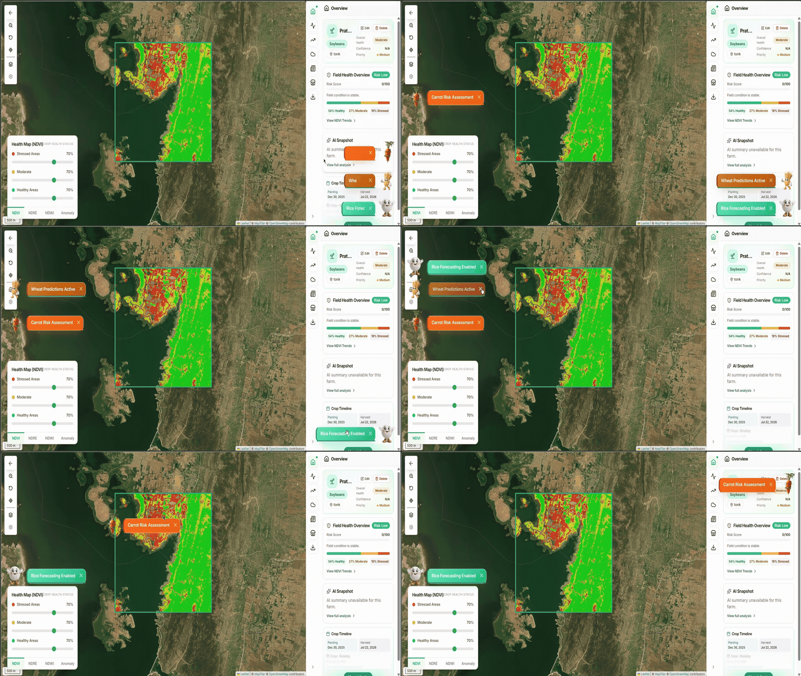
Lightweight toast notifications with complete control.
|
|
6
|
+
|
|
7
|
+
robot-toast gives you a canvas, not a prescription — bring your own robot, colors, buttons, and timing. 16 tree-shakeable robots, fully draggable, zero dependencies.
|
|
4
8
|
|
|
5
9
|
<p align="left">
|
|
6
10
|
<a href="https://robot-toast-client.vercel.app/" style="color:#e53935; font-weight:600; text-decoration:none;">Demo & Playground →</a>
|
|
@@ -14,7 +18,37 @@ Lightweight toast notifications with an animated robot companion. 16 tree-shakea
|
|
|
14
18
|
<img src="https://img.shields.io/bundlephobia/minzip/robot-toast?style=flat-square" />
|
|
15
19
|
</p>
|
|
16
20
|
|
|
17
|
-
|
|
21
|
+
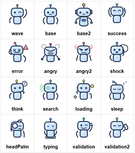
## 🤖 Built-in Robots
|
|
22
|
+
|
|
23
|
+
|
|
24
|
+
|
|
25
|
+
[**See them animated in the playground →**](https://robot-toast-client.vercel.app/features)
|
|
26
|
+
|
|
27
|
+
## 🎨 Features in Action
|
|
28
|
+
|
|
29
|
+
<table>
|
|
30
|
+
<tr>
|
|
31
|
+
<td align="center" width="50%">
|
|
32
|
+
<img src="https://raw.githubusercontent.com/Pratham2703005/robot-toast/refs/heads/main/public/offiicial-page/ad.png" alt="Light Mode" width="100%">
|
|
33
|
+
</td>
|
|
34
|
+
<td align="center" width="50%">
|
|
35
|
+
<img src="https://raw.githubusercontent.com/Pratham2703005/robot-toast/refs/heads/main/public/offiicial-page/darkmode.png" alt="Dark Mode" width="100%">
|
|
36
|
+
</td>
|
|
37
|
+
</tr>
|
|
38
|
+
<tr>
|
|
39
|
+
<td align="center" width="50%">
|
|
40
|
+
<img src="https://raw.githubusercontent.com/Pratham2703005/robot-toast/refs/heads/main/public/offiicial-page/lightmode.png" alt="Light Mode" width="100%">
|
|
41
|
+
</td>
|
|
42
|
+
<td align="center" width="50%">
|
|
43
|
+
<img src="https://raw.githubusercontent.com/Pratham2703005/robot-toast/refs/heads/main/public/offiicial-page/custom.png" alt="Custom Styling" width="100%">
|
|
44
|
+
</td>
|
|
45
|
+
</tr>
|
|
46
|
+
<tr>
|
|
47
|
+
<td align="center" colspan="2">
|
|
48
|
+
<img src="https://raw.githubusercontent.com/Pratham2703005/robot-toast/refs/heads/main/public/offiicial-page/questions_and_new_styles.png" alt="Styles & Questions" width="100%">
|
|
49
|
+
</td>
|
|
50
|
+
</tr>
|
|
51
|
+
</table>
|
|
18
52
|
|
|
19
53
|
## Install
|
|
20
54
|
|
|
@@ -25,38 +59,36 @@ npm install robot-toast
|
|
|
25
59
|
## Quick Start
|
|
26
60
|
|
|
27
61
|
```ts
|
|
28
|
-
import { toast } from
|
|
29
|
-
import { wave } from
|
|
62
|
+
import { toast } from "robot-toast";
|
|
63
|
+
import { wave } from "robot-toast/robots";
|
|
30
64
|
|
|
31
|
-
toast({ message:
|
|
32
|
-
toast.success(
|
|
33
|
-
toast.error(
|
|
65
|
+
toast({ message: "Hello! 🤖", robotVariant: wave });
|
|
66
|
+
toast.success("Operation successful!");
|
|
67
|
+
toast.error("Something went wrong");
|
|
34
68
|
```
|
|
35
69
|
|
|
36
|
-
**Explore all features & interactive demos →** [Full Playground](https://robot-toast-client.vercel.app/features)
|
|
37
|
-
|
|
38
70
|
## Features at a Glance
|
|
39
71
|
|
|
40
|
-
| Robots
|
|
41
|
-
|
|
42
|
-
| 16 built-in variants
|
|
43
|
-
| Tree-shakeable imports
|
|
44
|
-
| Custom images (SVG/PNG) | Progress bar
|
|
45
|
-
| | | | React hook included
|
|
72
|
+
| Robots | Layout | Styling | Behavior |
|
|
73
|
+
| ----------------------- | ------------------ | --------------------- | --------------------- |
|
|
74
|
+
| 16 built-in variants | 6 position options | 3 themes | Fully draggable |
|
|
75
|
+
| Tree-shakeable imports | Auto-queuing | Custom inline styles | Typewriter effect |
|
|
76
|
+
| Custom images (SVG/PNG) | Progress bar | Transitions (4 types) | Promise helpers |
|
|
77
|
+
| Custom image paths | Multi-toast queue | CSS overrides | React hook included |
|
|
46
78
|
|
|
47
79
|
---
|
|
48
80
|
|
|
49
|
-
##
|
|
81
|
+
## Usage
|
|
50
82
|
|
|
51
83
|
### Basic Usage
|
|
52
84
|
|
|
53
85
|
```ts
|
|
54
|
-
import { toast } from
|
|
55
|
-
import { wave, success, error } from
|
|
86
|
+
import { toast } from "robot-toast";
|
|
87
|
+
import { wave, success, error } from "robot-toast/robots";
|
|
56
88
|
|
|
57
|
-
toast(
|
|
58
|
-
toast({ message:
|
|
59
|
-
toast.success(
|
|
89
|
+
toast("Simple notification");
|
|
90
|
+
toast({ message: "With options", type: "success", robotVariant: wave });
|
|
91
|
+
toast.success("Shorthand");
|
|
60
92
|
```
|
|
61
93
|
|
|
62
94
|
### All Options
|
|
@@ -65,19 +97,19 @@ toast.success('Shorthand');
|
|
|
65
97
|
toast({
|
|
66
98
|
// Content
|
|
67
99
|
message: 'Notification text',
|
|
68
|
-
|
|
100
|
+
|
|
69
101
|
// Appearance
|
|
70
102
|
type: 'default' | 'info' | 'success' | 'warning' | 'error',
|
|
71
103
|
theme: 'light' | 'dark' | 'colored',
|
|
72
104
|
transition: 'bounce' | 'flip' | 'zoom' | 'slide',
|
|
73
|
-
position: 'top-left' | 'top-center' | 'top-right' |
|
|
105
|
+
position: 'top-left' | 'top-center' | 'top-right' |
|
|
74
106
|
'bottom-left' | 'bottom-center' | 'bottom-right',
|
|
75
|
-
|
|
107
|
+
|
|
76
108
|
// Robot & Styling
|
|
77
109
|
robotVariant: wave | base | success | error | '...' | 'default' | '/path.svg',
|
|
78
110
|
nearScreen: true,
|
|
79
111
|
style: { background: '...', color: '...' },
|
|
80
|
-
|
|
112
|
+
|
|
81
113
|
// Timing & Behavior
|
|
82
114
|
autoClose: 5000 | false,
|
|
83
115
|
typeSpeed: 30,
|
|
@@ -86,11 +118,11 @@ toast({
|
|
|
86
118
|
pauseOnHover: true,
|
|
87
119
|
pauseOnFocusLoss: true,
|
|
88
120
|
rtl: false,
|
|
89
|
-
|
|
121
|
+
|
|
90
122
|
// Multi-toast
|
|
91
123
|
limit: 0,
|
|
92
124
|
newestOnTop: false,
|
|
93
|
-
|
|
125
|
+
|
|
94
126
|
// Buttons & Callbacks
|
|
95
127
|
buttons: [{ label: 'Undo', onClick: () => {...} }],
|
|
96
128
|
onOpen: () => {...},
|
|
@@ -98,34 +130,16 @@ toast({
|
|
|
98
130
|
});
|
|
99
131
|
```
|
|
100
132
|
|
|
101
|
-
### Built-in Robots
|
|
102
|
-
|
|
103
|
-
Import any of the 16 built-in robots from `robot-toast/robots`:
|
|
104
|
-
|
|
105
|
-
```ts
|
|
106
|
-
import {
|
|
107
|
-
wave, base, base2, success, error,
|
|
108
|
-
angry, angry2, shock, think, search,
|
|
109
|
-
loading, sleep, headPalm, typing,
|
|
110
|
-
validation, validation2,
|
|
111
|
-
} from 'robot-toast/robots';
|
|
112
|
-
|
|
113
|
-
// Or import directly for guaranteed tree-shaking:
|
|
114
|
-
import { wave } from 'robot-toast/robots/wave';
|
|
115
|
-
```
|
|
116
|
-
|
|
117
|
-
Custom images are supported: pass any SVG/PNG/JPG/GIF/WebP path to `robotVariant`.
|
|
118
|
-
|
|
119
133
|
### Inline Buttons
|
|
120
134
|
|
|
121
135
|
Add undo/confirm/cancel style buttons to toasts:
|
|
122
136
|
|
|
123
137
|
```ts
|
|
124
138
|
toast({
|
|
125
|
-
message:
|
|
139
|
+
message: "File deleted",
|
|
126
140
|
buttons: [
|
|
127
|
-
{ label:
|
|
128
|
-
{ label:
|
|
141
|
+
{ label: "Undo", onClick: () => restoreFile() },
|
|
142
|
+
{ label: "Keep", onClick: () => {}, style: { color: "gray" } },
|
|
129
143
|
],
|
|
130
144
|
});
|
|
131
145
|
```
|
|
@@ -135,33 +149,81 @@ toast({
|
|
|
135
149
|
Attach loading/success/error messages to any promise:
|
|
136
150
|
|
|
137
151
|
```ts
|
|
138
|
-
toast.promise(
|
|
139
|
-
|
|
140
|
-
|
|
141
|
-
|
|
142
|
-
}
|
|
152
|
+
toast.promise(
|
|
153
|
+
fetch("/api/save").then((r) => r.json()),
|
|
154
|
+
{
|
|
155
|
+
loading: "Saving…",
|
|
156
|
+
success: (data) => `Saved as ${data.name}`,
|
|
157
|
+
error: (err) => `Failed: ${err.message}`,
|
|
158
|
+
},
|
|
159
|
+
);
|
|
143
160
|
```
|
|
144
161
|
|
|
145
162
|
### React Bindings
|
|
146
163
|
|
|
147
164
|
```tsx
|
|
148
|
-
import { useRobotToast, useToastOnMount } from
|
|
165
|
+
import { useRobotToast, useToastOnMount } from "robot-toast/react";
|
|
149
166
|
|
|
150
167
|
function App() {
|
|
151
168
|
const toast = useRobotToast();
|
|
152
|
-
return <button onClick={() => toast.success(
|
|
169
|
+
return <button onClick={() => toast.success("Saved!")}>Save</button>;
|
|
153
170
|
}
|
|
154
171
|
|
|
155
172
|
function InitBanner() {
|
|
156
|
-
useToastOnMount({ message:
|
|
173
|
+
useToastOnMount({ message: "Welcome!", autoClose: false });
|
|
157
174
|
return null;
|
|
158
175
|
}
|
|
159
176
|
```
|
|
160
177
|
|
|
178
|
+
### Complete Example
|
|
179
|
+
|
|
180
|
+
Combine robots, buttons, theming, and promises in one powerful toast:
|
|
181
|
+
|
|
182
|
+
```tsx
|
|
183
|
+
import { useRobotToast } from "robot-toast/react";
|
|
184
|
+
import { success, error, loading } from "robot-toast/robots";
|
|
185
|
+
|
|
186
|
+
function CompleteExample() {
|
|
187
|
+
const toast = useRobotToast();
|
|
188
|
+
|
|
189
|
+
const handleUpload = () => {
|
|
190
|
+
toast.promise(
|
|
191
|
+
fetch("/api/upload").then((r) => r.json()),
|
|
192
|
+
{
|
|
193
|
+
loading: {
|
|
194
|
+
message: "Uploading your file...",
|
|
195
|
+
robotVariant: loading,
|
|
196
|
+
theme: "dark",
|
|
197
|
+
},
|
|
198
|
+
success: {
|
|
199
|
+
message: "File uploaded! Ready to go? 🎉",
|
|
200
|
+
robotVariant: success,
|
|
201
|
+
theme: "colored",
|
|
202
|
+
style: { background: "#10b981", color: "white" },
|
|
203
|
+
buttons: [
|
|
204
|
+
{ label: "View", onClick: () => window.open("/files") },
|
|
205
|
+
{ label: "Done", onClick: () => {} },
|
|
206
|
+
],
|
|
207
|
+
},
|
|
208
|
+
error: {
|
|
209
|
+
message: "Upload failed. Try again?",
|
|
210
|
+
robotVariant: error,
|
|
211
|
+
theme: "dark",
|
|
212
|
+
style: { background: "#ef4444" },
|
|
213
|
+
buttons: [{ label: "Retry", onClick: handleUpload }],
|
|
214
|
+
},
|
|
215
|
+
},
|
|
216
|
+
);
|
|
217
|
+
};
|
|
218
|
+
|
|
219
|
+
return <button onClick={handleUpload}>Upload File</button>;
|
|
220
|
+
}
|
|
221
|
+
```
|
|
222
|
+
|
|
161
223
|
### Programmatic Control
|
|
162
224
|
|
|
163
225
|
```ts
|
|
164
|
-
const id = toast(
|
|
226
|
+
const id = toast("Working…");
|
|
165
227
|
toast.closeById(id);
|
|
166
228
|
toast.closeAll();
|
|
167
229
|
```
|
|
@@ -169,14 +231,14 @@ toast.closeAll();
|
|
|
169
231
|
### Themes & Custom Styles
|
|
170
232
|
|
|
171
233
|
```ts
|
|
172
|
-
toast({ message:
|
|
173
|
-
toast({ message:
|
|
174
|
-
toast({
|
|
175
|
-
message:
|
|
234
|
+
toast({ message: "Light", theme: "light" });
|
|
235
|
+
toast({ message: "Dark", theme: "dark" });
|
|
236
|
+
toast({
|
|
237
|
+
message: "Custom gradient",
|
|
176
238
|
style: {
|
|
177
|
-
background:
|
|
178
|
-
color:
|
|
179
|
-
borderRadius:
|
|
239
|
+
background: "linear-gradient(135deg, #667eea, #764ba2)",
|
|
240
|
+
color: "#fff",
|
|
241
|
+
borderRadius: "16px",
|
|
180
242
|
},
|
|
181
243
|
});
|
|
182
244
|
```
|
|
@@ -187,25 +249,3 @@ toast({
|
|
|
187
249
|
- Other types: `role="status"` + `aria-live="polite"`
|
|
188
250
|
- `aria-atomic="true"` ensures full message re-announcement
|
|
189
251
|
- Labeled close button for screen readers
|
|
190
|
-
|
|
191
|
-
### Framework Examples
|
|
192
|
-
|
|
193
|
-
**React / Next.js**
|
|
194
|
-
```tsx
|
|
195
|
-
'use client';
|
|
196
|
-
import { useRobotToast } from 'robot-toast/react';
|
|
197
|
-
import { wave } from 'robot-toast/robots';
|
|
198
|
-
|
|
199
|
-
export default function App() {
|
|
200
|
-
const toast = useRobotToast();
|
|
201
|
-
|
|
202
|
-
return (
|
|
203
|
-
<button onClick={() => toast.success({
|
|
204
|
-
message: 'Deployed!',
|
|
205
|
-
robotVariant: wave
|
|
206
|
-
})}>
|
|
207
|
-
Deploy
|
|
208
|
-
</button>
|
|
209
|
-
);
|
|
210
|
-
}
|
|
211
|
-
```
|
package/package.json
CHANGED
|
@@ -1,6 +1,6 @@
|
|
|
1
1
|
{
|
|
2
2
|
"name": "robot-toast",
|
|
3
|
-
"version": "2.1.
|
|
3
|
+
"version": "2.1.4",
|
|
4
4
|
"description": "A lightweight, framework-agnostic toast notification library with an animated robot character. Tree-shakeable robots, draggable with swipe-to-dismiss, toast.promise(), and an optional React hook.",
|
|
5
5
|
"main": "dist/index.js",
|
|
6
6
|
"module": "dist/index.mjs",
|