rei-kit 4.2.0 → 4.4.0
This diff represents the content of publicly available package versions that have been released to one of the supported registries. The information contained in this diff is provided for informational purposes only and reflects changes between package versions as they appear in their respective public registries.
- package/README.md +49 -68
- package/dist/{BaseButton-BD2HKB1L.js → BaseButton-C3VGgIuR.js} +2 -2
- package/dist/BaseButton-C3VGgIuR.js.map +1 -0
- package/dist/{BaseListbox-D-NQ6nDd.js → BaseListbox-tS7ZpcoF.js} +2 -2
- package/dist/{BaseListbox-D-NQ6nDd.js.map → BaseListbox-tS7ZpcoF.js.map} +1 -1
- package/dist/app.js +3 -3
- package/dist/components/BaseCheckboxGroup.vue.d.ts +59 -0
- package/dist/components/PageHeader.vue.d.ts +14 -3
- package/dist/components/SectionHeading.vue.d.ts +15 -5
- package/dist/{focus-target-BtcoJdmz.js → focus-target-DENXwVQ3.js} +2 -2
- package/dist/{focus-target-BtcoJdmz.js.map → focus-target-DENXwVQ3.js.map} +1 -1
- package/dist/index.d.ts +20 -2
- package/dist/index.js +126 -25
- package/dist/index.js.map +1 -1
- package/dist/pwa.js +1 -1
- package/dist/{use-announce-B8Ln-LsE.js → use-announce-COM3S_ER.js} +2 -2
- package/dist/{use-announce-B8Ln-LsE.js.map → use-announce-COM3S_ER.js.map} +1 -1
- package/dist/web.js +3 -3
- package/package.json +17 -6
- package/dist/BaseButton-BD2HKB1L.js.map +0 -1
package/README.md
CHANGED
|
@@ -1,15 +1,19 @@
|
|
|
1
1
|
# rei-kit
|
|
2
2
|
|
|
3
|
-
**One kit. Every look.**
|
|
3
|
+
**One kit. Every look.** An accessible **Vue 3 + Tailwind 4 component
|
|
4
|
+
library**: 106 components for Vue 3 and Tailwind CSS 4.
|
|
4
5
|
Change the **material** with one attribute and the **palette** with another —
|
|
5
6
|
every component follows, and none of them knows your brand.
|
|
6
7
|
|
|
7
8
|
[](https://www.npmjs.com/package/rei-kit)
|
|
8
|
-
[](
|
|
9
|
+
[](https://github.com/ramazandogna/rei-kit/blob/main/LICENSE)
|
|
10
|
+
[](https://www.npmjs.com/package/rei-kit)
|
|
9
11
|
[](https://ramazandogna.github.io/rei-kit/)
|
|
10
12
|
|
|
11
13
|
**[Try every material and palette live →](https://ramazandogna.github.io/rei-kit/)**
|
|
12
14
|
|
|
15
|
+
[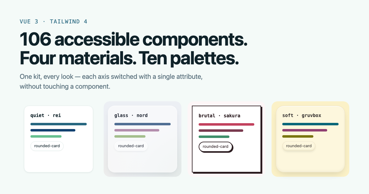](https://ramazandogna.github.io/rei-kit/)
|
|
16
|
+
|
|
13
17
|
```sh
|
|
14
18
|
pnpm add rei-kit
|
|
15
19
|
```
|
|
@@ -26,7 +30,36 @@ That line is the whole redesign. Three axes, each changed on its own:
|
|
|
26
30
|
| **Palette** | 10 built in — Nord, Dracula, Catppuccin, Solarized, Gruvbox, Tokyo Night, Rosé Pine, Rei, Sakura, Matcha |
|
|
27
31
|
| **Mode** | light and dark, every palette measured against WCAG AA in both |
|
|
28
32
|
|
|
29
|
-
零 — the layer everything else starts from.
|
|
33
|
+
零 — *rei*, zero: the layer everything else starts from.
|
|
34
|
+
|
|
35
|
+
**Stable.** 4.x is a published API: no export is removed, no prop renamed and
|
|
36
|
+
no component's output changed for the same input outside a major version.
|
|
37
|
+
Every release is packed as a real tarball, installed into three applications
|
|
38
|
+
and run through each one's own test suite before it ships.
|
|
39
|
+
[Changelog](https://github.com/ramazandogna/rei-kit/blob/main/CHANGELOG.md) ·
|
|
40
|
+
[Roadmap](https://github.com/ramazandogna/rei-kit/blob/main/ROADMAP.md)
|
|
41
|
+
|
|
42
|
+
### Is it for you?
|
|
43
|
+
|
|
44
|
+
**Reach for this** when you are already on Tailwind 4 and want your own
|
|
45
|
+
utilities and the kit to share one token layer; when the people using your app
|
|
46
|
+
— not just you — should be able to change how it looks; when you want the
|
|
47
|
+
accessible half of a control (the live region, the arrow keys, the focus
|
|
48
|
+
management) without writing it; and when what you ship at ten-plus components
|
|
49
|
+
matters.
|
|
50
|
+
|
|
51
|
+
**Reach for something else** when you need a data grid with pivots and frozen
|
|
52
|
+
columns, a charting library, a Nuxt module, or a Vue 2 / Tailwind 3 target.
|
|
53
|
+
Those are not on the roadmap.
|
|
54
|
+
|
|
55
|
+
**Unlike shadcn-vue**, components arrive as a dependency rather than copied
|
|
56
|
+
into your repository, so a fix reaches you as a patch release. The escape
|
|
57
|
+
hatch is a token set on one element, not a fork of the component.
|
|
58
|
+
|
|
59
|
+
**In Nuxt**, it is a plain Vue dependency: import from `rei-kit` as usual and
|
|
60
|
+
add the stylesheet to your CSS. There is no module, and the components are
|
|
61
|
+
SSR-safe — `ssr.spec.ts` renders every one of them on a server, and one of the
|
|
62
|
+
three apps that run on this kit prerenders every page it has.
|
|
30
63
|
|
|
31
64
|
| | |
|
|
32
65
|
| ---------------------- | ------------------------------------------------------------------------------ |
|
|
@@ -83,7 +116,7 @@ go red, and several of them exist nowhere else:
|
|
|
83
116
|
| -------------------------------- | -------------------------------------------------------------------------------------------------------------------------------------------------------------------------------------------------------------------------------------------- |
|
|
84
117
|
| **`direction-styles.spec.ts`** | One case per file, reading each stylesheet for a property that picks a side — `padding-left` where `padding-inline-start` was meant — and for a one-sided gradient with no right-to-left counterpart. It found 61 on its first run. |
|
|
85
118
|
| **`direction-keys.spec.ts`** | One case per control, pressing **ArrowLeft in a right-to-left document** and asserting it went *forward*. Ten components were walking backwards through themselves. It type-checks, it renders, it passes axe, and only an Arabic reader sees it. |
|
|
86
|
-
| **`examples-axe.spec.ts`** | axe on all
|
|
119
|
+
| **`examples-axe.spec.ts`** | axe on all 106 usage examples, **and again with each one opened** — a menu, a dialog, a combobox list is exactly where the ARIA lives and where a closed-state audit says nothing. |
|
|
87
120
|
| **`focus.spec.ts`** | Reads every component for a focus ring. A missing one compiles, renders and passes every other check. |
|
|
88
121
|
| **`public-api.spec.ts`** | Names every runtime export of all six entries. A kit compiles fine without an export nothing inside it calls. |
|
|
89
122
|
| **`type-surface.ts`** | Re-exports every published type and is type-checked twice, because a test cannot see types — they are gone by the time one runs. |
|
|
@@ -92,7 +125,7 @@ go red, and several of them exist nowhere else:
|
|
|
92
125
|
| **`consumer.yml`** | Packs the real tarball, installs it into all three apps and runs each one's whole gate. The only check that imports the package the way an app does. |
|
|
93
126
|
| **`pnpm size`** | Six budgets. The build fails when one grows past its line, and raising it has to say why in the commit. |
|
|
94
127
|
|
|
95
|
-
**
|
|
128
|
+
**1,888 tests across 73 files**, and every guard added is verified by being
|
|
96
129
|
broken first — the commit says what failed when it was removed. That habit
|
|
97
130
|
is what found the two cases in `anchored-panel.spec.ts` that were passing
|
|
98
131
|
with the feature deleted, and the comment in `BasePopover` that had
|
|
@@ -165,7 +198,7 @@ app, and the case *least* favourable to this kit:
|
|
|
165
198
|
|
|
166
199
|
| Kit | JS | CSS | Total |
|
|
167
200
|
| -------------------- | ---------: | ----------: | ----------: |
|
|
168
|
-
| **rei-kit 4.
|
|
201
|
+
| **rei-kit 4.4.0** | **3.7 KB** | **23.2 KB** | **26.9 KB** |
|
|
169
202
|
| element-plus 2.14.6 | 27.3 KB | 6.0 KB | 33.3 KB |
|
|
170
203
|
| naive-ui 2.45.3 | 51.2 KB | — | 51.2 KB |
|
|
171
204
|
| primevue 5.0.1 | 53.6 KB | — | 53.6 KB |
|
|
@@ -177,7 +210,7 @@ a data table, a tooltip and a card. A screen rather than a demo:
|
|
|
177
210
|
|
|
178
211
|
| Kit | JS | CSS | Total |
|
|
179
212
|
| -------------------- | ---------: | ----------: | -----------: |
|
|
180
|
-
| **rei-kit 4.
|
|
213
|
+
| **rei-kit 4.4.0** | **8.6 KB** | **23.2 KB** | **31.8 KB** |
|
|
181
214
|
| element-plus 2.14.6 | 90.1 KB | 14.0 KB | 104.1 KB |
|
|
182
215
|
| naive-ui 2.45.3 | 132.4 KB | — | 132.4 KB |
|
|
183
216
|
| primevue 5.0.1 | 135.8 KB | — | 135.8 KB |
|
|
@@ -191,7 +224,7 @@ the same seven cost them **60 to 125 KB**. A quarter smaller at three
|
|
|
191
224
|
components; **3.3× smaller at ten**.
|
|
192
225
|
|
|
193
226
|
That is the trade, stated rather than left to be inferred: rei-kit's CSS
|
|
194
|
-
column is the entire `mobile.css` preset — all
|
|
227
|
+
column is the entire `mobile.css` preset — all 106 components, four materials,
|
|
195
228
|
ten palettes — and it is the same 23.1 KB whether an app imports three
|
|
196
229
|
components or every one of them. An app using very little of the kit carries
|
|
197
230
|
stylesheet it does not need; an app using a screenful stops paying anything
|
|
@@ -222,7 +255,7 @@ Each claim here is enforced by something that fails, not by a promise.
|
|
|
222
255
|
|
|
223
256
|
| Standard | How it is held |
|
|
224
257
|
| ---------------------------------------- | --------------------------------------------------------------------------------------------------------------------------------------------------------------------------------------------------------------------------------------------------------------------------------------------------------------------------------------- |
|
|
225
|
-
| **Open for extension, closed for edits** | A new look is a token, a material or a palette — never an edit to a component. Materials and palettes restyle all
|
|
258
|
+
| **Open for extension, closed for edits** | A new look is a token, a material or a palette — never an edit to a component. Materials and palettes restyle all 106 without touching one, and a test fails if a component holds a colour. |
|
|
226
259
|
| **Single responsibility** | One part, one job. Label-and-error wiring lives in `FormField`, not in five inputs; taking the page behind a layer out of reach lives in one helper the modal, the sheet and the guide share. |
|
|
227
260
|
| **Depend on roles, not values** | Components read `primary`, `surface`, `--shadow-card` — never a hex or a pixel shadow. An app's brand wins in both modes, tested. |
|
|
228
261
|
| **WAI-ARIA Authoring Practices** | Menus, comboboxes, tabs, sliders, dialogs and accordions follow their APG pattern: arrows move, Tab leaves, Escape closes, focus returns. Behaviour tests drive each with the keyboard. |
|
|
@@ -234,11 +267,11 @@ Each claim here is enforced by something that fails, not by a promise.
|
|
|
234
267
|
|
|
235
268
|
## Status
|
|
236
269
|
|
|
237
|
-
**
|
|
270
|
+
**Three apps run on it, and none of them resembles another.**
|
|
238
271
|
|
|
239
272
|
| | |
|
|
240
273
|
| ------------ | --------------------------------------------------------------------------------------------------------------------------------------------------------------------------------------------------------------------------------------------------------------------------------------------------------------------------------------------------------------------------------------------------------------------------------------------------------------------------------------------------------------------------------------------------------------------------------------------------------------------------------------------------------------------------- |
|
|
241
|
-
| Components |
|
|
274
|
+
| Components | 106 (`AuthForm`, `BaseTable`, `BaseCombobox`, `BaseSlider`, `TabShell`, `BaseModal`, `BaseTabs`, `BaseTooltip`, `BasePagination`, `BaseBreadcrumb`, `BaseDisclosure`, `BaseAccordion`, `NavLinks`, `OfflineBanner`, `FabButton`, `BaseButton`, `BaseCard`, `BaseInput`, `BaseSelect`, `BaseTextarea`, `BaseCheckbox`, `BaseSwitch`, `BaseRadioGroup`, `BaseMenu`, `BaseAvatar`, `BaseSpinner`, `BaseAlert`, `BaseBadge`, `BaseSheet`, `ProgressBar`, `PriceCard`, `ToastHost`, `TabBar`, `GoogleButton`, `LocaleLinks`, `LocaleSheet`, `AuthShell`, `TourShell`, `InstallPrompt`, `UpdatePrompt`, `InstallSettings`, `SkeletonList`, `PageContainer`, `ErrorBoundary`, etc.) |
|
|
242
275
|
| Composables | 14 (`useToast`, `useTheme`, `useMaterial`, `usePalette`, `useToday`, `useMediaQuery`, `useOnline`, `useInstall`, `useSnooze`, `useThemeSync`, `useVisualViewport`, `useDragScroll`, `useDebouncedCallback`, `useAnnounce`) |
|
|
243
276
|
| Utilities | 48 functions and 5 constants (`applyTheme`, `applyMaterial`, `applyPalette`, `MATERIALS`, `PALETTES`, `formatDate`, `fieldErrors`, `toAuthMessageKey`, `createAuthGuard`, `createQueryDefaults`, `createWriteReport`, `toRedirectPath`, `Supabase error mapper`, i18n runtime, etc.) |
|
|
244
277
|
| Entry Points | `rei-kit`, `rei-kit/app`, `rei-kit/web`, `rei-kit/pwa`, `rei-kit/motion`, `rei-kit/supabase`, `rei-kit/mobile.css`, `rei-kit/web.css`, and each stylesheet on its own |
|
|
@@ -606,64 +639,12 @@ package's exports in both directions. A table maintained by hand is wrong by
|
|
|
606
639
|
the second release, and being wrong is worse than being absent — a reader
|
|
607
640
|
trusts it.
|
|
608
641
|
|
|
609
|
-
##
|
|
610
|
-
|
|
611
|
-
| Command | What it does |
|
|
612
|
-
| --------------------- | ----------------------------------------------------- |
|
|
613
|
-
| `pnpm dev` | Rebuild on change, for use with a linked app |
|
|
614
|
-
| `pnpm build` | Type-check, then build |
|
|
615
|
-
| `pnpm check` | Everything CI runs: format, lint, types, tests, build |
|
|
616
|
-
| `pnpm showcase` | The showcase, in dev mode |
|
|
617
|
-
| `pnpm showcase:build` | The showcase, built (`SHOWCASE_BASE` for a subpath) |
|
|
618
|
-
| `pnpm test:unit` | Vitest, watch mode |
|
|
619
|
-
| `pnpm lint` | oxlint + ESLint, with `--fix` |
|
|
620
|
-
|
|
621
|
-
## Not breaking the apps that use it
|
|
622
|
-
|
|
623
|
-
Four layers, cheapest first.
|
|
624
|
-
|
|
625
|
-
**Pinned ranges.** A consumer depends on `^0.4.0`, which at 0.x means
|
|
626
|
-
`>=0.4.0 <0.5.0` — publishing 0.5.0 upgrades nobody. Apps move on their own
|
|
627
|
-
schedule, and a release can never reach an app that has not asked for it. The
|
|
628
|
-
cost is the mirror image: an app that never asks never moves. Two of these
|
|
629
|
-
three sat two minors behind, so `PATCHNOTES.md` exists to make taking one a
|
|
630
|
-
short read.
|
|
631
|
-
|
|
632
|
-
**The public API test.** `src/__tests__/public-api.spec.ts` lists every export
|
|
633
|
-
by name. The kit compiles perfectly well without an export nothing here calls,
|
|
634
|
-
so removing one is invisible to every other test; this one fails loudly and
|
|
635
|
-
asks whether the version should be a major.
|
|
636
|
-
|
|
637
|
-
**The SSR test.** `src/__tests__/ssr.spec.ts` renders in the **node**
|
|
638
|
-
environment, not jsdom — jsdom supplies the very `document` a server lacks, and
|
|
639
|
-
passed all four of the SSR bugs 0.2.2 fixed.
|
|
640
|
-
|
|
641
|
-
**The consumer check.** `.github/workflows/consumer.yml` packs the tarball npm
|
|
642
|
-
would serve and installs it into **all three** apps, running each one's full
|
|
643
|
-
gate — format, lint, types, tests, production build. Kakehashi's build is
|
|
644
|
-
`vite-ssg build`, so that job is also the real prerender.
|
|
645
|
-
|
|
646
|
-
That last one is the important one: the kit's own tests never import it the way
|
|
647
|
-
an app does.
|
|
648
|
-
|
|
649
|
-
## Releasing
|
|
650
|
-
|
|
651
|
-
Pushing a `v*` tag runs the full check and publishes to npm. Nothing publishes
|
|
652
|
-
from a branch, so `main` can move without shipping.
|
|
653
|
-
|
|
654
|
-
```sh
|
|
655
|
-
cd bench && npm run bench && cd .. # the site's comparison table reads this
|
|
656
|
-
pnpm version minor
|
|
657
|
-
git push --follow-tags
|
|
658
|
-
```
|
|
659
|
-
|
|
660
|
-
The benchmark step is not optional and not a courtesy: `showcase-catalogue.spec.ts`
|
|
661
|
-
fails when `bench/results.json` names a version other than the one being
|
|
662
|
-
published, because the evidence section on the site reads that file. A
|
|
663
|
-
comparison table nobody re-ran is a claim about a build nobody ships.
|
|
642
|
+
## Working on rei-kit itself
|
|
664
643
|
|
|
665
|
-
|
|
666
|
-
|
|
644
|
+
The commands, the four checks that keep a release from breaking an app, and
|
|
645
|
+
how a version is cut are in
|
|
646
|
+
**[CONTRIBUTING.md](https://github.com/ramazandogna/rei-kit/blob/main/CONTRIBUTING.md)**
|
|
647
|
+
— they are for somebody changing this package rather than using it.
|
|
667
648
|
|
|
668
649
|
## Taking part
|
|
669
650
|
|
|
@@ -2,7 +2,7 @@ import { computed, createBlock, createCommentVNode, createElementBlock, defineCo
|
|
|
2
2
|
//#region src/components/BaseButton.vue?vue&type=script&setup=true&lang.ts
|
|
3
3
|
var _hoisted_1 = {
|
|
4
4
|
key: 0,
|
|
5
|
-
class: "size-4
|
|
5
|
+
class: "size-4 rounded-full border-2 border-current border-t-transparent motion-safe:animate-spin motion-reduce:animate-pulse",
|
|
6
6
|
"aria-hidden": "true"
|
|
7
7
|
};
|
|
8
8
|
//#endregion
|
|
@@ -146,4 +146,4 @@ var BaseButton_default = /* @__PURE__ */ defineComponent({
|
|
|
146
146
|
//#endregion
|
|
147
147
|
export { BaseButton_default as t };
|
|
148
148
|
|
|
149
|
-
//# sourceMappingURL=BaseButton-
|
|
149
|
+
//# sourceMappingURL=BaseButton-C3VGgIuR.js.map
|
|
@@ -0,0 +1 @@
|
|
|
1
|
+
{"version":3,"file":"BaseButton-C3VGgIuR.js","names":[],"sources":["../src/components/BaseButton.vue","../src/components/BaseButton.vue"],"sourcesContent":["<script setup lang=\"ts\">\nimport { computed } from 'vue'\nimport type { HTMLAttributes } from 'vue'\n\n/**\n * The kit's button, and — when asked — its link.\n *\n * `as` exists because a button and a link are the same shape and a different\n * element, and the app was resolving that by nesting them: a consumer had\n * `<RouterLink><BaseButton>` in every call to action, which is an `<a>` around\n * a `<button>`. That is invalid HTML, two stops in the tab order and two\n * controls to a screen reader, for one thing on the screen. Whether something\n * navigates is the app's decision; carrying it is this component's job.\n *\n * `router-link` is resolved by name rather than imported, so `vue-router` stays\n * the optional peer it is. Only an app that passes `as=\"router-link\"` needs it,\n * and an app that passes it has it.\n */\nconst {\n as = 'button',\n variant = 'primary',\n size = 'md',\n loading = false,\n disabled = false,\n type = 'button',\n icon = false,\n block = false,\n pill = false,\n pressed = undefined,\n to = undefined,\n href = undefined,\n} = defineProps<\n {\n /** What to render. `button` unless this navigates. */\n as?: 'button' | 'a' | 'router-link' | undefined\n /**\n * `link` is a real action that should read as text — \"clear this note\",\n * \"remove\", \"change category\". It has no surface at all, so it also has no\n * height and no padding: giving it either would make it a ghost button,\n * which is a different thing and was already here.\n */\n variant?:\n | 'primary'\n | 'secondary'\n | 'ghost'\n | 'quiet'\n | 'destructive'\n | 'row'\n | 'danger'\n | 'positive'\n | 'warning'\n | 'accent'\n | 'link'\n | 'unstyled'\n | undefined\n /** `xs` is the action inside a prompt or a nudge, not on a page. */\n size?: 'xs' | 'sm' | 'md' | 'lg' | undefined\n loading?: boolean | undefined\n disabled?: boolean | undefined\n /** Ignored unless `as` is `button`. */\n type?: 'button' | 'submit' | undefined\n /**\n * Square, sized to its icon, with no label beside it.\n *\n * **Pass `aria-label`.** An icon on its own has no accessible name, and a\n * control a screen reader announces as \"button\" is not usable. Attributes\n * fall through, so `aria-label` lands where it should — nothing here can\n * check that you passed one, which is why it is said this loudly.\n */\n icon?: boolean | undefined\n /** Fills its container. The ordinary case under a form. */\n block?: boolean | undefined\n /** For `as=\"router-link\"`. */\n to?: string | Record<string, unknown> | undefined\n /** For `as=\"a\"`. */\n href?: string | undefined\n /**\n * Fully rounded rather than card-cornered.\n *\n * Every install prompt, update prompt and nudge across the apps used the\n * same pair — a filled pill to act and a quiet one to dismiss — and none of\n * them could use this component, because it only knew one corner radius.\n */\n pill?: boolean | undefined\n /**\n * That this button is a switch, and whether it is on.\n *\n * Omit it and the button is an action. Pass it and the button becomes a\n * toggle: `aria-pressed` is written, and the variants that have an \"off\"\n * look — ghost, quiet, secondary — take a filled one when on.\n *\n * There were 18 of these hand-written across the three apps, every one a\n * picker cell or a filter chip, and almost none of them said `aria-pressed`\n * at all. A screen reader met a row of identical buttons with no way to know\n * which was chosen.\n */\n pressed?: boolean | undefined\n /* The root element's own attributes and listeners — `@click`, `aria-label`,\n `role` — typed for editors and for vue-tsc's strictTemplates, where an\n undeclared one is an error. `@vue-ignore` keeps them out of the runtime\n props, so they still fall through to the element as before. */\n } & /* @vue-ignore */ HTMLAttributes\n>()\n\nconst VARIANT_CLASS = {\n primary: 'bg-primary text-on-primary shadow-(--shadow-control) hover:bg-primary/90',\n /*\n * An action that is real but not the one being urged.\n *\n * `ghost` had been standing in for this and cannot: with no border and no\n * fill it reads as text, so \"Save draft\" sitting next to \"Publish\" looked\n * like a caption rather than the other half of a choice. Ghost is for a\n * control that should recede until it is wanted — a toolbar, a menu row —\n * and that is a different job.\n */\n secondary: 'control text-ink hover:bg-muted',\n ghost: 'bg-transparent text-ink hover:bg-muted',\n /*\n * Quiet until you reach for it, and then plainly destructive: a delete at\n * the end of a row, a \"remove this note\", an archive.\n *\n * Not `danger`, which is filled and shouts before it is needed — a red\n * button in a list of rows makes the list look like a warning. And not\n * `quiet` with a `hover:text-negative` class beside it, which is how all\n * three apps were doing it: that class and the variant's own\n * `hover:text-ink` set the same property at the same specificity, so which\n * one wins depends on the order they happen to land in the stylesheet.\n *\n * Fifteen of these across the three apps, and every one of them was that\n * coin toss.\n */\n destructive: 'bg-transparent text-ink-soft hover:text-negative',\n /*\n * A line in a list that is also a control: a settings row, a node in a tree,\n * a heading that opens something.\n *\n * Full width, aligned to the start, and a hover that fills the whole line\n * rather than a box inside it. Every app had written this — `.tree-row`,\n * `.row`, `.header-action` — because a button that centres its content\n * cannot be a row, and the alignment is the only thing that had to change.\n *\n * Padding stays the app's: a menu row and a tree node are not the same\n * height, and the kit has no opinion about which one this is.\n */\n row: 'w-full justify-start text-left bg-transparent text-ink hover:bg-muted',\n /*\n * The control that is present without asking for attention: a dismiss beside\n * an install prompt, a chevron beside a month, a delete at the end of a row.\n *\n * `ghost` is not this. Ghost keeps full-strength ink; this one starts soft\n * and darkens, which is the difference between a control waiting to be used\n * and one that is merely available. The pair `text-ink-soft hover:text-ink`\n * was hand-written 47 times across the three apps.\n *\n * It fills on hover, and 0.11.0 got that half-right by fill... only for\n * icons. The evidence said otherwise once the third app was read: an editor\n * toolbar's buttons carry text and fill exactly the same way. The shape is\n * \"a control in a strip\", not \"a control with a glyph in it\". A text action\n * that should have no surface at all is `link`.\n */\n quiet: 'bg-transparent text-ink-soft hover:bg-muted hover:text-ink',\n danger: 'bg-negative text-on-negative shadow-(--shadow-control) hover:bg-negative/90',\n /*\n * The rest of the roles the kit already declares.\n *\n * `tokens.css` names five colour roles and this component exposed two of\n * them, so an app that wanted a success-coloured action had to hand-write\n * the button — which is what Hibi's green install button is. A component\n * that cannot use a role its own design system declares is not avoiding a\n * guess; it is incomplete.\n */\n positive: 'bg-positive text-on-positive shadow-(--shadow-control) hover:bg-positive/90',\n warning: 'bg-warning text-on-warning shadow-(--shadow-control) hover:bg-warning/90',\n accent: 'bg-accent text-on-accent shadow-(--shadow-control) hover:bg-accent/90',\n /* No fill, no border, no box: underlined so it is still obviously a control\n without one. `ghost` cannot stand in — it has a hover surface and a\n radius, so it reads as a button that happens to be empty. */\n link: 'bg-transparent underline underline-offset-2 hover:opacity-80',\n /*\n * Everything this component is, except the paint.\n *\n * The reason it exists is measurable: across the three apps there were 58\n * raw `<button>` elements sitting in 24 files that already imported and used\n * `BaseButton`. The developer reached for the kit and gave up halfway down\n * the same file — because the kit offered all of its appearance or none of\n * itself, and what those places needed was everything but the appearance.\n *\n * A picker cell, a chip, a calendar day: the surface is the app's, and it\n * should be. The element, the focus ring, the disabled handling, the\n * `aria-pressed` bookkeeping and the `as` switch are not, and were being\n * rewritten every time — usually without the focus ring.\n */\n unstyled: '',\n} as const\n\n/* Two scales, because a square control cannot take horizontal padding and\n still be square. `lg` is here for a wide page's call to action: a 44px\n button is right under a thumb and undersized under a headline. */\nconst SIZE_CLASS = {\n xs: 'h-8 px-3 text-xs',\n sm: 'h-9 px-3 text-sm',\n md: 'h-11 px-4 text-base',\n lg: 'h-14 px-6 text-lg',\n} as const\n\nconst ICON_SIZE_CLASS = {\n xs: 'size-8 text-xs',\n sm: 'size-9 text-sm',\n md: 'size-11 text-base',\n lg: 'size-14 text-lg',\n} as const\n\n/* A row is sized by its padding, not by a height. A settings line holds one\n line of text and a tree node can hold two, and a fixed height turns the\n second into an overflow. */\nconst ROW_SIZE_CLASS = {\n xs: 'px-2 py-1.5 text-xs',\n sm: 'px-3 py-2 text-sm',\n md: 'px-3 py-2.5 text-base',\n lg: 'px-4 py-3 text-lg',\n} as const\n\n/* A link takes the type size and nothing else. Height and padding are what\n make a surface, and this variant is the one without one. */\nconst LINK_SIZE_CLASS = {\n xs: 'text-xs',\n sm: 'text-sm',\n md: 'text-base',\n lg: 'text-lg',\n} as const\n\nconst sizing = computed(() => {\n // Unstyled owns no box, so it takes no size: the app's own classes decide.\n if (variant === 'unstyled') return ''\n if (variant === 'link') return LINK_SIZE_CLASS[size]\n if (variant === 'row') return ROW_SIZE_CLASS[size]\n return icon ? ICON_SIZE_CLASS[size] : SIZE_CLASS[size]\n})\n\n/* The variants with an \"off\" look, and what \"on\" looks like for them. The\n filled ones are already on; link and unstyled have no surface to fill. */\nconst PRESSED_CLASS: Partial<Record<string, string>> = {\n ghost: 'bg-primary text-on-primary hover:bg-primary/90',\n quiet: 'bg-primary text-on-primary hover:bg-primary/90',\n secondary: 'bg-primary border-primary text-on-primary hover:bg-primary/90',\n /* A selected row is filled, not recoloured: the line stays a line, and the\n fill is what a list uses to say \"this one\". Filling it with the primary\n colour instead would make one row of a list shout. */\n row: 'w-full justify-start text-left bg-muted text-ink hover:bg-muted',\n}\n\nconst surface = computed(() => {\n if (pressed === true) return PRESSED_CLASS[variant] ?? VARIANT_CLASS[variant]\n\n /* Destructive tints its own fill rather than borrowing the neutral one: a\n red glyph on a grey wash reads as two different states at once. */\n if (variant === 'destructive') return `${VARIANT_CLASS.destructive} hover:bg-negative/10`\n\n return VARIANT_CLASS[variant]\n})\n\n/* Layout and feel, which unstyled does not impose either — but the focus ring\n and the disabled handling stay, because those are the floor. A raw <button>\n is what happens when a component makes them optional.\n \n Colour is in the transition, not just transform. Every variant here changes\n colour on hover and none of them animated it, so every button in every\n consuming app snapped while the hand-written controls beside them faded —\n `transition-colors` appears 106 times across the three apps, which is the\n convention this component was the only thing not following. */\nconst shell = computed(() => {\n if (variant === 'unstyled') return ''\n\n const feel =\n 'transition-[transform,translate,scale,color,background-color,border-color,box-shadow] duration-(--duration-fast) ease-standard select-none'\n\n /* A row does not press. Scaling a full-width line looks like the list itself\n flinched, and every hand-written row in the apps animated colour only. */\n if (variant === 'row') return `inline-flex items-center gap-2 font-medium ${feel}`\n\n /* The press belongs to the material. A shrink by default; a material that\n draws hard offset shadows moves the button *into* its shadow instead, and\n drops the shadow, so pressing reads as pressing on every one of them. */\n return `inline-flex items-center justify-center gap-2 font-medium ${feel} active:scale-(--press-scale) active:translate-x-(--press-offset) active:translate-y-(--press-offset) active:shadow-(--shadow-control-pressed)`\n})\n\nconst radius = computed(() => {\n if (variant === 'unstyled') return ''\n if (variant === 'link') return 'rounded-cell'\n return pill ? 'rounded-full' : 'rounded-card'\n})\n\n/** Anything that is not a `<button>` cannot be `disabled`; it has to be told. */\nconst inactive = computed(() => disabled || loading)\n\nconst linkProps = computed(() => {\n if (as === 'router-link') return { to }\n // The href is dropped rather than kept alongside aria-disabled: an anchor\n // without one is not focusable and not activatable, which is the whole of\n // what \"disabled\" means for a link.\n if (as === 'a') return inactive.value ? {} : { href }\n return {}\n})\n</script>\n\n<template>\n <component\n :is=\"as\"\n v-bind=\"linkProps\"\n :type=\"as === 'button' ? type : undefined\"\n :disabled=\"as === 'button' ? inactive : undefined\"\n :aria-disabled=\"as !== 'button' && inactive ? 'true' : undefined\"\n :aria-busy=\"loading\"\n :aria-pressed=\"pressed === undefined ? undefined : String(pressed)\"\n class=\"focus-visible:outline-primary focus-visible:outline-2 focus-visible:outline-offset-2 disabled:pointer-events-none disabled:opacity-50 aria-disabled:pointer-events-none aria-disabled:opacity-50\"\n :class=\"[shell, surface, sizing, radius, block ? 'w-full' : '']\"\n >\n <!-- Still moving under the preference, like `BaseSpinner`: a loading\n indicator that stops says the app has hung — a slow fade rather than\n a fast rotation. Tailwind's `animate-spin` has no guard of its own. -->\n <span\n v-if=\"loading\"\n class=\"size-4 rounded-full border-2 border-current border-t-transparent motion-safe:animate-spin motion-reduce:animate-pulse\"\n aria-hidden=\"true\"\n />\n <slot />\n </component>\n</template>\n","<script setup lang=\"ts\">\nimport { computed } from 'vue'\nimport type { HTMLAttributes } from 'vue'\n\n/**\n * The kit's button, and — when asked — its link.\n *\n * `as` exists because a button and a link are the same shape and a different\n * element, and the app was resolving that by nesting them: a consumer had\n * `<RouterLink><BaseButton>` in every call to action, which is an `<a>` around\n * a `<button>`. That is invalid HTML, two stops in the tab order and two\n * controls to a screen reader, for one thing on the screen. Whether something\n * navigates is the app's decision; carrying it is this component's job.\n *\n * `router-link` is resolved by name rather than imported, so `vue-router` stays\n * the optional peer it is. Only an app that passes `as=\"router-link\"` needs it,\n * and an app that passes it has it.\n */\nconst {\n as = 'button',\n variant = 'primary',\n size = 'md',\n loading = false,\n disabled = false,\n type = 'button',\n icon = false,\n block = false,\n pill = false,\n pressed = undefined,\n to = undefined,\n href = undefined,\n} = defineProps<\n {\n /** What to render. `button` unless this navigates. */\n as?: 'button' | 'a' | 'router-link' | undefined\n /**\n * `link` is a real action that should read as text — \"clear this note\",\n * \"remove\", \"change category\". It has no surface at all, so it also has no\n * height and no padding: giving it either would make it a ghost button,\n * which is a different thing and was already here.\n */\n variant?:\n | 'primary'\n | 'secondary'\n | 'ghost'\n | 'quiet'\n | 'destructive'\n | 'row'\n | 'danger'\n | 'positive'\n | 'warning'\n | 'accent'\n | 'link'\n | 'unstyled'\n | undefined\n /** `xs` is the action inside a prompt or a nudge, not on a page. */\n size?: 'xs' | 'sm' | 'md' | 'lg' | undefined\n loading?: boolean | undefined\n disabled?: boolean | undefined\n /** Ignored unless `as` is `button`. */\n type?: 'button' | 'submit' | undefined\n /**\n * Square, sized to its icon, with no label beside it.\n *\n * **Pass `aria-label`.** An icon on its own has no accessible name, and a\n * control a screen reader announces as \"button\" is not usable. Attributes\n * fall through, so `aria-label` lands where it should — nothing here can\n * check that you passed one, which is why it is said this loudly.\n */\n icon?: boolean | undefined\n /** Fills its container. The ordinary case under a form. */\n block?: boolean | undefined\n /** For `as=\"router-link\"`. */\n to?: string | Record<string, unknown> | undefined\n /** For `as=\"a\"`. */\n href?: string | undefined\n /**\n * Fully rounded rather than card-cornered.\n *\n * Every install prompt, update prompt and nudge across the apps used the\n * same pair — a filled pill to act and a quiet one to dismiss — and none of\n * them could use this component, because it only knew one corner radius.\n */\n pill?: boolean | undefined\n /**\n * That this button is a switch, and whether it is on.\n *\n * Omit it and the button is an action. Pass it and the button becomes a\n * toggle: `aria-pressed` is written, and the variants that have an \"off\"\n * look — ghost, quiet, secondary — take a filled one when on.\n *\n * There were 18 of these hand-written across the three apps, every one a\n * picker cell or a filter chip, and almost none of them said `aria-pressed`\n * at all. A screen reader met a row of identical buttons with no way to know\n * which was chosen.\n */\n pressed?: boolean | undefined\n /* The root element's own attributes and listeners — `@click`, `aria-label`,\n `role` — typed for editors and for vue-tsc's strictTemplates, where an\n undeclared one is an error. `@vue-ignore` keeps them out of the runtime\n props, so they still fall through to the element as before. */\n } & /* @vue-ignore */ HTMLAttributes\n>()\n\nconst VARIANT_CLASS = {\n primary: 'bg-primary text-on-primary shadow-(--shadow-control) hover:bg-primary/90',\n /*\n * An action that is real but not the one being urged.\n *\n * `ghost` had been standing in for this and cannot: with no border and no\n * fill it reads as text, so \"Save draft\" sitting next to \"Publish\" looked\n * like a caption rather than the other half of a choice. Ghost is for a\n * control that should recede until it is wanted — a toolbar, a menu row —\n * and that is a different job.\n */\n secondary: 'control text-ink hover:bg-muted',\n ghost: 'bg-transparent text-ink hover:bg-muted',\n /*\n * Quiet until you reach for it, and then plainly destructive: a delete at\n * the end of a row, a \"remove this note\", an archive.\n *\n * Not `danger`, which is filled and shouts before it is needed — a red\n * button in a list of rows makes the list look like a warning. And not\n * `quiet` with a `hover:text-negative` class beside it, which is how all\n * three apps were doing it: that class and the variant's own\n * `hover:text-ink` set the same property at the same specificity, so which\n * one wins depends on the order they happen to land in the stylesheet.\n *\n * Fifteen of these across the three apps, and every one of them was that\n * coin toss.\n */\n destructive: 'bg-transparent text-ink-soft hover:text-negative',\n /*\n * A line in a list that is also a control: a settings row, a node in a tree,\n * a heading that opens something.\n *\n * Full width, aligned to the start, and a hover that fills the whole line\n * rather than a box inside it. Every app had written this — `.tree-row`,\n * `.row`, `.header-action` — because a button that centres its content\n * cannot be a row, and the alignment is the only thing that had to change.\n *\n * Padding stays the app's: a menu row and a tree node are not the same\n * height, and the kit has no opinion about which one this is.\n */\n row: 'w-full justify-start text-left bg-transparent text-ink hover:bg-muted',\n /*\n * The control that is present without asking for attention: a dismiss beside\n * an install prompt, a chevron beside a month, a delete at the end of a row.\n *\n * `ghost` is not this. Ghost keeps full-strength ink; this one starts soft\n * and darkens, which is the difference between a control waiting to be used\n * and one that is merely available. The pair `text-ink-soft hover:text-ink`\n * was hand-written 47 times across the three apps.\n *\n * It fills on hover, and 0.11.0 got that half-right by fill... only for\n * icons. The evidence said otherwise once the third app was read: an editor\n * toolbar's buttons carry text and fill exactly the same way. The shape is\n * \"a control in a strip\", not \"a control with a glyph in it\". A text action\n * that should have no surface at all is `link`.\n */\n quiet: 'bg-transparent text-ink-soft hover:bg-muted hover:text-ink',\n danger: 'bg-negative text-on-negative shadow-(--shadow-control) hover:bg-negative/90',\n /*\n * The rest of the roles the kit already declares.\n *\n * `tokens.css` names five colour roles and this component exposed two of\n * them, so an app that wanted a success-coloured action had to hand-write\n * the button — which is what Hibi's green install button is. A component\n * that cannot use a role its own design system declares is not avoiding a\n * guess; it is incomplete.\n */\n positive: 'bg-positive text-on-positive shadow-(--shadow-control) hover:bg-positive/90',\n warning: 'bg-warning text-on-warning shadow-(--shadow-control) hover:bg-warning/90',\n accent: 'bg-accent text-on-accent shadow-(--shadow-control) hover:bg-accent/90',\n /* No fill, no border, no box: underlined so it is still obviously a control\n without one. `ghost` cannot stand in — it has a hover surface and a\n radius, so it reads as a button that happens to be empty. */\n link: 'bg-transparent underline underline-offset-2 hover:opacity-80',\n /*\n * Everything this component is, except the paint.\n *\n * The reason it exists is measurable: across the three apps there were 58\n * raw `<button>` elements sitting in 24 files that already imported and used\n * `BaseButton`. The developer reached for the kit and gave up halfway down\n * the same file — because the kit offered all of its appearance or none of\n * itself, and what those places needed was everything but the appearance.\n *\n * A picker cell, a chip, a calendar day: the surface is the app's, and it\n * should be. The element, the focus ring, the disabled handling, the\n * `aria-pressed` bookkeeping and the `as` switch are not, and were being\n * rewritten every time — usually without the focus ring.\n */\n unstyled: '',\n} as const\n\n/* Two scales, because a square control cannot take horizontal padding and\n still be square. `lg` is here for a wide page's call to action: a 44px\n button is right under a thumb and undersized under a headline. */\nconst SIZE_CLASS = {\n xs: 'h-8 px-3 text-xs',\n sm: 'h-9 px-3 text-sm',\n md: 'h-11 px-4 text-base',\n lg: 'h-14 px-6 text-lg',\n} as const\n\nconst ICON_SIZE_CLASS = {\n xs: 'size-8 text-xs',\n sm: 'size-9 text-sm',\n md: 'size-11 text-base',\n lg: 'size-14 text-lg',\n} as const\n\n/* A row is sized by its padding, not by a height. A settings line holds one\n line of text and a tree node can hold two, and a fixed height turns the\n second into an overflow. */\nconst ROW_SIZE_CLASS = {\n xs: 'px-2 py-1.5 text-xs',\n sm: 'px-3 py-2 text-sm',\n md: 'px-3 py-2.5 text-base',\n lg: 'px-4 py-3 text-lg',\n} as const\n\n/* A link takes the type size and nothing else. Height and padding are what\n make a surface, and this variant is the one without one. */\nconst LINK_SIZE_CLASS = {\n xs: 'text-xs',\n sm: 'text-sm',\n md: 'text-base',\n lg: 'text-lg',\n} as const\n\nconst sizing = computed(() => {\n // Unstyled owns no box, so it takes no size: the app's own classes decide.\n if (variant === 'unstyled') return ''\n if (variant === 'link') return LINK_SIZE_CLASS[size]\n if (variant === 'row') return ROW_SIZE_CLASS[size]\n return icon ? ICON_SIZE_CLASS[size] : SIZE_CLASS[size]\n})\n\n/* The variants with an \"off\" look, and what \"on\" looks like for them. The\n filled ones are already on; link and unstyled have no surface to fill. */\nconst PRESSED_CLASS: Partial<Record<string, string>> = {\n ghost: 'bg-primary text-on-primary hover:bg-primary/90',\n quiet: 'bg-primary text-on-primary hover:bg-primary/90',\n secondary: 'bg-primary border-primary text-on-primary hover:bg-primary/90',\n /* A selected row is filled, not recoloured: the line stays a line, and the\n fill is what a list uses to say \"this one\". Filling it with the primary\n colour instead would make one row of a list shout. */\n row: 'w-full justify-start text-left bg-muted text-ink hover:bg-muted',\n}\n\nconst surface = computed(() => {\n if (pressed === true) return PRESSED_CLASS[variant] ?? VARIANT_CLASS[variant]\n\n /* Destructive tints its own fill rather than borrowing the neutral one: a\n red glyph on a grey wash reads as two different states at once. */\n if (variant === 'destructive') return `${VARIANT_CLASS.destructive} hover:bg-negative/10`\n\n return VARIANT_CLASS[variant]\n})\n\n/* Layout and feel, which unstyled does not impose either — but the focus ring\n and the disabled handling stay, because those are the floor. A raw <button>\n is what happens when a component makes them optional.\n \n Colour is in the transition, not just transform. Every variant here changes\n colour on hover and none of them animated it, so every button in every\n consuming app snapped while the hand-written controls beside them faded —\n `transition-colors` appears 106 times across the three apps, which is the\n convention this component was the only thing not following. */\nconst shell = computed(() => {\n if (variant === 'unstyled') return ''\n\n const feel =\n 'transition-[transform,translate,scale,color,background-color,border-color,box-shadow] duration-(--duration-fast) ease-standard select-none'\n\n /* A row does not press. Scaling a full-width line looks like the list itself\n flinched, and every hand-written row in the apps animated colour only. */\n if (variant === 'row') return `inline-flex items-center gap-2 font-medium ${feel}`\n\n /* The press belongs to the material. A shrink by default; a material that\n draws hard offset shadows moves the button *into* its shadow instead, and\n drops the shadow, so pressing reads as pressing on every one of them. */\n return `inline-flex items-center justify-center gap-2 font-medium ${feel} active:scale-(--press-scale) active:translate-x-(--press-offset) active:translate-y-(--press-offset) active:shadow-(--shadow-control-pressed)`\n})\n\nconst radius = computed(() => {\n if (variant === 'unstyled') return ''\n if (variant === 'link') return 'rounded-cell'\n return pill ? 'rounded-full' : 'rounded-card'\n})\n\n/** Anything that is not a `<button>` cannot be `disabled`; it has to be told. */\nconst inactive = computed(() => disabled || loading)\n\nconst linkProps = computed(() => {\n if (as === 'router-link') return { to }\n // The href is dropped rather than kept alongside aria-disabled: an anchor\n // without one is not focusable and not activatable, which is the whole of\n // what \"disabled\" means for a link.\n if (as === 'a') return inactive.value ? {} : { href }\n return {}\n})\n</script>\n\n<template>\n <component\n :is=\"as\"\n v-bind=\"linkProps\"\n :type=\"as === 'button' ? type : undefined\"\n :disabled=\"as === 'button' ? inactive : undefined\"\n :aria-disabled=\"as !== 'button' && inactive ? 'true' : undefined\"\n :aria-busy=\"loading\"\n :aria-pressed=\"pressed === undefined ? undefined : String(pressed)\"\n class=\"focus-visible:outline-primary focus-visible:outline-2 focus-visible:outline-offset-2 disabled:pointer-events-none disabled:opacity-50 aria-disabled:pointer-events-none aria-disabled:opacity-50\"\n :class=\"[shell, surface, sizing, radius, block ? 'w-full' : '']\"\n >\n <!-- Still moving under the preference, like `BaseSpinner`: a loading\n indicator that stops says the app has hung — a slow fade rather than\n a fast rotation. Tailwind's `animate-spin` has no guard of its own. -->\n <span\n v-if=\"loading\"\n class=\"size-4 rounded-full border-2 border-current border-t-transparent motion-safe:animate-spin motion-reduce:animate-pulse\"\n aria-hidden=\"true\"\n />\n <slot />\n </component>\n</template>\n"],"mappings":";;;;;;;;;;;;;;;;;;;;;;;;;;;;;;;;;;;;;;;;;;;;EAwGA,MAAM,gBAAgB;GACpB,SAAS;GAUT,WAAW;GACX,OAAO;GAeP,aAAa;GAab,KAAK;GAgBL,OAAO;GACP,QAAQ;GAUR,UAAU;GACV,SAAS;GACT,QAAQ;GAIR,MAAM;GAeN,UAAU;EACZ;EAKA,MAAM,aAAa;GACjB,IAAI;GACJ,IAAI;GACJ,IAAI;GACJ,IAAI;EACN;EAEA,MAAM,kBAAkB;GACtB,IAAI;GACJ,IAAI;GACJ,IAAI;GACJ,IAAI;EACN;EAKA,MAAM,iBAAiB;GACrB,IAAI;GACJ,IAAI;GACJ,IAAI;GACJ,IAAI;EACN;EAIA,MAAM,kBAAkB;GACtB,IAAI;GACJ,IAAI;GACJ,IAAI;GACJ,IAAI;EACN;EAEA,MAAM,SAAS,eAAe;GAE5B,IAAI,QAAA,YAAY,YAAY,OAAO;GACnC,IAAI,QAAA,YAAY,QAAQ,OAAO,gBAAgB,QAAA;GAC/C,IAAI,QAAA,YAAY,OAAO,OAAO,eAAe,QAAA;GAC7C,OAAO,QAAA,OAAO,gBAAgB,QAAA,QAAQ,WAAW,QAAA;EACnD,CAAC;EAID,MAAM,gBAAiD;GACrD,OAAO;GACP,OAAO;GACP,WAAW;GAIX,KAAK;EACP;EAEA,MAAM,UAAU,eAAe;GAC7B,IAAI,QAAA,YAAY,MAAM,OAAO,cAAc,QAAA,YAAY,cAAc,QAAA;GAIrE,IAAI,QAAA,YAAY,eAAe,OAAO,GAAG,cAAc,YAAY;GAEnE,OAAO,cAAc,QAAA;EACvB,CAAC;EAWD,MAAM,QAAQ,eAAe;GAC3B,IAAI,QAAA,YAAY,YAAY,OAAO;GAEnC,MAAM,OACJ;GAIF,IAAI,QAAA,YAAY,OAAO,OAAO,8CAA8C;GAK5E,OAAO,6DAA6D,KAAK;EAC3E,CAAC;EAED,MAAM,SAAS,eAAe;GAC5B,IAAI,QAAA,YAAY,YAAY,OAAO;GACnC,IAAI,QAAA,YAAY,QAAQ,OAAO;GAC/B,OAAO,QAAA,OAAO,iBAAiB;EACjC,CAAC;;EAGD,MAAM,WAAW,eAAe,QAAA,YAAY,QAAA,OAAO;EAEnD,MAAM,YAAY,eAAe;GAC/B,IAAI,QAAA,OAAO,eAAe,OAAO,EAAE,IAAC,QAAA,GAAE;GAItC,IAAI,QAAA,OAAO,KAAK,OAAO,SAAS,QAAQ,CAAC,IAAI,EAAE,MAAG,QAAA,KAAE;GACpD,OAAO,CAAC;EACV,CAAC;;GAIC,OAAA,UAAA,GAAA,YAoBY,wBAnBL,QAAA,EAAE,GADT,WAEU,UAkBE,OAlBO;IAChB,MAAM,QAAA,OAAE,WAAgB,QAAA,OAAO,KAAA;IAC/B,UAAU,QAAA,OAAE,WAAgB,SAAA,QAAW,KAAA;IACvC,iBAAe,QAAA,OAAE,YAAiB,SAAA,QAAQ,SAAY,KAAA;IACtD,aAAW,QAAA;IACX,gBAAc,QAAA,YAAY,KAAA,IAAY,KAAA,IAAY,OAAO,QAAA,OAAO;IACjE,OAAK,CAAC,oMAAkM;KAC/L,MAAA;KAAO,QAAA;KAAS,OAAA;KAAQ,OAAA;KAAQ,QAAA,QAAK,WAAA;IAAA,CAAA;;IAK9C,SAAA,cAIE,CAHM,QAAA,WADR,UAAA,GAAA,mBAIE,QAJF,UAIE,KAAA,mBAAA,IAAA,IAAA,GACF,WAAQ,KAAA,QAAA,SAAA,CAAA,CAAA"}
|
|
@@ -1,4 +1,4 @@
|
|
|
1
|
-
import { c as useBoundValue } from "./focus-target-
|
|
1
|
+
import { c as useBoundValue } from "./focus-target-DENXwVQ3.js";
|
|
2
2
|
import { t as _plugin_vue_export_helper_default } from "./_plugin-vue_export-helper-BOaGB7Aw.js";
|
|
3
3
|
import { Fragment, computed, createBlock, createCommentVNode, createElementBlock, createElementVNode, defineComponent, nextTick, normalizeClass, normalizeStyle, onBeforeUnmount, onMounted, onScopeDispose, openBlock, ref, renderList, renderSlot, toDisplayString, unref, useId, useTemplateRef, watch, watchEffect } from "vue";
|
|
4
4
|
import { Check } from "lucide-vue-next";
|
|
@@ -546,4 +546,4 @@ var BaseListbox_default = /*#__PURE__*/ _plugin_vue_export_helper_default(/* @__
|
|
|
546
546
|
//#endregion
|
|
547
547
|
export { BaseSkeleton_default as a, useMediaQuery as c, focusableWithin as i, useDragScroll as l, ScrollArea_default as n, useMenuKeys as o, FOCUSABLE as r, useAnchoredPanel as s, BaseListbox_default as t };
|
|
548
548
|
|
|
549
|
-
//# sourceMappingURL=BaseListbox-
|
|
549
|
+
//# sourceMappingURL=BaseListbox-tS7ZpcoF.js.map
|