react-premium-charts 0.1.6
This diff represents the content of publicly available package versions that have been released to one of the supported registries. The information contained in this diff is provided for informational purposes only and reflects changes between package versions as they appear in their respective public registries.
- package/LICENSE +1 -0
- package/README.md +117 -0
- package/dist/index.cjs +2087 -0
- package/dist/index.cjs.map +1 -0
- package/dist/index.d.cts +478 -0
- package/dist/index.d.ts +478 -0
- package/dist/index.js +2053 -0
- package/dist/index.js.map +1 -0
- package/dist/styles.css +222 -0
- package/package.json +71 -0
package/LICENSE
ADDED
|
@@ -0,0 +1 @@
|
|
|
1
|
+
MIT
|
package/README.md
ADDED
|
@@ -0,0 +1,117 @@
|
|
|
1
|
+
# react-premium-charts
|
|
2
|
+
|
|
3
|
+
A small, modern **SVG-first** React chart library using **d3-scale** and **d3-shape** for layout and path generation. Lightweight, themeable, and built for React 18+.
|
|
4
|
+
|
|
5
|
+
|
|
6
|
+
|
|
7
|
+
## Install
|
|
8
|
+
|
|
9
|
+
```bash
|
|
10
|
+
npm i d3-array d3-scale d3-shape
|
|
11
|
+
npm i react-premium-charts
|
|
12
|
+
```
|
|
13
|
+
|
|
14
|
+
Import CSS once:
|
|
15
|
+
|
|
16
|
+
```ts
|
|
17
|
+
import "react-premium-charts/styles.css";
|
|
18
|
+
```
|
|
19
|
+
|
|
20
|
+
## Quick Start
|
|
21
|
+
|
|
22
|
+
```tsx
|
|
23
|
+
import { scaleLinear } from "d3-scale";
|
|
24
|
+
import { ThemeProvider, Chart, LineSeries } from "react-premium-charts";
|
|
25
|
+
import "react-premium-charts/styles.css";
|
|
26
|
+
|
|
27
|
+
function App() {
|
|
28
|
+
const data = [{ value: 10 }, { value: 25 }, { value: 15 }, { value: 40 }];
|
|
29
|
+
const xScale = scaleLinear().domain([0, 3]).range([0, 360]);
|
|
30
|
+
const yScale = scaleLinear().domain([0, 50]).range([160, 0]);
|
|
31
|
+
|
|
32
|
+
return (
|
|
33
|
+
<ThemeProvider mode="light" palette="default">
|
|
34
|
+
<Chart width={400} height={200} margin={{ top: 16, right: 16, bottom: 28, left: 40 }}>
|
|
35
|
+
<LineSeries data={data} x={(_, i) => i} y={(d) => d.value} xScale={xScale} yScale={yScale} />
|
|
36
|
+
</Chart>
|
|
37
|
+
</ThemeProvider>
|
|
38
|
+
);
|
|
39
|
+
}
|
|
40
|
+
```
|
|
41
|
+
|
|
42
|
+
## Chart Types
|
|
43
|
+
|
|
44
|
+
| Chart | Component | Description |
|
|
45
|
+
|-------|-----------|-------------|
|
|
46
|
+
| Vertical Bar | `BarSeries` | Vertical bars |
|
|
47
|
+
| Horizontal Bar | `HorizontalBarSeries` | Horizontal bars |
|
|
48
|
+
| Stacked Bar | `StackedBarSeries` | Horizontal or vertical stacked segments (selective corner rounding) |
|
|
49
|
+
| Grouped Bar | `GroupedBarSeries` | Side-by-side bars per category |
|
|
50
|
+
| Area | `AreaSeries` | Filled area under line |
|
|
51
|
+
| Line | `LineSeries` | Line with optional markers |
|
|
52
|
+
| Multiaxis Line | `MultiaxisLineChart` | Line chart with two Y axes |
|
|
53
|
+
| Pie | `PieChart`, `PieSeries` | Pie with optional legend |
|
|
54
|
+
| Doughnut | `PieChart` (innerRadius) | Donut chart |
|
|
55
|
+
| Polar Area | `PolarAreaChart` | Variable radius by value |
|
|
56
|
+
| Radar | `RadarChart` | Spider/radar chart |
|
|
57
|
+
| Scatter | `ScatterSeries` | Scatter plot |
|
|
58
|
+
| Bubble | `BubbleSeries` | Scatter with variable size |
|
|
59
|
+
| Multitype | `ComboChart` | Bar + line combo |
|
|
60
|
+
| Gradient | `LinearGradient`, `RadialGradient` | All charts support `fill="url(#id)"` or `stroke="url(#id)"` |
|
|
61
|
+
| Heatmap | `HeatmapSeries` | Grid with color intensity |
|
|
62
|
+
|
|
63
|
+
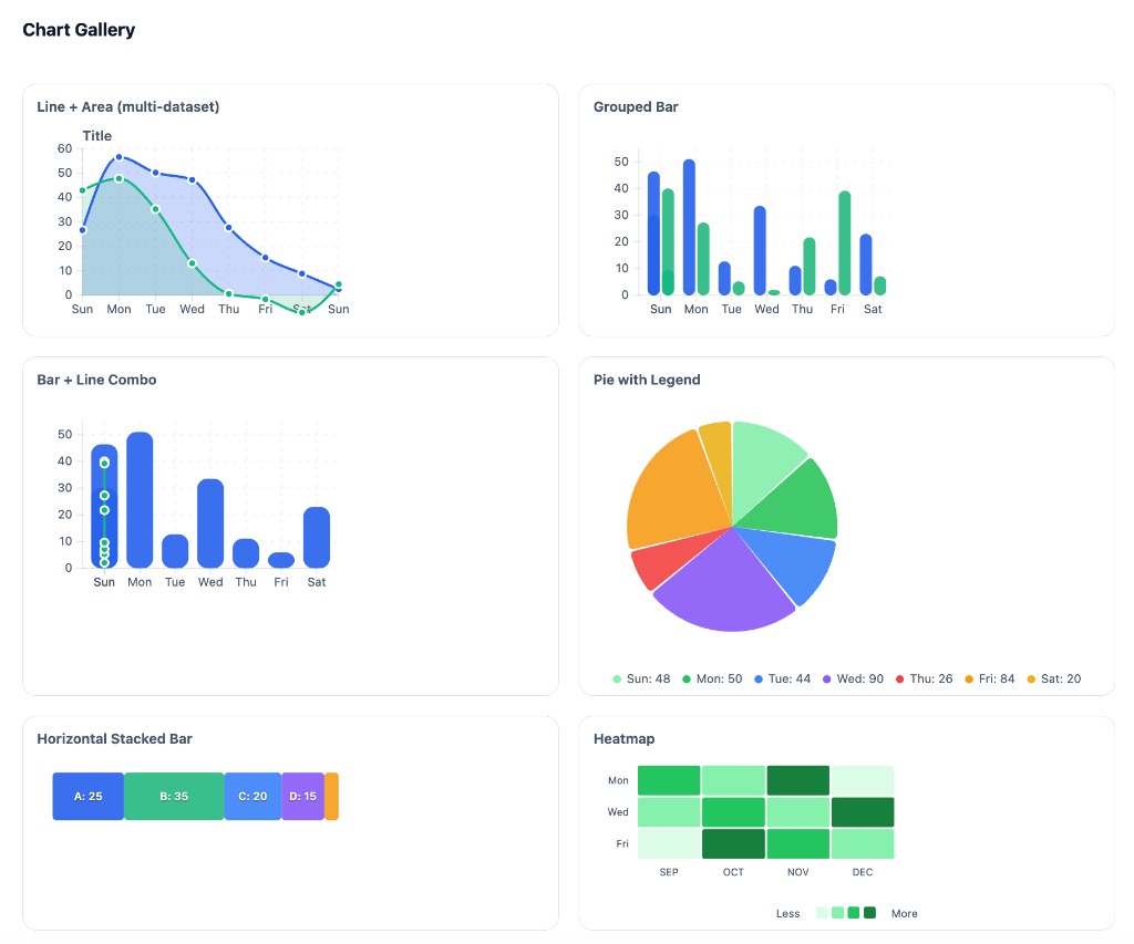
**[Full chart documentation →](https://github.com/giginkrishnan/react-modern-charts/blob/main/docs/CHARTS.md)** — Props, examples, and usage for each chart type.
|
|
64
|
+
|
|
65
|
+
## Theming & Palettes
|
|
66
|
+
|
|
67
|
+
```tsx
|
|
68
|
+
<ThemeProvider mode="light" palette="default" isGradientEnabled={true}>
|
|
69
|
+
<YourCharts />
|
|
70
|
+
</ThemeProvider>
|
|
71
|
+
```
|
|
72
|
+
|
|
73
|
+
| Prop | Description |
|
|
74
|
+
|------|-------------|
|
|
75
|
+
| `mode` | `"light"` \| `"dark"` — backgrounds, text, borders |
|
|
76
|
+
| `palette` | Chart series colors (`--msc-s1` through `--msc-s5`) |
|
|
77
|
+
| `isGradientEnabled` | `true` (default) — use gradients; `false` — solid fills |
|
|
78
|
+
|
|
79
|
+
### Predefined Palettes
|
|
80
|
+
|
|
81
|
+
| Palette | Colors |
|
|
82
|
+
|---------|--------|
|
|
83
|
+
| **default** | #118133, #343738, #78AE81, #64B66F, #5E656E (forest) |
|
|
84
|
+
| **forest** | Same as default |
|
|
85
|
+
| **sage** | #a4b494, #bec5ad, #3B5249, #519872, #34252F |
|
|
86
|
+
| **periwinkle** | #EDFFEC, #61E786, #5A5766, #48435C, #9792E3 |
|
|
87
|
+
| **indigo** | #30343F, #FAFAFF, #E4D9FF, #273469, #1E2749 |
|
|
88
|
+
| **ocean** | #75DDDD, #508991, #172A3A, #004346, #09BC8A |
|
|
89
|
+
|
|
90
|
+
Use `var(--msc-s1)` through `var(--msc-s5)` in custom series to inherit palette colors. Access theme via `useTheme()`.
|
|
91
|
+
|
|
92
|
+
## Build
|
|
93
|
+
|
|
94
|
+
```bash
|
|
95
|
+
npm i
|
|
96
|
+
npm run build
|
|
97
|
+
```
|
|
98
|
+
|
|
99
|
+
## Local Demo
|
|
100
|
+
|
|
101
|
+
Run the interactive playground:
|
|
102
|
+
|
|
103
|
+
```bash
|
|
104
|
+
cd .playground
|
|
105
|
+
npm i
|
|
106
|
+
npm run dev
|
|
107
|
+
```
|
|
108
|
+
|
|
109
|
+
## Exports
|
|
110
|
+
|
|
111
|
+
**Theme:** `ThemeProvider`, `useTheme`
|
|
112
|
+
**Primitives:** `Chart`, `Grid`, `AxisBottom`, `AxisLeft`, `AxisRight`, `ThresholdLine`, `ChartTitle`, `Legend`
|
|
113
|
+
**Series:** `LineSeries`, `AreaSeries`, `BarSeries`, `HorizontalBarSeries`, `GroupedBarSeries`, `StackedBarSeries`, `PieSeries`, `PolarAreaSeries`, `ScatterSeries`, `BubbleSeries`, `HeatmapSeries`
|
|
114
|
+
**Components:** `PieChart`, `PolarAreaChart`, `ComboChart`, `RadarChart`, `MultiaxisLineChart`
|
|
115
|
+
**Gradients:** `LinearGradient`, `RadialGradient`
|
|
116
|
+
**Tooltips:** `TooltipPortal`, `DefaultTooltip`
|
|
117
|
+
**Hooks:** `useChart`, `useNearestPoint`
|