react-native-notitoast 0.0.0-stage → 1.0.0
This diff represents the content of publicly available package versions that have been released to one of the supported registries. The information contained in this diff is provided for informational purposes only and reflects changes between package versions as they appear in their respective public registries.
- package/LICENSE +21 -0
- package/README.md +199 -2
- package/lib/commonjs/ToastItem.js +467 -0
- package/lib/commonjs/ToastItem.js.map +1 -0
- package/lib/commonjs/ToastProvider.js +84 -0
- package/lib/commonjs/ToastProvider.js.map +1 -0
- package/lib/commonjs/index.js +26 -0
- package/lib/commonjs/index.js.map +1 -0
- package/lib/commonjs/package.json +1 -0
- package/lib/commonjs/theme.js +43 -0
- package/lib/commonjs/theme.js.map +1 -0
- package/lib/commonjs/toast.js +39 -0
- package/lib/commonjs/toast.js.map +1 -0
- package/lib/commonjs/types.js +6 -0
- package/lib/commonjs/types.js.map +1 -0
- package/lib/module/ToastItem.js +463 -0
- package/lib/module/ToastItem.js.map +1 -0
- package/lib/module/ToastProvider.js +80 -0
- package/lib/module/ToastProvider.js.map +1 -0
- package/lib/module/index.js +5 -0
- package/lib/module/index.js.map +1 -0
- package/lib/module/theme.js +39 -0
- package/lib/module/theme.js.map +1 -0
- package/lib/module/toast.js +33 -0
- package/lib/module/toast.js.map +1 -0
- package/lib/module/types.js +4 -0
- package/lib/module/types.js.map +1 -0
- package/lib/typescript/src/ToastItem.d.ts +12 -0
- package/lib/typescript/src/ToastItem.d.ts.map +1 -0
- package/lib/typescript/src/ToastProvider.d.ts +7 -0
- package/lib/typescript/src/ToastProvider.d.ts.map +1 -0
- package/lib/typescript/src/index.d.ts +6 -0
- package/lib/typescript/src/index.d.ts.map +1 -0
- package/lib/typescript/src/theme.d.ts +23 -0
- package/lib/typescript/src/theme.d.ts.map +1 -0
- package/lib/typescript/src/toast.d.ts +23 -0
- package/lib/typescript/src/toast.d.ts.map +1 -0
- package/lib/typescript/src/types.d.ts +86 -0
- package/lib/typescript/src/types.d.ts.map +1 -0
- package/package.json +77 -6
- package/src/ToastItem.tsx +561 -0
- package/src/ToastProvider.tsx +93 -0
- package/src/index.ts +14 -0
- package/src/theme.ts +41 -0
- package/src/toast.ts +51 -0
- package/src/types.ts +101 -0
package/LICENSE
ADDED
|
@@ -0,0 +1,21 @@
|
|
|
1
|
+
MIT License
|
|
2
|
+
|
|
3
|
+
Copyright (c) 2026 Vasanthakumar A
|
|
4
|
+
|
|
5
|
+
Permission is hereby granted, free of charge, to any person obtaining a copy
|
|
6
|
+
of this software and associated documentation files (the "Software"), to deal
|
|
7
|
+
in the Software without restriction, including without limitation the rights
|
|
8
|
+
to use, copy, modify, merge, publish, distribute, sublicense, and/or sell
|
|
9
|
+
copies of the Software, and to permit persons to whom the Software is
|
|
10
|
+
furnished to do so, subject to the following conditions:
|
|
11
|
+
|
|
12
|
+
The above copyright notice and this permission notice shall be included in all
|
|
13
|
+
copies or substantial portions of the Software.
|
|
14
|
+
|
|
15
|
+
THE SOFTWARE IS PROVIDED "AS IS", WITHOUT WARRANTY OF ANY KIND, EXPRESS OR
|
|
16
|
+
IMPLIED, INCLUDING BUT NOT LIMITED TO THE WARRANTIES OF MERCHANTABILITY,
|
|
17
|
+
FITNESS FOR A PARTICULAR PURPOSE AND NONINFRINGEMENT. IN NO EVENT SHALL THE
|
|
18
|
+
AUTHORS OR COPYRIGHT HOLDERS BE LIABLE FOR ANY CLAIM, DAMAGES OR OTHER
|
|
19
|
+
LIABILITY, WHETHER IN AN ACTION OF CONTRACT, TORT OR OTHERWISE, ARISING FROM,
|
|
20
|
+
OUT OF OR IN CONNECTION WITH THE SOFTWARE OR THE USE OR OTHER DEALINGS IN THE
|
|
21
|
+
SOFTWARE.
|
package/README.md
CHANGED
|
@@ -1,3 +1,200 @@
|
|
|
1
|
-
#
|
|
1
|
+
# react-native-notitoast
|
|
2
2
|
|
|
3
|
-
|
|
3
|
+
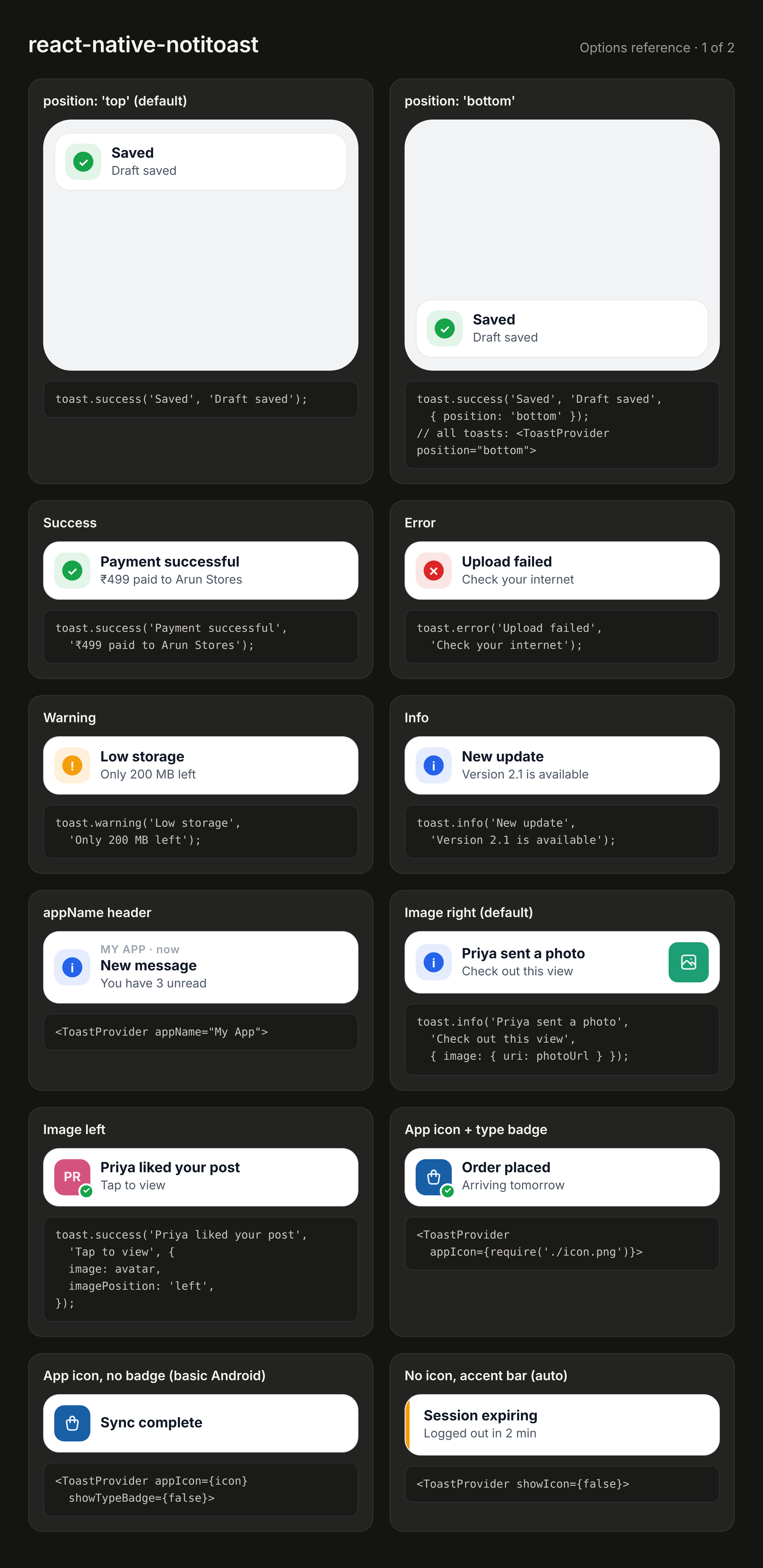
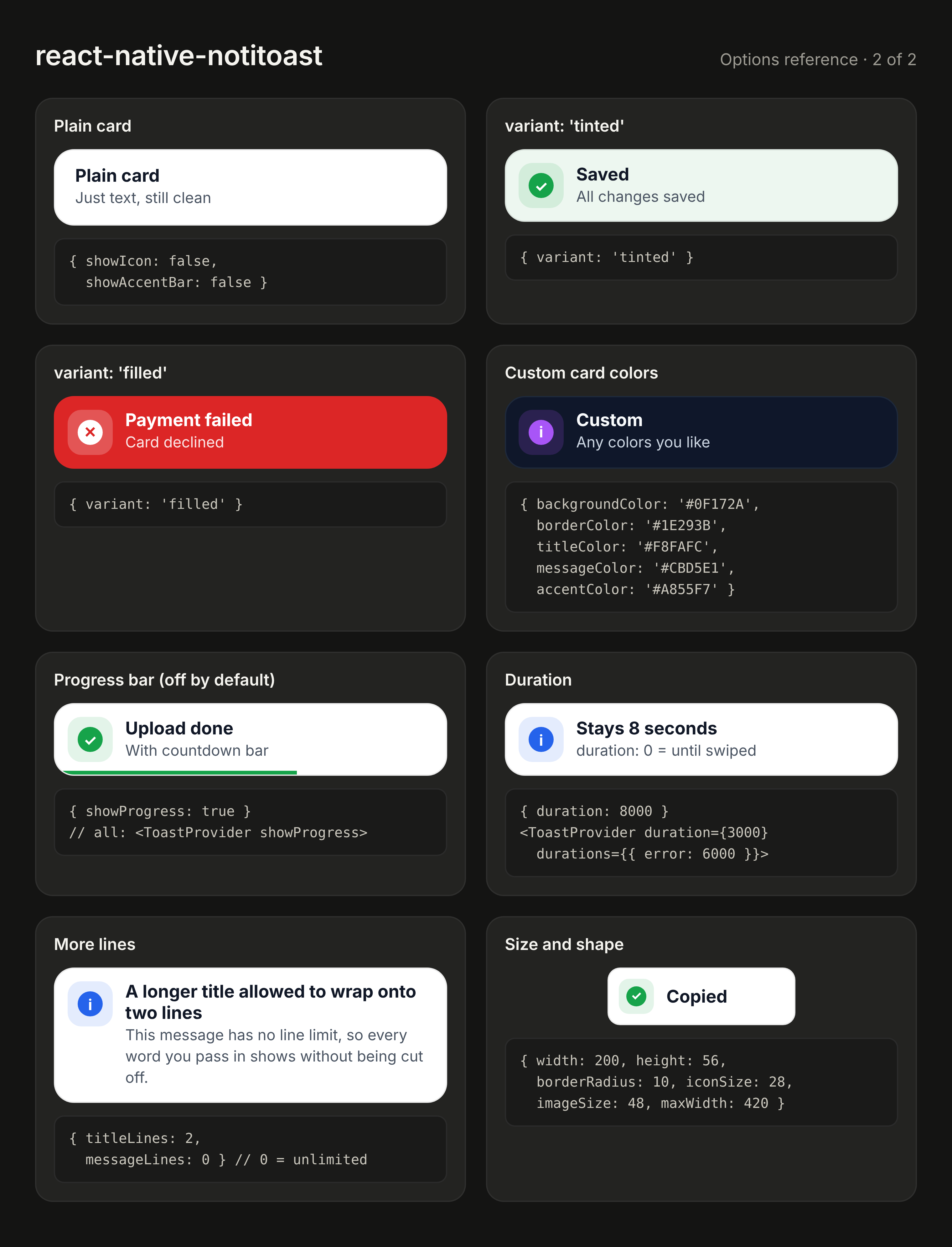
Neat, **mobile-notification-style** toasts for React Native — success, error, warning and info, with images, app icon, variants and full customization.
|
|
4
|
+
Zero dependencies · TypeScript · Expo & bare RN · light/dark mode · swipe to dismiss.
|
|
5
|
+
|
|
6
|
+
|
|
7
|
+
|
|
8
|
+
|
|
9
|
+
## Install
|
|
10
|
+
|
|
11
|
+
```sh
|
|
12
|
+
npm install react-native-notitoast
|
|
13
|
+
```
|
|
14
|
+
|
|
15
|
+
Requires `react-native >= 0.72`. Works in Expo Go — no native code.
|
|
16
|
+
|
|
17
|
+
## Setup
|
|
18
|
+
|
|
19
|
+
```tsx
|
|
20
|
+
import { ToastProvider } from 'react-native-notitoast';
|
|
21
|
+
|
|
22
|
+
export default function App() {
|
|
23
|
+
return (
|
|
24
|
+
<ToastProvider appName="My App">
|
|
25
|
+
<RootNavigator />
|
|
26
|
+
</ToastProvider>
|
|
27
|
+
);
|
|
28
|
+
}
|
|
29
|
+
```
|
|
30
|
+
|
|
31
|
+
## Usage
|
|
32
|
+
|
|
33
|
+
```tsx
|
|
34
|
+
import { toast } from 'react-native-notitoast';
|
|
35
|
+
|
|
36
|
+
toast.success('Payment successful', '₹499 paid to Arun Stores');
|
|
37
|
+
toast.error('Upload failed', 'Check your internet connection');
|
|
38
|
+
toast.warning('Low storage', 'Only 200 MB left on device');
|
|
39
|
+
toast.info('New update', 'Version 2.1 is available');
|
|
40
|
+
```
|
|
41
|
+
|
|
42
|
+
Every option below works **globally** (as a `<ToastProvider>` prop) and **per toast** (third argument). Per-toast values win.
|
|
43
|
+
|
|
44
|
+
## Customization recipes
|
|
45
|
+
|
|
46
|
+
### Image left or right
|
|
47
|
+
|
|
48
|
+
```tsx
|
|
49
|
+
toast.info('Priya sent a photo', 'Check out this view!', {
|
|
50
|
+
image: { uri: 'https://example.com/photo.jpg' },
|
|
51
|
+
imagePosition: 'left', // default 'right'
|
|
52
|
+
});
|
|
53
|
+
```
|
|
54
|
+
|
|
55
|
+
A left image takes the icon's place, with a small type badge on its corner (`showTypeBadge: false` to remove).
|
|
56
|
+
|
|
57
|
+
### App icon (basic Android-toast style)
|
|
58
|
+
|
|
59
|
+
```tsx
|
|
60
|
+
<ToastProvider appIcon={require('./assets/icon.png')}>
|
|
61
|
+
```
|
|
62
|
+
|
|
63
|
+
Leave `appIcon` unset and nothing shows there.
|
|
64
|
+
|
|
65
|
+
### No icons — still clean
|
|
66
|
+
|
|
67
|
+
```tsx
|
|
68
|
+
<ToastProvider showIcon={false}>
|
|
69
|
+
```
|
|
70
|
+
|
|
71
|
+
Without a left icon, a thin colored accent stripe marks the type automatically. Turn that off too with `showAccentBar: false` for a plain text card.
|
|
72
|
+
|
|
73
|
+
### Duration
|
|
74
|
+
|
|
75
|
+
```tsx
|
|
76
|
+
<ToastProvider duration={3000} /> // all toasts
|
|
77
|
+
<ToastProvider durations={{ error: 6000, success: 2000 }} /> // per type
|
|
78
|
+
toast.success('Saved', undefined, { duration: 1500 }); // one toast
|
|
79
|
+
toast.info('Read me', 'Stays until closed', { duration: 0 }); // sticky
|
|
80
|
+
```
|
|
81
|
+
|
|
82
|
+
Defaults: error 5000ms, warning 4000ms, success/info 3500ms.
|
|
83
|
+
|
|
84
|
+
### Progress bar (off by default)
|
|
85
|
+
|
|
86
|
+
```tsx
|
|
87
|
+
<ToastProvider showProgress />
|
|
88
|
+
toast.success('Saved', 'Draft saved', { showProgress: true });
|
|
89
|
+
```
|
|
90
|
+
|
|
91
|
+
### Lines
|
|
92
|
+
|
|
93
|
+
```tsx
|
|
94
|
+
toast.info('A long title that can wrap', 'Long message…', {
|
|
95
|
+
titleLines: 2, // default 1
|
|
96
|
+
messageLines: 0, // default 3, 0 = unlimited
|
|
97
|
+
});
|
|
98
|
+
```
|
|
99
|
+
|
|
100
|
+
### Size
|
|
101
|
+
|
|
102
|
+
```tsx
|
|
103
|
+
<ToastProvider width="90%" maxWidth={420} minHeight={64} borderRadius={14} iconSize={36} imageSize={48} />
|
|
104
|
+
toast.info('Fixed height', 'This one is 80px', { height: 80 });
|
|
105
|
+
```
|
|
106
|
+
|
|
107
|
+
### Card color and variants
|
|
108
|
+
|
|
109
|
+
```tsx
|
|
110
|
+
<ToastProvider variant="tinted" /> // 'default' | 'tinted' | 'filled'
|
|
111
|
+
toast.error('Payment failed', 'Card declined', { variant: 'filled' });
|
|
112
|
+
|
|
113
|
+
toast.info('Custom', 'Any colors you like', {
|
|
114
|
+
backgroundColor: '#0F172A',
|
|
115
|
+
borderColor: '#1E293B',
|
|
116
|
+
titleColor: '#F8FAFC',
|
|
117
|
+
messageColor: '#CBD5E1',
|
|
118
|
+
accentColor: '#A855F7',
|
|
119
|
+
});
|
|
120
|
+
|
|
121
|
+
<ToastProvider colors={{ success: '#10B981', info: '#6366F1' }} />
|
|
122
|
+
```
|
|
123
|
+
|
|
124
|
+
### Update a toast in place
|
|
125
|
+
|
|
126
|
+
```tsx
|
|
127
|
+
const id = toast.info('Uploading…', 'Please wait', { duration: 0 });
|
|
128
|
+
toast.success('Uploaded', 'Your file is live', { id });
|
|
129
|
+
```
|
|
130
|
+
|
|
131
|
+
### Hide
|
|
132
|
+
|
|
133
|
+
```tsx
|
|
134
|
+
toast.hide(id); toast.hide(); toast.hideAll();
|
|
135
|
+
```
|
|
136
|
+
|
|
137
|
+
Hook form: `const toast = useToast();`
|
|
138
|
+
|
|
139
|
+
## All options
|
|
140
|
+
|
|
141
|
+
### Appearance (provider **and** per toast)
|
|
142
|
+
|
|
143
|
+
| Option | Type | Default |
|
|
144
|
+
| --- | --- | --- |
|
|
145
|
+
| `position` | `'top' \| 'bottom'` | `'top'` |
|
|
146
|
+
| `duration` | ms, `0` = sticky | per type |
|
|
147
|
+
| `showProgress` | `boolean` | `false` |
|
|
148
|
+
| `showIcon` | `boolean` | `true` |
|
|
149
|
+
| `showTypeBadge` | `boolean` — badge on left image / app icon | `true` |
|
|
150
|
+
| `showAccentBar` | `boolean` | auto (on when no left icon) |
|
|
151
|
+
| `imagePosition` | `'left' \| 'right'` | `'right'` |
|
|
152
|
+
| `appIcon` | `ImageSourcePropType` | — (hidden) |
|
|
153
|
+
| `variant` | `'default' \| 'tinted' \| 'filled'` | `'default'` |
|
|
154
|
+
| `backgroundColor` `borderColor` `titleColor` `messageColor` | `string` | theme |
|
|
155
|
+
| `titleLines` | `number`, `0` = unlimited | `1` |
|
|
156
|
+
| `messageLines` | `number`, `0` = unlimited | `3` |
|
|
157
|
+
| `width` `maxWidth` `minHeight` `height` | number or `'%'` | `'100%'`, `560`, —, — |
|
|
158
|
+
| `borderRadius` | `number` | `18` |
|
|
159
|
+
| `iconSize` | `number` | `40` |
|
|
160
|
+
| `imageSize` | `number` | `44` |
|
|
161
|
+
| `style` `titleStyle` `messageStyle` | style overrides | — |
|
|
162
|
+
|
|
163
|
+
### Per toast only
|
|
164
|
+
|
|
165
|
+
| Option | Type |
|
|
166
|
+
| --- | --- |
|
|
167
|
+
| `type` | `'success' \| 'error' \| 'warning' \| 'info'` |
|
|
168
|
+
| `title`, `message` | `string` |
|
|
169
|
+
| `image` | `ImageSourcePropType` |
|
|
170
|
+
| `icon` | `ImageSourcePropType` — custom left icon / avatar |
|
|
171
|
+
| `accentColor` | `string` |
|
|
172
|
+
| `id` | `string` — reuse to update |
|
|
173
|
+
| `onPress`, `onHide` | `() => void` |
|
|
174
|
+
|
|
175
|
+
### Provider only
|
|
176
|
+
|
|
177
|
+
| Prop | Type | Default |
|
|
178
|
+
| --- | --- | --- |
|
|
179
|
+
| `theme` | `'light' \| 'dark' \| 'system'` | `'system'` |
|
|
180
|
+
| `appName` | `string` — "MY APP · now" header | — |
|
|
181
|
+
| `timeLabel` | `string` | `'now'` |
|
|
182
|
+
| `colors` | `{ success?, error?, warning?, info? }` | green / red / amber / blue |
|
|
183
|
+
| `durations` | `{ success?, error?, warning?, info? }` | 3500 / 5000 / 4000 / 3500 |
|
|
184
|
+
| `topOffset` | `number` | iOS 54, Android status bar + 8 |
|
|
185
|
+
| `bottomOffset` | `number` | `40` |
|
|
186
|
+
|
|
187
|
+
**Left slot priority:** left `image` → `icon` → `appIcon` → type icon → accent stripe.
|
|
188
|
+
|
|
189
|
+
**Safe area tip:** `<ToastProvider topOffset={useSafeAreaInsets().top + 8}>`
|
|
190
|
+
|
|
191
|
+
## Behaviour
|
|
192
|
+
|
|
193
|
+
- Toasts queue: one at a time, the next slides in after.
|
|
194
|
+
- Swipe up (down for bottom) to dismiss. Press and hold pauses the timer.
|
|
195
|
+
- Announced to screen readers.
|
|
196
|
+
- Toasts render behind an open React Native `<Modal>`. Put another `<ToastProvider>` inside the modal if needed.
|
|
197
|
+
|
|
198
|
+
## License
|
|
199
|
+
|
|
200
|
+
MIT
|
|
@@ -0,0 +1,467 @@
|
|
|
1
|
+
"use strict";
|
|
2
|
+
|
|
3
|
+
Object.defineProperty(exports, "__esModule", {
|
|
4
|
+
value: true
|
|
5
|
+
});
|
|
6
|
+
exports.ToastItem = ToastItem;
|
|
7
|
+
var _react = require("react");
|
|
8
|
+
var _reactNative = require("react-native");
|
|
9
|
+
var _theme = require("./theme");
|
|
10
|
+
var _jsxRuntime = require("react/jsx-runtime");
|
|
11
|
+
/** Per-toast values win over provider values, but `undefined` never overrides. */
|
|
12
|
+
function mergeAppearance(base, over) {
|
|
13
|
+
const out = {
|
|
14
|
+
...base
|
|
15
|
+
};
|
|
16
|
+
for (const [key, value] of Object.entries(over)) {
|
|
17
|
+
if (value !== undefined) out[key] = value;
|
|
18
|
+
}
|
|
19
|
+
return out;
|
|
20
|
+
}
|
|
21
|
+
function ToastItem({
|
|
22
|
+
toast,
|
|
23
|
+
config,
|
|
24
|
+
scheme,
|
|
25
|
+
topOffset,
|
|
26
|
+
bottomOffset,
|
|
27
|
+
onExited
|
|
28
|
+
}) {
|
|
29
|
+
const o = mergeAppearance(config, toast);
|
|
30
|
+
const type = toast.type ?? 'info';
|
|
31
|
+
const isTop = (o.position ?? 'top') === 'top';
|
|
32
|
+
const duration = toast.duration ?? config.durations?.[type] ?? config.duration ?? _theme.defaultDurations[type];
|
|
33
|
+
const showProgress = o.showProgress ?? false;
|
|
34
|
+
const variant = o.variant ?? 'default';
|
|
35
|
+
const filled = variant === 'filled';
|
|
36
|
+
const accent = toast.accentColor ?? config.colors?.[type] ?? _theme.typeColors[type];
|
|
37
|
+
const palette = _theme.palettes[scheme];
|
|
38
|
+
const glyph = _theme.typeGlyphs[type];
|
|
39
|
+
|
|
40
|
+
// Colors
|
|
41
|
+
const onFilled = type === 'warning' ? '#111827' : '#FFFFFF';
|
|
42
|
+
const cardBg = o.backgroundColor ?? (filled ? accent : palette.card);
|
|
43
|
+
const borderColor = o.borderColor ?? (filled ? 'transparent' : palette.border);
|
|
44
|
+
const titleColor = o.titleColor ?? (filled ? onFilled : palette.title);
|
|
45
|
+
const messageColor = o.messageColor ?? (filled ? onFilled : palette.message);
|
|
46
|
+
const headerColor = filled ? onFilled : palette.header;
|
|
47
|
+
const badgeBg = filled ? onFilled : accent;
|
|
48
|
+
const badgeGlyph = filled ? accent : '#FFFFFF';
|
|
49
|
+
|
|
50
|
+
// Layout pieces
|
|
51
|
+
const imagePosition = o.imagePosition ?? 'right';
|
|
52
|
+
const showIcon = o.showIcon ?? true;
|
|
53
|
+
const leftImage = (imagePosition === 'left' ? toast.image : undefined) ?? toast.icon ?? o.appIcon;
|
|
54
|
+
const rightImage = imagePosition === 'right' ? toast.image : undefined;
|
|
55
|
+
const showTypeIcon = !leftImage && showIcon;
|
|
56
|
+
const showCornerBadge = !!leftImage && showIcon && (o.showTypeBadge ?? true);
|
|
57
|
+
const hasLeft = !!leftImage || showTypeIcon;
|
|
58
|
+
const showAccentBar = o.showAccentBar ?? (!hasLeft && !filled);
|
|
59
|
+
|
|
60
|
+
// Sizes
|
|
61
|
+
const radius = o.borderRadius ?? 18;
|
|
62
|
+
const iconSize = o.iconSize ?? 40;
|
|
63
|
+
const imageSize = o.imageSize ?? 44;
|
|
64
|
+
const innerBadge = Math.round(iconSize * 0.55);
|
|
65
|
+
const cornerBadge = Math.max(14, Math.round(iconSize * 0.42));
|
|
66
|
+
const titleLines = o.titleLines ?? 1;
|
|
67
|
+
const messageLines = o.messageLines ?? 3;
|
|
68
|
+
const hiddenY = isTop ? -(topOffset + 200) : bottomOffset + 200;
|
|
69
|
+
const translateY = (0, _react.useRef)(new _reactNative.Animated.Value(hiddenY)).current;
|
|
70
|
+
const opacity = (0, _react.useRef)(new _reactNative.Animated.Value(0)).current;
|
|
71
|
+
const progress = (0, _react.useRef)(new _reactNative.Animated.Value(1)).current;
|
|
72
|
+
const exiting = (0, _react.useRef)(false);
|
|
73
|
+
const onExitedRef = (0, _react.useRef)(onExited);
|
|
74
|
+
onExitedRef.current = onExited;
|
|
75
|
+
const onHideRef = (0, _react.useRef)(toast.onHide);
|
|
76
|
+
onHideRef.current = toast.onHide;
|
|
77
|
+
const pauseTimer = () => progress.stopAnimation();
|
|
78
|
+
const startTimer = () => {
|
|
79
|
+
if (duration <= 0 || exiting.current) return;
|
|
80
|
+
progress.stopAnimation(value => {
|
|
81
|
+
_reactNative.Animated.timing(progress, {
|
|
82
|
+
toValue: 0,
|
|
83
|
+
duration: value * duration,
|
|
84
|
+
easing: _reactNative.Easing.linear,
|
|
85
|
+
useNativeDriver: false
|
|
86
|
+
}).start(({
|
|
87
|
+
finished
|
|
88
|
+
}) => {
|
|
89
|
+
if (finished) dismiss();
|
|
90
|
+
});
|
|
91
|
+
});
|
|
92
|
+
};
|
|
93
|
+
const dismiss = () => {
|
|
94
|
+
if (exiting.current) return;
|
|
95
|
+
exiting.current = true;
|
|
96
|
+
progress.stopAnimation();
|
|
97
|
+
_reactNative.Animated.parallel([_reactNative.Animated.timing(translateY, {
|
|
98
|
+
toValue: hiddenY,
|
|
99
|
+
duration: 240,
|
|
100
|
+
easing: _reactNative.Easing.in(_reactNative.Easing.cubic),
|
|
101
|
+
useNativeDriver: true
|
|
102
|
+
}), _reactNative.Animated.timing(opacity, {
|
|
103
|
+
toValue: 0,
|
|
104
|
+
duration: 200,
|
|
105
|
+
useNativeDriver: true
|
|
106
|
+
})]).start(() => {
|
|
107
|
+
onHideRef.current?.();
|
|
108
|
+
onExitedRef.current();
|
|
109
|
+
});
|
|
110
|
+
};
|
|
111
|
+
|
|
112
|
+
// Latest-closure ref so the (once-created) PanResponder never goes stale.
|
|
113
|
+
const actions = (0, _react.useRef)({
|
|
114
|
+
dismiss,
|
|
115
|
+
startTimer,
|
|
116
|
+
pauseTimer
|
|
117
|
+
});
|
|
118
|
+
actions.current = {
|
|
119
|
+
dismiss,
|
|
120
|
+
startTimer,
|
|
121
|
+
pauseTimer
|
|
122
|
+
};
|
|
123
|
+
const pan = (0, _react.useRef)(_reactNative.PanResponder.create({
|
|
124
|
+
onMoveShouldSetPanResponder: (_, g) => Math.abs(g.dy) > 6 && Math.abs(g.dy) > Math.abs(g.dx),
|
|
125
|
+
onPanResponderGrant: () => actions.current.pauseTimer(),
|
|
126
|
+
onPanResponderMove: (_, g) => {
|
|
127
|
+
const toward = isTop ? Math.min(g.dy, 0) : Math.max(g.dy, 0);
|
|
128
|
+
const away = isTop ? Math.max(g.dy, 0) : Math.min(g.dy, 0);
|
|
129
|
+
translateY.setValue(toward + away * 0.15);
|
|
130
|
+
},
|
|
131
|
+
onPanResponderRelease: (_, g) => {
|
|
132
|
+
const shouldDismiss = isTop ? g.dy < -24 || g.vy < -0.6 : g.dy > 24 || g.vy > 0.6;
|
|
133
|
+
if (shouldDismiss) {
|
|
134
|
+
actions.current.dismiss();
|
|
135
|
+
return;
|
|
136
|
+
}
|
|
137
|
+
_reactNative.Animated.spring(translateY, {
|
|
138
|
+
toValue: 0,
|
|
139
|
+
useNativeDriver: true
|
|
140
|
+
}).start();
|
|
141
|
+
actions.current.startTimer();
|
|
142
|
+
},
|
|
143
|
+
onPanResponderTerminate: () => {
|
|
144
|
+
_reactNative.Animated.spring(translateY, {
|
|
145
|
+
toValue: 0,
|
|
146
|
+
useNativeDriver: true
|
|
147
|
+
}).start();
|
|
148
|
+
actions.current.startTimer();
|
|
149
|
+
},
|
|
150
|
+
onPanResponderTerminationRequest: () => false
|
|
151
|
+
})).current;
|
|
152
|
+
|
|
153
|
+
// Enter animation + announce for screen readers.
|
|
154
|
+
(0, _react.useEffect)(() => {
|
|
155
|
+
_reactNative.Animated.parallel([_reactNative.Animated.spring(translateY, {
|
|
156
|
+
toValue: 0,
|
|
157
|
+
damping: 18,
|
|
158
|
+
stiffness: 180,
|
|
159
|
+
mass: 0.9,
|
|
160
|
+
useNativeDriver: true
|
|
161
|
+
}), _reactNative.Animated.timing(opacity, {
|
|
162
|
+
toValue: 1,
|
|
163
|
+
duration: 220,
|
|
164
|
+
useNativeDriver: true
|
|
165
|
+
})]).start();
|
|
166
|
+
startTimer();
|
|
167
|
+
const spoken = [toast.title, toast.message].filter(Boolean).join('. ');
|
|
168
|
+
if (spoken) _reactNative.AccessibilityInfo.announceForAccessibility(spoken);
|
|
169
|
+
return () => progress.stopAnimation();
|
|
170
|
+
// eslint-disable-next-line react-hooks/exhaustive-deps
|
|
171
|
+
}, []);
|
|
172
|
+
|
|
173
|
+
// Same id shown again → content updated, restart the timer.
|
|
174
|
+
const firstRev = (0, _react.useRef)(toast.rev);
|
|
175
|
+
(0, _react.useEffect)(() => {
|
|
176
|
+
if (toast.rev === firstRev.current) return;
|
|
177
|
+
progress.stopAnimation();
|
|
178
|
+
progress.setValue(1);
|
|
179
|
+
startTimer();
|
|
180
|
+
// eslint-disable-next-line react-hooks/exhaustive-deps
|
|
181
|
+
}, [toast.rev, duration]);
|
|
182
|
+
(0, _react.useEffect)(() => {
|
|
183
|
+
if (toast.dismissing) dismiss();
|
|
184
|
+
// eslint-disable-next-line react-hooks/exhaustive-deps
|
|
185
|
+
}, [toast.dismissing]);
|
|
186
|
+
const handlePress = () => {
|
|
187
|
+
toast.onPress?.();
|
|
188
|
+
dismiss();
|
|
189
|
+
};
|
|
190
|
+
const barWidth = progress.interpolate({
|
|
191
|
+
inputRange: [0, 1],
|
|
192
|
+
outputRange: ['0%', '100%']
|
|
193
|
+
});
|
|
194
|
+
const sizeStyle = {
|
|
195
|
+
...(o.width !== undefined && {
|
|
196
|
+
width: o.width
|
|
197
|
+
}),
|
|
198
|
+
...(o.maxWidth !== undefined && {
|
|
199
|
+
maxWidth: o.maxWidth
|
|
200
|
+
}),
|
|
201
|
+
...(o.minHeight !== undefined && {
|
|
202
|
+
minHeight: o.minHeight
|
|
203
|
+
}),
|
|
204
|
+
...(o.height !== undefined && {
|
|
205
|
+
height: o.height
|
|
206
|
+
})
|
|
207
|
+
};
|
|
208
|
+
return /*#__PURE__*/(0, _jsxRuntime.jsx)(_reactNative.Animated.View, {
|
|
209
|
+
pointerEvents: "box-none",
|
|
210
|
+
style: [styles.container, isTop ? {
|
|
211
|
+
top: topOffset
|
|
212
|
+
} : {
|
|
213
|
+
bottom: bottomOffset
|
|
214
|
+
}, {
|
|
215
|
+
opacity,
|
|
216
|
+
transform: [{
|
|
217
|
+
translateY
|
|
218
|
+
}]
|
|
219
|
+
}],
|
|
220
|
+
...pan.panHandlers,
|
|
221
|
+
children: /*#__PURE__*/(0, _jsxRuntime.jsx)(_reactNative.View, {
|
|
222
|
+
style: [styles.shadow, {
|
|
223
|
+
backgroundColor: cardBg,
|
|
224
|
+
borderColor,
|
|
225
|
+
borderRadius: radius
|
|
226
|
+
}, sizeStyle, o.style],
|
|
227
|
+
children: /*#__PURE__*/(0, _jsxRuntime.jsxs)(_reactNative.Pressable, {
|
|
228
|
+
onPress: handlePress,
|
|
229
|
+
onPressIn: pauseTimer,
|
|
230
|
+
onPressOut: startTimer,
|
|
231
|
+
accessibilityRole: "alert",
|
|
232
|
+
accessibilityLiveRegion: "polite",
|
|
233
|
+
style: [styles.card, {
|
|
234
|
+
borderRadius: radius
|
|
235
|
+
}],
|
|
236
|
+
children: [variant === 'tinted' ? /*#__PURE__*/(0, _jsxRuntime.jsx)(_reactNative.View, {
|
|
237
|
+
pointerEvents: "none",
|
|
238
|
+
style: [styles.fill, {
|
|
239
|
+
backgroundColor: accent,
|
|
240
|
+
opacity: scheme === 'dark' ? 0.16 : 0.08
|
|
241
|
+
}]
|
|
242
|
+
}) : null, showAccentBar ? /*#__PURE__*/(0, _jsxRuntime.jsx)(_reactNative.View, {
|
|
243
|
+
style: [styles.accentBar, {
|
|
244
|
+
backgroundColor: accent
|
|
245
|
+
}]
|
|
246
|
+
}) : null, /*#__PURE__*/(0, _jsxRuntime.jsxs)(_reactNative.View, {
|
|
247
|
+
style: [styles.row, showAccentBar && styles.rowWithBar, !hasLeft && styles.rowTextOnly],
|
|
248
|
+
children: [leftImage ? /*#__PURE__*/(0, _jsxRuntime.jsxs)(_reactNative.View, {
|
|
249
|
+
style: {
|
|
250
|
+
width: iconSize,
|
|
251
|
+
height: iconSize
|
|
252
|
+
},
|
|
253
|
+
children: [/*#__PURE__*/(0, _jsxRuntime.jsx)(_reactNative.Image, {
|
|
254
|
+
source: leftImage,
|
|
255
|
+
style: {
|
|
256
|
+
width: iconSize,
|
|
257
|
+
height: iconSize,
|
|
258
|
+
borderRadius: Math.round(iconSize * 0.28)
|
|
259
|
+
}
|
|
260
|
+
}), showCornerBadge ? /*#__PURE__*/(0, _jsxRuntime.jsx)(_reactNative.View, {
|
|
261
|
+
style: [styles.cornerBadge, {
|
|
262
|
+
width: cornerBadge,
|
|
263
|
+
height: cornerBadge,
|
|
264
|
+
borderRadius: cornerBadge / 2,
|
|
265
|
+
backgroundColor: badgeBg,
|
|
266
|
+
borderColor: cardBg
|
|
267
|
+
}],
|
|
268
|
+
children: /*#__PURE__*/(0, _jsxRuntime.jsx)(_reactNative.Text, {
|
|
269
|
+
style: [styles.glyph, {
|
|
270
|
+
color: badgeGlyph,
|
|
271
|
+
fontSize: Math.round(cornerBadge * 0.5),
|
|
272
|
+
lineHeight: Math.round(cornerBadge * 0.62)
|
|
273
|
+
}],
|
|
274
|
+
children: glyph
|
|
275
|
+
})
|
|
276
|
+
}) : null]
|
|
277
|
+
}) : showTypeIcon ? /*#__PURE__*/(0, _jsxRuntime.jsxs)(_reactNative.View, {
|
|
278
|
+
style: [styles.iconWrap, {
|
|
279
|
+
width: iconSize,
|
|
280
|
+
height: iconSize,
|
|
281
|
+
borderRadius: Math.round(iconSize * 0.3)
|
|
282
|
+
}],
|
|
283
|
+
children: [/*#__PURE__*/(0, _jsxRuntime.jsx)(_reactNative.View, {
|
|
284
|
+
style: [styles.fill, {
|
|
285
|
+
backgroundColor: filled ? '#FFFFFF' : accent,
|
|
286
|
+
opacity: filled ? 0.22 : 0.12
|
|
287
|
+
}]
|
|
288
|
+
}), /*#__PURE__*/(0, _jsxRuntime.jsx)(_reactNative.View, {
|
|
289
|
+
style: [styles.innerBadge, {
|
|
290
|
+
width: innerBadge,
|
|
291
|
+
height: innerBadge,
|
|
292
|
+
borderRadius: innerBadge / 2,
|
|
293
|
+
backgroundColor: badgeBg
|
|
294
|
+
}],
|
|
295
|
+
children: /*#__PURE__*/(0, _jsxRuntime.jsx)(_reactNative.Text, {
|
|
296
|
+
style: [styles.glyph, {
|
|
297
|
+
color: badgeGlyph,
|
|
298
|
+
fontSize: Math.round(innerBadge * 0.58),
|
|
299
|
+
lineHeight: Math.round(innerBadge * 0.72)
|
|
300
|
+
}],
|
|
301
|
+
children: glyph
|
|
302
|
+
})
|
|
303
|
+
})]
|
|
304
|
+
}) : null, /*#__PURE__*/(0, _jsxRuntime.jsxs)(_reactNative.View, {
|
|
305
|
+
style: styles.texts,
|
|
306
|
+
children: [config.appName ? /*#__PURE__*/(0, _jsxRuntime.jsxs)(_reactNative.Text, {
|
|
307
|
+
numberOfLines: 1,
|
|
308
|
+
style: [styles.header, {
|
|
309
|
+
color: headerColor
|
|
310
|
+
}, filled && styles.softText],
|
|
311
|
+
children: [config.appName.toUpperCase(), " \xB7 ", config.timeLabel ?? 'now']
|
|
312
|
+
}) : null, toast.title ? /*#__PURE__*/(0, _jsxRuntime.jsx)(_reactNative.Text, {
|
|
313
|
+
numberOfLines: titleLines,
|
|
314
|
+
style: [styles.title, {
|
|
315
|
+
color: titleColor
|
|
316
|
+
}, o.titleStyle],
|
|
317
|
+
children: toast.title
|
|
318
|
+
}) : null, toast.message ? /*#__PURE__*/(0, _jsxRuntime.jsx)(_reactNative.Text, {
|
|
319
|
+
numberOfLines: messageLines,
|
|
320
|
+
style: [styles.message, {
|
|
321
|
+
color: messageColor
|
|
322
|
+
}, filled && styles.softText, o.messageStyle],
|
|
323
|
+
children: toast.message
|
|
324
|
+
}) : null]
|
|
325
|
+
}), rightImage ? /*#__PURE__*/(0, _jsxRuntime.jsx)(_reactNative.Image, {
|
|
326
|
+
source: rightImage,
|
|
327
|
+
style: {
|
|
328
|
+
width: imageSize,
|
|
329
|
+
height: imageSize,
|
|
330
|
+
borderRadius: Math.round(imageSize * 0.23)
|
|
331
|
+
}
|
|
332
|
+
}) : null]
|
|
333
|
+
}), showProgress && duration > 0 ? /*#__PURE__*/(0, _jsxRuntime.jsx)(_reactNative.View, {
|
|
334
|
+
style: [styles.track, {
|
|
335
|
+
backgroundColor: filled ? 'rgba(255,255,255,0.25)' : palette.track
|
|
336
|
+
}],
|
|
337
|
+
children: /*#__PURE__*/(0, _jsxRuntime.jsx)(_reactNative.Animated.View, {
|
|
338
|
+
style: [styles.bar, {
|
|
339
|
+
backgroundColor: filled ? onFilled : accent,
|
|
340
|
+
width: barWidth
|
|
341
|
+
}]
|
|
342
|
+
})
|
|
343
|
+
}) : null]
|
|
344
|
+
})
|
|
345
|
+
})
|
|
346
|
+
});
|
|
347
|
+
}
|
|
348
|
+
const styles = _reactNative.StyleSheet.create({
|
|
349
|
+
container: {
|
|
350
|
+
position: 'absolute',
|
|
351
|
+
left: 0,
|
|
352
|
+
right: 0,
|
|
353
|
+
paddingHorizontal: 12,
|
|
354
|
+
alignItems: 'center',
|
|
355
|
+
zIndex: 9999,
|
|
356
|
+
elevation: 9999
|
|
357
|
+
},
|
|
358
|
+
shadow: {
|
|
359
|
+
width: '100%',
|
|
360
|
+
maxWidth: 560,
|
|
361
|
+
borderWidth: _reactNative.StyleSheet.hairlineWidth,
|
|
362
|
+
..._reactNative.Platform.select({
|
|
363
|
+
ios: {
|
|
364
|
+
shadowColor: '#000',
|
|
365
|
+
shadowOpacity: 0.12,
|
|
366
|
+
shadowRadius: 18,
|
|
367
|
+
shadowOffset: {
|
|
368
|
+
width: 0,
|
|
369
|
+
height: 8
|
|
370
|
+
}
|
|
371
|
+
},
|
|
372
|
+
android: {
|
|
373
|
+
elevation: 8
|
|
374
|
+
},
|
|
375
|
+
default: {}
|
|
376
|
+
})
|
|
377
|
+
},
|
|
378
|
+
card: {
|
|
379
|
+
flexGrow: 1,
|
|
380
|
+
justifyContent: 'center',
|
|
381
|
+
overflow: 'hidden'
|
|
382
|
+
},
|
|
383
|
+
fill: {
|
|
384
|
+
position: 'absolute',
|
|
385
|
+
top: 0,
|
|
386
|
+
left: 0,
|
|
387
|
+
right: 0,
|
|
388
|
+
bottom: 0
|
|
389
|
+
},
|
|
390
|
+
accentBar: {
|
|
391
|
+
position: 'absolute',
|
|
392
|
+
top: 0,
|
|
393
|
+
bottom: 0,
|
|
394
|
+
left: 0,
|
|
395
|
+
width: 4
|
|
396
|
+
},
|
|
397
|
+
row: {
|
|
398
|
+
flexDirection: 'row',
|
|
399
|
+
alignItems: 'center',
|
|
400
|
+
paddingVertical: 12,
|
|
401
|
+
paddingHorizontal: 12,
|
|
402
|
+
gap: 12
|
|
403
|
+
},
|
|
404
|
+
rowWithBar: {
|
|
405
|
+
paddingLeft: 18
|
|
406
|
+
},
|
|
407
|
+
rowTextOnly: {
|
|
408
|
+
paddingVertical: 14,
|
|
409
|
+
paddingRight: 16
|
|
410
|
+
},
|
|
411
|
+
iconWrap: {
|
|
412
|
+
alignItems: 'center',
|
|
413
|
+
justifyContent: 'center',
|
|
414
|
+
overflow: 'hidden'
|
|
415
|
+
},
|
|
416
|
+
innerBadge: {
|
|
417
|
+
alignItems: 'center',
|
|
418
|
+
justifyContent: 'center'
|
|
419
|
+
},
|
|
420
|
+
cornerBadge: {
|
|
421
|
+
position: 'absolute',
|
|
422
|
+
right: -4,
|
|
423
|
+
bottom: -4,
|
|
424
|
+
borderWidth: 2,
|
|
425
|
+
alignItems: 'center',
|
|
426
|
+
justifyContent: 'center'
|
|
427
|
+
},
|
|
428
|
+
glyph: {
|
|
429
|
+
fontWeight: '800',
|
|
430
|
+
textAlign: 'center',
|
|
431
|
+
includeFontPadding: false,
|
|
432
|
+
textAlignVertical: 'center'
|
|
433
|
+
},
|
|
434
|
+
texts: {
|
|
435
|
+
flex: 1,
|
|
436
|
+
minWidth: 0
|
|
437
|
+
},
|
|
438
|
+
header: {
|
|
439
|
+
fontSize: 11,
|
|
440
|
+
fontWeight: '600',
|
|
441
|
+
letterSpacing: 0.4,
|
|
442
|
+
marginBottom: 2
|
|
443
|
+
},
|
|
444
|
+
title: {
|
|
445
|
+
fontSize: 15,
|
|
446
|
+
fontWeight: '700'
|
|
447
|
+
},
|
|
448
|
+
message: {
|
|
449
|
+
fontSize: 13.5,
|
|
450
|
+
lineHeight: 18,
|
|
451
|
+
marginTop: 2
|
|
452
|
+
},
|
|
453
|
+
softText: {
|
|
454
|
+
opacity: 0.88
|
|
455
|
+
},
|
|
456
|
+
track: {
|
|
457
|
+
position: 'absolute',
|
|
458
|
+
left: 0,
|
|
459
|
+
right: 0,
|
|
460
|
+
bottom: 0,
|
|
461
|
+
height: 3
|
|
462
|
+
},
|
|
463
|
+
bar: {
|
|
464
|
+
height: 3
|
|
465
|
+
}
|
|
466
|
+
});
|
|
467
|
+
//# sourceMappingURL=ToastItem.js.map
|