quassel 0.2.1 → 0.3.0
This diff represents the content of publicly available package versions that have been released to one of the supported registries. The information contained in this diff is provided for informational purposes only and reflects changes between package versions as they appear in their respective public registries.
- package/ChatActionDock.d.ts +2 -0
- package/ChatMessages.d.ts +5 -1
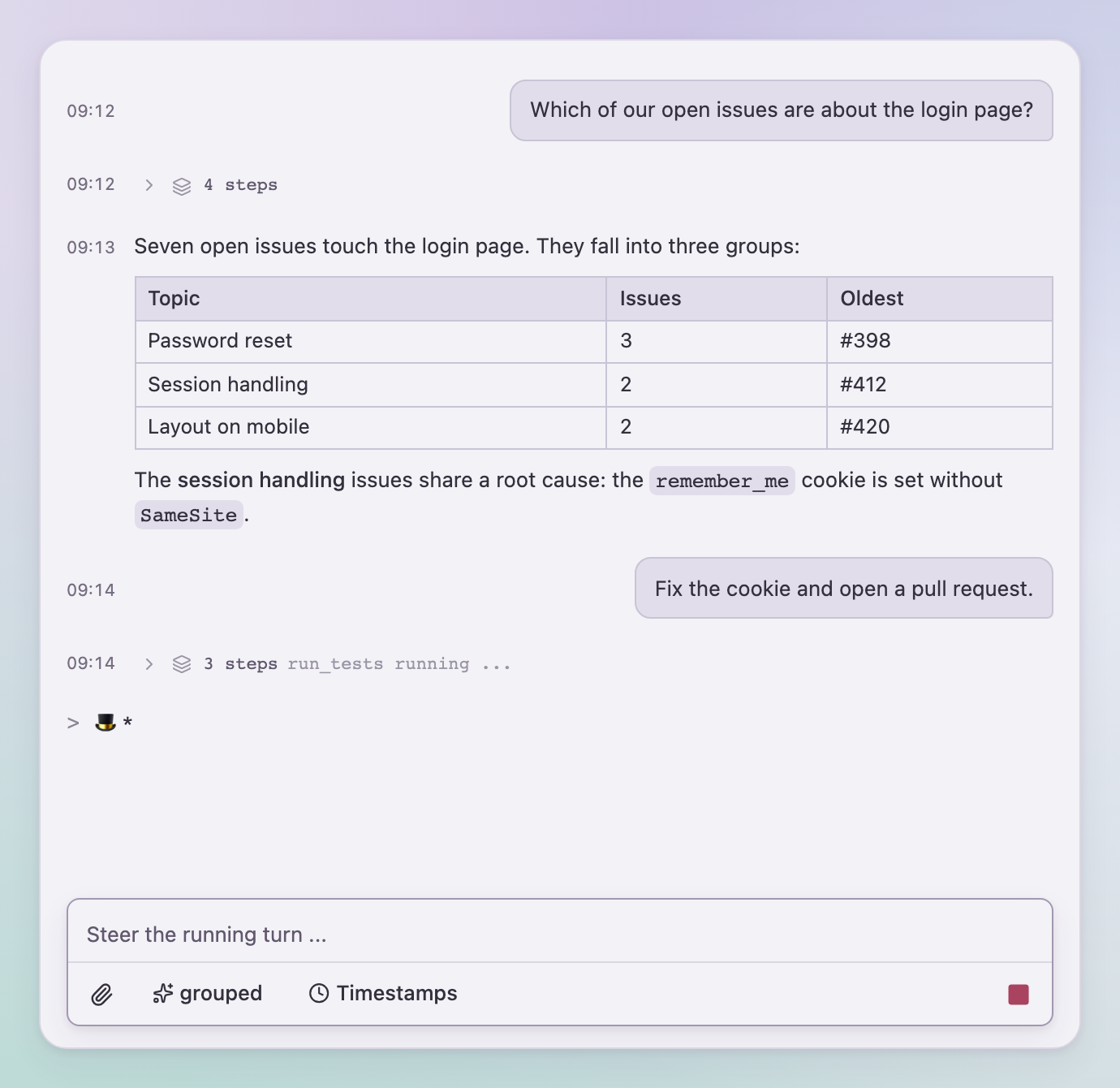
- package/QuasselProvider.d.ts +10 -2
- package/README.md +10 -4
- package/chat.css +56 -35
- package/elapsed.d.ts +16 -0
- package/index.d.ts +2 -1
- package/index.js +185 -59
- package/index.js.map +4 -4
- package/package.json +1 -1
- package/texts.d.ts +1 -1
- package/ui/popover.d.ts +3 -1
package/ChatMessages.d.ts
CHANGED
|
@@ -7,7 +7,7 @@ import { type ChatAppearance, type TimestampOptions, type CodeBlockOptions, type
|
|
|
7
7
|
* Der Verlauf: eigener Scroll-Container mit Autoscroll, solange man unten ist,
|
|
8
8
|
* und einem Zum-Ende-Knopf, sobald man liest. Ohne Eingabe read-only nutzbar.
|
|
9
9
|
*/
|
|
10
|
-
export declare function ChatMessages({ messages, owner, detailMode, running, working, stepsExpandable, texts, toolArgumentsText, renderTool, renderAction, onDismissAction, onLinkClick, emptyState, className, showTimestamps, announce, scrollerRef, maxWidth, horizontalPadding, jumpToEndThreshold, appearance, timestampOptions, codeBlockOptions, bubbleOptions, messageActions, }: {
|
|
10
|
+
export declare function ChatMessages({ messages, owner, detailMode, running, working, stepsExpandable, texts, toolArgumentsText, renderTool, renderAction, onDismissAction, onLinkClick, emptyState, className, scrollerClassName, showTimestamps, announce, scrollerRef, maxWidth, horizontalPadding, jumpToEndThreshold, appearance, timestampOptions, codeBlockOptions, bubbleOptions, messageActions, toolElapsedThreshold, }: {
|
|
11
11
|
messages: Message[];
|
|
12
12
|
/** Beiträge mit diesem Message.sender erscheinen ohne Sprechblase; null behält die Nachrichtenvorgaben. */
|
|
13
13
|
owner?: string | null;
|
|
@@ -27,6 +27,8 @@ export declare function ChatMessages({ messages, owner, detailMode, running, wor
|
|
|
27
27
|
onLinkClick?: LinkClickHandler;
|
|
28
28
|
emptyState?: ReactNode;
|
|
29
29
|
className?: string;
|
|
30
|
+
/** Klassen des Hosts für den Scroll-Container (data-quassel-transcript). */
|
|
31
|
+
scrollerClassName?: string;
|
|
30
32
|
/** true = dezente HH:MM-Spalte links an jedem Block (Message.at). */
|
|
31
33
|
showTimestamps?: boolean;
|
|
32
34
|
/** Screenreader-Ansage fertiger Antworten und neuer Aktionen; false = der Host sagt selbst an. */
|
|
@@ -41,4 +43,6 @@ export declare function ChatMessages({ messages, owner, detailMode, running, wor
|
|
|
41
43
|
codeBlockOptions?: CodeBlockOptions;
|
|
42
44
|
bubbleOptions?: BubbleOptions;
|
|
43
45
|
messageActions?: MessageActionsOptions;
|
|
46
|
+
/** Milliseconds before a running tool call shows its elapsed time (from Message.at) while running; false = never. */
|
|
47
|
+
toolElapsedThreshold?: number | false;
|
|
44
48
|
}): import("react").JSX.Element;
|
package/QuasselProvider.d.ts
CHANGED
|
@@ -1,4 +1,4 @@
|
|
|
1
|
-
import { type ComponentType, type ReactNode } from "react";
|
|
1
|
+
import { type ComponentType, type ReactNode, type RefObject } from "react";
|
|
2
2
|
export type QuasselButtonVariant = "default" | "outline" | "secondary" | "ghost" | "destructive" | "link";
|
|
3
3
|
export type QuasselButtonSize = "default" | "xs" | "sm" | "lg" | "icon" | "icon-xs" | "icon-sm" | "icon-lg";
|
|
4
4
|
export interface QuasselButtonProps {
|
|
@@ -45,6 +45,9 @@ export interface QuasselPopoverAnchor {
|
|
|
45
45
|
getBoundingClientRect: () => DOMRect;
|
|
46
46
|
contextElement?: Element;
|
|
47
47
|
}
|
|
48
|
+
/** Where popovers mount: an element, a ref or a getter; resolved when the popover opens. */
|
|
49
|
+
export type QuasselPortalTarget = HTMLElement | ShadowRoot;
|
|
50
|
+
export type QuasselPortalContainer = QuasselPortalTarget | RefObject<QuasselPortalTarget | null> | (() => QuasselPortalTarget | null | undefined);
|
|
48
51
|
export interface QuasselPopoverContentProps {
|
|
49
52
|
anchor?: QuasselPopoverAnchor;
|
|
50
53
|
align?: "start" | "center" | "end";
|
|
@@ -53,6 +56,8 @@ export interface QuasselPopoverContentProps {
|
|
|
53
56
|
collisionPadding?: number;
|
|
54
57
|
className?: string;
|
|
55
58
|
"aria-label"?: string;
|
|
59
|
+
/** The resolved portalContainer of QuasselProvider; undefined = document.body. */
|
|
60
|
+
portalContainer?: QuasselPortalTarget;
|
|
56
61
|
children?: ReactNode;
|
|
57
62
|
}
|
|
58
63
|
/** The primitives quassel renders; a host replaces any of them through QuasselProvider. */
|
|
@@ -65,12 +70,15 @@ export interface QuasselComponents {
|
|
|
65
70
|
PopoverContent: ComponentType<QuasselPopoverContentProps>;
|
|
66
71
|
}
|
|
67
72
|
export declare const defaultComponents: QuasselComponents;
|
|
68
|
-
export declare function QuasselProvider({ components, allowUrl, children }: {
|
|
73
|
+
export declare function QuasselProvider({ components, allowUrl, portalContainer, children }: {
|
|
69
74
|
/** Replaces single primitives; the rest stay the built-in ones or those of an outer provider. */
|
|
70
75
|
components?: Partial<QuasselComponents>;
|
|
71
76
|
/** Keeps Markdown link and image URLs that the default policy (http, https, mailto, tel, ftp, irc, xmpp, relative) would drop. */
|
|
72
77
|
allowUrl?: (url: string) => boolean;
|
|
78
|
+
/** Mounts quassel's popovers inside this element instead of document.body, e.g. within the host's theme wrapper. */
|
|
79
|
+
portalContainer?: QuasselPortalContainer;
|
|
73
80
|
children: ReactNode;
|
|
74
81
|
}): import("react").JSX.Element;
|
|
75
82
|
export declare const useQuasselComponents: () => QuasselComponents;
|
|
76
83
|
export declare const useAllowUrl: () => ((url: string) => boolean) | undefined;
|
|
84
|
+
export declare function useQuasselPortalContainer(): QuasselPortalTarget | undefined;
|
package/README.md
CHANGED
|
@@ -4,7 +4,7 @@ Chat building blocks for React: a streaming transcript with thinking and tool st
|
|
|
4
4
|
actions, an input card with attachments and steering, and a small event contract that works
|
|
5
5
|
on the server as well. quassel is the chat of [RAgents](https://github.com/SchlenkR/RAgents),
|
|
6
6
|
published as a library. It ships a compiled stylesheet, so hosts need no Tailwind, and every
|
|
7
|
-
color, radius and font is a `--qsl-*` variable.
|
|
7
|
+
color, radius, font and font size is a `--qsl-*` variable.
|
|
8
8
|
|
|
9
9
|
|
|
10
10
|
|
|
@@ -12,12 +12,15 @@ color, radius and font is a `--qsl-*` variable.
|
|
|
12
12
|
|
|
13
13
|
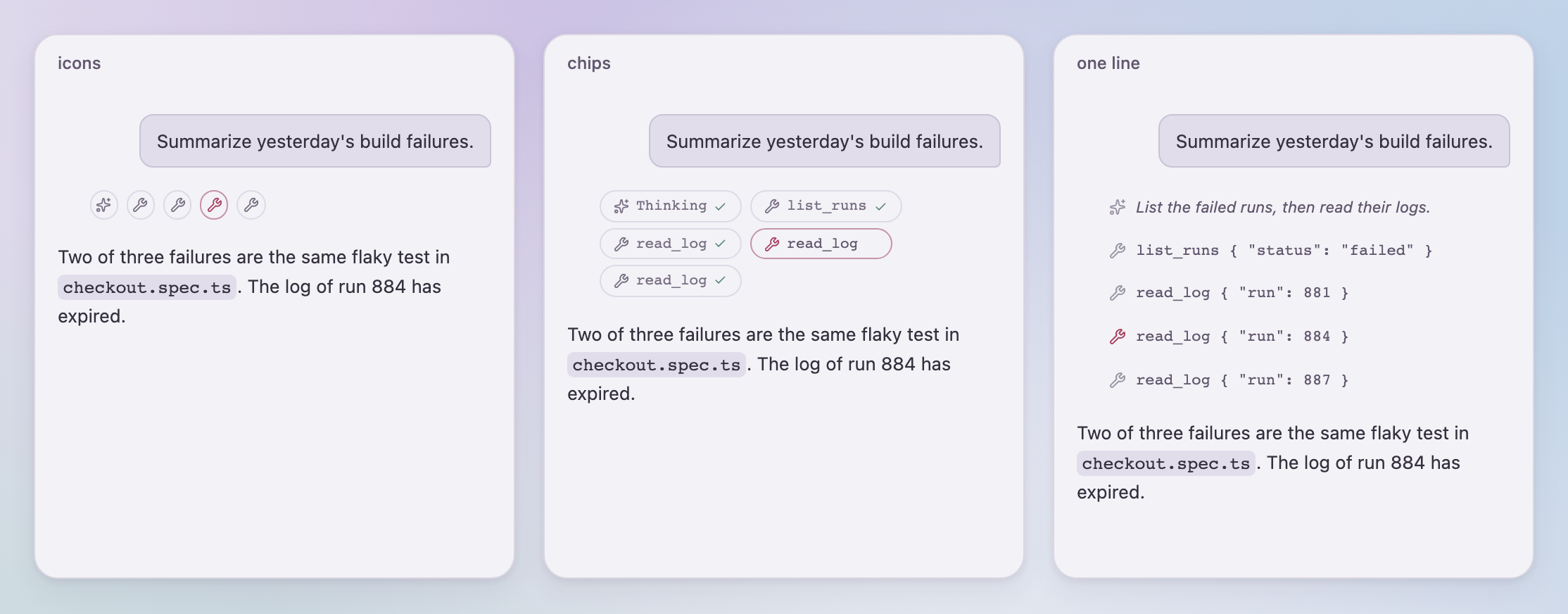
**Agent chats that show their work.** Thinking and tool calls appear as steps. Pick how much
|
|
14
14
|
of them the user sees - only the current step, icons, chips, a collapsible group, single lines
|
|
15
|
-
or everything - and let them switch at runtime.
|
|
15
|
+
or everything - and let them switch at runtime. A tool call that runs longer than a few seconds
|
|
16
|
+
shows how long it has been running, on its row and on the collapsed group header, so a slow step
|
|
17
|
+
does not look like a hung one.
|
|
16
18
|
|
|
17
19
|
|
|
18
20
|
|
|
19
21
|
**Pending actions.** The agent waits for input: a generic card with dismiss, or the host's own
|
|
20
|
-
rendering per action owner.
|
|
22
|
+
rendering per action owner. Open actions sit right above the input, like a question in a terminal
|
|
23
|
+
agent; resolved actions stay in the transcript as a record.
|
|
21
24
|
|
|
22
25
|
**Multi-party conversations.** Colored bubbles with labels for agents that talk to each other.
|
|
23
26
|
|
|
@@ -27,7 +30,9 @@ rendering per action owner. Resolved actions stay in the transcript as a record.
|
|
|
27
30
|
</p>
|
|
28
31
|
|
|
29
32
|
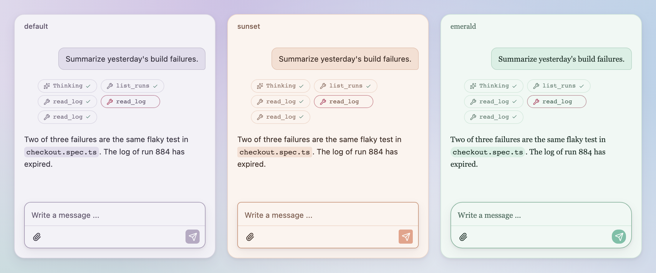
**Your look, not a fork.** Override `--qsl-*` variables on any wrapper, switch light and dark
|
|
30
|
-
with `data-theme`, or hand quassel your own Button, Toggle, Card and Popover components.
|
|
33
|
+
with `data-theme`, or hand quassel your own Button, Toggle, Card and Popover components. With
|
|
34
|
+
`portalContainer` on `QuasselProvider`, popovers render inside your wrapper and pick up its
|
|
35
|
+
variables too.
|
|
31
36
|
|
|
32
37
|
|
|
33
38
|
|
|
@@ -87,6 +92,7 @@ Any backend that emits the `quassel/events` stream works with the same component
|
|
|
87
92
|
pnpm install
|
|
88
93
|
pnpm dev # stylesheet in watch mode plus the gallery on http://localhost:3210
|
|
89
94
|
pnpm check # type check package and gallery
|
|
95
|
+
pnpm test # package tests (node:test with happy-dom)
|
|
90
96
|
pnpm build # stylesheet and gallery build
|
|
91
97
|
pnpm release --dry-run
|
|
92
98
|
```
|
package/chat.css
CHANGED
|
@@ -18,11 +18,12 @@
|
|
|
18
18
|
--qsl-font-weight-semibold: 600;
|
|
19
19
|
--qsl-leading-normal: 1.5;
|
|
20
20
|
--qsl-leading-relaxed: 1.625;
|
|
21
|
-
--qsl-radius-md: calc(var(--qsl-radius) * 0.8);
|
|
22
|
-
--qsl-radius-xl: calc(var(--qsl-radius) * 1.4);
|
|
23
21
|
--qsl-animate-spin: qsl-spin 1s linear infinite;
|
|
24
22
|
--qsl-default-transition-duration: 150ms;
|
|
25
23
|
--qsl-default-transition-timing-function: cubic-bezier(0.4, 0, 0.2, 1);
|
|
24
|
+
--qsl-text-meta: 10.5px;
|
|
25
|
+
--qsl-text-trace: 11px;
|
|
26
|
+
--qsl-text-label: 0.72rem;
|
|
26
27
|
--qsl-radius-panel: 17px;
|
|
27
28
|
--qsl-animate-fade-pulse: qsl-fade-pulse 1.9s cubic-bezier(0.2, 0.6, 0.35, 1) infinite;
|
|
28
29
|
--qsl-animate-working-pulse: qsl-working-pulse 1.6s ease-in-out infinite;
|
|
@@ -86,6 +87,9 @@
|
|
|
86
87
|
.qsl\:z-\[110\] {
|
|
87
88
|
z-index: 110;
|
|
88
89
|
}
|
|
90
|
+
.qsl\:-mx-\[16px\] {
|
|
91
|
+
margin-inline: calc(16px * -1);
|
|
92
|
+
}
|
|
89
93
|
.qsl\:mx-auto {
|
|
90
94
|
margin-inline: auto;
|
|
91
95
|
}
|
|
@@ -199,6 +203,9 @@
|
|
|
199
203
|
.qsl\:max-h-\[240px\] {
|
|
200
204
|
max-height: 240px;
|
|
201
205
|
}
|
|
206
|
+
.qsl\:max-h-\[calc\(var\(--qsl-panel-height\,100dvh\)_\/_2\)\] {
|
|
207
|
+
max-height: calc(var(--qsl-panel-height,100dvh) / 2);
|
|
208
|
+
}
|
|
202
209
|
.qsl\:max-h-\[min\(70vh\,620px\)\] {
|
|
203
210
|
max-height: min(70vh, 620px);
|
|
204
211
|
}
|
|
@@ -376,6 +383,9 @@
|
|
|
376
383
|
.qsl\:gap-\[5px\] {
|
|
377
384
|
gap: 5px;
|
|
378
385
|
}
|
|
386
|
+
.qsl\:gap-\[var\(--qsl-chat-dense-message-gap\,8px\)\] {
|
|
387
|
+
gap: var(--qsl-chat-dense-message-gap,8px);
|
|
388
|
+
}
|
|
379
389
|
:where(.qsl\:space-y-0 > :not(:last-child)) {
|
|
380
390
|
--tw-space-y-reverse: 0;
|
|
381
391
|
margin-block-start: 0;
|
|
@@ -405,32 +415,32 @@
|
|
|
405
415
|
.qsl\:overflow-y-auto {
|
|
406
416
|
overflow-y: auto;
|
|
407
417
|
}
|
|
408
|
-
.qsl\:rounded-\[
|
|
409
|
-
border-radius:
|
|
418
|
+
.qsl\:rounded-\[min\(--theme\(--radius-md\)\,10px\)\] {
|
|
419
|
+
border-radius: min(var(--qsl-radius-md, calc(var(--qsl-radius) * 0.8)), 10px);
|
|
410
420
|
}
|
|
411
|
-
.qsl\:rounded-\[min\(
|
|
412
|
-
border-radius: min(var(--qsl-radius-md),
|
|
421
|
+
.qsl\:rounded-\[min\(--theme\(--radius-md\)\,12px\)\] {
|
|
422
|
+
border-radius: min(var(--qsl-radius-md, calc(var(--qsl-radius) * 0.8)), 12px);
|
|
413
423
|
}
|
|
414
|
-
.qsl\:rounded-\[
|
|
415
|
-
border-radius:
|
|
424
|
+
.qsl\:rounded-\[var\(--qsl-bubble-radius\,10px_10px_4px_10px\)\] {
|
|
425
|
+
border-radius: var(--qsl-bubble-radius,10px 10px 4px 10px);
|
|
416
426
|
}
|
|
417
|
-
.qsl\:rounded-\[var\(--qsl-input-card-radius
|
|
418
|
-
border-radius: var(--qsl-input-card-radius,var(--qsl-radius-xl));
|
|
427
|
+
.qsl\:rounded-\[var\(--qsl-input-card-radius\,--theme\(--radius-xl\)\)\] {
|
|
428
|
+
border-radius: var(--qsl-input-card-radius,var(--qsl-radius-xl, calc(var(--qsl-radius) * 1.4)));
|
|
419
429
|
}
|
|
420
430
|
.qsl\:rounded-full {
|
|
421
431
|
border-radius: calc(infinity * 1px);
|
|
422
432
|
}
|
|
423
433
|
.qsl\:rounded-lg {
|
|
424
|
-
border-radius: var(--qsl-radius);
|
|
434
|
+
border-radius: var(--qsl-radius-lg, var(--qsl-radius));
|
|
425
435
|
}
|
|
426
436
|
.qsl\:rounded-md {
|
|
427
|
-
border-radius: calc(var(--qsl-radius) * 0.8);
|
|
437
|
+
border-radius: var(--qsl-radius-md, calc(var(--qsl-radius) * 0.8));
|
|
428
438
|
}
|
|
429
439
|
.qsl\:rounded-panel {
|
|
430
440
|
border-radius: var(--qsl-radius-panel);
|
|
431
441
|
}
|
|
432
442
|
.qsl\:rounded-sm {
|
|
433
|
-
border-radius: calc(var(--qsl-radius) * 0.6);
|
|
443
|
+
border-radius: var(--qsl-radius-sm, calc(var(--qsl-radius) * 0.6));
|
|
434
444
|
}
|
|
435
445
|
.qsl\:border {
|
|
436
446
|
border-style: var(--tw-border-style);
|
|
@@ -522,6 +532,9 @@
|
|
|
522
532
|
.qsl\:bg-\[linear-gradient\(to_right\,var\(--qsl-scroll-cover\,var\(--qsl-background\)\)_50\%\,transparent\)_left\/20px_100\%_no-repeat_local\,linear-gradient\(to_left\,var\(--qsl-scroll-cover\,var\(--qsl-background\)\)_50\%\,transparent\)_right\/20px_100\%_no-repeat_local\,linear-gradient\(to_right\,\#00000047\,transparent\)_left\/14px_100\%_no-repeat_scroll\,linear-gradient\(to_left\,\#00000047\,transparent\)_right\/14px_100\%_no-repeat_scroll\] {
|
|
523
533
|
background-image: linear-gradient(to right,var(--qsl-scroll-cover,var(--qsl-background)) 50%,transparent) left/20px 100% no-repeat local,linear-gradient(to left,var(--qsl-scroll-cover,var(--qsl-background)) 50%,transparent) right/20px 100% no-repeat local,linear-gradient(to right,#00000047,transparent) left/14px 100% no-repeat scroll,linear-gradient(to left,#00000047,transparent) right/14px 100% no-repeat scroll;
|
|
524
534
|
}
|
|
535
|
+
.qsl\:\[mask-image\:linear-gradient\(to_bottom\,\#000_calc\(100\%_-_var\(--qsl-chat-message-gap\,16px\)\)\,transparent\)\] {
|
|
536
|
+
mask-image: linear-gradient(to bottom,#000 calc(100% - var(--qsl-chat-message-gap,16px)),transparent);
|
|
537
|
+
}
|
|
525
538
|
.qsl\:\[mask-image\:linear-gradient\(to_bottom\,\#000_calc\(var\(--qsl-fade-edge\)_-_40px\)\,transparent_calc\(var\(--qsl-fade-edge\)_\+_16px\)\)\] {
|
|
526
539
|
mask-image: linear-gradient(to bottom,#000 calc(var(--qsl-fade-edge) - 40px),transparent calc(var(--qsl-fade-edge) + 16px));
|
|
527
540
|
}
|
|
@@ -570,6 +583,9 @@
|
|
|
570
583
|
.qsl\:px-\[7px\] {
|
|
571
584
|
padding-inline: 7px;
|
|
572
585
|
}
|
|
586
|
+
.qsl\:px-\[16px\] {
|
|
587
|
+
padding-inline: 16px;
|
|
588
|
+
}
|
|
573
589
|
.qsl\:px-\[var\(--qsl-chat-horizontal-padding\,24px\)\] {
|
|
574
590
|
padding-inline: var(--qsl-chat-horizontal-padding,24px);
|
|
575
591
|
}
|
|
@@ -621,6 +637,9 @@
|
|
|
621
637
|
.qsl\:pb-\[calc\(var\(--qsl-composer-height\,0px\)_\+_max\(3\.25em\,40px\)\)\] {
|
|
622
638
|
padding-bottom: calc(var(--qsl-composer-height,0px) + max(3.25em, 40px));
|
|
623
639
|
}
|
|
640
|
+
.qsl\:pb-\[var\(--qsl-chat-message-gap\,16px\)\] {
|
|
641
|
+
padding-bottom: var(--qsl-chat-message-gap,16px);
|
|
642
|
+
}
|
|
624
643
|
.qsl\:pl-1 {
|
|
625
644
|
padding-left: var(--qsl-spacing);
|
|
626
645
|
}
|
|
@@ -667,15 +686,6 @@
|
|
|
667
686
|
.qsl\:text-\[0\.8rem\] {
|
|
668
687
|
font-size: 0.8rem;
|
|
669
688
|
}
|
|
670
|
-
.qsl\:text-\[0\.72rem\] {
|
|
671
|
-
font-size: 0.72rem;
|
|
672
|
-
}
|
|
673
|
-
.qsl\:text-\[10\.5px\] {
|
|
674
|
-
font-size: 10.5px;
|
|
675
|
-
}
|
|
676
|
-
.qsl\:text-\[11px\] {
|
|
677
|
-
font-size: 11px;
|
|
678
|
-
}
|
|
679
689
|
.qsl\:text-\[13px\] {
|
|
680
690
|
font-size: 13px;
|
|
681
691
|
}
|
|
@@ -685,6 +695,15 @@
|
|
|
685
695
|
.qsl\:text-\[length\:var\(--qsl-chat-font-size\,13px\)\] {
|
|
686
696
|
font-size: var(--qsl-chat-font-size,13px);
|
|
687
697
|
}
|
|
698
|
+
.qsl\:text-label {
|
|
699
|
+
font-size: var(--qsl-text-label);
|
|
700
|
+
}
|
|
701
|
+
.qsl\:text-meta {
|
|
702
|
+
font-size: var(--qsl-text-meta);
|
|
703
|
+
}
|
|
704
|
+
.qsl\:text-trace {
|
|
705
|
+
font-size: var(--qsl-text-trace);
|
|
706
|
+
}
|
|
688
707
|
.qsl\:leading-\[1\.3\] {
|
|
689
708
|
--tw-leading: 1.3;
|
|
690
709
|
line-height: 1.3;
|
|
@@ -915,6 +934,9 @@
|
|
|
915
934
|
.qsl\:\[--qsl-scroll-cover\:var\(--qsl-secondary\)\] {
|
|
916
935
|
--qsl-scroll-cover: var(--qsl-secondary);
|
|
917
936
|
}
|
|
937
|
+
.qsl\:\[-webkit-mask-image\:linear-gradient\(to_bottom\,\#000_calc\(100\%_-_var\(--qsl-chat-message-gap\,16px\)\)\,transparent\)\] {
|
|
938
|
+
-webkit-mask-image: linear-gradient(to bottom,#000 calc(100% - var(--qsl-chat-message-gap,16px)),transparent);
|
|
939
|
+
}
|
|
918
940
|
.qsl\:\[-webkit-mask-image\:linear-gradient\(to_bottom\,\#000_calc\(var\(--qsl-fade-edge\)_-_40px\)\,transparent_calc\(var\(--qsl-fade-edge\)_\+_16px\)\)\] {
|
|
919
941
|
-webkit-mask-image: linear-gradient(to bottom,#000 calc(var(--qsl-fade-edge) - 40px),transparent calc(var(--qsl-fade-edge) + 16px));
|
|
920
942
|
}
|
|
@@ -950,6 +972,9 @@
|
|
|
950
972
|
.qsl\:placeholder\:text-muted-foreground::placeholder {
|
|
951
973
|
color: var(--qsl-muted-foreground);
|
|
952
974
|
}
|
|
975
|
+
.qsl\:empty\:hidden:empty {
|
|
976
|
+
display: none;
|
|
977
|
+
}
|
|
953
978
|
.qsl\:focus-within\:pointer-events-auto:focus-within {
|
|
954
979
|
pointer-events: auto;
|
|
955
980
|
}
|
|
@@ -1071,13 +1096,13 @@
|
|
|
1071
1096
|
display: none;
|
|
1072
1097
|
}
|
|
1073
1098
|
:where([data-slot="button-group"]) .qsl\:in-data-\[slot\=button-group\]\:rounded-lg {
|
|
1074
|
-
border-radius: var(--qsl-radius);
|
|
1099
|
+
border-radius: var(--qsl-radius-lg, var(--qsl-radius));
|
|
1075
1100
|
}
|
|
1076
|
-
:where([data-tone="material"]) .qsl\:in-data-\[tone\=material\]\:rounded-\[9px\] {
|
|
1077
|
-
border-radius: 9px;
|
|
1101
|
+
:where([data-tone="material"]) .qsl\:in-data-\[tone\=material\]\:rounded-\[var\(--qsl-bubble-radius\,9px\)\] {
|
|
1102
|
+
border-radius: var(--qsl-bubble-radius,9px);
|
|
1078
1103
|
}
|
|
1079
1104
|
:where([data-tone="material"]) .qsl\:in-data-\[tone\=material\]\:rounded-xl {
|
|
1080
|
-
border-radius: calc(var(--qsl-radius) * 1.4);
|
|
1105
|
+
border-radius: var(--qsl-radius-xl, calc(var(--qsl-radius) * 1.4));
|
|
1081
1106
|
}
|
|
1082
1107
|
:where([data-tone="material"]) .qsl\:in-data-\[tone\=material\]\:border-glass-edge\/20 {
|
|
1083
1108
|
border-color: var(--qsl-glass-edge);
|
|
@@ -1512,12 +1537,12 @@
|
|
|
1512
1537
|
background-color: var(--qsl-border);
|
|
1513
1538
|
}
|
|
1514
1539
|
:is(.qsl\:\*\:\[img\:first-child\]\:rounded-t-xl > *):is(img:first-child) {
|
|
1515
|
-
border-top-left-radius: calc(var(--qsl-radius) * 1.4);
|
|
1516
|
-
border-top-right-radius: calc(var(--qsl-radius) * 1.4);
|
|
1540
|
+
border-top-left-radius: var(--qsl-radius-xl, calc(var(--qsl-radius) * 1.4));
|
|
1541
|
+
border-top-right-radius: var(--qsl-radius-xl, calc(var(--qsl-radius) * 1.4));
|
|
1517
1542
|
}
|
|
1518
1543
|
:is(.qsl\:\*\:\[img\:last-child\]\:rounded-b-xl > *):is(img:last-child) {
|
|
1519
|
-
border-bottom-right-radius: calc(var(--qsl-radius) * 1.4);
|
|
1520
|
-
border-bottom-left-radius: calc(var(--qsl-radius) * 1.4);
|
|
1544
|
+
border-bottom-right-radius: var(--qsl-radius-xl, calc(var(--qsl-radius) * 1.4));
|
|
1545
|
+
border-bottom-left-radius: var(--qsl-radius-xl, calc(var(--qsl-radius) * 1.4));
|
|
1521
1546
|
}
|
|
1522
1547
|
.qsl\:\[\&\>\*\:first-child\]\:mt-0 > :first-child {
|
|
1523
1548
|
margin-top: 0px;
|
|
@@ -1656,10 +1681,6 @@
|
|
|
1656
1681
|
--qsl-pop-shadow: 0 12px 36px #49384e26;
|
|
1657
1682
|
--qsl-card-shadow: 0 12px 22px #49384e2c;
|
|
1658
1683
|
}
|
|
1659
|
-
:where([data-quassel]) {
|
|
1660
|
-
--qsl-radius-md: calc(var(--qsl-radius) * 0.8);
|
|
1661
|
-
--qsl-radius-xl: calc(var(--qsl-radius) * 1.4);
|
|
1662
|
-
}
|
|
1663
1684
|
:where([data-theme="dark"]) {
|
|
1664
1685
|
--qsl-color-scheme: dark;
|
|
1665
1686
|
--qsl-background: #292735;
|
|
@@ -1750,7 +1771,7 @@
|
|
|
1750
1771
|
font-size: 1em;
|
|
1751
1772
|
}
|
|
1752
1773
|
:where([data-quassel], [data-quassel] *):where(small) {
|
|
1753
|
-
font-size: 80
|
|
1774
|
+
font-size: var(--qsl-text-small, 80%);
|
|
1754
1775
|
}
|
|
1755
1776
|
:where([data-quassel], [data-quassel] *):where(sub, sup) {
|
|
1756
1777
|
font-size: 75%;
|
package/elapsed.d.ts
ADDED
|
@@ -0,0 +1,16 @@
|
|
|
1
|
+
import { type ChatTexts } from "./texts";
|
|
2
|
+
/** Under a minute "{seconds} s" from texts, then m:ss, from an hour on h:mm:ss. */
|
|
3
|
+
export declare function formatElapsed(ms: number, texts: Pick<ChatTexts, "toolElapsedSeconds">): string;
|
|
4
|
+
/** One interval for every subscriber; it runs only while someone listens. */
|
|
5
|
+
export declare function createTicker(intervalMs?: number): {
|
|
6
|
+
subscribe(listener: () => void): () => void;
|
|
7
|
+
now(): number;
|
|
8
|
+
active: () => boolean;
|
|
9
|
+
};
|
|
10
|
+
export declare const elapsedTicker: {
|
|
11
|
+
subscribe(listener: () => void): () => void;
|
|
12
|
+
now(): number;
|
|
13
|
+
active: () => boolean;
|
|
14
|
+
};
|
|
15
|
+
/** Milliseconds since start in whole seconds, so a row renders only when its display changes; undefined on the server. */
|
|
16
|
+
export declare function useElapsed(start: number): number | undefined;
|
package/index.d.ts
CHANGED
|
@@ -17,7 +17,8 @@ export { useChatAction, copyChatText } from "./useChatAction";
|
|
|
17
17
|
export { createChatScroll } from "./chat-scroll";
|
|
18
18
|
export { ChatSendContext, createChatSendScope, type ChatSendScope } from "./ChatSendContext";
|
|
19
19
|
export { messageDate, timestampDay, timestampLabel } from "./timestamps";
|
|
20
|
+
export { formatElapsed, useElapsed } from "./elapsed";
|
|
20
21
|
export { attachmentCapabilityError, attachmentDownloadUrl, attachmentMediaType, encodeAttachment, formatAttachmentSize, validateAttachmentSelection, MAX_CHAT_ATTACHMENTS, MAX_CHAT_ATTACHMENT_BYTES, } from "./attachments";
|
|
21
22
|
export type { ChatAppearance, TimestampOptions, CodeBlockOptions, BubbleOptions, MessageAction, MessageActionsOptions, SendShortcut, } from "./options";
|
|
22
23
|
export { appearanceStyle } from "./options";
|
|
23
|
-
export { QuasselProvider, defaultComponents, useQuasselComponents, type QuasselComponents, type QuasselButtonProps, type QuasselButtonVariant, type QuasselButtonSize, type QuasselToggleProps, type QuasselCardProps, type QuasselStopButtonProps, type QuasselPopoverProps, type QuasselPopoverContentProps, type QuasselPopoverAnchor, } from "./QuasselProvider";
|
|
24
|
+
export { QuasselProvider, defaultComponents, useQuasselComponents, useQuasselPortalContainer, type QuasselComponents, type QuasselButtonProps, type QuasselButtonVariant, type QuasselButtonSize, type QuasselToggleProps, type QuasselCardProps, type QuasselStopButtonProps, type QuasselPopoverProps, type QuasselPopoverContentProps, type QuasselPopoverAnchor, type QuasselPortalContainer, type QuasselPortalTarget, } from "./QuasselProvider";
|