quassel 0.1.0 → 0.2.0
This diff represents the content of publicly available package versions that have been released to one of the supported registries. The information contained in this diff is provided for informational purposes only and reflects changes between package versions as they appear in their respective public registries.
- package/ChatInputToolbar.d.ts +35 -6
- package/ChatMessages.d.ts +19 -15
- package/ChatPanel.d.ts +4 -2
- package/ChatSendContext.d.ts +7 -12
- package/DetailModeSwitch.d.ts +1 -1
- package/Markdown.d.ts +4 -11
- package/MessageActions.d.ts +1 -10
- package/PendingActionCard.d.ts +13 -0
- package/QuasselProvider.d.ts +76 -0
- package/README.md +39 -38
- package/StepPopover.d.ts +1 -1
- package/TimestampSwitch.d.ts +2 -2
- package/WorkingScenes.d.ts +3 -1
- package/attachments.d.ts +24 -0
- package/chat-attachments.d.ts +6 -0
- package/chat-scroll.d.ts +12 -0
- package/chat.css +2051 -0
- package/chunk-IGCFQJZB.js +183 -0
- package/chunk-IGCFQJZB.js.map +7 -0
- package/events.d.ts +74 -17
- package/events.js +11 -1
- package/index.d.ts +17 -10
- package/index.js +1615 -980
- package/index.js.map +4 -4
- package/options.d.ts +1 -1
- package/package.json +12 -10
- package/texts.d.ts +38 -11
- package/timestamps.d.ts +6 -4
- package/types.d.ts +6 -6
- package/ui/button.d.ts +8 -0
- package/ui/card.d.ts +5 -0
- package/ui/cn.d.ts +2 -0
- package/ui/popover.d.ts +4 -0
- package/ui/spinner.d.ts +2 -0
- package/ui/stop-button.d.ts +10 -0
- package/ui/toggle.d.ts +8 -0
- package/ui/useFileInput.d.ts +20 -0
- package/useChatAction.d.ts +6 -0
- package/QuestionCard.d.ts +0 -12
- package/chunk-DOLTANTM.js +0 -84
- package/chunk-DOLTANTM.js.map +0 -7
- package/css/chat.css +0 -927
- package/css/foundation/base.css +0 -24
- package/css/foundation/index.css +0 -3
- package/css/foundation/panel.css +0 -111
- package/css/foundation/tokens.css +0 -68
- package/css/foundation/wash.css +0 -26
- package/css/question.css +0 -149
- package/icons.d.ts +0 -15
- package/server/http.d.ts +0 -17
- package/server/index.d.ts +0 -6
- package/server/index.js +0 -478
- package/server/index.js.map +0 -7
- package/server/manager.d.ts +0 -12
- package/server/openai.d.ts +0 -16
- package/server/session.d.ts +0 -27
- package/server/store.d.ts +0 -18
- package/server/types.d.ts +0 -62
- package/useChat.d.ts +0 -14
package/ChatInputToolbar.d.ts
CHANGED
|
@@ -1,5 +1,6 @@
|
|
|
1
|
-
import { ReactNode } from "react";
|
|
1
|
+
import { ReactNode, Ref } from "react";
|
|
2
2
|
import { ChatTexts } from "./texts";
|
|
3
|
+
import type { ChatAttachmentInput } from "./events";
|
|
3
4
|
import type { SendShortcut } from "./options";
|
|
4
5
|
/** Ein Toolbar-Knopf, deklarativ: Symbol, Text oder beides - plus Klick-Handler. */
|
|
5
6
|
export interface ToolbarAction {
|
|
@@ -10,23 +11,51 @@ export interface ToolbarAction {
|
|
|
10
11
|
active?: boolean;
|
|
11
12
|
onClick: () => void;
|
|
12
13
|
}
|
|
14
|
+
/** Hosts steuern den Entwurf von aussen, z.B. um eine Vorlage zum Bearbeiten einzusetzen. */
|
|
15
|
+
export interface ChatInputHandle {
|
|
16
|
+
/** Ersetzt den Entwurf, fokussiert die Eingabe und stellt die Schreibmarke ans Ende. */
|
|
17
|
+
insert: (text: string) => void;
|
|
18
|
+
focus: () => void;
|
|
19
|
+
reset: () => void;
|
|
20
|
+
submit: (onSubmit?: (text: string, attachments?: ChatAttachmentInput[]) => void | Promise<void>, options?: {
|
|
21
|
+
allowEmpty?: boolean;
|
|
22
|
+
}) => Promise<void>;
|
|
23
|
+
}
|
|
13
24
|
/**
|
|
14
25
|
* Die Eingabe-Karte: rahmenlose Textarea oben, Toolbar unter einer Haarlinie. Eigene
|
|
15
|
-
* Knöpfe kommen deklarativ über `actions` oder frei über die Slots links/rechts;
|
|
16
|
-
* bleibt der Stop-Knopf sichtbar, und Tippen zeigt daneben den Senden-Knopf,
|
|
17
|
-
* Dazwischenfunken wird. `rows` bestimmt die Starthöhe; mit `maxRows` wächst die Textarea
|
|
26
|
+
* Knöpfe kommen deklarativ über `actions` oder frei über die Slots links/rechts; bei
|
|
27
|
+
* laufender Arbeit bleibt der Stop-Knopf sichtbar, und Tippen zeigt daneben den Senden-Knopf,
|
|
28
|
+
* der zum Dazwischenfunken wird. `rows` bestimmt die Starthöhe; mit `maxRows` wächst die Textarea
|
|
18
29
|
* mit dem Inhalt bis zu dieser Zeilenzahl und scrollt danach.
|
|
19
30
|
*/
|
|
20
|
-
export declare function ChatInputToolbar({ onSend, onStop, running, disabled, rows, maxRows, actions, toolbarLeft, toolbarRight, texts, sendShortcut, }: {
|
|
21
|
-
onSend: (text: string) => void | Promise<void>;
|
|
31
|
+
export declare function ChatInputToolbar({ onSend, onStop, running, disabled, sendDisabled, layout, detailsContainer, onErrorChange, inputAriaControls, rows, maxRows, actions, toolbarLeft, toolbarRight, texts, handleRef, attachments: attachmentsEnabled, attachmentCapabilities, attachmentCapabilitiesError, onAttachmentsChange, initialValue, onDraftChange, sendShortcut, autoFocus, onAutoFocusSettled, }: {
|
|
32
|
+
onSend: (text: string, attachments?: ChatAttachmentInput[]) => void | Promise<void>;
|
|
22
33
|
onStop?: () => void;
|
|
23
34
|
running?: boolean;
|
|
24
35
|
disabled?: boolean;
|
|
36
|
+
sendDisabled?: boolean;
|
|
37
|
+
layout?: "card" | "toolbar" | "inline";
|
|
38
|
+
detailsContainer?: HTMLElement | null;
|
|
39
|
+
onErrorChange?: (error: string | undefined) => void;
|
|
40
|
+
inputAriaControls?: string;
|
|
25
41
|
rows?: number;
|
|
26
42
|
maxRows?: number;
|
|
27
43
|
actions?: ToolbarAction[];
|
|
28
44
|
toolbarLeft?: ReactNode;
|
|
29
45
|
toolbarRight?: ReactNode;
|
|
30
46
|
texts?: Partial<ChatTexts>;
|
|
47
|
+
handleRef?: Ref<ChatInputHandle>;
|
|
48
|
+
/** false = kein Anhängen: weder Knopf noch Ablegen oder Einfügen von Dateien. */
|
|
49
|
+
attachments?: boolean;
|
|
50
|
+
attachmentCapabilities?: {
|
|
51
|
+
input: readonly string[];
|
|
52
|
+
model: string;
|
|
53
|
+
};
|
|
54
|
+
attachmentCapabilitiesError?: string;
|
|
55
|
+
onAttachmentsChange?: (hasAttachments: boolean) => void;
|
|
56
|
+
initialValue?: string;
|
|
57
|
+
onDraftChange?: (text: string) => void;
|
|
31
58
|
sendShortcut?: SendShortcut;
|
|
59
|
+
autoFocus?: boolean;
|
|
60
|
+
onAutoFocusSettled?: () => void;
|
|
32
61
|
}): import("react").JSX.Element;
|
package/ChatMessages.d.ts
CHANGED
|
@@ -1,40 +1,44 @@
|
|
|
1
|
-
import { ReactNode } from "react";
|
|
2
|
-
import {
|
|
3
|
-
import { ChatAnnouncement, DetailMode, Message, ToolInfo } from "./types";
|
|
1
|
+
import { type CSSProperties, ReactNode } from "react";
|
|
2
|
+
import { ChatAnnouncement, DetailMode, Message, PendingAction, ToolInfo } from "./types";
|
|
4
3
|
import { ChatTexts } from "./texts";
|
|
5
4
|
import { type LinkClickHandler } from "./Markdown";
|
|
5
|
+
import { type ChatAppearance, type TimestampOptions, type CodeBlockOptions, type BubbleOptions, type MessageActionsOptions } from "./options";
|
|
6
6
|
/**
|
|
7
7
|
* Der Verlauf: eigener Scroll-Container mit Autoscroll, solange man unten ist,
|
|
8
8
|
* und einem Zum-Ende-Knopf, sobald man liest. Ohne Eingabe read-only nutzbar.
|
|
9
9
|
*/
|
|
10
|
-
export declare function ChatMessages({ messages, detailMode, running, working,
|
|
10
|
+
export declare function ChatMessages({ messages, owner, detailMode, running, working, stepsExpandable, texts, toolArgumentsText, renderTool, renderAction, onDismissAction, onLinkClick, emptyState, className, showTimestamps, announce, scrollerRef, maxWidth, horizontalPadding, jumpToEndThreshold, appearance, timestampOptions, codeBlockOptions, bubbleOptions, messageActions, }: {
|
|
11
11
|
messages: Message[];
|
|
12
|
-
|
|
13
|
-
|
|
14
|
-
codeBlockOptions?: CodeBlockOptions;
|
|
15
|
-
bubbleOptions?: BubbleOptions;
|
|
16
|
-
messageActions?: MessageActionsOptions;
|
|
12
|
+
/** Beiträge mit diesem Message.sender erscheinen ohne Sprechblase; null behält die Nachrichtenvorgaben. */
|
|
13
|
+
owner?: string | null;
|
|
17
14
|
detailMode?: DetailMode;
|
|
18
15
|
running?: boolean;
|
|
19
16
|
working?: ReactNode;
|
|
20
|
-
/** Ohne neue Events verschwindet der Working-Indikator nach dieser Zeit, Default 20s. */
|
|
21
|
-
workingTimeoutMs?: number;
|
|
22
17
|
/** false = Denk- und Werkzeug-Schritte lassen sich nicht aufklappen (kein Popover). */
|
|
23
18
|
stepsExpandable?: boolean;
|
|
24
19
|
texts?: Partial<ChatTexts>;
|
|
25
20
|
toolArgumentsText?: (tool: ToolInfo) => string;
|
|
26
21
|
/** Eigene Darstellung fuer einzelne Werkzeuge; undefined = Standarddarstellung. */
|
|
27
22
|
renderTool?: (tool: ToolInfo) => ReactNode | undefined;
|
|
28
|
-
|
|
23
|
+
/** Darstellung einer wartenden Aktion durch ihren Eigentümer; undefined = generische Karte. */
|
|
24
|
+
renderAction?: (action: PendingAction, text: string) => ReactNode | undefined;
|
|
25
|
+
onDismissAction?: (actionId: string) => void;
|
|
29
26
|
/** Faengt Klicks auf Markdown-Links ab; true = behandelt, der Browser folgt nicht. */
|
|
30
27
|
onLinkClick?: LinkClickHandler;
|
|
31
|
-
/** Screenreader-Ansage je fertiger Antwort und neuer Rückfrage: Default ist ihr Text, eine Funktion liefert eigenen Text (undefined = still), false schaltet ab. */
|
|
32
|
-
announce?: false | ((announcement: ChatAnnouncement) => string | undefined);
|
|
33
28
|
emptyState?: ReactNode;
|
|
34
29
|
className?: string;
|
|
35
30
|
/** true = dezente HH:MM-Spalte links an jedem Block (Message.at). */
|
|
36
31
|
showTimestamps?: boolean;
|
|
37
|
-
|
|
32
|
+
/** Screenreader-Ansage fertiger Antworten und neuer Aktionen; false = der Host sagt selbst an. */
|
|
33
|
+
announce?: false | ((announcement: ChatAnnouncement) => string | undefined);
|
|
38
34
|
/** Exposes the scroll container so hosts can scroll without querying the DOM. */
|
|
39
35
|
scrollerRef?: (element: HTMLDivElement | null) => void;
|
|
36
|
+
maxWidth?: CSSProperties["maxWidth"];
|
|
37
|
+
horizontalPadding?: CSSProperties["paddingInline"];
|
|
38
|
+
jumpToEndThreshold?: number;
|
|
39
|
+
appearance?: ChatAppearance;
|
|
40
|
+
timestampOptions?: TimestampOptions;
|
|
41
|
+
codeBlockOptions?: CodeBlockOptions;
|
|
42
|
+
bubbleOptions?: BubbleOptions;
|
|
43
|
+
messageActions?: MessageActionsOptions;
|
|
40
44
|
}): import("react").JSX.Element;
|
package/ChatPanel.d.ts
CHANGED
|
@@ -1,15 +1,17 @@
|
|
|
1
|
-
import { type ReactNode, type Ref } from "react";
|
|
1
|
+
import { type CSSProperties, type ReactNode, type Ref } from "react";
|
|
2
2
|
import { type ChatAppearance } from "./options";
|
|
3
3
|
/**
|
|
4
4
|
* Verlauf mit ueberlagerter Eingabe. Der Rahmen misst die Eingabe selbst und
|
|
5
5
|
* gibt dem Verlauf den noetigen Fussraum, damit kein Host Innenmasse setzen muss.
|
|
6
6
|
*/
|
|
7
|
-
export declare function ChatPanel({ children, composer, className, nodeRef, appearance, scrollOnSend, }: {
|
|
7
|
+
export declare function ChatPanel({ children, composer, className, nodeRef, maxWidth, horizontalPadding, appearance, scrollOnSend, }: {
|
|
8
8
|
children: ReactNode;
|
|
9
9
|
/** Die Eingabe; sie liegt ueber dem Verlauf, nicht darunter. */
|
|
10
10
|
composer?: ReactNode;
|
|
11
11
|
className?: string;
|
|
12
12
|
nodeRef?: Ref<HTMLDivElement>;
|
|
13
|
+
maxWidth?: CSSProperties["maxWidth"];
|
|
14
|
+
horizontalPadding?: CSSProperties["paddingInline"];
|
|
13
15
|
appearance?: ChatAppearance;
|
|
14
16
|
scrollOnSend?: boolean;
|
|
15
17
|
}): import("react").JSX.Element;
|
package/ChatSendContext.d.ts
CHANGED
|
@@ -1,12 +1,7 @@
|
|
|
1
|
-
import type
|
|
2
|
-
|
|
3
|
-
|
|
4
|
-
|
|
5
|
-
|
|
6
|
-
|
|
7
|
-
export declare function
|
|
8
|
-
export declare function useChatSubmit(onSend: (text: string) => void | Promise<void>): {
|
|
9
|
-
submit: (text: string) => Promise<boolean>;
|
|
10
|
-
sending: boolean;
|
|
11
|
-
error: string | undefined;
|
|
12
|
-
};
|
|
1
|
+
import { type RefObject } from "react";
|
|
2
|
+
export interface ChatSendScope {
|
|
3
|
+
notify: () => void;
|
|
4
|
+
subscribe: (listener: () => void) => () => void;
|
|
5
|
+
}
|
|
6
|
+
export declare const ChatSendContext: import("react").Context<ChatSendScope | undefined>;
|
|
7
|
+
export declare function createChatSendScope(enabled: RefObject<boolean>): ChatSendScope;
|
package/DetailModeSwitch.d.ts
CHANGED
|
@@ -9,7 +9,7 @@ export declare const detailModeLabel: (mode: DetailMode, texts?: Partial<ChatTex
|
|
|
9
9
|
export declare function DetailModeSwitch({ mode, onChange, modes, collapsible, texts, className, }: {
|
|
10
10
|
mode: DetailMode;
|
|
11
11
|
onChange: (mode: DetailMode) => void;
|
|
12
|
-
/** Auswahl und Reihenfolge des Weiterschaltens; Default sind alle
|
|
12
|
+
/** Auswahl und Reihenfolge des Weiterschaltens; Default sind alle Modi. */
|
|
13
13
|
modes?: readonly DetailMode[];
|
|
14
14
|
/** false = die Beschriftung bleibt auch in einer schmalen Eingabe-Karte stehen. */
|
|
15
15
|
collapsible?: boolean;
|
package/Markdown.d.ts
CHANGED
|
@@ -1,26 +1,19 @@
|
|
|
1
1
|
import { ReactNode } from "react";
|
|
2
2
|
import type { CodeBlockOptions } from "./options";
|
|
3
3
|
import { type ChatTexts } from "./texts";
|
|
4
|
+
export type LinkClickHandler = (href: string, label: string) => boolean;
|
|
4
5
|
export declare function MarkdownCodeBlocks({ children, options, texts }: {
|
|
5
6
|
children: ReactNode;
|
|
6
7
|
options?: CodeBlockOptions;
|
|
7
|
-
texts
|
|
8
|
+
texts: ChatTexts;
|
|
8
9
|
}): import("react").JSX.Element;
|
|
9
|
-
/**
|
|
10
|
-
* Schlanker Markdown-Renderer ohne Abhängigkeit: Überschriften, **fett**, *kursiv*,
|
|
11
|
-
* `code`, Links, Listen, Blockquotes, Code-Blöcke und Tabellen. Bewusst sicher (reines
|
|
12
|
-
* React, kein dangerouslySetInnerHTML) und streaming-robust: zeilenbasiert, unvollständige
|
|
13
|
-
* Blöcke werden so weit gerendert wie vorhanden.
|
|
14
|
-
*/
|
|
15
|
-
/** true = der Host hat den Link behandelt, der Browser folgt ihm nicht. */
|
|
16
|
-
export type LinkClickHandler = (href: string, label: string) => boolean;
|
|
17
|
-
/** Faengt Klicks auf Markdown-Links im Teilbaum ab, z.B. fuer eigene Ziele der Gastseite. */
|
|
18
10
|
export declare function MarkdownLinks({ children, onLinkClick }: {
|
|
19
11
|
children: ReactNode;
|
|
20
12
|
onLinkClick?: LinkClickHandler;
|
|
21
13
|
}): import("react").JSX.Element;
|
|
22
|
-
export declare function Markdown({ text }: {
|
|
14
|
+
export declare function Markdown({ text, streaming }: {
|
|
23
15
|
text: string;
|
|
16
|
+
streaming?: boolean;
|
|
24
17
|
}): import("react").JSX.Element;
|
|
25
18
|
/** Dieselbe Syntax wie der Renderer, als Klartext ohne Markup, etwa für Screenreader-Ansagen. */
|
|
26
19
|
export declare function markdownPlainText(text: string): string;
|
package/MessageActions.d.ts
CHANGED
|
@@ -1,17 +1,8 @@
|
|
|
1
|
-
import { type ReactNode } from "react";
|
|
2
1
|
import type { MessageActionsOptions } from "./options";
|
|
3
2
|
import type { ChatTexts } from "./texts";
|
|
4
3
|
import type { Message } from "./types";
|
|
5
|
-
export declare function ActionButton({ label, icon, disabled, onClick, successLabel }: {
|
|
6
|
-
label: string;
|
|
7
|
-
icon?: ReactNode;
|
|
8
|
-
disabled?: boolean;
|
|
9
|
-
onClick: () => void | Promise<void>;
|
|
10
|
-
successLabel?: string;
|
|
11
|
-
}): import("react").JSX.Element;
|
|
12
|
-
export declare function copyText(text: string, error: string): Promise<void>;
|
|
13
4
|
export declare function MessageActions({ message, options, texts }: {
|
|
14
5
|
message: Message;
|
|
15
6
|
options?: MessageActionsOptions;
|
|
16
7
|
texts: ChatTexts;
|
|
17
|
-
}): import("react").JSX.Element
|
|
8
|
+
}): import("react").JSX.Element;
|
|
@@ -0,0 +1,13 @@
|
|
|
1
|
+
import type { PendingAction } from "./types";
|
|
2
|
+
/**
|
|
3
|
+
* Die Darstellung einer wartenden Aktion ohne Beitrag ihres Eigentümers: Titel, der Hinweis,
|
|
4
|
+
* dass eine Eingabe erwartet wird, und das Verwerfen. Die Form kennt nur das Plugin.
|
|
5
|
+
*/
|
|
6
|
+
export declare function PendingActionCard({ text, action, waitingLabel, dismissLabel, dismissedLabel, onDismiss, }: {
|
|
7
|
+
text: string;
|
|
8
|
+
action: PendingAction;
|
|
9
|
+
waitingLabel: string;
|
|
10
|
+
dismissLabel: string;
|
|
11
|
+
dismissedLabel: string;
|
|
12
|
+
onDismiss?: () => void;
|
|
13
|
+
}): import("react").JSX.Element;
|
|
@@ -0,0 +1,76 @@
|
|
|
1
|
+
import { type ComponentType, type ReactNode } from "react";
|
|
2
|
+
export type QuasselButtonVariant = "default" | "outline" | "secondary" | "ghost" | "destructive" | "link";
|
|
3
|
+
export type QuasselButtonSize = "default" | "xs" | "sm" | "lg" | "icon" | "icon-xs" | "icon-sm" | "icon-lg";
|
|
4
|
+
export interface QuasselButtonProps {
|
|
5
|
+
variant?: QuasselButtonVariant;
|
|
6
|
+
size?: QuasselButtonSize;
|
|
7
|
+
className?: string;
|
|
8
|
+
disabled?: boolean;
|
|
9
|
+
title?: string;
|
|
10
|
+
"aria-label"?: string;
|
|
11
|
+
"aria-pressed"?: boolean;
|
|
12
|
+
onClick?: () => void;
|
|
13
|
+
children?: ReactNode;
|
|
14
|
+
}
|
|
15
|
+
export interface QuasselToggleProps {
|
|
16
|
+
variant?: "default" | "outline";
|
|
17
|
+
size?: "default" | "sm" | "lg";
|
|
18
|
+
className?: string;
|
|
19
|
+
disabled?: boolean;
|
|
20
|
+
title?: string;
|
|
21
|
+
pressed?: boolean;
|
|
22
|
+
onPressedChange?: (pressed: boolean) => void;
|
|
23
|
+
children?: ReactNode;
|
|
24
|
+
}
|
|
25
|
+
export interface QuasselCardProps {
|
|
26
|
+
size?: "default" | "sm";
|
|
27
|
+
className?: string;
|
|
28
|
+
children?: ReactNode;
|
|
29
|
+
}
|
|
30
|
+
export interface QuasselStopButtonProps {
|
|
31
|
+
label: string;
|
|
32
|
+
busy?: boolean;
|
|
33
|
+
size?: QuasselButtonSize;
|
|
34
|
+
className?: string;
|
|
35
|
+
disabled?: boolean;
|
|
36
|
+
title?: string;
|
|
37
|
+
onClick?: () => void;
|
|
38
|
+
}
|
|
39
|
+
export interface QuasselPopoverProps {
|
|
40
|
+
open?: boolean;
|
|
41
|
+
onOpenChange?: (open: boolean) => void;
|
|
42
|
+
children?: ReactNode;
|
|
43
|
+
}
|
|
44
|
+
export interface QuasselPopoverAnchor {
|
|
45
|
+
getBoundingClientRect: () => DOMRect;
|
|
46
|
+
contextElement?: Element;
|
|
47
|
+
}
|
|
48
|
+
export interface QuasselPopoverContentProps {
|
|
49
|
+
anchor?: QuasselPopoverAnchor;
|
|
50
|
+
align?: "start" | "center" | "end";
|
|
51
|
+
side?: "top" | "bottom" | "left" | "right" | "inline-start" | "inline-end";
|
|
52
|
+
sideOffset?: number;
|
|
53
|
+
collisionPadding?: number;
|
|
54
|
+
className?: string;
|
|
55
|
+
"aria-label"?: string;
|
|
56
|
+
children?: ReactNode;
|
|
57
|
+
}
|
|
58
|
+
/** The primitives quassel renders; a host replaces any of them through QuasselProvider. */
|
|
59
|
+
export interface QuasselComponents {
|
|
60
|
+
Button: ComponentType<QuasselButtonProps>;
|
|
61
|
+
Toggle: ComponentType<QuasselToggleProps>;
|
|
62
|
+
Card: ComponentType<QuasselCardProps>;
|
|
63
|
+
StopButton: ComponentType<QuasselStopButtonProps>;
|
|
64
|
+
Popover: ComponentType<QuasselPopoverProps>;
|
|
65
|
+
PopoverContent: ComponentType<QuasselPopoverContentProps>;
|
|
66
|
+
}
|
|
67
|
+
export declare const defaultComponents: QuasselComponents;
|
|
68
|
+
export declare function QuasselProvider({ components, allowUrl, children }: {
|
|
69
|
+
/** Replaces single primitives; the rest stay the built-in ones or those of an outer provider. */
|
|
70
|
+
components?: Partial<QuasselComponents>;
|
|
71
|
+
/** Keeps Markdown link and image URLs that the default policy (http, https, mailto, tel, ftp, irc, xmpp, relative) would drop. */
|
|
72
|
+
allowUrl?: (url: string) => boolean;
|
|
73
|
+
children: ReactNode;
|
|
74
|
+
}): import("react").JSX.Element;
|
|
75
|
+
export declare const useQuasselComponents: () => QuasselComponents;
|
|
76
|
+
export declare const useAllowUrl: () => ((url: string) => boolean) | undefined;
|
package/README.md
CHANGED
|
@@ -1,30 +1,33 @@
|
|
|
1
1
|
# quassel
|
|
2
2
|
|
|
3
|
-
|
|
4
|
-
|
|
5
|
-
|
|
3
|
+
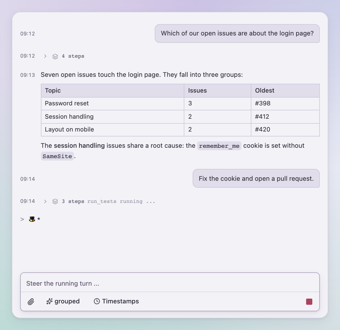
Chat building blocks for React: a streaming transcript with thinking and tool steps, pending
|
|
4
|
+
actions, an input card with attachments and steering, and a small event contract that works
|
|
5
|
+
on the server as well. quassel is the chat of [RAgents](https://github.com/SchlenkR/RAgents),
|
|
6
|
+
published as a library. It ships a compiled stylesheet, so hosts need no Tailwind, and every
|
|
7
|
+
color, radius and font is a `--qsl-*` variable.
|
|
6
8
|
|
|
7
9
|
|
|
8
10
|
|
|
9
11
|
## What you can build
|
|
10
12
|
|
|
11
13
|
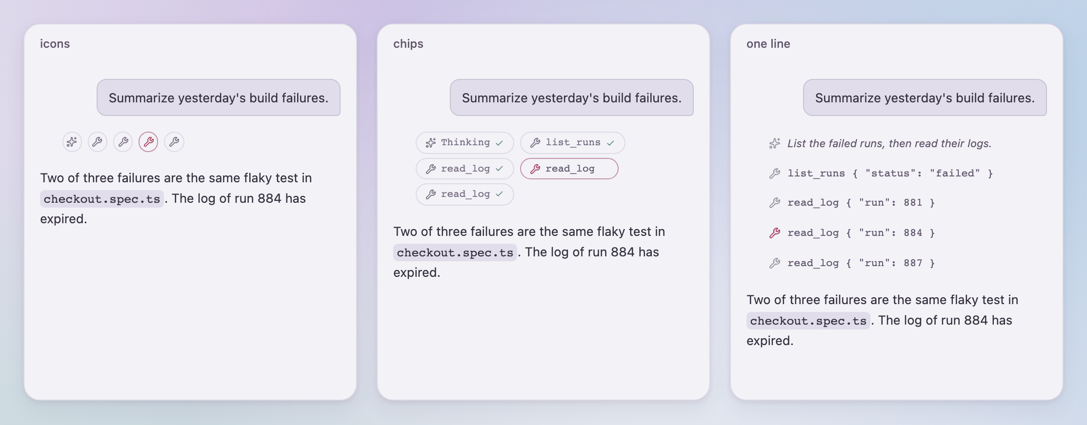
**Agent chats that show their work.** Thinking and tool calls appear as steps. Pick how much
|
|
12
|
-
of them the user sees -
|
|
14
|
+
of them the user sees - only the current step, icons, chips, a collapsible group, single lines
|
|
15
|
+
or everything - and let them switch at runtime.
|
|
13
16
|
|
|
14
17
|
|
|
15
18
|
|
|
16
|
-
**
|
|
17
|
-
|
|
19
|
+
**Pending actions.** The agent waits for input: a generic card with dismiss, or the host's own
|
|
20
|
+
rendering per action owner. Resolved actions stay in the transcript as a record.
|
|
18
21
|
|
|
19
22
|
**Multi-party conversations.** Colored bubbles with labels for agents that talk to each other.
|
|
20
23
|
|
|
21
24
|
<p>
|
|
22
|
-
<img src="docs/images/questions.png" alt="
|
|
25
|
+
<img src="docs/images/questions.png" alt="Pending actions: a host-rendered choice and the generic card" width="49%">
|
|
23
26
|
<img src="docs/images/party.png" alt="Planner and reviewer as labeled bubbles" width="49%">
|
|
24
27
|
</p>
|
|
25
28
|
|
|
26
|
-
**Your look, not a fork.**
|
|
27
|
-
|
|
29
|
+
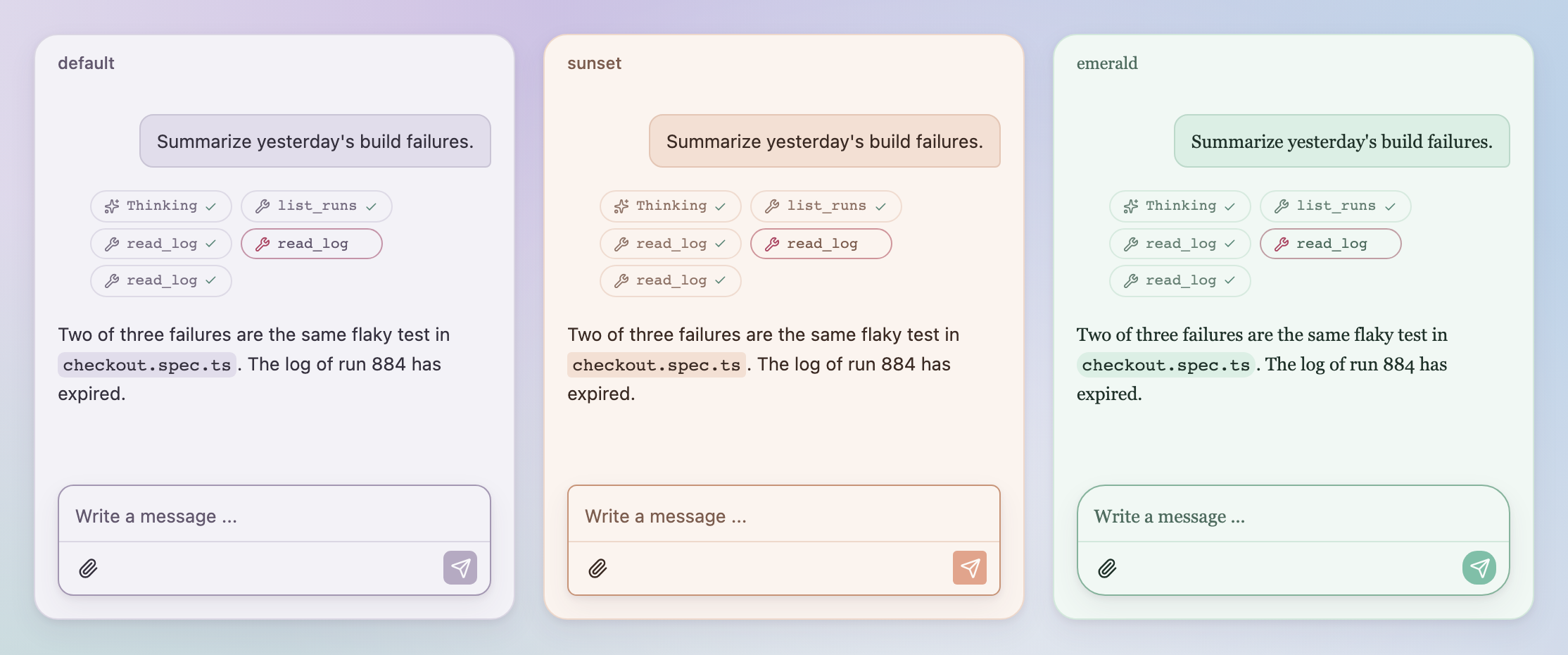
**Your look, not a fork.** Override `--qsl-*` variables on any wrapper, switch light and dark
|
|
30
|
+
with `data-theme`, or hand quassel your own Button, Toggle, Card and Popover components.
|
|
28
31
|
|
|
29
32
|
|
|
30
33
|
|
|
@@ -32,11 +35,12 @@ that overrides tokens; dark mode follows the system or `data-theme`.
|
|
|
32
35
|
|
|
33
36
|
## Highlights
|
|
34
37
|
|
|
35
|
-
- Streaming-safe Markdown
|
|
36
|
-
- Steering: typing while a
|
|
37
|
-
-
|
|
38
|
+
- Streaming-safe Markdown (tables, code with copy button, lists) via Streamdown.
|
|
39
|
+
- Steering: typing while a turn runs sends into it; stop, retry and failed-send recovery built in.
|
|
40
|
+
- Attachments by button, drag and drop or paste, with previews and size limits.
|
|
41
|
+
- Timestamps, day separators, message actions, configurable bubbles and appearance.
|
|
38
42
|
- Screen reader friendly: the transcript is not a live region; finished replies and new
|
|
39
|
-
|
|
43
|
+
actions are announced once, with the host in control of the wording.
|
|
40
44
|
- All labels are replaceable through `texts` (defaults are German).
|
|
41
45
|
|
|
42
46
|
## Install
|
|
@@ -47,36 +51,32 @@ npm install quassel
|
|
|
47
51
|
|
|
48
52
|
| Import | Contents |
|
|
49
53
|
|---|---|
|
|
50
|
-
| `quassel` | React components, `
|
|
51
|
-
| `quassel/events` | The event contract
|
|
52
|
-
| `quassel/
|
|
53
|
-
| `quassel/chat.css` | Component styles including the tokens |
|
|
54
|
-
| `quassel/foundation.css` | Tokens, color wash and glass panel for the whole page |
|
|
54
|
+
| `quassel` | React components, `QuasselProvider`, types, texts, `announce`, `markdownPlainText` |
|
|
55
|
+
| `quassel/events` | The event contract, the pure reducer `applyEvent` and the attachment limits, without React |
|
|
56
|
+
| `quassel/chat.css` | The compiled stylesheet: theme variables, scoped reset and all utilities quassel uses |
|
|
55
57
|
|
|
56
58
|
```tsx
|
|
57
|
-
import {
|
|
59
|
+
import { useReducer, useState } from "react";
|
|
60
|
+
import { applyEvent, ChatInputToolbar, ChatMessages, ChatPanel, type Message } from "quassel";
|
|
58
61
|
import "quassel/chat.css";
|
|
59
62
|
|
|
60
|
-
export function Chat() {
|
|
61
|
-
const
|
|
63
|
+
export function Chat({ send, stop }: { send: (text: string) => Promise<void>; stop: () => void }) {
|
|
64
|
+
const [messages, dispatch] = useReducer(applyEvent, [] as Message[]);
|
|
65
|
+
const [running, setRunning] = useState(false);
|
|
66
|
+
// feed your backend's ChatEvent stream into dispatch(event) and setRunning(event.running) on "status"
|
|
62
67
|
return (
|
|
63
|
-
<ChatPanel composer={<ChatInputToolbar onSend={send} onStop={stop} running={running} />}>
|
|
68
|
+
<ChatPanel composer={<ChatInputToolbar onSend={send} onStop={stop} running={running} rows={1} />}>
|
|
64
69
|
<ChatMessages messages={messages} running={running} detailMode="grouped" />
|
|
65
70
|
</ChatPanel>
|
|
66
71
|
);
|
|
67
72
|
}
|
|
68
73
|
```
|
|
69
74
|
|
|
70
|
-
```
|
|
71
|
-
|
|
72
|
-
|
|
73
|
-
|
|
74
|
-
|
|
75
|
-
const handler = createChatHandler({ manager });
|
|
76
|
-
|
|
77
|
-
createServer(async (req, res) => {
|
|
78
|
-
if (!(await handler(req, res))) res.writeHead(404).end();
|
|
79
|
-
}).listen(3300);
|
|
75
|
+
```css
|
|
76
|
+
.my-chat {
|
|
77
|
+
--qsl-primary: #11855c;
|
|
78
|
+
--qsl-radius: 0.9rem;
|
|
79
|
+
}
|
|
80
80
|
```
|
|
81
81
|
|
|
82
82
|
Any backend that emits the `quassel/events` stream works with the same components.
|
|
@@ -85,14 +85,15 @@ Any backend that emits the `quassel/events` stream works with the same component
|
|
|
85
85
|
|
|
86
86
|
```sh
|
|
87
87
|
pnpm install
|
|
88
|
-
pnpm dev
|
|
89
|
-
pnpm check
|
|
90
|
-
pnpm
|
|
88
|
+
pnpm dev # stylesheet in watch mode plus the gallery on http://localhost:3210
|
|
89
|
+
pnpm check # type check package and gallery
|
|
90
|
+
pnpm build # stylesheet and gallery build
|
|
91
|
+
pnpm release --dry-run
|
|
91
92
|
```
|
|
92
93
|
|
|
93
|
-
The full
|
|
94
|
-
[docs/guide.md](https://github.com/SchlenkR/quassel/blob/main/docs/guide.md) (German). It is written so that an AI assistant can build
|
|
95
|
-
application with quassel from it.
|
|
94
|
+
The full guide - every prop, the event contract, theming, slots, dark mode and publishing -
|
|
95
|
+
is in [docs/guide.md](https://github.com/SchlenkR/quassel/blob/main/docs/guide.md) (German). It is written so that an AI assistant can build
|
|
96
|
+
an application with quassel from it.
|
|
96
97
|
|
|
97
98
|
## License
|
|
98
99
|
|
package/StepPopover.d.ts
CHANGED
package/TimestampSwitch.d.ts
CHANGED
|
@@ -1,5 +1,5 @@
|
|
|
1
|
-
import { ChatTexts } from "./texts";
|
|
2
|
-
export declare function TimestampSwitch({ showTimestamps, onChange, collapsible, texts, className
|
|
1
|
+
import { type ChatTexts } from "./texts";
|
|
2
|
+
export declare function TimestampSwitch({ showTimestamps, onChange, collapsible, texts, className }: {
|
|
3
3
|
showTimestamps: boolean;
|
|
4
4
|
onChange: (showTimestamps: boolean) => void;
|
|
5
5
|
collapsible?: boolean;
|
package/WorkingScenes.d.ts
CHANGED
|
@@ -1,4 +1,6 @@
|
|
|
1
1
|
export interface WorkingScenesProps {
|
|
2
|
+
/** Limits scenes to one or two visible characters for small status fields. */
|
|
3
|
+
compact?: boolean;
|
|
2
4
|
/** Text fuer Screenreader, Default "Arbeitet ...". */
|
|
3
5
|
label?: string;
|
|
4
6
|
}
|
|
@@ -7,4 +9,4 @@ export interface WorkingScenesProps {
|
|
|
7
9
|
* und Startphase, damit dieselben Szenen nie wie eine Schleife wirken. Ueber die
|
|
8
10
|
* working-Prop von ChatMessages laesst er sich komplett ersetzen.
|
|
9
11
|
*/
|
|
10
|
-
export declare function WorkingScenes({ label }: WorkingScenesProps): import("react").JSX.Element;
|
|
12
|
+
export declare function WorkingScenes({ label, compact }: WorkingScenesProps): import("react").JSX.Element;
|
package/attachments.d.ts
ADDED
|
@@ -0,0 +1,24 @@
|
|
|
1
|
+
import type { ChatAttachmentInput } from "./events";
|
|
2
|
+
import { MAX_CHAT_ATTACHMENTS, MAX_CHAT_ATTACHMENT_BYTES } from "./chat-attachments";
|
|
3
|
+
import { type ChatTexts } from "./texts";
|
|
4
|
+
export { MAX_CHAT_ATTACHMENTS, MAX_CHAT_ATTACHMENT_BYTES };
|
|
5
|
+
export declare const maxAttachmentSizeLabel = "20 MiB";
|
|
6
|
+
export declare function attachmentMediaType(file: {
|
|
7
|
+
name: string;
|
|
8
|
+
type: string;
|
|
9
|
+
}): string;
|
|
10
|
+
export declare function attachmentCapabilityError(files: readonly {
|
|
11
|
+
name: string;
|
|
12
|
+
mediaType: string;
|
|
13
|
+
}[], capabilities: {
|
|
14
|
+
input: readonly string[];
|
|
15
|
+
model: string;
|
|
16
|
+
}, texts?: ChatTexts): string | undefined;
|
|
17
|
+
export declare function validateAttachmentSelection(existing: readonly {
|
|
18
|
+
size: number;
|
|
19
|
+
}[], incoming: readonly {
|
|
20
|
+
size: number;
|
|
21
|
+
}[], texts?: ChatTexts): void;
|
|
22
|
+
export declare function encodeAttachment(file: File): Promise<ChatAttachmentInput>;
|
|
23
|
+
export declare function formatAttachmentSize(bytes: number): string;
|
|
24
|
+
export declare function attachmentDownloadUrl(url: string): string;
|
|
@@ -0,0 +1,6 @@
|
|
|
1
|
+
import type { ChatAttachmentInput } from "./events";
|
|
2
|
+
export declare const MAX_CHAT_ATTACHMENTS = 8;
|
|
3
|
+
export declare const MAX_CHAT_ATTACHMENT_BYTES: number;
|
|
4
|
+
export declare const MAX_CHAT_REQUEST_BYTES: number;
|
|
5
|
+
export declare const chatAttachmentMediaType: (name: string, mediaType: string) => string;
|
|
6
|
+
export declare const parseChatAttachments: (value: unknown) => ChatAttachmentInput[];
|
package/chat-scroll.d.ts
ADDED
|
@@ -0,0 +1,12 @@
|
|
|
1
|
+
interface ScrollViewport {
|
|
2
|
+
scrollTop: number;
|
|
3
|
+
readonly scrollHeight: number;
|
|
4
|
+
readonly clientHeight: number;
|
|
5
|
+
}
|
|
6
|
+
export declare function createChatScroll(onFollowChange?: (following: boolean) => void): {
|
|
7
|
+
layout: (viewport: ScrollViewport, dragging?: boolean) => void;
|
|
8
|
+
pause(viewport: ScrollViewport): void;
|
|
9
|
+
scroll(viewport: ScrollViewport, dragging?: boolean): void;
|
|
10
|
+
jump(viewport: ScrollViewport): void;
|
|
11
|
+
};
|
|
12
|
+
export {};
|