pieceboard 0.1.0-alpha.1 → 0.1.0-alpha.3
This diff represents the content of publicly available package versions that have been released to one of the supported registries. The information contained in this diff is provided for informational purposes only and reflects changes between package versions as they appear in their respective public registries.
- package/CHANGELOG.md +9 -0
- package/README.md +16 -16
- package/docs/images/pieceboard-logo.png +0 -0
- package/docs/images/pieceboard-mark.svg +4 -6
- package/package.json +1 -1
package/CHANGELOG.md
CHANGED
|
@@ -1,5 +1,14 @@
|
|
|
1
1
|
# Changelog
|
|
2
2
|
|
|
3
|
+
## 0.1.0-alpha.3 — 2026-11-07
|
|
4
|
+
|
|
5
|
+
- Connect the lower-left and upper-right blue pieces in the logo and small vector mark for clearer recognition at header size.
|
|
6
|
+
- Point npm README images and source links to this immutable release tag.
|
|
7
|
+
|
|
8
|
+
## 0.1.0-alpha.2 — 2026-11-07
|
|
9
|
+
|
|
10
|
+
- Unpublished staged candidate superseded by alpha.3 before npm approval.
|
|
11
|
+
|
|
3
12
|
## 0.1.0-alpha.1 — 2026-11-07
|
|
4
13
|
|
|
5
14
|
- Rename the public package and primary CLI to Pieceboard, retain the `ui-sheet` command and serialized format for existing projects, and ship the owner-selected connected-piece logo.
|
package/README.md
CHANGED
|
@@ -1,6 +1,6 @@
|
|
|
1
1
|
# Pieceboard
|
|
2
2
|
|
|
3
|
-
<img src="docs/images/pieceboard-logo.png" alt="Pieceboard: connected interface pieces with one amber choice" width="240">
|
|
3
|
+
<img src="https://raw.githubusercontent.com/FrankBoyle/pieceboard/v0.1.0-alpha.3/docs/images/pieceboard-logo.png" alt="Pieceboard: connected interface pieces with one amber choice" width="240">
|
|
4
4
|
|
|
5
5
|
**See the real choices. Pick the right piece.** Pieceboard scans a project and builds an offline visual inventory of its components, styles, and assets. When you capture pages, it puts observed differences next to each other so a person can make a clear this-or-that decision.
|
|
6
6
|
|
|
@@ -56,13 +56,13 @@ npm view pieceboard@alpha version
|
|
|
56
56
|
|
|
57
57
|
Complete the npm authentication or two-factor prompt locally; do not paste tokens or one-time codes into a chat, README, or shell history. The final command must print the exact version in `package.json`. If publishing fails, do not bump the version or retry blindly: read the registry error, check whether that version exists, then correct the cause. After success, install `pieceboard@alpha` in a fresh temporary project and run `npx pieceboard --help` and a source scan before announcing the release. Publish GitHub source only from a reviewed, clean history; local capture reports and private project screenshots must never enter that history.
|
|
58
58
|
|
|
59
|
-
The package includes the [project plan](PROJECT_PLAN.md) and [synthetic evaluations](evaluation/README.md) so readers can inspect the known successes and misses. Those studies are development evidence, not product-wide accuracy claims. See [data formats](docs/data-format.md) for the current agent and CI outputs.
|
|
59
|
+
The package includes the [project plan](https://github.com/FrankBoyle/pieceboard/blob/v0.1.0-alpha.3/PROJECT_PLAN.md) and [synthetic evaluations](https://github.com/FrankBoyle/pieceboard/blob/v0.1.0-alpha.3/evaluation/README.md) so readers can inspect the known successes and misses. Those studies are development evidence, not product-wide accuracy claims. See [data formats](https://github.com/FrankBoyle/pieceboard/blob/v0.1.0-alpha.3/docs/data-format.md) for the current agent and CI outputs.
|
|
60
60
|
|
|
61
|
-
Integrations can validate the shipped [JSON contracts](docs/schema.md) locally. Source matches and visual findings require human review; they are not product-wide accuracy claims.
|
|
61
|
+
Integrations can validate the shipped [JSON contracts](https://github.com/FrankBoyle/pieceboard/blob/v0.1.0-alpha.3/docs/schema.md) locally. Source matches and visual findings require human review; they are not product-wide accuracy claims.
|
|
62
62
|
|
|
63
63
|
> **Early alpha.** The scanner supports JavaScript/TypeScript with JSX, static HTML/PHP markup, plain CSS, and local image/font files. Browser captures provide actual element previews and possible style differences. Approved references are available for native buttons and explicitly configured UI groups. Source links remain limited evidence; see the installation instructions below.
|
|
64
64
|
|
|
65
|
-

|
|
65
|
+
|
|
66
66
|
|
|
67
67
|
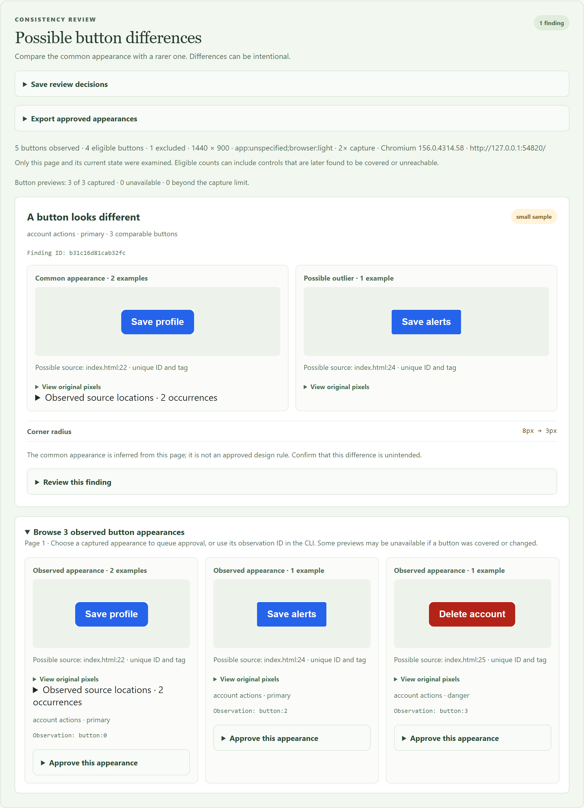
The example uses synthetic content. The buttons are real browser captures; the different radius is a possible finding for a person to review.
|
|
68
68
|
|
|
@@ -78,11 +78,11 @@ npm run demo
|
|
|
78
78
|
|
|
79
79
|
Open `.ui-sheet-demo-elements/index.html`. The default demo serves a synthetic workspace briefly, captures real fields, tabs, dropdowns, selectors and buttons, writes its offline report, and closes its server. Set `UI_SHEET_BROWSER` to an installed compatible browser path if you prefer that to the Chromium download. The generated HTML works offline; `ui-sheet.json` contains the same machine-readable evidence.
|
|
80
80
|
|
|
81
|
-
For a source-only example requiring no browser, run `npm run demo:inventory` and open `.ui-sheet-demo/index.html`. [`examples/harbor`](examples/harbor) uses supplied SVG illustrations to demonstrate manual preview metadata; those illustrations are not browser captures.
|
|
81
|
+
For a source-only example requiring no browser, run `npm run demo:inventory` and open `.ui-sheet-demo/index.html`. [`examples/harbor`](https://github.com/FrankBoyle/pieceboard/tree/v0.1.0-alpha.3/examples/harbor) uses supplied SVG illustrations to demonstrate manual preview metadata; those illustrations are not browser captures.
|
|
82
82
|
|
|
83
83
|
### Try a button consistency finding
|
|
84
84
|
|
|
85
|
-
The synthetic [`examples/button-review`](examples/button-review) contains two similar primary buttons, a third with an intentionally different corner radius, and an intentional destructive button. Install Playwright's browser once, then run the example:
|
|
85
|
+
The synthetic [`examples/button-review`](https://github.com/FrankBoyle/pieceboard/tree/v0.1.0-alpha.3/examples/button-review) contains two similar primary buttons, a third with an intentionally different corner radius, and an intentional destructive button. Install Playwright's browser once, then run the example:
|
|
86
86
|
|
|
87
87
|
```sh
|
|
88
88
|
npx playwright install chromium
|
|
@@ -91,7 +91,7 @@ npm run demo:consistency
|
|
|
91
91
|
|
|
92
92
|
Open `.ui-sheet-demo-consistency/index.html`. The script starts a temporary server for the example, captures real buttons, writes an offline report, and closes the server. Alternatively, set `UI_SHEET_BROWSER` to the path of a compatible installed browser before running the example.
|
|
93
93
|
|
|
94
|
-
Run `npm run demo:cross-page` for a second synthetic example with one button on each of three pages. Open `.ui-sheet-demo-cross-page/index.html` to see the cross-page comparison, or [view the example image](docs/images/cross-page.png).
|
|
94
|
+
Run `npm run demo:cross-page` for a second synthetic example with one button on each of three pages. Open `.ui-sheet-demo-cross-page/index.html` to see the cross-page comparison, or [view the example image](https://raw.githubusercontent.com/FrankBoyle/pieceboard/v0.1.0-alpha.3/docs/images/cross-page.png).
|
|
95
95
|
|
|
96
96
|
Run `npm run demo:elements` for a synthetic workspace with fields, dropdowns, tabs, selectors, and actions. Open `.ui-sheet-demo-elements/index.html` to review four configured-family differences and one native-button difference. These are genuine 2× captures; set `UI_SHEET_PIXEL_RATIO=4` for a denser capture. The single intentional destructive action remains an undersampled group until a reviewer approves a reference.
|
|
97
97
|
|
|
@@ -236,7 +236,7 @@ The sheet embeds actual PNG captures and opens on the **Captured on page** view
|
|
|
236
236
|
|
|
237
237
|
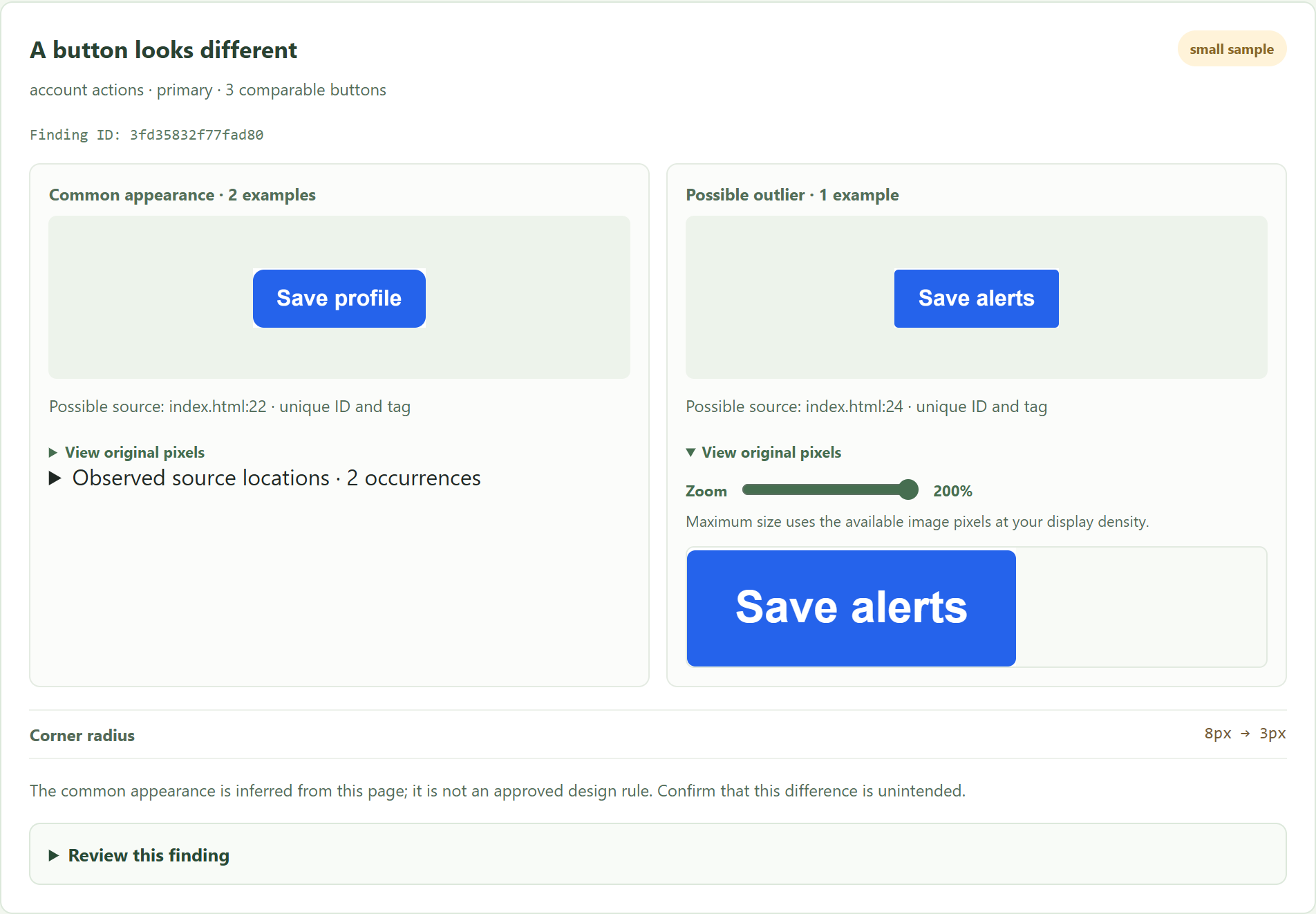
For small controls on a high-density screen, request more image detail with `pieceboard scan . --capture --pixel-ratio 4`, or set `"pixelRatio": 4` in the configuration. Values 1 through 4 are supported, and the CLI overrides the configuration. The CSS viewport dimensions stay the same, but changing device pixel ratio can affect a site's styles or JavaScript; compare and approve patterns using the same ratio. The viewport and ratio together are limited to 33,177,600 device pixels to keep captures manageable. A larger capture can still fall back to 1× when it exceeds the image-size limit, and a zoom control cannot create detail missing from the original image.
|
|
238
238
|
|
|
239
|
-

|
|
239
|
+
|
|
240
240
|
|
|
241
241
|
Automatic capture focuses on UI controls, navigation, headers, headings, and likely brand assets. It skips ordinary paragraphs, generic links, content images, and oversized controls instead of treating every visible piece of page content as a reusable UI element. Repeated simple links, headings, or labels with the same detected style contribute one preview per inventory item; their source references are still retained. These heuristics may miss a custom control or a meaningful visual difference; add a screenshot manually when needed. This filter limits previews, not all source analysis: the scanner can still find many named application components, tokens, and assets. Use `--include` to narrow the source files as well.
|
|
242
242
|
|
|
@@ -271,9 +271,9 @@ Use explicit `elementGroups` to compare selected inputs, dropdowns, selectors, t
|
|
|
271
271
|
}
|
|
272
272
|
```
|
|
273
273
|
|
|
274
|
-
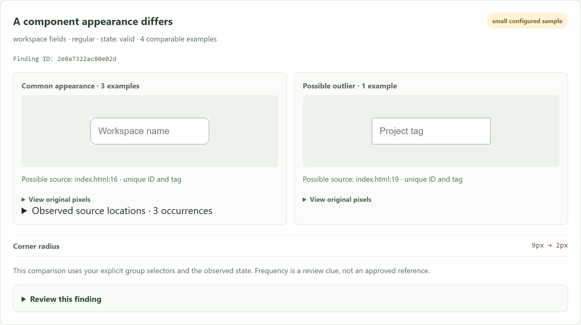
Then run the usual captured scan. The report shows real component previews, differences, source evidence, counts, and review controls; `check --json` includes their findings and `elementPages` coverage. Native type, semantic role, selection, checked, disabled, validation, focus, and hover states are kept separate. Composed headers and sidebars compare their own supported computed styles, rather than every descendant. Simple `.class` group selectors also classify selected static markup in the source inventory; complex selectors may need existing UI roles or `inventoryClasses` to establish source clues. See [configured UI groups](docs/element-groups.md) for limits. This extension is experimental and has no representative accuracy claim.
|
|
274
|
+
Then run the usual captured scan. The report shows real component previews, differences, source evidence, counts, and review controls; `check --json` includes their findings and `elementPages` coverage. Native type, semantic role, selection, checked, disabled, validation, focus, and hover states are kept separate. Composed headers and sidebars compare their own supported computed styles, rather than every descendant. Simple `.class` group selectors also classify selected static markup in the source inventory; complex selectors may need existing UI roles or `inventoryClasses` to establish source clues. See [configured UI groups](https://github.com/FrankBoyle/pieceboard/blob/v0.1.0-alpha.3/docs/element-groups.md) for limits. This extension is experimental and has no representative accuracy claim.
|
|
275
275
|
|
|
276
|
-

|
|
276
|
+
|
|
277
277
|
|
|
278
278
|
Use `element-appearances REPORT --page 1` for compact measured styles and `element-locations REPORT --family "workspace fields"` for every recorded family occurrence. In the report's configured appearance gallery, **Approve this appearance** queues a chosen page or explicit cross-page reference; **Export approved UI group appearances** imports and downloads its separate baseline file. Apply it on the next scan using `--element-baseline FILE` or the `elementBaseline` configuration path. Importing or downloading a file does not apply changes automatically.
|
|
279
279
|
|
|
@@ -361,7 +361,7 @@ The finding-identity version changed when opacity/filter measurements and repeat
|
|
|
361
361
|
|
|
362
362
|
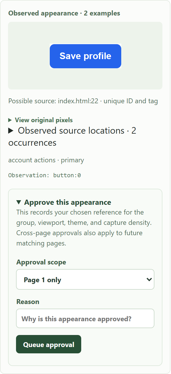
In the visual report, open **Browse observed button appearances**, choose **Approve this appearance** under a captured example, select the scope, enter a reason, and queue it. Open **Export approved appearances** and download the baseline file. Import your existing baseline file there first to preserve its other approvals; a later queued choice for the same group and scope replaces the earlier one. The original imported file is not modified. Supply the downloaded file with `--baseline` on the next scan, or save it inside the project and configure `"baseline"` to point to it. Imported rules are validated by the next scan.
|
|
363
363
|
|
|
364
|
-

|
|
364
|
+
|
|
365
365
|
|
|
366
366
|
Visual approval requires a captured preview, a known theme, a stable group, and distinct page scopes. It is unavailable when screenshot masks are configured, because a masked preview may hide the appearance being approved. Cross-page approval also requires an explicitly named group and variant; it applies to future matching pages as well as the selected pages. Regenerate older reports to obtain the visual approval controls. You can still use the CLI when a preview is unavailable, after checking the appearance by other means.
|
|
367
367
|
|
|
@@ -423,13 +423,13 @@ The catalog returns JSON with definitions, source references, and preview availa
|
|
|
423
423
|
|
|
424
424
|
Use opt-in `layoutChecks` to measure actual text clearance inside a container, gaps between wordmark parts, computed margins/padding/word spacing, and use of approved logo image paths without stretching. Findings appear in a separate report section with measurements and genuine previews. Run `npm run demo:layout` for seeded examples, or `pieceboard check-layout .ui-sheet --json` after a configured capture.
|
|
425
425
|
|
|
426
|
-
Rules remain explicit, and missing or unsupported targets stay incomplete. Screen and print-preview contexts are separate; direct PDF auditing is planned. See [layout checks](docs/layout-checks.md) for configuration and limits.
|
|
426
|
+
Rules remain explicit, and missing or unsupported targets stay incomplete. Screen and print-preview contexts are separate; direct PDF auditing is planned. See [layout checks](https://github.com/FrankBoyle/pieceboard/blob/v0.1.0-alpha.3/docs/layout-checks.md) for configuration and limits.
|
|
427
427
|
|
|
428
428
|
### Keep approved design-token values consistent
|
|
429
429
|
|
|
430
430
|
Source-only scans record CSS custom-property declarations separately by file, selector, and enclosing at-rule. Use `pieceboard tokens .ui-sheet --name --control-radius` to inspect them, `pieceboard token-baseline` to approve a specific declaration, and `pieceboard check-tokens` to check a fresh scan against those approvals. The visual inventory also shows the separate scoped values.
|
|
431
431
|
|
|
432
|
-
Light/dark overrides remain separate. Changed, missing, ambiguous, and unscanned declarations have distinct results; this check does not resolve the CSS cascade or runtime values. See the [complete token approval and CI workflow](docs/token-contracts.md).
|
|
432
|
+
Light/dark overrides remain separate. Changed, missing, ambiguous, and unscanned declarations have distinct results; this check does not resolve the CSS cascade or runtime values. See the [complete token approval and CI workflow](https://github.com/FrankBoyle/pieceboard/blob/v0.1.0-alpha.3/docs/token-contracts.md).
|
|
433
433
|
|
|
434
434
|
### Give a coding agent the workflow
|
|
435
435
|
|
|
@@ -440,7 +440,7 @@ npx pieceboard install-skill --agent codex
|
|
|
440
440
|
npx pieceboard install-skill --agent claude
|
|
441
441
|
```
|
|
442
442
|
|
|
443
|
-
Run either or both commands from your project root. They copy the same [`ui-consistency` skill](skills/ui-consistency/SKILL.md) into the appropriate project skill directory and refuse to overwrite an existing, different skill. Start a new agent session if it does not discover the skill immediately. The skill teaches the agent to consult the catalog before a UI change and review a fresh report afterward; it does not require an AI API key or train a model. The agent still needs authorization and a reachable demo page to render a new report.
|
|
443
|
+
Run either or both commands from your project root. They copy the same [`ui-consistency` skill](https://github.com/FrankBoyle/pieceboard/blob/v0.1.0-alpha.3/skills/ui-consistency/SKILL.md) into the appropriate project skill directory and refuse to overwrite an existing, different skill. Start a new agent session if it does not discover the skill immediately. The skill teaches the agent to consult the catalog before a UI change and review a fresh report afterward; it does not require an AI API key or train a model. The agent still needs authorization and a reachable demo page to render a new report.
|
|
444
444
|
|
|
445
445
|
An automated synthetic test exercises the same CLI sequence with a matching change and a seeded regression. Independent tests of actual Codex and Claude behavior remain future work.
|
|
446
446
|
|
|
@@ -608,6 +608,6 @@ The CLI is in `bin/`, scanning and report generation are in `src/`, and the exam
|
|
|
608
608
|
|
|
609
609
|
Pieceboard explores a smaller, local-first slice of a larger space. [Storybook](https://storybook.js.org/docs/get-started/browse-stories) renders documented component states; [zeroheight](https://zeroheight.com/features/measurement/) offers design-system documentation and usage measurement; and [Knapsack](https://docs.knapsack.cloud/code-sources) can discover components from connected code sources. They demonstrate that many parts of this idea already exist, while leaving room to experiment with a lightweight inventory and source-first workflow.
|
|
610
610
|
|
|
611
|
-
For vulnerability reporting and the tool's trust boundaries, see [SECURITY.md](SECURITY.md).
|
|
611
|
+
For vulnerability reporting and the tool's trust boundaries, see [SECURITY.md](https://github.com/FrankBoyle/pieceboard/blob/v0.1.0-alpha.3/SECURITY.md).
|
|
612
612
|
|
|
613
|
-
MIT licensed; see [LICENSE](LICENSE).
|
|
613
|
+
MIT licensed; see [LICENSE](https://github.com/FrankBoyle/pieceboard/blob/v0.1.0-alpha.3/LICENSE).
|
|
Binary file
|
|
@@ -1,9 +1,7 @@
|
|
|
1
1
|
<svg xmlns="http://www.w3.org/2000/svg" viewBox="0 0 96 96" role="img" aria-labelledby="title desc">
|
|
2
2
|
<title id="title">Pieceboard</title>
|
|
3
|
-
<desc id="desc">
|
|
4
|
-
<
|
|
5
|
-
<rect x="
|
|
6
|
-
<rect x="
|
|
7
|
-
<rect x="8" y="57" width="29" height="31" rx="8" fill="#248da1"/>
|
|
8
|
-
<rect x="40" y="57" width="48" height="31" rx="8" fill="#f2b344"/>
|
|
3
|
+
<desc id="desc">One connected blue path links the upper-right and lower-left pieces; the separate amber choice stands out.</desc>
|
|
4
|
+
<path d="M63 8h17q8 0 8 8v23q0 8-8 8H69v6q0 8-8 8H48q-6 0-6 6v13q0 8-8 8H16q-8 0-8-8V65q0-8 8-8h16q6 0 6-6v-4q0-8 8-8h1q8 0 8-8V16q0-8 8-8Z" fill="#2b7898"/>
|
|
5
|
+
<rect x="8" y="8" width="43" height="39" rx="8" fill="#17385b" stroke="#0b1b29" stroke-width="2"/>
|
|
6
|
+
<rect x="48" y="57" width="40" height="31" rx="8" fill="#f2b344"/>
|
|
9
7
|
</svg>
|