pi-better-model-select 0.3.5 → 0.3.6
This diff represents the content of publicly available package versions that have been released to one of the supported registries. The information contained in this diff is provided for informational purposes only and reflects changes between package versions as they appear in their respective public registries.
- package/CHANGELOG.md +11 -0
- package/README.md +9 -2
- package/docs/demo/gallery.png +0 -0
- package/docs/demo/showcase.gif +0 -0
- package/docs/public/configuration.md +22 -0
- package/extensions/bms.ts +16 -0
- package/extensions/lib/picker-dialog.ts +3 -2
- package/extensions/lib/picker.ts +14 -1
- package/extensions/lib/store.ts +9 -0
- package/extensions/lib/tui.ts +12 -4
- package/extensions/lib/usage-colors.ts +31 -0
- package/package.json +7 -2
package/CHANGELOG.md
CHANGED
|
@@ -1,5 +1,16 @@
|
|
|
1
1
|
# Changelog
|
|
2
2
|
|
|
3
|
+
## 0.3.6
|
|
4
|
+
|
|
5
|
+
- Add author metadata and public Matrix/Mastodon contact links for questions, feedback, and bug reports.
|
|
6
|
+
|
|
7
|
+
- Fix cropped package gallery artwork by pointing `pi.image` at a padded 1280×720 PNG generated from the square icon. Keep `icon.svg` unchanged.
|
|
8
|
+
|
|
9
|
+
- Color model names by relative lifetime selection frequency, using logarithmic low/medium/high tiers across the enabled model list. Search does not change the scale.
|
|
10
|
+
- Add independent Color-code usage, Show total selections, and Usage palette options. Defaults are colors on, totals off, and the icon's blue/amber/orange palette. The alternative Theme palette uses Pi's thinking-level colors.
|
|
11
|
+
- Keep usage colors visible on the selected row and remove the USES column when totals are hidden. Counting and sorting remain unchanged.
|
|
12
|
+
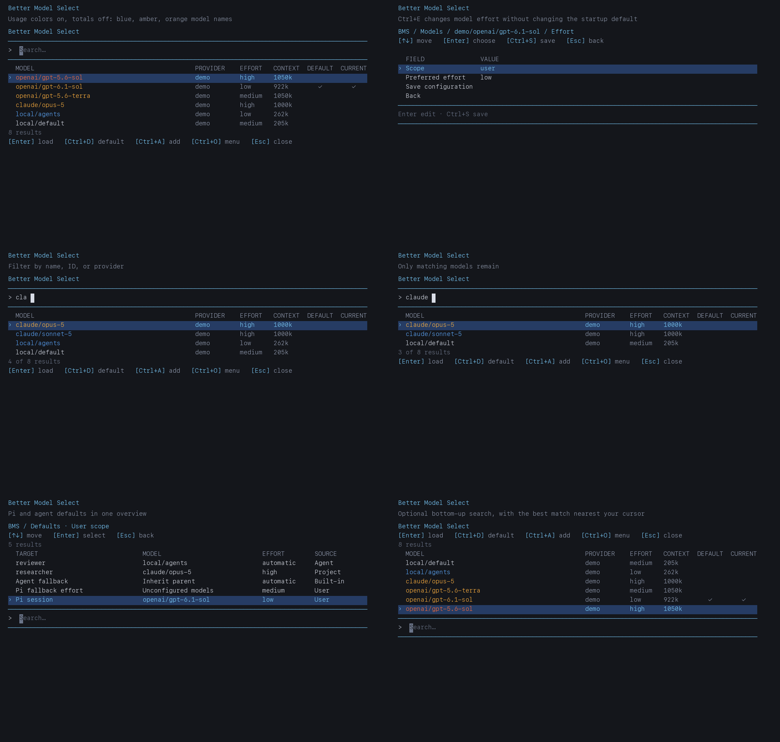
- Refresh the demo GIF and picker still with usage colors, optional totals, the theme palette, and the real Options form.
|
|
13
|
+
|
|
3
14
|
## 0.3.5
|
|
4
15
|
|
|
5
16
|
### Added
|
package/README.md
CHANGED
|
@@ -16,9 +16,9 @@ Run `/bms`, type to filter by name, model ID, or provider, then press Enter to s
|
|
|
16
16
|
|
|
17
17
|
|
|
18
18
|
|
|
19
|
-
The picker uses aligned model, provider, effort, context,
|
|
19
|
+
The picker uses aligned model, provider, effort, context, default, and current columns. Model names are color-coded by relative selection frequency using the icon's blue, amber, and orange palette. Unused models stay neutral. Selection totals are hidden by default. Type in the search field in Pi's editor area. Results appear below search by default, matching Pi command completion. Choose **Options → Result placement → Above prompt** for bottom-up results with the best match nearest the search line.
|
|
20
20
|
|
|
21
|
-
Add and edit use one form. Review the fields, press Enter to change a value, then choose **Save configuration** or press Ctrl+S to save. Text and numeric fields currently open a Pi input dialog; choices use the compact table. Esc goes back; unsaved changes require a discard confirmation. Options also stay in a draft until saved.
|
|
21
|
+
Add and edit use one form. Review the fields, press Enter to change a value, then choose **Save configuration** or press Ctrl+S to save. Text and numeric fields currently open a Pi input dialog; choices use the compact table. Esc goes back; unsaved changes require a discard confirmation. Options also stay in a draft until saved. **Color-code usage**, **Show total selections**, and **Usage palette** are independent options. Choose the Icon palette, the default, or Theme to use Pi's active thinking-level colors. Turning display options off does not stop counting or change sorting.
|
|
22
22
|
|
|
23
23
|
## Commands and shortcuts
|
|
24
24
|
|
|
@@ -99,6 +99,13 @@ Provider filters hide entries only in `/bms`, not Pi's `/model` picker. Default-
|
|
|
99
99
|
- [Configuration reference](https://cdn.jsdelivr.net/npm/pi-better-model-select@latest/docs/public/configuration.md): file paths, precedence, overlays, metadata, and integration limits.
|
|
100
100
|
Development and navigation design documents live in `docs/internal/` in the source checkout and are not included in the npm package.
|
|
101
101
|
|
|
102
|
+
## Support and contact
|
|
103
|
+
|
|
104
|
+
By Martin Senebald. For questions, feedback, or bug reports, contact me on:
|
|
105
|
+
|
|
106
|
+
- [Matrix: @msenebald:daq.red](https://matrix.to/#/@msenebald:daq.red)
|
|
107
|
+
- [Mastodon: @msenebald@chaos.social](https://chaos.social/@msenebald)
|
|
108
|
+
|
|
102
109
|
## License
|
|
103
110
|
|
|
104
111
|
MIT
|
|
Binary file
|
package/docs/demo/showcase.gif
CHANGED
|
Binary file
|
|
@@ -109,3 +109,25 @@ If discovery fails, the menu offers **Agent discovery details** with the error.
|
|
|
109
109
|
Only models loaded with Enter in `/bms` count toward ranking. BMS sorts by selection count, then recency, then alphabetically. Default assignments, `/model`, model cycling, and session restores do not count.
|
|
110
110
|
|
|
111
111
|
BMS prunes statistics for models missing from the effective configuration when the picker opens. Ctrl+R clears all usage statistics.
|
|
112
|
+
|
|
113
|
+
### Usage display
|
|
114
|
+
|
|
115
|
+
Ctrl+O → Options provides three independent settings. Press Ctrl+S to save.
|
|
116
|
+
|
|
117
|
+
| Option | JSON key | Default |
|
|
118
|
+
| --- | --- | --- |
|
|
119
|
+
| Color-code usage | `colorCodeUsage` | `true` |
|
|
120
|
+
| Show total selections | `showUsageCounts` | `false` |
|
|
121
|
+
| Usage palette | `usagePalette` | `"icon"` |
|
|
122
|
+
|
|
123
|
+
These keys live in `<agent-dir>/bms-settings.json`. Existing settings files inherit the defaults. Disabling colors or hiding totals does not stop recording selections or change sorting. With totals off, the USES column is removed entirely.
|
|
124
|
+
|
|
125
|
+
The Icon palette uses blue `#5BA7FF`, amber `#FFB13D`, and orange `#FF6B3D`. The Theme palette uses the active Pi theme's `thinkingLow`, `thinkingMedium`, and `thinkingHigh` roles. Theme hues and their distinctness depend on the theme. Usage colors stay visible on the keyboard-highlighted row; its background and chevron still follow Pi's selection theme. Icon colors are approximated on 256-color terminals.
|
|
126
|
+
|
|
127
|
+
Color tiers use a dynamic logarithmic scale:
|
|
128
|
+
|
|
129
|
+
```text
|
|
130
|
+
strength = log(1 + model selection count) / log(1 + highest selection count)
|
|
131
|
+
```
|
|
132
|
+
|
|
133
|
+
The maximum comes from all configured, enabled models before search filtering. Zero selections stay neutral. Positive strengths up to one-third use the low color, up to two-thirds use medium, and the rest use high. Equal counts get equal colors; if all counts are zero, everything stays neutral. A single used model gets the high color even after its first selection: colors express relative lifetime preference, not an absolute amount or recent activity. Colors can change as other models accumulate selections or providers are hidden. Searching does not rescale them.
|
package/extensions/bms.ts
CHANGED
|
@@ -105,6 +105,22 @@ export async function optionsFlow(ctx: any, config: ModelsConfig): Promise<void>
|
|
|
105
105
|
settings.writeMode = value as "overlay" | "direct";
|
|
106
106
|
return writeLabel();
|
|
107
107
|
} },
|
|
108
|
+
{ key: "colorCodeUsage", label: "Color-code usage", value: settings.colorCodeUsage ? "On" : "Off",
|
|
109
|
+
description: "Color model names by relative selection frequency. Counting and ranking remain active when off.",
|
|
110
|
+
edit: async () => { settings.colorCodeUsage = !settings.colorCodeUsage; return settings.colorCodeUsage ? "On" : "Off"; } },
|
|
111
|
+
{ key: "showUsageCounts", label: "Show total selections", value: settings.showUsageCounts ? "On" : "Off",
|
|
112
|
+
description: "Show the USES column independently of usage colors. Counts are saved even when hidden.",
|
|
113
|
+
edit: async () => { settings.showUsageCounts = !settings.showUsageCounts; return settings.showUsageCounts ? "On" : "Off"; } },
|
|
114
|
+
{ key: "usagePalette", label: "Usage palette", value: settings.usagePalette === "icon" ? "Icon" : "Theme",
|
|
115
|
+
description: "Icon uses blue, amber, orange. Theme uses thinkingLow, thinkingMedium, thinkingHigh from the active Pi theme.",
|
|
116
|
+
edit: async () => {
|
|
117
|
+
const value = await tableSelect(ctx, { title: "BMS / Options / Usage palette", initialValue: settings.usagePalette,
|
|
118
|
+
rows: [{ value: "icon", label: "Icon", description: "Blue → amber → orange" },
|
|
119
|
+
{ value: "theme", label: "Theme", description: "Active theme's low, medium, high thinking colors" }] });
|
|
120
|
+
if (value !== "icon" && value !== "theme") return;
|
|
121
|
+
settings.usagePalette = value;
|
|
122
|
+
return value === "icon" ? "Icon" : "Theme";
|
|
123
|
+
} },
|
|
108
124
|
{ key: "reset", label: "Reset usage ranking", value: "", edit: async () => {
|
|
109
125
|
if (await confirmAction(ctx, { title: "BMS / Options / Reset usage", lines: ["Clear all model usage counts? This takes effect immediately."], confirmLabel: "Reset usage" })) saveUsage({ version: 1, counts: {}, lastUsed: {} });
|
|
110
126
|
return;
|
|
@@ -1,5 +1,5 @@
|
|
|
1
1
|
import { ModelPicker, type PickerAction, type PickerOptions, type RankedModel } from "./picker.ts";
|
|
2
|
-
import {
|
|
2
|
+
import { loadSettings } from "./store.ts";
|
|
3
3
|
|
|
4
4
|
export async function pickerDialog(
|
|
5
5
|
ctx: any, rows: RankedModel[], title = "Better Model Select", assignment = false,
|
|
@@ -7,7 +7,8 @@ export async function pickerDialog(
|
|
|
7
7
|
): Promise<PickerAction | undefined> {
|
|
8
8
|
// Return the Focusable itself. Pi's custom UI installs it in the prompt area,
|
|
9
9
|
// calls setFocus on it and restores the previous editor when done is called.
|
|
10
|
+
const settings = loadSettings();
|
|
10
11
|
return ctx.ui.custom((tui: any, theme: any, _kb: any, done: any) =>
|
|
11
12
|
new ModelPicker(rows, theme, () => tui.requestRender(), done, assignment,
|
|
12
|
-
{ ...options, placement: options.placement ?? resultPlacement
|
|
13
|
+
{ ...options, usageDisplay: options.usageDisplay ?? settings, placement: options.placement ?? settings.resultPlacement }, title));
|
|
13
14
|
}
|
package/extensions/lib/picker.ts
CHANGED
|
@@ -4,6 +4,7 @@
|
|
|
4
4
|
import { matchesKey, type Focusable, type SelectItem, type SelectListTheme } from "@earendil-works/pi-tui";
|
|
5
5
|
import { TableSelect, type Placement, type SelectionState, type TableColumn } from "./tui.ts";
|
|
6
6
|
import { loadUsage, usageKey, type ModelsConfig } from "./store.ts";
|
|
7
|
+
import { DEFAULT_USAGE_DISPLAY, usageColor, usageTier, type UsageDisplay } from "./usage-colors.ts";
|
|
7
8
|
|
|
8
9
|
export type PickerAction =
|
|
9
10
|
| { kind: "load"; provider: string; modelId: string }
|
|
@@ -109,6 +110,7 @@ const HINT = "enter load · ctrl+d default · ctrl+a add · ctrl+o menu · esc c
|
|
|
109
110
|
|
|
110
111
|
export interface PickerOptions {
|
|
111
112
|
placement?: Placement;
|
|
113
|
+
usageDisplay?: UsageDisplay;
|
|
112
114
|
/** Pass the same state object when reopening after an action. Updated in place. */
|
|
113
115
|
state?: SelectionState & { menuValue?: string };
|
|
114
116
|
}
|
|
@@ -147,7 +149,18 @@ export class ModelPicker implements Focusable {
|
|
|
147
149
|
this.done = done;
|
|
148
150
|
this.assignment = assignment;
|
|
149
151
|
this.options = options;
|
|
150
|
-
|
|
152
|
+
const display = options.usageDisplay ?? DEFAULT_USAGE_DISPLAY;
|
|
153
|
+
const columns = display.showUsageCounts ? MODEL_COLUMNS : MODEL_COLUMNS.filter(column => column.key !== "uses");
|
|
154
|
+
const maximum = Math.max(0, ...rows.map(row => row.count));
|
|
155
|
+
const tiers = new Map(rows.map(row => [toSelectItem(row).value, usageTier(row.count, maximum)]));
|
|
156
|
+
this.table = new TableSelect({ title, columns,
|
|
157
|
+
styleCell: (row, key, text, activeTheme, selected) => {
|
|
158
|
+
if (display.colorCodeUsage && (key === "model" || key === "uses")) {
|
|
159
|
+
return usageColor(activeTheme, tiers.get(row.value) ?? "unused", display.usagePalette, text);
|
|
160
|
+
}
|
|
161
|
+
return typeof activeTheme?.fg === "function"
|
|
162
|
+
? activeTheme.fg(selected ? "accent" : key === "model" ? "text" : "muted", text) : text;
|
|
163
|
+
},
|
|
151
164
|
rows: rows.map(row => ({ value: toSelectItem(row).value, label: row.label,
|
|
152
165
|
// IDs remain searchable but are not repeated under the display name.
|
|
153
166
|
description: row.modelId,
|
package/extensions/lib/store.ts
CHANGED
|
@@ -22,6 +22,9 @@ export interface BmsSettings {
|
|
|
22
22
|
writeMode: WriteMode;
|
|
23
23
|
resultPlacement: "above" | "below";
|
|
24
24
|
disabledProviders: string[];
|
|
25
|
+
colorCodeUsage: boolean;
|
|
26
|
+
showUsageCounts: boolean;
|
|
27
|
+
usagePalette: "icon" | "theme";
|
|
25
28
|
}
|
|
26
29
|
|
|
27
30
|
const DEFAULT_SETTINGS: BmsSettings = {
|
|
@@ -29,6 +32,9 @@ const DEFAULT_SETTINGS: BmsSettings = {
|
|
|
29
32
|
writeMode: "overlay",
|
|
30
33
|
resultPlacement: "below",
|
|
31
34
|
disabledProviders: [],
|
|
35
|
+
colorCodeUsage: true,
|
|
36
|
+
showUsageCounts: false,
|
|
37
|
+
usagePalette: "icon",
|
|
32
38
|
};
|
|
33
39
|
|
|
34
40
|
export interface ModelEntry {
|
|
@@ -75,6 +81,9 @@ export function loadSettings(): BmsSettings {
|
|
|
75
81
|
version: 1,
|
|
76
82
|
writeMode: raw.writeMode === "direct" ? "direct" : "overlay",
|
|
77
83
|
resultPlacement: raw.resultPlacement === "above" ? "above" : "below",
|
|
84
|
+
colorCodeUsage: typeof raw.colorCodeUsage === "boolean" ? raw.colorCodeUsage : true,
|
|
85
|
+
showUsageCounts: typeof raw.showUsageCounts === "boolean" ? raw.showUsageCounts : false,
|
|
86
|
+
usagePalette: raw.usagePalette === "theme" ? "theme" : "icon",
|
|
78
87
|
disabledProviders: Array.isArray(raw.disabledProviders)
|
|
79
88
|
? raw.disabledProviders.filter((value): value is string => typeof value === "string")
|
|
80
89
|
: [],
|
package/extensions/lib/tui.ts
CHANGED
|
@@ -28,6 +28,8 @@ export interface TableSelectOptions {
|
|
|
28
28
|
placement?: Placement;
|
|
29
29
|
initialValue?: string;
|
|
30
30
|
state?: SelectionState;
|
|
31
|
+
/** Style fitted cells at render time; source values remain plain and searchable. */
|
|
32
|
+
styleCell?: (row: TableRow, key: string, text: string, theme: any, selected: boolean) => string;
|
|
31
33
|
}
|
|
32
34
|
export interface SelectionState { query?: string; selectedValue?: string }
|
|
33
35
|
|
|
@@ -146,10 +148,16 @@ export class TableSelect implements Component, Focusable {
|
|
|
146
148
|
if (this.options.search !== false && this.options.placement === "above") indices = indices.reverse();
|
|
147
149
|
return [...header, ...indices.map(index => {
|
|
148
150
|
const row = this.filtered[index]!;
|
|
149
|
-
const
|
|
150
|
-
|
|
151
|
-
const
|
|
152
|
-
|
|
151
|
+
const isSelected = index === this.selected;
|
|
152
|
+
const prefix = isSelected ? color(this.theme, "accent", "› ") : " ";
|
|
153
|
+
const cells = columns.map((column, i) => {
|
|
154
|
+
const fitted = fitCell(cell(row, column.key), sizes[i]!);
|
|
155
|
+
return this.options.styleCell
|
|
156
|
+
? this.options.styleCell(row, column.key, fitted, this.theme, isSelected)
|
|
157
|
+
: isSelected ? color(this.theme, "accent", fitted) : fitted;
|
|
158
|
+
});
|
|
159
|
+
const text = fitCell(prefix + cells.join(" "), width);
|
|
160
|
+
return isSelected && typeof this.theme?.bg === "function" ? this.theme.bg("selectedBg", text) : text;
|
|
153
161
|
})];
|
|
154
162
|
}
|
|
155
163
|
|
|
@@ -0,0 +1,31 @@
|
|
|
1
|
+
import type { BmsSettings } from "./store.ts";
|
|
2
|
+
|
|
3
|
+
export type UsageTier = "unused" | "low" | "medium" | "high";
|
|
4
|
+
export type UsageDisplay = Pick<BmsSettings, "colorCodeUsage" | "showUsageCounts" | "usagePalette">;
|
|
5
|
+
|
|
6
|
+
export const DEFAULT_USAGE_DISPLAY: UsageDisplay = {
|
|
7
|
+
colorCodeUsage: true, showUsageCounts: false, usagePalette: "icon",
|
|
8
|
+
};
|
|
9
|
+
|
|
10
|
+
/** Relative to the full enabled list, never the current search results. */
|
|
11
|
+
export function usageTier(count: number, maximum: number): UsageTier {
|
|
12
|
+
if (!Number.isFinite(count) || count <= 0 || !Number.isFinite(maximum) || maximum <= 0) return "unused";
|
|
13
|
+
const strength = Math.log1p(count) / Math.log1p(maximum);
|
|
14
|
+
return strength <= 1 / 3 ? "low" : strength <= 2 / 3 ? "medium" : "high";
|
|
15
|
+
}
|
|
16
|
+
|
|
17
|
+
const ICON_RGB = { low: [91, 167, 255], medium: [255, 177, 61], high: [255, 107, 61] } as const;
|
|
18
|
+
const THEME_ROLES = { low: "thinkingLow", medium: "thinkingMedium", high: "thinkingHigh" } as const;
|
|
19
|
+
|
|
20
|
+
/** Resolve colors at render time, so theme invalidation cannot retain old ANSI. */
|
|
21
|
+
export function usageColor(theme: any, tier: UsageTier, palette: UsageDisplay["usagePalette"], text: string): string {
|
|
22
|
+
if (tier === "unused") return typeof theme?.fg === "function" ? theme.fg("text", text) : text;
|
|
23
|
+
if (palette === "theme") return typeof theme?.fg === "function" ? theme.fg(THEME_ROLES[tier], text) : text;
|
|
24
|
+
// A missing theme means a plain-text renderer, as in tests and non-terminal hosts.
|
|
25
|
+
if (typeof theme?.fg !== "function") return text;
|
|
26
|
+
const rgb = ICON_RGB[tier];
|
|
27
|
+
const code = theme.getColorMode?.() === "256color"
|
|
28
|
+
? `38;5;${16 + 36 * Math.round(rgb[0] / 255 * 5) + 6 * Math.round(rgb[1] / 255 * 5) + Math.round(rgb[2] / 255 * 5)}`
|
|
29
|
+
: `38;2;${rgb.join(";")}`;
|
|
30
|
+
return `\x1b[${code}m${text}\x1b[39m`;
|
|
31
|
+
}
|
package/package.json
CHANGED
|
@@ -1,6 +1,6 @@
|
|
|
1
1
|
{
|
|
2
2
|
"name": "pi-better-model-select",
|
|
3
|
-
"version": "0.3.
|
|
3
|
+
"version": "0.3.6",
|
|
4
4
|
"type": "module",
|
|
5
5
|
"description": "Searchable, usage-ranked model picker for Pi with model management, default model and thinking effort selection, and per-role subagent defaults.",
|
|
6
6
|
"keywords": [
|
|
@@ -20,6 +20,10 @@
|
|
|
20
20
|
"litellm",
|
|
21
21
|
"openai-compatible"
|
|
22
22
|
],
|
|
23
|
+
"author": {
|
|
24
|
+
"name": "Martin Senebald",
|
|
25
|
+
"url": "https://chaos.social/@msenebald"
|
|
26
|
+
},
|
|
23
27
|
"license": "MIT",
|
|
24
28
|
"files": [
|
|
25
29
|
"extensions/",
|
|
@@ -29,10 +33,11 @@
|
|
|
29
33
|
"CHANGELOG.md",
|
|
30
34
|
"docs/public/configuration.md",
|
|
31
35
|
"docs/demo/showcase.gif",
|
|
36
|
+
"docs/demo/gallery.png",
|
|
32
37
|
"LICENSE"
|
|
33
38
|
],
|
|
34
39
|
"pi": {
|
|
35
|
-
"image": "https://cdn.jsdelivr.net/npm/pi-better-model-select@latest/
|
|
40
|
+
"image": "https://cdn.jsdelivr.net/npm/pi-better-model-select@latest/docs/demo/gallery.png",
|
|
36
41
|
"extensions": [
|
|
37
42
|
"./extensions/bms.ts"
|
|
38
43
|
]
|