ordinary-palette 0.2.0
This diff represents the content of publicly available package versions that have been released to one of the supported registries. The information contained in this diff is provided for informational purposes only and reflects changes between package versions as they appear in their respective public registries.
- package/LICENSE +21 -0
- package/README.en.md +161 -0
- package/README.md +318 -0
- package/dist/colors.css +286 -0
- package/dist/colors.json +344 -0
- package/dist/index.d.ts +3 -0
- package/dist/index.d.ts.map +1 -0
- package/dist/index.js +2 -0
- package/dist/index.js.map +1 -0
- package/dist/palette.d.ts +1300 -0
- package/dist/palette.d.ts.map +1 -0
- package/dist/palette.js +1019 -0
- package/dist/palette.js.map +1 -0
- package/package.json +45 -0
package/LICENSE
ADDED
|
@@ -0,0 +1,21 @@
|
|
|
1
|
+
MIT License
|
|
2
|
+
|
|
3
|
+
Copyright (c) 2026 성수 김
|
|
4
|
+
|
|
5
|
+
Permission is hereby granted, free of charge, to any person obtaining a copy
|
|
6
|
+
of this software and associated documentation files (the "Software"), to deal
|
|
7
|
+
in the Software without restriction, including without limitation the rights
|
|
8
|
+
to use, copy, modify, merge, publish, distribute, sublicense, and/or sell
|
|
9
|
+
copies of the Software, and to permit persons to whom the Software is
|
|
10
|
+
furnished to do so, subject to the following conditions:
|
|
11
|
+
|
|
12
|
+
The above copyright notice and this permission notice shall be included in all
|
|
13
|
+
copies or substantial portions of the Software.
|
|
14
|
+
|
|
15
|
+
THE SOFTWARE IS PROVIDED "AS IS", WITHOUT WARRANTY OF ANY KIND, EXPRESS OR
|
|
16
|
+
IMPLIED, INCLUDING BUT NOT LIMITED TO THE WARRANTIES OF MERCHANTABILITY,
|
|
17
|
+
FITNESS FOR A PARTICULAR PURPOSE AND NONINFRINGEMENT. IN NO EVENT SHALL THE
|
|
18
|
+
AUTHORS OR COPYRIGHT HOLDERS BE LIABLE FOR ANY CLAIM, DAMAGES OR OTHER
|
|
19
|
+
LIABILITY, WHETHER IN AN ACTION OF CONTRACT, TORT OR OTHERWISE, ARISING FROM,
|
|
20
|
+
OUT OF OR IN CONNECTION WITH THE SOFTWARE OR THE USE OR OTHER DEALINGS IN THE
|
|
21
|
+
SOFTWARE.
|
package/README.en.md
ADDED
|
@@ -0,0 +1,161 @@
|
|
|
1
|
+
<div align="center">
|
|
2
|
+
|
|
3
|
+
|
|
4
|
+
|
|
5
|
+
**The most ordinary, perfect palette you can use anywhere**
|
|
6
|
+
|
|
7
|
+
Every color keeps the same lightness at each step, so it's easy to build UI with
|
|
8
|
+
|
|
9
|
+
[](https://www.npmjs.com/package/ordinary-palette)
|
|
10
|
+
[](https://www.npmjs.com/package/ordinary-palette)
|
|
11
|
+
[](LICENSE)
|
|
12
|
+
|
|
13
|
+
[한국어](README.md) | English
|
|
14
|
+
|
|
15
|
+
</div>
|
|
16
|
+
|
|
17
|
+
## Features
|
|
18
|
+
|
|
19
|
+
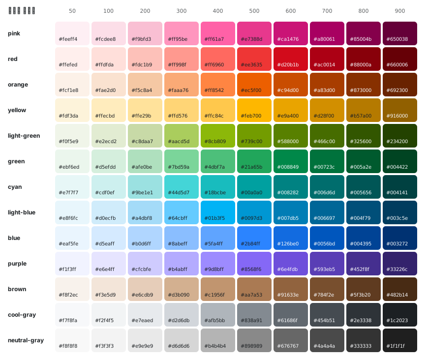
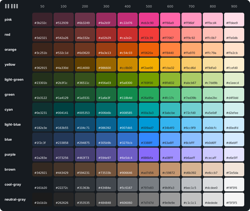
- **Same lightness across colors and steps:** The chromatic families share one lightness curve, so blue 500 and green 500 look equally bright. 13 families × 10 steps (50–900), in light and dark scales.
|
|
20
|
+
- **Each step has a job:** 50–200 are backgrounds. 600 is text on white and a fill for white text. White text on 700 and 800 text on 100 reach 4.5:1 or more (for yellow, 900 is the text step).
|
|
21
|
+
- **Dark keeps the same jobs:** The dark scale runs the other way, so a step does the same work in both modes. It does not reuse light hex values.
|
|
22
|
+
- **Rules locked in by tests:** `npm test` checks lightness spacing, chroma, and contrast on every run.
|
|
23
|
+
- **Raw palette only:** There are no semantic roles such as primary, surface, or text. Put your own design system on top.
|
|
24
|
+
|
|
25
|
+
## Why
|
|
26
|
+
|
|
27
|
+
Made so vibe coding gets consistent color: the same step looks equally bright across families. One reason the project started is Toss's article on rebuilding the TDS color system, [달리는 기차 바퀴 칠하기](https://toss.tech/article/43385) (a color-system update after seven years). The shared lightness curve follows that article. The hex values are original.
|
|
28
|
+
|
|
29
|
+
## Install
|
|
30
|
+
|
|
31
|
+
```bash
|
|
32
|
+
npm install ordinary-palette
|
|
33
|
+
```
|
|
34
|
+
|
|
35
|
+
## Usage
|
|
36
|
+
|
|
37
|
+
### JavaScript
|
|
38
|
+
|
|
39
|
+
```ts
|
|
40
|
+
import { blue, colors, darkBlue, whiteOpacity } from "ordinary-palette";
|
|
41
|
+
|
|
42
|
+
colors.blue[500];
|
|
43
|
+
colors["light-blue"][500];
|
|
44
|
+
darkBlue[500];
|
|
45
|
+
whiteOpacity["40"];
|
|
46
|
+
```
|
|
47
|
+
|
|
48
|
+
Each light family is also exported by name: `pink`, `red`, `orange`, `yellow`, `lightGreen`, `green`, `cyan`, `lightBlue`, `blue`, `purple`, `brown`, `coolGray`, `neutralGray`. Dark families are `darkPink`, `darkRed`, `darkOrange`, `darkYellow`, `darkLightGreen`, `darkGreen`, `darkCyan`, `darkLightBlue`, `darkBlue`, `darkPurple`, `darkBrown`, `darkCoolGray`, `darkNeutralGray`, and all of them together are `darkColors`. The opacity scales are `whiteOpacity` and `blackOpacity`.
|
|
49
|
+
|
|
50
|
+
### CSS
|
|
51
|
+
|
|
52
|
+
```css
|
|
53
|
+
@import "ordinary-palette/colors.css";
|
|
54
|
+
|
|
55
|
+
.notice {
|
|
56
|
+
background: var(--color-blue-600);
|
|
57
|
+
color: var(--color-white-opacity-100);
|
|
58
|
+
}
|
|
59
|
+
|
|
60
|
+
.notice-dark {
|
|
61
|
+
background: var(--color-dark-blue-500);
|
|
62
|
+
color: var(--color-dark-cool-gray-50);
|
|
63
|
+
}
|
|
64
|
+
```
|
|
65
|
+
|
|
66
|
+
CSS variables are named `--color-<family>-<step>` for light and `--color-dark-<family>-<step>` for dark, for example `--color-cool-gray-500`, `--color-dark-cool-gray-500`, `--color-light-blue-500`, `--color-white-opacity-40`, and `--color-black-opacity-05`.
|
|
67
|
+
|
|
68
|
+
### JSON
|
|
69
|
+
|
|
70
|
+
```ts
|
|
71
|
+
import palette from "ordinary-palette/colors.json" with { type: "json" };
|
|
72
|
+
|
|
73
|
+
palette.cyan["500"];
|
|
74
|
+
palette.dark.blue["500"];
|
|
75
|
+
```
|
|
76
|
+
|
|
77
|
+
## Figma
|
|
78
|
+
|
|
79
|
+
A Figma Community file and a way to import Variables will come later.
|
|
80
|
+
|
|
81
|
+
## At a glance
|
|
82
|
+
|
|
83
|
+
|
|
84
|
+
|
|
85
|
+
|
|
86
|
+
|
|
87
|
+
## How the curves behave
|
|
88
|
+
|
|
89
|
+
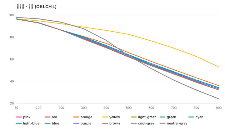
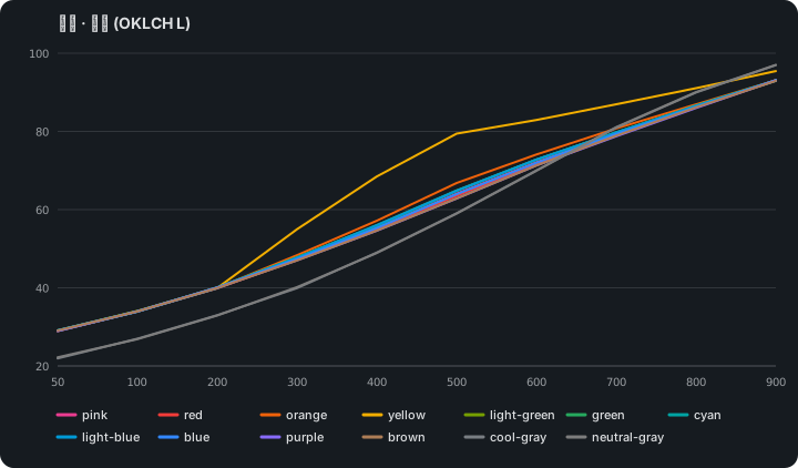
- **Lightness:** 50 is the lightest and 900 the darkest. Every chromatic family except yellow sits within about 1 L of blue at each step (orange runs up to 3 L lighter), so the same step looks equally bright across families. From 200 to 900, each step is a similar visual change, with a slightly larger drop before 500. 50–200 are background tints, so they sit closer together on purpose.
|
|
90
|
+
- **Chroma:** Low at 50, highest at 400–600, and it does not collapse at 900, so dark steps keep their family color. 600 is never more saturated than 500, so 500 reads as the main step.
|
|
91
|
+
- **Light tints:** 50–200 share lightness and chroma across chromatic families, so a row of different 100s looks even. Yellow shares 50 only and is brighter from 100 on.
|
|
92
|
+
- **Grays:** Start lighter (L 98) with three steps above L 93 for surfaces and borders. cool-gray 900 is the dark body text color. neutral-gray has cool-gray's lightness with zero chroma.
|
|
93
|
+
- **Dark scale:** Dark 50 is a dark tinted background, dark 500 is close to light 500 in lightness, and dark 900 is a light tint for text.
|
|
94
|
+
- **Visual correction:** Lightness stays on the shared curve. Where colors still look off (for example, saturated blue and purple look brighter), only chroma and hue are adjusted, so contrast does not change.
|
|
95
|
+
- **White and black:** Available as opacity scales (`white-opacity`, `black-opacity`) with steps 00, 05, 10, 20, 30, 40, 50, 60, 70, 80, 90, 100.
|
|
96
|
+
|
|
97
|
+
|
|
98
|
+
|
|
99
|
+
|
|
100
|
+
|
|
101
|
+
## Families
|
|
102
|
+
|
|
103
|
+
| Family | 50 → 900 | Character |
|
|
104
|
+
| --- | --- | --- |
|
|
105
|
+
| pink |  | A true pink (hue 356), kept apart from red. |
|
|
106
|
+
| red |  | A little redder than orange so the two stay apart. |
|
|
107
|
+
| orange |  | A vivid orange at 500. Light steps lean apricot, dark steps lean red. |
|
|
108
|
+
| yellow |  | Brighter than the shared curve from 100 on. 900 is a deep gold that works as text. |
|
|
109
|
+
| light-green |  | Yellow-green between yellow and green. Dark steps lean green so they do not look olive. |
|
|
110
|
+
| green |  | A clear green. |
|
|
111
|
+
| cyan |  | From aqua to teal. Dark steps are less saturated because of the sRGB limit. |
|
|
112
|
+
| light-blue |  | Sky blue between cyan and blue. |
|
|
113
|
+
| blue |  | The reference family for the shared lightness curve. |
|
|
114
|
+
| purple |  | Slightly more violet than indigo. |
|
|
115
|
+
| brown |  | A low-chroma warm brown between orange and gray. |
|
|
116
|
+
| cool-gray |  | A slightly cool gray for surfaces, borders, and text. |
|
|
117
|
+
| neutral-gray |  | cool-gray's lightness with zero chroma. |
|
|
118
|
+
|
|
119
|
+
Every family has the steps 50, 100, 200, 300, 400, 500, 600, 700, 800, 900 in both light and dark.
|
|
120
|
+
|
|
121
|
+
## Step guide
|
|
122
|
+
|
|
123
|
+
The palette has no semantic roles, and it will not add them. These are measured starting points, not rules (WCAG 2 contrast: 4.5:1 for text, 3:1 for icons and input borders).
|
|
124
|
+
|
|
125
|
+
- **Grays (light):** 50 and 100 for page and card backgrounds, 200 for dividers, 300 for visible borders, 500 for input borders, 600 for secondary text, 800–900 for body text.
|
|
126
|
+
- **Grays (dark):** Dark 50–200 for backgrounds, dark 500 for input borders, dark 600 for secondary text, dark 800–900 for body text.
|
|
127
|
+
- **Chromatic families (light):** 600 for text on white and as a fill for white text, 700 for badge text on a 100 tint, 500 for icons on white. For yellow, use 900 for text and 800 for icons.
|
|
128
|
+
- **Chromatic families (dark):** Dark 500 for text on dark backgrounds.
|
|
129
|
+
- **Same step, similar colors:** Because families share lightness, some same-step pairs are hard to tell apart with color vision deficiency. Add a label or icon, or mix steps.
|
|
130
|
+
|
|
131
|
+
The full guide, with measured contrast tables, color vision simulation, and screen examples, is in the [Korean README](README.md#스텝-사용-가이드).
|
|
132
|
+
|
|
133
|
+
## Development
|
|
134
|
+
|
|
135
|
+
```bash
|
|
136
|
+
npm install
|
|
137
|
+
npm test
|
|
138
|
+
```
|
|
139
|
+
|
|
140
|
+
`npm test` builds the package and then checks the palette rules: step format, lightness, spacing, chroma, family hue, contrast, the dark scale, visual correction, and whether the README tables match the palette and the README points to every swatch image. When the `assets` branch is fetched, it also checks that those images match the palette.
|
|
141
|
+
|
|
142
|
+
## Changelog
|
|
143
|
+
|
|
144
|
+
0.2.0 is the current version. The npm badges show the version and monthly downloads after the first publish.
|
|
145
|
+
|
|
146
|
+
### 0.2.0
|
|
147
|
+
|
|
148
|
+
- Renamed families: `lime` → `light-green`, `teal` → `cyan`, `cloudy-blue` → `light-blue`.
|
|
149
|
+
- Added the `brown` family.
|
|
150
|
+
- Chromatic families share one lightness curve. Yellow and the grays stay on their own.
|
|
151
|
+
- For every chromatic family except yellow, 600 is text on white and a fill for white text. Yellow text is 900.
|
|
152
|
+
- The 0.1.0 hex values were not kept.
|
|
153
|
+
|
|
154
|
+
### 0.1.0
|
|
155
|
+
|
|
156
|
+
- Twelve families (`lime`, `teal`, `cloudy-blue`, no brown), steps 50–900, light and dark scales, and white/black opacity.
|
|
157
|
+
- JavaScript, CSS variables, and JSON.
|
|
158
|
+
|
|
159
|
+
## License
|
|
160
|
+
|
|
161
|
+
MIT
|
package/README.md
ADDED
|
@@ -0,0 +1,318 @@
|
|
|
1
|
+
<div align="center">
|
|
2
|
+
|
|
3
|
+

|
|
4
|
+
|
|
5
|
+
**어디서든 쓸 수 있는 가장 평범하고 완벽한 팔레트**
|
|
6
|
+
|
|
7
|
+
컬러별, 스텝별로 일정한 명도를 지원해서 UI 제작에 쓰기 좋아요
|
|
8
|
+
|
|
9
|
+
[](https://www.npmjs.com/package/ordinary-palette)
|
|
10
|
+
[](https://www.npmjs.com/package/ordinary-palette)
|
|
11
|
+
[](LICENSE)
|
|
12
|
+
|
|
13
|
+
한국어 | [English](README.en.md)
|
|
14
|
+
|
|
15
|
+
</div>
|
|
16
|
+
|
|
17
|
+
## 특징
|
|
18
|
+
|
|
19
|
+
- **컬러별·스텝별로 일정한 명도:** 유색 가족이 명도 곡선 하나를 공유해서 blue 500과 green 500이 같은 밝기로 보입니다. 13개 가족 × 10스텝(50–900), 라이트·다크 스케일을 제공합니다.
|
|
20
|
+
- **스텝마다 정해진 역할:** 50–200은 배경, 600은 흰 배경 위 글자이자 흰 글자를 올리는 채움색입니다. 700 위 흰 글자와 100 위 800 글자는 4.5:1 이상입니다(yellow는 900이 글자 역할).
|
|
21
|
+
- **다크도 같은 역할:** 다크 스케일은 방향을 뒤집어서 한 스텝이 두 모드에서 같은 일을 합니다. 라이트 hex를 재사용하지 않습니다.
|
|
22
|
+
- **규칙을 테스트로 고정:** 명도 간격, 채도, 대비 기준을 `npm test`가 매번 검사합니다.
|
|
23
|
+
- **원시 팔레트만:** primary·surface·text 같은 의미 역할(시맨틱 토큰)은 없습니다. 각자의 디자인 시스템 위에 얹어 씁니다.
|
|
24
|
+
|
|
25
|
+
## 만든 이유
|
|
26
|
+
|
|
27
|
+
바이브코딩을 할 때 화면마다 색이 흔들리지 않도록, 같은 스텝이 같은 밝기로 보이는 팔레트를 만들었습니다. 시작한 이유 중 하나는 Toss의 [달리는 기차 바퀴 칠하기: 7년만의 컬러 시스템 업데이트](https://toss.tech/article/43385)입니다. 그 글처럼 명도 곡선 하나를 공유하는 형태만 참고했고, 색값은 직접 정했습니다.
|
|
28
|
+
|
|
29
|
+
## 설치
|
|
30
|
+
|
|
31
|
+
```bash
|
|
32
|
+
npm install ordinary-palette
|
|
33
|
+
```
|
|
34
|
+
|
|
35
|
+
## 사용법
|
|
36
|
+
|
|
37
|
+
### JavaScript
|
|
38
|
+
|
|
39
|
+
```ts
|
|
40
|
+
import { blue, colors, darkBlue, whiteOpacity } from "ordinary-palette";
|
|
41
|
+
|
|
42
|
+
colors.blue[500];
|
|
43
|
+
colors["light-blue"][500];
|
|
44
|
+
darkBlue[500];
|
|
45
|
+
whiteOpacity["40"];
|
|
46
|
+
```
|
|
47
|
+
|
|
48
|
+
라이트 가족은 각각 이름으로도 export됩니다: `pink`, `red`, `orange`, `yellow`, `lightGreen`, `green`, `cyan`, `lightBlue`, `blue`, `purple`, `brown`, `coolGray`, `neutralGray`. 다크 가족은 `darkPink`, `darkRed`, `darkOrange`, `darkYellow`, `darkLightGreen`, `darkGreen`, `darkCyan`, `darkLightBlue`, `darkBlue`, `darkPurple`, `darkBrown`, `darkCoolGray`, `darkNeutralGray`로 export되고, 한데 모은 `darkColors`도 있습니다. 투명도 스케일은 `whiteOpacity`, `blackOpacity`입니다. `yellowLightnessOffset`과 `darkLightness`는 아래에 적은 명도 숫자를 export합니다.
|
|
49
|
+
|
|
50
|
+
### CSS
|
|
51
|
+
|
|
52
|
+
```css
|
|
53
|
+
@import "ordinary-palette/colors.css";
|
|
54
|
+
|
|
55
|
+
.notice {
|
|
56
|
+
background: var(--color-blue-600);
|
|
57
|
+
color: var(--color-white-opacity-100);
|
|
58
|
+
}
|
|
59
|
+
|
|
60
|
+
.notice-dark {
|
|
61
|
+
background: var(--color-dark-blue-500);
|
|
62
|
+
color: var(--color-dark-cool-gray-50);
|
|
63
|
+
}
|
|
64
|
+
```
|
|
65
|
+
|
|
66
|
+
CSS 변수 이름은 라이트가 `--color-<가족>-<스텝>`, 다크가 `--color-dark-<가족>-<스텝>`입니다. 예를 들어 `--color-cool-gray-500`, `--color-neutral-gray-500`, `--color-dark-cool-gray-500`, `--color-light-blue-500`, `--color-white-opacity-40`, `--color-black-opacity-05`가 있습니다.
|
|
67
|
+
|
|
68
|
+
### JSON
|
|
69
|
+
|
|
70
|
+
```ts
|
|
71
|
+
import palette from "ordinary-palette/colors.json" with { type: "json" };
|
|
72
|
+
|
|
73
|
+
palette.cyan["500"];
|
|
74
|
+
palette.dark.blue["500"];
|
|
75
|
+
```
|
|
76
|
+
|
|
77
|
+
## Figma에서 쓰기
|
|
78
|
+
|
|
79
|
+
Figma Community 파일과 Variables로 가져오는 방법은 나중에 제공합니다.
|
|
80
|
+
|
|
81
|
+
## 한눈에 보기
|
|
82
|
+
|
|
83
|
+

|
|
84
|
+
|
|
85
|
+

|
|
86
|
+
|
|
87
|
+
## 곡선의 성격
|
|
88
|
+
|
|
89
|
+
- **명도:** 50이 가장 밝고 900이 가장 어둡습니다. yellow와 회색을 뺀 유색 가족은 명도 곡선 하나를 같이 씁니다. 모든 스텝이 blue에서 약 1 L 안에 있어서(orange만 +3 L), 가족이 달라도 같은 스텝이면 같은 밝기로 보입니다(Toss TDS 2025 개편과 같은 방식). 200부터 900까지는 스텝 하나가 비슷한 크기의 변화(ΔE OK 0.07–0.10)로 보이도록 간격을 맞췄고, 500 전의 하락이 조금 더 큽니다. 700–900도 한 가족 안에서 뚜렷하게 구분됩니다. 50–200은 배경용이라 일부러 촘촘합니다.
|
|
90
|
+
- **채도:** 50에서 낮고 400–600에서 가장 높으며, 900까지 크게 무너지지 않아서 짙은 스텝도 가족 색이 남습니다. 600은 500보다 채도가 높지 않아서 500이 메인 스텝으로 읽힙니다.
|
|
91
|
+
- **쨍함:** blue·red·orange는 SEED, Toss TDS, Montage의 같은 hue 최저 채도 이상입니다. 나머지 가족도 sRGB가 허락하는 만큼 선명하게 둡니다.
|
|
92
|
+
- **옅은 스텝:** 유색 가족은 50–200의 명도와 채도가 같아서(라이트 채도 0.017, 0.036, 0.070), 여러 가족의 100을 나란히 써도 한 가족만 진해 보이지 않습니다. brown은 원래 채도가 낮아 더 옅습니다. yellow만 50을 공유하고 100부터 더 밝게 두어, Toss 수준 채도를 sRGB 안에 넣습니다.
|
|
93
|
+
- **회색:** 더 밝은 L 98에서 시작하고, 표면과 테두리용으로 L 93 이상 스텝을 3개 둡니다. cool-gray 900은 어두운 본문 글자색입니다. neutral-gray는 cool-gray와 같은 명도에 채도 0입니다.
|
|
94
|
+
- **yellow:** 400부터 blue보다 밝고, 900은 짙은 금색이라 흰 배경과 yellow 100 위에서 글자로 읽힙니다. hue는 50에서 15° 안입니다.
|
|
95
|
+
- **다크 스케일:** 방향이 반대입니다. 다크 50은 어두운 틴트 배경, 다크 500은 라이트 500과 비슷한 명도, 다크 900은 글자용 밝은 틴트라서 한 스텝이 두 모드에서 같은 역할을 합니다. 라이트 hex를 재사용하지 않습니다.
|
|
96
|
+
- **시각 보정:** 명도가 같아도 채도가 높은 blue·purple은 더 밝아 보입니다(Helmholtz–Kohlrausch 효과). 그래서 purple 700–900은 blue와 같은 비율로 채도를 줄이고, 다크 blue·purple 300–400도 채도를 조금 낮췄습니다. 짙은 light-green은 올리브처럼 보여서 600–900을 초록 쪽으로 2–3° 옮겼습니다. 명도는 그대로라 대비는 바뀌지 않습니다.
|
|
97
|
+
- **흰색과 검정:** 투명도 스케일(white-opacity, black-opacity)로 제공합니다.
|
|
98
|
+
|
|
99
|
+
### 명도 곡선
|
|
100
|
+
|
|
101
|
+
가로축은 스텝, 세로축은 OKLCH 명도(L)입니다. 선 색은 각 가족의 500입니다.
|
|
102
|
+
|
|
103
|
+

|
|
104
|
+
|
|
105
|
+

|
|
106
|
+
|
|
107
|
+
- **라이트 명도:** 유색 가족은 끝까지 거의 한 줄로 겹쳐서 내려갑니다. yellow는 100부터 따로 밝게 가고, 회색은 더 밝게 시작해서 더 어둡게 끝납니다.
|
|
108
|
+
- **다크 명도:** 방향이 반대라서 50(어두운 배경)에서 900(밝은 틴트)으로 올라갑니다.
|
|
109
|
+
|
|
110
|
+
## 가족
|
|
111
|
+
|
|
112
|
+
| 가족 | 50 → 900 | 라이트 500 | 다크 500 |
|
|
113
|
+
| --- | --- | --- | --- |
|
|
114
|
+
| pink |  | `#e7388d` | `#eb3c90` |
|
|
115
|
+
| red |  | `#ee3635` | `#f33c39` |
|
|
116
|
+
| orange |  | `#ec5f00` | `#f0620a` |
|
|
117
|
+
| yellow |  | `#feb700` | `#f2ae00` |
|
|
118
|
+
| light-green |  | `#739c00` | `#769f00` |
|
|
119
|
+
| green |  | `#21a65b` | `#26a95e` |
|
|
120
|
+
| cyan |  | `#00a0a0` | `#00a3a3` |
|
|
121
|
+
| light-blue |  | `#0097d3` | `#009ad7` |
|
|
122
|
+
| blue |  | `#2b84ff` | `#3388ff` |
|
|
123
|
+
| purple |  | `#8568f6` | `#886bfa` |
|
|
124
|
+
| brown |  | `#aa7a53` | `#ad7d56` |
|
|
125
|
+
| cool-gray |  | `#838a91` | `#797e83` |
|
|
126
|
+
| neutral-gray |  | `#898989` | `#7d7d7d` |
|
|
127
|
+
|
|
128
|
+
모든 가족의 스텝은 라이트·다크 모두 50, 100, 200, 300, 400, 500, 600, 700, 800, 900입니다.
|
|
129
|
+
|
|
130
|
+
- **orange:** 500은 채도 0.19의 쨍한 주황(hue 44)으로, 당근 SEED carrot에 가까운 채도입니다. 주황은 노랑처럼 밝아야 쨍해지는 색이라 300부터 공유 곡선보다 조금 밝게(300은 +1.5 L, 400부터 +3 L) 두고, 짙어질수록 hue를 붉은 쪽으로 옮깁니다. red는 그만큼 3° 더 붉게 두어 정상 시각에서 두 색이 ΔE 0.07 이상 떨어집니다. 옅은 스텝은 살구색(hue 60) 쪽입니다.
|
|
131
|
+
- **yellow:** 500·600에서 Toss TDS 채도 이상입니다. 50은 blue와 명도가 같고, 100부터는 blue보다 이만큼(OKLCH L) 밝습니다: 100 +1.9, 200 +5.8, 300 +10.0, 400 +14.7, 500 +19.5, 600 +21.6, 700 +22.4, 800 +22.4, 900 +19.8.
|
|
132
|
+
- **light-green:** yellow와 green 사이의 연두(hue 124–133)입니다. 짙은 스텝이 올리브로 보이지 않게 600부터 초록 쪽으로 조금 기웁니다.
|
|
133
|
+
- **cyan:** hue 195로 #00ffff 같은 아쿠아에서 #008080 같은 teal로 이어집니다. 이 hue는 밝아야 채도가 나와서, 명도를 맞춘 짙은 스텝은 다른 가족보다 채도가 낮습니다(sRGB 한계).
|
|
134
|
+
- **light-blue:** cyan과 blue 사이의 하늘색(hue 232–242)입니다.
|
|
135
|
+
- **pink:** hue 356의 진짜 분홍이라 red와 구분됩니다.
|
|
136
|
+
- **purple:** hue 288로 indigo보다 살짝 보라 쪽입니다.
|
|
137
|
+
- **brown:** orange와 회색 사이의 채도 낮은 따뜻한 갈색(hue 56–64)입니다. 명도가 orange와 같아서, 채도를 더 낮추고 hue를 노란 쪽으로 옮겨 구분합니다.
|
|
138
|
+
- **neutral-gray:** cool-gray와 같은 명도에 채도 0입니다. `#666666`은 그 성격을 설명하는 예시일 뿐, 스케일의 스텝이 아닙니다.
|
|
139
|
+
|
|
140
|
+
다크 cool-gray 명도는 올라가는 순서입니다: 50 = 22, 100 = 27, 200 = 33, 300 = 40, 400 = 49, 500 = 59, 600 = 70, 700 = 81, 800 = 90, 900 = 97. 다크 유색 가족의 50–200은 L 29, 34, 40을 공유합니다. 다크 500은 라이트 500과 명도 4 이내이고, 다크 900은 L 93 근처의 밝은 틴트입니다. 다크 채도는 500에서 가장 높고, 라이트 최고 채도의 90% 이상입니다.
|
|
141
|
+
|
|
142
|
+
투명도 스텝은 `white-opacity`와 `black-opacity` 모두 00, 05, 10, 20, 30, 40, 50, 60, 70, 80, 90, 100입니다.
|
|
143
|
+
|
|
144
|
+
## 스텝 사용 가이드
|
|
145
|
+
|
|
146
|
+
이 팔레트에는 primary, surface 같은 의미 역할(토큰)이 없고, 앞으로도 만들지 않습니다. 아래 내용은 규칙이 아니라 실제로 측정해 본 출발점입니다. 숫자는 WCAG 2 대비입니다. 글자는 4.5:1, 아이콘과 입력창 테두리는 3:1이 기준입니다.
|
|
147
|
+
|
|
148
|
+
### 회색
|
|
149
|
+
|
|
150
|
+
**라이트:** 페이지·카드 배경은 50과 100, 구분선은 200, 눈에 보이는 테두리는 300입니다. 입력창처럼 반드시 보여야 하는 테두리는 500(3.5:1), 보조 글자는 600(5.7:1), 본문은 800–900입니다.
|
|
151
|
+
|
|
152
|
+
**다크:** 배경은 다크 50–200, 입력창 테두리는 다크 500(4.2:1), 보조 글자는 다크 600(6.5:1), 본문은 다크 800–900입니다.
|
|
153
|
+
|
|
154
|
+
### 유색 가족
|
|
155
|
+
|
|
156
|
+
각 칸은 기준을 처음 통과하는 스텝입니다. "500 채움색에 맞는 글자"는 500 위에서 더 잘 읽히는 글자색과 그 대비입니다. 어두운 글자는 cool-gray 900이고, 다크 스케일에서는 다크 cool-gray 50입니다.
|
|
157
|
+
|
|
158
|
+
| 가족 | 흰 배경 위 글자 | 흰 글자를 올리는 채움색 | 500 채움색에 맞는 글자 | 100 틴트 위 뱃지 글자 | 흰 배경 위 아이콘 |
|
|
159
|
+
| --- | --- | --- | --- | --- | --- |
|
|
160
|
+
| pink | 600 | 600 | 어두운 글자 4.2:1 | 700 | 500 |
|
|
161
|
+
| red | 600 | 600 | 어두운 글자 4.1:1 | 700 | 500 |
|
|
162
|
+
| orange | 600 | 600 | 어두운 글자 4.8:1 | 700 | 500 |
|
|
163
|
+
| yellow | 900 | 900 | 어두운 글자 9.4:1 | 900 | 800 |
|
|
164
|
+
| light-green | 600 | 600 | 어두운 글자 5.1:1 | 700 | 500 |
|
|
165
|
+
| green | 600 | 600 | 어두운 글자 5.2:1 | 700 | 500 |
|
|
166
|
+
| cyan | 600 | 600 | 어두운 글자 5.1:1 | 700 | 500 |
|
|
167
|
+
| light-blue | 600 | 600 | 어두운 글자 5.0:1 | 700 | 500 |
|
|
168
|
+
| blue | 600 | 600 | 어두운 글자 4.6:1 | 700 | 500 |
|
|
169
|
+
| purple | 600 | 600 | 어두운 글자 4.1:1 | 700 | 500 |
|
|
170
|
+
| brown | 600 | 600 | 어두운 글자 4.4:1 | 700 | 500 |
|
|
171
|
+
|
|
172
|
+
다크 스케일 (다크 cool-gray 50 배경):
|
|
173
|
+
|
|
174
|
+
| 가족 | 다크 50 위 글자 | 500 채움색에 맞는 글자 | 다크 100 틴트 위 뱃지 글자 |
|
|
175
|
+
| --- | --- | --- | --- |
|
|
176
|
+
| pink | 500 | 어두운 글자 4.6:1 | 700 |
|
|
177
|
+
| red | 500 | 어두운 글자 4.6:1 | 700 |
|
|
178
|
+
| orange | 500 | 어두운 글자 5.3:1 | 600 |
|
|
179
|
+
| yellow | 400 | 어두운 글자 8.9:1 | 500 |
|
|
180
|
+
| light-green | 500 | 어두운 글자 5.6:1 | 600 |
|
|
181
|
+
| green | 500 | 어두운 글자 5.7:1 | 600 |
|
|
182
|
+
| cyan | 500 | 어두운 글자 5.6:1 | 600 |
|
|
183
|
+
| light-blue | 500 | 어두운 글자 5.4:1 | 600 |
|
|
184
|
+
| blue | 500 | 어두운 글자 5.0:1 | 600 |
|
|
185
|
+
| purple | 500 | 어두운 글자 4.6:1 | 700 |
|
|
186
|
+
| brown | 500 | 어두운 글자 4.8:1 | 600 |
|
|
187
|
+
|
|
188
|
+
### 쓸 때 알아둘 점
|
|
189
|
+
|
|
190
|
+
**1. 밝은 가족의 500 채움색에는 어두운 글자를 올립니다.** 어두운 글자는 cool-gray 900입니다.
|
|
191
|
+
|
|
192
|
+
| 채움색 | 어두운 글자 | 흰 글자 |
|
|
193
|
+
| --- | --- | --- |
|
|
194
|
+
| orange 500 `#ec5f00` | ✅ 어두운 글자 4.8:1 | ❌ 흰 글자 3.4:1 |
|
|
195
|
+
| yellow 500 `#feb700` | ✅ 어두운 글자 9.4:1 | ❌ 흰 글자 1.8:1 |
|
|
196
|
+
| light-green 500 `#739c00` | ✅ 어두운 글자 5.1:1 | ❌ 흰 글자 3.2:1 |
|
|
197
|
+
| cyan 500 `#00a0a0` | ✅ 어두운 글자 5.1:1 | ❌ 흰 글자 3.2:1 |
|
|
198
|
+
| light-blue 500 `#0097d3` | ✅ 어두운 글자 5.0:1 | ❌ 흰 글자 3.3:1 |
|
|
199
|
+
|
|
200
|
+
**2. pink·red·purple의 흰 글자 버튼은 600부터 씁니다.** 500은 크고 굵은 글자(3:1)에만 씁니다.
|
|
201
|
+
|
|
202
|
+
| 가족 | 500 | 600 |
|
|
203
|
+
| --- | --- | --- |
|
|
204
|
+
| pink | ⚠️ 500 `#e7388d` + 흰 글자 3.9:1 | ✅ 600 `#ca1476` + 흰 글자 5.4:1 |
|
|
205
|
+
| red | ⚠️ 500 `#ee3635` + 흰 글자 4.0:1 | ✅ 600 `#d20b1b` + 흰 글자 5.5:1 |
|
|
206
|
+
| purple | ⚠️ 500 `#8568f6` + 흰 글자 4.0:1 | ✅ 600 `#6e4fdb` + 흰 글자 5.5:1 |
|
|
207
|
+
|
|
208
|
+
**3. 흰 배경 위 단독 아이콘은 600 이상을 씁니다.** 아이콘은 3:1이 기준입니다.
|
|
209
|
+
|
|
210
|
+
| 가족 | 500 아이콘 | 600 아이콘 |
|
|
211
|
+
| --- | --- | --- |
|
|
212
|
+
| orange | ❌ 500 3.4:1 | ✅ 600 4.6:1 |
|
|
213
|
+
| light-green | ❌ 500 3.2:1 | ✅ 600 4.7:1 |
|
|
214
|
+
| cyan | ❌ 500 3.2:1 | ✅ 600 4.7:1 |
|
|
215
|
+
| light-blue | ❌ 500 3.3:1 | ✅ 600 4.6:1 |
|
|
216
|
+
|
|
217
|
+
**4. yellow를 글자로 쓸 때는 900만 씁니다.**
|
|
218
|
+
|
|
219
|
+
| 글자 | 흰 배경 위 | yellow 100 위 |
|
|
220
|
+
| --- | --- | --- |
|
|
221
|
+
| yellow 500 `#feb700` | ❌ 1.8:1 | ❌ 1.5:1 |
|
|
222
|
+
| yellow 700 `#d28f00` | ❌ 2.7:1 | ❌ 2.3:1 |
|
|
223
|
+
| yellow 800 `#b57a00` | ❌ 3.7:1 | ❌ 3.1:1 |
|
|
224
|
+
| yellow 900 `#916000` | ✅ 5.4:1 | ✅ 4.6:1 |
|
|
225
|
+
|
|
226
|
+
**5. 50·100 틴트만으로 카테고리를 구분하지 않습니다.** 옅은 틴트는 가족끼리 거의 같아 보입니다(ΔE 0.03 미만). 틴트 위에 700–800 글자나 아이콘을 함께 올립니다.
|
|
227
|
+
|
|
228
|
+
| 가족 | 틴트 | 채움색 |
|
|
229
|
+
| --- | --- | --- |
|
|
230
|
+
| pink/red | 100끼리 ΔE 0.020 | 500끼리 ΔE 0.116 |
|
|
231
|
+
| light-blue/blue | 100끼리 ΔE 0.011 | 500끼리 ΔE 0.091 |
|
|
232
|
+
| cyan/light-blue | 100끼리 ΔE 0.023 | 500끼리 ΔE 0.090 |
|
|
233
|
+
|
|
234
|
+
**6. hover와 pressed 상태는 라이트에서 한 단계 어둡게(600 → 700), 다크에서 한 단계 밝게 씁니다.**
|
|
235
|
+
|
|
236
|
+
### 색각 이상 시뮬레이션
|
|
237
|
+
|
|
238
|
+
적색약·녹색약·청색약을 Machado(2009) 모델로 시뮬레이션해서, 500끼리 거의 같아 보이는 조합을 찾았습니다. 정상 시각에서 이웃 가족끼리는 모두 ΔE 0.10 이상 떨어집니다.
|
|
239
|
+
|
|
240
|
+
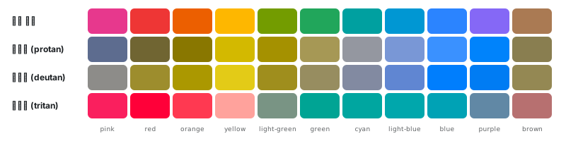
|
|
241
|
+
|
|
242
|
+
| 시뮬레이션 | 500에서 헷갈리는 조합 (ΔE OK 0.07 미만) |
|
|
243
|
+
| --- | --- |
|
|
244
|
+
| 정상 시각 | 없음 |
|
|
245
|
+
| 적색약 (protan) | orange/brown 0.057, light-green/green 0.052, blue/purple 0.046 |
|
|
246
|
+
| 녹색약 (deutan) | pink/green 0.058, pink/cyan 0.041, red/orange 0.043, red/light-green 0.011, red/green 0.052, red/brown 0.044, orange/light-green 0.034, light-green/green 0.063, light-green/brown 0.055, green/brown 0.018, blue/purple 0.015 |
|
|
247
|
+
| 청색약 (tritan) | pink/red 0.041, pink/orange 0.038, red/orange 0.036, green/cyan 0.017, green/light-blue 0.035, green/blue 0.053, cyan/light-blue 0.018, cyan/blue 0.038, light-blue/blue 0.023 |
|
|
248
|
+
|
|
249
|
+
차트처럼 색만으로 구분해야 할 때 쓰기 좋은 500 순서: blue → orange → yellow → brown → cyan → pink. 앞에서부터 고르면 정상 시각과 세 가지 시뮬레이션 모두에서 서로 떨어진 최소 거리가 4색 ΔE 0.057, 5색 0.038, 6색 0.038입니다. 0.07보다 작아지는 개수부터는 색 외에 모양이나 라벨을 함께 씁니다.
|
|
250
|
+
|
|
251
|
+
- **성공과 오류를 red와 green만으로 구분하지 않습니다.** 녹색약(남성의 약 5%)에게는 red 500과 green 500이 거의 같아 보입니다. 아이콘(✓, !)이나 문구를 함께 씁니다.
|
|
252
|
+
- 적색약에게는 red와 brown, 녹색약에게는 blue와 purple, 청색약에게는 cyan과 light-blue가 거의 같아 보입니다. 이 쌍을 나란히 쓸 때는 명도를 두 단계 이상 벌리거나(예: red 500과 brown 800) 라벨을 붙입니다.
|
|
253
|
+
- 유색 가족은 명도 곡선을 공유해서, 같은 스텝끼리는 명도 차이가 거의 없습니다. 색각 이상이 있으면 hue 차이만 남기 때문에 헷갈리는 조합이 많아집니다. 같은 스텝의 색을 여러 개 나란히 쓸 때는 스텝을 섞어 명도 차이를 만들거나 라벨을 붙입니다.
|
|
254
|
+
|
|
255
|
+
### 실제 화면 적용 예시
|
|
256
|
+
|
|
257
|
+
카드, 폼, 알림이 있는 흔한 화면에 스텝을 대입해 본 예시입니다. 토큰이 아니라 "이 요소에는 이 스텝이 맞았다"는 기록입니다. 괄호 안은 카드 배경(라이트 cool-gray 50, 다크 cool-gray 100)과의 대비이고, 뱃지와 배너는 배경색과 글자색 사이의 대비입니다.
|
|
258
|
+
|
|
259
|
+
| 요소 | 라이트 (카드 배경 대비) | 다크 (카드 배경 대비) |
|
|
260
|
+
| --- | --- | --- |
|
|
261
|
+
| 페이지 배경 | white `#ffffff` | dark cool-gray 50 `#161b20` |
|
|
262
|
+
| 카드 배경 | cool-gray 50 `#f7f8fa` | dark cool-gray 100 `#22272c` |
|
|
263
|
+
| 카드 테두리 | cool-gray 200 `#e7eaed` (1.1:1) | dark cool-gray 200 `#31363b` (1.2:1) |
|
|
264
|
+
| 제목 | cool-gray 900 `#1c2023` (15.4:1) | dark cool-gray 900 `#f4f5f6` (13.8:1) |
|
|
265
|
+
| 본문 | cool-gray 700 `#454b51` (8.3:1) | dark cool-gray 800 `#dcdee0` (11.2:1) |
|
|
266
|
+
| 보조 글자 | cool-gray 600 `#61686f` (5.3:1) | dark cool-gray 700 `#bec1c5` (8.3:1) |
|
|
267
|
+
| 입력창 테두리 | cool-gray 500 `#838a91` (3.3:1) | dark cool-gray 500 `#797e83` (3.7:1) |
|
|
268
|
+
| 링크 | blue 700 `#0056bd` (6.4:1) | dark blue 700 `#8cbfff` (7.9:1) |
|
|
269
|
+
| 오류 문구 | red 600 `#d20b1b` (5.2:1) | dark red 700 `#ff9c92` (7.5:1) |
|
|
270
|
+
| 기본 버튼 | blue 600 + 흰 글자 (5.0:1) | dark blue 500 + 어두운 글자 (5.0:1) |
|
|
271
|
+
| 성공 뱃지 | green 100 + green 800 (6.9:1) | dark green 100 + dark green 700 (6.4:1) |
|
|
272
|
+
| 경고 배너 | yellow 100 + yellow 900 (4.6:1) | dark yellow 100 + dark yellow 700 (7.9:1) |
|
|
273
|
+
| 오류 배너 | red 100 + red 800 (8.2:1) | dark red 100 + dark red 700 (6.0:1) |
|
|
274
|
+
|
|
275
|
+
- 링크는 카드 배경 위에서 blue 600이 4.3:1로 모자라서 700을 씁니다. 흰 배경 위라면 600(4.6:1)도 됩니다.
|
|
276
|
+
- 카드 테두리(1.1–1.2:1)는 장식용 구분선입니다. 카드 배경과 페이지 배경의 차이가 작으므로, 카드 구분이 꼭 필요하면 테두리를 300으로 올리거나 그림자를 함께 씁니다.
|
|
277
|
+
|
|
278
|
+
위의 표와 수치는 모두 `scripts/usage-table.ts`가, README의 색 이미지와 명도 곡선 차트는 `scripts/write-swatches.ts`가 팔레트에서 만들고, `assets` 브랜치에 올려 README에서 불러옵니다. 색이 바뀌어 표나 이미지가 어긋나면 `npm test`가 실패하고, 이미지는 `scripts/update-assets.sh`로 다시 올립니다. 표를 다시 만들 때는 `node --experimental-strip-types scripts/usage-table.ts`를 실행합니다.
|
|
279
|
+
|
|
280
|
+
## 개발
|
|
281
|
+
|
|
282
|
+
```bash
|
|
283
|
+
npm install
|
|
284
|
+
npm test
|
|
285
|
+
```
|
|
286
|
+
|
|
287
|
+
`npm test`는 패키지를 빌드한 뒤 아래 규칙을 검사합니다.
|
|
288
|
+
|
|
289
|
+
- **형식:** 스텝은 50–900(950 없음), 색은 `#RRGGBB`, `colors.json`·`colors.css`·빌드 결과가 팔레트와 같은지.
|
|
290
|
+
- **명도:** 50에서 900으로 떨어지는지, yellow·회색을 뺀 유색 가족이 blue 명도와 1.3 L 안인지(orange는 300 +1.5 L, 400부터 +3 L), blue 600 이후 스텝마다 6.5 L 이상 떨어지고 900이 L 35 이하인지.
|
|
291
|
+
- **간격:** 200–900 인접 스텝이 라이트·다크 모두 ΔE OK 0.065–0.105인지.
|
|
292
|
+
- **채도:** 400–600에서 가장 높은지, 900은 최고의 50% 이상인지(cyan처럼 sRGB가 못 담으면 한계까지), 600이 500을 넘지 않는지, 50–200 틴트 채도가 가족끼리 같은지, blue·red·orange와 orange·yellow가 기준 채도에 닿는지.
|
|
293
|
+
- **가족 자리:** 각 가족의 hue, pink/red와 brown/orange 거리, 회색의 밝은 쪽, neutral-gray 채도 0.
|
|
294
|
+
- **대비:** 700 위 흰 글자와 100 위 800 글자, yellow 900 글자.
|
|
295
|
+
- **다크:** 방향(어두운 틴트 50 → 밝은 900), 다크 50 틴트, 다크 최고 채도가 라이트의 90% 이상인지.
|
|
296
|
+
- **시각 보정:** purple 700–900 채도 비율이 blue 이하, 다크 blue·purple 300·400 채도 상한.
|
|
297
|
+
- **문서:** README 가이드 표가 팔레트와 같은지, README가 모든 색 이미지를 가리키는지, `assets` 브랜치를 받아 둔 경우 그 이미지가 팔레트와 같은지.
|
|
298
|
+
|
|
299
|
+
## 변경 기록
|
|
300
|
+
|
|
301
|
+
0.2.0이 현재 버전입니다. npm 배지는 첫 배포 뒤에 버전과 월간 다운로드를 보여 줍니다.
|
|
302
|
+
|
|
303
|
+
### 0.2.0
|
|
304
|
+
|
|
305
|
+
- 가족 이름을 바꿨습니다. `lime` → `light-green`, `teal` → `cyan`, `cloudy-blue` → `light-blue`.
|
|
306
|
+
- `brown` 가족을 추가했습니다.
|
|
307
|
+
- 유색 가족은 명도 곡선 하나를 공유합니다. yellow와 회색은 따로 둡니다.
|
|
308
|
+
- yellow를 뺀 유색 가족은 600이 흰 배경 위 글자이자 흰 글자 채움색입니다. yellow 글자는 900입니다.
|
|
309
|
+
- 0.1.0의 hex는 그대로 두지 않았습니다.
|
|
310
|
+
|
|
311
|
+
### 0.1.0
|
|
312
|
+
|
|
313
|
+
- 12가족(`lime`, `teal`, `cloudy-blue`, brown 없음), 스텝 50–900, 라이트·다크, white/black opacity.
|
|
314
|
+
- JavaScript, CSS 변수, JSON.
|
|
315
|
+
|
|
316
|
+
## 라이선스
|
|
317
|
+
|
|
318
|
+
MIT
|