opus-react 0.4.5 → 0.4.6
This diff represents the content of publicly available package versions that have been released to one of the supported registries. The information contained in this diff is provided for informational purposes only and reflects changes between package versions as they appear in their respective public registries.
- package/README.md +69 -1
- package/assets/npm/components.png +0 -0
- package/assets/npm/desktop.png +0 -0
- package/assets/npm/playground.png +0 -0
- package/dist/index.cjs +150 -150
- package/dist/index.js +150 -150
- package/package.json +1 -1
package/README.md
CHANGED
|
@@ -2,7 +2,7 @@
|
|
|
2
2
|
|
|
3
3
|
**Build modern business applications without rebuilding the foundations.**
|
|
4
4
|
|
|
5
|
-
Opus is a production-ready, themeable React design system for dashboards, CRM products, internal tools
|
|
5
|
+
Opus is a production-ready, themeable React design system for dashboards, CRM products, internal tools, data-rich workflows, and browser-based desktop experiences. It combines polished visual design with accessible interaction patterns, strong TypeScript support and a broad component catalogue—from form primitives to complete application layouts and draggable multi-window workspaces.
|
|
6
6
|
|
|
7
7
|
[Component catalogue](https://project-opus.netlify.app/documentation/components) · [GitHub](https://github.com/Carl-Fearby/Opus)
|
|
8
8
|
|
|
@@ -22,6 +22,7 @@ Opus is a production-ready, themeable React design system for dashboards, CRM pr
|
|
|
22
22
|
## Why Opus
|
|
23
23
|
|
|
24
24
|
- **Hundreds of composable components** covering forms, content, navigation, overlays, charts, dashboards, media and desktop-style experiences.
|
|
25
|
+
- **Build complete web desktops** with draggable and resizable windows, desktop shortcuts, a responsive dock, minimise/maximise behaviour, focus management, and application-defined window content.
|
|
25
26
|
- **Designed for real application interfaces**, with responsive layouts, resizable panes, rich data views and reusable workflow components.
|
|
26
27
|
- **Themeable by default**, including light and dark modes, CSS design tokens and runtime accent colours.
|
|
27
28
|
- **Accessible and typed**, with keyboard-aware interactions and complete TypeScript definitions.
|
|
@@ -220,6 +221,73 @@ import {
|
|
|
220
221
|
</Columns>;
|
|
221
222
|
```
|
|
222
223
|
|
|
224
|
+
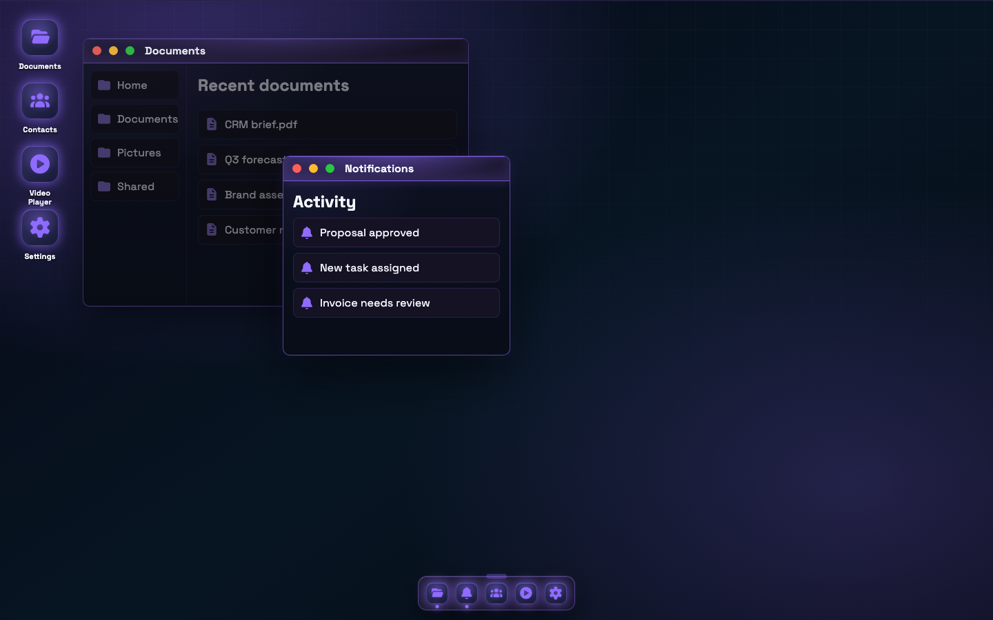
### Desktop applications
|
|
225
|
+
|
|
226
|
+
Create browser-based desktop and workspace experiences from reusable primitives. Opus supplies the shell and interaction model while your application owns every shortcut, dock item, window, and piece of content.
|
|
227
|
+
|
|
228
|
+
[](https://project-opus.netlify.app/documentation/components)
|
|
229
|
+
|
|
230
|
+
- `Desktop` — stateful workspace shell with wallpaper, shortcuts, windows, dock placement, and edge-to-edge mode
|
|
231
|
+
- `DesktopWindow` — draggable, resizable, focus-aware windows with close, minimise, maximise, and restore transitions
|
|
232
|
+
- `DesktopDock` — resizable dock with bottom, left, and right placement plus optional auto-hide
|
|
233
|
+
- `DesktopIcon` — keyboard-accessible, selectable shortcuts with single- or double-click opening
|
|
234
|
+
- `VideoPlayer` — window-ready media playback with responsive controls and ambient blurred video fill
|
|
235
|
+
|
|
236
|
+
```tsx
|
|
237
|
+
import {
|
|
238
|
+
Desktop,
|
|
239
|
+
type DesktopDockItem,
|
|
240
|
+
type DesktopShortcut,
|
|
241
|
+
type DesktopWindowItem,
|
|
242
|
+
} from "opus-react";
|
|
243
|
+
|
|
244
|
+
const shortcuts: DesktopShortcut[] = [
|
|
245
|
+
{ id: "documents", icon: "folder-open", label: "Documents", x: 20, y: 20 },
|
|
246
|
+
{ id: "contacts", icon: "users", label: "Contacts", x: 20, y: 124 },
|
|
247
|
+
];
|
|
248
|
+
|
|
249
|
+
const dockItems: DesktopDockItem[] = shortcuts.map(({ id, icon, label }) => ({
|
|
250
|
+
id,
|
|
251
|
+
icon,
|
|
252
|
+
label,
|
|
253
|
+
}));
|
|
254
|
+
|
|
255
|
+
const windows: DesktopWindowItem[] = [
|
|
256
|
+
{
|
|
257
|
+
id: "documents",
|
|
258
|
+
title: "Documents",
|
|
259
|
+
icon: "folder-open",
|
|
260
|
+
open: true,
|
|
261
|
+
rect: { x: 180, y: 64, width: 640, height: 420 },
|
|
262
|
+
content: <div style={{ padding: 24 }}>Your documents application</div>,
|
|
263
|
+
},
|
|
264
|
+
{
|
|
265
|
+
id: "contacts",
|
|
266
|
+
title: "Contacts",
|
|
267
|
+
icon: "users",
|
|
268
|
+
open: false,
|
|
269
|
+
rect: { x: 320, y: 120, width: 560, height: 400 },
|
|
270
|
+
content: <div style={{ padding: 24 }}>Your contacts application</div>,
|
|
271
|
+
},
|
|
272
|
+
];
|
|
273
|
+
|
|
274
|
+
export function Workspace() {
|
|
275
|
+
return (
|
|
276
|
+
<Desktop
|
|
277
|
+
dockAutoHide
|
|
278
|
+
dockItems={dockItems}
|
|
279
|
+
edgeToEdge
|
|
280
|
+
onAction={(action, id) => console.log(action, id)}
|
|
281
|
+
shortcuts={shortcuts}
|
|
282
|
+
wallpaper="aurora"
|
|
283
|
+
windows={windows}
|
|
284
|
+
/>
|
|
285
|
+
);
|
|
286
|
+
}
|
|
287
|
+
```
|
|
288
|
+
|
|
289
|
+
The same React composition works in a normal web application or inside a desktop wrapper such as Electron—without moving application behaviour into the shell component.
|
|
290
|
+
|
|
223
291
|
### Media and 3D
|
|
224
292
|
|
|
225
293
|
- `Carousel`, `Lightbox`, `ImageThumbnail`, `ImageGallery`
|
|
Binary file
|
|
Binary file
|
|
Binary file
|