opus-react 0.4.1 → 0.4.2
This diff represents the content of publicly available package versions that have been released to one of the supported registries. The information contained in this diff is provided for informational purposes only and reflects changes between package versions as they appear in their respective public registries.
- package/LICENSE +21 -0
- package/README.md +30 -5
- package/assets/npm/components.png +0 -0
- package/assets/npm/marketing.png +0 -0
- package/assets/npm/playground.png +0 -0
- package/dist/index.cjs +147 -145
- package/dist/index.cjs.map +1 -1
- package/dist/index.js +147 -145
- package/dist/index.js.map +1 -1
- package/package.json +31 -3
package/LICENSE
ADDED
|
@@ -0,0 +1,21 @@
|
|
|
1
|
+
MIT License
|
|
2
|
+
|
|
3
|
+
Copyright (c) 2026 Carl Fearby
|
|
4
|
+
|
|
5
|
+
Permission is hereby granted, free of charge, to any person obtaining a copy
|
|
6
|
+
of this software and associated documentation files (the "Software"), to deal
|
|
7
|
+
in the Software without restriction, including without limitation the rights
|
|
8
|
+
to use, copy, modify, merge, publish, distribute, sublicense, and/or sell
|
|
9
|
+
copies of the Software, and to permit persons to whom the Software is
|
|
10
|
+
furnished to do so, subject to the following conditions:
|
|
11
|
+
|
|
12
|
+
The above copyright notice and this permission notice shall be included in all
|
|
13
|
+
copies or substantial portions of the Software.
|
|
14
|
+
|
|
15
|
+
THE SOFTWARE IS PROVIDED "AS IS", WITHOUT WARRANTY OF ANY KIND, EXPRESS OR
|
|
16
|
+
IMPLIED, INCLUDING BUT NOT LIMITED TO THE WARRANTIES OF MERCHANTABILITY,
|
|
17
|
+
FITNESS FOR A PARTICULAR PURPOSE AND NONINFRINGEMENT. IN NO EVENT SHALL THE
|
|
18
|
+
AUTHORS OR COPYRIGHT HOLDERS BE LIABLE FOR ANY CLAIM, DAMAGES OR OTHER
|
|
19
|
+
LIABILITY, WHETHER IN AN ACTION OF CONTRACT, TORT OR OTHERWISE, ARISING FROM,
|
|
20
|
+
OUT OF OR IN CONNECTION WITH THE SOFTWARE OR THE USE OR OTHER DEALINGS IN THE
|
|
21
|
+
SOFTWARE.
|
package/README.md
CHANGED
|
@@ -1,10 +1,31 @@
|
|
|
1
|
-
#
|
|
1
|
+
# Opus React
|
|
2
2
|
|
|
3
|
-
|
|
3
|
+
**Build modern business applications without rebuilding the foundations.**
|
|
4
4
|
|
|
5
|
-
|
|
5
|
+
Opus is a production-ready, themeable React design system for dashboards, CRM products, internal tools and data-rich workflows. It combines polished visual design with accessible interaction patterns, strong TypeScript support and a broad component catalogue—from form primitives to complete application layouts.
|
|
6
6
|
|
|
7
|
-
|
|
7
|
+
[Website](https://project-opus.netlify.app) · [Component library](https://project-opus.netlify.app/documentation/components) · [Live playground](https://project-opus.netlify.app/documentation/playground) · [Pricing](https://project-opus.netlify.app/pricing) · [GitHub](https://github.com/Carl-Fearby/Opus)
|
|
8
|
+
|
|
9
|
+
[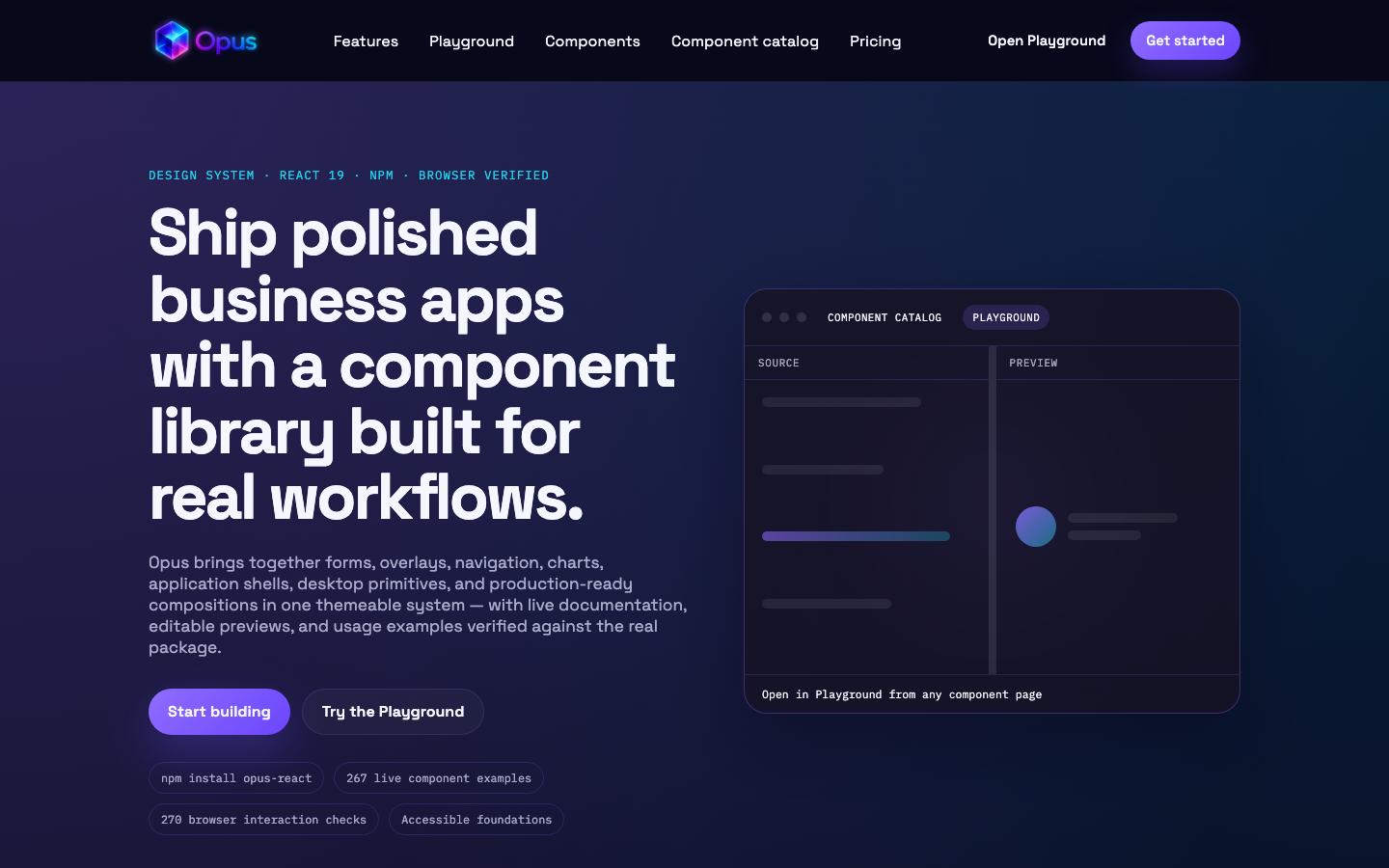](https://project-opus.netlify.app)
|
|
10
|
+
|
|
11
|
+
<table>
|
|
12
|
+
<tr>
|
|
13
|
+
<td width="50%"><a href="https://project-opus.netlify.app/documentation/components"><img src="https://raw.githubusercontent.com/Carl-Fearby/Opus/main/Library/packages/opus-react/assets/npm/components.png" alt="Browse the Opus component library" /></a></td>
|
|
14
|
+
<td width="50%"><a href="https://project-opus.netlify.app/documentation/playground"><img src="https://raw.githubusercontent.com/Carl-Fearby/Opus/main/Library/packages/opus-react/assets/npm/playground.png" alt="Experiment in the Opus live playground" /></a></td>
|
|
15
|
+
</tr>
|
|
16
|
+
<tr>
|
|
17
|
+
<td align="center"><strong>Component library</strong></td>
|
|
18
|
+
<td align="center"><strong>Live playground</strong></td>
|
|
19
|
+
</tr>
|
|
20
|
+
</table>
|
|
21
|
+
|
|
22
|
+
## Why Opus
|
|
23
|
+
|
|
24
|
+
- **Hundreds of composable components** covering forms, content, navigation, overlays, charts, dashboards, media and desktop-style experiences.
|
|
25
|
+
- **Designed for real application interfaces**, with responsive layouts, resizable panes, rich data views and reusable workflow components.
|
|
26
|
+
- **Themeable by default**, including light and dark modes, CSS design tokens and runtime accent colours.
|
|
27
|
+
- **Accessible and typed**, with keyboard-aware interactions and complete TypeScript definitions.
|
|
28
|
+
- **Preview before you build** in the live component library and editable playground.
|
|
8
29
|
|
|
9
30
|
## Requirements
|
|
10
31
|
|
|
@@ -330,6 +351,10 @@ npm publish -w opus-react --access public
|
|
|
330
351
|
|
|
331
352
|
`prepublishOnly` runs the package build automatically. Bump the version in `packages/opus-react/package.json` before publishing.
|
|
332
353
|
|
|
354
|
+
## Contact
|
|
355
|
+
|
|
356
|
+
Carl Fearby — [carlfearby@me.com](mailto:carlfearby@me.com)
|
|
357
|
+
|
|
333
358
|
## License
|
|
334
359
|
|
|
335
|
-
|
|
360
|
+
MIT — see [`LICENSE`](./LICENSE).
|
|
Binary file
|
|
Binary file
|
|
Binary file
|