oh-my-design-cli 0.1.0 → 0.1.2
This diff represents the content of publicly available package versions that have been released to one of the supported registries. The information contained in this diff is provided for informational purposes only and reflects changes between package versions as they appear in their respective public registries.
- package/README.ko.md +3 -2
- package/README.md +3 -2
- package/dist/bin/oh-my-design.js +5 -5
- package/dist/bin/oh-my-design.js.map +1 -1
- package/dist/{init-STACB7E5.js → init-UMM4XIV5.js} +42 -2
- package/dist/init-UMM4XIV5.js.map +1 -0
- package/dist/{sync-P7X4S2DK.js → sync-FDYRKNFE.js} +16 -3
- package/dist/sync-FDYRKNFE.js.map +1 -0
- package/package.json +3 -3
- package/dist/init-STACB7E5.js.map +0 -1
- package/dist/sync-P7X4S2DK.js.map +0 -1
- package/references/Claude-Design-Sys-Prompt.txt +0 -421
- package/references/airbnb/README.md +0 -23
- package/references/airbnb/preview-dark.html +0 -234
- package/references/airbnb/preview.html +0 -233
- package/references/airtable/README.md +0 -23
- package/references/airtable/preview-dark.html +0 -165
- package/references/airtable/preview.html +0 -164
- package/references/apple/README.md +0 -24
- package/references/apple/preview-dark.html +0 -420
- package/references/apple/preview.html +0 -414
- package/references/baemin/README.md +0 -19
- package/references/bmw/README.md +0 -23
- package/references/bmw/preview-dark.html +0 -211
- package/references/bmw/preview.html +0 -210
- package/references/cal/README.md +0 -23
- package/references/cal/preview-dark.html +0 -449
- package/references/cal/preview.html +0 -575
- package/references/claude/README.md +0 -24
- package/references/claude/preview-dark.html +0 -803
- package/references/claude/preview.html +0 -826
- package/references/clay/README.md +0 -23
- package/references/clay/preview-dark.html +0 -316
- package/references/clay/preview.html +0 -315
- package/references/clickhouse/README.md +0 -24
- package/references/clickhouse/preview-dark.html +0 -834
- package/references/clickhouse/preview.html +0 -786
- package/references/cohere/README.md +0 -24
- package/references/cohere/preview-dark.html +0 -803
- package/references/cohere/preview.html +0 -807
- package/references/coinbase/README.md +0 -23
- package/references/coinbase/preview-dark.html +0 -164
- package/references/coinbase/preview.html +0 -163
- package/references/composio/README.md +0 -24
- package/references/composio/preview-dark.html +0 -958
- package/references/composio/preview.html +0 -933
- package/references/cursor/README.md +0 -24
- package/references/cursor/preview-dark.html +0 -393
- package/references/cursor/preview.html +0 -383
- package/references/dcard/README.md +0 -12
- package/references/dcard/_research/forum-1440px.png +0 -0
- package/references/dcard/_research.md +0 -77
- package/references/elevenlabs/README.md +0 -23
- package/references/elevenlabs/preview-dark.html +0 -252
- package/references/elevenlabs/preview.html +0 -251
- package/references/expo/README.md +0 -24
- package/references/expo/preview-dark.html +0 -533
- package/references/expo/preview.html +0 -533
- package/references/ferrari/README.md +0 -23
- package/references/ferrari/preview-dark.html +0 -1162
- package/references/ferrari/preview.html +0 -1122
- package/references/figma/README.md +0 -24
- package/references/figma/preview-dark.html +0 -822
- package/references/figma/preview.html +0 -832
- package/references/framer/README.md +0 -23
- package/references/framer/preview-dark.html +0 -902
- package/references/framer/preview.html +0 -883
- package/references/freee/README.md +0 -12
- package/references/freee/_research/vibes-storybook-1440px.png +0 -0
- package/references/freee/_research.md +0 -77
- package/references/hashicorp/README.md +0 -24
- package/references/hashicorp/preview-dark.html +0 -1202
- package/references/hashicorp/preview.html +0 -1193
- package/references/ibm/README.md +0 -24
- package/references/ibm/preview-dark.html +0 -443
- package/references/ibm/preview.html +0 -428
- package/references/intercom/README.md +0 -23
- package/references/intercom/preview-dark.html +0 -185
- package/references/intercom/preview.html +0 -184
- package/references/kakao/README.md +0 -18
- package/references/karrot/README.md +0 -18
- package/references/kraken/README.md +0 -23
- package/references/kraken/preview-dark.html +0 -169
- package/references/kraken/preview.html +0 -168
- package/references/lamborghini/README.md +0 -23
- package/references/lamborghini/preview-dark.html +0 -303
- package/references/lamborghini/preview.html +0 -381
- package/references/line/README.md +0 -12
- package/references/line/_research/home-1440px.png +0 -0
- package/references/line/_research.md +0 -65
- package/references/linear.app/README.md +0 -24
- package/references/linear.app/preview-dark.html +0 -383
- package/references/linear.app/preview.html +0 -373
- package/references/lovable/README.md +0 -24
- package/references/lovable/preview-dark.html +0 -349
- package/references/lovable/preview.html +0 -348
- package/references/mercari/README.md +0 -12
- package/references/mercari/_research/home-1440px.png +0 -0
- package/references/mercari/_research.md +0 -77
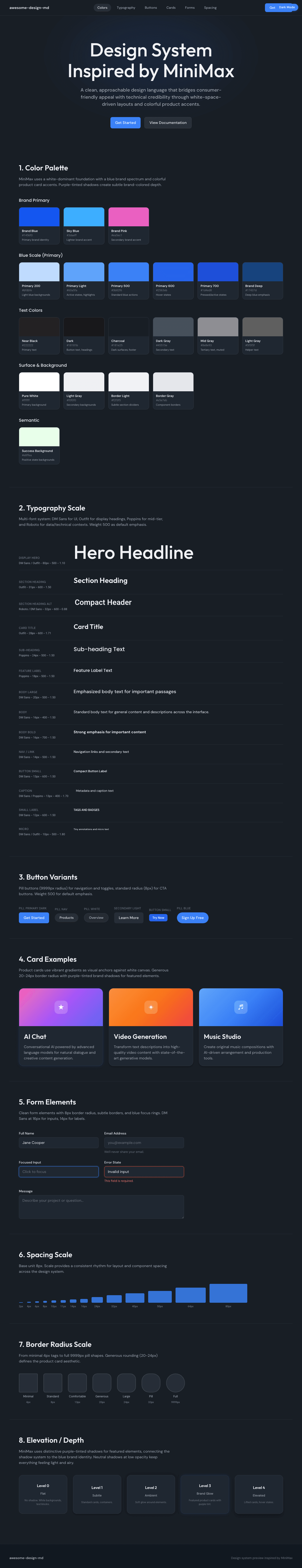
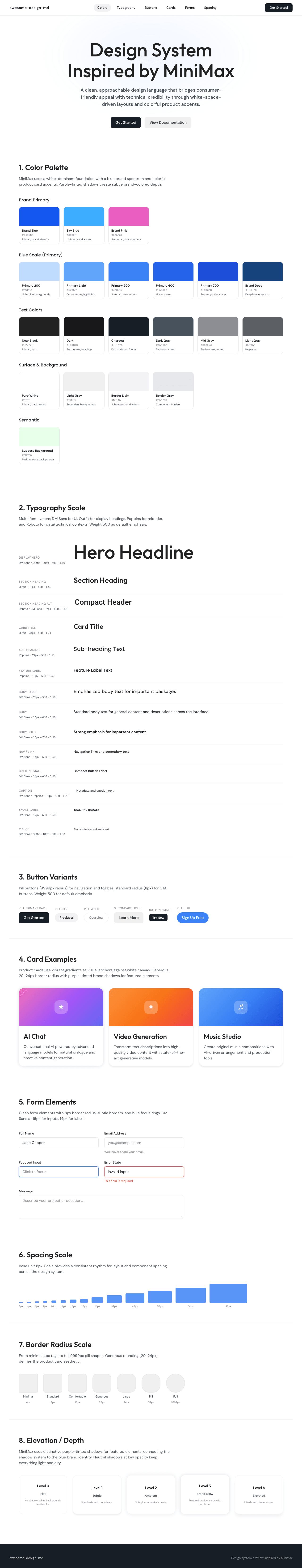
- package/references/minimax/README.md +0 -24
- package/references/minimax/preview-dark.html +0 -1262
- package/references/minimax/preview.html +0 -1248
- package/references/mintlify/README.md +0 -24
- package/references/mintlify/preview-dark.html +0 -409
- package/references/mintlify/preview.html +0 -398
- package/references/miro/README.md +0 -23
- package/references/miro/preview-dark.html +0 -174
- package/references/miro/preview.html +0 -173
- package/references/mistral.ai/README.md +0 -24
- package/references/mistral.ai/preview-dark.html +0 -806
- package/references/mistral.ai/preview.html +0 -805
- package/references/mongodb/README.md +0 -23
- package/references/mongodb/preview-dark.html +0 -260
- package/references/mongodb/preview.html +0 -259
- package/references/notion/README.md +0 -24
- package/references/notion/preview-dark.html +0 -372
- package/references/notion/preview.html +0 -364
- package/references/nvidia/README.md +0 -24
- package/references/nvidia/preview-dark.html +0 -374
- package/references/nvidia/preview.html +0 -366
- package/references/ollama/README.md +0 -24
- package/references/ollama/preview-dark.html +0 -678
- package/references/ollama/preview.html +0 -678
- package/references/opencode.ai/README.md +0 -24
- package/references/opencode.ai/preview-dark.html +0 -366
- package/references/opencode.ai/preview.html +0 -357
- package/references/pinkoi/README.md +0 -12
- package/references/pinkoi/_research/browse-1440px.png +0 -0
- package/references/pinkoi/_research.md +0 -115
- package/references/pinterest/README.md +0 -23
- package/references/pinterest/preview-dark.html +0 -233
- package/references/pinterest/preview.html +0 -232
- package/references/posthog/README.md +0 -23
- package/references/posthog/preview-dark.html +0 -699
- package/references/posthog/preview.html +0 -749
- package/references/raycast/README.md +0 -23
- package/references/raycast/preview-dark.html +0 -606
- package/references/raycast/preview.html +0 -688
- package/references/renault/README.md +0 -23
- package/references/renault/preview-dark.html +0 -406
- package/references/renault/preview.html +0 -606
- package/references/replicate/README.md +0 -24
- package/references/replicate/preview-dark.html +0 -828
- package/references/replicate/preview.html +0 -831
- package/references/resend/README.md +0 -23
- package/references/resend/preview-dark.html +0 -355
- package/references/resend/preview.html +0 -354
- package/references/revolut/README.md +0 -23
- package/references/revolut/preview-dark.html +0 -234
- package/references/revolut/preview.html +0 -233
- package/references/runwayml/README.md +0 -24
- package/references/runwayml/preview-dark.html +0 -664
- package/references/runwayml/preview.html +0 -665
- package/references/sanity/README.md +0 -24
- package/references/sanity/preview-dark.html +0 -990
- package/references/sanity/preview.html +0 -1135
- package/references/sentry/README.md +0 -24
- package/references/sentry/preview-dark.html +0 -626
- package/references/sentry/preview.html +0 -951
- package/references/spacex/README.md +0 -23
- package/references/spacex/preview-dark.html +0 -221
- package/references/spacex/preview.html +0 -220
- package/references/spotify/README.md +0 -23
- package/references/spotify/preview-dark.html +0 -231
- package/references/spotify/preview.html +0 -230
- package/references/stripe/README.md +0 -24
- package/references/stripe/preview-dark.html +0 -428
- package/references/stripe/preview.html +0 -419
- package/references/supabase/README.md +0 -24
- package/references/supabase/preview-dark.html +0 -977
- package/references/supabase/preview.html +0 -955
- package/references/superhuman/README.md +0 -23
- package/references/superhuman/preview-dark.html +0 -973
- package/references/superhuman/preview.html +0 -951
- package/references/tesla/README.md +0 -23
- package/references/tesla/preview-dark.html +0 -947
- package/references/tesla/preview.html +0 -925
- package/references/together.ai/README.md +0 -24
- package/references/together.ai/preview-dark.html +0 -892
- package/references/together.ai/preview.html +0 -897
- package/references/toss/README.md +0 -19
- package/references/uber/README.md +0 -24
- package/references/uber/preview-dark.html +0 -1120
- package/references/uber/preview.html +0 -1119
- package/references/vercel/README.md +0 -24
- package/references/vercel/preview-dark.html +0 -368
- package/references/vercel/preview.html +0 -367
- package/references/voltagent/README.md +0 -24
- package/references/voltagent/preview-dark.html +0 -487
- package/references/voltagent/preview.html +0 -766
- package/references/warp/README.md +0 -23
- package/references/warp/preview-dark.html +0 -500
- package/references/warp/preview.html +0 -533
- package/references/webflow/README.md +0 -23
- package/references/webflow/preview-dark.html +0 -147
- package/references/webflow/preview.html +0 -146
- package/references/wise/README.md +0 -23
- package/references/wise/preview-dark.html +0 -230
- package/references/wise/preview.html +0 -229
- package/references/x.ai/README.md +0 -24
- package/references/x.ai/preview-dark.html +0 -356
- package/references/x.ai/preview.html +0 -407
- package/references/zapier/README.md +0 -24
- package/references/zapier/preview-dark.html +0 -380
- package/references/zapier/preview.html +0 -372
|
@@ -1,348 +0,0 @@
|
|
|
1
|
-
<!DOCTYPE html>
|
|
2
|
-
<html lang="en">
|
|
3
|
-
<head>
|
|
4
|
-
<meta charset="UTF-8">
|
|
5
|
-
<meta name="viewport" content="width=device-width, initial-scale=1.0">
|
|
6
|
-
<title>Design System Inspired by Lovable</title>
|
|
7
|
-
<link rel="preconnect" href="https://fonts.googleapis.com">
|
|
8
|
-
<link rel="preconnect" href="https://fonts.gstatic.com" crossorigin>
|
|
9
|
-
<link href="https://fonts.googleapis.com/css2?family=DM+Sans:wght@400;480;500;600&display=swap" rel="stylesheet">
|
|
10
|
-
<style>
|
|
11
|
-
:root {
|
|
12
|
-
--cream: #f7f4ed;
|
|
13
|
-
--charcoal: #1c1c1c;
|
|
14
|
-
--off-white: #fcfbf8;
|
|
15
|
-
--border-light: #eceae4;
|
|
16
|
-
--muted: #5f5f5d;
|
|
17
|
-
--charcoal-40: rgba(28,28,28,0.4);
|
|
18
|
-
--charcoal-83: rgba(28,28,28,0.83);
|
|
19
|
-
--charcoal-04: rgba(28,28,28,0.04);
|
|
20
|
-
--charcoal-03: rgba(28,28,28,0.03);
|
|
21
|
-
--ring-blue: rgba(59,130,246,0.5);
|
|
22
|
-
--focus-shadow: rgba(0,0,0,0.1) 0px 4px 12px;
|
|
23
|
-
--shadow-inset: rgba(255,255,255,0.2) 0px 0.5px 0px 0px inset, rgba(0,0,0,0.2) 0px 0px 0px 0.5px inset, rgba(0,0,0,0.05) 0px 1px 2px 0px;
|
|
24
|
-
--font-primary: 'DM Sans', ui-sans-serif, system-ui, -apple-system, sans-serif;
|
|
25
|
-
}
|
|
26
|
-
* { margin: 0; padding: 0; box-sizing: border-box; }
|
|
27
|
-
body {
|
|
28
|
-
background: var(--cream);
|
|
29
|
-
color: var(--charcoal);
|
|
30
|
-
font-family: var(--font-primary);
|
|
31
|
-
font-size: 16px; font-weight: 400; line-height: 1.50;
|
|
32
|
-
-webkit-font-smoothing: antialiased;
|
|
33
|
-
}
|
|
34
|
-
|
|
35
|
-
/* NAV */
|
|
36
|
-
.nav {
|
|
37
|
-
position: sticky; top: 0; z-index: 100;
|
|
38
|
-
display: flex; align-items: center; justify-content: space-between;
|
|
39
|
-
padding: 12px 32px;
|
|
40
|
-
background: rgba(247,244,237,0.88);
|
|
41
|
-
backdrop-filter: blur(12px);
|
|
42
|
-
border-bottom: 1px solid var(--border-light);
|
|
43
|
-
}
|
|
44
|
-
.nav-brand { font-size: 14px; font-weight: 600; color: var(--charcoal); text-decoration: none; letter-spacing: -0.28px; }
|
|
45
|
-
.nav-links { display: flex; gap: 24px; list-style: none; }
|
|
46
|
-
.nav-links a { font-size: 14px; font-weight: 400; color: var(--muted); text-decoration: none; transition: color 0.15s; }
|
|
47
|
-
.nav-links a:hover { color: var(--charcoal); }
|
|
48
|
-
.nav-cta {
|
|
49
|
-
display: inline-block; background: var(--charcoal); color: var(--off-white);
|
|
50
|
-
padding: 8px 16px; border-radius: 6px; font-size: 14px; font-weight: 500;
|
|
51
|
-
text-decoration: none; transition: opacity 0.15s;
|
|
52
|
-
box-shadow: var(--shadow-inset);
|
|
53
|
-
}
|
|
54
|
-
.nav-cta:hover { opacity: 0.85; }
|
|
55
|
-
|
|
56
|
-
/* HERO */
|
|
57
|
-
.hero { padding: 96px 32px 80px; text-align: center; }
|
|
58
|
-
.hero h1 {
|
|
59
|
-
font-size: 60px; font-weight: 600; line-height: 1.10;
|
|
60
|
-
letter-spacing: -1.5px; color: var(--charcoal); margin-bottom: 16px;
|
|
61
|
-
}
|
|
62
|
-
.hero p { font-size: 18px; font-weight: 400; line-height: 1.38; color: var(--muted); max-width: 560px; margin: 0 auto 32px; }
|
|
63
|
-
.hero-buttons { display: flex; gap: 12px; justify-content: center; flex-wrap: wrap; }
|
|
64
|
-
.btn-dark {
|
|
65
|
-
display: inline-block; background: var(--charcoal); color: var(--off-white);
|
|
66
|
-
padding: 10px 20px; border-radius: 6px; border: none;
|
|
67
|
-
font-family: var(--font-primary); font-size: 14px; font-weight: 500;
|
|
68
|
-
text-decoration: none; cursor: pointer; transition: opacity 0.15s;
|
|
69
|
-
box-shadow: var(--shadow-inset);
|
|
70
|
-
}
|
|
71
|
-
.btn-dark:hover { opacity: 0.85; }
|
|
72
|
-
.btn-ghost {
|
|
73
|
-
display: inline-block; background: transparent; color: var(--charcoal);
|
|
74
|
-
padding: 10px 20px; border-radius: 6px;
|
|
75
|
-
border: 1px solid var(--charcoal-40);
|
|
76
|
-
font-family: var(--font-primary); font-size: 14px; font-weight: 500;
|
|
77
|
-
text-decoration: none; cursor: pointer; transition: opacity 0.15s;
|
|
78
|
-
}
|
|
79
|
-
.btn-ghost:hover { opacity: 0.8; }
|
|
80
|
-
|
|
81
|
-
/* SECTIONS */
|
|
82
|
-
.section { padding: 64px 32px; max-width: 1200px; margin: 0 auto; }
|
|
83
|
-
.section-label { font-size: 12px; font-weight: 500; color: var(--muted); text-transform: uppercase; margin-bottom: 8px; letter-spacing: 0.5px; }
|
|
84
|
-
.section-title { font-size: 36px; font-weight: 600; line-height: 1.10; letter-spacing: -0.9px; margin-bottom: 32px; }
|
|
85
|
-
.section-divider { border: none; border-top: 1px solid var(--border-light); margin: 0; }
|
|
86
|
-
|
|
87
|
-
/* COLORS */
|
|
88
|
-
.color-grid { display: grid; grid-template-columns: repeat(auto-fill, minmax(155px, 1fr)); gap: 12px; margin-bottom: 24px; }
|
|
89
|
-
.color-swatch { border-radius: 12px; overflow: hidden; border: 1px solid var(--border-light); }
|
|
90
|
-
.color-swatch-block { height: 72px; width: 100%; }
|
|
91
|
-
.color-swatch-info { padding: 10px 12px; }
|
|
92
|
-
.color-swatch-name { font-size: 13px; font-weight: 600; margin-bottom: 2px; }
|
|
93
|
-
.color-swatch-hex { font-size: 12px; color: var(--muted); font-family: ui-monospace, SFMono-Regular, monospace; }
|
|
94
|
-
.color-swatch-role { font-size: 11px; color: var(--muted); margin-top: 3px; }
|
|
95
|
-
.color-group-label { font-size: 14px; font-weight: 600; color: var(--muted); margin: 24px 0 10px; }
|
|
96
|
-
|
|
97
|
-
/* TYPOGRAPHY */
|
|
98
|
-
.type-sample { margin-bottom: 28px; padding-bottom: 24px; border-bottom: 1px solid var(--border-light); }
|
|
99
|
-
.type-sample:last-child { border-bottom: none; }
|
|
100
|
-
.type-meta { font-size: 12px; font-weight: 500; color: var(--muted); margin-top: 8px; font-family: ui-monospace, SFMono-Regular, monospace; }
|
|
101
|
-
|
|
102
|
-
/* BUTTONS */
|
|
103
|
-
.button-row { display: flex; gap: 16px; flex-wrap: wrap; align-items: center; }
|
|
104
|
-
.button-item { text-align: center; }
|
|
105
|
-
.button-label { font-size: 12px; font-weight: 500; color: var(--muted); margin-top: 8px; }
|
|
106
|
-
.btn-cream {
|
|
107
|
-
display: inline-block; background: var(--cream); color: var(--charcoal);
|
|
108
|
-
padding: 8px 16px; border-radius: 6px; font-size: 14px; font-weight: 400;
|
|
109
|
-
text-decoration: none; border: none; cursor: pointer;
|
|
110
|
-
}
|
|
111
|
-
.btn-pill {
|
|
112
|
-
display: inline-flex; align-items: center; justify-content: center;
|
|
113
|
-
background: var(--cream); color: var(--charcoal);
|
|
114
|
-
width: 36px; height: 36px; border-radius: 9999px;
|
|
115
|
-
font-size: 14px; font-weight: 400; text-decoration: none;
|
|
116
|
-
box-shadow: var(--shadow-inset); opacity: 0.5; cursor: pointer; border: none;
|
|
117
|
-
}
|
|
118
|
-
|
|
119
|
-
/* CARDS */
|
|
120
|
-
.card-grid { display: grid; grid-template-columns: repeat(auto-fit, minmax(320px, 1fr)); gap: 20px; }
|
|
121
|
-
.card { background: var(--cream); border-radius: 12px; padding: 24px; border: 1px solid var(--border-light); transition: border-color 0.2s; }
|
|
122
|
-
.card:hover { border-color: var(--charcoal-40); }
|
|
123
|
-
.card h3 { font-size: 20px; font-weight: 600; letter-spacing: -0.5px; margin-bottom: 8px; }
|
|
124
|
-
.card p { font-size: 14px; color: var(--muted); line-height: 1.50; }
|
|
125
|
-
.card-badge { display: inline-block; font-size: 12px; font-weight: 500; padding: 2px 8px; border-radius: 9999px; margin-bottom: 12px; }
|
|
126
|
-
|
|
127
|
-
/* FORMS */
|
|
128
|
-
.form-group { margin-bottom: 20px; max-width: 400px; }
|
|
129
|
-
.form-label { display: block; font-size: 14px; font-weight: 500; color: var(--charcoal); margin-bottom: 6px; }
|
|
130
|
-
.form-input {
|
|
131
|
-
width: 100%; background: var(--cream); color: var(--charcoal);
|
|
132
|
-
border: 1px solid var(--border-light); padding: 10px 12px; border-radius: 6px;
|
|
133
|
-
font-family: var(--font-primary); font-size: 14px; outline: none;
|
|
134
|
-
transition: border-color 0.15s, box-shadow 0.15s;
|
|
135
|
-
}
|
|
136
|
-
.form-input:focus { border-color: transparent; box-shadow: 0 0 0 2px var(--ring-blue); }
|
|
137
|
-
.form-input--focus { border-color: transparent; box-shadow: 0 0 0 2px var(--ring-blue); }
|
|
138
|
-
.form-input--error { border-color: transparent; box-shadow: 0 0 0 2px #ef4444; }
|
|
139
|
-
.form-textarea {
|
|
140
|
-
width: 100%; min-height: 80px; background: var(--cream); color: var(--charcoal);
|
|
141
|
-
border: 1px solid var(--border-light); padding: 10px 12px; border-radius: 6px;
|
|
142
|
-
font-family: var(--font-primary); font-size: 14px; resize: vertical; outline: none;
|
|
143
|
-
}
|
|
144
|
-
.form-state-label { font-size: 11px; color: var(--muted); margin-top: 4px; }
|
|
145
|
-
|
|
146
|
-
/* SPACING */
|
|
147
|
-
.spacing-row { display: flex; align-items: flex-end; gap: 10px; flex-wrap: wrap; margin-bottom: 24px; }
|
|
148
|
-
.spacing-item { text-align: center; }
|
|
149
|
-
.spacing-block { background: var(--charcoal); border-radius: 3px; margin-bottom: 6px; height: 28px; }
|
|
150
|
-
.spacing-value { font-family: ui-monospace, SFMono-Regular, monospace; font-size: 11px; font-weight: 500; color: var(--muted); }
|
|
151
|
-
|
|
152
|
-
/* RADIUS */
|
|
153
|
-
.radius-row { display: flex; gap: 14px; flex-wrap: wrap; align-items: center; }
|
|
154
|
-
.radius-item { text-align: center; }
|
|
155
|
-
.radius-box { width: 64px; height: 64px; background: var(--charcoal); margin-bottom: 6px; }
|
|
156
|
-
.radius-label { font-family: ui-monospace, SFMono-Regular, monospace; font-size: 11px; font-weight: 500; color: var(--muted); }
|
|
157
|
-
.radius-context { font-size: 10px; color: var(--muted); }
|
|
158
|
-
|
|
159
|
-
/* ELEVATION */
|
|
160
|
-
.elevation-grid { display: grid; grid-template-columns: repeat(auto-fit, minmax(200px, 1fr)); gap: 20px; }
|
|
161
|
-
.elevation-card { background: var(--cream); border-radius: 12px; padding: 20px; text-align: center; }
|
|
162
|
-
.elevation-label { font-size: 14px; font-weight: 600; margin-bottom: 4px; }
|
|
163
|
-
.elevation-desc { font-family: ui-monospace, SFMono-Regular, monospace; font-size: 11px; color: var(--muted); }
|
|
164
|
-
|
|
165
|
-
/* FOOTER */
|
|
166
|
-
.footer { padding: 32px; text-align: center; border-top: 1px solid var(--border-light); font-size: 13px; color: var(--muted); }
|
|
167
|
-
.footer a { color: var(--charcoal); text-decoration: underline; }
|
|
168
|
-
|
|
169
|
-
@media (max-width: 768px) {
|
|
170
|
-
.hero h1 { font-size: 36px; letter-spacing: -0.9px; }
|
|
171
|
-
.nav-links { display: none; }
|
|
172
|
-
.section { padding: 48px 20px; }
|
|
173
|
-
.card-grid { grid-template-columns: 1fr; }
|
|
174
|
-
}
|
|
175
|
-
</style>
|
|
176
|
-
</head>
|
|
177
|
-
<body>
|
|
178
|
-
|
|
179
|
-
<nav class="nav">
|
|
180
|
-
<span class="nav-brand">awesome-design-md</span>
|
|
181
|
-
<ul class="nav-links">
|
|
182
|
-
<li><a href="#colors">Colors</a></li>
|
|
183
|
-
<li><a href="#typography">Typography</a></li>
|
|
184
|
-
<li><a href="#buttons">Buttons</a></li>
|
|
185
|
-
<li><a href="#cards">Cards</a></li>
|
|
186
|
-
<li><a href="#forms">Forms</a></li>
|
|
187
|
-
<li><a href="#spacing">Spacing</a></li>
|
|
188
|
-
</ul>
|
|
189
|
-
<a class="nav-cta" href="#">Start Building</a>
|
|
190
|
-
</nav>
|
|
191
|
-
|
|
192
|
-
<section class="hero">
|
|
193
|
-
<h1>Design System<br>Inspired by Lovable</h1>
|
|
194
|
-
<p>A design token catalog generated from DESIGN.md. Every color, font, component, and spacing value — visualized.</p>
|
|
195
|
-
<div class="hero-buttons">
|
|
196
|
-
<a class="btn-dark" href="#">Start Building</a>
|
|
197
|
-
<a class="btn-ghost" href="#">View Documentation</a>
|
|
198
|
-
</div>
|
|
199
|
-
</section>
|
|
200
|
-
|
|
201
|
-
<hr class="section-divider">
|
|
202
|
-
|
|
203
|
-
<section class="section" id="colors">
|
|
204
|
-
<div class="section-label">01 / Colors</div>
|
|
205
|
-
<h2 class="section-title">Color Palette</h2>
|
|
206
|
-
|
|
207
|
-
<div class="color-group-label">Primary</div>
|
|
208
|
-
<div class="color-grid">
|
|
209
|
-
<div class="color-swatch"><div class="color-swatch-block" style="background:#f7f4ed; border-bottom:1px solid #eceae4"></div><div class="color-swatch-info"><div class="color-swatch-name">Cream</div><div class="color-swatch-hex">#f7f4ed</div><div class="color-swatch-role">Page background</div></div></div>
|
|
210
|
-
<div class="color-swatch"><div class="color-swatch-block" style="background:#1c1c1c"></div><div class="color-swatch-info"><div class="color-swatch-name">Charcoal</div><div class="color-swatch-hex">#1c1c1c</div><div class="color-swatch-role">Primary text, headings</div></div></div>
|
|
211
|
-
<div class="color-swatch"><div class="color-swatch-block" style="background:#fcfbf8; border-bottom:1px solid #eceae4"></div><div class="color-swatch-info"><div class="color-swatch-name">Off-White</div><div class="color-swatch-hex">#fcfbf8</div><div class="color-swatch-role">Button text on dark</div></div></div>
|
|
212
|
-
</div>
|
|
213
|
-
|
|
214
|
-
<div class="color-group-label">Neutral Scale (Opacity-Based)</div>
|
|
215
|
-
<div class="color-grid">
|
|
216
|
-
<div class="color-swatch"><div class="color-swatch-block" style="background:rgba(28,28,28,0.83)"></div><div class="color-swatch-info"><div class="color-swatch-name">Charcoal 83%</div><div class="color-swatch-hex">rgba(28,28,28,0.83)</div><div class="color-swatch-role">Strong secondary</div></div></div>
|
|
217
|
-
<div class="color-swatch"><div class="color-swatch-block" style="background:#5f5f5d"></div><div class="color-swatch-info"><div class="color-swatch-name">Muted Gray</div><div class="color-swatch-hex">#5f5f5d</div><div class="color-swatch-role">Body text, captions</div></div></div>
|
|
218
|
-
<div class="color-swatch"><div class="color-swatch-block" style="background:rgba(28,28,28,0.4)"></div><div class="color-swatch-info"><div class="color-swatch-name">Charcoal 40%</div><div class="color-swatch-hex">rgba(28,28,28,0.4)</div><div class="color-swatch-role">Interactive borders</div></div></div>
|
|
219
|
-
<div class="color-swatch"><div class="color-swatch-block" style="background:rgba(28,28,28,0.04); border-bottom:1px solid #eceae4"></div><div class="color-swatch-info"><div class="color-swatch-name">Charcoal 4%</div><div class="color-swatch-hex">rgba(28,28,28,0.04)</div><div class="color-swatch-role">Hover tint</div></div></div>
|
|
220
|
-
<div class="color-swatch"><div class="color-swatch-block" style="background:rgba(28,28,28,0.03); border-bottom:1px solid #eceae4"></div><div class="color-swatch-info"><div class="color-swatch-name">Charcoal 3%</div><div class="color-swatch-hex">rgba(28,28,28,0.03)</div><div class="color-swatch-role">Subtle overlay</div></div></div>
|
|
221
|
-
</div>
|
|
222
|
-
|
|
223
|
-
<div class="color-group-label">Surface & Border</div>
|
|
224
|
-
<div class="color-grid">
|
|
225
|
-
<div class="color-swatch"><div class="color-swatch-block" style="background:#eceae4"></div><div class="color-swatch-info"><div class="color-swatch-name">Light Cream</div><div class="color-swatch-hex">#eceae4</div><div class="color-swatch-role">Borders, dividers</div></div></div>
|
|
226
|
-
</div>
|
|
227
|
-
|
|
228
|
-
<div class="color-group-label">Interactive</div>
|
|
229
|
-
<div class="color-grid">
|
|
230
|
-
<div class="color-swatch"><div class="color-swatch-block" style="background:rgba(59,130,246,0.5)"></div><div class="color-swatch-info"><div class="color-swatch-name">Ring Blue</div><div class="color-swatch-hex">rgba(59,130,246,0.5)</div><div class="color-swatch-role">Focus ring</div></div></div>
|
|
231
|
-
</div>
|
|
232
|
-
</section>
|
|
233
|
-
|
|
234
|
-
<hr class="section-divider">
|
|
235
|
-
|
|
236
|
-
<section class="section" id="typography">
|
|
237
|
-
<div class="section-label">02 / Typography</div>
|
|
238
|
-
<h2 class="section-title">Typography Scale</h2>
|
|
239
|
-
|
|
240
|
-
<div class="type-sample"><div style="font-size:60px; font-weight:600; line-height:1.10; letter-spacing:-1.5px;">Display Hero</div><div class="type-meta">Display Hero — 60px / 600 / 1.10 / -1.5px / Camera Plain Variable</div></div>
|
|
241
|
-
<div class="type-sample"><div style="font-size:48px; font-weight:600; line-height:1.00; letter-spacing:-1.2px;">Section Heading</div><div class="type-meta">Section Heading — 48px / 600 / 1.00 / -1.2px / Camera Plain Variable</div></div>
|
|
242
|
-
<div class="type-sample"><div style="font-size:36px; font-weight:600; line-height:1.10; letter-spacing:-0.9px;">Sub-heading</div><div class="type-meta">Sub-heading — 36px / 600 / 1.10 / -0.9px / Camera Plain Variable</div></div>
|
|
243
|
-
<div class="type-sample"><div style="font-size:20px; font-weight:400; line-height:1.25;">Card Title</div><div class="type-meta">Card Title — 20px / 400 / 1.25 / Camera Plain Variable</div></div>
|
|
244
|
-
<div class="type-sample"><div style="font-size:18px; font-weight:400; line-height:1.38;">Body Large — Build something lovable. Create web applications with AI-powered development tools.</div><div class="type-meta">Body Large — 18px / 400 / 1.38 / Camera Plain Variable</div></div>
|
|
245
|
-
<div class="type-sample"><div style="font-size:16px; font-weight:400; line-height:1.50;">Body — Standard reading text for descriptions, paragraphs, and UI content.</div><div class="type-meta">Body — 16px / 400 / 1.50 / Camera Plain Variable</div></div>
|
|
246
|
-
<div class="type-sample"><div style="font-size:14px; font-weight:400; line-height:1.50;">Button / Link — Interactive text</div><div class="type-meta">Button / Link — 14px / 400 / 1.50 / Camera Plain Variable</div></div>
|
|
247
|
-
<div class="type-sample"><div style="font-size:14px; font-weight:400; line-height:1.50; color:var(--muted);">Caption — Metadata and small labels</div><div class="type-meta">Caption — 14px / 400 / 1.50 / Camera Plain Variable</div></div>
|
|
248
|
-
</section>
|
|
249
|
-
|
|
250
|
-
<hr class="section-divider">
|
|
251
|
-
|
|
252
|
-
<section class="section" id="buttons">
|
|
253
|
-
<div class="section-label">03 / Buttons</div>
|
|
254
|
-
<h2 class="section-title">Button Variants</h2>
|
|
255
|
-
<div class="button-row">
|
|
256
|
-
<div class="button-item"><a class="btn-dark" href="#">Start Building</a><div class="button-label">Primary Dark</div></div>
|
|
257
|
-
<div class="button-item"><a class="btn-ghost" href="#">Documentation</a><div class="button-label">Ghost / Outline</div></div>
|
|
258
|
-
<div class="button-item"><a class="btn-cream" href="#">Settings</a><div class="button-label">Cream Surface</div></div>
|
|
259
|
-
<div class="button-item"><button class="btn-pill">+</button><div class="button-label">Pill Icon</div></div>
|
|
260
|
-
</div>
|
|
261
|
-
</section>
|
|
262
|
-
|
|
263
|
-
<hr class="section-divider">
|
|
264
|
-
|
|
265
|
-
<section class="section" id="cards">
|
|
266
|
-
<div class="section-label">04 / Cards</div>
|
|
267
|
-
<h2 class="section-title">Card Examples</h2>
|
|
268
|
-
<div class="card-grid">
|
|
269
|
-
<div class="card">
|
|
270
|
-
<div class="card-badge" style="background:var(--charcoal-04); color:var(--charcoal);">Template</div>
|
|
271
|
-
<h3>Portfolio Website</h3>
|
|
272
|
-
<p>A minimal portfolio template with project showcase, about section, and contact form. Built with modern design principles.</p>
|
|
273
|
-
</div>
|
|
274
|
-
<div class="card" style="border-color: var(--charcoal-40);">
|
|
275
|
-
<div class="card-badge" style="background:var(--charcoal-04); color:var(--charcoal);">Featured</div>
|
|
276
|
-
<h3>AI Chat Application</h3>
|
|
277
|
-
<p>Full-stack AI chat interface with streaming responses, conversation history, and customizable prompts. Hover-state border shown.</p>
|
|
278
|
-
</div>
|
|
279
|
-
<div class="card">
|
|
280
|
-
<div class="card-badge" style="background:var(--charcoal-04); color:var(--charcoal);">Starter</div>
|
|
281
|
-
<h3>SaaS Dashboard</h3>
|
|
282
|
-
<p>Analytics dashboard with charts, data tables, and user management. Integrates with common APIs and databases.</p>
|
|
283
|
-
</div>
|
|
284
|
-
</div>
|
|
285
|
-
</section>
|
|
286
|
-
|
|
287
|
-
<hr class="section-divider">
|
|
288
|
-
|
|
289
|
-
<section class="section" id="forms">
|
|
290
|
-
<div class="section-label">05 / Forms</div>
|
|
291
|
-
<h2 class="section-title">Form Elements</h2>
|
|
292
|
-
<div class="form-group"><label class="form-label">Project Name</label><input class="form-input" type="text" placeholder="my-lovable-app"><div class="form-state-label">Default (border)</div></div>
|
|
293
|
-
<div class="form-group"><label class="form-label">Repository</label><input class="form-input form-input--focus" type="text" value="lovable/my-project"><div class="form-state-label">Focus (blue ring)</div></div>
|
|
294
|
-
<div class="form-group"><label class="form-label">Domain</label><input class="form-input form-input--error" type="text" value="invalid domain"><div class="form-state-label">Error (red ring)</div></div>
|
|
295
|
-
<div class="form-group"><label class="form-label">Description</label><textarea class="form-textarea" placeholder="Describe your project..."></textarea></div>
|
|
296
|
-
</section>
|
|
297
|
-
|
|
298
|
-
<hr class="section-divider">
|
|
299
|
-
|
|
300
|
-
<section class="section" id="spacing">
|
|
301
|
-
<div class="section-label">06 / Spacing</div>
|
|
302
|
-
<h2 class="section-title">Spacing Scale</h2>
|
|
303
|
-
<div class="spacing-row">
|
|
304
|
-
<div class="spacing-item"><div class="spacing-block" style="width:8px"></div><div class="spacing-value">8</div></div>
|
|
305
|
-
<div class="spacing-item"><div class="spacing-block" style="width:10px"></div><div class="spacing-value">10</div></div>
|
|
306
|
-
<div class="spacing-item"><div class="spacing-block" style="width:12px"></div><div class="spacing-value">12</div></div>
|
|
307
|
-
<div class="spacing-item"><div class="spacing-block" style="width:16px"></div><div class="spacing-value">16</div></div>
|
|
308
|
-
<div class="spacing-item"><div class="spacing-block" style="width:24px"></div><div class="spacing-value">24</div></div>
|
|
309
|
-
<div class="spacing-item"><div class="spacing-block" style="width:32px"></div><div class="spacing-value">32</div></div>
|
|
310
|
-
<div class="spacing-item"><div class="spacing-block" style="width:40px"></div><div class="spacing-value">40</div></div>
|
|
311
|
-
<div class="spacing-item"><div class="spacing-block" style="width:56px"></div><div class="spacing-value">56</div></div>
|
|
312
|
-
<div class="spacing-item"><div class="spacing-block" style="width:80px"></div><div class="spacing-value">80</div></div>
|
|
313
|
-
</div>
|
|
314
|
-
</section>
|
|
315
|
-
|
|
316
|
-
<hr class="section-divider">
|
|
317
|
-
|
|
318
|
-
<section class="section" id="radius">
|
|
319
|
-
<div class="section-label">07 / Radius</div>
|
|
320
|
-
<h2 class="section-title">Border Radius Scale</h2>
|
|
321
|
-
<div class="radius-row">
|
|
322
|
-
<div class="radius-item"><div class="radius-box" style="border-radius:4px"></div><div class="radius-label">4px</div><div class="radius-context">Small</div></div>
|
|
323
|
-
<div class="radius-item"><div class="radius-box" style="border-radius:6px"></div><div class="radius-label">6px</div><div class="radius-context">Buttons</div></div>
|
|
324
|
-
<div class="radius-item"><div class="radius-box" style="border-radius:8px"></div><div class="radius-label">8px</div><div class="radius-context">Compact</div></div>
|
|
325
|
-
<div class="radius-item"><div class="radius-box" style="border-radius:12px"></div><div class="radius-label">12px</div><div class="radius-context">Cards</div></div>
|
|
326
|
-
<div class="radius-item"><div class="radius-box" style="border-radius:16px"></div><div class="radius-label">16px</div><div class="radius-context">Containers</div></div>
|
|
327
|
-
<div class="radius-item"><div class="radius-box" style="border-radius:9999px"></div><div class="radius-label">9999px</div><div class="radius-context">Pills</div></div>
|
|
328
|
-
</div>
|
|
329
|
-
</section>
|
|
330
|
-
|
|
331
|
-
<hr class="section-divider">
|
|
332
|
-
|
|
333
|
-
<section class="section" id="elevation">
|
|
334
|
-
<div class="section-label">08 / Elevation</div>
|
|
335
|
-
<h2 class="section-title">Elevation & Depth</h2>
|
|
336
|
-
<div class="elevation-grid">
|
|
337
|
-
<div class="elevation-card" style="border: 1px solid var(--border-light);"><div class="elevation-label">Level 0: Flat</div><div class="elevation-desc">No shadow, cream bg</div></div>
|
|
338
|
-
<div class="elevation-card" style="border: 1px solid var(--border-light);"><div class="elevation-label">Level 1: Bordered</div><div class="elevation-desc">1px solid #eceae4</div></div>
|
|
339
|
-
<div class="elevation-card" style="background:var(--charcoal); color:var(--off-white); box-shadow: var(--shadow-inset);"><div class="elevation-label" style="color:var(--off-white);">Level 2: Inset</div><div class="elevation-desc" style="color:rgba(252,251,248,0.6);">Button inset shadow</div></div>
|
|
340
|
-
<div class="elevation-card" style="border: 1px solid var(--border-light); box-shadow: var(--focus-shadow);"><div class="elevation-label">Level 3: Focus</div><div class="elevation-desc">Focus shadow glow</div></div>
|
|
341
|
-
<div class="elevation-card" style="box-shadow: 0 0 0 2px rgba(59,130,246,0.5);"><div class="elevation-label">Ring</div><div class="elevation-desc">Accessibility ring</div></div>
|
|
342
|
-
</div>
|
|
343
|
-
</section>
|
|
344
|
-
|
|
345
|
-
<footer class="footer">Maintained by <a href="https://github.com/VoltAgent/voltagent" target="_blank" rel="noopener noreferrer" style="text-decoration:none;"><img src="https://github.com/VoltAgent.png?size=32" alt="VoltAgent" width="14" height="14" style="border-radius:3px;vertical-align:-2px;margin-right:3px;">VoltAgent</a> team</footer>
|
|
346
|
-
|
|
347
|
-
</body>
|
|
348
|
-
</html>
|
|
@@ -1,12 +0,0 @@
|
|
|
1
|
-
# Mercari Inspired Design System
|
|
2
|
-
|
|
3
|
-
[DESIGN.md](./DESIGN.md) extracted from the public [Mercari](https://jp.mercari.com) production site, which **exposes 681 semantic CSS custom properties on `:root`** (the `--alias-color-*` namespace). Tokens were extracted directly via Playwright MCP at 1440px viewport on 2026-04-17. Mercari Engineering also publishes extensive design system writeups on Medium and their tech blog. See [_research.md](./_research.md) for source detail and confidence per item.
|
|
4
|
-
|
|
5
|
-
## Files
|
|
6
|
-
|
|
7
|
-
| File | Description |
|
|
8
|
-
|------|-------------|
|
|
9
|
-
| `DESIGN.md` | Complete design system documentation (9 sections) |
|
|
10
|
-
| `_research.md` | Sources used, extraction methodology, and confidence per item |
|
|
11
|
-
|
|
12
|
-
Use [DESIGN.md](./DESIGN.md) as a reference for AI agents (Claude, Cursor, Stitch) to generate UI that looks like the Mercari design language — Japan's largest C2C marketplace with Mercari Red (`#ff333f`) as the `attention` semantic, comprehensive `--alias-color-*` token system, Japanese-first font stack with Hiragino "Custom" variants, sharp `4px` button radii, and explicit z-index hierarchy (1100-1600 named layers).
|
|
Binary file
|
|
@@ -1,77 +0,0 @@
|
|
|
1
|
-
# Research Sources for Mercari
|
|
2
|
-
|
|
3
|
-
추출 일자: 2026-04-17
|
|
4
|
-
스킬: `omd:add-reference` (5-tier methodology)
|
|
5
|
-
입력 URL: `https://jp.mercari.com`
|
|
6
|
-
|
|
7
|
-
## Tier 1 — Official Design System
|
|
8
|
-
|
|
9
|
-
**Status: EFFECTIVELY FOUND via runtime token exposure (681 CSS variables on `:root`)**
|
|
10
|
-
|
|
11
|
-
Mercari does not host a public documentation site comparable to Material Design, but the production app **exposes 681 semantic CSS custom properties on `:root`**, organized into a consistent `--alias-color-{property}-{role}-{state}` namespace. Extracted via `getComputedStyle(document.documentElement)` using Playwright MCP. This is functionally equivalent to a published design tokens file.
|
|
12
|
-
|
|
13
|
-
Token namespaces discovered:
|
|
14
|
-
- `--alias-color-background-{role}-{state}` — surface tokens (primary, secondary, tertiary, attention, attentionThin, accent, accentThin, success, disabled)
|
|
15
|
-
- `--alias-color-text-{role}-{state}` — foreground tokens (primary, secondary, accent, attention, success, disabled, placeholder, link, inverse, hint)
|
|
16
|
-
- `--alias-color-border-{role}-{state}` — divider system
|
|
17
|
-
- `--alias-color-icon-{role}-{state}` — icon foreground
|
|
18
|
-
- `--alias-color-overlay-{strength}` — modal backdrops (weak/middle/midStrong/strong + inverse variants)
|
|
19
|
-
- `--alias-color-system-static{Tone}-default` — fixed white/black/clear (theme-independent)
|
|
20
|
-
- `--mer-z-index-{layer}` — explicit z-index hierarchy (1100-1600)
|
|
21
|
-
- `--grid-layout-*` — page padding, gutter, inset
|
|
22
|
-
- `--component-*` — per-component overrides (button, radio, avatar, skeleton, etc.)
|
|
23
|
-
- `--typography-{role}-{property}` and `--fonts-{role}-{property}` — type scale (mostly hashed token names from Panda CSS, but semantic aliases also present)
|
|
24
|
-
|
|
25
|
-
Additional public sources:
|
|
26
|
-
- [Mercari Engineering blog — design system tag](https://engineering.mercari.com/en/blog/tag/design-system/) — multiple posts on DS architecture
|
|
27
|
-
- [GitHub: mercari/fractal](https://github.com/mercari/fractal) — open-source UI patterns library
|
|
28
|
-
- [Building Mercari's Design System (Medium)](https://medium.com/mercari-engineering/building-mercaris-design-system-b6789043053d)
|
|
29
|
-
- [The Story Behind Mercari Design System Rebuild (2025)](https://engineering.mercari.com/en/blog/entry/20250624-the-story-behind-mercari-design-system-rebuild/)
|
|
30
|
-
|
|
31
|
-
## Tier 2 — Brand / Press Kit
|
|
32
|
-
|
|
33
|
-
Not investigated separately; runtime tokens were sufficient.
|
|
34
|
-
|
|
35
|
-
## Tier 3 — Engineering / Design Blog
|
|
36
|
-
|
|
37
|
-
[engineering.mercari.com/en/blog/tag/design-system](https://engineering.mercari.com/en/blog/tag/design-system/) — extensive English-language coverage of Mercari Design System architecture and rebuild rationale. Pulled context but not specific token values.
|
|
38
|
-
|
|
39
|
-
## Tier 4 — Live Site Recon
|
|
40
|
-
|
|
41
|
-
**Method**: Playwright MCP at viewport 1440×900 on `https://jp.mercari.com/`.
|
|
42
|
-
|
|
43
|
-
### Verified at runtime
|
|
44
|
-
- Body bg: `rgb(255, 255, 255)` = `#ffffff` (matches `--alias-color-background-primary-default`)
|
|
45
|
-
- Body text: `rgb(51, 51, 51)` = `#333333` (matches `--alias-color-text-primary-default`)
|
|
46
|
-
- Body font: `Helvetica Neue, Arial, "Hiragino Kaku Gothic ProN Custom", "Hiragino Sans Custom", "Meiryo Custom", sans-serif`
|
|
47
|
-
- Body size: `15px`
|
|
48
|
-
- 681 `:root` CSS custom properties enumerated
|
|
49
|
-
- Sample buttons confirm:
|
|
50
|
-
- Attention CTA: bg `#ff333f`, white text, `4px` radius, padding `11px 15px`, weight 700
|
|
51
|
-
- Accent CTA (Shop Now): bg `#ffffff`, text `#0095ee`, `4px` radius, weight 700
|
|
52
|
-
- Login/Signup: bg `#ffffff`, text `#333333`, `4px` radius, weight 400
|
|
53
|
-
|
|
54
|
-
Screenshot saved: `_research/home-1440px.png`
|
|
55
|
-
|
|
56
|
-
## Confidence
|
|
57
|
-
|
|
58
|
-
### High Confidence (extracted directly from `:root` CSS variables)
|
|
59
|
-
- All `--alias-color-*` values in §2
|
|
60
|
-
- Z-index hierarchy (`--mer-z-index-*`) in §6
|
|
61
|
-
- Grid layout values (`--grid-layout-*`) in §5
|
|
62
|
-
- Verified live: body bg/text/font, button variants
|
|
63
|
-
|
|
64
|
-
### Medium Confidence
|
|
65
|
-
- Hue family interpretations (e.g., "yellow is for ratings/reviews") — inferred from token names, not verified per-component
|
|
66
|
-
- Animation easing curves — extracted from CSS but specific component bindings not enumerated
|
|
67
|
-
- Spacing scale tokens — extracted as values but specific semantic uses inferred
|
|
68
|
-
|
|
69
|
-
### Inferred (verify before relying on)
|
|
70
|
-
- "Mercari Red is exclusively for attention/danger" — token naming supports this; product-level usage not exhaustively verified
|
|
71
|
-
- Mobile breakpoints — inferred from presence of `--typography-*-font-size-mobile` tokens; exact px values not extracted
|
|
72
|
-
|
|
73
|
-
## Notes
|
|
74
|
-
- Mercari's design system uses **Panda CSS** (the `--made-with-panda: "🐼"` token confirms it). Token names are hashed in production but semantic aliases (`--alias-color-*`) provide a stable layer.
|
|
75
|
-
- The "Custom" suffix on Hiragino/Meiryo fonts indicates Mercari deploys optically-tuned variants — same families, adjusted spacing.
|
|
76
|
-
- Mercari is a textbook example of mature semantic token architecture for a Japanese-market commerce platform; the system is internal but exposed on `:root` for direct consumption.
|
|
77
|
-
- This reference may drift if Mercari ships a token rename. Re-running `omd:add-reference https://jp.mercari.com` periodically captures updates.
|
|
@@ -1,24 +0,0 @@
|
|
|
1
|
-
# Minimax Inspired Design System
|
|
2
|
-
|
|
3
|
-
[DESIGN.md](https://github.com/VoltAgent/awesome-design-md/blob/main/design-md/minimax/DESIGN.md) extracted from the public [MiniMax](https://minimax.io/) website. This is not the official design system. Colors, fonts, and spacing may not be 100% accurate. But it's a good starting point for building something similar.
|
|
4
|
-
|
|
5
|
-
## Files
|
|
6
|
-
|
|
7
|
-
| File | Description |
|
|
8
|
-
|------|-------------|
|
|
9
|
-
| `DESIGN.md` | Complete design system documentation (9 sections) |
|
|
10
|
-
| `preview.html` | Interactive design token catalog (light) |
|
|
11
|
-
| `preview-dark.html` | Interactive design token catalog (dark) |
|
|
12
|
-
|
|
13
|
-
|
|
14
|
-
Use [DESIGN.md](https://github.com/VoltAgent/awesome-design-md/blob/main/design-md/minimax/DESIGN.md) to use as a reference for AI agents (Claude, Cursor, Stitch) to generate UI that looks like the Minimax design language.
|
|
15
|
-
|
|
16
|
-
## Preview
|
|
17
|
-
|
|
18
|
-
A sample landing page built with DESIGN.md. It shows the actual colors, typography, buttons, cards, spacing, and elevation, all in one page.
|
|
19
|
-
|
|
20
|
-
### Dark Mode
|
|
21
|
-
|
|
22
|
-
|
|
23
|
-
### Light Mode
|
|
24
|
-
|