ngx-material-entity 0.1.4 → 1.0.5
This diff represents the content of publicly available package versions that have been released to one of the supported registries. The information contained in this diff is provided for informational purposes only and reflects changes between package versions as they appear in their respective public registries.
- package/README.md +416 -39
- package/capsulation/lodash.utilities.d.ts +62 -0
- package/capsulation/reflect.utilities.d.ts +56 -0
- package/classes/base.builder.d.ts +2 -1
- package/classes/date.utilities.d.ts +18 -6
- package/classes/entity.model.d.ts +9 -2
- package/classes/entity.service.d.ts +38 -1
- package/classes/entity.utilities.d.ts +45 -16
- package/classes/file.utilities.d.ts +52 -0
- package/components/input/add-array-item-dialog-data.builder.d.ts +3 -2
- package/components/input/add-array-item-dialog-data.d.ts +2 -1
- package/components/input/array/array-date-input/array-date-input.component.d.ts +11 -0
- package/components/input/array/array-date-range-input/array-date-range-input.component.d.ts +20 -0
- package/components/input/array/array-date-time-input/array-date-time-input.component.d.ts +22 -0
- package/components/input/array/array-string-autocomplete-chips/array-string-autocomplete-chips.component.d.ts +50 -0
- package/components/input/array/array-string-chips-input/array-string-chips-input.component.d.ts +42 -0
- package/components/input/array/array-table.class.d.ts +48 -0
- package/components/input/base-input.component.d.ts +57 -0
- package/components/input/boolean/boolean-checkbox-input/boolean-checkbox-input.component.d.ts +10 -0
- package/components/input/boolean/boolean-dropdown-input/boolean-dropdown-input.component.d.ts +9 -0
- package/components/input/boolean/boolean-toggle-input/boolean-toggle-input.component.d.ts +10 -0
- package/components/input/custom/custom.component.d.ts +13 -0
- package/components/input/date/date-input/date-input.component.d.ts +11 -0
- package/components/input/date/date-range-input/date-range-input.component.d.ts +19 -0
- package/components/input/date/date-time-input/date-time-input.component.d.ts +30 -0
- package/components/input/file/file-default-input/file-default-input.component.d.ts +13 -0
- package/components/input/file/file-image-input/file-image-input.component.d.ts +22 -0
- package/components/input/file/file-input/dragDrop.directive.d.ts +32 -0
- package/components/input/file/file-input/file-input.component.d.ts +33 -0
- package/components/input/input.component.d.ts +49 -92
- package/components/input/input.module.d.ts +41 -16
- package/components/input/number/number-dropdown-input/number-dropdown-input.component.d.ts +9 -0
- package/components/input/number/number-input/number-input.component.d.ts +9 -0
- package/components/input/number/number-slider-input/number-slider-input.component.d.ts +9 -0
- package/components/input/string/string-autocomplete-input/string-autocomplete-input.component.d.ts +18 -0
- package/components/input/string/string-dropdown-input/string-dropdown-input.component.d.ts +9 -0
- package/components/input/string/string-input/string-input.component.d.ts +9 -0
- package/components/input/string/string-password-input/string-password-input.component.d.ts +15 -0
- package/components/input/string/string-textbox-input/string-textbox-input.component.d.ts +9 -0
- package/components/table/create-dialog/create-entity-dialog-data.builder.d.ts +3 -2
- package/components/table/create-dialog/create-entity-dialog-data.d.ts +2 -1
- package/components/table/create-dialog/create-entity-dialog.component.d.ts +7 -2
- package/components/table/edit-dialog/edit-dialog-data.builder.d.ts +3 -2
- package/components/table/edit-dialog/edit-entity-dialog-data.d.ts +6 -1
- package/components/table/edit-dialog/edit-entity-dialog.builder.d.ts +5 -3
- package/components/table/edit-dialog/edit-entity-dialog.component.d.ts +6 -2
- package/components/table/table-data.builder.d.ts +9 -8
- package/components/table/table-data.d.ts +18 -10
- package/components/table/table.component.d.ts +2 -1
- package/decorators/array/array-decorator-internal.data.d.ts +71 -6
- package/decorators/array/array-decorator.data.d.ts +178 -12
- package/decorators/array/array.decorator.d.ts +3 -2
- package/decorators/base/base-property.decorator.d.ts +2 -3
- package/decorators/base/decorator-types.enum.d.ts +15 -5
- package/decorators/custom/custom-decorator-internal.data.d.ts +17 -0
- package/decorators/custom/custom-decorator.data.d.ts +37 -0
- package/decorators/custom/custom.decorator.d.ts +11 -0
- package/decorators/date/date-decorator-internal.data.d.ts +2 -2
- package/decorators/date/date.decorator.d.ts +8 -0
- package/decorators/file/file-decorator-internal.data.d.ts +92 -0
- package/decorators/file/file-decorator.data.d.ts +92 -0
- package/decorators/file/file.decorator.d.ts +9 -0
- package/decorators/number/number-decorator-internal.data.d.ts +20 -1
- package/decorators/number/number-decorator.data.d.ts +27 -1
- package/decorators/number/number.decorator.d.ts +2 -2
- package/decorators/object/object-decorator-internal.data.d.ts +2 -2
- package/decorators/object/object-decorator.data.d.ts +3 -3
- package/decorators/object/object.decorator.d.ts +2 -1
- package/decorators/string/string-decorator-internal.data.d.ts +14 -1
- package/decorators/string/string-decorator.data.d.ts +37 -1
- package/decorators/string/string.decorator.d.ts +2 -2
- package/esm2020/capsulation/lodash.utilities.mjs +75 -0
- package/esm2020/capsulation/reflect.utilities.mjs +69 -0
- package/esm2020/classes/base.builder.mjs +2 -3
- package/esm2020/classes/date.utilities.mjs +35 -15
- package/esm2020/classes/entity.model.mjs +5 -1
- package/esm2020/classes/entity.service.mjs +103 -6
- package/esm2020/classes/entity.utilities.mjs +241 -71
- package/esm2020/classes/file.utilities.mjs +124 -0
- package/esm2020/components/confirm-dialog/confirm-dialog-data.builder.mjs +4 -4
- package/esm2020/components/confirm-dialog/confirm-dialog.component.mjs +3 -3
- package/esm2020/components/input/add-array-item-dialog-data.builder.mjs +2 -2
- package/esm2020/components/input/add-array-item-dialog-data.mjs +1 -1
- package/esm2020/components/input/array/array-date-input/array-date-input.component.mjs +26 -0
- package/esm2020/components/input/array/array-date-range-input/array-date-range-input.component.mjs +50 -0
- package/esm2020/components/input/array/array-date-time-input/array-date-time-input.component.mjs +50 -0
- package/esm2020/components/input/array/array-string-autocomplete-chips/array-string-autocomplete-chips.component.mjs +103 -0
- package/esm2020/components/input/array/array-string-chips-input/array-string-chips-input.component.mjs +85 -0
- package/esm2020/components/input/array/array-table.class.mjs +104 -0
- package/esm2020/components/input/base-input.component.mjs +65 -0
- package/esm2020/components/input/boolean/boolean-checkbox-input/boolean-checkbox-input.component.mjs +21 -0
- package/esm2020/components/input/boolean/boolean-dropdown-input/boolean-dropdown-input.component.mjs +17 -0
- package/esm2020/components/input/boolean/boolean-toggle-input/boolean-toggle-input.component.mjs +21 -0
- package/esm2020/components/input/custom/custom.component.mjs +26 -0
- package/esm2020/components/input/date/date-input/date-input.component.mjs +22 -0
- package/esm2020/components/input/date/date-range-input/date-range-input.component.mjs +51 -0
- package/esm2020/components/input/date/date-time-input/date-time-input.component.mjs +63 -0
- package/esm2020/components/input/file/file-default-input/file-default-input.component.mjs +23 -0
- package/esm2020/components/input/file/file-image-input/file-image-input.component.mjs +84 -0
- package/esm2020/components/input/file/file-input/dragDrop.directive.mjs +64 -0
- package/esm2020/components/input/file/file-input/file-input.component.mjs +154 -0
- package/esm2020/components/input/input.component.mjs +137 -236
- package/esm2020/components/input/input.module.mjs +82 -6
- package/esm2020/components/input/number/number-dropdown-input/number-dropdown-input.component.mjs +18 -0
- package/esm2020/components/input/number/number-input/number-input.component.mjs +16 -0
- package/esm2020/components/input/number/number-slider-input/number-slider-input.component.mjs +17 -0
- package/esm2020/components/input/string/string-autocomplete-input/string-autocomplete-input.component.mjs +35 -0
- package/esm2020/components/input/string/string-dropdown-input/string-dropdown-input.component.mjs +18 -0
- package/esm2020/components/input/string/string-input/string-input.component.mjs +16 -0
- package/esm2020/components/input/string/string-password-input/string-password-input.component.mjs +36 -0
- package/esm2020/components/input/string/string-textbox-input/string-textbox-input.component.mjs +17 -0
- package/esm2020/components/table/create-dialog/create-dialog-data.builder.mjs +2 -2
- package/esm2020/components/table/create-dialog/create-entity-dialog-data.builder.mjs +1 -1
- package/esm2020/components/table/create-dialog/create-entity-dialog-data.mjs +1 -1
- package/esm2020/components/table/create-dialog/create-entity-dialog.component.mjs +15 -8
- package/esm2020/components/table/edit-dialog/edit-dialog-data.builder.mjs +2 -2
- package/esm2020/components/table/edit-dialog/edit-entity-dialog-data.mjs +1 -1
- package/esm2020/components/table/edit-dialog/edit-entity-dialog.builder.mjs +4 -3
- package/esm2020/components/table/edit-dialog/edit-entity-dialog.component.mjs +19 -10
- package/esm2020/components/table/table-data.builder.mjs +13 -10
- package/esm2020/components/table/table-data.mjs +1 -1
- package/esm2020/components/table/table.component.mjs +35 -35
- package/esm2020/decorators/array/array-decorator-internal.data.mjs +102 -14
- package/esm2020/decorators/array/array-decorator.data.mjs +2 -2
- package/esm2020/decorators/array/array.decorator.mjs +8 -2
- package/esm2020/decorators/base/base-property.decorator.mjs +4 -3
- package/esm2020/decorators/base/decorator-types.enum.mjs +9 -1
- package/esm2020/decorators/base/property-decorator-internal.data.mjs +10 -10
- package/esm2020/decorators/base/property-decorator.data.mjs +1 -1
- package/esm2020/decorators/boolean/boolean-decorator-internal.data.mjs +3 -3
- package/esm2020/decorators/custom/custom-decorator-internal.data.mjs +26 -0
- package/esm2020/decorators/custom/custom-decorator.data.mjs +2 -0
- package/esm2020/decorators/custom/custom.decorator.mjs +13 -0
- package/esm2020/decorators/date/date-decorator-internal.data.mjs +5 -5
- package/esm2020/decorators/date/date.decorator.mjs +21 -0
- package/esm2020/decorators/file/file-decorator-internal.data.mjs +98 -0
- package/esm2020/decorators/file/file-decorator.data.mjs +7 -0
- package/esm2020/decorators/file/file.decorator.mjs +22 -0
- package/esm2020/decorators/number/number-decorator-internal.data.mjs +24 -1
- package/esm2020/decorators/number/number-decorator.data.mjs +1 -1
- package/esm2020/decorators/number/number.decorator.mjs +9 -7
- package/esm2020/decorators/object/object-decorator-internal.data.mjs +1 -1
- package/esm2020/decorators/object/object-decorator.data.mjs +1 -1
- package/esm2020/decorators/object/object.decorator.mjs +1 -1
- package/esm2020/decorators/string/string-decorator-internal.data.mjs +16 -1
- package/esm2020/decorators/string/string-decorator.data.mjs +1 -1
- package/esm2020/decorators/string/string.decorator.mjs +13 -13
- package/esm2020/mocks/placeholder-data.png.mjs +3 -0
- package/esm2020/public-api.mjs +9 -1
- package/fesm2015/ngx-material-entity.mjs +2488 -524
- package/fesm2015/ngx-material-entity.mjs.map +1 -1
- package/fesm2020/ngx-material-entity.mjs +2363 -493
- package/fesm2020/ngx-material-entity.mjs.map +1 -1
- package/mocks/placeholder-data.png.d.ts +1 -0
- package/package.json +1 -1
- package/public-api.d.ts +8 -0
package/README.md
CHANGED
|
@@ -1,10 +1,14 @@
|
|
|
1
1
|
# NgxMaterialEntity
|
|
2
2
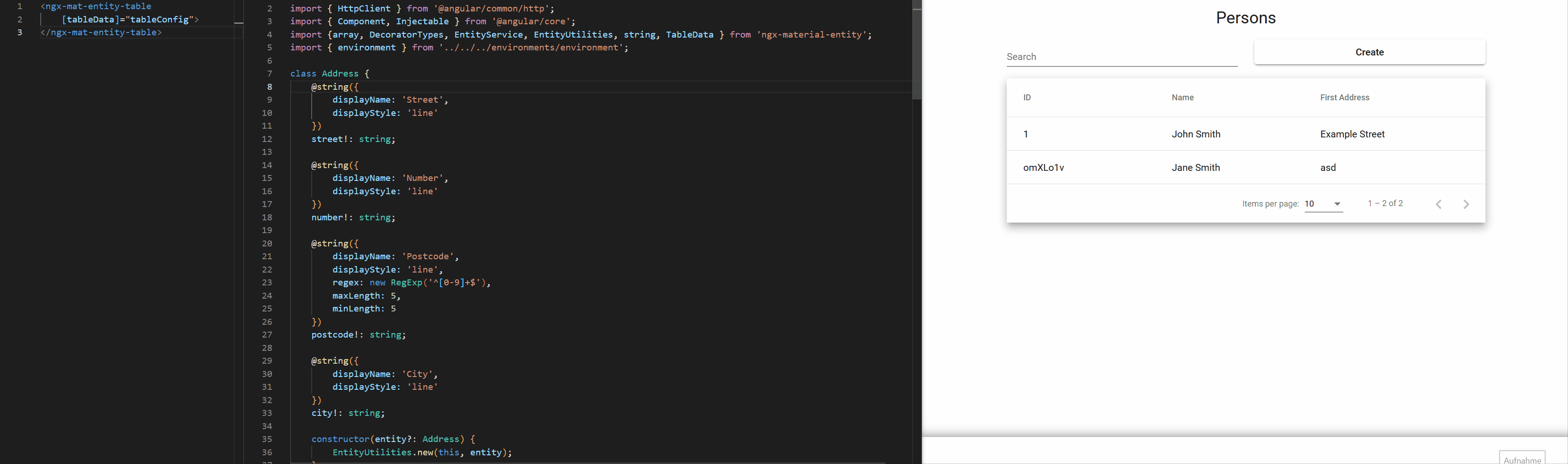
|
With NgxMaterialEntity you can define how to display entities directly on their properties by using a multitude of decorators for them. You can then use the input component to display the value solely based on the entity and the propertyKey.
|
|
3
3
|
|
|
4
|
-
|
|
4
|
+
If the predefined decorators dont quite fit your needs you can also build your own.
|
|
5
|
+
|
|
6
|
+
The library also offers a table component which generates complete CRUD-functionality right out of the box.
|
|
5
7
|
|
|
6
8
|
NgxMaterialEntity aims to have a fast way to get started with a lot of default options which can be overriden to allow high customization aswell.
|
|
7
9
|
|
|
10
|
+
|
|
11
|
+
|
|
8
12
|
[](https://github.com/tim-fabian/ngx-material-entity/actions/workflows/main.yml)
|
|
9
13
|
[](https://badge.fury.io/js/ngx-material-entity)
|
|
10
14
|
[](https://snyk.io/test/npm/ngx-material-entity)
|
|
@@ -19,7 +23,7 @@ NgxMaterialEntity aims to have a fast way to get started with a lot of default o
|
|
|
19
23
|
- [Use the input for your entity property](#use-the-input-for-your-entity-property)
|
|
20
24
|
- [Generate a complete CRUD Table for your entity](#generate-a-complete-crud-table-for-your-entity)
|
|
21
25
|
- [Create a Service for your entity](#create-a-service-for-your-entity)
|
|
22
|
-
- [Define the
|
|
26
|
+
- [Define the Table-Element](#define-the-table-element)
|
|
23
27
|
- [PropertyDecorators](#propertydecorators)
|
|
24
28
|
- [base](#base)
|
|
25
29
|
- [@string default](#string-default)
|
|
@@ -39,6 +43,16 @@ NgxMaterialEntity aims to have a fast way to get started with a lot of default o
|
|
|
39
43
|
- [@array entity](#array-entity)
|
|
40
44
|
- [@array string chips](#array-string-chips)
|
|
41
45
|
- [@array string chips autocomplete](#array-string-chips-autocomplete)
|
|
46
|
+
- [@array date](#array-date)
|
|
47
|
+
- [@array date time](#array-date-time)
|
|
48
|
+
- [@array date range](#array-date-range)
|
|
49
|
+
- [@file data](#file-data)
|
|
50
|
+
- [@file](#file)
|
|
51
|
+
- [@file default](#file-default)
|
|
52
|
+
- [@file image](#file-image)
|
|
53
|
+
- [@custom](#custom)
|
|
54
|
+
- [metadata](#metadata)
|
|
55
|
+
- [component](#component)
|
|
42
56
|
- [NgxMatEntityInput Configuration](#ngxmatentityinput-configuration)
|
|
43
57
|
- [NgxMatEntityTable Configuration](#ngxmatentitytable-configuration)
|
|
44
58
|
- [Display Columns](#display-columns)
|
|
@@ -116,12 +130,12 @@ For a list of further configuration options for the input see [PropertyInput Con
|
|
|
116
130
|
It is pretty easy to use the input component inside a for-loop that iterates over every key of an entity to build a complete form for that entity.
|
|
117
131
|
<br>
|
|
118
132
|
We thought this approach a bit further and build a complete CRUD table component with support for:
|
|
119
|
-
- omitting values for
|
|
120
|
-
- layouting
|
|
121
|
-
- responsive design
|
|
133
|
+
- omitting values for creating or updating entities
|
|
134
|
+
- layouting & responsive design (based on bootstrap)
|
|
122
135
|
- multi select actions
|
|
136
|
+
- validation
|
|
123
137
|
|
|
124
|
-
|
|
138
|
+
The component is usable out of the box but offers a lot of customization aswell.
|
|
125
139
|
|
|
126
140
|
### Create a Service for your entity
|
|
127
141
|
In order to use the table component you have to define a service that handles http-Requests for the entity and extends from the abstract EntityService-Class:
|
|
@@ -138,10 +152,12 @@ export class MyEntityService extends EntityService<MyEntity> {
|
|
|
138
152
|
constructor(private readonly httpClient: HttpClient) {
|
|
139
153
|
super(httpClient);
|
|
140
154
|
}
|
|
155
|
+
|
|
156
|
+
// All the create, read, update and delete logic is already implemented, but you can of course override it.
|
|
141
157
|
}
|
|
142
158
|
```
|
|
143
159
|
|
|
144
|
-
### Define the
|
|
160
|
+
### Define the Table-Element
|
|
145
161
|
Import the `NgxMatEntityTableModule` anywhere in your code:
|
|
146
162
|
|
|
147
163
|
```typescript
|
|
@@ -154,18 +170,41 @@ import { NgxMatEntityTableModule } from 'ngx-material-entity';
|
|
|
154
170
|
...
|
|
155
171
|
```
|
|
156
172
|
|
|
173
|
+
In your ts you can then define the table configuration data, eg.:
|
|
174
|
+
|
|
175
|
+
```typescript
|
|
176
|
+
const tableData: TableData<MyEntity> = {
|
|
177
|
+
baseData: {
|
|
178
|
+
title: 'My Entities', // The title above the table
|
|
179
|
+
displayColumns: [
|
|
180
|
+
{
|
|
181
|
+
displayName: 'id',
|
|
182
|
+
value: (entity: MyEntity) => entity.id
|
|
183
|
+
},
|
|
184
|
+
{
|
|
185
|
+
displayName: 'My String',
|
|
186
|
+
value: (entity: MyEntity) => entity.myString
|
|
187
|
+
}
|
|
188
|
+
],
|
|
189
|
+
EntityClass: MyEntity,
|
|
190
|
+
EntityServiceClass: MyEntityService,
|
|
191
|
+
},
|
|
192
|
+
createDialogData: {
|
|
193
|
+
title: 'Create My Entity'
|
|
194
|
+
},
|
|
195
|
+
editDialogData: {
|
|
196
|
+
title: (entity: MyEntity) => `My Entity #${entity.id}`
|
|
197
|
+
}
|
|
198
|
+
};
|
|
199
|
+
```
|
|
200
|
+
|
|
157
201
|
In the html you can then define:
|
|
158
202
|
|
|
159
203
|
```html
|
|
160
|
-
<ngx-mat-entity-table
|
|
161
|
-
[displayColumns]="displayColumns"
|
|
162
|
-
[title]="title"
|
|
163
|
-
[EntityServiceClass]="MyEntityService"
|
|
164
|
-
[EntityClass]="MyEntity"
|
|
165
|
-
[multiSelectActions]="multiSelectActions"
|
|
166
|
-
[createDialogTitle]="'Custom Create Dialog Title'">
|
|
204
|
+
<ngx-mat-entity-table [tableData]="tableData">
|
|
167
205
|
</ngx-mat-entity-table>
|
|
168
206
|
```
|
|
207
|
+
|
|
169
208
|
For a list of all configuration options see [NgxMatEntityTable Configuration](#ngxmatentitytable-configuration).
|
|
170
209
|
|
|
171
210
|
# PropertyDecorators
|
|
@@ -220,14 +259,13 @@ export abstract class PropertyDecoratorConfig {
|
|
|
220
259
|
position?: Position
|
|
221
260
|
}
|
|
222
261
|
```
|
|
223
|
-
For more information regarding the defaultWidths see the bootstrap guide about the [Grid system](https://getbootstrap.com/docs/5.0/layout/grid/).
|
|
262
|
+
For more information regarding the "defaultWidths" see the bootstrap guide about the [Grid system](https://getbootstrap.com/docs/5.0/layout/grid/).
|
|
224
263
|
|
|
225
264
|
## @string default
|
|
226
265
|
The "default" display of a string value. Inside a single line mat-input.
|
|
227
266
|
|
|
228
267
|
```typescript
|
|
229
268
|
export interface DefaultStringDecoratorConfig extends StringDecoratorConfig {
|
|
230
|
-
// eslint-disable-next-line jsdoc/require-jsdoc
|
|
231
269
|
displayStyle: 'line',
|
|
232
270
|
/**
|
|
233
271
|
* The minimum required length of the string.
|
|
@@ -249,13 +287,11 @@ Displays a string as a dropdown where the user can input one of the defined drop
|
|
|
249
287
|
|
|
250
288
|
```typescript
|
|
251
289
|
export interface DropdownStringDecoratorConfig extends StringDecoratorConfig {
|
|
252
|
-
// eslint-disable-next-line jsdoc/require-jsdoc
|
|
253
290
|
displayStyle: 'dropdown',
|
|
254
291
|
/**
|
|
255
292
|
* The values of the dropdown, consisting of a name to display and the actual value
|
|
256
293
|
* Can also receive a function to determine the values.
|
|
257
294
|
*/
|
|
258
|
-
// eslint-disable-next-line jsdoc/require-jsdoc
|
|
259
295
|
dropdownValues: DropdownValue<string>[]
|
|
260
296
|
}
|
|
261
297
|
```
|
|
@@ -265,7 +301,6 @@ Displays a string as a textbox.
|
|
|
265
301
|
|
|
266
302
|
```typescript
|
|
267
303
|
export interface TextboxStringDecoratorConfig extends StringDecoratorConfig {
|
|
268
|
-
// eslint-disable-next-line jsdoc/require-jsdoc
|
|
269
304
|
displayStyle: 'textbox',
|
|
270
305
|
/**
|
|
271
306
|
* The minimum required length of the string.
|
|
@@ -283,7 +318,6 @@ Just like the default @string, but the user has additional autocomplete values t
|
|
|
283
318
|
|
|
284
319
|
```typescript
|
|
285
320
|
export interface AutocompleteStringDecoratorConfig extends StringDecoratorConfig {
|
|
286
|
-
// eslint-disable-next-line jsdoc/require-jsdoc
|
|
287
321
|
displayStyle: 'autocomplete',
|
|
288
322
|
/**
|
|
289
323
|
* The autocomplete values.
|
|
@@ -309,7 +343,6 @@ The "default" display of a number value. Inside a single line mat-input.
|
|
|
309
343
|
|
|
310
344
|
```typescript
|
|
311
345
|
export interface DefaultNumberDecoratorConfig extends NumberDecoratorConfig {
|
|
312
|
-
// eslint-disable-next-line jsdoc/require-jsdoc
|
|
313
346
|
displayStyle: 'line',
|
|
314
347
|
/**
|
|
315
348
|
* The minimum value of the number.
|
|
@@ -327,12 +360,10 @@ Displays the numbers in a dropdown
|
|
|
327
360
|
|
|
328
361
|
```typescript
|
|
329
362
|
export interface DropdownNumberDecoratorConfig extends NumberDecoratorConfig {
|
|
330
|
-
// eslint-disable-next-line jsdoc/require-jsdoc
|
|
331
363
|
displayStyle: 'dropdown',
|
|
332
364
|
/**
|
|
333
365
|
* The values of the dropdown, consisting of a name to display and the actual value.
|
|
334
366
|
*/
|
|
335
|
-
// eslint-disable-next-line jsdoc/require-jsdoc
|
|
336
367
|
dropdownValues: DropdownValue<number>[]
|
|
337
368
|
}
|
|
338
369
|
```
|
|
@@ -342,7 +373,6 @@ Displays the boolean value as a MatSlideToggle
|
|
|
342
373
|
|
|
343
374
|
```typescript
|
|
344
375
|
export interface ToggleBooleanDecoratorConfig extends BooleanDecoratorConfig {
|
|
345
|
-
// eslint-disable-next-line jsdoc/require-jsdoc
|
|
346
376
|
displayStyle: 'toggle'
|
|
347
377
|
}
|
|
348
378
|
```
|
|
@@ -352,7 +382,6 @@ Displays the boolean value as a MatCheckbox
|
|
|
352
382
|
|
|
353
383
|
```typescript
|
|
354
384
|
export interface CheckboxBooleanDecoratorConfig extends BooleanDecoratorConfig {
|
|
355
|
-
// eslint-disable-next-line jsdoc/require-jsdoc
|
|
356
385
|
displayStyle: 'checkbox'
|
|
357
386
|
}
|
|
358
387
|
```
|
|
@@ -362,7 +391,6 @@ Displays the boolean value as a MatCheckbox
|
|
|
362
391
|
|
|
363
392
|
```typescript
|
|
364
393
|
export interface DropdownBooleanDecoratorConfig extends BooleanDecoratorConfig {
|
|
365
|
-
// eslint-disable-next-line jsdoc/require-jsdoc
|
|
366
394
|
displayStyle: 'dropdown',
|
|
367
395
|
/**
|
|
368
396
|
* The name of the true value if displayStyle dropdown is used.
|
|
@@ -379,7 +407,6 @@ export interface DropdownBooleanDecoratorConfig extends BooleanDecoratorConfig {
|
|
|
379
407
|
Displays a date value as an mat-datepicker.
|
|
380
408
|
```typescript
|
|
381
409
|
export interface DefaultDateDecoratorConfig extends DateDecoratorConfig {
|
|
382
|
-
// eslint-disable-next-line jsdoc/require-jsdoc
|
|
383
410
|
displayStyle: 'date',
|
|
384
411
|
/**
|
|
385
412
|
* A function to get the minimum value of the date.
|
|
@@ -401,7 +428,6 @@ Displays the selection of a time period as the daterange-picker.
|
|
|
401
428
|
|
|
402
429
|
```typescript
|
|
403
430
|
export interface DateRangeDateDecoratorConfig extends DateDecoratorConfig {
|
|
404
|
-
// eslint-disable-next-line jsdoc/require-jsdoc
|
|
405
431
|
displayStyle: 'daterange',
|
|
406
432
|
/**
|
|
407
433
|
* A function to get the minimum value of the start date.
|
|
@@ -443,7 +469,6 @@ Displays the date as a datetime input.
|
|
|
443
469
|
|
|
444
470
|
```typescript
|
|
445
471
|
export interface DateTimeDateDecoratorConfig extends DateDecoratorConfig {
|
|
446
|
-
// eslint-disable-next-line jsdoc/require-jsdoc
|
|
447
472
|
displayStyle: 'datetime',
|
|
448
473
|
/**
|
|
449
474
|
* The selectable times.
|
|
@@ -525,9 +550,7 @@ abstract class ArrayDecoratorConfig extends PropertyDecoratorConfig {
|
|
|
525
550
|
* Definition for an array of Entities.
|
|
526
551
|
*/
|
|
527
552
|
export interface EntityArrayDecoratorConfig<EntityType extends object> extends ArrayDecoratorConfig {
|
|
528
|
-
// eslint-disable-next-line jsdoc/require-jsdoc
|
|
529
553
|
itemType: DecoratorTypes.OBJECT,
|
|
530
|
-
// eslint-disable-next-line jsdoc/require-jsdoc
|
|
531
554
|
displayStyle: 'table',
|
|
532
555
|
|
|
533
556
|
/**
|
|
@@ -582,9 +605,7 @@ export interface EntityArrayDecoratorConfig<EntityType extends object> extends A
|
|
|
582
605
|
* Definition for an array of strings displayed as a chips list.
|
|
583
606
|
*/
|
|
584
607
|
export interface StringChipsArrayDecoratorConfig extends ArrayDecoratorConfig {
|
|
585
|
-
// eslint-disable-next-line jsdoc/require-jsdoc
|
|
586
608
|
itemType: DecoratorTypes.STRING,
|
|
587
|
-
// eslint-disable-next-line jsdoc/require-jsdoc
|
|
588
609
|
displayStyle: 'chips',
|
|
589
610
|
|
|
590
611
|
/**
|
|
@@ -614,9 +635,7 @@ export interface StringChipsArrayDecoratorConfig extends ArrayDecoratorConfig {
|
|
|
614
635
|
* Definition for an array of autocomplete strings displayed as a chips list.
|
|
615
636
|
*/
|
|
616
637
|
export interface AutocompleteStringChipsArrayDecoratorConfig extends ArrayDecoratorConfig {
|
|
617
|
-
// eslint-disable-next-line jsdoc/require-jsdoc
|
|
618
638
|
itemType: DecoratorTypes.STRING_AUTOCOMPLETE,
|
|
619
|
-
// eslint-disable-next-line jsdoc/require-jsdoc
|
|
620
639
|
displayStyle: 'chips',
|
|
621
640
|
|
|
622
641
|
/**
|
|
@@ -644,6 +663,358 @@ export interface AutocompleteStringChipsArrayDecoratorConfig extends ArrayDecora
|
|
|
644
663
|
}
|
|
645
664
|
```
|
|
646
665
|
|
|
666
|
+
## @array date
|
|
667
|
+
```typescript
|
|
668
|
+
/**
|
|
669
|
+
* Definition for an array of Dates.
|
|
670
|
+
*/
|
|
671
|
+
export interface DateArrayDecoratorConfig extends ArrayDecoratorConfig {
|
|
672
|
+
itemType: DecoratorTypes.DATE,
|
|
673
|
+
|
|
674
|
+
/**
|
|
675
|
+
* The definition of the columns to display. Consists of the displayName to show in the header of the row
|
|
676
|
+
* and the value, which is a function that generates the value to display inside a column.
|
|
677
|
+
*/
|
|
678
|
+
displayColumns: ArrayTableDisplayColumn<Date>[],
|
|
679
|
+
|
|
680
|
+
/**
|
|
681
|
+
* The label for the add button.
|
|
682
|
+
*
|
|
683
|
+
* @default 'Add'
|
|
684
|
+
*/
|
|
685
|
+
addButtonLabel?: string,
|
|
686
|
+
|
|
687
|
+
/**
|
|
688
|
+
* The label for the remove button.
|
|
689
|
+
*
|
|
690
|
+
* @default 'Remove'
|
|
691
|
+
*/
|
|
692
|
+
removeButtonLabel?: string,
|
|
693
|
+
|
|
694
|
+
/**
|
|
695
|
+
* The error-message to display when the array is required but contains no values.
|
|
696
|
+
*/
|
|
697
|
+
missingErrorMessage?: string,
|
|
698
|
+
|
|
699
|
+
/**
|
|
700
|
+
* A function to get the minimum value of the date.
|
|
701
|
+
*/
|
|
702
|
+
min?: (date?: Date) => Date,
|
|
703
|
+
|
|
704
|
+
/**
|
|
705
|
+
* A function to get the maximum value of the date.
|
|
706
|
+
*/
|
|
707
|
+
max?: (date?: Date) => Date,
|
|
708
|
+
|
|
709
|
+
/**
|
|
710
|
+
* A filter function to do more specific filtering. This could be the removal of e.g. All weekends.
|
|
711
|
+
*/
|
|
712
|
+
filter?: DateFilterFn<Date | null | undefined>
|
|
713
|
+
}
|
|
714
|
+
```
|
|
715
|
+
|
|
716
|
+
## @array date time
|
|
717
|
+
```typescript
|
|
718
|
+
/**
|
|
719
|
+
* Definition for an array of DateTimes.
|
|
720
|
+
*/
|
|
721
|
+
export interface DateTimeArrayDecoratorConfig extends ArrayDecoratorConfig {
|
|
722
|
+
itemType: DecoratorTypes.DATE_TIME,
|
|
723
|
+
|
|
724
|
+
/**
|
|
725
|
+
* The definition of the columns to display. Consists of the displayName to show in the header of the row
|
|
726
|
+
* and the value, which is a function that generates the value to display inside a column.
|
|
727
|
+
*/
|
|
728
|
+
displayColumns: ArrayTableDisplayColumn<Date>[],
|
|
729
|
+
|
|
730
|
+
/**
|
|
731
|
+
* The label for the add button.
|
|
732
|
+
*
|
|
733
|
+
* @default 'Add'
|
|
734
|
+
*/
|
|
735
|
+
addButtonLabel?: string,
|
|
736
|
+
|
|
737
|
+
/**
|
|
738
|
+
* The label for the remove button.
|
|
739
|
+
*
|
|
740
|
+
* @default 'Remove'
|
|
741
|
+
*/
|
|
742
|
+
removeButtonLabel?: string,
|
|
743
|
+
|
|
744
|
+
/**
|
|
745
|
+
* The error-message to display when the array is required but contains no values.
|
|
746
|
+
*/
|
|
747
|
+
missingErrorMessage?: string,
|
|
748
|
+
|
|
749
|
+
/**
|
|
750
|
+
* The selectable times.
|
|
751
|
+
*/
|
|
752
|
+
times?: DropdownValue<Time>[],
|
|
753
|
+
|
|
754
|
+
/**
|
|
755
|
+
* The name to use as a label for the time form field.
|
|
756
|
+
*
|
|
757
|
+
* @default 'Time'
|
|
758
|
+
*/
|
|
759
|
+
timeDisplayName?: string,
|
|
760
|
+
|
|
761
|
+
/**
|
|
762
|
+
* A function to get the minimum value of the date.
|
|
763
|
+
*/
|
|
764
|
+
minDate?: (date?: Date) => Date,
|
|
765
|
+
|
|
766
|
+
/**
|
|
767
|
+
* A function to get the maximum value of the date.
|
|
768
|
+
*/
|
|
769
|
+
maxDate?: (date?: Date) => Date,
|
|
770
|
+
|
|
771
|
+
/**
|
|
772
|
+
* A filter function to do more specific date filtering. This could be the removal of e.g. All weekends.
|
|
773
|
+
*/
|
|
774
|
+
filterDate?: DateFilterFn<Date | null | undefined>,
|
|
775
|
+
|
|
776
|
+
/**
|
|
777
|
+
* A function to get the minimum value of the time.
|
|
778
|
+
*/
|
|
779
|
+
minTime?: (date?: Date) => Time,
|
|
780
|
+
|
|
781
|
+
/**
|
|
782
|
+
* A function to get the maximum value of the time.
|
|
783
|
+
*/
|
|
784
|
+
maxTime?: (date?: Date) => Time,
|
|
785
|
+
|
|
786
|
+
/**
|
|
787
|
+
* A filter function to do more specific time filtering. This could be e.g. The removal of lunch breaks.
|
|
788
|
+
*/
|
|
789
|
+
filterTime?: ((time: Time) => boolean) | (() => boolean)
|
|
790
|
+
}
|
|
791
|
+
```
|
|
792
|
+
|
|
793
|
+
## @array date range
|
|
794
|
+
```typescript
|
|
795
|
+
/**
|
|
796
|
+
* Definition for an array of DateRanges.
|
|
797
|
+
*/
|
|
798
|
+
export interface DateRangeArrayDecoratorConfig extends ArrayDecoratorConfig {
|
|
799
|
+
itemType: DecoratorTypes.DATE_RANGE,
|
|
800
|
+
|
|
801
|
+
/**
|
|
802
|
+
* The definition of the columns to display. Consists of the displayName to show in the header of the row
|
|
803
|
+
* and the value, which is a function that generates the value to display inside a column.
|
|
804
|
+
*/
|
|
805
|
+
displayColumns: ArrayTableDisplayColumn<DateRange>[],
|
|
806
|
+
|
|
807
|
+
/**
|
|
808
|
+
* The label for the add button.
|
|
809
|
+
*
|
|
810
|
+
* @default 'Add'
|
|
811
|
+
*/
|
|
812
|
+
addButtonLabel?: string,
|
|
813
|
+
|
|
814
|
+
/**
|
|
815
|
+
* The label for the remove button.
|
|
816
|
+
*
|
|
817
|
+
* @default 'Remove'
|
|
818
|
+
*/
|
|
819
|
+
removeButtonLabel?: string,
|
|
820
|
+
|
|
821
|
+
/**
|
|
822
|
+
* The error-message to display when the array is required but contains no values.
|
|
823
|
+
*/
|
|
824
|
+
missingErrorMessage?: string,
|
|
825
|
+
|
|
826
|
+
/**
|
|
827
|
+
* A function to get the minimum value of the start date.
|
|
828
|
+
*/
|
|
829
|
+
minStart?: (date?: Date) => Date,
|
|
830
|
+
/**
|
|
831
|
+
* A function to get the maximum value of the start date.
|
|
832
|
+
*/
|
|
833
|
+
maxStart?: (date?: Date) => Date,
|
|
834
|
+
/**
|
|
835
|
+
* A function to get the minimum value of the end date.
|
|
836
|
+
*/
|
|
837
|
+
minEnd?: (date?: Date) => Date,
|
|
838
|
+
/**
|
|
839
|
+
* A function to get the maximum value of the end date.
|
|
840
|
+
*/
|
|
841
|
+
maxEnd?: (date?: Date) => Date,
|
|
842
|
+
/**
|
|
843
|
+
* A filter function to do more specific filtering on the disallowed end date values. This could be the removal of e.g. All weekends.
|
|
844
|
+
*/
|
|
845
|
+
filter?: DateFilterFn<Date>,
|
|
846
|
+
/**
|
|
847
|
+
* The placeholder for the start date of the date range picker.
|
|
848
|
+
*
|
|
849
|
+
* @default "Start"
|
|
850
|
+
*/
|
|
851
|
+
placeholderStart?: string,
|
|
852
|
+
/**
|
|
853
|
+
* The placeholder for the end date of the date range picker.
|
|
854
|
+
*
|
|
855
|
+
* @default "End"
|
|
856
|
+
*/
|
|
857
|
+
placeholderEnd?: string
|
|
858
|
+
}
|
|
859
|
+
```
|
|
860
|
+
|
|
861
|
+
## @file data
|
|
862
|
+
```typescript
|
|
863
|
+
/**
|
|
864
|
+
* The type of any property annotated with @file.
|
|
865
|
+
*/
|
|
866
|
+
export type FileData = FileDataWithFile | FileDataWithUrl;
|
|
867
|
+
```
|
|
868
|
+
|
|
869
|
+
## @file
|
|
870
|
+
```typescript
|
|
871
|
+
abstract class FileDecoratorConfig extends PropertyDecoratorConfig {
|
|
872
|
+
/**
|
|
873
|
+
* Specifies whether or not the decorated property can have multiple files.
|
|
874
|
+
*/
|
|
875
|
+
multiple!: boolean;
|
|
876
|
+
|
|
877
|
+
/**
|
|
878
|
+
* The type of the upload.
|
|
879
|
+
*/
|
|
880
|
+
type!: 'image' | 'other';
|
|
881
|
+
|
|
882
|
+
/**
|
|
883
|
+
* The class for the <i> tag used to remove a file from the input.
|
|
884
|
+
*
|
|
885
|
+
* @default 'fas fa-circle-minus'
|
|
886
|
+
*/
|
|
887
|
+
deleteIcon?: string;
|
|
888
|
+
|
|
889
|
+
/**
|
|
890
|
+
* Whether or not the file should be displayed inside a preview.
|
|
891
|
+
*
|
|
892
|
+
* @default true
|
|
893
|
+
*/
|
|
894
|
+
preview?: boolean;
|
|
895
|
+
|
|
896
|
+
/**
|
|
897
|
+
* Specifies allowed File types like 'image/jpg' etc.
|
|
898
|
+
* Allows every file type if not set.
|
|
899
|
+
*/
|
|
900
|
+
allowedMimeTypes?: string[];
|
|
901
|
+
|
|
902
|
+
/**
|
|
903
|
+
* The error dialog to display when the user inputs files that are not of the allowed mime types.
|
|
904
|
+
*/
|
|
905
|
+
mimeTypeErrorDialog?: ConfirmDialogData;
|
|
906
|
+
|
|
907
|
+
/**
|
|
908
|
+
* The maximum allowed size of a single file in MB.
|
|
909
|
+
*
|
|
910
|
+
* @default 10
|
|
911
|
+
*/
|
|
912
|
+
maxSize?: number;
|
|
913
|
+
|
|
914
|
+
/**
|
|
915
|
+
* The error dialog to display when the user inputs a single file that is bigger than the 'maxSize' value.
|
|
916
|
+
*/
|
|
917
|
+
maxSizeErrorDialog?: ConfirmDialogData;
|
|
918
|
+
|
|
919
|
+
/**
|
|
920
|
+
* The maximum allowed size of all files in MB.
|
|
921
|
+
*
|
|
922
|
+
* @default 100
|
|
923
|
+
*/
|
|
924
|
+
maxSizeTotal?: number;
|
|
925
|
+
|
|
926
|
+
/**
|
|
927
|
+
* The error dialog to display when the user inputs files which are in total bigger than the 'maxSizeTotal' value.
|
|
928
|
+
*/
|
|
929
|
+
maxSizeTotalErrorDialog?: ConfirmDialogData;
|
|
930
|
+
|
|
931
|
+
/**
|
|
932
|
+
* Defines whether or not a dropdown box is displayed.
|
|
933
|
+
*
|
|
934
|
+
* @default true // when multiple is set to true.
|
|
935
|
+
* false // when multiple is set to false.
|
|
936
|
+
*/
|
|
937
|
+
dragAndDrop?: boolean;
|
|
938
|
+
}
|
|
939
|
+
```
|
|
940
|
+
|
|
941
|
+
## @file default
|
|
942
|
+
```typescript
|
|
943
|
+
/**
|
|
944
|
+
* Definition for a default file.
|
|
945
|
+
*/
|
|
946
|
+
export interface DefaultFileDecoratorConfig extends FileDecoratorConfig {
|
|
947
|
+
type: 'other',
|
|
948
|
+
preview?: false
|
|
949
|
+
}
|
|
950
|
+
```
|
|
951
|
+
|
|
952
|
+
## @file image
|
|
953
|
+
```typescript
|
|
954
|
+
/**
|
|
955
|
+
* Definition for a image file.
|
|
956
|
+
*/
|
|
957
|
+
export interface ImageFileDecoratorConfig extends FileDecoratorConfig {
|
|
958
|
+
// eslint-disable-next-line jsdoc/require-jsdoc
|
|
959
|
+
type: 'image',
|
|
960
|
+
/**
|
|
961
|
+
* Specifies allowed File types like image/jpg etc. In a comma separated string.
|
|
962
|
+
*
|
|
963
|
+
* @default ['image/*']
|
|
964
|
+
*/
|
|
965
|
+
allowedMimeTypes?: string[],
|
|
966
|
+
/**
|
|
967
|
+
* Url to the file that gets displayed in the preview when no file has been selected yet.
|
|
968
|
+
*/
|
|
969
|
+
previewPlaceholderUrl?: string
|
|
970
|
+
}
|
|
971
|
+
```
|
|
972
|
+
|
|
973
|
+
## @custom
|
|
974
|
+
Wit the custom decorator you have the freedom to build your own input components.
|
|
975
|
+
|
|
976
|
+
### metadata
|
|
977
|
+
The @custom decorator gives you the option to provide additional metadata.
|
|
978
|
+
It also uses generics to provide type safety for you:
|
|
979
|
+
|
|
980
|
+
```typescript
|
|
981
|
+
// Somewhere outside the entity
|
|
982
|
+
// This is the additional metadata to provide for the property.
|
|
983
|
+
interface MyCustomMetadata {
|
|
984
|
+
random: () => string
|
|
985
|
+
}
|
|
986
|
+
.
|
|
987
|
+
.
|
|
988
|
+
.
|
|
989
|
+
// Somewhere inside the entity
|
|
990
|
+
@custom<string, MyCustomMetadata, MyEntity>({
|
|
991
|
+
customMetadata: {
|
|
992
|
+
// This is type safe because we defined two lines above that the custom metadata has the type "MyCustomMetadata"
|
|
993
|
+
random: () => (Math.random() + 1).toString(36).substring(7)
|
|
994
|
+
},
|
|
995
|
+
displayName: 'Random Value',
|
|
996
|
+
component: CustomInputComponent // will be defined below
|
|
997
|
+
})
|
|
998
|
+
randomValue!: string;
|
|
999
|
+
```
|
|
1000
|
+
### component
|
|
1001
|
+
The component needs to extend the NgxMatEntityBaseInputComponent:
|
|
1002
|
+
```typescript
|
|
1003
|
+
@Component({
|
|
1004
|
+
selector: 'custom-input-component',
|
|
1005
|
+
templateUrl: './custom-input.component.html',
|
|
1006
|
+
styleUrls: ['./custom-input.component.scss']
|
|
1007
|
+
})
|
|
1008
|
+
export class CustomInputComponent
|
|
1009
|
+
extends NgxMatEntityBaseInputComponent<MyEntity, DecoratorTypes.CUSTOM, string, MyCustomMetadata>
|
|
1010
|
+
implements OnInit {
|
|
1011
|
+
// Define your logic here.
|
|
1012
|
+
// The base class already provides the entity and key values and handles getting the metadata.
|
|
1013
|
+
// This is also type safe because we defined above that the custom metadata has the type "MyCustomMetadata"
|
|
1014
|
+
// and the entity has the type "MyEntity"
|
|
1015
|
+
}
|
|
1016
|
+
```
|
|
1017
|
+
|
|
647
1018
|
# NgxMatEntityInput Configuration
|
|
648
1019
|
With the property input you can generate an input field based on the metadata you defined on your property.
|
|
649
1020
|
<br>
|
|
@@ -739,15 +1110,21 @@ export interface BaseData<EntityType extends object> {
|
|
|
739
1110
|
/**
|
|
740
1111
|
* Defines whether or not the user can add new entities.
|
|
741
1112
|
*
|
|
742
|
-
* @default true
|
|
1113
|
+
* @default () => true
|
|
1114
|
+
*/
|
|
1115
|
+
allowCreate?: () => boolean,
|
|
1116
|
+
/**
|
|
1117
|
+
* Defines whether or not the user can view this specific entity.
|
|
1118
|
+
*
|
|
1119
|
+
* @default () => true
|
|
743
1120
|
*/
|
|
744
|
-
|
|
1121
|
+
allowRead?: (entity: EntityType) => boolean,
|
|
745
1122
|
/**
|
|
746
|
-
* Defines whether or not the user can edit
|
|
1123
|
+
* Defines whether or not the user can edit this specific entity.
|
|
747
1124
|
*
|
|
748
1125
|
* @default () => true
|
|
749
1126
|
*/
|
|
750
|
-
|
|
1127
|
+
allowUpdate?: (entity: EntityType) => boolean,
|
|
751
1128
|
/**
|
|
752
1129
|
* Whether or not the user can delete this specific entity.
|
|
753
1130
|
*/
|
|
@@ -0,0 +1,62 @@
|
|
|
1
|
+
import { Dictionary, Many, ValueKeyIteratee } from 'lodash';
|
|
2
|
+
/**
|
|
3
|
+
* Encapsulates all functionality of lodash.
|
|
4
|
+
*/
|
|
5
|
+
export declare abstract class LodashUtilities {
|
|
6
|
+
/**
|
|
7
|
+
* Performs a deep comparison between two values to determine if they are
|
|
8
|
+
* equivalent.
|
|
9
|
+
*
|
|
10
|
+
* **Note:** This method supports comparing arrays, array buffers, booleans,
|
|
11
|
+
* date objects, error objects, maps, numbers, `Object` objects, regexps,
|
|
12
|
+
* sets, strings, symbols, and typed arrays. `Object` objects are compared
|
|
13
|
+
* by their own, not inherited, enumerable properties. Functions and DOM
|
|
14
|
+
* nodes are **not** supported.
|
|
15
|
+
*
|
|
16
|
+
* @param value - The value to compare.
|
|
17
|
+
* @param other - The other value to compare.
|
|
18
|
+
* @returns Returns `true` if the values are equivalent, else `false`.
|
|
19
|
+
*/
|
|
20
|
+
static isEqual(value: unknown, other: unknown): boolean;
|
|
21
|
+
/**
|
|
22
|
+
* This method is like _.clone except that it recursively clones value.
|
|
23
|
+
*
|
|
24
|
+
* @param value - The value to recursively clone.
|
|
25
|
+
* @returns Returns the deep cloned value.
|
|
26
|
+
*/
|
|
27
|
+
static cloneDeep<T>(value: T): T;
|
|
28
|
+
/**
|
|
29
|
+
* The opposite of `_.pick`; this method creates an object composed of the
|
|
30
|
+
* own and inherited enumerable properties of `object` that are not omitted.
|
|
31
|
+
*
|
|
32
|
+
* @param object - The source object.
|
|
33
|
+
* @param paths - The property names to omit, specified
|
|
34
|
+
* individually or in arrays.
|
|
35
|
+
* @returns Returns the new object.
|
|
36
|
+
*/
|
|
37
|
+
static omit<T extends object, K extends keyof T>(object: T | null | undefined, ...paths: Many<K>[]): Omit<T, K>;
|
|
38
|
+
/**
|
|
39
|
+
* Checks if `value` is `null` or `undefined`.
|
|
40
|
+
*
|
|
41
|
+
* @param value - The value to check.
|
|
42
|
+
* @returns Returns `true` if `value` is nullish, else `false`.
|
|
43
|
+
*/
|
|
44
|
+
static isNil(value: unknown): value is null | undefined;
|
|
45
|
+
/**
|
|
46
|
+
* The opposite of `_.pickBy`; this method creates an object composed of the
|
|
47
|
+
* own and inherited enumerable properties of `object` that `predicate`
|
|
48
|
+
* doesn't return truthy for.
|
|
49
|
+
*
|
|
50
|
+
* @param object - The source object.
|
|
51
|
+
* @param predicate - The function invoked per property.
|
|
52
|
+
* @returns Returns the new object.
|
|
53
|
+
*/
|
|
54
|
+
static omitBy<T>(object: Dictionary<T> | null | undefined, predicate?: ValueKeyIteratee<T>): Dictionary<T>;
|
|
55
|
+
/**
|
|
56
|
+
* Checks if value is classified as an Array object.
|
|
57
|
+
*
|
|
58
|
+
* @param value - The value to check.
|
|
59
|
+
* @returns Returns true if value is correctly classified, else false.
|
|
60
|
+
*/
|
|
61
|
+
static isArray(value?: unknown): value is unknown[];
|
|
62
|
+
}
|