ngx-material-entity 0.1.3 → 1.0.0
This diff represents the content of publicly available package versions that have been released to one of the supported registries. The information contained in this diff is provided for informational purposes only and reflects changes between package versions as they appear in their respective public registries.
- package/README.md +914 -336
- package/capsulation/lodash.utilities.d.ts +62 -0
- package/capsulation/reflect.utilities.d.ts +56 -0
- package/classes/{base-builder.class.d.ts → base.builder.d.ts} +2 -1
- package/classes/date.utilities.d.ts +70 -0
- package/classes/entity.model.d.ts +20 -0
- package/classes/entity.service.d.ts +108 -0
- package/classes/{entity-utilities.class.d.ts → entity.utilities.d.ts} +52 -16
- package/classes/file.utilities.d.ts +52 -0
- package/components/confirm-dialog/confirm-dialog-data.builder.d.ts +1 -1
- package/components/input/add-array-item-dialog-data.builder.d.ts +4 -4
- package/components/input/add-array-item-dialog-data.d.ts +2 -2
- package/components/input/array/array-date-input/array-date-input.component.d.ts +11 -0
- package/components/input/array/array-date-range-input/array-date-range-input.component.d.ts +20 -0
- package/components/input/array/array-date-time-input/array-date-time-input.component.d.ts +22 -0
- package/components/input/array/array-string-autocomplete-chips/array-string-autocomplete-chips.component.d.ts +51 -0
- package/components/input/array/array-string-chips-input/array-string-chips-input.component.d.ts +44 -0
- package/components/input/array/array-table.class.d.ts +49 -0
- package/components/input/base-input.component.d.ts +31 -0
- package/components/input/boolean/boolean-checkbox-input/boolean-checkbox-input.component.d.ts +10 -0
- package/components/input/boolean/boolean-dropdown-input/boolean-dropdown-input.component.d.ts +9 -0
- package/components/input/boolean/boolean-toggle-input/boolean-toggle-input.component.d.ts +10 -0
- package/components/input/custom/custom.component.d.ts +13 -0
- package/components/input/date/date-input/date-input.component.d.ts +13 -0
- package/components/input/date/date-range-input/date-range-input.component.d.ts +20 -0
- package/components/input/date/date-time-input/date-time-input.component.d.ts +31 -0
- package/components/input/file/file-default-input/file-default-input.component.d.ts +13 -0
- package/components/input/file/file-image-input/file-image-input.component.d.ts +22 -0
- package/components/input/file/file-input/dragDrop.directive.d.ts +32 -0
- package/components/input/file/file-input/file-input.component.d.ts +32 -0
- package/components/input/input.component.d.ts +49 -73
- package/components/input/input.module.d.ts +38 -15
- package/components/input/number/number-dropdown-input/number-dropdown-input.component.d.ts +9 -0
- package/components/input/number/number-input/number-input.component.d.ts +9 -0
- package/components/input/string/string-autocomplete-input/string-autocomplete-input.component.d.ts +18 -0
- package/components/input/string/string-dropdown-input/string-dropdown-input.component.d.ts +9 -0
- package/components/input/string/string-input/string-input.component.d.ts +9 -0
- package/components/input/string/string-textbox-input/string-textbox-input.component.d.ts +9 -0
- package/components/table/create-dialog/create-dialog-data.builder.d.ts +1 -1
- package/components/table/create-dialog/create-entity-dialog-data.builder.d.ts +5 -5
- package/components/table/create-dialog/create-entity-dialog-data.d.ts +3 -3
- package/components/table/create-dialog/create-entity-dialog.component.d.ts +9 -5
- package/components/table/edit-dialog/edit-dialog-data.builder.d.ts +4 -4
- package/components/table/edit-dialog/edit-entity-dialog-data.d.ts +3 -3
- package/components/table/edit-dialog/edit-entity-dialog.builder.d.ts +5 -5
- package/components/table/edit-dialog/edit-entity-dialog.component.d.ts +7 -5
- package/components/table/table-data.builder.d.ts +9 -9
- package/components/table/table-data.d.ts +8 -8
- package/components/table/table.component.d.ts +2 -2
- package/decorators/array/array-decorator-internal.data.d.ts +72 -7
- package/decorators/array/array-decorator.data.d.ts +179 -13
- package/decorators/array/array.decorator.d.ts +3 -3
- package/decorators/base/base-property.decorator.d.ts +2 -3
- package/decorators/base/decorator-types.enum.d.ts +15 -4
- package/decorators/base/dropdown-value.interface.d.ts +14 -0
- package/decorators/custom/custom-decorator-internal.data.d.ts +17 -0
- package/decorators/custom/custom-decorator.data.d.ts +33 -0
- package/decorators/custom/custom.decorator.d.ts +11 -0
- package/decorators/date/date-decorator-internal.data.d.ts +44 -0
- package/decorators/date/date-decorator.data.d.ts +129 -0
- package/decorators/date/date.decorator.d.ts +8 -0
- package/decorators/file/file-decorator-internal.data.d.ts +92 -0
- package/decorators/file/file-decorator.data.d.ts +92 -0
- package/decorators/file/file.decorator.d.ts +9 -0
- package/decorators/number/number-decorator-internal.data.d.ts +2 -4
- package/decorators/number/number-decorator.data.d.ts +2 -4
- package/decorators/number/number.decorator.d.ts +2 -2
- package/decorators/object/object-decorator-internal.data.d.ts +3 -3
- package/decorators/object/object-decorator.data.d.ts +5 -5
- package/decorators/object/object.decorator.d.ts +2 -2
- package/decorators/string/string-decorator-internal.data.d.ts +2 -4
- package/decorators/string/string-decorator.data.d.ts +2 -4
- package/esm2020/capsulation/lodash.utilities.mjs +75 -0
- package/esm2020/capsulation/reflect.utilities.mjs +69 -0
- package/esm2020/classes/base.builder.mjs +42 -0
- package/esm2020/classes/date.utilities.mjs +158 -0
- package/esm2020/classes/entity.model.mjs +23 -0
- package/esm2020/classes/entity.service.mjs +180 -0
- package/esm2020/classes/entity.utilities.mjs +686 -0
- package/esm2020/classes/file.utilities.mjs +123 -0
- package/esm2020/components/confirm-dialog/confirm-dialog-data.builder.mjs +5 -5
- package/esm2020/components/confirm-dialog/confirm-dialog.component.mjs +3 -3
- package/esm2020/components/input/add-array-item-dialog-data.builder.mjs +4 -4
- package/esm2020/components/input/add-array-item-dialog-data.mjs +1 -1
- package/esm2020/components/input/array/array-date-input/array-date-input.component.mjs +26 -0
- package/esm2020/components/input/array/array-date-range-input/array-date-range-input.component.mjs +50 -0
- package/esm2020/components/input/array/array-date-time-input/array-date-time-input.component.mjs +50 -0
- package/esm2020/components/input/array/array-string-autocomplete-chips/array-string-autocomplete-chips.component.mjs +119 -0
- package/esm2020/components/input/array/array-string-chips-input/array-string-chips-input.component.mjs +104 -0
- package/esm2020/components/input/array/array-table.class.mjs +107 -0
- package/esm2020/components/input/base-input.component.mjs +39 -0
- package/esm2020/components/input/boolean/boolean-checkbox-input/boolean-checkbox-input.component.mjs +23 -0
- package/esm2020/components/input/boolean/boolean-dropdown-input/boolean-dropdown-input.component.mjs +17 -0
- package/esm2020/components/input/boolean/boolean-toggle-input/boolean-toggle-input.component.mjs +23 -0
- package/esm2020/components/input/custom/custom.component.mjs +25 -0
- package/esm2020/components/input/date/date-input/date-input.component.mjs +23 -0
- package/esm2020/components/input/date/date-range-input/date-range-input.component.mjs +51 -0
- package/esm2020/components/input/date/date-time-input/date-time-input.component.mjs +63 -0
- package/esm2020/components/input/file/file-default-input/file-default-input.component.mjs +24 -0
- package/esm2020/components/input/file/file-image-input/file-image-input.component.mjs +79 -0
- package/esm2020/components/input/file/file-input/dragDrop.directive.mjs +64 -0
- package/esm2020/components/input/file/file-input/file-input.component.mjs +152 -0
- package/esm2020/components/input/input.component.mjs +143 -179
- package/esm2020/components/input/input.module.mjs +76 -6
- package/esm2020/components/input/number/number-dropdown-input/number-dropdown-input.component.mjs +18 -0
- package/esm2020/components/input/number/number-input/number-input.component.mjs +16 -0
- package/esm2020/components/input/string/string-autocomplete-input/string-autocomplete-input.component.mjs +37 -0
- package/esm2020/components/input/string/string-dropdown-input/string-dropdown-input.component.mjs +18 -0
- package/esm2020/components/input/string/string-input/string-input.component.mjs +16 -0
- package/esm2020/components/input/string/string-textbox-input/string-textbox-input.component.mjs +17 -0
- package/esm2020/components/table/create-dialog/create-dialog-data.builder.mjs +3 -3
- package/esm2020/components/table/create-dialog/create-entity-dialog-data.builder.mjs +2 -2
- package/esm2020/components/table/create-dialog/create-entity-dialog-data.mjs +1 -1
- package/esm2020/components/table/create-dialog/create-entity-dialog.component.mjs +16 -9
- package/esm2020/components/table/edit-dialog/edit-dialog-data.builder.mjs +3 -3
- package/esm2020/components/table/edit-dialog/edit-entity-dialog-data.mjs +1 -1
- package/esm2020/components/table/edit-dialog/edit-entity-dialog.builder.mjs +3 -3
- package/esm2020/components/table/edit-dialog/edit-entity-dialog.component.mjs +19 -11
- package/esm2020/components/table/table-data.builder.mjs +4 -4
- package/esm2020/components/table/table-data.mjs +1 -1
- package/esm2020/components/table/table.component.mjs +21 -23
- package/esm2020/decorators/array/array-decorator-internal.data.mjs +102 -14
- package/esm2020/decorators/array/array-decorator.data.mjs +2 -2
- package/esm2020/decorators/array/array.decorator.mjs +8 -2
- package/esm2020/decorators/base/base-property.decorator.mjs +4 -3
- package/esm2020/decorators/base/decorator-types.enum.mjs +10 -1
- package/esm2020/decorators/base/dropdown-value.interface.mjs +2 -0
- package/esm2020/decorators/base/property-decorator-internal.data.mjs +10 -10
- package/esm2020/decorators/base/property-decorator.data.mjs +1 -1
- package/esm2020/decorators/boolean/boolean-decorator-internal.data.mjs +3 -3
- package/esm2020/decorators/custom/custom-decorator-internal.data.mjs +26 -0
- package/esm2020/decorators/custom/custom-decorator.data.mjs +2 -0
- package/esm2020/decorators/custom/custom.decorator.mjs +13 -0
- package/esm2020/decorators/date/date-decorator-internal.data.mjs +48 -0
- package/esm2020/decorators/date/date-decorator.data.mjs +7 -0
- package/esm2020/decorators/date/date.decorator.mjs +21 -0
- package/esm2020/decorators/file/file-decorator-internal.data.mjs +98 -0
- package/esm2020/decorators/file/file-decorator.data.mjs +7 -0
- package/esm2020/decorators/file/file.decorator.mjs +22 -0
- package/esm2020/decorators/number/number-decorator-internal.data.mjs +1 -1
- package/esm2020/decorators/number/number-decorator.data.mjs +1 -1
- package/esm2020/decorators/number/number.decorator.mjs +3 -3
- package/esm2020/decorators/object/object-decorator-internal.data.mjs +2 -2
- package/esm2020/decorators/object/object-decorator.data.mjs +1 -1
- package/esm2020/decorators/object/object.decorator.mjs +1 -1
- package/esm2020/decorators/string/string-decorator-internal.data.mjs +1 -1
- package/esm2020/decorators/string/string-decorator.data.mjs +1 -1
- package/esm2020/decorators/string/string.decorator.mjs +1 -1
- package/esm2020/mocks/placeholder-data.png.mjs +3 -0
- package/esm2020/public-api.mjs +15 -5
- package/fesm2015/ngx-material-entity.mjs +2649 -422
- package/fesm2015/ngx-material-entity.mjs.map +1 -1
- package/fesm2020/ngx-material-entity.mjs +2537 -397
- package/fesm2020/ngx-material-entity.mjs.map +1 -1
- package/mocks/placeholder-data.png.d.ts +1 -0
- package/package.json +7 -1
- package/public-api.d.ts +15 -4
- package/classes/entity-model.class.d.ts +0 -9
- package/classes/entity-service.class.d.ts +0 -66
- package/esm2020/classes/base-builder.class.mjs +0 -43
- package/esm2020/classes/entity-model.class.mjs +0 -19
- package/esm2020/classes/entity-service.class.mjs +0 -76
- package/esm2020/classes/entity-utilities.class.mjs +0 -377
package/README.md
CHANGED
|
@@ -1,6 +1,13 @@
|
|
|
1
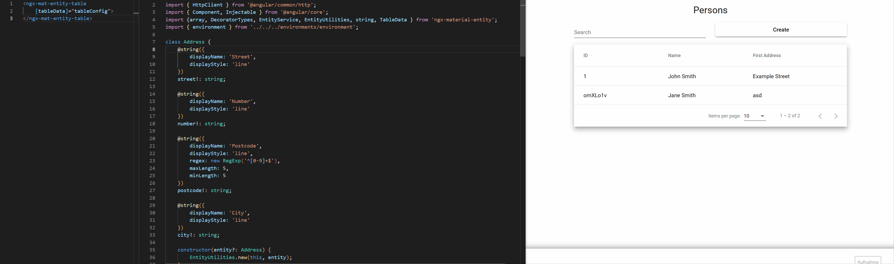
1
|
# NgxMaterialEntity
|
|
2
|
-
|
|
3
|
-
|
|
2
|
+
With NgxMaterialEntity you can define how to display entities directly on their properties by using a multitude of decorators for them. You can then use the input component to display the value solely based on the entity and the propertyKey.
|
|
3
|
+
|
|
4
|
+
If the predefined decorators dont quite fit your needs you can also build your own.
|
|
5
|
+
|
|
6
|
+
The library also offers a table component which generates complete CRUD-functionality right out of the box.
|
|
7
|
+
|
|
8
|
+
NgxMaterialEntity aims to have a fast way to get started with a lot of default options which can be overriden to allow high customization aswell.
|
|
9
|
+
|
|
10
|
+
|
|
4
11
|
|
|
5
12
|
[](https://github.com/tim-fabian/ngx-material-entity/actions/workflows/main.yml)
|
|
6
13
|
[](https://badge.fury.io/js/ngx-material-entity)
|
|
@@ -16,7 +23,7 @@ Can even generate complete and highly customizable CRUD-Tables for them.
|
|
|
16
23
|
- [Use the input for your entity property](#use-the-input-for-your-entity-property)
|
|
17
24
|
- [Generate a complete CRUD Table for your entity](#generate-a-complete-crud-table-for-your-entity)
|
|
18
25
|
- [Create a Service for your entity](#create-a-service-for-your-entity)
|
|
19
|
-
- [Define the
|
|
26
|
+
- [Define the Table-Element](#define-the-table-element)
|
|
20
27
|
- [PropertyDecorators](#propertydecorators)
|
|
21
28
|
- [base](#base)
|
|
22
29
|
- [@string default](#string-default)
|
|
@@ -28,11 +35,24 @@ Can even generate complete and highly customizable CRUD-Tables for them.
|
|
|
28
35
|
- [@boolean toggle](#boolean-toggle)
|
|
29
36
|
- [@boolean checkbox](#boolean-checkbox)
|
|
30
37
|
- [@boolean dropdown](#boolean-dropdown)
|
|
38
|
+
- [@date default](#date-default)
|
|
39
|
+
- [@date dateRange](#date-daterange)
|
|
40
|
+
- [@date datetime](#date-datetime)
|
|
31
41
|
- [@object default](#object-default)
|
|
32
42
|
- [@array](#array)
|
|
33
43
|
- [@array entity](#array-entity)
|
|
34
44
|
- [@array string chips](#array-string-chips)
|
|
35
45
|
- [@array string chips autocomplete](#array-string-chips-autocomplete)
|
|
46
|
+
- [@array date](#array-date)
|
|
47
|
+
- [@array date time](#array-date-time)
|
|
48
|
+
- [@array date range](#array-date-range)
|
|
49
|
+
- [@file data](#file-data)
|
|
50
|
+
- [@file](#file)
|
|
51
|
+
- [@file default](#file-default)
|
|
52
|
+
- [@file image](#file-image)
|
|
53
|
+
- [@custom](#custom)
|
|
54
|
+
- [metadata](#metadata)
|
|
55
|
+
- [component](#component)
|
|
36
56
|
- [NgxMatEntityInput Configuration](#ngxmatentityinput-configuration)
|
|
37
57
|
- [NgxMatEntityTable Configuration](#ngxmatentitytable-configuration)
|
|
38
58
|
- [Display Columns](#display-columns)
|
|
@@ -54,6 +74,8 @@ Create your entity and define Metadata directly on the properties:
|
|
|
54
74
|
```typescript
|
|
55
75
|
import { Entity, EntityUtilities, string } from 'ngx-material-entity';
|
|
56
76
|
|
|
77
|
+
// The "extends Entity" can be left out.
|
|
78
|
+
// The abstract Entity-Class provides an id out of the box.
|
|
57
79
|
export class MyEntity extends Entity {
|
|
58
80
|
|
|
59
81
|
/**
|
|
@@ -69,12 +91,14 @@ export class MyEntity extends Entity {
|
|
|
69
91
|
|
|
70
92
|
constructor(entity?: MyEntity) {
|
|
71
93
|
super();
|
|
94
|
+
// this helper-method sets all values from the provided entity.
|
|
95
|
+
// It can be used universally.
|
|
72
96
|
EntityUtilities.new(this, entity);
|
|
73
97
|
}
|
|
74
98
|
|
|
75
99
|
}
|
|
76
100
|
```
|
|
77
|
-
For a list of all decorators and configuration options see [PropertyDecorators](#propertydecorators).
|
|
101
|
+
For a list of all property decorators and their configuration options see [PropertyDecorators](#propertydecorators).
|
|
78
102
|
|
|
79
103
|
## Use the input for your entity property
|
|
80
104
|
You can import the ```NgxMatEntityInputModule``` anywhere in your code:
|
|
@@ -92,19 +116,29 @@ import { NgxMatEntityInputModule } from 'ngx-material-entity';
|
|
|
92
116
|
In the html you can then define:
|
|
93
117
|
|
|
94
118
|
```html
|
|
95
|
-
<ngx-mat-entity-input
|
|
96
|
-
[entity]="myEntity"
|
|
97
|
-
[propertyKey]="myString">
|
|
119
|
+
<ngx-mat-entity-input [entity]="myEntity" [propertyKey]="myString">
|
|
98
120
|
</ngx-mat-entity-input>
|
|
99
121
|
```
|
|
100
122
|
|
|
123
|
+
That's it!
|
|
124
|
+
|
|
101
125
|
This snippet automatically generates an material input for "myString" based on the metadata you defined earlier.
|
|
102
126
|
<br>
|
|
103
|
-
For a list of
|
|
127
|
+
For a list of further configuration options for the input see [PropertyInput Configuration](#propertyinput-configuration).
|
|
104
128
|
|
|
105
129
|
## Generate a complete CRUD Table for your entity
|
|
130
|
+
It is pretty easy to use the input component inside a for-loop that iterates over every key of an entity to build a complete form for that entity.
|
|
131
|
+
<br>
|
|
132
|
+
We thought this approach a bit further and build a complete CRUD table component with support for:
|
|
133
|
+
- omitting values for creating or updating entities
|
|
134
|
+
- layouting & responsive design (based on bootstrap)
|
|
135
|
+
- multi select actions
|
|
136
|
+
- validation
|
|
137
|
+
|
|
138
|
+
The component is usable out of the box but offers a lot of customization aswell.
|
|
139
|
+
|
|
106
140
|
### Create a Service for your entity
|
|
107
|
-
In order to use the
|
|
141
|
+
In order to use the table component you have to define a service that handles http-Requests for the entity and extends from the abstract EntityService-Class:
|
|
108
142
|
|
|
109
143
|
```typescript
|
|
110
144
|
// ↓ It's required that the service can be injected
|
|
@@ -113,14 +147,17 @@ In order to use the ngx-material-entites component you have to define a service
|
|
|
113
147
|
})
|
|
114
148
|
export class MyEntityService extends EntityService<MyEntity> {
|
|
115
149
|
baseUrl: string = `${environment.apiUrl}/my-entity`;
|
|
150
|
+
idKey: keyof MyEntity;
|
|
116
151
|
|
|
117
152
|
constructor(private readonly httpClient: HttpClient) {
|
|
118
153
|
super(httpClient);
|
|
119
154
|
}
|
|
155
|
+
|
|
156
|
+
// All the create, read, update and delete logic is already implemented, but you can of course override it.
|
|
120
157
|
}
|
|
121
158
|
```
|
|
122
159
|
|
|
123
|
-
### Define the
|
|
160
|
+
### Define the Table-Element
|
|
124
161
|
Import the `NgxMatEntityTableModule` anywhere in your code:
|
|
125
162
|
|
|
126
163
|
```typescript
|
|
@@ -133,18 +170,41 @@ import { NgxMatEntityTableModule } from 'ngx-material-entity';
|
|
|
133
170
|
...
|
|
134
171
|
```
|
|
135
172
|
|
|
173
|
+
In your ts you can then define the table configuration data, eg.:
|
|
174
|
+
|
|
175
|
+
```typescript
|
|
176
|
+
const tableData: TableData<MyEntity> = {
|
|
177
|
+
baseData: {
|
|
178
|
+
title: 'My Entities', // The title above the table
|
|
179
|
+
displayColumns: [
|
|
180
|
+
{
|
|
181
|
+
displayName: 'id',
|
|
182
|
+
value: (entity: MyEntity) => entity.id
|
|
183
|
+
},
|
|
184
|
+
{
|
|
185
|
+
displayName: 'My String',
|
|
186
|
+
value: (entity: MyEntity) => entity.myString
|
|
187
|
+
}
|
|
188
|
+
],
|
|
189
|
+
EntityClass: MyEntity,
|
|
190
|
+
EntityServiceClass: MyEntityService,
|
|
191
|
+
},
|
|
192
|
+
createDialogData: {
|
|
193
|
+
title: 'Create My Entity'
|
|
194
|
+
},
|
|
195
|
+
editDialogData: {
|
|
196
|
+
title: (entity: MyEntity) => `My Entity #${entity.id}`
|
|
197
|
+
}
|
|
198
|
+
};
|
|
199
|
+
```
|
|
200
|
+
|
|
136
201
|
In the html you can then define:
|
|
137
202
|
|
|
138
203
|
```html
|
|
139
|
-
<ngx-mat-entity-table
|
|
140
|
-
[displayColumns]="displayColumns"
|
|
141
|
-
[title]="title"
|
|
142
|
-
[EntityServiceClass]="MyEntityService"
|
|
143
|
-
[EntityClass]="MyEntity"
|
|
144
|
-
[multiSelectActions]="multiSelectActions"
|
|
145
|
-
[createDialogTitle]="'Custom Create Dialog Title'">
|
|
204
|
+
<ngx-mat-entity-table [tableData]="tableData">
|
|
146
205
|
</ngx-mat-entity-table>
|
|
147
206
|
```
|
|
207
|
+
|
|
148
208
|
For a list of all configuration options see [NgxMatEntityTable Configuration](#ngxmatentitytable-configuration).
|
|
149
209
|
|
|
150
210
|
# PropertyDecorators
|
|
@@ -154,307 +214,804 @@ The property decorators contain all the metadata of an entity property.
|
|
|
154
214
|
Contains information that is universally defined on every property.
|
|
155
215
|
|
|
156
216
|
```typescript
|
|
157
|
-
|
|
158
|
-
|
|
159
|
-
|
|
160
|
-
|
|
161
|
-
|
|
162
|
-
|
|
163
|
-
|
|
164
|
-
|
|
165
|
-
|
|
166
|
-
|
|
167
|
-
|
|
168
|
-
|
|
169
|
-
|
|
170
|
-
|
|
171
|
-
|
|
172
|
-
|
|
173
|
-
|
|
174
|
-
|
|
175
|
-
|
|
176
|
-
|
|
177
|
-
|
|
178
|
-
|
|
179
|
-
|
|
180
|
-
|
|
181
|
-
|
|
182
|
-
|
|
183
|
-
|
|
184
|
-
|
|
185
|
-
|
|
186
|
-
|
|
187
|
-
|
|
188
|
-
|
|
189
|
-
|
|
190
|
-
|
|
191
|
-
|
|
192
|
-
|
|
193
|
-
|
|
194
|
-
|
|
217
|
+
export abstract class PropertyDecoratorConfig {
|
|
218
|
+
/**
|
|
219
|
+
* Whether or not the Property is displayed at all.
|
|
220
|
+
*
|
|
221
|
+
* @default true
|
|
222
|
+
*/
|
|
223
|
+
display?: boolean;
|
|
224
|
+
/**
|
|
225
|
+
* The name of the property used as a label for form fields.
|
|
226
|
+
*/
|
|
227
|
+
displayName!: string;
|
|
228
|
+
/**
|
|
229
|
+
* Whether or not the Property is required.
|
|
230
|
+
*
|
|
231
|
+
* @default true
|
|
232
|
+
*/
|
|
233
|
+
required?: boolean;
|
|
234
|
+
/**
|
|
235
|
+
* Whether or not the property gets omitted when creating new Entities.
|
|
236
|
+
*
|
|
237
|
+
* @default false
|
|
238
|
+
*/
|
|
239
|
+
omitForCreate?: boolean;
|
|
240
|
+
/**
|
|
241
|
+
* Whether or not the property gets omitted when updating Entities.
|
|
242
|
+
*
|
|
243
|
+
* @default false
|
|
244
|
+
*/
|
|
245
|
+
omitForUpdate?: boolean;
|
|
246
|
+
/**
|
|
247
|
+
* Defines the width of the input property when used inside the default create or edit dialog.
|
|
248
|
+
* Has 3 bootstrap values for different breakpoints for simple responsive design.
|
|
249
|
+
* The first value sets the columns for the screen size lg, the second for md and the third for sm.
|
|
250
|
+
*
|
|
251
|
+
* @default [6, 6, 12]
|
|
252
|
+
*/
|
|
253
|
+
defaultWidths?: [Col, Col, Col];
|
|
254
|
+
/**
|
|
255
|
+
* Specifies the how to position this property when using default create/edit dialogs.
|
|
256
|
+
*
|
|
257
|
+
* @default { row: -1, order: -1} (Adds the property at the end)
|
|
258
|
+
*/
|
|
259
|
+
position?: Position
|
|
260
|
+
}
|
|
195
261
|
```
|
|
196
|
-
For more information regarding the defaultWidths see the bootstrap guide about the [Grid system](https://getbootstrap.com/docs/5.0/layout/grid/).
|
|
262
|
+
For more information regarding the "defaultWidths" see the bootstrap guide about the [Grid system](https://getbootstrap.com/docs/5.0/layout/grid/).
|
|
197
263
|
|
|
198
264
|
## @string default
|
|
199
265
|
The "default" display of a string value. Inside a single line mat-input.
|
|
200
266
|
|
|
201
267
|
```typescript
|
|
202
|
-
|
|
203
|
-
|
|
204
|
-
|
|
205
|
-
|
|
206
|
-
|
|
207
|
-
|
|
208
|
-
|
|
209
|
-
|
|
210
|
-
|
|
211
|
-
|
|
212
|
-
|
|
213
|
-
|
|
214
|
-
|
|
268
|
+
export interface DefaultStringDecoratorConfig extends StringDecoratorConfig {
|
|
269
|
+
displayStyle: 'line',
|
|
270
|
+
/**
|
|
271
|
+
* The minimum required length of the string.
|
|
272
|
+
*/
|
|
273
|
+
minLength?: number,
|
|
274
|
+
/**
|
|
275
|
+
* The maximum required length of the string.
|
|
276
|
+
*/
|
|
277
|
+
maxLength?: number,
|
|
278
|
+
/**
|
|
279
|
+
* A regex used for validation.
|
|
280
|
+
*/
|
|
281
|
+
regex?: RegExp
|
|
282
|
+
}
|
|
215
283
|
```
|
|
216
284
|
|
|
217
285
|
## @string dropdown
|
|
218
286
|
Displays a string as a dropdown where the user can input one of the defined dropdownValues.
|
|
219
287
|
|
|
220
288
|
```typescript
|
|
221
|
-
|
|
222
|
-
|
|
223
|
-
|
|
224
|
-
|
|
225
|
-
|
|
226
|
-
|
|
289
|
+
export interface DropdownStringDecoratorConfig extends StringDecoratorConfig {
|
|
290
|
+
displayStyle: 'dropdown',
|
|
291
|
+
/**
|
|
292
|
+
* The values of the dropdown, consisting of a name to display and the actual value
|
|
293
|
+
* Can also receive a function to determine the values.
|
|
294
|
+
*/
|
|
295
|
+
dropdownValues: DropdownValue<string>[]
|
|
296
|
+
}
|
|
227
297
|
```
|
|
228
298
|
|
|
229
299
|
## @string textbox
|
|
230
300
|
Displays a string as a textbox.
|
|
231
301
|
|
|
232
302
|
```typescript
|
|
233
|
-
|
|
234
|
-
|
|
235
|
-
|
|
236
|
-
|
|
237
|
-
|
|
238
|
-
|
|
239
|
-
|
|
240
|
-
|
|
241
|
-
|
|
303
|
+
export interface TextboxStringDecoratorConfig extends StringDecoratorConfig {
|
|
304
|
+
displayStyle: 'textbox',
|
|
305
|
+
/**
|
|
306
|
+
* The minimum required length of the string.
|
|
307
|
+
*/
|
|
308
|
+
minLength?: number,
|
|
309
|
+
/**
|
|
310
|
+
* The maximum required length of the string.
|
|
311
|
+
*/
|
|
312
|
+
maxLength?: number
|
|
313
|
+
}
|
|
242
314
|
```
|
|
243
315
|
|
|
244
316
|
## @string autocomplete
|
|
245
317
|
Just like the default @string, but the user has additional autocomplete values to quickly input data.
|
|
246
318
|
|
|
247
319
|
```typescript
|
|
248
|
-
|
|
249
|
-
|
|
250
|
-
|
|
251
|
-
|
|
252
|
-
|
|
253
|
-
|
|
254
|
-
|
|
255
|
-
|
|
256
|
-
|
|
257
|
-
|
|
258
|
-
|
|
259
|
-
|
|
260
|
-
|
|
261
|
-
|
|
262
|
-
|
|
263
|
-
|
|
264
|
-
|
|
320
|
+
export interface AutocompleteStringDecoratorConfig extends StringDecoratorConfig {
|
|
321
|
+
displayStyle: 'autocomplete',
|
|
322
|
+
/**
|
|
323
|
+
* The autocomplete values.
|
|
324
|
+
*/
|
|
325
|
+
autocompleteValues: string[],
|
|
326
|
+
/**
|
|
327
|
+
* The minimum required length of the string.
|
|
328
|
+
*/
|
|
329
|
+
minLength?: number,
|
|
330
|
+
/**
|
|
331
|
+
* The maximum required length of the string.
|
|
332
|
+
*/
|
|
333
|
+
maxLength?: number,
|
|
334
|
+
/**
|
|
335
|
+
* A regex used for validation.
|
|
336
|
+
*/
|
|
337
|
+
regex?: RegExp
|
|
338
|
+
}
|
|
265
339
|
```
|
|
266
340
|
|
|
267
341
|
## @number default
|
|
268
342
|
The "default" display of a number value. Inside a single line mat-input.
|
|
269
343
|
|
|
270
344
|
```typescript
|
|
271
|
-
|
|
272
|
-
|
|
273
|
-
|
|
274
|
-
|
|
275
|
-
|
|
276
|
-
|
|
277
|
-
|
|
278
|
-
|
|
279
|
-
|
|
345
|
+
export interface DefaultNumberDecoratorConfig extends NumberDecoratorConfig {
|
|
346
|
+
displayStyle: 'line',
|
|
347
|
+
/**
|
|
348
|
+
* The minimum value of the number.
|
|
349
|
+
*/
|
|
350
|
+
min?: number,
|
|
351
|
+
/**
|
|
352
|
+
* The maximum value of the number.
|
|
353
|
+
*/
|
|
354
|
+
max?: number
|
|
355
|
+
}
|
|
280
356
|
```
|
|
281
357
|
|
|
282
358
|
## @number dropdown
|
|
283
359
|
Displays the numbers in a dropdown
|
|
284
360
|
|
|
285
361
|
```typescript
|
|
286
|
-
|
|
287
|
-
|
|
288
|
-
|
|
289
|
-
|
|
290
|
-
|
|
291
|
-
dropdownValues:
|
|
362
|
+
export interface DropdownNumberDecoratorConfig extends NumberDecoratorConfig {
|
|
363
|
+
displayStyle: 'dropdown',
|
|
364
|
+
/**
|
|
365
|
+
* The values of the dropdown, consisting of a name to display and the actual value.
|
|
366
|
+
*/
|
|
367
|
+
dropdownValues: DropdownValue<number>[]
|
|
368
|
+
}
|
|
292
369
|
```
|
|
293
370
|
|
|
294
371
|
## @boolean toggle
|
|
295
372
|
Displays the boolean value as a MatSlideToggle
|
|
296
373
|
|
|
297
374
|
```typescript
|
|
298
|
-
|
|
375
|
+
export interface ToggleBooleanDecoratorConfig extends BooleanDecoratorConfig {
|
|
376
|
+
displayStyle: 'toggle'
|
|
377
|
+
}
|
|
299
378
|
```
|
|
300
379
|
|
|
301
380
|
## @boolean checkbox
|
|
302
381
|
Displays the boolean value as a MatCheckbox
|
|
303
382
|
|
|
304
383
|
```typescript
|
|
305
|
-
|
|
384
|
+
export interface CheckboxBooleanDecoratorConfig extends BooleanDecoratorConfig {
|
|
385
|
+
displayStyle: 'checkbox'
|
|
386
|
+
}
|
|
306
387
|
```
|
|
307
388
|
|
|
308
389
|
## @boolean dropdown
|
|
309
390
|
Displays the boolean value as a MatCheckbox
|
|
310
391
|
|
|
311
392
|
```typescript
|
|
312
|
-
|
|
313
|
-
|
|
314
|
-
|
|
315
|
-
|
|
316
|
-
|
|
317
|
-
dropdownTrue: string
|
|
318
|
-
/**
|
|
319
|
-
|
|
320
|
-
|
|
321
|
-
|
|
322
|
-
|
|
393
|
+
export interface DropdownBooleanDecoratorConfig extends BooleanDecoratorConfig {
|
|
394
|
+
displayStyle: 'dropdown',
|
|
395
|
+
/**
|
|
396
|
+
* The name of the true value if displayStyle dropdown is used.
|
|
397
|
+
*/
|
|
398
|
+
dropdownTrue: string,
|
|
399
|
+
/**
|
|
400
|
+
* The name of the false value if displayStyle dropdown is used.
|
|
401
|
+
*/
|
|
402
|
+
dropdownFalse: string
|
|
403
|
+
}
|
|
404
|
+
```
|
|
405
|
+
|
|
406
|
+
## @date default
|
|
407
|
+
Displays a date value as an mat-datepicker.
|
|
408
|
+
```typescript
|
|
409
|
+
export interface DefaultDateDecoratorConfig extends DateDecoratorConfig {
|
|
410
|
+
displayStyle: 'date',
|
|
411
|
+
/**
|
|
412
|
+
* A function to get the minimum value of the date.
|
|
413
|
+
*/
|
|
414
|
+
min?: (date?: Date) => Date,
|
|
415
|
+
/**
|
|
416
|
+
* A function to get the maximum value of the date.
|
|
417
|
+
*/
|
|
418
|
+
max?: (date?: Date) => Date,
|
|
419
|
+
/**
|
|
420
|
+
* A filter function to do more specific filtering. This could be the removal of e.g. All weekends.
|
|
421
|
+
*/
|
|
422
|
+
filter?: DateFilterFn<Date | null | undefined>
|
|
423
|
+
}
|
|
424
|
+
```
|
|
425
|
+
|
|
426
|
+
## @date dateRange
|
|
427
|
+
Displays the selection of a time period as the daterange-picker.
|
|
428
|
+
|
|
429
|
+
```typescript
|
|
430
|
+
export interface DateRangeDateDecoratorConfig extends DateDecoratorConfig {
|
|
431
|
+
displayStyle: 'daterange',
|
|
432
|
+
/**
|
|
433
|
+
* A function to get the minimum value of the start date.
|
|
434
|
+
*/
|
|
435
|
+
minStart?: (date?: Date) => Date,
|
|
436
|
+
/**
|
|
437
|
+
* A function to get the maximum value of the start date.
|
|
438
|
+
*/
|
|
439
|
+
maxStart?: (date?: Date) => Date,
|
|
440
|
+
/**
|
|
441
|
+
* A function to get the minimum value of the end date.
|
|
442
|
+
*/
|
|
443
|
+
minEnd?: (date?: Date) => Date,
|
|
444
|
+
/**
|
|
445
|
+
* A function to get the maximum value of the end date.
|
|
446
|
+
*/
|
|
447
|
+
maxEnd?: (date?: Date) => Date,
|
|
448
|
+
/**
|
|
449
|
+
* A filter function to do more specific filtering on the disallowed end date values. This could be the removal of e.g. All weekends.
|
|
450
|
+
*/
|
|
451
|
+
filter?: DateFilterFn<Date>,
|
|
452
|
+
/**
|
|
453
|
+
* The placeholder for the start date of the date range picker.
|
|
454
|
+
*
|
|
455
|
+
* @default "Start"
|
|
456
|
+
*/
|
|
457
|
+
placeholderStart?: string,
|
|
458
|
+
/**
|
|
459
|
+
* The placeholder for the end date of the date range picker.
|
|
460
|
+
*
|
|
461
|
+
* @default "End"
|
|
462
|
+
*/
|
|
463
|
+
placeholderEnd?: string
|
|
464
|
+
}
|
|
465
|
+
```
|
|
466
|
+
|
|
467
|
+
## @date datetime
|
|
468
|
+
Displays the date as a datetime input.
|
|
469
|
+
|
|
470
|
+
```typescript
|
|
471
|
+
export interface DateTimeDateDecoratorConfig extends DateDecoratorConfig {
|
|
472
|
+
displayStyle: 'datetime',
|
|
473
|
+
/**
|
|
474
|
+
* The selectable times.
|
|
475
|
+
*/
|
|
476
|
+
times?: DropdownValue<Time>[],
|
|
477
|
+
/**
|
|
478
|
+
* The name to use as a label for the time form field.
|
|
479
|
+
*
|
|
480
|
+
* @default 'Time'
|
|
481
|
+
*/
|
|
482
|
+
timeDisplayName?: string,
|
|
483
|
+
/**
|
|
484
|
+
* A function to get the minimum value of the date.
|
|
485
|
+
*/
|
|
486
|
+
minDate?: (date?: Date) => Date,
|
|
487
|
+
/**
|
|
488
|
+
* A function to get the maximum value of the date.
|
|
489
|
+
*/
|
|
490
|
+
maxDate?: (date?: Date) => Date,
|
|
491
|
+
/**
|
|
492
|
+
* A filter function to do more specific date filtering. This could be the removal of e.g. All weekends.
|
|
493
|
+
*/
|
|
494
|
+
filterDate?: DateFilterFn<Date | null | undefined>,
|
|
495
|
+
/**
|
|
496
|
+
* A function to get the minimum value of the time.
|
|
497
|
+
*/
|
|
498
|
+
minTime?: (date?: Date) => Time,
|
|
499
|
+
/**
|
|
500
|
+
* A function to get the maximum value of the time.
|
|
501
|
+
*/
|
|
502
|
+
maxTime?: (date?: Date) => Time,
|
|
503
|
+
/**
|
|
504
|
+
* A filter function to do more specific time filtering. This could be e.g. The removal of lunch breaks.
|
|
505
|
+
*/
|
|
506
|
+
filterTime?: ((time: Time) => boolean) | (() => boolean)
|
|
507
|
+
}
|
|
323
508
|
```
|
|
324
509
|
|
|
325
510
|
## @object default
|
|
326
511
|
Displays an entity object inline.
|
|
327
512
|
|
|
328
513
|
```typescript
|
|
329
|
-
|
|
330
|
-
/**
|
|
331
|
-
|
|
332
|
-
|
|
333
|
-
|
|
514
|
+
export interface DefaultObjectDecoratorConfig<EntityType extends object> extends ObjectDecoratorConfig<EntityType> {
|
|
515
|
+
/**
|
|
516
|
+
* The class of the object. Is used to call the constructor so that all metadata is initialized.
|
|
517
|
+
*/
|
|
518
|
+
EntityClass!: EntityClassNewable<EntityType>;
|
|
519
|
+
|
|
520
|
+
/**
|
|
521
|
+
* How to display the object.
|
|
522
|
+
*
|
|
523
|
+
* The objects properties are added as input fields in an section of the entity.
|
|
524
|
+
* Useful if the object only contains a few properties (e.g. A address on a user).
|
|
525
|
+
*/
|
|
526
|
+
displayStyle!: 'inline';
|
|
527
|
+
}
|
|
334
528
|
```
|
|
335
529
|
|
|
336
530
|
## @array
|
|
337
531
|
```typescript
|
|
338
532
|
/**
|
|
339
|
-
*
|
|
533
|
+
* Interface definition for the @array metadata.
|
|
340
534
|
*/
|
|
341
535
|
abstract class ArrayDecoratorConfig extends PropertyDecoratorConfig {
|
|
342
536
|
/**
|
|
343
|
-
* How to display the
|
|
537
|
+
* How to display the string.
|
|
344
538
|
*/
|
|
345
539
|
displayStyle!: 'table' | 'chips';
|
|
346
540
|
|
|
347
541
|
/**
|
|
348
|
-
* The type of the items inside the array
|
|
542
|
+
* The type of the items inside the array.
|
|
349
543
|
*/
|
|
350
544
|
itemType!: DecoratorTypes;
|
|
351
|
-
|
|
352
|
-
/**
|
|
353
|
-
* The error-message to display when the array is required but contains no values
|
|
354
|
-
*/
|
|
355
|
-
missingErrorMessage?: string;
|
|
356
545
|
}
|
|
357
546
|
```
|
|
358
547
|
## @array entity
|
|
359
548
|
```typescript
|
|
360
549
|
/**
|
|
361
|
-
* Definition for an array of Entities
|
|
550
|
+
* Definition for an array of Entities.
|
|
362
551
|
*/
|
|
363
|
-
export
|
|
364
|
-
|
|
365
|
-
|
|
552
|
+
export interface EntityArrayDecoratorConfig<EntityType extends object> extends ArrayDecoratorConfig {
|
|
553
|
+
itemType: DecoratorTypes.OBJECT,
|
|
554
|
+
displayStyle: 'table',
|
|
366
555
|
|
|
367
556
|
/**
|
|
368
|
-
* The EntityClass used for generating the create inputs
|
|
557
|
+
* The EntityClass used for generating the create inputs.
|
|
369
558
|
*/
|
|
370
|
-
EntityClass
|
|
559
|
+
EntityClass: EntityClassNewable<EntityType>,
|
|
371
560
|
|
|
372
561
|
/**
|
|
373
562
|
* The definition of the columns to display. Consists of the displayName to show in the header of the row
|
|
374
|
-
* and the value, which is a function that generates the value to display inside a column
|
|
563
|
+
* and the value, which is a function that generates the value to display inside a column.
|
|
375
564
|
*/
|
|
376
|
-
displayColumns: ArrayTableDisplayColumn<EntityType>[]
|
|
565
|
+
displayColumns: ArrayTableDisplayColumn<EntityType>[],
|
|
377
566
|
|
|
378
567
|
/**
|
|
379
568
|
* The data for the add-item-dialog.
|
|
380
569
|
* Can be omitted when adding items inline.
|
|
381
570
|
*/
|
|
382
|
-
createDialogData?: CreateDialogData
|
|
571
|
+
createDialogData?: CreateDialogData,
|
|
383
572
|
|
|
384
573
|
/**
|
|
385
574
|
* Whether or not the form for adding items to the array
|
|
386
575
|
* should be displayed inline.
|
|
576
|
+
*
|
|
387
577
|
* @default true
|
|
388
578
|
*/
|
|
389
|
-
createInline?: boolean
|
|
579
|
+
createInline?: boolean,
|
|
580
|
+
|
|
581
|
+
/**
|
|
582
|
+
* The label for the add button when createInline is true.
|
|
583
|
+
*
|
|
584
|
+
* @default 'Add'
|
|
585
|
+
*/
|
|
586
|
+
addButtonLabel?: string,
|
|
587
|
+
|
|
588
|
+
/**
|
|
589
|
+
* The label for the remove button when createInline is true.
|
|
590
|
+
*
|
|
591
|
+
* @default 'Remove'
|
|
592
|
+
*/
|
|
593
|
+
removeButtonLabel?: string,
|
|
594
|
+
|
|
595
|
+
/**
|
|
596
|
+
* The error-message to display when the array is required but contains no values.
|
|
597
|
+
*/
|
|
598
|
+
missingErrorMessage?: string
|
|
390
599
|
}
|
|
391
600
|
```
|
|
392
601
|
|
|
393
602
|
## @array string chips
|
|
394
603
|
```typescript
|
|
395
604
|
/**
|
|
396
|
-
* Definition for an array of strings displayed as a chips list
|
|
605
|
+
* Definition for an array of strings displayed as a chips list.
|
|
397
606
|
*/
|
|
398
|
-
export
|
|
399
|
-
|
|
400
|
-
|
|
607
|
+
export interface StringChipsArrayDecoratorConfig extends ArrayDecoratorConfig {
|
|
608
|
+
itemType: DecoratorTypes.STRING,
|
|
609
|
+
displayStyle: 'chips',
|
|
401
610
|
|
|
402
611
|
/**
|
|
403
|
-
* The
|
|
404
|
-
*
|
|
405
|
-
*
|
|
406
|
-
* You can however work around this by using `<span class="material-icons"></span>`
|
|
407
|
-
* @default <mat-icon>cancel</mat-icon>
|
|
612
|
+
* The class for the <i> tag used to remove an entry from the array.
|
|
613
|
+
*
|
|
614
|
+
* @default 'fas fa-circle-minus'
|
|
408
615
|
*/
|
|
409
|
-
|
|
616
|
+
deleteIcon?: string,
|
|
410
617
|
/**
|
|
411
|
-
*
|
|
618
|
+
* The minimum required length of the string.
|
|
412
619
|
*/
|
|
413
|
-
minLength?: number
|
|
620
|
+
minLength?: number,
|
|
414
621
|
/**
|
|
415
|
-
*
|
|
622
|
+
* The maximum required length of the string.
|
|
416
623
|
*/
|
|
417
|
-
maxLength?: number
|
|
624
|
+
maxLength?: number,
|
|
418
625
|
/**
|
|
419
|
-
*
|
|
626
|
+
* A regex used for validation.
|
|
420
627
|
*/
|
|
421
|
-
regex?: RegExp
|
|
628
|
+
regex?: RegExp
|
|
422
629
|
}
|
|
423
630
|
```
|
|
424
631
|
|
|
425
632
|
## @array string chips autocomplete
|
|
426
633
|
```typescript
|
|
427
634
|
/**
|
|
428
|
-
* Definition for an array of autocomplete strings displayed as a chips list
|
|
635
|
+
* Definition for an array of autocomplete strings displayed as a chips list.
|
|
429
636
|
*/
|
|
430
|
-
export
|
|
431
|
-
|
|
432
|
-
|
|
637
|
+
export interface AutocompleteStringChipsArrayDecoratorConfig extends ArrayDecoratorConfig {
|
|
638
|
+
itemType: DecoratorTypes.STRING_AUTOCOMPLETE,
|
|
639
|
+
displayStyle: 'chips',
|
|
433
640
|
|
|
434
641
|
/**
|
|
435
|
-
* The
|
|
436
|
-
*
|
|
437
|
-
*
|
|
438
|
-
* You can however work around this by using `<span class="material-icons"></span>`
|
|
439
|
-
* @default <mat-icon>cancel</mat-icon>
|
|
642
|
+
* The class for the <i> tag used to remove an entry from the array.
|
|
643
|
+
*
|
|
644
|
+
* @default 'fas fa-circle-minus'
|
|
440
645
|
*/
|
|
441
|
-
|
|
646
|
+
deleteIcon?: string,
|
|
442
647
|
/**
|
|
443
|
-
* The autocomplete values
|
|
648
|
+
* The autocomplete values.
|
|
444
649
|
*/
|
|
445
|
-
autocompleteValues: string[]
|
|
650
|
+
autocompleteValues: string[],
|
|
446
651
|
/**
|
|
447
|
-
*
|
|
652
|
+
* The minimum required length of the string.
|
|
448
653
|
*/
|
|
449
|
-
minLength?: number
|
|
654
|
+
minLength?: number,
|
|
450
655
|
/**
|
|
451
|
-
*
|
|
656
|
+
* The maximum required length of the string.
|
|
452
657
|
*/
|
|
453
|
-
maxLength?: number
|
|
658
|
+
maxLength?: number,
|
|
454
659
|
/**
|
|
455
|
-
*
|
|
660
|
+
* A regex used for validation.
|
|
456
661
|
*/
|
|
457
|
-
regex?: RegExp
|
|
662
|
+
regex?: RegExp
|
|
663
|
+
}
|
|
664
|
+
```
|
|
665
|
+
|
|
666
|
+
## @array date
|
|
667
|
+
```typescript
|
|
668
|
+
/**
|
|
669
|
+
* Definition for an array of Dates.
|
|
670
|
+
*/
|
|
671
|
+
export interface DateArrayDecoratorConfig extends ArrayDecoratorConfig {
|
|
672
|
+
itemType: DecoratorTypes.DATE,
|
|
673
|
+
|
|
674
|
+
/**
|
|
675
|
+
* The definition of the columns to display. Consists of the displayName to show in the header of the row
|
|
676
|
+
* and the value, which is a function that generates the value to display inside a column.
|
|
677
|
+
*/
|
|
678
|
+
displayColumns: ArrayTableDisplayColumn<Date>[],
|
|
679
|
+
|
|
680
|
+
/**
|
|
681
|
+
* The label for the add button.
|
|
682
|
+
*
|
|
683
|
+
* @default 'Add'
|
|
684
|
+
*/
|
|
685
|
+
addButtonLabel?: string,
|
|
686
|
+
|
|
687
|
+
/**
|
|
688
|
+
* The label for the remove button.
|
|
689
|
+
*
|
|
690
|
+
* @default 'Remove'
|
|
691
|
+
*/
|
|
692
|
+
removeButtonLabel?: string,
|
|
693
|
+
|
|
694
|
+
/**
|
|
695
|
+
* The error-message to display when the array is required but contains no values.
|
|
696
|
+
*/
|
|
697
|
+
missingErrorMessage?: string,
|
|
698
|
+
|
|
699
|
+
/**
|
|
700
|
+
* A function to get the minimum value of the date.
|
|
701
|
+
*/
|
|
702
|
+
min?: (date?: Date) => Date,
|
|
703
|
+
|
|
704
|
+
/**
|
|
705
|
+
* A function to get the maximum value of the date.
|
|
706
|
+
*/
|
|
707
|
+
max?: (date?: Date) => Date,
|
|
708
|
+
|
|
709
|
+
/**
|
|
710
|
+
* A filter function to do more specific filtering. This could be the removal of e.g. All weekends.
|
|
711
|
+
*/
|
|
712
|
+
filter?: DateFilterFn<Date | null | undefined>
|
|
713
|
+
}
|
|
714
|
+
```
|
|
715
|
+
|
|
716
|
+
## @array date time
|
|
717
|
+
```typescript
|
|
718
|
+
/**
|
|
719
|
+
* Definition for an array of DateTimes.
|
|
720
|
+
*/
|
|
721
|
+
export interface DateTimeArrayDecoratorConfig extends ArrayDecoratorConfig {
|
|
722
|
+
itemType: DecoratorTypes.DATE_TIME,
|
|
723
|
+
|
|
724
|
+
/**
|
|
725
|
+
* The definition of the columns to display. Consists of the displayName to show in the header of the row
|
|
726
|
+
* and the value, which is a function that generates the value to display inside a column.
|
|
727
|
+
*/
|
|
728
|
+
displayColumns: ArrayTableDisplayColumn<Date>[],
|
|
729
|
+
|
|
730
|
+
/**
|
|
731
|
+
* The label for the add button.
|
|
732
|
+
*
|
|
733
|
+
* @default 'Add'
|
|
734
|
+
*/
|
|
735
|
+
addButtonLabel?: string,
|
|
736
|
+
|
|
737
|
+
/**
|
|
738
|
+
* The label for the remove button.
|
|
739
|
+
*
|
|
740
|
+
* @default 'Remove'
|
|
741
|
+
*/
|
|
742
|
+
removeButtonLabel?: string,
|
|
743
|
+
|
|
744
|
+
/**
|
|
745
|
+
* The error-message to display when the array is required but contains no values.
|
|
746
|
+
*/
|
|
747
|
+
missingErrorMessage?: string,
|
|
748
|
+
|
|
749
|
+
/**
|
|
750
|
+
* The selectable times.
|
|
751
|
+
*/
|
|
752
|
+
times?: DropdownValue<Time>[],
|
|
753
|
+
|
|
754
|
+
/**
|
|
755
|
+
* The name to use as a label for the time form field.
|
|
756
|
+
*
|
|
757
|
+
* @default 'Time'
|
|
758
|
+
*/
|
|
759
|
+
timeDisplayName?: string,
|
|
760
|
+
|
|
761
|
+
/**
|
|
762
|
+
* A function to get the minimum value of the date.
|
|
763
|
+
*/
|
|
764
|
+
minDate?: (date?: Date) => Date,
|
|
765
|
+
|
|
766
|
+
/**
|
|
767
|
+
* A function to get the maximum value of the date.
|
|
768
|
+
*/
|
|
769
|
+
maxDate?: (date?: Date) => Date,
|
|
770
|
+
|
|
771
|
+
/**
|
|
772
|
+
* A filter function to do more specific date filtering. This could be the removal of e.g. All weekends.
|
|
773
|
+
*/
|
|
774
|
+
filterDate?: DateFilterFn<Date | null | undefined>,
|
|
775
|
+
|
|
776
|
+
/**
|
|
777
|
+
* A function to get the minimum value of the time.
|
|
778
|
+
*/
|
|
779
|
+
minTime?: (date?: Date) => Time,
|
|
780
|
+
|
|
781
|
+
/**
|
|
782
|
+
* A function to get the maximum value of the time.
|
|
783
|
+
*/
|
|
784
|
+
maxTime?: (date?: Date) => Time,
|
|
785
|
+
|
|
786
|
+
/**
|
|
787
|
+
* A filter function to do more specific time filtering. This could be e.g. The removal of lunch breaks.
|
|
788
|
+
*/
|
|
789
|
+
filterTime?: ((time: Time) => boolean) | (() => boolean)
|
|
790
|
+
}
|
|
791
|
+
```
|
|
792
|
+
|
|
793
|
+
## @array date range
|
|
794
|
+
```typescript
|
|
795
|
+
/**
|
|
796
|
+
* Definition for an array of DateRanges.
|
|
797
|
+
*/
|
|
798
|
+
export interface DateRangeArrayDecoratorConfig extends ArrayDecoratorConfig {
|
|
799
|
+
itemType: DecoratorTypes.DATE_RANGE,
|
|
800
|
+
|
|
801
|
+
/**
|
|
802
|
+
* The definition of the columns to display. Consists of the displayName to show in the header of the row
|
|
803
|
+
* and the value, which is a function that generates the value to display inside a column.
|
|
804
|
+
*/
|
|
805
|
+
displayColumns: ArrayTableDisplayColumn<DateRange>[],
|
|
806
|
+
|
|
807
|
+
/**
|
|
808
|
+
* The label for the add button.
|
|
809
|
+
*
|
|
810
|
+
* @default 'Add'
|
|
811
|
+
*/
|
|
812
|
+
addButtonLabel?: string,
|
|
813
|
+
|
|
814
|
+
/**
|
|
815
|
+
* The label for the remove button.
|
|
816
|
+
*
|
|
817
|
+
* @default 'Remove'
|
|
818
|
+
*/
|
|
819
|
+
removeButtonLabel?: string,
|
|
820
|
+
|
|
821
|
+
/**
|
|
822
|
+
* The error-message to display when the array is required but contains no values.
|
|
823
|
+
*/
|
|
824
|
+
missingErrorMessage?: string,
|
|
825
|
+
|
|
826
|
+
/**
|
|
827
|
+
* A function to get the minimum value of the start date.
|
|
828
|
+
*/
|
|
829
|
+
minStart?: (date?: Date) => Date,
|
|
830
|
+
/**
|
|
831
|
+
* A function to get the maximum value of the start date.
|
|
832
|
+
*/
|
|
833
|
+
maxStart?: (date?: Date) => Date,
|
|
834
|
+
/**
|
|
835
|
+
* A function to get the minimum value of the end date.
|
|
836
|
+
*/
|
|
837
|
+
minEnd?: (date?: Date) => Date,
|
|
838
|
+
/**
|
|
839
|
+
* A function to get the maximum value of the end date.
|
|
840
|
+
*/
|
|
841
|
+
maxEnd?: (date?: Date) => Date,
|
|
842
|
+
/**
|
|
843
|
+
* A filter function to do more specific filtering on the disallowed end date values. This could be the removal of e.g. All weekends.
|
|
844
|
+
*/
|
|
845
|
+
filter?: DateFilterFn<Date>,
|
|
846
|
+
/**
|
|
847
|
+
* The placeholder for the start date of the date range picker.
|
|
848
|
+
*
|
|
849
|
+
* @default "Start"
|
|
850
|
+
*/
|
|
851
|
+
placeholderStart?: string,
|
|
852
|
+
/**
|
|
853
|
+
* The placeholder for the end date of the date range picker.
|
|
854
|
+
*
|
|
855
|
+
* @default "End"
|
|
856
|
+
*/
|
|
857
|
+
placeholderEnd?: string
|
|
858
|
+
}
|
|
859
|
+
```
|
|
860
|
+
|
|
861
|
+
## @file data
|
|
862
|
+
```typescript
|
|
863
|
+
/**
|
|
864
|
+
* The type of any property annotated with @file.
|
|
865
|
+
*/
|
|
866
|
+
export type FileData = FileDataWithFile | FileDataWithUrl;
|
|
867
|
+
```
|
|
868
|
+
|
|
869
|
+
## @file
|
|
870
|
+
```typescript
|
|
871
|
+
abstract class FileDecoratorConfig extends PropertyDecoratorConfig {
|
|
872
|
+
/**
|
|
873
|
+
* Specifies whether or not the decorated property can have multiple files.
|
|
874
|
+
*/
|
|
875
|
+
multiple!: boolean;
|
|
876
|
+
|
|
877
|
+
/**
|
|
878
|
+
* The type of the upload.
|
|
879
|
+
*/
|
|
880
|
+
type!: 'image' | 'other';
|
|
881
|
+
|
|
882
|
+
/**
|
|
883
|
+
* The class for the <i> tag used to remove a file from the input.
|
|
884
|
+
*
|
|
885
|
+
* @default 'fas fa-circle-minus'
|
|
886
|
+
*/
|
|
887
|
+
deleteIcon?: string;
|
|
888
|
+
|
|
889
|
+
/**
|
|
890
|
+
* Whether or not the file should be displayed inside a preview.
|
|
891
|
+
*
|
|
892
|
+
* @default true
|
|
893
|
+
*/
|
|
894
|
+
preview?: boolean;
|
|
895
|
+
|
|
896
|
+
/**
|
|
897
|
+
* Specifies allowed File types like 'image/jpg' etc.
|
|
898
|
+
* Allows every file type if not set.
|
|
899
|
+
*/
|
|
900
|
+
allowedMimeTypes?: string[];
|
|
901
|
+
|
|
902
|
+
/**
|
|
903
|
+
* The error dialog to display when the user inputs files that are not of the allowed mime types.
|
|
904
|
+
*/
|
|
905
|
+
mimeTypeErrorDialog?: ConfirmDialogData;
|
|
906
|
+
|
|
907
|
+
/**
|
|
908
|
+
* The maximum allowed size of a single file in MB.
|
|
909
|
+
*
|
|
910
|
+
* @default 10
|
|
911
|
+
*/
|
|
912
|
+
maxSize?: number;
|
|
913
|
+
|
|
914
|
+
/**
|
|
915
|
+
* The error dialog to display when the user inputs a single file that is bigger than the 'maxSize' value.
|
|
916
|
+
*/
|
|
917
|
+
maxSizeErrorDialog?: ConfirmDialogData;
|
|
918
|
+
|
|
919
|
+
/**
|
|
920
|
+
* The maximum allowed size of all files in MB.
|
|
921
|
+
*
|
|
922
|
+
* @default 100
|
|
923
|
+
*/
|
|
924
|
+
maxSizeTotal?: number;
|
|
925
|
+
|
|
926
|
+
/**
|
|
927
|
+
* The error dialog to display when the user inputs files which are in total bigger than the 'maxSizeTotal' value.
|
|
928
|
+
*/
|
|
929
|
+
maxSizeTotalErrorDialog?: ConfirmDialogData;
|
|
930
|
+
|
|
931
|
+
/**
|
|
932
|
+
* Defines whether or not a dropdown box is displayed.
|
|
933
|
+
*
|
|
934
|
+
* @default true // when multiple is set to true.
|
|
935
|
+
* false // when multiple is set to false.
|
|
936
|
+
*/
|
|
937
|
+
dragAndDrop?: boolean;
|
|
938
|
+
}
|
|
939
|
+
```
|
|
940
|
+
|
|
941
|
+
## @file default
|
|
942
|
+
```typescript
|
|
943
|
+
/**
|
|
944
|
+
* Definition for a default file.
|
|
945
|
+
*/
|
|
946
|
+
export interface DefaultFileDecoratorConfig extends FileDecoratorConfig {
|
|
947
|
+
type: 'other',
|
|
948
|
+
preview?: false
|
|
949
|
+
}
|
|
950
|
+
```
|
|
951
|
+
|
|
952
|
+
## @file image
|
|
953
|
+
```typescript
|
|
954
|
+
/**
|
|
955
|
+
* Definition for a image file.
|
|
956
|
+
*/
|
|
957
|
+
export interface ImageFileDecoratorConfig extends FileDecoratorConfig {
|
|
958
|
+
// eslint-disable-next-line jsdoc/require-jsdoc
|
|
959
|
+
type: 'image',
|
|
960
|
+
/**
|
|
961
|
+
* Specifies allowed File types like image/jpg etc. In a comma separated string.
|
|
962
|
+
*
|
|
963
|
+
* @default ['image/*']
|
|
964
|
+
*/
|
|
965
|
+
allowedMimeTypes?: string[],
|
|
966
|
+
/**
|
|
967
|
+
* Url to the file that gets displayed in the preview when no file has been selected yet.
|
|
968
|
+
*/
|
|
969
|
+
previewPlaceholderUrl?: string
|
|
970
|
+
}
|
|
971
|
+
```
|
|
972
|
+
|
|
973
|
+
## @custom
|
|
974
|
+
Wit the custom decorator you have the freedom to build your own input components.
|
|
975
|
+
|
|
976
|
+
### metadata
|
|
977
|
+
The @custom decorator gives you the option to provide additional metadata.
|
|
978
|
+
It also uses generics to provide type safety for you:
|
|
979
|
+
|
|
980
|
+
```typescript
|
|
981
|
+
// Somewhere outside the entity
|
|
982
|
+
// This is the additional metadata to provide for the property.
|
|
983
|
+
interface MyCustomMetadata {
|
|
984
|
+
random: () => string
|
|
985
|
+
}
|
|
986
|
+
.
|
|
987
|
+
.
|
|
988
|
+
.
|
|
989
|
+
// Somewhere inside the entity
|
|
990
|
+
@custom<string, MyCustomMetadata, MyEntity>({
|
|
991
|
+
customMetadata: {
|
|
992
|
+
// This is type safe because we defined two lines above that the custom metadata has the type "MyCustomMetadata"
|
|
993
|
+
random: () => (Math.random() + 1).toString(36).substring(7)
|
|
994
|
+
},
|
|
995
|
+
displayName: 'Random Value',
|
|
996
|
+
component: CustomInputComponent // will be defined below
|
|
997
|
+
})
|
|
998
|
+
randomValue!: string;
|
|
999
|
+
```
|
|
1000
|
+
### component
|
|
1001
|
+
The component needs to extend the NgxMatEntityBaseInputComponent:
|
|
1002
|
+
```typescript
|
|
1003
|
+
@Component({
|
|
1004
|
+
selector: 'custom-input-component',
|
|
1005
|
+
templateUrl: './custom-input.component.html',
|
|
1006
|
+
styleUrls: ['./custom-input.component.scss']
|
|
1007
|
+
})
|
|
1008
|
+
export class CustomInputComponent
|
|
1009
|
+
extends NgxMatEntityBaseInputComponent<MyEntity, DecoratorTypes.CUSTOM, MyCustomMetadata>
|
|
1010
|
+
implements OnInit {
|
|
1011
|
+
// Define your logic here.
|
|
1012
|
+
// The base class already provides the entity and key values and handles getting the metadata.
|
|
1013
|
+
// This is also type safe because we defined above that the custom metadata has the type "MyCustomMetadata"
|
|
1014
|
+
// and the entity has the type "MyEntity"
|
|
458
1015
|
}
|
|
459
1016
|
```
|
|
460
1017
|
|
|
@@ -465,14 +1022,14 @@ Configuration options are:
|
|
|
465
1022
|
|
|
466
1023
|
```typescript
|
|
467
1024
|
/**
|
|
468
|
-
* The entity on which the property exists. Used in
|
|
1025
|
+
* The entity on which the property exists. Used in conjunction with the "propertyKey"
|
|
469
1026
|
* to determine the property for which the input should be generated.
|
|
470
1027
|
*/
|
|
471
1028
|
@Input()
|
|
472
1029
|
entity!: EntityType;
|
|
473
1030
|
|
|
474
1031
|
/**
|
|
475
|
-
* The name of the property to generate the input for. Used in
|
|
1032
|
+
* The name of the property to generate the input for. Used in conjunction with the "entity".
|
|
476
1033
|
*/
|
|
477
1034
|
@Input()
|
|
478
1035
|
propertyKey!: keyof EntityType;
|
|
@@ -505,168 +1062,178 @@ As this component is highly configurable and allows you to either create your ow
|
|
|
505
1062
|
|
|
506
1063
|
```typescript
|
|
507
1064
|
/**
|
|
508
|
-
* The
|
|
509
|
-
*/
|
|
510
|
-
@Input()
|
|
511
|
-
title!: string;
|
|
512
|
-
/**
|
|
513
|
-
* The definition of the columns to display. Consists of the displayName to show in the header of the row
|
|
514
|
-
* and the value, which is a function that generates the value to display inside a column
|
|
1065
|
+
* The base data of the ngx-mat-entity-table.
|
|
515
1066
|
*/
|
|
516
|
-
|
|
517
|
-
|
|
518
|
-
|
|
519
|
-
|
|
520
|
-
|
|
521
|
-
|
|
522
|
-
|
|
523
|
-
|
|
524
|
-
|
|
525
|
-
|
|
526
|
-
|
|
527
|
-
|
|
528
|
-
|
|
529
|
-
|
|
530
|
-
|
|
531
|
-
|
|
532
|
-
|
|
533
|
-
|
|
534
|
-
|
|
535
|
-
|
|
536
|
-
|
|
537
|
-
|
|
538
|
-
|
|
539
|
-
/**
|
|
540
|
-
|
|
541
|
-
|
|
542
|
-
|
|
543
|
-
|
|
544
|
-
|
|
545
|
-
|
|
546
|
-
|
|
547
|
-
|
|
548
|
-
|
|
549
|
-
|
|
550
|
-
|
|
551
|
-
|
|
552
|
-
create
|
|
553
|
-
|
|
554
|
-
|
|
555
|
-
|
|
556
|
-
|
|
557
|
-
|
|
558
|
-
|
|
559
|
-
|
|
560
|
-
|
|
561
|
-
|
|
562
|
-
|
|
563
|
-
|
|
564
|
-
|
|
565
|
-
|
|
566
|
-
|
|
567
|
-
|
|
568
|
-
|
|
569
|
-
|
|
570
|
-
|
|
571
|
-
|
|
572
|
-
|
|
573
|
-
|
|
574
|
-
|
|
575
|
-
|
|
576
|
-
|
|
577
|
-
|
|
578
|
-
|
|
579
|
-
|
|
580
|
-
|
|
581
|
-
|
|
582
|
-
|
|
583
|
-
multiSelectLabel?: string
|
|
584
|
-
|
|
585
|
-
|
|
1067
|
+
export interface BaseData<EntityType extends object> {
|
|
1068
|
+
/**
|
|
1069
|
+
* The title of the table.
|
|
1070
|
+
*/
|
|
1071
|
+
title: string,
|
|
1072
|
+
/**
|
|
1073
|
+
* The definition of the columns to display. Consists of the displayName to show in the header of the row
|
|
1074
|
+
* and the value, which is a function that generates the value to display inside a column.
|
|
1075
|
+
*/
|
|
1076
|
+
displayColumns: DisplayColumn<EntityType>[],
|
|
1077
|
+
/**
|
|
1078
|
+
* The Class of the service that handles the entities.
|
|
1079
|
+
* Needs to be injectable and an extension of the "EntityService"-Class.
|
|
1080
|
+
*/
|
|
1081
|
+
EntityServiceClass: new (httpClient: HttpClient) => EntityService<EntityType>,
|
|
1082
|
+
/**
|
|
1083
|
+
* The Class of the entities to manage.
|
|
1084
|
+
*/
|
|
1085
|
+
EntityClass?: EntityClassNewable<EntityType>,
|
|
1086
|
+
/**
|
|
1087
|
+
* The label on the search bar. Defaults to "Search".
|
|
1088
|
+
*/
|
|
1089
|
+
searchLabel?: string,
|
|
1090
|
+
/**
|
|
1091
|
+
* The label on the button for adding new entities. Defaults to "Create".
|
|
1092
|
+
*/
|
|
1093
|
+
createButtonLabel?: string,
|
|
1094
|
+
/**
|
|
1095
|
+
* Takes a custom edit method which runs when you click on a entity.
|
|
1096
|
+
* If you don't need any special editing of entries you can also omit this.
|
|
1097
|
+
* In that case a default edit dialog is generated.
|
|
1098
|
+
*/
|
|
1099
|
+
edit?: (entity: EntityType) => unknown,
|
|
1100
|
+
/**
|
|
1101
|
+
* Takes a method to run when you click on the new button.
|
|
1102
|
+
* If you don't need anything special you can also omit this.
|
|
1103
|
+
* In that case a default create dialog is generated.
|
|
1104
|
+
*/
|
|
1105
|
+
create?: (entity: EntityType) => unknown,
|
|
1106
|
+
/**
|
|
1107
|
+
* Defines how the search string of entities is generated.
|
|
1108
|
+
*/
|
|
1109
|
+
searchString?: (entity: EntityType) => string,
|
|
1110
|
+
/**
|
|
1111
|
+
* Defines whether or not the user can add new entities.
|
|
1112
|
+
*
|
|
1113
|
+
* @default true
|
|
1114
|
+
*/
|
|
1115
|
+
allowCreate?: boolean,
|
|
1116
|
+
/**
|
|
1117
|
+
* Defines whether or not the user can edit entities.
|
|
1118
|
+
*
|
|
1119
|
+
* @default () => true
|
|
1120
|
+
*/
|
|
1121
|
+
allowEdit?: (entity: EntityType) => boolean,
|
|
1122
|
+
/**
|
|
1123
|
+
* Whether or not the user can delete this specific entity.
|
|
1124
|
+
*/
|
|
1125
|
+
allowDelete?: (entity: EntityType) => boolean,
|
|
1126
|
+
/**
|
|
1127
|
+
* All Actions that you want to run on multiple entities can be defined here.
|
|
1128
|
+
* (e.g. Download as zip-file or mass delete).
|
|
1129
|
+
*/
|
|
1130
|
+
multiSelectActions?: MultiSelectAction<EntityType>[],
|
|
1131
|
+
/**
|
|
1132
|
+
* The Label for the button that opens all multi-actions.
|
|
1133
|
+
*/
|
|
1134
|
+
multiSelectLabel?: string
|
|
1135
|
+
}
|
|
586
1136
|
|
|
587
1137
|
/**
|
|
588
|
-
* The
|
|
589
|
-
*/
|
|
590
|
-
@Input()
|
|
591
|
-
createDialogTitle!: string;
|
|
592
|
-
/**
|
|
593
|
-
* The label on the create-button of the default create-dialog. Defaults to "Create".
|
|
1138
|
+
* The data of the default create-dialog.
|
|
594
1139
|
*/
|
|
595
|
-
|
|
596
|
-
|
|
1140
|
+
export interface CreateDialogData {
|
|
1141
|
+
/**
|
|
1142
|
+
* The title of the default create-dialog.
|
|
1143
|
+
*/
|
|
1144
|
+
title?: string,
|
|
1145
|
+
/**
|
|
1146
|
+
* The label on the create-button of the default create-dialog. Defaults to "Create".
|
|
1147
|
+
*/
|
|
1148
|
+
createButtonLabel?: string,
|
|
1149
|
+
/**
|
|
1150
|
+
* The label on the cancel-button for the default create-dialog. Defaults to "Cancel".
|
|
1151
|
+
*/
|
|
1152
|
+
cancelButtonLabel?: string,
|
|
1153
|
+
/**
|
|
1154
|
+
* Whether or not the creation of an entry should require a confirm dialog.
|
|
1155
|
+
*/
|
|
1156
|
+
createRequiresConfirmDialog?: boolean,
|
|
1157
|
+
/**
|
|
1158
|
+
* The data used to generate a confirmation dialog for the create action.
|
|
1159
|
+
*/
|
|
1160
|
+
confirmCreateDialogData?: ConfirmDialogData
|
|
1161
|
+
}
|
|
1162
|
+
|
|
597
1163
|
/**
|
|
598
|
-
* The
|
|
1164
|
+
* The data of the default edit-dialog.
|
|
599
1165
|
*/
|
|
600
|
-
|
|
601
|
-
|
|
1166
|
+
export interface EditDialogData<EntityType extends object> {
|
|
1167
|
+
/**
|
|
1168
|
+
* The title of the default edit-dialog.
|
|
1169
|
+
*/
|
|
1170
|
+
title?: (entity: EntityType) => string,
|
|
1171
|
+
/**
|
|
1172
|
+
* The label on the confirm-button of the default edit-dialog. Defaults to "Save".
|
|
1173
|
+
*/
|
|
1174
|
+
confirmButtonLabel?: string,
|
|
1175
|
+
/**
|
|
1176
|
+
* The label on the delete-button of the default edit-dialog. Defaults to "Delete".
|
|
1177
|
+
*/
|
|
1178
|
+
deleteButtonLabel?: string,
|
|
1179
|
+
/**
|
|
1180
|
+
* The label on the cancel-button for the default edit-dialog. Defaults to "Cancel".
|
|
1181
|
+
*/
|
|
1182
|
+
cancelButtonLabel?: string,
|
|
1183
|
+
/**
|
|
1184
|
+
* Whether or not the deletion of an entry should require a confirm dialog.
|
|
1185
|
+
*/
|
|
1186
|
+
deleteRequiresConfirmDialog?: boolean,
|
|
1187
|
+
/**
|
|
1188
|
+
* Whether or not the editing of an entry should require a confirm dialog.
|
|
1189
|
+
*/
|
|
1190
|
+
editRequiresConfirmDialog?: boolean,
|
|
602
1191
|
|
|
1192
|
+
/**
|
|
1193
|
+
* The data used to generate a confirmation dialog for the delete action.
|
|
1194
|
+
*/
|
|
1195
|
+
confirmDeleteDialogData?: ConfirmDialogData,
|
|
603
1196
|
|
|
1197
|
+
/**
|
|
1198
|
+
* The data used to generate a confirmation dialog for the delete action.
|
|
1199
|
+
*/
|
|
1200
|
+
confirmEditDialogData?: ConfirmDialogData
|
|
1201
|
+
}
|
|
604
1202
|
|
|
605
1203
|
/**
|
|
606
|
-
*
|
|
607
|
-
*/
|
|
608
|
-
@Input()
|
|
609
|
-
editDialogTitle!: string;
|
|
610
|
-
/**
|
|
611
|
-
* The label on the confirm-button of the default edit-dialog. Defaults to "Save".
|
|
612
|
-
*/
|
|
613
|
-
@Input()
|
|
614
|
-
editDialogConfirmButtonLabel?: string;
|
|
615
|
-
/**
|
|
616
|
-
* The label on the delete-button of the default edit-dialog. Defaults to "Delete".
|
|
617
|
-
*/
|
|
618
|
-
@Input()
|
|
619
|
-
editDialogDeleteButtonLabel?: string;
|
|
620
|
-
/**
|
|
621
|
-
* The label on the cancel-button for the default edit-dialog. Defaults to "Cancel".
|
|
1204
|
+
* All the configuration data required to display a ngx-mat-entity-table.
|
|
622
1205
|
*/
|
|
623
|
-
|
|
624
|
-
|
|
625
|
-
|
|
626
|
-
|
|
627
|
-
|
|
628
|
-
|
|
629
|
-
|
|
630
|
-
|
|
631
|
-
|
|
632
|
-
|
|
633
|
-
|
|
634
|
-
|
|
635
|
-
|
|
636
|
-
|
|
637
|
-
|
|
638
|
-
|
|
639
|
-
|
|
640
|
-
cancelDeleteButtonLabel?: string;
|
|
641
|
-
/**
|
|
642
|
-
* The title of the dialog where you have to either confirm or cancel the deletion of an entity.
|
|
643
|
-
*/
|
|
644
|
-
@Input()
|
|
645
|
-
confirmDeleteDialogTitle?: string;
|
|
646
|
-
/**
|
|
647
|
-
* Whether or not a checkbox needs to be checked before being able to click on the confirm-delete-button
|
|
648
|
-
*/
|
|
649
|
-
@Input()
|
|
650
|
-
confirmDeleteRequireConfirmation?: boolean;
|
|
651
|
-
/**
|
|
652
|
-
* The text next to the checkbox
|
|
653
|
-
*/
|
|
654
|
-
@Input()
|
|
655
|
-
confirmDeleteConfirmationText?: string
|
|
1206
|
+
export interface TableData<EntityType extends object> {
|
|
1207
|
+
/**
|
|
1208
|
+
* The base data for the table-component.
|
|
1209
|
+
* Includes stuff like the title for the table, what to display inside the rows etc.
|
|
1210
|
+
*/
|
|
1211
|
+
baseData: BaseData<EntityType>,
|
|
1212
|
+
/**
|
|
1213
|
+
* The data for the default create-dialog.
|
|
1214
|
+
* Can be omitted when specifying a custom "create" method inside the baseData.
|
|
1215
|
+
*/
|
|
1216
|
+
createDialogData?: CreateDialogData,
|
|
1217
|
+
/**
|
|
1218
|
+
* The data for the default edit-dialog.
|
|
1219
|
+
* Can be omitted when specifying a custom "edit" method inside the baseData.
|
|
1220
|
+
*/
|
|
1221
|
+
editDialogData?: EditDialogData<EntityType>
|
|
1222
|
+
}
|
|
656
1223
|
```
|
|
657
1224
|
|
|
658
1225
|
## Display Columns
|
|
659
1226
|
The definition of a column inside the table.
|
|
660
1227
|
```typescript
|
|
661
|
-
export interface DisplayColumn<EntityType extends
|
|
1228
|
+
export interface DisplayColumn<EntityType extends object> {
|
|
662
1229
|
/**
|
|
663
1230
|
* The name inside the header.
|
|
664
1231
|
*/
|
|
665
|
-
displayName: string
|
|
1232
|
+
displayName: string,
|
|
666
1233
|
/**
|
|
667
|
-
* A method to get the value inside an
|
|
1234
|
+
* A method to get the value inside an row.
|
|
668
1235
|
*/
|
|
669
|
-
value: (entity: EntityType) => string
|
|
1236
|
+
value: (entity: EntityType) => string
|
|
670
1237
|
}
|
|
671
1238
|
```
|
|
672
1239
|
|
|
@@ -674,19 +1241,30 @@ export interface DisplayColumn<EntityType extends Entity> {
|
|
|
674
1241
|
Multiselect Actions appear on the right upper corner and allow you to do actions on all selected entries.
|
|
675
1242
|
|
|
676
1243
|
```typescript
|
|
677
|
-
export interface MultiSelectAction<EntityType extends
|
|
1244
|
+
export interface MultiSelectAction<EntityType extends object> {
|
|
678
1245
|
/**
|
|
679
|
-
* The name of the action
|
|
1246
|
+
* The name of the action.
|
|
680
1247
|
*/
|
|
681
|
-
displayName: string
|
|
1248
|
+
displayName: string,
|
|
682
1249
|
/**
|
|
683
|
-
* The action itself
|
|
1250
|
+
* The action itself.
|
|
684
1251
|
*/
|
|
685
|
-
action: (
|
|
1252
|
+
action: (selectedEntities: EntityType[]) => unknown,
|
|
686
1253
|
/**
|
|
687
1254
|
* A method that defines whether or not the action can be used.
|
|
688
|
-
*
|
|
1255
|
+
*
|
|
1256
|
+
* @default true
|
|
1257
|
+
*/
|
|
1258
|
+
enabled?: (selectedEntities: EntityType[]) => boolean,
|
|
1259
|
+
/**
|
|
1260
|
+
* A method that defines whether or not a confirm dialog is needed to run the action.
|
|
1261
|
+
*
|
|
1262
|
+
* @default false
|
|
1263
|
+
*/
|
|
1264
|
+
requireConfirmDialog?: (selectedEntities: EntityType[]) => boolean,
|
|
1265
|
+
/**
|
|
1266
|
+
* The data used to generate a confirmation dialog for the multiSelect action.
|
|
689
1267
|
*/
|
|
690
|
-
|
|
1268
|
+
confirmDialogData?: ConfirmDialogData
|
|
691
1269
|
}
|
|
692
1270
|
```
|