morphing-scroll 2.2.14 → 2.2.16
This diff represents the content of publicly available package versions that have been released to one of the supported registries. The information contained in this diff is provided for informational purposes only and reflects changes between package versions as they appear in their respective public registries.
- package/README.md +950 -1052
- package/package.json +1 -1
- package/shared/index.js +1 -1
- package/types/index.d.ts +8 -8
- package/types/intersectionTracker.d.ts +8 -0
- package/types/morphScroll.d.ts +24 -0
- package/types/resizeTracker.d.ts +5 -0
package/README.md
CHANGED
|
@@ -1,4 +1,4 @@
|
|
|
1
|
-

|
|
2
2
|
|
|
3
3
|
<h2></h2>
|
|
4
4
|
|
|
@@ -6,8 +6,11 @@
|
|
|
6
6
|
|
|
7
7
|
- [About](#-about-)
|
|
8
8
|
- [Installation](#-installation-)
|
|
9
|
-
- [Components](#-components-)
|
|
10
9
|
- [API](#-api-)
|
|
10
|
+
- [MorphScroll](#-morphscroll)
|
|
11
|
+
- [Resizetracker](#-resizetracker)
|
|
12
|
+
- [Intersectiontracker](#-intersectiontracker)
|
|
13
|
+
- [License](#-license-)
|
|
11
14
|
|
|
12
15
|
<h2></h2>
|
|
13
16
|
|
|
@@ -55,7 +58,9 @@ Start using the `MorphScroll` component by defining the required `size` prop. Fo
|
|
|
55
58
|
|
|
56
59
|
<h2></h2>
|
|
57
60
|
|
|
58
|
-
### 〈
|
|
61
|
+
### 〈 API 〉
|
|
62
|
+
|
|
63
|
+
<ul><div>
|
|
59
64
|
|
|
60
65
|
#### ♦ MorphScroll
|
|
61
66
|
|
|
@@ -63,728 +68,683 @@ Start using the `MorphScroll` component by defining the required `size` prop. Fo
|
|
|
63
68
|
|
|
64
69
|
- #### Props:
|
|
65
70
|
|
|
66
|
-
|
|
67
|
-
|
|
68
|
-
|
|
69
|
-
|
|
70
|
-
|
|
71
|
-
|
|
72
|
-
|
|
73
|
-
|
|
74
|
-
|
|
75
|
-
|
|
76
|
-
|
|
77
|
-
|
|
78
|
-
|
|
79
|
-
|
|
80
|
-
|
|
81
|
-
|
|
82
|
-
|
|
83
|
-
|
|
84
|
-
|
|
85
|
-
|
|
86
|
-
|
|
87
|
-
|
|
88
|
-
|
|
89
|
-
|
|
90
|
-
|
|
91
|
-
|
|
92
|
-
|
|
93
|
-
|
|
94
|
-
|
|
95
|
-
|
|
96
|
-
|
|
97
|
-
|
|
98
|
-
|
|
99
|
-
|
|
100
|
-
|
|
101
|
-
|
|
102
|
-
|
|
103
|
-
|
|
104
|
-
|
|
105
|
-
|
|
106
|
-
|
|
107
|
-
|
|
108
|
-
|
|
109
|
-
|
|
110
|
-
|
|
111
|
-
|
|
112
|
-
|
|
113
|
-
|
|
114
|
-
|
|
115
|
-
|
|
116
|
-
|
|
117
|
-
|
|
118
|
-
|
|
119
|
-
|
|
120
|
-
|
|
121
|
-
|
|
122
|
-
|
|
123
|
-
|
|
124
|
-
|
|
125
|
-
|
|
126
|
-
|
|
127
|
-
|
|
128
|
-
|
|
129
|
-
|
|
130
|
-
|
|
131
|
-
|
|
132
|
-
|
|
133
|
-
|
|
134
|
-
|
|
135
|
-
|
|
136
|
-
|
|
137
|
-
|
|
138
|
-
|
|
139
|
-
|
|
140
|
-
|
|
141
|
-
|
|
142
|
-
|
|
143
|
-
|
|
144
|
-
|
|
145
|
-
|
|
146
|
-
|
|
147
|
-
|
|
148
|
-
|
|
149
|
-
|
|
150
|
-
|
|
151
|
-
|
|
152
|
-
|
|
153
|
-
|
|
154
|
-
|
|
155
|
-
|
|
156
|
-
|
|
157
|
-
|
|
158
|
-
|
|
159
|
-
|
|
160
|
-
|
|
161
|
-
|
|
162
|
-
|
|
163
|
-
|
|
164
|
-
|
|
165
|
-
|
|
166
|
-
|
|
167
|
-
|
|
168
|
-
|
|
169
|
-
|
|
170
|
-
|
|
171
|
-
|
|
172
|
-
|
|
173
|
-
|
|
174
|
-
|
|
175
|
-
|
|
176
|
-
|
|
177
|
-
|
|
178
|
-
|
|
179
|
-
|
|
180
|
-
|
|
181
|
-
|
|
182
|
-
|
|
183
|
-
|
|
184
|
-
|
|
185
|
-
|
|
186
|
-
|
|
187
|
-
|
|
188
|
-
|
|
189
|
-
|
|
190
|
-
|
|
191
|
-
|
|
192
|
-
|
|
193
|
-
|
|
194
|
-
|
|
195
|
-
|
|
196
|
-
|
|
197
|
-
|
|
198
|
-
|
|
199
|
-
|
|
200
|
-
|
|
201
|
-
|
|
202
|
-
|
|
203
|
-
|
|
204
|
-
|
|
205
|
-
|
|
206
|
-
|
|
207
|
-
|
|
208
|
-
|
|
209
|
-
|
|
210
|
-
|
|
211
|
-
|
|
212
|
-
|
|
213
|
-
|
|
214
|
-
|
|
215
|
-
|
|
216
|
-
|
|
217
|
-
|
|
218
|
-
|
|
219
|
-
|
|
220
|
-
|
|
221
|
-
|
|
222
|
-
|
|
223
|
-
|
|
224
|
-
|
|
225
|
-
|
|
226
|
-
|
|
227
|
-
|
|
228
|
-
|
|
229
|
-
|
|
230
|
-
|
|
231
|
-
|
|
232
|
-
|
|
233
|
-
|
|
234
|
-
|
|
235
|
-
|
|
236
|
-
|
|
237
|
-
|
|
238
|
-
|
|
239
|
-
|
|
240
|
-
|
|
241
|
-
|
|
242
|
-
|
|
243
|
-
|
|
244
|
-
|
|
245
|
-
|
|
246
|
-
|
|
247
|
-
|
|
248
|
-
|
|
249
|
-
|
|
250
|
-
|
|
251
|
-
|
|
252
|
-
|
|
253
|
-
|
|
254
|
-
|
|
255
|
-
|
|
256
|
-
|
|
257
|
-
|
|
258
|
-
|
|
259
|
-
|
|
260
|
-
|
|
261
|
-
|
|
262
|
-
|
|
263
|
-
|
|
264
|
-
|
|
265
|
-
|
|
266
|
-
|
|
267
|
-
|
|
268
|
-
|
|
269
|
-
|
|
270
|
-
|
|
271
|
-
|
|
272
|
-
|
|
273
|
-
|
|
274
|
-
|
|
275
|
-
|
|
276
|
-
|
|
277
|
-
|
|
278
|
-
|
|
279
|
-
|
|
280
|
-
|
|
281
|
-
|
|
282
|
-
|
|
283
|
-
|
|
284
|
-
|
|
285
|
-
|
|
286
|
-
|
|
287
|
-
|
|
288
|
-
|
|
289
|
-
|
|
290
|
-
|
|
291
|
-
|
|
292
|
-
|
|
293
|
-
|
|
294
|
-
|
|
295
|
-
|
|
296
|
-
|
|
297
|
-
|
|
298
|
-
|
|
299
|
-
|
|
300
|
-
|
|
301
|
-
|
|
302
|
-
|
|
303
|
-
|
|
304
|
-
|
|
305
|
-
|
|
306
|
-
|
|
307
|
-
|
|
308
|
-
|
|
309
|
-
|
|
310
|
-
|
|
311
|
-
|
|
312
|
-
|
|
313
|
-
|
|
314
|
-
|
|
315
|
-
|
|
316
|
-
|
|
317
|
-
|
|
318
|
-
|
|
319
|
-
|
|
320
|
-
|
|
321
|
-
|
|
322
|
-
|
|
323
|
-
|
|
324
|
-
|
|
325
|
-
|
|
326
|
-
|
|
327
|
-
|
|
328
|
-
|
|
329
|
-
|
|
330
|
-
|
|
331
|
-
|
|
332
|
-
|
|
333
|
-
|
|
334
|
-
|
|
335
|
-
|
|
336
|
-
|
|
337
|
-
|
|
338
|
-
|
|
339
|
-
|
|
340
|
-
|
|
341
|
-
|
|
342
|
-
|
|
343
|
-
|
|
344
|
-
|
|
345
|
-
|
|
346
|
-
|
|
347
|
-
|
|
348
|
-
|
|
349
|
-
|
|
350
|
-
|
|
351
|
-
|
|
352
|
-
|
|
353
|
-
|
|
354
|
-
|
|
355
|
-
|
|
356
|
-
|
|
357
|
-
|
|
358
|
-
|
|
359
|
-
|
|
360
|
-
|
|
361
|
-
|
|
362
|
-
|
|
363
|
-
|
|
364
|
-
|
|
365
|
-
|
|
366
|
-
|
|
367
|
-
|
|
368
|
-
|
|
369
|
-
|
|
370
|
-
|
|
371
|
-
|
|
372
|
-
|
|
373
|
-
|
|
374
|
-
|
|
375
|
-
|
|
376
|
-
|
|
377
|
-
|
|
378
|
-
|
|
379
|
-
|
|
380
|
-
|
|
381
|
-
|
|
382
|
-
|
|
383
|
-
|
|
384
|
-
|
|
385
|
-
|
|
386
|
-
|
|
387
|
-
|
|
388
|
-
|
|
389
|
-
|
|
390
|
-
|
|
391
|
-
|
|
392
|
-
|
|
393
|
-
|
|
394
|
-
|
|
395
|
-
|
|
396
|
-
|
|
397
|
-
|
|
398
|
-
|
|
399
|
-
|
|
400
|
-
|
|
401
|
-
|
|
402
|
-
|
|
403
|
-
|
|
404
|
-
|
|
405
|
-
|
|
406
|
-
|
|
407
|
-
|
|
408
|
-
|
|
409
|
-
|
|
410
|
-
|
|
411
|
-
|
|
412
|
-
|
|
413
|
-
|
|
414
|
-
|
|
415
|
-
|
|
416
|
-
|
|
417
|
-
|
|
418
|
-
|
|
419
|
-
|
|
420
|
-
|
|
421
|
-
|
|
422
|
-
|
|
423
|
-
|
|
424
|
-
|
|
425
|
-
|
|
426
|
-
|
|
427
|
-
|
|
428
|
-
|
|
429
|
-
|
|
430
|
-
|
|
431
|
-
|
|
432
|
-
|
|
433
|
-
|
|
434
|
-
|
|
435
|
-
|
|
436
|
-
|
|
437
|
-
|
|
438
|
-
|
|
439
|
-
|
|
440
|
-
|
|
441
|
-
|
|
442
|
-
|
|
443
|
-
|
|
444
|
-
|
|
445
|
-
|
|
446
|
-
|
|
447
|
-
|
|
448
|
-
|
|
449
|
-
|
|
450
|
-
|
|
451
|
-
|
|
452
|
-
|
|
453
|
-
|
|
454
|
-
|
|
455
|
-
|
|
456
|
-
|
|
457
|
-
|
|
458
|
-
|
|
459
|
-
|
|
460
|
-
|
|
461
|
-
|
|
462
|
-
|
|
463
|
-
|
|
464
|
-
|
|
465
|
-
|
|
466
|
-
|
|
467
|
-
|
|
468
|
-
|
|
469
|
-
|
|
470
|
-
|
|
471
|
-
|
|
472
|
-
|
|
473
|
-
|
|
474
|
-
|
|
475
|
-
|
|
476
|
-
|
|
477
|
-
|
|
478
|
-
|
|
479
|
-
|
|
480
|
-
|
|
481
|
-
|
|
482
|
-
|
|
483
|
-
|
|
484
|
-
|
|
485
|
-
|
|
486
|
-
|
|
487
|
-
|
|
488
|
-
|
|
489
|
-
|
|
490
|
-
|
|
491
|
-
|
|
492
|
-
|
|
493
|
-
|
|
494
|
-
|
|
495
|
-
|
|
496
|
-
|
|
497
|
-
|
|
498
|
-
|
|
499
|
-
|
|
500
|
-
|
|
501
|
-
|
|
502
|
-
|
|
503
|
-
|
|
504
|
-
|
|
505
|
-
|
|
506
|
-
|
|
507
|
-
|
|
508
|
-
|
|
509
|
-
|
|
510
|
-
|
|
511
|
-
|
|
512
|
-
|
|
513
|
-
|
|
514
|
-
|
|
515
|
-
|
|
516
|
-
|
|
517
|
-
|
|
518
|
-
|
|
519
|
-
|
|
520
|
-
|
|
521
|
-
|
|
522
|
-
|
|
523
|
-
|
|
524
|
-
|
|
525
|
-
|
|
526
|
-
|
|
527
|
-
|
|
528
|
-
|
|
529
|
-
|
|
530
|
-
|
|
531
|
-
|
|
532
|
-
|
|
533
|
-
|
|
534
|
-
|
|
535
|
-
|
|
536
|
-
|
|
537
|
-
|
|
538
|
-
|
|
539
|
-
|
|
540
|
-
|
|
541
|
-
|
|
542
|
-
|
|
543
|
-
|
|
544
|
-
|
|
545
|
-
|
|
546
|
-
|
|
547
|
-
|
|
548
|
-
|
|
549
|
-
|
|
550
|
-
|
|
551
|
-
|
|
552
|
-
|
|
553
|
-
|
|
554
|
-
|
|
555
|
-
|
|
556
|
-
|
|
557
|
-
|
|
558
|
-
|
|
559
|
-
|
|
560
|
-
|
|
561
|
-
|
|
562
|
-
|
|
563
|
-
|
|
564
|
-
|
|
565
|
-
|
|
566
|
-
|
|
567
|
-
|
|
568
|
-
|
|
569
|
-
|
|
570
|
-
|
|
571
|
-
|
|
572
|
-
|
|
573
|
-
|
|
574
|
-
|
|
575
|
-
|
|
576
|
-
|
|
577
|
-
|
|
578
|
-
|
|
579
|
-
|
|
580
|
-
|
|
581
|
-
|
|
582
|
-
|
|
583
|
-
|
|
584
|
-
|
|
585
|
-
|
|
586
|
-
|
|
587
|
-
|
|
588
|
-
|
|
589
|
-
|
|
590
|
-
|
|
591
|
-
|
|
592
|
-
|
|
593
|
-
|
|
594
|
-
|
|
595
|
-
|
|
596
|
-
|
|
597
|
-
|
|
598
|
-
|
|
599
|
-
|
|
600
|
-
|
|
601
|
-
|
|
602
|
-
|
|
603
|
-
|
|
604
|
-
|
|
605
|
-
|
|
606
|
-
|
|
607
|
-
|
|
608
|
-
|
|
609
|
-
|
|
610
|
-
|
|
611
|
-
|
|
612
|
-
|
|
613
|
-
|
|
614
|
-
|
|
615
|
-
|
|
616
|
-
|
|
617
|
-
|
|
618
|
-
|
|
619
|
-
|
|
620
|
-
|
|
621
|
-
|
|
622
|
-
|
|
623
|
-
|
|
624
|
-
|
|
625
|
-
|
|
626
|
-
|
|
627
|
-
|
|
628
|
-
|
|
629
|
-
|
|
630
|
-
|
|
631
|
-
|
|
632
|
-
|
|
633
|
-
|
|
634
|
-
|
|
635
|
-
|
|
636
|
-
|
|
637
|
-
|
|
638
|
-
|
|
639
|
-
|
|
640
|
-
|
|
641
|
-
|
|
642
|
-
|
|
643
|
-
|
|
644
|
-
|
|
645
|
-
|
|
646
|
-
|
|
647
|
-
|
|
648
|
-
|
|
649
|
-
|
|
650
|
-
|
|
651
|
-
|
|
652
|
-
|
|
653
|
-
|
|
654
|
-
|
|
655
|
-
|
|
656
|
-
|
|
657
|
-
|
|
658
|
-
|
|
659
|
-
|
|
660
|
-
|
|
661
|
-
|
|
662
|
-
|
|
663
|
-
|
|
664
|
-
|
|
665
|
-
|
|
666
|
-
|
|
667
|
-
|
|
668
|
-
|
|
669
|
-
|
|
670
|
-
|
|
671
|
-
|
|
672
|
-
|
|
673
|
-
|
|
674
|
-
|
|
675
|
-
|
|
676
|
-
|
|
677
|
-
|
|
678
|
-
|
|
679
|
-
|
|
680
|
-
|
|
681
|
-
|
|
682
|
-
|
|
683
|
-
|
|
684
|
-
|
|
685
|
-
|
|
686
|
-
|
|
687
|
-
|
|
688
|
-
|
|
689
|
-
|
|
690
|
-
|
|
691
|
-
|
|
692
|
-
|
|
693
|
-
|
|
694
|
-
|
|
695
|
-
|
|
696
|
-
|
|
697
|
-
|
|
698
|
-
|
|
699
|
-
|
|
700
|
-
|
|
701
|
-
|
|
702
|
-
|
|
703
|
-
|
|
704
|
-
|
|
705
|
-
|
|
706
|
-
|
|
707
|
-
|
|
708
|
-
|
|
709
|
-
|
|
710
|
-
|
|
711
|
-
|
|
712
|
-
|
|
713
|
-
|
|
714
|
-
|
|
715
|
-
|
|
716
|
-
|
|
717
|
-
|
|
718
|
-
|
|
719
|
-
|
|
720
|
-
|
|
721
|
-
|
|
722
|
-
|
|
723
|
-
|
|
724
|
-
|
|
725
|
-
|
|
726
|
-
|
|
727
|
-
|
|
728
|
-
|
|
729
|
-
|
|
730
|
-
|
|
731
|
-
|
|
732
|
-
|
|
733
|
-
|
|
734
|
-
|
|
735
|
-
|
|
736
|
-
|
|
737
|
-
|
|
738
|
-
|
|
739
|
-
|
|
740
|
-
|
|
741
|
-
|
|
742
|
-
|
|
743
|
-
<br />
|
|
744
|
-
<b>Description:</b> <em><br />
|
|
745
|
-
This parameter adds React Suspense to the MorphScroll component for asynchronous rendering.</em><br />
|
|
746
|
-
<br />
|
|
747
|
-
<b>Example:</b>
|
|
748
|
-
|
|
749
|
-
```tsx
|
|
750
|
-
<MorphScroll {...props}
|
|
751
|
-
suspending
|
|
752
|
-
>
|
|
753
|
-
{children}
|
|
754
|
-
</MorphScroll>
|
|
755
|
-
```
|
|
756
|
-
|
|
757
|
-
</ul></details>
|
|
758
|
-
|
|
759
|
-
<h2></h2>
|
|
760
|
-
|
|
761
|
-
<details>
|
|
762
|
-
<summary><b><code>fallback</code></b>: <em>Fallback element.</em></summary><br />
|
|
763
|
-
<ul>
|
|
764
|
-
<b>Type:</b> React.ReactNode<br />
|
|
765
|
-
<br />
|
|
766
|
-
<b>Description:</b> <em><br />
|
|
767
|
-
This parameter sets the fallback element to display during loading or placeholder.<br />
|
|
768
|
-
It will be used when:
|
|
769
|
-
<ul>
|
|
770
|
-
<li><code>suspending</code> is set to <mark>true</mark>.</li>
|
|
771
|
-
<li><code>render.stopLoadOnScroll</code> is set to <mark>true</mark>.</li>
|
|
772
|
-
<li><code>emptyElements.mode</code> is set to <mark>"fallback"</mark>.</li>
|
|
773
|
-
</ul></em><br />
|
|
774
|
-
<br />
|
|
775
|
-
<b>Example:</b>
|
|
776
|
-
|
|
777
|
-
```tsx
|
|
778
|
-
<MorphScroll {...props}
|
|
779
|
-
fallback={<div>Loading...</div>}
|
|
780
|
-
>
|
|
781
|
-
{children}
|
|
782
|
-
</MorphScroll>
|
|
783
|
-
```
|
|
784
|
-
|
|
785
|
-
</ul></details>
|
|
786
|
-
|
|
787
|
-
</div>
|
|
71
|
+
<ul><div>
|
|
72
|
+
|
|
73
|
+
##### **GENERAL SETTINGS**:
|
|
74
|
+
|
|
75
|
+
<details><summary><b><code>className</code></b>: <em>Additional classes.</em></summary><br /><ul><div>
|
|
76
|
+
<b>Type:</b> string<br />
|
|
77
|
+
<br />
|
|
78
|
+
<b>Description:</b> <em><br />
|
|
79
|
+
This parameter allows you to add additional classes to the component.</em><br />
|
|
80
|
+
<br />
|
|
81
|
+
<b>Example:</b>
|
|
82
|
+
|
|
83
|
+
```tsx
|
|
84
|
+
<MorphScroll {...props} className="custom-class">
|
|
85
|
+
{children}
|
|
86
|
+
</MorphScroll>
|
|
87
|
+
```
|
|
88
|
+
|
|
89
|
+
</div></ul></details>
|
|
90
|
+
|
|
91
|
+
<h2></h2>
|
|
92
|
+
|
|
93
|
+
<details><summary><b><code>children</code></b>: <em>Custom user content.</em></summary><br /><ul><div>
|
|
94
|
+
<b>Type:</b> React.ReactNode<br />
|
|
95
|
+
<br />
|
|
96
|
+
<b>Description:</b> <em><br />
|
|
97
|
+
This is where you can pass your list elements.<br />
|
|
98
|
+
Make sure to provide unique keys for each list item, as per React's rules. The <code>MorphScroll</code> component ensures that the cells it generates will use the same keys as your list items, allowing it to render the correct cells for the current list.<br />
|
|
99
|
+
Additionally, <code>MorphScroll</code> handles a passed <mark>null</mark> value the same way as <mark>undefined</mark>, rendering nothing in both cases.</em><br />
|
|
100
|
+
<br />
|
|
101
|
+
<b>Example:</b>
|
|
102
|
+
|
|
103
|
+
```tsx
|
|
104
|
+
<MorphScroll {...props}>{children}</MorphScroll>
|
|
105
|
+
```
|
|
106
|
+
|
|
107
|
+
</div></ul></details>
|
|
108
|
+
|
|
109
|
+
<h2></h2>
|
|
110
|
+
|
|
111
|
+
##### **SCROLL SETTINGS**:
|
|
112
|
+
|
|
113
|
+
<details><summary><b><code>type</code></b>: <em>Type of progress element.</em></summary><br /><ul><div>
|
|
114
|
+
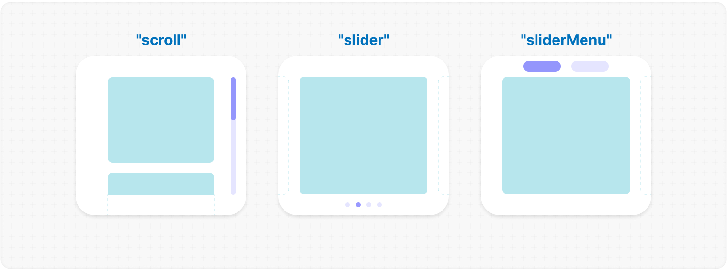
<b>Type:</b> "scroll" | "slider" | "sliderMenu"<br />
|
|
115
|
+
<br />
|
|
116
|
+
<b>Default:</b> "scroll"<br />
|
|
117
|
+
<br />
|
|
118
|
+
<b>Description:</b> <em><br />
|
|
119
|
+
This parameter defines how the provided <code>progressElement</code> behaves within <code>progressTrigger</code> and how you interact with it.<br />
|
|
120
|
+
<br />
|
|
121
|
+
<mark>scroll</mark> - This is the default value and represents a standard scrollbar.<br />
|
|
122
|
+
<br />
|
|
123
|
+
<mark>slider</mark> - It displays distinct elements indicating the number of full scroll steps within the list.<br />
|
|
124
|
+
<br />
|
|
125
|
+
<mark>sliderMenu</mark> - It behaves like a <code>slider</code>, but now the <code>progressElement</code> is a menu, an you can provide custom buttons as an array in the <code>progressElement</code>.</em><br />
|
|
126
|
+
<br />
|
|
127
|
+
<b>Example:</b>
|
|
128
|
+
|
|
129
|
+
```tsx
|
|
130
|
+
<MorphScroll {...props} type="slider">
|
|
131
|
+
{children}
|
|
132
|
+
</MorphScroll>
|
|
133
|
+
```
|
|
134
|
+
|
|
135
|
+
|
|
136
|
+
|
|
137
|
+
</div></ul></details>
|
|
138
|
+
|
|
139
|
+
<h2></h2>
|
|
140
|
+
|
|
141
|
+
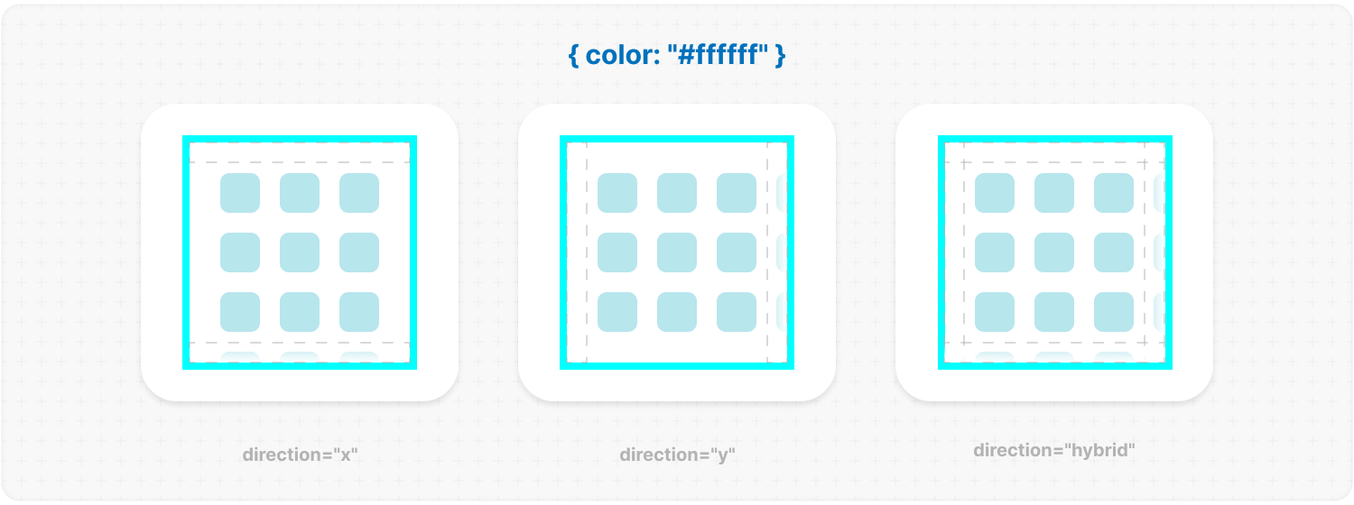
<details><summary><b><code>direction</code></b>: <em>Scrolling direction.</em></summary><br /><ul><div>
|
|
142
|
+
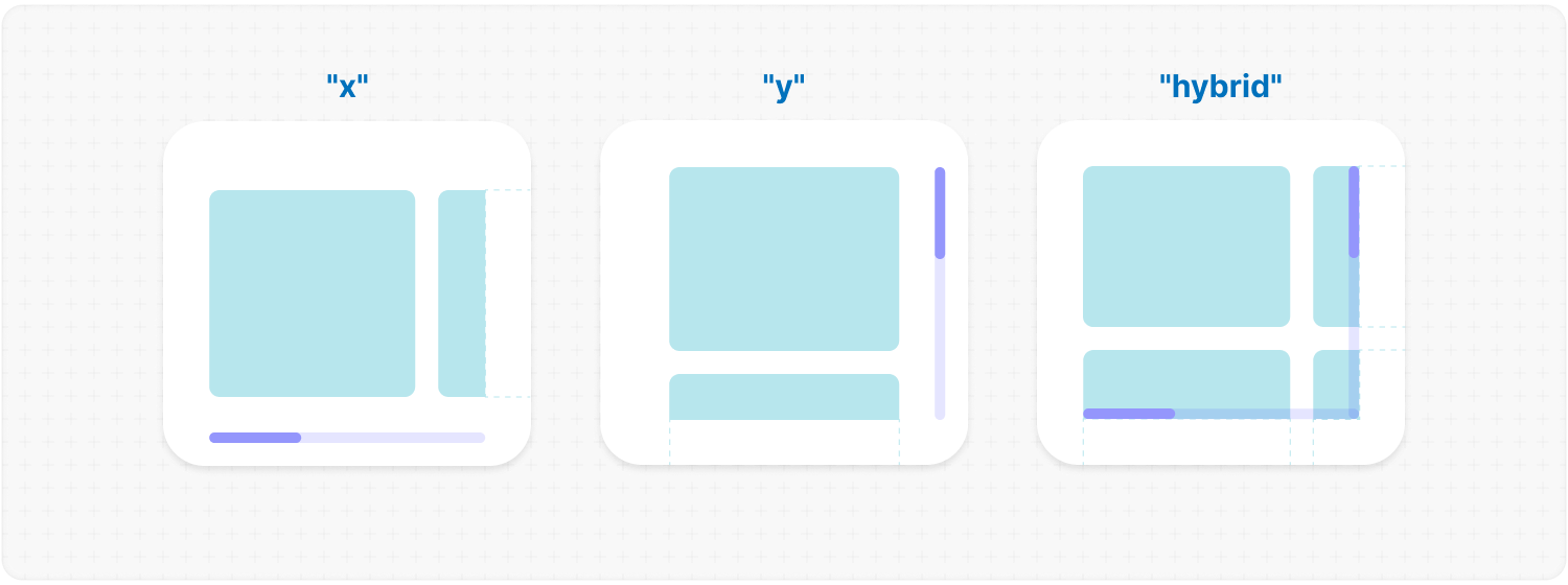
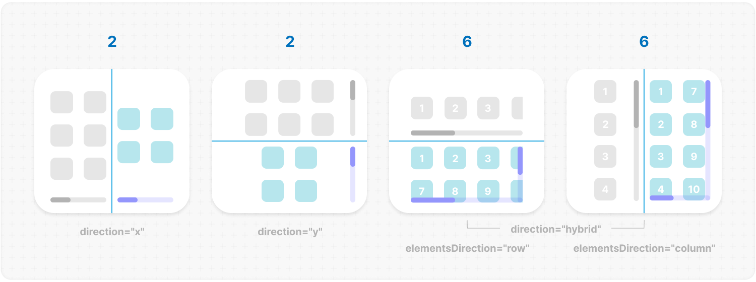
<b>Type:</b> "x" | "y" | "hybrid"<br />
|
|
143
|
+
<br />
|
|
144
|
+
<b>Default:</b> "y"<br />
|
|
145
|
+
<br />
|
|
146
|
+
<b>Description:</b> <em><br />
|
|
147
|
+
This parameter changes the scroll or slider type direction based on the provided value.<br />
|
|
148
|
+
You can set the value to horizontal, vertical or hybrid positions to customize the component according to your needs.</em><br />
|
|
149
|
+
<br />
|
|
150
|
+
<b>Example:</b>
|
|
151
|
+
|
|
152
|
+
```tsx
|
|
153
|
+
<MorphScroll {...props} direction="x">
|
|
154
|
+
{children}
|
|
155
|
+
</MorphScroll>
|
|
156
|
+
```
|
|
157
|
+
|
|
158
|
+
|
|
159
|
+
|
|
160
|
+
</div></ul></details>
|
|
161
|
+
|
|
162
|
+
<h2></h2>
|
|
163
|
+
|
|
164
|
+
<details><summary><b><code>scrollPosition</code></b>: <em>Scroll position and additional options.</em></summary><br /><ul><div>
|
|
165
|
+
<b>Type:</b> {<br />
|
|
166
|
+
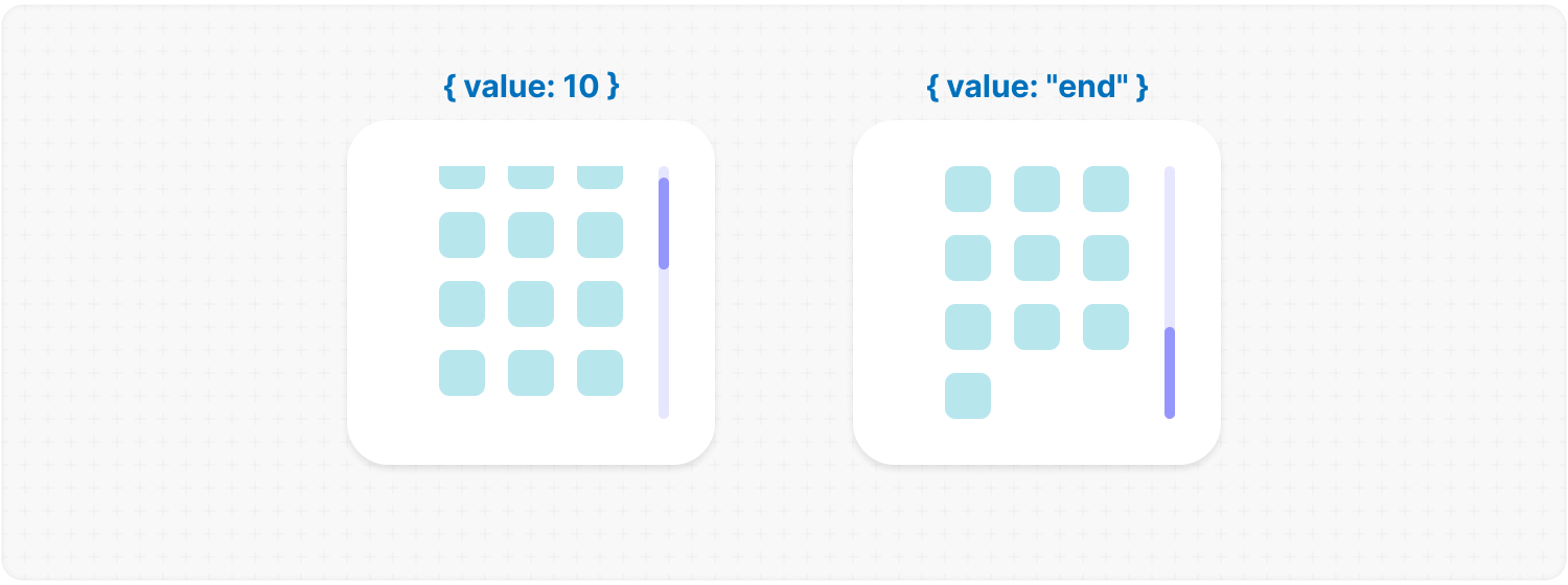
value: number | "end" | (number | "end")[];<br />
|
|
167
|
+
duration?: number;<br />
|
|
168
|
+
updater?: boolean;<br />
|
|
169
|
+
}<br />
|
|
170
|
+
<br />
|
|
171
|
+
<b>Default:</b> { duration: 200; updater: false }<br />
|
|
172
|
+
<br />
|
|
173
|
+
<b>Description:</b> <em><br />
|
|
174
|
+
This parameter allows you to set custom scroll values.<br />
|
|
175
|
+
<br />
|
|
176
|
+
<code>value</code>:<br />
|
|
177
|
+
<ul>
|
|
178
|
+
<li><mark>number</mark> - Sets the scroll position to a specific value.</li>
|
|
179
|
+
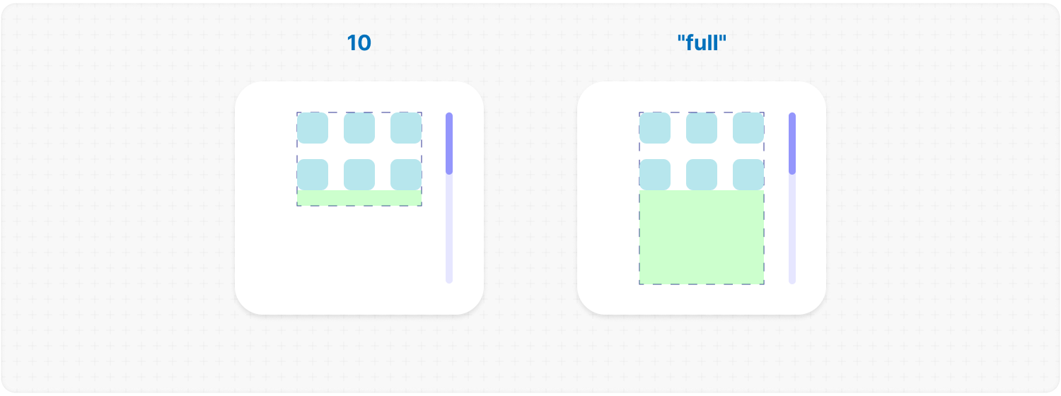
<li><mark>"end"</mark> - Scrolls to the bottom of the list upon loading, which is useful for scenarios like chat message lists. When new elements are appended to the list, the scroll position will update automatically. However, to prevent unwanted scrolling when adding elements to the beginning of the list, this property will not trigger.</li>
|
|
180
|
+
</ul>
|
|
181
|
+
You can also provide an array of two values to specific positions ( e.g., [ x, y ] axes ) for hybrid directions.</code>.<br />
|
|
182
|
+
<br />
|
|
183
|
+
<code>duration</code>:<br />
|
|
184
|
+
This property determines the animation speed for scrolling in <b>ms</b>.<br />
|
|
185
|
+
<br />
|
|
186
|
+
<code>updater</code>:<br />
|
|
187
|
+
This property is a helper for the <code>value</code> property. When setting the same scroll value repeatedly (e.g., clicking a button to scroll to the top), React does not register the update. To force an update, toggle updater within setState, e.g.,<br />
|
|
188
|
+
<code>setScroll((prev) => ({ ...prev, value: 0, updater: <b>!prev.updater</b> }))</code></em><br />
|
|
189
|
+
<br />
|
|
190
|
+
<b>Example:</b>
|
|
191
|
+
|
|
192
|
+
```tsx
|
|
193
|
+
<MorphScroll {...props}
|
|
194
|
+
scrollPosition={{ value: 100; duration: 100 }}
|
|
195
|
+
>
|
|
196
|
+
{children}
|
|
197
|
+
</MorphScroll>
|
|
198
|
+
```
|
|
199
|
+
|
|
200
|
+
|
|
201
|
+
|
|
202
|
+
</div></ul></details>
|
|
203
|
+
|
|
204
|
+
<h2></h2>
|
|
205
|
+
|
|
206
|
+
<details><summary><b><code>onScrollValue</code></b>: <em>Callback for scroll value.</em></summary><br /><ul><div>
|
|
207
|
+
<b>Type:</b> ( left: number, top: number ) => void<br />
|
|
208
|
+
<br />
|
|
209
|
+
<b>Description:</b> <em><br />
|
|
210
|
+
This parameter accepts a callback function that is triggered on every scroll event. The callback receives the current scroll top and left position as a number. The return value of the callback can be used to determine custom behavior based on the scroll value.</em><br />
|
|
211
|
+
<br />
|
|
212
|
+
<b>Example:</b>
|
|
213
|
+
|
|
214
|
+
```tsx
|
|
215
|
+
<MorphScroll {...props}
|
|
216
|
+
onScrollValue={
|
|
217
|
+
(left, top) => console.log("Scroll position:", left, top),
|
|
218
|
+
}
|
|
219
|
+
>
|
|
220
|
+
{children}
|
|
221
|
+
</MorphScroll>
|
|
222
|
+
```
|
|
223
|
+
|
|
224
|
+
</div></ul></details>
|
|
225
|
+
|
|
226
|
+
<h2></h2>
|
|
227
|
+
|
|
228
|
+
<details><summary><b><code>isScrolling</code></b>: <em>Callback function for scroll status.</em></summary><br /><ul><div>
|
|
229
|
+
<b>Type:</b> ( motion: boolean ) => void<br />
|
|
230
|
+
<br />
|
|
231
|
+
<b>Description:</b> <em><br />
|
|
232
|
+
This parameter accepts a callback function that is triggered whenever the scroll status changes. The callback receives a boolean value, where <code>true</code> indicates that scrolling is in progress, and <code>false</code> indicates that scrolling has stopped. This can be useful for triggering additional actions, such as pausing animations or loading indicators based on the scroll state.</em><br />
|
|
233
|
+
<br />
|
|
234
|
+
<b>Example:</b>
|
|
235
|
+
|
|
236
|
+
```tsx
|
|
237
|
+
<MorphScroll
|
|
238
|
+
{...props}
|
|
239
|
+
isScrolling={(motion) => {
|
|
240
|
+
console.log(motion ? "Scrolling..." : "Scroll stopped.");
|
|
241
|
+
}}
|
|
242
|
+
>
|
|
243
|
+
{children}
|
|
244
|
+
</MorphScroll>
|
|
245
|
+
```
|
|
246
|
+
|
|
247
|
+
</div></ul></details>
|
|
248
|
+
|
|
249
|
+
<h2></h2>
|
|
250
|
+
|
|
251
|
+
##### **VISUAL SETTINGS**:
|
|
252
|
+
|
|
253
|
+
<details><summary><b><code>size</code> REQUIRED</b>: <em>[width, height] dimension of <b>MorphScroll</b>.</em></summary><br /><ul><div>
|
|
254
|
+
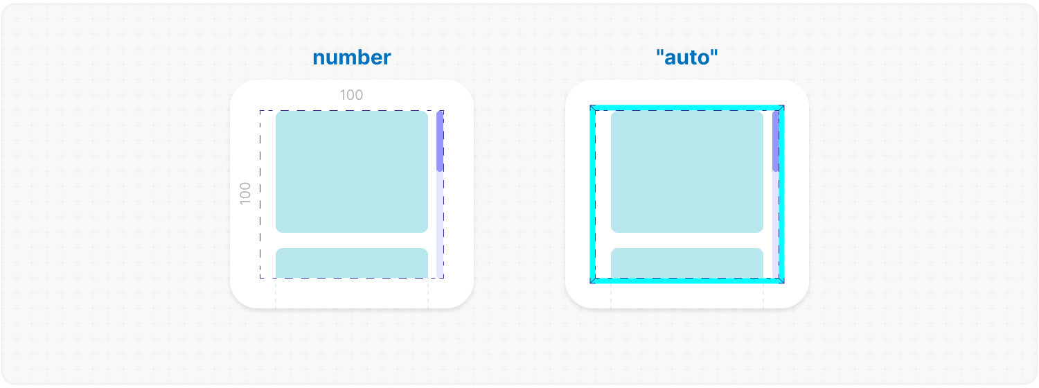
<b>Type:</b><br /> number | number[] | "auto"<br />
|
|
255
|
+
<br />
|
|
256
|
+
<b>Description:</b> <em><br />
|
|
257
|
+
This parameter sets the width and height of the <code>MorphScroll</code>.<br />
|
|
258
|
+
<br />
|
|
259
|
+
<mark>number</mark> - Sets a fixed size in pixels. It can be 1 number if you want to set the same width and height, or an array of 2 numbers.<br />
|
|
260
|
+
<br />
|
|
261
|
+
<mark>"auto"</mark> - Adds the <code>ResizeTracker</code> component to measure the width and height of the area where <code>MorphScroll</code> is added. The dimensions will automatically adjust when the container changes.</em><br />
|
|
262
|
+
<br />
|
|
263
|
+
<b>Example:</b>
|
|
264
|
+
|
|
265
|
+
```tsx
|
|
266
|
+
<MorphScroll {...props} size={[100, 400]}>
|
|
267
|
+
{children}
|
|
268
|
+
</MorphScroll>
|
|
269
|
+
```
|
|
270
|
+
|
|
271
|
+
|
|
272
|
+
|
|
273
|
+
</div></ul></details>
|
|
274
|
+
|
|
275
|
+
<h2></h2>
|
|
276
|
+
|
|
277
|
+
<details><summary><b><code>objectsSize</code></b>: <em>[width, height] dimension of cells for each object.</em></summary><br /><ul><div>
|
|
278
|
+
<b>Type:</b><br />
|
|
279
|
+
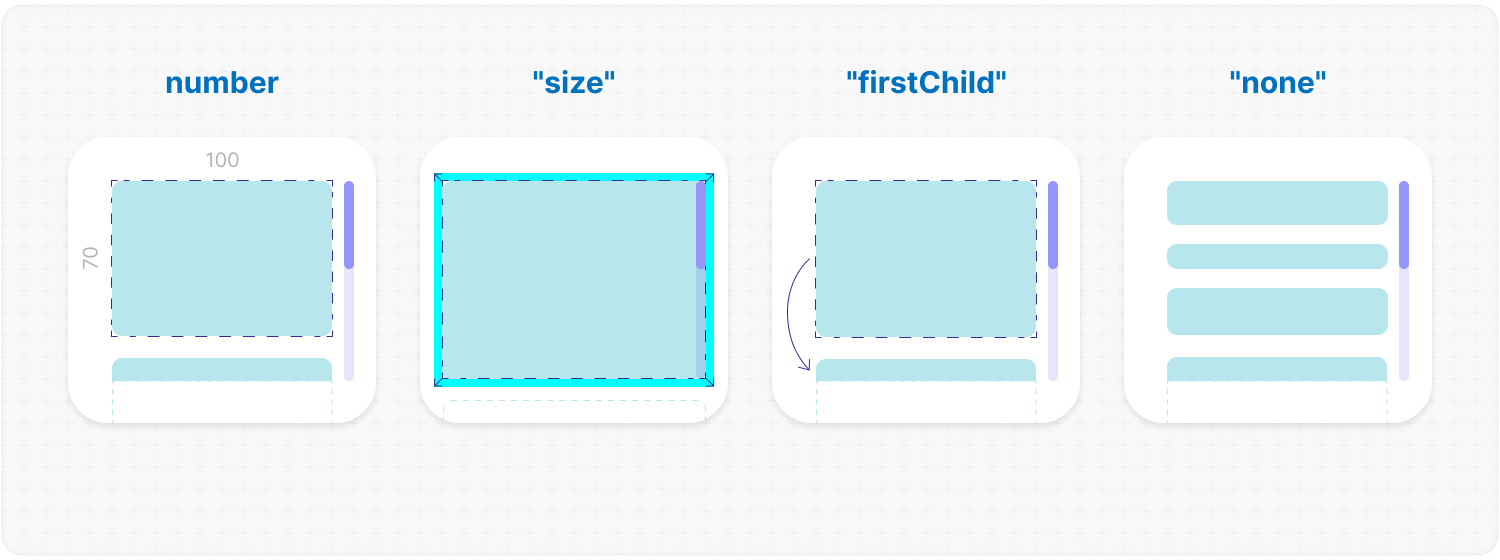
number | "size" | "firstChild" | "none"<br />
|
|
280
|
+
| (number | "size" | "firstChild" | "none")[]<br />
|
|
281
|
+
<br />
|
|
282
|
+
<b>Default:</b> If you don't provide any value, the default value will be taken from <code>size</code><br />
|
|
283
|
+
<br />
|
|
284
|
+
<b>Description:</b> <em><br />
|
|
285
|
+
This parameter defines the [width, height] of cells for each of your objects.<br />
|
|
286
|
+
<br />
|
|
287
|
+
<mark>number</mark> - Sets a fixed size for your custom objects.<br />
|
|
288
|
+
<br />
|
|
289
|
+
<mark>"size"</mark> - The dimensions will be taken from <code>size</code>.<br />
|
|
290
|
+
<br />
|
|
291
|
+
<mark>"firstChild"</mark> - Creates a <code>ResizeTracker</code> wrapper for the first child of your list. This wrapper will calculate the size of the first child, and these dimensions will be applied to all cells in the list.<br />
|
|
292
|
+
This can be useful if you want to change the size of objects in your list dynamically, e.g., when reducing the size of the user's screen.<br />
|
|
293
|
+
<br />
|
|
294
|
+
<mark>"none"</mark> - Cells will still be created, but <code>MorphScroll</code> will not calculate their sizes-they will simply wrap your objects.<br />
|
|
295
|
+
<br />
|
|
296
|
+
<mark>undefined</mark> - If no value is provided, the default behavior is partially inferred from the <code>size</code> prop:
|
|
297
|
+
<ul>
|
|
298
|
+
<li>When <code>direction="x"</code>, the height from <code>size</code> will be used, behaving as if you had passed <code>objectsSize=["size", "none"]</code>.</li>
|
|
299
|
+
<li>When <code>direction="y"</code>, the width from <code>size</code> will be used, behaving as if you had passed <code>objectsSize=["none", "size"]</code>.</li>
|
|
300
|
+
</ul>
|
|
301
|
+
<br />
|
|
302
|
+
✦ Note:<br />
|
|
303
|
+
<ul>
|
|
304
|
+
<li>All types can be used as 1 value, or an array of 2 values.</li>
|
|
305
|
+
<li><mark>"none"</mark> is not compatible with <code>render</code>.</li>
|
|
306
|
+
</ul></em><br />
|
|
307
|
+
<br />
|
|
308
|
+
<b>Example:</b>
|
|
309
|
+
|
|
310
|
+
```tsx
|
|
311
|
+
<MorphScroll {...props} objectsSize={[80, 80]}>
|
|
312
|
+
{children}
|
|
313
|
+
</MorphScroll>
|
|
314
|
+
```
|
|
315
|
+
|
|
316
|
+
|
|
317
|
+
|
|
318
|
+
</div></ul></details>
|
|
319
|
+
|
|
320
|
+
<h2></h2>
|
|
321
|
+
|
|
322
|
+
<details><summary><b><code>crossCount</code></b>: <em>Number of cells in each direction.</em></summary><br /><ul><div>
|
|
323
|
+
<b>Type:</b> number<br />
|
|
324
|
+
<br />
|
|
325
|
+
<b>Description:</b> <em><br />
|
|
326
|
+
This parameter defines the number of <b>columns</b> (<code>direction="y"</code>, <code>direction="hybrid"</code> + <code>elementsDirection="column"</code>) or <b>rows</b> (<code>direction="x"</code>, <code>direction="hybrid"</code> + <code>elementsDirection="row"</code>).<br />
|
|
327
|
+
<br />
|
|
328
|
+
✦ Note:<br />
|
|
329
|
+
<ul>
|
|
330
|
+
<li>If you use <mark>"x"</mark> or <mark>"y"</mark> for the <code>direction</code> parameter, <code>crossCount</code> only limits the <b>maximum</b> number of columns or rows.</li>
|
|
331
|
+
<li>If you use <mark>"hybrid"</mark> for the <code>direction</code> parameter, <code>crossCount</code> defines the <b>exact</b> number of columns or rows in dependence of the <code>elementsDirection</code>, but not exceeding the total number of passed elements.</li>
|
|
332
|
+
</ul></em><br />
|
|
333
|
+
<br />
|
|
334
|
+
<b>Example:</b>
|
|
335
|
+
|
|
336
|
+
```tsx
|
|
337
|
+
<MorphScroll {...props} crossCount={3}>
|
|
338
|
+
{children}
|
|
339
|
+
</MorphScroll>
|
|
340
|
+
```
|
|
341
|
+
|
|
342
|
+
|
|
343
|
+
|
|
344
|
+
</div></ul></details>
|
|
345
|
+
|
|
346
|
+
<h2></h2>
|
|
347
|
+
|
|
348
|
+
<details><summary><b><code>gap</code></b>: <em>Gap between cells.</em></summary><br /><ul><div>
|
|
349
|
+
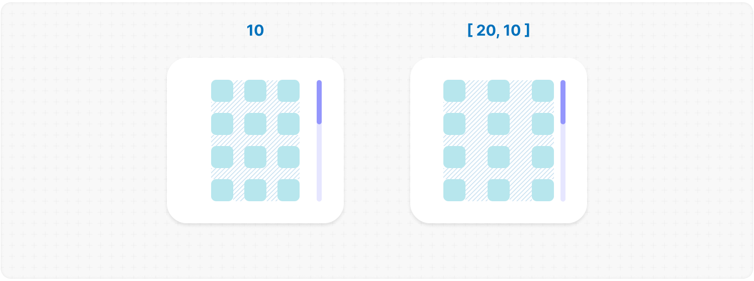
<b>Type:</b> number | number[]<br />
|
|
350
|
+
<br />
|
|
351
|
+
<b>Description:</b> <em><br />
|
|
352
|
+
This parameter allows you to set spacing in pixels between list items for rows and columns.<br />
|
|
353
|
+
<br />
|
|
354
|
+
✦ Note:<br />
|
|
355
|
+
It can be 1 number or an array of 2 numbers.</em><br />
|
|
356
|
+
<br />
|
|
357
|
+
<b>Example:</b>
|
|
358
|
+
|
|
359
|
+
```tsx
|
|
360
|
+
<MorphScroll {...props} gap={10}>
|
|
361
|
+
{children}
|
|
362
|
+
</MorphScroll>
|
|
363
|
+
```
|
|
364
|
+
|
|
365
|
+
|
|
366
|
+
|
|
367
|
+
</div></ul></details>
|
|
368
|
+
|
|
369
|
+
<h2></h2>
|
|
370
|
+
|
|
371
|
+
<details><summary><b><code>wrapperMargin</code></b>: <em>Margin for the <b>.ms-objects-wrapper</b>.</em></summary><br /><ul><div>
|
|
372
|
+
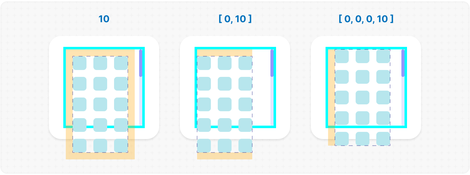
<b>Type:</b> number | number[]<br />
|
|
373
|
+
<br />
|
|
374
|
+
<b>Description:</b> <em><br />
|
|
375
|
+
This parameter defines the spacing between the list items and their wrapper, effectively increasing the width or height of the scrollable area.<br />
|
|
376
|
+
<br />
|
|
377
|
+
✦ Note:<br />
|
|
378
|
+
Can be 1 number or an array of 2 or 4 numbers in pixels.</em><br />
|
|
379
|
+
<br />
|
|
380
|
+
<b>Example:</b>
|
|
381
|
+
|
|
382
|
+
```tsx
|
|
383
|
+
<MorphScroll {...props} wrapperMargin={10}>
|
|
384
|
+
{children}
|
|
385
|
+
</MorphScroll>
|
|
386
|
+
```
|
|
387
|
+
|
|
388
|
+
|
|
389
|
+
|
|
390
|
+
</div></ul></details>
|
|
391
|
+
|
|
392
|
+
<h2></h2>
|
|
393
|
+
|
|
394
|
+
<details><summary><b><code>wrapperMinSize</code></b>: <em>Minimum height or width of the <b>.ms-objects-wrapper</b>.</em></summary><br /><ul><div>
|
|
395
|
+
<b>Type:</b> number | "full" | (number | "full")[]<br /><br />
|
|
396
|
+
<b>Description:</b> <em><br />
|
|
397
|
+
This parameter defines the minimum height or width of the <b>.ms-objects-wrapper</b>, to which CSS properties like <code>min-height</code> or <code>min-width</code> will be applied.<br />
|
|
398
|
+
<br />
|
|
399
|
+
✦ Note:<br />
|
|
400
|
+
Can be used as 1 value, or an array of 2 values.</em><br />
|
|
401
|
+
<br />
|
|
402
|
+
<b>Example:</b>
|
|
403
|
+
|
|
404
|
+
```tsx
|
|
405
|
+
<MorphScroll {...props} wrapperMinSize={"full"}>
|
|
406
|
+
{children}
|
|
407
|
+
</MorphScroll>
|
|
408
|
+
```
|
|
409
|
+
|
|
410
|
+
|
|
411
|
+
|
|
412
|
+
</div></ul></details>
|
|
413
|
+
|
|
414
|
+
<h2></h2>
|
|
415
|
+
|
|
416
|
+
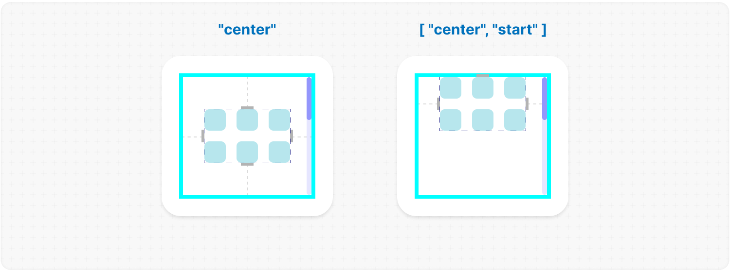
<details><summary><b><code>wrapperAlign</code></b>: <em>[horizontal, vertical] aligns your content when it is smaller than the <code>size</code>.</em></summary><br /><ul><div>
|
|
417
|
+
<b>Type:</b><br />
|
|
418
|
+
"start" | "center" | "end"<br />
|
|
419
|
+
| ("start" | "center" | "end")[]<br />
|
|
420
|
+
<br />
|
|
421
|
+
<b>Description:</b> <em><br />
|
|
422
|
+
This parameter aligns the <b>.ms-objects-wrapper</b>, which contains all the provided elements, relative to the scroll or the <code>size</code>.<br />
|
|
423
|
+
<br />
|
|
424
|
+
✦ Note:<br />
|
|
425
|
+
Use 1 value to align one or both axes, or an array of 2 values to align both axes.</em><br />
|
|
426
|
+
<br />
|
|
427
|
+
<b>Example:</b>
|
|
428
|
+
|
|
429
|
+
```tsx
|
|
430
|
+
<MorphScroll {...props} wrapperAlign={["center", "center"]}>
|
|
431
|
+
{children}
|
|
432
|
+
</MorphScroll>
|
|
433
|
+
```
|
|
434
|
+
|
|
435
|
+
|
|
436
|
+
|
|
437
|
+
</div></ul></details>
|
|
438
|
+
|
|
439
|
+
<h2></h2>
|
|
440
|
+
|
|
441
|
+
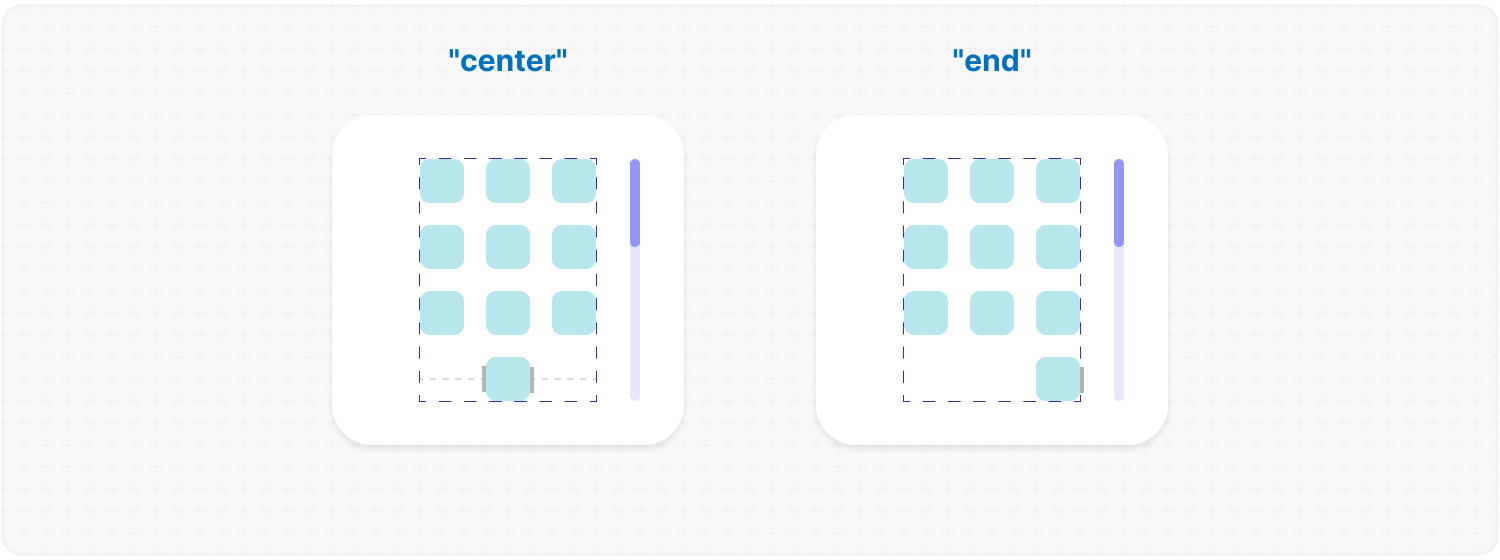
<details><summary><b><code>elementsAlign</code></b>: <em>Aligns the objects inside <code>MorphScroll</code>.</em></summary><br /><ul><div>
|
|
442
|
+
<b>Type:</b> "start" | "center" | "end"<br />
|
|
443
|
+
<br />
|
|
444
|
+
<b>Example:</b>
|
|
445
|
+
|
|
446
|
+
```tsx
|
|
447
|
+
<MorphScroll {...props} elementsAlign="center">
|
|
448
|
+
{children}
|
|
449
|
+
</MorphScroll>
|
|
450
|
+
```
|
|
451
|
+
|
|
452
|
+
|
|
453
|
+
|
|
454
|
+
</div></ul></details>
|
|
455
|
+
|
|
456
|
+
<h2></h2>
|
|
457
|
+
|
|
458
|
+
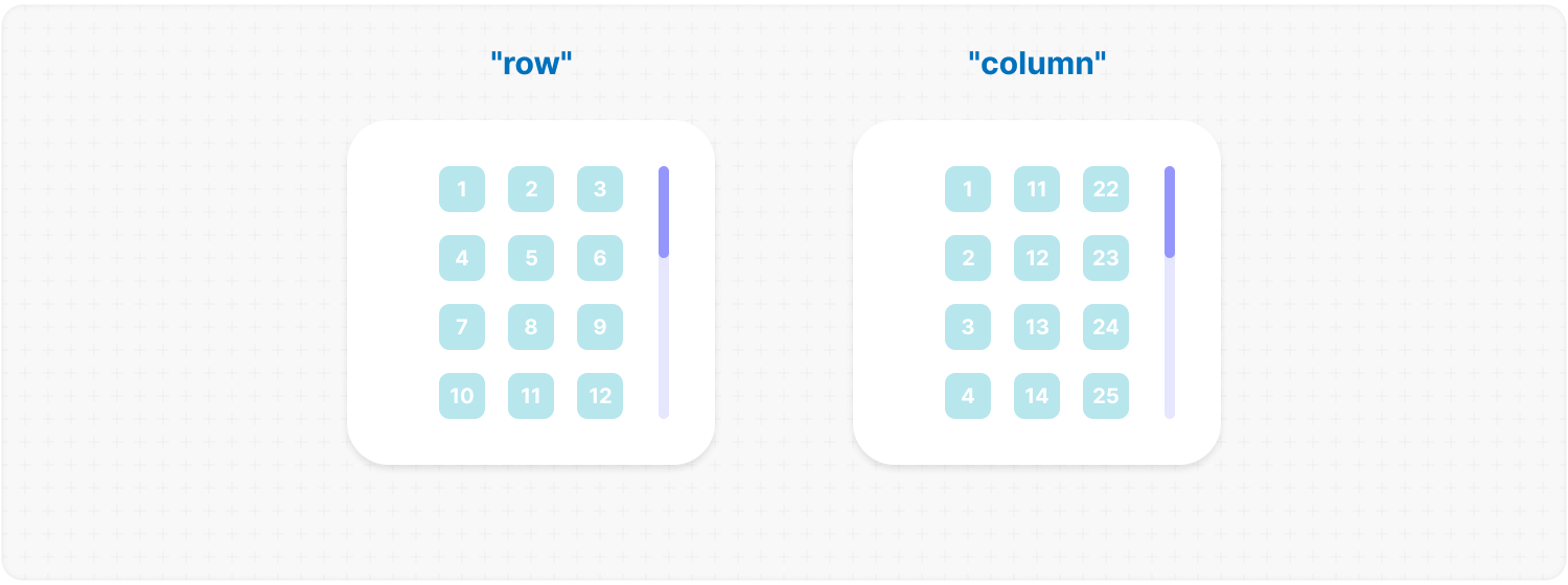
<details><summary><b><code>elementsDirection</code></b>: <em>Direction of the provided elements.</em></summary><br /><ul><div>
|
|
459
|
+
<b>Type:</b> "row" | "column"<br />
|
|
460
|
+
<br />
|
|
461
|
+
<b>Default:</b> "row"<br />
|
|
462
|
+
<br />
|
|
463
|
+
<b>Description:</b> <em><br />
|
|
464
|
+
This parameter changes the order of the provided elements based on the provided value.</em><br />
|
|
465
|
+
<br />
|
|
466
|
+
<b>Example:</b>
|
|
467
|
+
|
|
468
|
+
```tsx
|
|
469
|
+
<MorphScroll {...props} elementsDirection="column">
|
|
470
|
+
{children}
|
|
471
|
+
</MorphScroll>
|
|
472
|
+
```
|
|
473
|
+
|
|
474
|
+
|
|
475
|
+
|
|
476
|
+
</div></ul></details>
|
|
477
|
+
|
|
478
|
+
<h2></h2>
|
|
479
|
+
|
|
480
|
+
<details><summary><b><code>edgeGradient</code></b>: <em>Gradient overlay at the edges of the scroll area.</em></summary><br /><ul><div>
|
|
481
|
+
<b>Type:</b> boolean | { color?: string; size?: number }<br />
|
|
482
|
+
<br />
|
|
483
|
+
<b>Default:</b> { size: 40 }<br />
|
|
484
|
+
<br />
|
|
485
|
+
<b>Description:</b> <em><br />
|
|
486
|
+
This parameter creates two edge elements responsible for darkening the edges of the scroll when it overflows.<br />
|
|
487
|
+
<br />
|
|
488
|
+
<code>color</code> :<br />
|
|
489
|
+
The property accepts any valid color format.
|
|
490
|
+
If you provide it, the library will generate a gradient transitioning from the custom color to transparent.
|
|
491
|
+
If you provide just <mark>true</mark>, the edge elements will have no color, allowing for custom styling via CSS classes.<br />
|
|
492
|
+
<br />
|
|
493
|
+
<code>size</code> :<br />
|
|
494
|
+
The property changes the height for horizontal and width for vertical <b>.ms-edge</b>.</em><br />
|
|
495
|
+
<br />
|
|
496
|
+
<b>Example:</b>
|
|
497
|
+
|
|
498
|
+
```tsx
|
|
499
|
+
<MorphScroll
|
|
500
|
+
{...props}
|
|
501
|
+
edgeGradient={{ color: "rgba(0, 0, 0, 0.5)", size: 60 }}
|
|
502
|
+
>
|
|
503
|
+
{children}
|
|
504
|
+
</MorphScroll>
|
|
505
|
+
```
|
|
506
|
+
|
|
507
|
+
|
|
508
|
+
|
|
509
|
+
</div></ul></details>
|
|
510
|
+
|
|
511
|
+
<h2></h2>
|
|
512
|
+
|
|
513
|
+
##### **PROGRESSBAR**:
|
|
514
|
+
|
|
515
|
+
<details><summary><b><code>progressTrigger</code></b>: <em>Triggers for the scroll progress.</em></summary><br /><ul><div>
|
|
516
|
+
<b>Type:</b> {<br />
|
|
517
|
+
wheel?: boolean;<br />
|
|
518
|
+
content?: boolean;<br />
|
|
519
|
+
progressElement?: boolean | React.ReactNode | React.ReactNode[];<br />
|
|
520
|
+
arrows?: boolean | { size?: number; element?: React.ReactNode };<br />
|
|
521
|
+
}<br />
|
|
522
|
+
<br />
|
|
523
|
+
<b>Default:</b> { wheel: true }<br />
|
|
524
|
+
<br />
|
|
525
|
+
<b>Description:</b> <em><br />
|
|
526
|
+
This is one of the most important properties, allowing you to define how users interact with the progress bar and customize its appearance.<br />
|
|
527
|
+
<br />
|
|
528
|
+
<code>wheel</code> :<br />
|
|
529
|
+
This parameter determines whether the progress bar responds to mouse wheel scrolling.<br />
|
|
530
|
+
<br />
|
|
531
|
+
<code>content</code> :<br />
|
|
532
|
+
This parameter enables interaction by clicking and dragging anywhere within the scrollable content to move it.<br />
|
|
533
|
+
<br />
|
|
534
|
+
<code>progressElement</code> :<br />
|
|
535
|
+
This parameter determines how the scroll progress is managed.<br />
|
|
536
|
+
<br />
|
|
537
|
+
<ul>
|
|
538
|
+
<li>When using <code>type="scroll"</code>, you can provide a custom scroll element. If it's not ready yet, simply set <mark>true</mark> instead — this will fall back to the browser’s default scrollbar.</li>
|
|
539
|
+
<li>When using <code>type="slider"</code>, a <b>.ms-slider</b> element is automatically generated. It contains multiple <b>sliderElem</b> elements that visually represent the scroll progress. One of them will always have the <code>active</code> class depending on the current position.</li>
|
|
540
|
+
<li>When using <code>type="sliderMenu"</code>, everything is the same as with <mark>"slider"</mark> but you can pass an array of custom buttons to <code>progressElement</code>. These buttons act as a navigation menu, allowing users to jump to specific sections.</li>
|
|
541
|
+
</ul>
|
|
542
|
+
<br />
|
|
543
|
+
<code>arrows</code> :<br />
|
|
544
|
+
This parameter allows you to add custom arrows to the progress bar. You can either specify a <code>size</code> for the arrows and provide a custom element.<br />
|
|
545
|
+
<br />
|
|
546
|
+
✦ Note:<br />
|
|
547
|
+
<code>progressTrigger</code> can only create or provide your elements, but you must make the design for them yourself.</em><br />
|
|
548
|
+
<br />
|
|
549
|
+
<b>Example:</b>
|
|
550
|
+
|
|
551
|
+
```tsx
|
|
552
|
+
<MorphScroll
|
|
553
|
+
{...props}
|
|
554
|
+
progressTrigger={{
|
|
555
|
+
wheel: true,
|
|
556
|
+
progressElement: <div className="your-scroll-thumb" />,
|
|
557
|
+
}}
|
|
558
|
+
>
|
|
559
|
+
{children}
|
|
560
|
+
</MorphScroll>
|
|
561
|
+
```
|
|
562
|
+
|
|
563
|
+
</div></ul></details>
|
|
564
|
+
|
|
565
|
+
<h2></h2>
|
|
566
|
+
|
|
567
|
+
<details><summary><b><code>progressReverse</code></b>: <em>Reverse the progress bar position.</em></summary><br /><ul><div>
|
|
568
|
+
<b>Type:</b> boolean | boolean[]<br />
|
|
569
|
+
<br />
|
|
570
|
+
<b>Default:</b> false<br />
|
|
571
|
+
<br />
|
|
572
|
+
<b>Description:</b> <em><br />
|
|
573
|
+
This parameter changes the position of the progress bar based on the direction property.<br />
|
|
574
|
+
<br />
|
|
575
|
+
<ul>
|
|
576
|
+
<li>If <code>direction="x"</code>, the progress bar appears on the left by default and moves to the right when set to <mark>true</mark>.</li>
|
|
577
|
+
<li>If <code>direction="y"</code>, the progress bar appears at the bottom by default and moves to the top when set to <mark>true</mark>.</li>
|
|
578
|
+
<li>If <code>direction="hybrid"</code>, both horizontal and vertical progress bars are used with the same logic as above. And in this case, you can also pass an array of booleans to control each bar individually.</li>
|
|
579
|
+
</ul></em><br />
|
|
580
|
+
<br />
|
|
581
|
+
<b>Example:</b>
|
|
582
|
+
|
|
583
|
+
```tsx
|
|
584
|
+
<MorphScroll {...props} progressReverse>
|
|
585
|
+
{children}
|
|
586
|
+
</MorphScroll>
|
|
587
|
+
```
|
|
588
|
+
|
|
589
|
+
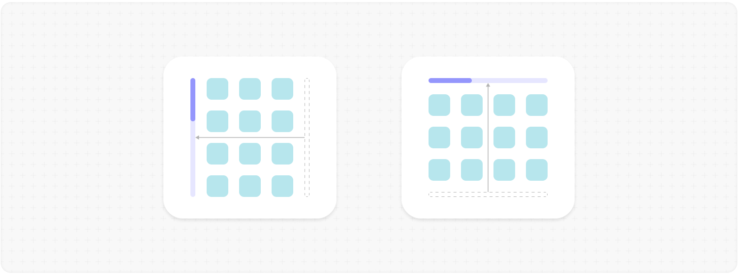
|
|
590
|
+
|
|
591
|
+
</div></ul></details>
|
|
592
|
+
|
|
593
|
+
<h2></h2>
|
|
594
|
+
|
|
595
|
+
<details><summary><b><code>scrollBarOnHover</code></b>: <em>Hover visibility of the <b>progress bar</b>.</em></summary><br /><ul><div>
|
|
596
|
+
<b>Type:</b> boolean<br />
|
|
597
|
+
<br />
|
|
598
|
+
<b>Default:</b> false<br />
|
|
599
|
+
<br />
|
|
600
|
+
<b>Description:</b> <em><br />
|
|
601
|
+
This parameter controls the visibility of the progress bar regardless of the <code>type</code> value.<br />
|
|
602
|
+
When you use it, the <b>"hover"</b> class is applied to the <b>.ms-bar</b> when the cursor is over it (or the finger touches it on touchscreens), and <b>"leave"</b> is applied when it is no longer hovered. This allows you to easily customize its appearance on interaction.</em><br />
|
|
603
|
+
<br />
|
|
604
|
+
<b>Example:</b>
|
|
605
|
+
|
|
606
|
+
```tsx
|
|
607
|
+
<MorphScroll {...props} scrollBarOnHover>
|
|
608
|
+
{children}
|
|
609
|
+
</MorphScroll>
|
|
610
|
+
```
|
|
611
|
+
|
|
612
|
+
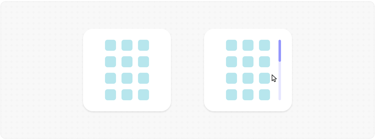
|
|
613
|
+
|
|
614
|
+
</div></ul></details>
|
|
615
|
+
|
|
616
|
+
<h2></h2>
|
|
617
|
+
|
|
618
|
+
##### **OPTIMIZATIONS**:
|
|
619
|
+
|
|
620
|
+
<details><summary><b><code>render</code></b>: <em>Rendering strategy for performance optimization.</em></summary><br /><ul><div>
|
|
621
|
+
<b>Type:</b> {<br />
|
|
622
|
+
type: "lazy" | "virtual";<br />
|
|
623
|
+
rootMargin?: number | number[];<br />
|
|
624
|
+
stopLoadOnScroll?: boolean;<br />
|
|
625
|
+
}<br />
|
|
626
|
+
<br />
|
|
627
|
+
<b>Description:</b> <em><br />
|
|
628
|
+
This parameter adds a gradual rendering of the content as it enters the viewport.<br />
|
|
629
|
+
When used, a container is created for each scrollable object, and its absolute positioning is calculated based on scroll position and area dimensions.<br />
|
|
630
|
+
<br />
|
|
631
|
+
<code>type</code>:<br />
|
|
632
|
+
<ul>
|
|
633
|
+
<li>With <mark>"lazy"</mark>, content is not deleted when it leaves the viewport.</li>
|
|
634
|
+
<li>With <mark>"virtual"</mark>, content is deleted when it leaves the viewport.</li>
|
|
635
|
+
</ul>
|
|
636
|
+
<br />
|
|
637
|
+
<code>rootMargin</code>:<br />
|
|
638
|
+
This property controls the threshold for loading content. It can be a single number or an array of 2 <b>[ top-bottom, left-right ]</b> or 4 <b>[ top, right, bottom, left ]</b> numbers. It is the distance for loading from the root element ( <b>.ms-element</b> ) in pixels.<br />
|
|
639
|
+
<br />
|
|
640
|
+
<code>stopLoadOnScroll</code>:<br />
|
|
641
|
+
This property controls whether to stop loading content when scrolling.<br />
|
|
642
|
+
<br />
|
|
643
|
+
✦ Note:<br />
|
|
644
|
+
<code>render</code> is not compatible with <code>objectsSize: "none"</code>.</em><br />
|
|
645
|
+
<br />
|
|
646
|
+
<b>Example:</b>
|
|
647
|
+
|
|
648
|
+
```tsx
|
|
649
|
+
<MorphScroll {...props} render={{ type: "virtual" }}>
|
|
650
|
+
{children}
|
|
651
|
+
</MorphScroll>
|
|
652
|
+
```
|
|
653
|
+
|
|
654
|
+
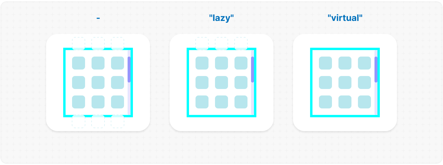
|
|
655
|
+
|
|
656
|
+
</div></ul></details>
|
|
657
|
+
|
|
658
|
+
<h2></h2>
|
|
659
|
+
|
|
660
|
+
<details><summary><b><code>emptyElements</code></b>: <em>Handling of empty scroll elements.</em></summary><br /><ul><div>
|
|
661
|
+
<b>Type:</b> {<br />
|
|
662
|
+
mode: "clear" | "fallback" | { fallback: React.ReactNode };<br />
|
|
663
|
+
clickTrigger?: { selector: string; delay?: number };<br />
|
|
664
|
+
}<br />
|
|
665
|
+
<br />
|
|
666
|
+
<b>Description:</b> <em><br />
|
|
667
|
+
This option will allow you to delete or replace empty list items during the first rendering, or to start this process by clicking.<br />
|
|
668
|
+
<br />
|
|
669
|
+
<code>mode</code> :<br />
|
|
670
|
+
<ul>
|
|
671
|
+
<li><mark>"clear"</mark> – automatically removes empty elements.</li>
|
|
672
|
+
<li><mark>"fallback"</mark> – replaces empty elements with the value from the <code>fallback</code> props.</li>
|
|
673
|
+
<li><mark>{ fallback: React.ReactNode }</mark> – if you need a different element than in <code>fallback</code> to replace empty elements, you can use this option.</li>
|
|
674
|
+
</ul>
|
|
675
|
+
<br />
|
|
676
|
+
<code>clickTrigger</code> :<br />
|
|
677
|
+
In case if elements are removed via a click action, use this option. It accepts an object with a <code>selector</code> ( such as a delete button’s class ) and <code>delay</code> ( in <b>ms</b> ) to wait before removing the elements.<br />
|
|
678
|
+
<br />
|
|
679
|
+
✦ Note:<br />
|
|
680
|
+
<ul>
|
|
681
|
+
<li>The cleanup will start on the initial render, when the number of passed elements changes, on scroll and on click if you use <code>clickTrigger</code>.</li>
|
|
682
|
+
<li>If you are using <code>clickTrigger</code> but there are no changes, you may need to increase the <code>delay</code> value, since the cleanup function is triggered when your item has not yet been deleted.</li>
|
|
683
|
+
</ul></em>
|
|
684
|
+
<br />
|
|
685
|
+
<b>Example:</b>
|
|
686
|
+
|
|
687
|
+
```tsx
|
|
688
|
+
<MorphScroll
|
|
689
|
+
{...props}
|
|
690
|
+
emptyElements={{
|
|
691
|
+
mode: "clear",
|
|
692
|
+
clickTrigger: { selector: ".close-button" },
|
|
693
|
+
}}
|
|
694
|
+
>
|
|
695
|
+
{children}
|
|
696
|
+
</MorphScroll>
|
|
697
|
+
```
|
|
698
|
+
|
|
699
|
+
|
|
700
|
+
|
|
701
|
+
</div></ul></details>
|
|
702
|
+
|
|
703
|
+
<h2></h2>
|
|
704
|
+
|
|
705
|
+
<details><summary><b><code>suspending</code></b>: <em>Adds React Suspense.</em></summary><br /><ul><div>
|
|
706
|
+
<b>Type:</b> boolean<br />
|
|
707
|
+
<br />
|
|
708
|
+
<b>Default:</b> false<br />
|
|
709
|
+
<br />
|
|
710
|
+
<b>Description:</b> <em><br />
|
|
711
|
+
This parameter adds React Suspense to the MorphScroll component for asynchronous rendering.</em><br />
|
|
712
|
+
<br />
|
|
713
|
+
<b>Example:</b>
|
|
714
|
+
|
|
715
|
+
```tsx
|
|
716
|
+
<MorphScroll {...props} suspending>
|
|
717
|
+
{children}
|
|
718
|
+
</MorphScroll>
|
|
719
|
+
```
|
|
720
|
+
|
|
721
|
+
</div></ul></details>
|
|
722
|
+
|
|
723
|
+
<h2></h2>
|
|
724
|
+
|
|
725
|
+
<details><summary><b><code>fallback</code></b>: <em>Fallback element.</em></summary><br /><ul><div>
|
|
726
|
+
<b>Type:</b> React.ReactNode<br />
|
|
727
|
+
<br />
|
|
728
|
+
<b>Description:</b> <em><br />
|
|
729
|
+
This parameter sets the fallback element to display during loading or placeholder.<br />
|
|
730
|
+
It will be used when:
|
|
731
|
+
<ul>
|
|
732
|
+
<li><code>suspending</code> is set to <mark>true</mark>.</li>
|
|
733
|
+
<li><code>render.stopLoadOnScroll</code> is set to <mark>true</mark>.</li>
|
|
734
|
+
<li><code>emptyElements.mode</code> is set to <mark>"fallback"</mark>.</li>
|
|
735
|
+
</ul></em><br />
|
|
736
|
+
<br />
|
|
737
|
+
<b>Example:</b>
|
|
738
|
+
|
|
739
|
+
```tsx
|
|
740
|
+
<MorphScroll {...props} fallback={<div>Loading...</div>}>
|
|
741
|
+
{children}
|
|
742
|
+
</MorphScroll>
|
|
743
|
+
```
|
|
744
|
+
|
|
745
|
+
</div></ul></details>
|
|
746
|
+
|
|
747
|
+
</div></ul>
|
|
788
748
|
|
|
789
749
|
<h2></h2>
|
|
790
750
|
|
|
@@ -794,128 +754,104 @@ Start using the `MorphScroll` component by defining the required `size` prop. Fo
|
|
|
794
754
|
|
|
795
755
|
- #### Props:
|
|
796
756
|
|
|
797
|
-
|
|
798
|
-
|
|
799
|
-
|
|
800
|
-
|
|
801
|
-
|
|
802
|
-
|
|
803
|
-
|
|
804
|
-
|
|
805
|
-
|
|
806
|
-
|
|
807
|
-
|
|
808
|
-
|
|
809
|
-
|
|
810
|
-
|
|
811
|
-
|
|
812
|
-
|
|
813
|
-
|
|
814
|
-
|
|
815
|
-
|
|
816
|
-
|
|
817
|
-
|
|
818
|
-
|
|
819
|
-
|
|
820
|
-
|
|
821
|
-
|
|
822
|
-
|
|
823
|
-
|
|
824
|
-
|
|
825
|
-
|
|
826
|
-
|
|
827
|
-
|
|
828
|
-
|
|
829
|
-
|
|
830
|
-
|
|
831
|
-
|
|
832
|
-
|
|
833
|
-
|
|
834
|
-
|
|
835
|
-
|
|
836
|
-
|
|
837
|
-
|
|
838
|
-
|
|
839
|
-
|
|
840
|
-
|
|
841
|
-
|
|
842
|
-
|
|
843
|
-
|
|
844
|
-
|
|
845
|
-
|
|
846
|
-
|
|
847
|
-
|
|
848
|
-
|
|
849
|
-
|
|
850
|
-
|
|
851
|
-
|
|
852
|
-
|
|
853
|
-
|
|
854
|
-
|
|
855
|
-
|
|
856
|
-
|
|
857
|
-
|
|
858
|
-
|
|
859
|
-
|
|
860
|
-
|
|
861
|
-
|
|
862
|
-
|
|
863
|
-
|
|
864
|
-
|
|
865
|
-
|
|
866
|
-
|
|
867
|
-
|
|
868
|
-
|
|
869
|
-
|
|
870
|
-
|
|
871
|
-
|
|
872
|
-
|
|
873
|
-
|
|
874
|
-
|
|
875
|
-
|
|
876
|
-
|
|
877
|
-
|
|
878
|
-
|
|
879
|
-
|
|
880
|
-
|
|
881
|
-
|
|
882
|
-
|
|
883
|
-
|
|
884
|
-
|
|
885
|
-
|
|
886
|
-
|
|
887
|
-
|
|
888
|
-
|
|
889
|
-
|
|
890
|
-
|
|
891
|
-
|
|
892
|
-
|
|
893
|
-
|
|
894
|
-
|
|
895
|
-
<ul>
|
|
896
|
-
<b>Type:</b> (rect: Partial<DOMRectReadOnly>) => void<br />
|
|
897
|
-
<br />
|
|
898
|
-
<b>Description:</b><br />
|
|
899
|
-
<em>A callback function that is triggered whenever the observed element's dimensions change.<br />
|
|
900
|
-
The function receives an object containing the updated size properties.</em><br />
|
|
901
|
-
<br />
|
|
902
|
-
<b>Example:</b>
|
|
903
|
-
|
|
904
|
-
```tsx
|
|
905
|
-
<ResizeTracker
|
|
906
|
-
onResize={(rect) => {
|
|
907
|
-
console.log("New size:", rect);
|
|
908
|
-
}}
|
|
909
|
-
>
|
|
910
|
-
{children}
|
|
911
|
-
</ResizeTracker>
|
|
912
|
-
```
|
|
913
|
-
|
|
914
|
-
</ul></details>
|
|
915
|
-
|
|
916
|
-
<h2></h2>
|
|
917
|
-
|
|
918
|
-
</div>
|
|
757
|
+
<ul><div>
|
|
758
|
+
|
|
759
|
+
<details><summary><b><code>className</code></b>: <em>Additional classes.</em></summary><br /><ul><div>
|
|
760
|
+
<b>Type:</b> string<br />
|
|
761
|
+
<br />
|
|
762
|
+
<b>Description:</b> <em><br />
|
|
763
|
+
This parameter allows you to add additional classes to the component.</em><br />
|
|
764
|
+
<br />
|
|
765
|
+
<b>Example:</b>
|
|
766
|
+
|
|
767
|
+
```tsx
|
|
768
|
+
<ResizeTracker className="custom-class">{children}</ResizeTracker>
|
|
769
|
+
```
|
|
770
|
+
|
|
771
|
+
</div></ul></details>
|
|
772
|
+
|
|
773
|
+
<h2></h2>
|
|
774
|
+
|
|
775
|
+
<details><summary><b><code>children</code></b>: <em>Custom user content.</em></summary><br /><ul><div>
|
|
776
|
+
<b>Type:</b> React.ReactNode<br />
|
|
777
|
+
<br />
|
|
778
|
+
<b>Description:</b> <em><br />
|
|
779
|
+
This parameter allows you to add custom content to the component.</em><br />
|
|
780
|
+
<br />
|
|
781
|
+
<b>Example:</b>
|
|
782
|
+
|
|
783
|
+
```tsx
|
|
784
|
+
<ResizeTracker>{children}</ResizeTracker>
|
|
785
|
+
```
|
|
786
|
+
|
|
787
|
+
</div></ul></details>
|
|
788
|
+
|
|
789
|
+
<h2></h2>
|
|
790
|
+
|
|
791
|
+
<details><summary><b><code>style</code></b>: <em>Applies inline styles to the container.</em></summary><br /><ul><div>
|
|
792
|
+
<b>Type:</b> React.CSSProperties<br />
|
|
793
|
+
<br />
|
|
794
|
+
<b>Example:</b>
|
|
795
|
+
|
|
796
|
+
```tsx
|
|
797
|
+
<ResizeTracker style={{ backgroundColor: "yellow" }}>{children}</ResizeTracker>
|
|
798
|
+
```
|
|
799
|
+
|
|
800
|
+
</div></ul></details>
|
|
801
|
+
|
|
802
|
+
<h2></h2>
|
|
803
|
+
|
|
804
|
+
<details><summary><b><code>measure</code></b>: <em>Defines the measurement strategy.</em></summary><br /><ul><div>
|
|
805
|
+
<b>Type:</b> "inner" | "outer" | "all"<br />
|
|
806
|
+
<br />
|
|
807
|
+
<b>Default:</b> "inner"<br />
|
|
808
|
+
<br />
|
|
809
|
+
<b>Description:</b><br />
|
|
810
|
+
<em>This prop determines what is being measured by automatically applying inline styles that affect width and height.<br />
|
|
811
|
+
<br />
|
|
812
|
+
<ul>
|
|
813
|
+
<li><mark>"inner"</mark> sets <code>width: "max-content"</code> and <code>height: "max-content"</code>, measuring the size of child elements.</li>
|
|
814
|
+
<li><mark>"outer"</mark> measures the parent element by setting <code>minWidth: "100%"</code> and <code>minHeight: "100%"</code>.</li>
|
|
815
|
+
<li><mark>"all"</mark> value combines the styles of both <code>"inner"</code> and <code>"outer"</code>, allowing measurement of both the parent and child elements.</li>
|
|
816
|
+
</ul>
|
|
817
|
+
<br />
|
|
818
|
+
✦ Note: <br />
|
|
819
|
+
Be cautious when overriding styles via the <code>style</code> prop, as it may interfere with the styles applied by <code>measure</code>, leading to unexpected behavior.</em><br />
|
|
820
|
+
<br />
|
|
821
|
+
<b>Example:</b>
|
|
822
|
+
|
|
823
|
+
```tsx
|
|
824
|
+
<ResizeTracker measure="all">{children}</ResizeTracker>
|
|
825
|
+
```
|
|
826
|
+
|
|
827
|
+
</div></ul></details>
|
|
828
|
+
|
|
829
|
+
<h2></h2>
|
|
830
|
+
|
|
831
|
+
<details><summary><b><code>onResize</code></b>: <em>Callback triggered on size changes.</em></summary><br /><ul><div>
|
|
832
|
+
<b>Type:</b> (rect: Partial<DOMRectReadOnly>) => void<br />
|
|
833
|
+
<br />
|
|
834
|
+
<b>Description:</b><br />
|
|
835
|
+
<em>A callback function that is triggered whenever the observed element's dimensions change.<br />
|
|
836
|
+
The function receives an object containing the updated size properties.</em><br />
|
|
837
|
+
<br />
|
|
838
|
+
<b>Example:</b>
|
|
839
|
+
|
|
840
|
+
```tsx
|
|
841
|
+
<ResizeTracker
|
|
842
|
+
onResize={(rect) => {
|
|
843
|
+
console.log("New size:", rect);
|
|
844
|
+
}}
|
|
845
|
+
>
|
|
846
|
+
{children}
|
|
847
|
+
</ResizeTracker>
|
|
848
|
+
```
|
|
849
|
+
|
|
850
|
+
</div></ul></details>
|
|
851
|
+
|
|
852
|
+
<h2></h2>
|
|
853
|
+
|
|
854
|
+
</div></ul>
|
|
919
855
|
|
|
920
856
|
- #### Link:
|
|
921
857
|
|
|
@@ -929,216 +865,178 @@ Start using the `MorphScroll` component by defining the required `size` prop. Fo
|
|
|
929
865
|
|
|
930
866
|
- #### Props:
|
|
931
867
|
|
|
932
|
-
|
|
933
|
-
|
|
934
|
-
|
|
935
|
-
|
|
936
|
-
|
|
937
|
-
|
|
938
|
-
|
|
939
|
-
|
|
940
|
-
|
|
941
|
-
|
|
942
|
-
|
|
943
|
-
|
|
944
|
-
|
|
945
|
-
|
|
946
|
-
|
|
947
|
-
|
|
948
|
-
|
|
949
|
-
|
|
950
|
-
|
|
951
|
-
|
|
952
|
-
|
|
953
|
-
|
|
954
|
-
|
|
955
|
-
|
|
956
|
-
|
|
957
|
-
|
|
958
|
-
|
|
959
|
-
|
|
960
|
-
|
|
961
|
-
|
|
962
|
-
|
|
963
|
-
|
|
964
|
-
|
|
965
|
-
|
|
966
|
-
|
|
967
|
-
|
|
968
|
-
|
|
969
|
-
|
|
970
|
-
|
|
971
|
-
|
|
972
|
-
|
|
973
|
-
|
|
974
|
-
|
|
975
|
-
|
|
976
|
-
|
|
977
|
-
|
|
978
|
-
|
|
979
|
-
|
|
980
|
-
|
|
981
|
-
|
|
982
|
-
|
|
983
|
-
|
|
984
|
-
|
|
985
|
-
|
|
986
|
-
|
|
987
|
-
|
|
988
|
-
|
|
989
|
-
|
|
990
|
-
|
|
991
|
-
|
|
992
|
-
|
|
993
|
-
|
|
994
|
-
|
|
995
|
-
|
|
996
|
-
|
|
997
|
-
|
|
998
|
-
|
|
999
|
-
|
|
1000
|
-
|
|
1001
|
-
|
|
1002
|
-
|
|
1003
|
-
|
|
1004
|
-
|
|
1005
|
-
|
|
1006
|
-
|
|
1007
|
-
|
|
1008
|
-
|
|
1009
|
-
|
|
1010
|
-
|
|
1011
|
-
|
|
1012
|
-
|
|
1013
|
-
|
|
1014
|
-
|
|
1015
|
-
|
|
1016
|
-
|
|
1017
|
-
|
|
1018
|
-
|
|
1019
|
-
|
|
1020
|
-
|
|
1021
|
-
|
|
1022
|
-
|
|
1023
|
-
|
|
1024
|
-
|
|
1025
|
-
|
|
1026
|
-
|
|
1027
|
-
|
|
1028
|
-
|
|
1029
|
-
|
|
1030
|
-
|
|
1031
|
-
|
|
1032
|
-
|
|
1033
|
-
|
|
1034
|
-
|
|
1035
|
-
|
|
1036
|
-
|
|
1037
|
-
|
|
1038
|
-
|
|
1039
|
-
|
|
1040
|
-
|
|
1041
|
-
|
|
1042
|
-
|
|
1043
|
-
|
|
1044
|
-
|
|
1045
|
-
|
|
1046
|
-
|
|
1047
|
-
|
|
1048
|
-
|
|
1049
|
-
|
|
1050
|
-
|
|
1051
|
-
|
|
1052
|
-
|
|
1053
|
-
|
|
1054
|
-
|
|
1055
|
-
|
|
1056
|
-
|
|
1057
|
-
|
|
1058
|
-
|
|
1059
|
-
|
|
1060
|
-
|
|
1061
|
-
|
|
1062
|
-
|
|
1063
|
-
|
|
1064
|
-
|
|
1065
|
-
|
|
1066
|
-
|
|
1067
|
-
|
|
1068
|
-
|
|
1069
|
-
|
|
1070
|
-
|
|
1071
|
-
|
|
1072
|
-
|
|
1073
|
-
|
|
1074
|
-
|
|
1075
|
-
|
|
1076
|
-
|
|
1077
|
-
|
|
1078
|
-
|
|
1079
|
-
|
|
1080
|
-
|
|
1081
|
-
|
|
1082
|
-
|
|
1083
|
-
|
|
1084
|
-
|
|
1085
|
-
|
|
1086
|
-
|
|
1087
|
-
|
|
1088
|
-
|
|
1089
|
-
|
|
1090
|
-
|
|
1091
|
-
|
|
1092
|
-
|
|
1093
|
-
|
|
1094
|
-
|
|
1095
|
-
<h2></h2>
|
|
1096
|
-
|
|
1097
|
-
<details>
|
|
1098
|
-
<summary><b><code>onIntersection</code></b>: <em>Callback function triggered when the element becomes visible.</em></summary><br />
|
|
1099
|
-
<ul>
|
|
1100
|
-
<b>Type:</b> (entry: IntersectionObserverEntry) => void<br />
|
|
1101
|
-
<br />
|
|
1102
|
-
<b>Description:</b> <em><br />
|
|
1103
|
-
A callback function that is called when the observed element enters or leaves the viewport or the area defined by the <code>root</code> property. This can be used to load new list items for <code>MorphScroll</code>.<br />
|
|
1104
|
-
<br />
|
|
1105
|
-
✦ Note:<br />
|
|
1106
|
-
The <code>IntersectionObserverEntry</code> object provides details about the intersection state, including:<br />
|
|
1107
|
-
<ul>
|
|
1108
|
-
<li><code>boundingClientRect</code>: The bounding rectangle of the element relative to the viewport.</li>
|
|
1109
|
-
<li><code>intersectionRatio</code>: The percentage of the element that is visible in the viewport.</li>
|
|
1110
|
-
<li><code>intersectionRect</code>: The intersection rectangle between the element and the viewport.</li>
|
|
1111
|
-
<li><code>rootBounds</code>: The bounding rectangle of the root element relative to the viewport.</li>
|
|
1112
|
-
<li><code>target</code>: The observed element.</li>
|
|
1113
|
-
<li><code>time</code>: The timestamp when the intersection state changed.</li>
|
|
1114
|
-
</ul></em>
|
|
1115
|
-
<br />
|
|
1116
|
-
<b>Example:</b>
|
|
1117
|
-
|
|
1118
|
-
```tsx
|
|
1119
|
-
<IntersectionTracker
|
|
1120
|
-
onIntersection={
|
|
1121
|
-
(entry) => { if (entry.isIntersecting) loadMoreItems(); }
|
|
1122
|
-
}
|
|
1123
|
-
>
|
|
1124
|
-
{children}
|
|
1125
|
-
</IntersectionTracker>
|
|
1126
|
-
```
|
|
1127
|
-
|
|
1128
|
-
</ul></details>
|
|
1129
|
-
|
|
1130
|
-
<h2></h2>
|
|
1131
|
-
|
|
1132
|
-
</div>
|
|
868
|
+
<ul><div>
|
|
869
|
+
|
|
870
|
+
<details><summary><b><code>className</code></b>: <em>Additional classes.</em></summary><br /><ul><div>
|
|
871
|
+
<b>Type:</b> string<br />
|
|
872
|
+
<br />
|
|
873
|
+
<b>Description:</b> <em><br />
|
|
874
|
+
This parameter allows you to add additional classes to the component.</em><br />
|
|
875
|
+
<br />
|
|
876
|
+
<b>Example:</b>
|
|
877
|
+
|
|
878
|
+
```tsx
|
|
879
|
+
<IntersectionTracker className="custom-class">{children}</IntersectionTracker>
|
|
880
|
+
```
|
|
881
|
+
|
|
882
|
+
</div></ul></details>
|
|
883
|
+
|
|
884
|
+
<h2></h2>
|
|
885
|
+
|
|
886
|
+
<details><summary><b><code>children</code></b>: <em>Custom user content.</em></summary><br /><ul><div>
|
|
887
|
+
<b>Type:</b> React.ReactNode<br />
|
|
888
|
+
<br />
|
|
889
|
+
<b>Example:</b>
|
|
890
|
+
|
|
891
|
+
```tsx
|
|
892
|
+
<IntersectionTracker>{children}</IntersectionTracker>
|
|
893
|
+
```
|
|
894
|
+
|
|
895
|
+
</div></ul></details>
|
|
896
|
+
|
|
897
|
+
<h2></h2>
|
|
898
|
+
|
|
899
|
+
<details><summary><b><code>style</code></b>: <em>Applies inline styles to the container.</em></summary><br /><ul><div>
|
|
900
|
+
<b>Type:</b> React.CSSProperties<br />
|
|
901
|
+
<br />
|
|
902
|
+
<b>Example:</b>
|
|
903
|
+
|
|
904
|
+
```tsx
|
|
905
|
+
<IntersectionTracker style={{ backgroundColor: "yellow" }}>
|
|
906
|
+
{children}
|
|
907
|
+
</IntersectionTracker>
|
|
908
|
+
```
|
|
909
|
+
|
|
910
|
+
</div></ul></details>
|
|
911
|
+
|
|
912
|
+
<h2></h2>
|
|
913
|
+
|
|
914
|
+
<details><summary><b><code>root</code></b>: <em>Defines the observation area.</em></summary><br /><ul><div>
|
|
915
|
+
<b>Type:</b> Element | null<br />
|
|
916
|
+
<br />
|
|
917
|
+
<b>Default:</b> null (window)<br />
|
|
918
|
+
<br />
|
|
919
|
+
<b>Description:</b> <em><br />
|
|
920
|
+
Specifies the element that serves as the bounding box for the intersection observation.
|
|
921
|
+
If provided, it must be an ancestor of the observed element.</em><br />
|
|
922
|
+
<br />
|
|
923
|
+
<b>Example:</b>
|
|
924
|
+
|
|
925
|
+
```tsx
|
|
926
|
+
<IntersectionTracker root={document.getElementById("observer-container")}>
|
|
927
|
+
{children}
|
|
928
|
+
</IntersectionTracker>
|
|
929
|
+
```
|
|
930
|
+
|
|
931
|
+
</div></ul></details>
|
|
932
|
+
|
|
933
|
+
<h2></h2>
|
|
934
|
+
|
|
935
|
+
<details><summary><b><code>rootMargin</code></b>: <em>Sets the margin around the root element.</em></summary><br /><ul><div>
|
|
936
|
+
<b>Type:</b> number | number[]<br />
|
|
937
|
+
<br />
|
|
938
|
+
<b>Description:</b> <em><br />
|
|
939
|
+
Defines an offset around the root element, expanding or shrinking the observed area.<br />
|
|
940
|
+
<br />
|
|
941
|
+
✦ Note:<br />
|
|
942
|
+
It can be a single number or an array of 2 <b>[ top-bottom, left-right ]</b> or 4 <b>[ top, right, bottom, left ]</b> numbers.</em><br />
|
|
943
|
+
<br />
|
|
944
|
+
<b>Example:</b>
|
|
945
|
+
|
|
946
|
+
```tsx
|
|
947
|
+
<IntersectionTracker rootMargin={10}>{children}</IntersectionTracker>
|
|
948
|
+
```
|
|
949
|
+
|
|
950
|
+
</div></ul></details>
|
|
951
|
+
|
|
952
|
+
<h2></h2>
|
|
953
|
+
|
|
954
|
+
<details><summary><b><code>threshold</code></b>: <em>Defines when the callback <code>onIntersection</code> and content visibility should be triggered.</em></summary><br /><ul><div>
|
|
955
|
+
<b>Type:</b> number | number[]<br />
|
|
956
|
+
<br />
|
|
957
|
+
<b>Default:</b> 0<br />
|
|
958
|
+
<br />
|
|
959
|
+
<b>Description:</b> <em><br />
|
|
960
|
+
Specifies at what percentage of the observed element’s visibility the callback should be executed.<br />
|
|
961
|
+
<br />
|
|
962
|
+
✦ Note:<br />
|
|
963
|
+
<ul>
|
|
964
|
+
<li>A value of <code>0</code> means the callback fires when any part of the element appears, while <code>1</code> means the element must be fully visible.</li>
|
|
965
|
+
<li>An array (e.g., <code>[0, 0.5, 1]</code>) triggers the callback multiple times at different visibility levels.</li>
|
|
966
|
+
</ul></em>
|
|
967
|
+
<br />
|
|
968
|
+
<b>Example:</b>
|
|
969
|
+
|
|
970
|
+
```tsx
|
|
971
|
+
<IntersectionTracker threshold={0.5}>{children}</IntersectionTracker>
|
|
972
|
+
```
|
|
973
|
+
|
|
974
|
+
</div></ul></details>
|
|
975
|
+
|
|
976
|
+
<h2></h2>
|
|
977
|
+
|
|
978
|
+
<details><summary><b><code>visibleContent</code></b>: <em>Makes all elements always visible.</em></summary><br /><ul><div>
|
|
979
|
+
<b>Type:</b> boolean<br />
|
|
980
|
+
<br />
|
|
981
|
+
<b>Default:</b> false<br />
|
|
982
|
+
<br />
|
|
983
|
+
<b>Description:</b> <em><br />
|
|
984
|
+
If set to <mark>true</mark>, the tracked elements will always be visible, regardless of their actual intersection status.<br />
|
|
985
|
+
This is useful for testing purposes or when using the <code>onIntersection</code> callback, ensuring that it reliably triggers whenever the element enters the viewport, even if all elements are already visible.</em><br />
|
|
986
|
+
<br />
|
|
987
|
+
<b>Example:</b>
|
|
988
|
+
|
|
989
|
+
```tsx
|
|
990
|
+
<IntersectionTracker visibleContent>{children}</IntersectionTracker>
|
|
991
|
+
```
|
|
992
|
+
|
|
993
|
+
</div></ul></details>
|
|
994
|
+
|
|
995
|
+
<h2></h2>
|
|
996
|
+
|
|
997
|
+
<details><summary><b><code>onIntersection</code></b>: <em>Callback function triggered when the element becomes visible.</em></summary><br /><ul><div>
|
|
998
|
+
<b>Type:</b> (entry: IntersectionObserverEntry) => void<br />
|
|
999
|
+
<br />
|
|
1000
|
+
<b>Description:</b> <em><br />
|
|
1001
|
+
A callback function that is called when the observed element enters or leaves the viewport or the area defined by the <code>root</code> property. This can be used to load new list items for <code>MorphScroll</code>.<br />
|
|
1002
|
+
<br />
|
|
1003
|
+
✦ Note:<br />
|
|
1004
|
+
The <code>IntersectionObserverEntry</code> object provides details about the intersection state, including:<br />
|
|
1005
|
+
<ul>
|
|
1006
|
+
<li><code>boundingClientRect</code>: The bounding rectangle of the element relative to the viewport.</li>
|
|
1007
|
+
<li><code>intersectionRatio</code>: The percentage of the element that is visible in the viewport.</li>
|
|
1008
|
+
<li><code>intersectionRect</code>: The intersection rectangle between the element and the viewport.</li>
|
|
1009
|
+
<li><code>rootBounds</code>: The bounding rectangle of the root element relative to the viewport.</li>
|
|
1010
|
+
<li><code>target</code>: The observed element.</li>
|
|
1011
|
+
<li><code>time</code>: The timestamp when the intersection state changed.</li>
|
|
1012
|
+
</ul></em>
|
|
1013
|
+
<br />
|
|
1014
|
+
<b>Example:</b>
|
|
1015
|
+
|
|
1016
|
+
```tsx
|
|
1017
|
+
<IntersectionTracker
|
|
1018
|
+
onIntersection={(entry) => {
|
|
1019
|
+
if (entry.isIntersecting) loadMoreItems();
|
|
1020
|
+
}}
|
|
1021
|
+
>
|
|
1022
|
+
{children}
|
|
1023
|
+
</IntersectionTracker>
|
|
1024
|
+
```
|
|
1025
|
+
|
|
1026
|
+
</div></ul></details>
|
|
1027
|
+
|
|
1028
|
+
<h2></h2>
|
|
1029
|
+
|
|
1030
|
+
</div></ul>
|
|
1133
1031
|
|
|
1134
1032
|
- #### Link:
|
|
1135
1033
|
|
|
1136
1034
|
[IntersectionObserver](https://developer.mozilla.org/en-US/docs/Web/API/Intersection_Observer_API)
|
|
1137
1035
|
|
|
1036
|
+
</div></ul>
|
|
1037
|
+
|
|
1138
1038
|
<h2></h2>
|
|
1139
1039
|
|
|
1140
|
-
### 〈
|
|
1040
|
+
### 〈 License 〉
|
|
1141
1041
|
|
|
1142
|
-
|
|
1143
|
-
- `ResizeTracker`: Component for monitoring changes to an element’s size.
|
|
1144
|
-
- `IntersectionTracker`: Component for tracking element visibility in the viewport.
|
|
1042
|
+
[MIT](./publish/LICENSE)
|