imperijal-components 0.0.0 → 0.0.1
This diff represents the content of publicly available package versions that have been released to one of the supported registries. The information contained in this diff is provided for informational purposes only and reflects changes between package versions as they appear in their respective public registries.
- package/CUSTOMIZATION.md +191 -0
- package/DEMO.md +311 -0
- package/README.md +14 -0
- package/VERSIONING.md +156 -0
- package/apps/demo/demo.png +0 -0
- package/apps/demo/index.html +12 -0
- package/apps/demo/package.json +34 -0
- package/apps/demo/src/App.tsx +67 -0
- package/apps/demo/src/demos/DateTimePickerDemo.tsx +74 -0
- package/apps/demo/src/index.css +51 -0
- package/apps/demo/src/main.tsx +11 -0
- package/apps/demo/tsconfig.json +15 -0
- package/apps/demo/vite.config.ts +39 -0
- package/package.json +7 -9
- package/packages/date-time-picker/README.md +14 -0
- package/packages/date-time-picker/package.json +3 -2
- package/packages/date-time-picker/src/components/date-time-picker.tsx +19 -7
- package/packages/date-time-picker/src/styles.css +3 -3
- package/pnpm-workspace.yaml +1 -0
package/CUSTOMIZATION.md
ADDED
|
@@ -0,0 +1,191 @@
|
|
|
1
|
+
# Customization — `@imperijal/date-time-picker`
|
|
2
|
+
|
|
3
|
+
## Does Tailwind need to be installed?
|
|
4
|
+
|
|
5
|
+
**Yes.** This package ships **Tailwind class names** in the components — it does **not** bundle Tailwind CSS.
|
|
6
|
+
|
|
7
|
+
Your app must have:
|
|
8
|
+
|
|
9
|
+
1. **Tailwind CSS** configured (v3 or v4)
|
|
10
|
+
2. **Content scan** including the package:
|
|
11
|
+
|
|
12
|
+
```js
|
|
13
|
+
// tailwind.config (v3)
|
|
14
|
+
content: [
|
|
15
|
+
'./src/**/*.{js,ts,jsx,tsx}',
|
|
16
|
+
'./node_modules/@imperijal/date-time-picker/dist/**/*.js',
|
|
17
|
+
]
|
|
18
|
+
```
|
|
19
|
+
|
|
20
|
+
```css
|
|
21
|
+
/* globals.css (v4) */
|
|
22
|
+
@source "../node_modules/@imperijal/date-time-picker/dist/**/*.js";
|
|
23
|
+
```
|
|
24
|
+
|
|
25
|
+
3. **CSS theme variables** (`--primary`, `--border`, etc.) — either from shadcn/ui or:
|
|
26
|
+
|
|
27
|
+
```css
|
|
28
|
+
@import '@imperijal/date-time-picker/styles.css';
|
|
29
|
+
```
|
|
30
|
+
|
|
31
|
+
4. **Peer dependencies** installed (see package README)
|
|
32
|
+
|
|
33
|
+
Without Tailwind + theme variables, the component renders **unstyled / empty-looking**.
|
|
34
|
+
|
|
35
|
+
---
|
|
36
|
+
|
|
37
|
+
## Customization via props
|
|
38
|
+
|
|
39
|
+
You customize with **props** (pass Tailwind classes as strings). You do **not** install Tailwind inside the package itself.
|
|
40
|
+
|
|
41
|
+
### `className` — trigger button
|
|
42
|
+
|
|
43
|
+
```tsx
|
|
44
|
+
<DateTimePicker
|
|
45
|
+
value={value}
|
|
46
|
+
onChange={setValue}
|
|
47
|
+
className="mt-2 border-slate-200 bg-white shadow-sm focus-visible:ring-indigo-400"
|
|
48
|
+
/>
|
|
49
|
+
```
|
|
50
|
+
|
|
51
|
+
### `popoverClassName` — popover panel
|
|
52
|
+
|
|
53
|
+
```tsx
|
|
54
|
+
<DateTimePicker
|
|
55
|
+
value={value}
|
|
56
|
+
onChange={setValue}
|
|
57
|
+
popoverClassName="border-2 border-indigo-200 shadow-xl"
|
|
58
|
+
/>
|
|
59
|
+
```
|
|
60
|
+
|
|
61
|
+
### `contentClassName` — inner picker (date chips + time grid)
|
|
62
|
+
|
|
63
|
+
```tsx
|
|
64
|
+
<DateTimePicker
|
|
65
|
+
value={value}
|
|
66
|
+
onChange={setValue}
|
|
67
|
+
contentClassName="text-sm"
|
|
68
|
+
/>
|
|
69
|
+
```
|
|
70
|
+
|
|
71
|
+
### `size` — preset trigger size
|
|
72
|
+
|
|
73
|
+
```tsx
|
|
74
|
+
<DateTimePicker size="sm" ... /> // compact (delivery rows)
|
|
75
|
+
<DateTimePicker size="default" ... />
|
|
76
|
+
```
|
|
77
|
+
|
|
78
|
+
### `placeholder`
|
|
79
|
+
|
|
80
|
+
```tsx
|
|
81
|
+
<DateTimePicker placeholder="Pick deadline" ... />
|
|
82
|
+
```
|
|
83
|
+
|
|
84
|
+
### `disabled`
|
|
85
|
+
|
|
86
|
+
```tsx
|
|
87
|
+
<DateTimePicker disabled ... />
|
|
88
|
+
```
|
|
89
|
+
|
|
90
|
+
### `align` — popover position
|
|
91
|
+
|
|
92
|
+
```tsx
|
|
93
|
+
<DateTimePicker align="start" ... /> // default
|
|
94
|
+
<DateTimePicker align="center" ... />
|
|
95
|
+
<DateTimePicker align="end" ... />
|
|
96
|
+
```
|
|
97
|
+
|
|
98
|
+
### `timeSlots` — time range & interval
|
|
99
|
+
|
|
100
|
+
```tsx
|
|
101
|
+
<DateTimePicker
|
|
102
|
+
timeSlots={{
|
|
103
|
+
startHour: 5, // 05:00 first slot
|
|
104
|
+
endHour: 24, // up to 23:30 (exclusive end)
|
|
105
|
+
intervalMinutes: 30, // 30 min steps
|
|
106
|
+
}}
|
|
107
|
+
/>
|
|
108
|
+
```
|
|
109
|
+
|
|
110
|
+
Examples:
|
|
111
|
+
|
|
112
|
+
| Config | Result |
|
|
113
|
+
|--------|--------|
|
|
114
|
+
| Default | 05:00–23:30 every 30 min |
|
|
115
|
+
| `{ startHour: 9, endHour: 18 }` | Business hours |
|
|
116
|
+
| `{ intervalMinutes: 15 }` | 15-minute slots |
|
|
117
|
+
|
|
118
|
+
---
|
|
119
|
+
|
|
120
|
+
## Customization via CSS variables (global theme)
|
|
121
|
+
|
|
122
|
+
Override colors for **all** pickers in your app:
|
|
123
|
+
|
|
124
|
+
```css
|
|
125
|
+
:root {
|
|
126
|
+
--primary: #9810fa;
|
|
127
|
+
--primary-foreground: #ffffff;
|
|
128
|
+
--border: #e2e8f0;
|
|
129
|
+
--accent: #f1f5f9;
|
|
130
|
+
}
|
|
131
|
+
```
|
|
132
|
+
|
|
133
|
+
Or import the package defaults and override after:
|
|
134
|
+
|
|
135
|
+
```css
|
|
136
|
+
@import '@imperijal/date-time-picker/styles.css';
|
|
137
|
+
|
|
138
|
+
:root {
|
|
139
|
+
--primary: #004ac6;
|
|
140
|
+
}
|
|
141
|
+
```
|
|
142
|
+
|
|
143
|
+
---
|
|
144
|
+
|
|
145
|
+
## What is NOT customizable via props (today)
|
|
146
|
+
|
|
147
|
+
| Part | How to customize |
|
|
148
|
+
|------|------------------|
|
|
149
|
+
| Date chip labels (Today, Tomorrow) | Fork / PR — hardcoded in `quick-dates.ts` |
|
|
150
|
+
| Step titles ("Step 1: Choose Date") | Use `DateTimePickerContent` directly |
|
|
151
|
+
| Confirm button text | Use `DateTimePickerContent` directly |
|
|
152
|
+
| Icons | Uses `lucide-react` internally |
|
|
153
|
+
|
|
154
|
+
For full control, use the headless export:
|
|
155
|
+
|
|
156
|
+
```tsx
|
|
157
|
+
import { DateTimePickerContent, useDateTimeSelection } from '@imperijal/date-time-picker';
|
|
158
|
+
```
|
|
159
|
+
|
|
160
|
+
---
|
|
161
|
+
|
|
162
|
+
## restoranico example
|
|
163
|
+
|
|
164
|
+
```tsx
|
|
165
|
+
<DateTimePicker
|
|
166
|
+
value={defaultDeadline}
|
|
167
|
+
onChange={handleDefaultDeadlineChange}
|
|
168
|
+
className="mt-0.5 border-slate-200 focus-visible:ring-indigo-400"
|
|
169
|
+
/>
|
|
170
|
+
|
|
171
|
+
<DateTimePicker
|
|
172
|
+
value={d.deadline}
|
|
173
|
+
onChange={(deadline) => updateDelivery(d.id, { deadline })}
|
|
174
|
+
size="sm"
|
|
175
|
+
className="mt-0.5 border-slate-200 focus-visible:ring-indigo-400"
|
|
176
|
+
/>
|
|
177
|
+
```
|
|
178
|
+
|
|
179
|
+
restoranico already has Tailwind + shadcn variables — no extra install needed beyond the npm package.
|
|
180
|
+
|
|
181
|
+
---
|
|
182
|
+
|
|
183
|
+
## Summary
|
|
184
|
+
|
|
185
|
+
| Question | Answer |
|
|
186
|
+
|----------|--------|
|
|
187
|
+
| Install Tailwind in consumer app? | **Yes** |
|
|
188
|
+
| Pass Tailwind via props? | **Yes** — `className`, `popoverClassName`, `contentClassName` |
|
|
189
|
+
| Tailwind inside the npm package? | **No** — peer / consumer responsibility |
|
|
190
|
+
| Change colors globally? | CSS variables on `:root` |
|
|
191
|
+
| Change time range? | `timeSlots` prop |
|
package/DEMO.md
ADDED
|
@@ -0,0 +1,311 @@
|
|
|
1
|
+
# Demo playground — local iteration & public preview
|
|
2
|
+
|
|
3
|
+
How to **preview components locally**, ship **v2**, add **new components**, and show a **live demo** to npm users.
|
|
4
|
+
|
|
5
|
+
---
|
|
6
|
+
|
|
7
|
+
## Monorepo layout
|
|
8
|
+
|
|
9
|
+
```
|
|
10
|
+
imperijal-components/
|
|
11
|
+
├── apps/
|
|
12
|
+
│ └── demo/ ← local + public demo site (NOT published to npm)
|
|
13
|
+
├── packages/
|
|
14
|
+
│ ├── date-time-picker/ ← @imperijal/date-time-picker (published)
|
|
15
|
+
│ └── your-next-component/ ← future packages
|
|
16
|
+
├── DEMO.md ← this file
|
|
17
|
+
├── INSTALL_AND_USAGE.md
|
|
18
|
+
└── PUBLISHING.md
|
|
19
|
+
```
|
|
20
|
+
|
|
21
|
+
| Folder | Published to npm? | Purpose |
|
|
22
|
+
|--------|-------------------|---------|
|
|
23
|
+
| `apps/demo` | No | Playground + public website |
|
|
24
|
+
| `packages/*` | Yes | Reusable components |
|
|
25
|
+
|
|
26
|
+
---
|
|
27
|
+
|
|
28
|
+
## 1. Run demo locally (daily workflow)
|
|
29
|
+
|
|
30
|
+
From monorepo root:
|
|
31
|
+
|
|
32
|
+
```bash
|
|
33
|
+
cd /home/marko-og/Documents/wappa/imperijal-components
|
|
34
|
+
pnpm install
|
|
35
|
+
pnpm demo
|
|
36
|
+
```
|
|
37
|
+
|
|
38
|
+
Opens **http://localhost:5173** with all component demos.
|
|
39
|
+
|
|
40
|
+
### How hot reload works
|
|
41
|
+
|
|
42
|
+
`apps/demo/vite.config.ts` aliases the package to **source**:
|
|
43
|
+
|
|
44
|
+
```ts
|
|
45
|
+
'@imperijal/date-time-picker' → packages/date-time-picker/src/index.ts
|
|
46
|
+
```
|
|
47
|
+
|
|
48
|
+
So when you edit files in `packages/date-time-picker/src/`, the demo updates **immediately** — no rebuild needed while iterating v2.
|
|
49
|
+
|
|
50
|
+
---
|
|
51
|
+
|
|
52
|
+
## 2. Iterate v2 of DateTimePicker
|
|
53
|
+
|
|
54
|
+
```bash
|
|
55
|
+
# Terminal 1 — demo (keep running)
|
|
56
|
+
pnpm demo
|
|
57
|
+
|
|
58
|
+
# Terminal 2 — edit component
|
|
59
|
+
code packages/date-time-picker/src/components/date-time-picker.tsx
|
|
60
|
+
```
|
|
61
|
+
|
|
62
|
+
Check variants in the demo:
|
|
63
|
+
- Default size
|
|
64
|
+
- Small size (`size="sm"`)
|
|
65
|
+
- Custom `timeSlots`
|
|
66
|
+
|
|
67
|
+
When v2 is ready:
|
|
68
|
+
|
|
69
|
+
```bash
|
|
70
|
+
cd packages/date-time-picker
|
|
71
|
+
npm version minor # 0.1.0 → 0.2.0 (or patch / major)
|
|
72
|
+
pnpm build
|
|
73
|
+
pnpm publish --access public
|
|
74
|
+
```
|
|
75
|
+
|
|
76
|
+
Or from root:
|
|
77
|
+
|
|
78
|
+
```bash
|
|
79
|
+
pnpm publish:date-time-picker
|
|
80
|
+
```
|
|
81
|
+
|
|
82
|
+
Update in restoranico:
|
|
83
|
+
|
|
84
|
+
```bash
|
|
85
|
+
cd ../restoranico
|
|
86
|
+
pnpm update @imperijal/date-time-picker
|
|
87
|
+
```
|
|
88
|
+
|
|
89
|
+
---
|
|
90
|
+
|
|
91
|
+
## 3. Add a new component to the same group
|
|
92
|
+
|
|
93
|
+
### Step A — Create package
|
|
94
|
+
|
|
95
|
+
```bash
|
|
96
|
+
cd /home/marko-og/Documents/wappa/imperijal-components
|
|
97
|
+
cp -r packages/date-time-picker packages/my-widget
|
|
98
|
+
```
|
|
99
|
+
|
|
100
|
+
Edit `packages/my-widget/package.json`:
|
|
101
|
+
|
|
102
|
+
```json
|
|
103
|
+
{
|
|
104
|
+
"name": "@imperijal/my-widget",
|
|
105
|
+
"version": "0.1.0",
|
|
106
|
+
...
|
|
107
|
+
}
|
|
108
|
+
```
|
|
109
|
+
|
|
110
|
+
Clear `src/` and implement your component. Add root script:
|
|
111
|
+
|
|
112
|
+
```json
|
|
113
|
+
"publish:my-widget": "pnpm --filter @imperijal/my-widget publish --access public --no-git-checks"
|
|
114
|
+
```
|
|
115
|
+
|
|
116
|
+
### Step B — Add to demo app
|
|
117
|
+
|
|
118
|
+
1. In `apps/demo/package.json`:
|
|
119
|
+
|
|
120
|
+
```json
|
|
121
|
+
"@imperijal/my-widget": "workspace:*"
|
|
122
|
+
```
|
|
123
|
+
|
|
124
|
+
2. Create `apps/demo/src/demos/MyWidgetDemo.tsx`
|
|
125
|
+
|
|
126
|
+
3. Register in `apps/demo/src/App.tsx`:
|
|
127
|
+
|
|
128
|
+
```tsx
|
|
129
|
+
const DEMOS = [
|
|
130
|
+
{ id: 'date-time-picker', label: 'Date & Time Picker', package: '@imperijal/date-time-picker' },
|
|
131
|
+
{ id: 'my-widget', label: 'My Widget', package: '@imperijal/my-widget' },
|
|
132
|
+
];
|
|
133
|
+
```
|
|
134
|
+
|
|
135
|
+
4. Add Vite alias in `vite.config.ts`:
|
|
136
|
+
|
|
137
|
+
```ts
|
|
138
|
+
'@imperijal/my-widget': path.resolve(root, '../../packages/my-widget/src/index.ts'),
|
|
139
|
+
```
|
|
140
|
+
|
|
141
|
+
5. Run `pnpm install && pnpm demo`
|
|
142
|
+
|
|
143
|
+
### Step C — Publish separately
|
|
144
|
+
|
|
145
|
+
Each package gets its own npm page:
|
|
146
|
+
|
|
147
|
+
```bash
|
|
148
|
+
pnpm --filter @imperijal/my-widget publish --access public
|
|
149
|
+
```
|
|
150
|
+
|
|
151
|
+
---
|
|
152
|
+
|
|
153
|
+
## 4. Public demo for npm users
|
|
154
|
+
|
|
155
|
+
npm does **not** host interactive demos. You deploy `apps/demo` as a website and link it from:
|
|
156
|
+
|
|
157
|
+
- Package README on npm
|
|
158
|
+
- `homepage` field in `package.json`
|
|
159
|
+
|
|
160
|
+
### Option A — Vercel (easiest)
|
|
161
|
+
|
|
162
|
+
1. Push repo to GitHub
|
|
163
|
+
2. [vercel.com](https://vercel.com) → Import `imperijal-components`
|
|
164
|
+
3. Settings:
|
|
165
|
+
- **Root Directory:** `apps/demo`
|
|
166
|
+
- **Build Command:** `pnpm build`
|
|
167
|
+
- **Install Command:** `cd ../.. && pnpm install`
|
|
168
|
+
- **Output Directory:** `dist`
|
|
169
|
+
|
|
170
|
+
4. Add to `packages/date-time-picker/package.json`:
|
|
171
|
+
|
|
172
|
+
```json
|
|
173
|
+
"homepage": "https://imperijal-components.vercel.app"
|
|
174
|
+
```
|
|
175
|
+
|
|
176
|
+
5. Add to package README:
|
|
177
|
+
|
|
178
|
+
```markdown
|
|
179
|
+
## Live demo
|
|
180
|
+
|
|
181
|
+
https://imperijal-components.vercel.app
|
|
182
|
+
```
|
|
183
|
+
|
|
184
|
+
npm shows the **homepage** link on the package page.
|
|
185
|
+
|
|
186
|
+
### Option B — GitHub Pages
|
|
187
|
+
|
|
188
|
+
Build with base path:
|
|
189
|
+
|
|
190
|
+
```bash
|
|
191
|
+
cd apps/demo
|
|
192
|
+
IMPERIJAL_DEMO_BASE=/imperijal-components/ pnpm build
|
|
193
|
+
```
|
|
194
|
+
|
|
195
|
+
Deploy `apps/demo/dist` to GitHub Pages (see `.github/workflows/demo-pages.yml` if added).
|
|
196
|
+
|
|
197
|
+
Homepage URL:
|
|
198
|
+
|
|
199
|
+
```
|
|
200
|
+
https://YOUR_USERNAME.github.io/imperijal-components/
|
|
201
|
+
```
|
|
202
|
+
|
|
203
|
+
---
|
|
204
|
+
|
|
205
|
+
## 5. What npm users see
|
|
206
|
+
|
|
207
|
+
On [npmjs.com/package/@imperijal/date-time-picker](https://www.npmjs.com/package/@imperijal/date-time-picker):
|
|
208
|
+
|
|
209
|
+
| Field | Shows |
|
|
210
|
+
|-------|--------|
|
|
211
|
+
| **README** | Install + usage (from package README) |
|
|
212
|
+
| **homepage** | Link to live demo (if set in package.json) |
|
|
213
|
+
| **Repository** | GitHub source link |
|
|
214
|
+
|
|
215
|
+
They install via:
|
|
216
|
+
|
|
217
|
+
```bash
|
|
218
|
+
pnpm add @imperijal/date-time-picker
|
|
219
|
+
```
|
|
220
|
+
|
|
221
|
+
They try live UI on your deployed demo URL — not on npm itself.
|
|
222
|
+
|
|
223
|
+
---
|
|
224
|
+
|
|
225
|
+
## 6. Fix `ENOSPC: System limit for number of file watchers reached`
|
|
226
|
+
|
|
227
|
+
Linux limits how many files Vite can watch. Monorepos + `node_modules` + restoranico dev server can exceed the default (**65536**).
|
|
228
|
+
|
|
229
|
+
### Option A — Permanent fix (recommended)
|
|
230
|
+
|
|
231
|
+
Run in your terminal (requires password once):
|
|
232
|
+
|
|
233
|
+
```bash
|
|
234
|
+
echo fs.inotify.max_user_watches=524288 | sudo tee /etc/sysctl.d/99-inotify.conf
|
|
235
|
+
echo fs.inotify.max_user_instances=512 | sudo tee -a /etc/sysctl.d/99-inotify.conf
|
|
236
|
+
sudo sysctl -p /etc/sysctl.d/99-inotify.conf
|
|
237
|
+
```
|
|
238
|
+
|
|
239
|
+
Then retry:
|
|
240
|
+
|
|
241
|
+
```bash
|
|
242
|
+
pnpm demo
|
|
243
|
+
```
|
|
244
|
+
|
|
245
|
+
### Option B — No sudo (polling fallback)
|
|
246
|
+
|
|
247
|
+
Uses more CPU but avoids file watchers:
|
|
248
|
+
|
|
249
|
+
```bash
|
|
250
|
+
pnpm demo:poll
|
|
251
|
+
```
|
|
252
|
+
|
|
253
|
+
### Option C — Free watchers temporarily
|
|
254
|
+
|
|
255
|
+
Stop other dev servers (e.g. restoranico `pnpm dev`) before running the demo — each Next/Vite instance consumes many watchers.
|
|
256
|
+
|
|
257
|
+
---
|
|
258
|
+
|
|
259
|
+
## 7. Quick command reference
|
|
260
|
+
|
|
261
|
+
| Task | Command |
|
|
262
|
+
|------|---------|
|
|
263
|
+
| Local demo | `pnpm demo` |
|
|
264
|
+
| Demo (ENOSPC workaround) | `pnpm demo:poll` |
|
|
265
|
+
| Build demo for deploy | `pnpm demo:build` |
|
|
266
|
+
| Preview production build | `pnpm demo:preview` |
|
|
267
|
+
| Build all packages | `pnpm build` |
|
|
268
|
+
| Publish date-time-picker | `pnpm publish:date-time-picker` |
|
|
269
|
+
| Typecheck package | `pnpm --filter @imperijal/date-time-picker typecheck` |
|
|
270
|
+
|
|
271
|
+
---
|
|
272
|
+
|
|
273
|
+
## 7. Recommended release loop
|
|
274
|
+
|
|
275
|
+
```
|
|
276
|
+
edit packages/…/src
|
|
277
|
+
↓
|
|
278
|
+
pnpm demo (verify in browser)
|
|
279
|
+
↓
|
|
280
|
+
pnpm build (verify dist)
|
|
281
|
+
↓
|
|
282
|
+
npm version patch (in package folder)
|
|
283
|
+
↓
|
|
284
|
+
pnpm publish --access public
|
|
285
|
+
↓
|
|
286
|
+
git tag + push
|
|
287
|
+
↓
|
|
288
|
+
Vercel auto-deploys demo (optional)
|
|
289
|
+
↓
|
|
290
|
+
pnpm update in restoranico
|
|
291
|
+
```
|
|
292
|
+
|
|
293
|
+
---
|
|
294
|
+
|
|
295
|
+
## 8. Test in restoranico before publishing (optional)
|
|
296
|
+
|
|
297
|
+
Use file dependency while iterating:
|
|
298
|
+
|
|
299
|
+
```json
|
|
300
|
+
// restoranico/package.json
|
|
301
|
+
"@imperijal/date-time-picker": "file:../imperijal-components/packages/date-time-picker"
|
|
302
|
+
```
|
|
303
|
+
|
|
304
|
+
Or link:
|
|
305
|
+
|
|
306
|
+
```bash
|
|
307
|
+
cd imperijal-components/packages/date-time-picker && pnpm link --global
|
|
308
|
+
cd restoranico && pnpm link --global @imperijal/date-time-picker
|
|
309
|
+
```
|
|
310
|
+
|
|
311
|
+
Switch back to npm version when published.
|
package/README.md
CHANGED
|
@@ -2,13 +2,27 @@
|
|
|
2
2
|
|
|
3
3
|
Monorepo of reusable React UI packages published under the `@imperijal/*` scope.
|
|
4
4
|
|
|
5
|
+

|
|
6
|
+
|
|
5
7
|
## Documentation
|
|
6
8
|
|
|
7
9
|
| Guide | Purpose |
|
|
8
10
|
|-------|---------|
|
|
11
|
+
| [**VERSIONING.md**](./VERSIONING.md) | Bump version, publish, update apps |
|
|
12
|
+
| [**CUSTOMIZATION.md**](./CUSTOMIZATION.md) | Tailwind setup, props, theming |
|
|
13
|
+
| [**DEMO.md**](./DEMO.md) | Local demo app, v2 iteration, public preview for npm users |
|
|
9
14
|
| [**INSTALL_AND_USAGE.md**](./INSTALL_AND_USAGE.md) | Install in an app + component usage |
|
|
10
15
|
| [**PUBLISHING.md**](./PUBLISHING.md) | Publish to npm + fix E403 / 2FA errors |
|
|
11
16
|
|
|
17
|
+
## Quick start — local demo
|
|
18
|
+
|
|
19
|
+
```bash
|
|
20
|
+
pnpm install
|
|
21
|
+
pnpm demo
|
|
22
|
+
```
|
|
23
|
+
|
|
24
|
+
Opens http://localhost:5173 — edit `packages/date-time-picker/src/` and see changes live.
|
|
25
|
+
|
|
12
26
|
## Packages
|
|
13
27
|
|
|
14
28
|
| Package | Description |
|
package/VERSIONING.md
ADDED
|
@@ -0,0 +1,156 @@
|
|
|
1
|
+
# Versioning & publishing packages
|
|
2
|
+
|
|
3
|
+
How to bump versions, publish to npm, and update apps that use `@imperijal/*` packages.
|
|
4
|
+
|
|
5
|
+
---
|
|
6
|
+
|
|
7
|
+
## Semantic versioning (semver)
|
|
8
|
+
|
|
9
|
+
| Bump | When | Example |
|
|
10
|
+
|------|------|---------|
|
|
11
|
+
| **patch** | Bug fix, CSS fix, docs | `0.1.0` → `0.1.1` |
|
|
12
|
+
| **minor** | New feature, new optional prop | `0.1.1` → `0.2.0` |
|
|
13
|
+
| **major** | Breaking API change | `0.2.0` → `1.0.0` |
|
|
14
|
+
|
|
15
|
+
---
|
|
16
|
+
|
|
17
|
+
## Step-by-step: release a new version
|
|
18
|
+
|
|
19
|
+
### 1. Develop & verify locally
|
|
20
|
+
|
|
21
|
+
```bash
|
|
22
|
+
cd /home/marko-og/Documents/wappa/imperijal-components
|
|
23
|
+
pnpm demo # or pnpm demo:poll if ENOSPC
|
|
24
|
+
```
|
|
25
|
+
|
|
26
|
+
Edit files in `packages/date-time-picker/src/`.
|
|
27
|
+
|
|
28
|
+
### 2. Build the package
|
|
29
|
+
|
|
30
|
+
```bash
|
|
31
|
+
pnpm --filter @imperijal/date-time-picker build
|
|
32
|
+
```
|
|
33
|
+
|
|
34
|
+
Check `packages/date-time-picker/dist/` exists.
|
|
35
|
+
|
|
36
|
+
### 3. Bump the version
|
|
37
|
+
|
|
38
|
+
From the **package folder** (not monorepo root):
|
|
39
|
+
|
|
40
|
+
```bash
|
|
41
|
+
cd packages/date-time-picker
|
|
42
|
+
|
|
43
|
+
# Pick one:
|
|
44
|
+
npm version patch # 0.1.1 → 0.1.2 (bug fix)
|
|
45
|
+
npm version minor # 0.1.1 → 0.2.0 (new feature)
|
|
46
|
+
npm version major # 0.2.0 → 1.0.0 (breaking change)
|
|
47
|
+
```
|
|
48
|
+
|
|
49
|
+
This updates `package.json` and creates a git tag (if inside a git repo).
|
|
50
|
+
|
|
51
|
+
**Manual alternative** — edit `packages/date-time-picker/package.json`:
|
|
52
|
+
|
|
53
|
+
```json
|
|
54
|
+
"version": "0.1.2"
|
|
55
|
+
```
|
|
56
|
+
|
|
57
|
+
### 4. Commit & tag (recommended)
|
|
58
|
+
|
|
59
|
+
```bash
|
|
60
|
+
cd /home/marko-og/Documents/wappa/imperijal-components
|
|
61
|
+
git add packages/date-time-picker
|
|
62
|
+
git commit -m "chore(date-time-picker): release v0.1.2"
|
|
63
|
+
git tag date-time-picker-v0.1.2
|
|
64
|
+
git push && git push --tags
|
|
65
|
+
```
|
|
66
|
+
|
|
67
|
+
### 5. Publish to npm
|
|
68
|
+
|
|
69
|
+
Requires npm login + 2FA enabled (see [PUBLISHING.md](./PUBLISHING.md)).
|
|
70
|
+
|
|
71
|
+
```bash
|
|
72
|
+
cd packages/date-time-picker
|
|
73
|
+
pnpm publish --access public
|
|
74
|
+
```
|
|
75
|
+
|
|
76
|
+
Or from monorepo root:
|
|
77
|
+
|
|
78
|
+
```bash
|
|
79
|
+
pnpm publish:date-time-picker
|
|
80
|
+
```
|
|
81
|
+
|
|
82
|
+
Enter OTP from your authenticator when prompted.
|
|
83
|
+
|
|
84
|
+
### 6. Update consumer apps (restoranico)
|
|
85
|
+
|
|
86
|
+
```bash
|
|
87
|
+
cd /home/marko-og/Documents/wappa/restoranico
|
|
88
|
+
pnpm update @imperijal/date-time-picker
|
|
89
|
+
# or pin exact version in package.json:
|
|
90
|
+
# "@imperijal/date-time-picker": "0.1.2"
|
|
91
|
+
pnpm install
|
|
92
|
+
```
|
|
93
|
+
|
|
94
|
+
---
|
|
95
|
+
|
|
96
|
+
## Release checklist
|
|
97
|
+
|
|
98
|
+
- [ ] `pnpm demo` — component looks correct
|
|
99
|
+
- [ ] `pnpm --filter @imperijal/date-time-picker build` — no errors
|
|
100
|
+
- [ ] `pnpm --filter @imperijal/date-time-picker typecheck` — passes
|
|
101
|
+
- [ ] Version bumped in `packages/date-time-picker/package.json`
|
|
102
|
+
- [ ] CHANGELOG or commit message describes changes
|
|
103
|
+
- [ ] `pnpm publish --access public` from package folder
|
|
104
|
+
- [ ] Consumer app updated
|
|
105
|
+
|
|
106
|
+
---
|
|
107
|
+
|
|
108
|
+
## Multiple packages in this monorepo
|
|
109
|
+
|
|
110
|
+
Each package under `packages/` has **its own version**:
|
|
111
|
+
|
|
112
|
+
```
|
|
113
|
+
packages/date-time-picker/ → @imperijal/date-time-picker@0.1.1
|
|
114
|
+
packages/my-widget/ → @imperijal/my-widget@0.1.0
|
|
115
|
+
```
|
|
116
|
+
|
|
117
|
+
Bump and publish **each package separately**:
|
|
118
|
+
|
|
119
|
+
```bash
|
|
120
|
+
cd packages/my-widget
|
|
121
|
+
npm version patch
|
|
122
|
+
pnpm publish --access public
|
|
123
|
+
```
|
|
124
|
+
|
|
125
|
+
Add a root script when you create a new package:
|
|
126
|
+
|
|
127
|
+
```json
|
|
128
|
+
"publish:my-widget": "pnpm --filter @imperijal/my-widget publish --access public --no-git-checks"
|
|
129
|
+
```
|
|
130
|
+
|
|
131
|
+
---
|
|
132
|
+
|
|
133
|
+
## Version history example
|
|
134
|
+
|
|
135
|
+
| Version | Changes |
|
|
136
|
+
|---------|---------|
|
|
137
|
+
| `0.1.0` | Initial publish |
|
|
138
|
+
| `0.1.1` | Fix `:root` theme CSS; add `popoverClassName` / `contentClassName` props |
|
|
139
|
+
|
|
140
|
+
---
|
|
141
|
+
|
|
142
|
+
## Never publish these
|
|
143
|
+
|
|
144
|
+
| Path | Why |
|
|
145
|
+
|------|-----|
|
|
146
|
+
| Monorepo root `imperijal-components` | `"private": true` — not a package |
|
|
147
|
+
| `apps/demo` | Demo site only — not on npm |
|
|
148
|
+
|
|
149
|
+
---
|
|
150
|
+
|
|
151
|
+
## Related docs
|
|
152
|
+
|
|
153
|
+
- [PUBLISHING.md](./PUBLISHING.md) — npm login, 2FA, E403 fixes
|
|
154
|
+
- [DEMO.md](./DEMO.md) — local demo playground
|
|
155
|
+
- [CUSTOMIZATION.md](./CUSTOMIZATION.md) — Tailwind & props
|
|
156
|
+
- [INSTALL_AND_USAGE.md](./INSTALL_AND_USAGE.md) — install in apps
|
|
Binary file
|
|
@@ -0,0 +1,12 @@
|
|
|
1
|
+
<!doctype html>
|
|
2
|
+
<html lang="en">
|
|
3
|
+
<head>
|
|
4
|
+
<meta charset="UTF-8" />
|
|
5
|
+
<meta name="viewport" content="width=device-width, initial-scale=1.0" />
|
|
6
|
+
<title>Imperijal Components — Demo</title>
|
|
7
|
+
</head>
|
|
8
|
+
<body>
|
|
9
|
+
<div id="root"></div>
|
|
10
|
+
<script type="module" src="/src/main.tsx"></script>
|
|
11
|
+
</body>
|
|
12
|
+
</html>
|
|
@@ -0,0 +1,34 @@
|
|
|
1
|
+
{
|
|
2
|
+
"name": "@imperijal/demo",
|
|
3
|
+
"private": false,
|
|
4
|
+
"version": "0.0.1",
|
|
5
|
+
"type": "module",
|
|
6
|
+
"scripts": {
|
|
7
|
+
"dev": "vite",
|
|
8
|
+
"build": "tsc -b && vite build",
|
|
9
|
+
"preview": "vite preview"
|
|
10
|
+
},
|
|
11
|
+
"dependencies": {
|
|
12
|
+
"@imperijal/date-time-picker": "workspace:*",
|
|
13
|
+
"@radix-ui/react-collapsible": "^1.1.11",
|
|
14
|
+
"@radix-ui/react-popover": "^1.1.14",
|
|
15
|
+
"@radix-ui/react-slot": "^1.2.3",
|
|
16
|
+
"class-variance-authority": "^0.7.1",
|
|
17
|
+
"clsx": "^2.1.1",
|
|
18
|
+
"date-fns": "^4.1.0",
|
|
19
|
+
"lucide-react": "^0.511.0",
|
|
20
|
+
"react": "^19.0.0",
|
|
21
|
+
"react-day-picker": "^9.7.0",
|
|
22
|
+
"react-dom": "^19.0.0",
|
|
23
|
+
"tailwind-merge": "^3.0.0"
|
|
24
|
+
},
|
|
25
|
+
"devDependencies": {
|
|
26
|
+
"@tailwindcss/vite": "^4.1.8",
|
|
27
|
+
"@types/react": "^19.0.0",
|
|
28
|
+
"@types/react-dom": "^19.0.0",
|
|
29
|
+
"@vitejs/plugin-react": "^4.5.2",
|
|
30
|
+
"tailwindcss": "^4.1.8",
|
|
31
|
+
"typescript": "^5.8.0",
|
|
32
|
+
"vite": "^6.3.5"
|
|
33
|
+
}
|
|
34
|
+
}
|
|
@@ -0,0 +1,67 @@
|
|
|
1
|
+
import { useState } from 'react';
|
|
2
|
+
|
|
3
|
+
import { DateTimePickerDemo } from './demos/DateTimePickerDemo';
|
|
4
|
+
|
|
5
|
+
type DemoId = 'date-time-picker';
|
|
6
|
+
|
|
7
|
+
const DEMOS: { id: DemoId; label: string; package: string }[] = [
|
|
8
|
+
{
|
|
9
|
+
id: 'date-time-picker',
|
|
10
|
+
label: 'Date & Time Picker',
|
|
11
|
+
package: '@imperijal/date-time-picker',
|
|
12
|
+
},
|
|
13
|
+
];
|
|
14
|
+
|
|
15
|
+
export default function App() {
|
|
16
|
+
const [active, setActive] = useState<DemoId>('date-time-picker');
|
|
17
|
+
const current = DEMOS.find((d) => d.id === active)!;
|
|
18
|
+
|
|
19
|
+
return (
|
|
20
|
+
<div className="flex min-h-screen">
|
|
21
|
+
<aside className="w-64 shrink-0 border-r border-white/40 bg-white/55 p-4 shadow-sm backdrop-blur-xl">
|
|
22
|
+
<div className="mb-6">
|
|
23
|
+
<p className="text-[10px] font-bold uppercase tracking-widest text-primary/70">
|
|
24
|
+
Imperijal
|
|
25
|
+
</p>
|
|
26
|
+
<h1 className="bg-gradient-to-r from-primary to-indigo-500 bg-clip-text text-lg font-bold text-transparent">
|
|
27
|
+
Components
|
|
28
|
+
</h1>
|
|
29
|
+
<p className="text-xs text-muted-foreground">Local demo playground</p>
|
|
30
|
+
</div>
|
|
31
|
+
|
|
32
|
+
<nav className="space-y-1">
|
|
33
|
+
{DEMOS.map((demo) => (
|
|
34
|
+
<button
|
|
35
|
+
key={demo.id}
|
|
36
|
+
type="button"
|
|
37
|
+
onClick={() => setActive(demo.id)}
|
|
38
|
+
className={`w-full rounded-lg px-3 py-2 text-left text-sm transition-colors ${
|
|
39
|
+
active === demo.id
|
|
40
|
+
? 'bg-primary text-primary-foreground'
|
|
41
|
+
: 'hover:bg-accent'
|
|
42
|
+
}`}
|
|
43
|
+
>
|
|
44
|
+
{demo.label}
|
|
45
|
+
</button>
|
|
46
|
+
))}
|
|
47
|
+
</nav>
|
|
48
|
+
|
|
49
|
+
<p className="mt-8 text-[10px] leading-relaxed text-muted-foreground">
|
|
50
|
+
Add new packages under{' '}
|
|
51
|
+
<code className="text-foreground">packages/</code> and register them
|
|
52
|
+
here.
|
|
53
|
+
</p>
|
|
54
|
+
</aside>
|
|
55
|
+
|
|
56
|
+
<main className="flex-1 p-8">
|
|
57
|
+
<p className="mb-6 text-xs text-muted-foreground">
|
|
58
|
+
Package:{' '}
|
|
59
|
+
<code className="rounded-md border border-white/50 bg-white/60 px-1.5 py-0.5 shadow-sm backdrop-blur-sm">
|
|
60
|
+
{current.package}
|
|
61
|
+
</code>
|
|
62
|
+
</p>
|
|
63
|
+
{active === 'date-time-picker' ? <DateTimePickerDemo /> : null}
|
|
64
|
+
</main>
|
|
65
|
+
</div>
|
|
66
|
+
);
|
|
67
|
+
}
|
|
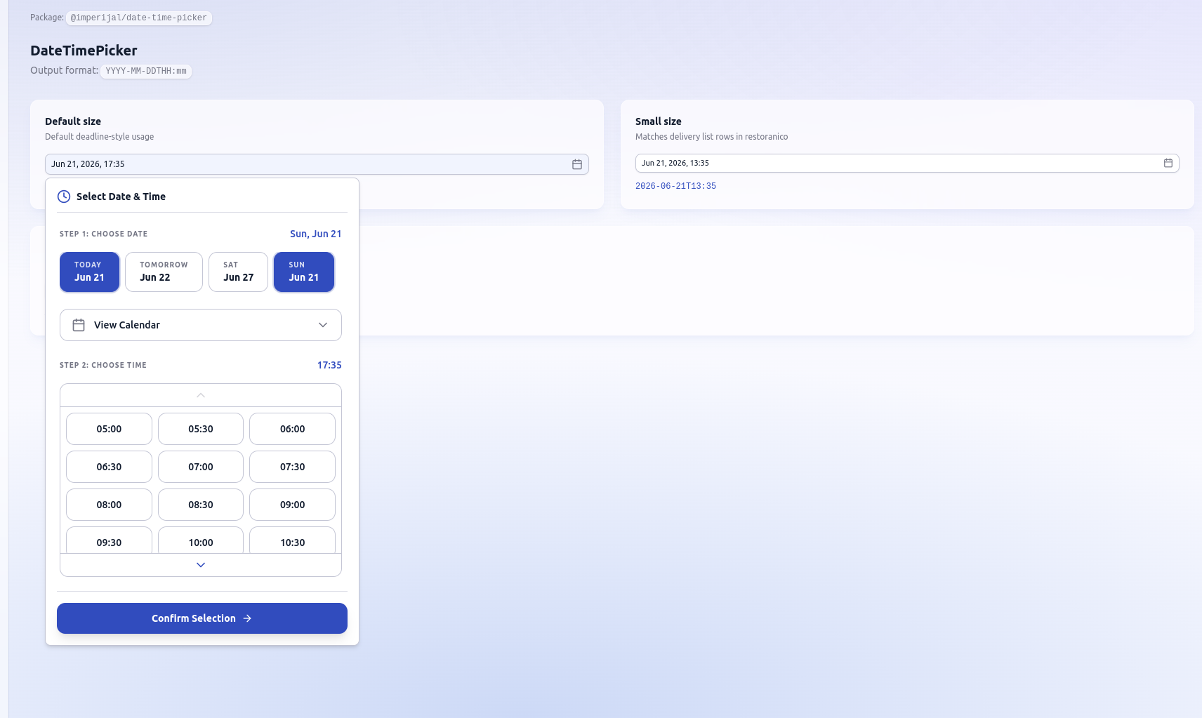
@@ -0,0 +1,74 @@
|
|
|
1
|
+
import { useState } from 'react';
|
|
2
|
+
|
|
3
|
+
import {
|
|
4
|
+
DateTimePicker,
|
|
5
|
+
toLocalInputValue,
|
|
6
|
+
} from '@imperijal/date-time-picker';
|
|
7
|
+
|
|
8
|
+
export function DateTimePickerDemo() {
|
|
9
|
+
const [defaultSize, setDefaultSize] = useState(() =>
|
|
10
|
+
toLocalInputValue(new Date(Date.now() + 4 * 60 * 60 * 1000)),
|
|
11
|
+
);
|
|
12
|
+
const [smallSize, setSmallSize] = useState(() => toLocalInputValue(new Date()));
|
|
13
|
+
const [earlyHours, setEarlyHours] = useState('');
|
|
14
|
+
|
|
15
|
+
return (
|
|
16
|
+
<div className="space-y-8">
|
|
17
|
+
<header>
|
|
18
|
+
<h2 className="text-xl font-bold">DateTimePicker</h2>
|
|
19
|
+
<p className="mt-1 text-sm text-muted-foreground">
|
|
20
|
+
Output format:{' '}
|
|
21
|
+
<code className="rounded-md border border-white/50 bg-white/60 px-1.5 py-0.5 text-xs shadow-sm backdrop-blur-sm">
|
|
22
|
+
YYYY-MM-DDTHH:mm
|
|
23
|
+
</code>
|
|
24
|
+
</p>
|
|
25
|
+
</header>
|
|
26
|
+
|
|
27
|
+
<section className="grid gap-6 lg:grid-cols-2">
|
|
28
|
+
<div className="rounded-xl border border-white/50 bg-white/70 p-5 shadow-lg shadow-primary/5 backdrop-blur-md">
|
|
29
|
+
<h3 className="mb-1 text-sm font-semibold">Default size</h3>
|
|
30
|
+
<p className="mb-4 text-xs text-muted-foreground">
|
|
31
|
+
Default deadline-style usage
|
|
32
|
+
</p>
|
|
33
|
+
<DateTimePicker value={defaultSize} onChange={setDefaultSize} />
|
|
34
|
+
<p className="mt-3 font-mono text-xs text-primary">{defaultSize || '—'}</p>
|
|
35
|
+
</div>
|
|
36
|
+
|
|
37
|
+
<div className="rounded-xl border border-white/50 bg-white/70 p-5 shadow-lg shadow-primary/5 backdrop-blur-md">
|
|
38
|
+
<h3 className="mb-1 text-sm font-semibold">Small size</h3>
|
|
39
|
+
<p className="mb-4 text-xs text-muted-foreground">
|
|
40
|
+
Matches delivery list rows in restoranico
|
|
41
|
+
</p>
|
|
42
|
+
<DateTimePicker
|
|
43
|
+
value={smallSize}
|
|
44
|
+
onChange={setSmallSize}
|
|
45
|
+
size="sm"
|
|
46
|
+
/>
|
|
47
|
+
<p className="mt-3 font-mono text-xs text-primary">{smallSize || '—'}</p>
|
|
48
|
+
</div>
|
|
49
|
+
|
|
50
|
+
<div className="rounded-xl border border-white/50 bg-white/70 p-5 shadow-lg shadow-primary/5 backdrop-blur-md lg:col-span-2">
|
|
51
|
+
<h3 className="mb-1 text-sm font-semibold">Custom time range</h3>
|
|
52
|
+
<p className="mb-4 text-xs text-muted-foreground">
|
|
53
|
+
06:00–22:00, 15-minute slots
|
|
54
|
+
</p>
|
|
55
|
+
<div className="max-w-sm">
|
|
56
|
+
<DateTimePicker
|
|
57
|
+
value={earlyHours}
|
|
58
|
+
onChange={setEarlyHours}
|
|
59
|
+
popoverClassName="shadow-2xl"
|
|
60
|
+
timeSlots={{
|
|
61
|
+
startHour: 6,
|
|
62
|
+
endHour: 22,
|
|
63
|
+
intervalMinutes: 15,
|
|
64
|
+
}}
|
|
65
|
+
/>
|
|
66
|
+
</div>
|
|
67
|
+
<p className="mt-3 font-mono text-xs text-primary">
|
|
68
|
+
{earlyHours || '—'}
|
|
69
|
+
</p>
|
|
70
|
+
</div>
|
|
71
|
+
</section>
|
|
72
|
+
</div>
|
|
73
|
+
);
|
|
74
|
+
}
|
|
@@ -0,0 +1,51 @@
|
|
|
1
|
+
@import 'tailwindcss';
|
|
2
|
+
@import 'react-day-picker/style.css';
|
|
3
|
+
@import '../../../packages/date-time-picker/src/styles.css';
|
|
4
|
+
|
|
5
|
+
@source "../../../packages/date-time-picker/src/**/*.tsx";
|
|
6
|
+
@source "./**/*.tsx";
|
|
7
|
+
|
|
8
|
+
@theme inline {
|
|
9
|
+
--color-background: var(--background);
|
|
10
|
+
--color-foreground: var(--foreground);
|
|
11
|
+
--color-popover: var(--popover);
|
|
12
|
+
--color-popover-foreground: var(--popover-foreground);
|
|
13
|
+
--color-primary: var(--primary);
|
|
14
|
+
--color-primary-foreground: var(--primary-foreground);
|
|
15
|
+
--color-secondary: var(--secondary);
|
|
16
|
+
--color-muted-foreground: var(--muted-foreground);
|
|
17
|
+
--color-accent: var(--accent);
|
|
18
|
+
--color-accent-foreground: var(--accent-foreground);
|
|
19
|
+
--color-border: var(--border);
|
|
20
|
+
--color-input: var(--input);
|
|
21
|
+
--color-ring: var(--ring);
|
|
22
|
+
--radius-md: 0.5rem;
|
|
23
|
+
--radius-xl: 0.75rem;
|
|
24
|
+
}
|
|
25
|
+
|
|
26
|
+
@layer base {
|
|
27
|
+
* {
|
|
28
|
+
border-color: var(--border);
|
|
29
|
+
}
|
|
30
|
+
body {
|
|
31
|
+
@apply min-h-screen text-foreground antialiased;
|
|
32
|
+
background-color: #f8f9ff;
|
|
33
|
+
background-image:
|
|
34
|
+
radial-gradient(
|
|
35
|
+
ellipse 80% 50% at 20% -10%,
|
|
36
|
+
color-mix(in srgb, var(--primary) 18%, transparent),
|
|
37
|
+
transparent
|
|
38
|
+
),
|
|
39
|
+
radial-gradient(
|
|
40
|
+
ellipse 60% 45% at 100% 0%,
|
|
41
|
+
color-mix(in srgb, #6366f1 14%, transparent),
|
|
42
|
+
transparent
|
|
43
|
+
),
|
|
44
|
+
radial-gradient(
|
|
45
|
+
ellipse 70% 50% at 50% 100%,
|
|
46
|
+
color-mix(in srgb, var(--primary) 10%, #dce9ff),
|
|
47
|
+
#f8f9ff
|
|
48
|
+
);
|
|
49
|
+
background-attachment: fixed;
|
|
50
|
+
}
|
|
51
|
+
}
|
|
@@ -0,0 +1,15 @@
|
|
|
1
|
+
{
|
|
2
|
+
"compilerOptions": {
|
|
3
|
+
"target": "ES2020",
|
|
4
|
+
"lib": ["ES2020", "DOM", "DOM.Iterable"],
|
|
5
|
+
"module": "ESNext",
|
|
6
|
+
"moduleResolution": "bundler",
|
|
7
|
+
"jsx": "react-jsx",
|
|
8
|
+
"strict": true,
|
|
9
|
+
"skipLibCheck": true,
|
|
10
|
+
"noEmit": true,
|
|
11
|
+
"isolatedModules": true,
|
|
12
|
+
"resolveJsonModule": true
|
|
13
|
+
},
|
|
14
|
+
"include": ["src"]
|
|
15
|
+
}
|
|
@@ -0,0 +1,39 @@
|
|
|
1
|
+
import path from 'node:path';
|
|
2
|
+
import { fileURLToPath } from 'node:url';
|
|
3
|
+
|
|
4
|
+
import tailwindcss from '@tailwindcss/vite';
|
|
5
|
+
import react from '@vitejs/plugin-react';
|
|
6
|
+
import { defineConfig } from 'vite';
|
|
7
|
+
|
|
8
|
+
const root = path.dirname(fileURLToPath(import.meta.url));
|
|
9
|
+
const pickerSrc = path.resolve(
|
|
10
|
+
root,
|
|
11
|
+
'../../packages/date-time-picker/src/index.ts',
|
|
12
|
+
);
|
|
13
|
+
|
|
14
|
+
export default defineConfig({
|
|
15
|
+
plugins: [react(), tailwindcss()],
|
|
16
|
+
// GitHub Pages: set IMPERIJAL_DEMO_BASE=/imperijal-components/ when deploying
|
|
17
|
+
base: process.env.IMPERIJAL_DEMO_BASE ?? '/',
|
|
18
|
+
resolve: {
|
|
19
|
+
alias: {
|
|
20
|
+
// Live source — edit packages/date-time-picker and see changes instantly
|
|
21
|
+
'@imperijal/date-time-picker': pickerSrc,
|
|
22
|
+
},
|
|
23
|
+
},
|
|
24
|
+
server: {
|
|
25
|
+
port: 5173,
|
|
26
|
+
open: true,
|
|
27
|
+
watch: {
|
|
28
|
+
// Reduce watchers (helps ENOSPC on Linux with low fs.inotify.max_user_watches)
|
|
29
|
+
ignored: [
|
|
30
|
+
'**/node_modules/**',
|
|
31
|
+
'**/.git/**',
|
|
32
|
+
'**/dist/**',
|
|
33
|
+
'**/.pnpm/**',
|
|
34
|
+
],
|
|
35
|
+
// Set CHOKIDAR_USEPOLLING=true if you still hit ENOSPC (no sudo needed)
|
|
36
|
+
usePolling: process.env.CHOKIDAR_USEPOLLING === 'true',
|
|
37
|
+
},
|
|
38
|
+
},
|
|
39
|
+
});
|
package/package.json
CHANGED
|
@@ -1,21 +1,19 @@
|
|
|
1
1
|
{
|
|
2
2
|
"name": "imperijal-components",
|
|
3
3
|
"private": false,
|
|
4
|
-
"version": "0.0.
|
|
4
|
+
"version": "0.0.1",
|
|
5
5
|
"description": "Imperijal reusable React component packages (monorepo root — not published to npm)",
|
|
6
|
-
"keywords": [
|
|
7
|
-
"react",
|
|
8
|
-
"components",
|
|
9
|
-
"ui"
|
|
10
|
-
],
|
|
11
6
|
"license": "MIT",
|
|
12
7
|
"engines": {
|
|
13
8
|
"node": ">=18"
|
|
14
9
|
},
|
|
15
10
|
"scripts": {
|
|
16
|
-
"build": "pnpm -r build",
|
|
17
|
-
"dev": "pnpm -
|
|
18
|
-
"
|
|
11
|
+
"build": "pnpm -r --filter './packages/*' build",
|
|
12
|
+
"dev": "pnpm --filter @imperijal/date-time-picker dev",
|
|
13
|
+
"demo": "pnpm --filter @imperijal/demo dev",
|
|
14
|
+
"demo:poll": "CHOKIDAR_USEPOLLING=true pnpm --filter @imperijal/demo dev",
|
|
15
|
+
"demo:build": "pnpm --filter @imperijal/demo build",
|
|
16
|
+
"demo:preview": "pnpm --filter @imperijal/demo preview",
|
|
19
17
|
"typecheck": "pnpm -r typecheck",
|
|
20
18
|
"publish:date-time-picker": "pnpm --filter @imperijal/date-time-picker publish --access public --no-git-checks"
|
|
21
19
|
}
|
|
@@ -2,6 +2,14 @@
|
|
|
2
2
|
|
|
3
3
|
Lumina-style date & time picker for React. Outputs **`YYYY-MM-DDTHH:mm`** (same as HTML `datetime-local`).
|
|
4
4
|
|
|
5
|
+
|
|
6
|
+
|
|
7
|
+
## Live demo
|
|
8
|
+
|
|
9
|
+
After deploying `apps/demo` (see [DEMO.md](../DEMO.md)):
|
|
10
|
+
|
|
11
|
+
**https://YOUR_DEMO_URL.vercel.app**
|
|
12
|
+
|
|
5
13
|
## Install
|
|
6
14
|
|
|
7
15
|
```bash
|
|
@@ -64,6 +72,12 @@ Your app needs shadcn-style CSS variables (`--primary`, `--border`, etc.) or imp
|
|
|
64
72
|
| `size` | `'default' \| 'sm'` | `'default'` |
|
|
65
73
|
| `timeSlots` | `{ startHour?, endHour?, intervalMinutes? }` | 5–24h, 30 min |
|
|
66
74
|
| `disabled` | `boolean` | `false` |
|
|
75
|
+
| `className` | `string` | — | Tailwind classes on **trigger button** |
|
|
76
|
+
| `popoverClassName` | `string` | — | Tailwind classes on **popover panel** |
|
|
77
|
+
| `contentClassName` | `string` | — | Tailwind classes on **inner content** |
|
|
78
|
+
| `align` | `'start' \| 'center' \| 'end'` | `'start'` |
|
|
79
|
+
|
|
80
|
+
See [CUSTOMIZATION.md](../../CUSTOMIZATION.md) for Tailwind setup and theming.
|
|
67
81
|
|
|
68
82
|
## Exports
|
|
69
83
|
|
|
@@ -1,6 +1,6 @@
|
|
|
1
1
|
{
|
|
2
2
|
"name": "@imperijal/date-time-picker",
|
|
3
|
-
"version": "0.1.
|
|
3
|
+
"version": "0.1.1",
|
|
4
4
|
"description": "Lumina-style date & time picker for React (outputs YYYY-MM-DDTHH:mm)",
|
|
5
5
|
"type": "module",
|
|
6
6
|
"main": "./dist/index.cjs",
|
|
@@ -43,9 +43,10 @@
|
|
|
43
43
|
"license": "MIT",
|
|
44
44
|
"repository": {
|
|
45
45
|
"type": "git",
|
|
46
|
-
"url": "https://github.com/
|
|
46
|
+
"url": "https://github.com/belforto/imperijal-components.git",
|
|
47
47
|
"directory": "packages/date-time-picker"
|
|
48
48
|
},
|
|
49
|
+
"homepage": "https://github.com/belforto/imperijal-components#readme",
|
|
49
50
|
"publishConfig": {
|
|
50
51
|
"access": "public"
|
|
51
52
|
},
|
|
@@ -20,7 +20,12 @@ export type DateTimePickerProps = {
|
|
|
20
20
|
onChange: (value: string) => void;
|
|
21
21
|
placeholder?: string;
|
|
22
22
|
disabled?: boolean;
|
|
23
|
+
/** Tailwind classes on the trigger button */
|
|
23
24
|
className?: string;
|
|
25
|
+
/** Tailwind classes on the popover panel wrapper */
|
|
26
|
+
popoverClassName?: string;
|
|
27
|
+
/** Tailwind classes on the inner picker content */
|
|
28
|
+
contentClassName?: string;
|
|
24
29
|
id?: string;
|
|
25
30
|
size?: 'default' | 'sm';
|
|
26
31
|
timeSlots?: TimeSlotConfig;
|
|
@@ -33,6 +38,8 @@ export function DateTimePicker({
|
|
|
33
38
|
placeholder = 'Select date & time',
|
|
34
39
|
disabled = false,
|
|
35
40
|
className,
|
|
41
|
+
popoverClassName,
|
|
42
|
+
contentClassName,
|
|
36
43
|
id,
|
|
37
44
|
size = 'default',
|
|
38
45
|
timeSlots,
|
|
@@ -73,19 +80,24 @@ export function DateTimePicker({
|
|
|
73
80
|
</PopoverTrigger>
|
|
74
81
|
<PopoverContent
|
|
75
82
|
align={align}
|
|
76
|
-
className=
|
|
83
|
+
className={cn(
|
|
84
|
+
'w-[min(calc(100vw-2rem),28rem)] p-4',
|
|
85
|
+
popoverClassName,
|
|
86
|
+
)}
|
|
77
87
|
onOpenAutoFocus={(e) => e.preventDefault()}
|
|
78
88
|
>
|
|
79
89
|
<div className="mb-4 flex items-center gap-2 border-b border-border/60 pb-3">
|
|
80
90
|
<ClockIcon className="size-5 text-primary" />
|
|
81
91
|
<h3 className="text-sm font-semibold">Select Date & Time</h3>
|
|
82
92
|
</div>
|
|
83
|
-
<
|
|
84
|
-
|
|
85
|
-
|
|
86
|
-
|
|
87
|
-
|
|
88
|
-
|
|
93
|
+
<div className={contentClassName}>
|
|
94
|
+
<DateTimePickerContent
|
|
95
|
+
value={value}
|
|
96
|
+
open={open}
|
|
97
|
+
onConfirm={handleConfirm}
|
|
98
|
+
timeSlots={timeSlots}
|
|
99
|
+
/>
|
|
100
|
+
</div>
|
|
89
101
|
</PopoverContent>
|
|
90
102
|
</Popover>
|
|
91
103
|
);
|
|
@@ -1,8 +1,8 @@
|
|
|
1
1
|
/**
|
|
2
|
-
*
|
|
3
|
-
* Import in
|
|
2
|
+
* Theme tokens for apps without shadcn CSS variables.
|
|
3
|
+
* Import in global CSS: @import '@imperijal/date-time-picker/styles.css';
|
|
4
4
|
*/
|
|
5
|
-
|
|
5
|
+
:root {
|
|
6
6
|
--background: #ffffff;
|
|
7
7
|
--foreground: #0b1c30;
|
|
8
8
|
--popover: #ffffff;
|
package/pnpm-workspace.yaml
CHANGED