hs-uix 1.7.0 → 2.0.1
This diff represents the content of publicly available package versions that have been released to one of the supported registries. The information contained in this diff is provided for informational purposes only and reflects changes between package versions as they appear in their respective public registries.
- package/README.md +17 -4
- package/package.json +1 -1
- package/packages/feed/README.md +3 -1
- package/packages/form/README.md +15 -1
- package/packages/kanban/README.md +3 -3
- package/packages/kanban/index.d.ts +3 -3
package/README.md
CHANGED
|
@@ -15,11 +15,11 @@ npm install hs-uix
|
|
|
15
15
|
import { DataTable } from "hs-uix/datatable";
|
|
16
16
|
import { FormBuilder } from "hs-uix/form";
|
|
17
17
|
import { Feed } from "hs-uix/feed";
|
|
18
|
-
import { AutoStatusTag, AutoTag, KeyValueList, SectionHeader } from "hs-uix/common-components";
|
|
19
|
-
import { formatCurrency, formatDate } from "hs-uix/utils";
|
|
18
|
+
import { Icon, AutoStatusTag, AutoTag, CrmLookupSelect, KeyValueList, SectionHeader } from "hs-uix/common-components";
|
|
19
|
+
import { CrmDataTable, CrmKanban, formatCurrency, formatDate } from "hs-uix/utils";
|
|
20
20
|
|
|
21
21
|
// or import everything from the root
|
|
22
|
-
import { DataTable, FormBuilder, AutoStatusTag, AutoTag } from "hs-uix";
|
|
22
|
+
import { DataTable, FormBuilder, Icon, AutoStatusTag, AutoTag } from "hs-uix";
|
|
23
23
|
```
|
|
24
24
|
|
|
25
25
|
Requires `react` >= 18.0.0 and `@hubspot/ui-extensions` >= 0.12.0 as peer dependencies (already present in any HubSpot UI Extensions project).
|
|
@@ -32,7 +32,8 @@ Requires `react` >= 18.0.0 and `@hubspot/ui-extensions` >= 0.12.0 as peer depend
|
|
|
32
32
|
| **FormBuilder** | Declarative, config-driven form with validation, multi-step wizards, and 20+ field types | [Full documentation](https://github.com/05bmckay/hs-uix/blob/main/packages/form/README.md) |
|
|
33
33
|
| **Kanban** | Stage-based board with filters, sort, headline metrics, card action bars, and DataTable-parity card field config | [Full documentation](https://github.com/05bmckay/hs-uix/blob/main/packages/kanban/README.md) |
|
|
34
34
|
| **Feed** | Activity feed / timeline with a standard item shape, date grouping, load-more pagination, and HubSpot-native item regions | [Full documentation](https://github.com/05bmckay/hs-uix/blob/main/packages/feed/README.md) |
|
|
35
|
-
| **Common Components** | Thin visual wrappers over HubSpot primitives — `AutoTag`, `AutoStatusTag`, `AvatarStack`, `SectionHeader`, `KeyValueList`, `StyledText` | [Full documentation](https://github.com/05bmckay/hs-uix/blob/main/src/common-components/README.md) |
|
|
35
|
+
| **Common Components** | Thin visual wrappers over HubSpot primitives — `Icon`, `AutoTag`, `AutoStatusTag`, `AvatarStack`, `CrmLookupSelect`, `SectionHeader`, `KeyValueList`, `StyledText` | [Full documentation](https://github.com/05bmckay/hs-uix/blob/main/src/common-components/README.md) |
|
|
36
|
+
| **CRM data** | `CrmDataTable` / `CrmKanban` — batch-fetching, client-side-paginating CRM table & board, plus the `useCrmSearch*` hooks behind them | [Full documentation](https://github.com/05bmckay/hs-uix/blob/main/src/utils/README.md) |
|
|
36
37
|
| **Utils** | Pure helpers for formatting, options, HubSpot value guards, and tag-variant inference | [Full documentation](https://github.com/05bmckay/hs-uix/blob/main/src/utils/README.md) |
|
|
37
38
|
|
|
38
39
|
---
|
|
@@ -305,9 +306,11 @@ import { formatCurrency } from "hs-uix/utils";
|
|
|
305
306
|
|
|
306
307
|
## What's inside
|
|
307
308
|
|
|
309
|
+
- `Icon` — a superset of HubSpot's native `<Icon>`: custom glyphs, any CSS color, and pixel sizes, delegating to the native component whenever the request is natively expressible
|
|
308
310
|
- `AutoStatusTag` — `StatusTag` with variant inferred from the value (`Active` → success, `At risk` → warning, `Failed` → danger, etc.)
|
|
309
311
|
- `AutoTag` — `Tag` with the same inference, for non-status labels
|
|
310
312
|
- `AvatarStack` — overlapping circular avatars as a single SVG (letters, image URLs, or mixed); `+N` overflow chip past `maxVisible`
|
|
313
|
+
- `CrmLookupSelect` — CRM-backed `Select` / `MultiSelect` with live, debounced search
|
|
311
314
|
- `SectionHeader` — title + optional description + actions slot
|
|
312
315
|
- `KeyValueList` — vertical list of label/value rows via `DescriptionList`
|
|
313
316
|
- `StyledText` — SVG-rendered text with rotation, custom color, and pill backgrounds for cases native `<Text>` can't express
|
|
@@ -330,6 +333,16 @@ Pass a free-form status string and get a properly-colored tag back. Matching is
|
|
|
330
333
|
|
|
331
334
|
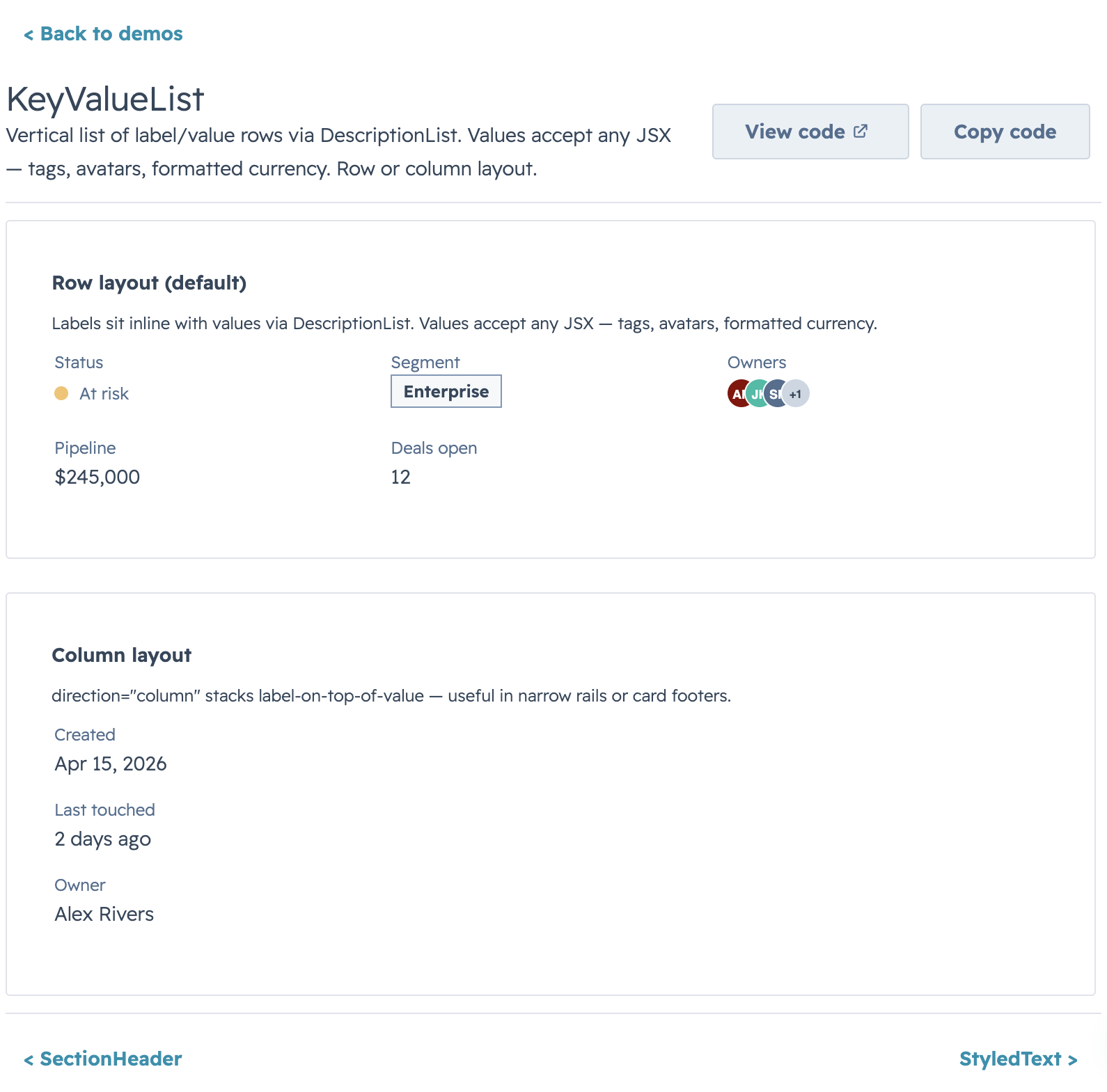
Overlapping avatars rendered as a single SVG via `<Image>`. T-shirt sizing (`xs` → `xl`) or a raw pixel number. Letters auto-color from the built-in palette; image URLs get circular-clipped. Extras past `maxVisible` collapse into a neutral `+N` chip.
|
|
332
335
|
|
|
336
|
+
### Icon
|
|
337
|
+
|
|
338
|
+
A superset of HubSpot's native `<Icon>`. When the request is natively expressible (a whitelisted `name`, a semantic `color`, an `sm`/`md`/`lg` `size`) it **delegates to the real `<Icon>`** — keeping auto-sizing, `color="inherit"`, and screen-reader semantics. Otherwise it renders a registered SVG glyph as a data-URI `<Image>`, lifting all three native limits: custom/unregistered glyphs (~248 bundled in `ICONS`), any CSS color, and `xs`–`xl` tokens or a pixel size. Add your own glyphs via `svgToIconEntry`, or build a data URI directly with `makeIconDataUri`.
|
|
339
|
+
|
|
340
|
+
### CrmLookupSelect
|
|
341
|
+
|
|
342
|
+
|
|
343
|
+
|
|
344
|
+
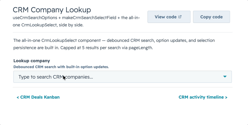
Point it at a CRM `objectType` + `properties` and get a debounced, paginated `Select` / `MultiSelect` that searches live as the user types. Picked options stay valid after results change, `loadingOption` shows during the debounce window, and `noResultsOption` only appears once a query settles — no "no results" flash mid-type.
|
|
345
|
+
|
|
333
346
|
### SectionHeader & KeyValueList
|
|
334
347
|
|
|
335
348
|
|
package/package.json
CHANGED
package/packages/feed/README.md
CHANGED
|
@@ -89,6 +89,8 @@ Feed works out of the box with these item keys:
|
|
|
89
89
|
| `type` | Activity type label, rendered in a `StatusTag` by default |
|
|
90
90
|
| `typeLabel` | Optional display label when `type` is a machine value |
|
|
91
91
|
| `typeVariant` | `StatusTag` variant: `default`, `info`, `success`, `warning`, `danger` |
|
|
92
|
+
| `status` / `statusLabel` / `outcome` / `severity` | Optional secondary status text rendered in its own `StatusTag` (e.g. a call outcome or task severity). `statusLabel` wins when set, then `status`, `outcome`, `severity` |
|
|
93
|
+
| `statusVariant` / `outcomeVariant` / `severityVariant` | `StatusTag` variant for that status text (`default`, `info`, `success`, `warning`, `danger`); defaults to `default` |
|
|
92
94
|
| `iconName` / `icon` | Activity/entity icon. Use verified HubSpot icon names (`email`, `calling`, `appointment`, `comment`, `description`, etc.) |
|
|
93
95
|
| `title` / `subject` | Main item heading |
|
|
94
96
|
| `href` | Optional link wrapping the title |
|
|
@@ -209,7 +211,7 @@ Use `serverSide` when the parent/API owns filtering, sorting, searching, and pag
|
|
|
209
211
|
```
|
|
210
212
|
|
|
211
213
|
- `container`: `"tile"` (default), `"none"`, or `"card"` (`card` is a Tile-backed alias)
|
|
212
|
-
- `itemContainer`: `"
|
|
214
|
+
- `itemContainer`: `"tile"` (default), `"none"`, or `"card"` (`card` is a Tile-backed alias)
|
|
213
215
|
- `showDividers`: dividers between items when `itemContainer="none"`
|
|
214
216
|
|
|
215
217
|
## Render escape hatches
|
package/packages/form/README.md
CHANGED
|
@@ -943,7 +943,21 @@ Add/remove rows for dynamic lists:
|
|
|
943
943
|
min: 1, max: 5 }
|
|
944
944
|
```
|
|
945
945
|
|
|
946
|
-
Repeater sub-fields now validate on blur/onChange like top-level fields.
|
|
946
|
+
Repeater sub-fields now validate on blur/onChange like top-level fields. Pass `repeaterProps` on the repeater field to customize the add/remove/reorder controls:
|
|
947
|
+
|
|
948
|
+
| `repeaterProps` key | Type | Default | Description |
|
|
949
|
+
|---|---|---|---|
|
|
950
|
+
| `addLabel` | `string` | repeater add label | Text for the add-row control |
|
|
951
|
+
| `removeLabel` | `string` | repeater remove label | Text for the per-row remove control |
|
|
952
|
+
| `renderAdd` | `({ onClick, count }) => ReactNode` | — | Replace the default add control |
|
|
953
|
+
| `renderRemove` | `({ index, onClick }) => ReactNode` | — | Replace the default per-row remove control |
|
|
954
|
+
| `reorderable` | `boolean` | `false` | Enable up/down row reordering controls |
|
|
955
|
+
| `moveUpLabel` | `string` | `"Up"` | Label for the move-up control |
|
|
956
|
+
| `moveDownLabel` | `string` | `"Down"` | Label for the move-down control |
|
|
957
|
+
| `renderMoveUp` | `({ index, disabled, onClick }) => ReactNode` | — | Replace the move-up control. `disabled` is `true` on the first row |
|
|
958
|
+
| `renderMoveDown` | `({ index, disabled, onClick }) => ReactNode` | — | Replace the move-down control. `disabled` is `true` on the last row |
|
|
959
|
+
|
|
960
|
+
When `reorderable` is set, both move controls always render so rows stay column-aligned — the first row's "up" and the last row's "down" come through disabled (and the `disabled` flag is passed to `renderMoveUp` / `renderMoveDown`).
|
|
947
961
|
|
|
948
962
|
## Field Groups (Structured)
|
|
949
963
|
|
|
@@ -550,11 +550,11 @@ If your data comes from an API or you have too many records to load up-front, dr
|
|
|
550
550
|
| `showSearch` | boolean | `true` (when `searchFields` set) | Show/hide the search input |
|
|
551
551
|
| `searchFields` | string[] | `[]` | Fields to search across. Search UI only renders when non-empty. |
|
|
552
552
|
| `searchPlaceholder` | string | `"Search..."` | Placeholder for the search input |
|
|
553
|
-
| `searchDebounce` | number | `
|
|
553
|
+
| `searchDebounce` | number | `250` | Milliseconds to debounce `onSearchChange` callback. Pass `0` for synchronous search |
|
|
554
554
|
| `fuzzySearch` | boolean | `false` | Enable fuzzy matching via Fuse.js |
|
|
555
555
|
| `fuzzyOptions` | object | — | Custom Fuse.js options (threshold, distance, keys) |
|
|
556
556
|
| `filters` | `KanbanFilterConfig[]` | `[]` | Filter configurations (see below) |
|
|
557
|
-
| `filterInlineLimit` | number | `
|
|
557
|
+
| `filterInlineLimit` | number | `4` | Max filters shown inline before overflow into a "Filters" button |
|
|
558
558
|
| `showFilterBadges` | boolean | `true` | Show active filter chips |
|
|
559
559
|
| `showClearFiltersButton` | boolean | `showFilterBadges` | Show "Clear all" reset button. Defaults to the value of `showFilterBadges`, so hiding the chips hides the reset button too unless set explicitly |
|
|
560
560
|
| `sortOptions` | `KanbanSortOption[]` | — | Sort options (single board-wide sort) |
|
|
@@ -562,7 +562,7 @@ If your data comes from an API or you have too many records to load up-front, dr
|
|
|
562
562
|
| `sort` | string | — | Controlled sort option `value` |
|
|
563
563
|
| `onSortChange` | `(value) => void` | — | Sort callback (controlled) |
|
|
564
564
|
| `columnFooter` | `(rows, stage) => ReactNode` | — | Per-stage footer (aggregate row). Overridden by `stage.footer` when set. |
|
|
565
|
-
| `columnWidth` | number | `
|
|
565
|
+
| `columnWidth` | number | `350` | Min per-column width in px (AutoGrid `columnWidth`). Clamped to a 350px minimum. |
|
|
566
566
|
| `collapsedStages` | string[] | — | Controlled list of collapsed stage values |
|
|
567
567
|
| `onCollapsedStagesChange` | `(stages) => void` | — | Controlled-collapse callback |
|
|
568
568
|
| `metrics` | `KanbanMetricItem[] \| ReactNode` | — | Headline metrics panel. Array → `<StatisticsItem>` shorthand; ReactNode → full custom render. |
|
|
@@ -303,14 +303,14 @@ export interface KanbanProps<Row = Record<string, unknown>, Id = string | number
|
|
|
303
303
|
/** Search is only active, and the search input only renders, when this list is non-empty. */
|
|
304
304
|
searchFields?: string[];
|
|
305
305
|
searchPlaceholder?: string;
|
|
306
|
-
/** ms to debounce onSearchChange callback. 0 = no debounce. */
|
|
306
|
+
/** ms to debounce onSearchChange callback. Default 250; 0 = no debounce. */
|
|
307
307
|
searchDebounce?: number;
|
|
308
308
|
/** Enable fuzzy matching via Fuse.js */
|
|
309
309
|
fuzzySearch?: boolean;
|
|
310
310
|
/** Custom Fuse.js options (threshold, distance, keys, etc.) */
|
|
311
311
|
fuzzyOptions?: Record<string, unknown>;
|
|
312
312
|
filters?: KanbanFilterConfig<Row>[];
|
|
313
|
-
/** Number of filters shown inline before the "Filters" overflow button. Default
|
|
313
|
+
/** Number of filters shown inline before the "Filters" overflow button. Default 4. */
|
|
314
314
|
filterInlineLimit?: number;
|
|
315
315
|
/** Show active filter chips with individual clear affordances. Default true. */
|
|
316
316
|
showFilterBadges?: boolean;
|
|
@@ -327,7 +327,7 @@ export interface KanbanProps<Row = Record<string, unknown>, Id = string | number
|
|
|
327
327
|
/**
|
|
328
328
|
* Pixel width for each column, passed to AutoGrid's columnWidth. Columns
|
|
329
329
|
* share available horizontal space equally with this value as the minimum.
|
|
330
|
-
* Clamped to
|
|
330
|
+
* Clamped to 350px minimum regardless of the value passed. Default 350px.
|
|
331
331
|
*/
|
|
332
332
|
columnWidth?: number;
|
|
333
333
|
collapsedStages?: string[];
|