hs-uix 1.6.5 → 2.0.0
This diff represents the content of publicly available package versions that have been released to one of the supported registries. The information contained in this diff is provided for informational purposes only and reflects changes between package versions as they appear in their respective public registries.
- package/README.md +2 -0
- package/common-components.d.ts +152 -0
- package/dist/common-components.js +1385 -77
- package/dist/common-components.mjs +1438 -82
- package/dist/datatable.js +291 -239
- package/dist/datatable.mjs +207 -155
- package/dist/feed.js +939 -0
- package/dist/feed.mjs +927 -0
- package/dist/form.js +115 -93
- package/dist/form.mjs +115 -93
- package/dist/index.js +3529 -1060
- package/dist/index.mjs +3231 -770
- package/dist/kanban.js +286 -225
- package/dist/kanban.mjs +180 -119
- package/dist/utils.js +2906 -2
- package/dist/utils.mjs +2944 -1
- package/feed.d.ts +1 -0
- package/index.d.ts +51 -2
- package/package.json +17 -4
- package/packages/datatable/README.md +1046 -0
- package/packages/datatable/index.d.ts +246 -0
- package/packages/feed/README.md +224 -0
- package/packages/feed/index.d.ts +261 -0
- package/packages/form/README.md +1229 -0
- package/packages/form/index.d.ts +498 -0
- package/packages/kanban/README.md +707 -0
- package/packages/kanban/index.d.ts +367 -0
- package/utils.d.ts +122 -0
|
@@ -0,0 +1,707 @@
|
|
|
1
|
+
# Kanban (hs-uix/kanban)
|
|
2
|
+
|
|
3
|
+
[](https://www.npmjs.com/package/hs-uix)
|
|
4
|
+
[](https://www.npmjs.com/package/hs-uix)
|
|
5
|
+
[](https://github.com/05bmckay/hs-uix/blob/main/LICENSE)
|
|
6
|
+
|
|
7
|
+
A stage-based board view for HubSpot UI Extensions. Share DataTable's config vocabulary (`cardFields` ≈ `columns`, filters, sort, selection) so you can offer users a table-or-board toggle without rewriting the data layer. Drag-and-drop isn't available inside HubSpot UI Extensions, so stage changes happen through an inline `Select` (or menu) on each card.
|
|
8
|
+
|
|
9
|
+
|
|
10
|
+
|
|
11
|
+
## Why Kanban?
|
|
12
|
+
|
|
13
|
+
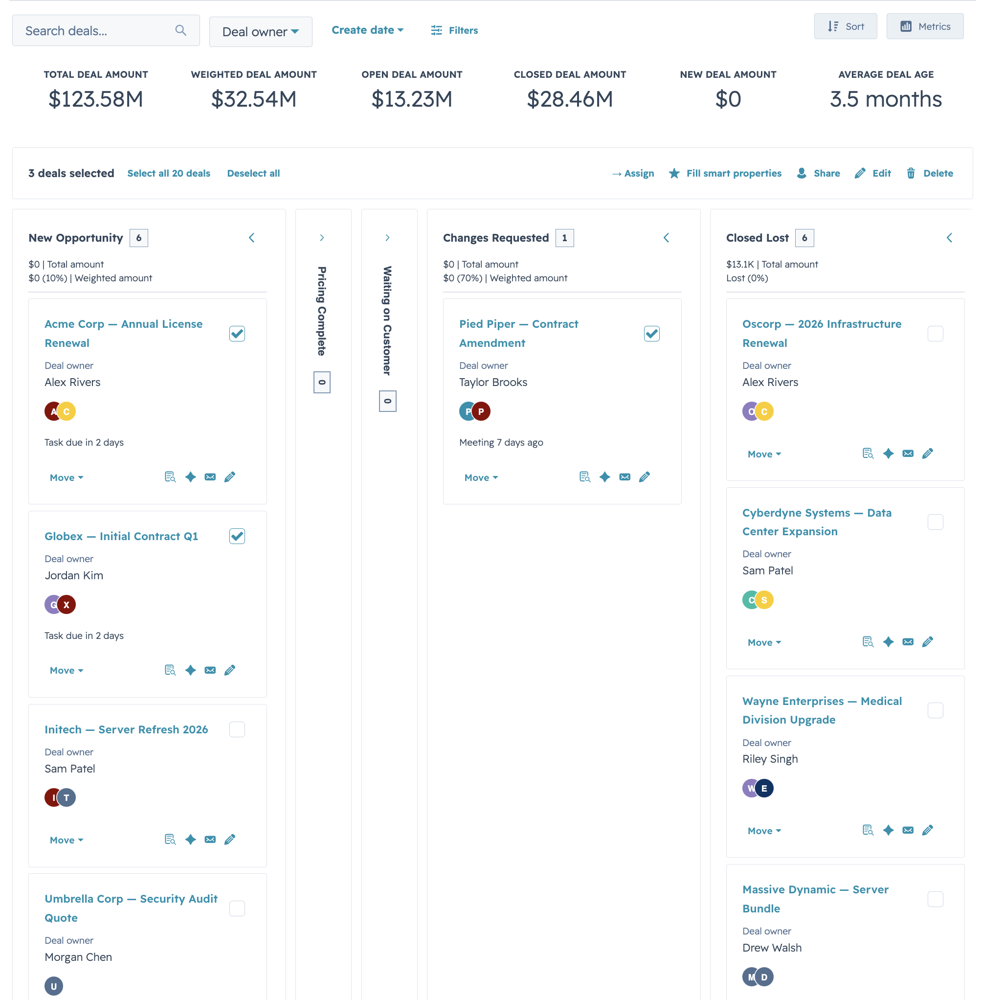
If you've tried to build a board view on top of HubSpot's primitives, you know the drill: Flex + Box columns, a `Select` per card for stage changes, manual bucket-by-stage logic, per-column totals, overflow handling, and a toolbar that behaves differently from your table views. Kanban does all of that for you with the same config shape DataTable uses.
|
|
14
|
+
|
|
15
|
+
```jsx
|
|
16
|
+
<Kanban
|
|
17
|
+
data={deals}
|
|
18
|
+
stages={STAGES}
|
|
19
|
+
groupBy="stage"
|
|
20
|
+
cardFields={CARD_FIELDS}
|
|
21
|
+
onStageChange={(row, newStage) => updateDealStage(row.id, newStage)}
|
|
22
|
+
/>
|
|
23
|
+
```
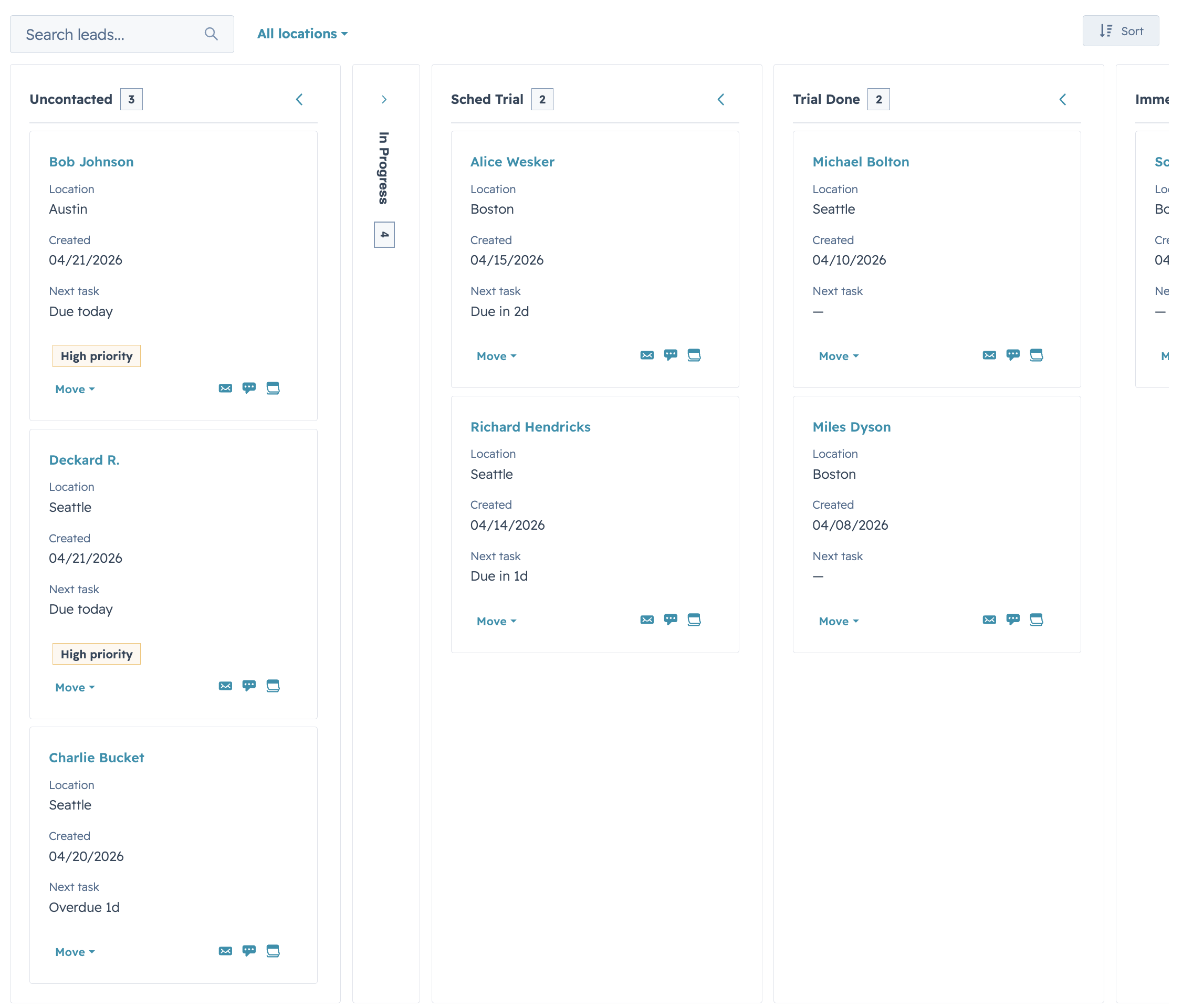
|
|
24
|
+
|
|
25
|
+
That's a filterable, sortable, stage-bucketed board with per-stage footers and inline stage controls.
|
|
26
|
+
|
|
27
|
+
## Features
|
|
28
|
+
|
|
29
|
+
- Stage-based columns with variant-colored headers (`success` / `warning` / `info` / `default`), collapse-to-rail, and per-stage count badges
|
|
30
|
+
- `cardFields` with placement (`title` / `subtitle` / `meta` / `body` / `footer`) — same render / truncate / visible hooks as DataTable columns
|
|
31
|
+
- Two card densities (`compact` and `comfortable`) with sensible divider defaults at each
|
|
32
|
+
- Filters and sort with the same config shape as DataTable (`select`, `multiselect`, `dateRange`)
|
|
33
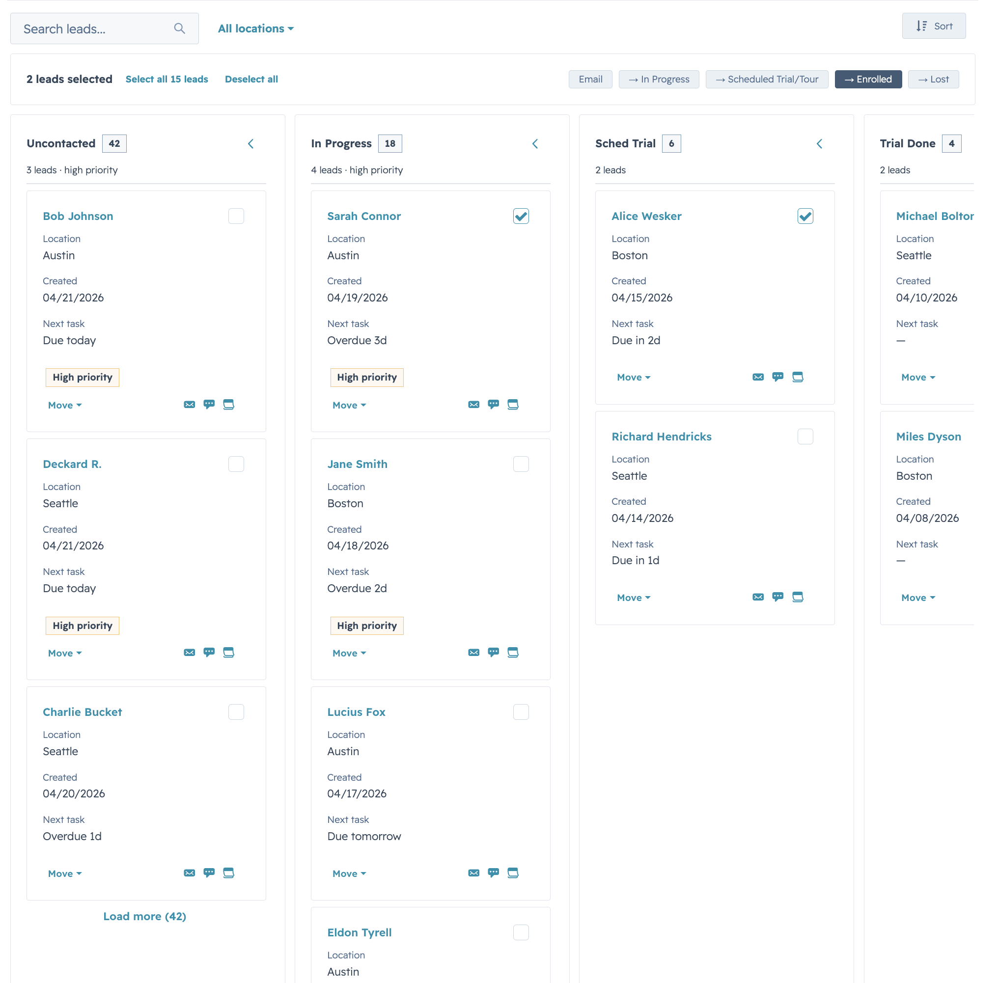
|
+
- Full-text search across any combination of fields, with optional fuzzy matching via Fuse.js
|
|
34
|
+
- Headline metrics panel rendered above the board (`<Statistics>` under the hood) via a `metrics` prop
|
|
35
|
+
- Stage transition prompts — async confirmation or extra-property capture before committing a stage change, declared per-stage via `stage.onEnterRequired.render`
|
|
36
|
+
- Per-card selection with a bulk action bar, plus `KanbanCardActions` for per-card actions
|
|
37
|
+
- Per-stage pagination via `stageMeta` + `onLoadMore` — mix client-side, server-load-more, and pre-bucketed server data column-by-column
|
|
38
|
+
- Empty / loading / error render slots that mirror DataTable's override API
|
|
39
|
+
- `deriveCardFieldsFromColumns` utility in `hs-uix/utils` that projects a DataTable `columns` config into Kanban `cardFields` with a single function call
|
|
40
|
+
- Full i18n surface via the `labels` prop
|
|
41
|
+
|
|
42
|
+
## Installation
|
|
43
|
+
|
|
44
|
+
```bash
|
|
45
|
+
npm install hs-uix
|
|
46
|
+
```
|
|
47
|
+
|
|
48
|
+
Import it in your card:
|
|
49
|
+
|
|
50
|
+
```jsx
|
|
51
|
+
import { Kanban, KanbanCardActions } from "hs-uix/kanban";
|
|
52
|
+
```
|
|
53
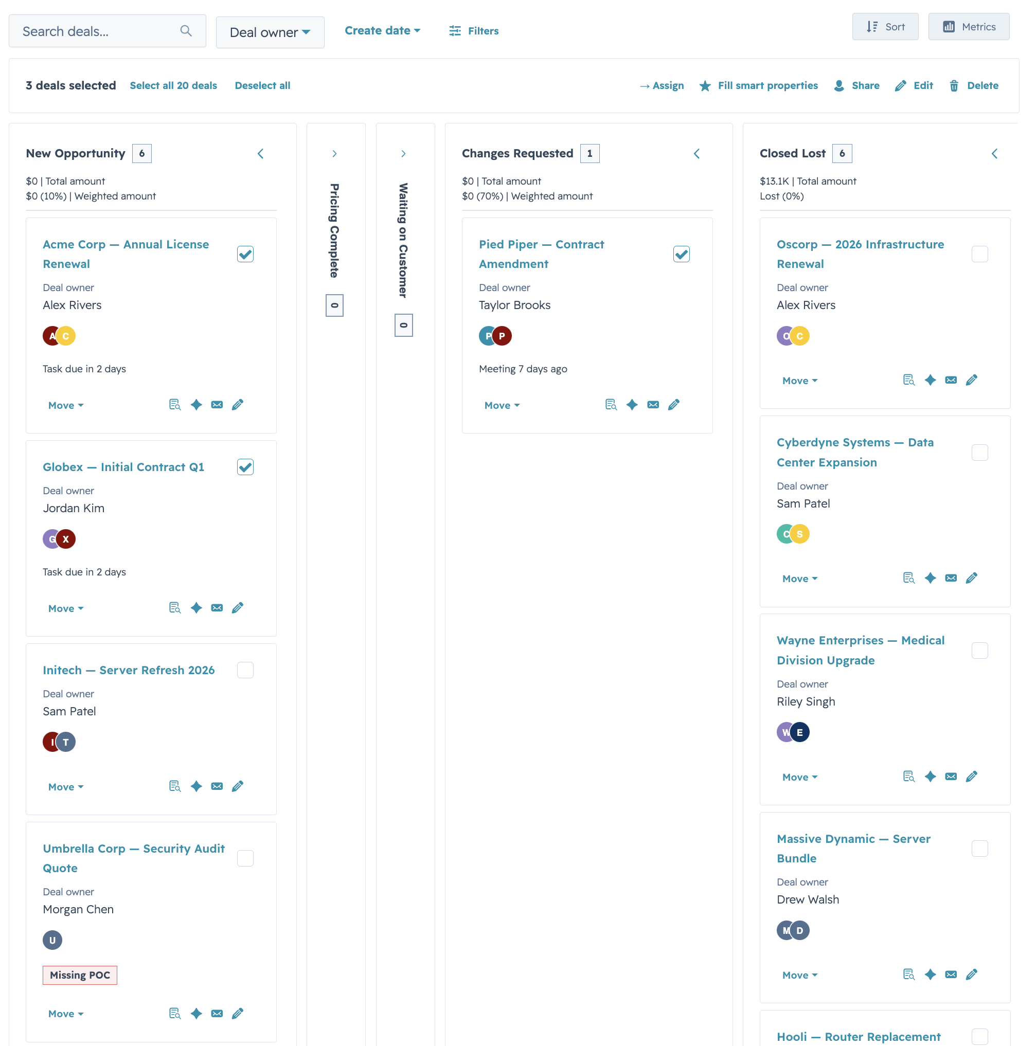
|
+
|
|
54
|
+
Requires `@hubspot/ui-extensions` >= 0.12.0 and `react` >= 18.0.0 as peer dependencies (already present in any HubSpot UI Extensions project). TypeScript declarations are bundled with `hs-uix` (`kanban.d.ts`).
|
|
55
|
+
|
|
56
|
+
---
|
|
57
|
+
|
|
58
|
+
## Examples
|
|
59
|
+
|
|
60
|
+
### Basic board with stage transitions
|
|
61
|
+
|
|
62
|
+
Define your stages and card fields, pass your data, and the component handles bucketing, per-stage counts, and the inline stage control on each card.
|
|
63
|
+
|
|
64
|
+
```jsx
|
|
65
|
+
import React from "react";
|
|
66
|
+
import { Link, hubspot } from "@hubspot/ui-extensions";
|
|
67
|
+
import { Kanban } from "hs-uix/kanban";
|
|
68
|
+
import { AutoTag } from "hs-uix/common-components";
|
|
69
|
+
import { formatCurrencyCompact, formatDate } from "hs-uix/utils";
|
|
70
|
+
|
|
71
|
+
const STAGES = [
|
|
72
|
+
{ value: "qualified", label: "Qualified", variant: "info" },
|
|
73
|
+
{ value: "proposal", label: "Proposal", variant: "info" },
|
|
74
|
+
{ value: "negotiation", label: "Negotiation", variant: "warning" },
|
|
75
|
+
{ value: "closed_won", label: "Closed Won", variant: "success", terminal: true },
|
|
76
|
+
{ value: "closed_lost", label: "Closed Lost", variant: "default", terminal: true },
|
|
77
|
+
];
|
|
78
|
+
|
|
79
|
+
const CARD_FIELDS = [
|
|
80
|
+
{ field: "name", placement: "title",
|
|
81
|
+
render: (val, row) => <Link href={dealUrl(row)}>{val}</Link> },
|
|
82
|
+
{ field: "company", placement: "subtitle" },
|
|
83
|
+
{ field: "amount", placement: "meta",
|
|
84
|
+
render: (val) => formatCurrencyCompact(val) },
|
|
85
|
+
{ field: "segment", placement: "body", label: "Segment",
|
|
86
|
+
render: (val) => <AutoTag value={val} /> },
|
|
87
|
+
{ field: "closeDate", placement: "footer",
|
|
88
|
+
render: (val) => formatDate(val) },
|
|
89
|
+
];
|
|
90
|
+
|
|
91
|
+
hubspot.extend(() => (
|
|
92
|
+
<Kanban
|
|
93
|
+
data={deals}
|
|
94
|
+
stages={STAGES}
|
|
95
|
+
groupBy="stage"
|
|
96
|
+
rowIdField="id"
|
|
97
|
+
cardFields={CARD_FIELDS}
|
|
98
|
+
onStageChange={(row, newStage) => updateDealStage(row.id, newStage)}
|
|
99
|
+
/>
|
|
100
|
+
));
|
|
101
|
+
```
|
|
102
|
+
|
|
103
|
+
> You can pass a custom `renderCard(row, context)` function for full control, but `cardFields` is required when using `selectable`, density presets, or the divider system — it's the declarative baseline the component optimizes around.
|
|
104
|
+
|
|
105
|
+
---
|
|
106
|
+
|
|
107
|
+
### HubSpot Deals preset with metrics
|
|
108
|
+
|
|
109
|
+

|
|
110
|
+
|
|
111
|
+
Drop-in preset shaped like HubSpot's native deals pipeline: stage-variant headers, per-stage amount totals in the column footer, and a headline metrics panel above the board. Hide the summary row with `showMetrics={false}` for dashboards that already surface totals elsewhere.
|
|
112
|
+
|
|
113
|
+
```jsx
|
|
114
|
+
import { Kanban } from "hs-uix/kanban";
|
|
115
|
+
import { formatCurrencyCompact, sumBy } from "hs-uix/utils";
|
|
116
|
+
|
|
117
|
+
const metrics = useMemo(() => {
|
|
118
|
+
const total = sumBy(deals, "amount");
|
|
119
|
+
const weighted = deals.reduce((s, r) => s + r.amount * (r.probability ?? 0), 0);
|
|
120
|
+
const open = sumBy(deals.filter((d) => !isClosed(d.stage)), "amount");
|
|
121
|
+
return [
|
|
122
|
+
{ label: "Total deal amount", number: formatCurrencyCompact(total) },
|
|
123
|
+
{ label: "Weighted deal amount", number: formatCurrencyCompact(weighted) },
|
|
124
|
+
{ label: "Open deal amount", number: formatCurrencyCompact(open) },
|
|
125
|
+
];
|
|
126
|
+
}, [deals]);
|
|
127
|
+
|
|
128
|
+
<Kanban
|
|
129
|
+
data={deals}
|
|
130
|
+
stages={STAGES}
|
|
131
|
+
groupBy="stage"
|
|
132
|
+
cardFields={CARD_FIELDS}
|
|
133
|
+
metrics={metrics}
|
|
134
|
+
columnFooter={(rows) => `Total: ${formatCurrencyCompact(sumBy(rows, "amount"))}`}
|
|
135
|
+
onStageChange={handleStageChange}
|
|
136
|
+
/>
|
|
137
|
+
```
|
|
138
|
+
|
|
139
|
+
|
|
140
|
+
|
|
141
|
+
The metrics panel is toggled via a **Metrics** button that appears in the toolbar whenever `metrics` is provided. Pass an array for the shorthand `<StatisticsItem>` rendering, or a raw `ReactNode` when you need a chart / multi-row layout:
|
|
142
|
+
|
|
143
|
+
```jsx
|
|
144
|
+
import { Statistics, StatisticsItem, BarChart } from "@hubspot/ui-extensions";
|
|
145
|
+
|
|
146
|
+
<Kanban
|
|
147
|
+
{...rest}
|
|
148
|
+
metrics={
|
|
149
|
+
<Flex direction="column" gap="sm">
|
|
150
|
+
<Statistics>
|
|
151
|
+
<StatisticsItem label="Pipeline" number="$123.58M" />
|
|
152
|
+
<StatisticsItem label="Forecast" number="$32.54M" />
|
|
153
|
+
</Statistics>
|
|
154
|
+
<BarChart data={monthlyForecast} options={{ xAxis: "month", yAxis: "amount" }} />
|
|
155
|
+
</Flex>
|
|
156
|
+
}
|
|
157
|
+
/>
|
|
158
|
+
```
|
|
159
|
+
|
|
160
|
+
Keep metrics to 4–6 items (HubSpot's own `<Statistics>` guidance caps at 4 side-by-side; native Deals boards stretch to 6). Reach for the `ReactNode` escape hatch beyond that.
|
|
161
|
+
|
|
162
|
+
---
|
|
163
|
+
|
|
164
|
+
### Compact lead board
|
|
165
|
+
|
|
166
|
+
|
|
167
|
+
|
|
168
|
+
`cardDensity="compact"` with trimmed `cardFields` for high-volume boards (leads, tickets, tasks) where you want to fit 8–12 cards per column on a typical viewport without horizontal scrolling.
|
|
169
|
+
|
|
170
|
+
```jsx
|
|
171
|
+
<Kanban
|
|
172
|
+
data={leads}
|
|
173
|
+
stages={LEAD_STAGES}
|
|
174
|
+
groupBy="leadStatus"
|
|
175
|
+
cardDensity="compact"
|
|
176
|
+
cardFields={[
|
|
177
|
+
{ field: "name", placement: "title",
|
|
178
|
+
render: (val, row) => <Link href={contactUrl(row)}>{val}</Link> },
|
|
179
|
+
{ field: "createDate", placement: "meta",
|
|
180
|
+
render: (val) => formatDate(val) },
|
|
181
|
+
{ field: "location", placement: "body" },
|
|
182
|
+
{ placement: "footer",
|
|
183
|
+
render: (_, row) => (
|
|
184
|
+
<KanbanCardActions
|
|
185
|
+
display="icon"
|
|
186
|
+
actions={[
|
|
187
|
+
{ label: "Email", icon: "email", onClick: () => openEmail(row) },
|
|
188
|
+
{ label: "Note", icon: "comment", onClick: () => openNote(row) },
|
|
189
|
+
{ label: "Task", icon: "tasks", onClick: () => openTask(row) },
|
|
190
|
+
]}
|
|
191
|
+
/>
|
|
192
|
+
),
|
|
193
|
+
},
|
|
194
|
+
]}
|
|
195
|
+
searchFields={["name", "email"]}
|
|
196
|
+
columnFooter={(rows) => `${rows.length} leads`}
|
|
197
|
+
/>
|
|
198
|
+
```
|
|
199
|
+
|
|
200
|
+
Density defaults:
|
|
201
|
+
|
|
202
|
+
| Knob | compact | comfortable |
|
|
203
|
+
|---|---|---|
|
|
204
|
+
| Subtitle visible | no | yes |
|
|
205
|
+
| `cardDividers` default | after-body only | every seam |
|
|
206
|
+
| Body line cap | 3 | 5 |
|
|
207
|
+
| `stageControl` default | `menu` (inside footer cluster) | `select` (full-width below footer) |
|
|
208
|
+
| `KanbanCardActions` default | icon-only | label with pipe separators |
|
|
209
|
+
|
|
210
|
+
Every knob stays overridable per board — density only shifts the defaults.
|
|
211
|
+
|
|
212
|
+
---
|
|
213
|
+
|
|
214
|
+
### Per-stage "Load more" and stage controls
|
|
215
|
+
|
|
216
|
+
|
|
217
|
+
|
|
218
|
+
Per-column pagination via an `onLoadMore` handler and `stageMeta[stage].hasMore`, plus inline `Select` stage controls on each card (`stageControl="select"`). Switch to `"menu"` for action-menu style transitions, or `"none"` for read-only boards.
|
|
219
|
+
|
|
220
|
+
```jsx
|
|
221
|
+
const [data, setData] = useState(initial);
|
|
222
|
+
const [stageMeta, setStageMeta] = useState({
|
|
223
|
+
qualified: { hasMore: true, totalCount: 142, loading: false },
|
|
224
|
+
proposal: { hasMore: true, totalCount: 37, loading: false },
|
|
225
|
+
negotiation: { hasMore: false },
|
|
226
|
+
});
|
|
227
|
+
|
|
228
|
+
const handleLoadMore = useCallback(async (stage) => {
|
|
229
|
+
setStageMeta((m) => ({ ...m, [stage]: { ...m[stage], loading: true } }));
|
|
230
|
+
try {
|
|
231
|
+
const { rows, hasMore } = await fetchMoreForStage(stage, {
|
|
232
|
+
offset: data.filter((r) => r.stage === stage).length,
|
|
233
|
+
});
|
|
234
|
+
setData((prev) => [...prev, ...rows]);
|
|
235
|
+
setStageMeta((m) => ({ ...m, [stage]: { ...m[stage], loading: false, hasMore } }));
|
|
236
|
+
} catch (err) {
|
|
237
|
+
setStageMeta((m) => ({
|
|
238
|
+
...m,
|
|
239
|
+
[stage]: { ...m[stage], loading: false, error: err.message },
|
|
240
|
+
}));
|
|
241
|
+
}
|
|
242
|
+
}, [data]);
|
|
243
|
+
|
|
244
|
+
<Kanban
|
|
245
|
+
data={data}
|
|
246
|
+
stages={STAGES}
|
|
247
|
+
groupBy="stage"
|
|
248
|
+
cardFields={CARD_FIELDS}
|
|
249
|
+
stageMeta={stageMeta}
|
|
250
|
+
onLoadMore={handleLoadMore}
|
|
251
|
+
stageControl="select"
|
|
252
|
+
onStageChange={handleStageChange}
|
|
253
|
+
/>
|
|
254
|
+
```
|
|
255
|
+
|
|
256
|
+
Three pagination shapes compose freely in the same board:
|
|
257
|
+
|
|
258
|
+
1. **Fully client-side (default).** `data` holds everything; clamp kicks in at `maxCardsPerColumn` with a "Show more" button per column.
|
|
259
|
+
2. **Per-column server load-more.** Caller wires `stageMeta[stage].hasMore` + `onLoadMore(stage)`. Columns without `hasMore` keep the client-side show-more behavior.
|
|
260
|
+
3. **Parent pre-buckets.** Pass already-filtered `data` plus `stageMeta[stage].totalCount` per column — the component just bucket-renders whatever `data` contains and trusts `totalCount` for the header display.
|
|
261
|
+
|
|
262
|
+
Column header count format:
|
|
263
|
+
- No meta: `{loaded}`.
|
|
264
|
+
- `totalCount` present: `{loaded} of {totalCount}`.
|
|
265
|
+
- `loading`: trailing inline `LoadingSpinner`.
|
|
266
|
+
- `error`: inline retry row under the last card.
|
|
267
|
+
|
|
268
|
+
---
|
|
269
|
+
|
|
270
|
+
### Stage transition prompts — reason-required transitions
|
|
271
|
+
|
|
272
|
+
Prompt for extra information (e.g. a `closed_lost_reason`) before committing a stage change. Declare it per-stage — no new UI state in the caller:
|
|
273
|
+
|
|
274
|
+
```jsx
|
|
275
|
+
import { FormBuilder } from "hs-uix/form";
|
|
276
|
+
|
|
277
|
+
const LOST_REASONS = [
|
|
278
|
+
{ label: "Price", value: "price" },
|
|
279
|
+
{ label: "Competitor", value: "competitor" },
|
|
280
|
+
{ label: "No decision", value: "no_decision" },
|
|
281
|
+
];
|
|
282
|
+
|
|
283
|
+
const STAGES = [
|
|
284
|
+
// …other stages…
|
|
285
|
+
{
|
|
286
|
+
value: "closed_lost",
|
|
287
|
+
label: "Closed Lost",
|
|
288
|
+
variant: "default",
|
|
289
|
+
terminal: true,
|
|
290
|
+
onEnterRequired: {
|
|
291
|
+
render: ({ row, onConfirm, onCancel }) => (
|
|
292
|
+
<FormBuilder
|
|
293
|
+
fields={[
|
|
294
|
+
{ name: "reason", type: "select", label: "Reason", options: LOST_REASONS, required: true },
|
|
295
|
+
]}
|
|
296
|
+
onSubmit={(v) => onConfirm({ extraProperties: { closed_lost_reason: v.reason } })}
|
|
297
|
+
onCancel={onCancel}
|
|
298
|
+
showCancel
|
|
299
|
+
/>
|
|
300
|
+
),
|
|
301
|
+
},
|
|
302
|
+
},
|
|
303
|
+
];
|
|
304
|
+
|
|
305
|
+
<Kanban
|
|
306
|
+
data={deals}
|
|
307
|
+
stages={STAGES}
|
|
308
|
+
groupBy="stage"
|
|
309
|
+
cardFields={CARD_FIELDS}
|
|
310
|
+
onStageChange={(row, newStage, oldStage, result) => {
|
|
311
|
+
// result.extraProperties = { closed_lost_reason: "..." }
|
|
312
|
+
saveStageChange(row.id, newStage, result?.extraProperties);
|
|
313
|
+
}}
|
|
314
|
+
/>
|
|
315
|
+
```
|
|
316
|
+
|
|
317
|
+
The card flips to the prompt renderer in place; `onStageChange` only fires after `onConfirm({ extraProperties })` resolves. This composes with FormBuilder — no separate prompt DSL.
|
|
318
|
+
|
|
319
|
+
You can also gate transitions with a synchronous predicate:
|
|
320
|
+
|
|
321
|
+
```jsx
|
|
322
|
+
{
|
|
323
|
+
value: "closed_won",
|
|
324
|
+
canEnter: (row) => row.amount > 0 && row.owner != null,
|
|
325
|
+
}
|
|
326
|
+
```
|
|
327
|
+
|
|
328
|
+
Invalid target stages are disabled in the inline control; no callback fires.
|
|
329
|
+
|
|
330
|
+
---
|
|
331
|
+
|
|
332
|
+
### Row selection with bulk actions
|
|
333
|
+
|
|
334
|
+
Add `selectable={true}` and checkboxes appear on each card (top-right of the title row). When any card is selected, a compact selection bar appears above the board with selected count, "Select all", "Deselect all", and any custom action buttons.
|
|
335
|
+
|
|
336
|
+
```jsx
|
|
337
|
+
import { useState, useMemo } from "react";
|
|
338
|
+
import { Kanban } from "hs-uix/kanban";
|
|
339
|
+
|
|
340
|
+
function SelectableBoard() {
|
|
341
|
+
const [selected, setSelected] = useState([]);
|
|
342
|
+
|
|
343
|
+
const actions = useMemo(() => [
|
|
344
|
+
{ label: "Assign", icon: "add", onClick: (ids) => assignDealsTo(ids) },
|
|
345
|
+
{ label: "Archive", icon: "delete", variant: "secondary", onClick: (ids) => archive(ids) },
|
|
346
|
+
{ label: "Export", icon: "dataExport", onClick: (ids) => exportDeals(ids) },
|
|
347
|
+
], []);
|
|
348
|
+
|
|
349
|
+
return (
|
|
350
|
+
<Kanban
|
|
351
|
+
data={deals}
|
|
352
|
+
stages={STAGES}
|
|
353
|
+
groupBy="stage"
|
|
354
|
+
rowIdField="id"
|
|
355
|
+
cardFields={CARD_FIELDS}
|
|
356
|
+
selectable
|
|
357
|
+
selectedIds={selected}
|
|
358
|
+
onSelectionChange={setSelected}
|
|
359
|
+
selectionActions={actions}
|
|
360
|
+
recordLabel={{ singular: "Deal", plural: "Deals" }}
|
|
361
|
+
/>
|
|
362
|
+
);
|
|
363
|
+
}
|
|
364
|
+
```
|
|
365
|
+
|
|
366
|
+
Each action's `onClick` receives the array of selected row IDs. Uncontrolled selection memory persists across filter/sort changes by default; use `selectionResetKey` to force a reset when dataset identity changes (switching tabs, changing scope, etc.).
|
|
367
|
+
|
|
368
|
+
---
|
|
369
|
+
|
|
370
|
+
### Card actions — `KanbanCardActions`
|
|
371
|
+
|
|
372
|
+
A dedicated helper for the per-card action row. Typical placement is `placement: "footer"` inside `cardFields`.
|
|
373
|
+
|
|
374
|
+
```jsx
|
|
375
|
+
import { KanbanCardActions } from "hs-uix/kanban";
|
|
376
|
+
|
|
377
|
+
const CARD_FIELDS = [
|
|
378
|
+
// …title, body, etc.…
|
|
379
|
+
{
|
|
380
|
+
placement: "footer",
|
|
381
|
+
render: (_, row) => (
|
|
382
|
+
<KanbanCardActions
|
|
383
|
+
display="icon"
|
|
384
|
+
actions={[
|
|
385
|
+
{ label: "Open record", icon: "record", href: { url: recordUrl(row), external: true } },
|
|
386
|
+
{ label: "Email", icon: "email", onClick: () => openEmail(row) },
|
|
387
|
+
{ label: "Note", icon: "comment", onClick: () => openNote(row) },
|
|
388
|
+
{ label: "Task", icon: "tasks", onClick: () => openTask(row) },
|
|
389
|
+
]}
|
|
390
|
+
/>
|
|
391
|
+
),
|
|
392
|
+
},
|
|
393
|
+
];
|
|
394
|
+
```
|
|
395
|
+
|
|
396
|
+
Display modes:
|
|
397
|
+
|
|
398
|
+
| `display` | Use when |
|
|
399
|
+
|---|---|
|
|
400
|
+
| `"icon"` *(default)* | Native deal-card footer look — icon-only buttons |
|
|
401
|
+
| `"label"` | Prototype lead-board look — `Email \| Note \| Task`. Combine with `separator="pipe"` |
|
|
402
|
+
| `"iconAndLabel"` | Comfortable density boards where you have room for both |
|
|
403
|
+
|
|
404
|
+
Use `overflowAfter={N}` to collapse actions past index N into an overflow menu, and `align="end"` (default) to anchor actions to the right of the footer row.
|
|
405
|
+
|
|
406
|
+
Icon names must come from HubSpot's `IconNames` union (`add`, `email`, `comment`, `tasks`, `record`, `calling`, etc.). There is no `note` icon — use `comment`.
|
|
407
|
+
|
|
408
|
+
---
|
|
409
|
+
|
|
410
|
+
### Sharing a config with DataTable
|
|
411
|
+
|
|
412
|
+
The state props on `DataTable` and `Kanban` are wire-compatible (`data`, `searchValue`, `filterValues`, `selectedIds`, `loading`, `error`) — the one thing that isn't is the rendering config. Use `deriveCardFieldsFromColumns` from `hs-uix/utils` to project a DataTable `columns` config into Kanban `cardFields`:
|
|
413
|
+
|
|
414
|
+
```jsx
|
|
415
|
+
import { DataTable } from "hs-uix/datatable";
|
|
416
|
+
import { Kanban } from "hs-uix/kanban";
|
|
417
|
+
import { deriveCardFieldsFromColumns } from "hs-uix/utils";
|
|
418
|
+
|
|
419
|
+
const COLUMNS = [
|
|
420
|
+
{ field: "name", label: "Deal name", sortable: true,
|
|
421
|
+
renderCell: (v, row) => <Link href={dealUrl(row)}>{v}</Link> },
|
|
422
|
+
{ field: "owner", label: "Deal owner", sortable: true },
|
|
423
|
+
{ field: "amount", label: "Amount", renderCell: (v) => formatCurrencyCompact(v) },
|
|
424
|
+
{ field: "closeDate", label: "Close date", sortable: true,
|
|
425
|
+
renderCell: (v) => formatDate(v) },
|
|
426
|
+
];
|
|
427
|
+
|
|
428
|
+
const CARD_FIELDS = deriveCardFieldsFromColumns(COLUMNS, {
|
|
429
|
+
titleField: "name",
|
|
430
|
+
placements: { owner: "subtitle", amount: "footer" },
|
|
431
|
+
});
|
|
432
|
+
|
|
433
|
+
const [view, setView] = useState("table");
|
|
434
|
+
|
|
435
|
+
const shared = {
|
|
436
|
+
data,
|
|
437
|
+
rowIdField: "id",
|
|
438
|
+
searchFields: ["name", "owner"],
|
|
439
|
+
filters: FILTERS,
|
|
440
|
+
selectable: true,
|
|
441
|
+
selectedIds,
|
|
442
|
+
onSelectionChange: setSelectedIds,
|
|
443
|
+
loading,
|
|
444
|
+
error,
|
|
445
|
+
};
|
|
446
|
+
|
|
447
|
+
return view === "table"
|
|
448
|
+
? <DataTable {...shared} columns={COLUMNS} />
|
|
449
|
+
: <Kanban {...shared} stages={STAGES} groupBy="stage" cardFields={CARD_FIELDS} />;
|
|
450
|
+
```
|
|
451
|
+
|
|
452
|
+
Per-column sort and board-wide `sortOptions` are different models — you still maintain a separate `sortOptions` array for Kanban. See the `deriveCardFieldsFromColumns` docs in `hs-uix/utils` for the full option list (`titleHref`, `exclude`, `include`, `maxBodyFields`).
|
|
453
|
+
|
|
454
|
+
---
|
|
455
|
+
|
|
456
|
+
### Sorting
|
|
457
|
+
|
|
458
|
+
Sort is a board-wide single-select (one sort applies to every column) — matches native Deals behavior and avoids combinatoric per-column sort state.
|
|
459
|
+
|
|
460
|
+
```jsx
|
|
461
|
+
const SORT_OPTIONS = [
|
|
462
|
+
{ value: "amount_desc", label: "Amount (high to low)",
|
|
463
|
+
field: "amount", direction: "desc", fieldLabel: "Amount",
|
|
464
|
+
comparator: (a, b) => b.amount - a.amount },
|
|
465
|
+
{ value: "amount_asc", label: "Amount (low to high)",
|
|
466
|
+
field: "amount", direction: "asc", fieldLabel: "Amount",
|
|
467
|
+
comparator: (a, b) => a.amount - b.amount },
|
|
468
|
+
{ value: "close_date", label: "Close date (soonest first)",
|
|
469
|
+
field: "closeDate", direction: "asc", fieldLabel: "Close date",
|
|
470
|
+
comparator: (a, b) => new Date(a.closeDate) - new Date(b.closeDate) },
|
|
471
|
+
];
|
|
472
|
+
|
|
473
|
+
<Kanban
|
|
474
|
+
{...rest}
|
|
475
|
+
sortOptions={SORT_OPTIONS}
|
|
476
|
+
defaultSort="amount_desc"
|
|
477
|
+
/>
|
|
478
|
+
```
|
|
479
|
+
|
|
480
|
+
When every sort option has `field` + `direction`, the toolbar renders the richer "field picker + Asc/Desc toggle" UI. Mixed or missing → simple flat option list.
|
|
481
|
+
|
|
482
|
+
---
|
|
483
|
+
|
|
484
|
+
### Server-driven board
|
|
485
|
+
|
|
486
|
+
If your data comes from an API or you have too many records to load up-front, drive the board from controlled state. Pass pre-filtered / pre-sorted `data`, wire the toolbar callbacks to re-fetch, and use `stageMeta` for per-column totals and load-more.
|
|
487
|
+
|
|
488
|
+
```jsx
|
|
489
|
+
<Kanban
|
|
490
|
+
loading={loading}
|
|
491
|
+
error={error}
|
|
492
|
+
data={rows} // already filtered/sorted on the server
|
|
493
|
+
stages={STAGES}
|
|
494
|
+
groupBy="stage"
|
|
495
|
+
cardFields={CARD_FIELDS}
|
|
496
|
+
|
|
497
|
+
searchValue={params.search}
|
|
498
|
+
filterValues={params.filters}
|
|
499
|
+
sort={params.sort}
|
|
500
|
+
onParamsChange={fetchBoard} // { search, filters, sort, collapsedStages }
|
|
501
|
+
|
|
502
|
+
stageMeta={stageMeta} // per-column totals / hasMore / loading
|
|
503
|
+
onLoadMore={loadMoreForStage}
|
|
504
|
+
|
|
505
|
+
searchDebounce={300}
|
|
506
|
+
/>
|
|
507
|
+
```
|
|
508
|
+
|
|
509
|
+
`onParamsChange` fires on any toolbar change with a unified `{ search, filters, sort, collapsedStages }` object so you can avoid wiring four separate callbacks. The component never mutates `data` — updating the board after a stage change or load-more is the caller's job, same as DataTable's `onRowEdit`.
|
|
510
|
+
|
|
511
|
+
---
|
|
512
|
+
|
|
513
|
+
## API Reference
|
|
514
|
+
|
|
515
|
+
### Kanban Props
|
|
516
|
+
|
|
517
|
+
| Prop | Type | Default | Description |
|
|
518
|
+
|---|---|---|---|
|
|
519
|
+
| `data` | `Row[]` | *required* | Array of row objects |
|
|
520
|
+
| `stages` | `KanbanStage[]` | *required* | Ordered stage/column definitions |
|
|
521
|
+
| `groupBy` | `string \| (row) => string` | `"status"` | Field name or accessor that maps a row to its stage `value` |
|
|
522
|
+
| `rowIdField` | string | `"id"` | Field name for the unique row identifier |
|
|
523
|
+
| `renderCard` | `(row, context) => ReactNode` | — | Full-card escape hatch. Omit to use `cardFields`. |
|
|
524
|
+
| `cardFields` | `KanbanCardField[]` | — | Declarative card content (see below) |
|
|
525
|
+
| `cardDensity` | `"compact" \| "comfortable"` | `"compact"` | Card density preset |
|
|
526
|
+
| `cardDividers` | `boolean \| KanbanCardDividers` | density-dependent | Toggle region dividers. Object allows per-seam control. |
|
|
527
|
+
| `cardBodyAs` | `"descriptionList" \| "stack"` | `"descriptionList"` | Body layout. `descriptionList` aligns labels across cards for consistent height. |
|
|
528
|
+
| `countDisplay` | `"tag" \| "text" \| "none"` | `"tag"` | How per-stage counts render in the column header |
|
|
529
|
+
| `maxBodyLines` | number | density default | Max body rows before truncation |
|
|
530
|
+
| `maxCardsPerColumn` | number | `10` | Cards per column before "Show more" |
|
|
531
|
+
| `maxCardsExpanded` | number | `50` | Cards per column after "Show more" is clicked |
|
|
532
|
+
| `expandedStages` | string[] | — | Controlled list of stages showing all cards |
|
|
533
|
+
| `onExpandedStagesChange` | `(stages) => void` | — | Controlled-expansion callback |
|
|
534
|
+
| `stageMeta` | `Record<string, KanbanStageMeta>` | — | Per-stage `hasMore` / `totalCount` / `loading` / `error` |
|
|
535
|
+
| `onLoadMore` | `(stage) => void` | — | Per-column "Load more" callback |
|
|
536
|
+
| `selectable` | boolean | `false` | Show a selection checkbox on each card |
|
|
537
|
+
| `selectedIds` | `Id[]` | — | Controlled selection — array of row IDs |
|
|
538
|
+
| `onSelectionChange` | `(ids) => void` | — | Called when selection changes |
|
|
539
|
+
| `selectionActions` | `KanbanSelectionAction[]` | — | Bulk action buttons in the selection bar |
|
|
540
|
+
| `recordLabel` | `{ singular, plural }` | `{ "record", "records" }` | Entity name for selection bar, loading, empty states |
|
|
541
|
+
| `selectionResetKey` | unknown | — | Force uncontrolled selection memory to reset when changed |
|
|
542
|
+
| `resetSelectionOnQueryChange` | boolean | `true` | Whether uncontrolled selection resets on search/filter/sort changes |
|
|
543
|
+
| `showSelectionBar` | boolean | `true` | Hide the default selection bar while keeping selection state active |
|
|
544
|
+
| `renderSelectionBar` | `(ctx) => ReactNode` | — | Replace the default selection bar |
|
|
545
|
+
| `stageControl` | `"select" \| "menu" \| "none"` | `"menu"` in compact, `"select"` in comfortable | Per-card stage control style |
|
|
546
|
+
| `stageControlPlacement` | `"inline" \| "separateRow"` | density default | Render the stage control inside the footer row, or on its own row below |
|
|
547
|
+
| `onStageChange` | `(row, newStage, oldStage, result?) => void \| Promise` | — | Called when a user commits a stage change |
|
|
548
|
+
| `isStageChanging` | `(row) => boolean` | — | Caller-owned pending flag that shows a spinner on the card |
|
|
549
|
+
| `canMove` | `(row, toStage) => boolean` | — | Gate target stages per row |
|
|
550
|
+
| `showSearch` | boolean | `true` (when `searchFields` set) | Show/hide the search input |
|
|
551
|
+
| `searchFields` | string[] | `[]` | Fields to search across. Search UI only renders when non-empty. |
|
|
552
|
+
| `searchPlaceholder` | string | `"Search..."` | Placeholder for the search input |
|
|
553
|
+
| `searchDebounce` | number | `0` | Milliseconds to debounce `onSearchChange` callback |
|
|
554
|
+
| `fuzzySearch` | boolean | `false` | Enable fuzzy matching via Fuse.js |
|
|
555
|
+
| `fuzzyOptions` | object | — | Custom Fuse.js options (threshold, distance, keys) |
|
|
556
|
+
| `filters` | `KanbanFilterConfig[]` | `[]` | Filter configurations (see below) |
|
|
557
|
+
| `filterInlineLimit` | number | `2` | Max filters shown inline before overflow into a "Filters" button |
|
|
558
|
+
| `showFilterBadges` | boolean | `true` | Show active filter chips |
|
|
559
|
+
| `showClearFiltersButton` | boolean | `showFilterBadges` | Show "Clear all" reset button. Defaults to the value of `showFilterBadges`, so hiding the chips hides the reset button too unless set explicitly |
|
|
560
|
+
| `sortOptions` | `KanbanSortOption[]` | — | Sort options (single board-wide sort) |
|
|
561
|
+
| `defaultSort` | string | — | Initial sort option `value` (uncontrolled) |
|
|
562
|
+
| `sort` | string | — | Controlled sort option `value` |
|
|
563
|
+
| `onSortChange` | `(value) => void` | — | Sort callback (controlled) |
|
|
564
|
+
| `columnFooter` | `(rows, stage) => ReactNode` | — | Per-stage footer (aggregate row). Overridden by `stage.footer` when set. |
|
|
565
|
+
| `columnWidth` | number | `280` | Min per-column width in px (AutoGrid `columnWidth`). Clamped to 280px. |
|
|
566
|
+
| `collapsedStages` | string[] | — | Controlled list of collapsed stage values |
|
|
567
|
+
| `onCollapsedStagesChange` | `(stages) => void` | — | Controlled-collapse callback |
|
|
568
|
+
| `metrics` | `KanbanMetricItem[] \| ReactNode` | — | Headline metrics panel. Array → `<StatisticsItem>` shorthand; ReactNode → full custom render. |
|
|
569
|
+
| `showMetrics` | boolean | — | Controlled visibility of the metrics panel |
|
|
570
|
+
| `onMetricsToggle` | `(visible) => void` | — | Called when the toolbar Metrics button is clicked |
|
|
571
|
+
| `searchValue` | string | — | Controlled search term |
|
|
572
|
+
| `onSearchChange` | `(term) => void` | — | Search callback |
|
|
573
|
+
| `filterValues` | `Record<string, unknown>` | — | Controlled filter values |
|
|
574
|
+
| `onFilterChange` | `(values) => void` | — | Filter callback |
|
|
575
|
+
| `onParamsChange` | `({ search, filters, sort, collapsedStages }) => void` | — | Unified callback fired on any toolbar change |
|
|
576
|
+
| `loading` | boolean | `false` | Show a loading skeleton in place of the board |
|
|
577
|
+
| `error` | `string \| boolean` | — | Show an error state. String value is used as the title. |
|
|
578
|
+
| `labels` | `KanbanLabels` | — | Override hardcoded UI strings for i18n |
|
|
579
|
+
| `renderEmptyState` | `(ctx) => ReactNode` | — | Replace the default empty state |
|
|
580
|
+
| `renderLoadingState` | `(ctx) => ReactNode` | — | Replace the default loading spinner |
|
|
581
|
+
| `renderErrorState` | `(ctx) => ReactNode` | — | Replace the default error state |
|
|
582
|
+
|
|
583
|
+
### Stage Definition
|
|
584
|
+
|
|
585
|
+
| Property | Type | Description |
|
|
586
|
+
|---|---|---|
|
|
587
|
+
| `value` | string | Stage key; matches `groupBy` output |
|
|
588
|
+
| `label` | string | Column title |
|
|
589
|
+
| `shortLabel` | string | Shorter label shown in narrow columns |
|
|
590
|
+
| `description` | string | Tooltip text on the column header |
|
|
591
|
+
| `variant` | `"success" \| "info" \| "warning" \| "default"` | Drives the column header color |
|
|
592
|
+
| `color` | string | Optional dot color for the header |
|
|
593
|
+
| `icon` | string | Optional HubSpot `Icon` name for the header |
|
|
594
|
+
| `terminal` | boolean | Mark as a "closed" stage (hidden behind a "Show closed" toggle) |
|
|
595
|
+
| `order` | number | Explicit order override (otherwise array order wins) |
|
|
596
|
+
| `footer` | `(rows) => ReactNode` | Per-stage footer content (overrides `columnFooter`) |
|
|
597
|
+
| `canEnter` | `(row) => boolean` | Gate whether a row can move *into* this stage |
|
|
598
|
+
| `onEnterRequired` | `{ render: (ctx) => ReactNode }` | Inline prompt shown before committing a transition into this stage. `ctx = { row, fromStage, toStage, onConfirm, onCancel }`. |
|
|
599
|
+
|
|
600
|
+
### Card Field Definition
|
|
601
|
+
|
|
602
|
+
| Property | Type | Description |
|
|
603
|
+
|---|---|---|
|
|
604
|
+
| `field` | string | Data key. Optional when `render` is provided and doesn't read a single value. |
|
|
605
|
+
| `label` | string | Body-placement label (shown as `DescriptionListItem` term). Ignored for `title`/`subtitle`/`meta`/`footer`. |
|
|
606
|
+
| `placement` | `"title" \| "subtitle" \| "meta" \| "body" \| "footer"` | Where this field renders on the card |
|
|
607
|
+
| `render` | `(value, row) => ReactNode` | Custom value renderer |
|
|
608
|
+
| `href` | string \| `{ url, external? }` \| `(row) => string \| { url, external? }` | On `placement: "title"`, wraps the rendered value in a `<Link>`. `external: true` opens in a new tab. |
|
|
609
|
+
| `truncate` | `true \| number` | Truncate long values (title default: 60 chars). Use `false` to opt out on title. |
|
|
610
|
+
| `visible` | `(row) => boolean` | Hide this field for specific rows |
|
|
611
|
+
| `colSpan` | number | Reserved for future grid-body variants |
|
|
612
|
+
|
|
613
|
+
### Filter Definition
|
|
614
|
+
|
|
615
|
+
| Property | Type | Description |
|
|
616
|
+
|---|---|---|
|
|
617
|
+
| `name` | string | Field name to filter on |
|
|
618
|
+
| `type` | `"select" \| "multiselect" \| "dateRange"` | Filter type (default `"select"`) |
|
|
619
|
+
| `placeholder` | string | Placeholder / label text |
|
|
620
|
+
| `options` | `{ label, value }[]` | Options for select / multiselect |
|
|
621
|
+
| `chipLabel` | string | Prefix used in the active-filter chip (defaults to `placeholder` or `name`) |
|
|
622
|
+
| `filterFn` | `(row, value) => boolean` | Custom filter function (e.g. for range-based filters or computed values) |
|
|
623
|
+
|
|
624
|
+
### Sort Option Definition
|
|
625
|
+
|
|
626
|
+
| Property | Type | Description |
|
|
627
|
+
|---|---|---|
|
|
628
|
+
| `value` | string | Unique sort identifier |
|
|
629
|
+
| `label` | string | Display label in the sort dropdown |
|
|
630
|
+
| `field` | string | *(Optional)* Field key for the richer "field + direction" picker UI |
|
|
631
|
+
| `direction` | `"asc" \| "desc"` | *(Optional)* Direction for the field-picker UI |
|
|
632
|
+
| `fieldLabel` | string | *(Optional)* Label shown in the grouped field selector |
|
|
633
|
+
| `comparator` | `(a, b) => number` | Sort comparator applied within each stage |
|
|
634
|
+
|
|
635
|
+
### Stage Meta
|
|
636
|
+
|
|
637
|
+
| Property | Type | Description |
|
|
638
|
+
|---|---|---|
|
|
639
|
+
| `hasMore` | boolean | Column shows "Load more" at the bottom |
|
|
640
|
+
| `totalCount` | number | Shown in the column header as `{loaded} of {totalCount}` |
|
|
641
|
+
| `loading` | boolean | Column shows a spinner under the last card |
|
|
642
|
+
| `error` | string | Column shows an inline error row (with retry if `onLoadMore` is wired) |
|
|
643
|
+
|
|
644
|
+
### Metric Item
|
|
645
|
+
|
|
646
|
+
| Property | Type | Description |
|
|
647
|
+
|---|---|---|
|
|
648
|
+
| `id` | string | Unique key (defaults to `label`) |
|
|
649
|
+
| `label` | string | Metric label (`"Total deal amount"`) |
|
|
650
|
+
| `number` | `string \| number` | Display value (`"$123.58M"`, `42`) |
|
|
651
|
+
| `trend` | `{ direction?: "increase" \| "decrease", value: string, color?: "red" \| "green" }` | Optional `<StatisticsTrend>` indicator |
|
|
652
|
+
|
|
653
|
+
### KanbanCardActions Props
|
|
654
|
+
|
|
655
|
+
| Prop | Type | Default | Description |
|
|
656
|
+
|---|---|---|---|
|
|
657
|
+
| `actions` | `KanbanCardAction[]` | *required* | Action definitions |
|
|
658
|
+
| `display` | `"icon" \| "label" \| "iconAndLabel"` | `"icon"` | How each action renders |
|
|
659
|
+
| `size` | `"xs" \| "sm"` | `"xs"` | Button size |
|
|
660
|
+
| `align` | `"start" \| "end" \| "between"` | `"end"` | Horizontal alignment inside the container |
|
|
661
|
+
| `gap` | string | `"xs"` | HubSpot spacing token between actions |
|
|
662
|
+
| `separator` | `"none" \| "pipe"` | `"none"` | Render `\|` between actions (matches label-style prototype) |
|
|
663
|
+
| `overflowAfter` | number | — | Collapse actions past index N into an overflow menu |
|
|
664
|
+
| `overflowLabel` | string | `"More"` | Overflow button label |
|
|
665
|
+
|
|
666
|
+
### KanbanCardAction
|
|
667
|
+
|
|
668
|
+
| Property | Type | Description |
|
|
669
|
+
|---|---|---|
|
|
670
|
+
| `key` | string | Unique key (defaults to `label`) |
|
|
671
|
+
| `label` | string | Button label; used as `aria-label` in icon-only mode |
|
|
672
|
+
| `icon` | string | HubSpot `Icon` name |
|
|
673
|
+
| `tooltip` | string | Hover tooltip (defaults to `label` in icon-only mode) |
|
|
674
|
+
| `variant` | `"primary" \| "secondary" \| "transparent"` | Button variant (default `"transparent"`) |
|
|
675
|
+
| `disabled` | boolean | Disable the action |
|
|
676
|
+
| `visible` | boolean | Hide without taking layout space (default `true`) |
|
|
677
|
+
| `onClick` | `() => void` | Click handler — mutually exclusive with `href` |
|
|
678
|
+
| `href` | string \| `{ url, external? }` | Navigation target — mutually exclusive with `onClick` |
|
|
679
|
+
|
|
680
|
+
### Labels
|
|
681
|
+
|
|
682
|
+
`labels` accepts overrides for every hardcoded UI string. See `KanbanLabels` in `kanban.d.ts` for the full list — the most common overrides are `search`, `filtersButton`, `sortButton`, `loadMore`, `loadingMore`, `showMore`, `emptyTitle`, `emptyMessage`, `selected`, `selectAll`, `deselectAll`, `moveTo`, `metricsButton`.
|
|
683
|
+
|
|
684
|
+
---
|
|
685
|
+
|
|
686
|
+
## Limitations
|
|
687
|
+
|
|
688
|
+
These come from HubSpot UI Extensions itself, not Kanban:
|
|
689
|
+
|
|
690
|
+
| Limitation | Details |
|
|
691
|
+
|---|---|
|
|
692
|
+
| No drag-and-drop | The UI Extensions runtime doesn't expose HTML5 drag-and-drop. Stage changes happen through an inline `Select` or menu on each card. |
|
|
693
|
+
| No sticky headers | HubSpot primitives don't support `position: sticky`. Long columns scroll the header out of view — use `maxCardsPerColumn` + "Show more" to keep columns short. |
|
|
694
|
+
| Column widths in HubSpot's AutoGrid | Columns share the viewport; `columnWidth` is a *minimum* (clamped to 280px). The number of columns that fit is driven by viewport width, not the prop. |
|
|
695
|
+
| Rotated column labels | Collapsed columns stack each character vertically in its own `Text` (no CSS transforms available). Long stage names become tall — use `shortLabel` for those. |
|
|
696
|
+
| External-link glyph on title links | HubSpot's `Link` primitive always shows the external-link glyph when `href.external === true`. To get a title link *without* the glyph, omit `external: true`. New-tab + no-glyph is not possible today. |
|
|
697
|
+
| No row expansion | Cards are read-mostly; expandable detail rows aren't supported. Route to the CRM record for full edits. |
|
|
698
|
+
| No swimlanes | Secondary grouping (e.g. by owner within stage) isn't supported. On the roadmap. |
|
|
699
|
+
| No export | No built-in CSV/Excel export. Pair with a serverless function. |
|
|
700
|
+
|
|
701
|
+
See [`packages/kanban/SPEC.md`](./SPEC.md) for the full design doc, decision log, and roadmap.
|
|
702
|
+
|
|
703
|
+
---
|
|
704
|
+
|
|
705
|
+
## License
|
|
706
|
+
|
|
707
|
+
MIT
|