hs-uix 1.0.2 → 1.0.3
This diff represents the content of publicly available package versions that have been released to one of the supported registries. The information contained in this diff is provided for informational purposes only and reflects changes between package versions as they appear in their respective public registries.
- package/README.md +50 -623
- package/package.json +1 -1
package/README.md
CHANGED
|
@@ -29,11 +29,7 @@ A drop-in table component for HubSpot UI Extensions. Define your columns, pass y
|
|
|
29
29
|
|
|
30
30
|
|
|
31
31
|
|
|
32
|
-
##
|
|
33
|
-
|
|
34
|
-
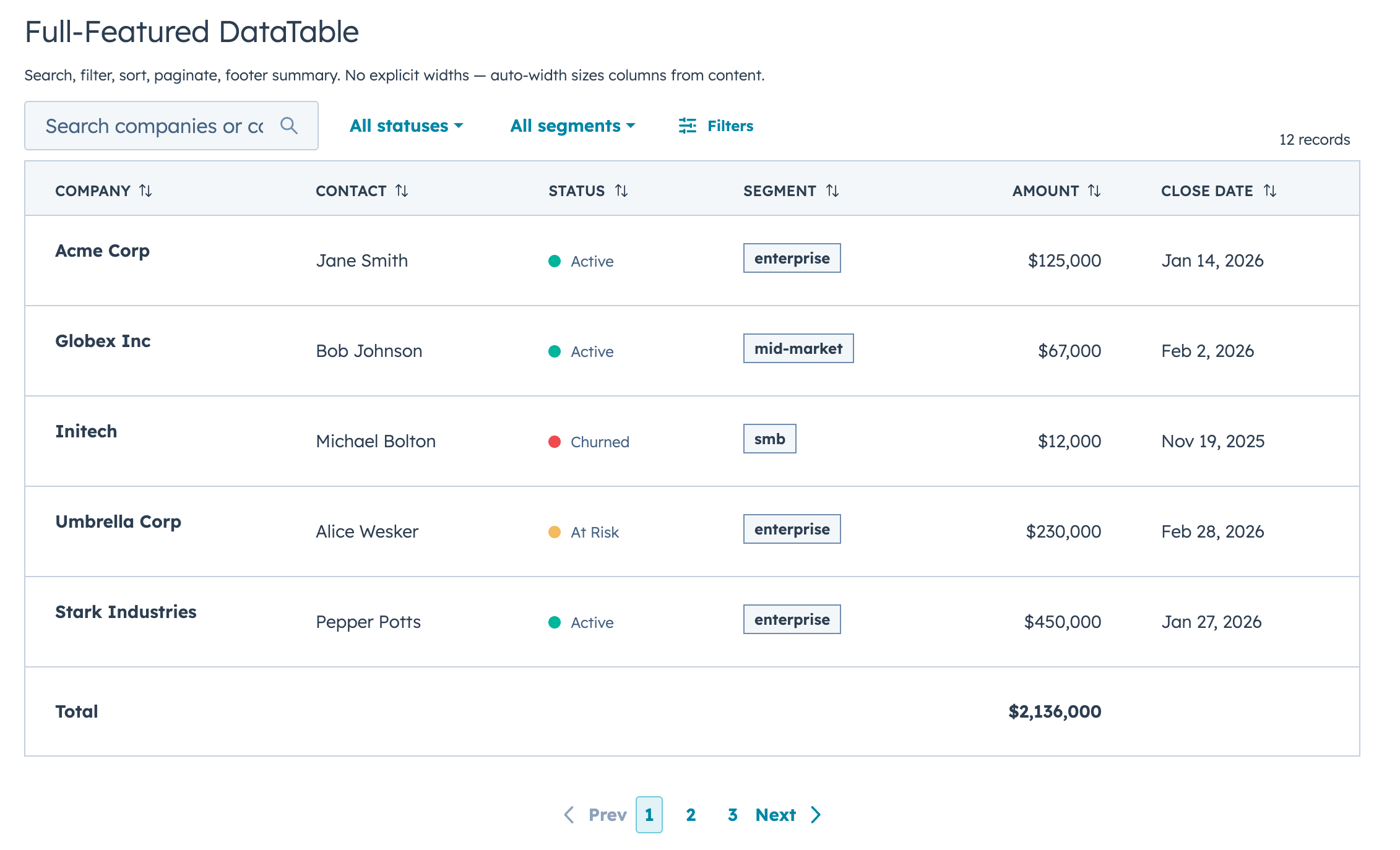
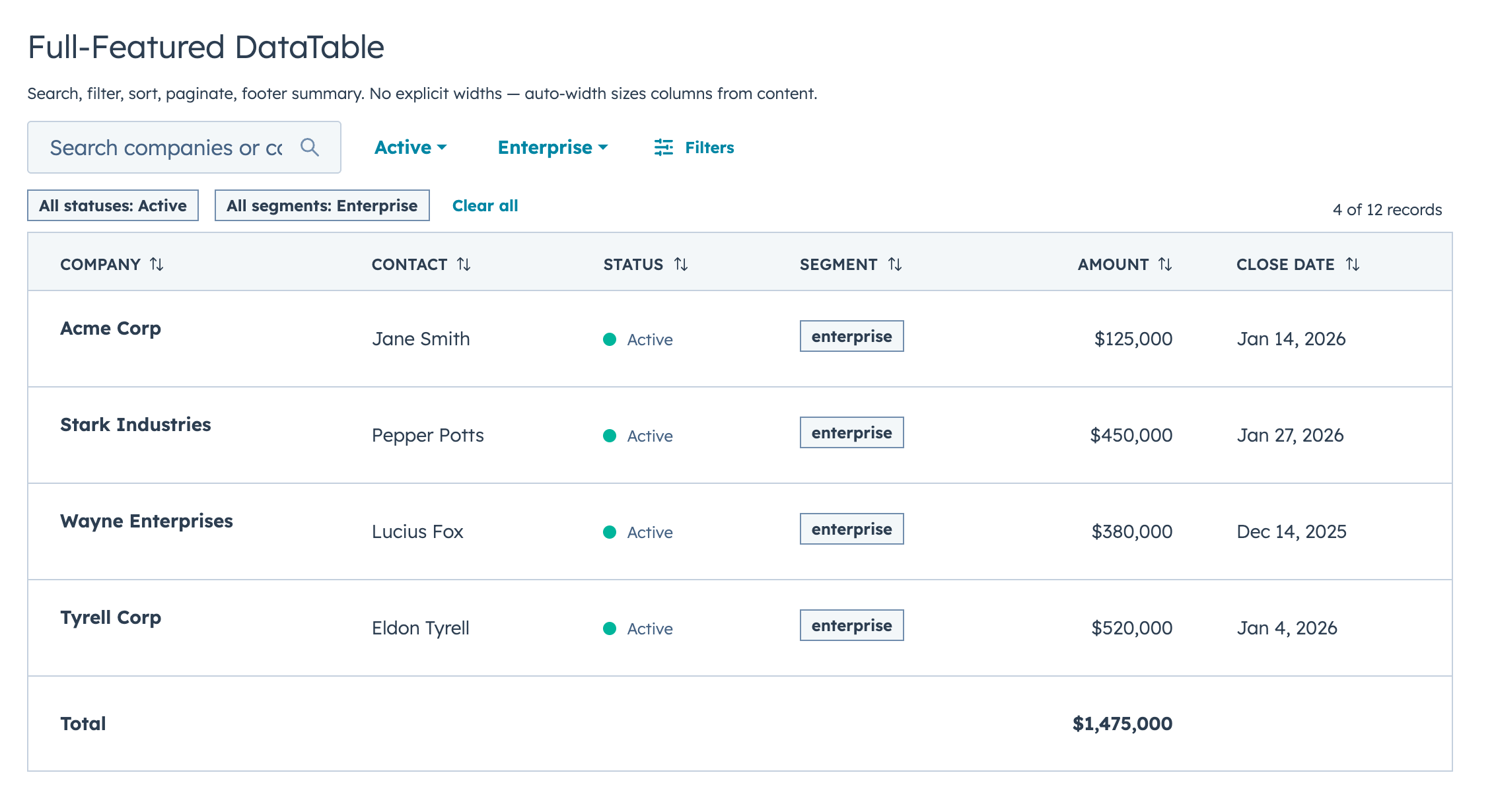
If you've built tables with HubSpot's `Table`, `TableRow`, and `TableCell` primitives, you know the drill: wire up search, sorting, pagination, and filtering yourself, then spend an hour tweaking column widths that still look wrong. DataTable does all of that for you.
|
|
35
|
-
|
|
36
|
-
The column sizing alone is worth it. DataTable looks at your actual data (types, string lengths, unique values, whether a column has edit controls) and picks widths automatically. Booleans and dates get compact columns, text gets room, and editable columns are never too narrow for their inputs. You don't configure any widths unless you want to.
|
|
32
|
+
## Quick Start
|
|
37
33
|
|
|
38
34
|
```jsx
|
|
39
35
|
import { DataTable } from "hs-uix/datatable";
|
|
@@ -49,286 +45,52 @@ const COLUMNS = [
|
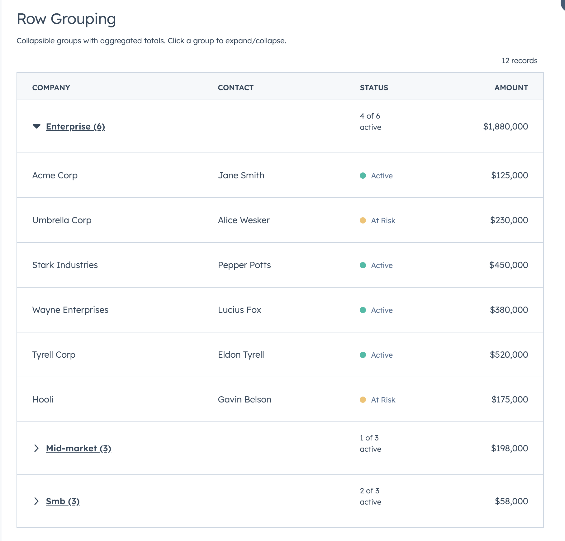
|
|
49
45
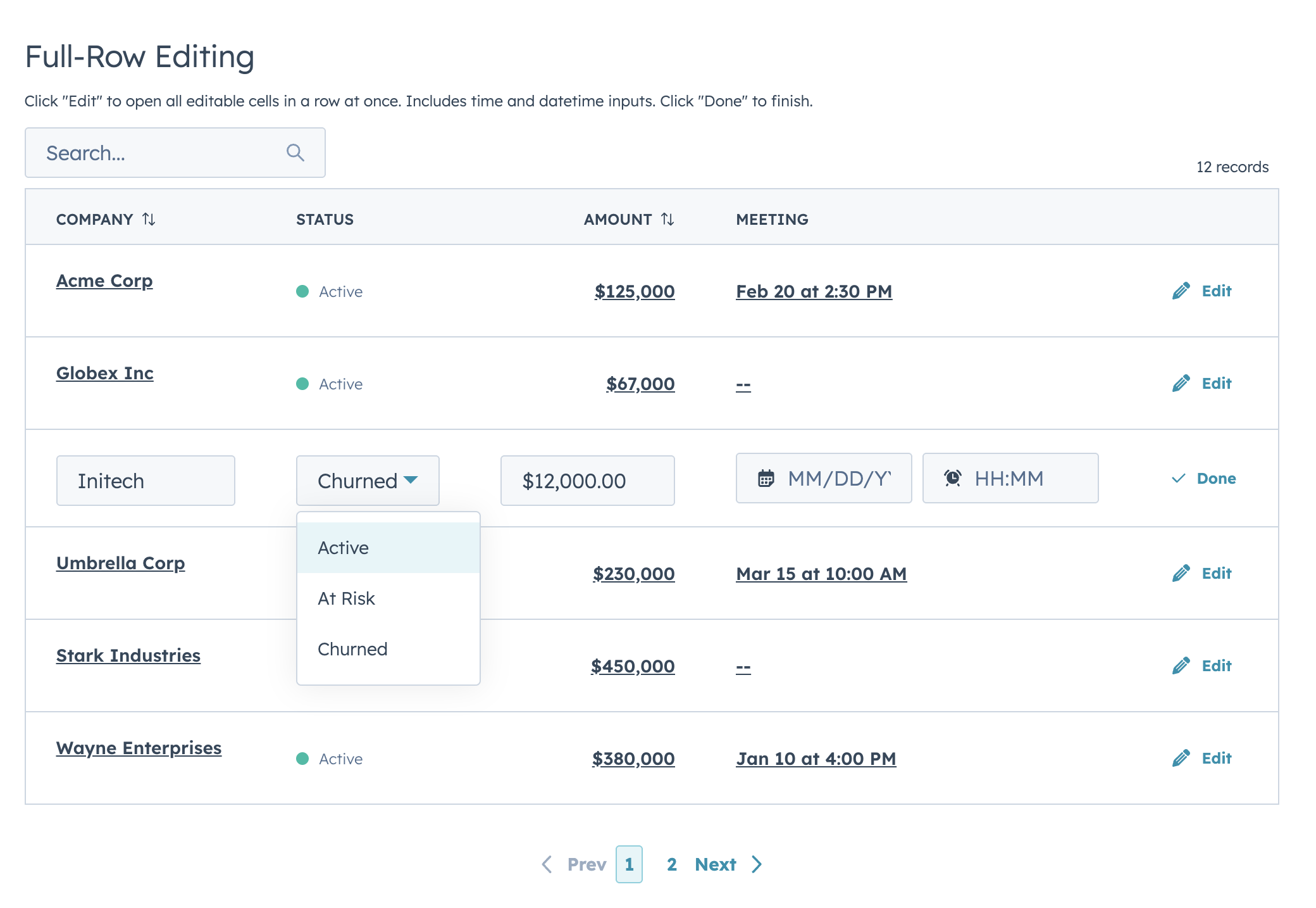
|
|
|
50
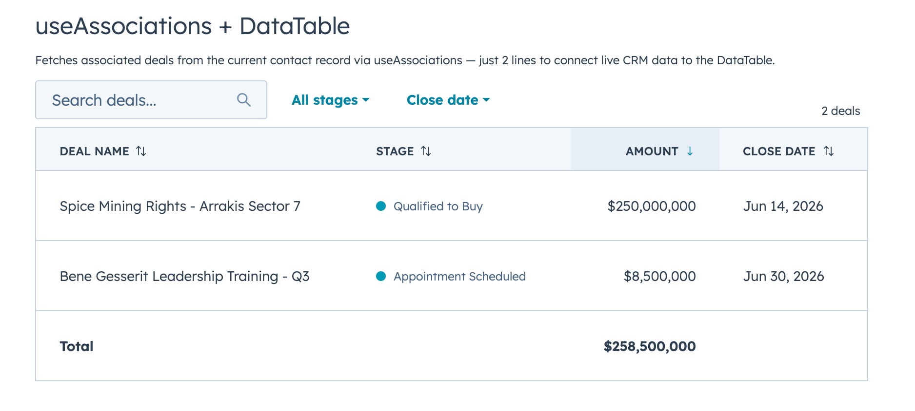
46
|
That's a searchable, sortable, paginated table with auto-sized columns in 5 lines of config.
|
|
51
47
|
|
|
52
|
-
##
|
|
53
|
-
|
|
54
|
-
- Full-text search
|
|
55
|
-
- Select, multi-select, and date range filters with
|
|
56
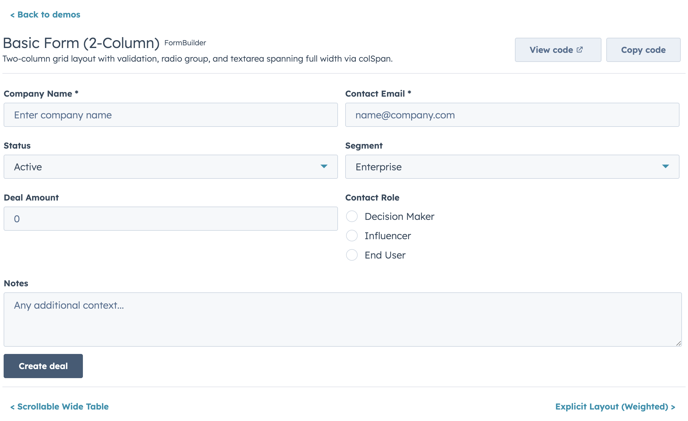
|
-
- Click-to-sort headers with three-state cycling
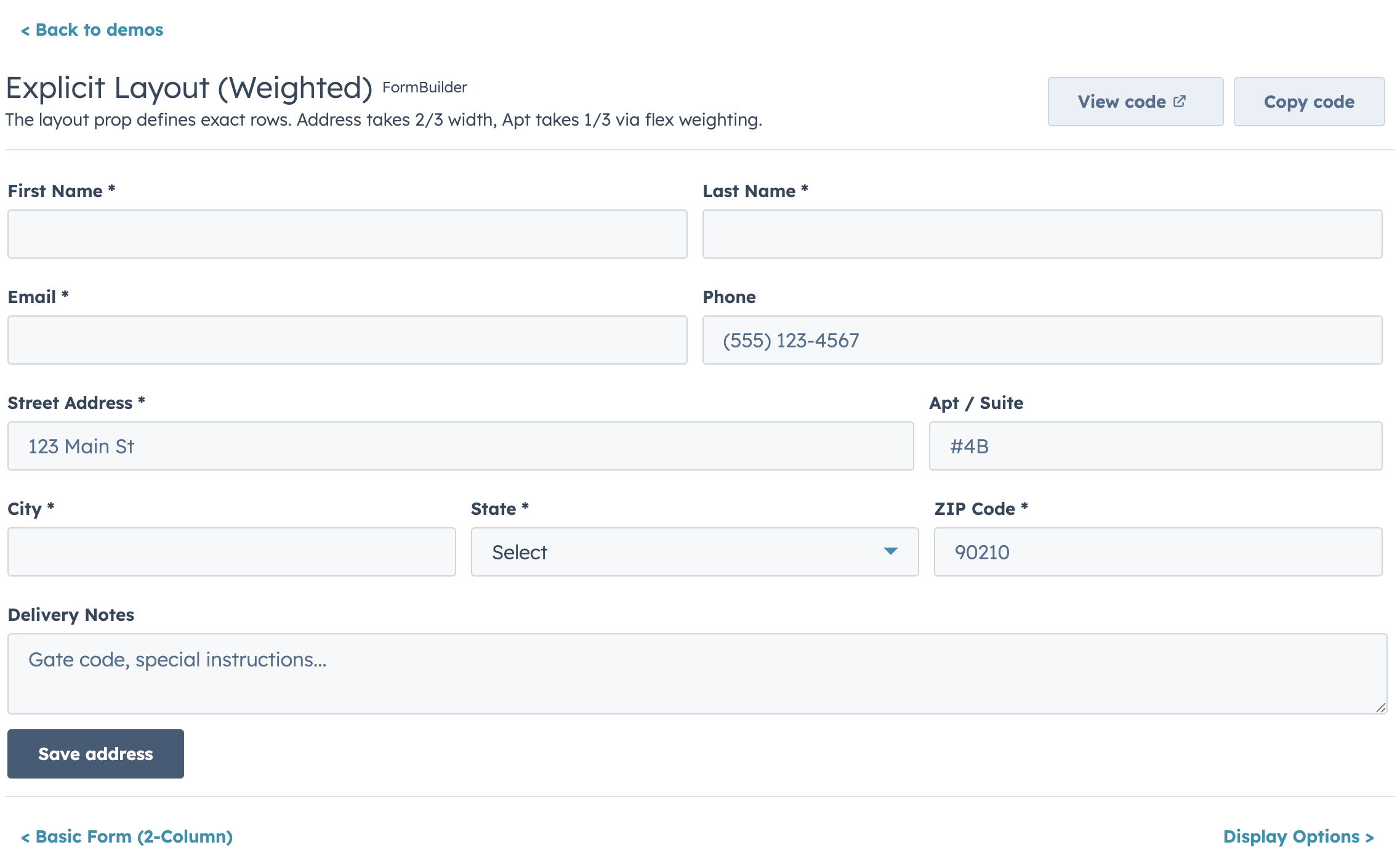
|
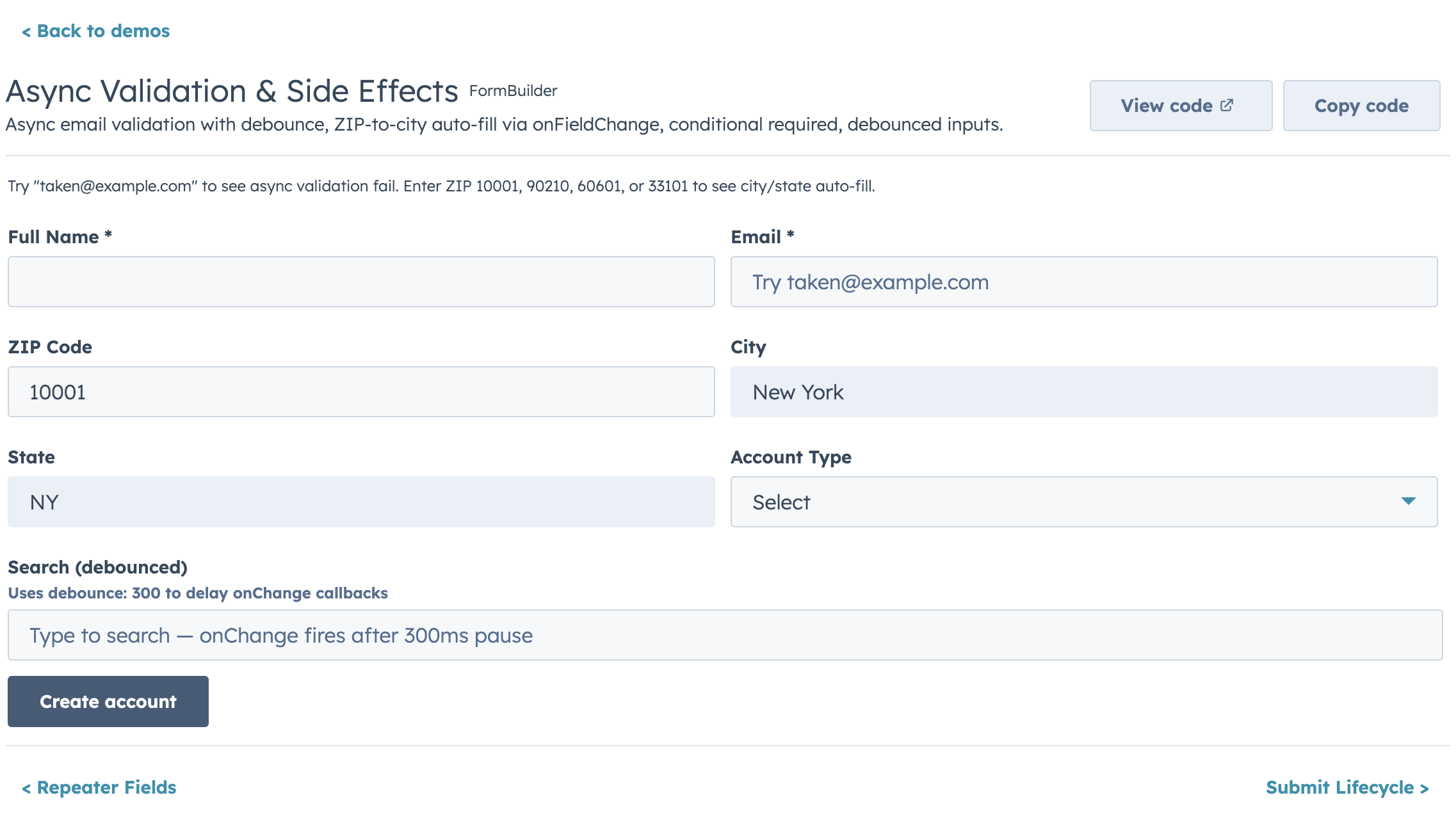
|
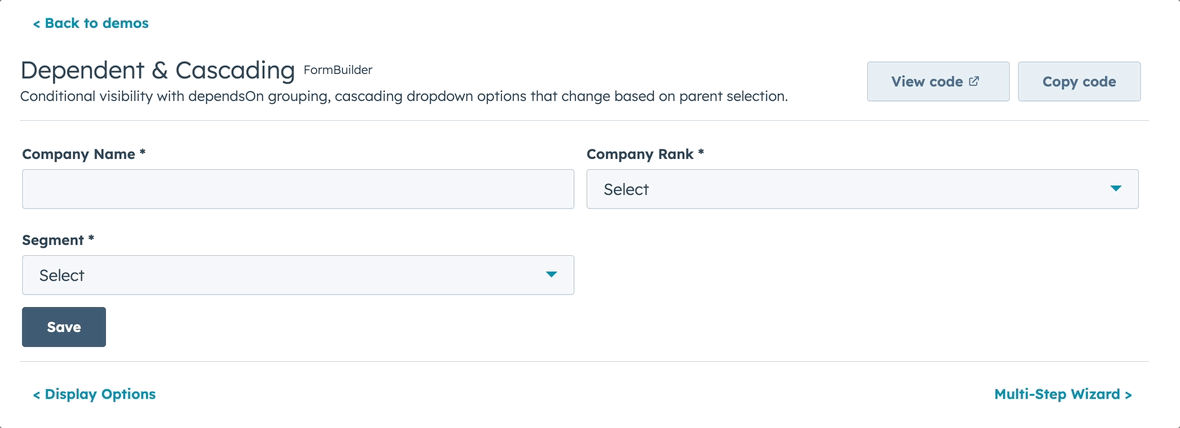
57
|
-
- Client-side or server-side pagination
|
|
58
|
-
- Collapsible row groups with per-column aggregation
|
|
59
|
-
- Row selection
|
|
60
|
-
-
|
|
61
|
-
-
|
|
62
|
-
-
|
|
63
|
-
- Auto-width column sizing based on data analysis, with manual overrides
|
|
64
|
-
- Text truncation helpers (`truncate: true` or `truncate: { maxLength }`)
|
|
65
|
-
- Customizable record label, row count display, and table appearance (`bordered`, `flush`, `scrollable`)
|
|
48
|
+
## Features
|
|
49
|
+
|
|
50
|
+
- Full-text search with optional fuzzy matching via Fuse.js
|
|
51
|
+
- Select, multi-select, and date range filters with active badges and clear/reset controls
|
|
52
|
+
- Click-to-sort headers with three-state cycling
|
|
53
|
+
- Client-side or server-side pagination
|
|
54
|
+
- Collapsible row groups with per-column aggregation
|
|
55
|
+
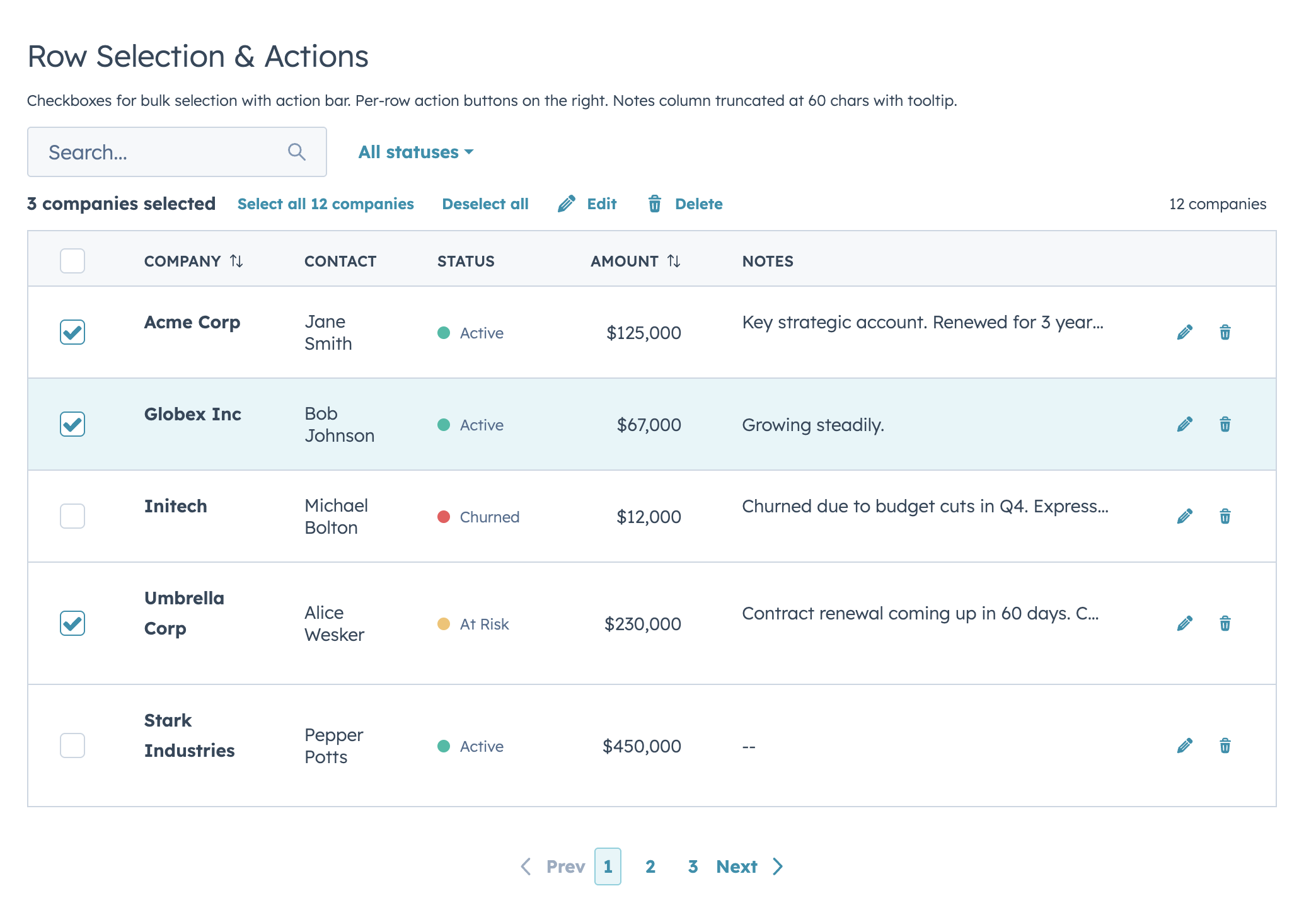
- Row selection with bulk action bar
|
|
56
|
+
- Per-row actions via `rowActions`
|
|
57
|
+
- Two edit modes (discrete click-to-edit and inline always-visible) supporting 12 input types with validation
|
|
58
|
+
- Auto-width column sizing based on data analysis
|
|
66
59
|
- Column-level footer for totals rows
|
|
67
60
|
- Works with `useAssociations` for live CRM data
|
|
68
|
-
- Server-side mode with loading/error states, search debounce,
|
|
69
|
-
|
|
70
|
-
## Filters and Footer Totals
|
|
71
|
-
|
|
72
|
-
|
|
61
|
+
- Server-side mode with loading/error states, search debounce, and unified `onParamsChange` callback
|
|
73
62
|
|
|
74
|
-
|
|
63
|
+
## Highlights
|
|
75
64
|
|
|
76
|
-
|
|
77
|
-
const FILTERS = [
|
|
78
|
-
{
|
|
79
|
-
name: "status",
|
|
80
|
-
type: "select",
|
|
81
|
-
placeholder: "All statuses",
|
|
82
|
-
options: [
|
|
83
|
-
{ label: "Active", value: "active" },
|
|
84
|
-
{ label: "At Risk", value: "at-risk" },
|
|
85
|
-
{ label: "Churned", value: "churned" },
|
|
86
|
-
],
|
|
87
|
-
},
|
|
88
|
-
{ name: "closeDate", type: "dateRange", placeholder: "Close date" },
|
|
89
|
-
];
|
|
90
|
-
|
|
91
|
-
const COLUMNS = [
|
|
92
|
-
{ field: "company", label: "Company", sortable: true, footer: "Total",
|
|
93
|
-
renderCell: (val) => <Text format={{ fontWeight: "demibold" }}>{val}</Text> },
|
|
94
|
-
{ field: "amount", label: "Amount", sortable: true, align: "right",
|
|
95
|
-
footer: (rows) => formatCurrency(rows.reduce((sum, r) => sum + r.amount, 0)),
|
|
96
|
-
renderCell: (val) => formatCurrency(val) },
|
|
97
|
-
];
|
|
65
|
+
### Filters & Footer Totals
|
|
98
66
|
|
|
99
|
-
|
|
100
|
-
data={DEALS}
|
|
101
|
-
columns={COLUMNS}
|
|
102
|
-
filters={FILTERS}
|
|
103
|
-
searchFields={["company"]}
|
|
104
|
-
pageSize={5}
|
|
105
|
-
/>
|
|
106
|
-
```
|
|
67
|
+

|
|
107
68
|
|
|
108
|
-
|
|
69
|
+
### Row Selection & Bulk Actions
|
|
109
70
|
|
|
110
71
|
|
|
111
72
|
|
|
112
|
-
|
|
113
|
-
const selectionActions = [
|
|
114
|
-
{ label: "Edit", icon: "edit", onClick: (ids) => console.log("Edit", ids) },
|
|
115
|
-
{ label: "Delete", icon: "delete", onClick: (ids) => console.log("Delete", ids) },
|
|
116
|
-
{ label: "Export", icon: "dataExport", onClick: (ids) => console.log("Export", ids) },
|
|
117
|
-
];
|
|
118
|
-
|
|
119
|
-
<DataTable
|
|
120
|
-
data={COMPANIES}
|
|
121
|
-
columns={columns}
|
|
122
|
-
selectable={true}
|
|
123
|
-
rowIdField="id"
|
|
124
|
-
recordLabel={{ singular: "Company", plural: "Companies" }}
|
|
125
|
-
onSelectionChange={setSelected}
|
|
126
|
-
selectionActions={selectionActions}
|
|
127
|
-
searchFields={["name", "contact"]}
|
|
128
|
-
pageSize={10}
|
|
129
|
-
/>
|
|
130
|
-
```
|
|
131
|
-
|
|
132
|
-
## Inline Editing
|
|
73
|
+
### Inline Editing
|
|
133
74
|
|
|
134
75
|
|
|
135
76
|
|
|
136
|
-
Two edit modes: **discrete** (click-to-edit, default) and **inline** (always-visible inputs).
|
|
77
|
+
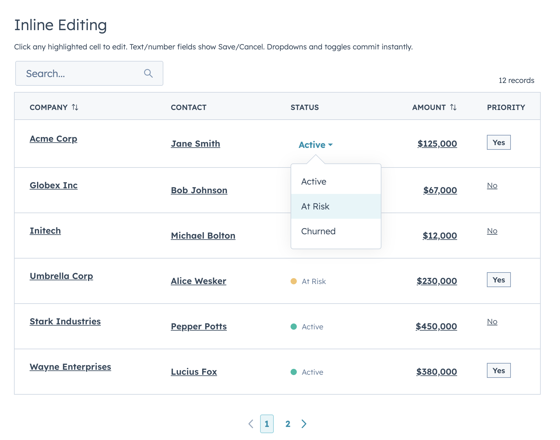
Two edit modes: **discrete** (click-to-edit, default) and **inline** (always-visible inputs). Supports `text`, `textarea`, `number`, `currency`, `stepper`, `select`, `multiselect`, `date`, `time`, `datetime`, `toggle`, and `checkbox`.
|
|
137
78
|
|
|
138
|
-
|
|
139
|
-
const columns = [
|
|
140
|
-
{ field: "company", label: "Company", editable: true, editType: "text",
|
|
141
|
-
renderCell: (val) => <Text format={{ fontWeight: "demibold" }}>{val}</Text> },
|
|
142
|
-
{ field: "status", label: "Status", editable: true, editType: "select",
|
|
143
|
-
editOptions: [
|
|
144
|
-
{ label: "Active", value: "active" },
|
|
145
|
-
{ label: "At Risk", value: "at-risk" },
|
|
146
|
-
],
|
|
147
|
-
renderCell: (val) => <StatusTag variant={STATUS_COLORS[val]}>{val}</StatusTag> },
|
|
148
|
-
{ field: "amount", label: "Amount", editable: true, editType: "currency",
|
|
149
|
-
renderCell: (val) => formatCurrency(val) },
|
|
150
|
-
];
|
|
151
|
-
|
|
152
|
-
<DataTable
|
|
153
|
-
data={data}
|
|
154
|
-
columns={columns}
|
|
155
|
-
rowIdField="id"
|
|
156
|
-
onRowEdit={(row, field, newValue) => handleEdit(row, field, newValue)}
|
|
157
|
-
/>
|
|
158
|
-
```
|
|
159
|
-
|
|
160
|
-
**Supported edit types:** `text`, `textarea`, `number`, `currency`, `stepper`, `select`, `multiselect`, `date`, `time`, `datetime`, `toggle`, `checkbox`
|
|
161
|
-
|
|
162
|
-
## Row Grouping
|
|
79
|
+
### Row Grouping
|
|
163
80
|
|
|
164
81
|
|
|
165
82
|
|
|
166
|
-
|
|
167
|
-
|
|
168
|
-
```jsx
|
|
169
|
-
<DataTable
|
|
170
|
-
data={DEALS}
|
|
171
|
-
columns={COLUMNS}
|
|
172
|
-
groupBy={{
|
|
173
|
-
field: "segment",
|
|
174
|
-
label: (value, rows) => `${value} (${rows.length})`,
|
|
175
|
-
sort: "asc",
|
|
176
|
-
defaultExpanded: true,
|
|
177
|
-
aggregations: {
|
|
178
|
-
amount: (rows) => formatCurrency(rows.reduce((sum, r) => sum + r.amount, 0)),
|
|
179
|
-
},
|
|
180
|
-
}}
|
|
181
|
-
/>
|
|
182
|
-
```
|
|
183
|
-
|
|
184
|
-
## Full-Row Editing
|
|
83
|
+
### Full-Row Editing
|
|
185
84
|
|
|
186
85
|
|
|
187
86
|
|
|
188
|
-
|
|
189
|
-
|
|
190
|
-
```jsx
|
|
191
|
-
<DataTable
|
|
192
|
-
data={rows}
|
|
193
|
-
columns={columns}
|
|
194
|
-
rowIdField="id"
|
|
195
|
-
editingRowId={editingRowId}
|
|
196
|
-
onRowEdit={handleCommittedEdit}
|
|
197
|
-
rowActions={(row) => editingRowId === row.id
|
|
198
|
-
? [{ label: "Done", icon: "success", onClick: () => saveRow(row.id) }]
|
|
199
|
-
: [{ label: "Edit", icon: "edit", onClick: () => setEditingRowId(row.id) }]}
|
|
200
|
-
/>
|
|
201
|
-
```
|
|
202
|
-
|
|
203
|
-
## Scrollable Wide Tables
|
|
204
|
-
|
|
205
|
-
|
|
206
|
-
|
|
207
|
-
```jsx
|
|
208
|
-
<DataTable data={data} columns={manyColumns} scrollable={true} pageSize={10} />
|
|
209
|
-
```
|
|
210
|
-
|
|
211
|
-
## useAssociations
|
|
87
|
+
### useAssociations
|
|
212
88
|
|
|
213
89
|
|
|
214
90
|
|
|
215
|
-
Connect live CRM data to a DataTable
|
|
216
|
-
|
|
217
|
-
```jsx
|
|
218
|
-
import { useAssociations } from "@hubspot/ui-extensions/crm";
|
|
219
|
-
import { DataTable } from "hs-uix/datatable";
|
|
220
|
-
|
|
221
|
-
const { results, isLoading } = useAssociations({
|
|
222
|
-
toObjectType: "0-3",
|
|
223
|
-
properties: ["dealname", "dealstage", "amount", "closedate"],
|
|
224
|
-
});
|
|
225
|
-
|
|
226
|
-
const deals = results.map((a) => ({
|
|
227
|
-
id: a.toObjectId,
|
|
228
|
-
dealname: a.properties.dealname,
|
|
229
|
-
amount: Number(a.properties.amount) || 0,
|
|
230
|
-
}));
|
|
231
|
-
|
|
232
|
-
<DataTable data={deals} columns={columns} searchFields={["dealname"]} />
|
|
233
|
-
```
|
|
234
|
-
|
|
235
|
-
## Server-Side Mode
|
|
91
|
+
Connect live CRM data (contacts, deals, tickets, etc.) to a DataTable with `useAssociations` from `@hubspot/ui-extensions/crm`.
|
|
236
92
|
|
|
237
|
-
|
|
238
|
-
|
|
239
|
-
```jsx
|
|
240
|
-
<DataTable
|
|
241
|
-
serverSide={true}
|
|
242
|
-
loading={loading}
|
|
243
|
-
error={error}
|
|
244
|
-
data={pageRows}
|
|
245
|
-
totalCount={totalCount}
|
|
246
|
-
columns={COLUMNS}
|
|
247
|
-
searchFields={["name", "email"]}
|
|
248
|
-
filters={FILTERS}
|
|
249
|
-
pageSize={25}
|
|
250
|
-
page={params.page}
|
|
251
|
-
searchDebounce={300}
|
|
252
|
-
onParamsChange={(p) => fetchData(p)}
|
|
253
|
-
/>
|
|
254
|
-
```
|
|
255
|
-
|
|
256
|
-
## DataTable Props
|
|
257
|
-
|
|
258
|
-
| Prop | Type | Default | Description |
|
|
259
|
-
|---|---|---|---|
|
|
260
|
-
| `data` | Array | *required* | Array of row objects |
|
|
261
|
-
| `columns` | Array | *required* | Column definitions |
|
|
262
|
-
| `renderRow` | `(row) => ReactNode` | — | Full row renderer (alternative to `renderCell`) |
|
|
263
|
-
| `searchFields` | string[] | `[]` | Fields to search across |
|
|
264
|
-
| `fuzzySearch` | boolean | `false` | Enable fuzzy matching via Fuse.js |
|
|
265
|
-
| `searchPlaceholder` | string | `"Search..."` | Placeholder text |
|
|
266
|
-
| `filters` | Array | `[]` | Filter configurations |
|
|
267
|
-
| `showFilterBadges` | boolean | `true` | Show active filter chips |
|
|
268
|
-
| `showClearFiltersButton` | boolean | `true` | Show "Clear all" button |
|
|
269
|
-
| `pageSize` | number | `10` | Rows per page |
|
|
270
|
-
| `maxVisiblePageButtons` | number | — | Max page buttons |
|
|
271
|
-
| `showButtonLabels` | boolean | `true` | Show First/Prev/Next/Last text |
|
|
272
|
-
| `showFirstLastButtons` | boolean | auto | Show First/Last buttons |
|
|
273
|
-
| `showRowCount` | boolean | `true` | Show record count text |
|
|
274
|
-
| `rowCountBold` | boolean | `false` | Bold the row count |
|
|
275
|
-
| `rowCountText` | `(shownOnPage, totalMatching) => string` | — | Custom row count formatter |
|
|
276
|
-
| `bordered` | boolean | `true` | Show table borders |
|
|
277
|
-
| `flush` | boolean | `true` | Remove bottom margin |
|
|
278
|
-
| `scrollable` | boolean | `false` | Allow horizontal scrolling |
|
|
279
|
-
| `defaultSort` | object | `{}` | Initial sort state |
|
|
280
|
-
| `groupBy` | object | — | Grouping config |
|
|
281
|
-
| `footer` | `(filteredData) => ReactNode` | — | Footer row renderer |
|
|
282
|
-
| `emptyTitle` | string | `"No results found"` | Empty state heading |
|
|
283
|
-
| `emptyMessage` | string | — | Empty state body |
|
|
284
|
-
| `recordLabel` | `{ singular, plural }` | `{ singular: "record", plural: "records" }` | Entity name |
|
|
285
|
-
| `selectable` | boolean | `false` | Enable row selection |
|
|
286
|
-
| `rowIdField` | string | `"id"` | Unique row identifier field |
|
|
287
|
-
| `selectedIds` | Array | — | Controlled selection |
|
|
288
|
-
| `onSelectionChange` | `(ids[]) => void` | — | Selection change callback |
|
|
289
|
-
| `onSelectAllRequest` | `(context) => void` | — | Server-side select all callback |
|
|
290
|
-
| `selectionActions` | Array | `[]` | Bulk action buttons |
|
|
291
|
-
| `selectionResetKey` | any | — | Reset key for uncontrolled selection |
|
|
292
|
-
| `rowActions` | Array \| Function | — | Per-row action buttons |
|
|
293
|
-
| `hideRowActionsWhenSelectionActive` | boolean | `false` | Hide row actions during selection |
|
|
294
|
-
| `editMode` | `"discrete"` \| `"inline"` | `"discrete"` | Edit mode |
|
|
295
|
-
| `editingRowId` | string \| number | — | Full-row edit target |
|
|
296
|
-
| `onRowEdit` | `(row, field, newValue) => void` | — | Edit commit callback |
|
|
297
|
-
| `onRowEditInput` | `(row, field, inputValue) => void` | — | Live input callback |
|
|
298
|
-
| `autoWidth` | boolean | `true` | Auto-compute column widths |
|
|
299
|
-
| `serverSide` | boolean | `false` | Enable server-side mode |
|
|
300
|
-
| `loading` | boolean | `false` | Show loading spinner |
|
|
301
|
-
| `error` | string \| boolean | — | Show error state |
|
|
302
|
-
| `totalCount` | number | — | Total records (server-side) |
|
|
303
|
-
| `page` | number | — | Current page (controlled) |
|
|
304
|
-
| `searchValue` | string | — | Controlled search term |
|
|
305
|
-
| `filterValues` | object | — | Controlled filter values |
|
|
306
|
-
| `sort` | object | — | Controlled sort state |
|
|
307
|
-
| `searchDebounce` | number | `0` | Debounce search callback (ms) |
|
|
308
|
-
| `onSearchChange` | `(term) => void` | — | Search callback |
|
|
309
|
-
| `onFilterChange` | `(filterValues) => void` | — | Filter callback |
|
|
310
|
-
| `onSortChange` | `(field, direction) => void` | — | Sort callback |
|
|
311
|
-
| `onPageChange` | `(page) => void` | — | Page callback |
|
|
312
|
-
| `onParamsChange` | `({ search, filters, sort, page }) => void` | — | Unified change callback |
|
|
313
|
-
|
|
314
|
-
### Column Definition
|
|
315
|
-
|
|
316
|
-
| Property | Type | Description |
|
|
317
|
-
|---|---|---|
|
|
318
|
-
| `field` | string | Key in the row object |
|
|
319
|
-
| `label` | string | Column header text |
|
|
320
|
-
| `sortable` | boolean | Enable sorting |
|
|
321
|
-
| `width` | `"min"` \| `"max"` \| `"auto"` \| `number` | Column width |
|
|
322
|
-
| `cellWidth` | `"min"` \| `"max"` \| `"auto"` | Cell-only width override |
|
|
323
|
-
| `align` | `"left"` \| `"center"` \| `"right"` | Text alignment |
|
|
324
|
-
| `renderCell` | `(value, row) => ReactNode` | Cell renderer |
|
|
325
|
-
| `truncate` | `true` \| `{ maxLength?: number }` | Text truncation with tooltip |
|
|
326
|
-
| `editable` | boolean | Enable inline editing |
|
|
327
|
-
| `editType` | string | Input type |
|
|
328
|
-
| `editOptions` | Array | Options for select/multiselect |
|
|
329
|
-
| `editValidate` | `(value, row) => true \| string` | Validation function |
|
|
330
|
-
| `editProps` | object | Pass-through props to edit input |
|
|
331
|
-
| `footer` | `string \| (rows) => ReactNode` | Footer cell content |
|
|
93
|
+
> **Full documentation:** [DataTable README](./packages/datatable/README.md) — includes full API reference, all examples, server-side mode, and more.
|
|
332
94
|
|
|
333
95
|
---
|
|
334
96
|
|
|
@@ -338,6 +100,8 @@ Declarative, config-driven forms for HubSpot UI Extensions. Define fields as dat
|
|
|
338
100
|
|
|
339
101
|
|
|
340
102
|
|
|
103
|
+
## Quick Start
|
|
104
|
+
|
|
341
105
|
```jsx
|
|
342
106
|
import { FormBuilder } from "hs-uix/form";
|
|
343
107
|
|
|
@@ -354,391 +118,56 @@ const fields = [
|
|
|
354
118
|
/>
|
|
355
119
|
```
|
|
356
120
|
|
|
357
|
-
##
|
|
358
|
-
|
|
359
|
-
Every field maps to a native HubSpot UI Extension component with full prop support:
|
|
360
|
-
|
|
361
|
-
| `type` | Component | Key Props |
|
|
362
|
-
|---|---|---|
|
|
363
|
-
| `text` | `Input` | `placeholder`, `onInput`, `onBlur` |
|
|
364
|
-
| `password` | `Input type="password"` | Same as text |
|
|
365
|
-
| `textarea` | `TextArea` | `rows`, `cols`, `resize`, `maxLength` |
|
|
366
|
-
| `number` | `NumberInput` | `min`, `max`, `precision`, `formatStyle` |
|
|
367
|
-
| `stepper` | `StepperInput` | `min`, `max`, `stepSize`, `precision` |
|
|
368
|
-
| `currency` | `CurrencyInput` | `currency` (ISO 4217), `min`, `max`, `precision` |
|
|
369
|
-
| `date` | `DateInput` | `format`, `min`, `max`, `timezone` |
|
|
370
|
-
| `time` | `TimeInput` | `interval`, `min`, `max`, `timezone` |
|
|
371
|
-
| `datetime` | `DateInput` + `TimeInput` | All date and time props |
|
|
372
|
-
| `select` | `Select` | `options`, `variant` |
|
|
373
|
-
| `multiselect` | `MultiSelect` | `options` |
|
|
374
|
-
| `toggle` | `Toggle` | `size`, `labelDisplay`, `textChecked`, `textUnchecked` |
|
|
375
|
-
| `checkbox` | `Checkbox` | `inline`, `variant` |
|
|
376
|
-
| `checkboxGroup` | `ToggleGroup checkboxList` | `options`, `inline`, `variant` |
|
|
377
|
-
| `radioGroup` | `ToggleGroup radioButtonList` | `options`, `inline`, `variant` |
|
|
378
|
-
| `display` | Custom render | Render-only, no form value |
|
|
379
|
-
| `repeater` | Sub-field rows | `fields`, `min`, `max` |
|
|
380
|
-
| `crmPropertyList` | `CrmPropertyList` | `properties`, `direction` |
|
|
381
|
-
| `crmAssociationPropertyList` | `CrmAssociationPropertyList` | `objectTypeId`, `properties`, `filters`, `sort` |
|
|
382
|
-
|
|
383
|
-
## Layout
|
|
384
|
-
|
|
385
|
-
FormBuilder provides four layout modes. Use `columns` or `columnWidth` to match HubSpot's standard look.
|
|
386
|
-
|
|
387
|
-
### Fixed Columns
|
|
121
|
+
## Features
|
|
388
122
|
|
|
389
|
-
|
|
390
|
-
|
|
391
|
-
|
|
123
|
+
- 20+ field types mapping to native HubSpot components (`text`, `number`, `select`, `date`, `toggle`, `repeater`, `crmPropertyList`, and more)
|
|
124
|
+
- Four layout modes: fixed columns, responsive AutoGrid, explicit row layout, and legacy half-width
|
|
125
|
+
- Built-in validation chain: required, pattern, length/range, custom sync, and custom async with loading indicators
|
|
126
|
+
- Conditional visibility and dependent property grouping
|
|
127
|
+
- Multi-step wizards with per-step validation
|
|
128
|
+
- Repeater fields for dynamic add/remove rows
|
|
129
|
+
- Accordion sections and field group dividers
|
|
130
|
+
- Custom field type plugin registry
|
|
131
|
+
- Controlled and uncontrolled modes
|
|
132
|
+
- Ref API for imperative access (`submit`, `validate`, `reset`, `getValues`, `setFieldValue`, etc.)
|
|
133
|
+
- Submit lifecycle hooks (`transformValues`, `onBeforeSubmit`, `onSubmitSuccess`, `onSubmitError`)
|
|
134
|
+
- Auto-save, dirty tracking, read-only mode, and form-level alerts
|
|
392
135
|
|
|
393
|
-
|
|
136
|
+
## Highlights
|
|
394
137
|
|
|
395
|
-
###
|
|
396
|
-
|
|
397
|
-
```jsx
|
|
398
|
-
<FormBuilder columnWidth={200} fields={fields} />
|
|
399
|
-
```
|
|
400
|
-
|
|
401
|
-
Columns collapse automatically on narrow screens.
|
|
402
|
-
|
|
403
|
-
### Explicit Layout
|
|
138
|
+
### Layout
|
|
404
139
|
|
|
405
140
|
|
|
406
141
|
|
|
407
|
-
|
|
408
|
-
<FormBuilder
|
|
409
|
-
layout={[
|
|
410
|
-
["firstName", "lastName"], // 2 equal columns
|
|
411
|
-
["email"], // full width
|
|
412
|
-
["city", "state", "zip"], // 3 columns
|
|
413
|
-
]}
|
|
414
|
-
fields={fields}
|
|
415
|
-
/>
|
|
416
|
-
```
|
|
417
|
-
|
|
418
|
-
Weighted columns:
|
|
419
|
-
|
|
420
|
-
```jsx
|
|
421
|
-
layout={[
|
|
422
|
-
[{ field: "address", flex: 2 }, { field: "apt", flex: 1 }], // 2:1 ratio
|
|
423
|
-
]}
|
|
424
|
-
```
|
|
425
|
-
|
|
426
|
-
**Layout priority:** `layout` > `columnWidth` > `columns` > legacy
|
|
427
|
-
|
|
428
|
-
## Validation
|
|
429
|
-
|
|
430
|
-
Built-in validators run in order, first failure wins:
|
|
431
|
-
|
|
432
|
-
```jsx
|
|
433
|
-
{
|
|
434
|
-
name: "email",
|
|
435
|
-
type: "text",
|
|
436
|
-
label: "Email",
|
|
437
|
-
required: true,
|
|
438
|
-
pattern: /^[^\s@]+@[^\s@]+$/,
|
|
439
|
-
patternMessage: "Enter a valid email",
|
|
440
|
-
minLength: 5,
|
|
441
|
-
maxLength: 100,
|
|
442
|
-
validators: [
|
|
443
|
-
(value) => value.endsWith("@example.com") ? true : "Use your company email",
|
|
444
|
-
],
|
|
445
|
-
validate: async (value, allValues, { signal }) => {
|
|
446
|
-
const exists = await checkEmailExists(value, { signal });
|
|
447
|
-
return exists ? "Email already in use" : true;
|
|
448
|
-
},
|
|
449
|
-
}
|
|
450
|
-
```
|
|
451
|
-
|
|
452
|
-
| Timing | Default | When |
|
|
453
|
-
|---|---|---|
|
|
454
|
-
| `validateOnChange` | `false` | Every keystroke |
|
|
455
|
-
| `validateOnBlur` | `true` | Field loses focus |
|
|
456
|
-
| `validateOnSubmit` | `true` | Submit attempt |
|
|
457
|
-
|
|
458
|
-
## Async Validation
|
|
459
|
-
|
|
460
|
-
|
|
461
|
-
|
|
462
|
-
Fields show a loading indicator while async validation runs. Pending requests are versioned and prior requests are aborted when supported (`signal`).
|
|
463
|
-
|
|
464
|
-
```jsx
|
|
465
|
-
{
|
|
466
|
-
name: "email",
|
|
467
|
-
type: "text",
|
|
468
|
-
label: "Email",
|
|
469
|
-
validate: async (value, allValues, { signal }) => {
|
|
470
|
-
const exists = await checkEmailExists(value, { signal });
|
|
471
|
-
return exists ? "Email already in use" : true;
|
|
472
|
-
},
|
|
473
|
-
validateDebounce: 500,
|
|
474
|
-
}
|
|
475
|
-
```
|
|
476
|
-
|
|
477
|
-
## Conditional Visibility & Dependent Properties
|
|
142
|
+
### Conditional Visibility & Dependent Properties
|
|
478
143
|
|
|
479
144
|
|
|
480
145
|
|
|
481
|
-
|
|
482
|
-
const fields = [
|
|
483
|
-
{ name: "hasCompany", type: "toggle", label: "Has company?" },
|
|
484
|
-
{
|
|
485
|
-
name: "companyName",
|
|
486
|
-
type: "text",
|
|
487
|
-
label: "Company name",
|
|
488
|
-
visible: (values) => values.hasCompany === true,
|
|
489
|
-
},
|
|
490
|
-
];
|
|
491
|
-
```
|
|
492
|
-
|
|
493
|
-
Dependent fields are grouped in a HubSpot Tile container below their parent:
|
|
494
|
-
|
|
495
|
-
```jsx
|
|
496
|
-
{
|
|
497
|
-
name: "contractLength",
|
|
498
|
-
type: "number",
|
|
499
|
-
label: "Contract length (months)",
|
|
500
|
-
dependsOnConfig: {
|
|
501
|
-
field: "dealType",
|
|
502
|
-
display: "grouped",
|
|
503
|
-
label: "Contract details",
|
|
504
|
-
message: (parentLabel) => `These properties depend on ${parentLabel}`,
|
|
505
|
-
},
|
|
506
|
-
visible: (values) => values.dealType === "recurring",
|
|
507
|
-
}
|
|
508
|
-
```
|
|
509
|
-
|
|
510
|
-
## Multi-Step Wizard
|
|
146
|
+
### Async Validation
|
|
511
147
|
|
|
512
|
-
|
|
513
|
-
<FormBuilder
|
|
514
|
-
fields={allFields}
|
|
515
|
-
steps={[
|
|
516
|
-
{ title: "Contact Info", fields: ["firstName", "lastName", "email"] },
|
|
517
|
-
{ title: "Company", fields: ["company", "role"] },
|
|
518
|
-
{ title: "Review", render: ({ values, goBack }) => (
|
|
519
|
-
<ReviewPanel values={values} onEdit={goBack} />
|
|
520
|
-
)},
|
|
521
|
-
]}
|
|
522
|
-
showStepIndicator={true}
|
|
523
|
-
validateStepOnNext={true}
|
|
524
|
-
onSubmit={handleSubmit}
|
|
525
|
-
/>
|
|
526
|
-
```
|
|
148
|
+

|
|
527
149
|
|
|
528
|
-
|
|
150
|
+
### Repeater Fields
|
|
529
151
|
|
|
530
152
|
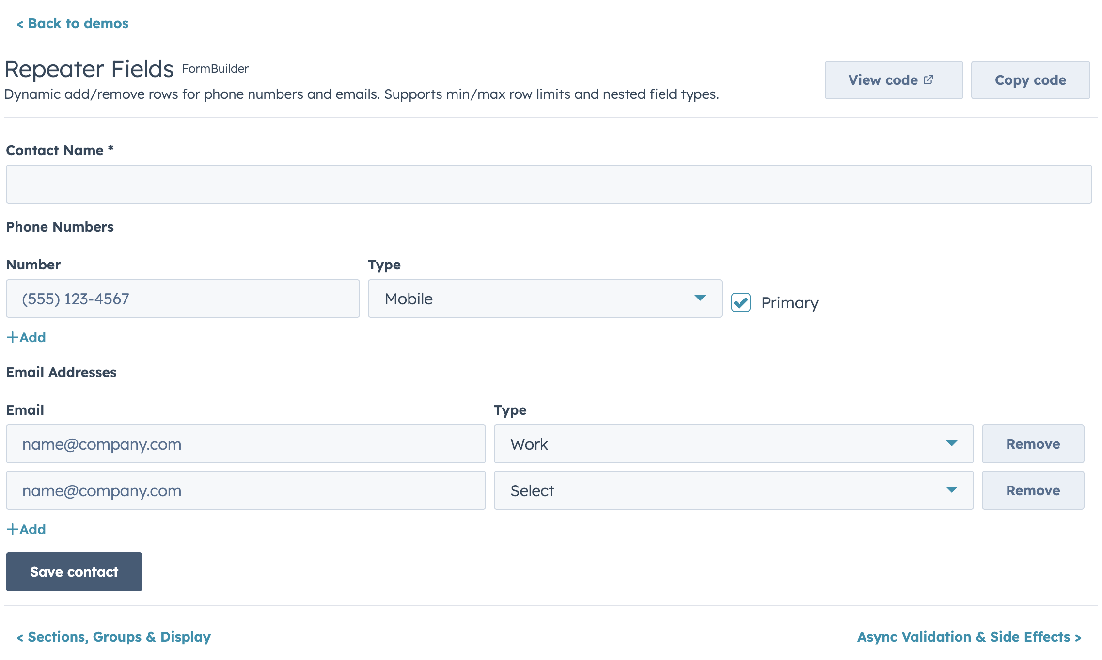
|
|
531
153
|
|
|
532
|
-
|
|
533
|
-
{ name: "phones", type: "repeater", label: "Phone Numbers",
|
|
534
|
-
fields: [
|
|
535
|
-
{ name: "number", type: "text", label: "Number" },
|
|
536
|
-
{ name: "type", type: "select", label: "Type", options: PHONE_TYPES },
|
|
537
|
-
],
|
|
538
|
-
min: 1, max: 5 }
|
|
539
|
-
```
|
|
540
|
-
|
|
541
|
-
## Sections (Accordion Grouping)
|
|
154
|
+
### Sections & Groups
|
|
542
155
|
|
|
543
156
|
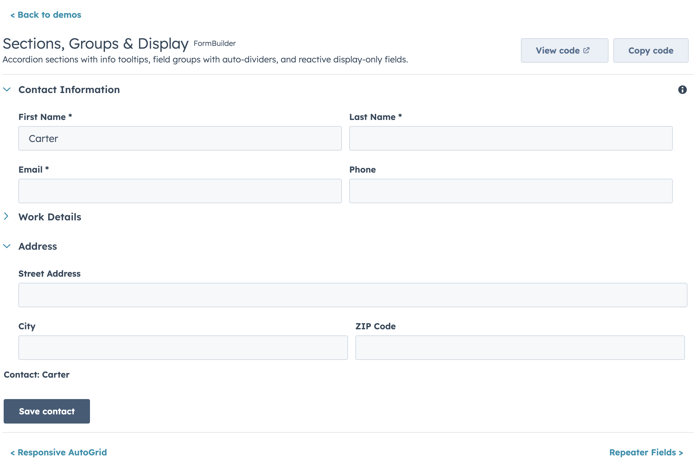
|
|
544
157
|
|
|
545
|
-
|
|
546
|
-
<FormBuilder
|
|
547
|
-
fields={fields}
|
|
548
|
-
sections={[
|
|
549
|
-
{ id: "basic", label: "Basic Info", fields: ["firstName", "lastName", "email"], defaultOpen: true },
|
|
550
|
-
{ id: "social", label: "Social Links", fields: ["facebook", "instagram"], defaultOpen: false },
|
|
551
|
-
]}
|
|
552
|
-
onSubmit={handleSubmit}
|
|
553
|
-
/>
|
|
554
|
-
```
|
|
555
|
-
|
|
556
|
-
## Custom Field Types
|
|
158
|
+
### Custom Field Types
|
|
557
159
|
|
|
558
160
|
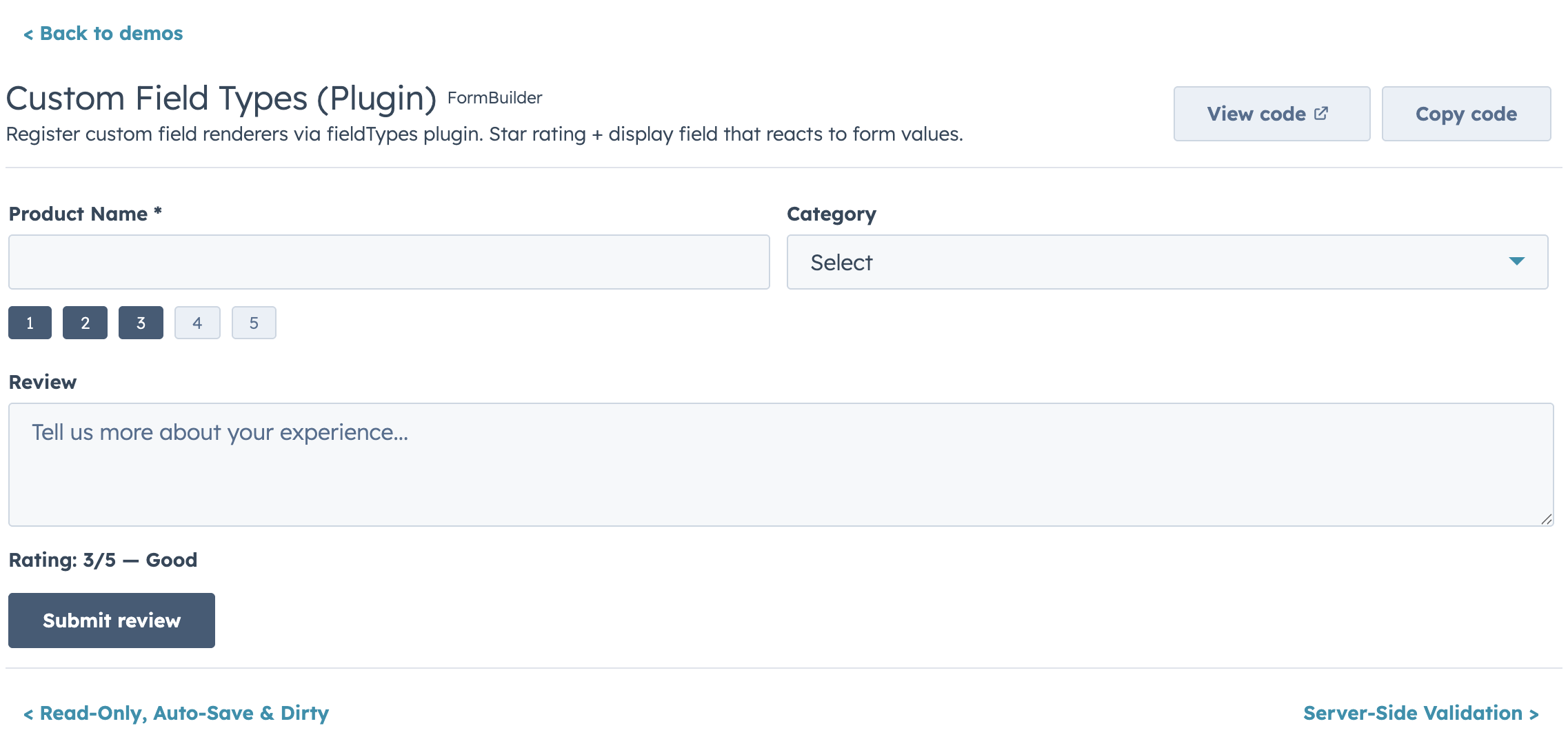
|
|
559
161
|
|
|
560
|
-
|
|
561
|
-
<FormBuilder
|
|
562
|
-
fieldTypes={{
|
|
563
|
-
imageGallery: {
|
|
564
|
-
render: ({ value, onChange, error, field }) => (
|
|
565
|
-
<ImageGalleryInput urls={value} onUpdate={onChange} error={error} />
|
|
566
|
-
),
|
|
567
|
-
getEmptyValue: () => [],
|
|
568
|
-
isEmpty: (v) => v.length === 0,
|
|
569
|
-
},
|
|
570
|
-
}}
|
|
571
|
-
fields={[
|
|
572
|
-
{ name: "photos", type: "imageGallery", label: "Photos", required: true },
|
|
573
|
-
]}
|
|
574
|
-
/>
|
|
575
|
-
```
|
|
576
|
-
|
|
577
|
-
## Display Options
|
|
162
|
+
### Display Options
|
|
578
163
|
|
|
579
164
|
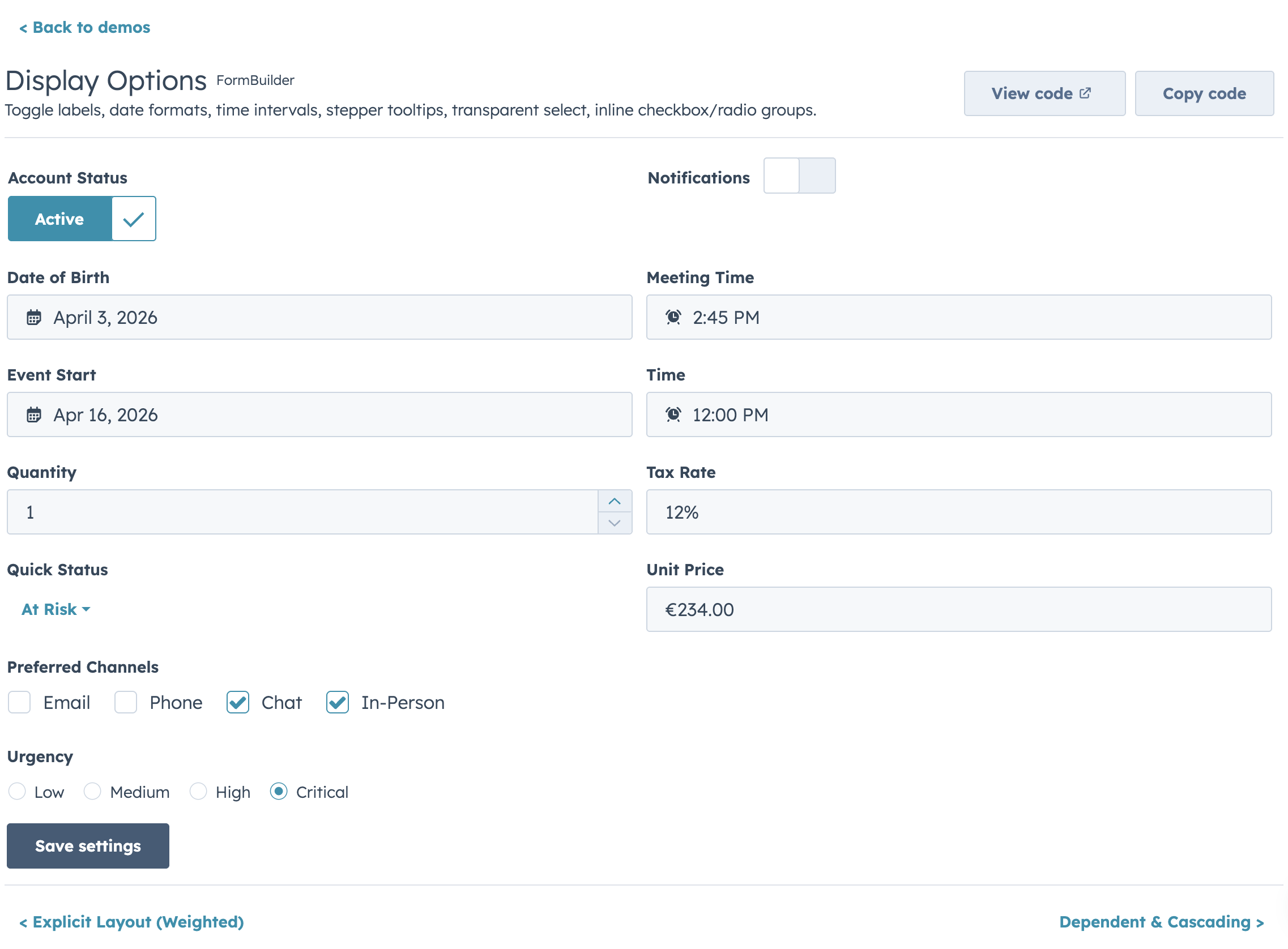
|
|
580
165
|
|
|
581
|
-
|
|
166
|
+
### Read-Only Mode
|
|
582
167
|
|
|
583
168
|
|
|
584
169
|
|
|
585
|
-
|
|
586
|
-
<FormBuilder
|
|
587
|
-
fields={fields}
|
|
588
|
-
readOnly={isPremiumAccount}
|
|
589
|
-
readOnlyMessage="This is a premium account. Editing is disabled."
|
|
590
|
-
onSubmit={handleSubmit}
|
|
591
|
-
/>
|
|
592
|
-
```
|
|
593
|
-
|
|
594
|
-
## Controlled vs Uncontrolled
|
|
595
|
-
|
|
596
|
-
**Uncontrolled (default):**
|
|
597
|
-
|
|
598
|
-
```jsx
|
|
599
|
-
<FormBuilder
|
|
600
|
-
fields={fields}
|
|
601
|
-
initialValues={{ firstName: "John" }}
|
|
602
|
-
onSubmit={(values) => save(values)}
|
|
603
|
-
/>
|
|
604
|
-
```
|
|
605
|
-
|
|
606
|
-
**Controlled:**
|
|
607
|
-
|
|
608
|
-
```jsx
|
|
609
|
-
const [values, setValues] = useState({});
|
|
610
|
-
|
|
611
|
-
<FormBuilder
|
|
612
|
-
fields={fields}
|
|
613
|
-
values={values}
|
|
614
|
-
onChange={setValues}
|
|
615
|
-
onSubmit={(values) => save(values)}
|
|
616
|
-
/>
|
|
617
|
-
```
|
|
618
|
-
|
|
619
|
-
## Ref API
|
|
620
|
-
|
|
621
|
-
```jsx
|
|
622
|
-
const formRef = useRef();
|
|
623
|
-
|
|
624
|
-
<FormBuilder ref={formRef} fields={fields} onSubmit={save} />
|
|
625
|
-
|
|
626
|
-
formRef.current.submit(); // trigger validation + submit
|
|
627
|
-
formRef.current.validate(); // { valid: boolean, errors: {} }
|
|
628
|
-
formRef.current.reset(); // reset to initial values
|
|
629
|
-
formRef.current.getValues(); // current form values
|
|
630
|
-
formRef.current.isDirty(); // true if values changed
|
|
631
|
-
formRef.current.setFieldValue("email", "new@test.com"); // programmatic update
|
|
632
|
-
formRef.current.setFieldError("email", "Taken"); // programmatic error
|
|
633
|
-
formRef.current.setErrors({ email: "Exists", phone: "Invalid" }); // batch set
|
|
634
|
-
```
|
|
635
|
-
|
|
636
|
-
## Submit Lifecycle
|
|
637
|
-
|
|
638
|
-
```jsx
|
|
639
|
-
<FormBuilder
|
|
640
|
-
fields={fields}
|
|
641
|
-
transformValues={(values) => ({
|
|
642
|
-
...values,
|
|
643
|
-
fullName: `${values.firstName} ${values.lastName}`.trim(),
|
|
644
|
-
})}
|
|
645
|
-
onBeforeSubmit={async (values) => await showConfirmDialog()}
|
|
646
|
-
onSubmit={saveRecord}
|
|
647
|
-
onSubmitSuccess={(result, { reset }) => actions.addAlert({ type: "success", message: "Saved!" })}
|
|
648
|
-
onSubmitError={(err) => actions.addAlert({ type: "danger", message: err.message })}
|
|
649
|
-
resetOnSuccess={true}
|
|
650
|
-
/>
|
|
651
|
-
```
|
|
652
|
-
|
|
653
|
-
## Buttons
|
|
654
|
-
|
|
655
|
-
```jsx
|
|
656
|
-
<FormBuilder
|
|
657
|
-
fields={fields}
|
|
658
|
-
onSubmit={save}
|
|
659
|
-
labels={{ submit: "Save record", cancel: "Discard", back: "Previous", next: "Continue" }}
|
|
660
|
-
submitVariant="primary"
|
|
661
|
-
showCancel={true}
|
|
662
|
-
onCancel={() => actions.closeOverlay()}
|
|
663
|
-
loading={isSaving}
|
|
664
|
-
disabled={!canEdit}
|
|
665
|
-
/>
|
|
666
|
-
```
|
|
667
|
-
|
|
668
|
-
## FormBuilder Props
|
|
669
|
-
|
|
670
|
-
| Prop | Type | Default | Description |
|
|
671
|
-
|---|---|---|---|
|
|
672
|
-
| `fields` | `FormBuilderField[]` | required | Field definitions |
|
|
673
|
-
| `onSubmit` | `(values, { reset }) => void \| Promise` | required | Called on valid submit |
|
|
674
|
-
| `initialValues` | `Record<string, unknown>` | `{}` | Starting values (uncontrolled) |
|
|
675
|
-
| `values` | `Record<string, unknown>` | — | Controlled values |
|
|
676
|
-
| `onChange` | `(values) => void` | — | Change callback (controlled) |
|
|
677
|
-
| `errors` | `Record<string, string>` | — | Controlled validation errors |
|
|
678
|
-
| `onFieldChange` | `(name, value, allValues) => void` | — | Per-field change |
|
|
679
|
-
| `validateOnChange` | `boolean` | `false` | Validate on keystroke |
|
|
680
|
-
| `validateOnBlur` | `boolean` | `true` | Validate on blur |
|
|
681
|
-
| `validateOnSubmit` | `boolean` | `true` | Validate all before submit |
|
|
682
|
-
| `onValidationChange` | `(errors) => void` | — | Validation state callback |
|
|
683
|
-
| `steps` | `FormBuilderStep[]` | — | Enables multi-step mode |
|
|
684
|
-
| `step` | `number` | — | Controlled step (0-based) |
|
|
685
|
-
| `onStepChange` | `(step) => void` | — | Step change callback |
|
|
686
|
-
| `showStepIndicator` | `boolean` | `true` | Show StepIndicator |
|
|
687
|
-
| `validateStepOnNext` | `boolean` | `true` | Validate before Next |
|
|
688
|
-
| `submitVariant` | `"primary" \| "secondary"` | `"primary"` | Button variant |
|
|
689
|
-
| `showCancel` | `boolean` | `false` | Show cancel button |
|
|
690
|
-
| `onCancel` | `() => void` | — | Cancel callback |
|
|
691
|
-
| `submitPosition` | `"bottom" \| "none"` | `"bottom"` | Button placement |
|
|
692
|
-
| `loading` | `boolean` | — | Controlled loading state |
|
|
693
|
-
| `disabled` | `boolean` | `false` | Disable entire form |
|
|
694
|
-
| `labels` | `{ submit?, cancel?, back?, next? }` | — | Button label i18n object |
|
|
695
|
-
| `renderButtons` | `(context) => ReactNode` | — | Custom button-row renderer |
|
|
696
|
-
| `columns` | `number` | `1` | Fixed column count |
|
|
697
|
-
| `columnWidth` | `number` | — | AutoGrid responsive column width (px) |
|
|
698
|
-
| `layout` | `FormBuilderLayout` | — | Explicit row layout |
|
|
699
|
-
| `gap` | `string` | `"sm"` | Spacing between fields |
|
|
700
|
-
| `showRequiredIndicator` | `boolean` | `true` | Show * on required fields |
|
|
701
|
-
| `sections` | `FormBuilderSection[]` | — | Accordion field grouping |
|
|
702
|
-
| `fieldTypes` | `Record<string, FieldTypePlugin>` | — | Custom field type registry |
|
|
703
|
-
| `readOnly` | `boolean` | `false` | Lock all fields |
|
|
704
|
-
| `readOnlyMessage` | `string` | — | Warning alert in read-only mode |
|
|
705
|
-
| `alerts` | `{ addAlert?, errorTitle?, successTitle? }` | — | Grouped alert config |
|
|
706
|
-
| `error` | `string \| boolean` | — | Form-level error alert |
|
|
707
|
-
| `success` | `string` | — | Form-level success alert |
|
|
708
|
-
| `transformValues` | `(values) => values` | — | Reshape values before submit |
|
|
709
|
-
| `onBeforeSubmit` | `(values) => boolean \| Promise` | — | Intercept submit |
|
|
710
|
-
| `onSubmitSuccess` | `(result, helpers) => void` | — | Post-submit success |
|
|
711
|
-
| `onSubmitError` | `(error, helpers) => void` | — | Post-submit error |
|
|
712
|
-
| `resetOnSuccess` | `boolean` | `false` | Auto-reset after success |
|
|
713
|
-
| `autoSave` | `{ debounce?, onAutoSave }` | — | Debounced auto-save |
|
|
714
|
-
| `onDirtyChange` | `(isDirty) => void` | — | Dirty state callback |
|
|
715
|
-
| `ref` | `Ref<FormBuilderRef>` | — | Imperative ref |
|
|
716
|
-
|
|
717
|
-
### Field Props
|
|
718
|
-
|
|
719
|
-
| Prop | Type | Description |
|
|
720
|
-
|---|---|---|
|
|
721
|
-
| `name` | `string` | Unique field identifier |
|
|
722
|
-
| `type` | `FormBuilderFieldType` | Field type |
|
|
723
|
-
| `label` | `string` | Field label |
|
|
724
|
-
| `description` | `string` | Helper text |
|
|
725
|
-
| `placeholder` | `string` | Placeholder text |
|
|
726
|
-
| `tooltip` | `string` | Tooltip next to label |
|
|
727
|
-
| `required` | `boolean \| (values) => boolean` | Required validation |
|
|
728
|
-
| `readOnly` | `boolean` | Prevent editing |
|
|
729
|
-
| `disabled` | `boolean` | Disable this field |
|
|
730
|
-
| `defaultValue` | `unknown` | Default value |
|
|
731
|
-
| `colSpan` | `number` | Columns to span |
|
|
732
|
-
| `visible` | `(values) => boolean` | Conditional visibility |
|
|
733
|
-
| `dependsOnConfig` | `{ field, display?, label?, message? }` | Grouped dependent config |
|
|
734
|
-
| `validate` | `(value, allValues, context?) => true \| string \| Promise` | Custom validation |
|
|
735
|
-
| `validators` | `Array<Function>` | Additional custom validators |
|
|
736
|
-
| `validateDebounce` | `number` | Debounce async validation (ms) |
|
|
737
|
-
| `debounce` | `number` | Debounce onChange (ms) |
|
|
738
|
-
| `options` | `Option[] \| (values) => Option[]` | Dropdown/toggle options |
|
|
739
|
-
| `render` | `(props) => ReactNode` | Custom render escape hatch |
|
|
740
|
-
| `fieldProps` | `Record<string, unknown>` | Pass-through to HubSpot component |
|
|
741
|
-
| `onFieldChange` | `(value, allValues, helpers) => void` | Cross-field side effects |
|
|
170
|
+
> **Full documentation:** [FormBuilder README](./packages/form/README.md) — includes full API reference, all field types, validation details, props tables, and more.
|
|
742
171
|
|
|
743
172
|
---
|
|
744
173
|
|
|
@@ -754,8 +183,6 @@ Both packages have been merged into `hs-uix`. Update your imports:
|
|
|
754
183
|
+ import { FormBuilder } from "hs-uix/form";
|
|
755
184
|
```
|
|
756
185
|
|
|
757
|
-
Then remove the old packages:
|
|
758
|
-
|
|
759
186
|
```bash
|
|
760
187
|
npm uninstall @hs-uix/datatable @hs-uix/form
|
|
761
188
|
npm install hs-uix
|