ghostykit 0.8.2 → 0.9.1
This diff represents the content of publicly available package versions that have been released to one of the supported registries. The information contained in this diff is provided for informational purposes only and reflects changes between package versions as they appear in their respective public registries.
- package/README.md +21 -0
- package/dist/split/index.d.ts +73 -0
- package/dist/split/index.js +239 -0
- package/dist/split.css +71 -0
- package/dist/styles.css +12 -0
- package/package.json +19 -4
package/README.md
CHANGED
|
@@ -258,6 +258,27 @@ with `icons={{ send: <PaperPlane /> }}` and a plugin `header: { start, end }`.
|
|
|
258
258
|
|---|---|---|
|
|
259
259
|
| 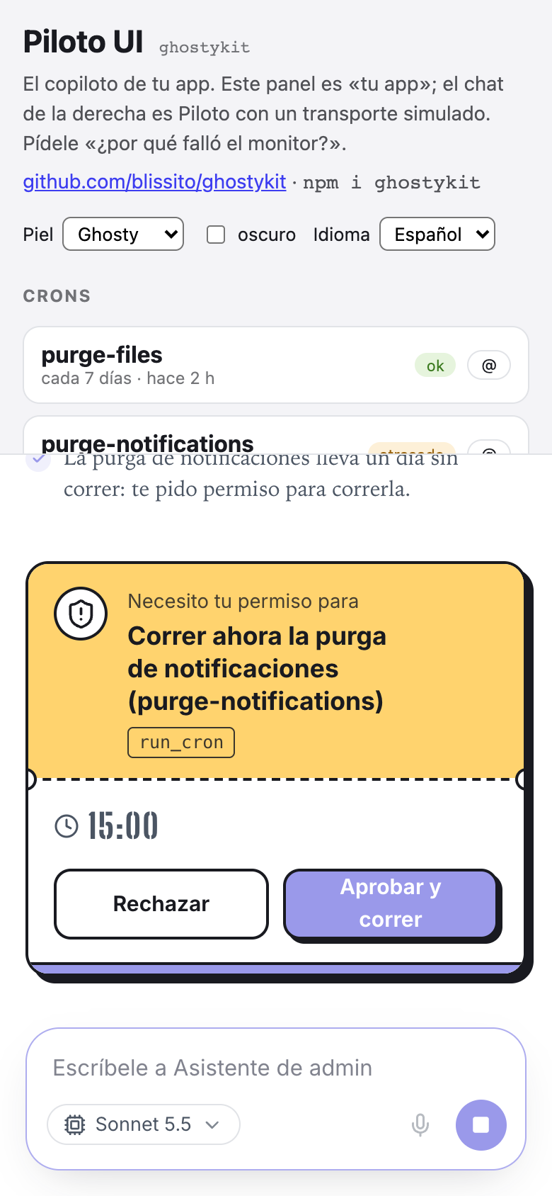 | 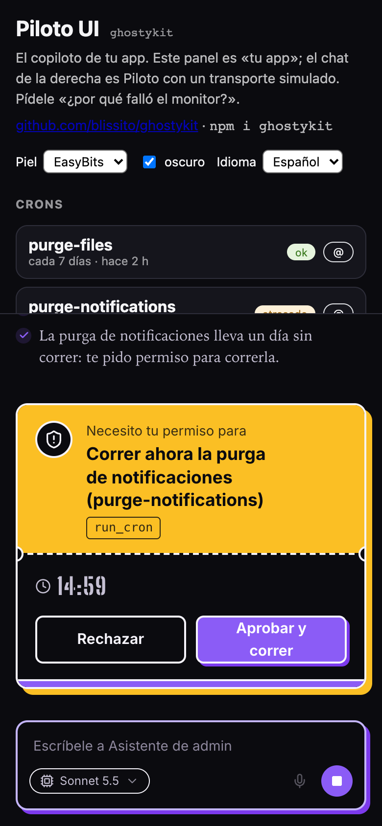 | 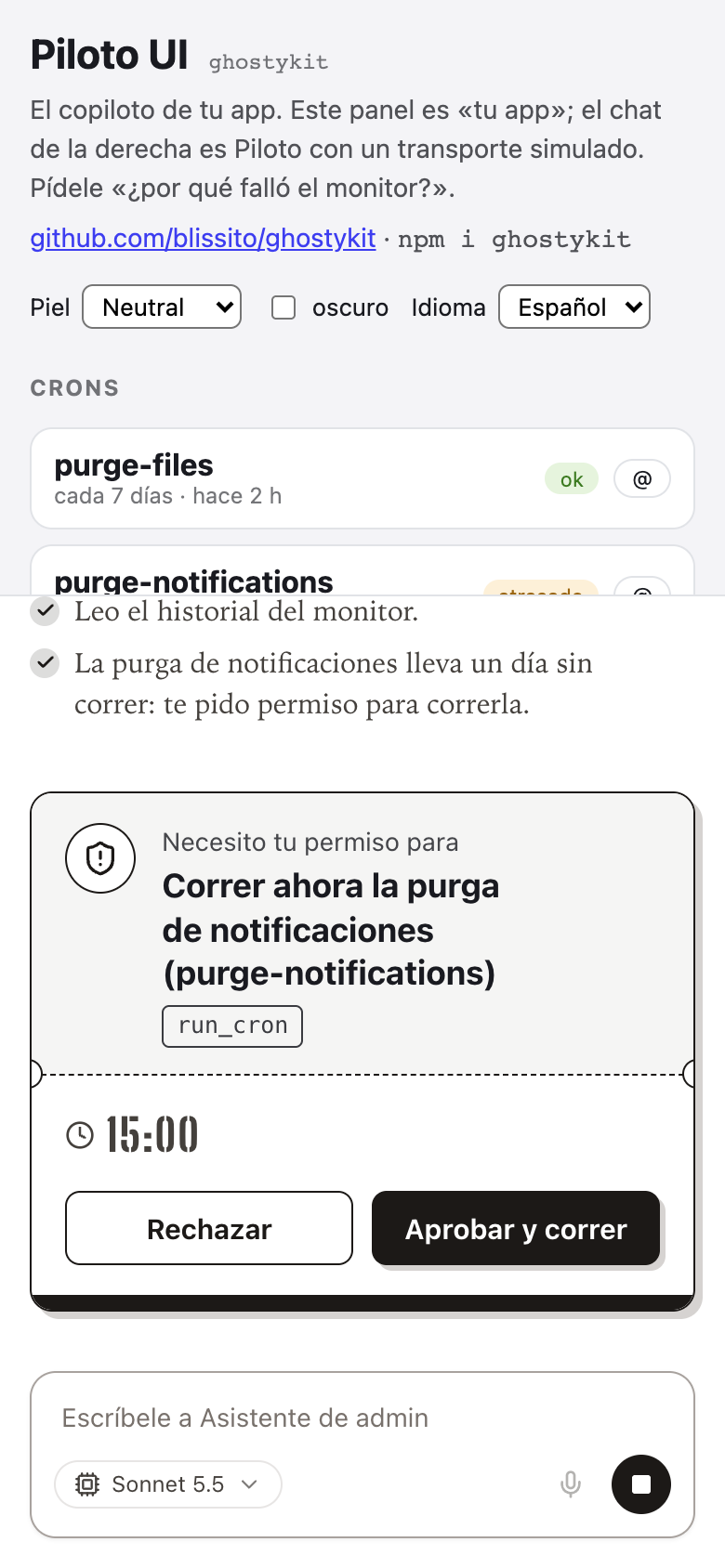 |
|
|
260
260
|
|
|
261
|
+
|
|
262
|
+
## Side panel that pushes your app (`ghostykit/split`)
|
|
263
|
+
|
|
264
|
+
`PilotoSplit` puts the chat next to your app instead of over it: on desktop a resizable panel that
|
|
265
|
+
pushes the content (open/close animate, width remembered); on mobile a bottom sheet. Optional peers:
|
|
266
|
+
`react-resizable-panels` and `vaul`.
|
|
267
|
+
|
|
268
|
+
```tsx
|
|
269
|
+
import { PilotoSplit, usePilotoSplit, useStickyPanelHeight } from "ghostykit/split";
|
|
270
|
+
import "ghostykit/split.css";
|
|
271
|
+
|
|
272
|
+
const split = usePilotoSplit({ widthKey: "app:agent-width", onOpenChange: setSidebarCollapsed });
|
|
273
|
+
<PilotoSplit id="agent" split={split} title="Assistant" piloto={(variant) => <MyPanel variant={variant} onClose={split.close} />}>
|
|
274
|
+
<main>…</main>
|
|
275
|
+
</PilotoSplit>
|
|
276
|
+
```
|
|
277
|
+
|
|
278
|
+
`useStickyPanelHeight(variant === "panel")` keeps the panel's composer in view while the page scrolls.
|
|
279
|
+
`<PilotoLauncher split={split} label="Talk to Ghosty" avatarSrc=… className="fixed bottom-6 right-6" />` is the open button (spring in/out, hidden while open).
|
|
280
|
+
Colors: `--gk-split-handle`, `--gk-split-accent`, `--gk-split-sheet-bg`, `--gk-split-overlay`.
|
|
281
|
+
|
|
261
282
|
## Accessibility
|
|
262
283
|
|
|
263
284
|
- Keyboard-first: Enter sends, Shift+Enter adds a new line, Backspace on an empty box removes the last reference. Menus close with Escape, and focus rings are visible (`--piloto-focus`).
|
|
@@ -0,0 +1,73 @@
|
|
|
1
|
+
import { type CSSProperties, type ReactNode } from "react";
|
|
2
|
+
export type PilotoSplitVariant = "panel" | "sheet";
|
|
3
|
+
export type PilotoSplitOptions = {
|
|
4
|
+
/** Llave de localStorage donde se recuerda el ancho que el usuario eligió arrastrando. */
|
|
5
|
+
widthKey: string;
|
|
6
|
+
/** Ancho inicial del panel en px (default 420). */
|
|
7
|
+
defaultWidth?: number;
|
|
8
|
+
/** Desde qué ancho de ventana es panel y no hoja (default 1024, el `lg` de Tailwind). */
|
|
9
|
+
desktopMinWidth?: number;
|
|
10
|
+
/** Se llama cada vez que se abre o se cierra (p. ej. para contraer el menú lateral de la app). */
|
|
11
|
+
onOpenChange?: (open: boolean) => void;
|
|
12
|
+
};
|
|
13
|
+
export declare function usePilotoSplit(options: PilotoSplitOptions | string): {
|
|
14
|
+
isDesktop: boolean;
|
|
15
|
+
panelRef: import("react").RefObject<import("react-resizable-panels").PanelImperativeHandle | null>;
|
|
16
|
+
panelOpen: boolean;
|
|
17
|
+
setPanelOpen: import("react").Dispatch<import("react").SetStateAction<boolean>>;
|
|
18
|
+
sheetOpen: boolean;
|
|
19
|
+
setSheetOpen: import("react").Dispatch<import("react").SetStateAction<boolean>>;
|
|
20
|
+
mounted: boolean;
|
|
21
|
+
widthKey: string;
|
|
22
|
+
animating: boolean;
|
|
23
|
+
targetWidth: number;
|
|
24
|
+
/** Abierto en la forma que toca (panel o hoja). */
|
|
25
|
+
isOpen: boolean;
|
|
26
|
+
open: () => void;
|
|
27
|
+
close: () => void;
|
|
28
|
+
toggle: () => void;
|
|
29
|
+
};
|
|
30
|
+
export type PilotoSplitState = ReturnType<typeof usePilotoSplit>;
|
|
31
|
+
export declare function PilotoSplit({ id, split, title, piloto, children, minContent, className, sheetClassName, style, }: {
|
|
32
|
+
/** Id del layout (react-resizable-panels lo usa para el estado). */
|
|
33
|
+
id: string;
|
|
34
|
+
split: PilotoSplitState;
|
|
35
|
+
/** Nombre para lectores de pantalla en la hoja móvil. */
|
|
36
|
+
title: string;
|
|
37
|
+
/** Lo que va en el panel o la hoja: normalmente un `<Piloto>`. Recibe la variante. */
|
|
38
|
+
piloto: (variant: PilotoSplitVariant) => ReactNode;
|
|
39
|
+
/** El contenido de la app que el panel empuja. */
|
|
40
|
+
children: ReactNode;
|
|
41
|
+
/** Ancho mínimo del contenido en escritorio, en px. */
|
|
42
|
+
minContent?: number;
|
|
43
|
+
className?: string;
|
|
44
|
+
/** Clases extra para la hoja móvil (borde, radio, fondo). */
|
|
45
|
+
sheetClassName?: string;
|
|
46
|
+
/** Variables de color: `--gk-split-handle`, `--gk-split-accent`, `--gk-split-sheet-bg`, `--gk-split-overlay`. */
|
|
47
|
+
style?: CSSProperties;
|
|
48
|
+
}): import("react").JSX.Element;
|
|
49
|
+
/**
|
|
50
|
+
* Para el `<aside>` del panel: alto = de donde empieza hasta abajo de la ventana (el composer siempre a la
|
|
51
|
+
* vista), aunque la página tenga scroll. Úsalo con `position: sticky; top: 0` y `height: var(--gk-split-h)`.
|
|
52
|
+
* La primera medida va ANTES de pintar: Piloto enfoca la caja al montar y, con la altura provisional
|
|
53
|
+
* (100vh), la caja quedaría bajo el borde y el navegador desplazaría la página.
|
|
54
|
+
*/
|
|
55
|
+
export declare function useStickyPanelHeight(enabled?: boolean): {
|
|
56
|
+
ref: import("react").RefObject<HTMLElement | null>;
|
|
57
|
+
style: CSSProperties;
|
|
58
|
+
};
|
|
59
|
+
/** Panel lateral desde `minWidth` px (default 1024, el `lg` de Tailwind), hoja debajo. En el servidor, escritorio. */
|
|
60
|
+
export declare function useIsDesktop(minWidth?: number): boolean;
|
|
61
|
+
/**
|
|
62
|
+
* El botón para abrir el piloto: una pastilla con el avatar y «Hablar con …» que entra y sale con
|
|
63
|
+
* resorte (como el tablero de Ventas de gs). Se muestra sólo con el piloto cerrado.
|
|
64
|
+
*/
|
|
65
|
+
export declare function PilotoLauncher({ split, label, avatarSrc, className, style, }: {
|
|
66
|
+
split: PilotoSplitState;
|
|
67
|
+
/** Texto de la pastilla, p. ej. «Hablar con Ghosty». Sin texto, sólo el avatar. */
|
|
68
|
+
label?: string;
|
|
69
|
+
avatarSrc: string;
|
|
70
|
+
/** Posición y colores (`fixed bottom-6 right-6 …`). */
|
|
71
|
+
className?: string;
|
|
72
|
+
style?: CSSProperties;
|
|
73
|
+
}): import("react").JSX.Element;
|
|
@@ -0,0 +1,239 @@
|
|
|
1
|
+
// src/split/index.tsx
|
|
2
|
+
import { useCallback, useEffect, useLayoutEffect, useRef, useState } from "react";
|
|
3
|
+
import { Group, Panel, Separator, usePanelRef } from "react-resizable-panels";
|
|
4
|
+
import { Drawer } from "vaul";
|
|
5
|
+
import { AnimatePresence, motion } from "motion/react";
|
|
6
|
+
import { Fragment, jsx, jsxs } from "react/jsx-runtime";
|
|
7
|
+
var SHEET_SNAPS = [0.6, 0.94];
|
|
8
|
+
var OPEN_MS = 320;
|
|
9
|
+
function usePilotoSplit(options) {
|
|
10
|
+
const { widthKey, defaultWidth = 420, desktopMinWidth = 1024, onOpenChange } = typeof options === "string" ? { widthKey: options } : options;
|
|
11
|
+
const isDesktop = useIsDesktop(desktopMinWidth);
|
|
12
|
+
const panelRef = usePanelRef();
|
|
13
|
+
const [panelOpen, setPanelOpen] = useState(false);
|
|
14
|
+
const [sheetOpen, setSheetOpen] = useState(false);
|
|
15
|
+
const [mounted, setMounted] = useState(false);
|
|
16
|
+
const [animating, setAnimating] = useState(false);
|
|
17
|
+
const animTimer = useRef(void 0);
|
|
18
|
+
const animate = useCallback(() => {
|
|
19
|
+
setAnimating(true);
|
|
20
|
+
clearTimeout(animTimer.current);
|
|
21
|
+
animTimer.current = setTimeout(() => setAnimating(false), OPEN_MS + 40);
|
|
22
|
+
}, []);
|
|
23
|
+
useEffect(() => {
|
|
24
|
+
const panel = panelRef.current;
|
|
25
|
+
if (isDesktop || !panel || panel.isCollapsed()) return;
|
|
26
|
+
panel.collapse();
|
|
27
|
+
setSheetOpen(true);
|
|
28
|
+
}, [isDesktop, panelRef]);
|
|
29
|
+
const open = useCallback(() => {
|
|
30
|
+
setMounted(true);
|
|
31
|
+
if (!isDesktop) return setSheetOpen(true);
|
|
32
|
+
const panel = panelRef.current;
|
|
33
|
+
if (!panel || !panel.isCollapsed()) return;
|
|
34
|
+
animate();
|
|
35
|
+
panel.expand();
|
|
36
|
+
panel.resize(`${readWidth(widthKey, defaultWidth)}px`);
|
|
37
|
+
}, [isDesktop, panelRef, widthKey, defaultWidth, animate]);
|
|
38
|
+
const close = useCallback(() => {
|
|
39
|
+
const panel = panelRef.current;
|
|
40
|
+
if (panel && !panel.isCollapsed()) animate();
|
|
41
|
+
panel?.collapse();
|
|
42
|
+
setSheetOpen(false);
|
|
43
|
+
}, [panelRef, animate]);
|
|
44
|
+
const isOpen = isDesktop ? panelOpen : sheetOpen;
|
|
45
|
+
const notify = useRef(onOpenChange);
|
|
46
|
+
notify.current = onOpenChange;
|
|
47
|
+
useEffect(() => {
|
|
48
|
+
notify.current?.(isOpen);
|
|
49
|
+
}, [isOpen]);
|
|
50
|
+
return {
|
|
51
|
+
isDesktop,
|
|
52
|
+
panelRef,
|
|
53
|
+
panelOpen,
|
|
54
|
+
setPanelOpen,
|
|
55
|
+
sheetOpen,
|
|
56
|
+
setSheetOpen,
|
|
57
|
+
mounted,
|
|
58
|
+
widthKey,
|
|
59
|
+
animating,
|
|
60
|
+
targetWidth: readWidth(widthKey, defaultWidth),
|
|
61
|
+
/** Abierto en la forma que toca (panel o hoja). */
|
|
62
|
+
isOpen,
|
|
63
|
+
open,
|
|
64
|
+
close,
|
|
65
|
+
toggle: useCallback(() => isOpen ? close() : open(), [isOpen, open, close])
|
|
66
|
+
};
|
|
67
|
+
}
|
|
68
|
+
function PilotoSplit({
|
|
69
|
+
id,
|
|
70
|
+
split,
|
|
71
|
+
title,
|
|
72
|
+
piloto,
|
|
73
|
+
children,
|
|
74
|
+
minContent = 420,
|
|
75
|
+
className = "",
|
|
76
|
+
sheetClassName = "",
|
|
77
|
+
style
|
|
78
|
+
}) {
|
|
79
|
+
const { isDesktop, panelRef, panelOpen, setPanelOpen, sheetOpen, setSheetOpen, mounted, widthKey, animating, targetWidth } = split;
|
|
80
|
+
const [sheetSnap, setSheetSnap] = useState(SHEET_SNAPS[0]);
|
|
81
|
+
const sheetChat = useRef(null);
|
|
82
|
+
const [sheetChatH, setSheetChatH] = useState(null);
|
|
83
|
+
useEffect(() => {
|
|
84
|
+
if (!sheetOpen) return;
|
|
85
|
+
let frame = 0;
|
|
86
|
+
const until = performance.now() + 700;
|
|
87
|
+
const measure = () => {
|
|
88
|
+
const el = sheetChat.current;
|
|
89
|
+
if (el) setSheetChatH(Math.max(240, Math.round(window.innerHeight - el.getBoundingClientRect().top)));
|
|
90
|
+
if (performance.now() < until) frame = requestAnimationFrame(measure);
|
|
91
|
+
};
|
|
92
|
+
frame = requestAnimationFrame(measure);
|
|
93
|
+
return () => cancelAnimationFrame(frame);
|
|
94
|
+
}, [sheetOpen, sheetSnap]);
|
|
95
|
+
const onLayoutChanged = (_, meta) => {
|
|
96
|
+
const px = panelRef.current?.getSize().inPixels ?? 0;
|
|
97
|
+
if (meta.isUserInteraction && px > 0) writeWidth(widthKey, px);
|
|
98
|
+
};
|
|
99
|
+
return /* @__PURE__ */ jsxs(Fragment, { children: [
|
|
100
|
+
/* @__PURE__ */ jsx("div", { className, style, children: /* @__PURE__ */ jsxs(Group, { id, className: "gk-split", style: { overflow: "clip" }, onLayoutChanged, children: [
|
|
101
|
+
/* @__PURE__ */ jsx(Panel, { id: `${id}-content`, minSize: isDesktop ? minContent : 0, style: { overflow: "clip", minWidth: 0 }, children }),
|
|
102
|
+
/* @__PURE__ */ jsx(
|
|
103
|
+
Separator,
|
|
104
|
+
{
|
|
105
|
+
className: "gk-split-separator",
|
|
106
|
+
style: !isDesktop || !panelOpen ? { visibility: "hidden" } : void 0,
|
|
107
|
+
"aria-label": "Cambiar el ancho del piloto"
|
|
108
|
+
}
|
|
109
|
+
),
|
|
110
|
+
/* @__PURE__ */ jsx(
|
|
111
|
+
Panel,
|
|
112
|
+
{
|
|
113
|
+
id: `${id}-piloto`,
|
|
114
|
+
panelRef,
|
|
115
|
+
collapsible: true,
|
|
116
|
+
collapsedSize: 0,
|
|
117
|
+
defaultSize: 0,
|
|
118
|
+
minSize: 320,
|
|
119
|
+
maxSize: "60%",
|
|
120
|
+
style: { overflow: "clip", minWidth: 0 },
|
|
121
|
+
onResize: (size) => setPanelOpen(size.inPixels > 0),
|
|
122
|
+
children: mounted && isDesktop && /* @__PURE__ */ jsx("div", { style: { height: "100%", width: animating ? `${targetWidth}px` : "100%" }, inert: !panelOpen, children: piloto("panel") })
|
|
123
|
+
}
|
|
124
|
+
)
|
|
125
|
+
] }) }),
|
|
126
|
+
!isDesktop && /* @__PURE__ */ jsx(
|
|
127
|
+
Drawer.Root,
|
|
128
|
+
{
|
|
129
|
+
open: sheetOpen,
|
|
130
|
+
onOpenChange: setSheetOpen,
|
|
131
|
+
snapPoints: SHEET_SNAPS,
|
|
132
|
+
activeSnapPoint: sheetSnap,
|
|
133
|
+
setActiveSnapPoint: (p) => setSheetSnap(typeof p === "number" ? p : SHEET_SNAPS[0]),
|
|
134
|
+
children: /* @__PURE__ */ jsxs(Drawer.Portal, { children: [
|
|
135
|
+
/* @__PURE__ */ jsx(Drawer.Overlay, { className: "gk-split-overlay" }),
|
|
136
|
+
/* @__PURE__ */ jsxs(Drawer.Content, { "aria-describedby": void 0, className: `gk-split-sheet ${sheetClassName}`, style, children: [
|
|
137
|
+
/* @__PURE__ */ jsx(Drawer.Handle, { className: "gk-split-handle" }),
|
|
138
|
+
/* @__PURE__ */ jsx(Drawer.Title, { className: "gk-split-sr", children: title }),
|
|
139
|
+
/* @__PURE__ */ jsx(
|
|
140
|
+
"div",
|
|
141
|
+
{
|
|
142
|
+
ref: sheetChat,
|
|
143
|
+
style: { minHeight: 0, height: sheetChatH ? `${sheetChatH}px` : `calc(${Math.round(sheetSnap * 100)}dvh - 3rem)` },
|
|
144
|
+
children: mounted && piloto("sheet")
|
|
145
|
+
}
|
|
146
|
+
)
|
|
147
|
+
] })
|
|
148
|
+
] })
|
|
149
|
+
}
|
|
150
|
+
)
|
|
151
|
+
] });
|
|
152
|
+
}
|
|
153
|
+
function useStickyPanelHeight(enabled = true) {
|
|
154
|
+
const ref = useRef(null);
|
|
155
|
+
const [height, setHeight] = useState(null);
|
|
156
|
+
useLayoutEffectSafe(() => {
|
|
157
|
+
if (!enabled) return;
|
|
158
|
+
const fit = () => {
|
|
159
|
+
const el = ref.current;
|
|
160
|
+
if (el) setHeight(Math.max(320, window.innerHeight - Math.max(el.getBoundingClientRect().top, 0)));
|
|
161
|
+
};
|
|
162
|
+
let frame = 0;
|
|
163
|
+
const measure = () => {
|
|
164
|
+
cancelAnimationFrame(frame);
|
|
165
|
+
frame = requestAnimationFrame(fit);
|
|
166
|
+
};
|
|
167
|
+
fit();
|
|
168
|
+
window.addEventListener("scroll", measure, { passive: true });
|
|
169
|
+
window.addEventListener("resize", measure);
|
|
170
|
+
return () => {
|
|
171
|
+
cancelAnimationFrame(frame);
|
|
172
|
+
window.removeEventListener("scroll", measure);
|
|
173
|
+
window.removeEventListener("resize", measure);
|
|
174
|
+
};
|
|
175
|
+
}, [enabled]);
|
|
176
|
+
const style = enabled ? { position: "sticky", top: 0, height: height ? `${height}px` : "100vh" } : { height: "100%" };
|
|
177
|
+
return { ref, style };
|
|
178
|
+
}
|
|
179
|
+
var useLayoutEffectSafe = typeof window === "undefined" ? useEffect : useLayoutEffect;
|
|
180
|
+
function readWidth(key, fallback) {
|
|
181
|
+
try {
|
|
182
|
+
const n = Number(localStorage.getItem(key));
|
|
183
|
+
if (n >= 320) return n;
|
|
184
|
+
} catch {
|
|
185
|
+
}
|
|
186
|
+
return fallback;
|
|
187
|
+
}
|
|
188
|
+
function writeWidth(key, px) {
|
|
189
|
+
try {
|
|
190
|
+
localStorage.setItem(key, String(Math.round(px)));
|
|
191
|
+
} catch {
|
|
192
|
+
}
|
|
193
|
+
}
|
|
194
|
+
function useIsDesktop(minWidth = 1024) {
|
|
195
|
+
const [desktop, setDesktop] = useState(true);
|
|
196
|
+
useEffect(() => {
|
|
197
|
+
const mq = window.matchMedia(`(min-width: ${minWidth}px)`);
|
|
198
|
+
const sync = () => setDesktop(mq.matches);
|
|
199
|
+
sync();
|
|
200
|
+
mq.addEventListener("change", sync);
|
|
201
|
+
return () => mq.removeEventListener("change", sync);
|
|
202
|
+
}, [minWidth]);
|
|
203
|
+
return desktop;
|
|
204
|
+
}
|
|
205
|
+
function PilotoLauncher({
|
|
206
|
+
split,
|
|
207
|
+
label,
|
|
208
|
+
avatarSrc,
|
|
209
|
+
className = "",
|
|
210
|
+
style
|
|
211
|
+
}) {
|
|
212
|
+
return /* @__PURE__ */ jsx(AnimatePresence, { children: !split.isOpen && /* @__PURE__ */ jsxs(
|
|
213
|
+
motion.button,
|
|
214
|
+
{
|
|
215
|
+
type: "button",
|
|
216
|
+
onClick: split.open,
|
|
217
|
+
"aria-label": label ?? "Abrir el piloto",
|
|
218
|
+
title: label,
|
|
219
|
+
initial: { opacity: 0, scale: 0.6, y: 20 },
|
|
220
|
+
animate: { opacity: 1, scale: 1, y: 0 },
|
|
221
|
+
exit: { opacity: 0, scale: 0.6, y: 20 },
|
|
222
|
+
transition: { type: "spring", stiffness: 400, damping: 24 },
|
|
223
|
+
className: `gk-launcher ${label ? "" : "gk-launcher-icon"} ${className}`,
|
|
224
|
+
style,
|
|
225
|
+
children: [
|
|
226
|
+
/* @__PURE__ */ jsx("img", { src: avatarSrc, alt: "" }),
|
|
227
|
+
label && /* @__PURE__ */ jsx("span", { children: label })
|
|
228
|
+
]
|
|
229
|
+
},
|
|
230
|
+
"gk-launcher"
|
|
231
|
+
) });
|
|
232
|
+
}
|
|
233
|
+
export {
|
|
234
|
+
PilotoLauncher,
|
|
235
|
+
PilotoSplit,
|
|
236
|
+
useIsDesktop,
|
|
237
|
+
usePilotoSplit,
|
|
238
|
+
useStickyPanelHeight
|
|
239
|
+
};
|
package/dist/split.css
ADDED
|
@@ -0,0 +1,71 @@
|
|
|
1
|
+
/* ghostykit/split — el piloto al lado de la app. Colores por variable:
|
|
2
|
+
--gk-split-handle (agarradera en reposo), --gk-split-accent (al arrastrar),
|
|
3
|
+
--gk-split-sheet-bg y --gk-split-overlay (hoja móvil). */
|
|
4
|
+
|
|
5
|
+
/* Abrir y cerrar se animan; arrastrar, no. */
|
|
6
|
+
.gk-split:not(:has([data-separator="active"])) > [data-panel] {
|
|
7
|
+
transition: flex-grow 320ms cubic-bezier(0.22, 1, 0.36, 1);
|
|
8
|
+
}
|
|
9
|
+
@media (prefers-reduced-motion: reduce) {
|
|
10
|
+
.gk-split > [data-panel] { transition: none; }
|
|
11
|
+
}
|
|
12
|
+
|
|
13
|
+
/* El borde que se arrastra: una franja ancha para atinarle, con una agarradera que se enciende. */
|
|
14
|
+
.gk-split-separator { position: relative; width: 12px; cursor: col-resize; }
|
|
15
|
+
.gk-split-separator::after {
|
|
16
|
+
content: "";
|
|
17
|
+
position: absolute;
|
|
18
|
+
top: 50%;
|
|
19
|
+
left: 50%;
|
|
20
|
+
width: 4px;
|
|
21
|
+
height: 44px;
|
|
22
|
+
transform: translate(-50%, -50%);
|
|
23
|
+
border-radius: 9999px;
|
|
24
|
+
background: var(--gk-split-handle, #9ca3af);
|
|
25
|
+
transition: background-color 120ms, height 120ms;
|
|
26
|
+
}
|
|
27
|
+
.gk-split-separator:hover::after,
|
|
28
|
+
.gk-split-separator[data-separator="active"]::after,
|
|
29
|
+
.gk-split-separator:focus-visible::after {
|
|
30
|
+
height: 100%;
|
|
31
|
+
background: var(--gk-split-accent, #6366f1);
|
|
32
|
+
}
|
|
33
|
+
|
|
34
|
+
/* Hoja móvil (vaul). */
|
|
35
|
+
.gk-split-overlay { position: fixed; inset: 0; z-index: 40; background: var(--gk-split-overlay, rgb(0 0 0 / 0.3)); }
|
|
36
|
+
.gk-split-sheet {
|
|
37
|
+
position: fixed;
|
|
38
|
+
left: 0;
|
|
39
|
+
right: 0;
|
|
40
|
+
bottom: 0;
|
|
41
|
+
z-index: 50;
|
|
42
|
+
display: flex;
|
|
43
|
+
flex-direction: column;
|
|
44
|
+
height: 94dvh;
|
|
45
|
+
border-radius: 16px 16px 0 0;
|
|
46
|
+
background: var(--gk-split-sheet-bg, #fff);
|
|
47
|
+
outline: none;
|
|
48
|
+
}
|
|
49
|
+
.gk-split-handle { margin: 8px auto !important; height: 6px !important; width: 48px !important; flex-shrink: 0; background: #d1d5db !important; }
|
|
50
|
+
.gk-split-sr { position: absolute; width: 1px; height: 1px; overflow: hidden; clip: rect(0 0 0 0); white-space: nowrap; }
|
|
51
|
+
|
|
52
|
+
/* Pastilla para abrir el piloto. Colores: --gk-launcher-bg, --gk-launcher-fg. */
|
|
53
|
+
.gk-launcher {
|
|
54
|
+
display: inline-flex;
|
|
55
|
+
align-items: center;
|
|
56
|
+
gap: 8px;
|
|
57
|
+
padding: 8px 16px 8px 8px;
|
|
58
|
+
border: 0;
|
|
59
|
+
border-radius: 9999px;
|
|
60
|
+
background: var(--gk-launcher-bg, #191a20);
|
|
61
|
+
color: var(--gk-launcher-fg, #fff);
|
|
62
|
+
font-family: inherit;
|
|
63
|
+
font-size: 14px;
|
|
64
|
+
font-weight: 600;
|
|
65
|
+
line-height: 1;
|
|
66
|
+
cursor: pointer;
|
|
67
|
+
box-shadow: 0 12px 30px -10px rgb(25 26 32 / 0.6);
|
|
68
|
+
z-index: 40;
|
|
69
|
+
}
|
|
70
|
+
.gk-launcher img { width: 32px; height: 32px; object-fit: contain; }
|
|
71
|
+
.gk-launcher-icon { padding: 8px; }
|
package/dist/styles.css
CHANGED
|
@@ -116,6 +116,9 @@
|
|
|
116
116
|
.piloto .static:not([data-piloto-isolate] *) {
|
|
117
117
|
position: static;
|
|
118
118
|
}
|
|
119
|
+
.piloto .sticky:not([data-piloto-isolate] *) {
|
|
120
|
+
position: sticky;
|
|
121
|
+
}
|
|
119
122
|
.piloto .inset-0:not([data-piloto-isolate] *) {
|
|
120
123
|
inset: 0px;
|
|
121
124
|
}
|
|
@@ -152,12 +155,18 @@
|
|
|
152
155
|
.piloto .right-4:not([data-piloto-isolate] *) {
|
|
153
156
|
right: calc(var(--spacing) * 4);
|
|
154
157
|
}
|
|
158
|
+
.piloto .right-6:not([data-piloto-isolate] *) {
|
|
159
|
+
right: calc(var(--spacing) * 6);
|
|
160
|
+
}
|
|
155
161
|
.piloto .bottom-2:not([data-piloto-isolate] *) {
|
|
156
162
|
bottom: calc(var(--spacing) * 2);
|
|
157
163
|
}
|
|
158
164
|
.piloto .bottom-4:not([data-piloto-isolate] *) {
|
|
159
165
|
bottom: calc(var(--spacing) * 4);
|
|
160
166
|
}
|
|
167
|
+
.piloto .bottom-6:not([data-piloto-isolate] *) {
|
|
168
|
+
bottom: calc(var(--spacing) * 6);
|
|
169
|
+
}
|
|
161
170
|
.piloto .bottom-full:not([data-piloto-isolate] *) {
|
|
162
171
|
bottom: 100%;
|
|
163
172
|
}
|
|
@@ -508,6 +517,9 @@
|
|
|
508
517
|
.piloto .cursor-pointer:not([data-piloto-isolate] *) {
|
|
509
518
|
cursor: pointer;
|
|
510
519
|
}
|
|
520
|
+
.piloto .resize:not([data-piloto-isolate] *) {
|
|
521
|
+
resize: both;
|
|
522
|
+
}
|
|
511
523
|
.piloto .resize-none:not([data-piloto-isolate] *) {
|
|
512
524
|
resize: none;
|
|
513
525
|
}
|
package/package.json
CHANGED
|
@@ -1,6 +1,6 @@
|
|
|
1
1
|
{
|
|
2
2
|
"name": "ghostykit",
|
|
3
|
-
"version": "0.
|
|
3
|
+
"version": "0.9.1",
|
|
4
4
|
"description": "Ghosty Autopilot — the autopilot chat for your React app, on AG-UI: works with LangGraph, Mastra, CrewAI or any AG-UI agent. Streaming text, agent steps, human approval cards (interrupt/resume), attachments and voice.",
|
|
5
5
|
"type": "module",
|
|
6
6
|
"main": "./dist/core/index.js",
|
|
@@ -30,9 +30,14 @@
|
|
|
30
30
|
"types": "./dist/pointer/index.d.ts",
|
|
31
31
|
"import": "./dist/pointer/index.js"
|
|
32
32
|
},
|
|
33
|
+
"./split": {
|
|
34
|
+
"types": "./dist/split/index.d.ts",
|
|
35
|
+
"import": "./dist/split/index.js"
|
|
36
|
+
},
|
|
33
37
|
"./styles.css": "./dist/styles.css",
|
|
34
38
|
"./package.json": "./package.json",
|
|
35
|
-
"./fonts.css": "./dist/fonts.css"
|
|
39
|
+
"./fonts.css": "./dist/fonts.css",
|
|
40
|
+
"./split.css": "./dist/split.css"
|
|
36
41
|
},
|
|
37
42
|
"files": [
|
|
38
43
|
"dist",
|
|
@@ -53,11 +58,19 @@
|
|
|
53
58
|
"motion": ">=11",
|
|
54
59
|
"react": ">=18",
|
|
55
60
|
"react-dom": ">=18",
|
|
56
|
-
"streamdown": ">=2.5.0 <3"
|
|
61
|
+
"streamdown": ">=2.5.0 <3",
|
|
62
|
+
"react-resizable-panels": ">=4.15 <5",
|
|
63
|
+
"vaul": ">=1.1 <2"
|
|
57
64
|
},
|
|
58
65
|
"peerDependenciesMeta": {
|
|
59
66
|
"@ghostystudio/pointer": {
|
|
60
67
|
"optional": true
|
|
68
|
+
},
|
|
69
|
+
"react-resizable-panels": {
|
|
70
|
+
"optional": true
|
|
71
|
+
},
|
|
72
|
+
"vaul": {
|
|
73
|
+
"optional": true
|
|
61
74
|
}
|
|
62
75
|
},
|
|
63
76
|
"devDependencies": {
|
|
@@ -76,7 +89,9 @@
|
|
|
76
89
|
"streamdown": "^2.7.0",
|
|
77
90
|
"tailwindcss": "^4.1.0",
|
|
78
91
|
"typescript": "^5.9.0",
|
|
79
|
-
"vitest": "^3.2.0"
|
|
92
|
+
"vitest": "^3.2.0",
|
|
93
|
+
"react-resizable-panels": "^4.15.0",
|
|
94
|
+
"vaul": "^1.1.2"
|
|
80
95
|
},
|
|
81
96
|
"keywords": [
|
|
82
97
|
"acp",
|