ghostykit 0.7.1 → 0.8.0
This diff represents the content of publicly available package versions that have been released to one of the supported registries. The information contained in this diff is provided for informational purposes only and reflects changes between package versions as they appear in their respective public registries.
- package/README.md +29 -4
- package/dist/chunks/{chunk-PNU3LKWG.js → chunk-VFCROLFF.js} +26 -6
- package/dist/plugins/index.js +1 -1
- package/dist/react/Composer.d.ts +8 -1
- package/dist/react/Piloto.d.ts +3 -0
- package/dist/react/index.d.ts +2 -2
- package/dist/react/index.js +11 -5
- package/dist/react/plugins.d.ts +15 -2
- package/dist/styles.css +114 -4
- package/package.json +2 -2
package/README.md
CHANGED
|
@@ -88,7 +88,7 @@ const ref = useRef<PilotoHandle>(null);
|
|
|
88
88
|
<Piloto
|
|
89
89
|
ref={ref}
|
|
90
90
|
transport={transport}
|
|
91
|
-
skin="easybits" // "ghosty" (default) | "easybits" | "neutral" | your own
|
|
91
|
+
skin="easybits" // "ghosty" (default) | "easybits" | "neutral" | "denik" | your own
|
|
92
92
|
theme="auto" // "light" | "dark" | "auto"
|
|
93
93
|
locale="en" // Spanish by default
|
|
94
94
|
agentName="Admin assistant"
|
|
@@ -107,7 +107,8 @@ ref.current?.send("Why did this fail?"); // ask on the user'
|
|
|
107
107
|
|
|
108
108
|
Other props: `features` (`attachments`, `retry`, `copy`, `usage`, `replyOptions`, `duration`,
|
|
109
109
|
`steer`, `narration`: `false` keeps the text written before each tool as part of the answer instead of
|
|
110
|
-
checked progress lines), `
|
|
110
|
+
checked progress lines), `icons` (`{ send?, stop? }`: your own nodes for the composer's round button;
|
|
111
|
+
default arrow and square), `references` / `onReferencesChange`, `placeholder`, `avatar`, `initialTurns`, `loadOlder`
|
|
111
112
|
(earlier pages of a long thread), `forwardedProps` (extra keys for every run, e.g.
|
|
112
113
|
`{permissions: "ask"}`), and the callbacks `onTurnStart`, `onTitle`, `onState`, `onEvent` (every raw
|
|
113
114
|
AG-UI event), `onSend`. The agent's shared state (`STATE_SNAPSHOT` + `STATE_DELTA`) is
|
|
@@ -173,7 +174,7 @@ const PLUGINS = [crm, modelPicker({ onChange: (model) => api.setModel(model) }),
|
|
|
173
174
|
| `composer.below` | Under the message box. | suggestion chips |
|
|
174
175
|
| `composer.attachments` | `upload`, `transcribe`, `voiceNoteText`, and the limits `accept`, `maxFiles`, `maxBytes`. A voice note keeps its audio attached when there is `upload`. | `{ upload, accept: "image/*", maxFiles: 4, maxBytes: 4_000_000 }` |
|
|
175
176
|
| `composer.replace` | `{ when(ctx), view }`: drawn instead of the message box while `when` is true. | trial over (403 + `x-needs-login`) → "Create your account" |
|
|
176
|
-
| `header` |
|
|
177
|
+
| `header` | The top bar, over the thread. A single view goes on the right; `{ start, end }` puts `start` on the left (who the agent is) and `end` on the right. | `{ start: avatar + name, end: new chat · close }` |
|
|
177
178
|
| `sidePanel` | Next to the chat. | live page, subagents |
|
|
178
179
|
| `aboveThread` | Above the messages. | a banner |
|
|
179
180
|
| `empty` | The empty thread (instead of the greeting). | onboarding |
|
|
@@ -195,7 +196,7 @@ in the URL).
|
|
|
195
196
|
- **Maps** (`strings`, `tools.verbs`, `tools.icons`, `vars`) are merged, and later plugins win. `markdown.transform`, `formatUserText` and `beforeSend` are chained.
|
|
196
197
|
- **`events` and `state`** call every handler, in order.
|
|
197
198
|
- **Keyed or single views** (`tools.render`, `message.custom`, `markdown.blocks`, `markdown.components`, `message.avatar`, `empty`, `waiting`, `composer.attachments`, `composer.replace`): the first plugin that declares one wins. A clash is a development warning.
|
|
198
|
-
- **Lists** (`header`, `sidePanel`, `aboveThread`, `composer.actions`/`actionsEnd`/`above`/`below`, `message.user`/`assistant`/`assistantBefore`, `wrap`, `onTurnStart`/`onTurnDone`) all apply, in order.
|
|
199
|
+
- **Lists** (`header` and its `start`/`end`, `sidePanel`, `aboveThread`, `composer.actions`/`actionsEnd`/`above`/`below`, `message.user`/`assistant`/`assistantBefore`, `wrap`, `onTurnStart`/`onTurnDone`) all apply, in order.
|
|
199
200
|
|
|
200
201
|
In development, ghostykit also warns once about a `CUSTOM` event that nothing handles.
|
|
201
202
|
|
|
@@ -228,6 +229,30 @@ like ghosty.studio; 16 px in the others). Every color, radius, border width and
|
|
|
228
229
|
}
|
|
229
230
|
```
|
|
230
231
|
|
|
232
|
+
The variables a host (or a widget owner, inside an iframe) usually overrides:
|
|
233
|
+
|
|
234
|
+
| Variable | What it paints |
|
|
235
|
+
|---|---|
|
|
236
|
+
| `--piloto-font`, `--piloto-font-prose`, `--piloto-font-mono` | UI text, the answers' prose, code |
|
|
237
|
+
| `--piloto-rem` | The size unit inside the chat (`1rem`) |
|
|
238
|
+
| `--piloto-bg`, `--piloto-surface`, `--piloto-surface-2` | Background, cards and fields, hover/secondary |
|
|
239
|
+
| `--piloto-text`, `--piloto-text-2`, `--piloto-text-3` | Text, secondary text, hints |
|
|
240
|
+
| `--piloto-accent`, `--piloto-accent-strong`, `--piloto-accent-soft`, `--piloto-on-accent` | Brand color (buttons, focus, links), its pressed and soft tones, text on it |
|
|
241
|
+
| `--piloto-user-bubble`, `--piloto-user-text` | The user's bubble |
|
|
242
|
+
| `--piloto-composer-bg`, `--piloto-shadow-input` | The message box |
|
|
243
|
+
| `--piloto-border`, `--piloto-border-width` | Borders |
|
|
244
|
+
| `--piloto-radius-bubble`, `--piloto-radius-input`, `--piloto-radius-card`, `--piloto-radius-button` | Corners |
|
|
245
|
+
| `--piloto-radius-bubble-tail` | The bottom-right corner of the user's bubble (its "tail"); defaults to `--piloto-radius-bubble` |
|
|
246
|
+
| `--piloto-success`, `--piloto-danger`, `--piloto-warning`, `--piloto-warning-ink` | States, and the approval pass |
|
|
247
|
+
|
|
248
|
+
Set them in your CSS on `.piloto`, or from a plugin with `vars` (e.g. the owner's theme of an
|
|
249
|
+
embedded widget): `definePlugin({ name: "theme", vars: { "--piloto-accent": owner.color, "--piloto-radius-input": "8px" } })`.
|
|
250
|
+
|
|
251
|
+
The `denik` skin is Deník's Nik: blue `#5158F6`, ink `#11151A`, Satoshi (the host loads the font), a
|
|
252
|
+
dark user bubble with an 8 px tail, the answer without a bubble (add the avatar with
|
|
253
|
+
`message.avatar`), and a 36 px round send button that turns into an ink circle while stopping. Pair it
|
|
254
|
+
with `icons={{ send: <PaperPlane /> }}` and a plugin `header: { start, end }`.
|
|
255
|
+
|
|
231
256
|
| Ghosty | EasyBits | Neutral |
|
|
232
257
|
|---|---|---|
|
|
233
258
|
| 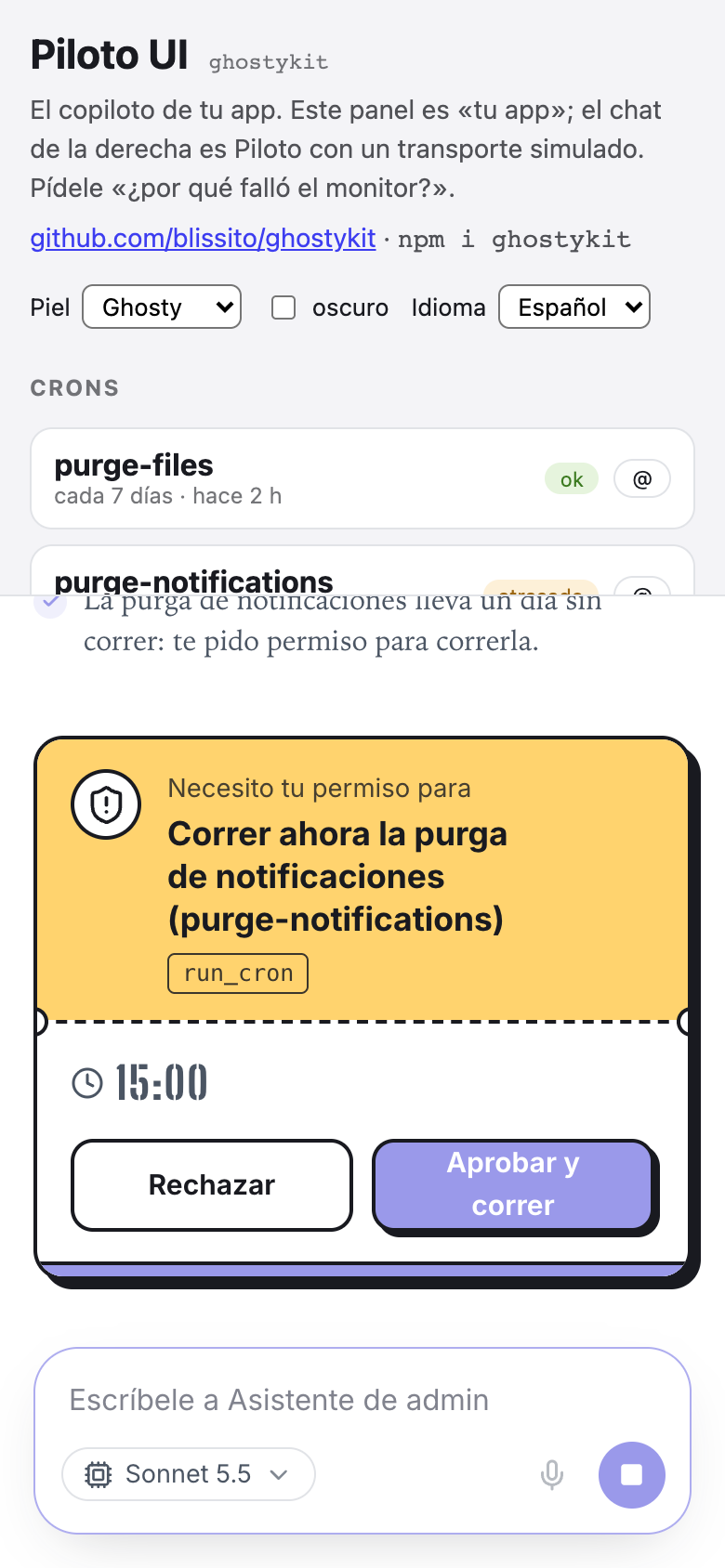 | 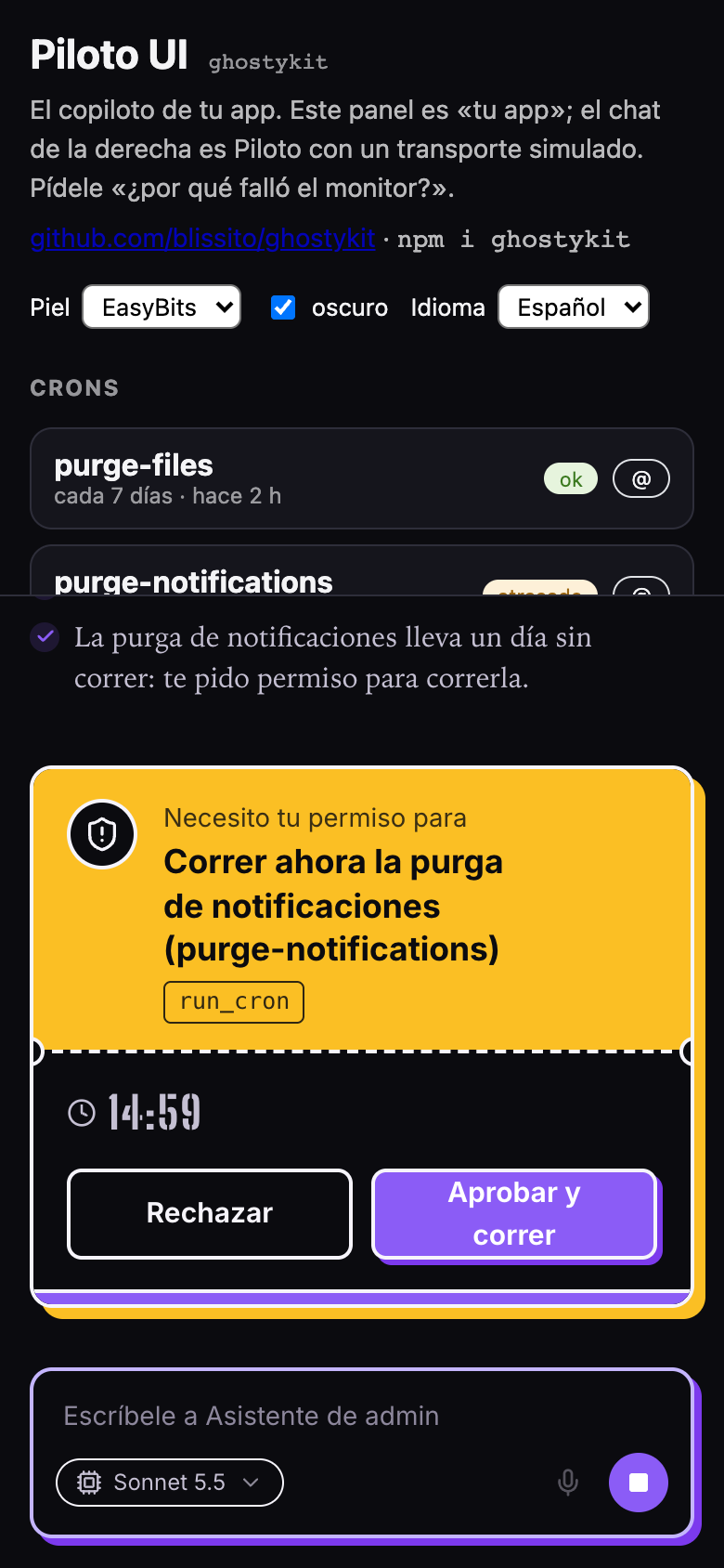 | 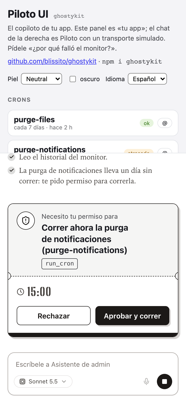 |
|
|
@@ -1095,8 +1095,11 @@ function Composer({
|
|
|
1095
1095
|
handleRef,
|
|
1096
1096
|
accept,
|
|
1097
1097
|
maxFiles = 8,
|
|
1098
|
-
maxFileMb = 25
|
|
1098
|
+
maxFileMb = 25,
|
|
1099
|
+
icons
|
|
1099
1100
|
}) {
|
|
1101
|
+
const sendIcon = icons?.send ?? /* @__PURE__ */ jsx2(ArrowUp, { className: "h-4 w-4" });
|
|
1102
|
+
const stopIcon = icons?.stop ?? /* @__PURE__ */ jsx2(Square, { className: "h-3 w-3 fill-current" });
|
|
1100
1103
|
const { strings: t } = usePiloto();
|
|
1101
1104
|
const [value, setValue] = useState(initialValue);
|
|
1102
1105
|
const [files, setFiles] = useState([]);
|
|
@@ -1431,8 +1434,8 @@ function Composer({
|
|
|
1431
1434
|
onClick: toggleRecording,
|
|
1432
1435
|
"aria-label": t.stopAndSendVoice,
|
|
1433
1436
|
title: t.send,
|
|
1434
|
-
className: "flex h-8 w-8 shrink-0 items-center justify-center rounded-full bg-brand-500 text-white hover:bg-brand-600",
|
|
1435
|
-
children:
|
|
1437
|
+
className: "gc-send-voice flex h-8 w-8 shrink-0 items-center justify-center rounded-full bg-brand-500 text-white hover:bg-brand-600",
|
|
1438
|
+
children: sendIcon
|
|
1436
1439
|
}
|
|
1437
1440
|
)
|
|
1438
1441
|
] })
|
|
@@ -1517,8 +1520,9 @@ function Composer({
|
|
|
1517
1520
|
onClick: busy ? onStop : () => void submit(),
|
|
1518
1521
|
disabled: !busy && !canSend || uploading,
|
|
1519
1522
|
"aria-label": busy ? t.stop : uploading ? t.uploading : t.send,
|
|
1523
|
+
"data-state": busy ? "stop" : "send",
|
|
1520
1524
|
className: `gc-send flex h-8 w-8 items-center justify-center rounded-full transition-colors ${busy || canSend || uploading ? "bg-brand-500 text-white hover:bg-brand-600" : "bg-background-disabled text-text-disabled"}`,
|
|
1521
|
-
children: busy ?
|
|
1525
|
+
children: busy ? stopIcon : uploading ? /* @__PURE__ */ jsx2(LoaderCircle, { className: "h-4 w-4 animate-spin" }) : sendIcon
|
|
1522
1526
|
}
|
|
1523
1527
|
)
|
|
1524
1528
|
] })
|
|
@@ -1580,6 +1584,9 @@ function ModelPicker({ models, current, onChange }) {
|
|
|
1580
1584
|
}
|
|
1581
1585
|
|
|
1582
1586
|
// src/react/plugins.ts
|
|
1587
|
+
function isView(x) {
|
|
1588
|
+
return typeof x === "function" || typeof x === "object" && x !== null && "$$typeof" in x;
|
|
1589
|
+
}
|
|
1583
1590
|
function definePlugin(plugin) {
|
|
1584
1591
|
return plugin;
|
|
1585
1592
|
}
|
|
@@ -1618,7 +1625,13 @@ function pluginPoints(p) {
|
|
|
1618
1625
|
add(p.composer?.above, "composer.above");
|
|
1619
1626
|
add(p.composer?.below, "composer.below");
|
|
1620
1627
|
add(p.composer?.attachments, "composer.attachments");
|
|
1621
|
-
|
|
1628
|
+
if (p.header) {
|
|
1629
|
+
if (isView(p.header)) out.push("header");
|
|
1630
|
+
else {
|
|
1631
|
+
add(p.header.start, "header.start");
|
|
1632
|
+
add(p.header.end, "header.end");
|
|
1633
|
+
}
|
|
1634
|
+
}
|
|
1622
1635
|
add(p.sidePanel, "sidePanel");
|
|
1623
1636
|
add(p.aboveThread, "aboveThread");
|
|
1624
1637
|
add(p.empty, "empty");
|
|
@@ -1646,6 +1659,7 @@ function resolvePlugins(list = []) {
|
|
|
1646
1659
|
httpError: [],
|
|
1647
1660
|
attachments: {},
|
|
1648
1661
|
header: [],
|
|
1662
|
+
headerStart: [],
|
|
1649
1663
|
sidePanel: [],
|
|
1650
1664
|
aboveThread: [],
|
|
1651
1665
|
composerActions: [],
|
|
@@ -1707,7 +1721,13 @@ function resolvePlugins(list = []) {
|
|
|
1707
1721
|
}
|
|
1708
1722
|
if (p.empty) r.empty ? r.warnings.push(`\xAB${p.name}\xBB tambi\xE9n dibuja empty: gana \xAB${r.empty.plugin}\xBB.`) : r.empty = own(p.empty);
|
|
1709
1723
|
if (p.waiting) r.waiting ? r.warnings.push(`\xAB${p.name}\xBB tambi\xE9n dibuja waiting: gana \xAB${r.waiting.plugin}\xBB.`) : r.waiting = own(p.waiting);
|
|
1710
|
-
if (p.header)
|
|
1724
|
+
if (p.header) {
|
|
1725
|
+
if (isView(p.header)) r.header.push(own(p.header));
|
|
1726
|
+
else {
|
|
1727
|
+
if (p.header.start) r.headerStart.push(own(p.header.start));
|
|
1728
|
+
if (p.header.end) r.header.push(own(p.header.end));
|
|
1729
|
+
}
|
|
1730
|
+
}
|
|
1711
1731
|
if (p.sidePanel) r.sidePanel.push(own(p.sidePanel));
|
|
1712
1732
|
if (p.aboveThread) r.aboveThread.push(own(p.aboveThread));
|
|
1713
1733
|
if (p.composer?.actions) r.composerActions.push(own(p.composer.actions));
|
package/dist/plugins/index.js
CHANGED
package/dist/react/Composer.d.ts
CHANGED
|
@@ -52,8 +52,15 @@ export interface ComposerProps {
|
|
|
52
52
|
accept?: string;
|
|
53
53
|
maxFiles?: number;
|
|
54
54
|
maxFileMb?: number;
|
|
55
|
+
/** Íconos del botón de mandar y de detener. Default: flecha hacia arriba y cuadrito. */
|
|
56
|
+
icons?: ComposerIcons;
|
|
55
57
|
}
|
|
56
|
-
|
|
58
|
+
/** Los íconos propios del botón redondo del composer (`<Piloto icons={…} />`). */
|
|
59
|
+
export interface ComposerIcons {
|
|
60
|
+
send?: ReactNode;
|
|
61
|
+
stop?: ReactNode;
|
|
62
|
+
}
|
|
63
|
+
export declare function Composer({ onSubmit, onStop, busy, canSteer, placeholder, initialValue, autoFocus, canSeeImages, attachments: withFiles, upload, transcribe, voiceNoteText, models, currentModel, onModelChange, references, onRemoveReference, onActivateReference, extras, extrasEnd, handleRef, accept, maxFiles, maxFileMb, icons, }: ComposerProps): import("react").JSX.Element;
|
|
57
64
|
/**
|
|
58
65
|
* El selector de modelo. PORTADO de Ghosty (`ModelPicker.tsx`): dropdown discreto hacia arriba, sin
|
|
59
66
|
* Radix; cierra con clic fuera y con Escape.
|
package/dist/react/Piloto.d.ts
CHANGED
|
@@ -1,6 +1,7 @@
|
|
|
1
1
|
import { type CSSProperties, type ReactNode } from "react";
|
|
2
2
|
import type { Reference } from "../core/types";
|
|
3
3
|
import type { PilotTransport } from "../transport";
|
|
4
|
+
import { type ComposerIcons } from "./Composer";
|
|
4
5
|
import { type PilotTheme } from "./context";
|
|
5
6
|
import { type PilotoPlugin, type PluginCtx } from "./plugins";
|
|
6
7
|
import { type Pilot, type UsePilotOptions } from "./usePilot";
|
|
@@ -40,6 +41,8 @@ export interface PilotoProps extends UsePilotOptions {
|
|
|
40
41
|
welcome?: ReactNode;
|
|
41
42
|
avatar?: ReactNode;
|
|
42
43
|
placeholder?: string;
|
|
44
|
+
/** Íconos del botón redondo del composer: `send` (mandar) y `stop` (detener). Default: flecha y cuadrito. */
|
|
45
|
+
icons?: ComposerIcons;
|
|
43
46
|
suggestions?: string[];
|
|
44
47
|
features?: PilotoFeatures;
|
|
45
48
|
/**
|
package/dist/react/index.d.ts
CHANGED
|
@@ -1,12 +1,12 @@
|
|
|
1
1
|
export { Piloto, Piloto as default, type PilotoFeatures, type PilotoHandle, type PilotoProps } from "./Piloto";
|
|
2
|
-
export { definePlugin, pluginPoints, pluginRequires, resolvePlugins, type PilotoPlugin, type PluginCtx, type PluginEvent, type PluginView, type ResolvedPlugins, } from "./plugins";
|
|
2
|
+
export { definePlugin, pluginPoints, pluginRequires, resolvePlugins, type PilotoPlugin, type PluginCtx, type PluginEvent, type PluginHeader, type PluginView, type ResolvedPlugins, } from "./plugins";
|
|
3
3
|
export { toAgUiContext, usePilot, type Pilot, type SendOptions, type TurnDoneInfo, type TurnEvent, type UsePilotOptions } from "./usePilot";
|
|
4
4
|
export { AgentBubble, CopyUserMessage, ReplyOptionButtons, TurnFooter, UsageStats, UserBubble, type AgentBubbleProps } from "./Bubble";
|
|
5
5
|
export { AgentSteps, ArcadeIcon, ClawIcon, DEFAULT_TOOL_ICONS, Narration, RobotArmIcon, ToolRow } from "./Steps";
|
|
6
6
|
export { LinkSafetyModal, Markdown } from "./Markdown";
|
|
7
7
|
export { InlineMarkdown, renderInline } from "./InlineMarkdown";
|
|
8
8
|
export { useTextAtPace } from "./TextAtPace";
|
|
9
|
-
export { Composer, ModelPicker, mimeOf, type ComposerHandle, type ComposerProps, type ModelOption, type UploadResult } from "./Composer";
|
|
9
|
+
export { Composer, ModelPicker, mimeOf, type ComposerHandle, type ComposerIcons, type ComposerProps, type ModelOption, type UploadResult } from "./Composer";
|
|
10
10
|
export { ConfirmCard, DecisionLines } from "./ConfirmCard";
|
|
11
11
|
export { ReferenceChips, Suggestions } from "./Chips";
|
|
12
12
|
export { TypingDots, WaitLabel } from "./Status";
|
package/dist/react/index.js
CHANGED
|
@@ -80,7 +80,7 @@ import {
|
|
|
80
80
|
resolvePlugins,
|
|
81
81
|
rootProps,
|
|
82
82
|
usePiloto
|
|
83
|
-
} from "../chunks/chunk-
|
|
83
|
+
} from "../chunks/chunk-VFCROLFF.js";
|
|
84
84
|
import {
|
|
85
85
|
TOOL_VERBS_EN,
|
|
86
86
|
TOOL_VERBS_ES,
|
|
@@ -679,7 +679,7 @@ function UserBubble({ turn }) {
|
|
|
679
679
|
},
|
|
680
680
|
i
|
|
681
681
|
)) }),
|
|
682
|
-
(inBubble.length > 0 || visible.trim()) && /* @__PURE__ */ jsxs4("div", { className: "gc-msg-user max-w-[75%] whitespace-pre-wrap break-words rounded-(--piloto-radius-bubble) bg-(--piloto-user-bubble) px-4 py-3 font-sans text-base leading-[22px] text-(--piloto-user-text)", children: [
|
|
682
|
+
(inBubble.length > 0 || visible.trim()) && /* @__PURE__ */ jsxs4("div", { className: "gc-msg-user max-w-[75%] whitespace-pre-wrap break-words rounded-(--piloto-radius-bubble) rounded-br-[var(--piloto-radius-bubble-tail,var(--piloto-radius-bubble))] bg-(--piloto-user-bubble) px-4 py-3 font-sans text-base leading-[22px] text-(--piloto-user-text)", children: [
|
|
683
683
|
inBubble.length > 0 && /* @__PURE__ */ jsx6("div", { className: `flex flex-wrap justify-end gap-1.5 ${visible.trim() ? "mb-2" : ""}`, children: inBubble.map(
|
|
684
684
|
(a, i) => a.mimeType.startsWith("image/") ? /* @__PURE__ */ jsx6("img", { src: a.data ? `data:${a.mimeType};base64,${a.data}` : a.url, alt: "", className: "h-20 w-20 rounded-lg object-cover" }, i) : /* @__PURE__ */ jsx6("audio", { src: a.url, controls: true, preload: "metadata", className: "h-9 max-w-[16rem]" }, i)
|
|
685
685
|
) }),
|
|
@@ -1498,6 +1498,7 @@ var Piloto = forwardRef(function Piloto2(props, handle) {
|
|
|
1498
1498
|
extras: plugins.composerActions.length ? /* @__PURE__ */ jsx8(Views, { items: plugins.composerActions, ctx, styled: plugins.ghostykitStyled, inline: true }) : void 0,
|
|
1499
1499
|
extrasEnd: plugins.composerActionsEnd.length ? /* @__PURE__ */ jsx8(Views, { items: plugins.composerActionsEnd, ctx, styled: plugins.ghostykitStyled, inline: true }) : void 0,
|
|
1500
1500
|
handleRef: composerHandle,
|
|
1501
|
+
icons: props.icons,
|
|
1501
1502
|
accept,
|
|
1502
1503
|
...maxFiles ? { maxFiles } : {},
|
|
1503
1504
|
...maxBytes ? { maxFileMb: maxBytes / (1024 * 1024) } : {}
|
|
@@ -1511,7 +1512,12 @@ var Piloto = forwardRef(function Piloto2(props, handle) {
|
|
|
1511
1512
|
] }) : chat;
|
|
1512
1513
|
const aboveComposer = plugins.composerAbove.length ? /* @__PURE__ */ jsx8(Views, { items: plugins.composerAbove, ctx, styled: plugins.ghostykitStyled }) : null;
|
|
1513
1514
|
const belowComposer = plugins.composerBelow.length ? /* @__PURE__ */ jsx8(Views, { items: plugins.composerBelow, ctx, styled: plugins.ghostykitStyled }) : null;
|
|
1514
|
-
const
|
|
1515
|
+
const headerStart = plugins.headerStart.length ? /* @__PURE__ */ jsx8(Views, { items: plugins.headerStart, ctx, styled: plugins.ghostykitStyled, inline: true }) : null;
|
|
1516
|
+
const headerEnd = plugins.header.length ? /* @__PURE__ */ jsx8(Views, { items: plugins.header, ctx, styled: plugins.ghostykitStyled, inline: true }) : null;
|
|
1517
|
+
const headerSides = (headerStart || headerEnd) && /* @__PURE__ */ jsxs6(Fragment4, { children: [
|
|
1518
|
+
headerStart && /* @__PURE__ */ jsx8("div", { className: "piloto-header-start flex min-w-0 items-center gap-2", children: headerStart }),
|
|
1519
|
+
headerEnd && /* @__PURE__ */ jsx8("div", { className: "piloto-header-end ml-auto flex items-center gap-2", children: headerEnd })
|
|
1520
|
+
] });
|
|
1515
1521
|
const Empty = plugins.empty?.value;
|
|
1516
1522
|
const Waiting = plugins.waiting?.value;
|
|
1517
1523
|
const renderDeliveries = (turn, live) => {
|
|
@@ -1562,7 +1568,7 @@ var Piloto = forwardRef(function Piloto2(props, handle) {
|
|
|
1562
1568
|
// Un hilo vacío enseña lo mismo que la portada: la cara, el saludo, la caja y por dónde
|
|
1563
1569
|
// empezar. Si no cabe (panel bajo), se desplaza: `safe center` nunca empuja nada fuera.
|
|
1564
1570
|
/* @__PURE__ */ jsxs6("div", { className: "gs-scroll flex min-h-0 flex-1 flex-col items-center justify-center overflow-y-auto px-4 pb-[10vh] [justify-content:safe_center]", children: [
|
|
1565
|
-
|
|
1571
|
+
headerSides && /* @__PURE__ */ jsx8("div", { className: "piloto-header absolute inset-x-0 top-0 z-10 flex items-center gap-2 px-4 pt-3", children: headerSides }),
|
|
1566
1572
|
Empty ? /* @__PURE__ */ jsx8("div", { ...mark(plugins.empty.plugin), children: /* @__PURE__ */ jsx8(Empty, { ctx }) }) : /* @__PURE__ */ jsxs6("div", { className: "mb-6 flex flex-col items-center", children: [
|
|
1567
1573
|
props.avatar && /* @__PURE__ */ jsx8("div", { className: "mb-3", children: props.avatar }),
|
|
1568
1574
|
props.welcome && // Un saludo largo (una explicación del piloto) baja a letra de lectura.
|
|
@@ -1582,7 +1588,7 @@ var Piloto = forwardRef(function Piloto2(props, handle) {
|
|
|
1582
1588
|
] })
|
|
1583
1589
|
] })
|
|
1584
1590
|
) : /* @__PURE__ */ jsxs6(Fragment4, { children: [
|
|
1585
|
-
|
|
1591
|
+
headerSides && /* @__PURE__ */ jsx8("div", { className: "piloto-header flex shrink-0 items-center gap-2 px-4 pt-3 sm:px-6", children: headerSides }),
|
|
1586
1592
|
/* @__PURE__ */ jsxs6(
|
|
1587
1593
|
"div",
|
|
1588
1594
|
{
|
package/dist/react/plugins.d.ts
CHANGED
|
@@ -162,8 +162,11 @@ export interface PilotoPlugin {
|
|
|
162
162
|
view: PluginView;
|
|
163
163
|
};
|
|
164
164
|
};
|
|
165
|
-
/**
|
|
166
|
-
|
|
165
|
+
/**
|
|
166
|
+
* La barra de arriba, sobre el hilo. Una vista sola va a la DERECHA (acciones); con
|
|
167
|
+
* `{ start, end }`, `start` va a la izquierda (avatar y nombre del agente) y `end` a la derecha.
|
|
168
|
+
*/
|
|
169
|
+
header?: PluginView | PluginHeader;
|
|
167
170
|
/** Junto al chat. */
|
|
168
171
|
sidePanel?: PluginView;
|
|
169
172
|
/** Arriba de los mensajes, dentro del hilo. */
|
|
@@ -187,6 +190,13 @@ export interface PilotoPlugin {
|
|
|
187
190
|
/** Terminó un turno de este cliente (abrir la última entrega, re-leer datos). */
|
|
188
191
|
onTurnDone?: (info: TurnDoneInfo, ctx: PluginCtx) => void;
|
|
189
192
|
}
|
|
193
|
+
/** Los dos lados de la barra de arriba. */
|
|
194
|
+
export interface PluginHeader {
|
|
195
|
+
/** A la izquierda: quién es (avatar, nombre). */
|
|
196
|
+
start?: PluginView;
|
|
197
|
+
/** A la derecha: acciones (nueva conversación, cerrar). */
|
|
198
|
+
end?: PluginView;
|
|
199
|
+
}
|
|
190
200
|
/** Ayuda de tipos: `definePlugin({ name: "crm", … })`. */
|
|
191
201
|
export declare function definePlugin<T extends PilotoPlugin>(plugin: T): T;
|
|
192
202
|
type Owned<T> = {
|
|
@@ -214,7 +224,10 @@ export interface ResolvedPlugins {
|
|
|
214
224
|
attachments: NonNullable<NonNullable<PilotoPlugin["composer"]>["attachments"]>;
|
|
215
225
|
empty?: Owned<PluginView>;
|
|
216
226
|
waiting?: Owned<NonNullable<PilotoPlugin["waiting"]>>;
|
|
227
|
+
/** La barra de arriba, a la derecha (`header` o `header.end`). */
|
|
217
228
|
header: Owned<PluginView>[];
|
|
229
|
+
/** La barra de arriba, a la izquierda (`header.start`). */
|
|
230
|
+
headerStart: Owned<PluginView>[];
|
|
218
231
|
sidePanel: Owned<PluginView>[];
|
|
219
232
|
aboveThread: Owned<PluginView>[];
|
|
220
233
|
composerActions: Owned<PluginView>[];
|
package/dist/styles.css
CHANGED
|
@@ -119,18 +119,21 @@
|
|
|
119
119
|
.piloto .inset-0:not([data-piloto-isolate] *) {
|
|
120
120
|
inset: 0px;
|
|
121
121
|
}
|
|
122
|
+
.piloto .inset-x-0:not([data-piloto-isolate] *) {
|
|
123
|
+
inset-inline: 0px;
|
|
124
|
+
}
|
|
122
125
|
.piloto .-top-12:not([data-piloto-isolate] *) {
|
|
123
126
|
top: calc(var(--spacing) * -12);
|
|
124
127
|
}
|
|
128
|
+
.piloto .top-0:not([data-piloto-isolate] *) {
|
|
129
|
+
top: 0px;
|
|
130
|
+
}
|
|
125
131
|
.piloto .top-0\.5:not([data-piloto-isolate] *) {
|
|
126
132
|
top: calc(var(--spacing) * 0.5);
|
|
127
133
|
}
|
|
128
134
|
.piloto .top-2:not([data-piloto-isolate] *) {
|
|
129
135
|
top: calc(var(--spacing) * 2);
|
|
130
136
|
}
|
|
131
|
-
.piloto .top-3:not([data-piloto-isolate] *) {
|
|
132
|
-
top: calc(var(--spacing) * 3);
|
|
133
|
-
}
|
|
134
137
|
.piloto .top-4:not([data-piloto-isolate] *) {
|
|
135
138
|
top: calc(var(--spacing) * 4);
|
|
136
139
|
}
|
|
@@ -254,6 +257,9 @@
|
|
|
254
257
|
.piloto .ml-1:not([data-piloto-isolate] *) {
|
|
255
258
|
margin-left: var(--spacing);
|
|
256
259
|
}
|
|
260
|
+
.piloto .ml-auto:not([data-piloto-isolate] *) {
|
|
261
|
+
margin-left: auto;
|
|
262
|
+
}
|
|
257
263
|
.piloto .block:not([data-piloto-isolate] *) {
|
|
258
264
|
display: block;
|
|
259
265
|
}
|
|
@@ -653,6 +659,9 @@
|
|
|
653
659
|
.piloto .rounded-xl:not([data-piloto-isolate] *) {
|
|
654
660
|
border-radius: var(--radius-xl);
|
|
655
661
|
}
|
|
662
|
+
.piloto .rounded-br-\[var\(--piloto-radius-bubble-tail\,var\(--piloto-radius-bubble\)\)\]:not([data-piloto-isolate] *) {
|
|
663
|
+
border-bottom-right-radius: var(--piloto-radius-bubble-tail,var(--piloto-radius-bubble));
|
|
664
|
+
}
|
|
656
665
|
.piloto .border:not([data-piloto-isolate] *) {
|
|
657
666
|
border-style: var(--tw-border-style);
|
|
658
667
|
border-width: 1px;
|
|
@@ -1853,7 +1862,7 @@
|
|
|
1853
1862
|
`.gs-prosa`, la garra, los puntitos), (3) el blindaje contra el CSS de la app
|
|
1854
1863
|
anfitriona y (4) la pieza nueva: el pase de permiso.
|
|
1855
1864
|
|
|
1856
|
-
Pieles por `data-skin`: ghosty (default), easybits y
|
|
1865
|
+
Pieles por `data-skin`: ghosty (default), easybits, neutral y denik; cada una con su
|
|
1857
1866
|
oscuro (`data-theme="dark"`, o `auto` siguiendo al sistema).
|
|
1858
1867
|
───────────────────────────────────────────────────────────────────────────── */
|
|
1859
1868
|
|
|
@@ -1897,6 +1906,9 @@
|
|
|
1897
1906
|
|
|
1898
1907
|
/* Forma (los valores de gs). */
|
|
1899
1908
|
--piloto-radius-bubble: 12px;
|
|
1909
|
+
/* La esquina inferior derecha de TU burbuja (la «cola»). Si no se define, vale lo mismo que
|
|
1910
|
+
`--piloto-radius-bubble` (el componente usa ese respaldo). */
|
|
1911
|
+
/* --piloto-radius-bubble-tail: 12px; */
|
|
1900
1912
|
--piloto-radius-input: 24px;
|
|
1901
1913
|
--piloto-radius-card: 16px;
|
|
1902
1914
|
--piloto-radius-button: 12px;
|
|
@@ -2055,6 +2067,80 @@
|
|
|
2055
2067
|
--piloto-shadow-hero: 4px 4px 0 #000000;
|
|
2056
2068
|
}
|
|
2057
2069
|
|
|
2070
|
+
/* ── Deník: azul #5158F6, tinta #11151A, Satoshi; tu burbuja oscura con cola, la respuesta sin
|
|
2071
|
+
burbuja (el avatar a la izquierda va por `message.avatar`). La app anfitriona carga Satoshi. ── */
|
|
2072
|
+
.piloto[data-skin="denik"] {
|
|
2073
|
+
--piloto-rem: 16px;
|
|
2074
|
+
--piloto-font: "Satoshi", "Satoshi ", ui-sans-serif, system-ui, -apple-system, "Segoe UI", sans-serif, "Apple Color Emoji", "Segoe UI Emoji";
|
|
2075
|
+
/* La respuesta va en la misma Satoshi, no en serif. */
|
|
2076
|
+
--piloto-font-prose: "Satoshi", "Satoshi ", ui-sans-serif, system-ui, -apple-system, "Segoe UI", sans-serif;
|
|
2077
|
+
--piloto-bg: #ffffff;
|
|
2078
|
+
--piloto-surface: #f8f8fa;
|
|
2079
|
+
--piloto-surface-2: #f2f2f2;
|
|
2080
|
+
--piloto-surface-hover: #fafafa;
|
|
2081
|
+
--piloto-text: #11151a;
|
|
2082
|
+
--piloto-text-2: #4b5563;
|
|
2083
|
+
--piloto-text-3: #8391a1;
|
|
2084
|
+
--piloto-text-disabled: #c4cad2;
|
|
2085
|
+
--piloto-text-inverse: #ffffff;
|
|
2086
|
+
--piloto-inverse: #11151a;
|
|
2087
|
+
--piloto-border: #f2f2f2;
|
|
2088
|
+
--piloto-border-2: #f2f2f2;
|
|
2089
|
+
--piloto-accent-100: #eeeffe;
|
|
2090
|
+
--piloto-accent-soft: #a8abfa;
|
|
2091
|
+
--piloto-accent: #5158f6;
|
|
2092
|
+
--piloto-accent-strong: #3f46e0;
|
|
2093
|
+
--piloto-on-accent: #ffffff;
|
|
2094
|
+
--piloto-success: #10b981;
|
|
2095
|
+
--piloto-danger: #ca5757;
|
|
2096
|
+
--piloto-focus: #5158f6;
|
|
2097
|
+
--piloto-user-bubble: #11151a;
|
|
2098
|
+
--piloto-user-text: #ffffff;
|
|
2099
|
+
--piloto-composer-bg: #ffffff;
|
|
2100
|
+
--piloto-radius-bubble: 24px;
|
|
2101
|
+
--piloto-radius-bubble-tail: 8px;
|
|
2102
|
+
--piloto-radius-input: 24px;
|
|
2103
|
+
--piloto-radius-card: 16px;
|
|
2104
|
+
--piloto-radius-button: 12px;
|
|
2105
|
+
--piloto-border-width: 1px;
|
|
2106
|
+
--piloto-shadow-input: 0 4px 24px rgb(0 0 0 / 0.06);
|
|
2107
|
+
--piloto-shadow-color: #11151a;
|
|
2108
|
+
--piloto-shadow-hero: 5px 5px 0 #11151a;
|
|
2109
|
+
}
|
|
2110
|
+
.piloto[data-skin="denik"][data-theme="dark"] {
|
|
2111
|
+
--piloto-bg: #11151a;
|
|
2112
|
+
--piloto-surface: #1a1f26;
|
|
2113
|
+
--piloto-surface-2: #242a33;
|
|
2114
|
+
--piloto-surface-hover: #161b21;
|
|
2115
|
+
--piloto-text: #f2f4f7;
|
|
2116
|
+
--piloto-text-2: #c2c8d0;
|
|
2117
|
+
--piloto-text-3: #8391a1;
|
|
2118
|
+
--piloto-text-disabled: #4b5563;
|
|
2119
|
+
--piloto-text-inverse: #11151a;
|
|
2120
|
+
--piloto-inverse: #f2f4f7;
|
|
2121
|
+
--piloto-border: #242a33;
|
|
2122
|
+
--piloto-border-2: #1a1f26;
|
|
2123
|
+
--piloto-accent-100: #1c2140;
|
|
2124
|
+
--piloto-accent-soft: #3d43b8;
|
|
2125
|
+
--piloto-accent: #6b71f8;
|
|
2126
|
+
--piloto-accent-strong: #8a8ffa;
|
|
2127
|
+
--piloto-user-bubble: #2a303a;
|
|
2128
|
+
--piloto-user-text: #f2f4f7;
|
|
2129
|
+
--piloto-composer-bg: #161b21;
|
|
2130
|
+
--piloto-shadow-input: 0 4px 24px rgb(0 0 0 / 0.4);
|
|
2131
|
+
--piloto-shadow-color: #5158f6;
|
|
2132
|
+
--piloto-shadow-hero: 5px 5px 0 #5158f6;
|
|
2133
|
+
}
|
|
2134
|
+
/* Las piezas de Deník que no son sólo color. */
|
|
2135
|
+
.piloto[data-skin="denik"] .piloto-header:not([data-piloto-isolate] *) { padding: 12px 16px; border-bottom: 1px solid var(--piloto-border); background: var(--piloto-bg); }
|
|
2136
|
+
.piloto[data-skin="denik"] .gc-msg-user:not([data-piloto-isolate] *) { max-width: 85%; padding: 10px 16px; font-size: 14px; line-height: 20px; }
|
|
2137
|
+
.piloto[data-skin="denik"] .gc-input:focus-within:not([data-piloto-isolate] *) { border-color: var(--piloto-accent); }
|
|
2138
|
+
/* El botón redondo: 36 px; apagado sigue azul (más tenue); al responder, círculo de tinta. */
|
|
2139
|
+
.piloto[data-skin="denik"] .gc-send:not([data-piloto-isolate] *),
|
|
2140
|
+
.piloto[data-skin="denik"] .gc-send-voice:not([data-piloto-isolate] *) { width: 36px; height: 36px; }
|
|
2141
|
+
.piloto[data-skin="denik"] .gc-send[data-state="send"]:disabled:not([data-piloto-isolate] *) { background: var(--piloto-accent); color: var(--piloto-on-accent); opacity: 0.4; }
|
|
2142
|
+
.piloto[data-skin="denik"] .gc-send[data-state="stop"]:not([data-piloto-isolate] *) { background: var(--piloto-inverse); color: var(--piloto-text-inverse); }
|
|
2143
|
+
|
|
2058
2144
|
@media (prefers-color-scheme: dark) {
|
|
2059
2145
|
.piloto[data-theme="auto"] {
|
|
2060
2146
|
color-scheme: dark;
|
|
@@ -2123,6 +2209,30 @@
|
|
|
2123
2209
|
--piloto-shadow-color: #000000;
|
|
2124
2210
|
--piloto-shadow-hero: 4px 4px 0 #000000;
|
|
2125
2211
|
}
|
|
2212
|
+
.piloto[data-skin="denik"][data-theme="auto"] {
|
|
2213
|
+
--piloto-bg: #11151a;
|
|
2214
|
+
--piloto-surface: #1a1f26;
|
|
2215
|
+
--piloto-surface-2: #242a33;
|
|
2216
|
+
--piloto-surface-hover: #161b21;
|
|
2217
|
+
--piloto-text: #f2f4f7;
|
|
2218
|
+
--piloto-text-2: #c2c8d0;
|
|
2219
|
+
--piloto-text-3: #8391a1;
|
|
2220
|
+
--piloto-text-disabled: #4b5563;
|
|
2221
|
+
--piloto-text-inverse: #11151a;
|
|
2222
|
+
--piloto-inverse: #f2f4f7;
|
|
2223
|
+
--piloto-border: #242a33;
|
|
2224
|
+
--piloto-border-2: #1a1f26;
|
|
2225
|
+
--piloto-accent-100: #1c2140;
|
|
2226
|
+
--piloto-accent-soft: #3d43b8;
|
|
2227
|
+
--piloto-accent: #6b71f8;
|
|
2228
|
+
--piloto-accent-strong: #8a8ffa;
|
|
2229
|
+
--piloto-user-bubble: #2a303a;
|
|
2230
|
+
--piloto-user-text: #f2f4f7;
|
|
2231
|
+
--piloto-composer-bg: #161b21;
|
|
2232
|
+
--piloto-shadow-input: 0 4px 24px rgb(0 0 0 / 0.4);
|
|
2233
|
+
--piloto-shadow-color: #5158f6;
|
|
2234
|
+
--piloto-shadow-hero: 5px 5px 0 #5158f6;
|
|
2235
|
+
}
|
|
2126
2236
|
}
|
|
2127
2237
|
|
|
2128
2238
|
/* ── Reset con alcance y BLINDAJE contra el CSS de la app anfitriona ──────────
|
package/package.json
CHANGED
|
@@ -1,7 +1,7 @@
|
|
|
1
1
|
{
|
|
2
2
|
"name": "ghostykit",
|
|
3
|
-
"version": "0.
|
|
4
|
-
"description": "Ghosty Autopilot
|
|
3
|
+
"version": "0.8.0",
|
|
4
|
+
"description": "Ghosty Autopilot — the autopilot chat for your React app, on AG-UI: works with LangGraph, Mastra, CrewAI or any AG-UI agent. Streaming text, agent steps, human approval cards (interrupt/resume), attachments and voice.",
|
|
5
5
|
"type": "module",
|
|
6
6
|
"main": "./dist/core/index.js",
|
|
7
7
|
"types": "./dist/core/index.d.ts",
|