emoji-picker-react 4.7.16-rc.0 → 4.7.17
This diff represents the content of publicly available package versions that have been released to one of the supported registries. The information contained in this diff is provided for informational purposes only and reflects changes between package versions as they appear in their respective public registries.
- package/README.md +29 -29
- package/dist/DomUtils/detectEmojyPartiallyBelowFold.d.ts +2 -0
- package/dist/DomUtils/selectors.d.ts +4 -0
- package/dist/Stylesheet/stylesheet.d.ts +19 -2
- package/dist/components/emoji/ClickableEmojiButton.d.ts +3 -2
- package/dist/components/emoji/Emoji.d.ts +2 -2
- package/dist/components/main/PickerMain.d.ts +1 -0
- package/dist/config/compareConfig.d.ts +2 -0
- package/dist/config/config.d.ts +4 -1
- package/dist/config/mutableConfig.d.ts +3 -2
- package/dist/config/useConfig.d.ts +6 -1
- package/dist/emoji-picker-react.cjs.development.js +3112 -3060
- package/dist/emoji-picker-react.cjs.development.js.map +1 -1
- package/dist/emoji-picker-react.cjs.production.min.js +1 -1
- package/dist/emoji-picker-react.cjs.production.min.js.map +1 -1
- package/dist/emoji-picker-react.esm.js +3113 -3061
- package/dist/emoji-picker-react.esm.js.map +1 -1
- package/dist/hooks/useIsEverMounted.d.ts +1 -0
- package/dist/hooks/useMouseDownHandlers.d.ts +2 -1
- package/package.json +2 -2
- package/src/DomUtils/detectEmojyPartiallyBelowFold.ts +16 -0
- package/src/DomUtils/elementPositionInRow.ts +17 -0
- package/src/DomUtils/selectors.ts +16 -0
- package/src/EmojiPickerReact.tsx +14 -30
- package/src/Stylesheet/stylesheet.tsx +17 -11
- package/src/components/Reactions/BtnPlus.tsx +11 -19
- package/src/components/Reactions/Reactions.tsx +16 -2
- package/src/components/body/Body.tsx +2 -1
- package/src/components/body/EmojiVariationPicker.tsx +4 -13
- package/src/components/body/Suggested.tsx +2 -2
- package/src/components/context/PickerConfigContext.tsx +24 -3
- package/src/components/emoji/ClickableEmojiButton.tsx +16 -5
- package/src/components/emoji/Emoji.tsx +5 -3
- package/src/components/header/Search/BtnClearSearch.tsx +5 -16
- package/src/components/header/Search/IcnSearch.tsx +4 -13
- package/src/components/header/Search/Search.tsx +8 -25
- package/src/components/main/PickerMain.tsx +14 -4
- package/src/components/navigation/CategoryButton.tsx +2 -4
- package/src/config/compareConfig.ts +28 -0
- package/src/config/config.ts +7 -2
- package/src/config/mutableConfig.ts +8 -4
- package/src/config/useConfig.ts +20 -5
- package/src/hooks/useEmojiPreviewEvents.ts +32 -5
- package/src/hooks/useIsEverMounted.ts +14 -0
- package/src/hooks/useMouseDownHandlers.ts +13 -11
- package/src/index.tsx +2 -1
- package/dist/hooks/useIsMounted.d.ts +0 -1
- package/src/hooks/useIsMounted.ts +0 -11
package/README.md
CHANGED
|
@@ -6,7 +6,7 @@
|
|
|
6
6
|
|
|
7
7
|
|
|
8
8
|
|
|
9
|
-
|
|
9
|
+
## 
|
|
10
10
|
|
|
11
11
|
_If you enjoy using emoji-picker-react<br/>
|
|
12
12
|
You should also consider trying:<br/>
|
|
@@ -62,30 +62,32 @@ function App() {
|
|
|
62
62
|
|
|
63
63
|
The following props are accepted by them picker:
|
|
64
64
|
|
|
65
|
-
| Prop | Type | Default | Description
|
|
66
|
-
| ---------------------- | ------------------------------------------------------ | ---------- |
|
|
67
|
-
|
|
|
68
|
-
|
|
|
69
|
-
|
|
|
70
|
-
|
|
|
71
|
-
|
|
|
72
|
-
|
|
|
73
|
-
|
|
|
74
|
-
|
|
|
75
|
-
|
|
|
76
|
-
|
|
|
77
|
-
|
|
|
78
|
-
|
|
|
79
|
-
|
|
|
80
|
-
|
|
|
81
|
-
| `
|
|
82
|
-
| `
|
|
83
|
-
| `
|
|
84
|
-
|
|
|
85
|
-
|
|
|
86
|
-
|
|
|
87
|
-
|
|
|
88
|
-
|
|
|
65
|
+
| Prop | Type | Default | Description |
|
|
66
|
+
| ---------------------- | ------------------------------------------------------ | ---------- | ---------------------------------------------------------------------------------------------------------------------------------------------------------- |
|
|
67
|
+
| open | boolean | `true` | Controls whether the picker is open or not. |
|
|
68
|
+
| onEmojiClick | function | | Callback function that is called when an emoji is clicked. The function receives the emoji object as a parameter. |
|
|
69
|
+
| autoFocusSearch | boolean | `true` | Controls the auto focus of the search input. |
|
|
70
|
+
| Theme | string | `light` | Controls the theme of the picker. Possible values are `light`, `dark` and `auto`. |
|
|
71
|
+
| emojiStyle | string | `apple` | Controls the emoji style. Possible values are `google`, `apple`, `facebook`, `twitter` and `native`. |
|
|
72
|
+
| defaultSkinTone | string | `neutral` | Controls the default skin tone. |
|
|
73
|
+
| lazyLoadEmojis | boolean | `false` | Controls whether the emojis are loaded lazily or not. |
|
|
74
|
+
| previewConfig | object | `{}` | Controls the preview of the emoji. See below for more information. |
|
|
75
|
+
| searchPlaceholder | string | `Search` | Controls the placeholder of the search input. |
|
|
76
|
+
| suggestedEmojisMode | string | `frequent` | Controls the suggested emojis mode. Possible values are `frequent` and `recent`. |
|
|
77
|
+
| skinTonesDisabled | boolean | `false` | Controls whether the skin tones are disabled or not. |
|
|
78
|
+
| searchDisabled | boolean | `false` | Controls whether the search is disabled or not. When disabled, the skin tone picker will be shown in the preview component. |
|
|
79
|
+
| skinTonePickerLocation | string | `SEARCH` | Controls the location of the skin tone picker. Possible values are `SEARCH` and `PREVIEW`. |
|
|
80
|
+
| emojiVersion | `string` | - | Allows displaying emojis up to a certain version for compatibility. |
|
|
81
|
+
| `className` | `string` | - | Adds a class name to the root element of the picker. |
|
|
82
|
+
| `width` | `number`/`string` | `350` | Controls the width of the picker. You can provide a number that will be treated as pixel size, or your any accepted css width as string. |
|
|
83
|
+
| `height` | `number`/`string` | `450` | Controls the height of the picker. You can provide a number that will be treated as pixel size, or your any accepted css height as string. |
|
|
84
|
+
| `style` | `React.CSSProperties` | `{}` | Adds inline style to the root element of the picker. |
|
|
85
|
+
| getEmojiUrl | `Function` | - | Allows to customize the emoji url and provide your own image host. |
|
|
86
|
+
| categories | `Array` | - | Allows full config over ordering, naming and display of categories. |
|
|
87
|
+
| customEmojis | `Array<{names: string[], imgUrl: string, id: string}>` | - | Allows adding custom emojis to the picker. |
|
|
88
|
+
| reactionsDefaultOpen | `boolean` | `false` | Controls whether the reactions picker is on the initial mount instead of the main picker component. |
|
|
89
|
+
| reactions | string[] | - | Controls the reactions to display in the reactions picker. Takes unified emoji ids |
|
|
90
|
+
| onReactionClick | `Function` | - | Callback function that is called when a reaction is clicked. The function receives the emoji object as a parameter. If not passed, onEmojiClicked is used. |
|
|
89
91
|
|
|
90
92
|
## Full details
|
|
91
93
|
|
|
@@ -120,8 +122,6 @@ The following props are accepted by them picker:
|
|
|
120
122
|
|
|
121
123
|
- `autoFocusSearch`: `boolean` - Whether to focus the search input on mount. Defaults to `true`.
|
|
122
124
|
|
|
123
|
-
\*
|
|
124
|
-
|
|
125
125
|
- `lazyLoadEmojis`: `boolean` - Whether to lazy load the emojis. Defaults to `false`.
|
|
126
126
|
|
|
127
127
|
- `defaultSkinTone`: `SkinTones` - The default skin tone to use when an emoji is clicked. Defaults to `SkinTones.Neutral`. Possible skin tones are:
|
|
@@ -259,7 +259,7 @@ Here are some additional things to keep in mind about custom emojis:
|
|
|
259
259
|
|
|
260
260
|

|
|
261
261
|
|
|
262
|
-

|
|
263
263
|
|
|
264
264
|
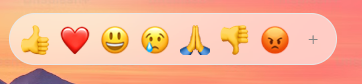
The picker can be used as a reactions picker. To use it as a reactions picker, you should set the reactionsDefaultOpen prop to true. This will cause the picker to the reactions picker on the initial mount instead of the main picker component.
|
|
265
265
|
|
|
@@ -268,7 +268,7 @@ To customize the reactions, you should pass an array of unified emoji ids to the
|
|
|
268
268
|
The reactions picker uses the same event handlers, and the same css variables for customizations.
|
|
269
269
|
|
|
270
270
|
```jsx
|
|
271
|
-
<Picker reactionsDefaultOpen />
|
|
271
|
+
<Picker reactionsDefaultOpen={true} onReactionClick={handleReaction} />
|
|
272
272
|
```
|
|
273
273
|
|
|
274
274
|
# Customization
|
|
@@ -18,6 +18,10 @@ export declare function closestScrollBody(element: NullableElement): NullableEle
|
|
|
18
18
|
export declare function emojiTruOffsetLeft(element: NullableElement): number;
|
|
19
19
|
export declare function unifiedFromEmojiElement(emoji: NullableElement): string | null;
|
|
20
20
|
export declare function originalUnifiedFromEmojiElement(emoji: NullableElement): string | null;
|
|
21
|
+
export declare function allUnifiedFromEmojiElement(emoji: NullableElement): {
|
|
22
|
+
unified: string | null;
|
|
23
|
+
originalUnified: string | null;
|
|
24
|
+
};
|
|
21
25
|
export declare function isVisibleEmoji(element: HTMLElement): boolean;
|
|
22
26
|
export declare function isHidden(element: NullableElement): boolean;
|
|
23
27
|
export declare function allVisibleEmojis(parent: NullableElement): HTMLElement[];
|
|
@@ -1,4 +1,5 @@
|
|
|
1
|
-
|
|
1
|
+
import { Styles } from 'flairup';
|
|
2
|
+
import * as React from 'react';
|
|
2
3
|
export declare const stylesheet: {
|
|
3
4
|
create: <K extends string>(styles: Partial<{ [k in K]: Partial<Partial<CSSStyleDeclaration> & Partial<{
|
|
4
5
|
'.'?: string | string[] | undefined;
|
|
@@ -8,5 +9,21 @@ export declare const stylesheet: {
|
|
|
8
9
|
isApplied: () => boolean;
|
|
9
10
|
};
|
|
10
11
|
export declare const commonStyles: Record<never, Set<string>>;
|
|
11
|
-
export declare
|
|
12
|
+
export declare const PickerStyleTag: React.NamedExoticComponent<object>;
|
|
12
13
|
export declare const commonInteractionStyles: Record<never, Set<string>>;
|
|
14
|
+
export declare function darkMode(key: string, value: Styles): {
|
|
15
|
+
'.epr-dark-theme': {
|
|
16
|
+
[x: string]: Partial<Partial<CSSStyleDeclaration> & Partial<{
|
|
17
|
+
'.'?: string | string[] | undefined;
|
|
18
|
+
'--'?: any;
|
|
19
|
+
}>>;
|
|
20
|
+
};
|
|
21
|
+
'.epr-auto-theme': {
|
|
22
|
+
[x: string]: {
|
|
23
|
+
'@media (prefers-color-scheme: dark)': Partial<Partial<CSSStyleDeclaration> & Partial<{
|
|
24
|
+
'.'?: string | string[] | undefined;
|
|
25
|
+
'--'?: any;
|
|
26
|
+
}>>;
|
|
27
|
+
};
|
|
28
|
+
};
|
|
29
|
+
};
|
|
@@ -7,7 +7,8 @@ declare type ClickableEmojiButtonProps = Readonly<{
|
|
|
7
7
|
children: React.ReactNode;
|
|
8
8
|
hasVariations: boolean;
|
|
9
9
|
unified?: string;
|
|
10
|
-
|
|
10
|
+
noBackground?: boolean;
|
|
11
|
+
className?: string;
|
|
11
12
|
}>;
|
|
12
|
-
export declare function ClickableEmojiButton({ emojiNames, unified, hidden, hiddenOnSearch, showVariations, hasVariations, children,
|
|
13
|
+
export declare function ClickableEmojiButton({ emojiNames, unified, hidden, hiddenOnSearch, showVariations, hasVariations, children, className, noBackground }: ClickableEmojiButtonProps): JSX.Element;
|
|
13
14
|
export {};
|
|
@@ -7,7 +7,7 @@ declare type ClickableEmojiProps = Readonly<BaseEmojiProps & {
|
|
|
7
7
|
hiddenOnSearch?: boolean;
|
|
8
8
|
emoji: DataEmoji;
|
|
9
9
|
className?: string;
|
|
10
|
-
|
|
10
|
+
noBackground?: boolean;
|
|
11
11
|
}>;
|
|
12
|
-
export declare function ClickableEmoji({ emoji, unified, hidden, hiddenOnSearch, emojiStyle, showVariations, size, lazyLoad, getEmojiUrl,
|
|
12
|
+
export declare function ClickableEmoji({ emoji, unified, hidden, hiddenOnSearch, emojiStyle, showVariations, size, lazyLoad, getEmojiUrl, className, noBackground }: ClickableEmojiProps): JSX.Element;
|
|
13
13
|
export {};
|
package/dist/config/config.d.ts
CHANGED
|
@@ -34,6 +34,7 @@ export declare type PickerConfigInternal = {
|
|
|
34
34
|
customEmojis: CustomEmoji[];
|
|
35
35
|
reactionsDefaultOpen: boolean;
|
|
36
36
|
reactions: string[];
|
|
37
|
+
open: boolean;
|
|
37
38
|
};
|
|
38
39
|
export declare type PreviewConfig = {
|
|
39
40
|
defaultEmoji: string;
|
|
@@ -42,8 +43,10 @@ export declare type PreviewConfig = {
|
|
|
42
43
|
};
|
|
43
44
|
declare type ConfigExternal = {
|
|
44
45
|
previewConfig: Partial<PreviewConfig>;
|
|
45
|
-
onEmojiClick:
|
|
46
|
+
onEmojiClick: MouseDownEvent;
|
|
47
|
+
onReactionClick: MouseDownEvent;
|
|
46
48
|
} & Omit<PickerConfigInternal, 'previewConfig' | 'unicodeToHide'>;
|
|
47
49
|
export declare type PickerConfig = Partial<ConfigExternal>;
|
|
48
50
|
export declare type PickerDimensions = string | number;
|
|
51
|
+
export declare type MouseDownEvent = (emoji: EmojiClickData, event: MouseEvent) => void;
|
|
49
52
|
export {};
|
|
@@ -1,7 +1,8 @@
|
|
|
1
1
|
import React from 'react';
|
|
2
|
-
import {
|
|
2
|
+
import { MouseDownEvent } from './config';
|
|
3
3
|
export declare type MutableConfig = {
|
|
4
|
-
onEmojiClick?:
|
|
4
|
+
onEmojiClick?: MouseDownEvent;
|
|
5
|
+
onReactionClick?: MouseDownEvent;
|
|
5
6
|
};
|
|
6
7
|
export declare const MutableConfigContext: React.Context<React.MutableRefObject<MutableConfig>>;
|
|
7
8
|
export declare function useMutableConfig(): React.MutableRefObject<MutableConfig>;
|
|
@@ -3,6 +3,10 @@ import { EmojiClickData, EmojiStyle, SkinTonePickerLocation, SkinTones, Suggesti
|
|
|
3
3
|
import { CategoriesConfig } from './categoryConfig';
|
|
4
4
|
import { PreviewConfig } from './config';
|
|
5
5
|
import { CustomEmoji } from './customEmojiConfig';
|
|
6
|
+
export declare enum MOUSE_EVENT_SOURCE {
|
|
7
|
+
REACTIONS = "reactions",
|
|
8
|
+
PICKER = "picker"
|
|
9
|
+
}
|
|
6
10
|
export declare function useSearchPlaceHolderConfig(): string;
|
|
7
11
|
export declare function useDefaultSkinToneConfig(): SkinTones;
|
|
8
12
|
export declare function useSkinTonesDisabledConfig(): boolean;
|
|
@@ -10,7 +14,8 @@ export declare function useEmojiStyleConfig(): EmojiStyle;
|
|
|
10
14
|
export declare function useAutoFocusSearchConfig(): boolean;
|
|
11
15
|
export declare function useCategoriesConfig(): CategoriesConfig;
|
|
12
16
|
export declare function useCustomEmojisConfig(): CustomEmoji[];
|
|
13
|
-
export declare function
|
|
17
|
+
export declare function useOpenConfig(): boolean;
|
|
18
|
+
export declare function useOnEmojiClickConfig(mouseEventSource: MOUSE_EVENT_SOURCE): (emoji: EmojiClickData, event: MouseEvent) => void;
|
|
14
19
|
export declare function usePreviewConfig(): PreviewConfig;
|
|
15
20
|
export declare function useThemeConfig(): Theme;
|
|
16
21
|
export declare function useSuggestedEmojisModeConfig(): SuggestionMode;
|