emoji-picker-react 4.6.15 → 4.7.1
This diff represents the content of publicly available package versions that have been released to one of the supported registries. The information contained in this diff is provided for informational purposes only and reflects changes between package versions as they appear in their respective public registries.
- package/README.md +60 -30
- package/dist/components/Reactions/BtnPlus.d.ts +2 -0
- package/dist/components/Reactions/DEFAULT_REACTIONS.d.ts +1 -0
- package/dist/components/Reactions/Reactions.d.ts +2 -0
- package/dist/components/context/ElementRefContext.d.ts +1 -0
- package/dist/components/context/PickerContext.d.ts +1 -0
- package/dist/components/emoji/ClickableEmojiButton.d.ts +2 -1
- package/dist/components/emoji/Emoji.d.ts +2 -1
- package/dist/config/config.d.ts +5 -1
- package/dist/config/mutableConfig.d.ts +3 -2
- package/dist/config/useConfig.d.ts +7 -1
- package/dist/emoji-picker-react.cjs.development.js +956 -741
- package/dist/emoji-picker-react.cjs.development.js.map +1 -1
- package/dist/emoji-picker-react.cjs.production.min.js +1 -1
- package/dist/emoji-picker-react.cjs.production.min.js.map +1 -1
- package/dist/emoji-picker-react.esm.js +957 -742
- package/dist/emoji-picker-react.esm.js.map +1 -1
- package/dist/hooks/useMouseDownHandlers.d.ts +2 -1
- package/package.json +5 -2
- package/src/EmojiPickerReact.tsx +28 -3
- package/src/Stylesheet/stylesheet.tsx +14 -2
- package/src/components/Reactions/BtnPlus.tsx +78 -0
- package/src/components/Reactions/DEFAULT_REACTIONS.ts +9 -0
- package/src/components/Reactions/Reactions.tsx +63 -0
- package/src/components/Reactions/svg/plus.svg +17 -0
- package/src/components/body/Body.tsx +10 -3
- package/src/components/context/ElementRefContext.tsx +10 -2
- package/src/components/context/PickerContext.tsx +16 -3
- package/src/components/emoji/ClickableEmojiButton.tsx +8 -2
- package/src/components/emoji/Emoji.tsx +4 -1
- package/src/components/footer/Preview.tsx +7 -2
- package/src/components/header/Header.tsx +5 -1
- package/src/components/main/PickerMain.tsx +27 -2
- package/src/config/config.ts +11 -3
- package/src/config/mutableConfig.ts +5 -3
- package/src/config/useConfig.ts +31 -8
- package/src/hooks/useMouseDownHandlers.ts +13 -11
- package/src/index.tsx +2 -1
package/README.md
CHANGED
|
@@ -2,14 +2,19 @@
|
|
|
2
2
|
|
|
3
3
|

|
|
4
4
|
|
|
5
|
+
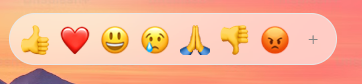
## Usage as a Reactions Picker
|
|
5
6
|
|
|
6
|
-
|
|
7
|
+
|
|
8
|
+
|
|
9
|
+

|
|
10
|
+
|
|
11
|
+
---
|
|
7
12
|
|
|
8
13
|
_If you enjoy using emoji-picker-react<br/>
|
|
9
14
|
You should also consider trying:<br/>
|
|
10
15
|
<img src="https://cdn.jsdelivr.net/gh/ealush/emoji-picker-react@custom_emojis_assets/vest.png" height="16"/> [Vest validation framework](https://vestjs.dev).<br/>_
|
|
11
16
|
|
|
12
|
-
|
|
17
|
+
---
|
|
13
18
|
|
|
14
19
|
## What to know before using
|
|
15
20
|
|
|
@@ -21,7 +26,7 @@ ____
|
|
|
21
26
|
npm install emoji-picker-react
|
|
22
27
|
```
|
|
23
28
|
|
|
24
|
-
## Usage
|
|
29
|
+
## Usage
|
|
25
30
|
|
|
26
31
|
```jsx
|
|
27
32
|
import EmojiPicker from 'emoji-picker-react';
|
|
@@ -35,7 +40,7 @@ function App() {
|
|
|
35
40
|
}
|
|
36
41
|
```
|
|
37
42
|
|
|
38
|
-
## Shout Outs
|
|
43
|
+
## Shout Outs
|
|
39
44
|
|
|
40
45
|
| Component Design 🎨 |
|
|
41
46
|
| :-----------------------------------------------------------------------------------------------------------------------------------------------------------------------------------------------------------------: |
|
|
@@ -53,33 +58,37 @@ function App() {
|
|
|
53
58
|
- Different emoji sets (Google, Apple, Facebook, Twitter)
|
|
54
59
|
- Native Emoji support
|
|
55
60
|
- Emoji Component To Render Emojis in your app
|
|
61
|
+
- Reactions Picker
|
|
56
62
|
|
|
57
63
|
# Props
|
|
58
64
|
|
|
59
65
|
The following props are accepted by them picker:
|
|
60
66
|
|
|
61
|
-
| Prop | Type | Default | Description
|
|
62
|
-
| ---------------------- | ------------------------------------------------------ | ---------- |
|
|
63
|
-
| onEmojiClick | function | | Callback function that is called when an emoji is clicked. The function receives the emoji object as a parameter.
|
|
64
|
-
| autoFocusSearch | boolean | `true` | Controls the auto focus of the search input.
|
|
65
|
-
| Theme | string | `light` | Controls the theme of the picker. Possible values are `light`, `dark` and `auto`.
|
|
66
|
-
| emojiStyle | string | `apple` | Controls the emoji style. Possible values are `google`, `apple`, `facebook`, `twitter` and `native`.
|
|
67
|
-
| defaultSkinTone | string | `neutral` | Controls the default skin tone.
|
|
68
|
-
| lazyLoadEmojis | boolean | `false` | Controls whether the emojis are loaded lazily or not.
|
|
69
|
-
| previewConfig | object | `{}` | Controls the preview of the emoji. See below for more information.
|
|
70
|
-
| searchPlaceholder | string | `Search` | Controls the placeholder of the search input.
|
|
71
|
-
| suggestedEmojisMode | string | `frequent` | Controls the suggested emojis mode. Possible values are `frequent` and `recent`.
|
|
72
|
-
| skinTonesDisabled | boolean | `false` | Controls whether the skin tones are disabled or not.
|
|
73
|
-
| searchDisabled | boolean | `false` | Controls whether the search is disabled or not. When disabled, the skin tone picker will be shown in the preview component.
|
|
74
|
-
| skinTonePickerLocation | string | `SEARCH` | Controls the location of the skin tone picker. Possible values are `SEARCH` and `PREVIEW`.
|
|
75
|
-
| emojiVersion | `string` | - | Allows displaying emojis up to a certain version for compatibility.
|
|
76
|
-
| `className` | `string` | - | Adds a class name to the root element of the picker.
|
|
77
|
-
| `width` | `number`/`string` | `350` | Controls the width of the picker. You can provide a number that will be treated as pixel size, or your any accepted css width as string.
|
|
78
|
-
| `height` | `number`/`string` | `450` | Controls the height of the picker. You can provide a number that will be treated as pixel size, or your any accepted css height as string.
|
|
79
|
-
| `style` | `React.CSSProperties` | `{}` | Adds inline style to the root element of the picker.
|
|
80
|
-
| getEmojiUrl | `Function` | - | Allows to customize the emoji url and provide your own image host.
|
|
81
|
-
| categories | `Array` | - | Allows full config over ordering, naming and display of categories.
|
|
82
|
-
| customEmojis | `Array<{names: string[], imgUrl: string, id: string}>` | - | Allows adding custom emojis to the picker.
|
|
67
|
+
| Prop | Type | Default | Description |
|
|
68
|
+
| ---------------------- | ------------------------------------------------------ | ---------- | ---------------------------------------------------------------------------------------------------------------------------------------------------------- |
|
|
69
|
+
| onEmojiClick | function | | Callback function that is called when an emoji is clicked. The function receives the emoji object as a parameter. |
|
|
70
|
+
| autoFocusSearch | boolean | `true` | Controls the auto focus of the search input. |
|
|
71
|
+
| Theme | string | `light` | Controls the theme of the picker. Possible values are `light`, `dark` and `auto`. |
|
|
72
|
+
| emojiStyle | string | `apple` | Controls the emoji style. Possible values are `google`, `apple`, `facebook`, `twitter` and `native`. |
|
|
73
|
+
| defaultSkinTone | string | `neutral` | Controls the default skin tone. |
|
|
74
|
+
| lazyLoadEmojis | boolean | `false` | Controls whether the emojis are loaded lazily or not. |
|
|
75
|
+
| previewConfig | object | `{}` | Controls the preview of the emoji. See below for more information. |
|
|
76
|
+
| searchPlaceholder | string | `Search` | Controls the placeholder of the search input. |
|
|
77
|
+
| suggestedEmojisMode | string | `frequent` | Controls the suggested emojis mode. Possible values are `frequent` and `recent`. |
|
|
78
|
+
| skinTonesDisabled | boolean | `false` | Controls whether the skin tones are disabled or not. |
|
|
79
|
+
| searchDisabled | boolean | `false` | Controls whether the search is disabled or not. When disabled, the skin tone picker will be shown in the preview component. |
|
|
80
|
+
| skinTonePickerLocation | string | `SEARCH` | Controls the location of the skin tone picker. Possible values are `SEARCH` and `PREVIEW`. |
|
|
81
|
+
| emojiVersion | `string` | - | Allows displaying emojis up to a certain version for compatibility. |
|
|
82
|
+
| `className` | `string` | - | Adds a class name to the root element of the picker. |
|
|
83
|
+
| `width` | `number`/`string` | `350` | Controls the width of the picker. You can provide a number that will be treated as pixel size, or your any accepted css width as string. |
|
|
84
|
+
| `height` | `number`/`string` | `450` | Controls the height of the picker. You can provide a number that will be treated as pixel size, or your any accepted css height as string. |
|
|
85
|
+
| `style` | `React.CSSProperties` | `{}` | Adds inline style to the root element of the picker. |
|
|
86
|
+
| getEmojiUrl | `Function` | - | Allows to customize the emoji url and provide your own image host. |
|
|
87
|
+
| categories | `Array` | - | Allows full config over ordering, naming and display of categories. |
|
|
88
|
+
| customEmojis | `Array<{names: string[], imgUrl: string, id: string}>` | - | Allows adding custom emojis to the picker. |
|
|
89
|
+
| reactionsDefaultOpen | `boolean` | `false` | Controls whether the reactions picker is on the initial mount instead of the main picker component. |
|
|
90
|
+
| reactions | string[] | - | Controls the reactions to display in the reactions picker. Takes unified emoji ids |
|
|
91
|
+
| onReactionClick | `Function` | - | Callback function that is called when a reaction is clicked. The function receives the emoji object as a parameter. If not passed, onEmojiClicked is used. |
|
|
83
92
|
|
|
84
93
|
## Full details
|
|
85
94
|
|
|
@@ -113,10 +122,14 @@ The following props are accepted by them picker:
|
|
|
113
122
|
```
|
|
114
123
|
|
|
115
124
|
* `autoFocusSearch`: `boolean` - Whether to focus the search input on mount. Defaults to `true`.
|
|
116
|
-
|
|
125
|
+
|
|
117
126
|
* `lazyLoadEmojis`: `boolean` - Whether to lazy load the emojis. Defaults to `false`.
|
|
118
127
|
|
|
119
|
-
|
|
128
|
+
- `autoFocusSearch`: `boolean` - Whether to focus the search input on mount. Defaults to `true`.
|
|
129
|
+
|
|
130
|
+
- `lazyLoadEmojis`: `boolean` - Whether to lazy load the emojis. Defaults to `false`.
|
|
131
|
+
|
|
132
|
+
- `defaultSkinTone`: `SkinTones` - The default skin tone to use when an emoji is clicked. Defaults to `SkinTones.Neutral`. Possible skin tones are:
|
|
120
133
|
|
|
121
134
|
- ✋ 'neutral'
|
|
122
135
|
- ✋🏻 '1f3fb'
|
|
@@ -190,6 +203,7 @@ import { SkinTones } from 'emoji-picker-react';
|
|
|
190
203
|
```
|
|
191
204
|
|
|
192
205
|
- `emojiVersion`: `string` - Allows displaying emojis up to a certain version for compatibility. The passed version will be parsed as a float and each emoji will be tested against it. Common values are:
|
|
206
|
+
|
|
193
207
|
- `"0.6"`
|
|
194
208
|
- `"1.0"`
|
|
195
209
|
- `"2.0"`
|
|
@@ -197,7 +211,7 @@ import { SkinTones } from 'emoji-picker-react';
|
|
|
197
211
|
- `"4.0"`
|
|
198
212
|
- `"5.0"`
|
|
199
213
|
|
|
200
|
-
|
|
214
|
+
- `getEmojiUrl`: `(unified: string, emojiStyle: EmojiStyle) => string` - Allows to customize the emoji url and provide your own image host. The function receives the emoji unified and the emoji style as parameters. The function should return the url of the emoji image.
|
|
201
215
|
|
|
202
216
|
## Custom Emojis
|
|
203
217
|
|
|
@@ -207,7 +221,7 @@ id: Unique identifier for each of the custom emojis
|
|
|
207
221
|
names: an array of string identifiers, will be used both for display, search and indexing.
|
|
208
222
|
imgUrl: URL for the emoji image
|
|
209
223
|
|
|
210
|
-
### Usage Example
|
|
224
|
+
### Usage Example
|
|
211
225
|
|
|
212
226
|
```jsx
|
|
213
227
|
<Picker
|
|
@@ -246,6 +260,22 @@ Here are some additional things to keep in mind about custom emojis:
|
|
|
246
260
|
- The location or name of the Custom category can be controlled via the categories prop.
|
|
247
261
|
- The custom emojis will be indexed by their id property. This means that you can search for custom emojis by their id or names.
|
|
248
262
|
|
|
263
|
+
## Reactions Picker
|
|
264
|
+
|
|
265
|
+

|
|
266
|
+
|
|
267
|
+

|
|
268
|
+
|
|
269
|
+
The picker can be used as a reactions picker. To use it as a reactions picker, you should set the reactionsDefaultOpen prop to true. This will cause the picker to the reactions picker on the initial mount instead of the main picker component.
|
|
270
|
+
|
|
271
|
+
To customize the reactions, you should pass an array of unified emoji ids to the reactions prop.
|
|
272
|
+
|
|
273
|
+
The reactions picker uses the same event handlers, and the same css variables for customizations.
|
|
274
|
+
|
|
275
|
+
```jsx
|
|
276
|
+
<Picker reactionsDefaultOpen={true} onReactionClick={handleReaction} />
|
|
277
|
+
```
|
|
278
|
+
|
|
249
279
|
# Customization
|
|
250
280
|
|
|
251
281
|
## Custom Picker Width and Height
|
|
@@ -0,0 +1 @@
|
|
|
1
|
+
export declare const DEFAULT_REACTIONS: string[];
|
|
@@ -8,6 +8,7 @@ export declare function usePickerMainRef(): ElementRef<HTMLElement>;
|
|
|
8
8
|
export declare function useAnchoredEmojiRef(): ElementRef<HTMLElement>;
|
|
9
9
|
export declare function useSetAnchoredEmojiRef(): (target: NullableElement) => void;
|
|
10
10
|
export declare function useBodyRef(): ElementRef<HTMLDivElement>;
|
|
11
|
+
export declare function useReactionsRef(): ElementRef<HTMLUListElement>;
|
|
11
12
|
export declare function useSearchInputRef(): ElementRef<HTMLInputElement>;
|
|
12
13
|
export declare function useSkinTonePickerRef(): ElementRef<HTMLDivElement>;
|
|
13
14
|
export declare function useCategoryNavigationRef(): ElementRef<HTMLDivElement>;
|
|
@@ -10,6 +10,7 @@ declare type Props = Readonly<{
|
|
|
10
10
|
export declare function useFilterRef(): React.MutableRefObject<Record<string, Record<string, DataEmoji>>>;
|
|
11
11
|
export declare function useDisallowClickRef(): React.MutableRefObject<boolean>;
|
|
12
12
|
export declare function useDisallowMouseRef(): React.MutableRefObject<boolean>;
|
|
13
|
+
export declare function useReactionsModeState(): ReactState<boolean>;
|
|
13
14
|
export declare function useSearchTermState(): [string, (term: string) => Promise<string>];
|
|
14
15
|
export declare function useActiveSkinToneState(): [SkinTones, (skinTone: SkinTones) => void];
|
|
15
16
|
export declare function useEmojisThatFailedToLoadState(): ReactState<Set<string>>;
|
|
@@ -7,6 +7,7 @@ declare type ClickableEmojiButtonProps = Readonly<{
|
|
|
7
7
|
children: React.ReactNode;
|
|
8
8
|
hasVariations: boolean;
|
|
9
9
|
unified?: string;
|
|
10
|
+
round?: boolean;
|
|
10
11
|
}>;
|
|
11
|
-
export declare function ClickableEmojiButton({ emojiNames, unified, hidden, hiddenOnSearch, showVariations, hasVariations, children }: ClickableEmojiButtonProps): JSX.Element;
|
|
12
|
+
export declare function ClickableEmojiButton({ emojiNames, unified, hidden, hiddenOnSearch, showVariations, hasVariations, children, round }: ClickableEmojiButtonProps): JSX.Element;
|
|
12
13
|
export {};
|
|
@@ -7,6 +7,7 @@ declare type ClickableEmojiProps = Readonly<BaseEmojiProps & {
|
|
|
7
7
|
hiddenOnSearch?: boolean;
|
|
8
8
|
emoji: DataEmoji;
|
|
9
9
|
className?: string;
|
|
10
|
+
round?: boolean;
|
|
10
11
|
}>;
|
|
11
|
-
export declare function ClickableEmoji({ emoji, unified, hidden, hiddenOnSearch, emojiStyle, showVariations, size, lazyLoad, getEmojiUrl }: ClickableEmojiProps): JSX.Element;
|
|
12
|
+
export declare function ClickableEmoji({ emoji, unified, hidden, hiddenOnSearch, emojiStyle, showVariations, size, lazyLoad, getEmojiUrl, round }: ClickableEmojiProps): JSX.Element;
|
|
12
13
|
export {};
|
package/dist/config/config.d.ts
CHANGED
|
@@ -32,6 +32,8 @@ export declare type PickerConfigInternal = {
|
|
|
32
32
|
skinTonePickerLocation: SkinTonePickerLocation;
|
|
33
33
|
unicodeToHide: Set<string>;
|
|
34
34
|
customEmojis: CustomEmoji[];
|
|
35
|
+
reactionsDefaultOpen: boolean;
|
|
36
|
+
reactions: string[];
|
|
35
37
|
};
|
|
36
38
|
export declare type PreviewConfig = {
|
|
37
39
|
defaultEmoji: string;
|
|
@@ -40,8 +42,10 @@ export declare type PreviewConfig = {
|
|
|
40
42
|
};
|
|
41
43
|
declare type ConfigExternal = {
|
|
42
44
|
previewConfig: Partial<PreviewConfig>;
|
|
43
|
-
onEmojiClick:
|
|
45
|
+
onEmojiClick: MouseDownEvent;
|
|
46
|
+
onReactionClick: MouseDownEvent;
|
|
44
47
|
} & Omit<PickerConfigInternal, 'previewConfig' | 'unicodeToHide'>;
|
|
45
48
|
export declare type PickerConfig = Partial<ConfigExternal>;
|
|
46
49
|
export declare type PickerDimensions = string | number;
|
|
50
|
+
export declare type MouseDownEvent = (emoji: EmojiClickData, event: MouseEvent) => void;
|
|
47
51
|
export {};
|
|
@@ -1,7 +1,8 @@
|
|
|
1
1
|
import React from 'react';
|
|
2
|
-
import {
|
|
2
|
+
import { MouseDownEvent } from './config';
|
|
3
3
|
export declare type MutableConfig = {
|
|
4
|
-
onEmojiClick?:
|
|
4
|
+
onEmojiClick?: MouseDownEvent;
|
|
5
|
+
onReactionClick?: MouseDownEvent;
|
|
5
6
|
};
|
|
6
7
|
export declare const MutableConfigContext: React.Context<React.MutableRefObject<MutableConfig>>;
|
|
7
8
|
export declare function useMutableConfig(): React.MutableRefObject<MutableConfig>;
|
|
@@ -3,6 +3,10 @@ import { EmojiClickData, EmojiStyle, SkinTonePickerLocation, SkinTones, Suggesti
|
|
|
3
3
|
import { CategoriesConfig } from './categoryConfig';
|
|
4
4
|
import { PreviewConfig } from './config';
|
|
5
5
|
import { CustomEmoji } from './customEmojiConfig';
|
|
6
|
+
export declare enum MOUSE_EVENT_SOURCE {
|
|
7
|
+
REACTIONS = "reactions",
|
|
8
|
+
PICKER = "picker"
|
|
9
|
+
}
|
|
6
10
|
export declare function useSearchPlaceHolderConfig(): string;
|
|
7
11
|
export declare function useDefaultSkinToneConfig(): SkinTones;
|
|
8
12
|
export declare function useSkinTonesDisabledConfig(): boolean;
|
|
@@ -10,16 +14,18 @@ export declare function useEmojiStyleConfig(): EmojiStyle;
|
|
|
10
14
|
export declare function useAutoFocusSearchConfig(): boolean;
|
|
11
15
|
export declare function useCategoriesConfig(): CategoriesConfig;
|
|
12
16
|
export declare function useCustomEmojisConfig(): CustomEmoji[];
|
|
13
|
-
export declare function useOnEmojiClickConfig(): (emoji: EmojiClickData, event: MouseEvent) => void;
|
|
17
|
+
export declare function useOnEmojiClickConfig(mouseEventSource: MOUSE_EVENT_SOURCE): (emoji: EmojiClickData, event: MouseEvent) => void;
|
|
14
18
|
export declare function usePreviewConfig(): PreviewConfig;
|
|
15
19
|
export declare function useThemeConfig(): Theme;
|
|
16
20
|
export declare function useSuggestedEmojisModeConfig(): SuggestionMode;
|
|
17
21
|
export declare function useLazyLoadEmojisConfig(): boolean;
|
|
18
22
|
export declare function useClassNameConfig(): string;
|
|
19
23
|
export declare function useStyleConfig(): React.CSSProperties;
|
|
24
|
+
export declare function useReactionsOpenConfig(): boolean;
|
|
20
25
|
export declare function useEmojiVersionConfig(): string | null;
|
|
21
26
|
export declare function useSearchDisabledConfig(): boolean;
|
|
22
27
|
export declare function useSkinTonePickerLocationConfig(): SkinTonePickerLocation;
|
|
23
28
|
export declare function useUnicodeToHide(): Set<string>;
|
|
29
|
+
export declare function useReactionsConfig(): string[];
|
|
24
30
|
export declare function useGetEmojiUrlConfig(): (unified: string, style: EmojiStyle) => string;
|
|
25
31
|
export declare function useSearchResultsConfig(searchResultsCount: number): string;
|