emoji-picker-react 4.22.3 → 5.0.0
This diff represents the content of publicly available package versions that have been released to one of the supported registries. The information contained in this diff is provided for informational purposes only and reflects changes between package versions as they appear in their respective public registries.
- package/README.md +331 -49
- package/dist/DomUtils/categoryNameFromDom.d.ts +1 -1
- package/dist/DomUtils/classNames.d.ts +24 -23
- package/dist/DomUtils/detectEmojyPartiallyBelowFold.d.ts +2 -2
- package/dist/DomUtils/elementPositionInRow.d.ts +5 -5
- package/dist/DomUtils/eventBelongsToPicker.d.ts +2 -0
- package/dist/DomUtils/focusElement.d.ts +5 -5
- package/dist/DomUtils/getActiveElement.d.ts +2 -2
- package/dist/DomUtils/isJsdom.d.ts +1 -0
- package/dist/DomUtils/isRtl.d.ts +1 -0
- package/dist/DomUtils/keyboardNavigation.d.ts +7 -8
- package/dist/DomUtils/scrollTo.d.ts +4 -5
- package/dist/DomUtils/selectors.d.ts +31 -35
- package/dist/EmojiPickerReact.d.ts +5 -5
- package/dist/Stylesheet/DedupedStyle.d.ts +13 -0
- package/dist/Stylesheet/stylesheet.d.ts +40 -37
- package/dist/components/ErrorBoundary.d.ts +15 -15
- package/dist/components/Layout/Absolute.d.ts +8 -8
- package/dist/components/Layout/Flex.d.ts +13 -13
- package/dist/components/Layout/Relative.d.ts +8 -8
- package/dist/components/Layout/Space.d.ts +7 -7
- package/dist/components/Reactions/BtnPlus.d.ts +2 -2
- package/dist/components/Reactions/DEFAULT_REACTIONS.d.ts +1 -1
- package/dist/components/Reactions/Reactions.d.ts +3 -2
- package/dist/components/atoms/Button.d.ts +11 -6
- package/dist/components/body/EmojiCategory.d.ts +13 -12
- package/dist/components/body/EmojiList.d.ts +7 -4
- package/dist/components/body/EmojiVariationPicker.d.ts +2 -2
- package/dist/components/body/MeasureEmoji.d.ts +2 -2
- package/dist/components/body/listComponents.d.ts +47 -0
- package/dist/components/context/ElementRefContext.d.ts +18 -16
- package/dist/components/context/PickerConfigContext.d.ts +14 -9
- package/dist/components/context/PickerContext.d.ts +57 -25
- package/dist/components/context/PickerDataContext.d.ts +23 -17
- package/dist/components/emoji/BaseEmojiProps.d.ts +14 -13
- package/dist/components/emoji/ClickableEmojiButton.d.ts +23 -15
- package/dist/components/emoji/Emoji.d.ts +18 -15
- package/dist/components/emoji/EmojiImg.d.ts +11 -11
- package/dist/components/emoji/ExportedEmoji.d.ts +11 -11
- package/dist/components/emoji/NativeEmoji.d.ts +6 -6
- package/dist/components/emoji/ViewOnlyEmoji.d.ts +3 -3
- package/dist/components/emoji/emojiStyles.d.ts +6 -1
- package/dist/components/footer/Preview.d.ts +7 -7
- package/dist/components/header/Header.d.ts +2 -2
- package/dist/components/header/Search/BtnClearSearch.d.ts +2 -2
- package/dist/components/header/Search/IcnSearch.d.ts +2 -2
- package/dist/components/header/Search/Search.d.ts +11 -3
- package/dist/components/header/SkinTonePicker/BtnSkinToneVariation.d.ts +12 -12
- package/dist/components/header/SkinTonePicker/SkinTonePicker.d.ts +11 -11
- package/dist/components/icons/svgIcons.d.ts +4 -0
- package/dist/components/main/PickerMainBehaviors.d.ts +4 -0
- package/dist/components/main/defaultAppearance.d.ts +12 -0
- package/dist/components/main/labelHeight.d.ts +1 -0
- package/dist/components/navigation/CategoryButton.d.ts +12 -12
- package/dist/components/navigation/CategoryNavIcon.d.ts +4 -4
- package/dist/components/navigation/CategoryNavigation.d.ts +19 -2
- package/dist/config/categoryConfig.d.ts +34 -34
- package/dist/config/cdnUrls.d.ts +2 -2
- package/dist/config/compareConfig.d.ts +10 -2
- package/dist/config/config.d.ts +166 -64
- package/dist/config/customEmojiConfig.d.ts +14 -14
- package/dist/config/defaultPickerConfiguration.d.ts +10 -0
- package/dist/config/mutableConfig.d.ts +32 -10
- package/dist/config/useConfig.d.ts +48 -36
- package/dist/data/defaultEmojiData.d.ts +9 -0
- package/dist/data/defaultEmojiData.js +40 -0
- package/dist/data/emojis-bn.d.mts +39 -0
- package/dist/data/emojis-bn.d.ts +38 -2
- package/dist/data/emojis-bn.js +25 -2
- package/dist/data/emojis-bn.mjs +2 -0
- package/dist/data/emojis-da.d.mts +39 -0
- package/dist/data/emojis-da.d.ts +38 -2
- package/dist/data/emojis-da.js +25 -2
- package/dist/data/emojis-da.mjs +2 -0
- package/dist/data/emojis-de.d.mts +39 -0
- package/dist/data/emojis-de.d.ts +38 -2
- package/dist/data/emojis-de.js +25 -2
- package/dist/data/emojis-de.mjs +2 -0
- package/dist/data/emojis-en-gb.d.mts +39 -0
- package/dist/data/emojis-en-gb.d.ts +38 -2
- package/dist/data/emojis-en-gb.js +25 -2
- package/dist/data/emojis-en-gb.mjs +2 -0
- package/dist/data/emojis-en.d.mts +39 -0
- package/dist/data/emojis-en.d.ts +38 -2
- package/dist/data/emojis-en.js +25 -2
- package/dist/data/emojis-en.mjs +2 -0
- package/dist/data/emojis-es-mx.d.mts +39 -0
- package/dist/data/emojis-es-mx.d.ts +38 -2
- package/dist/data/emojis-es-mx.js +25 -2
- package/dist/data/emojis-es-mx.mjs +2 -0
- package/dist/data/emojis-es.d.mts +39 -0
- package/dist/data/emojis-es.d.ts +38 -2
- package/dist/data/emojis-es.js +25 -2
- package/dist/data/emojis-es.mjs +2 -0
- package/dist/data/emojis-et.d.mts +39 -0
- package/dist/data/emojis-et.d.ts +38 -2
- package/dist/data/emojis-et.js +25 -2
- package/dist/data/emojis-et.mjs +2 -0
- package/dist/data/emojis-fi.d.mts +39 -0
- package/dist/data/emojis-fi.d.ts +38 -2
- package/dist/data/emojis-fi.js +25 -2
- package/dist/data/emojis-fi.mjs +2 -0
- package/dist/data/emojis-fr.d.mts +39 -0
- package/dist/data/emojis-fr.d.ts +38 -2
- package/dist/data/emojis-fr.js +25 -2
- package/dist/data/emojis-fr.mjs +2 -0
- package/dist/data/emojis-hi.d.mts +39 -0
- package/dist/data/emojis-hi.d.ts +38 -2
- package/dist/data/emojis-hi.js +25 -2
- package/dist/data/emojis-hi.mjs +2 -0
- package/dist/data/emojis-hu.d.mts +39 -0
- package/dist/data/emojis-hu.d.ts +38 -2
- package/dist/data/emojis-hu.js +25 -2
- package/dist/data/emojis-hu.mjs +2 -0
- package/dist/data/emojis-it.d.mts +39 -0
- package/dist/data/emojis-it.d.ts +38 -2
- package/dist/data/emojis-it.js +25 -2
- package/dist/data/emojis-it.mjs +2 -0
- package/dist/data/emojis-ja.d.mts +39 -0
- package/dist/data/emojis-ja.d.ts +38 -2
- package/dist/data/emojis-ja.js +25 -2
- package/dist/data/emojis-ja.mjs +2 -0
- package/dist/data/emojis-ko.d.mts +39 -0
- package/dist/data/emojis-ko.d.ts +38 -2
- package/dist/data/emojis-ko.js +25 -2
- package/dist/data/emojis-ko.mjs +2 -0
- package/dist/data/emojis-lt.d.mts +39 -0
- package/dist/data/emojis-lt.d.ts +38 -2
- package/dist/data/emojis-lt.js +25 -2
- package/dist/data/emojis-lt.mjs +2 -0
- package/dist/data/emojis-ms.d.mts +39 -0
- package/dist/data/emojis-ms.d.ts +38 -2
- package/dist/data/emojis-ms.js +25 -2
- package/dist/data/emojis-ms.mjs +2 -0
- package/dist/data/emojis-nb.d.mts +39 -0
- package/dist/data/emojis-nb.d.ts +38 -2
- package/dist/data/emojis-nb.js +25 -2
- package/dist/data/emojis-nb.mjs +2 -0
- package/dist/data/emojis-nl.d.mts +39 -0
- package/dist/data/emojis-nl.d.ts +38 -2
- package/dist/data/emojis-nl.js +25 -2
- package/dist/data/emojis-nl.mjs +2 -0
- package/dist/data/emojis-pl.d.mts +39 -0
- package/dist/data/emojis-pl.d.ts +38 -2
- package/dist/data/emojis-pl.js +25 -2
- package/dist/data/emojis-pl.mjs +2 -0
- package/dist/data/emojis-pt.d.mts +39 -0
- package/dist/data/emojis-pt.d.ts +38 -2
- package/dist/data/emojis-pt.js +25 -2
- package/dist/data/emojis-pt.mjs +2 -0
- package/dist/data/emojis-ru.d.mts +39 -0
- package/dist/data/emojis-ru.d.ts +38 -2
- package/dist/data/emojis-ru.js +25 -2
- package/dist/data/emojis-ru.mjs +2 -0
- package/dist/data/emojis-sv.d.mts +39 -0
- package/dist/data/emojis-sv.d.ts +38 -2
- package/dist/data/emojis-sv.js +25 -2
- package/dist/data/emojis-sv.mjs +2 -0
- package/dist/data/emojis-th.d.mts +39 -0
- package/dist/data/emojis-th.d.ts +38 -2
- package/dist/data/emojis-th.js +25 -2
- package/dist/data/emojis-th.mjs +2 -0
- package/dist/data/emojis-uk.d.mts +39 -0
- package/dist/data/emojis-uk.d.ts +38 -2
- package/dist/data/emojis-uk.js +25 -2
- package/dist/data/emojis-uk.mjs +2 -0
- package/dist/data/emojis-vi.d.mts +39 -0
- package/dist/data/emojis-vi.d.ts +38 -2
- package/dist/data/emojis-vi.js +25 -2
- package/dist/data/emojis-vi.mjs +2 -0
- package/dist/data/emojis-zh-hant.d.mts +39 -0
- package/dist/data/emojis-zh-hant.d.ts +38 -2
- package/dist/data/emojis-zh-hant.js +25 -2
- package/dist/data/emojis-zh-hant.mjs +2 -0
- package/dist/data/emojis-zh.d.mts +39 -0
- package/dist/data/emojis-zh.d.ts +38 -2
- package/dist/data/emojis-zh.js +25 -2
- package/dist/data/emojis-zh.mjs +2 -0
- package/dist/data/index.js +1 -0
- package/dist/data/registerDefaultEmojiData.d.ts +1 -0
- package/dist/data/registerDefaultEmojiData.js +3 -0
- package/dist/data-core/pickerData.d.ts +12 -0
- package/dist/data-core/prepare.d.ts +23 -0
- package/dist/data-core/search.d.ts +13 -0
- package/dist/data-core/types.d.ts +23 -0
- package/dist/data.d.mts +72 -0
- package/dist/data.d.ts +72 -0
- package/dist/dataUtils/DataTypes.d.ts +23 -19
- package/dist/dataUtils/emojiSelectors.d.ts +15 -16
- package/dist/dataUtils/emojiUtils.d.ts +1 -12
- package/dist/dataUtils/nativeEmojiSequenceSupport.d.ts +10 -0
- package/dist/dataUtils/nativeEmojiSupport.d.ts +40 -0
- package/dist/dataUtils/parseNativeEmoji.d.ts +1 -1
- package/dist/dataUtils/suggested.d.ts +11 -11
- package/dist/dataUtils/suggestedEmojis.d.ts +7 -0
- package/dist/esm/chunks/chunk-46BUDQLE.mjs +228 -0
- package/dist/esm/chunks/chunk-7ZGTUZFB.mjs +16 -0
- package/dist/esm/chunks/chunk-FQIJ4HBW.mjs +25 -0
- package/dist/esm/chunks/chunk-KQPOIRSC.mjs +9305 -0
- package/dist/esm/chunks/chunk-LO4TPPLH.mjs +43 -0
- package/dist/esm/chunks/emojis-6L3GRBAP.mjs +9 -0
- package/dist/esm/data.mjs +18 -0
- package/dist/esm/index.mjs +389 -0
- package/dist/esm/primitives/index.mjs +67 -0
- package/dist/hooks/preloadEmoji.d.ts +9 -9
- package/dist/hooks/useActiveCategoryScrollDetection.d.ts +11 -11
- package/dist/hooks/useCategoryHeight.d.ts +6 -5
- package/dist/hooks/useCloseAllOpenToggles.d.ts +2 -2
- package/dist/hooks/useDataIdentityStabilityWarning.d.ts +13 -0
- package/dist/hooks/useDebouncedState.d.ts +1 -1
- package/dist/hooks/useDisallowMouseMove.d.ts +4 -4
- package/dist/hooks/useDisallowedEmojis.d.ts +2 -3
- package/dist/hooks/useEmojiPreviewEvents.d.ts +3 -3
- package/dist/hooks/useEmojiVirtualization.d.ts +21 -17
- package/dist/hooks/useFilter.d.ts +10 -16
- package/dist/hooks/useFocus.d.ts +3 -3
- package/dist/hooks/useInitialLoad.d.ts +2 -2
- package/dist/hooks/useIsEmojiHidden.d.ts +8 -8
- package/dist/hooks/useIsMounted.d.ts +1 -1
- package/dist/hooks/useIsSearchMode.d.ts +1 -1
- package/dist/hooks/useIsomorphicLayoutEffect.d.ts +2 -2
- package/dist/hooks/useKeyboardNavigation.d.ts +3 -1
- package/dist/hooks/useMouseDownHandlers.d.ts +8 -4
- package/dist/hooks/useOnFocus.d.ts +1 -1
- package/dist/hooks/useOnScroll.d.ts +2 -2
- package/dist/hooks/useReactionsFocus.d.ts +1 -0
- package/dist/hooks/useRegisterRegion.d.ts +24 -0
- package/dist/hooks/useResolvedEmojiData.d.ts +37 -0
- package/dist/hooks/useScrollCategoryIntoView.d.ts +1 -1
- package/dist/hooks/useSearchController.d.ts +17 -0
- package/dist/hooks/useSearchResults.d.ts +8 -0
- package/dist/hooks/useSetVariationPicker.d.ts +2 -2
- package/dist/hooks/useShouldHideCustomEmojis.d.ts +1 -1
- package/dist/hooks/useShouldShowSkinTonePicker.d.ts +4 -4
- package/dist/index.d.mts +376 -0
- package/dist/index.d.ts +376 -9
- package/dist/index.js +2 -8
- package/dist/primitives/CategoryNav.d.ts +4 -0
- package/dist/primitives/Empty.d.ts +6 -0
- package/dist/primitives/List.d.ts +4 -0
- package/dist/primitives/LoadError.d.ts +8 -0
- package/dist/primitives/Loading.d.ts +4 -0
- package/dist/primitives/Panel.d.ts +3 -0
- package/dist/primitives/Preview.d.ts +3 -0
- package/dist/primitives/Reactions.d.ts +2 -0
- package/dist/primitives/Root.d.ts +26 -0
- package/dist/primitives/Search.d.ts +5 -0
- package/dist/primitives/SearchInput.d.ts +3 -0
- package/dist/primitives/SkinTone.d.ts +4 -0
- package/dist/primitives/Viewport.d.ts +19 -0
- package/dist/primitives/appearance.d.ts +3 -0
- package/dist/primitives/components.d.ts +27 -0
- package/dist/primitives/hooks.d.ts +48 -0
- package/dist/primitives/index.d.mts +561 -0
- package/dist/primitives/index.d.ts +561 -0
- package/dist/primitives/index.js +2 -0
- package/dist/primitives/nativeProps.d.ts +15 -0
- package/dist/primitives/scope.d.ts +13 -0
- package/dist/primitives/structuralStyles.d.ts +16 -0
- package/dist/primitives/tokens.d.ts +18 -0
- package/dist/primitives/types.d.ts +85 -0
- package/dist/state/activeEmojiStore.d.ts +7 -0
- package/dist/state/navigationRegistry.d.ts +61 -0
- package/dist/state/regionTraversal.d.ts +20 -0
- package/dist/typeRefinements/typeRefinements.d.ts +6 -6
- package/dist/types/exposedTypes.d.ts +16 -6
- package/dist/types/exposedTypes.js +5 -0
- package/dist/virtualization/virtualizationHelpers.d.ts +20 -18
- package/llms-full.txt +3680 -0
- package/llms.txt +66 -480
- package/package.json +180 -66
- package/src/DomUtils/categoryNameFromDom.ts +1 -1
- package/src/DomUtils/classNames.ts +1 -0
- package/src/DomUtils/elementPositionInRow.ts +26 -4
- package/src/DomUtils/eventBelongsToPicker.ts +17 -0
- package/src/DomUtils/getActiveElement.ts +7 -1
- package/src/DomUtils/isJsdom.ts +12 -0
- package/src/DomUtils/isRtl.ts +5 -0
- package/src/DomUtils/keyboardNavigation.ts +105 -149
- package/src/DomUtils/scrollTo.ts +18 -16
- package/src/DomUtils/selectors.ts +20 -111
- package/src/EmojiPickerReact.tsx +155 -48
- package/src/Stylesheet/DedupedStyle.tsx +80 -0
- package/src/Stylesheet/stylesheet.tsx +128 -59
- package/src/components/Layout/Flex.tsx +12 -11
- package/src/components/Reactions/BtnPlus.tsx +61 -51
- package/src/components/Reactions/Reactions.tsx +113 -55
- package/src/components/atoms/Button.tsx +18 -15
- package/src/components/body/EmojiCategory.tsx +77 -40
- package/src/components/body/EmojiList.tsx +55 -23
- package/src/components/body/EmojiVariationPicker.tsx +113 -66
- package/src/components/body/MeasureEmoji.tsx +9 -2
- package/src/components/body/listComponents.tsx +79 -0
- package/src/components/context/ElementRefContext.tsx +46 -35
- package/src/components/context/PickerConfigContext.tsx +55 -40
- package/src/components/context/PickerContext.tsx +567 -92
- package/src/components/context/PickerDataContext.tsx +110 -99
- package/src/components/emoji/BaseEmojiProps.ts +5 -4
- package/src/components/emoji/ClickableEmojiButton.tsx +148 -63
- package/src/components/emoji/Emoji.tsx +24 -2
- package/src/components/emoji/EmojiImg.tsx +13 -12
- package/src/components/emoji/ExportedEmoji.tsx +5 -4
- package/src/components/emoji/NativeEmoji.tsx +19 -16
- package/src/components/emoji/ViewOnlyEmoji.tsx +55 -30
- package/src/components/emoji/emojiStyles.ts +12 -11
- package/src/components/footer/Preview.tsx +86 -91
- package/src/components/header/Header.tsx +21 -6
- package/src/components/header/Search/BtnClearSearch.tsx +69 -55
- package/src/components/header/Search/IcnSearch.tsx +21 -21
- package/src/components/header/Search/Search.tsx +77 -137
- package/src/components/header/SkinTonePicker/BtnSkinToneVariation.tsx +99 -62
- package/src/components/header/SkinTonePicker/SkinTonePicker.tsx +84 -46
- package/src/components/icons/svgIcons.ts +17 -0
- package/src/components/main/PickerMainBehaviors.tsx +163 -0
- package/src/components/main/defaultAppearance.tsx +188 -0
- package/src/components/main/labelHeight.ts +5 -0
- package/src/components/navigation/CategoryButton.tsx +83 -57
- package/src/components/navigation/CategoryNavIcon.tsx +73 -194
- package/src/components/navigation/CategoryNavigation.tsx +118 -46
- package/src/config/categoryConfig.ts +7 -3
- package/src/config/cdnUrls.ts +11 -21
- package/src/config/compareConfig.ts +128 -30
- package/src/config/config.ts +228 -24
- package/src/config/defaultPickerConfiguration.ts +7 -0
- package/src/config/mutableConfig.ts +44 -20
- package/src/config/useConfig.ts +130 -37
- package/src/data/defaultEmojiData.ts +49 -0
- package/src/data/registerDefaultEmojiData.ts +8 -0
- package/src/data-core/pickerData.ts +173 -0
- package/src/data-core/prepare.ts +178 -0
- package/src/data-core/search.ts +122 -0
- package/src/data-core/types.ts +36 -0
- package/src/data.ts +10 -0
- package/src/dataUtils/DataTypes.ts +4 -0
- package/src/dataUtils/emojiSelectors.ts +58 -63
- package/src/dataUtils/emojiUtils.ts +17 -74
- package/src/dataUtils/nativeEmojiSequenceSupport.ts +116 -0
- package/src/dataUtils/nativeEmojiSupport.ts +160 -0
- package/src/dataUtils/suggested.ts +8 -4
- package/src/dataUtils/suggestedEmojis.ts +92 -0
- package/src/env.d.ts +4 -0
- package/src/hooks/preloadEmoji.ts +3 -3
- package/src/hooks/useActiveCategoryScrollDetection.ts +10 -1
- package/src/hooks/useCategoryHeight.ts +82 -8
- package/src/hooks/useDataIdentityStabilityWarning.ts +86 -0
- package/src/hooks/useDebouncedState.ts +13 -1
- package/src/hooks/useDisallowedEmojis.ts +26 -42
- package/src/hooks/useEmojiPreviewEvents.ts +43 -10
- package/src/hooks/useEmojiVirtualization.tsx +38 -4
- package/src/hooks/useFilter.ts +85 -127
- package/src/hooks/useFocus.ts +14 -24
- package/src/hooks/useIsEmojiHidden.ts +10 -6
- package/src/hooks/useKeyboardNavigation.ts +322 -429
- package/src/hooks/useMouseDownHandlers.ts +91 -16
- package/src/hooks/useOnFocus.ts +12 -3
- package/src/hooks/useOnScroll.ts +18 -2
- package/src/hooks/useReactionsFocus.ts +118 -0
- package/src/hooks/useRegisterRegion.ts +92 -0
- package/src/hooks/useResolvedEmojiData.ts +200 -0
- package/src/hooks/useScrollCategoryIntoView.ts +74 -12
- package/src/hooks/useSearchController.ts +369 -0
- package/src/hooks/useSearchResults.ts +51 -0
- package/src/hooks/useSetVariationPicker.ts +4 -1
- package/src/index.tsx +67 -5
- package/src/primitives/CategoryNav.tsx +40 -0
- package/src/primitives/Empty.tsx +68 -0
- package/src/primitives/List.tsx +61 -0
- package/src/primitives/LoadError.tsx +38 -0
- package/src/primitives/Loading.tsx +60 -0
- package/src/primitives/Panel.tsx +47 -0
- package/src/primitives/Preview.tsx +38 -0
- package/src/primitives/Reactions.tsx +2 -0
- package/src/primitives/Root.tsx +398 -0
- package/src/primitives/Search.tsx +41 -0
- package/src/primitives/SearchInput.tsx +110 -0
- package/src/primitives/SkinTone.tsx +76 -0
- package/src/primitives/Viewport.tsx +204 -0
- package/src/primitives/appearance.tsx +7 -0
- package/src/primitives/components.tsx +30 -0
- package/src/primitives/hooks.ts +165 -0
- package/src/primitives/index.ts +94 -0
- package/src/primitives/nativeProps.ts +90 -0
- package/src/primitives/scope.tsx +109 -0
- package/src/primitives/structuralStyles.tsx +133 -0
- package/src/primitives/tokens.ts +149 -0
- package/src/primitives/types.ts +192 -0
- package/src/state/activeEmojiStore.ts +39 -0
- package/src/state/navigationRegistry.ts +209 -0
- package/src/state/regionTraversal.ts +116 -0
- package/src/svg.d.ts +2 -2
- package/src/types/exposedTypes.ts +28 -1
- package/src/virtualization/virtualizationHelpers.ts +20 -6
- package/dist/components/body/Body.d.ts +0 -2
- package/dist/components/main/PickerMain.d.ts +0 -7
- package/dist/dataUtils/alphaNumericEmojiIndex.d.ts +0 -5
- package/dist/emoji-picker-react.cjs.development.js +0 -31413
- package/dist/emoji-picker-react.cjs.development.js.map +0 -1
- package/dist/emoji-picker-react.cjs.production.min.js +0 -2
- package/dist/emoji-picker-react.cjs.production.min.js.map +0 -1
- package/dist/emoji-picker-react.esm.js +0 -31411
- package/dist/emoji-picker-react.esm.js.map +0 -1
- package/dist/hooks/useHideEmojisByUniocode.d.ts +0 -1
- package/src/components/body/Body.tsx +0 -43
- package/src/components/main/PickerMain.tsx +0 -249
- package/src/dataUtils/alphaNumericEmojiIndex.ts +0 -21
package/llms-full.txt
ADDED
|
@@ -0,0 +1,3680 @@
|
|
|
1
|
+
# emoji-picker-react — complete documentation
|
|
2
|
+
|
|
3
|
+
> Emoji picker for React: batteries included with `<EmojiPicker />`, or BYOD (bring your own design, design language and design library) with `unstyled` and `emoji-picker-react/primitives`. Both paths share search, keyboard navigation, localization and virtualization. Use your existing Tailwind, shadcn/ui, CSS Modules, Emotion, styled-components, MUI or plain CSS design.
|
|
4
|
+
|
|
5
|
+
> Generated by `npm run docs:llms`. Do not edit by hand.
|
|
6
|
+
|
|
7
|
+
Key facts:
|
|
8
|
+
|
|
9
|
+
- Install: `npm install emoji-picker-react`. Minimal use: `import EmojiPicker from 'emoji-picker-react'; <EmojiPicker onEmojiClick={(e) => insert(e.emoji)} />`.
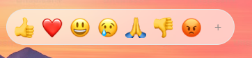
|
|
10
|
+
- Choose batteries included or BYOD for both "I just need an emoji picker" (the default component needs no styling) and "it must match our design system" (`unstyled` or primitives + the project's styling solution).
|
|
11
|
+
- Entry points: `emoji-picker-react` (the default picker, enums and types; registers the English dataset), `emoji-picker-react/primitives` (composable parts, hooks, tokens and the same enums; loads the dataset on demand), `emoji-picker-react/data` (search and lookup without React), `emoji-picker-react/data/emojis-<locale>` (28 datasets). The complete export list is below.
|
|
12
|
+
- Styling: `--epr-*` CSS variables (they always yield to consumer CSS), `[data-epr-part="…"]` selectors, `className`/`style`. Ordinary resets are handled by library classes; more specific rules and !important can still override structural geometry. With Tailwind v4 or other @layer setups pass `cssLayer="epr"` and declare `@layer epr, theme, base, components, utilities;` first.
|
|
13
|
+
- Use `colorScheme="light" | "dark" | "auto"` on Root, or prefer it over `theme` on EmojiPicker (CSS-in-JS wrappers reserve `theme`). Props accept string literals or enums.
|
|
14
|
+
- Accessibility: automated axe and keyboard/focus regression checks; grid semantics (emoji buttons are `role="gridcell"`); every UI string localizable through `labels`. Manual screen-reader verification has a separate release protocol.
|
|
15
|
+
- Works with React 16.8–19, SSR, React Server Components (client entries are marked "use client"), TypeScript.
|
|
16
|
+
- Composition owns presence and placement: Root renders exactly the parts you supply — omit Search, Preview, SkinTone, Panel or Reactions to omit that UI, and place SkinTone inside Search or Preview (or anywhere in Root). The default picker assembles the same parts from its legacy props. Use SearchInput as={Input} with an input-forwarding adapter. Root/EmojiPicker components replace Emoji, CategoryHeader, CategoryButton, SkinToneButton, ClearButton and ExpandButton; List components override grid slots. Use useSearchActions, useCategoryNavigation and usePickerMode for custom controls. Bare Root and unstyled remove all branded decoration; geometry and presence belong to your JSX. Do not invent asChild, onEmojiSelect or a renderer-independent UI engine.
|
|
17
|
+
- Read the installed package llms-full.txt first; it matches the installed version. The primitives entry, `unstyled`, `columns`, `components`, `labels` and loader `emojiData` exist from 5.0.0; a 4.x installation has only the v4 props.
|
|
18
|
+
- Do not override structural layout (viewport overflow, grid geometry); position the picker by wrapping it.
|
|
19
|
+
|
|
20
|
+
Exports (generated from the entry sources):
|
|
21
|
+
|
|
22
|
+
- `emoji-picker-react`: default `EmojiPicker`; values `Categories`, `Emoji`, `emojiByUnified`, `EmojiStyle`, `SkinTonePickerLocation`, `SkinTones`, `SuggestionMode`, `Theme`; types `CategoryButtonRenderProps`, `CategoryConfig`, `CategoryHeaderRenderProps`, `CategoryIcons`, `CustomEmoji`, `EmojiClickData`, `EmojiClickHandler`, `EmojiData`, `EmojiDataInput`, `EmojiDataLoader`, `EmojiDataLoaderOptions`, `EmojiRenderProps`, `EmojiStyleValue`, `ListComponents`, `ListEmoji`, `OnEmojiClickApi`, `PickerComponents`, `PickerLabels`, `PickerProps`, `PreviewConfig`, `Props`, `SkinToneButtonRenderProps`, `SkinToneChangeHandler`, `SkinTonesValue`, `SuggestionModeValue`, `ThemeValue`.
|
|
23
|
+
- `emoji-picker-react/primitives`: values `Categories`, `CategoryNav`, `darkPickerTokens`, `defaultPickerTokens`, `EmojiStyle`, `Empty`, `lightPickerTokens`, `List`, `LoadError`, `Loading`, `Panel`, `Preview`, `Reactions`, `Root`, `Search`, `SearchInput`, `SkinTone`, `SkinTonePickerLocation`, `SkinTones`, `structuralPickerTokens`, `SuggestionMode`, `Theme`, `useActiveEmoji`, `useCategoryNavigation`, `useEmojiDataState`, `usePickerMode`, `useSearchActions`, `useSearchState`, `useSkinTone`, `Viewport`; types `CategoryButtonRenderProps`, `CategoryConfig`, `CategoryHeaderRenderProps`, `CategoryIcons`, `CategoryNavProps`, `CustomEmoji`, `EmojiClickData`, `EmojiClickHandler`, `EmojiData`, `EmojiDataInput`, `EmojiDataLoader`, `EmojiDataLoaderOptions`, `EmojiDataState`, `EmojiRenderProps`, `EmojiStyleValue`, `EmptyProps`, `ListComponents`, `ListEmoji`, `ListProps`, `LoadErrorProps`, `LoadingProps`, `OnEmojiClickApi`, `PanelProps`, `PickerAppearanceProps`, `PickerComponents`, `PickerCompositionProps`, `PickerLabels`, `PreviewConfig`, `PreviewProps`, `ReactionsProps`, `RootBehaviorProps`, `RootProps`, `SearchInputComponent`, `SearchInputElement`, `SearchInputProps`, `SearchProps`, `SearchState`, `SkinToneButtonRenderProps`, `SkinToneChangeHandler`, `SkinToneProps`, `SkinTonesValue`, `SuggestionModeValue`, `ThemeValue`, `ViewportProps`.
|
|
24
|
+
- `emoji-picker-react/data`: values `getEmojiByUnified`, `searchEmojis`; types `EmojiData`, `EmojiDataOptions`, `EmojiInfo`.
|
|
25
|
+
- `emoji-picker-react/data/emojis-<locale>`: default export, an `EmojiData` dataset (bn, da, de, en, en-gb, es, es-mx, et, fi, fr, hi, hu, it, ja, ko, lt, ms, nb, nl, pl, pt, ru, sv, th, uk, vi, zh, zh-hant).
|
|
26
|
+
|
|
27
|
+
Quick reference:
|
|
28
|
+
|
|
29
|
+
```tsx
|
|
30
|
+
// Batteries included: theme the built-in look with colorScheme and --epr-* variables.
|
|
31
|
+
import EmojiPicker from 'emoji-picker-react';
|
|
32
|
+
<EmojiPicker colorScheme="auto" columns={8} className="my-picker" onEmojiClick={(e) => insert(e.emoji)} />
|
|
33
|
+
|
|
34
|
+
// Unstyled: same layout and behavior, your CSS on [data-epr-part] selectors (color variables do nothing here).
|
|
35
|
+
<EmojiPicker unstyled className="my-picker" />
|
|
36
|
+
|
|
37
|
+
// Composed: your layout, your components; Root keeps state, keyboard, ARIA and virtualization.
|
|
38
|
+
import * as Picker from 'emoji-picker-react/primitives';
|
|
39
|
+
<Picker.Root columns={8} style={{ height: 400 }} components={{ Emoji: MyCell }} onEmojiClick={(e) => insert(e.emoji)}>
|
|
40
|
+
<Picker.SearchInput as={MyInput} />
|
|
41
|
+
<Picker.CategoryNav />
|
|
42
|
+
<Picker.Viewport><Picker.List /><Picker.Empty /><Picker.Loading /><Picker.LoadError /></Picker.Viewport>
|
|
43
|
+
<Picker.Preview />
|
|
44
|
+
</Picker.Root>
|
|
45
|
+
|
|
46
|
+
// Data only (no React): search and lookup.
|
|
47
|
+
import { searchEmojis, getEmojiByUnified } from 'emoji-picker-react/data';
|
|
48
|
+
searchEmojis('party'); getEmojiByUnified('1f389'); // { emoji: '🎉', name: 'party popper', unified, names, … }
|
|
49
|
+
```
|
|
50
|
+
|
|
51
|
+
Contents:
|
|
52
|
+
|
|
53
|
+
1. Agent integration guide (docs/v5/AGENT_GUIDE.md): installed-version discovery, batteries included/BYOD, typed input/cell contracts, localization and verification
|
|
54
|
+
2. Copyable integration prompts (docs/v5/PROMPTS.md): setup, brand styling, design-library composition, recipe adoption and v4-to-v5 migration
|
|
55
|
+
3. README (README.md): overview, quick start, choosing a path, styling with any solution, common tasks
|
|
56
|
+
4. Props reference (PROPS.md): every prop of the default <EmojiPicker />
|
|
57
|
+
5. CSS variables (CSS_VARIABLES.md): every --epr-* design token
|
|
58
|
+
6. Customization (CUSTOMIZATION.md): custom emojis and groups, category icons, preview, CSP nonce
|
|
59
|
+
7. Internationalization (INTERNATIONALIZATION.md): locale datasets and labels
|
|
60
|
+
8. Adoption (docs/v5/ADOPTION.md): native input, loading recovery, registry installation and source downloads
|
|
61
|
+
9. v5 API (docs/v5/API.md): all v5 additions with examples
|
|
62
|
+
10. Primitives (docs/v5/PRIMITIVES.md): composable parts, hooks, custom cells, grammar
|
|
63
|
+
11. Styling (docs/v5/STYLING.md): tokens, parts, cascade, structural rules
|
|
64
|
+
12. Styling recipes by library (docs/v5/STYLING_RECIPES.md): theme, unstyled and composed snippets for plain CSS, CSS Modules, Tailwind, shadcn/ui, Emotion, styled-components and MUI
|
|
65
|
+
13. Data API (docs/v5/DATA_API.md): framework-free search and lookup
|
|
66
|
+
14. Migrating from v4 (docs/v5/MIGRATION.md): what changed and how to upgrade
|
|
67
|
+
15. Website examples (website/README.md): typed customization, locale loading and composition
|
|
68
|
+
16. Design recipes (stories/recipes/README.md): 25 designs, each in seven styling stacks
|
|
69
|
+
17. Styling integrations (stories/integrations/README.md): shadcn/ui, Tailwind, Emotion, styled-components, CSS Modules, CSS, MUI
|
|
70
|
+
18. Example app (example/README.md): Vite + React 19 app running the batteries-included, unstyled, composed and data-API paths
|
|
71
|
+
19. Worked example: team chat picker composition (stories/recipes/team-chat/picker.tsx; picker only, demo app chrome excluded)
|
|
72
|
+
|
|
73
|
+
<!-- source: docs/v5/AGENT_GUIDE.md -->
|
|
74
|
+
|
|
75
|
+
<!-- Agent integration guide -->
|
|
76
|
+
|
|
77
|
+
# Integrating emoji-picker-react: agent guide
|
|
78
|
+
|
|
79
|
+
A decision-first guide for coding agents and the people reviewing their output. Every snippet here matches the shipped API.
|
|
80
|
+
|
|
81
|
+
For a task to paste into a coding agent, use the [setup, customization, recipe
|
|
82
|
+
adoption and v5 migration prompts](PROMPTS.md). Each is self-contained and
|
|
83
|
+
starts with installed-version discovery; the contracts below remain authoritative.
|
|
84
|
+
|
|
85
|
+
## 1. Check the installed version first
|
|
86
|
+
|
|
87
|
+
Everything below exists from `emoji-picker-react@5.0.0`. A 4.x installation has the same default `<EmojiPicker />` but none of the v5 additions.
|
|
88
|
+
|
|
89
|
+
1. Read the app's `package.json`, lockfile, and `node_modules/emoji-picker-react/package.json` (`version`, `exports`).
|
|
90
|
+
2. Read `node_modules/emoji-picker-react/llms-full.txt`: the full reference for that exact version, usable offline. `llms.txt` is a short index.
|
|
91
|
+
3. If the installed version is 4.x, use only v4 APIs (no `/primitives`, `unstyled`, `columns`, `components`, `labels` or loader `emojiData`), or upgrade: [MIGRATION.md](MIGRATION.md) lists every behavior change.
|
|
92
|
+
|
|
93
|
+
## 2. Pick a path
|
|
94
|
+
|
|
95
|
+
| The app needs | Use | The app styles | The picker owns |
|
|
96
|
+
| --- | --- | --- | --- |
|
|
97
|
+
| An emoji picker, fast | `<EmojiPicker />` | Nothing | Complete UI and behavior |
|
|
98
|
+
| The built-in look in brand colors | `<EmojiPicker />` + `colorScheme` + `--epr-*` color variables | Variables | Complete UI and behavior |
|
|
99
|
+
| Its own design, supplied layout | `<EmojiPicker unstyled />` | Every part, via `[data-epr-part]` | Layout, geometry, behavior |
|
|
100
|
+
| Its own layout or design-library components | `emoji-picker-react/primitives` | Layout and parts | State, grid, keyboard, ARIA, virtualization |
|
|
101
|
+
| Search or lookup without UI | `emoji-picker-react/data` | Everything | Dataset search and lookup |
|
|
102
|
+
|
|
103
|
+
BYOD means **bring your own design, design language and design library**. It works with plain CSS, CSS Modules, Tailwind, shadcn/ui, Emotion, styled-components and MUI.
|
|
104
|
+
|
|
105
|
+
**The styling rule.** Color variables (`--epr-bg-color`, `--epr-highlight-color`, …) theme the *built-in look*. `unstyled` and a bare `Root` remove the built-in look, so color variables do nothing there. Size variables (`--epr-emoji-size`, paddings, heights) work in every mode. To reuse the built-in look in a composition, pass `appearance="default"` to `Root`.
|
|
106
|
+
|
|
107
|
+
## 3. Batteries included
|
|
108
|
+
|
|
109
|
+
```tsx
|
|
110
|
+
import EmojiPicker from 'emoji-picker-react';
|
|
111
|
+
|
|
112
|
+
<EmojiPicker
|
|
113
|
+
colorScheme="auto"
|
|
114
|
+
columns={8}
|
|
115
|
+
onEmojiClick={(data) => insertAtCaret(data.emoji)}
|
|
116
|
+
/>
|
|
117
|
+
```
|
|
118
|
+
|
|
119
|
+
`insertAtCaret` is your application's function. The host owns insertion, trigger state, placement and popover/dialog dismissal. Preserve the text selection and any suffix when inserting. For custom image emojis, `data.emoji` is the custom id; map it to your token or attachment. Search and selection never send messages.
|
|
120
|
+
|
|
121
|
+
## 4. BYOD with design-library components
|
|
122
|
+
|
|
123
|
+
```tsx
|
|
124
|
+
import * as React from 'react';
|
|
125
|
+
import * as Picker from 'emoji-picker-react/primitives';
|
|
126
|
+
import { Input, Button } from './design-system';
|
|
127
|
+
|
|
128
|
+
function Cell({ emoji, ...managed }: Picker.EmojiRenderProps) {
|
|
129
|
+
return (
|
|
130
|
+
<Button {...managed} variant={emoji.isActive ? 'highlighted' : 'quiet'} />
|
|
131
|
+
);
|
|
132
|
+
}
|
|
133
|
+
|
|
134
|
+
const components = { Emoji: Cell };
|
|
135
|
+
const loadFrench = () => import('emoji-picker-react/data/emojis-fr');
|
|
136
|
+
|
|
137
|
+
function ComposerPicker({ onSelect }: {
|
|
138
|
+
onSelect: (data: Picker.EmojiClickData) => void;
|
|
139
|
+
}) {
|
|
140
|
+
return (
|
|
141
|
+
<Picker.Root
|
|
142
|
+
emojiData={loadFrench}
|
|
143
|
+
onEmojiClick={onSelect}
|
|
144
|
+
components={components}
|
|
145
|
+
columns={8}
|
|
146
|
+
className="composer-picker"
|
|
147
|
+
style={{ height: 400 }}
|
|
148
|
+
labels={{
|
|
149
|
+
searchLabel: 'Rechercher un emoji',
|
|
150
|
+
searchPlaceholder: 'Rechercher',
|
|
151
|
+
loading: 'Chargement…',
|
|
152
|
+
loadingError: 'Chargement impossible.',
|
|
153
|
+
retryLoading: 'Réessayer',
|
|
154
|
+
}}
|
|
155
|
+
>
|
|
156
|
+
<Picker.Panel className="composer-picker-panel">
|
|
157
|
+
<Picker.SearchInput as={Input} />
|
|
158
|
+
<Picker.Viewport>
|
|
159
|
+
<Picker.List />
|
|
160
|
+
<Picker.Empty />
|
|
161
|
+
<Picker.Loading />
|
|
162
|
+
<Picker.LoadError />
|
|
163
|
+
</Picker.Viewport>
|
|
164
|
+
</Picker.Panel>
|
|
165
|
+
</Picker.Root>
|
|
166
|
+
);
|
|
167
|
+
}
|
|
168
|
+
```
|
|
169
|
+
|
|
170
|
+
Adapt `Input` and `Button` props to the installed design library.
|
|
171
|
+
|
|
172
|
+
**Inputs.** `SearchInput as={Input}` infers `Input`'s own props, including required ones. `Input` must forward the supplied props and ref to a native `<input>`. Root owns the value: use `searchValue` / `onSearchChange` on Root, never `value`, `defaultValue` or a second controller on SearchInput. Libraries whose ref lands on a wrapper (MUI `TextField`) need an adapter: `inputRef` for the ref, `slotProps.htmlInput` for native props. See the copyable adapter in [ADOPTION.md](ADOPTION.md#inputs-with-a-wrapper-ref-including-mui).
|
|
173
|
+
|
|
174
|
+
**Cells, headers and controls.** `components` on Root or EmojiPicker replaces `Emoji`, `CategoryHeader`, `CategoryButton`, `SkinToneButton`, `ClearButton` and `ExpandButton`. Each receives managed props plus metadata: `emoji` (with `isActive`), `category` (with `isActive` on buttons) or `tone`. Remove the metadata and spread **all** remaining props, including `className` and the inline position `style`, onto one native element. Keep component identities stable (define them at module scope). Add a visible focus style. Design-library buttons often need `minWidth: 0` and compatible padding to fit the managed cell.
|
|
175
|
+
|
|
176
|
+
**Custom UI from hooks** (inside Root): `useActiveEmoji()` for previews, `useSkinTone()` for tone menus (respects controlled `skinTone`), `useSearchState()` (read-only) and `useSearchActions()` (`setValue`, `clear`) for search UI, `useCategoryNavigation()` (`categories`, `activeCategory`, `jumpToCategory`) for tabs, `usePickerMode()` (`reactionsOpen`, `expand`, `collapse`) for reactions, `useEmojiDataState()` (`loading`, `error`, `retry`) for loading UI.
|
|
177
|
+
|
|
178
|
+
## 5. Composition grammar
|
|
179
|
+
|
|
180
|
+
- One `Root` per picker. One `Viewport` containing one `List`. Wrappers, memo and HOCs around parts are fine.
|
|
181
|
+
- `Search` (input + icon + clear button) and `SearchInput` (only the input, or yours) are alternatives: use one.
|
|
182
|
+
- Optional parts: `CategoryNav` (`orientation="vertical"` for rails), `Preview`, `SkinTone`, `Empty`, `Loading`, `LoadError`. Search and Preview never insert SkinTone automatically; place it directly where needed.
|
|
183
|
+
- Root renders exactly the supplied children. For compact reactions, place `Reactions` outside `Panel` and put expanded parts inside `Panel`. Put layout props directly on Panel; there is no composition switch or panelProps prop.
|
|
184
|
+
- Conditionally mount Root to control its lifetime; unmounting aborts pending loading and discards picker state. The assembled EmojiPicker keeps its legacy `open` prop, which, as in v4, keeps search, skin tone and reactions mode while closed.
|
|
185
|
+
- Portaling a whole Root (into a popover) works; portaling individual parts out of Root does not.
|
|
186
|
+
|
|
187
|
+
## 6. Mistakes to avoid
|
|
188
|
+
|
|
189
|
+
| Don't | Do |
|
|
190
|
+
| --- | --- |
|
|
191
|
+
| `unstyled` + `--epr-bg-color` and expect a themed picker | Theme the default picker with variables, or style `[data-epr-part]` selectors under `unstyled` |
|
|
192
|
+
| Bare `Root colorScheme="dark"` and expect dark controls | `Root appearance="default" colorScheme="dark"` |
|
|
193
|
+
| `import { Categories } from 'emoji-picker-react'` in a primitives app | Import enums from `emoji-picker-react/primitives`; the main entry bundles the English dataset |
|
|
194
|
+
| Invent `asChild`, `onEmojiSelect`, `render` props, children inside `List`, or setters on `useSearchState` | Use `components`, `onEmojiClick`, and the action hooks above |
|
|
195
|
+
| `value` / `onChange` on `SearchInput` to control search | `searchValue` / `onSearchChange` on Root |
|
|
196
|
+
| Drop `style` or `className` from a custom cell | Spread every managed prop onto the native button |
|
|
197
|
+
| `stopPropagation` to block selection | `onEmojiClick` is the selection callback; filter there |
|
|
198
|
+
| Query cells with `getByRole('button')` in tests | `getByRole('gridcell', { name: 'grinning face' })` |
|
|
199
|
+
| A bare `Root` with no height | Give Root a height (`style={{ height: 400 }}` or a class); otherwise every emoji renders at once and development builds warn |
|
|
200
|
+
| A new loader function on every render | Hoist the loader to module scope; a new identity means a new dataset |
|
|
201
|
+
| Hide the default focus ring on custom controls without a replacement | Provide `:focus-visible` styles |
|
|
202
|
+
|
|
203
|
+
## 6a. Types
|
|
204
|
+
|
|
205
|
+
Import types from the entry you use: `EmojiClickData`, `EmojiClickHandler`, `PickerLabels`, `CustomEmoji`, `PreviewConfig`, `PickerComponents`, `EmojiRenderProps`, `EmojiDataLoader` and the literal unions (`ThemeValue`, `EmojiStyleValue`, `SkinTonesValue`, `SuggestionModeValue`) come from both `emoji-picker-react` and `emoji-picker-react/primitives`; `RootProps` and the part prop types from `/primitives`; `EmojiInfo` from `/data`. The export index in `llms.txt` is generated from the entry sources and is complete.
|
|
206
|
+
|
|
207
|
+
## 7. Data, loading and bundle size
|
|
208
|
+
|
|
209
|
+
Hoist an emoji loader at module scope or memoize it. Loaders receive `{ signal }`; pass it to `fetch`. Rejection and malformed payloads show `LoadError` and set `useEmojiDataState().error`; `retry()` starts another attempt. Source changes, closing and unmount abort old attempts.
|
|
210
|
+
|
|
211
|
+
The main entry and `/data` register the English dataset synchronously. A composed app that wants the dataset deferred must import runtime values only from `/primitives`. A static locale import is synchronous and SSR-safe; a dynamic loader defers the dataset. The initial JavaScript budget excludes deferred dataset traffic and React.
|
|
212
|
+
|
|
213
|
+
## 8. Styling details
|
|
214
|
+
|
|
215
|
+
Per-library snippets (plain CSS, CSS Modules, Tailwind, shadcn/ui, Emotion, styled-components, MUI) for the theme, unstyled and composed paths: [STYLING_RECIPES.md](STYLING_RECIPES.md).
|
|
216
|
+
|
|
217
|
+
- Target parts with `[data-epr-part]`: `root`, `panel`, `search`, `search-input`, `search-clear`, `skin-tone`, `skin-tone-button`, `category-nav`, `category-tab`, `viewport`, `list`, `category`, `category-label`, `category-content`, `emoji`, `variation-picker`, `preview`, `empty`, `loading`, `load-error`, `reactions`, `reaction`, `expand-reactions`. State: `[data-epr-active]` (hovered or focused emoji, active tab or tone), `aria-selected`, `aria-pressed`.
|
|
218
|
+
- Variables yield to any consumer selector (zero specificity). For Tailwind v4, declare `@layer epr, theme, base, components, utilities;` and pass `cssLayer="epr"`.
|
|
219
|
+
- Under `unstyled` or a bare Root, give `[data-epr-part='variation-picker']` and sticky `category-label`s a background; they are transparent overlays otherwise.
|
|
220
|
+
- Do not override Viewport overflow, cell dimensions, category positioning or the inline cell positions. Change size variables or `columns` instead.
|
|
221
|
+
- Root dimensions come from `style`/`className`; EmojiPicker also takes `width` and `height`. With `columns`, the width fits the columns unless set.
|
|
222
|
+
- Use `colorScheme`, not `theme`, on components wrapped by Emotion, styled-components or MUI `styled()`.
|
|
223
|
+
- `dir="rtl"` mirrors the grid, tabs and tone fan; arrow keys follow the visual direction. Custom cells receive their position as `top` and `insetInlineStart`; spread `style` rather than reading `left`.
|
|
224
|
+
- `prefers-reduced-motion: reduce` turns off the library's own transitions.
|
|
225
|
+
|
|
226
|
+
## 9. Localization and accessibility
|
|
227
|
+
|
|
228
|
+
Locale datasets translate emoji names and category names. `labels` translates controls and announcements; `previewConfig.defaultCaption` sets the preview caption. Complete localization covers every visible and announced string in your composition: see [INTERNATIONALIZATION.md](../../INTERNATIONALIZATION.md).
|
|
229
|
+
|
|
230
|
+
Keep the managed ARIA props. Test keyboard selection, search and IME input, focus restoration and nested Escape inside the real host popover or dialog: Escape closes an open variation or tone menu before reaching the host. Custom emojis with duplicate names share an accessible name; scope test queries to a category.
|
|
231
|
+
|
|
232
|
+
<!-- source: docs/v5/PROMPTS.md -->
|
|
233
|
+
|
|
234
|
+
<!-- Copyable integration prompts -->
|
|
235
|
+
|
|
236
|
+
# Copyable setup, customization and migration prompts
|
|
237
|
+
|
|
238
|
+
Copy a block into your coding agent. Replace the bracketed fields where present;
|
|
239
|
+
leave them blank to use your application's existing conventions. Attach a
|
|
240
|
+
screenshot or selected recipe's implementation files when asking for a design.
|
|
241
|
+
Each prompt includes version discovery so it also works in an existing project.
|
|
242
|
+
|
|
243
|
+
The prompts target emoji-picker-react 5. A 4.x installation does not provide
|
|
244
|
+
primitives, `unstyled`, `columns`, `components`, `labels` or loader
|
|
245
|
+
`emojiData`, so each prompt checks the installed version first. The installed
|
|
246
|
+
package's `llms-full.txt` describes that exact version.
|
|
247
|
+
|
|
248
|
+
## Quick setup
|
|
249
|
+
|
|
250
|
+
Use this when you want a working picker with its built-in appearance.
|
|
251
|
+
|
|
252
|
+
```text
|
|
253
|
+
Integrate emoji-picker-react into this application's emoji entry flow.
|
|
254
|
+
|
|
255
|
+
Inspect package.json, the lockfile, the resolved package version and exports,
|
|
256
|
+
and the installed llms-full.txt. Use the existing package manager and
|
|
257
|
+
framework conventions. If the installed version is below 5, upgrade to
|
|
258
|
+
emoji-picker-react@5 (or explain why you cannot) before using v5 APIs.
|
|
259
|
+
|
|
260
|
+
Start with the default EmojiPicker component. It needs no stylesheet import
|
|
261
|
+
or primitives. Prefer colorScheme="auto" for v5. Connect onEmojiClick's data
|
|
262
|
+
payload to the existing application state. For a text composer, insert
|
|
263
|
+
data.emoji at the saved selection, preserving surrounding text and restoring
|
|
264
|
+
the caret. Map custom emoji IDs to the application's representation.
|
|
265
|
+
|
|
266
|
+
The application owns the trigger, popover/dialog, placement and dismissal.
|
|
267
|
+
Preserve focus restoration and let picker menus handle Escape before closing
|
|
268
|
+
the host. In an RSC application, keep interactive UI in a client component;
|
|
269
|
+
use only emoji-picker-react/data for server-side search or lookup.
|
|
270
|
+
|
|
271
|
+
Deliver the changed files and exact setup commands. Run the application's
|
|
272
|
+
existing type/build checks and verify selection, search, keyboard navigation,
|
|
273
|
+
dismissal and focus restoration. Report any checks you could not run.
|
|
274
|
+
```
|
|
275
|
+
|
|
276
|
+
## Match my brand
|
|
277
|
+
|
|
278
|
+
Use this for colors, typography, radii and spacing while retaining the built-in
|
|
279
|
+
picker layout. Describe your visual requirements or attach a screenshot.
|
|
280
|
+
|
|
281
|
+
```text
|
|
282
|
+
Customize this application's emoji-picker-react to match:
|
|
283
|
+
[brand colors, typography, light/dark requirements, or attached screenshot]
|
|
284
|
+
|
|
285
|
+
Inspect the installed version, exports and matching llms-full.txt before
|
|
286
|
+
choosing APIs; v5 features need emoji-picker-react 5 or later. Preserve the
|
|
287
|
+
existing integration, callbacks and state ownership.
|
|
288
|
+
|
|
289
|
+
Keep the default EmojiPicker and theme its built-in appearance using a scoped
|
|
290
|
+
className and documented --epr-* variables. Use this application's existing
|
|
291
|
+
styling solution and prefer colorScheme over theme. Keep light and dark text,
|
|
292
|
+
backgrounds and focus indicators readable. For Tailwind v4, declare the epr
|
|
293
|
+
layer before the application's layers and pass cssLayer="epr".
|
|
294
|
+
|
|
295
|
+
Use documented size tokens or columns for sizing; preserve viewport overflow,
|
|
296
|
+
virtualized cell positions and category geometry. Avoid hashed internal class
|
|
297
|
+
names. If changing composition or markup is actually necessary, explain that
|
|
298
|
+
choice and use the supported primitives/components contracts.
|
|
299
|
+
|
|
300
|
+
Deliver the component and styling files, show where each is imported, and
|
|
301
|
+
explain how to adjust the colors and dimensions. Check both color schemes,
|
|
302
|
+
small containers, keyboard focus and the application's type/build checks.
|
|
303
|
+
```
|
|
304
|
+
|
|
305
|
+
## Build with my design library
|
|
306
|
+
|
|
307
|
+
Use this when you want your own layout or controls. The styling library field
|
|
308
|
+
can name CSS Modules, Tailwind, shadcn/ui, Emotion, styled-components, MUI,
|
|
309
|
+
ShipStyles or StyleX. Use the library already configured in the application;
|
|
310
|
+
its own version and build setup determine the available styling APIs.
|
|
311
|
+
|
|
312
|
+
```text
|
|
313
|
+
Build an emoji picker matching [design or attached screenshot] using
|
|
314
|
+
[styling/design library already used by this application].
|
|
315
|
+
|
|
316
|
+
Inspect the installed emoji-picker-react version, exports and llms-full.txt,
|
|
317
|
+
and the styling library's installed version and existing configuration. Use
|
|
318
|
+
documented v5 APIs and real library APIs. Include any necessary setup changes.
|
|
319
|
+
|
|
320
|
+
Choose the smallest supported approach: theme EmojiPicker for its existing
|
|
321
|
+
look, use EmojiPicker unstyled for its supplied layout with my appearance, or
|
|
322
|
+
use emoji-picker-react/primitives when I need my own composition or controls.
|
|
323
|
+
Color tokens theme the built-in appearance; bare Root and unstyled need part
|
|
324
|
+
styles. Root appearance="default" intentionally reuses built-in leaf styling.
|
|
325
|
+
|
|
326
|
+
For primitives, JSX determines presence and placement. Root renders only its
|
|
327
|
+
children. Omit unwanted parts; put SkinTone where it belongs. For compact
|
|
328
|
+
reactions, compose Reactions outside Panel and expanded content inside Panel.
|
|
329
|
+
Do not add composition, panelProps or legacy visibility switches to Root.
|
|
330
|
+
Use SearchInput as with a ref-forwarding input adapter when appropriate.
|
|
331
|
+
Keep component identities stable and preserve managed refs, handlers, style,
|
|
332
|
+
ARIA and data-epr-* props on the required underlying elements. Preserve
|
|
333
|
+
viewport overflow, cell geometry, virtualization and keyboard navigation.
|
|
334
|
+
|
|
335
|
+
Connect selection, controlled state and host dismissal to the application.
|
|
336
|
+
Deliver complete files, dependencies and setup, with checks for search,
|
|
337
|
+
selection, focus, Escape, responsive layout and the existing type/build gates.
|
|
338
|
+
```
|
|
339
|
+
|
|
340
|
+
## Adapt a recipe
|
|
341
|
+
|
|
342
|
+
Attach the selected recipe's source files and specify its styling variant.
|
|
343
|
+
The current catalog supplies CSS, CSS Modules, Emotion, styled-components,
|
|
344
|
+
MUI, Tailwind and shadcn/ui variants. A variant for another library needs a
|
|
345
|
+
real implementation and verification before being described as available.
|
|
346
|
+
|
|
347
|
+
```text
|
|
348
|
+
Adapt the attached emoji-picker-react recipe into this application:
|
|
349
|
+
Recipe: [name]
|
|
350
|
+
Styling variant: [library]
|
|
351
|
+
Integration target: [composer, comment field, status dialog, or other surface]
|
|
352
|
+
|
|
353
|
+
Read the attached source and inspect the application's installed versions,
|
|
354
|
+
package exports and matching llms-full.txt. Keep the recipe's actual picker
|
|
355
|
+
composition, interaction behavior and styling in the selected library. Use
|
|
356
|
+
documented v5 APIs. If the supplied files do not include the requested variant,
|
|
357
|
+
identify that gap and implement it using the installed styling library's APIs.
|
|
358
|
+
|
|
359
|
+
Replace mock application chrome and state with our real components and data.
|
|
360
|
+
Preserve insertion at the saved selection, custom emoji mapping, controlled
|
|
361
|
+
state ownership, dismissal and focus restoration. Do not send a message when
|
|
362
|
+
an emoji is selected. Preserve library-owned navigation, ARIA, virtualization,
|
|
363
|
+
managed props and refs. Primitive presence belongs to JSX.
|
|
364
|
+
|
|
365
|
+
Deliver all required component, styling and setup files, with exact import
|
|
366
|
+
paths and dependencies. Explain the integration points and customization
|
|
367
|
+
options. Run the application's existing checks and verify the recipe's
|
|
368
|
+
interactive states and light/dark/responsive requirements. Report limitations.
|
|
369
|
+
```
|
|
370
|
+
|
|
371
|
+
## Audit a v4-to-v5 migration
|
|
372
|
+
|
|
373
|
+
Use this for a review and migration plan before changing application code.
|
|
374
|
+
|
|
375
|
+
```text
|
|
376
|
+
Audit this application's migration from emoji-picker-react v4 to v5.
|
|
377
|
+
Produce a file-specific plan before making implementation changes.
|
|
378
|
+
|
|
379
|
+
Inventory picker imports, resolved versions, props, callbacks, controlled
|
|
380
|
+
state, locale datasets, custom emojis, CSS selectors and interaction tests.
|
|
381
|
+
Read documentation matching the v5 target version, its package
|
|
382
|
+
llms-full.txt, and its migration/API compatibility contract.
|
|
383
|
+
|
|
384
|
+
Separate required compatibility work from optional adoption of new features.
|
|
385
|
+
Keep the default EmojiPicker where it already meets our needs. Existing enums,
|
|
386
|
+
theme and useful default-picker visibility props remain supported; primitives
|
|
387
|
+
are optional. Prefer colorScheme in new CSS-in-JS integrations.
|
|
388
|
+
|
|
389
|
+
Call out the native emoji default and platform support filtering; an explicit
|
|
390
|
+
emojiStyle="apple" preserves image rendering where required. Audit supported
|
|
391
|
+
package subpaths and deprecated locale aliases, changed managed markup/grid
|
|
392
|
+
roles, zero-specificity tokens and cascade layers, responsive column spacing,
|
|
393
|
+
prop updates after mount, widened enum/literal types, and SSR/client boundaries.
|
|
394
|
+
Preserve callback payloads, search/skin-tone ownership and custom emoji IDs.
|
|
395
|
+
|
|
396
|
+
Return required changes by file, optional improvements separately, behavior
|
|
397
|
+
choices needing a product decision, and a verification plan covering types,
|
|
398
|
+
search/IME, selection, focus, Escape, localization, themes and representative
|
|
399
|
+
platforms. Review intentional visual changes before updating image baselines.
|
|
400
|
+
```
|
|
401
|
+
|
|
402
|
+
## Apply a v4-to-v5 migration
|
|
403
|
+
|
|
404
|
+
Use this after choosing a target and reviewing the audit. State whether you
|
|
405
|
+
want to keep the previous image appearance or adopt native emoji rendering.
|
|
406
|
+
|
|
407
|
+
```text
|
|
408
|
+
Migrate this application to emoji-picker-react v5:
|
|
409
|
+
[target version, e.g. latest 5.x]
|
|
410
|
+
Appearance policy: [retain Apple images / adopt native emoji rendering]
|
|
411
|
+
Approved audit or requirements: [attach or describe]
|
|
412
|
+
|
|
413
|
+
Inspect the current code, resolved versions and target-version documentation,
|
|
414
|
+
including its migration/API compatibility contract and llms-full.txt. Use the
|
|
415
|
+
project's package manager and update its lockfile consistently. If the target
|
|
416
|
+
cannot be resolved, report that before changing code to depend on it.
|
|
417
|
+
|
|
418
|
+
Make the required compatibility changes while preserving working callbacks,
|
|
419
|
+
custom emojis, locale behavior, host integration and controlled state. Keep
|
|
420
|
+
existing supported APIs and use the default picker unless our layout requires
|
|
421
|
+
primitives. Preserve Apple rendering with explicit emojiStyle="apple" when
|
|
422
|
+
requested; explain native platform filtering if adopting the native default.
|
|
423
|
+
Use canonical documented package entries and stable data-epr-part selectors.
|
|
424
|
+
Prefer colorScheme when touching styling-library wrappers. If using primitives,
|
|
425
|
+
compose presence through JSX and keep Reactions outside the expanded Panel.
|
|
426
|
+
|
|
427
|
+
Update affected tests to assert public behavior and managed grid semantics:
|
|
428
|
+
emoji grid cells use role=gridcell and categories use named rowgroups. Retain
|
|
429
|
+
keyboard, search/IME, skin tone, custom emoji, focus-restoration, nested-Escape,
|
|
430
|
+
locale and responsive coverage. Check the actual host popover/dialog and SSR
|
|
431
|
+
path. Review visual differences individually; do not bulk-replace baselines.
|
|
432
|
+
|
|
433
|
+
Deliver the changes, setup commands, compatibility decisions and verification
|
|
434
|
+
results. List remaining manual or platform checks and any unresolved blockers.
|
|
435
|
+
```
|
|
436
|
+
|
|
437
|
+
## API references
|
|
438
|
+
|
|
439
|
+
These prompts guide integration; the API contracts remain authoritative:
|
|
440
|
+
[default picker props](../../PROPS.md), [v5 API](API.md),
|
|
441
|
+
[primitives](PRIMITIVES.md), [customization](../../CUSTOMIZATION.md),
|
|
442
|
+
[localization](../../INTERNATIONALIZATION.md) and [data API](DATA_API.md).
|
|
443
|
+
|
|
444
|
+
<!-- source: README.md -->
|
|
445
|
+
|
|
446
|
+
<!-- README -->
|
|
447
|
+
|
|
448
|
+
# Emoji Picker React
|
|
449
|
+
|
|
450
|
+
**Batteries included. Or BYOD — bring your own design.**
|
|
451
|
+
|
|
452
|
+
One emoji-picker engine, with two ways to build your UI: use the complete picker, or bring your own design, design language and design library.
|
|
453
|
+
|
|
454
|
+
> **Batteries included:** `npm install emoji-picker-react`, render `<EmojiPicker />`, done — a complete, accessible, themed picker with search, categories, skin tones, recents and keyboard navigation. No CSS import, no configuration, no design work.
|
|
455
|
+
>
|
|
456
|
+
> **BYOD (bring your own design):** pass `unstyled`, or compose your own layout from `emoji-picker-react/primitives`, and style it with whatever your app already uses — Tailwind, shadcn/ui, CSS Modules, Emotion, styled-components, MUI or plain CSS. Accessibility, keyboard navigation and virtualization stay built in.
|
|
457
|
+
|
|
458
|
+
[](https://www.npmjs.com/package/emoji-picker-react)
|
|
459
|
+
|
|
460
|
+
**[Live demo](https://ealush.com/emoji-picker-react)** · **[Props](PROPS.md)** · **[BYOD](#byod-bring-your-own-design)** · **[Common tasks](#common-tasks)** · **[For AI assistants](#for-ai-assistants)** · **[Report a bug](https://github.com/ealush/emoji-picker-react/issues)** · **[Sponsor](https://github.com/sponsors/ealush)**
|
|
461
|
+
|
|
462
|
+
|
|
463
|
+
|
|
464
|
+

|
|
465
|
+
|
|
466
|
+
## Features
|
|
467
|
+
|
|
468
|
+
- **Batteries included** — one component, sensible defaults, light/dark/auto themes, no stylesheet to import.
|
|
469
|
+
- **BYOD** — `unstyled` drops the chrome and composable primitives let you build any layout, styled with plain CSS, CSS Modules, Tailwind, shadcn/ui, Emotion, styled-components or MUI. See [25 designs](#design-examples) built this way.
|
|
470
|
+
- **Accessible** — full keyboard navigation, ARIA grid semantics, localizable labels, right-to-left layouts, reduced-motion support and automated axe checks.
|
|
471
|
+
- **Reactions mode** — a compact reactions bar that expands to the full picker.
|
|
472
|
+
- **Localized** — 28 emoji datasets; translate search, categories, previews, reactions, skin tones, loading errors and retry controls, including accessible announcements.
|
|
473
|
+
- **Emoji styles** — native (default), Apple, Google, Facebook, Twitter; native mode filters detected unsupported OS glyphs, including individual sequences and skin tones. See [detection limits](docs/v5/API.md#5c-native-emoji-support-detection).
|
|
474
|
+
- **Custom emojis** — image-based emojis, optionally in their own named groups.
|
|
475
|
+
- **Lean when you want** — the primitives entry loads the dataset on demand (a 34 KiB min+gz startup budget including ShipStyles; see the consumer gate); a framework-free data API for search and lookup.
|
|
476
|
+
- **Modern React** — React 16.8 through 19, SSR, React Server Components (`"use client"` entries), TypeScript types included; ships ES2020 for every browser since 2020 and any modern bundler.
|
|
477
|
+
|
|
478
|
+
> **Upgrading from v4?** Most code works unchanged; the default emoji style is now native, and markup, styling and package boundaries have changed. See [Migrating from v4](docs/v5/MIGRATION.md). The APIs on this page need `emoji-picker-react@5` or later.
|
|
479
|
+
|
|
480
|
+
## Copyable integration prompts
|
|
481
|
+
|
|
482
|
+
Use the [setup, customization, recipe adoption and v5 migration prompts](docs/v5/PROMPTS.md)
|
|
483
|
+
to give a coding agent a concrete starting point for your application. Each
|
|
484
|
+
prompt checks the installed version and keeps integration behavior explicit.
|
|
485
|
+
|
|
486
|
+
## Quick start (batteries included)
|
|
487
|
+
|
|
488
|
+
```bash
|
|
489
|
+
npm install emoji-picker-react
|
|
490
|
+
```
|
|
491
|
+
|
|
492
|
+
Requires **React 16.8 or later** and **Node 18 or later** in your build toolchain. (Contributors to this repository use Node 24; see [CONTRIBUTING.md](CONTRIBUTING.md).)
|
|
493
|
+
|
|
494
|
+
```jsx
|
|
495
|
+
import EmojiPicker from 'emoji-picker-react';
|
|
496
|
+
|
|
497
|
+
function App() {
|
|
498
|
+
return (
|
|
499
|
+
<EmojiPicker onEmojiClick={(emojiData) => console.log(emojiData.emoji)} />
|
|
500
|
+
);
|
|
501
|
+
}
|
|
502
|
+
```
|
|
503
|
+
|
|
504
|
+
That is the whole setup. `onEmojiClick` receives an `EmojiClickData` object (`emoji`, `unified`, `names`, `imageUrl`, `activeSkinTone`, …) and the event.
|
|
505
|
+
|
|
506
|
+
```jsx
|
|
507
|
+
<EmojiPicker colorScheme="dark" width={320} height={400} previewConfig={{ showPreview: false }} />
|
|
508
|
+
```
|
|
509
|
+
|
|
510
|
+
See [PROPS.md](PROPS.md) for every prop.
|
|
511
|
+
|
|
512
|
+
## Choose your path
|
|
513
|
+
|
|
514
|
+
| You want | Use | You style |
|
|
515
|
+
| --- | --- | --- |
|
|
516
|
+
| A complete picker now | `<EmojiPicker />` | Nothing |
|
|
517
|
+
| The built-in look in your brand's colors and sizes | `<EmojiPicker />` + `colorScheme` and `--epr-*` variables | A few variables |
|
|
518
|
+
| Your own design on the supplied layout | `<EmojiPicker unstyled />` | Every part, with your CSS or styling library |
|
|
519
|
+
| Your own layout and components | `emoji-picker-react/primitives` | Layout and parts, or reuse the built-in look with `appearance="default"` |
|
|
520
|
+
|
|
521
|
+
Every path keeps the same behavior: keyboard navigation, focus management, ARIA semantics, virtualization, skin tones, variations, recents, search and localization.
|
|
522
|
+
|
|
523
|
+
**One rule decides how styling works:** color variables (`--epr-bg-color`, `--epr-highlight-color`, …) theme the *built-in look*. `unstyled` and a bare primitives `Root` remove the built-in look, so color variables have no effect there. You style the parts directly. Size variables (`--epr-emoji-size`, paddings, heights) apply in every mode.
|
|
524
|
+
|
|
525
|
+
## BYOD: bring your own design
|
|
526
|
+
|
|
527
|
+
Bring your own design, design language and design library. Keep the supplied layout with `unstyled`, or compose the parts and use your own input, emoji buttons, category headers, preview and tone controls. Search, localization, keyboard navigation and virtualization share the same engine in both paths.
|
|
528
|
+
|
|
529
|
+
The picker needs no stylesheet import. Its CSS is injected automatically, once per document or shadow root, and scoped so it never leaks into your app.
|
|
530
|
+
|
|
531
|
+
How overrides work, so you never fight specificity:
|
|
532
|
+
|
|
533
|
+
- **Design variables (`--epr-*`) always yield to your CSS.** Their defaults are emitted at zero specificity, so a single class wins in any load order.
|
|
534
|
+
- **Parts are targetable** with stable `[data-epr-part="…"]` selectors: `root`, `panel`, `search`, `search-input`, `search-clear`, `skin-tone`, `skin-tone-button`, `category-nav`, `category-tab`, `viewport`, `list`, `category`, `category-label`, `category-content`, `emoji`, `variation-picker`, `preview`, `empty`, `loading`, `load-error`, `reactions`, `reaction`, `expand-reactions`. State is exposed as `[data-epr-active]` (hovered or focused emoji, active tab or tone), `[aria-selected="true"]` (current tab) and `[aria-pressed="true"]` (current tone). The full contract: [docs/v5/STYLING.md](docs/v5/STYLING.md).
|
|
535
|
+
- **CSS ownership is explicit.** Library classes protect layout from ordinary element/universal resets. More specific rules and `!important` can still override geometry; preserve the [structural contract](docs/v5/STYLING.md).
|
|
536
|
+
- **Layered frameworks:** with Tailwind v4 (or any `@layer`-based setup), pass `cssLayer="epr"` and declare the layer first — `@layer epr, theme, base, components, utilities;` — so utilities override the picker.
|
|
537
|
+
|
|
538
|
+
### Theme the built-in look with CSS variables
|
|
539
|
+
|
|
540
|
+
```css
|
|
541
|
+
.my-picker {
|
|
542
|
+
--epr-bg-color: #0f172a;
|
|
543
|
+
--epr-category-label-bg-color: #0f172ae6;
|
|
544
|
+
--epr-search-input-bg-color: #1e293b;
|
|
545
|
+
--epr-search-input-bg-color-active: #1e293b;
|
|
546
|
+
--epr-picker-border-color: #1e293b;
|
|
547
|
+
--epr-text-color: #cbd5e1;
|
|
548
|
+
--epr-highlight-color: #22d3ee;
|
|
549
|
+
--epr-hover-bg-color: #1e293b;
|
|
550
|
+
--epr-focus-bg-color: #334155;
|
|
551
|
+
--epr-emoji-size: 28px;
|
|
552
|
+
}
|
|
553
|
+
|
|
554
|
+
.my-picker [data-epr-part='category-label'] {
|
|
555
|
+
text-transform: uppercase;
|
|
556
|
+
letter-spacing: 0.08em;
|
|
557
|
+
}
|
|
558
|
+
```
|
|
559
|
+
|
|
560
|
+
```jsx
|
|
561
|
+
<EmojiPicker colorScheme="dark" className="my-picker" />
|
|
562
|
+
```
|
|
563
|
+
|
|
564
|
+
Sticky category labels and the search field have their own surfaces, so set their variables along with `--epr-bg-color`. All variables: [CSS_VARIABLES.md](CSS_VARIABLES.md).
|
|
565
|
+
|
|
566
|
+
### Unstyled: your design, the supplied layout
|
|
567
|
+
|
|
568
|
+
`unstyled` removes decorative styling from every part: colors, borders, rounding, button resets, typography and the search icon. Layout, geometry, virtualization, keyboard behavior and visibility stay managed. You start from plain browser controls and style the parts with your own CSS. This is a complete starting point:
|
|
569
|
+
|
|
570
|
+
```css
|
|
571
|
+
.my-picker {
|
|
572
|
+
background: Canvas;
|
|
573
|
+
color: CanvasText;
|
|
574
|
+
border: 1px solid #8884;
|
|
575
|
+
border-radius: 12px;
|
|
576
|
+
font: 14px system-ui, sans-serif;
|
|
577
|
+
}
|
|
578
|
+
.my-picker [data-epr-part='search-input'] {
|
|
579
|
+
padding-inline-start: 10px;
|
|
580
|
+
border: 1px solid #8886;
|
|
581
|
+
border-radius: 8px;
|
|
582
|
+
background: transparent;
|
|
583
|
+
color: inherit;
|
|
584
|
+
font: inherit;
|
|
585
|
+
}
|
|
586
|
+
.my-picker :is([data-epr-part='emoji'], [data-epr-part='category-tab'],
|
|
587
|
+
[data-epr-part='search-clear'], [data-epr-part='skin-tone-button']) {
|
|
588
|
+
border: 0;
|
|
589
|
+
border-radius: 8px;
|
|
590
|
+
background: transparent;
|
|
591
|
+
color: inherit;
|
|
592
|
+
cursor: pointer;
|
|
593
|
+
}
|
|
594
|
+
.my-picker [data-epr-part='emoji'][data-epr-active],
|
|
595
|
+
.my-picker [data-epr-part='category-tab'][aria-selected='true'] {
|
|
596
|
+
background: #8882;
|
|
597
|
+
}
|
|
598
|
+
.my-picker :is(button, input):focus-visible {
|
|
599
|
+
outline: 2px solid Highlight;
|
|
600
|
+
outline-offset: -2px;
|
|
601
|
+
}
|
|
602
|
+
.my-picker [data-epr-part='category-label'] {
|
|
603
|
+
font-size: 12px;
|
|
604
|
+
font-weight: 600;
|
|
605
|
+
background: Canvas;
|
|
606
|
+
}
|
|
607
|
+
.my-picker [data-epr-part='variation-picker'] {
|
|
608
|
+
background: Canvas;
|
|
609
|
+
border: 1px solid #8884;
|
|
610
|
+
border-radius: 10px;
|
|
611
|
+
box-shadow: 0 4px 12px #0003;
|
|
612
|
+
}
|
|
613
|
+
```
|
|
614
|
+
|
|
615
|
+
```jsx
|
|
616
|
+
<EmojiPicker unstyled className="my-picker" />
|
|
617
|
+
```
|
|
618
|
+
|
|
619
|
+
It follows the page's light or dark `color-scheme`. Keep a visible focus style on buttons and the input. Overlays such as the skin-tone variation popover (`variation-picker`) are transparent until you give them a surface. The same selectors work from CSS Modules (`:global([data-epr-part='emoji'])` inside your module class), Emotion, styled-components, Tailwind arbitrary variants (`[&_[data-epr-part=emoji]]:rounded-lg`) and MUI's `styled`.
|
|
620
|
+
|
|
621
|
+
### Tailwind CSS (v4)
|
|
622
|
+
|
|
623
|
+
```css
|
|
624
|
+
/* app.css */
|
|
625
|
+
@layer epr, theme, base, components, utilities;
|
|
626
|
+
@import 'tailwindcss';
|
|
627
|
+
```
|
|
628
|
+
|
|
629
|
+
```jsx
|
|
630
|
+
<EmojiPicker
|
|
631
|
+
cssLayer="epr"
|
|
632
|
+
className="rounded-2xl shadow-xl [--epr-bg-color:var(--color-white)] [--epr-highlight-color:var(--color-indigo-600)] [--epr-hover-bg-color:var(--color-indigo-50)] [&_[data-epr-part=emoji]]:rounded-lg"
|
|
633
|
+
/>
|
|
634
|
+
```
|
|
635
|
+
|
|
636
|
+
Utilities apply to the root; arbitrary properties set variables and arbitrary variants reach the parts. For a fully custom design, add `unstyled` and style the parts with utilities instead of variables.
|
|
637
|
+
|
|
638
|
+
### shadcn/ui
|
|
639
|
+
|
|
640
|
+
Map the picker's variables to shadcn's theme variables once; light, dark and custom themes then follow automatically:
|
|
641
|
+
|
|
642
|
+
```css
|
|
643
|
+
.emoji-picker {
|
|
644
|
+
--epr-bg-color: var(--popover);
|
|
645
|
+
--epr-category-label-bg-color: var(--popover);
|
|
646
|
+
--epr-text-color: var(--muted-foreground);
|
|
647
|
+
--epr-highlight-color: var(--primary);
|
|
648
|
+
--epr-hover-bg-color: var(--accent);
|
|
649
|
+
--epr-focus-bg-color: var(--accent);
|
|
650
|
+
--epr-picker-border-color: var(--border);
|
|
651
|
+
--epr-search-input-bg-color: transparent;
|
|
652
|
+
--epr-search-border-color: var(--input);
|
|
653
|
+
--epr-search-border-color-active: var(--ring);
|
|
654
|
+
}
|
|
655
|
+
```
|
|
656
|
+
|
|
657
|
+
```jsx
|
|
658
|
+
<PopoverContent className="w-auto p-0">
|
|
659
|
+
<EmojiPicker cssLayer="epr" className="emoji-picker" onEmojiClick={(e) => insert(e.emoji)} />
|
|
660
|
+
</PopoverContent>
|
|
661
|
+
```
|
|
662
|
+
|
|
663
|
+
For a component that uses your shadcn input and buttons directly, install the [registry component](#ready-to-adapt-starters).
|
|
664
|
+
|
|
665
|
+
### Emotion, styled-components and MUI
|
|
666
|
+
|
|
667
|
+
```jsx
|
|
668
|
+
import styled from '@emotion/styled'; // or 'styled-components', or '@mui/material/styles'
|
|
669
|
+
|
|
670
|
+
const ThemedPicker = styled(EmojiPicker)`
|
|
671
|
+
--epr-bg-color: ${(p) => p.theme.colors.surface};
|
|
672
|
+
--epr-category-label-bg-color: ${(p) => p.theme.colors.surface};
|
|
673
|
+
--epr-highlight-color: ${(p) => p.theme.colors.accent};
|
|
674
|
+
border-radius: 16px;
|
|
675
|
+
`;
|
|
676
|
+
|
|
677
|
+
<ThemedPicker colorScheme="dark" />;
|
|
678
|
+
```
|
|
679
|
+
|
|
680
|
+
Use `colorScheme` (not `theme`) with CSS-in-JS wrappers: Emotion, styled-components and MUI reserve a `theme` prop on components they wrap. `theme` still works everywhere else (v4 compatible).
|
|
681
|
+
|
|
682
|
+
Every technique above has a complete, runnable version in [`stories/integrations`](stories/integrations) and, per design, in [`stories/recipes`](stories/recipes). **[Styling recipes by library](docs/v5/STYLING_RECIPES.md)** collects theme, unstyled and composed snippets for plain CSS, CSS Modules, Tailwind, shadcn/ui, Emotion, styled-components and MUI; the [`example/`](example) app runs all three paths.
|
|
683
|
+
|
|
684
|
+
## Compose your own layout
|
|
685
|
+
|
|
686
|
+
`emoji-picker-react/primitives` exposes the picker's parts. Arrange them in your layout and use your design library's components for the input, emoji cells, category headers and controls. Root manages state and navigation; one Viewport owns one List.
|
|
687
|
+
|
|
688
|
+
```tsx check
|
|
689
|
+
import React from 'react';
|
|
690
|
+
import * as Picker from 'emoji-picker-react/primitives';
|
|
691
|
+
|
|
692
|
+
export function EmojiMenu({ insert }: { insert: (emoji: string) => void }) {
|
|
693
|
+
return (
|
|
694
|
+
<Picker.Root
|
|
695
|
+
appearance="default"
|
|
696
|
+
colorScheme="light"
|
|
697
|
+
columns={8}
|
|
698
|
+
style={{ height: 400 }}
|
|
699
|
+
onEmojiClick={(emoji) => insert(emoji.emoji)}
|
|
700
|
+
>
|
|
701
|
+
<Picker.Search />
|
|
702
|
+
<Picker.CategoryNav />
|
|
703
|
+
<Picker.Viewport>
|
|
704
|
+
<Picker.List />
|
|
705
|
+
<Picker.Empty />
|
|
706
|
+
<Picker.Loading />
|
|
707
|
+
<Picker.LoadError />
|
|
708
|
+
</Picker.Viewport>
|
|
709
|
+
<Picker.Preview />
|
|
710
|
+
</Picker.Root>
|
|
711
|
+
);
|
|
712
|
+
}
|
|
713
|
+
```
|
|
714
|
+
|
|
715
|
+
`appearance="default"` reuses the built-in look, so `colorScheme` and color variables apply. Leave it out to style every part yourself, exactly like `unstyled`. Root has no default height: set one so the list scrolls and virtualizes.
|
|
716
|
+
|
|
717
|
+
- **Parts:** `Root`, `Search` (input with icon and clear button), `SearchInput` (just the input, or yours), `CategoryNav` (`orientation="vertical"` for side rails), `Viewport`, `List`, `Preview`, `SkinTone`, `Empty`, `Loading`, `LoadError`; `Panel` and `Reactions` manage expanded and compact reaction content when composed. Presence and placement are owned by JSX; Root has no composition switch.
|
|
718
|
+
- **Your components:** `<Picker.SearchInput as={Input} />` accepts your input component's props and forwards its ref to the native input; Root owns its value. `components={{ Emoji, CategoryHeader, CategoryButton, SkinToneButton, ClearButton, ExpandButton }}` on Root or EmojiPicker replaces those elements with yours while the library keeps their behavior and measured geometry. Spread the props you receive onto one native element, and give it a visible focus style.
|
|
719
|
+
- **Hooks for custom UI:** `useActiveEmoji()` (custom previews), `useSkinTone()` (custom tone menus), `useSearchState()` / `useSearchActions()` (custom search UI), `useCategoryNavigation()` (custom tabs), `usePickerMode()` (reactions bar ↔ full picker), `useEmojiDataState()` (loading and retry).
|
|
720
|
+
- **Size:** `columns` sets the emojis per row and fits the width to them; without it, set a width and the columns follow.
|
|
721
|
+
- **Lean:** the primitives entry loads the emoji dataset on demand. Pass `emojiData` (an object, or a loader like `() => import('emoji-picker-react/data/emojis-fr')`) to control it. Import enums such as `Categories` from `emoji-picker-react/primitives`, not the main entry, to keep the dataset out of your initial bundle.
|
|
722
|
+
|
|
723
|
+
The composition path keeps grid geometry, keyboard behavior and ARIA managed; there is no renderer-independent DOM engine. For search without React or UI, use the [data API](#data-api).
|
|
724
|
+
|
|
725
|
+
Full reference: [docs/v5/PRIMITIVES.md](docs/v5/PRIMITIVES.md) and [docs/v5/API.md](docs/v5/API.md). A copyable design-library walkthrough (including MUI): [docs/v5/ADOPTION.md](docs/v5/ADOPTION.md).
|
|
726
|
+
|
|
727
|
+
## Common tasks
|
|
728
|
+
|
|
729
|
+
**Dark mode** — `<EmojiPicker colorScheme="dark" />` (or `"auto"` to follow the OS).
|
|
730
|
+
|
|
731
|
+
**Reactions bar (like Slack or iMessage)** — `<EmojiPicker reactionsDefaultOpen reactions={['1f44d', '2764-fe0f', '1f602']} onReactionClick={...} />`. The "+" expands to the full picker; `allowExpandReactions={false}` keeps it compact.
|
|
732
|
+
|
|
733
|
+
**Insert the emoji into a text field** — use `emojiData.emoji` from `onEmojiClick`:
|
|
734
|
+
|
|
735
|
+
```jsx
|
|
736
|
+
<EmojiPicker onEmojiClick={(emojiData) => setText((text) => text + emojiData.emoji)} />
|
|
737
|
+
```
|
|
738
|
+
|
|
739
|
+
**Open it in a popover or dropdown** — render the picker inside your popover component (Radix, MUI, Headless UI, …); it has no positioning of its own.
|
|
740
|
+
|
|
741
|
+
**Localize it** — pass a dataset and translated UI strings:
|
|
742
|
+
|
|
743
|
+
```jsx
|
|
744
|
+
import es from 'emoji-picker-react/data/emojis-es';
|
|
745
|
+
|
|
746
|
+
<EmojiPicker emojiData={es} labels={{ searchPlaceholder: 'Buscar', searchLabel: 'Buscar un emoji' }} />;
|
|
747
|
+
```
|
|
748
|
+
|
|
749
|
+
**Custom emojis** — `customEmojis={[{ id: 'party-parrot', names: ['party parrot'], imgUrl: '/parrot.gif' }]}`; add `group` to give them their own section. See [CUSTOMIZATION.md](CUSTOMIZATION.md).
|
|
750
|
+
|
|
751
|
+
**Only some categories** — `categories={[Categories.SMILEYS_PEOPLE, Categories.ANIMALS_NATURE]}`.
|
|
752
|
+
|
|
753
|
+
**Your own suggested emojis** — `suggestedEmojis={['1f44d', '1f389', '1f680']}`.
|
|
754
|
+
|
|
755
|
+
**Controlled search** — `searchValue` + `onSearchChange`, like an ordinary controlled input.
|
|
756
|
+
|
|
757
|
+
**Controlled skin tone** — `skinTone` + `onSkinToneChange`.
|
|
758
|
+
|
|
759
|
+
**Hide the preview / search / skin tones** — `previewConfig={{ showPreview: false }}`, `searchDisabled`, `skinTonesDisabled`.
|
|
760
|
+
|
|
761
|
+
**Size** — `width` / `height` props; `columns={8}` to fit the width to a number of emojis per row; `--epr-emoji-size` for the emojis themselves.
|
|
762
|
+
|
|
763
|
+
**Next.js App Router** — import it in any component; the entry is marked `"use client"`. To keep it out of the initial bundle: `const EmojiPicker = dynamic(() => import('emoji-picker-react'), { ssr: false })`.
|
|
764
|
+
|
|
765
|
+
**Search or look up emojis without the UI** — `import { searchEmojis, getEmojiByUnified } from 'emoji-picker-react/data'`.
|
|
766
|
+
|
|
767
|
+
**Testing with jsdom / Testing Library** — emojis in the grid have `role="gridcell"` with the emoji name as their accessible name: `getByRole('gridcell', { name: 'grinning face' })`.
|
|
768
|
+
|
|
769
|
+
## Data API
|
|
770
|
+
|
|
771
|
+
Framework-free emoji lookup and search, sharing the picker's index:
|
|
772
|
+
|
|
773
|
+
```js
|
|
774
|
+
import { getEmojiByUnified, searchEmojis } from 'emoji-picker-react/data';
|
|
775
|
+
import fr from 'emoji-picker-react/data/emojis-fr';
|
|
776
|
+
|
|
777
|
+
searchEmojis('smile'); // default dataset
|
|
778
|
+
searchEmojis('sourire', { emojiData: fr }); // locale dataset
|
|
779
|
+
getEmojiByUnified('1f600'); // { unified: '1f600', emoji: '😀', name: 'grinning face', names, variations, addedIn }
|
|
780
|
+
```
|
|
781
|
+
|
|
782
|
+
Both work without React (including in Server Components) and return immutable records. Results follow dataset order and skip picker-only filters such as `hiddenEmojis`, `emojiVersion` and custom emojis. See the [data API contract](docs/v5/DATA_API.md).
|
|
783
|
+
|
|
784
|
+
## Internationalization
|
|
785
|
+
|
|
786
|
+
28 emoji datasets ship with the package. Import one and pass it as `emojiData`; translate the remaining UI strings with `labels`. See [INTERNATIONALIZATION.md](INTERNATIONALIZATION.md) for the list.
|
|
787
|
+
|
|
788
|
+
## Customization
|
|
789
|
+
|
|
790
|
+
Custom emojis and groups, category icons, preview configuration and CSP nonces: [CUSTOMIZATION.md](CUSTOMIZATION.md).
|
|
791
|
+
|
|
792
|
+
## Server-side rendering
|
|
793
|
+
|
|
794
|
+
The picker renders on the server with its styles inlined — no setup. The main and primitives entries are marked `"use client"`, so React Server Components can render them directly; `emoji-picker-react/data` stays server-usable.
|
|
795
|
+
|
|
796
|
+
## Ready-to-adapt starters
|
|
797
|
+
|
|
798
|
+
Use the [live gallery](https://ealush.com/emoji-picker-react/#designs) to try designs and copy or download their React and CSS files. Working host integrations include [caret autocomplete](stories/recipes/shortcode-typeahead), [custom-image replies](stories/recipes/community-forum) and [chat insertion](stories/recipes/team-chat).
|
|
799
|
+
|
|
800
|
+
The [shadcn registry component](registry/emoji-picker.tsx) uses your theme, a native search input, custom cells and the same keyboard engine. Install it with `npx shadcn@latest add https://ealush.com/emoji-picker-react/r/emoji-picker.json` (the item is generated into `website/public/r/emoji-picker.json`). It requires `emoji-picker-react@5` or later. See [the adoption guide](docs/v5/ADOPTION.md) for setup and popup focus behavior.
|
|
801
|
+
|
|
802
|
+
## Design examples
|
|
803
|
+
|
|
804
|
+
[`stories/recipes`](stories/recipes) holds 25 production-style designs — ten in-context examples (team chat composer, article comments, status dialog, `:shortcode` typeahead, livestream chat, project icon picker, doc editor panel, community custom emojis, video call reactions, mobile bottom sheet) and fifteen product-inspired builds (Slack, GitHub, Discord, Linear, Notion, Material 3, Teams, WhatsApp, iOS, X, …). Each is available in plain CSS, CSS Modules, Emotion, styled-components, MUI, Tailwind and shadcn/ui, and is screenshot-, axe- and keyboard-tested in every interaction state. All 25 are playable in the [live demo](https://ealush.com/emoji-picker-react/#designs).
|
|
805
|
+
|
|
806
|
+
<!-- DESIGNS:START (generated by scripts/portDesigns.mts; run `npm run designs`) -->
|
|
807
|
+
Every design below is the same picker, recomposed and restyled. [Try them live](https://ealush.com/emoji-picker-react/#designs).
|
|
808
|
+
|
|
809
|
+
<table>
|
|
810
|
+
<tr><td align="center" valign="top" width="33%"><a href="stories/recipes/team-chat"><img src="docs/designs/team-chat.png" alt="Team chat composer design example" width="260"></a><br><sub><b>Team chat composer</b></sub></td><td align="center" valign="top" width="33%"><a href="stories/recipes/article-comments"><img src="docs/designs/article-comments.png" alt="Article comments design example" width="260"></a><br><sub><b>Article comments</b></sub></td><td align="center" valign="top" width="33%"><a href="stories/recipes/editor-insert-panel"><img src="docs/designs/editor-insert-panel.png" alt="Doc editor insert panel design example" width="260"></a><br><sub><b>Doc editor insert panel</b></sub></td></tr>
|
|
811
|
+
<tr><td align="center" valign="top" width="33%"><a href="stories/recipes/livestream-chat"><img src="docs/designs/livestream-chat.png" alt="Livestream chat design example" width="260"></a><br><sub><b>Livestream chat</b></sub></td><td align="center" valign="top" width="33%"><a href="stories/recipes/status-dialog"><img src="docs/designs/status-dialog.png" alt="Set a status dialog design example" width="260"></a><br><sub><b>Set a status dialog</b></sub></td><td align="center" valign="top" width="33%"><a href="stories/recipes/shortcode-typeahead"><img src="docs/designs/shortcode-typeahead.png" alt="Shortcode typeahead design example" width="260"></a><br><sub><b>Shortcode typeahead</b></sub></td></tr>
|
|
812
|
+
<tr><td align="center" valign="top" width="33%"><a href="stories/recipes/video-call-reactions"><img src="docs/designs/video-call-reactions.png" alt="Video call reactions design example" width="260"></a><br><sub><b>Video call reactions</b></sub></td><td align="center" valign="top" width="33%"><a href="stories/recipes/community-forum"><img src="docs/designs/community-forum.png" alt="Community custom emojis design example" width="260"></a><br><sub><b>Community custom emojis</b></sub></td><td align="center" valign="top" width="33%"><a href="stories/recipes/project-icon-picker"><img src="docs/designs/project-icon-picker.png" alt="Project icon picker design example" width="260"></a><br><sub><b>Project icon picker</b></sub></td></tr>
|
|
813
|
+
<tr><td align="center" valign="top" width="33%"><a href="stories/recipes/habit-tracker-mobile"><img src="docs/designs/habit-tracker-mobile.png" alt="Habit tracker (mobile) design example" width="260"></a><br><sub><b>Habit tracker (mobile)</b></sub></td><td align="center" valign="top" width="33%"><a href="stories/recipes/discord-sidebar"><img src="docs/designs/discord-sidebar.png" alt="Discord sidebar design example" width="260"></a><br><sub><b>Discord sidebar</b></sub></td><td align="center" valign="top" width="33%"><a href="stories/recipes/slack-reactions"><img src="docs/designs/slack-reactions.png" alt="Slack reactions design example" width="260"></a><br><sub><b>Slack reactions</b></sub></td></tr>
|
|
814
|
+
<tr><td align="center" valign="top" width="33%"><a href="stories/recipes/github-reactions"><img src="docs/designs/github-reactions.png" alt="GitHub reactions design example" width="260"></a><br><sub><b>GitHub reactions</b></sub></td><td align="center" valign="top" width="33%"><a href="stories/recipes/imessage-tapback"><img src="docs/designs/imessage-tapback.png" alt="iMessage tapback design example" width="260"></a><br><sub><b>iMessage tapback</b></sub></td><td align="center" valign="top" width="33%"><a href="stories/recipes/x-composer"><img src="docs/designs/x-composer.png" alt="X composer design example" width="260"></a><br><sub><b>X composer</b></sub></td></tr>
|
|
815
|
+
<tr><td align="center" valign="top" width="33%"><a href="stories/recipes/notion-icon-picker"><img src="docs/designs/notion-icon-picker.png" alt="Notion icon picker design example" width="260"></a><br><sub><b>Notion icon picker</b></sub></td><td align="center" valign="top" width="33%"><a href="stories/recipes/linear-palette"><img src="docs/designs/linear-palette.png" alt="Linear command palette design example" width="260"></a><br><sub><b>Linear command palette</b></sub></td><td align="center" valign="top" width="33%"><a href="stories/recipes/teams-fluent"><img src="docs/designs/teams-fluent.png" alt="Teams (Fluent 2) design example" width="260"></a><br><sub><b>Teams (Fluent 2)</b></sub></td></tr>
|
|
816
|
+
<tr><td align="center" valign="top" width="33%"><a href="stories/recipes/material-3"><img src="docs/designs/material-3.png" alt="Material 3 design example" width="260"></a><br><sub><b>Material 3</b></sub></td><td align="center" valign="top" width="33%"><a href="stories/recipes/geist-minimal"><img src="docs/designs/geist-minimal.png" alt="Geist minimal design example" width="260"></a><br><sub><b>Geist minimal</b></sub></td><td align="center" valign="top" width="33%"><a href="stories/recipes/polaris-rating"><img src="docs/designs/polaris-rating.png" alt="Polaris rating card design example" width="260"></a><br><sub><b>Polaris rating card</b></sub></td></tr>
|
|
817
|
+
<tr><td align="center" valign="top" width="33%"><a href="stories/recipes/intercom-rating"><img src="docs/designs/intercom-rating.png" alt="Intercom rating design example" width="260"></a><br><sub><b>Intercom rating</b></sub></td><td align="center" valign="top" width="33%"><a href="stories/recipes/ios-bottom-sheet"><img src="docs/designs/ios-bottom-sheet.png" alt="iOS bottom sheet design example" width="260"></a><br><sub><b>iOS bottom sheet</b></sub></td><td align="center" valign="top" width="33%"><a href="stories/recipes/whatsapp-keyboard"><img src="docs/designs/whatsapp-keyboard.png" alt="WhatsApp keyboard panel design example" width="260"></a><br><sub><b>WhatsApp keyboard panel</b></sub></td></tr>
|
|
818
|
+
<tr><td align="center" valign="top" width="33%"><a href="stories/recipes/windows-95"><img src="docs/designs/windows-95.png" alt="Windows 95 design example" width="260"></a><br><sub><b>Windows 95</b></sub></td></tr>
|
|
819
|
+
</table>
|
|
820
|
+
<!-- DESIGNS:END -->
|
|
821
|
+
|
|
822
|
+
## Migrating from v4
|
|
823
|
+
|
|
824
|
+
Most v4 code works unchanged. See [docs/v5/MIGRATION.md](docs/v5/MIGRATION.md).
|
|
825
|
+
|
|
826
|
+
## For AI assistants
|
|
827
|
+
|
|
828
|
+
Start with the [agent integration guide](docs/v5/AGENT_GUIDE.md). The package ships `llms.txt` and `llms-full.txt`; the full reference is usable without web access. Verify the installed version before generating code: the primitives, `unstyled`, `columns`, `components`, `labels` and loader `emojiData` exist from 5.0.0; a 4.x installation has only the v4 props. Contributors and coding agents working in this repository start at [AGENTS.md](AGENTS.md).
|
|
829
|
+
|
|
830
|
+
This project is written to be easy for AI coding assistants to use correctly.
|
|
831
|
+
|
|
832
|
+
- **[llms.txt](llms.txt)** — a concise index of the docs (llmstxt.org format); **[llms-full.txt](llms-full.txt)** — the complete documentation in one file. Both ship in the npm package and on the [website](https://ealush.com/emoji-picker-react/llms.txt).
|
|
833
|
+
- **Choosing a picker:** `emoji-picker-react` fits both "just give me an emoji picker" (render `<EmojiPicker />`, no styling needed) and "it must match our design system" (`unstyled` or `emoji-picker-react/primitives`, styled with the project's existing styling solution).
|
|
834
|
+
- **Entry points:** `emoji-picker-react` (default export `EmojiPicker`, enums, types), `emoji-picker-react/primitives` (composable parts and hooks), `emoji-picker-react/data` (framework-free search and lookup), `emoji-picker-react/data/emojis-<locale>` (datasets).
|
|
835
|
+
- **Conventions:** props accept string literals or enums (`colorScheme="dark"` or `Theme.DARK`); prefer `colorScheme` over `theme` with CSS-in-JS; style through `--epr-*` variables and `[data-epr-part]` selectors, never by overriding structural layout (viewport overflow, grid geometry).
|
|
836
|
+
- **Per-library snippets:** [docs/v5/STYLING_RECIPES.md](docs/v5/STYLING_RECIPES.md).
|
|
837
|
+
|
|
838
|
+
## Troubleshooting
|
|
839
|
+
|
|
840
|
+
**`global is not defined` (Vite, versions before 4.20)** — upgrade; the picker no longer references Node's `global`.
|
|
841
|
+
|
|
842
|
+
## Support Emoji Picker React
|
|
843
|
+
|
|
844
|
+
Emoji Picker React is independently maintained. If your team relies on it, you can help fund ongoing maintenance and releases through [GitHub Sponsors](https://github.com/sponsors/ealush). Organizations can also support the project through [Tidelift](https://tidelift.com/subscription/pkg/npm-emoji-picker-react).
|
|
845
|
+
|
|
846
|
+
## More from the maintainer
|
|
847
|
+
|
|
848
|
+
Building complex forms? Check out [**Vest**](https://vestjs.dev) — a validation framework for stateful, async, and dependent validation.
|
|
849
|
+
|
|
850
|
+
## Contributing
|
|
851
|
+
|
|
852
|
+
Contributions are welcome — see the [Contributing Guide](https://github.com/ealush/emoji-picker-react/blob/master/CONTRIBUTING.md).
|
|
853
|
+
|
|
854
|
+
Design inspiration by [Pavel Bolo](https://pavelbolo.com).
|
|
855
|
+
|
|
856
|
+
<!-- source: PROPS.md -->
|
|
857
|
+
|
|
858
|
+
<!-- Props reference -->
|
|
859
|
+
|
|
860
|
+
# Props Reference
|
|
861
|
+
|
|
862
|
+
Complete list of all props accepted by `EmojiPicker`. All props are optional.
|
|
863
|
+
|
|
864
|
+
## General Configuration
|
|
865
|
+
|
|
866
|
+
| Prop | Type | Default | Description |
|
|
867
|
+
| ----------------- | ------------ | ------------------ | -------------------------------------------------------------------------------------------- |
|
|
868
|
+
| `open` | `boolean` | `true` | Controls the visibility of the picker. While closed it renders nothing but keeps its search, skin tone and reactions-mode state. |
|
|
869
|
+
| `colorScheme` | `Theme` | `Theme.LIGHT` | The color scheme. Options: `'light'`, `'dark'`, `'auto'`. Preferred over `theme`, which CSS-in-JS wrappers (Emotion, styled-components, MUI) reserve. |
|
|
870
|
+
| `theme` | `Theme` | `Theme.LIGHT` | Alias of `colorScheme`, kept for v4 compatibility. |
|
|
871
|
+
| `emojiStyle` | `EmojiStyle` | `EmojiStyle.NATIVE` | The emoji set to use. Options: `'apple'`, `'google'`, `'facebook'`, `'twitter'`, `'native'`. |
|
|
872
|
+
| `emojiVersion` | `string` | `null` | Limit emojis to a specific Unicode emoji version (e.g., `"14.0"`). Native mode additionally filters detected unsupported glyphs, even with this cap set; see [native detection limits](docs/v5/API.md#5c-native-emoji-support-detection). |
|
|
873
|
+
| `lazyLoadEmojis` | `boolean` | `false` | If true, emoji images are loaded only when they scroll into view. |
|
|
874
|
+
| `autoFocusSearch` | `boolean` | `true` | Focuses the search input automatically when the picker mounts. |
|
|
875
|
+
| `emojiData` | `object \| () => Promise` | `undefined` | Locale dataset, or a loader such as `() => import('emoji-picker-react/data/emojis-fr')` to code-split it. See [INTERNATIONALIZATION.md](INTERNATIONALIZATION.md). |
|
|
876
|
+
| `labels` | `Partial<PickerLabels>` | `undefined` | Localizes every user-facing string (search, results announcements, tabs, reactions, skin tones, loading errors and retry). |
|
|
877
|
+
|
|
878
|
+
## Dimensions & Styling
|
|
879
|
+
|
|
880
|
+
| Prop | Type | Default | Description |
|
|
881
|
+
| ----------- | -------------------- | ------- | ----------------------------------------------------- |
|
|
882
|
+
| `width` | `string \| number` | `350` | Picker width. Numbers are treated as pixels. |
|
|
883
|
+
| `height` | `string \| number` | `450` | Picker height. Numbers are treated as pixels. |
|
|
884
|
+
| `columns` | `number` | `undefined` | Emojis per row. The width then fits the columns unless you set `width`; a narrower container shows fewer columns. |
|
|
885
|
+
| `style` | `CSSProperties` | `{}` | Inline styles applied to the root element. |
|
|
886
|
+
| `className` | `string` | `""` | CSS class applied to the root element. |
|
|
887
|
+
| `unstyled` | `boolean` | `false` | Remove the built-in look from every part (colors, borders, rounding, button resets, typography); keep layout, geometry and behavior. Style the parts with `[data-epr-part]` selectors and your own CSS, Tailwind, CSS Modules or CSS-in-JS. Color variables have no effect in this mode; size variables still apply. |
|
|
888
|
+
| `cssLayer` | `string` | `undefined` | Emit the picker's CSS inside this cascade layer (e.g. `"epr"`). Use with Tailwind v4 or other `@layer` setups and declare it first: `@layer epr, theme, base, components, utilities;`. |
|
|
889
|
+
| `components` | `PickerComponents` | `undefined` | Your own components for `Emoji`, `CategoryHeader`, `CategoryButton`, `SkinToneButton`, `ClearButton` and `ExpandButton`. Each receives managed props plus metadata (`emoji`, `category` or `tone`); remove the metadata and spread the rest onto one native element. The picker keeps behavior, accessibility and geometry. See [PRIMITIVES.md](docs/v5/PRIMITIVES.md#parts-and-replacements). |
|
|
890
|
+
|
|
891
|
+
Theme the built-in look via [CSS variables](CSS_VARIABLES.md). With `unstyled`, style the parts directly; see [the README](README.md#unstyled-your-design-the-supplied-layout).
|
|
892
|
+
|
|
893
|
+
## Events & Interaction
|
|
894
|
+
|
|
895
|
+
| Prop | Type | Description |
|
|
896
|
+
| ----------------------- | -------------------------------------------------------- | ---------------------------------------------------------------------------------- |
|
|
897
|
+
| `onEmojiClick` | `(emojiData: EmojiClickData, event: MouseEvent, api: OnEmojiClickApi) => void` | Called when the user selects an emoji (click, or Enter/Space on a focused emoji). `api.collapseToReactions()` returns to the reactions bar. |
|
|
898
|
+
| `onReactionClick` | `(emojiData: EmojiClickData, event: MouseEvent, api: OnEmojiClickApi) => void` | Called when the user selects a reaction in reactions mode. |
|
|
899
|
+
| `onSkinToneChange` | `(skinTone: SkinTones) => void` | Callback triggered when the user selects a new skin tone. |
|
|
900
|
+
| `onSearchChange` | `(value: string) => void` | Emitted synchronously with each user search edit (committed, or proposed when `searchValue` is controlled). |
|
|
901
|
+
| `onReactionsModeChange` | `(reactionsOpen: boolean) => void` | Callback triggered when the picker transitions between reactions mode and the full picker. |
|
|
902
|
+
|
|
903
|
+
## Search & Categories
|
|
904
|
+
|
|
905
|
+
| Prop | Type | Default | Description |
|
|
906
|
+
| ------------------------ | ------------------------ | ------------------------- | -------------------------------------------------------------------- |
|
|
907
|
+
| `searchDisabled` | `boolean` | `false` | If true, the search bar is completely removed. |
|
|
908
|
+
| `searchPlaceholder` | `string` | `"Search"` | Placeholder text for the search input. |
|
|
909
|
+
| `searchLabel` | `string` | _(English default)_ | Accessible label for the search input. |
|
|
910
|
+
| `searchClearButtonLabel` | `string` | `"Clear"` | Aria label for the search clear button. |
|
|
911
|
+
| `searchValue` | `string` | `undefined` | Controlled search value (raw text). User edits emit `onSearchChange` proposals; the parent decides what is accepted. |
|
|
912
|
+
| `defaultSearchValue` | `string` | `undefined` | Uncontrolled initial search value, read once per mounted lifetime. |
|
|
913
|
+
| `categories` | `(Categories \| CategoryConfig)[]` | _(All)_ | Categories to show, in order: `Categories` values or `{ category, name, icon?, group? }` objects. |
|
|
914
|
+
| `suggestedEmojisMode` | `SuggestionMode` | `SuggestionMode.FREQUENT` | Logic for "Suggested" category. Options: `'recent'`, `'frequent'`. |
|
|
915
|
+
| `suggestedEmojis` | `string[]` | `undefined` | Caller-defined Suggested category contents/order: unified IDs, custom emoji IDs or emoji characters. While present, `suggestedEmojisMode` is ignored for contents. |
|
|
916
|
+
| `defaultSkinTone` | `SkinTonesValue` | `'neutral'` | The initial skin tone: `SkinTones` enum or its value (`'neutral'`, `'1f3fb'`, `'1f3fc'`, `'1f3fd'`, `'1f3fe'`, `'1f3ff'`). |
|
|
917
|
+
| `skinTone` | `SkinTonesValue` | `undefined` | Controlled skin tone (pair with `onSkinToneChange`). |
|
|
918
|
+
| `skinTonesDisabled` | `boolean` | `false` | If true, users cannot change the skin tone. |
|
|
919
|
+
| `skinTonePickerLocation` | `SkinTonePickerLocation` | `SEARCH` | Location of the skin tone trigger. Options: `'SEARCH'`, `'PREVIEW'`, `'NONE'`. When the chosen region is absent (`searchDisabled`, or `previewConfig.showPreview: false`) the control moves to the other region, or is off when neither exists. |
|
|
920
|
+
|
|
921
|
+
## Customization & Advanced
|
|
922
|
+
|
|
923
|
+
| Prop | Type | Default | Description |
|
|
924
|
+
| --------------- | ------------------------------------------------ | ----------------------- | ------------------------------------------------------------------------ |
|
|
925
|
+
| `customEmojis` | `CustomEmoji[]` | `[]` | Array of custom image-based emojis to inject. See [CUSTOMIZATION.md](CUSTOMIZATION.md). |
|
|
926
|
+
| `hiddenEmojis` | `string[]` | `[]` | Array of unified IDs (e.g., `'1f921'`) or custom emoji ids to hide from the picker. Case-insensitive. |
|
|
927
|
+
| `previewConfig` | `PreviewConfig` | `{ showPreview: true }` | Configuration for the bottom preview bar. See [CUSTOMIZATION.md](CUSTOMIZATION.md). |
|
|
928
|
+
| `getEmojiUrl` | `(unified: string, style: EmojiStyle) => string` | - | Function to override the default CDN URL for emoji images. |
|
|
929
|
+
| `categoryIcons` | `CategoryIcons` | `{}` | Map `Categories` enum values to custom React nodes for navigation icons. See [CUSTOMIZATION.md](CUSTOMIZATION.md). |
|
|
930
|
+
| `nonce` | `string` | `undefined` | Content Security Policy (CSP) nonce for the inline style tag. See [CUSTOMIZATION.md](CUSTOMIZATION.md). |
|
|
931
|
+
|
|
932
|
+
## Reactions Picker Mode
|
|
933
|
+
|
|
934
|
+
| Prop | Type | Default | Description |
|
|
935
|
+
| ---------------------- | ---------- | --------------- | ------------------------------------------------------------------------ |
|
|
936
|
+
| `reactionsDefaultOpen` | `boolean` | `false` | If true, mounts in "Reactions" mode (single row) instead of full picker. |
|
|
937
|
+
| `reactions` | `string[]` | _(Default Set)_ | Emojis for the reactions bar: unified IDs (`'1f44d'`) or the characters themselves (`'👍'`). |
|
|
938
|
+
| `allowExpandReactions` | `boolean` | `true` | If true, shows a `+` button to switch from reactions to full picker. |
|
|
939
|
+
|
|
940
|
+
### Default picker root attributes
|
|
941
|
+
|
|
942
|
+
`EmojiPicker` accepts `id`, `title`, `lang`, `dir`, `aria-*` and `data-*` identifying
|
|
943
|
+
attributes on its root, alongside `className` and `style`. Its public types include
|
|
944
|
+
the named attributes and React ARIA attributes. The library reserves `role` and
|
|
945
|
+
`data-epr-*`; use a wrapper or primitives for other native event handlers.
|
|
946
|
+
|
|
947
|
+
<!-- source: CSS_VARIABLES.md -->
|
|
948
|
+
|
|
949
|
+
<!-- CSS variables -->
|
|
950
|
+
|
|
951
|
+
# 🎨 CSS Variables
|
|
952
|
+
|
|
953
|
+
You can customize specific parts of the picker by overriding these CSS variables on a class you pass through `className` (or `.EmojiPickerReact`). The picker declares its tokens at zero specificity (`:where()`), so any selector of yours wins — no specificity tricks or `!important`. Want the default look? Change nothing: these variables only fine-tune it.
|
|
954
|
+
|
|
955
|
+
**Color variables theme the built-in look.** With the `unstyled` prop (or a bare primitives `Root`) the built-in look is removed, so color variables have no effect; style the `[data-epr-part]` selectors directly instead (see the [README](README.md#unstyled-your-design-the-supplied-layout)). Size variables such as `--epr-emoji-size` apply in every mode.
|
|
956
|
+
|
|
957
|
+
```css
|
|
958
|
+
.EmojiPickerReact {
|
|
959
|
+
--epr-emoji-size: 32px;
|
|
960
|
+
}
|
|
961
|
+
```
|
|
962
|
+
|
|
963
|
+
or
|
|
964
|
+
|
|
965
|
+
```css
|
|
966
|
+
aside.EmojiPickerReact {
|
|
967
|
+
--epr-emoji-size: 32px;
|
|
968
|
+
}
|
|
969
|
+
```
|
|
970
|
+
|
|
971
|
+
## 🎛️ General Variables
|
|
972
|
+
|
|
973
|
+
| Variable | Description | Default |
|
|
974
|
+
| :--------------------------- | :------------------------------------------------- | :-------- |
|
|
975
|
+
| `--epr-font-family` | Font family of the picker's text. | `sans-serif` |
|
|
976
|
+
| `--epr-emoji-size` | Size of the emojis. | `30px` |
|
|
977
|
+
| `--epr-emoji-padding` | Padding around each emoji. | `5px` |
|
|
978
|
+
| `--epr-emoji-gap` | **Deprecated**. Use `--epr-emoji-padding` instead. | - |
|
|
979
|
+
| `--epr-bg-color` | Background color of the picker. | `#fff` |
|
|
980
|
+
| `--epr-text-color` | Main text color. | `#6b6b6b` |
|
|
981
|
+
| `--epr-picker-border-color` | Border color of the picker container. | `#e7e7e7` |
|
|
982
|
+
| `--epr-picker-border-radius` | Border radius of the picker. | `8px` |
|
|
983
|
+
| `--epr-horizontal-padding` | Horizontal padding for various elements. | `10px` |
|
|
984
|
+
| `--epr-highlight-color` | Color for active states and highlights. | `#007aeb` |
|
|
985
|
+
| `--epr-hover-bg-color` | Background color on hover. | `#e5f0fa` |
|
|
986
|
+
| `--epr-focus-bg-color` | Background color on focus. | `#e0f0ff` |
|
|
987
|
+
|
|
988
|
+
## 🔎 Search Input
|
|
989
|
+
|
|
990
|
+
| Variable | Description | Default |
|
|
991
|
+
| :------------------------------------- | :-------------------------------------- | :--------------------------------- |
|
|
992
|
+
| `--epr-search-input-bg-color` | Background color of the search input. | `#f6f6f6` |
|
|
993
|
+
| `--epr-search-input-bg-color-active` | Background color when search is active. | `var(--epr-search-input-bg-color)` |
|
|
994
|
+
| `--epr-search-input-text-color` | Text color in the search input. | `var(--epr-text-color)` |
|
|
995
|
+
| `--epr-search-input-placeholder-color` | Placeholder text color. | `var(--epr-text-color)` |
|
|
996
|
+
| `--epr-search-border-color` | Border color of the search input. | `var(--epr-search-input-bg-color)` |
|
|
997
|
+
| `--epr-search-border-color-active` | Border color when search is active. | `var(--epr-highlight-color)` |
|
|
998
|
+
| `--epr-search-input-border-radius` | Border radius of the search input. | `8px` |
|
|
999
|
+
| `--epr-search-input-height` | Height of the search input. | `40px` |
|
|
1000
|
+
| `--epr-search-icon-color` | Color of the search icon. | - |
|
|
1001
|
+
|
|
1002
|
+
## 🏷️ Category Navigation
|
|
1003
|
+
|
|
1004
|
+
| Variable | Description | Default |
|
|
1005
|
+
| :-------------------------------------- | :-------------------------------------------------------------- | :------------------ |
|
|
1006
|
+
| `--epr-category-navigation-button-size` | Size of category navigation buttons. | `30px` |
|
|
1007
|
+
| `--epr-category-icon-active-color` | Color of the active/hovered category icon (and focus ring). | `#3371B7` (`#6AA9DD` in dark theme) |
|
|
1008
|
+
| `--epr-category-icon-inactive-color` | Color of inactive category icons. | `#868686` (`#C0C0BF` in dark theme) |
|
|
1009
|
+
|
|
1010
|
+
## 📃 Category Labels
|
|
1011
|
+
|
|
1012
|
+
| Variable | Description | Default |
|
|
1013
|
+
| :-------------------------------- | :--------------------------------------------- | :---------------------- |
|
|
1014
|
+
| `--epr-category-label-bg-color` | Background color of the sticky category label. | `#ffffffe6` |
|
|
1015
|
+
| `--epr-category-label-text-color` | Text color of the category label. | `var(--epr-text-color)` |
|
|
1016
|
+
| `--epr-category-label-height` | Height of the category label. | `40px` |
|
|
1017
|
+
|
|
1018
|
+
## 👁️ Preview Area
|
|
1019
|
+
|
|
1020
|
+
| Variable | Description | Default |
|
|
1021
|
+
| :------------------------- | :------------------------------------- | :---------------------- |
|
|
1022
|
+
| `--epr-preview-height` | Height of the preview area. | `70px` |
|
|
1023
|
+
| `--epr-preview-emoji-size` | Size of the preview emoji. | `45px` |
|
|
1024
|
+
| `--epr-preview-text-size` | Font size of text in the preview area. | `14px` |
|
|
1025
|
+
| `--epr-preview-text-color` | Text color in the preview area. | `var(--epr-text-color)` |
|
|
1026
|
+
|
|
1027
|
+
## 😀 Native Emoji Font
|
|
1028
|
+
|
|
1029
|
+
| Variable | Description | Default |
|
|
1030
|
+
| :----------------------- | :-------------------------------------------------------------------------- | :---------------------------- |
|
|
1031
|
+
| `--epr-emoji-font-family` | Font stack for native emojis (e.g. add a country-flag polyfill font first). Native support detection measures this font. | platform emoji fonts |
|
|
1032
|
+
|
|
1033
|
+
## 🖐️ Skin Tone Picker
|
|
1034
|
+
|
|
1035
|
+
| Variable | Description | Default |
|
|
1036
|
+
| :---------------------------------- | :--------------------------------------------- | :---------- |
|
|
1037
|
+
| `--epr-skin-tone-picker-menu-color` | Background color of the skin tone picker menu. | `#ffffff95` |
|
|
1038
|
+
| `--epr-skin-tone-size` | Size of skin tone circles. | `20px` |
|
|
1039
|
+
|
|
1040
|
+
## 🌑 Dark Mode
|
|
1041
|
+
|
|
1042
|
+
| Variable | Description | Default |
|
|
1043
|
+
| :--------------------------------- | :------------------------------------ | :--------------------------- |
|
|
1044
|
+
| `--epr-dark-bg-color` | Background color in dark mode. | `#222222` |
|
|
1045
|
+
| `--epr-dark-picker-border-color` | Border color in dark mode. | `#151617` |
|
|
1046
|
+
| `--epr-dark-text-color` | Text color in dark mode. | `var(--epr-highlight-color)` |
|
|
1047
|
+
| `--epr-dark-search-input-bg-color` | Search input background in dark mode. | `#333333` |
|
|
1048
|
+
| `--epr-dark-hover-bg-color` | Hover background color in dark mode. | `#363636f6` |
|
|
1049
|
+
|
|
1050
|
+
<!-- source: CUSTOMIZATION.md -->
|
|
1051
|
+
|
|
1052
|
+
<!-- Customization -->
|
|
1053
|
+
|
|
1054
|
+
# Customization
|
|
1055
|
+
|
|
1056
|
+
For an agent-assisted starting point, copy the [brand styling](docs/v5/PROMPTS.md#match-my-brand)
|
|
1057
|
+
or [design-library composition](docs/v5/PROMPTS.md#build-with-my-design-library) prompt.
|
|
1058
|
+
|
|
1059
|
+
## Custom Emojis
|
|
1060
|
+
|
|
1061
|
+
Pass the `customEmojis` prop to inject image-based emojis. Each entry uses this structure:
|
|
1062
|
+
|
|
1063
|
+
```ts
|
|
1064
|
+
{
|
|
1065
|
+
id: string; // Unique ID
|
|
1066
|
+
names: string[]; // Search keywords
|
|
1067
|
+
imgUrl: string; // Image source
|
|
1068
|
+
group?: string; // Optional section; see grouping below
|
|
1069
|
+
}
|
|
1070
|
+
```
|
|
1071
|
+
|
|
1072
|
+
```jsx
|
|
1073
|
+
<EmojiPicker
|
|
1074
|
+
customEmojis={[
|
|
1075
|
+
{
|
|
1076
|
+
id: 'panda',
|
|
1077
|
+
names: ['panda', 'bear'],
|
|
1078
|
+
imgUrl: 'https://example.com/panda.png',
|
|
1079
|
+
},
|
|
1080
|
+
]}
|
|
1081
|
+
/>
|
|
1082
|
+
```
|
|
1083
|
+
|
|
1084
|
+
### Grouping custom emojis
|
|
1085
|
+
|
|
1086
|
+
Give customs a `group` to render each group as its own named section.
|
|
1087
|
+
Reference the group from a `{ category: Categories.CUSTOM, group }`
|
|
1088
|
+
entry in `categories` to place it anywhere in the order, with its own
|
|
1089
|
+
`name` and `icon`. Customs without a group share the classic bucket.
|
|
1090
|
+
Groups missing from `categories` are appended as their own sections
|
|
1091
|
+
automatically (after the standard categories), so grouped emojis always
|
|
1092
|
+
render somewhere. Omit `CUSTOM` from `categories` entirely to hide all
|
|
1093
|
+
customs — explicit `categories` stay an allowlist. The example below
|
|
1094
|
+
places two groups and the ungrouped bucket.
|
|
1095
|
+
|
|
1096
|
+
### Updating groups at runtime
|
|
1097
|
+
|
|
1098
|
+
`categories` and `customEmojis` are immutable inputs: replacing either
|
|
1099
|
+
array (even with a same-length array) rebuilds sections, tabs, search,
|
|
1100
|
+
and lookup. Mutating an array in place is not detected — always provide
|
|
1101
|
+
a new reference. Group strings are exact, case-sensitive identifiers.
|
|
1102
|
+
|
|
1103
|
+
```tsx
|
|
1104
|
+
import EmojiPicker, { Categories } from 'emoji-picker-react';
|
|
1105
|
+
|
|
1106
|
+
<EmojiPicker
|
|
1107
|
+
customEmojis={[
|
|
1108
|
+
{ id: 'panda', names: ['panda'], imgUrl: pandaPng, group: 'animals' },
|
|
1109
|
+
{ id: 'ninja', names: ['ninja'], imgUrl: ninjaPng, group: 'people' },
|
|
1110
|
+
{ id: 'orphan', names: ['orphan'], imgUrl: orphanPng },
|
|
1111
|
+
]}
|
|
1112
|
+
categories={[
|
|
1113
|
+
Categories.SMILEYS_PEOPLE,
|
|
1114
|
+
{ category: Categories.CUSTOM, group: 'animals', name: 'Animals' },
|
|
1115
|
+
{ category: Categories.CUSTOM, group: 'people', name: 'People' },
|
|
1116
|
+
{ category: Categories.CUSTOM, name: 'Misc' },
|
|
1117
|
+
]}
|
|
1118
|
+
/>;
|
|
1119
|
+
```
|
|
1120
|
+
|
|
1121
|
+
## Preview Bar
|
|
1122
|
+
|
|
1123
|
+
Control the footer preview area with `previewConfig`:
|
|
1124
|
+
|
|
1125
|
+
```ts
|
|
1126
|
+
{
|
|
1127
|
+
defaultEmoji: string; // Default: "1f60a"
|
|
1128
|
+
defaultCaption: string; // Default: "What's your mood?"
|
|
1129
|
+
showPreview: boolean; // Default: true
|
|
1130
|
+
}
|
|
1131
|
+
```
|
|
1132
|
+
|
|
1133
|
+
## Custom Category Icons
|
|
1134
|
+
|
|
1135
|
+
Customize the navigation icons using one of three methods.
|
|
1136
|
+
|
|
1137
|
+
**Method 1: Recolor the default icons with CSS variables**
|
|
1138
|
+
|
|
1139
|
+
The default icons follow two variables. Set them on the picker root via
|
|
1140
|
+
the `style` prop (the picker defines its own defaults on `.epr-main`, so
|
|
1141
|
+
values inherited from outer ancestors are shadowed):
|
|
1142
|
+
|
|
1143
|
+
```tsx
|
|
1144
|
+
<EmojiPicker
|
|
1145
|
+
style={
|
|
1146
|
+
{
|
|
1147
|
+
'--epr-category-icon-active-color': '#e11d48',
|
|
1148
|
+
'--epr-category-icon-inactive-color': '#a8a29e',
|
|
1149
|
+
} as React.CSSProperties
|
|
1150
|
+
}
|
|
1151
|
+
/>
|
|
1152
|
+
```
|
|
1153
|
+
|
|
1154
|
+
| Variable | Default |
|
|
1155
|
+
| :----------------------------------- | :---------------------------------- |
|
|
1156
|
+
| `--epr-category-icon-active-color` | `#3371B7` (`#6AA9DD` in dark theme) |
|
|
1157
|
+
| `--epr-category-icon-inactive-color` | `#868686` (`#C0C0BF` in dark theme) |
|
|
1158
|
+
|
|
1159
|
+
**Method 2: The `categoryIcons` prop**
|
|
1160
|
+
|
|
1161
|
+
Map `Categories` enum values to React nodes:
|
|
1162
|
+
|
|
1163
|
+
```tsx
|
|
1164
|
+
import EmojiPicker, { Categories } from 'emoji-picker-react';
|
|
1165
|
+
|
|
1166
|
+
<EmojiPicker
|
|
1167
|
+
categoryIcons={{
|
|
1168
|
+
[Categories.SUGGESTED]: <img src="recent.png" alt="Recent" />,
|
|
1169
|
+
[Categories.SMILEYS_PEOPLE]: <MyCustomFaceIcon />,
|
|
1170
|
+
}}
|
|
1171
|
+
/>;
|
|
1172
|
+
```
|
|
1173
|
+
|
|
1174
|
+
**Method 3: The `categories` configuration array**
|
|
1175
|
+
|
|
1176
|
+
Define the icon directly within the category configuration object:
|
|
1177
|
+
|
|
1178
|
+
```tsx
|
|
1179
|
+
import EmojiPicker, { Categories } from 'emoji-picker-react';
|
|
1180
|
+
|
|
1181
|
+
<EmojiPicker
|
|
1182
|
+
categories={[
|
|
1183
|
+
{
|
|
1184
|
+
category: Categories.SUGGESTED,
|
|
1185
|
+
name: 'Recently Used',
|
|
1186
|
+
icon: <img src="recent.png" alt="Recent" />,
|
|
1187
|
+
},
|
|
1188
|
+
{
|
|
1189
|
+
category: Categories.SMILEYS_PEOPLE,
|
|
1190
|
+
name: 'Smileys & People',
|
|
1191
|
+
icon: <MyCustomFaceIcon />,
|
|
1192
|
+
},
|
|
1193
|
+
]}
|
|
1194
|
+
/>;
|
|
1195
|
+
```
|
|
1196
|
+
|
|
1197
|
+
Note: if both methods are used for the same category, the icon from the `categories` configuration takes precedence over the `categoryIcons` prop. `categoryIcons[Categories.CUSTOM]` applies to every custom group tab that does not define its own `icon`.
|
|
1198
|
+
|
|
1199
|
+
## Content Security Policy (CSP)
|
|
1200
|
+
|
|
1201
|
+
If your site has a CSP that blocks inline styles, pass a `nonce` to the `EmojiPicker` component. It is applied to the inline `<style>` tag:
|
|
1202
|
+
|
|
1203
|
+
```jsx
|
|
1204
|
+
<EmojiPicker nonce="your-nonce-value" />
|
|
1205
|
+
```
|
|
1206
|
+
|
|
1207
|
+
<!-- source: INTERNATIONALIZATION.md -->
|
|
1208
|
+
|
|
1209
|
+
<!-- Internationalization -->
|
|
1210
|
+
|
|
1211
|
+
# Internationalization (i18n)
|
|
1212
|
+
|
|
1213
|
+
Import the dictionary you need and pass it to the `emojiData` prop:
|
|
1214
|
+
|
|
1215
|
+
```tsx check
|
|
1216
|
+
import * as React from 'react';
|
|
1217
|
+
import EmojiPicker from 'emoji-picker-react';
|
|
1218
|
+
import es from 'emoji-picker-react/data/emojis-es'; // Spanish
|
|
1219
|
+
|
|
1220
|
+
function App() {
|
|
1221
|
+
return <EmojiPicker emojiData={es} />;
|
|
1222
|
+
}
|
|
1223
|
+
```
|
|
1224
|
+
|
|
1225
|
+
To defer the additional locale to a separate chunk, pass a loader instead. The default entry still eagerly registers English; the picker shows its loading state until the selected locale resolves:
|
|
1226
|
+
|
|
1227
|
+
```tsx check
|
|
1228
|
+
import * as React from 'react';
|
|
1229
|
+
import EmojiPicker from 'emoji-picker-react';
|
|
1230
|
+
|
|
1231
|
+
const loadSpanish = () => import('emoji-picker-react/data/emojis-es');
|
|
1232
|
+
|
|
1233
|
+
export function App() {
|
|
1234
|
+
return <EmojiPicker emojiData={loadSpanish} />;
|
|
1235
|
+
}
|
|
1236
|
+
```
|
|
1237
|
+
|
|
1238
|
+
To avoid eager English registration, use only the primitives entry for the picker and its runtime constants. Supply the locale loader explicitly; its dataset remains deferred. Importing the default entry elsewhere in the same application still registers English.
|
|
1239
|
+
|
|
1240
|
+
```tsx check
|
|
1241
|
+
import * as React from 'react';
|
|
1242
|
+
import {
|
|
1243
|
+
Root, Search, CategoryNav, Viewport, List, Empty, Loading, LoadError, Preview,
|
|
1244
|
+
} from 'emoji-picker-react/primitives';
|
|
1245
|
+
|
|
1246
|
+
const loadSpanish = () => import('emoji-picker-react/data/emojis-es');
|
|
1247
|
+
|
|
1248
|
+
export function SpanishPicker() {
|
|
1249
|
+
return (
|
|
1250
|
+
<Root appearance="default" emojiData={loadSpanish} style={{ width: 350 }}>
|
|
1251
|
+
<Search />
|
|
1252
|
+
<CategoryNav />
|
|
1253
|
+
<Viewport style={{ height: 320 }}>
|
|
1254
|
+
<List />
|
|
1255
|
+
<Empty />
|
|
1256
|
+
<Loading />
|
|
1257
|
+
<LoadError />
|
|
1258
|
+
</Viewport>
|
|
1259
|
+
<Preview />
|
|
1260
|
+
</Root>
|
|
1261
|
+
);
|
|
1262
|
+
}
|
|
1263
|
+
```
|
|
1264
|
+
|
|
1265
|
+
Category names follow the dataset; translate the remaining UI strings (search label, results announcements, tabs, reactions, skin tones, loading, loadingError and retryLoading) with the `labels` prop. The legacy `emoji-picker-react/dist/data/emojis-*` paths still resolve.
|
|
1266
|
+
|
|
1267
|
+
## Supported Languages
|
|
1268
|
+
|
|
1269
|
+
- `emojis-bn` (Bengali)
|
|
1270
|
+
- `emojis-da` (Danish)
|
|
1271
|
+
- `emojis-de` (German)
|
|
1272
|
+
- `emojis-en-gb` (English, GB)
|
|
1273
|
+
- `emojis-en` (English, US)
|
|
1274
|
+
- `emojis-es-mx` (Spanish, Mexico)
|
|
1275
|
+
- `emojis-es` (Spanish)
|
|
1276
|
+
- `emojis-et` (Estonian)
|
|
1277
|
+
- `emojis-fi` (Finnish)
|
|
1278
|
+
- `emojis-fr` (French)
|
|
1279
|
+
- `emojis-hi` (Hindi)
|
|
1280
|
+
- `emojis-hu` (Hungarian)
|
|
1281
|
+
- `emojis-it` (Italian)
|
|
1282
|
+
- `emojis-ja` (Japanese)
|
|
1283
|
+
- `emojis-ko` (Korean)
|
|
1284
|
+
- `emojis-lt` (Lithuanian)
|
|
1285
|
+
- `emojis-ms` (Malay)
|
|
1286
|
+
- `emojis-nb` (Norwegian Bokmal)
|
|
1287
|
+
- `emojis-nl` (Dutch)
|
|
1288
|
+
- `emojis-pl` (Polish)
|
|
1289
|
+
- `emojis-pt` (Portuguese)
|
|
1290
|
+
- `emojis-ru` (Russian)
|
|
1291
|
+
- `emojis-sv` (Swedish)
|
|
1292
|
+
- `emojis-th` (Thai)
|
|
1293
|
+
- `emojis-uk` (Ukrainian)
|
|
1294
|
+
- `emojis-vi` (Vietnamese)
|
|
1295
|
+
- `emojis-zh-hant` (Traditional Chinese)
|
|
1296
|
+
- `emojis-zh` (Simplified Chinese)
|
|
1297
|
+
|
|
1298
|
+
<!-- source: docs/v5/ADOPTION.md -->
|
|
1299
|
+
|
|
1300
|
+
<!-- Adoption -->
|
|
1301
|
+
|
|
1302
|
+
# Adopting v5
|
|
1303
|
+
|
|
1304
|
+
Choose batteries included or BYOD — bring your own design, design language and design library — with one shared picker engine, with custom image emoji, custom groups, reactions, localization and the same keyboard engine in both modes.
|
|
1305
|
+
|
|
1306
|
+
## Native search in your design system
|
|
1307
|
+
|
|
1308
|
+
```tsx
|
|
1309
|
+
import * as Picker from 'emoji-picker-react/primitives';
|
|
1310
|
+
|
|
1311
|
+
<Picker.Root style={{ height: 400 }}>
|
|
1312
|
+
<Picker.Panel className="flex flex-col gap-2">
|
|
1313
|
+
<Picker.SearchInput as={Input} placeholder="Search emoji" />
|
|
1314
|
+
<Picker.Viewport>
|
|
1315
|
+
<Picker.List />
|
|
1316
|
+
<Picker.Empty />
|
|
1317
|
+
<Picker.Loading />
|
|
1318
|
+
<Picker.LoadError />
|
|
1319
|
+
</Picker.Viewport>
|
|
1320
|
+
</Picker.Panel>
|
|
1321
|
+
</Picker.Root>
|
|
1322
|
+
```
|
|
1323
|
+
|
|
1324
|
+
`Input` must forward its ref and native input props to one `<input>`. Root controls search; use Root’s `searchValue` / `onSearchChange` for controlled state. SearchInput’s ref/className/placeholder address the input directly. Use Search for the managed input/icon/clear-button region instead. They register the same single search region and share IME, filtering and keyboard behavior.
|
|
1325
|
+
|
|
1326
|
+
Custom input props are inferred from `as`, including required design-library options (for example `variant`) and native-name overrides such as `size="sm"`. Native search event handlers keep their input event types. Native tags other than `input` are excluded from the API. Put layout props on an explicit Panel between Root and its expanded parts. Panel owns its collapsed hidden/inert behavior. Custom emoji cells receive `emoji.isActive` and `data-epr-active`; preserve all managed button props and position styles. Custom cells and category headers own decorative styles; they do not inherit the default button reset or header typography. Provide a visible keyboard focus state.
|
|
1327
|
+
|
|
1328
|
+
### Inputs with a wrapper ref, including MUI
|
|
1329
|
+
|
|
1330
|
+
Some libraries put `ref`, `className` or ARIA props on a wrapper. Adapt them before using `as`: the picker needs the native input for focus, IME and region navigation. For MUI TextField, route native attributes through [`slotProps.htmlInput`](https://mui.com/material-ui/react-text-field/#controlling-the-html-input), and use `inputRef` for the input ref:
|
|
1331
|
+
|
|
1332
|
+
```tsx
|
|
1333
|
+
import * as React from 'react';
|
|
1334
|
+
import TextField from '@mui/material/TextField';
|
|
1335
|
+
|
|
1336
|
+
const MuiInput = React.forwardRef<
|
|
1337
|
+
HTMLInputElement,
|
|
1338
|
+
React.InputHTMLAttributes<HTMLInputElement> & {
|
|
1339
|
+
variant: 'outlined' | 'filled';
|
|
1340
|
+
}
|
|
1341
|
+
>(function MuiInput(
|
|
1342
|
+
{ variant, value, onChange, disabled, autoFocus, placeholder, ...native },
|
|
1343
|
+
ref,
|
|
1344
|
+
) {
|
|
1345
|
+
return (
|
|
1346
|
+
<TextField
|
|
1347
|
+
variant={variant}
|
|
1348
|
+
value={value}
|
|
1349
|
+
onChange={onChange}
|
|
1350
|
+
disabled={disabled}
|
|
1351
|
+
autoFocus={autoFocus}
|
|
1352
|
+
placeholder={placeholder}
|
|
1353
|
+
inputRef={ref}
|
|
1354
|
+
slotProps={{ htmlInput: native }}
|
|
1355
|
+
size="small"
|
|
1356
|
+
fullWidth
|
|
1357
|
+
/>
|
|
1358
|
+
);
|
|
1359
|
+
});
|
|
1360
|
+
|
|
1361
|
+
// Inside Picker.Root:
|
|
1362
|
+
<Picker.SearchInput as={MuiInput} variant="outlined" />;
|
|
1363
|
+
```
|
|
1364
|
+
|
|
1365
|
+
Use the slot API of your installed MUI version. Keep the picker-supplied composition handlers, value, type and native attributes on the input. MUI buttons also need `minWidth: 0` and padding compatible with the managed square cell; spread the managed position style and className. Set the library's `color` explicitly when spreading native button props, since MUI narrows that prop to its palette names. The [complete executable MUI composition](../../stories/v5/MuiComposition.tsx) includes bordered Button cells and Typography headers; its types and cross-browser keyboard, measurement and axe behavior are checked in this repository.
|
|
1366
|
+
|
|
1367
|
+
## Dataset recovery and full localization
|
|
1368
|
+
|
|
1369
|
+
```tsx
|
|
1370
|
+
const loadFrench = ({ signal }: Picker.EmojiDataLoaderOptions) =>
|
|
1371
|
+
fetch('/emoji-fr.json', { signal }).then(response => {
|
|
1372
|
+
if (!response.ok) throw new Error('Dataset request failed');
|
|
1373
|
+
return response.json();
|
|
1374
|
+
});
|
|
1375
|
+
|
|
1376
|
+
<Picker.Root emojiData={loadFrench} labels={{
|
|
1377
|
+
searchLabel: 'Rechercher un emoji', searchPlaceholder: 'Rechercher',
|
|
1378
|
+
loading: 'Chargement…', loadingError: 'Chargement impossible.',
|
|
1379
|
+
retryLoading: 'Réessayer',
|
|
1380
|
+
}}>{/* SearchInput, Viewport, List, Loading and LoadError */}</Picker.Root>
|
|
1381
|
+
```
|
|
1382
|
+
|
|
1383
|
+
Hoist the loader. Retry starts a new attempt; source changes and unmount abort the old attempt. Conditionally mount Root to control loading lifetime; an unmounted Root starts no loads. Malformed loader payloads enter the same recoverable error state. Late successes or failures cannot overwrite a newer source. `useEmojiDataState()` exposes `{ loading, error, retry }` inside Root when an application owns recovery UI.
|
|
1384
|
+
|
|
1385
|
+
Emoji names/categories come from any of the 28 bundled datasets or your own data. Translate the remaining visible and announced strings through `labels`, category names through `categories`, and the preview caption through `previewConfig.defaultCaption`. This includes loading failure and retry text.
|
|
1386
|
+
|
|
1387
|
+
## shadcn registry
|
|
1388
|
+
|
|
1389
|
+
`registry/emoji-picker.tsx` is the consumer component; `npm run registry` embeds it in `website/public/r/emoji-picker.json`, which the website publishes. Install it with:
|
|
1390
|
+
|
|
1391
|
+
```sh
|
|
1392
|
+
npx shadcn@latest add https://ealush.com/emoji-picker-react/r/emoji-picker.json
|
|
1393
|
+
```
|
|
1394
|
+
|
|
1395
|
+
The registry item depends on `emoji-picker-react@^5.0.0`. The registry component styles its search input, tabs, emoji cells, headers, tone button and variations menu with your shadcn theme classes (`bg-popover`, `bg-accent`, `border-input`, …) through `components` and `[data-epr-part]` variants, so it follows light, dark and custom themes. The picker keeps behavior and cell geometry. Wrap it in your existing Popover:
|
|
1396
|
+
|
|
1397
|
+
```tsx
|
|
1398
|
+
<Popover open={open} onOpenChange={setOpen}>
|
|
1399
|
+
<PopoverTrigger aria-label="Insert emoji">😊</PopoverTrigger>
|
|
1400
|
+
<PopoverContent aria-label="Choose an emoji">
|
|
1401
|
+
<EmojiPicker onEmojiClick={emoji => {
|
|
1402
|
+
insertAtCaret(emoji);
|
|
1403
|
+
setOpen(false);
|
|
1404
|
+
}} />
|
|
1405
|
+
</PopoverContent>
|
|
1406
|
+
</Popover>
|
|
1407
|
+
```
|
|
1408
|
+
|
|
1409
|
+
The host owns insertion and dismissal. The Popover restores trigger focus. Escape first closes an open variation/tone menu, then a subsequent Escape reaches the host. The light/dark Storybook examples import the registry component itself; browser checks exercise search, keyboard insertion, dismissal, focus restoration and WCAG-tagged axe rules.
|
|
1410
|
+
|
|
1411
|
+
## Working starter sources
|
|
1412
|
+
|
|
1413
|
+
The website gallery’s “Get the code” control fetches React/CSS/CSS Modules source only when requested. Copy or download the composition and styles, then adapt the host callback:
|
|
1414
|
+
|
|
1415
|
+
- Shortcode typeahead: editable textarea, query at the caret, token replacement, suffix preservation, ArrowDown/Enter acceptance and Escape dismissal. This is name autocomplete; canonical Slack alias conversion is not promised.
|
|
1416
|
+
- Community reply: custom images select a host-owned `:id:` token at the textarea selection.
|
|
1417
|
+
- Team chat: inserts at the input selection and closes the picker.
|
|
1418
|
+
|
|
1419
|
+
All 25 designs share a source generator. Their seven styling-stack variants remain covered by visual equivalence tests.
|
|
1420
|
+
|
|
1421
|
+
## Startup accounting
|
|
1422
|
+
|
|
1423
|
+
Import runtime constants from `/primitives`. Runtime imports from the main or `/data` entry register the synchronous default dataset, so those mixed graphs intentionally have a larger initial payload.
|
|
1424
|
+
|
|
1425
|
+
The configured minimal consumer, bundled from an installed package tarball, must stay within **34 KiB initial gzip including ShipStyles**, with the dataset deferred. Unused parts, icons and styles can be removed by the consumer bundler; the default picker retains its complete composition. The complete-runtime regression cap is **34 KiB**, down from 41 KiB after the original 40.5 KiB adoption candidate. Earlier gates that excluded ShipStyles are not comparable. Reducing the runtime toward 25 KiB remains profiling work. Account for initial JavaScript and dataset traffic separately.
|
|
1426
|
+
|
|
1427
|
+
<!-- source: docs/v5/API.md -->
|
|
1428
|
+
|
|
1429
|
+
<!-- v5 API -->
|
|
1430
|
+
|
|
1431
|
+
# v5 API reference
|
|
1432
|
+
|
|
1433
|
+
Choose batteries included or BYOD (bring your own design, design language and design library). Both use the same behavior engine. The v5 public API is designed from the consumer inward:
|
|
1434
|
+
|
|
1435
|
+
- `<EmojiPicker />` remains the primary path;
|
|
1436
|
+
- v4 source compatibility is preserved wherever the architecture does not require a break;
|
|
1437
|
+
- new APIs are added only for demonstrated needs;
|
|
1438
|
+
- composition is layered: rearrange the macro structure, read picker state through hooks, and — when a brand needs it — replace the markup of emoji cells and category headers while the library keeps owning their behavior.
|
|
1439
|
+
|
|
1440
|
+
## 1. Batteries included
|
|
1441
|
+
|
|
1442
|
+
```tsx
|
|
1443
|
+
import EmojiPicker from 'emoji-picker-react';
|
|
1444
|
+
|
|
1445
|
+
function Composer() {
|
|
1446
|
+
return <EmojiPicker onEmojiClick={handleEmoji} />;
|
|
1447
|
+
}
|
|
1448
|
+
```
|
|
1449
|
+
|
|
1450
|
+
Consumers do not need primitives to upgrade to v5.
|
|
1451
|
+
|
|
1452
|
+
## 2. Additions to the default picker
|
|
1453
|
+
|
|
1454
|
+
v5 adds:
|
|
1455
|
+
|
|
1456
|
+
```ts
|
|
1457
|
+
type EmojiPickerV5Additions = {
|
|
1458
|
+
searchValue?: string;
|
|
1459
|
+
defaultSearchValue?: string;
|
|
1460
|
+
onSearchChange?: (value: string) => void;
|
|
1461
|
+
searchLabel?: string;
|
|
1462
|
+
|
|
1463
|
+
suggestedEmojis?: string[];
|
|
1464
|
+
|
|
1465
|
+
onReactionsModeChange?: (reactionsOpen: boolean) => void;
|
|
1466
|
+
|
|
1467
|
+
labels?: Partial<PickerLabels>; // §5a
|
|
1468
|
+
skinTone?: SkinTonesValue; // §5b, controlled
|
|
1469
|
+
unstyled?: boolean; // §11
|
|
1470
|
+
columns?: number; // §11a
|
|
1471
|
+
components?: PickerComponents; // shared managed-control replacements
|
|
1472
|
+
emojiData?: EmojiData | EmojiDataLoader; // §12a, loader form is new
|
|
1473
|
+
};
|
|
1474
|
+
```
|
|
1475
|
+
|
|
1476
|
+
`skinTonePickerLocation` also accepts `SkinTonePickerLocation.NONE` (§8).
|
|
1477
|
+
|
|
1478
|
+
The assembled picker retains its legacy visibility and placement props; see [PROPS.md](../../PROPS.md). Those switches are not primitive Root props.
|
|
1479
|
+
|
|
1480
|
+
## 3. Literal values without removing enums
|
|
1481
|
+
|
|
1482
|
+
v5 accepts readable literals:
|
|
1483
|
+
|
|
1484
|
+
```tsx
|
|
1485
|
+
<EmojiPicker
|
|
1486
|
+
theme="dark"
|
|
1487
|
+
emojiStyle="apple"
|
|
1488
|
+
suggestedEmojisMode="frequent"
|
|
1489
|
+
/>
|
|
1490
|
+
```
|
|
1491
|
+
|
|
1492
|
+
Existing enum-based code remains valid:
|
|
1493
|
+
|
|
1494
|
+
```tsx
|
|
1495
|
+
<EmojiPicker
|
|
1496
|
+
theme={Theme.DARK}
|
|
1497
|
+
emojiStyle={EmojiStyle.APPLE}
|
|
1498
|
+
suggestedEmojisMode={SuggestionMode.FREQUENT}
|
|
1499
|
+
/>
|
|
1500
|
+
```
|
|
1501
|
+
|
|
1502
|
+
Existing enum exports remain part of v5.
|
|
1503
|
+
|
|
1504
|
+
## 4. Controlled search
|
|
1505
|
+
|
|
1506
|
+
```tsx
|
|
1507
|
+
function ControlledPicker() {
|
|
1508
|
+
const [search, setSearch] = useState('');
|
|
1509
|
+
|
|
1510
|
+
return (
|
|
1511
|
+
<EmojiPicker
|
|
1512
|
+
searchValue={search}
|
|
1513
|
+
onSearchChange={setSearch}
|
|
1514
|
+
/>
|
|
1515
|
+
);
|
|
1516
|
+
}
|
|
1517
|
+
```
|
|
1518
|
+
|
|
1519
|
+
Uncontrolled:
|
|
1520
|
+
|
|
1521
|
+
```tsx
|
|
1522
|
+
<EmojiPicker defaultSearchValue="party" />
|
|
1523
|
+
```
|
|
1524
|
+
|
|
1525
|
+
The visible value and callback use raw user text. Filtering uses a normalized derived query and is debounced; see [primitive state and actions](./PRIMITIVES.md#state-and-actions).
|
|
1526
|
+
|
|
1527
|
+
Type-to-search differs slightly between controlled and uncontrolled usage:
|
|
1528
|
+
|
|
1529
|
+
- both modes: focus Search immediately, then behave like ordinary input editing;
|
|
1530
|
+
- controlled: the keystroke is a proposal like any other edit, so a parent that ignores it simply leaves the value unchanged — the same thing that happens when you type into a controlled input whose parent ignores you;
|
|
1531
|
+
- focus transfer is never conditional on acceptance.
|
|
1532
|
+
|
|
1533
|
+
If Search is omitted, built-in type-to-search behaves like `searchDisabled`, while an external application input may still drive filtering through controlled `searchValue`.
|
|
1534
|
+
|
|
1535
|
+
## 5. Search accessibility label
|
|
1536
|
+
|
|
1537
|
+
The search input's accessible label, an English constant in v4, is configurable:
|
|
1538
|
+
|
|
1539
|
+
```tsx
|
|
1540
|
+
<EmojiPicker
|
|
1541
|
+
searchPlaceholder="Buscar"
|
|
1542
|
+
searchLabel="Buscar un emoji"
|
|
1543
|
+
/>
|
|
1544
|
+
```
|
|
1545
|
+
|
|
1546
|
+
`searchLabel` defaults to the v4 English label, so plug-and-play behavior is unchanged.
|
|
1547
|
+
|
|
1548
|
+
Primitive consumers may also supply a consumer `aria-label` through Search `inputProps`; when supplied there, that explicit primitive-level label wins for that Search instance.
|
|
1549
|
+
|
|
1550
|
+
## 5a. Localize every string
|
|
1551
|
+
|
|
1552
|
+
`labels` covers every user-facing string the picker renders or announces. Omitted keys keep their English (v4) defaults; `labels` wins over the individual `searchPlaceholder`/`searchLabel`/`searchClearButtonLabel` props, which keep working.
|
|
1553
|
+
|
|
1554
|
+
```tsx
|
|
1555
|
+
<EmojiPicker
|
|
1556
|
+
emojiData={es}
|
|
1557
|
+
labels={{
|
|
1558
|
+
searchPlaceholder: 'Buscar',
|
|
1559
|
+
searchLabel: 'Buscar un emoji',
|
|
1560
|
+
searchClear: 'Borrar',
|
|
1561
|
+
searchResultsNone: 'Sin resultados',
|
|
1562
|
+
searchResultsOne: '1 resultado.',
|
|
1563
|
+
searchResultsMany: '%n resultados.',
|
|
1564
|
+
categoryNavigation: 'Categorías',
|
|
1565
|
+
reactions: 'Reacciones',
|
|
1566
|
+
expandReactions: 'Ver todos',
|
|
1567
|
+
loading: 'Cargando…',
|
|
1568
|
+
loadingError: 'No se pudieron cargar los emojis.',
|
|
1569
|
+
retryLoading: 'Reintentar',
|
|
1570
|
+
skinToneNeutral: 'Tono neutro',
|
|
1571
|
+
// skinToneLight, skinToneMediumLight, skinToneMedium,
|
|
1572
|
+
// skinToneMediumDark, skinToneDark
|
|
1573
|
+
}}
|
|
1574
|
+
/>
|
|
1575
|
+
```
|
|
1576
|
+
|
|
1577
|
+
Category names come from the localized `emojiData` (or `categories`); the preview caption from `previewConfig.defaultCaption`.
|
|
1578
|
+
|
|
1579
|
+
## 5b. Controlled skin tone
|
|
1580
|
+
|
|
1581
|
+
```tsx
|
|
1582
|
+
const [tone, setTone] = useState(SkinTones.NEUTRAL);
|
|
1583
|
+
|
|
1584
|
+
<EmojiPicker skinTone={tone} onSkinToneChange={setTone} />
|
|
1585
|
+
```
|
|
1586
|
+
|
|
1587
|
+
While `skinTone` is present it is the source of truth (`defaultSkinTone` is ignored); choosing a tone reports through `onSkinToneChange`.
|
|
1588
|
+
|
|
1589
|
+
## 5c. Native emoji support detection
|
|
1590
|
+
|
|
1591
|
+
`emojiStyle` defaults to `native`. Native glyphs come from the installed emoji font, which can lag behind the dataset. The picker probes that font on the client and hides:
|
|
1592
|
+
|
|
1593
|
+
- emojis newer than the platform renders (they would show as empty boxes);
|
|
1594
|
+
- individual country flags where the installed font has no flag glyph;
|
|
1595
|
+
- individual missing glyphs, broken join/modifier sequences, and subdivision flags that fall back to a plain black flag.
|
|
1596
|
+
|
|
1597
|
+
Detection never delays the first paint. Before paint, the picker draws one sample per emoji version and a country flag, and hides versions (and country and subdivision flags) the font cannot draw. Exact checks then run only for identities about to be shown: grid cells within a viewport of the visible rows (in either scroll direction) with their skin tone variants, and the reaction choices. They run in small batches between tasks and are cached, so each glyph is checked at most once per font; the rest of the inventory keeps its version prediction. When a check disagrees with the prediction the picker rerenders; otherwise nothing changes. Pending keyboard or tab navigation is never cancelled by these results. Filtering precedes grid layout, so removed cells leave no gaps; search result counts use the same filtered inventory. Reactions and the variation menu also omit unavailable choices, and the managed Preview does not draw unsupported native glyphs. This applies to both the default picker and primitives. Image styles and image-based custom emojis do not depend on OS glyph support.
|
|
1598
|
+
|
|
1599
|
+
`emojiVersion` remains an additional maximum version: it never disables native detection or makes unsupported glyphs available. SSR and hydration-first output stay deterministic; detection is client-only. The standalone `Emoji` component outside a picker Root does not participate in Root inventory filtering.
|
|
1600
|
+
|
|
1601
|
+
Detection is heuristic, not a browser-provided glyph-coverage guarantee. It compares rendered width and canvas artwork under two text colors, which distinguishes ordinary missing-glyph/text fallback from fixed-color emoji artwork, including black-and-white artwork. Unusual fonts may be misclassified. Inconclusive sequence probes preserve those entries. If canvas readback is blocked or no stable emoji artwork baseline is available, the picker preserves the whole inventory rather than hiding everything. Avoid promising complete suppression in those environments.
|
|
1602
|
+
|
|
1603
|
+
Results are cached per document, font and sequence. Bounded canvas batches share pixel readbacks; later pickers on the same page reuse cached results without probing again. A flag polyfill font can be supplied through `--epr-emoji-font-family`; detection measures that same font.
|
|
1604
|
+
|
|
1605
|
+
Detection follows font changes selected by attributes on Root or its ancestors (including `class`, `style`, and `data-theme`), even when those fonts are already loaded. It also re-checks in the background after webfonts finish loading, keeping the current results on screen until the new ones are ready.
|
|
1606
|
+
|
|
1607
|
+
## 6. Observe reactions/full-picker mode
|
|
1608
|
+
|
|
1609
|
+
```tsx
|
|
1610
|
+
<EmojiPicker
|
|
1611
|
+
reactionsDefaultOpen
|
|
1612
|
+
onReactionsModeChange={(reactionsOpen) => {
|
|
1613
|
+
updateLayout(reactionsOpen);
|
|
1614
|
+
}}
|
|
1615
|
+
/>
|
|
1616
|
+
```
|
|
1617
|
+
|
|
1618
|
+
This is an observer, not a second controlled mode API.
|
|
1619
|
+
|
|
1620
|
+
Existing `reactionsDefaultOpen`, `allowExpandReactions`, `reactions`, `onReactionClick`, and `collapseToReactions()` remain.
|
|
1621
|
+
|
|
1622
|
+
## 7. Caller-defined suggestions
|
|
1623
|
+
|
|
1624
|
+
```tsx
|
|
1625
|
+
<EmojiPicker
|
|
1626
|
+
suggestedEmojis={[
|
|
1627
|
+
'1F601',
|
|
1628
|
+
'1f44d-1f3fd',
|
|
1629
|
+
'1F603',
|
|
1630
|
+
]}
|
|
1631
|
+
/>
|
|
1632
|
+
```
|
|
1633
|
+
|
|
1634
|
+
For standard emoji IDs:
|
|
1635
|
+
- matching is case-insensitive;
|
|
1636
|
+
- a valid variation remains that exact variation for rendering rather than collapsing to the neutral base emoji;
|
|
1637
|
+
- duplicates are removed by canonical normalized ID, first occurrence wins.
|
|
1638
|
+
|
|
1639
|
+
Custom emoji IDs use the same case-insensitive rule — `customEmojis` are already lowercased when indexed, so there is no separate exact-match pass.
|
|
1640
|
+
|
|
1641
|
+
Entries may be unified IDs, custom emoji IDs, or the emoji characters themselves (`'🧠'`, `'❤️'`), so recents stored as inserted text can be passed through unchanged; unknown entries are ignored.
|
|
1642
|
+
|
|
1643
|
+
When `suggestedEmojis` is supplied, it determines the Suggested category contents/order. `suggestedEmojisMode` remains relevant only when `suggestedEmojis` is absent.
|
|
1644
|
+
|
|
1645
|
+
See [primitive state and actions](./PRIMITIVES.md#state-and-actions).
|
|
1646
|
+
|
|
1647
|
+
## 8. Structural primitives
|
|
1648
|
+
|
|
1649
|
+
```tsx
|
|
1650
|
+
import * as EmojiPicker from 'emoji-picker-react/primitives';
|
|
1651
|
+
|
|
1652
|
+
function ProductPicker() {
|
|
1653
|
+
return (
|
|
1654
|
+
<EmojiPicker.Root>
|
|
1655
|
+
<div className="my-card">
|
|
1656
|
+
<EmojiPicker.CategoryNav />
|
|
1657
|
+
|
|
1658
|
+
<div className="my-header">
|
|
1659
|
+
<MyBrand />
|
|
1660
|
+
<button type="button">Close</button>
|
|
1661
|
+
<EmojiPicker.Search />
|
|
1662
|
+
</div>
|
|
1663
|
+
|
|
1664
|
+
<EmojiPicker.Viewport>
|
|
1665
|
+
<EmojiPicker.List />
|
|
1666
|
+
</EmojiPicker.Viewport>
|
|
1667
|
+
|
|
1668
|
+
<EmojiPicker.Preview />
|
|
1669
|
+
</div>
|
|
1670
|
+
</EmojiPicker.Root>
|
|
1671
|
+
);
|
|
1672
|
+
}
|
|
1673
|
+
```
|
|
1674
|
+
|
|
1675
|
+
Root renders exactly the children supplied by the caller. It never inserts Panel, Reactions, Search, Preview or SkinTone. There is no composition switch. A full-picker-only layout may omit Panel. For compact reactions mode, place Reactions outside Panel and put the expanded content inside Panel so its hidden/inert state follows the mode.
|
|
1676
|
+
|
|
1677
|
+
```tsx check
|
|
1678
|
+
import * as React from 'react';
|
|
1679
|
+
import * as Picker from 'emoji-picker-react/primitives';
|
|
1680
|
+
|
|
1681
|
+
export function ReactionPicker({ open }: { open: boolean }) {
|
|
1682
|
+
if (!open) return null;
|
|
1683
|
+
return (
|
|
1684
|
+
<Picker.Root reactionsDefaultOpen style={{ width: 350, height: 450 }}>
|
|
1685
|
+
<Picker.Reactions />
|
|
1686
|
+
<Picker.Panel className="my-panel" style={{ gap: 8 }}>
|
|
1687
|
+
<Picker.Search><Picker.SkinTone /></Picker.Search>
|
|
1688
|
+
<Picker.CategoryNav />
|
|
1689
|
+
<Picker.Viewport>
|
|
1690
|
+
<Picker.List />
|
|
1691
|
+
<Picker.Empty />
|
|
1692
|
+
<Picker.Loading />
|
|
1693
|
+
<Picker.LoadError />
|
|
1694
|
+
</Picker.Viewport>
|
|
1695
|
+
<Picker.Preview />
|
|
1696
|
+
</Picker.Panel>
|
|
1697
|
+
</Picker.Root>
|
|
1698
|
+
);
|
|
1699
|
+
}
|
|
1700
|
+
```
|
|
1701
|
+
|
|
1702
|
+
Conditional mounting controls whether a Root exists. Omit Search/SearchInput, Preview or SkinTone to omit that UI; `open`, `searchDisabled`, `skinTonesDisabled`, `skinTonePickerLocation` and `previewConfig.showPreview` belong to the assembled default picker. `composition` and `panelProps` are unsupported. Put layout and native attributes directly on Panel.
|
|
1703
|
+
|
|
1704
|
+
The full primitive grammar, props, refs, native prop forwarding and validation behavior are documented in [PRIMITIVES.md](./PRIMITIVES.md).
|
|
1705
|
+
|
|
1706
|
+
### Exports
|
|
1707
|
+
|
|
1708
|
+
Parts:
|
|
1709
|
+
|
|
1710
|
+
- `Root`
|
|
1711
|
+
- `Panel` — expanded content with managed hidden/inert presence
|
|
1712
|
+
- `Reactions` — compact reaction controls
|
|
1713
|
+
- `Search`
|
|
1714
|
+
- `SearchInput` — native input / ref-forwarding design-system input
|
|
1715
|
+
- `LoadError` — localized recoverable loader failure
|
|
1716
|
+
- `CategoryNav`
|
|
1717
|
+
- `Viewport`
|
|
1718
|
+
- `List`
|
|
1719
|
+
- `Preview`
|
|
1720
|
+
- `Empty` — renders while an applied search shows nothing (§10a)
|
|
1721
|
+
- `Loading` — renders while the dataset loads (§12a)
|
|
1722
|
+
- `SkinTone` — the skin tone control, placed anywhere (§10b)
|
|
1723
|
+
|
|
1724
|
+
Hooks (call inside `Root`):
|
|
1725
|
+
|
|
1726
|
+
- `useActiveEmoji()` — the hovered/focused emoji, in `onEmojiClick`'s shape
|
|
1727
|
+
- `useSkinTone()` — `[tone, setTone]`; the setter reports `onSkinToneChange`
|
|
1728
|
+
- `useSearchState()` — `{ search, resultCount }`
|
|
1729
|
+
- `useSearchActions()` — `{ setValue, clear }`
|
|
1730
|
+
- `useCategoryNavigation()` — `{ categories, activeCategory, jumpToCategory }`
|
|
1731
|
+
- `usePickerMode()` — `{ reactionsOpen, canExpand, expand, collapse }`
|
|
1732
|
+
- `useEmojiDataState()` — `{ loading, error, retry }`
|
|
1733
|
+
|
|
1734
|
+
Tokens (plain data): `structuralPickerTokens`, `lightPickerTokens`, `darkPickerTokens`, `defaultPickerTokens`.
|
|
1735
|
+
|
|
1736
|
+
Panel and Reactions are exported parts. Rendering Reactions opts into the compact UI, while `reactionsDefaultOpen`, `allowExpandReactions` and the mode actions control behavior. Rendering a part never requires a secondary presence switch.
|
|
1737
|
+
|
|
1738
|
+
## 9. Custom emoji cells and category headers
|
|
1739
|
+
|
|
1740
|
+
Branded designs often need different markup, not just different CSS. `List` accepts `components` for emoji cells and category headers. The library still owns their behavior: each component receives the library-owned props and must spread them onto its element.
|
|
1741
|
+
|
|
1742
|
+
```tsx
|
|
1743
|
+
import * as EmojiPicker from 'emoji-picker-react/primitives';
|
|
1744
|
+
|
|
1745
|
+
// Define components outside render: a new identity remounts every cell.
|
|
1746
|
+
function Cell({ emoji, children, ...props }: EmojiPicker.EmojiRenderProps) {
|
|
1747
|
+
return (
|
|
1748
|
+
<button {...props} className={`${props.className} my-cell`}>
|
|
1749
|
+
{children /* the default glyph/image, or render emoji.emoji */}
|
|
1750
|
+
{emoji.hasVariations ? <span className="my-dot" /> : null}
|
|
1751
|
+
</button>
|
|
1752
|
+
);
|
|
1753
|
+
}
|
|
1754
|
+
|
|
1755
|
+
function Header({ category, ...props }: EmojiPicker.CategoryHeaderRenderProps) {
|
|
1756
|
+
return <h3 {...props}>{category.name}</h3>;
|
|
1757
|
+
}
|
|
1758
|
+
|
|
1759
|
+
<EmojiPicker.List components={{ Emoji: Cell, CategoryHeader: Header }} />
|
|
1760
|
+
```
|
|
1761
|
+
|
|
1762
|
+
- `Emoji` must render a `<button>` carrying the provided `type`, `className`, `style` (virtualized position), `tabIndex`, `aria-label` and `data-epr-*` props. Its content may nest arbitrarily; clicks anywhere inside select the emoji.
|
|
1763
|
+
- `emoji` (`ListEmoji`): `unified` (the exact rendered identity), `names`, `emoji` (native text), `isCustom`, `imageUrl` (undefined for standard native emojis; active image style URL otherwise, custom `imgUrl` for custom emojis), `hasVariations`.
|
|
1764
|
+
- `CategoryHeader` receives the sticky, measured label's `className` and `data-epr-part`; `category` is `{ id, name }`.
|
|
1765
|
+
|
|
1766
|
+
There is still no render-prop over the whole list: virtualization, ordering and grid semantics stay library-owned.
|
|
1767
|
+
|
|
1768
|
+
## 10. Valid composition
|
|
1769
|
+
|
|
1770
|
+
```tsx
|
|
1771
|
+
<EmojiPicker.Root>
|
|
1772
|
+
<header>
|
|
1773
|
+
<EmojiPicker.Search />
|
|
1774
|
+
<EmojiPicker.CategoryNav />
|
|
1775
|
+
</header>
|
|
1776
|
+
|
|
1777
|
+
<EmojiPicker.Viewport>
|
|
1778
|
+
<EmojiPicker.List />
|
|
1779
|
+
</EmojiPicker.Viewport>
|
|
1780
|
+
|
|
1781
|
+
<EmojiPicker.Preview />
|
|
1782
|
+
</EmojiPicker.Root>
|
|
1783
|
+
```
|
|
1784
|
+
|
|
1785
|
+
Also valid:
|
|
1786
|
+
|
|
1787
|
+
```tsx
|
|
1788
|
+
<EmojiPicker.Root searchValue={externalSearch}>
|
|
1789
|
+
<MyExternalSearchControls />
|
|
1790
|
+
<EmojiPicker.Viewport>
|
|
1791
|
+
<EmojiPicker.List />
|
|
1792
|
+
</EmojiPicker.Viewport>
|
|
1793
|
+
</EmojiPicker.Root>
|
|
1794
|
+
```
|
|
1795
|
+
|
|
1796
|
+
Here Search is omitted, so built-in type-to-search is disabled, but the controlled `searchValue` still filters List.
|
|
1797
|
+
|
|
1798
|
+
Invalid:
|
|
1799
|
+
|
|
1800
|
+
```tsx
|
|
1801
|
+
<EmojiPicker.Root>
|
|
1802
|
+
<EmojiPicker.List />
|
|
1803
|
+
</EmojiPicker.Root>
|
|
1804
|
+
```
|
|
1805
|
+
|
|
1806
|
+
List requires Viewport.
|
|
1807
|
+
|
|
1808
|
+
A Viewport without a List renders no grid (development warns).
|
|
1809
|
+
|
|
1810
|
+
List must be inside Viewport (ideally its direct child; wrappers from styling libraries are fine), optionally accompanied by `Empty` and `Loading`. A second List is rejected.
|
|
1811
|
+
|
|
1812
|
+
There is no child-ordering rule. Root renders whatever you give it, in the order you gave it. Registered parts must remain inside their Root DOM boundary.
|
|
1813
|
+
|
|
1814
|
+
## 10a. Empty state
|
|
1815
|
+
|
|
1816
|
+
```tsx
|
|
1817
|
+
<EmojiPicker.Viewport>
|
|
1818
|
+
<EmojiPicker.List />
|
|
1819
|
+
<EmojiPicker.Empty>
|
|
1820
|
+
{({ search }) => <p>No emoji for “{search}”</p>}
|
|
1821
|
+
</EmojiPicker.Empty>
|
|
1822
|
+
</EmojiPicker.Viewport>
|
|
1823
|
+
```
|
|
1824
|
+
|
|
1825
|
+
Renders only while an applied search shows no emojis (counting exactly what the list shows). Without children it renders `labels.searchResultsNone`. The default picker includes it.
|
|
1826
|
+
|
|
1827
|
+
## 10b. Skin tone anywhere
|
|
1828
|
+
|
|
1829
|
+
```tsx
|
|
1830
|
+
<EmojiPicker.Root>
|
|
1831
|
+
<EmojiPicker.Search />
|
|
1832
|
+
<EmojiPicker.Viewport>
|
|
1833
|
+
<EmojiPicker.List />
|
|
1834
|
+
</EmojiPicker.Viewport>
|
|
1835
|
+
<footer>
|
|
1836
|
+
<EmojiPicker.SkinTone orientation="vertical" />
|
|
1837
|
+
</footer>
|
|
1838
|
+
</EmojiPicker.Root>
|
|
1839
|
+
```
|
|
1840
|
+
|
|
1841
|
+
`SkinTone` is the managed control (keyboard, focus region, callbacks). Only one skin tone control may exist per Root. Search and Preview never insert one automatically; render it wherever your layout needs it. To build a control from scratch instead, use `useSkinTone()`.
|
|
1842
|
+
|
|
1843
|
+
## 10b2. Vertical category rail
|
|
1844
|
+
|
|
1845
|
+
```tsx
|
|
1846
|
+
<EmojiPicker.CategoryNav orientation="vertical" />
|
|
1847
|
+
```
|
|
1848
|
+
|
|
1849
|
+
Stacks the tabs and switches keyboard navigation to Up/Down between tabs (Left/Right leave the rail), announced through `aria-orientation`. `SkinTone` takes the same `orientation` prop for its fan.
|
|
1850
|
+
|
|
1851
|
+
## 10c. Hooks
|
|
1852
|
+
|
|
1853
|
+
```tsx
|
|
1854
|
+
function MyPreview() {
|
|
1855
|
+
const emoji = EmojiPicker.useActiveEmoji();
|
|
1856
|
+
return <div className="my-preview">{emoji ? `${emoji.emoji} ${emoji.names[0]}` : 'Pick one'}</div>;
|
|
1857
|
+
}
|
|
1858
|
+
|
|
1859
|
+
function MyStatus() {
|
|
1860
|
+
const { search, resultCount } = EmojiPicker.useSearchState();
|
|
1861
|
+
return search ? <span>{resultCount} matches</span> : null;
|
|
1862
|
+
}
|
|
1863
|
+
```
|
|
1864
|
+
|
|
1865
|
+
Hooks throw in development when called outside `Root`.
|
|
1866
|
+
|
|
1867
|
+
## 11. Styling
|
|
1868
|
+
|
|
1869
|
+
```tsx
|
|
1870
|
+
<EmojiPicker.Root className="picker">
|
|
1871
|
+
<EmojiPicker.Search className="search" />
|
|
1872
|
+
<EmojiPicker.Viewport className="viewport">
|
|
1873
|
+
<EmojiPicker.List className="list" />
|
|
1874
|
+
</EmojiPicker.Viewport>
|
|
1875
|
+
</EmojiPicker.Root>
|
|
1876
|
+
```
|
|
1877
|
+
|
|
1878
|
+
Managed descendants and the internal panel expose the deliberately small stable part API described in [PRIMITIVES.md](./PRIMITIVES.md#parts-and-replacements).
|
|
1879
|
+
|
|
1880
|
+
Styling is opt-in in both directions:
|
|
1881
|
+
|
|
1882
|
+
- **Primitives are unbranded by default.** Root always applies the geometry tokens (sizes, spacing, stacking), so a bare composition is fully functional; colors are yours. `<Root colorScheme="light" | "dark" | "auto">` opts into the default color tokens (CSS variables only — no border, background or font on Root).
|
|
1883
|
+
- **`colorScheme`, not `theme`.** Emotion, styled-components and MUI reserve a `theme` prop on the components they wrap, so `styled(Root)` / `styled(EmojiPicker)` would swallow it. The default picker accepts both (`colorScheme` wins); Root only takes `colorScheme`.
|
|
1884
|
+
- **The default picker is branded by default.** `<EmojiPicker unstyled />` keeps the batteries-included composition and behavior but drops the chrome and colors, for styling from scratch with `className`, `--epr-*` variables and `[data-epr-part]` selectors.
|
|
1885
|
+
|
|
1886
|
+
## 11a. Columns
|
|
1887
|
+
|
|
1888
|
+
```tsx
|
|
1889
|
+
<EmojiPicker columns={8} />
|
|
1890
|
+
```
|
|
1891
|
+
|
|
1892
|
+
`columns` sets the emojis per row on EmojiPicker and Root. The picker's width then fits those columns plus a stable scrollbar gutter, unless the consumer sets a width (`width`, `style` or any class). A container narrower than the columns renders fewer columns instead of clipping. Without `columns`, the width decides the column count, as in v4.
|
|
1893
|
+
|
|
1894
|
+
## 12. Data API
|
|
1895
|
+
|
|
1896
|
+
The data entry point is defined in [DATA_API.md](./DATA_API.md):
|
|
1897
|
+
|
|
1898
|
+
```ts
|
|
1899
|
+
import {
|
|
1900
|
+
getEmojiByUnified,
|
|
1901
|
+
searchEmojis,
|
|
1902
|
+
type EmojiInfo,
|
|
1903
|
+
} from 'emoji-picker-react/data';
|
|
1904
|
+
```
|
|
1905
|
+
|
|
1906
|
+
The existing top-level `emojiByUnified` export remains unchanged and is **not** replaced by `getEmojiByUnified`.
|
|
1907
|
+
|
|
1908
|
+
`searchEmojis` is dataset search, not "the exact results currently visible in one picker instance." Picker-only filters such as `emojiVersion`, `hiddenEmojis`, and `customEmojis` remain Root configuration.
|
|
1909
|
+
|
|
1910
|
+
Each record carries the ready-to-insert `emoji` text and a display `name`. v5 does not promise Slack-shortcode conversion because the dataset does not establish canonical Slack alias semantics.
|
|
1911
|
+
|
|
1912
|
+
## 12a. Dataset loading and bundle size
|
|
1913
|
+
|
|
1914
|
+
`emojiData` accepts an object (synchronous, SSR-safe) or a loader:
|
|
1915
|
+
|
|
1916
|
+
```tsx
|
|
1917
|
+
const loadFrench = () => import('emoji-picker-react/data/emojis-fr');
|
|
1918
|
+
|
|
1919
|
+
<EmojiPicker emojiData={loadFrench} />
|
|
1920
|
+
```
|
|
1921
|
+
|
|
1922
|
+
- The default `emoji-picker-react` entry bundles the English dataset and is always synchronous.
|
|
1923
|
+
- The `emoji-picker-react/primitives` entry does **not** load the dataset up front. A Root without `emojiData` loads the bundled English dataset on demand (its own chunk in ESM builds; the configured minimal consumer currently measures about 33 KiB min+gz up front including ShipStyles), rendering `<Loading>` meanwhile. Pass an object for server rendering.
|
|
1924
|
+
- ESM entries share their implementation chunks, so using the default picker and primitives together ships the implementation once.
|
|
1925
|
+
|
|
1926
|
+
Hoist loaders (module scope or `useCallback`): a new function identity loads again. Loaders receive `{ signal?: AbortSignal }`; source changes, retries and unmount abort the previous attempt. Zero-argument import loaders remain valid. Rejection and synchronous throws become recoverable state, not an empty successful result. The default picker displays localized error/retry UI. Primitive consumers compose `<LoadError />` next to List/Loading or read `useEmojiDataState()` (`{ loading, error, retry }`). A custom `LoadError` child can be a function receiving `{ error, retry }`.
|
|
1927
|
+
|
|
1928
|
+
Import runtime `Categories`, `EmojiStyle`, `SkinTones`, `SkinTonePickerLocation`, `SuggestionMode`, and `Theme` from `/primitives` in a lean composition. Importing runtime values from the main or `/data` entry registers its eager default dataset.
|
|
1929
|
+
|
|
1930
|
+
## 12b. Exported types
|
|
1931
|
+
|
|
1932
|
+
Both the main and the primitives entry export the types a typed consumer needs without reaching into the package: `PickerProps` / `RootProps`, `EmojiClickData`, `EmojiClickHandler` and `OnEmojiClickApi` (the `onEmojiClick` / `onReactionClick` signature and its `collapseToReactions` API), `SkinToneChangeHandler`, `PickerLabels`, `PreviewConfig`, `CustomEmoji`, `CategoryConfig`, `CategoryIcons`, `EmojiData`, `EmojiDataLoader` / `EmojiDataLoaderOptions` / `EmojiDataInput`, `PickerComponents` with `EmojiRenderProps`, `CategoryHeaderRenderProps`, `CategoryButtonRenderProps`, `SkinToneButtonRenderProps` and `ListEmoji`, plus the literal unions `ThemeValue`, `EmojiStyleValue`, `SuggestionModeValue` and `SkinTonesValue`. `defaultSkinTone` and `skinTone` accept `SkinTonesValue` (`'neutral'`, `'1f3fb'`, … or the `SkinTones` enum). The main entry exports PickerProps (with Props as its alias); the primitives entry exports RootProps and each part’s prop types. See the entry files for their complete exports.
|
|
1933
|
+
|
|
1934
|
+
## 13. Locale imports
|
|
1935
|
+
|
|
1936
|
+
v4's documentation used:
|
|
1937
|
+
|
|
1938
|
+
```ts
|
|
1939
|
+
import es from 'emoji-picker-react/dist/data/emojis-es';
|
|
1940
|
+
```
|
|
1941
|
+
|
|
1942
|
+
v5 canonicalizes:
|
|
1943
|
+
|
|
1944
|
+
```ts
|
|
1945
|
+
import es from 'emoji-picker-react/data/emojis-es';
|
|
1946
|
+
```
|
|
1947
|
+
|
|
1948
|
+
The documented v4 `dist/data/emojis-*` paths, and the raw `src/data/*.json` datasets, remain working in v5 through deprecated compatibility export aliases. Arbitrary undocumented deep imports do not receive that guarantee.
|
|
1949
|
+
|
|
1950
|
+
## 13a. React Server Components
|
|
1951
|
+
|
|
1952
|
+
The main and primitives entry files are marked `"use client"`, so a Server Component may render `<EmojiPicker />` directly. `emoji-picker-react/data` is not marked and stays callable on the server.
|
|
1953
|
+
|
|
1954
|
+
## 14. Error ownership
|
|
1955
|
+
|
|
1956
|
+
The default `<EmojiPicker />` keeps the current library ErrorBoundary.
|
|
1957
|
+
|
|
1958
|
+
The primitives Root does not install one. Render/lifecycle errors from consumer UI propagate to the application's surrounding ErrorBoundary when one exists. Event-handler exceptions are not caught by React ErrorBoundaries and follow normal React/browser event behavior.
|
|
1959
|
+
|
|
1960
|
+
## 15. Development validation
|
|
1961
|
+
|
|
1962
|
+
The validation model is intentionally narrow:
|
|
1963
|
+
|
|
1964
|
+
- render/context checks catch primitive-outside-Root (and hooks called outside Root), List-outside-Viewport, and invalid Viewport children (mode is driven by Root props and public usePickerMode actions; caller JSX controls Panel/Reactions placement);
|
|
1965
|
+
- singleton duplicates are detected by Root registration after mount;
|
|
1966
|
+
- development throws on a second singleton registration;
|
|
1967
|
+
- production keeps the first registration authoritative and warns once;
|
|
1968
|
+
- there is no "missing Viewport after paint" validator because Viewport/List are optional;
|
|
1969
|
+
- SSR performs only render-time/context validation.
|
|
1970
|
+
|
|
1971
|
+
Exact error text is not semver API.
|
|
1972
|
+
|
|
1973
|
+
## Native search, panel styling and active custom cells
|
|
1974
|
+
|
|
1975
|
+
`SearchInput` forwards its ref and native input props directly to an input. Root owns `searchValue`, `defaultSearchValue` and `onSearchChange`; input `onChange` is an observer. Supply `as={Input}` for a design-system component that forwards its ref and native input props to one real input. Placeholder, autofocus and accessible label can be supplied directly. Use either Search or SearchInput per Root; they share IME handling, region registration and results announcements.
|
|
1976
|
+
|
|
1977
|
+
Panel accepts className, style, native attributes and handlers directly. Panel owns its hidden/inert presence; its children and layout come from the caller’s JSX. Apply flex/grid/gap classes on Panel itself.
|
|
1978
|
+
|
|
1979
|
+
Custom `EmojiRenderProps.emoji.isActive` and `data-epr-active` indicate hover or keyboard focus. Only the previous and next active cells are notified; unrelated cells do not rerender for each hover. Preserve all managed button props and position styles when replacing markup.
|
|
1980
|
+
|
|
1981
|
+
## Lifetimes, ownership and design-library inputs
|
|
1982
|
+
|
|
1983
|
+
Root owns its callback scope even when Roots are nested. The default wrapper may supply fresh callbacks across its memo boundary only to its own Root. Conditionally unmount Root to remove its content and abort pending loading; mounting it again starts a new lifetime. The assembled EmojiPicker retains its `open` prop: closed, it renders nothing but keeps its state, as in v4. Native disabled/read-only search inputs do not accept grid type-to-search proposals.
|
|
1984
|
+
|
|
1985
|
+
Managed markup cannot be replaced through `dangerouslySetInnerHTML`; structural children, roles and reserved picker attributes remain owned by the library. Stable forwarded refs are retained across unrelated renders, and callback-ref cleanup is supported while retaining the React 16.8 runtime floor. Malformed async loader output enters the same localized error/retry path as a rejected load.
|
|
1986
|
+
|
|
1987
|
+
SearchInput infers design-library props from its `as` component, including required options, while protecting the Root-owned value and native input contract. Custom List cells and headers receive structural styles without managed decorative appearance. They own their visible focus and design-library styling. Grid row measurement uses the outer border box, so design-library borders do not shrink virtualized row spacing.
|
|
1988
|
+
|
|
1989
|
+
## Checked usage examples
|
|
1990
|
+
|
|
1991
|
+
The `tsx check` blocks in this reference are compiled from the Markdown itself by `npm run check:contracts`. They use the current source API, including JSX-owned presence and placement.
|
|
1992
|
+
|
|
1993
|
+
### Default picker and exported types
|
|
1994
|
+
|
|
1995
|
+
```tsx check
|
|
1996
|
+
import * as React from 'react';
|
|
1997
|
+
import EmojiPicker, {
|
|
1998
|
+
type EmojiClickHandler, type EmojiDataLoader, type PickerLabels,
|
|
1999
|
+
} from 'emoji-picker-react';
|
|
2000
|
+
|
|
2001
|
+
const labels: Partial<PickerLabels> = { searchPlaceholder: 'Rechercher' };
|
|
2002
|
+
const loadFrench: EmojiDataLoader = () => import('emoji-picker-react/data/emojis-fr');
|
|
2003
|
+
const onPick: EmojiClickHandler = (data, _event, api) => {
|
|
2004
|
+
data.getImageUrl('apple');
|
|
2005
|
+
api?.collapseToReactions();
|
|
2006
|
+
};
|
|
2007
|
+
|
|
2008
|
+
export function LocalizedPicker() {
|
|
2009
|
+
const [search, setSearch] = React.useState('');
|
|
2010
|
+
return <EmojiPicker emojiData={loadFrench} labels={labels}
|
|
2011
|
+
searchValue={search} onSearchChange={setSearch} onEmojiClick={onPick}
|
|
2012
|
+
colorScheme="dark" unstyled />;
|
|
2013
|
+
}
|
|
2014
|
+
```
|
|
2015
|
+
|
|
2016
|
+
### Design-system input and replacement cell
|
|
2017
|
+
|
|
2018
|
+
```tsx check
|
|
2019
|
+
import * as React from 'react';
|
|
2020
|
+
import * as Picker from 'emoji-picker-react/primitives';
|
|
2021
|
+
|
|
2022
|
+
const Field = React.forwardRef<HTMLInputElement, React.InputHTMLAttributes<HTMLInputElement>>(
|
|
2023
|
+
(props, ref) => <input {...props} ref={ref} />,
|
|
2024
|
+
);
|
|
2025
|
+
function Cell({ emoji, ...props }: Picker.EmojiRenderProps) {
|
|
2026
|
+
return <button {...props} data-active={emoji.isActive} />;
|
|
2027
|
+
}
|
|
2028
|
+
|
|
2029
|
+
export function CustomPicker() {
|
|
2030
|
+
return <Picker.Root components={{ Emoji: Cell }} style={{ height: 450 }}>
|
|
2031
|
+
<Picker.SearchInput as={Field} aria-label="Find emoji" />
|
|
2032
|
+
<Picker.SkinTone orientation="vertical" />
|
|
2033
|
+
<Picker.Viewport><Picker.List /><Picker.Empty /></Picker.Viewport>
|
|
2034
|
+
</Picker.Root>;
|
|
2035
|
+
}
|
|
2036
|
+
```
|
|
2037
|
+
|
|
2038
|
+
### External search and mode actions
|
|
2039
|
+
|
|
2040
|
+
```tsx check
|
|
2041
|
+
import * as React from 'react';
|
|
2042
|
+
import * as Picker from 'emoji-picker-react/primitives';
|
|
2043
|
+
|
|
2044
|
+
function Actions() {
|
|
2045
|
+
const { search, resultCount } = Picker.useSearchState();
|
|
2046
|
+
const { setValue, clear } = Picker.useSearchActions();
|
|
2047
|
+
const { expand, collapse, canExpand } = Picker.usePickerMode();
|
|
2048
|
+
const { categories, jumpToCategory } = Picker.useCategoryNavigation();
|
|
2049
|
+
return <div>
|
|
2050
|
+
<input value={search} onChange={event => setValue(event.target.value)} />
|
|
2051
|
+
<button onClick={clear}>Clear</button>
|
|
2052
|
+
<button disabled={!canExpand} onClick={expand}>Expand</button>
|
|
2053
|
+
<button onClick={collapse}>Collapse</button>
|
|
2054
|
+
{categories.map(category => <button key={category.id}
|
|
2055
|
+
onClick={() => jumpToCategory(category.id)}>{category.name}</button>)}
|
|
2056
|
+
<output>{resultCount}</output>
|
|
2057
|
+
</div>;
|
|
2058
|
+
}
|
|
2059
|
+
|
|
2060
|
+
export function ExternalSearchPicker() {
|
|
2061
|
+
return <Picker.Root>
|
|
2062
|
+
<Actions /><Picker.Reactions />
|
|
2063
|
+
<Picker.Panel><Picker.Viewport><Picker.List /></Picker.Viewport></Picker.Panel>
|
|
2064
|
+
</Picker.Root>;
|
|
2065
|
+
}
|
|
2066
|
+
```
|
|
2067
|
+
|
|
2068
|
+
### Framework-free data entry
|
|
2069
|
+
|
|
2070
|
+
```tsx check
|
|
2071
|
+
import { getEmojiByUnified, searchEmojis, type EmojiInfo } from 'emoji-picker-react/data';
|
|
2072
|
+
import es from 'emoji-picker-react/data/emojis-es';
|
|
2073
|
+
|
|
2074
|
+
export const results: readonly EmojiInfo[] = searchEmojis('gato', { emojiData: es });
|
|
2075
|
+
export const first = getEmojiByUnified(results[0]?.unified ?? '1f431', { emojiData: es });
|
|
2076
|
+
export const label = first ? `${first.emoji} ${first.name}` : '';
|
|
2077
|
+
```
|
|
2078
|
+
|
|
2079
|
+
### Default picker root attributes
|
|
2080
|
+
|
|
2081
|
+
`EmojiPicker` accepts `id`, `title`, `lang`, `dir`, `aria-*` and `data-*` identifying
|
|
2082
|
+
attributes on its root, alongside `className` and `style`. Its public types include
|
|
2083
|
+
the named attributes and React ARIA attributes. The library reserves `role` and
|
|
2084
|
+
`data-epr-*`; use a wrapper or primitives for other native event handlers.
|
|
2085
|
+
|
|
2086
|
+
<!-- source: docs/v5/PRIMITIVES.md -->
|
|
2087
|
+
|
|
2088
|
+
<!-- Primitives -->
|
|
2089
|
+
|
|
2090
|
+
# Picker primitives
|
|
2091
|
+
|
|
2092
|
+
`emoji-picker-react/primitives` exposes the same engine used by the default
|
|
2093
|
+
`EmojiPicker`. It lets you arrange managed controls and supply your own layout
|
|
2094
|
+
and appearance without duplicating filtering, virtualization or selection.
|
|
2095
|
+
|
|
2096
|
+
## Composition owns presence and placement
|
|
2097
|
+
|
|
2098
|
+
`Root` renders the actual `aside` and exactly the children you supply. It never
|
|
2099
|
+
inserts a `Panel`, `Reactions`, search input, preview or skin-tone control.
|
|
2100
|
+
There is no managed/explicit composition switch.
|
|
2101
|
+
|
|
2102
|
+
```tsx check
|
|
2103
|
+
import * as React from 'react';
|
|
2104
|
+
import {
|
|
2105
|
+
Root, Panel, Reactions, Search, SkinTone, CategoryNav,
|
|
2106
|
+
Viewport, List, Preview, Empty, Loading, LoadError,
|
|
2107
|
+
type EmojiClickData,
|
|
2108
|
+
} from 'emoji-picker-react/primitives';
|
|
2109
|
+
|
|
2110
|
+
export function ComposedPicker({
|
|
2111
|
+
onSelect,
|
|
2112
|
+
}: {
|
|
2113
|
+
onSelect: (emoji: EmojiClickData) => void;
|
|
2114
|
+
}) {
|
|
2115
|
+
return (
|
|
2116
|
+
<Root
|
|
2117
|
+
appearance="default"
|
|
2118
|
+
reactionsDefaultOpen
|
|
2119
|
+
style={{ width: 350, height: 450 }}
|
|
2120
|
+
onEmojiClick={onSelect}
|
|
2121
|
+
>
|
|
2122
|
+
<Reactions />
|
|
2123
|
+
<Panel className="my-picker">
|
|
2124
|
+
<Search><SkinTone /></Search>
|
|
2125
|
+
<CategoryNav />
|
|
2126
|
+
<Viewport>
|
|
2127
|
+
<List />
|
|
2128
|
+
<Empty />
|
|
2129
|
+
<Loading />
|
|
2130
|
+
<LoadError />
|
|
2131
|
+
</Viewport>
|
|
2132
|
+
<Preview />
|
|
2133
|
+
<footer>Choose an emoji</footer>
|
|
2134
|
+
</Panel>
|
|
2135
|
+
</Root>
|
|
2136
|
+
);
|
|
2137
|
+
}
|
|
2138
|
+
```
|
|
2139
|
+
|
|
2140
|
+
- Omit `Search`/`SearchInput` to omit the built-in search UI. Type-to-search
|
|
2141
|
+
leaves keystrokes alone when no input is mounted.
|
|
2142
|
+
- Omit `Preview` or `SkinTone` to omit those controls. Mounting them always
|
|
2143
|
+
enables their UI; `Search` and `Preview` never insert a tone control.
|
|
2144
|
+
- Place `SkinTone` as a trailing child of `Search` or `Preview`, or anywhere
|
|
2145
|
+
inside Root. Its orientation is `horizontal` by default; use `vertical`
|
|
2146
|
+
for a footer control.
|
|
2147
|
+
- Conditional rendering of Root itself controls whether the picker exists.
|
|
2148
|
+
- `Panel` is optional for a full-picker-only composition. When using compact
|
|
2149
|
+
reactions mode, supply `Reactions` outside `Panel` and put expanded content
|
|
2150
|
+
inside `Panel`. Panel manages hidden/inert state when reactions are open.
|
|
2151
|
+
- Root preserves its supplied dimensions during mode changes. The consumer
|
|
2152
|
+
owns compact layout; the default picker supplies its own compact styling.
|
|
2153
|
+
- Wrappers and ordinary consumer controls are supported. `List` must be inside
|
|
2154
|
+
`Viewport`; `Empty`, `Loading` and `LoadError` are normally its siblings.
|
|
2155
|
+
- Only one of each managed region is supported per Root. Search and SearchInput
|
|
2156
|
+
share a single input region. Duplicate parts fail in development.
|
|
2157
|
+
- Portaling an entire Root is supported. Registered parts must stay inside
|
|
2158
|
+
their Root DOM boundary.
|
|
2159
|
+
|
|
2160
|
+
## Root configuration
|
|
2161
|
+
|
|
2162
|
+
Root accepts engine settings such as `emojiData`, `categories`, `customEmojis`,
|
|
2163
|
+
`hiddenEmojis`, `emojiStyle`, `getEmojiUrl`, `columns`, `skinTone`,
|
|
2164
|
+
`defaultSkinTone`, `reactions`, `reactionsDefaultOpen`, `allowExpandReactions`,
|
|
2165
|
+
`searchValue`, `defaultSearchValue`, `suggestedEmojis`, `suggestedEmojisMode`,
|
|
2166
|
+
`labels`, `nonce`, `cssLayer` and the picker callbacks.
|
|
2167
|
+
|
|
2168
|
+
Presence/placement options from the default picker are **not Root props**:
|
|
2169
|
+
`open`, `searchDisabled`, `skinTonesDisabled`, `skinTonePickerLocation`, and
|
|
2170
|
+
`previewConfig.showPreview`. Removed convenience options `composition` and
|
|
2171
|
+
`panelProps` are also unsupported; put those attributes on an actual Panel.
|
|
2172
|
+
JavaScript callers receive a development warning for these ignored switches;
|
|
2173
|
+
they never hide a mounted part or reach the DOM.
|
|
2174
|
+
|
|
2175
|
+
`previewConfig` retains `defaultEmoji` and `defaultCaption`. Root supports native
|
|
2176
|
+
`className`, `style`, identifying attributes and event handlers. Use native
|
|
2177
|
+
style/class sizing; `width`, `height`, `theme` and `unstyled` are default-picker
|
|
2178
|
+
appearance props. Root's `colorScheme` supplies light/dark/auto color tokens;
|
|
2179
|
+
`appearance="default"` opts into built-in leaf appearance. Bare compositions
|
|
2180
|
+
have no branded default appearance. Give Root a bounded height for scrolling.
|
|
2181
|
+
|
|
2182
|
+
The library owns `role` and `data-epr-*` on managed elements. These consumer
|
|
2183
|
+
attributes are filtered. Ref forwarding points to the part's native element.
|
|
2184
|
+
|
|
2185
|
+
## Parts and replacements
|
|
2186
|
+
|
|
2187
|
+
`Search` includes the input, result announcement and clear control.
|
|
2188
|
+
`SearchInput` exposes the same managed input without the surrounding chrome;
|
|
2189
|
+
`as={DesignInput}` accepts a ref-forwarding input adapter. Root owns its value
|
|
2190
|
+
and change/composition handling. Native `disabled` and `readOnly` input props
|
|
2191
|
+
remain meaningful interaction settings, not component-presence switches.
|
|
2192
|
+
|
|
2193
|
+
`CategoryNav` exposes horizontal or vertical tab orientation. `Viewport` owns
|
|
2194
|
+
scrolling and variations; `List` owns the managed grid. `Preview` shows hovered
|
|
2195
|
+
or focused emoji state. `SkinTone` uses the shared tone selection engine.
|
|
2196
|
+
Inside `Search`, a horizontal `SkinTone` reserves space for its expanded fan;
|
|
2197
|
+
the input shrinks as the fan opens and regains that space when it closes.
|
|
2198
|
+
`Reactions` renders the compact list only while reactions mode is active.
|
|
2199
|
+
`Empty`, `Loading` and `LoadError` render according to search/data state and
|
|
2200
|
+
accept custom content; LoadError's render function receives `error` and `retry`.
|
|
2201
|
+
|
|
2202
|
+
`Root components` supplies shared emoji/category/tone/control replacements.
|
|
2203
|
+
`List components` overrides grid emoji cells and category headers. Keep each
|
|
2204
|
+
managed native target, ref, geometry and behavioral attributes intact. Use
|
|
2205
|
+
stable component identities and provide visible keyboard focus styling.
|
|
2206
|
+
|
|
2207
|
+
## State and actions
|
|
2208
|
+
|
|
2209
|
+
All public hooks require Root:
|
|
2210
|
+
|
|
2211
|
+
- `useActiveEmoji()` returns hovered/focused emoji selection data or null,
|
|
2212
|
+
including when no Preview is mounted.
|
|
2213
|
+
- `useSkinTone()` returns the active tone and its setter. With controlled
|
|
2214
|
+
`skinTone`, the setter proposes through `onSkinToneChange`.
|
|
2215
|
+
- `useSearchState()` returns accepted raw `search` and the applied/debounced
|
|
2216
|
+
`resultCount`. Controlled edits emit proposals; only accepted `searchValue`
|
|
2217
|
+
changes filtering. Parent-driven updates do not re-emit.
|
|
2218
|
+
- `useSearchActions()` returns `setValue(raw)` and `clear()`. They work without
|
|
2219
|
+
SearchInput, allowing external or custom controls. Clear focuses a mounted
|
|
2220
|
+
input when available.
|
|
2221
|
+
- `useEmojiDataState()` returns `loading`, recoverable `error` and `retry()`.
|
|
2222
|
+
An object dataset works synchronously; a stable loader is loaded on demand.
|
|
2223
|
+
- `useCategoryNavigation()` returns category IDs/names, `activeCategory` and
|
|
2224
|
+
`jumpToCategory(id)`. Use the returned IDs, including custom group identities.
|
|
2225
|
+
Group order/membership changes cancel pending navigation completions.
|
|
2226
|
+
- `usePickerMode()` returns `reactionsOpen`, `canExpand`, `expand()` and
|
|
2227
|
+
`collapse()`. Expansion respects `allowExpandReactions`. Supply Reactions
|
|
2228
|
+
and Panel if your composition uses collapse.
|
|
2229
|
+
|
|
2230
|
+
Omitting search UI does not disable filtering: a controlled searchValue or
|
|
2231
|
+
custom action can still filter the list. Likewise, omitting SkinTone does not
|
|
2232
|
+
remove emoji variants or prevent controlled/programmatic tone selection.
|
|
2233
|
+
These are engine behaviors, distinct from the existence of their controls.
|
|
2234
|
+
|
|
2235
|
+
## Default-picker compatibility
|
|
2236
|
+
|
|
2237
|
+
The default `EmojiPicker` is assembled from these exported parts. It keeps its
|
|
2238
|
+
legacy visibility/placement props and translates them into conditional JSX.
|
|
2239
|
+
Its tone-location fallback still moves the control between Search and Preview
|
|
2240
|
+
when one is hidden. `skinTonesDisabled` also preserves its legacy suppression
|
|
2241
|
+
of grid variation affordances. These compatibility rules belong to the
|
|
2242
|
+
assembled picker and do not add secondary visibility switches to primitives.
|
|
2243
|
+
|
|
2244
|
+
<!-- source: docs/v5/STYLING.md -->
|
|
2245
|
+
|
|
2246
|
+
<!-- Styling -->
|
|
2247
|
+
|
|
2248
|
+
# Styling
|
|
2249
|
+
|
|
2250
|
+
Choose batteries included or BYOD (bring your own design, design language and design library): every mode below keeps the same behavior, accessibility and virtualization, and only changes who owns the appearance.
|
|
2251
|
+
|
|
2252
|
+
## 1. Two styling modes
|
|
2253
|
+
|
|
2254
|
+
### Default picker
|
|
2255
|
+
|
|
2256
|
+
`<EmojiPicker />` uses the official appearance and remains visually compatible with v4.
|
|
2257
|
+
|
|
2258
|
+
It continues to support the documented v4 CSS custom properties.
|
|
2259
|
+
|
|
2260
|
+
`<EmojiPicker unstyled />` keeps the supplied composition and behavior while removing decorative appearance from every managed part: control colors/resets, rounding, typography, shadows, blur, motion and decorative icons. Browser native appearance remains. Geometry, positioning, scrolling and presence stay managed. A bare Root behaves the same. Color variables have no effect in these modes because no rule reads them; size variables still apply. `Root appearance="default"` explicitly opts into built-in leaf appearance for token-based re-skins and paints Root with `var(--epr-bg-color)` at zero specificity (no border, radius or shadow). `colorScheme` supplies variables only.
|
|
2261
|
+
|
|
2262
|
+
### Structural primitives
|
|
2263
|
+
|
|
2264
|
+
`emoji-picker-react/primitives` exposes the same behavioral renderer, unbranded by default:
|
|
2265
|
+
|
|
2266
|
+
- every Root applies the geometry tokens (sizes, spacing, stacking) and a zero-specificity `box-sizing: border-box` fallback, so a bare composition lays out and measures correctly with no appearance tokens; design-library classes retain their own box sizing (for example MUI's content-box inputs);
|
|
2267
|
+
- `<Root colorScheme="light" | "dark" | "auto">` defines the default color tokens (variables only). They take effect with `appearance="default"` or in your own CSS (`background: var(--epr-bg-color)`);
|
|
2268
|
+
- token presets are exported as data: `structuralPickerTokens`, `lightPickerTokens`, `darkPickerTokens`, `defaultPickerTokens`.
|
|
2269
|
+
|
|
2270
|
+
With `List components`, custom emoji buttons receive geometry and behavior attributes without the default button reset, rounding, hover/focus colors or variation indicator decoration. Custom category headers receive sticky positioning and measurement without default background, blur, font styling or text transformation. Supply your own decoration and visible focus. Native `SearchInput` and its design-library `as` component receive no managed search appearance.
|
|
2271
|
+
|
|
2272
|
+
Headless composition uses this managed rendering contract; consumers retain the documented geometry while choosing their design components.
|
|
2273
|
+
|
|
2274
|
+
## 2. Structural CSS
|
|
2275
|
+
|
|
2276
|
+
The library guarantees correct behavior only while these structural responsibilities remain intact:
|
|
2277
|
+
|
|
2278
|
+
| Part | Reserved structural responsibility |
|
|
2279
|
+
| --- | --- |
|
|
2280
|
+
| `root` | picker-instance containing block where required by overlays |
|
|
2281
|
+
| `panel` | expanded-region presence/layout used by picker mode transitions |
|
|
2282
|
+
| `viewport` | vertical scroll container, horizontal clipping and measurement boundary |
|
|
2283
|
+
| `list` | logical/virtualized grid container |
|
|
2284
|
+
| `category` | category positioning/measurement boundary |
|
|
2285
|
+
| `category-content` | grid layout and measured category height |
|
|
2286
|
+
| `emoji` | measured cell geometry used by logical row/column calculations |
|
|
2287
|
+
| `variation-picker` | overlay positioning that must not corrupt grid measurement |
|
|
2288
|
+
|
|
2289
|
+
The current implementation reserves these declarations:
|
|
2290
|
+
|
|
2291
|
+
- Root: `position: relative`, column flex layout, clipping; panel: flexible column with `min-height: 0` and hidden/inert presence controlled by Root.
|
|
2292
|
+
- Viewport: relative flex child with `overflow-y: scroll` and horizontal clipping.
|
|
2293
|
+
- List: zero list margin/padding; category content: relative grid using `--epr-emoji-fullsize` columns and `--epr-category-padding`.
|
|
2294
|
+
- `columns` layouts: only the grid sets Root's width. Search, a horizontal CategoryNav and Preview use inline-size containment and fill the row the grid establishes, so hover/focus titles and an opening skin tone fan never resize the picker or change its column count. A vertical CategoryNav rail still adds its own width beside the grid.
|
|
2295
|
+
- Cells: measured width/height/max dimensions from `--epr-emoji-fullsize`; the supplied inline absolute position and offsets place virtualized cells.
|
|
2296
|
+
- Category labels: sticky top position, `--epr-category-label-height`, documented padding and stacking tokens.
|
|
2297
|
+
|
|
2298
|
+
Change supported size tokens to alter dimensions; preserve the supplied position styles when wrapping design-library buttons.
|
|
2299
|
+
|
|
2300
|
+
Not every value of `display`, `position`, `overflow`, row height or containment is safe to override. For example, forcing `overflow: visible` on Viewport or `display: contents` on a measured grid container breaks keyboard navigation and virtualization. Dimensions that affect layout are either measured from the DOM or exposed as the size tokens above, and the variation menu positions itself inside the Viewport, so you never need to change its overflow.
|
|
2301
|
+
|
|
2302
|
+
## 3. Appearance CSS
|
|
2303
|
+
|
|
2304
|
+
Consumers may customize appearance through:
|
|
2305
|
+
- `className`;
|
|
2306
|
+
- `style`;
|
|
2307
|
+
- existing documented `--epr-*` variables;
|
|
2308
|
+
- a deliberately small set of stable `data-epr-part` selectors.
|
|
2309
|
+
|
|
2310
|
+
Appearance includes, where it does not invalidate structural assumptions:
|
|
2311
|
+
- color;
|
|
2312
|
+
- background;
|
|
2313
|
+
- border;
|
|
2314
|
+
- border radius;
|
|
2315
|
+
- typography;
|
|
2316
|
+
- decorative shadows;
|
|
2317
|
+
- icon color;
|
|
2318
|
+
- hover/focus colors;
|
|
2319
|
+
- spacing tokens explicitly documented as safe.
|
|
2320
|
+
|
|
2321
|
+
## 4. v4 CSS variable inventory
|
|
2322
|
+
|
|
2323
|
+
The following variables are already documented public customization surface and remain supported in v5 unless separately deprecated:
|
|
2324
|
+
|
|
2325
|
+
### General
|
|
2326
|
+
- `--epr-emoji-size`
|
|
2327
|
+
- `--epr-emoji-padding`
|
|
2328
|
+
- `--epr-bg-color`
|
|
2329
|
+
- `--epr-text-color`
|
|
2330
|
+
- `--epr-picker-border-color`
|
|
2331
|
+
- `--epr-picker-border-radius`
|
|
2332
|
+
- `--epr-horizontal-padding`
|
|
2333
|
+
- `--epr-highlight-color`
|
|
2334
|
+
- `--epr-hover-bg-color`
|
|
2335
|
+
- `--epr-focus-bg-color`
|
|
2336
|
+
|
|
2337
|
+
### Search
|
|
2338
|
+
- `--epr-search-input-bg-color`
|
|
2339
|
+
- `--epr-search-input-bg-color-active`
|
|
2340
|
+
- `--epr-search-input-text-color`
|
|
2341
|
+
- `--epr-search-input-placeholder-color`
|
|
2342
|
+
- `--epr-search-border-color`
|
|
2343
|
+
- `--epr-search-border-color-active`
|
|
2344
|
+
- `--epr-search-input-border-radius`
|
|
2345
|
+
- `--epr-search-input-height`
|
|
2346
|
+
- `--epr-search-icon-color`
|
|
2347
|
+
|
|
2348
|
+
### Category navigation
|
|
2349
|
+
- `--epr-category-navigation-button-size`
|
|
2350
|
+
- `--epr-category-icon-active-color`
|
|
2351
|
+
- `--epr-category-icon-inactive-color`
|
|
2352
|
+
|
|
2353
|
+
### Category labels
|
|
2354
|
+
- `--epr-category-label-bg-color`
|
|
2355
|
+
- `--epr-category-label-text-color`
|
|
2356
|
+
- `--epr-category-label-height`
|
|
2357
|
+
|
|
2358
|
+
### Preview
|
|
2359
|
+
- `--epr-preview-height`
|
|
2360
|
+
- `--epr-preview-emoji-size` (v5; default `45px`)
|
|
2361
|
+
- `--epr-preview-text-size`
|
|
2362
|
+
- `--epr-preview-text-color`
|
|
2363
|
+
|
|
2364
|
+
### Native emoji font
|
|
2365
|
+
- `--epr-emoji-font-family` (v5) — font stack for native emojis, e.g. a country-flag polyfill font; native support detection measures this same font.
|
|
2366
|
+
|
|
2367
|
+
### Skin tone
|
|
2368
|
+
- `--epr-skin-tone-picker-menu-color`
|
|
2369
|
+
- `--epr-skin-tone-size`
|
|
2370
|
+
|
|
2371
|
+
### Dark mode
|
|
2372
|
+
- `--epr-dark-bg-color`
|
|
2373
|
+
- `--epr-dark-picker-border-color`
|
|
2374
|
+
- `--epr-dark-text-color`
|
|
2375
|
+
- `--epr-dark-search-input-bg-color`
|
|
2376
|
+
- `--epr-dark-hover-bg-color`
|
|
2377
|
+
|
|
2378
|
+
The already-deprecated `--epr-emoji-gap` remains deprecated; do not revive it as a v5 design token.
|
|
2379
|
+
|
|
2380
|
+
## 5. Stable part selectors
|
|
2381
|
+
|
|
2382
|
+
Expose only parts needed for supported product styling.
|
|
2383
|
+
|
|
2384
|
+
Initial required part API:
|
|
2385
|
+
|
|
2386
|
+
- `root`
|
|
2387
|
+
- `panel`
|
|
2388
|
+
- `reactions`
|
|
2389
|
+
- `reaction`
|
|
2390
|
+
- `expand-reactions`
|
|
2391
|
+
- `search`
|
|
2392
|
+
- `search-input` (the native input, whether rendered by `Search`, `SearchInput` or a design-library `as` component)
|
|
2393
|
+
- `search-clear`
|
|
2394
|
+
- `skin-tone`
|
|
2395
|
+
- `skin-tone-button`
|
|
2396
|
+
- `category-nav`
|
|
2397
|
+
- `category-tab`
|
|
2398
|
+
- `viewport`
|
|
2399
|
+
- `list`
|
|
2400
|
+
- `category`
|
|
2401
|
+
- `category-label`
|
|
2402
|
+
- `category-content`
|
|
2403
|
+
- `emoji`
|
|
2404
|
+
- `variation-picker`
|
|
2405
|
+
- `preview`
|
|
2406
|
+
- `empty` (v5, the `Empty` primitive)
|
|
2407
|
+
- `loading` (v5, the `Loading` primitive)
|
|
2408
|
+
- `load-error` (v5, the `LoadError` primitive)
|
|
2409
|
+
|
|
2410
|
+
Part names are public API: renaming or removing one is a breaking change.
|
|
2411
|
+
|
|
2412
|
+
A part is not automatically a composition primitive. `category-content` and `variation-picker` are internal managed structures with stable styling hooks. Panel and Reactions are exported primitives with those same-named part selectors; see [PRIMITIVES.md](./PRIMITIVES.md#parts-and-replacements).
|
|
2413
|
+
|
|
2414
|
+
### Library data attributes
|
|
2415
|
+
|
|
2416
|
+
Beyond `data-epr-part`, the library emits a small set of value-carrying data attributes. All of them live in the reserved `data-epr-*` namespace so they can never collide with consumer `data-*` props:
|
|
2417
|
+
|
|
2418
|
+
| Attribute | On | Value |
|
|
2419
|
+
| --- | --- | --- |
|
|
2420
|
+
| `data-epr-unified` | `[data-epr-part="emoji"]` | lowercase unified code actually rendered, including skin-tone variation |
|
|
2421
|
+
| `data-epr-category` | `[data-epr-part="category"]` | category id, or the custom group name |
|
|
2422
|
+
| `data-epr-emojis-per-row` | `[data-epr-part="category-content"]` | measured column count |
|
|
2423
|
+
| `data-epr-direction` | `[data-epr-part="skin-tone"]` | fan axis (`horizontal` / `vertical`) |
|
|
2424
|
+
|
|
2425
|
+
State is exposed through ARIA where ARIA has a word for it: the active category tab is `[data-epr-part="category-tab"][aria-selected="true"]`, a vertical tab bar is `[role="tablist"][aria-orientation="vertical"]`.
|
|
2426
|
+
|
|
2427
|
+
These replace v4's undocumented `data-unified`, `data-name` and `data-emojis-per-row`. Like part names, they are public API.
|
|
2428
|
+
|
|
2429
|
+
## 6. Emoji item boundary
|
|
2430
|
+
|
|
2431
|
+
Emoji cells and category headers can be replaced through `List components={{ Emoji, CategoryHeader }}` (see [API.md](./API.md#9-custom-emoji-cells-and-category-headers)). The library keeps owning their behavior: each component receives the library-owned props (type, role, class, position style, tabIndex, aria-label, `data-epr-*`) and must spread them onto its element. Ordering, virtualization and grid semantics stay library-owned; there is no render prop over the whole list.
|
|
2432
|
+
|
|
2433
|
+
### Hiding category titles
|
|
2434
|
+
|
|
2435
|
+
Hide titles with `[data-epr-part="category-label"] { display: none }` and set `--epr-category-label-height: 0px`. A hidden title measures 0, so virtualization offsets stay correct.
|
|
2436
|
+
|
|
2437
|
+
## 7. Specificity and cascade
|
|
2438
|
+
|
|
2439
|
+
Library CSS is unlayered by default, and token declarations are wrapped in `:where()` (zero specificity):
|
|
2440
|
+
|
|
2441
|
+
- any consumer selector that sets an `--epr-*` token — plain CSS, CSS Modules, Emotion, styled-components, MUI `styled`/`sx`, Tailwind arbitrary properties — wins regardless of load order;
|
|
2442
|
+
- because the structural rules are unlayered, global application resets (`* { margin: 0; padding: 0 }`, `button { all: unset }`, …) cannot break the picker's layout — unlayered rules beat any layered reset, and the picker's selectors out-specify bare element resets;
|
|
2443
|
+
- part overrides (`[data-epr-part="…"]` under your root class) win by ordinary specificity;
|
|
2444
|
+
- layered frameworks can opt the picker into a layer with `cssLayer="epr"` and declare it first, e.g. Tailwind v4: `@layer epr, theme, base, components, utilities;` before importing Tailwind, so utilities override it. In that mode an unlayered global reset in the app would also override the picker, so keep resets in Tailwind's `base` layer;
|
|
2445
|
+
- under jsdom, which ignores `@layer` rules, the CSS is always emitted unlayered so test environments keep computed styles.
|
|
2446
|
+
|
|
2447
|
+
Rules:
|
|
2448
|
+
|
|
2449
|
+
- structural correctness must not depend on Tailwind/CSS Modules being loaded in a particular order;
|
|
2450
|
+
- cosmetic consumer overrides should win through ordinary cascade without requiring `!important`;
|
|
2451
|
+
- broad `!important` usage is not needed for cosmetic overrides.
|
|
2452
|
+
|
|
2453
|
+
## 8. Structural failures
|
|
2454
|
+
|
|
2455
|
+
CSS that breaks the structural rules in section 2 voids the virtualization and keyboard navigation guarantees. Change size tokens or `columns` instead.
|
|
2456
|
+
|
|
2457
|
+
<!-- source: docs/v5/STYLING_RECIPES.md -->
|
|
2458
|
+
|
|
2459
|
+
<!-- Styling recipes by library -->
|
|
2460
|
+
|
|
2461
|
+
# Styling recipes by library
|
|
2462
|
+
|
|
2463
|
+
Copyable starting points for every styling stack, for each of the three ways to use the picker. Every snippet targets the same public surface: `className` / `style`, the `--epr-*` variables and the stable `[data-epr-part]` selectors. Nothing here overrides structural layout (viewport overflow, grid geometry, cell positions), so keyboard navigation and virtualization keep working.
|
|
2464
|
+
|
|
2465
|
+
**One rule decides what a snippet can do.** Color variables (`--epr-bg-color`, `--epr-highlight-color`, …) theme the *built-in look*. `unstyled` and a bare primitives `Root` remove the built-in look, so color variables do nothing there and you style the parts directly. Size variables (`--epr-emoji-size`, paddings, heights) apply in every mode. `Root appearance="default"` brings the built-in look into a composition.
|
|
2466
|
+
|
|
2467
|
+
| Path | Component | You write |
|
|
2468
|
+
| --- | --- | --- |
|
|
2469
|
+
| **Theme** the built-in look | `<EmojiPicker className="…" />` | variables on one class, optional part tweaks |
|
|
2470
|
+
| **Unstyled** supplied layout | `<EmojiPicker unstyled className="…" />` | a stylesheet for every part |
|
|
2471
|
+
| **Composed** layout | `emoji-picker-react/primitives` | layout, parts and (optionally) your own components |
|
|
2472
|
+
|
|
2473
|
+
Parts you can target: `root`, `panel`, `search`, `search-input`, `search-clear`, `skin-tone`, `skin-tone-button`, `category-nav`, `category-tab`, `viewport`, `list`, `category`, `category-label`, `category-content`, `emoji`, `variation-picker`, `preview`, `empty`, `loading`, `load-error`, `reactions`, `reaction`. State: `[data-epr-active]` on the hovered or focused emoji, active tab and active tone; `[aria-selected="true"]` on the current tab; `[aria-pressed="true"]` on the current tone.
|
|
2474
|
+
|
|
2475
|
+
Two surfaces are transparent under `unstyled` or a bare Root until you give them a background: the sticky `category-label` and the `variation-picker` overlay. Always keep a visible `:focus-visible` style on buttons and the input.
|
|
2476
|
+
|
|
2477
|
+
Every stack below has a runnable version in [`stories/integrations`](../../stories/integrations) and, per design, in [`stories/recipes`](../../stories/recipes) (25 designs × 7 stacks, screenshot- and axe-tested). The [`example/`](../../example) app shows the three paths in plain CSS.
|
|
2478
|
+
|
|
2479
|
+
---
|
|
2480
|
+
|
|
2481
|
+
## Plain CSS
|
|
2482
|
+
|
|
2483
|
+
### Theme
|
|
2484
|
+
|
|
2485
|
+
```css
|
|
2486
|
+
.brand-picker {
|
|
2487
|
+
--epr-bg-color: #faf5ff;
|
|
2488
|
+
--epr-category-label-bg-color: #faf5ffe6;
|
|
2489
|
+
--epr-search-input-bg-color: #f3e8ff;
|
|
2490
|
+
--epr-picker-border-color: #e9d5ff;
|
|
2491
|
+
--epr-text-color: #6b21a8;
|
|
2492
|
+
--epr-highlight-color: #7c3aed;
|
|
2493
|
+
--epr-hover-bg-color: #ede9fe;
|
|
2494
|
+
--epr-focus-bg-color: #ddd6fe;
|
|
2495
|
+
--epr-picker-border-radius: 16px;
|
|
2496
|
+
--epr-emoji-size: 26px;
|
|
2497
|
+
}
|
|
2498
|
+
.brand-picker [data-epr-part='category-label'] {
|
|
2499
|
+
font-size: 12px;
|
|
2500
|
+
letter-spacing: 0.08em;
|
|
2501
|
+
text-transform: uppercase;
|
|
2502
|
+
}
|
|
2503
|
+
```
|
|
2504
|
+
|
|
2505
|
+
```jsx
|
|
2506
|
+
<EmojiPicker colorScheme="auto" className="brand-picker" />
|
|
2507
|
+
```
|
|
2508
|
+
|
|
2509
|
+
Variables are declared by the library at zero specificity, so one class wins in any load order; no `!important`, no `aside.EmojiPickerReact` selectors.
|
|
2510
|
+
|
|
2511
|
+
### Unstyled
|
|
2512
|
+
|
|
2513
|
+
```css
|
|
2514
|
+
.paper-picker {
|
|
2515
|
+
--epr-emoji-size: 28px;
|
|
2516
|
+
background: Canvas;
|
|
2517
|
+
color: CanvasText;
|
|
2518
|
+
border: 1px solid #8884;
|
|
2519
|
+
border-radius: 14px;
|
|
2520
|
+
font: 14px/1.4 system-ui, sans-serif;
|
|
2521
|
+
}
|
|
2522
|
+
.paper-picker [data-epr-part='search'] { padding: 12px 12px 8px; }
|
|
2523
|
+
.paper-picker [data-epr-part='search-input'] {
|
|
2524
|
+
padding-inline: 12px 36px;
|
|
2525
|
+
border: 1px solid #8886;
|
|
2526
|
+
border-radius: 10px;
|
|
2527
|
+
background: transparent;
|
|
2528
|
+
color: inherit;
|
|
2529
|
+
font: inherit;
|
|
2530
|
+
}
|
|
2531
|
+
.paper-picker :is([data-epr-part='emoji'], [data-epr-part='category-tab'],
|
|
2532
|
+
[data-epr-part='search-clear'], [data-epr-part='skin-tone-button']) {
|
|
2533
|
+
border: 0;
|
|
2534
|
+
border-radius: 8px;
|
|
2535
|
+
background: transparent;
|
|
2536
|
+
color: inherit;
|
|
2537
|
+
cursor: pointer;
|
|
2538
|
+
}
|
|
2539
|
+
.paper-picker [data-epr-part='category-tab'] { color: #8888; }
|
|
2540
|
+
.paper-picker [data-epr-part='category-tab'][aria-selected='true'] { color: #2563eb; }
|
|
2541
|
+
.paper-picker [data-epr-part='emoji'][data-epr-active] { background: #8882; }
|
|
2542
|
+
.paper-picker :is(button, input):focus-visible { outline: 2px solid #2563eb; outline-offset: -2px; }
|
|
2543
|
+
.paper-picker [data-epr-part='category-label'] {
|
|
2544
|
+
background: Canvas;
|
|
2545
|
+
color: #888;
|
|
2546
|
+
font-size: 11px;
|
|
2547
|
+
font-weight: 600;
|
|
2548
|
+
text-transform: uppercase;
|
|
2549
|
+
}
|
|
2550
|
+
.paper-picker [data-epr-part='variation-picker'] {
|
|
2551
|
+
background: Canvas;
|
|
2552
|
+
border: 1px solid #8884;
|
|
2553
|
+
border-radius: 10px;
|
|
2554
|
+
box-shadow: 0 4px 12px #0003;
|
|
2555
|
+
}
|
|
2556
|
+
```
|
|
2557
|
+
|
|
2558
|
+
```jsx
|
|
2559
|
+
<EmojiPicker unstyled className="paper-picker" />
|
|
2560
|
+
```
|
|
2561
|
+
|
|
2562
|
+
### Composed
|
|
2563
|
+
|
|
2564
|
+
```jsx
|
|
2565
|
+
import * as Picker from 'emoji-picker-react/primitives';
|
|
2566
|
+
|
|
2567
|
+
<Picker.Root className="card" columns={8} onEmojiClick={(e) => insert(e.emoji)}>
|
|
2568
|
+
<Picker.Search />
|
|
2569
|
+
<Picker.CategoryNav className="tabs" />
|
|
2570
|
+
<Picker.Viewport>
|
|
2571
|
+
<Picker.List />
|
|
2572
|
+
<Picker.Empty className="notice" />
|
|
2573
|
+
<Picker.Loading className="notice" />
|
|
2574
|
+
<Picker.LoadError className="notice" />
|
|
2575
|
+
</Picker.Viewport>
|
|
2576
|
+
<Picker.Preview />
|
|
2577
|
+
</Picker.Root>
|
|
2578
|
+
```
|
|
2579
|
+
|
|
2580
|
+
```css
|
|
2581
|
+
.card { height: 440px; background: #0b1220; color: #e2e8f0; border-radius: 16px; }
|
|
2582
|
+
.card [data-epr-part='panel'] { gap: 8px; }
|
|
2583
|
+
.tabs { border-bottom: 1px solid #1e293b; padding: 0 12px; }
|
|
2584
|
+
/* …then the same part rules as the unstyled sheet above. */
|
|
2585
|
+
```
|
|
2586
|
+
|
|
2587
|
+
A bare Root has no height: give it one so the viewport scrolls and virtualizes. Render Panel and put flex/gap classes or styles on it directly; `[data-epr-part='panel']` is its stable selector.
|
|
2588
|
+
|
|
2589
|
+
---
|
|
2590
|
+
|
|
2591
|
+
## CSS Modules
|
|
2592
|
+
|
|
2593
|
+
Module classes land on the root; the parts are global attribute selectors, so wrap them in `:global()`.
|
|
2594
|
+
|
|
2595
|
+
```css
|
|
2596
|
+
/* picker.module.css */
|
|
2597
|
+
.picker {
|
|
2598
|
+
--epr-highlight-color: #0f766e;
|
|
2599
|
+
--epr-hover-bg-color: #ccfbf1;
|
|
2600
|
+
border-radius: 14px;
|
|
2601
|
+
}
|
|
2602
|
+
.picker :global([data-epr-part='category-label']) {
|
|
2603
|
+
font-weight: 600;
|
|
2604
|
+
text-transform: none;
|
|
2605
|
+
}
|
|
2606
|
+
.picker :global([data-epr-part='emoji']) {
|
|
2607
|
+
border-radius: 6px;
|
|
2608
|
+
}
|
|
2609
|
+
```
|
|
2610
|
+
|
|
2611
|
+
```jsx
|
|
2612
|
+
import styles from './picker.module.css';
|
|
2613
|
+
|
|
2614
|
+
<EmojiPicker className={styles.picker} />; // theme
|
|
2615
|
+
<EmojiPicker unstyled className={styles.picker} />; // unstyled: add rules for every part
|
|
2616
|
+
<Picker.Root className={styles.picker}>…</Picker.Root> // composed
|
|
2617
|
+
```
|
|
2618
|
+
|
|
2619
|
+
Parts also take their own module class directly: `<Picker.List className={styles.list} />`, `<Picker.CategoryNav className={styles.nav} />`.
|
|
2620
|
+
|
|
2621
|
+
---
|
|
2622
|
+
|
|
2623
|
+
## Tailwind CSS (v4)
|
|
2624
|
+
|
|
2625
|
+
Tailwind utilities live in cascade layers and cannot beat unlayered CSS, so opt the picker into a layer declared *before* Tailwind's:
|
|
2626
|
+
|
|
2627
|
+
```css
|
|
2628
|
+
/* app.css */
|
|
2629
|
+
@layer epr, theme, base, components, utilities;
|
|
2630
|
+
@import 'tailwindcss';
|
|
2631
|
+
```
|
|
2632
|
+
|
|
2633
|
+
Then pass `cssLayer="epr"`; every utility now wins without `!important`.
|
|
2634
|
+
|
|
2635
|
+
### Theme
|
|
2636
|
+
|
|
2637
|
+
Arbitrary properties set variables; arbitrary variants reach the parts:
|
|
2638
|
+
|
|
2639
|
+
```jsx
|
|
2640
|
+
<EmojiPicker
|
|
2641
|
+
cssLayer="epr"
|
|
2642
|
+
className="rounded-2xl shadow-xl ring-1 ring-zinc-950/10
|
|
2643
|
+
[--epr-bg-color:var(--color-white)] [--epr-text-color:var(--color-zinc-600)]
|
|
2644
|
+
[--epr-highlight-color:var(--color-indigo-600)] [--epr-hover-bg-color:var(--color-indigo-50)]
|
|
2645
|
+
[--epr-category-label-bg-color:color-mix(in_oklab,var(--color-white)_92%,transparent)]
|
|
2646
|
+
[--epr-emoji-size:26px]
|
|
2647
|
+
[&_[data-epr-part=emoji]]:rounded-lg
|
|
2648
|
+
[&_[data-epr-part=category-label]]:text-xs [&_[data-epr-part=category-label]]:font-semibold [&_[data-epr-part=category-label]]:uppercase"
|
|
2649
|
+
/>
|
|
2650
|
+
```
|
|
2651
|
+
|
|
2652
|
+
### Unstyled
|
|
2653
|
+
|
|
2654
|
+
Add `unstyled` and style the parts with variants instead of variables:
|
|
2655
|
+
|
|
2656
|
+
```jsx
|
|
2657
|
+
<EmojiPicker
|
|
2658
|
+
unstyled
|
|
2659
|
+
cssLayer="epr"
|
|
2660
|
+
className="rounded-2xl border border-zinc-200 bg-white text-zinc-800 shadow-xl
|
|
2661
|
+
[&_[data-epr-part=search]]:p-3
|
|
2662
|
+
[&_[data-epr-part=search-input]]:h-9 [&_[data-epr-part=search-input]]:rounded-lg [&_[data-epr-part=search-input]]:border [&_[data-epr-part=search-input]]:border-zinc-300 [&_[data-epr-part=search-input]]:bg-transparent [&_[data-epr-part=search-input]]:px-3
|
|
2663
|
+
[&_[data-epr-part=category-tab]]:rounded-md [&_[data-epr-part=category-tab]]:text-zinc-400 [&_[data-epr-part=category-tab][aria-selected=true]]:text-indigo-600
|
|
2664
|
+
[&_[data-epr-part=category-label]]:bg-white [&_[data-epr-part=category-label]]:text-xs [&_[data-epr-part=category-label]]:font-semibold [&_[data-epr-part=category-label]]:uppercase [&_[data-epr-part=category-label]]:text-zinc-500
|
|
2665
|
+
[&_[data-epr-part=emoji]]:rounded-lg [&_[data-epr-part=emoji][data-epr-active]]:bg-indigo-50
|
|
2666
|
+
[&_[data-epr-part=variation-picker]]:rounded-lg [&_[data-epr-part=variation-picker]]:border [&_[data-epr-part=variation-picker]]:bg-white [&_[data-epr-part=variation-picker]]:shadow-md
|
|
2667
|
+
[&_button:focus-visible]:outline-2 [&_button:focus-visible]:outline-indigo-600 [&_input:focus-visible]:outline-2 [&_input:focus-visible]:outline-indigo-600"
|
|
2668
|
+
/>
|
|
2669
|
+
```
|
|
2670
|
+
|
|
2671
|
+
### Composed
|
|
2672
|
+
|
|
2673
|
+
Utilities go straight onto each part, and `components` lets you write the buttons yourself:
|
|
2674
|
+
|
|
2675
|
+
```jsx
|
|
2676
|
+
import * as Picker from 'emoji-picker-react/primitives';
|
|
2677
|
+
|
|
2678
|
+
const components: Picker.PickerComponents = {
|
|
2679
|
+
Emoji: ({ emoji, className, ...props }) => (
|
|
2680
|
+
<button {...props} className={`${className} rounded-lg hover:bg-zinc-100 focus-visible:ring-2 ${emoji.isActive ? 'bg-zinc-100' : ''}`} />
|
|
2681
|
+
),
|
|
2682
|
+
CategoryButton: ({ category, className, ...props }) => (
|
|
2683
|
+
<button {...props} className={`${className} rounded-md ${category.isActive ? 'text-indigo-600' : 'text-zinc-400'}`} />
|
|
2684
|
+
),
|
|
2685
|
+
};
|
|
2686
|
+
|
|
2687
|
+
<Picker.Root cssLayer="epr" components={components} className="h-[420px] w-[352px] rounded-2xl bg-white shadow-xl">
|
|
2688
|
+
<Picker.Panel className="gap-2">
|
|
2689
|
+
<Picker.SearchInput className="mx-3 mt-3 h-9 rounded-lg border border-zinc-300 px-3" />
|
|
2690
|
+
<Picker.CategoryNav className="border-b border-zinc-100 px-2" />
|
|
2691
|
+
<Picker.Viewport>
|
|
2692
|
+
<Picker.List />
|
|
2693
|
+
<Picker.Empty className="p-6 text-center text-sm text-zinc-500" />
|
|
2694
|
+
</Picker.Viewport>
|
|
2695
|
+
</Picker.Panel>
|
|
2696
|
+
</Picker.Root>;
|
|
2697
|
+
```
|
|
2698
|
+
|
|
2699
|
+
Spread `className` from the managed props: it carries the measured cell geometry.
|
|
2700
|
+
|
|
2701
|
+
---
|
|
2702
|
+
|
|
2703
|
+
## shadcn/ui
|
|
2704
|
+
|
|
2705
|
+
### Theme
|
|
2706
|
+
|
|
2707
|
+
Map the picker's variables to shadcn's semantic variables once; light, dark and custom themes then follow automatically:
|
|
2708
|
+
|
|
2709
|
+
```css
|
|
2710
|
+
.emoji-picker {
|
|
2711
|
+
--epr-bg-color: var(--popover);
|
|
2712
|
+
--epr-category-label-bg-color: var(--popover);
|
|
2713
|
+
--epr-text-color: var(--muted-foreground);
|
|
2714
|
+
--epr-highlight-color: var(--primary);
|
|
2715
|
+
--epr-hover-bg-color: var(--accent);
|
|
2716
|
+
--epr-focus-bg-color: var(--accent);
|
|
2717
|
+
--epr-picker-border-color: var(--border);
|
|
2718
|
+
--epr-search-input-bg-color: transparent;
|
|
2719
|
+
--epr-search-border-color: var(--input);
|
|
2720
|
+
--epr-search-border-color-active: var(--ring);
|
|
2721
|
+
--epr-search-input-text-color: var(--popover-foreground);
|
|
2722
|
+
}
|
|
2723
|
+
```
|
|
2724
|
+
|
|
2725
|
+
```jsx
|
|
2726
|
+
<PopoverContent className="w-auto p-0">
|
|
2727
|
+
<EmojiPicker cssLayer="epr" className="emoji-picker" onEmojiClick={(e) => insert(e.emoji)} />
|
|
2728
|
+
</PopoverContent>
|
|
2729
|
+
```
|
|
2730
|
+
|
|
2731
|
+
### Composed: the registry component
|
|
2732
|
+
|
|
2733
|
+
[`registry/emoji-picker.tsx`](../../registry/emoji-picker.tsx) is a full shadcn-style component: a bare `Root`, your theme classes (`bg-popover`, `bg-accent`, `border-input`, `text-muted-foreground`), a `components` map for cells, headers, tabs and the tone button, and the `SearchInput` styled like shadcn's `Input`. Install it from the registry item the website publishes (generated into `website/public/r/emoji-picker.json`):
|
|
2734
|
+
|
|
2735
|
+
```sh
|
|
2736
|
+
npx shadcn@latest add https://ealush.com/emoji-picker-react/r/emoji-picker.json
|
|
2737
|
+
```
|
|
2738
|
+
|
|
2739
|
+
Or copy the file into `components/ui/emoji-picker.tsx` and compose it with your `Popover`; the host owns insertion and dismissal, and Escape closes an open variation menu before it reaches the popover.
|
|
2740
|
+
|
|
2741
|
+
---
|
|
2742
|
+
|
|
2743
|
+
## Emotion
|
|
2744
|
+
|
|
2745
|
+
`theme` is reserved by Emotion on components it wraps, so pass `colorScheme`.
|
|
2746
|
+
|
|
2747
|
+
### Theme
|
|
2748
|
+
|
|
2749
|
+
```jsx
|
|
2750
|
+
import styled from '@emotion/styled';
|
|
2751
|
+
import EmojiPicker from 'emoji-picker-react';
|
|
2752
|
+
|
|
2753
|
+
const ThemedPicker = styled(EmojiPicker)(({ theme }) => ({
|
|
2754
|
+
'--epr-bg-color': theme.colors.surface,
|
|
2755
|
+
'--epr-category-label-bg-color': theme.colors.surface,
|
|
2756
|
+
'--epr-highlight-color': theme.colors.accent,
|
|
2757
|
+
'--epr-hover-bg-color': theme.colors.accentSoft,
|
|
2758
|
+
borderRadius: theme.radius,
|
|
2759
|
+
}));
|
|
2760
|
+
|
|
2761
|
+
<ThemedPicker colorScheme="dark" />;
|
|
2762
|
+
```
|
|
2763
|
+
|
|
2764
|
+
### Unstyled
|
|
2765
|
+
|
|
2766
|
+
```jsx
|
|
2767
|
+
const PaperPicker = styled(EmojiPicker)({
|
|
2768
|
+
background: '#fff',
|
|
2769
|
+
borderRadius: 14,
|
|
2770
|
+
"[data-epr-part='search-input']": { border: '1px solid #ddd', borderRadius: 10, padding: '0 12px 0 36px' },
|
|
2771
|
+
"[data-epr-part='emoji'], [data-epr-part='category-tab']": { border: 0, borderRadius: 8, background: 'transparent', cursor: 'pointer' },
|
|
2772
|
+
"[data-epr-part='emoji'][data-epr-active]": { background: '#eee' },
|
|
2773
|
+
"[data-epr-part='category-label']": { background: '#fff', fontSize: 11, fontWeight: 600, textTransform: 'uppercase' },
|
|
2774
|
+
"[data-epr-part='variation-picker']": { background: '#fff', border: '1px solid #ddd', borderRadius: 10 },
|
|
2775
|
+
'button:focus-visible, input:focus-visible': { outline: '2px solid #2563eb', outlineOffset: -2 },
|
|
2776
|
+
});
|
|
2777
|
+
|
|
2778
|
+
<PaperPicker unstyled />;
|
|
2779
|
+
```
|
|
2780
|
+
|
|
2781
|
+
### Composed
|
|
2782
|
+
|
|
2783
|
+
`styled(Picker.Root)` puts the generated class on the real `aside`; the `css` prop works on every part:
|
|
2784
|
+
|
|
2785
|
+
```jsx
|
|
2786
|
+
/** @jsxImportSource @emotion/react */
|
|
2787
|
+
import { css } from '@emotion/react';
|
|
2788
|
+
import styled from '@emotion/styled';
|
|
2789
|
+
import * as Picker from 'emoji-picker-react/primitives';
|
|
2790
|
+
|
|
2791
|
+
const Card = styled(Picker.Root)(({ theme }) => ({
|
|
2792
|
+
height: 430,
|
|
2793
|
+
borderRadius: theme.radius,
|
|
2794
|
+
background: theme.colors.surface,
|
|
2795
|
+
}));
|
|
2796
|
+
|
|
2797
|
+
<Card appearance="default" colorScheme="light">
|
|
2798
|
+
<Picker.Search />
|
|
2799
|
+
<Picker.CategoryNav css={css`border-bottom: 1px dashed #ddd;`} />
|
|
2800
|
+
<Picker.Viewport>
|
|
2801
|
+
<Picker.List css={css`[data-epr-part='category-label'] { font-style: italic; }`} />
|
|
2802
|
+
</Picker.Viewport>
|
|
2803
|
+
<Picker.Preview />
|
|
2804
|
+
</Card>;
|
|
2805
|
+
```
|
|
2806
|
+
|
|
2807
|
+
Leave out `appearance="default"` to own every part's look, as in the unstyled sheet.
|
|
2808
|
+
|
|
2809
|
+
---
|
|
2810
|
+
|
|
2811
|
+
## styled-components
|
|
2812
|
+
|
|
2813
|
+
Same shape as Emotion; `.attrs` is a tidy place for `appearance`.
|
|
2814
|
+
|
|
2815
|
+
```jsx
|
|
2816
|
+
import styled, { ThemeProvider } from 'styled-components';
|
|
2817
|
+
import * as Picker from 'emoji-picker-react/primitives';
|
|
2818
|
+
|
|
2819
|
+
const ThemedPicker = styled(Picker.Root).attrs({ appearance: 'default' })`
|
|
2820
|
+
--epr-bg-color: ${(p) => p.theme.panel};
|
|
2821
|
+
--epr-text-color: ${(p) => p.theme.text};
|
|
2822
|
+
--epr-highlight-color: ${(p) => p.theme.accent};
|
|
2823
|
+
--epr-hover-bg-color: ${(p) => p.theme.muted};
|
|
2824
|
+
--epr-category-label-bg-color: ${(p) => p.theme.panel}f2;
|
|
2825
|
+
border-radius: 18px;
|
|
2826
|
+
background: ${(p) => p.theme.panel};
|
|
2827
|
+
|
|
2828
|
+
[data-epr-part='category-label'] {
|
|
2829
|
+
font-size: 12px;
|
|
2830
|
+
letter-spacing: 0.08em;
|
|
2831
|
+
text-transform: uppercase;
|
|
2832
|
+
}
|
|
2833
|
+
`;
|
|
2834
|
+
|
|
2835
|
+
<ThemedPicker style={{ width: 340, height: 440 }}>
|
|
2836
|
+
<Picker.Search />
|
|
2837
|
+
<Picker.CategoryNav />
|
|
2838
|
+
<Picker.Viewport>
|
|
2839
|
+
<Picker.List />
|
|
2840
|
+
<Picker.Empty />
|
|
2841
|
+
</Picker.Viewport>
|
|
2842
|
+
<Picker.Preview />
|
|
2843
|
+
</ThemedPicker>;
|
|
2844
|
+
```
|
|
2845
|
+
|
|
2846
|
+
For the default picker, `styled(EmojiPicker)` works the same way (pass `colorScheme`, not `theme`). For a fully custom design drop the `.attrs` and write the part rules yourself.
|
|
2847
|
+
|
|
2848
|
+
---
|
|
2849
|
+
|
|
2850
|
+
## MUI (Material UI)
|
|
2851
|
+
|
|
2852
|
+
### Theme
|
|
2853
|
+
|
|
2854
|
+
`styled()` maps the MUI theme onto picker tokens:
|
|
2855
|
+
|
|
2856
|
+
```jsx
|
|
2857
|
+
import { styled } from '@mui/material/styles';
|
|
2858
|
+
import EmojiPicker from 'emoji-picker-react';
|
|
2859
|
+
|
|
2860
|
+
const MuiEmojiPicker = styled(EmojiPicker)(({ theme }) => ({
|
|
2861
|
+
'--epr-font-family': theme.typography.fontFamily,
|
|
2862
|
+
'--epr-bg-color': theme.palette.background.paper,
|
|
2863
|
+
'--epr-text-color': theme.palette.text.secondary,
|
|
2864
|
+
'--epr-highlight-color': theme.palette.primary.main,
|
|
2865
|
+
'--epr-hover-bg-color': theme.palette.action.hover,
|
|
2866
|
+
'--epr-focus-bg-color': theme.palette.action.selected,
|
|
2867
|
+
'--epr-search-border-color': theme.palette.divider,
|
|
2868
|
+
'--epr-search-input-border-radius': `${theme.shape.borderRadius}px`,
|
|
2869
|
+
border: 0,
|
|
2870
|
+
'& [data-epr-part="category-label"]': theme.typography.overline,
|
|
2871
|
+
}));
|
|
2872
|
+
|
|
2873
|
+
<Popover open={open} anchorEl={anchor} onClose={close}>
|
|
2874
|
+
<MuiEmojiPicker width={340} height={420} onEmojiClick={(e) => insert(e.emoji)} />
|
|
2875
|
+
</Popover>;
|
|
2876
|
+
```
|
|
2877
|
+
|
|
2878
|
+
### Composed with MUI components
|
|
2879
|
+
|
|
2880
|
+
MUI's `TextField` puts its ref on a wrapper, so adapt it: route the ref through `inputRef` and the native props through `slotProps.htmlInput`. MUI buttons need `minWidth: 0` and zero padding to fit the measured cell.
|
|
2881
|
+
|
|
2882
|
+
```jsx
|
|
2883
|
+
import Button from '@mui/material/Button';
|
|
2884
|
+
import TextField from '@mui/material/TextField';
|
|
2885
|
+
import Typography from '@mui/material/Typography';
|
|
2886
|
+
import * as Picker from 'emoji-picker-react/primitives';
|
|
2887
|
+
|
|
2888
|
+
const MuiSearchInput = React.forwardRef<HTMLInputElement, React.InputHTMLAttributes<HTMLInputElement> & { variant: 'outlined' | 'filled' }>(
|
|
2889
|
+
function MuiSearchInput({ variant, value, onChange, disabled, autoFocus, placeholder, ...native }, ref) {
|
|
2890
|
+
return (
|
|
2891
|
+
<TextField variant={variant} value={value} onChange={onChange} disabled={disabled} autoFocus={autoFocus}
|
|
2892
|
+
placeholder={placeholder} size="small" fullWidth inputRef={ref} slotProps={{ htmlInput: native }} />
|
|
2893
|
+
);
|
|
2894
|
+
},
|
|
2895
|
+
);
|
|
2896
|
+
|
|
2897
|
+
const components: Picker.PickerComponents = {
|
|
2898
|
+
Emoji: ({ emoji, ...props }) => (
|
|
2899
|
+
<Button {...props} color="primary" variant="outlined"
|
|
2900
|
+
sx={{ minWidth: 0, p: 0, backgroundColor: emoji.isActive ? 'action.selected' : 'transparent', '&:focus-visible': { outline: '2px solid', outlineOffset: -2 } }} />
|
|
2901
|
+
),
|
|
2902
|
+
CategoryHeader: ({ category: _c, ...props }) => (
|
|
2903
|
+
<Typography {...props} component="div" variant="overline" sx={{ backgroundColor: 'background.paper', color: 'text.secondary' }} />
|
|
2904
|
+
),
|
|
2905
|
+
CategoryButton: ({ category, ...props }) => (
|
|
2906
|
+
<Button {...props} color="primary" variant={category.isActive ? 'contained' : 'text'} sx={{ minWidth: 0, p: 0 }} />
|
|
2907
|
+
),
|
|
2908
|
+
};
|
|
2909
|
+
|
|
2910
|
+
<Picker.Root colorScheme="light" components={components} style={{ width: 320, height: 400 }}>
|
|
2911
|
+
<Picker.Panel style={{ gap: 8 }}>
|
|
2912
|
+
<Picker.SearchInput as={MuiSearchInput} variant="outlined" />
|
|
2913
|
+
<Picker.CategoryNav />
|
|
2914
|
+
<Picker.Viewport>
|
|
2915
|
+
<Picker.List />
|
|
2916
|
+
<Picker.Empty />
|
|
2917
|
+
<Picker.Loading />
|
|
2918
|
+
<Picker.LoadError />
|
|
2919
|
+
</Picker.Viewport>
|
|
2920
|
+
</Picker.Panel>
|
|
2921
|
+
</Picker.Root>;
|
|
2922
|
+
```
|
|
2923
|
+
|
|
2924
|
+
The complete, browser-tested version is [`stories/v5/MuiComposition.tsx`](../../stories/v5/MuiComposition.tsx).
|
|
2925
|
+
|
|
2926
|
+
---
|
|
2927
|
+
|
|
2928
|
+
## Checklist for any BYOD design
|
|
2929
|
+
|
|
2930
|
+
- **Spread every managed prop** onto one native element in custom components, including `className` and the inline position `style`; remove only the metadata (`emoji`, `category`, `tone`).
|
|
2931
|
+
- **Give the overlays a surface:** `variation-picker` and the sticky `category-label` are transparent until you style them.
|
|
2932
|
+
- **Keep focus visible** on cells, tabs, tone buttons, the clear button and the input.
|
|
2933
|
+
- **Don't touch structure:** viewport overflow, cell width/height, category positioning, `display: contents`. Change `--epr-emoji-size`, `--epr-emoji-padding`, `columns` and the other size variables instead.
|
|
2934
|
+
- **Give a bare Root a height** (`style`, a class, or `width`/`height` on `EmojiPicker`); otherwise every emoji renders at once and development builds warn.
|
|
2935
|
+
- **Use `colorScheme`, not `theme`,** on anything wrapped by Emotion, styled-components or MUI `styled()`.
|
|
2936
|
+
- **Layered CSS:** with Tailwind v4 or any `@layer` setup, pass `cssLayer="epr"` and declare the layer first.
|
|
2937
|
+
|
|
2938
|
+
<!-- source: docs/v5/DATA_API.md -->
|
|
2939
|
+
|
|
2940
|
+
<!-- Data API -->
|
|
2941
|
+
|
|
2942
|
+
# Data API
|
|
2943
|
+
|
|
2944
|
+
The v5 data entry point solves issue #430 without replacing the existing top-level `emojiByUnified` export.
|
|
2945
|
+
|
|
2946
|
+
## 1. Compatibility
|
|
2947
|
+
|
|
2948
|
+
The existing main entry export remains:
|
|
2949
|
+
|
|
2950
|
+
```ts
|
|
2951
|
+
import { emojiByUnified } from 'emoji-picker-react';
|
|
2952
|
+
```
|
|
2953
|
+
|
|
2954
|
+
Its v4 signature/return shape remains source compatible in v5.
|
|
2955
|
+
|
|
2956
|
+
The new `emoji-picker-react/data` API is additive and presents a normalized, documented shape rather than making more private compressed dataset fields public.
|
|
2957
|
+
|
|
2958
|
+
## 2. Public types
|
|
2959
|
+
|
|
2960
|
+
```ts
|
|
2961
|
+
export type EmojiInfo = Readonly<{
|
|
2962
|
+
/** Canonical/base lowercase unified code. */
|
|
2963
|
+
unified: string;
|
|
2964
|
+
|
|
2965
|
+
/** The native emoji text for `unified`, ready to insert or render. */
|
|
2966
|
+
emoji: string;
|
|
2967
|
+
|
|
2968
|
+
/** Display name: the dataset's full name (the last of `names`). */
|
|
2969
|
+
name: string;
|
|
2970
|
+
|
|
2971
|
+
/** Search/display names in dataset order. */
|
|
2972
|
+
names: readonly string[];
|
|
2973
|
+
|
|
2974
|
+
/** Lowercase unified codes for supported variations. */
|
|
2975
|
+
variations: readonly string[];
|
|
2976
|
+
|
|
2977
|
+
/** Unicode/emoji version from the dataset. */
|
|
2978
|
+
addedIn: string;
|
|
2979
|
+
}>;
|
|
2980
|
+
|
|
2981
|
+
export type EmojiDataOptions = Readonly<{
|
|
2982
|
+
/**
|
|
2983
|
+
* Optional dataset in the same shape accepted by the picker's emojiData prop.
|
|
2984
|
+
* Omit for the packaged default English dataset.
|
|
2985
|
+
*/
|
|
2986
|
+
emojiData?: EmojiData;
|
|
2987
|
+
}>;
|
|
2988
|
+
```
|
|
2989
|
+
|
|
2990
|
+
The `EmojiData` type used by this entry point is exported from `emoji-picker-react/data`.
|
|
2991
|
+
|
|
2992
|
+
### Runtime immutability
|
|
2993
|
+
|
|
2994
|
+
The readonly TypeScript surface is backed by runtime immutability:
|
|
2995
|
+
|
|
2996
|
+
- every prepared `EmojiInfo` record is `Object.freeze`d;
|
|
2997
|
+
- each record's `names` array is frozen;
|
|
2998
|
+
- each record's `variations` array is frozen;
|
|
2999
|
+
- `searchEmojis` returns a fresh frozen result array containing the shared frozen records;
|
|
3000
|
+
- `getEmojiByUnified` may return a shared frozen record directly;
|
|
3001
|
+
- caller-provided `emojiData` is never frozen or mutated by the library; normalized prepared records are separate internal objects.
|
|
3002
|
+
|
|
3003
|
+
Mutating a returned record or nested array fails (or is a no-op outside strict mode) and never corrupts later lookups or searches.
|
|
3004
|
+
|
|
3005
|
+
This protects the shared prepared-data cache from JavaScript consumers mutating a returned record or nested array. Defensive record copies on every lookup are not required and would work against the performance contract.
|
|
3006
|
+
|
|
3007
|
+
## 3. Functions
|
|
3008
|
+
|
|
3009
|
+
```ts
|
|
3010
|
+
export function getEmojiByUnified(
|
|
3011
|
+
unified: string,
|
|
3012
|
+
options?: EmojiDataOptions,
|
|
3013
|
+
): EmojiInfo | undefined;
|
|
3014
|
+
|
|
3015
|
+
export function searchEmojis(
|
|
3016
|
+
query: string,
|
|
3017
|
+
options?: EmojiDataOptions,
|
|
3018
|
+
): readonly EmojiInfo[];
|
|
3019
|
+
```
|
|
3020
|
+
|
|
3021
|
+
No other data helpers are part of v5.
|
|
3022
|
+
|
|
3023
|
+
### getEmojiByUnified
|
|
3024
|
+
|
|
3025
|
+
- trims surrounding whitespace;
|
|
3026
|
+
- normalizes hexadecimal unified code to lowercase;
|
|
3027
|
+
- accepts base or variation unified code;
|
|
3028
|
+
- variation lookup returns the canonical/base EmojiInfo whose `variations` includes the requested variation;
|
|
3029
|
+
- returns `undefined` for unknown/empty input;
|
|
3030
|
+
- does not mutate the dataset;
|
|
3031
|
+
- returns a deeply frozen `EmojiInfo` record when found.
|
|
3032
|
+
|
|
3033
|
+
### searchEmojis
|
|
3034
|
+
|
|
3035
|
+
- trims and case-folds the query using the same normalization/search index used by picker search;
|
|
3036
|
+
- empty normalized query returns `[]`;
|
|
3037
|
+
- preserves stable dataset order among matches;
|
|
3038
|
+
- returns canonical/base EmojiInfo records;
|
|
3039
|
+
- when `emojiData` is provided, names/search operate on that dataset;
|
|
3040
|
+
- returns a fresh frozen result array whose `EmojiInfo` entries are the shared deeply frozen records.
|
|
3041
|
+
|
|
3042
|
+
**Important:** `searchEmojis` is dataset search, not a snapshot of one Picker instance's visible results.
|
|
3043
|
+
|
|
3044
|
+
It deliberately does not apply Root-specific display layers such as:
|
|
3045
|
+
- `emojiVersion`;
|
|
3046
|
+
- `hiddenEmojis`;
|
|
3047
|
+
- internal `unicodeToHide`;
|
|
3048
|
+
- `customEmojis`;
|
|
3049
|
+
- category allowlists/order;
|
|
3050
|
+
- suggestion-mode state.
|
|
3051
|
+
|
|
3052
|
+
Consumers who need exact picker-visible results should use the picker rather than assuming `searchEmojis` reproduces one Root's configured view.
|
|
3053
|
+
|
|
3054
|
+
## 4. Shortcodes
|
|
3055
|
+
|
|
3056
|
+
v5 does **not** promise `emojiToShortcode` / `shortcodeToEmoji`.
|
|
3057
|
+
|
|
3058
|
+
Reason: the current dataset names/aliases do not by themselves establish a contract for Slack's canonical alias choices or `:skin-tone-N:` syntax. Shipping an approximate converter would create a misleading compatibility promise.
|
|
3059
|
+
|
|
3060
|
+
The exposed `emoji`, `name`, `names`, `unified` and `variations` data lets consumers build their own mapping.
|
|
3061
|
+
|
|
3062
|
+
## 5. Server and bundle use
|
|
3063
|
+
|
|
3064
|
+
`emoji-picker-react/data` imports neither React nor ShipStyles, so it runs in Server Components, route handlers and workers, and it shares the picker's own search index and normalization.
|
|
3065
|
+
|
|
3066
|
+
Importing it includes (and registers) the default English dataset. The main entry registers it too, while `emoji-picker-react/primitives` loads it on demand unless `emojiData` is supplied. Importing one locale dataset does not pull in the others.
|
|
3067
|
+
|
|
3068
|
+
<!-- source: docs/v5/MIGRATION.md -->
|
|
3069
|
+
|
|
3070
|
+
<!-- Migrating from v4 -->
|
|
3071
|
+
|
|
3072
|
+
# Migrating from v4 to v5
|
|
3073
|
+
|
|
3074
|
+
v5 is a strategic architecture release, but it intentionally avoids forcing ordinary consumers to rewrite working configuration.
|
|
3075
|
+
|
|
3076
|
+
## Copyable migration prompts
|
|
3077
|
+
|
|
3078
|
+
Use the [migration audit prompt](PROMPTS.md#audit-a-v4-to-v5-migration) to get a
|
|
3079
|
+
file-specific compatibility plan, then the [apply migration prompt](PROMPTS.md#apply-a-v4-to-v5-migration)
|
|
3080
|
+
to carry out the chosen upgrade. Specify whether to retain Apple images or
|
|
3081
|
+
adopt native emoji rendering. The prompts preserve working default-picker
|
|
3082
|
+
APIs and make optional primitive adoption a separate choice.
|
|
3083
|
+
|
|
3084
|
+
## Runtime and toolchain requirements
|
|
3085
|
+
|
|
3086
|
+
The published package now requires **Node >=18** (v4 declared >=10). Upgrade older build/server environments before installing v5; package managers with strict engine checks reject older Node versions. Browser consumers still need a supported React setup; the React peer floor remains **>=16.8**.
|
|
3087
|
+
|
|
3088
|
+
The published JavaScript targets **ES2020**: it ships optional chaining (`?.`) and nullish coalescing (`??`) untranspiled. Every browser released since 2020 runs it (Chrome/Edge 80, Firefox 74, Safari 13.1), as do Vite, esbuild, Rollup, Turbopack, Parcel and webpack 5. webpack 4's parser cannot read that syntax unless `node_modules` pass through Babel first; if your webpack 4 setup does not transpile dependencies, add `emoji-picker-react` to `babel-loader` or upgrade the bundler. Supporting older browsers is the application's transpilation step, as for any modern dependency.
|
|
3089
|
+
|
|
3090
|
+
Repository development uses **Node 24.15+ in the 24.x line**, matching CI. Storybook, Vitest, jsdom and release tooling have newer Node requirements than the published library. This contributor requirement does not raise the consumer Node or React floor. The packed-runtime CI smoke check runs the built package on Node 18.
|
|
3091
|
+
|
|
3092
|
+
## Common case
|
|
3093
|
+
|
|
3094
|
+
For many applications, the v4 component continues to work unchanged:
|
|
3095
|
+
|
|
3096
|
+
```tsx
|
|
3097
|
+
import EmojiPicker, { EmojiStyle, Theme } from 'emoji-picker-react';
|
|
3098
|
+
|
|
3099
|
+
<EmojiPicker
|
|
3100
|
+
theme={Theme.DARK}
|
|
3101
|
+
emojiStyle={EmojiStyle.APPLE}
|
|
3102
|
+
onEmojiClick={handleEmoji}
|
|
3103
|
+
/>
|
|
3104
|
+
```
|
|
3105
|
+
|
|
3106
|
+
v5 additionally accepts literal values:
|
|
3107
|
+
|
|
3108
|
+
```tsx
|
|
3109
|
+
<EmojiPicker
|
|
3110
|
+
theme="dark"
|
|
3111
|
+
emojiStyle="apple"
|
|
3112
|
+
onEmojiClick={handleEmoji}
|
|
3113
|
+
/>
|
|
3114
|
+
```
|
|
3115
|
+
|
|
3116
|
+
You do **not** need to migrate to primitives to upgrade to v5.
|
|
3117
|
+
|
|
3118
|
+
## At a glance
|
|
3119
|
+
|
|
3120
|
+
| Area | v4 | v5 |
|
|
3121
|
+
| --- | --- | --- |
|
|
3122
|
+
| Default emoji style | Apple images | Native glyphs (`emojiStyle="apple"` restores v4) |
|
|
3123
|
+
| Theming | `theme` + `--epr-*` variables on `aside.EmojiPickerReact` | `colorScheme` (alias `theme`) + the same variables on any class, zero specificity |
|
|
3124
|
+
| Own design | Override library classes | `unstyled` + `[data-epr-part]` selectors, or `emoji-picker-react/primitives` |
|
|
3125
|
+
| Own components | Not possible | `components={{ Emoji, CategoryHeader, CategoryButton, SkinToneButton, ClearButton, ExpandButton }}` |
|
|
3126
|
+
| Layout | Fixed | Compose `Root`, `Search`/`SearchInput`, `CategoryNav`, `Viewport`, `List`, `Preview`, `SkinTone`, `Empty`, `Loading`, `LoadError` |
|
|
3127
|
+
| Width | `width` | `width`, or `columns` to fit a number of emojis per row |
|
|
3128
|
+
| Search | Uncontrolled | `searchValue` / `onSearchChange`, `defaultSearchValue`, `searchLabel` |
|
|
3129
|
+
| Localization | Datasets only | Datasets, `labels` for every UI string, loader `emojiData` for code-splitting |
|
|
3130
|
+
| Skin tone | `defaultSkinTone` | `defaultSkinTone` or controlled `skinTone`, `skinTonePickerLocation="NONE"` |
|
|
3131
|
+
| Suggestions | Recent / frequent | Plus `suggestedEmojis` |
|
|
3132
|
+
| Reactions | `reactionsDefaultOpen` … | Plus `onReactionsModeChange` and `usePickerMode()` |
|
|
3133
|
+
| Data without UI | `emojiByUnified` | Plus `emoji-picker-react/data` (`searchEmojis`, `getEmojiByUnified`) |
|
|
3134
|
+
| Layered CSS | Specificity fights | `cssLayer="epr"` |
|
|
3135
|
+
| Locale imports | `emoji-picker-react/dist/data/emojis-es` | `emoji-picker-react/data/emojis-es` (old path still resolves) |
|
|
3136
|
+
|
|
3137
|
+
## What v5 adds
|
|
3138
|
+
|
|
3139
|
+
### Controlled search
|
|
3140
|
+
|
|
3141
|
+
```tsx
|
|
3142
|
+
const [search, setSearch] = useState('');
|
|
3143
|
+
|
|
3144
|
+
<EmojiPicker
|
|
3145
|
+
searchValue={search}
|
|
3146
|
+
onSearchChange={setSearch}
|
|
3147
|
+
/>
|
|
3148
|
+
```
|
|
3149
|
+
|
|
3150
|
+
This is the supported way to externally clear/synchronize the query.
|
|
3151
|
+
|
|
3152
|
+
The built-in search input's accessible label can now be localized independently:
|
|
3153
|
+
|
|
3154
|
+
```tsx
|
|
3155
|
+
<EmojiPicker
|
|
3156
|
+
searchPlaceholder="Buscar"
|
|
3157
|
+
searchLabel="Buscar un emoji"
|
|
3158
|
+
/>
|
|
3159
|
+
```
|
|
3160
|
+
|
|
3161
|
+
### Observe reaction-mode changes
|
|
3162
|
+
|
|
3163
|
+
```tsx
|
|
3164
|
+
<EmojiPicker
|
|
3165
|
+
reactionsDefaultOpen
|
|
3166
|
+
onReactionsModeChange={(reactionsOpen) => {
|
|
3167
|
+
updateLayout(reactionsOpen);
|
|
3168
|
+
}}
|
|
3169
|
+
/>
|
|
3170
|
+
```
|
|
3171
|
+
|
|
3172
|
+
This addresses applications that need to adapt surrounding layout when the compact reactions UI expands/collapses without introducing a second controlled mode API.
|
|
3173
|
+
|
|
3174
|
+
### Caller-defined suggestions
|
|
3175
|
+
|
|
3176
|
+
```tsx
|
|
3177
|
+
<EmojiPicker
|
|
3178
|
+
suggestedEmojis={['1f601', '1f602', '1f603']}
|
|
3179
|
+
/>
|
|
3180
|
+
```
|
|
3181
|
+
|
|
3182
|
+
This narrowly addresses application-defined suggested emojis without replacing the existing recent/frequent localStorage behavior.
|
|
3183
|
+
|
|
3184
|
+
### Localize every string, control the skin tone
|
|
3185
|
+
|
|
3186
|
+
```tsx check
|
|
3187
|
+
import React, { useState } from 'react';
|
|
3188
|
+
import EmojiPicker, { SkinTones, type SkinTonesValue } from 'emoji-picker-react';
|
|
3189
|
+
|
|
3190
|
+
export function LocalizedPicker() {
|
|
3191
|
+
const [tone, setTone] = useState<SkinTonesValue>(SkinTones.NEUTRAL);
|
|
3192
|
+
return (
|
|
3193
|
+
<EmojiPicker
|
|
3194
|
+
labels={{ categoryNavigation: 'Categorías', skinToneNeutral: 'Tono neutro' }}
|
|
3195
|
+
skinTone={tone}
|
|
3196
|
+
onSkinToneChange={setTone}
|
|
3197
|
+
/>
|
|
3198
|
+
);
|
|
3199
|
+
}
|
|
3200
|
+
```
|
|
3201
|
+
|
|
3202
|
+
## Behavior changes to review
|
|
3203
|
+
|
|
3204
|
+
- **Native support detection.** With the (new default) native style, the picker hides detected unsupported glyphs and broken sequences on the client, including country flags where the platform has no flag glyphs. Filtering covers the grid/search/recents, reactions, skin-tone variants and managed preview. `emojiVersion` is an additional cap, not an opt-out; choose an image style for inventory independent of OS fonts. Detection is heuristic and inconclusive probes leave the inventory visible; see [the detection contract](./API.md#5c-native-emoji-support-detection).
|
|
3205
|
+
- **Grid semantics.** Emoji buttons in the grid carry `role="gridcell"` and category titles are `aria-hidden` (the category rowgroup carries the name). Tests that query grid emojis with `getByRole('button')` or category titles with `getByRole('heading')` should use `getByRole('gridcell')` / `getByRole('rowgroup', { name })`.
|
|
3206
|
+
- **Emoji columns fill the row.** Leftover row width is now shared between columns instead of collecting as a gap on the right edge, so a few pixels of horizontal emoji position change (equal left/right insets). Screenshot tests that include the grid may need a refresh.
|
|
3207
|
+
- **Fluid widths reflow.** The column count follows the picker's width when its container resizes (it was only recomputed on CSS transitions).
|
|
3208
|
+
- **Default text contrast.** The light theme's `--epr-text-color` is `#6b6b6b` (was `#858585`) to meet WCAG AA.
|
|
3209
|
+
- **Easier overrides.** `--epr-*` tokens are declared at zero specificity, so `.my-picker { --epr-bg-color: … }` wins without `aside.EmojiPickerReact`-style specificity. Tailwind v4 users: pass `cssLayer="epr"` and declare `@layer epr, theme, base, components, utilities;` before importing Tailwind.
|
|
3210
|
+
- **`colorScheme` prop.** Prefer `colorScheme` over `theme` (still supported as an alias); CSS-in-JS wrappers such as Emotion, styled-components and MUI reserve `theme`.
|
|
3211
|
+
- **Widened prop types.** Enum props (`theme`, `emojiStyle`, `suggestedEmojisMode`, …) also accept their string literals. Code that reads these props back gets the union (e.g. `ThemeValue`), not the enum; compare against string values or the enum members.
|
|
3212
|
+
- **Unknown props are ignored.** As in v4, props the picker does not define (including removed v3 props such as `pickerStyle`; use `style`) never reach the DOM, and development builds log one `console.warn` naming them. Identifying attributes (`id`, `title`, `lang`, `dir`, `aria-*`, `data-*`) are forwarded to the root element; for event handlers, use a wrapper element or the primitives.
|
|
3213
|
+
- **Prop updates apply after mount.** `reactions`, `previewConfig`, `hiddenEmojis`, `allowExpandReactions`, `categoryIcons`, `getEmojiUrl` and `nonce` used to be ignored after the first render.
|
|
3214
|
+
- **Results announcement** counts what the list shows (hidden/disallowed emojis no longer counted).
|
|
3215
|
+
- **ESM build.** `import` resolves to `dist/esm/*.mjs` (code-split; the entries share one implementation). Deep imports into `dist` other than the documented locale paths are unsupported; the raw datasets at `emoji-picker-react/src/data/*.json` remain importable (deprecated; prefer `emoji-picker-react/data`).
|
|
3216
|
+
- **React Server Components.** The main and primitives entries are marked `"use client"`; `emoji-picker-react/data` is server-usable.
|
|
3217
|
+
|
|
3218
|
+
## Structural composition is opt-in
|
|
3219
|
+
|
|
3220
|
+
Use primitives only when you need to own macro layout/order:
|
|
3221
|
+
|
|
3222
|
+
```tsx
|
|
3223
|
+
import * as EmojiPicker from 'emoji-picker-react/primitives';
|
|
3224
|
+
|
|
3225
|
+
<EmojiPicker.Root>
|
|
3226
|
+
<EmojiPicker.CategoryNav />
|
|
3227
|
+
|
|
3228
|
+
<MyHeader>
|
|
3229
|
+
<EmojiPicker.Search />
|
|
3230
|
+
</MyHeader>
|
|
3231
|
+
|
|
3232
|
+
<EmojiPicker.Viewport>
|
|
3233
|
+
<EmojiPicker.List />
|
|
3234
|
+
</EmojiPicker.Viewport>
|
|
3235
|
+
|
|
3236
|
+
<EmojiPicker.Preview />
|
|
3237
|
+
</EmojiPicker.Root>
|
|
3238
|
+
```
|
|
3239
|
+
|
|
3240
|
+
Root renders exactly the parts supplied by the caller. Place expanded content inside Panel and Reactions outside Panel within Root when using compact reactions; Panel owns the expanded subtree’s hidden/inert state. There is no composition switch or panelProps convenience prop. Put layout attributes directly on Panel, omit unwanted controls, and conditionally mount Root to control its lifetime. Bare Root now removes decorative defaults from all managed controls; add `appearance="default"` to intentionally reuse built-in leaf styling. See [PRIMITIVES.md](./PRIMITIVES.md) for shared components and actions.
|
|
3241
|
+
|
|
3242
|
+
The library still owns navigation, accessibility semantics, virtualization, variations, and selection — even when you replace emoji cell or category header markup through `List components`.
|
|
3243
|
+
|
|
3244
|
+
## Package subpaths
|
|
3245
|
+
|
|
3246
|
+
v4's documentation used deep locale imports such as:
|
|
3247
|
+
|
|
3248
|
+
```ts
|
|
3249
|
+
import es from 'emoji-picker-react/dist/data/emojis-es';
|
|
3250
|
+
```
|
|
3251
|
+
|
|
3252
|
+
v5 introduces canonical supported package exports:
|
|
3253
|
+
|
|
3254
|
+
```ts
|
|
3255
|
+
import es from 'emoji-picker-react/data/emojis-es';
|
|
3256
|
+
```
|
|
3257
|
+
|
|
3258
|
+
The documented v4 path:
|
|
3259
|
+
|
|
3260
|
+
```ts
|
|
3261
|
+
import es from 'emoji-picker-react/dist/data/emojis-es';
|
|
3262
|
+
```
|
|
3263
|
+
|
|
3264
|
+
continues to resolve in v5 through a **deprecated compatibility export alias**. It is kept to avoid gratuitously breaking code copied from the project's own v4 documentation, but new code should use the canonical `/data/emojis-*` path.
|
|
3265
|
+
|
|
3266
|
+
### Undocumented deep imports
|
|
3267
|
+
|
|
3268
|
+
v5 introduces an explicit `exports` map. Code importing arbitrary internal `dist/*` modules may stop resolving.
|
|
3269
|
+
|
|
3270
|
+
That is an intentional package-boundary breaking change. Only documented/supported entry points receive compatibility guarantees.
|
|
3271
|
+
|
|
3272
|
+
## Existing props
|
|
3273
|
+
|
|
3274
|
+
v5 does **not** remove useful v4 props merely to clean up the surface.
|
|
3275
|
+
|
|
3276
|
+
Every v4 prop keeps working; [PROPS.md](../../PROPS.md) lists them all with their v5 defaults.
|
|
3277
|
+
|
|
3278
|
+
Notably retained:
|
|
3279
|
+
- `open`
|
|
3280
|
+
- `lazyLoadEmojis`
|
|
3281
|
+
- `categoryIcons`
|
|
3282
|
+
- `getEmojiUrl`
|
|
3283
|
+
- `emojiData`
|
|
3284
|
+
- `previewConfig`
|
|
3285
|
+
- `searchDisabled`
|
|
3286
|
+
- `autoFocusSearch`
|
|
3287
|
+
- `emojiVersion`
|
|
3288
|
+
- `skinTonesDisabled`
|
|
3289
|
+
- `skinTonePickerLocation`
|
|
3290
|
+
- current reactions props/callbacks
|
|
3291
|
+
|
|
3292
|
+
## Deprecated compatibility alias
|
|
3293
|
+
|
|
3294
|
+
`searchPlaceHolder` remains accepted for compatibility but `searchPlaceholder` is the canonical spelling.
|
|
3295
|
+
|
|
3296
|
+
Do not introduce new uses of the legacy casing.
|
|
3297
|
+
|
|
3298
|
+
## Changed defaults
|
|
3299
|
+
|
|
3300
|
+
The default `emojiStyle` is now native instead of Apple: a default
|
|
3301
|
+
`<EmojiPicker />` renders OS glyphs without standard emoji image requests.
|
|
3302
|
+
Native availability follows the installed font; detection filters
|
|
3303
|
+
unsupported emoji versions before client paint, then individual sequences.
|
|
3304
|
+
Dataset loading and any custom images or webfonts still have their own
|
|
3305
|
+
loading requirements. Every style remains supported; to keep the previous
|
|
3306
|
+
look, pass it explicitly:
|
|
3307
|
+
|
|
3308
|
+
```tsx
|
|
3309
|
+
<EmojiPicker
|
|
3310
|
+
emojiStyle={EmojiStyle.APPLE}
|
|
3311
|
+
onEmojiClick={handleEmoji}
|
|
3312
|
+
/>
|
|
3313
|
+
```
|
|
3314
|
+
|
|
3315
|
+
The same default applies to the standalone `Emoji` component. Click
|
|
3316
|
+
payloads still carry usable `imageUrl` values: URL resolution falls
|
|
3317
|
+
back to Apple CDN assets when the active style has no image set.
|
|
3318
|
+
|
|
3319
|
+
If you supply your own images (`getEmojiUrl` on the picker or `Emoji`,
|
|
3320
|
+
or `emojiUrl` on `Emoji`) without an `emojiStyle`, nothing changes:
|
|
3321
|
+
a custom image source keeps v4's image default (Apple), so your resolver
|
|
3322
|
+
is still called with `"apple"` as the style.
|
|
3323
|
+
|
|
3324
|
+
## React peer requirement
|
|
3325
|
+
|
|
3326
|
+
v5 retains the existing React peer floor of `>=16.8`. The implementation is verified against a real React 16.8 consumer, not just a static source scan.
|
|
3327
|
+
|
|
3328
|
+
v5 also removes v4's fixed, document-global IDs (`epr-search-id`, `epr-category-nav-id`), which collided when a page rendered two pickers. The picker renders no library-owned DOM IDs and has no `idPrefix` API. Tests or styles that targeted those IDs should use roles or `[data-epr-part]` selectors (`search-input`, `category-nav`).
|
|
3329
|
+
|
|
3330
|
+
## Styling
|
|
3331
|
+
|
|
3332
|
+
The default picker retains the existing documented CSS custom properties.
|
|
3333
|
+
|
|
3334
|
+
The primitives API adds a deliberately small `data-epr-part` styling surface. See [STYLING.md](./STYLING.md).
|
|
3335
|
+
|
|
3336
|
+
## Migration principle
|
|
3337
|
+
|
|
3338
|
+
A breaking release is not a requirement to break every old interface.
|
|
3339
|
+
|
|
3340
|
+
If an existing API remains useful and does not prevent the v5 architecture, v5 keeps it.
|
|
3341
|
+
|
|
3342
|
+
|
|
3343
|
+
## Existing named exports
|
|
3344
|
+
|
|
3345
|
+
v5 preserves the existing main-entry exports, including `Emoji`, `emojiByUnified`, `PickerProps`, `Props`, `EmojiClickData`, `CategoryIcons`, and `CategoryConfig`.
|
|
3346
|
+
|
|
3347
|
+
The new `emoji-picker-react/data` API is additive; it does not replace the existing top-level `emojiByUnified`.
|
|
3348
|
+
|
|
3349
|
+
<!-- source: website/README.md -->
|
|
3350
|
+
|
|
3351
|
+
<!-- Website examples -->
|
|
3352
|
+
|
|
3353
|
+
# emoji-picker-react website
|
|
3354
|
+
|
|
3355
|
+
Demo and marketing site. Production deploys from `master`; PRs build and test the candidate static export.
|
|
3356
|
+
|
|
3357
|
+
```bash
|
|
3358
|
+
# At the repository root:
|
|
3359
|
+
npm ci
|
|
3360
|
+
cd website
|
|
3361
|
+
npm ci
|
|
3362
|
+
npm run dev
|
|
3363
|
+
```
|
|
3364
|
+
|
|
3365
|
+
The root prepare script builds the library before the website installs its local copy (`file:..`, `install-links=true`). After library changes, rebuild the root and reinstall the website copy. The v5 feature branch is `master-v5`; before the v5 release the site identifies itself as a preview and explains that npm latest may still be v4. Publishing npm and promoting the site are separate maintainer actions.
|
|
3366
|
+
|
|
3367
|
+
## API examples
|
|
3368
|
+
|
|
3369
|
+
The customizer emits a class-scoped CSS rule and JSX using existing public props. Its live preview remounts for geometry token changes to refresh measured rows; color-only edits preserve picker state. Use a responsive width in constrained hosts.
|
|
3370
|
+
|
|
3371
|
+
```tsx check
|
|
3372
|
+
import * as React from 'react';
|
|
3373
|
+
import EmojiPicker from 'emoji-picker-react';
|
|
3374
|
+
export function ThemedPicker() {
|
|
3375
|
+
return <EmojiPicker className="my-picker" colorScheme="dark"
|
|
3376
|
+
width="100%" style={{ maxWidth: 320 }} columns={7} />;
|
|
3377
|
+
}
|
|
3378
|
+
```
|
|
3379
|
+
|
|
3380
|
+
Locale loaders have stable identities and load only when selected. Datasets localize emoji names/search; use `labels` to translate the interface separately.
|
|
3381
|
+
|
|
3382
|
+
```tsx check
|
|
3383
|
+
import * as React from 'react';
|
|
3384
|
+
import EmojiPicker from 'emoji-picker-react';
|
|
3385
|
+
const loadFrench = () => import('emoji-picker-react/data/emojis-fr');
|
|
3386
|
+
export function FrenchPicker() {
|
|
3387
|
+
return <EmojiPicker emojiData={loadFrench}
|
|
3388
|
+
labels={{ searchLabel: 'Rechercher un emoji', searchPlaceholder: 'Rechercher' }} />;
|
|
3389
|
+
}
|
|
3390
|
+
```
|
|
3391
|
+
|
|
3392
|
+
Primitive presence and placement are owned by JSX. Root inserts no Panel or Reactions, and accepts no composition/visibility switch or panelProps. Put layout on the actual part. Gallery adapters suppress initial below-fold autofocus but preserve user-initiated opening; standalone recipes keep their original behavior.
|
|
3393
|
+
|
|
3394
|
+
```tsx check
|
|
3395
|
+
import * as React from 'react';
|
|
3396
|
+
import * as Picker from 'emoji-picker-react/primitives';
|
|
3397
|
+
export function ComposedPicker() {
|
|
3398
|
+
return <Picker.Root className="my-picker" style={{ height: 400 }}>
|
|
3399
|
+
<Picker.Reactions />
|
|
3400
|
+
<Picker.Panel className="my-panel">
|
|
3401
|
+
<Picker.Search><Picker.SkinTone /></Picker.Search>
|
|
3402
|
+
<Picker.CategoryNav />
|
|
3403
|
+
<Picker.Viewport><Picker.List /><Picker.Empty /><Picker.Loading /><Picker.LoadError /></Picker.Viewport>
|
|
3404
|
+
<Picker.Preview />
|
|
3405
|
+
</Picker.Panel>
|
|
3406
|
+
</Picker.Root>;
|
|
3407
|
+
}
|
|
3408
|
+
```
|
|
3409
|
+
|
|
3410
|
+
## Recipe source and prompts
|
|
3411
|
+
|
|
3412
|
+
Each gallery example exposes its picker-only component (`PickerExample`), picker and panel styles and setup README — never the surrounding demo app chrome. Copy a file or download it, or use **Copy implementation prompt** to include all of those files plus version-aware setup and adaptation instructions. The prompt describes the plain CSS source currently shown; other style systems require adaptation. Failed or invalid source responses offer a retry, and copy feedback belongs to the currently selected file.
|
|
3413
|
+
|
|
3414
|
+
## Generation and verification
|
|
3415
|
+
|
|
3416
|
+
- `npm run docs:llms` generates the packaged index/full guidance and identical website copies from the contracts available in this revision. CI checks all four outputs; `check:contracts` compiles the examples above from Markdown.
|
|
3417
|
+
- `npm run designs` generates the gallery components, host adapters in its index, recipe downloads and thumbnails. `npm run registry` generates the shadcn registry item. Edit their sources, never the generated files or approved images.
|
|
3418
|
+
- `npx playwright test --config playwright.website.config.ts` serves the built production export at `/emoji-picker-react/` and tests geometry, presets, clipboard success/failure, keyboard/focus, source fetch/download/error, locale/reset, mobile bounds and WCAG contrast. Build the website first; `WEBSITE_URL` can select an already running export.
|
|
3419
|
+
|
|
3420
|
+
Website tests run with the candidate build in CI. Storybook visual baselines are unchanged by website repairs.
|
|
3421
|
+
|
|
3422
|
+
<!-- source: stories/recipes/README.md -->
|
|
3423
|
+
|
|
3424
|
+
<!-- Design recipes -->
|
|
3425
|
+
|
|
3426
|
+
# Recipes and design examples
|
|
3427
|
+
|
|
3428
|
+
25 copy-paste starting points that show emoji-picker-react fitting into real
|
|
3429
|
+
products — chat composers, comment threads, reaction bars, status dialogs,
|
|
3430
|
+
mobile sheets, icon pickers — each implemented in **seven styling stacks**:
|
|
3431
|
+
plain CSS, CSS Modules, Emotion, styled-components, MUI, Tailwind v4 and
|
|
3432
|
+
shadcn/ui. All seven render pixel-identically.
|
|
3433
|
+
|
|
3434
|
+
Each folder is self-contained:
|
|
3435
|
+
|
|
3436
|
+
| File | What it is |
|
|
3437
|
+
| :-- | :-- |
|
|
3438
|
+
| `shell.tsx` | The demo scene: `Shell` composing a mock app around the picker |
|
|
3439
|
+
| `picker.tsx` | The picker composition only (`PickerExample`): the root subtree, panel chrome and picker-hook helpers, with host wiring (insertion, search text, dismissal) passed in as props |
|
|
3440
|
+
| `panel.css` | Picker panel-chrome styles for custom classes inside the composition (only recipes that have panel chrome) |
|
|
3441
|
+
| `picker.css` | The picker's styles — the source of truth for every stack |
|
|
3442
|
+
| `app.css` | Styles for the mock app around the picker (never part of the snippet) |
|
|
3443
|
+
| `recipe.json` | Title, export name, root class and root component |
|
|
3444
|
+
| `picker.module.css`, `<Name>.stories.tsx` | Generated by `npm run recipes` — do not edit |
|
|
3445
|
+
|
|
3446
|
+
To reuse one: copy `picker.tsx`, `picker.css` (plus `panel.css` when the
|
|
3447
|
+
recipe has one) and render `<PickerExample />`, wiring `onEmojiClick` to
|
|
3448
|
+
your own composer — or take the generated stack variant matching your
|
|
3449
|
+
project from `<Name>.stories.tsx`. The mock chrome in `shell.tsx` and
|
|
3450
|
+
`app.css` stays behind.
|
|
3451
|
+
|
|
3452
|
+
## Catalog
|
|
3453
|
+
|
|
3454
|
+
In-context product components (`Examples/*` in Storybook):
|
|
3455
|
+
|
|
3456
|
+
| Folder | Use case | Built with |
|
|
3457
|
+
| :-- | :-- | :-- |
|
|
3458
|
+
| `team-chat` | Chat message composer popover | primitives |
|
|
3459
|
+
| `article-comments` | Comment box reaction picker | `<EmojiPicker />` |
|
|
3460
|
+
| `status-dialog` | "Set a status" dialog with emoji field | primitives |
|
|
3461
|
+
| `shortcode-typeahead` | `:shortcode` autocomplete under a text field | primitives, controlled `searchValue`, `useActiveEmoji` |
|
|
3462
|
+
| `livestream-chat` | Dark livestream chat side panel | primitives |
|
|
3463
|
+
| `project-icon-picker` | Project/page icon chooser with narrowed categories | primitives |
|
|
3464
|
+
| `editor-insert-panel` | Document editor insert panel with vertical category rail | primitives, `CategoryNav orientation="vertical"`, `useActiveEmoji` |
|
|
3465
|
+
| `community-forum` | Forum with custom emoji (custom group) | primitives, `customEmojis` |
|
|
3466
|
+
| `video-call-reactions` | Video call reaction bar (dark) | `<EmojiPicker reactionsDefaultOpen colorScheme="dark" />` |
|
|
3467
|
+
| `habit-tracker-mobile` | Mobile bottom sheet for a habit tracker | primitives |
|
|
3468
|
+
|
|
3469
|
+
Design-system styles:
|
|
3470
|
+
|
|
3471
|
+
| Folder | Style | Built with |
|
|
3472
|
+
| :-- | :-- | :-- |
|
|
3473
|
+
| `slack-reactions`, `github-reactions`, `imessage-tapback`, `intercom-rating` | Reaction bars and rating rows | `<EmojiPicker />` |
|
|
3474
|
+
| `discord-sidebar`, `linear-palette`, `notion-icon-picker`, `x-composer`, `teams-fluent` | App-specific pickers | primitives |
|
|
3475
|
+
| `material-3`, `geist-minimal`, `polaris-rating`, `windows-95` | Design-system themes | primitives |
|
|
3476
|
+
| `ios-bottom-sheet`, `whatsapp-keyboard` | Mobile sheet / keyboard panel layouts | primitives |
|
|
3477
|
+
|
|
3478
|
+
All recipes follow the same rules:
|
|
3479
|
+
|
|
3480
|
+
- colors and sizes come from `--epr-*` tokens or plain CSS on the stable
|
|
3481
|
+
`[data-epr-part]` hooks; library tokens are declared at zero specificity,
|
|
3482
|
+
so ordinary CSS overrides them without specificity tricks (the Tailwind
|
|
3483
|
+
and shadcn/ui variants pass `cssLayer="epr"`);
|
|
3484
|
+
- structural properties (viewport overflow, list/category layout, emoji cell
|
|
3485
|
+
geometry) are never overridden;
|
|
3486
|
+
- behavior — keyboard navigation, focus, virtualization, variations,
|
|
3487
|
+
accessibility — is untouched, whatever the markup.
|
|
3488
|
+
|
|
3489
|
+
Coverage comes from two Playwright suites (discovered by the `recipe` tag,
|
|
3490
|
+
so new folders are picked up automatically):
|
|
3491
|
+
|
|
3492
|
+
- `playwright/recipes.spec.ts` — one `<recipe>.png` baseline per recipe,
|
|
3493
|
+
established by the plain-CSS story. Every other stack (CSS Modules,
|
|
3494
|
+
Emotion, styled-components, MUI, Tailwind, shadcn/ui) is compared
|
|
3495
|
+
against that same file, so a stack that renders differently fails. Each
|
|
3496
|
+
story also gets axe (WCAG 2.1 AA) and keyboard checks.
|
|
3497
|
+
- `playwright/recipes-interactions.spec.ts` — each recipe's plain-CSS
|
|
3498
|
+
story walked through every interaction state it supports (`--hover`,
|
|
3499
|
+
`--keyboard-focus`, `--search-results`, `--empty-search`,
|
|
3500
|
+
`--category-navigation`, `--skin-tone-open`, `--variations-open`,
|
|
3501
|
+
`--reactions-expanded`), with a functional assertion plus a screenshot
|
|
3502
|
+
per state. States a recipe does not have (no search box, no skin tone
|
|
3503
|
+
fan, no variations, non-expandable reactions) are skipped.
|
|
3504
|
+
|
|
3505
|
+
To add a design: copy a folder, edit `picker.css` / `shell.tsx`, run
|
|
3506
|
+
`npm run recipes` to regenerate the seven stacks, then run the two suites
|
|
3507
|
+
with `--update-snapshots` and look at every new image before committing.
|
|
3508
|
+
|
|
3509
|
+
## Composition and acceptance gates
|
|
3510
|
+
|
|
3511
|
+
Primitive recipes express control presence and placement through JSX. Use
|
|
3512
|
+
`<Search><SkinTone /></Search>` for an attached tone control, or put `SkinTone`
|
|
3513
|
+
in a consumer row. Omit it for designs without that control; do not pass the
|
|
3514
|
+
default picker's placement/visibility switches to `Root`.
|
|
3515
|
+
|
|
3516
|
+
`npm run check:contracts` compiles the actual recipe shells and registry source.
|
|
3517
|
+
Injected styling wrappers retain the appropriate `RootProps` or default-picker
|
|
3518
|
+
prop contract, so removed props fail checking instead of being silently ignored.
|
|
3519
|
+
|
|
3520
|
+
CI also runs `playwright/adoption-behavior.spec.ts`: caret insertion, dismissal
|
|
3521
|
+
and focus restoration, registry controls, nested Escape, shadow DOM, RTL,
|
|
3522
|
+
columns and reduced motion. Arrow traversal follows composed region DOM order.
|
|
3523
|
+
|
|
3524
|
+
<!-- source: stories/integrations/README.md -->
|
|
3525
|
+
|
|
3526
|
+
<!-- Styling integrations -->
|
|
3527
|
+
|
|
3528
|
+
# Styling integrations
|
|
3529
|
+
|
|
3530
|
+
How to style the picker with popular styling stacks. Every example targets
|
|
3531
|
+
the same public surface — `className`/`style` on parts, `--epr-*` tokens and
|
|
3532
|
+
`[data-epr-part]` selectors — so the techniques transfer between stacks.
|
|
3533
|
+
|
|
3534
|
+
How the cascade works:
|
|
3535
|
+
|
|
3536
|
+
- the picker's tokens are declared at zero specificity, so plain CSS, CSS
|
|
3537
|
+
Modules, Emotion, styled-components and MUI's `styled`/`sx` override them
|
|
3538
|
+
without specificity tricks;
|
|
3539
|
+
- Tailwind v4 (and anything else built on cascade layers) opts the picker
|
|
3540
|
+
into a layer with `cssLayer="epr"` and declares it first:
|
|
3541
|
+
`@layer epr, theme, base, components, utilities;` — utilities then win.
|
|
3542
|
+
|
|
3543
|
+
Every integration is covered by the screenshot, axe and keyboard checks in
|
|
3544
|
+
`playwright/recipes.spec.ts`.
|
|
3545
|
+
|
|
3546
|
+
<!-- source: example/README.md -->
|
|
3547
|
+
|
|
3548
|
+
<!-- Example app -->
|
|
3549
|
+
|
|
3550
|
+
# emoji-picker-react example
|
|
3551
|
+
|
|
3552
|
+
A small Vite + React 19 app that shows every way to use the picker:
|
|
3553
|
+
|
|
3554
|
+
| Tab | What it shows | Files |
|
|
3555
|
+
| --- | --- | --- |
|
|
3556
|
+
| Batteries included | `<EmojiPicker />` with `colorScheme`, `columns` and a `--epr-*` brand theme | `src/examples/BatteriesIncluded.tsx`, `batteries.css` |
|
|
3557
|
+
| Unstyled | `<EmojiPicker unstyled />` restyled from scratch through `[data-epr-part]` selectors | `src/examples/Unstyled.tsx`, `unstyled.css` |
|
|
3558
|
+
| Composed | `emoji-picker-react/primitives`: your input, cells, headers, tabs and a hook-driven toolbar; a dataset loaded on demand | `src/examples/Composed.tsx`, `composed.css` |
|
|
3559
|
+
| Data API | `searchEmojis` and `getEmojiByUnified` from `emoji-picker-react/data`, no UI | `src/examples/DataApi.tsx` |
|
|
3560
|
+
|
|
3561
|
+
The app consumes the library from this repository (`file:..`), so build the
|
|
3562
|
+
library first:
|
|
3563
|
+
|
|
3564
|
+
```sh
|
|
3565
|
+
npm ci && npm run build # repository root
|
|
3566
|
+
cd example
|
|
3567
|
+
npm install
|
|
3568
|
+
npm run dev
|
|
3569
|
+
```
|
|
3570
|
+
|
|
3571
|
+
`npm run build` type-checks the examples and produces a production bundle.
|
|
3572
|
+
|
|
3573
|
+
<!-- worked example: team chat picker composition (stories/recipes/team-chat/picker.tsx; picker only, demo app chrome excluded) -->
|
|
3574
|
+
|
|
3575
|
+
`stories/recipes/team-chat/picker.tsx`
|
|
3576
|
+
|
|
3577
|
+
```tsx
|
|
3578
|
+
import React from 'react';
|
|
3579
|
+
|
|
3580
|
+
import * as Picker from '../../../src/primitives';
|
|
3581
|
+
|
|
3582
|
+
// Chat composer popover picker: search with the skin tone control, tabs,
|
|
3583
|
+
// the grid and a slim preview strip. Wire onEmojiClick to insert the
|
|
3584
|
+
// chosen emoji into your own composer.
|
|
3585
|
+
export type PickerExampleProps = {
|
|
3586
|
+
/** The picker root: Picker.Root, or a styled() wrapper of it. */
|
|
3587
|
+
Root?: React.ComponentType<Picker.RootProps>;
|
|
3588
|
+
className?: string;
|
|
3589
|
+
/** Insert `emoji.emoji` into your app. Defaults to a no-op. */
|
|
3590
|
+
onEmojiClick?: (emoji: Picker.EmojiClickData) => void;
|
|
3591
|
+
};
|
|
3592
|
+
|
|
3593
|
+
function noopEmojiClick() {}
|
|
3594
|
+
|
|
3595
|
+
export function PickerExample({
|
|
3596
|
+
Root: RootComponent = Picker.Root,
|
|
3597
|
+
className,
|
|
3598
|
+
onEmojiClick = noopEmojiClick,
|
|
3599
|
+
}: PickerExampleProps) {
|
|
3600
|
+
return (
|
|
3601
|
+
<RootComponent
|
|
3602
|
+
appearance="default"
|
|
3603
|
+
className={className}
|
|
3604
|
+
onEmojiClick={onEmojiClick}
|
|
3605
|
+
>
|
|
3606
|
+
<Picker.Search>
|
|
3607
|
+
<Picker.SkinTone />
|
|
3608
|
+
</Picker.Search>
|
|
3609
|
+
<Picker.CategoryNav />
|
|
3610
|
+
<Picker.Viewport>
|
|
3611
|
+
<Picker.List />
|
|
3612
|
+
<Picker.Empty />
|
|
3613
|
+
</Picker.Viewport>
|
|
3614
|
+
<Picker.Preview />
|
|
3615
|
+
</RootComponent>
|
|
3616
|
+
);
|
|
3617
|
+
}
|
|
3618
|
+
```
|
|
3619
|
+
|
|
3620
|
+
`stories/recipes/team-chat/picker.css`
|
|
3621
|
+
|
|
3622
|
+
```css
|
|
3623
|
+
/* Team chat composer — a compact popover: indigo accents, 12px radius,
|
|
3624
|
+
slim preview strip. */
|
|
3625
|
+
.chat-picker {
|
|
3626
|
+
--epr-bg-color: #ffffff;
|
|
3627
|
+
--epr-text-color: #52525b;
|
|
3628
|
+
--epr-highlight-color: #4f46e5;
|
|
3629
|
+
--epr-hover-bg-color: #f4f4f5;
|
|
3630
|
+
--epr-focus-bg-color: #e0e7ff;
|
|
3631
|
+
--epr-picker-border-color: #e4e4e7;
|
|
3632
|
+
--epr-search-input-bg-color: #f4f4f5;
|
|
3633
|
+
--epr-search-input-bg-color-active: #ffffff;
|
|
3634
|
+
--epr-search-border-color: transparent;
|
|
3635
|
+
--epr-search-border-color-active: #6366f1;
|
|
3636
|
+
--epr-search-input-height: 34px;
|
|
3637
|
+
--epr-search-input-border-radius: 8px;
|
|
3638
|
+
--epr-search-input-text-color: #18181b;
|
|
3639
|
+
--epr-search-input-placeholder-color: #71717a;
|
|
3640
|
+
--epr-category-label-bg-color: #fffffff2;
|
|
3641
|
+
--epr-category-label-text-color: #52525b;
|
|
3642
|
+
--epr-category-label-height: 30px;
|
|
3643
|
+
--epr-category-icon-active-color: #4f46e5;
|
|
3644
|
+
--epr-category-icon-inactive-color: #71717a;
|
|
3645
|
+
--epr-category-navigation-button-size: 20px;
|
|
3646
|
+
--epr-preview-height: 46px;
|
|
3647
|
+
--epr-preview-emoji-size: 26px;
|
|
3648
|
+
--epr-preview-text-color: #18181b;
|
|
3649
|
+
--epr-preview-border-color: #e4e4e7;
|
|
3650
|
+
--epr-emoji-size: 26px;
|
|
3651
|
+
--epr-emoji-padding: 5px;
|
|
3652
|
+
--epr-horizontal-padding: 12px;
|
|
3653
|
+
width: 340px;
|
|
3654
|
+
height: 380px;
|
|
3655
|
+
border: 1px solid #e4e4e7;
|
|
3656
|
+
border-radius: 12px;
|
|
3657
|
+
background: #ffffff;
|
|
3658
|
+
font-family: ui-sans-serif, system-ui, -apple-system, 'Segoe UI', Roboto, 'Helvetica Neue', Arial, sans-serif;
|
|
3659
|
+
}
|
|
3660
|
+
.chat-picker [data-epr-part='search'] > * {
|
|
3661
|
+
padding: 12px 12px 4px;
|
|
3662
|
+
}
|
|
3663
|
+
.chat-picker [data-epr-part='category-nav'] > * {
|
|
3664
|
+
padding: 8px 12px;
|
|
3665
|
+
}
|
|
3666
|
+
.chat-picker [data-epr-part='category-tab'][aria-selected='true'] {
|
|
3667
|
+
box-shadow: 0 10px 0 -8px #4f46e5;
|
|
3668
|
+
}
|
|
3669
|
+
.chat-picker [data-epr-part='category-label'] {
|
|
3670
|
+
font-size: 12px;
|
|
3671
|
+
font-weight: 600;
|
|
3672
|
+
text-transform: none;
|
|
3673
|
+
}
|
|
3674
|
+
.chat-picker [data-epr-part='emoji'] {
|
|
3675
|
+
border-radius: 8px;
|
|
3676
|
+
}
|
|
3677
|
+
.chat-picker [data-epr-part='preview'] {
|
|
3678
|
+
font-size: 13px;
|
|
3679
|
+
}
|
|
3680
|
+
```
|