emoji-picker-react 4.20.0 → 4.20.2
This diff represents the content of publicly available package versions that have been released to one of the supported registries. The information contained in this diff is provided for informational purposes only and reflects changes between package versions as they appear in their respective public registries.
- package/README.md +55 -230
- package/dist/Stylesheet/stylesheet.d.ts +16 -4
- package/dist/dataUtils/emojiSelectors.d.ts +0 -2
- package/dist/emoji-picker-react.cjs.development.js +96 -114
- package/dist/emoji-picker-react.cjs.development.js.map +1 -1
- package/dist/emoji-picker-react.cjs.production.min.js +1 -1
- package/dist/emoji-picker-react.cjs.production.min.js.map +1 -1
- package/dist/emoji-picker-react.esm.js +97 -115
- package/dist/emoji-picker-react.esm.js.map +1 -1
- package/dist/hooks/useIsomorphicLayoutEffect.d.ts +2 -0
- package/llms.txt +425 -0
- package/package.json +11 -8
- package/src/components/body/EmojiList.tsx +15 -16
- package/src/components/body/EmojiVariationPicker.tsx +1 -1
- package/src/components/body/MeasureEmoji.tsx +4 -5
- package/src/components/context/PickerDataContext.tsx +9 -1
- package/src/components/emoji/Emoji.tsx +1 -1
- package/src/components/footer/Preview.tsx +1 -1
- package/src/dataUtils/emojiSelectors.ts +4 -31
- package/src/dataUtils/suggested.ts +7 -4
- package/src/hooks/useDebouncedState.ts +2 -2
- package/src/hooks/useIsomorphicLayoutEffect.ts +6 -0
- package/src/hooks/useMouseDownHandlers.ts +3 -3
- package/src/hooks/useOnFocus.ts +1 -1
package/README.md
CHANGED
|
@@ -1,218 +1,77 @@
|
|
|
1
|
-
#
|
|
1
|
+
# Emoji Picker React
|
|
2
2
|
|
|
3
|
-
|
|
3
|
+
The most popular fully customizable emoji picker for React.
|
|
4
4
|
|
|
5
|
-
|
|
5
|
+
[](https://www.npmjs.com/package/emoji-picker-react)
|
|
6
|
+
|
|
7
|
+
**[Live Demo](https://ealush.com/emoji-picker-react)** | **[Report a Bug](https://github.com/ealush/emoji-picker-react/issues)**
|
|
6
8
|
|
|
7
9
|
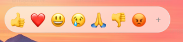
|
|
8
10
|
|
|
9
11
|

|
|
10
12
|
|
|
11
|
-
|
|
12
|
-
|
|
13
|
-
## ✨ Features
|
|
14
|
-
|
|
15
|
-
- 🎨 **Fully Customizable**: Control styles via CSS variables.
|
|
16
|
-
- 🌗 **Dark Mode**: Native support for light, dark, and auto themes.
|
|
17
|
-
- 🖱️ **Interactivity**: Custom click handlers and reactions picker mode.
|
|
18
|
-
- 🌍 **Multi-Language**: Built-in support for dozens of languages.
|
|
19
|
-
- 🦄 **Custom Emojis**: seamless support for custom image-based emojis.
|
|
20
|
-
- 📦 **Zero-Config**: Works out of the box with sensible defaults.
|
|
21
|
-
- 📱 **Responsive**: Mobile-friendly design.
|
|
22
|
-
- 🍎 **Multiple Styles**: Support for Apple, Google, Facebook, Twitter, and Native system emojis.
|
|
23
|
-
|
|
24
|
-
---
|
|
13
|
+
## Features
|
|
25
14
|
|
|
26
|
-
|
|
15
|
+
- Fully customizable through props and CSS variables
|
|
16
|
+
- Light, dark, and auto themes
|
|
17
|
+
- Reactions picker mode and custom click handlers
|
|
18
|
+
- Dozens of built-in languages
|
|
19
|
+
- Custom image-based emojis
|
|
20
|
+
- Apple, Google, Facebook, Twitter, and native emoji styles
|
|
21
|
+
- Responsive and mobile-friendly
|
|
22
|
+
- SSR-safe
|
|
27
23
|
|
|
28
|
-
|
|
24
|
+
## Installation
|
|
29
25
|
|
|
30
26
|
```bash
|
|
31
27
|
npm install emoji-picker-react
|
|
32
|
-
|
|
33
28
|
```
|
|
34
29
|
|
|
35
|
-
|
|
36
|
-
|
|
37
|
-
Render the component in your app. It works immediately with no required props.
|
|
30
|
+
## Usage
|
|
38
31
|
|
|
39
32
|
```jsx
|
|
40
33
|
import EmojiPicker from 'emoji-picker-react';
|
|
41
34
|
|
|
42
35
|
function App() {
|
|
43
36
|
return (
|
|
44
|
-
<
|
|
45
|
-
<EmojiPicker onEmojiClick={(emojiObject) => console.log(emojiObject)} />
|
|
46
|
-
</div>
|
|
37
|
+
<EmojiPicker onEmojiClick={(emojiData) => console.log(emojiData.emoji)} />
|
|
47
38
|
);
|
|
48
39
|
}
|
|
49
40
|
```
|
|
50
41
|
|
|
51
|
-
|
|
52
|
-
|
|
53
|
-
## 📚 Props Reference
|
|
54
|
-
|
|
55
|
-
The following is a complete list of all props accepted by `EmojiPicker`.
|
|
56
|
-
|
|
57
|
-
### 🎛️ General Configuration
|
|
58
|
-
|
|
59
|
-
| Prop | Type | Default | Description |
|
|
60
|
-
| ----------------- | ------------ | ------------------ | -------------------------------------------------------------------------------------------- |
|
|
61
|
-
| `open` | `boolean` | `true` | Controls the visibility of the picker. |
|
|
62
|
-
| `theme` | `Theme` | `Theme.LIGHT` | The visual theme. Options: `'light'`, `'dark'`, `'auto'`. |
|
|
63
|
-
| `emojiStyle` | `EmojiStyle` | `EmojiStyle.APPLE` | The emoji set to use. Options: `'apple'`, `'google'`, `'facebook'`, `'twitter'`, `'native'`. |
|
|
64
|
-
| `emojiVersion` | `string` | `null` | Limit emojis to a specific unicode version (e.g., `"14.0"`). |
|
|
65
|
-
| `lazyLoadEmojis` | `boolean` | `false` | If true, emoji images are loaded only when they scroll into view. |
|
|
66
|
-
| `autoFocusSearch` | `boolean` | `true` | Focuses the search input automatically when the picker mounts. |
|
|
67
|
-
| `emojiData` | `object` | `undefined` | Pass imported locale data here for internationalization. |
|
|
68
|
-
|
|
69
|
-
### 📐 Dimensions & Styling
|
|
70
|
-
|
|
71
|
-
| Prop | Type | Default | Description |
|
|
72
|
-
| ----------- | --------------- | -------- | ------------------------------------------ |
|
|
73
|
-
| `width` | `string` | `number` | `350` |
|
|
74
|
-
| `height` | `string` | `number` | `450` |
|
|
75
|
-
| `style` | `CSSProperties` | `{}` | Inline styles applied to the root element. |
|
|
76
|
-
| `className` | `string` | `""` | CSS class applied to the root element. |
|
|
77
|
-
|
|
78
|
-
### 🖱️ Events & Interaction
|
|
79
|
-
|
|
80
|
-
| Prop | Type | Description |
|
|
81
|
-
| ------------------ | -------------------------------------------------------- | -------------------------------------------------------------------- |
|
|
82
|
-
| `onEmojiClick` | `(emojiData: EmojiClickData, event: MouseEvent) => void` | Callback triggered when a user clicks an emoji. |
|
|
83
|
-
| `onReactionClick` | `(emojiData: EmojiClickData, event: MouseEvent) => void` | Callback triggered when a user clicks a reaction (in reaction mode). |
|
|
84
|
-
| `onSkinToneChange` | `(skinTone: SkinTones) => void` | Callback triggered when the user selects a new skin tone. |
|
|
85
|
-
|
|
86
|
-
### 🔎 Search & Categories
|
|
87
|
-
|
|
88
|
-
| Prop | Type | Default | Description |
|
|
89
|
-
| ------------------------ | ------------------------ | ------------------------- | -------------------------------------------------------------------- |
|
|
90
|
-
| `searchDisabled` | `boolean` | `false` | If true, the search bar is completely removed. |
|
|
91
|
-
| `searchPlaceholder` | `string` | `"Search"` | Placeholder text for the search input. |
|
|
92
|
-
| `searchClearButtonLabel` | `string` | `"Clear"` | Aria label for the search clear button. |
|
|
93
|
-
| `categories` | `CategoryConfig[]` | _(All)_ | Array of category objects to customize order or visibility. |
|
|
94
|
-
| `suggestedEmojisMode` | `SuggestionMode` | `SuggestionMode.FREQUENT` | Logic for "Suggested" category. Options: `'recent'`, `'frequent'`. |
|
|
95
|
-
| `defaultSkinTone` | `SkinTones` | `SkinTones.NEUTRAL` | The initial skin tone. |
|
|
96
|
-
| `skinTonesDisabled` | `boolean` | `false` | If true, users cannot change the skin tone. |
|
|
97
|
-
| `skinTonePickerLocation` | `SkinTonePickerLocation` | `SEARCH` | Location of the skin tone trigger. Options: `'SEARCH'`, `'PREVIEW'`. |
|
|
98
|
-
|
|
99
|
-
### 🦄 Customization & Advanced
|
|
100
|
-
|
|
101
|
-
| Prop | Type | Default | Description |
|
|
102
|
-
| --------------- | ------------------------------------------------ | ----------------------- | ------------------------------------------------------------------------ |
|
|
103
|
-
| `customEmojis` | `CustomEmoji[]` | `[]` | Array of custom image-based emojis to inject. |
|
|
104
|
-
| `hiddenEmojis` | `string[]` | `[]` | Array of unified IDs (e.g., `'1f921'`) to hide from the picker. |
|
|
105
|
-
| `previewConfig` | `PreviewConfig` | `{ showPreview: true }` | Configuration for the bottom preview bar. |
|
|
106
|
-
| `getEmojiUrl` | `(unified: string, style: EmojiStyle) => string` | - | Function to override the default CDN URL for emoji images. |
|
|
107
|
-
| `categoryIcons` | `CategoryIcons` | `{}` | Map `Categories` enum values to custom React nodes for navigation icons. |
|
|
108
|
-
| `nonce` | `string` | `undefined` | Content Security Policy (CSP) nonce for the inline style tag. |
|
|
109
|
-
|
|
110
|
-
### ❤️ Reactions Picker Mode
|
|
111
|
-
|
|
112
|
-
| Prop | Type | Default | Description |
|
|
113
|
-
| ---------------------- | ---------- | --------------- | ------------------------------------------------------------------------ |
|
|
114
|
-
| `reactionsDefaultOpen` | `boolean` | `false` | If true, mounts in "Reactions" mode (single row) instead of full picker. |
|
|
115
|
-
| `reactions` | `string[]` | _(Default Set)_ | Array of unified IDs to display in the reactions bar. |
|
|
116
|
-
| `allowExpandReactions` | `boolean` | `true` | If true, shows a `+` button to switch from reactions to full picker. |
|
|
117
|
-
|
|
118
|
-
---
|
|
119
|
-
|
|
120
|
-
## 🛠️ Detailed Configuration
|
|
121
|
-
|
|
122
|
-
### CSS Variables
|
|
123
|
-
|
|
124
|
-
Override default variables by targeting `.EmojiPickerReact` or `aside.EmojiPickerReact`.
|
|
125
|
-
|
|
126
|
-
### CSS Variables
|
|
127
|
-
|
|
128
|
-
You can customize the picker by overriding CSS variables.
|
|
129
|
-
|
|
130
|
-
**[🎨 View Full List of CSS Variables](CSS_VARIABLES.md)**
|
|
131
|
-
|
|
132
|
-
### Custom Emojis Data Structure
|
|
133
|
-
|
|
134
|
-
When passing `customEmojis`, use this format:
|
|
135
|
-
|
|
136
|
-
```ts
|
|
137
|
-
{
|
|
138
|
-
id: string; // Unique ID
|
|
139
|
-
names: string[]; // Search keywords
|
|
140
|
-
imgUrl: string; // Image source
|
|
141
|
-
}
|
|
142
|
-
|
|
143
|
-
```
|
|
144
|
-
|
|
145
|
-
### Content Security Policy (CSP)
|
|
42
|
+
`onEmojiClick` receives an `EmojiClickData` object (unified code, names, image URL, active skin tone) and the underlying mouse event.
|
|
146
43
|
|
|
147
|
-
|
|
44
|
+
## Configuration
|
|
148
45
|
|
|
149
46
|
```jsx
|
|
150
|
-
<EmojiPicker nonce="your-nonce-value" />
|
|
151
|
-
```
|
|
152
|
-
|
|
153
|
-
### Preview Config
|
|
154
|
-
|
|
155
|
-
Control the footer preview area using `previewConfig`:
|
|
156
|
-
|
|
157
|
-
```ts
|
|
158
|
-
{
|
|
159
|
-
defaultEmoji: string; // Default: "1f60a"
|
|
160
|
-
defaultCaption: string; // Default: "What's your mood?"
|
|
161
|
-
showPreview: boolean; // Default: true
|
|
162
|
-
}
|
|
163
|
-
```
|
|
164
|
-
|
|
165
|
-
### Custom Category Icons
|
|
166
|
-
|
|
167
|
-
You can customize the navigation icons using one of two methods.
|
|
168
|
-
|
|
169
|
-
**Method 1: The `categoryIcons` prop**
|
|
170
|
-
|
|
171
|
-
Map `Categories` enum values to valid React nodes:
|
|
172
|
-
|
|
173
|
-
```tsx
|
|
174
|
-
import EmojiPicker, { Categories } from 'emoji-picker-react';
|
|
175
|
-
|
|
176
47
|
<EmojiPicker
|
|
177
|
-
|
|
178
|
-
|
|
179
|
-
|
|
180
|
-
}
|
|
181
|
-
|
|
48
|
+
theme="dark"
|
|
49
|
+
emojiStyle="native"
|
|
50
|
+
width={320}
|
|
51
|
+
height={400}
|
|
52
|
+
previewConfig={{ showPreview: false }}
|
|
53
|
+
/>
|
|
182
54
|
```
|
|
183
55
|
|
|
184
|
-
|
|
185
|
-
|
|
186
|
-
Define the icon directly within the category configuration object:
|
|
56
|
+
See [PROPS.md](PROPS.md) for the complete props reference.
|
|
187
57
|
|
|
188
|
-
|
|
189
|
-
import EmojiPicker, { Categories } from 'emoji-picker-react';
|
|
58
|
+
## Styling
|
|
190
59
|
|
|
191
|
-
|
|
192
|
-
categories={[
|
|
193
|
-
{
|
|
194
|
-
category: Categories.SUGGESTED,
|
|
195
|
-
name: 'Recently Used',
|
|
196
|
-
icon: <img src="recent.png" alt="Recent" />,
|
|
197
|
-
},
|
|
198
|
-
{
|
|
199
|
-
category: Categories.SMILEYS_PEOPLE,
|
|
200
|
-
name: 'Smileys & People',
|
|
201
|
-
icon: <MyCustomFaceIcon />,
|
|
202
|
-
},
|
|
203
|
-
]}
|
|
204
|
-
/>;
|
|
205
|
-
```
|
|
60
|
+
No stylesheet import needed. All styles are scoped via [Flairup](https://github.com/ealush/flairup) — generated class names are hashed, so the picker's CSS won't leak into or clash with your app's styles.
|
|
206
61
|
|
|
207
|
-
|
|
62
|
+
Restyle the picker by overriding [CSS variables](CSS_VARIABLES.md) on `.EmojiPickerReact`:
|
|
208
63
|
|
|
209
|
-
|
|
64
|
+
```css
|
|
65
|
+
.EmojiPickerReact {
|
|
66
|
+
--epr-emoji-size: 32px;
|
|
67
|
+
}
|
|
68
|
+
```
|
|
210
69
|
|
|
211
|
-
##
|
|
70
|
+
## Internationalization
|
|
212
71
|
|
|
213
|
-
|
|
72
|
+
Pass imported locale data via the `emojiData` prop:
|
|
214
73
|
|
|
215
|
-
```
|
|
74
|
+
```jsx
|
|
216
75
|
import EmojiPicker from 'emoji-picker-react';
|
|
217
76
|
import es from 'emoji-picker-react/dist/data/emojis-es'; // Spanish
|
|
218
77
|
|
|
@@ -221,58 +80,29 @@ function App() {
|
|
|
221
80
|
}
|
|
222
81
|
```
|
|
223
82
|
|
|
224
|
-
|
|
225
|
-
|
|
226
|
-
|
|
227
|
-
|
|
228
|
-
|
|
229
|
-
|
|
230
|
-
|
|
231
|
-
|
|
232
|
-
|
|
233
|
-
- `emojis-es` (Spanish 🇪🇸)
|
|
234
|
-
- `emojis-et` (Estonian 🇪🇪)
|
|
235
|
-
- `emojis-fi` (Finnish 🇫🇮)
|
|
236
|
-
- `emojis-fr` (French 🇫🇷)
|
|
237
|
-
- `emojis-hi` (Hindi 🇮🇳)
|
|
238
|
-
- `emojis-hu` (Hungarian 🇭🇺)
|
|
239
|
-
- `emojis-it` (Italian 🇮🇹)
|
|
240
|
-
- `emojis-ja` (Japanese 🇯🇵)
|
|
241
|
-
- `emojis-ko` (Korean 🇰🇷)
|
|
242
|
-
- `emojis-lt` (Lithuanian 🇱🇹)
|
|
243
|
-
- `emojis-ms` (Malay 🇲🇾)
|
|
244
|
-
- `emojis-nb` (Norwegian Bokmål 🇳🇴)
|
|
245
|
-
- `emojis-nl` (Dutch 🇳🇱)
|
|
246
|
-
- `emojis-pl` (Polish 🇵🇱)
|
|
247
|
-
- `emojis-pt` (Portuguese 🇵🇹)
|
|
248
|
-
- `emojis-ru` (Russian 🇷🇺)
|
|
249
|
-
- `emojis-sv` (Swedish 🇸🇪)
|
|
250
|
-
- `emojis-th` (Thai 🇹🇭)
|
|
251
|
-
- `emojis-uk` (Ukrainian 🇺🇦)
|
|
252
|
-
- `emojis-zh-hant` (Traditional Chinese 🇹🇼)
|
|
253
|
-
- `emojis-zh` (Simplified Chinese 🇨🇳)
|
|
254
|
-
|
|
255
|
-
</details>
|
|
256
|
-
|
|
257
|
-
---
|
|
258
|
-
|
|
259
|
-
## ⚠️ Troubleshooting
|
|
260
|
-
|
|
261
|
-
### Server-Side Rendering (Next.js / Remix)
|
|
262
|
-
|
|
263
|
-
This package relies on the `window` object and must be rendered on the client.
|
|
264
|
-
|
|
265
|
-
**Next.js Example:**
|
|
83
|
+
See [INTERNATIONALIZATION.md](INTERNATIONALIZATION.md) for the supported languages.
|
|
84
|
+
|
|
85
|
+
## Customization
|
|
86
|
+
|
|
87
|
+
Custom emojis, custom category icons, preview configuration, and CSP nonces are covered in [CUSTOMIZATION.md](CUSTOMIZATION.md).
|
|
88
|
+
|
|
89
|
+
## Server-Side Rendering
|
|
90
|
+
|
|
91
|
+
The picker renders on the server, with styles inlined into the server HTML — no setup needed. Since the picker is usually opened on demand rather than shown immediately, lazy-loading it is still recommended to keep the initial bundle small:
|
|
266
92
|
|
|
267
93
|
```javascript
|
|
268
94
|
import dynamic from 'next/dynamic';
|
|
269
95
|
|
|
270
|
-
const Picker = dynamic(() => import('emoji-picker-react')
|
|
96
|
+
const Picker = dynamic(() => import('emoji-picker-react'));
|
|
271
97
|
```
|
|
272
98
|
|
|
273
|
-
|
|
99
|
+
## Troubleshooting
|
|
274
100
|
|
|
275
|
-
|
|
101
|
+
### `global is not defined` (Vite, versions before 4.20)
|
|
102
|
+
|
|
103
|
+
Since 4.20 the picker is SSR-safe and no longer references the Node-style
|
|
104
|
+
`global`. If you see `global is not defined`, upgrade to the latest version.
|
|
105
|
+
On older versions only, the workaround was adding this to your HTML:
|
|
276
106
|
|
|
277
107
|
```html
|
|
278
108
|
<script>
|
|
@@ -280,17 +110,12 @@ If you encounter `global is not defined`, add this to your HTML:
|
|
|
280
110
|
</script>
|
|
281
111
|
```
|
|
282
112
|
|
|
283
|
-
---
|
|
284
|
-
|
|
285
113
|
## More from the maintainer
|
|
286
114
|
|
|
287
115
|
Building complex forms? Check out [**Vest**](https://vestjs.dev) — a validation framework for stateful, async, and dependent validation.
|
|
288
116
|
|
|
289
|
-
|
|
290
|
-
|
|
291
|
-
## 🤝 Contributing
|
|
117
|
+
## Contributing
|
|
292
118
|
|
|
293
|
-
|
|
119
|
+
Contributions are welcome — see the [Contributing Guide](https://github.com/ealush/emoji-picker-react/blob/master/CONTRIBUTING.md).
|
|
294
120
|
|
|
295
|
-
**Shout Outs:**
|
|
296
121
|
Design inspiration by [Pavel Bolo](https://pavelbolo.com).
|
|
@@ -1,10 +1,16 @@
|
|
|
1
1
|
import { Styles } from 'flairup';
|
|
2
2
|
import * as React from 'react';
|
|
3
3
|
export declare const stylesheet: {
|
|
4
|
-
create: <K extends string>(styles: Partial<{ [k in K]: Partial<
|
|
4
|
+
create: <K extends string>(styles: Partial<{ [k in K]: Partial<{
|
|
5
5
|
'.'?: string | string[] | undefined;
|
|
6
6
|
'--'?: any;
|
|
7
|
-
}
|
|
7
|
+
}> | Partial<Partial<CSSStyleDeclaration> & Partial<{
|
|
8
|
+
'.'?: string | string[] | undefined;
|
|
9
|
+
'--'?: any;
|
|
10
|
+
}>>; }> | Partial<{}>) => Record<Exclude<Exclude<K, any>, any>, Set<string>> & Record<never, Set<string>>;
|
|
11
|
+
keyframes: <KF extends string>(keyframesInput: Record<KF, {
|
|
12
|
+
[stage: string]: Partial<CSSStyleDeclaration>;
|
|
13
|
+
}>) => Record<KF, string>;
|
|
8
14
|
getStyle: () => string;
|
|
9
15
|
isApplied: () => boolean;
|
|
10
16
|
};
|
|
@@ -15,11 +21,17 @@ export declare const PickerStyleTag: React.NamedExoticComponent<{
|
|
|
15
21
|
export declare const commonInteractionStyles: Record<never, Set<string>>;
|
|
16
22
|
export declare function darkMode(key: string, value: Styles): {
|
|
17
23
|
'.epr-dark-theme': {
|
|
18
|
-
[x: string]: Partial<Partial<CSSStyleDeclaration
|
|
24
|
+
[x: string]: Partial<Partial<CSSStyleDeclaration> & Partial<{
|
|
25
|
+
'.'?: string | string[] | undefined;
|
|
26
|
+
'--'?: any;
|
|
27
|
+
}>>;
|
|
19
28
|
};
|
|
20
29
|
'.epr-auto-theme': {
|
|
21
30
|
[x: string]: {
|
|
22
|
-
'@media (prefers-color-scheme: dark)': Partial<Partial<CSSStyleDeclaration
|
|
31
|
+
'@media (prefers-color-scheme: dark)': Partial<Partial<CSSStyleDeclaration> & Partial<{
|
|
32
|
+
'.'?: string | string[] | undefined;
|
|
33
|
+
'--'?: any;
|
|
34
|
+
}>>;
|
|
23
35
|
};
|
|
24
36
|
};
|
|
25
37
|
};
|
|
@@ -1,4 +1,3 @@
|
|
|
1
|
-
import { Categories } from '../config/categoryConfig';
|
|
2
1
|
import { CustomEmoji } from '../config/customEmojiConfig';
|
|
3
2
|
import { EmojiStyle, SkinTones } from '../types/exposedTypes';
|
|
4
3
|
import { DataEmoji, DataEmojis, WithName } from './DataTypes';
|
|
@@ -7,7 +6,6 @@ export declare function addedIn(emoji: DataEmoji): number;
|
|
|
7
6
|
export declare function emojiName(emoji?: WithName): string;
|
|
8
7
|
export declare function unifiedWithoutSkinTone(unified: string): string;
|
|
9
8
|
export declare function emojiUnified(emoji: DataEmoji, skinTone?: string): string;
|
|
10
|
-
export declare function useGetEmojisByCategory(): (Category: Categories) => DataEmojis;
|
|
11
9
|
export declare function emojiUrlByUnified(unified: string, emojiStyle: EmojiStyle): string;
|
|
12
10
|
export declare function emojiVariations(emoji: DataEmoji): string[];
|
|
13
11
|
export declare function emojiHasVariations(emoji: DataEmoji): boolean;
|