emoji-picker-react 4.20.0 → 4.20.1
This diff represents the content of publicly available package versions that have been released to one of the supported registries. The information contained in this diff is provided for informational purposes only and reflects changes between package versions as they appear in their respective public registries.
- package/README.md +53 -230
- package/dist/Stylesheet/stylesheet.d.ts +16 -4
- package/dist/emoji-picker-react.cjs.development.js +38 -12
- package/dist/emoji-picker-react.cjs.development.js.map +1 -1
- package/dist/emoji-picker-react.cjs.production.min.js +1 -1
- package/dist/emoji-picker-react.cjs.production.min.js.map +1 -1
- package/dist/emoji-picker-react.esm.js +38 -12
- package/dist/emoji-picker-react.esm.js.map +1 -1
- package/dist/hooks/useIsomorphicLayoutEffect.d.ts +2 -0
- package/llms.txt +422 -0
- package/package.json +6 -4
- package/src/components/body/MeasureEmoji.tsx +2 -1
- package/src/components/context/PickerDataContext.tsx +9 -1
- package/src/dataUtils/emojiSelectors.ts +9 -1
- package/src/dataUtils/suggested.ts +6 -3
- package/src/hooks/useDebouncedState.ts +2 -2
- package/src/hooks/useIsomorphicLayoutEffect.ts +6 -0
- package/src/hooks/useMouseDownHandlers.ts +2 -2
package/llms.txt
ADDED
|
@@ -0,0 +1,422 @@
|
|
|
1
|
+
# emoji-picker-react — LLM context
|
|
2
|
+
|
|
3
|
+
> This file is auto-generated by `npm run docs:llms`. Do not edit by hand.
|
|
4
|
+
> Sources: README.md, PROPS.md, CUSTOMIZATION.md, INTERNATIONALIZATION.md, CSS_VARIABLES.md
|
|
5
|
+
|
|
6
|
+
<!-- source: README.md -->
|
|
7
|
+
|
|
8
|
+
# Emoji Picker React
|
|
9
|
+
|
|
10
|
+
The most popular fully customizable emoji picker for React.
|
|
11
|
+
|
|
12
|
+
[](https://www.npmjs.com/package/emoji-picker-react)
|
|
13
|
+
|
|
14
|
+
**[Live Demo](https://ealush.com/emoji-picker-react)** | **[Report a Bug](https://github.com/ealush/emoji-picker-react/issues)**
|
|
15
|
+
|
|
16
|
+
|
|
17
|
+
|
|
18
|
+

|
|
19
|
+
|
|
20
|
+
## Features
|
|
21
|
+
|
|
22
|
+
- Fully customizable through props and CSS variables
|
|
23
|
+
- Light, dark, and auto themes
|
|
24
|
+
- Reactions picker mode and custom click handlers
|
|
25
|
+
- Dozens of built-in languages
|
|
26
|
+
- Custom image-based emojis
|
|
27
|
+
- Apple, Google, Facebook, Twitter, and native emoji styles
|
|
28
|
+
- Responsive and mobile-friendly
|
|
29
|
+
- SSR-safe
|
|
30
|
+
|
|
31
|
+
## Installation
|
|
32
|
+
|
|
33
|
+
```bash
|
|
34
|
+
npm install emoji-picker-react
|
|
35
|
+
```
|
|
36
|
+
|
|
37
|
+
## Usage
|
|
38
|
+
|
|
39
|
+
```jsx
|
|
40
|
+
import EmojiPicker from 'emoji-picker-react';
|
|
41
|
+
|
|
42
|
+
function App() {
|
|
43
|
+
return (
|
|
44
|
+
<EmojiPicker onEmojiClick={(emojiData) => console.log(emojiData.emoji)} />
|
|
45
|
+
);
|
|
46
|
+
}
|
|
47
|
+
```
|
|
48
|
+
|
|
49
|
+
`onEmojiClick` receives an `EmojiClickData` object (unified code, names, image URL, active skin tone) and the underlying mouse event.
|
|
50
|
+
|
|
51
|
+
## Configuration
|
|
52
|
+
|
|
53
|
+
```jsx
|
|
54
|
+
<EmojiPicker
|
|
55
|
+
theme="dark"
|
|
56
|
+
emojiStyle="native"
|
|
57
|
+
width={320}
|
|
58
|
+
height={400}
|
|
59
|
+
previewConfig={{ showPreview: false }}
|
|
60
|
+
/>
|
|
61
|
+
```
|
|
62
|
+
|
|
63
|
+
See [PROPS.md](PROPS.md) for the complete props reference.
|
|
64
|
+
|
|
65
|
+
## Styling
|
|
66
|
+
|
|
67
|
+
No stylesheet import needed. All styles are scoped via [Flairup](https://github.com/ealush/flairup) — generated class names are hashed, so the picker's CSS won't leak into or clash with your app's styles.
|
|
68
|
+
|
|
69
|
+
Restyle the picker by overriding [CSS variables](CSS_VARIABLES.md) on `.EmojiPickerReact`:
|
|
70
|
+
|
|
71
|
+
```css
|
|
72
|
+
.EmojiPickerReact {
|
|
73
|
+
--epr-emoji-size: 32px;
|
|
74
|
+
}
|
|
75
|
+
```
|
|
76
|
+
|
|
77
|
+
## Internationalization
|
|
78
|
+
|
|
79
|
+
Pass imported locale data via the `emojiData` prop:
|
|
80
|
+
|
|
81
|
+
```jsx
|
|
82
|
+
import EmojiPicker from 'emoji-picker-react';
|
|
83
|
+
import es from 'emoji-picker-react/dist/data/emojis-es'; // Spanish
|
|
84
|
+
|
|
85
|
+
function App() {
|
|
86
|
+
return <EmojiPicker emojiData={es} />;
|
|
87
|
+
}
|
|
88
|
+
```
|
|
89
|
+
|
|
90
|
+
See [INTERNATIONALIZATION.md](INTERNATIONALIZATION.md) for the supported languages.
|
|
91
|
+
|
|
92
|
+
## Customization
|
|
93
|
+
|
|
94
|
+
Custom emojis, custom category icons, preview configuration, and CSP nonces are covered in [CUSTOMIZATION.md](CUSTOMIZATION.md).
|
|
95
|
+
|
|
96
|
+
## Server-Side Rendering
|
|
97
|
+
|
|
98
|
+
The picker renders on the server, with styles inlined into the server HTML — no setup needed. Since the picker is usually opened on demand rather than shown immediately, lazy-loading it is still recommended to keep the initial bundle small:
|
|
99
|
+
|
|
100
|
+
```javascript
|
|
101
|
+
import dynamic from 'next/dynamic';
|
|
102
|
+
|
|
103
|
+
const Picker = dynamic(() => import('emoji-picker-react'));
|
|
104
|
+
```
|
|
105
|
+
|
|
106
|
+
## Troubleshooting
|
|
107
|
+
|
|
108
|
+
### `global is not defined` (Vite)
|
|
109
|
+
|
|
110
|
+
Add this to your HTML:
|
|
111
|
+
|
|
112
|
+
```html
|
|
113
|
+
<script>
|
|
114
|
+
window.global = window;
|
|
115
|
+
</script>
|
|
116
|
+
```
|
|
117
|
+
|
|
118
|
+
## More from the maintainer
|
|
119
|
+
|
|
120
|
+
Building complex forms? Check out [**Vest**](https://vestjs.dev) — a validation framework for stateful, async, and dependent validation.
|
|
121
|
+
|
|
122
|
+
## Contributing
|
|
123
|
+
|
|
124
|
+
Contributions are welcome — see the [Contributing Guide](https://github.com/ealush/emoji-picker-react/blob/master/CONTRIBUTING.md).
|
|
125
|
+
|
|
126
|
+
Design inspiration by [Pavel Bolo](https://pavelbolo.com).
|
|
127
|
+
|
|
128
|
+
<!-- source: PROPS.md -->
|
|
129
|
+
|
|
130
|
+
# Props Reference
|
|
131
|
+
|
|
132
|
+
Complete list of all props accepted by `EmojiPicker`. All props are optional.
|
|
133
|
+
|
|
134
|
+
## General Configuration
|
|
135
|
+
|
|
136
|
+
| Prop | Type | Default | Description |
|
|
137
|
+
| ----------------- | ------------ | ------------------ | -------------------------------------------------------------------------------------------- |
|
|
138
|
+
| `open` | `boolean` | `true` | Controls the visibility of the picker. |
|
|
139
|
+
| `theme` | `Theme` | `Theme.LIGHT` | The visual theme. Options: `'light'`, `'dark'`, `'auto'`. |
|
|
140
|
+
| `emojiStyle` | `EmojiStyle` | `EmojiStyle.APPLE` | The emoji set to use. Options: `'apple'`, `'google'`, `'facebook'`, `'twitter'`, `'native'`. |
|
|
141
|
+
| `emojiVersion` | `string` | `null` | Limit emojis to a specific unicode version (e.g., `"14.0"`). |
|
|
142
|
+
| `lazyLoadEmojis` | `boolean` | `false` | If true, emoji images are loaded only when they scroll into view. |
|
|
143
|
+
| `autoFocusSearch` | `boolean` | `true` | Focuses the search input automatically when the picker mounts. |
|
|
144
|
+
| `emojiData` | `object` | `undefined` | Pass imported locale data here for internationalization. See [INTERNATIONALIZATION.md](INTERNATIONALIZATION.md). |
|
|
145
|
+
|
|
146
|
+
## Dimensions & Styling
|
|
147
|
+
|
|
148
|
+
| Prop | Type | Default | Description |
|
|
149
|
+
| ----------- | -------------------- | ------- | ----------------------------------------------------- |
|
|
150
|
+
| `width` | `string \| number` | `350` | Picker width. Numbers are treated as pixels. |
|
|
151
|
+
| `height` | `string \| number` | `450` | Picker height. Numbers are treated as pixels. |
|
|
152
|
+
| `style` | `CSSProperties` | `{}` | Inline styles applied to the root element. |
|
|
153
|
+
| `className` | `string` | `""` | CSS class applied to the root element. |
|
|
154
|
+
|
|
155
|
+
Visual styling beyond size is done via [CSS variables](CSS_VARIABLES.md).
|
|
156
|
+
|
|
157
|
+
## Events & Interaction
|
|
158
|
+
|
|
159
|
+
| Prop | Type | Description |
|
|
160
|
+
| ------------------ | -------------------------------------------------------- | -------------------------------------------------------------------- |
|
|
161
|
+
| `onEmojiClick` | `(emojiData: EmojiClickData, event: MouseEvent) => void` | Callback triggered when a user clicks an emoji. |
|
|
162
|
+
| `onReactionClick` | `(emojiData: EmojiClickData, event: MouseEvent) => void` | Callback triggered when a user clicks a reaction (in reaction mode). |
|
|
163
|
+
| `onSkinToneChange` | `(skinTone: SkinTones) => void` | Callback triggered when the user selects a new skin tone. |
|
|
164
|
+
|
|
165
|
+
## Search & Categories
|
|
166
|
+
|
|
167
|
+
| Prop | Type | Default | Description |
|
|
168
|
+
| ------------------------ | ------------------------ | ------------------------- | -------------------------------------------------------------------- |
|
|
169
|
+
| `searchDisabled` | `boolean` | `false` | If true, the search bar is completely removed. |
|
|
170
|
+
| `searchPlaceholder` | `string` | `"Search"` | Placeholder text for the search input. |
|
|
171
|
+
| `searchClearButtonLabel` | `string` | `"Clear"` | Aria label for the search clear button. |
|
|
172
|
+
| `categories` | `CategoryConfig[]` | _(All)_ | Array of category objects to customize order or visibility. |
|
|
173
|
+
| `suggestedEmojisMode` | `SuggestionMode` | `SuggestionMode.FREQUENT` | Logic for "Suggested" category. Options: `'recent'`, `'frequent'`. |
|
|
174
|
+
| `defaultSkinTone` | `SkinTones` | `SkinTones.NEUTRAL` | The initial skin tone. |
|
|
175
|
+
| `skinTonesDisabled` | `boolean` | `false` | If true, users cannot change the skin tone. |
|
|
176
|
+
| `skinTonePickerLocation` | `SkinTonePickerLocation` | `SEARCH` | Location of the skin tone trigger. Options: `'SEARCH'`, `'PREVIEW'`. |
|
|
177
|
+
|
|
178
|
+
## Customization & Advanced
|
|
179
|
+
|
|
180
|
+
| Prop | Type | Default | Description |
|
|
181
|
+
| --------------- | ------------------------------------------------ | ----------------------- | ------------------------------------------------------------------------ |
|
|
182
|
+
| `customEmojis` | `CustomEmoji[]` | `[]` | Array of custom image-based emojis to inject. See [CUSTOMIZATION.md](CUSTOMIZATION.md). |
|
|
183
|
+
| `hiddenEmojis` | `string[]` | `[]` | Array of unified IDs (e.g., `'1f921'`) to hide from the picker. |
|
|
184
|
+
| `previewConfig` | `PreviewConfig` | `{ showPreview: true }` | Configuration for the bottom preview bar. See [CUSTOMIZATION.md](CUSTOMIZATION.md). |
|
|
185
|
+
| `getEmojiUrl` | `(unified: string, style: EmojiStyle) => string` | - | Function to override the default CDN URL for emoji images. |
|
|
186
|
+
| `categoryIcons` | `CategoryIcons` | `{}` | Map `Categories` enum values to custom React nodes for navigation icons. See [CUSTOMIZATION.md](CUSTOMIZATION.md). |
|
|
187
|
+
| `nonce` | `string` | `undefined` | Content Security Policy (CSP) nonce for the inline style tag. See [CUSTOMIZATION.md](CUSTOMIZATION.md). |
|
|
188
|
+
|
|
189
|
+
## Reactions Picker Mode
|
|
190
|
+
|
|
191
|
+
| Prop | Type | Default | Description |
|
|
192
|
+
| ---------------------- | ---------- | --------------- | ------------------------------------------------------------------------ |
|
|
193
|
+
| `reactionsDefaultOpen` | `boolean` | `false` | If true, mounts in "Reactions" mode (single row) instead of full picker. |
|
|
194
|
+
| `reactions` | `string[]` | _(Default Set)_ | Array of unified IDs to display in the reactions bar. |
|
|
195
|
+
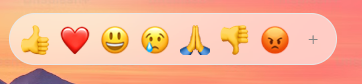
| `allowExpandReactions` | `boolean` | `true` | If true, shows a `+` button to switch from reactions to full picker. |
|
|
196
|
+
|
|
197
|
+
<!-- source: CUSTOMIZATION.md -->
|
|
198
|
+
|
|
199
|
+
# Customization
|
|
200
|
+
|
|
201
|
+
## Custom Emojis
|
|
202
|
+
|
|
203
|
+
Pass the `customEmojis` prop to inject image-based emojis. Each entry uses this structure:
|
|
204
|
+
|
|
205
|
+
```ts
|
|
206
|
+
{
|
|
207
|
+
id: string; // Unique ID
|
|
208
|
+
names: string[]; // Search keywords
|
|
209
|
+
imgUrl: string; // Image source
|
|
210
|
+
}
|
|
211
|
+
```
|
|
212
|
+
|
|
213
|
+
```jsx
|
|
214
|
+
<EmojiPicker
|
|
215
|
+
customEmojis={[
|
|
216
|
+
{
|
|
217
|
+
id: 'panda',
|
|
218
|
+
names: ['panda', 'bear'],
|
|
219
|
+
imgUrl: 'https://example.com/panda.png',
|
|
220
|
+
},
|
|
221
|
+
]}
|
|
222
|
+
/>
|
|
223
|
+
```
|
|
224
|
+
|
|
225
|
+
## Preview Bar
|
|
226
|
+
|
|
227
|
+
Control the footer preview area with `previewConfig`:
|
|
228
|
+
|
|
229
|
+
```ts
|
|
230
|
+
{
|
|
231
|
+
defaultEmoji: string; // Default: "1f60a"
|
|
232
|
+
defaultCaption: string; // Default: "What's your mood?"
|
|
233
|
+
showPreview: boolean; // Default: true
|
|
234
|
+
}
|
|
235
|
+
```
|
|
236
|
+
|
|
237
|
+
## Custom Category Icons
|
|
238
|
+
|
|
239
|
+
Customize the navigation icons using one of two methods.
|
|
240
|
+
|
|
241
|
+
**Method 1: The `categoryIcons` prop**
|
|
242
|
+
|
|
243
|
+
Map `Categories` enum values to React nodes:
|
|
244
|
+
|
|
245
|
+
```tsx
|
|
246
|
+
import EmojiPicker, { Categories } from 'emoji-picker-react';
|
|
247
|
+
|
|
248
|
+
<EmojiPicker
|
|
249
|
+
categoryIcons={{
|
|
250
|
+
[Categories.SUGGESTED]: <img src="recent.png" alt="Recent" />,
|
|
251
|
+
[Categories.SMILEYS_PEOPLE]: <MyCustomFaceIcon />,
|
|
252
|
+
}}
|
|
253
|
+
/>;
|
|
254
|
+
```
|
|
255
|
+
|
|
256
|
+
**Method 2: The `categories` configuration array**
|
|
257
|
+
|
|
258
|
+
Define the icon directly within the category configuration object:
|
|
259
|
+
|
|
260
|
+
```tsx
|
|
261
|
+
import EmojiPicker, { Categories } from 'emoji-picker-react';
|
|
262
|
+
|
|
263
|
+
<EmojiPicker
|
|
264
|
+
categories={[
|
|
265
|
+
{
|
|
266
|
+
category: Categories.SUGGESTED,
|
|
267
|
+
name: 'Recently Used',
|
|
268
|
+
icon: <img src="recent.png" alt="Recent" />,
|
|
269
|
+
},
|
|
270
|
+
{
|
|
271
|
+
category: Categories.SMILEYS_PEOPLE,
|
|
272
|
+
name: 'Smileys & People',
|
|
273
|
+
icon: <MyCustomFaceIcon />,
|
|
274
|
+
},
|
|
275
|
+
]}
|
|
276
|
+
/>;
|
|
277
|
+
```
|
|
278
|
+
|
|
279
|
+
Note: if both methods are used for the same category, the icon from the `categories` configuration takes precedence over the `categoryIcons` prop.
|
|
280
|
+
|
|
281
|
+
## Content Security Policy (CSP)
|
|
282
|
+
|
|
283
|
+
If your site has a CSP that blocks inline styles, pass a `nonce` to the `EmojiPicker` component. It is applied to the inline `<style>` tag:
|
|
284
|
+
|
|
285
|
+
```jsx
|
|
286
|
+
<EmojiPicker nonce="your-nonce-value" />
|
|
287
|
+
```
|
|
288
|
+
|
|
289
|
+
<!-- source: INTERNATIONALIZATION.md -->
|
|
290
|
+
|
|
291
|
+
# Internationalization (i18n)
|
|
292
|
+
|
|
293
|
+
Import the dictionary you need and pass it to the `emojiData` prop:
|
|
294
|
+
|
|
295
|
+
```javascript
|
|
296
|
+
import EmojiPicker from 'emoji-picker-react';
|
|
297
|
+
import es from 'emoji-picker-react/dist/data/emojis-es'; // Spanish
|
|
298
|
+
|
|
299
|
+
function App() {
|
|
300
|
+
return <EmojiPicker emojiData={es} />;
|
|
301
|
+
}
|
|
302
|
+
```
|
|
303
|
+
|
|
304
|
+
## Supported Languages
|
|
305
|
+
|
|
306
|
+
- `emojis-bn` (Bengali)
|
|
307
|
+
- `emojis-da` (Danish)
|
|
308
|
+
- `emojis-de` (German)
|
|
309
|
+
- `emojis-en-gb` (English, GB)
|
|
310
|
+
- `emojis-en` (English, US)
|
|
311
|
+
- `emojis-es-mx` (Spanish, Mexico)
|
|
312
|
+
- `emojis-es` (Spanish)
|
|
313
|
+
- `emojis-et` (Estonian)
|
|
314
|
+
- `emojis-fi` (Finnish)
|
|
315
|
+
- `emojis-fr` (French)
|
|
316
|
+
- `emojis-hi` (Hindi)
|
|
317
|
+
- `emojis-hu` (Hungarian)
|
|
318
|
+
- `emojis-it` (Italian)
|
|
319
|
+
- `emojis-ja` (Japanese)
|
|
320
|
+
- `emojis-ko` (Korean)
|
|
321
|
+
- `emojis-lt` (Lithuanian)
|
|
322
|
+
- `emojis-ms` (Malay)
|
|
323
|
+
- `emojis-nb` (Norwegian Bokmal)
|
|
324
|
+
- `emojis-nl` (Dutch)
|
|
325
|
+
- `emojis-pl` (Polish)
|
|
326
|
+
- `emojis-pt` (Portuguese)
|
|
327
|
+
- `emojis-ru` (Russian)
|
|
328
|
+
- `emojis-sv` (Swedish)
|
|
329
|
+
- `emojis-th` (Thai)
|
|
330
|
+
- `emojis-uk` (Ukrainian)
|
|
331
|
+
- `emojis-zh-hant` (Traditional Chinese)
|
|
332
|
+
- `emojis-zh` (Simplified Chinese)
|
|
333
|
+
|
|
334
|
+
<!-- source: CSS_VARIABLES.md -->
|
|
335
|
+
|
|
336
|
+
# 🎨 CSS Variables
|
|
337
|
+
|
|
338
|
+
You can customize specific parts of the picker by overriding these CSS variables. Target `.EmojiPickerReact` or `aside.EmojiPickerReact` to apply them.
|
|
339
|
+
|
|
340
|
+
```css
|
|
341
|
+
.EmojiPickerReact {
|
|
342
|
+
--epr-emoji-size: 32px;
|
|
343
|
+
}
|
|
344
|
+
```
|
|
345
|
+
|
|
346
|
+
or
|
|
347
|
+
|
|
348
|
+
```css
|
|
349
|
+
aside.EmojiPickerReact {
|
|
350
|
+
--epr-emoji-size: 32px;
|
|
351
|
+
}
|
|
352
|
+
```
|
|
353
|
+
|
|
354
|
+
## 🎛️ General Variables
|
|
355
|
+
|
|
356
|
+
| Variable | Description | Default |
|
|
357
|
+
| :--------------------------- | :------------------------------------------------- | :-------- |
|
|
358
|
+
| `--epr-emoji-size` | Size of the emojis. | `30px` |
|
|
359
|
+
| `--epr-emoji-padding` | Padding around each emoji. | `5px` |
|
|
360
|
+
| `--epr-emoji-gap` | **Deprecated**. Use `--epr-emoji-padding` instead. | - |
|
|
361
|
+
| `--epr-bg-color` | Background color of the picker. | `#fff` |
|
|
362
|
+
| `--epr-text-color` | Main text color. | `#858585` |
|
|
363
|
+
| `--epr-picker-border-color` | Border color of the picker container. | `#e7e7e7` |
|
|
364
|
+
| `--epr-picker-border-radius` | Border radius of the picker. | `8px` |
|
|
365
|
+
| `--epr-horizontal-padding` | Horizontal padding for various elements. | `10px` |
|
|
366
|
+
| `--epr-highlight-color` | Color for active states and highlights. | `#007aeb` |
|
|
367
|
+
| `--epr-hover-bg-color` | Background color on hover. | `#e5f0fa` |
|
|
368
|
+
| `--epr-focus-bg-color` | Background color on focus. | `#e0f0ff` |
|
|
369
|
+
|
|
370
|
+
## 🔎 Search Input
|
|
371
|
+
|
|
372
|
+
| Variable | Description | Default |
|
|
373
|
+
| :------------------------------------- | :-------------------------------------- | :--------------------------------- |
|
|
374
|
+
| `--epr-search-input-bg-color` | Background color of the search input. | `#f6f6f6` |
|
|
375
|
+
| `--epr-search-input-bg-color-active` | Background color when search is active. | `var(--epr-search-input-bg-color)` |
|
|
376
|
+
| `--epr-search-input-text-color` | Text color in the search input. | `var(--epr-text-color)` |
|
|
377
|
+
| `--epr-search-input-placeholder-color` | Placeholder text color. | `var(--epr-text-color)` |
|
|
378
|
+
| `--epr-search-border-color` | Border color of the search input. | `var(--epr-search-input-bg-color)` |
|
|
379
|
+
| `--epr-search-border-color-active` | Border color when search is active. | `var(--epr-highlight-color)` |
|
|
380
|
+
| `--epr-search-input-border-radius` | Border radius of the search input. | `8px` |
|
|
381
|
+
| `--epr-search-input-height` | Height of the search input. | `40px` |
|
|
382
|
+
| `--epr-search-icon-color` | Color of the search icon. | - |
|
|
383
|
+
|
|
384
|
+
## 🏷️ Category Navigation
|
|
385
|
+
|
|
386
|
+
| Variable | Description | Default |
|
|
387
|
+
| :-------------------------------------- | :----------------------------------- | :-------- |
|
|
388
|
+
| `--epr-category-navigation-button-size` | Size of category navigation buttons. | `30px` |
|
|
389
|
+
| `--epr-category-icon-active-color` | Color of the active category icon. | `#6aa8de` |
|
|
390
|
+
|
|
391
|
+
## 📃 Category Labels
|
|
392
|
+
|
|
393
|
+
| Variable | Description | Default |
|
|
394
|
+
| :-------------------------------- | :--------------------------------------------- | :---------------------- |
|
|
395
|
+
| `--epr-category-label-bg-color` | Background color of the sticky category label. | `#ffffffe6` |
|
|
396
|
+
| `--epr-category-label-text-color` | Text color of the category label. | `var(--epr-text-color)` |
|
|
397
|
+
| `--epr-category-label-height` | Height of the category label. | `40px` |
|
|
398
|
+
|
|
399
|
+
## 👁️ Preview Area
|
|
400
|
+
|
|
401
|
+
| Variable | Description | Default |
|
|
402
|
+
| :------------------------- | :------------------------------------- | :---------------------- |
|
|
403
|
+
| `--epr-preview-height` | Height of the preview area. | `70px` |
|
|
404
|
+
| `--epr-preview-text-size` | Font size of text in the preview area. | `14px` |
|
|
405
|
+
| `--epr-preview-text-color` | Text color in the preview area. | `var(--epr-text-color)` |
|
|
406
|
+
|
|
407
|
+
## 🖐️ Skin Tone Picker
|
|
408
|
+
|
|
409
|
+
| Variable | Description | Default |
|
|
410
|
+
| :---------------------------------- | :--------------------------------------------- | :---------- |
|
|
411
|
+
| `--epr-skin-tone-picker-menu-color` | Background color of the skin tone picker menu. | `#ffffff95` |
|
|
412
|
+
| `--epr-skin-tone-size` | Size of skin tone circles. | `20px` |
|
|
413
|
+
|
|
414
|
+
## 🌑 Dark Mode
|
|
415
|
+
|
|
416
|
+
| Variable | Description | Default |
|
|
417
|
+
| :--------------------------------- | :------------------------------------ | :--------------------------- |
|
|
418
|
+
| `--epr-dark-bg-color` | Background color in dark mode. | `#222222` |
|
|
419
|
+
| `--epr-dark-picker-border-color` | Border color in dark mode. | `#151617` |
|
|
420
|
+
| `--epr-dark-text-color` | Text color in dark mode. | `var(--epr-highlight-color)` |
|
|
421
|
+
| `--epr-dark-search-input-bg-color` | Search input background in dark mode. | `#333333` |
|
|
422
|
+
| `--epr-dark-hover-bg-color` | Hover background color in dark mode. | `#363636f6` |
|
package/package.json
CHANGED
|
@@ -1,12 +1,13 @@
|
|
|
1
1
|
{
|
|
2
|
-
"version": "4.20.
|
|
2
|
+
"version": "4.20.1",
|
|
3
3
|
"license": "MIT",
|
|
4
4
|
"main": "dist/index.js",
|
|
5
5
|
"typings": "dist/index.d.ts",
|
|
6
6
|
"homepage": "https://ealush.com/emoji-picker-react",
|
|
7
7
|
"files": [
|
|
8
8
|
"dist",
|
|
9
|
-
"src"
|
|
9
|
+
"src",
|
|
10
|
+
"llms.txt"
|
|
10
11
|
],
|
|
11
12
|
"description": "Emoji Picker component for React Applications on the web",
|
|
12
13
|
"keywords": [
|
|
@@ -27,7 +28,7 @@
|
|
|
27
28
|
},
|
|
28
29
|
"scripts": {
|
|
29
30
|
"start": "tsdx watch",
|
|
30
|
-
"build": "npm run build:data:src && npm run type-check && tsdx build --transpileOnly && npm run build:data:dist",
|
|
31
|
+
"build": "npm run build:data:src && npm run type-check && tsdx build --transpileOnly && npm run build:data:dist && npm run docs:llms",
|
|
31
32
|
"type-check": "tsc --noEmit --incremental --pretty --project tsconfig.json",
|
|
32
33
|
"test": "vitest run",
|
|
33
34
|
"test:watch": "vitest",
|
|
@@ -40,7 +41,8 @@
|
|
|
40
41
|
"build:data:dist": "tsc --project tsconfig.data.json && node ./scripts/copyData.js",
|
|
41
42
|
"build:data": "npm run build:data:src && npm run build:data:dist",
|
|
42
43
|
"storybook": "npm run build:data && storybook dev -p 6006",
|
|
43
|
-
"build-storybook": "storybook build"
|
|
44
|
+
"build-storybook": "storybook build",
|
|
45
|
+
"docs:llms": "node ./scripts/generateLlmsTxt.js"
|
|
44
46
|
},
|
|
45
47
|
"peerDependencies": {
|
|
46
48
|
"react": ">=16"
|
|
@@ -11,6 +11,7 @@ import {
|
|
|
11
11
|
useGetEmojisByCategory,
|
|
12
12
|
emojiUnified,
|
|
13
13
|
} from '../../dataUtils/emojiSelectors';
|
|
14
|
+
import { useIsomorphicLayoutEffect } from '../../hooks/useIsomorphicLayoutEffect';
|
|
14
15
|
import {
|
|
15
16
|
useActiveSkinToneState,
|
|
16
17
|
useEmojiSizeState,
|
|
@@ -27,7 +28,7 @@ export function MeasureEmoji() {
|
|
|
27
28
|
const [emojiSize, setEmojiSize] = useEmojiSizeState();
|
|
28
29
|
const ref = React.useRef<HTMLDivElement>(null);
|
|
29
30
|
|
|
30
|
-
|
|
31
|
+
useIsomorphicLayoutEffect(() => {
|
|
31
32
|
if (ref.current) {
|
|
32
33
|
setEmojiSize(ref.current.clientHeight);
|
|
33
34
|
}
|
|
@@ -15,6 +15,7 @@ import {
|
|
|
15
15
|
unifiedWithoutSkinTone,
|
|
16
16
|
} from '../../dataUtils/emojiUtils';
|
|
17
17
|
import { getSuggested } from '../../dataUtils/suggested';
|
|
18
|
+
import { useIsMounted } from '../../hooks/useIsMounted';
|
|
18
19
|
import { Categories, EmojiData, SkinTones } from '../../types/exposedTypes';
|
|
19
20
|
|
|
20
21
|
import { usePickerConfig } from './PickerConfigContext';
|
|
@@ -126,8 +127,15 @@ export function useGetEmojisByCategory() {
|
|
|
126
127
|
const { emojiData, emojiByUnified } = usePickerDataContext();
|
|
127
128
|
const suggestedEmojisModeConfig = useSuggestedEmojisModeConfig();
|
|
128
129
|
const [suggestedUpdated] = useUpdateSuggested();
|
|
130
|
+
// Suggestions come from localStorage, which doesn't exist during SSR.
|
|
131
|
+
// Read them only after mount so the first client render matches the server.
|
|
132
|
+
const isMounted = useIsMounted();
|
|
129
133
|
|
|
130
134
|
const suggested = React.useMemo(() => {
|
|
135
|
+
if (!isMounted) {
|
|
136
|
+
return [] as DataEmojis;
|
|
137
|
+
}
|
|
138
|
+
|
|
131
139
|
const suggested = getSuggested(suggestedEmojisModeConfig) ?? [];
|
|
132
140
|
|
|
133
141
|
return suggested
|
|
@@ -141,7 +149,7 @@ export function useGetEmojisByCategory() {
|
|
|
141
149
|
})
|
|
142
150
|
.filter(Boolean) as DataEmojis;
|
|
143
151
|
// eslint-disable-next-line react-hooks/exhaustive-deps
|
|
144
|
-
}, [suggestedUpdated, suggestedEmojisModeConfig, emojiByUnified]);
|
|
152
|
+
}, [isMounted, suggestedUpdated, suggestedEmojisModeConfig, emojiByUnified]);
|
|
145
153
|
|
|
146
154
|
return function getEmojisByCategory(category: Categories): DataEmojis {
|
|
147
155
|
if (category === Categories.SUGGESTED) {
|
|
@@ -9,6 +9,7 @@ import emojis from '../data/emojis';
|
|
|
9
9
|
import skinToneVariations, {
|
|
10
10
|
skinTonesMapped,
|
|
11
11
|
} from '../data/skinToneVariations';
|
|
12
|
+
import { useIsMounted } from '../hooks/useIsMounted';
|
|
12
13
|
import { EmojiStyle, SkinTones } from '../types/exposedTypes';
|
|
13
14
|
|
|
14
15
|
import { DataEmoji, DataEmojis, EmojiProperties, WithName } from './DataTypes';
|
|
@@ -56,9 +57,16 @@ export function emojiUnified(emoji: DataEmoji, skinTone?: string): string {
|
|
|
56
57
|
export function useGetEmojisByCategory(): (Category: Categories) => DataEmojis {
|
|
57
58
|
const suggestedEmojisModeConfig = useSuggestedEmojisModeConfig();
|
|
58
59
|
const [suggestedUpdated] = useUpdateSuggested();
|
|
60
|
+
// Suggestions come from localStorage, which doesn't exist during SSR.
|
|
61
|
+
// Read them only after mount so the first client render matches the server.
|
|
62
|
+
const isMounted = useIsMounted();
|
|
59
63
|
|
|
60
64
|
const suggested = React.useMemo(
|
|
61
65
|
() => {
|
|
66
|
+
if (!isMounted) {
|
|
67
|
+
return [] as DataEmojis;
|
|
68
|
+
}
|
|
69
|
+
|
|
62
70
|
const suggested = getSuggested(suggestedEmojisModeConfig) ?? [];
|
|
63
71
|
|
|
64
72
|
return suggested
|
|
@@ -66,7 +74,7 @@ export function useGetEmojisByCategory(): (Category: Categories) => DataEmojis {
|
|
|
66
74
|
.filter(Boolean) as DataEmojis;
|
|
67
75
|
},
|
|
68
76
|
// eslint-disable-next-line react-hooks/exhaustive-deps
|
|
69
|
-
[suggestedUpdated, suggestedEmojisModeConfig],
|
|
77
|
+
[isMounted, suggestedUpdated, suggestedEmojisModeConfig],
|
|
70
78
|
);
|
|
71
79
|
|
|
72
80
|
return function getEmojisByCategory(category: Categories): DataEmojis {
|
|
@@ -15,11 +15,11 @@ type Suggested = SuggestedItem[];
|
|
|
15
15
|
|
|
16
16
|
export function getSuggested(mode?: SuggestionMode): Suggested {
|
|
17
17
|
try {
|
|
18
|
-
if (!window
|
|
18
|
+
if (typeof window === 'undefined' || !window.localStorage) {
|
|
19
19
|
return [];
|
|
20
20
|
}
|
|
21
21
|
const recent = JSON.parse(
|
|
22
|
-
window
|
|
22
|
+
window.localStorage.getItem(SUGGESTED_LS_KEY) ?? '[]',
|
|
23
23
|
) as Suggested;
|
|
24
24
|
|
|
25
25
|
if (mode === SuggestionMode.FREQUENT) {
|
|
@@ -58,7 +58,10 @@ export function setSuggested(emoji: DataEmoji, skinTone: SkinTones) {
|
|
|
58
58
|
nextList.length = Math.min(nextList.length, 14);
|
|
59
59
|
|
|
60
60
|
try {
|
|
61
|
-
|
|
61
|
+
if (typeof window === 'undefined') {
|
|
62
|
+
return;
|
|
63
|
+
}
|
|
64
|
+
window.localStorage.setItem(SUGGESTED_LS_KEY, JSON.stringify(nextList));
|
|
62
65
|
// Prevents the change from being seen immediately.
|
|
63
66
|
} catch {
|
|
64
67
|
// ignore
|
|
@@ -5,7 +5,7 @@ export function useDebouncedState<T>(
|
|
|
5
5
|
delay: number = 0,
|
|
6
6
|
): [T, (value: T) => Promise<T>] {
|
|
7
7
|
const [state, setState] = useState<T>(initialValue);
|
|
8
|
-
const timer = useRef<
|
|
8
|
+
const timer = useRef<ReturnType<typeof setTimeout> | null>(null);
|
|
9
9
|
|
|
10
10
|
function debouncedSetState(value: T) {
|
|
11
11
|
return new Promise<T>((resolve) => {
|
|
@@ -13,7 +13,7 @@ export function useDebouncedState<T>(
|
|
|
13
13
|
clearTimeout(timer.current);
|
|
14
14
|
}
|
|
15
15
|
|
|
16
|
-
timer.current =
|
|
16
|
+
timer.current = setTimeout(() => {
|
|
17
17
|
setState(value);
|
|
18
18
|
resolve(value);
|
|
19
19
|
}, delay);
|
|
@@ -0,0 +1,6 @@
|
|
|
1
|
+
import * as React from 'react';
|
|
2
|
+
|
|
3
|
+
// `useLayoutEffect` warns during SSR since it never runs on the server.
|
|
4
|
+
// Fall back to `useEffect` there: measurement only matters on the client.
|
|
5
|
+
export const useIsomorphicLayoutEffect =
|
|
6
|
+
typeof window !== 'undefined' ? React.useLayoutEffect : React.useEffect;
|
|
@@ -39,7 +39,7 @@ export function useMouseDownHandlers(
|
|
|
39
39
|
ContainerRef: React.MutableRefObject<NullableElement>,
|
|
40
40
|
mouseEventSource: MOUSE_EVENT_SOURCE,
|
|
41
41
|
) {
|
|
42
|
-
const mouseDownTimerRef = useRef<
|
|
42
|
+
const mouseDownTimerRef = useRef<ReturnType<typeof setTimeout>>();
|
|
43
43
|
const setVariationPicker = useSetVariationPicker();
|
|
44
44
|
const disallowClickRef = useDisallowClickRef();
|
|
45
45
|
const [, setEmojiVariationPicker] = useEmojiVariationPickerState();
|
|
@@ -99,7 +99,7 @@ export function useMouseDownHandlers(
|
|
|
99
99
|
return;
|
|
100
100
|
}
|
|
101
101
|
|
|
102
|
-
mouseDownTimerRef.current =
|
|
102
|
+
mouseDownTimerRef.current = setTimeout(() => {
|
|
103
103
|
disallowClickRef.current = true;
|
|
104
104
|
mouseDownTimerRef.current = undefined;
|
|
105
105
|
closeAllOpenToggles();
|