ehscan-react-components 0.1.47 → 0.1.49
This diff represents the content of publicly available package versions that have been released to one of the supported registries. The information contained in this diff is provided for informational purposes only and reflects changes between package versions as they appear in their respective public registries.
- package/README.md +103 -86
- package/dist/Components.d.ts +1 -1
- package/dist/Components.js +1 -1
- package/dist/{Button.d.ts → button/Button.d.ts} +1 -2
- package/dist/{Button.js → button/Button.js} +6 -5
- package/dist/style/button.module.css +100 -0
- package/dist/style/ripple.module.css +20 -0
- package/dist/tools/useRipple.js +2 -1
- package/package.json +2 -2
- package/dist/style/button.css +0 -132
package/README.md
CHANGED
|
@@ -7,6 +7,7 @@ This library is ideal for dashboards, admin panels, internal tools, and feature-
|
|
|
7
7
|
## 📦 Available Components
|
|
8
8
|
|
|
9
9
|
## Table of Contents
|
|
10
|
+
- [Button](#button)
|
|
10
11
|
- [Drag And Drop](#drag-and-drop)
|
|
11
12
|
- [AddBox](#addbox)
|
|
12
13
|
- [Window](#window)
|
|
@@ -24,8 +25,103 @@ yarn add ehscan-react-components
|
|
|
24
25
|
|
|
25
26
|
# Usage Examples
|
|
26
27
|
|
|
28
|
+
## Button
|
|
29
|
+
|
|
30
|
+
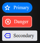
A flexible, reusable button component for React with support for multiple interaction styles like raw, pop, and ripple effects.
|
|
31
|
+
|
|
32
|
+
Features:
|
|
33
|
+
|
|
34
|
+
- **Optional text and icon support**: You can pass text and/or children (e.g., an icon) to display inside the button.
|
|
35
|
+
- **Multiple button styles**: Controlled via the type prop:
|
|
36
|
+
- "raw": Standard button with no extra visual effect.
|
|
37
|
+
- "pop": Shrinks slightly when pressed, creating a “pop” effect.
|
|
38
|
+
- "ripple": Shows a ripple animation on click.
|
|
39
|
+
- **Click handling with optional delay**: The click callback is triggered on button press, with an optional 200ms delay unless notimeout is true.
|
|
40
|
+
- **Custom styling**: You can pass additional classes via addClass.
|
|
41
|
+
- **Accessibility support**: Uses aria-pressed to indicate a selected state.
|
|
42
|
+
|
|
43
|
+
|
|
44
|
+
|
|
45
|
+
```jsx
|
|
46
|
+
import { Button } from 'ehscan-react-components';
|
|
47
|
+
|
|
48
|
+
const ButtonPage = () => {
|
|
49
|
+
|
|
50
|
+
const doStuff = () => {
|
|
51
|
+
console.log("doStuff")
|
|
52
|
+
}
|
|
53
|
+
|
|
54
|
+
return (<>
|
|
55
|
+
<Button index={'primary'} text='Primary' type="pop" addClass="inject-styling" click={() => doStuff()} >
|
|
56
|
+
<svg xmlns="http://www.w3.org/2000/svg" height="24px" viewBox="0 -960 960 960" width="24px" fill="white"><path d="m354-287 126-76 126 77-33-144 111-96-146-13-58-136-58 135-146 13 111 97-33 143ZM233-120l65-281L80-590l288-25 112-265 112 265 288 25-218 189 65 281-247-149-247 149Zm247-350Z" /></svg>
|
|
57
|
+
</Button>
|
|
58
|
+
<Button index={'danger'} text='Danger' type="pop" addClass="ext-btn--danger" click={() => doStuff()} >
|
|
59
|
+
<svg xmlns="http://www.w3.org/2000/svg" height="24px" viewBox="0 -960 960 960" width="24px" fill="#FFFFFF"><path d="M330-120 120-330v-300l210-210h300l210 210v300L630-120H330Zm36-190 114-114 114 114 56-56-114-114 114-114-56-56-114 114-114-114-56 56 114 114-114 114 56 56Zm-2 110h232l164-164v-232L596-760H364L200-596v232l164 164Zm116-280Z" /></svg>
|
|
60
|
+
</Button>
|
|
61
|
+
<Button index={'secondary'} text='Secondary' type="pop" addClass="ext-btn--secondary" click={() => doStuff()} >
|
|
62
|
+
<svg xmlns="http://www.w3.org/2000/svg" height="24px" viewBox="0 -960 960 960" width="24px" fill="#0000F5"><path d="M360-160q-19 0-36-8.5T296-192L80-480l216-288q11-15 28-23.5t36-8.5h440q33 0 56.5 23.5T880-720v480q0 33-23.5 56.5T800-160H360ZM180-480l180 240h440v-480H360L180-480Zm220 40q17 0 28.5-11.5T440-480q0-17-11.5-28.5T400-520q-17 0-28.5 11.5T360-480q0 17 11.5 28.5T400-440Zm140 0q17 0 28.5-11.5T580-480q0-17-11.5-28.5T540-520q-17 0-28.5 11.5T500-480q0 17 11.5 28.5T540-440Zm140 0q17 0 28.5-11.5T720-480q0-17-11.5-28.5T680-520q-17 0-28.5 11.5T640-480q0 17 11.5 28.5T680-440Zm-100-40Z" /></svg>
|
|
63
|
+
</Button>
|
|
64
|
+
</>)
|
|
65
|
+
}
|
|
66
|
+
|
|
67
|
+
```
|
|
68
|
+
### Styling
|
|
69
|
+
```css
|
|
70
|
+
.inject-styling {
|
|
71
|
+
/* Spacing & layout */
|
|
72
|
+
--ext-btn-gap: 0.5rem;
|
|
73
|
+
--ext-btn-padding: 5px 10px 5px 5px;
|
|
74
|
+
--ext-btn-width: fit-content;
|
|
75
|
+
--ext-btn-height: auto;
|
|
76
|
+
|
|
77
|
+
/* Typography */
|
|
78
|
+
--ext-btn-font-size: 1rem;
|
|
79
|
+
--ext-btn-font-weight: 500;
|
|
80
|
+
--ext-btn-color: #fff;
|
|
81
|
+
--ext-btn-colorbtn-line-height: 1.5;
|
|
82
|
+
--ext-btn-font-family: inherit;
|
|
83
|
+
|
|
84
|
+
/* Background & color */
|
|
85
|
+
--ext-btn-bg: #007aff;
|
|
86
|
+
--ext-btn-color: #fff;
|
|
87
|
+
|
|
88
|
+
/* Border & radius */
|
|
89
|
+
--ext-btn-border: none;
|
|
90
|
+
--ext-btn-radius: 18px;
|
|
91
|
+
|
|
92
|
+
/* Effects & transitions */
|
|
93
|
+
--ext-btn-transition: all 0.2s ease;
|
|
94
|
+
--ext-btn-pop-scale: 0.95;
|
|
95
|
+
--ripple-box-shadow: rgb(100 100 111 / 20%) 0px 7px 29px 0px;
|
|
96
|
+
}
|
|
97
|
+
```
|
|
98
|
+
|
|
27
99
|
## Drag And Drop
|
|
28
100
|
|
|
101
|
+
A fully interactive drag-and-drop list component built with React that allows users to reorder items, select items, and handle autosave or custom callbacks.
|
|
102
|
+
|
|
103
|
+
Features:
|
|
104
|
+
|
|
105
|
+
- **Drag & drop reordering**
|
|
106
|
+
- Users can click and drag any item in the list to reorder it.
|
|
107
|
+
- A “ghost” of the dragged item follows the cursor while dragging.
|
|
108
|
+
- Items swap positions when dropped, and the updated order is saved.
|
|
109
|
+
- **Selection support**
|
|
110
|
+
- Clicking an item toggles its selected state.
|
|
111
|
+
- Selected items can be highlighted using a CSS class (styles.selected).
|
|
112
|
+
- **Custom callbacks & autosave**
|
|
113
|
+
- setItems: Updates the parent state with the new item order.
|
|
114
|
+
- changeItemsAction: A callback fired whenever items are reordered or clicked.
|
|
115
|
+
- Debounced autosave: Changes are automatically saved with a delay (debounce) to reduce rapid API calls.
|
|
116
|
+
- **Pop effect on drop**
|
|
117
|
+
- When an item is dropped into a new position, it briefly triggers a “pop” animation to indicate the change.
|
|
118
|
+
- **Accessibility & flexibility**
|
|
119
|
+
- Works with any list of objects that have an id and label.
|
|
120
|
+
- Each item can optionally have a selected property.
|
|
121
|
+
- The component is fully type-safe with TypeScript.
|
|
122
|
+
|
|
123
|
+
|
|
124
|
+
|
|
29
125
|
```jsx
|
|
30
126
|
import { DragAndDrop } from 'ehscan-react-components';
|
|
31
127
|
|
|
@@ -162,91 +258,6 @@ CSS Variables for AddBox
|
|
|
162
258
|
| `--ext-addbox-textarea-tag-erase-hover-bck-clr` | `darkgray` | Background color of the delete button on hover |
|
|
163
259
|
| `--ext-addbox-input-focus-border` | `1px dashed darkgrey` | Border of the input on focus |
|
|
164
260
|
|
|
165
|
-
|
|
166
|
-
# Styling
|
|
167
|
-
|
|
168
|
-
- TextAreaDropDown
|
|
169
|
-
|
|
170
|
-
| Variable | Fallback / Default |
|
|
171
|
-
| ---------------------------------- | ----------------------------------- |
|
|
172
|
-
| `--ext-textarea-box-bck-clr` | `lightgray` |
|
|
173
|
-
| `--ext-textarea-box-border-radius` | `10px` |
|
|
174
|
-
| `--ext-dropdown-border-radius` | `20px` |
|
|
175
|
-
| `--input-txt-size` | *(not explicitly set, optional)* |
|
|
176
|
-
| `--d-font-weight` | *(not explicitly set, optional)* |
|
|
177
|
-
| `--input-clr` | `black` |
|
|
178
|
-
| `--textarea-tag-bck-clr` | `white` (some places `transparent`) |
|
|
179
|
-
| `--textarea-tag-clr` | `darkblue` (some places `white`) |
|
|
180
|
-
| `--d-input-placeholder-clr` | `black` |
|
|
181
|
-
| `--d-input-bck-clr` | `transparent` |
|
|
182
|
-
| `--dropdown-item-bck-clr` | `wheat` |
|
|
183
|
-
| `--dropdown-amount-row-bck-clr` | `yellow` |
|
|
184
|
-
| `--animate-s` | `.5s` |
|
|
185
|
-
|
|
186
|
-
|
|
187
|
-
## Base Button Variables
|
|
188
|
-
|
|
189
|
-
| Variable | Default/Fallback |
|
|
190
|
-
| --------------------- | ----------------------------------------- |
|
|
191
|
-
| `--btn-bg` | `#007aff` |
|
|
192
|
-
| `--btn-color` | `#fff` |
|
|
193
|
-
| `--btn-radius` | `18px` |
|
|
194
|
-
| `--btn-padding-y` | `0.5rem` |
|
|
195
|
-
| `--btn-padding-x` | `1rem` |
|
|
196
|
-
| `--btn-width` | `fit-content` |
|
|
197
|
-
| `--btn-height` | `auto` |
|
|
198
|
-
| `--btn-font-size` | `1rem` |
|
|
199
|
-
| `--btn-font-weight` | `500` |
|
|
200
|
-
| `--btn-transition` | `all 0.2s ease` |
|
|
201
|
-
| `--btn-line-height` | `1.5` |
|
|
202
|
-
| `--ripple-box-shadow` | `rgb(100 100 111 / 20%) 0px 7px 29px 0px` |
|
|
203
|
-
| `--ripple-effect-bck` | `rgb(0 0 0 / 15%)` |
|
|
204
|
-
|
|
205
|
-
|
|
206
|
-
### Size-specific overrides
|
|
207
|
-
|
|
208
|
-
| Variable | Size | Default/Fallback |
|
|
209
|
-
| -------------------- | ---- | ---------------- |
|
|
210
|
-
| `--btn-padding-y-sm` | sm | `0.25rem` |
|
|
211
|
-
| `--btn-padding-x-sm` | sm | `0.75rem` |
|
|
212
|
-
| `--btn-font-size-sm` | sm | `0.85rem` |
|
|
213
|
-
| `--btn-padding-y-md` | md | `0.5rem` |
|
|
214
|
-
| `--btn-padding-x-md` | md | `1rem` |
|
|
215
|
-
| `--btn-font-size-md` | md | `1rem` |
|
|
216
|
-
| `--btn-padding-y-lg` | lg | `0.75rem` |
|
|
217
|
-
| `--btn-padding-x-lg` | lg | `1.5rem` |
|
|
218
|
-
| `--btn-font-size-lg` | lg | `1.1rem` |
|
|
219
|
-
|
|
220
|
-
### Variant-specific variables
|
|
221
|
-
|
|
222
|
-
| Variable | Variant | Default/Fallback |
|
|
223
|
-
| ----------------------- | --------- | ---------------- |
|
|
224
|
-
| `--btn-bg-primary` | primary | `#007aff` |
|
|
225
|
-
| `--btn-color-primary` | primary | `#fff` |
|
|
226
|
-
| `--btn-bg-secondary` | secondary | `#e5e5ea` |
|
|
227
|
-
| `--btn-color-secondary` | secondary | `#111` |
|
|
228
|
-
| `--btn-bg-outline` | outline | `transparent` |
|
|
229
|
-
| `--btn-color-outline` | outline | `#007aff` |
|
|
230
|
-
| `--btn-bg-ghost` | ghost | `transparent` |
|
|
231
|
-
| `--btn-color-ghost` | ghost | `#007aff` |
|
|
232
|
-
| `--btn-bg-danger` | danger | `#ff3b30` |
|
|
233
|
-
| `--btn-color-danger` | danger | `#fff` |
|
|
234
|
-
|
|
235
|
-
### Specific Button Types
|
|
236
|
-
|
|
237
|
-
| Variable | Type | Default/Fallback |
|
|
238
|
-
| ----------------------- | -------- | ---------------- |
|
|
239
|
-
| `--btn-width-close` | closeBtn | `35px` |
|
|
240
|
-
| `--btn-height-close` | closeBtn | `35px` |
|
|
241
|
-
| `--btn-bg-close` | closeBtn | `lightgray` |
|
|
242
|
-
| `--btn-height-save` | saveBtn | `35px` |
|
|
243
|
-
| `--btn-padding-x-save` | saveBtn | `30px` |
|
|
244
|
-
| `--btn-bg-save` | saveBtn | `#007aff` |
|
|
245
|
-
| `--btn-height-trash` | trashBtn | `35px` |
|
|
246
|
-
| `--btn-padding-x-trash` | trashBtn | `10px` |
|
|
247
|
-
| `--btn-radius-trash` | trashBtn | `4px` |
|
|
248
|
-
| `--btn-bg-trash` | trashBtn | `lightgray` |
|
|
249
|
-
|
|
250
261
|
## Window
|
|
251
262
|
```jsx
|
|
252
263
|
import { useEffect, useState } from "react";
|
|
@@ -311,7 +322,13 @@ const WindowWrapper = ({ windowOpen, setWindowOpen }) => {
|
|
|
311
322
|
----
|
|
312
323
|
# Changelog
|
|
313
324
|
|
|
325
|
+
## [0.1.49] - 2025-12-12
|
|
326
|
+
- Image and docu for Drag and Drop
|
|
327
|
+
|
|
328
|
+
## [0.1.48] - 2025-12-12
|
|
329
|
+
- Improved Button, module styling and docu, mobile usage (type: "pop")
|
|
330
|
+
- Ripple module styling
|
|
331
|
+
|
|
314
332
|
## [0.1.45] - 2025-12-11
|
|
315
333
|
- Added Drag And Drop Component
|
|
316
334
|
- Added Window css module and docu
|
|
317
|
-
---
|
package/dist/Components.d.ts
CHANGED
package/dist/Components.js
CHANGED
|
@@ -1,13 +1,12 @@
|
|
|
1
1
|
import { ReactNode } from "react";
|
|
2
|
-
import './style/button.css';
|
|
3
2
|
type Props = {
|
|
4
3
|
index?: string | number;
|
|
5
4
|
text?: string;
|
|
6
5
|
selected?: boolean;
|
|
7
6
|
addClass?: string;
|
|
8
7
|
notimeout?: boolean;
|
|
9
|
-
size?: 'sm' | 'md' | 'lg';
|
|
10
8
|
click?: (args?: any) => void;
|
|
9
|
+
type?: "raw" | "pop" | "ripple";
|
|
11
10
|
children?: ReactNode;
|
|
12
11
|
};
|
|
13
12
|
export declare const Button: React.FC<Props>;
|
|
@@ -1,12 +1,13 @@
|
|
|
1
1
|
import { jsx as _jsx, jsxs as _jsxs, Fragment as _Fragment } from "react/jsx-runtime";
|
|
2
2
|
import { useRef, useCallback } from "react";
|
|
3
|
-
import useRipple from "
|
|
4
|
-
import '
|
|
5
|
-
export const Button = ({ index, text, selected, addClass, notimeout,
|
|
3
|
+
import useRipple from "../tools/useRipple";
|
|
4
|
+
import styles from '../style/button.module.css';
|
|
5
|
+
export const Button = ({ index, text, selected, addClass, notimeout, click, type = "raw", children }) => {
|
|
6
6
|
const buttonRef = useRef(null);
|
|
7
7
|
const handleRipple = useRipple();
|
|
8
8
|
const handleButtonClick = useCallback((event) => {
|
|
9
|
-
|
|
9
|
+
if (type === 'ripple')
|
|
10
|
+
handleRipple(event, buttonRef);
|
|
10
11
|
if (notimeout) {
|
|
11
12
|
click === null || click === void 0 ? void 0 : click(event);
|
|
12
13
|
return;
|
|
@@ -15,5 +16,5 @@ export const Button = ({ index, text, selected, addClass, notimeout, size = 'md'
|
|
|
15
16
|
click === null || click === void 0 ? void 0 : click(event);
|
|
16
17
|
}, 200);
|
|
17
18
|
}, [notimeout, click, handleRipple]);
|
|
18
|
-
return (_jsx(_Fragment, { children: _jsxs("button", { type: "button", ref: buttonRef, onClick: handleButtonClick, className:
|
|
19
|
+
return (_jsx(_Fragment, { children: _jsxs("button", { type: "button", ref: buttonRef, onClick: handleButtonClick, className: `${styles.button} ${styles.ApplyRipple} ${addClass !== null && addClass !== void 0 ? addClass : styles.btnPrimary}${type === 'pop' ? ` ${styles.buttonPop}` : ''}`, "aria-pressed": selected, children: [children, text && _jsx("div", { className: styles.btnLabel, children: text })] }, index) }));
|
|
19
20
|
};
|
|
@@ -0,0 +1,100 @@
|
|
|
1
|
+
/* EHSCAN Base Button */
|
|
2
|
+
.button {
|
|
3
|
+
display: inline-flex;
|
|
4
|
+
align-items: center;
|
|
5
|
+
justify-content: center;
|
|
6
|
+
gap: var(--ext-btn-gap, 0.5rem);
|
|
7
|
+
font-family: inherit;
|
|
8
|
+
font-size: var(--ext-btn-font-size, 1rem);
|
|
9
|
+
font-weight: var(--ext-btn-font-weight, 500);
|
|
10
|
+
color: var(--ext-btn-color, #fff);
|
|
11
|
+
background-color: var(--btn-bg, #007aff);
|
|
12
|
+
border: none;
|
|
13
|
+
border-radius: var(--ext-btn-radius, 18px);
|
|
14
|
+
padding: var(--ext-btn-padding, 5px 10px 5px 5px);
|
|
15
|
+
width: var(--ext-btn-width, fit-content);
|
|
16
|
+
height: var(--ext-btn-height, auto);
|
|
17
|
+
cursor: pointer;
|
|
18
|
+
transition: var(--ext-btn-transition, all 0.2s ease);
|
|
19
|
+
text-align: center;
|
|
20
|
+
text-decoration: none;
|
|
21
|
+
user-select: none;
|
|
22
|
+
line-height: var(--ext-btn-colorbtn-line-height, 1.5);
|
|
23
|
+
}
|
|
24
|
+
|
|
25
|
+
.button:focus-visible {
|
|
26
|
+
outline: 2px solid var(--ext-btn-bg, #007aff);
|
|
27
|
+
outline-offset: 2px;
|
|
28
|
+
}
|
|
29
|
+
|
|
30
|
+
.button:disabled,
|
|
31
|
+
.button[aria-disabled="true"] {
|
|
32
|
+
opacity: 0.6;
|
|
33
|
+
cursor: not-allowed;
|
|
34
|
+
}
|
|
35
|
+
|
|
36
|
+
.button:hover:not(:disabled):not([aria-disabled="true"]) {
|
|
37
|
+
filter: brightness(0.9);
|
|
38
|
+
}
|
|
39
|
+
|
|
40
|
+
.buttonPop:active:not(:disabled):not([aria-disabled="true"]) {
|
|
41
|
+
transform: scale(var(--ext-btn-pop-scale, .95));
|
|
42
|
+
}
|
|
43
|
+
|
|
44
|
+
/* Variants */
|
|
45
|
+
.btnPrimary {
|
|
46
|
+
--ext-btn-bg: #007aff;
|
|
47
|
+
--ext-btn-color: #fff;
|
|
48
|
+
}
|
|
49
|
+
|
|
50
|
+
.ext-btn--secondary {
|
|
51
|
+
--btn-bg: #e5e5ea;
|
|
52
|
+
--btn-color: #111;
|
|
53
|
+
}
|
|
54
|
+
|
|
55
|
+
.ext-btn--outline {
|
|
56
|
+
--btn-bg: transparent;
|
|
57
|
+
--btn-color: #007aff;
|
|
58
|
+
}
|
|
59
|
+
|
|
60
|
+
.ext-btn--ghost {
|
|
61
|
+
--btn-bg: transparent;
|
|
62
|
+
--btn-color: #007aff;
|
|
63
|
+
}
|
|
64
|
+
|
|
65
|
+
.ext-btn--danger {
|
|
66
|
+
--btn-bg: #ff3b30;
|
|
67
|
+
--btn-color: #fff;
|
|
68
|
+
}
|
|
69
|
+
|
|
70
|
+
/* Loading state */
|
|
71
|
+
.ext-btn--loading {
|
|
72
|
+
pointer-events: none;
|
|
73
|
+
opacity: 0.8;
|
|
74
|
+
}
|
|
75
|
+
|
|
76
|
+
/* Icon and label wrappers */
|
|
77
|
+
.ext-btn-icon {
|
|
78
|
+
display: flex;
|
|
79
|
+
align-items: center;
|
|
80
|
+
justify-content: center;
|
|
81
|
+
font-size: 1.1em;
|
|
82
|
+
}
|
|
83
|
+
|
|
84
|
+
.btnLabel {
|
|
85
|
+
display: inline-block;
|
|
86
|
+
white-space: nowrap;
|
|
87
|
+
}
|
|
88
|
+
|
|
89
|
+
/* --------------
|
|
90
|
+
Apply Ripple effect
|
|
91
|
+
---------------*/
|
|
92
|
+
.ApplyRipple {
|
|
93
|
+
box-shadow: var(--ripple-box-shadow, rgb(100 100 111 / 20%) 0px 7px 29px 0px);
|
|
94
|
+
position: relative;
|
|
95
|
+
overflow: hidden;
|
|
96
|
+
display: flex;
|
|
97
|
+
align-items: center;
|
|
98
|
+
justify-content: center;
|
|
99
|
+
user-select: none;
|
|
100
|
+
}
|
|
@@ -0,0 +1,20 @@
|
|
|
1
|
+
/* --------------
|
|
2
|
+
Ripple effect
|
|
3
|
+
---------------*/
|
|
4
|
+
.ripple {
|
|
5
|
+
background: var(--ext-ripple-effect-bck, rgb(0 0 0 / 15%));
|
|
6
|
+
position: absolute;
|
|
7
|
+
border-radius: 50%;
|
|
8
|
+
transform: scale(0);
|
|
9
|
+
animation: ripple-animation 0.6s linear;
|
|
10
|
+
pointer-events: none;
|
|
11
|
+
transform-origin: center center;
|
|
12
|
+
will-change: transform, opacity;
|
|
13
|
+
}
|
|
14
|
+
|
|
15
|
+
@keyframes ripple-animation {
|
|
16
|
+
to {
|
|
17
|
+
transform: scale(4);
|
|
18
|
+
opacity: 0;
|
|
19
|
+
}
|
|
20
|
+
}
|
package/dist/tools/useRipple.js
CHANGED
|
@@ -1,4 +1,5 @@
|
|
|
1
1
|
import { useCallback } from 'react';
|
|
2
|
+
import styles from '../style/ripple.module.css';
|
|
2
3
|
const useRipple = () => {
|
|
3
4
|
const handleRipple = useCallback((event, buttonRef) => {
|
|
4
5
|
const button = buttonRef.current;
|
|
@@ -12,7 +13,7 @@ const useRipple = () => {
|
|
|
12
13
|
ripple.style.width = ripple.style.height = `${size}px`;
|
|
13
14
|
ripple.style.left = `${x}px`;
|
|
14
15
|
ripple.style.top = `${y}px`;
|
|
15
|
-
ripple.className =
|
|
16
|
+
ripple.className = styles.ripple;
|
|
16
17
|
button.appendChild(ripple);
|
|
17
18
|
setTimeout(() => ripple.remove(), 600);
|
|
18
19
|
}, []);
|
package/package.json
CHANGED
|
@@ -1,12 +1,12 @@
|
|
|
1
1
|
{
|
|
2
2
|
"name": "ehscan-react-components",
|
|
3
|
-
"version": "0.1.
|
|
3
|
+
"version": "0.1.49",
|
|
4
4
|
"description": "components",
|
|
5
5
|
"main": "dist/Components.js",
|
|
6
6
|
"types": "dist/Components.d.ts",
|
|
7
7
|
"scripts": {
|
|
8
8
|
"build": "tsc && npm run copy-css",
|
|
9
|
-
"copy-css": "rsync -a src/style/ dist/style/",
|
|
9
|
+
"copy-css": "rsync -a src/style/ dist/style/",
|
|
10
10
|
"prepublishOnly": "npm run build"
|
|
11
11
|
},
|
|
12
12
|
"keywords": [
|
package/dist/style/button.css
DELETED
|
@@ -1,132 +0,0 @@
|
|
|
1
|
-
/* EHSCAN Base Button - Refactored */
|
|
2
|
-
.ext-btn {
|
|
3
|
-
/* Core variables with fallbacks */
|
|
4
|
-
/* --btn-bg: #007aff;
|
|
5
|
-
--btn-color: #fff;
|
|
6
|
-
--btn-radius: 18px;
|
|
7
|
-
--btn-padding: 0.5rem;
|
|
8
|
-
--btn-width: fit-content;
|
|
9
|
-
--btn-height: auto;
|
|
10
|
-
--btn-font-size: 1rem;
|
|
11
|
-
--btn-font-weight: 500;
|
|
12
|
-
--btn-transition: all 0.2s ease;
|
|
13
|
-
--btn-line-height: 1.5;
|
|
14
|
-
--btn-gap: 0.5rem;
|
|
15
|
-
--ripple-box-shadow: rgb(100 100 111 / 20%) 0px 7px 29px 0px;
|
|
16
|
-
--ripple-effect-bck: rgb(0 0 0 / 15%); */
|
|
17
|
-
|
|
18
|
-
display: inline-flex;
|
|
19
|
-
align-items: center;
|
|
20
|
-
justify-content: center;
|
|
21
|
-
gap: var(--btn-gap, 0.5rem);
|
|
22
|
-
font-family: inherit;
|
|
23
|
-
font-size: var(--btn-font-size, 1rem);
|
|
24
|
-
font-weight: var(--btn-font-weight, 500);
|
|
25
|
-
color: var(--btn-color, #fff);
|
|
26
|
-
background-color: var(--btn-bg, #007aff);
|
|
27
|
-
border: none;
|
|
28
|
-
border-radius: var(--btn-radius, 18px);
|
|
29
|
-
padding: var(--btn-padding, 0.5rem);
|
|
30
|
-
width: var(--btn-width, fit-content);
|
|
31
|
-
height: var(--btn-height, auto);
|
|
32
|
-
cursor: pointer;
|
|
33
|
-
transition: var(--btn-transition, all 0.2s ease);
|
|
34
|
-
text-align: center;
|
|
35
|
-
text-decoration: none;
|
|
36
|
-
user-select: none;
|
|
37
|
-
line-height: var(--btn-line-height, 1.5);
|
|
38
|
-
}
|
|
39
|
-
|
|
40
|
-
.ext-btn:focus-visible {
|
|
41
|
-
outline: 2px solid var(--btn-bg, #007aff);
|
|
42
|
-
outline-offset: 2px;
|
|
43
|
-
}
|
|
44
|
-
|
|
45
|
-
.ext-btn:disabled,
|
|
46
|
-
.ext-btn[aria-disabled="true"] {
|
|
47
|
-
opacity: 0.6;
|
|
48
|
-
cursor: not-allowed;
|
|
49
|
-
}
|
|
50
|
-
|
|
51
|
-
.ext-btn:hover:not(:disabled):not([aria-disabled="true"]) {
|
|
52
|
-
filter: brightness(0.9);
|
|
53
|
-
}
|
|
54
|
-
|
|
55
|
-
.ext-btn:active:not(:disabled):not([aria-disabled="true"]) {
|
|
56
|
-
transform: scale(0.97);
|
|
57
|
-
}
|
|
58
|
-
|
|
59
|
-
/* Variants */
|
|
60
|
-
.ext-btn--primary {
|
|
61
|
-
--btn-bg: #007aff;
|
|
62
|
-
--btn-color: #fff;
|
|
63
|
-
}
|
|
64
|
-
|
|
65
|
-
.ext-btn--secondary {
|
|
66
|
-
--btn-bg: #e5e5ea;
|
|
67
|
-
--btn-color: #111;
|
|
68
|
-
}
|
|
69
|
-
|
|
70
|
-
.ext-btn--outline {
|
|
71
|
-
--btn-bg: transparent;
|
|
72
|
-
--btn-color: #007aff;
|
|
73
|
-
}
|
|
74
|
-
|
|
75
|
-
.ext-btn--ghost {
|
|
76
|
-
--btn-bg: transparent;
|
|
77
|
-
--btn-color: #007aff;
|
|
78
|
-
}
|
|
79
|
-
|
|
80
|
-
.ext-btn--danger {
|
|
81
|
-
--btn-bg: #ff3b30;
|
|
82
|
-
--btn-color: #fff;
|
|
83
|
-
}
|
|
84
|
-
|
|
85
|
-
/* Loading state */
|
|
86
|
-
.ext-btn--loading {
|
|
87
|
-
pointer-events: none;
|
|
88
|
-
opacity: 0.8;
|
|
89
|
-
}
|
|
90
|
-
|
|
91
|
-
/* Icon and label wrappers */
|
|
92
|
-
.ext-btn-icon {
|
|
93
|
-
display: flex;
|
|
94
|
-
align-items: center;
|
|
95
|
-
justify-content: center;
|
|
96
|
-
font-size: 1.1em;
|
|
97
|
-
}
|
|
98
|
-
|
|
99
|
-
.ext-btn-label {
|
|
100
|
-
display: inline-block;
|
|
101
|
-
white-space: nowrap;
|
|
102
|
-
}
|
|
103
|
-
|
|
104
|
-
/* Ripple effect */
|
|
105
|
-
._ripple {
|
|
106
|
-
font-weight: var(--btn-font-weight, 500);
|
|
107
|
-
box-shadow: var(--ripple-box-shadow, rgb(100 100 111 / 20%) 0px 7px 29px 0px);
|
|
108
|
-
position: relative;
|
|
109
|
-
overflow: hidden;
|
|
110
|
-
display: flex;
|
|
111
|
-
align-items: center;
|
|
112
|
-
justify-content: center;
|
|
113
|
-
user-select: none;
|
|
114
|
-
}
|
|
115
|
-
|
|
116
|
-
.ripple {
|
|
117
|
-
background: var(--ripple-effect-bck, rgb(0 0 0 / 15%));
|
|
118
|
-
position: absolute;
|
|
119
|
-
border-radius: 50%;
|
|
120
|
-
transform: scale(0);
|
|
121
|
-
animation: ripple-animation 0.6s linear;
|
|
122
|
-
pointer-events: none;
|
|
123
|
-
transform-origin: center center;
|
|
124
|
-
will-change: transform, opacity;
|
|
125
|
-
}
|
|
126
|
-
|
|
127
|
-
@keyframes ripple-animation {
|
|
128
|
-
to {
|
|
129
|
-
transform: scale(4);
|
|
130
|
-
opacity: 0;
|
|
131
|
-
}
|
|
132
|
-
}
|