ehscan-react-components 0.1.45 → 0.1.46
This diff represents the content of publicly available package versions that have been released to one of the supported registries. The information contained in this diff is provided for informational purposes only and reflects changes between package versions as they appear in their respective public registries.
- package/README.md +149 -33
- package/dist/Components.d.ts +2 -2
- package/dist/Components.js +2 -2
- package/dist/dnd/DragAndDrop.js +2 -2
- package/dist/style/window.module.css +74 -0
- package/dist/window/Window.d.ts +16 -0
- package/dist/window/Window.js +35 -0
- package/package.json +1 -1
package/README.md
CHANGED
|
@@ -1,25 +1,101 @@
|
|
|
1
1
|
# ehscan-react-components
|
|
2
2
|
|
|
3
|
+
A lightweight, modular collection of reusable React UI components designed for modern applications.
|
|
4
|
+
All components are built with TypeScript, React, and Vite and css modules. Its focused on flexibility, performance, and ease of integration.
|
|
5
|
+
This library is ideal for dashboards, admin panels, internal tools, and feature-rich web apps.
|
|
6
|
+
|
|
7
|
+
## 📦 Available Components
|
|
8
|
+
|
|
9
|
+
## Table of Contents
|
|
10
|
+
- [Drag And Drop](#drag-and-drop)
|
|
11
|
+
- [AddBox](#addbox)
|
|
12
|
+
- [Window](#window)
|
|
3
13
|
- Button
|
|
4
|
-
-
|
|
5
|
-
- TextArea
|
|
14
|
+
- textarea
|
|
6
15
|
- TextAreaDropDown
|
|
7
|
-
- AddBox
|
|
8
|
-
- useChangeAddBox.tsx
|
|
9
|
-
- css changes on vars can be done in parent class
|
|
10
16
|
|
|
11
|
-
|
|
17
|
+
## Installation
|
|
18
|
+
|
|
19
|
+
```bash
|
|
20
|
+
npm ehscan-react-components
|
|
21
|
+
# or
|
|
22
|
+
yarn add ehscan-react-components
|
|
23
|
+
```
|
|
24
|
+
|
|
25
|
+
# Usage Examples
|
|
26
|
+
|
|
27
|
+
## Drag And Drop
|
|
28
|
+
|
|
29
|
+
```jsx
|
|
30
|
+
import { DragAndDrop } from 'ehscan-react-components';
|
|
31
|
+
|
|
32
|
+
const DND = () => {
|
|
33
|
+
|
|
34
|
+
const [items, setItems] = useState([
|
|
35
|
+
{ id: 1, label: "title" },
|
|
36
|
+
{ id: 2, label: "description" },
|
|
37
|
+
{ id: 3, label: "category" },
|
|
38
|
+
...
|
|
39
|
+
{ id: 10, label: "thumbnail" }
|
|
40
|
+
]
|
|
41
|
+
);
|
|
42
|
+
|
|
43
|
+
const changeItemsAction = (colums) => {
|
|
44
|
+
console.log(colums)
|
|
45
|
+
};
|
|
46
|
+
|
|
47
|
+
return (<>
|
|
48
|
+
<div classname="dnd-css-inject">
|
|
49
|
+
<DragAndDrop items={items} setItems={setItems} changeItemsAction={changeItemsAction} />
|
|
50
|
+
</div>
|
|
51
|
+
</>)
|
|
52
|
+
}
|
|
53
|
+
|
|
54
|
+
```
|
|
55
|
+
<!-- IMAGE -->
|
|
56
|
+
|
|
57
|
+
### Styling
|
|
58
|
+
```css
|
|
59
|
+
/* Customize Drag & Drop component */
|
|
60
|
+
.dnd-css-inject {
|
|
61
|
+
/* List Item */
|
|
62
|
+
--ext-dnd-item-bck-clr: darkblue;
|
|
63
|
+
--ext-dnd-item-border-radius: 4px;
|
|
64
|
+
--ext-dnd-item-padding: 10px;
|
|
65
|
+
--ext-dnd-item-clr: white;
|
|
66
|
+
--ext-dnd-item-height: 40px;
|
|
67
|
+
|
|
68
|
+
/* Selected Item */
|
|
69
|
+
--ext-dnd-item-selected-bck-clr: darkviolet;
|
|
70
|
+
|
|
71
|
+
/* Hovered Item */
|
|
72
|
+
--ext-dnd-item-selected-bck-hvr-clr: darkgreen;
|
|
73
|
+
|
|
74
|
+
/* Drag Handle */
|
|
75
|
+
--ext-dnd-item-handle-clr: #6c8cff;
|
|
76
|
+
|
|
77
|
+
/* SVG */
|
|
78
|
+
--ext-dnd-svg-width: 30px;
|
|
79
|
+
--ext-dnd-svg-height: 30px;
|
|
80
|
+
--ext-dnd-svg-fill: white;
|
|
81
|
+
--ext-dnd-svg-fill-check: lightslategrey;
|
|
82
|
+
|
|
83
|
+
/* Ghost Item (dragging) */
|
|
84
|
+
--ext-dnd-item-ghost-padding: 10px;
|
|
85
|
+
--ext-dnd-item-ghost-bck-clr: white;
|
|
86
|
+
--ext-dnd-item-ghost-border: 1px solid #6c8cff;
|
|
87
|
+
--ext-dnd-item-ghost-clr: lightslategrey;
|
|
88
|
+
--ext-dnd-item-ghost-border-radius: 6px;
|
|
89
|
+
}
|
|
90
|
+
```
|
|
91
|
+
|
|
12
92
|
## AddBox
|
|
13
93
|
|
|
14
94
|
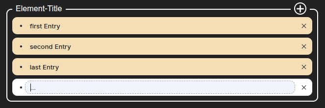
AddBox is a React component for managing a list of entries. It allows users to add, edit, and remove rows dynamically. Each row has an id and a title.
|
|
15
|
-
|
|
16
95
|
The component is fully controlled — the parent manages the state and receives updates via the onChange callback.
|
|
17
96
|
|
|
18
97
|
|
|
19
98
|
|
|
20
|
-
|
|
21
|
-
### Implementation
|
|
22
|
-
|
|
23
99
|
```jsx
|
|
24
100
|
import { useEffect, useState } from "react";
|
|
25
101
|
import { AddBox, useChangeAddBox } from 'ehscan-react-components';
|
|
@@ -87,7 +163,6 @@ CSS Variables for AddBox
|
|
|
87
163
|
| `--ext-addbox-input-focus-border` | `1px dashed darkgrey` | Border of the input on focus |
|
|
88
164
|
|
|
89
165
|
|
|
90
|
-
|
|
91
166
|
# Styling
|
|
92
167
|
|
|
93
168
|
- TextAreaDropDown
|
|
@@ -172,30 +247,71 @@ CSS Variables for AddBox
|
|
|
172
247
|
| `--btn-radius-trash` | trashBtn | `4px` |
|
|
173
248
|
| `--btn-bg-trash` | trashBtn | `lightgray` |
|
|
174
249
|
|
|
175
|
-
|
|
176
|
-
|
|
177
|
-
|
|
178
|
-
|
|
179
|
-
|
|
180
|
-
|
|
181
|
-
|
|
182
|
-
|
|
183
|
-
|
|
184
|
-
|
|
185
|
-
|
|
186
|
-
|
|
187
|
-
|
|
188
|
-
|
|
189
|
-
|
|
190
|
-
|
|
191
|
-
|
|
192
|
-
|
|
193
|
-
|
|
194
|
-
|
|
195
|
-
|
|
250
|
+
## Window
|
|
251
|
+
```jsx
|
|
252
|
+
import { useEffect, useState } from "react";
|
|
253
|
+
import { Window } from 'ehscan-react-components';
|
|
254
|
+
|
|
255
|
+
const WindowWrapper = ({ windowOpen, setWindowOpen }) => {
|
|
256
|
+
const [closeCommand, setCloseCommand] = useState(undefined);
|
|
257
|
+
|
|
258
|
+
return (<>
|
|
259
|
+
<div className="inject-window-css">
|
|
260
|
+
<Window trackMove={(entry) => setCloseCommand(entry)} open={windowOpen}
|
|
261
|
+
header={
|
|
262
|
+
<div className="window-header">
|
|
263
|
+
<div className="window-header-title _txt">My Window Header Title</div>
|
|
264
|
+
</div>
|
|
265
|
+
}
|
|
266
|
+
body={
|
|
267
|
+
<div className="window-body-wrapper">My Window Body</div>
|
|
268
|
+
}
|
|
269
|
+
footer={
|
|
270
|
+
<div className="window-footer">My Window Footer</div>
|
|
271
|
+
}
|
|
272
|
+
/>
|
|
273
|
+
</div>
|
|
274
|
+
</>)
|
|
275
|
+
}
|
|
276
|
+
|
|
277
|
+
```
|
|
196
278
|
|
|
279
|
+
### Styling
|
|
280
|
+
```css
|
|
281
|
+
|
|
282
|
+
.inject-window-css {
|
|
283
|
+
/* Window container */
|
|
284
|
+
--ext-window-bck-color: white;
|
|
285
|
+
--ext-window-width: 400px;
|
|
286
|
+
--ext-window-min-height: 300px;
|
|
287
|
+
--ext-window-border-radius: 12px;
|
|
288
|
+
--ext-window-shadow: rgba(50, 50, 93, 0.25) 0px 13px 27px -5px, rgba(0, 0, 0, 0.3) 0px 8px 16px -8px;
|
|
289
|
+
--ext-window-opacity: 0;
|
|
290
|
+
--ext-window-transition: opacity 0.4s ease-in-out;
|
|
291
|
+
|
|
292
|
+
/* Header */
|
|
293
|
+
--ext-window-header-bck-color: transparent;
|
|
294
|
+
--ext-window-header-height: 50px;
|
|
295
|
+
|
|
296
|
+
/* Body */
|
|
297
|
+
--ext-window-body-bck: transparent;
|
|
298
|
+
|
|
299
|
+
/* Footer */
|
|
300
|
+
--ext-window-footer-bck: transparent;
|
|
301
|
+
--ext-window-footer-height: 50px;
|
|
302
|
+
|
|
303
|
+
/* Scrollbars */
|
|
304
|
+
--ext-window-scrollbar-thumb: white;
|
|
305
|
+
--ext-window-scrollbar-thumb-hover: #555;
|
|
306
|
+
|
|
307
|
+
/* Resize handle */
|
|
308
|
+
--ext-window-resize-bck: darkgrey;
|
|
309
|
+
}
|
|
310
|
+
```
|
|
197
311
|
----
|
|
198
312
|
# Changelog
|
|
199
313
|
|
|
200
|
-
|
|
314
|
+
## [0.1.45] - 2025-12-11
|
|
315
|
+
- Added Drag And Drop Component
|
|
316
|
+
- Added Window css module and docu
|
|
201
317
|
---
|
package/dist/Components.d.ts
CHANGED
|
@@ -1,7 +1,7 @@
|
|
|
1
1
|
export { Button } from './Button';
|
|
2
|
-
export { Window } from './Window';
|
|
2
|
+
export { Window } from './window/Window';
|
|
3
|
+
export { DragAndDrop } from './dnd/DragAndDrop';
|
|
3
4
|
export { TextArea } from './TextArea';
|
|
4
5
|
export { TextAreaDropDown } from './TextAreaDropDown';
|
|
5
6
|
export { AddBox } from './AddBox';
|
|
6
|
-
export { DragAndDrop } from './dnd/DragAndDrop';
|
|
7
7
|
export { useChangeAddBox } from './tools/useChangeAddBox';
|
package/dist/Components.js
CHANGED
|
@@ -1,8 +1,8 @@
|
|
|
1
1
|
// ehscan-react-components entries
|
|
2
2
|
export { Button } from './Button';
|
|
3
|
-
export { Window } from './Window';
|
|
3
|
+
export { Window } from './window/Window';
|
|
4
|
+
export { DragAndDrop } from './dnd/DragAndDrop';
|
|
4
5
|
export { TextArea } from './TextArea';
|
|
5
6
|
export { TextAreaDropDown } from './TextAreaDropDown';
|
|
6
7
|
export { AddBox } from './AddBox';
|
|
7
|
-
export { DragAndDrop } from './dnd/DragAndDrop';
|
|
8
8
|
export { useChangeAddBox } from './tools/useChangeAddBox';
|
package/dist/dnd/DragAndDrop.js
CHANGED
|
@@ -18,7 +18,7 @@ export const DragAndDrop = ({ items, setItems, changeItemsAction }) => {
|
|
|
18
18
|
const [popItem, setPopItem] = useState(null);
|
|
19
19
|
const containerRef = useRef(null);
|
|
20
20
|
const draggingIndexRef = useRef(null);
|
|
21
|
-
const hoverIndexRef = useRef(
|
|
21
|
+
const hoverIndexRef = useRef(null);
|
|
22
22
|
useEffect(() => {
|
|
23
23
|
console.log(hoverIndexRef.current, draggingIndexRef.current);
|
|
24
24
|
}, [draggingIndexRef, hoverIndexRef]);
|
|
@@ -76,7 +76,7 @@ export const DragAndDrop = ({ items, setItems, changeItemsAction }) => {
|
|
|
76
76
|
}
|
|
77
77
|
setPopItem(hoverIndexRef.current);
|
|
78
78
|
draggingIndexRef.current = null;
|
|
79
|
-
hoverIndexRef.current =
|
|
79
|
+
hoverIndexRef.current = null;
|
|
80
80
|
setDragPosition({ x: 0, y: 0 });
|
|
81
81
|
setTimeout(() => { setPopItem(null); }, 300);
|
|
82
82
|
window.removeEventListener("mousemove", onMouseMove);
|
|
@@ -0,0 +1,74 @@
|
|
|
1
|
+
.extWindow {
|
|
2
|
+
background-color: var(--ext-window-bck-color, white);
|
|
3
|
+
position: absolute;
|
|
4
|
+
width: var(--ext-window-width, 400px);
|
|
5
|
+
min-height: var(--ext-window-min-height, 300px);
|
|
6
|
+
border-radius: var(--ext-window-border-radius, 12px);
|
|
7
|
+
box-shadow: var(--ext-window-shadow, rgba(50, 50, 93, 0.25) 0px 13px 27px -5px, rgba(0, 0, 0, 0.3) 0px 8px 16px -8px);
|
|
8
|
+
opacity: var(--ext-window-opacity, 0);
|
|
9
|
+
transition: var(--ext-window-transition, opacity 0.4s ease-in-out);
|
|
10
|
+
user-select: none;
|
|
11
|
+
}
|
|
12
|
+
|
|
13
|
+
.fadeIn {
|
|
14
|
+
opacity: 1;
|
|
15
|
+
}
|
|
16
|
+
|
|
17
|
+
/* Header */
|
|
18
|
+
.windowHeader {
|
|
19
|
+
border-radius: var(--ext-window-border-radius, 12px) var(--ext-window-border-radius, 12px) 0 0;
|
|
20
|
+
background-color: var(--ext-window-header-bck-color, transparent);
|
|
21
|
+
height: var(--ext-window-header-height, 50px);
|
|
22
|
+
cursor: pointer;
|
|
23
|
+
display: flex;
|
|
24
|
+
}
|
|
25
|
+
|
|
26
|
+
/* Body */
|
|
27
|
+
.windowBody {
|
|
28
|
+
background-color: var(--ext-window-body-bck, transparent);
|
|
29
|
+
min-height: var(--ext-window-min-height, 200px);
|
|
30
|
+
overflow: auto;
|
|
31
|
+
}
|
|
32
|
+
|
|
33
|
+
/* Footer */
|
|
34
|
+
.footer {
|
|
35
|
+
background-color: var(--ext-window-footer-bck, transparent);
|
|
36
|
+
height: var(--ext-window-footer-height, 50px);
|
|
37
|
+
border-radius: 0 0 var(--ext-window-border-radius, 12px) var(--ext-window-border-radius, 12px);
|
|
38
|
+
}
|
|
39
|
+
|
|
40
|
+
/* Scrollbars for WebKit */
|
|
41
|
+
.windowBody::-webkit-scrollbar {
|
|
42
|
+
width: 6px;
|
|
43
|
+
background-color: var(--ext-window-bck-color, white);
|
|
44
|
+
}
|
|
45
|
+
|
|
46
|
+
.windowBody:hover::-webkit-scrollbar {
|
|
47
|
+
width: 6px;
|
|
48
|
+
}
|
|
49
|
+
|
|
50
|
+
.windowBody::-webkit-scrollbar-thumb {
|
|
51
|
+
background-color: var(--ext-window-scrollbar-thumb, white);
|
|
52
|
+
border-radius: 12px;
|
|
53
|
+
}
|
|
54
|
+
|
|
55
|
+
.windowBody:hover::-webkit-scrollbar-thumb {
|
|
56
|
+
background-color: var(--ext-window-scrollbar-thumb-hover, #555);
|
|
57
|
+
}
|
|
58
|
+
|
|
59
|
+
/* Resize handle */
|
|
60
|
+
.resizeHandle {
|
|
61
|
+
width: 7px;
|
|
62
|
+
height: 120px;
|
|
63
|
+
position: absolute;
|
|
64
|
+
top: 50%;
|
|
65
|
+
right: 0;
|
|
66
|
+
transform: translateY(-50%);
|
|
67
|
+
cursor: e-resize;
|
|
68
|
+
background-color: transparent;
|
|
69
|
+
border-radius: 22px 0 0 22px;
|
|
70
|
+
}
|
|
71
|
+
|
|
72
|
+
.resizeHandle:hover {
|
|
73
|
+
background: var(--ext-window-resize-bck, darkgrey);
|
|
74
|
+
}
|
|
@@ -0,0 +1,16 @@
|
|
|
1
|
+
import React from "react";
|
|
2
|
+
export interface Props {
|
|
3
|
+
trackMove?: (args?: any) => void;
|
|
4
|
+
open: boolean;
|
|
5
|
+
initialPosition?: {
|
|
6
|
+
x: number;
|
|
7
|
+
y: number;
|
|
8
|
+
};
|
|
9
|
+
initialWidth?: number;
|
|
10
|
+
initialBodyPadding?: number;
|
|
11
|
+
header?: React.ReactNode;
|
|
12
|
+
body?: React.ReactNode;
|
|
13
|
+
footer?: React.ReactNode;
|
|
14
|
+
onClose?: () => void;
|
|
15
|
+
}
|
|
16
|
+
export declare const Window: React.FC<Props>;
|
|
@@ -0,0 +1,35 @@
|
|
|
1
|
+
import { jsx as _jsx, Fragment as _Fragment, jsxs as _jsxs } from "react/jsx-runtime";
|
|
2
|
+
import { useRef, useEffect, useState } from "react";
|
|
3
|
+
import { useDraggable } from "../tools/useDraggable"; // adjust path as needed
|
|
4
|
+
import styles from './style/window.module.css';
|
|
5
|
+
export const Window = ({ trackMove, open, initialPosition = { x: 600, y: 100 }, initialWidth = 400, initialBodyPadding = 20, header, body, footer, onClose, }) => {
|
|
6
|
+
const targetRef = useRef(null);
|
|
7
|
+
const headerRef = useRef(null);
|
|
8
|
+
const resizeHandleRef = useRef(null);
|
|
9
|
+
const bodyRef = useRef(null);
|
|
10
|
+
const footerRef = useRef(null);
|
|
11
|
+
const [bodyPadding] = useState(initialBodyPadding);
|
|
12
|
+
const [windowWidth] = useState(initialWidth);
|
|
13
|
+
useDraggable(open, targetRef, headerRef, bodyRef, resizeHandleRef, bodyPadding, trackMove);
|
|
14
|
+
useEffect(() => {
|
|
15
|
+
if (!bodyRef.current || !targetRef.current || !headerRef.current)
|
|
16
|
+
return;
|
|
17
|
+
const headerHeight = headerRef.current.offsetHeight;
|
|
18
|
+
const topPosition = targetRef.current.getBoundingClientRect().top;
|
|
19
|
+
const availableHeight = window.innerHeight - topPosition - 20; // 20px bottom margin
|
|
20
|
+
const bodyMaxHeight = Math.max(100, availableHeight - headerHeight - 2 * bodyPadding);
|
|
21
|
+
bodyRef.current.style.maxHeight = `${bodyMaxHeight}px`;
|
|
22
|
+
bodyRef.current.style.overflowY = "auto";
|
|
23
|
+
}, [bodyPadding]);
|
|
24
|
+
const [fadeIn, setFadeIn] = useState(false);
|
|
25
|
+
useEffect(() => {
|
|
26
|
+
if (open === undefined)
|
|
27
|
+
return;
|
|
28
|
+
setTimeout(() => {
|
|
29
|
+
setFadeIn(open);
|
|
30
|
+
}, 0);
|
|
31
|
+
}, [open]);
|
|
32
|
+
if (!open)
|
|
33
|
+
return null;
|
|
34
|
+
return (_jsxs("div", { ref: targetRef, className: `${styles.extWindow} ${fadeIn ? styles.fadeIn : ""}`, style: { left: `${initialPosition.x}px`, top: `${initialPosition.y}px`, minWidth: `${windowWidth}px` }, children: [_jsx("div", { ref: headerRef, className: styles.windowHeader, children: header !== null && header !== void 0 ? header : (_jsxs(_Fragment, { children: [_jsx("div", { children: "||" }), _jsx("div", { children: "Header" }), _jsx("div", { onClick: onClose, children: "close" })] })) }), _jsx("div", { ref: bodyRef, className: styles.windowBody, style: { padding: `${bodyPadding}px` }, children: body !== null && body !== void 0 ? body : _jsx(_Fragment, { children: "Body" }) }), footer && (_jsx("div", { ref: footerRef, className: styles.footer, children: footer })), _jsx("div", { className: styles.resizeHandle, ref: resizeHandleRef })] }));
|
|
35
|
+
};
|