dsh-plugin-core 0.33.0 → 0.33.1
This diff represents the content of publicly available package versions that have been released to one of the supported registries. The information contained in this diff is provided for informational purposes only and reflects changes between package versions as they appear in their respective public registries.
- package/README.md +197 -64
- package/README.zh-CN.md +242 -0
- package/docs/README.md +1 -0
- package/package.json +1 -1
package/README.md
CHANGED
|
@@ -1,109 +1,242 @@
|
|
|
1
1
|
# dsh-plugin-core
|
|
2
2
|
|
|
3
|
-
|
|
3
|
+
**English** · [简体中文](https://github.com/cq-guojia/dsh-plugin-core/blob/main/README.zh-CN.md)
|
|
4
4
|
|
|
5
|
-
|
|
5
|
+
The shared UI foundation for **DSH (DeepSeek Harness)** plugins: design tokens, a complete React control set, pure helpers, workspace file browsing, and read-only session preview — in one package, imported subpath by subpath.
|
|
6
6
|
|
|
7
|
-
|
|
7
|
+
It exists so that every plugin does not re-implement the same button, date picker, toast, file preview and conversation playback. Everything here is built on the host's own tokens and theme switch, so a plugin assembled from these parts looks native without any per-plugin skinning.
|
|
8
8
|
|
|
9
|
-
|
|
9
|
+
- **Follows the host, not the OS.** Light and dark come from the host's `body[data-ds-dark-theme]`; the 12 accent colors are the same ones the host uses.
|
|
10
|
+
- **Nothing here fetches data.** Values, options, workspaces and sessions arrive through props or a small injected interface — the components never reach into the host behind your back.
|
|
11
|
+
- **Runs everywhere the code runs.** The `design`, `ui` and `utils` entries carry zero `@deepseek-ai/*` imports, so they import cleanly in Node and in tests, not just inside the host.
|
|
10
12
|
|
|
11
|
-
|
|
12
|
-
|
|
13
|
-
|
|
13
|
+
## Screenshots
|
|
14
|
+
|
|
15
|
+
Real rendering inside a DSH host, dark theme:
|
|
16
|
+
|
|
17
|
+
Design tokens, the theme predicate and the style injector:
|
|
18
|
+
|
|
19
|
+

|
|
20
|
+
|
|
21
|
+
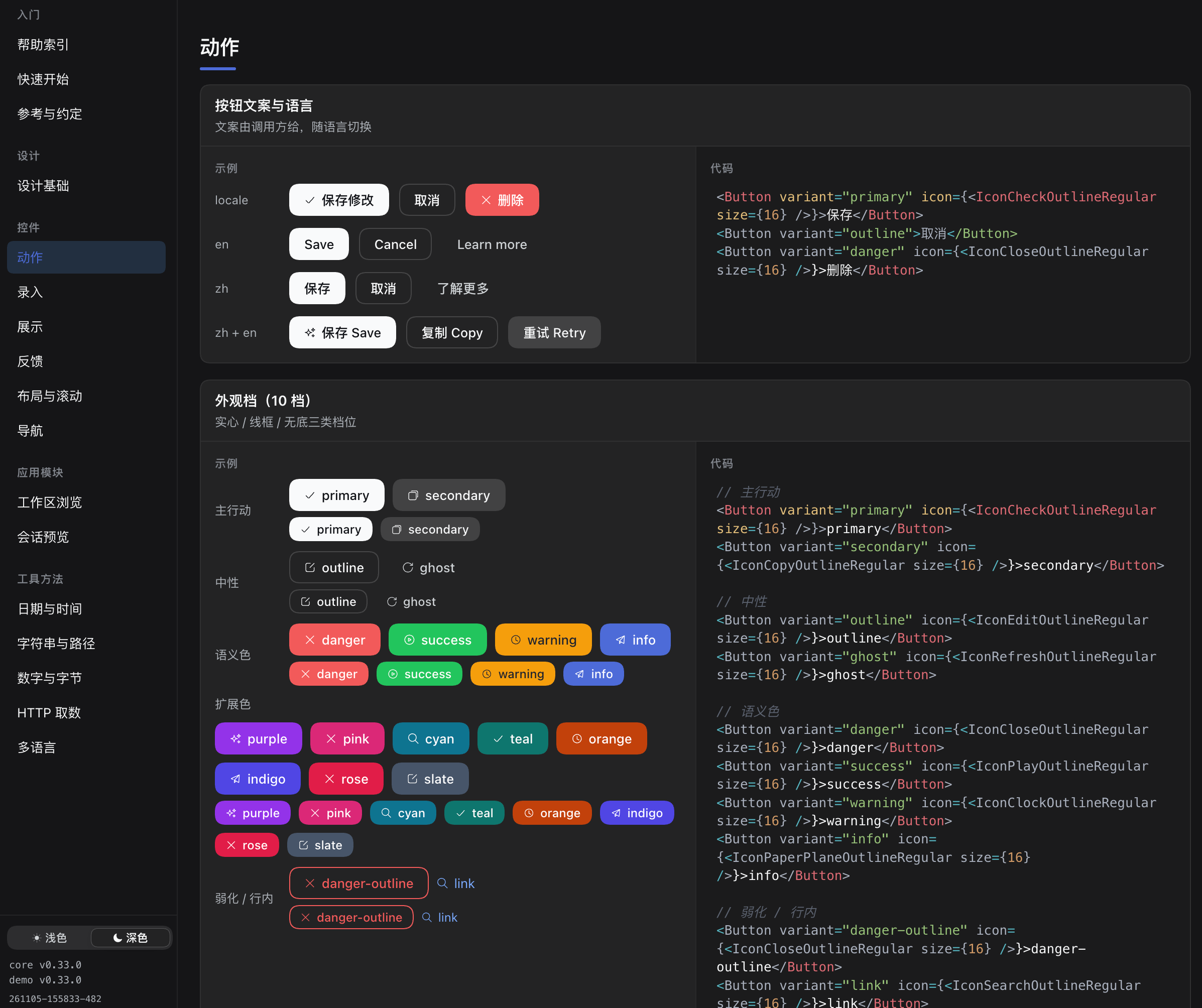
Buttons — 18 appearance tiers, three heights, icons, automatic loading:
|
|
22
|
+
|
|
23
|
+
|
|
24
|
+
|
|
25
|
+
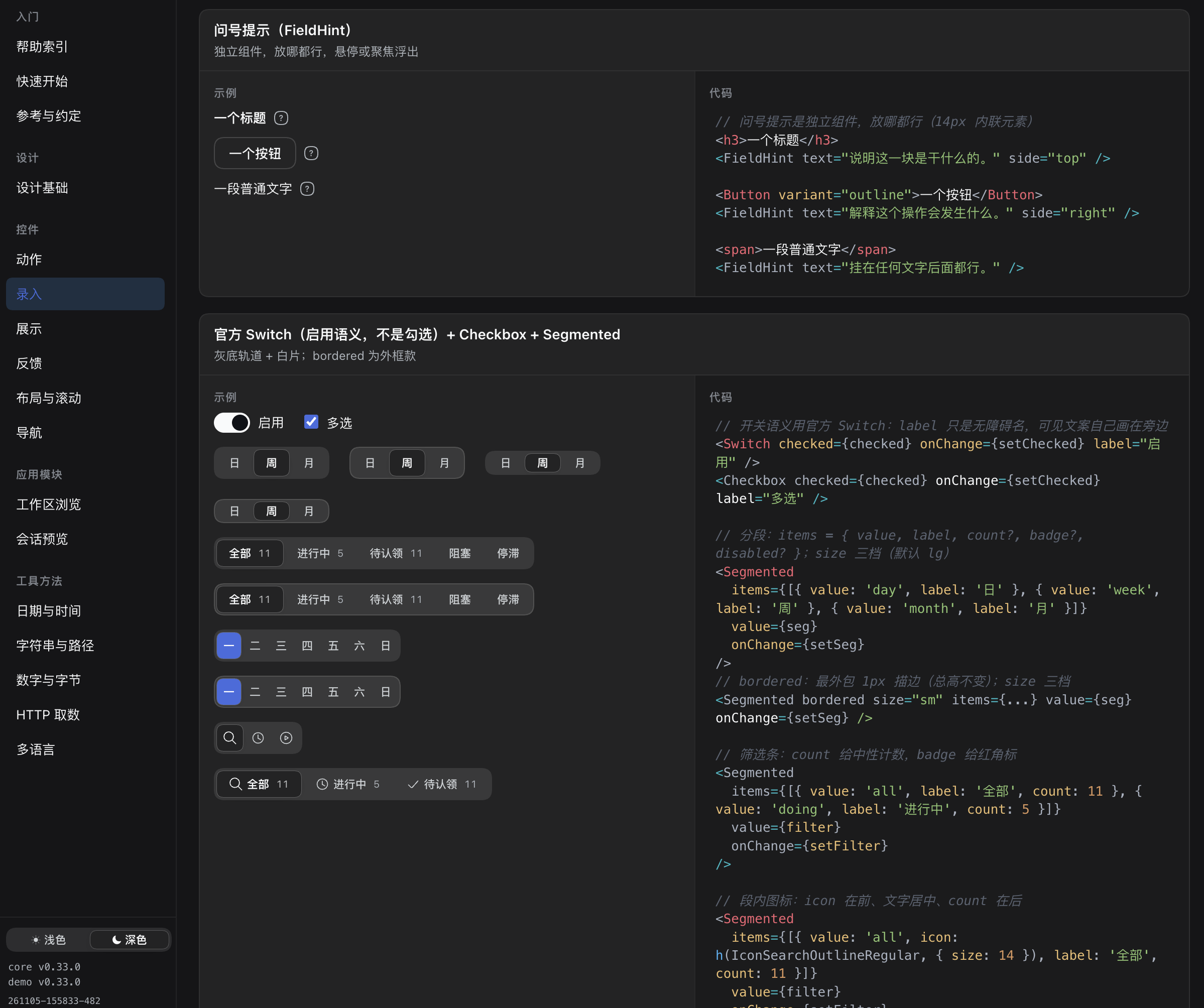
Inputs — field hints, switches, checkboxes, segmented controls:
|
|
26
|
+
|
|
27
|
+
|
|
28
|
+
|
|
29
|
+
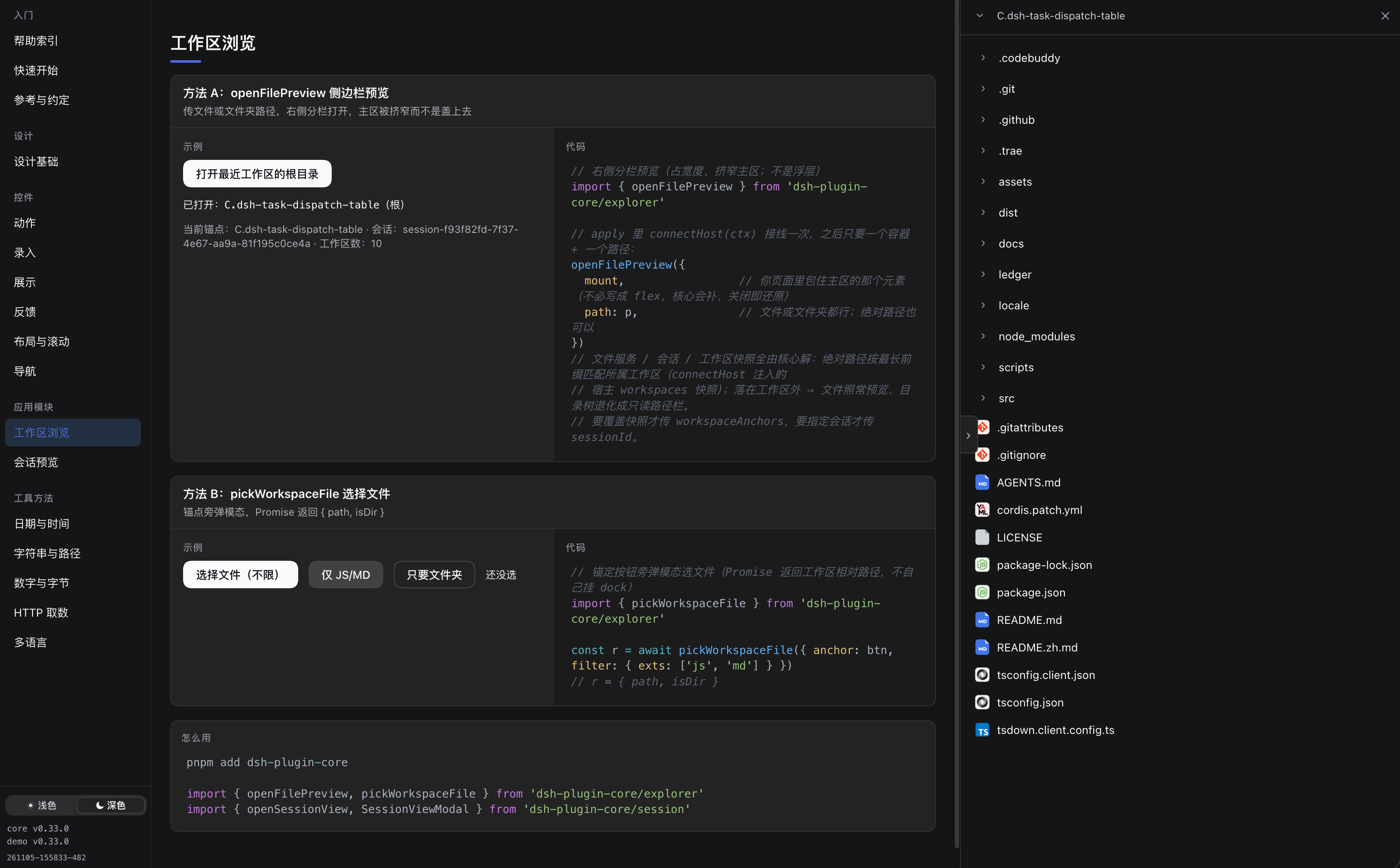
Workspace browsing — right-docked file browser and preview, not limited to workspaces:
|
|
30
|
+
|
|
31
|
+
|
|
32
|
+
|
|
33
|
+
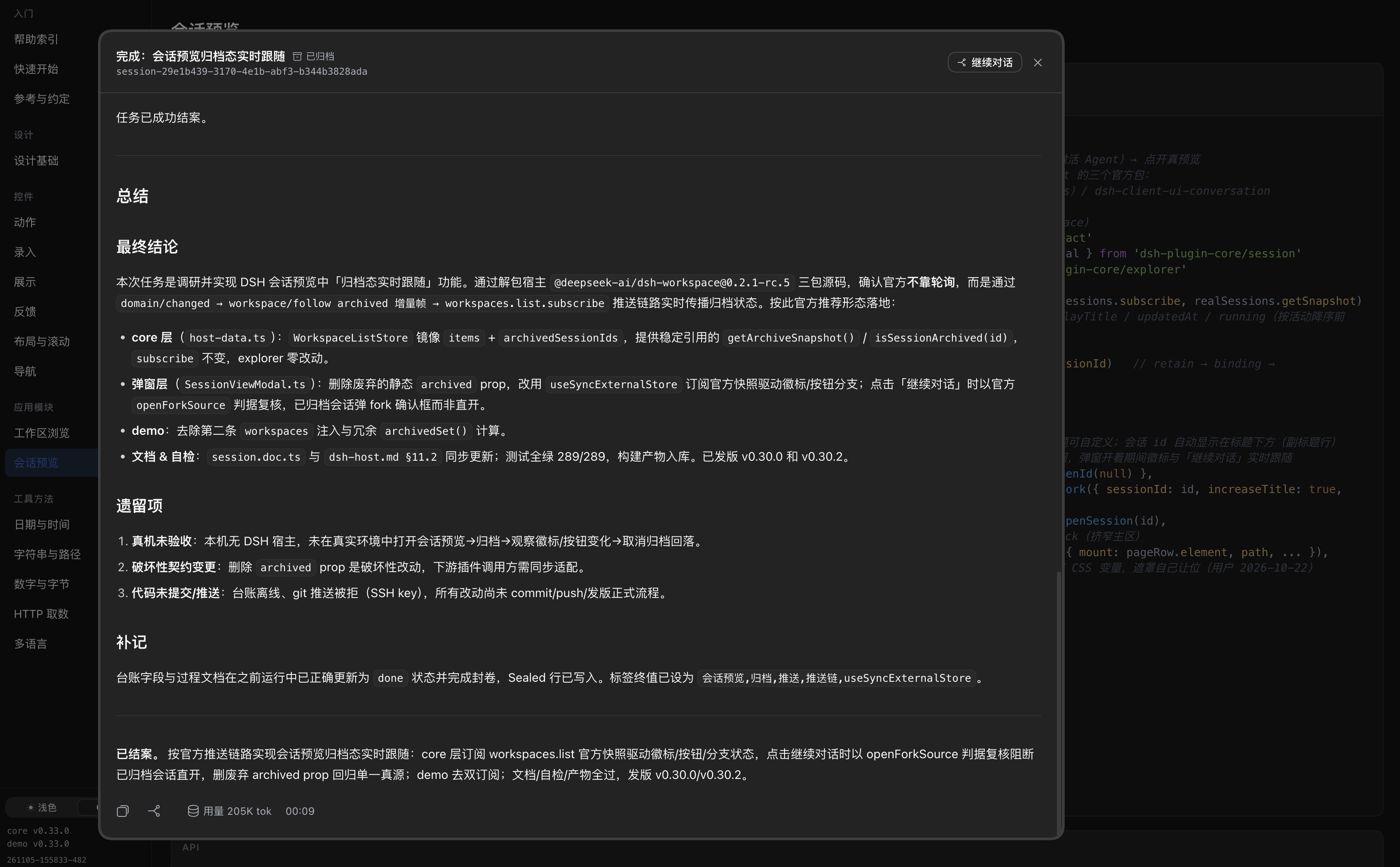
Session preview — a read-only dialog that mirrors the official conversation page:
|
|
14
34
|
|
|
15
|
-
|
|
35
|
+
|
|
16
36
|
|
|
17
|
-
|
|
37
|
+
All five screenshots are taken from [`dsh-plugin-core-demo`](#see-it-running-the-demo-plugin), the preview plugin shipped from the same repository.
|
|
18
38
|
|
|
19
|
-
##
|
|
39
|
+
## Install
|
|
20
40
|
|
|
21
41
|
```bash
|
|
22
42
|
pnpm add dsh-plugin-core
|
|
43
|
+
# or
|
|
44
|
+
npm install dsh-plugin-core
|
|
23
45
|
```
|
|
24
46
|
|
|
25
|
-
|
|
47
|
+
The published package already contains compiled `dist/` output and type declarations — the host never runs build scripts when installing a plugin. `react` / `react-dom` (`>= 18`) are **optional peers**: skip them if you only use `design` or `utils`.
|
|
26
48
|
|
|
27
|
-
|
|
28
|
-
import { createStyleKit } from 'dsh-plugin-core/design'
|
|
29
|
-
import { Button, setStyleKit } from 'dsh-plugin-core/ui'
|
|
49
|
+
## Quick start
|
|
30
50
|
|
|
31
|
-
|
|
32
|
-
|
|
51
|
+
```tsx
|
|
52
|
+
// your plugin's client entry
|
|
53
|
+
import { createStyleKit } from 'dsh-plugin-core/design'
|
|
54
|
+
import { Button, Input, setStyleKit, showToast } from 'dsh-plugin-core/ui'
|
|
55
|
+
|
|
56
|
+
const kit = createStyleKit({ id: 'dsh-task-reminder-ui' }) // 1. one kit per plugin
|
|
57
|
+
setStyleKit(kit)
|
|
58
|
+
|
|
59
|
+
export function TaskEditor(props: { name: string; setName: (v: string) => void }) {
|
|
60
|
+
return (
|
|
61
|
+
<div>
|
|
62
|
+
<Input value={props.name} onChange={props.setName} placeholder="Task name" hint="Shown in the task list" />
|
|
63
|
+
<Button variant="primary" onClick={async () => { await save(); showToast('Saved', { variant: 'success' }) }}>
|
|
64
|
+
Save
|
|
65
|
+
</Button>
|
|
66
|
+
</div>
|
|
67
|
+
)
|
|
68
|
+
}
|
|
33
69
|
```
|
|
34
70
|
|
|
35
|
-
|
|
71
|
+
Three things worth knowing on day one:
|
|
36
72
|
|
|
37
|
-
|
|
73
|
+
1. **Call `setStyleKit` once.** Styles reach the page as a runtime-injected `<style>` string, because a plugin's client bundle is a CJS closure and the kernel never loads `.css` assets. The `id` must be unique per plugin — several plugins share one page, and the id is what keeps their style tags from overwriting each other.
|
|
74
|
+
2. **Import by name.** Each control registers only its own CSS the first time it renders (idempotent), so an unused control costs nothing in your bundle. That only holds with named imports (`import { Button } from 'dsh-plugin-core/ui'`); `import * as core` or a CJS `require` disables tree-shaking and silently gives the saving back.
|
|
75
|
+
3. **Dialogs are promises.** `await confirmModal({...})` resolves to `true` / `false`, `alertModal({...})` resolves when dismissed. There are no callback-style variants.
|
|
38
76
|
|
|
39
|
-
##
|
|
77
|
+
## What's inside
|
|
40
78
|
|
|
41
|
-
|
|
|
42
|
-
|
|
43
|
-
| `dsh-plugin-core/design` |
|
|
44
|
-
| `dsh-plugin-core/ui` |
|
|
45
|
-
| `dsh-plugin-core/
|
|
46
|
-
| `dsh-plugin-core/
|
|
47
|
-
| `dsh-plugin-core/
|
|
48
|
-
| `dsh-plugin-core/
|
|
79
|
+
| Import | What you get | React required |
|
|
80
|
+
|---|---|---|
|
|
81
|
+
| `dsh-plugin-core/design` | Token variables (light + dark), `createStyleKit` injector factory, dark-mode predicate | no |
|
|
82
|
+
| `dsh-plugin-core/ui` | The whole control set — actions, inputs, display, feedback, layout, navigation | yes |
|
|
83
|
+
| `dsh-plugin-core/ui/official` | Direct re-exports of the host's official primitives, for the rare case you need one | yes |
|
|
84
|
+
| `dsh-plugin-core/ui/code-viewer` | Code viewer with per-line highlighting (also used by file preview) | yes |
|
|
85
|
+
| `dsh-plugin-core/ui/host` | Bridge to the host's own toast | yes |
|
|
86
|
+
| `dsh-plugin-core/utils` | Pure helpers: date, string, bytes, HTTP, built-in zh/en dictionary | no |
|
|
87
|
+
| `dsh-plugin-core/explorer` | File browser, file picker, docked file preview | yes |
|
|
88
|
+
| `dsh-plugin-core/explorer/preview` | Preview bodies: image, PDF, Markdown, HTML, Office, text/code | yes |
|
|
89
|
+
| `dsh-plugin-core/session` | Read-only session preview dialog + changed-file diff | yes |
|
|
90
|
+
| `dsh-plugin-core/host` | Host-side routes: read-only FS route, model catalog | no |
|
|
49
91
|
|
|
50
|
-
|
|
92
|
+
Dependency direction is one-way: `design` ← `ui` ← `explorer` / `session`, while `utils` depends on nothing.
|
|
51
93
|
|
|
52
|
-
|
|
94
|
+
## Feature tour
|
|
53
95
|
|
|
54
|
-
|
|
96
|
+
### design — tokens and style injection
|
|
55
97
|
|
|
56
|
-
|
|
57
|
-
- 明暗判据是 `body[data-ds-dark-theme]`,不是 `prefers-color-scheme`。
|
|
58
|
-
- 多语言:核心自带中英(`setLocale('zh' | 'en')` 切换),插件自己界面的文案由插件自己管。
|
|
59
|
-
- 数据调用方给:选工作区 / 选文件 / 会话预览的数据要跨 host↔client 边界,组件取不到。
|
|
98
|
+
Zero React, no components: it ships values plus the mechanism that puts them on the page.
|
|
60
99
|
|
|
61
|
-
|
|
100
|
+
- One token table for both themes, covering surfaces (`--dshpc-surface-1/2/sunken`), text (`--dshpc-fg`, `--dshpc-fg-3`, `--dshpc-fg-4`), borders, and twelve accents: `business`, `success`, `warning`, `danger`, `purple`, `pink`, `cyan`, `teal`, `orange`, `indigo`, `rose`, `slate`.
|
|
101
|
+
- `createStyleKit({ id })` returns a kit with `cssVar(name)`, `registerStyle(domain, css)`, `applyStyle(domain, css)` and `ensureStyles()` — one `<style>` tag per plugin, isolated by id.
|
|
102
|
+
- `DARK_THEME_SELECTOR` is exported as a constant (`body[data-ds-dark-theme]`) so your own CSS never guesses the theme from the OS.
|
|
103
|
+
- Prefixes are fixed across the ecosystem (`--dshpc-*` / `dshpc-*`); there is no per-plugin rename. Plugins built on different core versions are kept apart by the style-tag id, not by prefixing.
|
|
62
104
|
|
|
63
|
-
|
|
64
|
-
|
|
65
|
-
|
|
66
|
-
|
|
105
|
+
Use this subpath alone if you want the palette and the theme switch but write your own components.
|
|
106
|
+
|
|
107
|
+
### ui — the control set
|
|
108
|
+
|
|
109
|
+
Everything is built from tokens, takes its data through props, and follows the host's theme. Props are the customization surface — compose them instead of forking a component. See the [control reference](https://github.com/cq-guojia/dsh-plugin-core/blob/main/docs/help/ui.md) for every prop.
|
|
110
|
+
|
|
111
|
+
**Actions**
|
|
112
|
+
|
|
113
|
+
- `Button` — 18 appearance tiers (solid / outline / bare: `primary`, `secondary`, `danger`, `success`, `warning`, `info`, `outline`, `danger-outline`, `ghost`, `link`, plus the eight extended colors), three heights (24 / 28 / 32), leading and trailing icons, fixed / min / max width with marquee overflow, and automatic loading: return a Promise from `onClick` and the button spins, disables and restores itself — including on rejection.
|
|
114
|
+
- `IconButton` — icon-only variant of the same, with the accessible name enforced.
|
|
115
|
+
- `Segmented` — single or multiple selection, optional 1px frame, per-item icon / count / badge, tone-colored selection.
|
|
116
|
+
|
|
117
|
+
**Inputs**
|
|
118
|
+
|
|
119
|
+
- `Input`, `PrefixedInput`, `NumberInput`, `Textarea` — one shared field metric (`fieldMetricsOf`) so every control lines up; error state, leading icon slot, search clear button, and a question-mark hint that uses the host's tooltip.
|
|
120
|
+
- `Checkbox`, and the official `Switch` for on/off semantics.
|
|
121
|
+
- `Picker` — single or multiple, search, groups, selection cap, clearable, empty state; keyboard driven (Esc / arrows / Enter). Its logic (`toGroups`, `filterGroups`, `toggleValue`) is exported separately.
|
|
122
|
+
- `WorkspacePicker` / `ModelPicker` — pickers that bring their own data once `connectHost(ctx)` has been called; unwired they show an empty state rather than inventing entries.
|
|
123
|
+
- `DateTimePicker` — one control for a single instant or a range, precision `day` / `hour` / `minute` / `second`, two independent calendars, keyboard support, start floored and end ceiled.
|
|
124
|
+
- `InputGroup` — input with attached actions.
|
|
125
|
+
|
|
126
|
+
**Display**
|
|
127
|
+
|
|
128
|
+
- `Surface` — the plain framed container, with tone / border / padding / radius axes.
|
|
129
|
+
- `Card` / `StripCard` — cards with an accent system.
|
|
130
|
+
- `Chip`, `SectionHead`, `MarqueeText`, `FlipText`, `LiveText`.
|
|
131
|
+
- `Table` — grouped (multi-row) headers, banner groups so several sections live in one table, row spanning, selection, density / striped / border switches, per-column alignment and header tone, built-in empty state, loading and loading-more states, optional built-in pagination. Data-driven: it never sorts, fetches or virtualizes.
|
|
132
|
+
- `FieldHint` — the standalone question mark that opens the host's tooltip.
|
|
67
133
|
|
|
68
|
-
|
|
134
|
+
**Feedback**
|
|
69
135
|
|
|
70
|
-
|
|
136
|
+
- `Modal`, `SideSheet` — sized dialogs; `SideSheet` slides in from either side; both accept a `busy` lock.
|
|
137
|
+
- `AlertModal`, `ConfirmModal`, `alertModal()`, `confirmModal()` — promise-based dialogs.
|
|
138
|
+
- `showToast`, `notify` — Sonner-backed toasts, one host per screen shared across plugins.
|
|
139
|
+
- `Loader`, `LoaderBar`, `Loading`, `LoadingBlock`, `LoadingToast`, `RunningBlocks`, `showLoading` — spinners, an indeterminate bar, and a single-slot global loading card.
|
|
140
|
+
|
|
141
|
+
**Layout and navigation**
|
|
142
|
+
|
|
143
|
+
- `PanelDock` / `DockPanel` / `createPanelDock` — the right-docked column shell: a real layout member that takes width instead of floating over the page, multiple columns with draggable widths, saved widths, collapse to an edge ear.
|
|
144
|
+
- `QuickToolbar` — a toolbar that follows scrolling with back-to-top and visibility rules.
|
|
145
|
+
- `SplitGroup`, `startResizeLayoutWidth`, `Pagination`.
|
|
146
|
+
|
|
147
|
+
### utils — pure helpers
|
|
148
|
+
|
|
149
|
+
Zero React, zero DOM, zero dependency on `design`.
|
|
150
|
+
|
|
151
|
+
- **Date / time**: `formatDateTime`, `formatYmd`, `formatClock`, `formatDurationHms`, `formatRange`, `sameCalendarDay`, `relativePast`, `relativeFuture`, `overlaps`, `pad2`. Local timezone; a parse failure falls back instead of throwing, and never invents a time. `relativePast` and `relativeFuture` are duals — use the latter for future timestamps or "in 3 minutes" collapses into "just now".
|
|
152
|
+
- **Strings / bytes / paths**: `baseNameOf`, `safeTrim`, `truncateBytes` (UTF-8 aware, never splits a character), `formatBytes`, `formatCount`, `joinPath`, `parentOf`, `extOf`, `mimeOf`, `crumbsOf`.
|
|
153
|
+
- **HTTP**: `request`, `requestJson`, `HttpError` — one options object, structured failures.
|
|
154
|
+
- **i18n**: `setLocale('zh' | 'en')`, `getLocale()`, `t()` — the built-in dictionary shipped with the library (field placeholders, empty states, loading copy). Your plugin's own copy stays yours.
|
|
155
|
+
|
|
156
|
+
### explorer — workspace file browsing
|
|
157
|
+
|
|
158
|
+
- `openFilePreview({ mount, path })` — opens the right-docked file panel next to your main area. `mount` is the flex row that wraps the main area (element or selector); the dock becomes a layout member and gives the width back when closed.
|
|
159
|
+
- `pickWorkspaceFile({ anchor, filter })` — a Promise-based file picker; resolves to `{ path, isDir }` or `null`.
|
|
160
|
+
- `FileBrowser` — the browse surface on its own, if you would rather host it yourself.
|
|
161
|
+
- `FilePreview` — dispatches by extension to image, PDF, Markdown (rendered or source), HTML (rendered or source), Office (through the host's converter, honest "unavailable" state when it is missing), or text with syntax highlighting and open-at-line.
|
|
162
|
+
- Browsing is **not limited to workspaces**: one tree with workspace nodes plus the real root (`/`, or drive letters on Windows). Wiring takes two lines — `serveFsRoute({ path })` on the host side and `connectFs({ path })` on the client side with the same path constant. Browsing needs no session.
|
|
163
|
+
|
|
164
|
+
### session — read-only session preview
|
|
165
|
+
|
|
166
|
+
- `openSessionView(sessions, uiConversation, sessionId, mountId)` builds the data chain and returns a `view`, or `null` when the session cannot be resolved; hand it to `SessionViewModal` and call `view.dispose()` on close.
|
|
167
|
+
- Renders a dialog that mirrors the official conversation page: user and assistant turns, tool cards, reasoning blocks, changed files, permissions.
|
|
168
|
+
- Archive state is live, not a prop: core subscribes to the official workspace snapshot, so the archived badge and the "Continue" button follow changes while the dialog stays open. Archived sessions stay readable.
|
|
169
|
+
- "Continue" never disappears: an active session jumps to the official conversation, an archived one forks a child session first — with a confirmation dialog you can veto.
|
|
170
|
+
- `openSessionReview({ mount, locator })` opens the changed-file diff; a single file exit (`onOpenFile`) covers tool-card paths, inline mentions and delivered cards.
|
|
171
|
+
|
|
172
|
+
## Compatibility
|
|
173
|
+
|
|
174
|
+
| Area | Requirement |
|
|
71
175
|
|---|---|
|
|
72
|
-
|
|
|
73
|
-
|
|
|
74
|
-
|
|
|
75
|
-
|
|
|
176
|
+
| Host | DSH web client. Plugin client bundles are `window.__ModuleLoader__.load({ id, factory })` CJS closures; styles therefore arrive as runtime-injected strings. |
|
|
177
|
+
| Node.js | `>= 22.5` (build and install time only). |
|
|
178
|
+
| React / React DOM | `>= 18`, optional peers. Only `design` and `utils` work without React. |
|
|
179
|
+
| Theme | Follows the host: `body[data-ds-dark-theme]`. Never `prefers-color-scheme`. Tokens fall back to built-in values when the host does not provide them. |
|
|
180
|
+
| Naming | Variables `--dshpc-*`, class names `dshpc-*` — fixed, shared by the whole ecosystem. Nothing touches the host's own `--dsw-*` / `--dsh-*`. |
|
|
181
|
+
| Official primitives | Reachable only through `dsh-plugin-core/ui/official`, and only inside the host. The main entries stay free of `@deepseek-ai/*`, so importing `ui` in Node or in a test does not explode. |
|
|
182
|
+
| Bundling | ESM with `sideEffects: false` and per-control CSS domains — named imports keep unused controls (and their CSS) out of your bundle. |
|
|
183
|
+
| Data | Never fetched by a component. Workspaces, models, files and sessions come from the caller or from an interface you inject once. |
|
|
184
|
+
|
|
185
|
+
This is a **library, not a plugin**: no `main`, no `dsh` field. Whoever wants to *see* it running installs the demo plugin below.
|
|
76
186
|
|
|
77
|
-
##
|
|
187
|
+
## See it running: the demo plugin
|
|
78
188
|
|
|
79
|
-
|
|
189
|
+
`dsh-plugin-core-demo` ("Blue Whale Component Library") is an installable DSH plugin from the same repository. It renders every control and every composed module with real host data — the same code paths your plugin would use, not a static gallery.
|
|
80
190
|
|
|
81
|
-
|
|
191
|
+
Install it into your DSH host with the DSH CLI:
|
|
82
192
|
|
|
83
193
|
```bash
|
|
84
|
-
|
|
85
|
-
pnpm run build:demo # 构建预览插件 → packages/demo/dist/{index.js,client.js}
|
|
86
|
-
dsh plugin --profile web add dsh-plugin-core-demo # 本地路径安装即预览当前代码
|
|
194
|
+
dsh plugin --profile web add dsh-plugin-core-demo
|
|
87
195
|
```
|
|
88
196
|
|
|
89
|
-
|
|
197
|
+
Or install the npm package itself:
|
|
90
198
|
|
|
91
|
-
|
|
199
|
+
```bash
|
|
200
|
+
npm install dsh-plugin-core-demo
|
|
201
|
+
```
|
|
202
|
+
|
|
203
|
+
After installing, open the plugin in DSH: the plugin page carries a **Component preview** entry that opens the full-page preview, and the sidebar entry can be placed first-level, under "More", or turned off entirely in the plugin settings.
|
|
204
|
+
|
|
205
|
+
What it covers: design foundation (tokens, dark-mode predicate, injection), actions, inputs, display, feedback, layout and scrolling, navigation, workspace browsing, session preview, the utility helpers with live input/output, and every built-in i18n string in both languages.
|
|
206
|
+
|
|
207
|
+
Its `dist/` is committed to the repository and it bundles core's build output into itself, so it always previews the current code — you do not need to publish core first.
|
|
208
|
+
|
|
209
|
+
## Documentation
|
|
92
210
|
|
|
93
|
-
|
|
211
|
+
| I want to… | Read |
|
|
212
|
+
|---|---|
|
|
213
|
+
| Integrate the package into a plugin | [Integration guide](https://github.com/cq-guojia/dsh-plugin-core/blob/main/docs/help/integration.md) |
|
|
214
|
+
| Look up a control and its props | [Control reference](https://github.com/cq-guojia/dsh-plugin-core/blob/main/docs/help/ui.md) |
|
|
215
|
+
| Use `createStyleKit`, override tokens, isolate plugins | [design](https://github.com/cq-guojia/dsh-plugin-core/blob/main/docs/help/design.md) |
|
|
216
|
+
| Use tokens, colors or a custom skin | [Style guide](https://github.com/cq-guojia/dsh-plugin-core/blob/main/docs/help/style.md) |
|
|
217
|
+
| Handle dates, strings, bytes, HTTP | [utils](https://github.com/cq-guojia/dsh-plugin-core/blob/main/docs/help/utils.md) — and the shared [method conventions](https://github.com/cq-guojia/dsh-plugin-core/blob/main/docs/help/methods.md) |
|
|
218
|
+
| Add workspace browsing and file preview | [explorer](https://github.com/cq-guojia/dsh-plugin-core/blob/main/docs/help/explorer.md) |
|
|
219
|
+
| Render a session as a read-only preview | [session](https://github.com/cq-guojia/dsh-plugin-core/blob/main/docs/help/session.md) |
|
|
220
|
+
| Understand the architecture | [Architecture](https://github.com/cq-guojia/dsh-plugin-core/blob/main/docs/design/architecture.md) |
|
|
221
|
+
| See why a decision was made | [Requirements and decisions](https://github.com/cq-guojia/dsh-plugin-core/blob/main/docs/requirements.md) |
|
|
222
|
+
|
|
223
|
+
The help documents are bilingual (Chinese prose, English abstract under each section).
|
|
224
|
+
|
|
225
|
+
## Releasing
|
|
226
|
+
|
|
227
|
+
Core and the demo share one version number, and one git tag publishes both packages:
|
|
94
228
|
|
|
95
229
|
```bash
|
|
96
|
-
# 1.
|
|
97
|
-
# 2.
|
|
230
|
+
# 1. set the same version in the root package.json and packages/demo/package.json
|
|
231
|
+
# 2. build, commit (dist/ must be committed) and push
|
|
98
232
|
pnpm run build && pnpm run build:demo
|
|
99
|
-
git add -A && git commit -m "
|
|
100
|
-
# 3.
|
|
101
|
-
git tag
|
|
233
|
+
git add -A && git commit -m "Release X.Y.Z" && git push
|
|
234
|
+
# 3. the tag triggers GitHub Actions, which publishes to npm
|
|
235
|
+
git tag vX.Y.Z && git push origin vX.Y.Z
|
|
102
236
|
```
|
|
103
237
|
|
|
104
|
-
|
|
105
|
-
|
|
106
|
-
|
|
107
|
-
| 同上 | `.github/workflows/demo-publish.yml` | `dsh-plugin-core-demo` |
|
|
238
|
+
`tag vX.Y.Z` must equal both `version` fields; there is no separate `demo-v*` tag.
|
|
239
|
+
|
|
240
|
+
## License
|
|
108
241
|
|
|
109
|
-
|
|
242
|
+
MIT
|
package/README.zh-CN.md
ADDED
|
@@ -0,0 +1,242 @@
|
|
|
1
|
+
# dsh-plugin-core
|
|
2
|
+
|
|
3
|
+
[English](https://github.com/cq-guojia/dsh-plugin-core/blob/main/README.md) · **简体中文**
|
|
4
|
+
|
|
5
|
+
**DSH(DeepSeek Harness)** 插件的共享 UI 底座:设计 token、一整套 React 控件、纯方法、工作区文件浏览、只读会话预览——一个包,按子路径引入。
|
|
6
|
+
|
|
7
|
+
它存在的意义是:写下一个插件时,不必再把按钮、日期选择器、toast、文件预览、会话回放各抄一遍。这里的东西全部长在宿主自己的 token 与明暗开关上,拼出来的插件天然是宿主的样子,不需要每个插件各调一遍皮肤。
|
|
8
|
+
|
|
9
|
+
- **跟宿主走,不跟系统走**:明暗判据是宿主写在 body 上的 `body[data-ds-dark-theme]`,12 个强调色也是宿主那套。
|
|
10
|
+
- **组件不取数**:选项、当前值、工作区、会话,一律由调用方经 props 或一次性注入的接口给进来,组件绝不自己伸手去要。
|
|
11
|
+
- **在哪儿都能 import**:`design`、`ui`、`utils` 三个入口零 `@deepseek-ai/*` 依赖,Node 与单测环境里直接 import 不会炸,不是只能在宿主里活。
|
|
12
|
+
|
|
13
|
+
## 截图
|
|
14
|
+
|
|
15
|
+
以下都是在 DSH 宿主里暗色主题下的真实渲染:
|
|
16
|
+
|
|
17
|
+
设计基础——token 色板、明暗判据、样式注入机制:
|
|
18
|
+
|
|
19
|
+

|
|
20
|
+
|
|
21
|
+
按钮——18 档外观、三档高度、图标、自动 loading:
|
|
22
|
+
|
|
23
|
+

|
|
24
|
+
|
|
25
|
+
录入——问号提示、Switch、Checkbox、分段选择器:
|
|
26
|
+
|
|
27
|
+

|
|
28
|
+
|
|
29
|
+
工作区浏览——右侧停靠的文件浏览与预览,且不限工作区:
|
|
30
|
+
|
|
31
|
+

|
|
32
|
+
|
|
33
|
+
会话预览——与官方会话页同构的只读弹窗:
|
|
34
|
+
|
|
35
|
+

|
|
36
|
+
|
|
37
|
+
五张截图都来自 [`dsh-plugin-core-demo`](#装上就能看预览插件),也就是同仓库发布的预览插件。
|
|
38
|
+
|
|
39
|
+
## 安装
|
|
40
|
+
|
|
41
|
+
```bash
|
|
42
|
+
pnpm add dsh-plugin-core
|
|
43
|
+
# 或者
|
|
44
|
+
npm install dsh-plugin-core
|
|
45
|
+
```
|
|
46
|
+
|
|
47
|
+
发布包里带编译好的 `dist/` 与类型声明——宿主安装插件时不跑构建脚本。`react` / `react-dom`(`>= 18`)是**可选 peer**:只用 `design` 或 `utils` 的插件不必装。
|
|
48
|
+
|
|
49
|
+
## 快速开始
|
|
50
|
+
|
|
51
|
+
```tsx
|
|
52
|
+
// 插件 client 入口
|
|
53
|
+
import { createStyleKit } from 'dsh-plugin-core/design'
|
|
54
|
+
import { Button, Input, setStyleKit, showToast } from 'dsh-plugin-core/ui'
|
|
55
|
+
|
|
56
|
+
const kit = createStyleKit({ id: 'dsh-task-reminder-ui' }) // 1. 一个插件一套
|
|
57
|
+
setStyleKit(kit)
|
|
58
|
+
|
|
59
|
+
export function TaskEditor(props: { name: string; setName: (v: string) => void }) {
|
|
60
|
+
return (
|
|
61
|
+
<div>
|
|
62
|
+
<Input value={props.name} onChange={props.setName} placeholder="任务名" hint="会显示在任务列表里" />
|
|
63
|
+
<Button variant="primary" onClick={async () => { await save(); showToast('已保存', { variant: 'success' }) }}>
|
|
64
|
+
保存
|
|
65
|
+
</Button>
|
|
66
|
+
</div>
|
|
67
|
+
)
|
|
68
|
+
}
|
|
69
|
+
```
|
|
70
|
+
|
|
71
|
+
第一天就该知道的三件事:
|
|
72
|
+
|
|
73
|
+
1. **`setStyleKit` 只调一次。** 样式只能以字符串在运行时注入 `<style>`——插件 client 产物是 CJS 闭包,内核不加载 `.css` 资源。`id` 必须插件内唯一:多个插件同页时,靠它让自己的 `<style>` 不被别人覆盖。
|
|
74
|
+
2. **具名引入。** 每个控件在首次渲染时才登记自己那份 CSS(幂等),用不到的控件其 CSS 不进你的包。这条收益只在具名引入时成立(`import { Button } from 'dsh-plugin-core/ui'`);写成 `import * as core` 或 CJS `require`,打包器无法摇树,收益静默归零。
|
|
75
|
+
3. **弹窗是 Promise 形态。** `await confirmModal({...})` 拿 `true` / `false`,`alertModal({...})` 关闭即 resolve。没有回调式写法。
|
|
76
|
+
|
|
77
|
+
## 包里有什么
|
|
78
|
+
|
|
79
|
+
| 引入路径 | 给你什么 | 需要 React |
|
|
80
|
+
|---|---|---|
|
|
81
|
+
| `dsh-plugin-core/design` | token 变量(明 + 暗)、`createStyleKit` 注入器工厂、明暗判据 | 否 |
|
|
82
|
+
| `dsh-plugin-core/ui` | 全套控件:动作、录入、展示、反馈、布局、导航 | 是 |
|
|
83
|
+
| `dsh-plugin-core/ui/official` | 官方 primitives 的直接再导出(少数确实要用官方原件的场景) | 是 |
|
|
84
|
+
| `dsh-plugin-core/ui/code-viewer` | 代码查看器(行级高亮,文件预览源码态用的也是它) | 是 |
|
|
85
|
+
| `dsh-plugin-core/ui/host` | 宿主自带 toast 的桥接 | 是 |
|
|
86
|
+
| `dsh-plugin-core/utils` | 纯方法:日期、字符串、字节、HTTP,外加内置中英字典 | 否 |
|
|
87
|
+
| `dsh-plugin-core/explorer` | 文件浏览、文件选择、右侧停靠的文件预览 | 是 |
|
|
88
|
+
| `dsh-plugin-core/explorer/preview` | 预览体:图片、PDF、Markdown、HTML、Office、文本 / 代码 | 是 |
|
|
89
|
+
| `dsh-plugin-core/session` | 只读会话预览弹窗 + 变更文件 diff | 是 |
|
|
90
|
+
| `dsh-plugin-core/host` | 宿主侧路由:只读 FS 路由、模型目录 | 否 |
|
|
91
|
+
|
|
92
|
+
依赖方向单向:`design` ← `ui` ← `explorer` / `session`,`utils` 谁也不依赖。
|
|
93
|
+
|
|
94
|
+
## 功能说明
|
|
95
|
+
|
|
96
|
+
### design——token 与样式注入
|
|
97
|
+
|
|
98
|
+
零 React、没有组件,装的是「值 + 把值弄上页面的机制」。
|
|
99
|
+
|
|
100
|
+
- 一张明暗双份的 token 表:表面(`--dshpc-surface-1/2/sunken`)、文字(`--dshpc-fg`、`--dshpc-fg-3`、`--dshpc-fg-4`)、边框,以及十二个强调色:`business`、`success`、`warning`、`danger`、`purple`、`pink`、`cyan`、`teal`、`orange`、`indigo`、`rose`、`slate`。
|
|
101
|
+
- `createStyleKit({ id })` 返回一套工具:`cssVar(name)`、`registerStyle(domain, css)`、`applyStyle(domain, css)`、`ensureStyles()`——一个插件一个 `<style>` 标签,按 id 隔离。
|
|
102
|
+
- `DARK_THEME_SELECTOR` 常量为 `body[data-ds-dark-theme]`,自己的 CSS 不必再猜系统主题。
|
|
103
|
+
- 变量与类名前缀全生态固定为 `--dshpc-*` / `dshpc-*`,不存在按插件改名;不同 core 版本的插件靠 style 标签 id 隔离,不靠前缀。
|
|
104
|
+
|
|
105
|
+
只想统一配色与尺寸、但组件自己写:只引这一个子路径就够。
|
|
106
|
+
|
|
107
|
+
### ui——控件
|
|
108
|
+
|
|
109
|
+
全部由 token 搭出来,数据走 props,配色跟随宿主主题。props 就是定制面——组合 props,不要 fork 源码。每个参数的完整说明见[控件参考](https://github.com/cq-guojia/dsh-plugin-core/blob/main/docs/help/ui.md)。
|
|
110
|
+
|
|
111
|
+
**动作**
|
|
112
|
+
|
|
113
|
+
- `Button`——18 档外观(实心 / 线框 / 无底:`primary`、`secondary`、`danger`、`success`、`warning`、`info`、`outline`、`danger-outline`、`ghost`、`link`,加扩展八色),三档高度(24 / 28 / 32),前置与后置图标,固定 / 最小 / 最大宽度(超长跑马灯),自动 loading:`onClick` 返回 Promise 就转圈、禁用、settle 后自恢复,reject 同样恢复。
|
|
114
|
+
- `IconButton`——纯图标版本,无障碍名强制给。
|
|
115
|
+
- `Segmented`——单选 / 多选、可选 1px 外框、段内图标 / 计数 / 角标、`tone` 换选中片配色。
|
|
116
|
+
|
|
117
|
+
**录入**
|
|
118
|
+
|
|
119
|
+
- `Input`、`PrefixedInput`、`NumberInput`、`Textarea`——共用一套字段尺寸(`fieldMetricsOf`),错误态、左侧图标槽、搜索清空键,问号提示直接走宿主 tooltip。
|
|
120
|
+
- `Checkbox`;开关语义用官方 `Switch`。
|
|
121
|
+
- `Picker`——单选 / 多选、搜索、分组、选择上限、可清空、空态;键盘可全操作(Esc / ↑↓ / Enter)。底层逻辑(`toGroups`、`filterGroups`、`toggleValue`)单独导出。
|
|
122
|
+
- `WorkspacePicker` / `ModelPicker`——自带数据的领域选择器:插件 `apply` 里调一次 `connectHost(ctx)` 即订阅宿主快照,没接线就是空态,不编造。
|
|
123
|
+
- `DateTimePicker`——一个控件覆盖「一个时刻」与「时间段」,精度 `day` / `hour` / `minute` / `second`,左右两块独立月历,键盘可用,起始端归零、结束端拉满。
|
|
124
|
+
- `InputGroup`——带附着动作的输入框。
|
|
125
|
+
|
|
126
|
+
**展示**
|
|
127
|
+
|
|
128
|
+
- `Surface`——纯框容器,tone / 边框 / 内距 / 圆角四轴。
|
|
129
|
+
- `Card` / `StripCard`——带强调色的卡片。
|
|
130
|
+
- `Chip`、`SectionHead`、`MarqueeText`、`FlipText`、`LiveText`。
|
|
131
|
+
- `Table`——多行分组表头、通栏分组(一张表装多个板块)、跨行跨列、行选中、密度 / 斑马纹 / 边框开关、列级对齐与表头语义色、内置空态、加载态与加载更多、可选内置分页。数据驱动:不排序、不取数、不虚拟滚动。
|
|
132
|
+
- `FieldHint`——独立的问号提示,浮层用的是宿主官方 tooltip。
|
|
133
|
+
|
|
134
|
+
**反馈**
|
|
135
|
+
|
|
136
|
+
- `Modal`、`SideSheet`——定尺寸弹窗与侧边抽屉,都支持 `busy` 锁。
|
|
137
|
+
- `AlertModal`、`ConfirmModal`、`alertModal()`、`confirmModal()`——Promise 形态的确认 / 提示。
|
|
138
|
+
- `showToast`、`notify`——Sonner 底座的 toast,全屏单例、多插件共用。
|
|
139
|
+
- `Loader`、`LoaderBar`、`Loading`、`LoadingBlock`、`LoadingToast`、`RunningBlocks`、`showLoading`——转圈图标、不定进度条、全局单槽加载卡。
|
|
140
|
+
|
|
141
|
+
**布局与导航**
|
|
142
|
+
|
|
143
|
+
- `PanelDock` / `DockPanel` / `createPanelDock`——右侧停靠分栏的通用壳:是布局成员而不是浮层,占宽挤窄主区;支持多栏、拖宽、宽度记忆、收起成右侧耳朵。
|
|
144
|
+
- `QuickToolbar`——随滚动出现的工具栏,带回到顶部与可见性规则。
|
|
145
|
+
- `SplitGroup`、`startResizeLayoutWidth`、`Pagination`。
|
|
146
|
+
|
|
147
|
+
### utils——纯方法
|
|
148
|
+
|
|
149
|
+
零 React、零 DOM、零 `design` 依赖。
|
|
150
|
+
|
|
151
|
+
- **日期时间**:`formatDateTime`、`formatYmd`、`formatClock`、`formatDurationHms`、`formatRange`、`sameCalendarDay`、`relativePast`、`relativeFuture`、`overlaps`、`pad2`。一律本机时区;解析失败按兜底返回、不抛错,也不编造时间。`relativePast` 与 `relativeFuture` 是对偶的——未来时间必须用后者,否则「3 分钟后」会显示成「刚刚」。
|
|
152
|
+
- **字符串 / 字节 / 路径**:`baseNameOf`、`safeTrim`、`truncateBytes`(按 UTF-8 字节截断,不切半个字)、`formatBytes`、`formatCount`、`joinPath`、`parentOf`、`extOf`、`mimeOf`、`crumbsOf`。
|
|
153
|
+
- **HTTP**:`request`、`requestJson`、`HttpError`——一个 options 对象,失败有结构。
|
|
154
|
+
- **多语言**:`setLocale('zh' | 'en')`、`getLocale()`、`t()`——管的是库自带的固定文案(占位符、空态、加载文案)。插件自己界面的文案仍归插件自己。
|
|
155
|
+
|
|
156
|
+
### explorer——工作区文件浏览
|
|
157
|
+
|
|
158
|
+
- `openFilePreview({ mount, path })`——在主区旁边打开右侧停靠的文件面板。`mount` 是包住主区的那个 flex 行(元素或选择器都行),面板作为布局成员占宽,关闭时还原。
|
|
159
|
+
- `pickWorkspaceFile({ anchor, filter })`——Promise 形态的文件选择器,resolve `{ path, isDir }` 或 `null`。
|
|
160
|
+
- `FileBrowser`——单独使用浏览面板本体。
|
|
161
|
+
- `FilePreview`——按扩展名分派到图片、PDF、Markdown(渲染 / 源码)、HTML(渲染 / 源码)、Office(走宿主转换能力,缺了就如实显示「不可用」)、文本(代码高亮、可定位到行)。
|
|
162
|
+
- 浏览**不限工作区**:一棵树里既有工作区节点也有真实根(POSIX 是 `/`,Windows 是盘符)。接线两行——宿主侧 `serveFsRoute({ path })`,client 侧用同一个路径常量 `connectFs({ path })`。浏览本身不需要会话。
|
|
163
|
+
|
|
164
|
+
### session——只读会话预览
|
|
165
|
+
|
|
166
|
+
- `openSessionView(sessions, uiConversation, sessionId, mountId)` 建数据链拿到 `view`(不可解析返回 `null`),交给 `SessionViewModal`,关闭时记得 `view.dispose()`。
|
|
167
|
+
- 渲染与官方会话页同构:用户 / 助手轮次、工具卡、思考块、变更文件、权限卡。
|
|
168
|
+
- 归档态实时跟随、不用调用方传:核心订阅官方工作区快照,弹窗开着期间归档徽标与「继续对话」会跟着变;归档会话同样可读。
|
|
169
|
+
- 「继续对话」始终保留:未归档直跳官方会话区,已归档先开分支并弹确认框(可以取消)。
|
|
170
|
+
- `openSessionReview({ mount, locator })` 打开变更文件的 diff;文件出口只有一个 `onOpenFile`,工具卡路径、行内引用、交付卡都走它。
|
|
171
|
+
|
|
172
|
+
## 适配范围
|
|
173
|
+
|
|
174
|
+
| 维度 | 要求 |
|
|
175
|
+
|---|---|
|
|
176
|
+
| 宿主 | DSH web client。插件 client 产物是 `window.__ModuleLoader__.load({ id, factory })` 的 CJS 闭包,所以样式只能运行时注入。 |
|
|
177
|
+
| Node.js | `>= 22.5`(只影响构建与安装阶段)。 |
|
|
178
|
+
| React / React DOM | `>= 18`,可选 peer。只有 `design` 与 `utils` 可以完全不用 React。 |
|
|
179
|
+
| 主题 | 跟随宿主 `body[data-ds-dark-theme]`,绝不使用 `prefers-color-scheme`。宿主没给 token 时回落到内置值。 |
|
|
180
|
+
| 命名 | 变量 `--dshpc-*`、类名 `dshpc-*`,全生态固定;不碰宿主的 `--dsw-*` / `--dsh-*`。 |
|
|
181
|
+
| 官方 primitives | 只从 `dsh-plugin-core/ui/official` 走,且只在宿主内可解析。主入口零 `@deepseek-ai/*`,因此在 Node / 单测里 import `ui` 不会失败。 |
|
|
182
|
+
| 打包 | ESM、`sideEffects: false`、控件各带自己的 CSS 域——具名引入可让用不到的控件连同其 CSS 都不进包。 |
|
|
183
|
+
| 数据 | 组件从不取数。工作区、模型、文件、会话由调用方给,或来自一次性注入的接口。 |
|
|
184
|
+
|
|
185
|
+
这是一个**库,不是插件**:没有 `main`、没有 `dsh` 字段。想看它跑起来,装下面的预览插件。
|
|
186
|
+
|
|
187
|
+
## 装上就能看:预览插件
|
|
188
|
+
|
|
189
|
+
`dsh-plugin-core-demo`(蓝鲸组件库)是同仓库发布的、可安装的 DSH 插件。它用宿主真实数据把每个控件、每个组合模块跑一遍——走的是你的插件将来会走的同一条代码路径,不是静态画廊。
|
|
190
|
+
|
|
191
|
+
用 DSH 命令装进宿主:
|
|
192
|
+
|
|
193
|
+
```bash
|
|
194
|
+
dsh plugin --profile web add dsh-plugin-core-demo
|
|
195
|
+
```
|
|
196
|
+
|
|
197
|
+
或用 npm 装这个包本身:
|
|
198
|
+
|
|
199
|
+
```bash
|
|
200
|
+
npm install dsh-plugin-core-demo
|
|
201
|
+
```
|
|
202
|
+
|
|
203
|
+
装好后在 DSH 里打开本插件:插件详情页有「组件预览」入口,点开即整页预览;侧栏入口的位置(第一级 / 收入「更多」/ 关闭)在插件设置里选。
|
|
204
|
+
|
|
205
|
+
覆盖内容:设计基础(token、明暗判据、注入机制)、动作、录入、展示、反馈、布局与滚动、导航、工作区浏览、会话预览、工具方法的输入输出实测,以及内置中英双语文案。
|
|
206
|
+
|
|
207
|
+
它的 `dist/` 随仓库入库,并把 core 的构建产物打进自己 bundle,所以预览的永远是当前这份代码——不需要先把 core 发到 npm。
|
|
208
|
+
|
|
209
|
+
## 文档
|
|
210
|
+
|
|
211
|
+
| 我想… | 看哪 |
|
|
212
|
+
|---|---|
|
|
213
|
+
| 把包接进插件 | [接入指引](https://github.com/cq-guojia/dsh-plugin-core/blob/main/docs/help/integration.md) |
|
|
214
|
+
| 查控件与全部 props | [控件参考](https://github.com/cq-guojia/dsh-plugin-core/blob/main/docs/help/ui.md) |
|
|
215
|
+
| 建 style kit、覆盖 token、多插件隔离 | [design](https://github.com/cq-guojia/dsh-plugin-core/blob/main/docs/help/design.md) |
|
|
216
|
+
| 用 token、配色或定制皮肤 | [样式说明](https://github.com/cq-guojia/dsh-plugin-core/blob/main/docs/help/style.md) |
|
|
217
|
+
| 处理日期、字符串、字节、HTTP | [utils](https://github.com/cq-guojia/dsh-plugin-core/blob/main/docs/help/utils.md),以及[方法统一口径](https://github.com/cq-guojia/dsh-plugin-core/blob/main/docs/help/methods.md) |
|
|
218
|
+
| 加工作区文件浏览与预览 | [explorer](https://github.com/cq-guojia/dsh-plugin-core/blob/main/docs/help/explorer.md) |
|
|
219
|
+
| 把会话渲染成只读预览 | [session](https://github.com/cq-guojia/dsh-plugin-core/blob/main/docs/help/session.md) |
|
|
220
|
+
| 理解整体架构 | [架构](https://github.com/cq-guojia/dsh-plugin-core/blob/main/docs/design/architecture.md) |
|
|
221
|
+
| 查某个决定为什么这么定 | [需求与决策](https://github.com/cq-guojia/dsh-plugin-core/blob/main/docs/requirements.md) |
|
|
222
|
+
|
|
223
|
+
帮助文档为中英双语(正文中文,每节附英文摘要)。
|
|
224
|
+
|
|
225
|
+
## 发布
|
|
226
|
+
|
|
227
|
+
核心与预览插件共用同一个版本号,一个 tag 同时发布两个包:
|
|
228
|
+
|
|
229
|
+
```bash
|
|
230
|
+
# 1. 根 package.json 与 packages/demo/package.json 的 version 改成同一个号
|
|
231
|
+
# 2. 构建、提交(dist/ 必须入库)、推送
|
|
232
|
+
pnpm run build && pnpm run build:demo
|
|
233
|
+
git add -A && git commit -m "发布 X.Y.Z" && git push
|
|
234
|
+
# 3. 打 tag 触发 GitHub Actions 自动发 npm
|
|
235
|
+
git tag vX.Y.Z && git push origin vX.Y.Z
|
|
236
|
+
```
|
|
237
|
+
|
|
238
|
+
`tag vX.Y.Z` 必须等于两个 `version` 字段;没有 `demo-v*` 这种独立 tag。
|
|
239
|
+
|
|
240
|
+
## 许可证
|
|
241
|
+
|
|
242
|
+
MIT
|
package/docs/README.md
CHANGED
|
@@ -17,6 +17,7 @@
|
|
|
17
17
|
| 槽位 | 落位 | 说明 |
|
|
18
18
|
|---|---|---|
|
|
19
19
|
| 文档规范 | `docs/README.md`(本文件,路径固定) | 槽位表 + 阅读顺序 |
|
|
20
|
+
| 项目门面(英 + 简中,随包发布) | 根 `README.md` / `README.zh-CN.md`;`packages/demo/README.md` / `packages/demo/README.zh-CN.md` | 两个 npm 包的对外说明:功能总览、适配范围、安装与截图;中文版是英文版的翻译,正文只此一份 |
|
|
20
21
|
| **帮助文档区(追加槽位)** | **`docs/help/`** | **给引用方 / Agent,随包发布;`.doc.ts` 真源 + `.md` 投影同目录** |
|
|
21
22
|
| 帮助索引(入口) | `docs/help/index.md`(← `index.doc.ts`) | 引用方与 Agent 的唯一入口:按任务挑一份 |
|
|
22
23
|
| 接入样例 | `docs/help/integration.md`(← `integration.doc.ts`) | 从零接入一个插件 |
|
package/package.json
CHANGED