datex-ui 1.1.8 → 1.1.10
This diff represents the content of publicly available package versions that have been released to one of the supported registries. The information contained in this diff is provided for informational purposes only and reflects changes between package versions as they appear in their respective public registries.
- package/README.md +52 -8
- package/assets/images/screenshots/basic-range-datex-ui.png +0 -0
- package/assets/images/screenshots/bootstrap-theme-datex.png +0 -0
- package/assets/images/screenshots/dark-mode-datex.png +0 -0
- package/assets/images/screenshots/date-time-datex.png +0 -0
- package/assets/images/screenshots/default-theme-datex.png +0 -0
- package/assets/images/screenshots/full-datetime-12h.png +0 -0
- package/assets/images/screenshots/light-mode-datex.png +0 -0
- package/assets/images/screenshots/material-theme-datex.png +0 -0
- package/assets/images/screenshots/range-datex.png +0 -0
- package/assets/images/screenshots/restrict-datex.png +0 -0
- package/assets/images/screenshots/single-datex.png +0 -0
- package/dist/datex.d.ts +5 -0
- package/dist/index.esm.js +447 -206
- package/dist/services/calendar-service.d.ts +1 -0
- package/dist/services/keyboard-service.d.ts +0 -2
- package/dist/services/theme-manager.d.ts +55 -0
- package/dist/services/theme-service.d.ts +9 -0
- package/package.json +1 -1
package/README.md
CHANGED
|
@@ -2,8 +2,6 @@
|
|
|
2
2
|
|
|
3
3
|
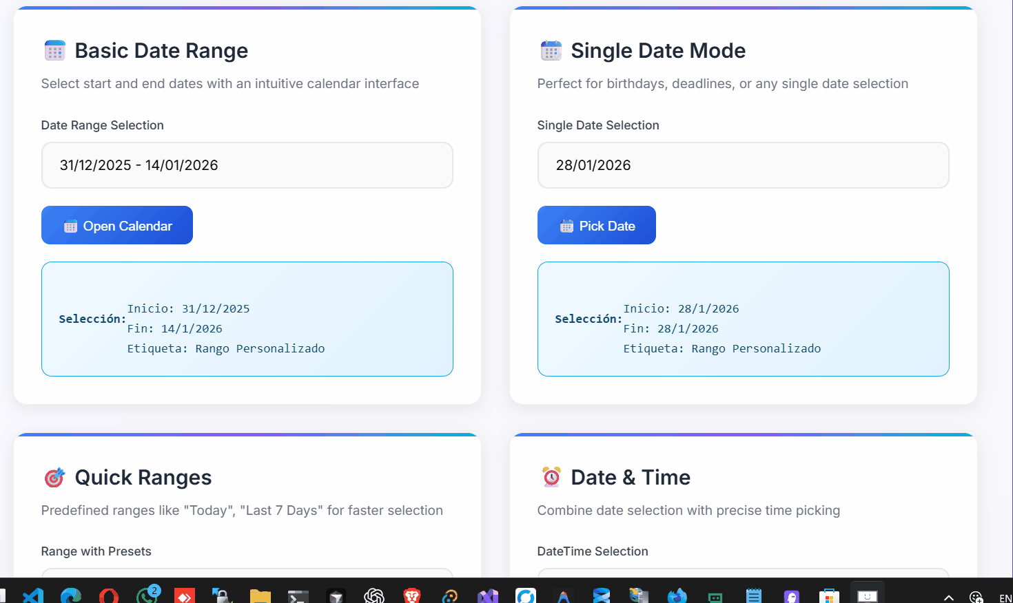
A modern, lightweight, and customizable date range picker for TypeScript/JavaScript applications. Built with native JavaScript, no external dependencies.
|
|
4
4
|
|
|
5
|
-
<!-- Add your demo GIF here -->
|
|
6
|
-
|
|
7
5
|
|
|
8
6
|
|
|
9
7
|
## Features
|
|
@@ -18,9 +16,31 @@ A modern, lightweight, and customizable date range picker for TypeScript/JavaScr
|
|
|
18
16
|
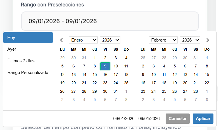
- 🎛️ **Predefined Ranges** - Quick selection with common date ranges
|
|
19
17
|
- ♿ **Accessible** - Keyboard navigation and screen reader support
|
|
20
18
|
|
|
21
|
-
|
|
19
|
+
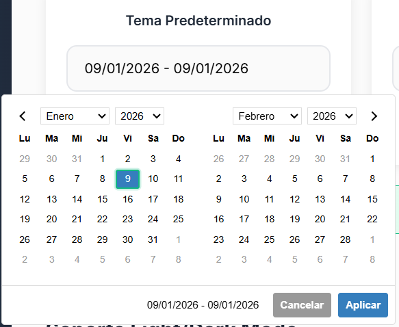
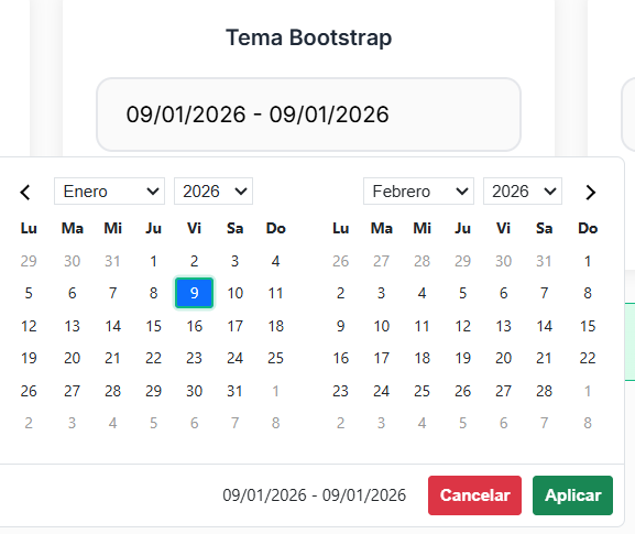
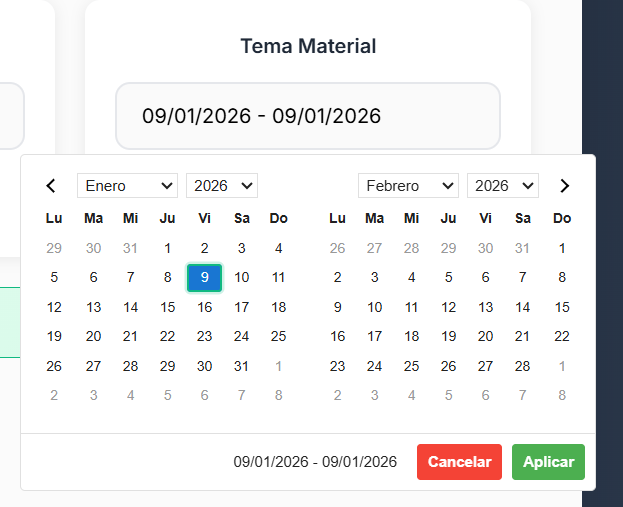
## Themes
|
|
20
|
+
|
|
21
|
+
DateX UI comes with multiple built-in themes to match your application's design:
|
|
22
|
+
|
|
23
|
+
### Default Theme
|
|
24
|
+
|
|
25
|
+
|
|
26
|
+
|
|
27
|
+
### Bootstrap Theme
|
|
28
|
+
|
|
29
|
+
|
|
30
|
+
|
|
31
|
+
### Material Theme
|
|
22
32
|
|
|
23
|
-
|
|
34
|
+
|
|
35
|
+
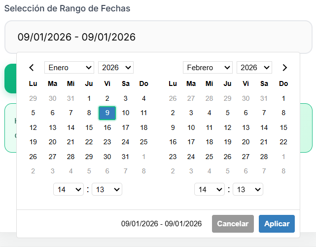
## Screenshots
|
|
36
|
+
|
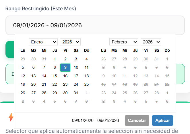
|
37
|
+
### Basic Date Range Selection
|
|
38
|
+
|
|
39
|
+
|
|
40
|
+
|
|
41
|
+
### Single Date Picker
|
|
42
|
+
|
|
43
|
+

|
|
24
44
|
|
|
25
45
|
## Installation
|
|
26
46
|
|
|
@@ -135,10 +155,12 @@ const timePicker = new Datex("#datetime-input", {
|
|
|
135
155
|
});
|
|
136
156
|
```
|
|
137
157
|
|
|
138
|
-
<!-- Add time picker screenshot here -->
|
|
139
|
-
|
|
140
158
|

|
|
141
159
|
|
|
160
|
+
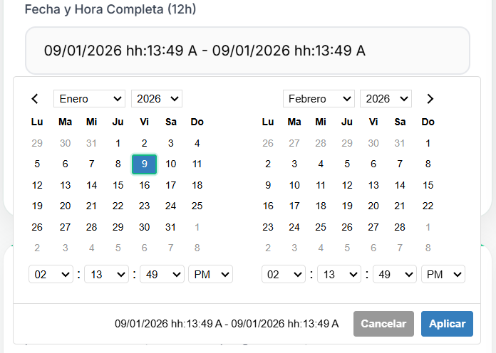
### Date and Time Combined
|
|
161
|
+
|
|
162
|
+
|
|
163
|
+
|
|
142
164
|
### Custom Theme
|
|
143
165
|
|
|
144
166
|
```typescript
|
|
@@ -158,11 +180,25 @@ const picker = new Datex("#themed-input", {
|
|
|
158
180
|
});
|
|
159
181
|
```
|
|
160
182
|
|
|
183
|
+
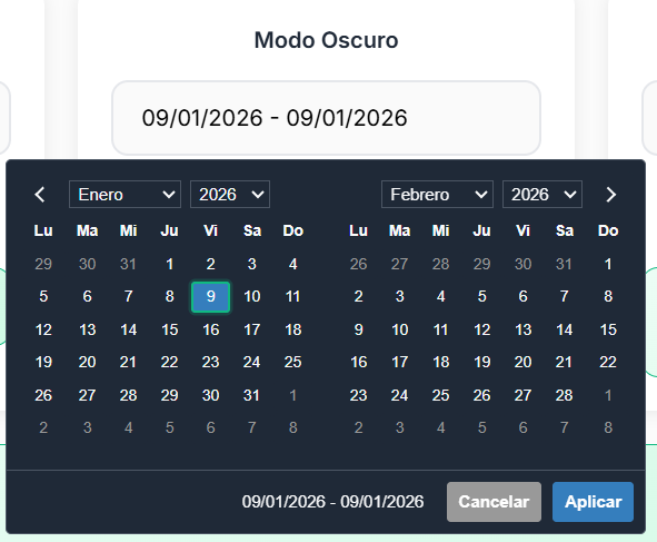
### Dark Mode Support
|
|
184
|
+
|
|
185
|
+
|
|
186
|
+
|
|
187
|
+
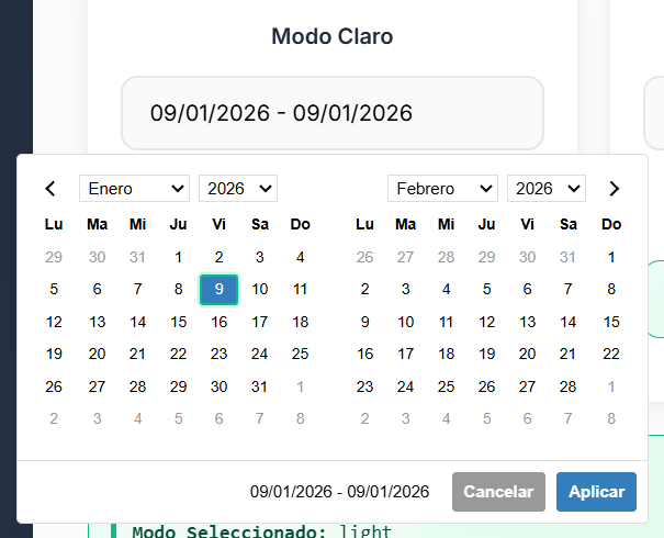
### Light Mode
|
|
188
|
+
|
|
189
|
+
|
|
190
|
+
|
|
191
|
+
### Date Restrictions
|
|
192
|
+
|
|
193
|
+
You can restrict selectable dates with min/max date options:
|
|
194
|
+
|
|
195
|
+
|
|
196
|
+
|
|
161
197
|
### Mobile Responsive
|
|
162
198
|
|
|
163
|
-
|
|
199
|
+
DateX UI is fully responsive and works great on mobile devices:
|
|
164
200
|
|
|
165
|
-
|
|
201
|
+
|
|
166
202
|
|
|
167
203
|
## Configuration Options
|
|
168
204
|
|
|
@@ -200,6 +236,14 @@ interface DatexOptions {
|
|
|
200
236
|
- `BOOTSTRAP_THEME` - Bootstrap-compatible styling
|
|
201
237
|
- `MATERIAL_THEME` - Material Design inspired theme
|
|
202
238
|
|
|
239
|
+
## Visual Examples
|
|
240
|
+
|
|
241
|
+
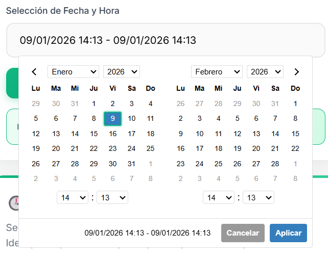
### Date and Time Picker
|
|
242
|
+
|
|
243
|
+
|
|
244
|
+
|
|
245
|
+
_Combined date and time selection with 12/24 hour format support_
|
|
246
|
+
|
|
203
247
|
## Built-in Locales
|
|
204
248
|
|
|
205
249
|
- `SPANISH_LOCALE` - Spanish localization for dates
|
|
Binary file
|
|
Binary file
|
|
Binary file
|
|
Binary file
|
|
Binary file
|
|
Binary file
|
|
Binary file
|
|
Binary file
|
|
Binary file
|
|
Binary file
|
|
Binary file
|
package/dist/datex.d.ts
CHANGED
|
@@ -38,6 +38,9 @@ export declare class Datex {
|
|
|
38
38
|
getStartDate(): Date;
|
|
39
39
|
getEndDate(): Date | null;
|
|
40
40
|
setTheme(theme: DatexTheme): void;
|
|
41
|
+
setThemeMode(mode: "light" | "dark" | "auto"): void;
|
|
42
|
+
getThemeMode(): "light" | "dark" | "auto";
|
|
43
|
+
getCurrentThemeMode(): "light" | "dark";
|
|
41
44
|
updateValidation(validation: DatexValidation): void;
|
|
42
45
|
validateDate(date: Date): ValidationResult;
|
|
43
46
|
validateDateRange(startDate: Date, endDate: Date): ValidationResult;
|
|
@@ -81,7 +84,9 @@ export declare class Datex {
|
|
|
81
84
|
private handleDateClick;
|
|
82
85
|
private handleDateHover;
|
|
83
86
|
private handleMonthYearChange;
|
|
87
|
+
private handleTimeChange;
|
|
84
88
|
private updateView;
|
|
89
|
+
private updateTimePickerControls;
|
|
85
90
|
private updateMonthsInView;
|
|
86
91
|
private updateCalendars;
|
|
87
92
|
private renderCalendar;
|