cosmos-docusaurus-theme 2.0.3 → 2.1.2
This diff represents the content of publicly available package versions that have been released to one of the supported registries. The information contained in this diff is provided for informational purposes only and reflects changes between package versions as they appear in their respective public registries.
- package/CHANGELOG.md +84 -0
- package/README.md +82 -58
- package/package.json +3 -3
- package/src/css/theme.css +82 -105
package/CHANGELOG.md
CHANGED
|
@@ -7,6 +7,90 @@ This project adheres to [Semantic Versioning](https://semver.org/spec/v2.0.0.htm
|
|
|
7
7
|
|
|
8
8
|
---
|
|
9
9
|
|
|
10
|
+
## [2.1.2] — 2026-03-17
|
|
11
|
+
|
|
12
|
+
### Fixed
|
|
13
|
+
|
|
14
|
+
- **Mobile navbar sidebar**: `.navbar-sidebar` had no background rule —
|
|
15
|
+
Infima's default rendered it white in both light and dark mode. Now
|
|
16
|
+
inherits `--ifm-navbar-background-color` (correct for both themes).
|
|
17
|
+
- **Mobile navbar overflow**: external links (e.g. GitHub) in
|
|
18
|
+
`.navbar__items--right` were visible on mobile (≤ 996px), overlapping
|
|
19
|
+
the search bar. Hidden on mobile — accessible via the hamburger menu.
|
|
20
|
+
|
|
21
|
+
### Changed
|
|
22
|
+
|
|
23
|
+
- **eslint**: `9.39.4` → `10.0.3`
|
|
24
|
+
- **@eslint/js**: `9.39.4` → `10.0.1`
|
|
25
|
+
- **aquasecurity/trivy-action**: `0.30.0` → `0.35.0` (SHA pinned)
|
|
26
|
+
|
|
27
|
+
---
|
|
28
|
+
|
|
29
|
+
## [2.1.1] — 2026-03-11
|
|
30
|
+
|
|
31
|
+
### Fixed
|
|
32
|
+
|
|
33
|
+
- **Breadcrumb**: `ul.breadcrumbs { display: flex }` + `::after { content: none }` — kills Infima's
|
|
34
|
+
whitespace injection between items; ChevronRight separator correctly aligned as flex child
|
|
35
|
+
- **Sidebar sub-menu**: corrected CSS selector from `.theme-doc-sidebar-menu .menu__list .menu__list`
|
|
36
|
+
to `.menu__list > .menu__list-item > .menu__list` (direct child `>`) — matches actual DOM depth;
|
|
37
|
+
`margin-left: 35px !important` aligns `|` line under category title text (measured 51.3px)
|
|
38
|
+
- **Sidebar sub-menu color**: `var(--ifm-menu-color)` instead of muted secondary
|
|
39
|
+
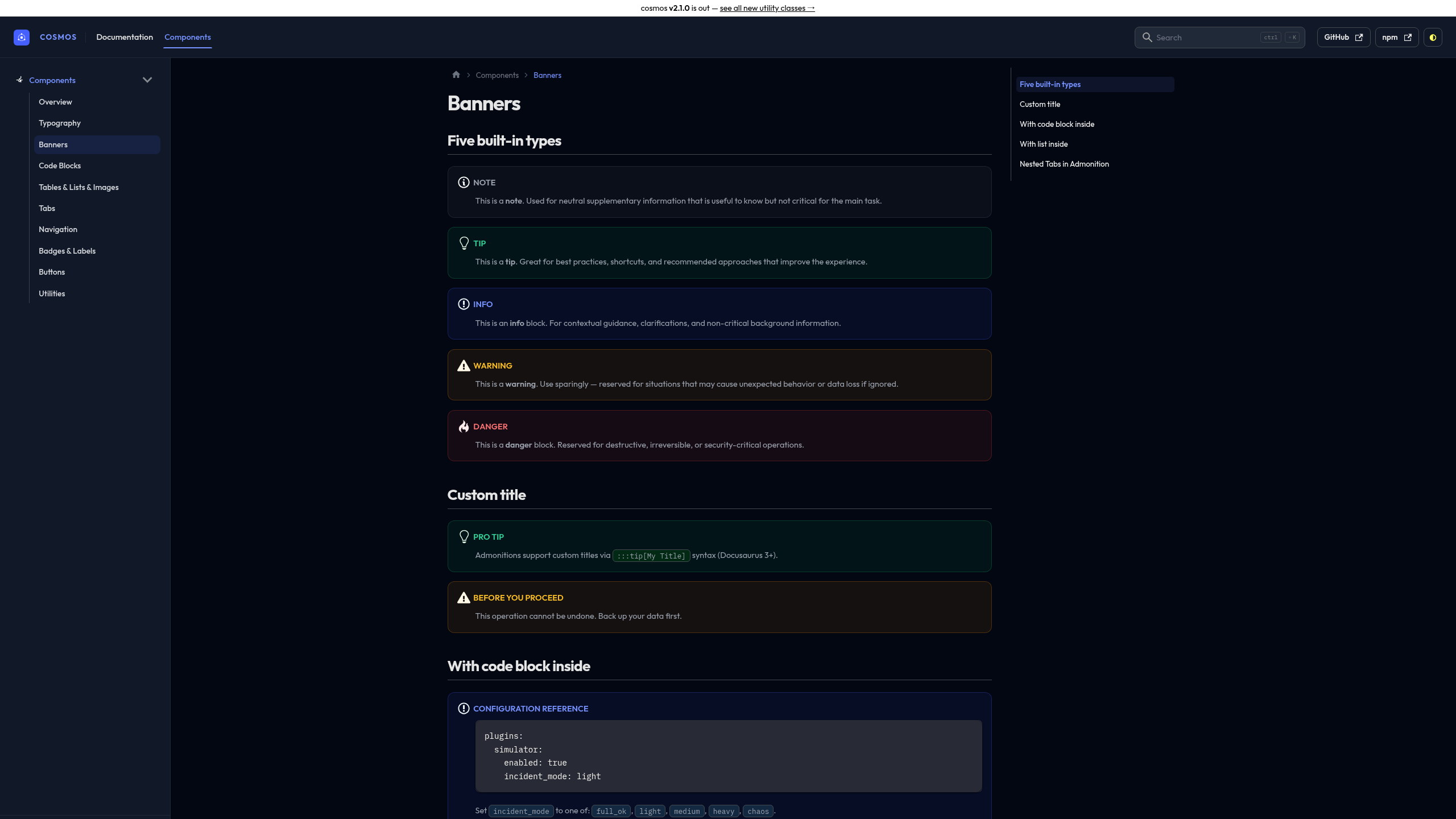
- **Banners (admonitions)**: reverted unsolicited CSS overrides; kept only the two requested rules:
|
|
40
|
+
`[class*='admonitionHeading']:not(:last-child) { margin-bottom: 1rem }` and
|
|
41
|
+
`[class*='admonitionIcon'] { display: inline-block; vertical-align: middle; margin-right: 0.4em }`
|
|
42
|
+
- **Demo MDX**: `class=` → `className=` in 7 files (fixes React DOM property warning)
|
|
43
|
+
|
|
44
|
+
### Added
|
|
45
|
+
|
|
46
|
+
- **`lint-mdx`** Makefile target — scans `demo/docs/**/*.md` for `class=` outside code blocks,
|
|
47
|
+
preventing React prop warnings from slipping through the lint pipeline
|
|
48
|
+
- **`demo-check`** Makefile target — verifies 12 key pages exist in the static build output
|
|
49
|
+
after `make demo-build`; more reliable than HTTP checks against the SPA dev server
|
|
50
|
+
- **`demo/scripts/check-pages.js`** — static build file checker used by `demo-check`
|
|
51
|
+
- `lint` target now includes `lint-mdx` as 5th step
|
|
52
|
+
|
|
53
|
+
## [2.1.0] — 2026-03-11
|
|
54
|
+
|
|
55
|
+
### Added
|
|
56
|
+
|
|
57
|
+
- **Banners (admonitions) — complete redesign**: Dismissible Alert style from Rackscope
|
|
58
|
+
`ui-library/alerts` — uniform full border (not left-only), semantic icon colors, flex
|
|
59
|
+
heading layout, `overflow: hidden` clips child shadows at rounded corners
|
|
60
|
+
- **Navbar COSMOS wordmark**: Outfit 700 uppercase, brand indigo `#465fff` / `#7592ff` dark;
|
|
61
|
+
`|` vertical separator; active nav tab underline indicator matching Tabs style
|
|
62
|
+
- **Tabs**: flat underline (no border-radius), brand active state, proper dark mode vars
|
|
63
|
+
- **Pagination**: `rounded-lg`, monospace uppercase sublabel, brand hover ring
|
|
64
|
+
- **Breadcrumb**: ChevronRight SVG separator (disables Infima default), brand hover
|
|
65
|
+
- **Details accordion**: ChevronRight SVG arrow replacing `›` character
|
|
66
|
+
- **Blockquote**: brand left border + subtle tint
|
|
67
|
+
- **`<kbd>`**: chip style with 3D bottom border
|
|
68
|
+
- **Markdown images**: `border-radius: 12px` + shadow
|
|
69
|
+
- **`<abbr title>`**: styled tooltip on hover
|
|
70
|
+
- **Buttons**: `.btn` `.btn-primary` `.btn-secondary` `.btn-danger` `.btn-sm` `.btn-lg`
|
|
71
|
+
- **Release badges**: `.badge-new` `.badge-beta` `.badge-deprecated` `.badge-experimental`
|
|
72
|
+
- **Steps**: `ol.steps` — numbered procedure with circle indicators
|
|
73
|
+
- **Timeline**: `ul.timeline` — versioned event list with vertical line
|
|
74
|
+
- **Check list**: `ul.list-check` — feature list with checkmarks
|
|
75
|
+
- **Footer CSS**: 4-column grid, responsive (4→2→1), monospace section titles, brand colors
|
|
76
|
+
- **Announcement bar**: gradient indigo, improved link style
|
|
77
|
+
- **Favicon**: cosmos atom SVG injected via `injectHtmlTags()` with opt-out option
|
|
78
|
+
`injectFavicon: false`; SVG properly `encodeURIComponent()`-encoded for `data:` URI
|
|
79
|
+
- **`validateOptions()`** exported — Docusaurus options validation for the theme plugin
|
|
80
|
+
- **Demo site restructure**: `showcase/` → `components/` (10 pages); dual navbar
|
|
81
|
+
Documentation | Components; Components sidebar dedicated; `class=` → `className=` in MDX
|
|
82
|
+
|
|
83
|
+
### Changed
|
|
84
|
+
|
|
85
|
+
- **Font**: JetBrains Mono → **IBM Plex Mono** (code blocks, kbd, monospace elements)
|
|
86
|
+
- **Sidebar sub-menu**: `var(--ifm-menu-color)` color; `|` line aligned under title text
|
|
87
|
+
- **GitHub Actions**: all SHA-pinned (supply chain hardening); Node 20.19 pinned
|
|
88
|
+
- **CI**: Trivy vulnerability scan before Docker push; `npm ci` in all demo jobs;
|
|
89
|
+
`publish.yml` runs full `npm run lint` before publish; `workflow_dispatch` default removed
|
|
90
|
+
- **Dockerfile**: `node:20.19-alpine3.21` (was floating `node:20-alpine`)
|
|
91
|
+
- **`demo/package.json`**: `@easyops-cn ^0.55` (was `latest`); `file:..` dependency
|
|
92
|
+
- **package.json**: description updated, removes stale "TailAdmin" reference
|
|
93
|
+
|
|
10
94
|
## [2.0.3] — 2026-03-11
|
|
11
95
|
|
|
12
96
|
### Added
|
package/README.md
CHANGED
|
@@ -16,32 +16,31 @@
|
|
|
16
16
|
|
|
17
17
|
---
|
|
18
18
|
|
|
19
|
-
A **CSS-only** Docusaurus theme built from the same design system that powers
|
|
20
|
-
|
|
21
|
-
Dark-first, opinionated, and refined.
|
|
19
|
+
A **CSS-only** Docusaurus theme built from the same design system that powers [Rackscope](https://rackscope.dev).
|
|
20
|
+
Dark-first, opinionated, pixel-perfect.
|
|
22
21
|
|
|
23
22
|
- **Void** dark palette — deep neutral blacks (`#030712 / #111827`) with indigo accents
|
|
24
23
|
- **Slate** light palette — warm white surfaces with brown text tones, not cold blue-gray
|
|
25
|
-
- **Outfit** display typeface + **
|
|
24
|
+
- **Outfit** display typeface + **IBM Plex Mono** for code
|
|
26
25
|
- Zero JavaScript, no swizzled components — pure CSS override of Docusaurus Infima
|
|
27
|
-
- Every
|
|
28
|
-
-
|
|
26
|
+
- Every native Docusaurus element styled out of the box
|
|
27
|
+
- Utility classes for MDX pages: buttons, badges, steps, timeline, check lists
|
|
29
28
|
|
|
30
29
|
---
|
|
31
30
|
|
|
32
31
|
## Screenshots
|
|
33
32
|
|
|
34
|
-
> Dark mode — Void palette
|
|
33
|
+
> Dark mode — Void palette
|
|
35
34
|
|
|
36
35
|
|
|
37
36
|
|
|
38
|
-
>
|
|
37
|
+
> Light mode — Slate palette
|
|
39
38
|
|
|
40
|
-
|
|
41
40
|
|
|
42
|
-
>
|
|
41
|
+
> Banners — Dismissible Alert style, semantic icons, full border
|
|
43
42
|
|
|
44
|
-
|
|
45
44
|
|
|
46
45
|
> See all components live → **[sckyzo.github.io/cosmos-docusaurus-theme](https://sckyzo.github.io/cosmos-docusaurus-theme/)**
|
|
47
46
|
|
|
@@ -65,9 +64,17 @@ export default {
|
|
|
65
64
|
};
|
|
66
65
|
```
|
|
67
66
|
|
|
68
|
-
###
|
|
67
|
+
### Options
|
|
69
68
|
|
|
70
|
-
|
|
69
|
+
```js title="docusaurus.config.js"
|
|
70
|
+
themes: [
|
|
71
|
+
['cosmos-docusaurus-theme', {
|
|
72
|
+
injectFavicon: false, // disable cosmos favicon injection (default: true)
|
|
73
|
+
}],
|
|
74
|
+
],
|
|
75
|
+
```
|
|
76
|
+
|
|
77
|
+
### Try it instantly with Docker
|
|
71
78
|
|
|
72
79
|
```bash
|
|
73
80
|
git clone https://github.com/SckyzO/cosmos-docusaurus-theme.git
|
|
@@ -76,43 +83,77 @@ docker compose up
|
|
|
76
83
|
# → http://localhost:3000
|
|
77
84
|
```
|
|
78
85
|
|
|
79
|
-
|
|
86
|
+
---
|
|
80
87
|
|
|
81
|
-
|
|
82
|
-
|
|
83
|
-
|
|
88
|
+
## What's covered
|
|
89
|
+
|
|
90
|
+
### Native Docusaurus elements
|
|
91
|
+
|
|
92
|
+
Styled automatically — no configuration needed:
|
|
93
|
+
|
|
94
|
+
| Element | Notes |
|
|
95
|
+
| ------------------------------------------------------- | --------------------------------------------- |
|
|
96
|
+
| Navbar — COSMOS wordmark, ghost buttons, `\|` separator | Brand indigo title |
|
|
97
|
+
| Sidebar — icons, sub-menu line, version badge | `className: 'sidebar-cat-*'` for icons |
|
|
98
|
+
| Breadcrumb — ChevronRight separator, brand hover | Automatic |
|
|
99
|
+
| Tabs — flat underline, brand active | `import Tabs from '@theme/Tabs'` |
|
|
100
|
+
| Pagination — monospace sublabel, brand hover | Automatic prev / next |
|
|
101
|
+
| Code blocks — all languages, titles | IBM Plex Mono |
|
|
102
|
+
| Banners — Dismissible Alert style, semantic icons | 5 types: note / tip / info / warning / danger |
|
|
103
|
+
| Tables — full-width desktop, scroll mobile | Automatic |
|
|
104
|
+
| Cards — rounded-2xl, dark shadow, hover | `<div class="card">` |
|
|
105
|
+
| Tags | `<span class="tag">` |
|
|
106
|
+
| Details / summary — accordion style | `<details><summary>` |
|
|
107
|
+
| TOC — H2/H3 hierarchy + active pill | Right panel |
|
|
108
|
+
| Blockquote — brand left border | `>` markdown syntax |
|
|
109
|
+
| `<kbd>` — chip style | `<kbd>Ctrl</kbd>` |
|
|
110
|
+
| Images — rounded-xl, shadow | `` |
|
|
111
|
+
| `<abbr title>` — tooltip on hover | `<abbr title="...">` |
|
|
112
|
+
| Back-to-top + progress bar | Automatic |
|
|
113
|
+
| Algolia DocSearch | `--docsearch-*` variables |
|
|
114
|
+
| Local search (easyops-cn) | `--search-local-*` variables |
|
|
115
|
+
| Announcement bar | `themeConfig.announcementBar` |
|
|
116
|
+
| Smooth dark/light transition | Automatic |
|
|
117
|
+
|
|
118
|
+
### Utility classes
|
|
119
|
+
|
|
120
|
+
For use in MDX pages (`className=` in JSX context):
|
|
121
|
+
|
|
122
|
+
| Class | Purpose |
|
|
123
|
+
| -------------------------------------------------------------------- | --------------------------- |
|
|
124
|
+
| `.btn` `.btn-primary` `.btn-secondary` `.btn-danger` | CTA buttons |
|
|
125
|
+
| `.btn-sm` `.btn-lg` | Button sizes |
|
|
126
|
+
| `.badge-new` `.badge-beta` `.badge-deprecated` `.badge-experimental` | Release lifecycle labels |
|
|
127
|
+
| `.method-get/post/put/delete/patch` | HTTP method labels |
|
|
128
|
+
| `.status-ok/warn/crit/unknown` | Operational health labels |
|
|
129
|
+
| `ol.steps` | Numbered procedure guide |
|
|
130
|
+
| `ul.timeline` | Version history / changelog |
|
|
131
|
+
| `ul.list-check` | Feature checklist |
|
|
84
132
|
|
|
85
133
|
---
|
|
86
134
|
|
|
87
|
-
##
|
|
135
|
+
## Sidebar icons
|
|
88
136
|
|
|
89
|
-
|
|
90
|
-
|
|
91
|
-
|
|
92
|
-
|
|
93
|
-
|
|
94
|
-
|
|
95
|
-
|
|
96
|
-
|
|
97
|
-
|
|
98
|
-
|
|
99
|
-
|
|
100
|
-
|
|
101
|
-
| TOC — H2/H3 hierarchy + active pill | ✅ |
|
|
102
|
-
| Pagination | ✅ |
|
|
103
|
-
| Announcement bar | ✅ |
|
|
104
|
-
| Back-to-top + Progress bar | ✅ |
|
|
105
|
-
| Algolia DocSearch | ✅ |
|
|
106
|
-
| Smooth dark/light transition | ✅ |
|
|
137
|
+
Add `className: 'sidebar-cat-*'` to any category in `sidebars.js`:
|
|
138
|
+
|
|
139
|
+
```js title="sidebars.js"
|
|
140
|
+
{
|
|
141
|
+
type: 'category',
|
|
142
|
+
label: 'Getting Started',
|
|
143
|
+
className: 'sidebar-cat-rocket',
|
|
144
|
+
items: ['getting-started'],
|
|
145
|
+
}
|
|
146
|
+
```
|
|
147
|
+
|
|
148
|
+
Available icons: `rocket` `monitor` `pencil` `puzzle` `sliders` `folder` `server` `database` `layers` `grid` `code`
|
|
107
149
|
|
|
108
150
|
---
|
|
109
151
|
|
|
110
152
|
## Customization
|
|
111
153
|
|
|
112
|
-
Override any CSS variable in
|
|
154
|
+
Override any CSS variable in `custom.css`:
|
|
113
155
|
|
|
114
156
|
```css title="src/css/custom.css"
|
|
115
|
-
/* Brand color */
|
|
116
157
|
:root {
|
|
117
158
|
--ifm-color-primary: #e11d48;
|
|
118
159
|
--ifm-color-primary-dark: #be123c;
|
|
@@ -122,35 +163,18 @@ Override any CSS variable in your own `custom.css`:
|
|
|
122
163
|
--ifm-color-primary-lighter: #fda4af;
|
|
123
164
|
--ifm-color-primary-lightest: #ffe4e6;
|
|
124
165
|
}
|
|
125
|
-
|
|
126
|
-
/* Font */
|
|
127
|
-
:root {
|
|
128
|
-
--ifm-font-family-base: 'Inter', system-ui, sans-serif;
|
|
129
|
-
}
|
|
130
166
|
```
|
|
131
167
|
|
|
132
|
-
See the [Color Tokens](https://sckyzo.github.io/cosmos-docusaurus-theme/color-tokens) page
|
|
133
|
-
for all available tokens (dark + light with visual swatches).
|
|
134
|
-
|
|
135
|
-
---
|
|
136
|
-
|
|
137
|
-
## Utility classes
|
|
138
|
-
|
|
139
|
-
| Class | Usage |
|
|
140
|
-
| ----------------------------------- | ---------------------------------------------- |
|
|
141
|
-
| `.method-get/post/put/delete/patch` | HTTP method labels (monospace, semantic color) |
|
|
142
|
-
| `.status-ok/warn/crit/unknown` | Health state labels |
|
|
143
|
-
| `.state-ok/warn/crit/unknown` | Aliases for the above |
|
|
144
|
-
|
|
145
168
|
---
|
|
146
169
|
|
|
147
170
|
## Development
|
|
148
171
|
|
|
149
172
|
```bash
|
|
150
173
|
make install # install devDependencies
|
|
151
|
-
make lint # CSS + JS + Markdown + format check
|
|
152
|
-
make security # npm audit + no-runtime-deps
|
|
174
|
+
make lint # CSS + JS + Markdown + format + MDX class= check
|
|
175
|
+
make security # npm audit + no-runtime-deps
|
|
153
176
|
make demo-build # build demo static site
|
|
177
|
+
make demo-check # verify 12 key pages exist in build output
|
|
154
178
|
make demo-start # dev server at http://localhost:3000
|
|
155
179
|
make docker-up # demo in Docker at http://localhost:3000
|
|
156
180
|
```
|
package/package.json
CHANGED
|
@@ -1,6 +1,6 @@
|
|
|
1
1
|
{
|
|
2
2
|
"name": "cosmos-docusaurus-theme",
|
|
3
|
-
"version": "2.
|
|
3
|
+
"version": "2.1.2",
|
|
4
4
|
"description": "A clean, dark-first Docusaurus theme aligned with the Rackscope Void/Slate design system — CSS-only, IBM Plex Mono + Outfit typography, brand indigo",
|
|
5
5
|
"keywords": [
|
|
6
6
|
"docusaurus",
|
|
@@ -44,8 +44,8 @@
|
|
|
44
44
|
"audit:check": "npm audit --audit-level=moderate"
|
|
45
45
|
},
|
|
46
46
|
"devDependencies": {
|
|
47
|
-
"@eslint/js": "^
|
|
48
|
-
"eslint": "^
|
|
47
|
+
"@eslint/js": "^10.0.1",
|
|
48
|
+
"eslint": "^10.0.3",
|
|
49
49
|
"markdownlint-cli": "^0.48.0",
|
|
50
50
|
"prettier": "^3.8.1",
|
|
51
51
|
"stylelint": "^17.4.0",
|
package/src/css/theme.css
CHANGED
|
@@ -339,6 +339,13 @@ button[aria-label*='dark and light mode']:hover::before {
|
|
|
339
339
|
color: #e5e5e5;
|
|
340
340
|
}
|
|
341
341
|
|
|
342
|
+
/* ── Mobile navbar sidebar (hamburger menu) ─────────────────────────────── */
|
|
343
|
+
/* Infima's default .navbar-sidebar has no background, causing it to render
|
|
344
|
+
white in both light and dark mode. Match the navbar background color. */
|
|
345
|
+
.navbar-sidebar {
|
|
346
|
+
background-color: var(--ifm-navbar-background-color);
|
|
347
|
+
}
|
|
348
|
+
|
|
342
349
|
/* ── Sidebar ─────────────────────────────────────────────────────────────── */
|
|
343
350
|
.theme-doc-sidebar-container {
|
|
344
351
|
border-right: 1px solid var(--ifm-toc-border-color) !important;
|
|
@@ -527,18 +534,6 @@ code {
|
|
|
527
534
|
border-color: #1f2937;
|
|
528
535
|
}
|
|
529
536
|
|
|
530
|
-
/* ── Breadcrumbs — explicit active + separator colors ────────────────────── */
|
|
531
|
-
.breadcrumbs__link--active,
|
|
532
|
-
.breadcrumbs__item--active .breadcrumbs__link {
|
|
533
|
-
color: var(--ifm-color-primary);
|
|
534
|
-
/* No background on active breadcrumb — avoids computed #080d25 artifact */
|
|
535
|
-
background: none;
|
|
536
|
-
}
|
|
537
|
-
|
|
538
|
-
[data-theme='dark'] .breadcrumbs__link:not(.breadcrumbs__link--active) {
|
|
539
|
-
color: #9ca3af; /* gray-400 — readable on Void dark without being dominant */
|
|
540
|
-
}
|
|
541
|
-
|
|
542
537
|
/* ── Right navbar — unified ghost button style ───────────────────────────── */
|
|
543
538
|
/* Both the external links (GitHub, npm…) and the color mode toggle get the */
|
|
544
539
|
/* same bordered ghost button treatment for visual consistency. */
|
|
@@ -570,6 +565,14 @@ code {
|
|
|
570
565
|
color: var(--ifm-color-primary);
|
|
571
566
|
}
|
|
572
567
|
|
|
568
|
+
/* Hide external navbar links on mobile — they overlap the search bar.
|
|
569
|
+
They remain accessible via the hamburger menu sidebar. */
|
|
570
|
+
@media (width <= 996px) {
|
|
571
|
+
.navbar__items--right > .navbar__item.navbar__link {
|
|
572
|
+
display: none;
|
|
573
|
+
}
|
|
574
|
+
}
|
|
575
|
+
|
|
573
576
|
/* Color mode toggle — match the ghost button style of external links */
|
|
574
577
|
button[aria-label*='dark and light mode'] {
|
|
575
578
|
border: 1px solid var(--ifm-toc-border-color) !important;
|
|
@@ -727,51 +730,19 @@ details > :not(summary) {
|
|
|
727
730
|
border: 1px solid;
|
|
728
731
|
border-radius: 12px;
|
|
729
732
|
padding: 16px;
|
|
733
|
+
overflow: hidden;
|
|
730
734
|
}
|
|
731
735
|
|
|
732
736
|
/* Heading — flex row: icon as first item, title text as second.
|
|
733
737
|
align-items: center = perfect icon ↔ title baseline alignment. */
|
|
734
|
-
[class*='admonitionHeading'] {
|
|
735
|
-
|
|
736
|
-
align-items: center;
|
|
737
|
-
gap: 12px;
|
|
738
|
-
font-size: 1.25rem !important;
|
|
739
|
-
font-weight: 600 !important;
|
|
740
|
-
text-transform: none;
|
|
741
|
-
letter-spacing: 0;
|
|
742
|
-
line-height: 1.4;
|
|
743
|
-
margin-bottom: 8px;
|
|
738
|
+
[class*='admonitionHeading']:not(:last-child) {
|
|
739
|
+
margin-bottom: 1rem;
|
|
744
740
|
}
|
|
745
741
|
|
|
746
|
-
/* Icon span — 20px, natural Docusaurus SVG size */
|
|
747
742
|
[class*='admonitionIcon'] {
|
|
748
|
-
|
|
749
|
-
|
|
750
|
-
|
|
751
|
-
justify-content: center;
|
|
752
|
-
width: 20px;
|
|
753
|
-
height: 20px;
|
|
754
|
-
}
|
|
755
|
-
|
|
756
|
-
[class*='admonitionIcon'] svg {
|
|
757
|
-
width: 20px !important;
|
|
758
|
-
height: 20px !important;
|
|
759
|
-
min-width: 20px;
|
|
760
|
-
max-width: 20px;
|
|
761
|
-
min-height: 20px;
|
|
762
|
-
max-height: 20px;
|
|
763
|
-
display: block;
|
|
764
|
-
flex-shrink: 0;
|
|
765
|
-
}
|
|
766
|
-
|
|
767
|
-
/* Force SVG paths to inherit color from parent (overrides any hardcoded fill) */
|
|
768
|
-
[class*='admonitionIcon'] svg path,
|
|
769
|
-
[class*='admonitionIcon'] svg circle,
|
|
770
|
-
[class*='admonitionIcon'] svg rect,
|
|
771
|
-
[class*='admonitionIcon'] svg polyline,
|
|
772
|
-
[class*='admonitionIcon'] svg line {
|
|
773
|
-
fill: currentcolor;
|
|
774
|
-
stroke: none;
|
|
743
|
+
display: inline-block;
|
|
744
|
+
vertical-align: middle;
|
|
745
|
+
margin-right: 0.4em;
|
|
775
746
|
}
|
|
776
747
|
|
|
777
748
|
/* Body — indented under title (20px icon + 12px gap = 32px) */
|
|
@@ -789,13 +760,6 @@ details > :not(summary) {
|
|
|
789
760
|
margin-bottom: 0;
|
|
790
761
|
}
|
|
791
762
|
|
|
792
|
-
/* Code blocks inside banners — full width, cancel body indent */
|
|
793
|
-
[class*='admonitionContent'] pre,
|
|
794
|
-
[class*='admonitionContent'] [class*='codeBlockContainer'] {
|
|
795
|
-
margin-left: -32px;
|
|
796
|
-
margin-right: 0;
|
|
797
|
-
}
|
|
798
|
-
|
|
799
763
|
/* ── note (secondary) — gray ─────────────────── */
|
|
800
764
|
.alert--secondary {
|
|
801
765
|
border-color: rgb(107, 114, 128, 0.25);
|
|
@@ -1121,27 +1085,44 @@ details > :not(summary) {
|
|
|
1121
1085
|
border-bottom-color: rgb(255, 255, 255, 0.08);
|
|
1122
1086
|
}
|
|
1123
1087
|
|
|
1124
|
-
/* ── Breadcrumbs
|
|
1125
|
-
/*
|
|
1126
|
-
|
|
1088
|
+
/* ── Breadcrumbs — rewritten from scratch ────────────────────────────────── */
|
|
1089
|
+
/* ul flex container → no HTML whitespace between items.
|
|
1090
|
+
Text separator › always vertically aligned (no SVG alignment hell).
|
|
1091
|
+
Active item: brand color. Inactive: muted gray. Hover: brand. */
|
|
1127
1092
|
:root {
|
|
1128
1093
|
--ifm-breadcrumb-color-active: #465fff;
|
|
1129
1094
|
--ifm-breadcrumb-item-background-active: transparent;
|
|
1130
1095
|
--ifm-breadcrumb-border-radius: 4px;
|
|
1131
|
-
--ifm-breadcrumb-padding-horizontal:
|
|
1096
|
+
--ifm-breadcrumb-padding-horizontal: 0;
|
|
1132
1097
|
--ifm-breadcrumb-padding-vertical: 2px;
|
|
1133
|
-
/* Disable Infima's built-in separator — we supply our own SVG via ::before */
|
|
1134
1098
|
--ifm-breadcrumb-separator: none;
|
|
1135
1099
|
--ifm-breadcrumb-separator-size-multiplier: 0;
|
|
1136
1100
|
}
|
|
1137
1101
|
|
|
1102
|
+
ul.breadcrumbs {
|
|
1103
|
+
display: flex !important;
|
|
1104
|
+
align-items: center !important;
|
|
1105
|
+
flex-wrap: wrap;
|
|
1106
|
+
gap: 0;
|
|
1107
|
+
}
|
|
1108
|
+
|
|
1109
|
+
.breadcrumbs__item {
|
|
1110
|
+
display: flex !important;
|
|
1111
|
+
align-items: center !important;
|
|
1112
|
+
}
|
|
1113
|
+
|
|
1114
|
+
/* Infima injects ::after { content: ' ' } on breadcrumb items — kills it */
|
|
1115
|
+
.breadcrumbs__item::after {
|
|
1116
|
+
content: none !important;
|
|
1117
|
+
display: none !important;
|
|
1118
|
+
}
|
|
1119
|
+
|
|
1138
1120
|
.breadcrumbs__link {
|
|
1139
|
-
border-radius: 4px;
|
|
1140
1121
|
font-size: 0.8125rem;
|
|
1141
|
-
color: #6b7280;
|
|
1142
|
-
|
|
1143
|
-
|
|
1144
|
-
|
|
1122
|
+
color: #6b7280;
|
|
1123
|
+
padding: 2px 6px;
|
|
1124
|
+
border-radius: 4px;
|
|
1125
|
+
transition: color 0.12s;
|
|
1145
1126
|
}
|
|
1146
1127
|
|
|
1147
1128
|
.breadcrumbs__link:hover {
|
|
@@ -1149,33 +1130,25 @@ details > :not(summary) {
|
|
|
1149
1130
|
color: var(--ifm-color-primary);
|
|
1150
1131
|
}
|
|
1151
1132
|
|
|
1152
|
-
/*
|
|
1153
|
-
|
|
1154
|
-
|
|
1155
|
-
|
|
1156
|
-
|
|
1157
|
-
vertical-align has no effect in flex context and is intentionally omitted. */
|
|
1158
|
-
.breadcrumbs__item {
|
|
1159
|
-
display: flex;
|
|
1160
|
-
align-items: center;
|
|
1133
|
+
/* Active breadcrumb — brand color, no background */
|
|
1134
|
+
.breadcrumbs__link--active,
|
|
1135
|
+
.breadcrumbs__item--active .breadcrumbs__link {
|
|
1136
|
+
color: var(--ifm-color-primary);
|
|
1137
|
+
background: none;
|
|
1161
1138
|
}
|
|
1162
1139
|
|
|
1140
|
+
/* Separator — ChevronRight SVG, flex item inside flex li → perfectly centered */
|
|
1163
1141
|
.breadcrumbs__item + .breadcrumbs__item::before {
|
|
1164
1142
|
content: '';
|
|
1165
|
-
display: block;
|
|
1143
|
+
display: block;
|
|
1166
1144
|
flex-shrink: 0;
|
|
1167
1145
|
width: 14px;
|
|
1168
1146
|
height: 14px;
|
|
1169
|
-
background: url("data:image/svg+xml,%3Csvg xmlns='http://www.w3.org/2000/svg' viewBox='0 0 24 24' fill='none' stroke='%
|
|
1170
|
-
center / 14px no-repeat;
|
|
1171
|
-
margin: 0 2px;
|
|
1172
|
-
}
|
|
1173
|
-
|
|
1174
|
-
[data-theme='dark'] .breadcrumbs__item + .breadcrumbs__item::before {
|
|
1175
|
-
background: url("data:image/svg+xml,%3Csvg xmlns='http://www.w3.org/2000/svg' viewBox='0 0 24 24' fill='none' stroke='%234b5563' stroke-width='2' stroke-linecap='round' stroke-linejoin='round'%3E%3Cpath d='M9 18l6-6-6-6'/%3E%3C/svg%3E")
|
|
1147
|
+
background: url("data:image/svg+xml,%3Csvg xmlns='http://www.w3.org/2000/svg' viewBox='0 0 24 24' fill='none' stroke='%236b7280' stroke-width='2' stroke-linecap='round' stroke-linejoin='round'%3E%3Cpath d='M9 18l6-6-6-6'/%3E%3C/svg%3E")
|
|
1176
1148
|
center / 14px no-repeat;
|
|
1177
1149
|
}
|
|
1178
1150
|
|
|
1151
|
+
/* Dark mode */
|
|
1179
1152
|
[data-theme='dark'] .breadcrumbs__link {
|
|
1180
1153
|
color: #6b7280;
|
|
1181
1154
|
}
|
|
@@ -1184,6 +1157,15 @@ details > :not(summary) {
|
|
|
1184
1157
|
color: #7592ff;
|
|
1185
1158
|
}
|
|
1186
1159
|
|
|
1160
|
+
[data-theme='dark'] .breadcrumbs__link--active,
|
|
1161
|
+
[data-theme='dark'] .breadcrumbs__item--active .breadcrumbs__link {
|
|
1162
|
+
color: #7592ff;
|
|
1163
|
+
}
|
|
1164
|
+
|
|
1165
|
+
[data-theme='dark'] .breadcrumbs__item + .breadcrumbs__item::before {
|
|
1166
|
+
background-image: url("data:image/svg+xml,%3Csvg xmlns='http://www.w3.org/2000/svg' viewBox='0 0 24 24' fill='none' stroke='%234b5563' stroke-width='2' stroke-linecap='round' stroke-linejoin='round'%3E%3Cpath d='M9 18l6-6-6-6'/%3E%3C/svg%3E");
|
|
1167
|
+
}
|
|
1168
|
+
|
|
1187
1169
|
/* ── Tabs ────────────────────────────────────────────────────────────────── */
|
|
1188
1170
|
/* Matches Rackscope Tabs component — flat underline, brand active,
|
|
1189
1171
|
no background fill on hover (clean underline-only style). */
|
|
@@ -1541,32 +1523,27 @@ details > :not(summary) {
|
|
|
1541
1523
|
/* │ sub item */
|
|
1542
1524
|
/* │ sub item */
|
|
1543
1525
|
|
|
1544
|
-
|
|
1545
|
-
|
|
1546
|
-
|
|
1526
|
+
/* Nested list: border-left aligned under title text (after icon).
|
|
1527
|
+
Measured: title text at x=51.3, sub-list default at x=16.3 → need +35px.
|
|
1528
|
+
!important required to override Infima's margin reset. */
|
|
1529
|
+
/* Nested sub-menu: border-left aligned under title text (after icon 15px+8px gap).
|
|
1530
|
+
Selector uses direct child (>) to match the DOM: ul>li>ul structure.
|
|
1531
|
+
margin-left: 35px !important needed to override Infima's margin reset. */
|
|
1532
|
+
.menu__list > .menu__list-item > .menu__list {
|
|
1533
|
+
margin-left: 35px !important;
|
|
1534
|
+
padding-left: 8px;
|
|
1547
1535
|
border-left: 1.5px solid var(--ifm-toc-border-color);
|
|
1548
1536
|
}
|
|
1549
1537
|
|
|
1550
|
-
[data-theme='dark'] .
|
|
1551
|
-
border-left-color: #374151;
|
|
1538
|
+
[data-theme='dark'] .menu__list > .menu__list-item > .menu__list {
|
|
1539
|
+
border-left-color: #374151;
|
|
1552
1540
|
}
|
|
1553
1541
|
|
|
1554
|
-
/* Sub-items
|
|
1555
|
-
.menu__list .menu__list > .menu__list-item > .menu__link {
|
|
1542
|
+
/* Sub-items — normal menu color (not muted), slightly smaller font */
|
|
1543
|
+
.menu__list > .menu__list-item > .menu__list > .menu__list-item > .menu__link {
|
|
1556
1544
|
font-size: 0.8375rem;
|
|
1557
|
-
padding-left:
|
|
1558
|
-
|
|
1559
|
-
|
|
1560
|
-
.menu__list .menu__list > .menu__list-item > .menu__link:not(.menu__link--active) {
|
|
1561
|
-
color: var(--ifm-font-color-secondary);
|
|
1562
|
-
}
|
|
1563
|
-
|
|
1564
|
-
[data-theme='dark']
|
|
1565
|
-
.menu__list
|
|
1566
|
-
.menu__list
|
|
1567
|
-
> .menu__list-item
|
|
1568
|
-
> .menu__link:not(.menu__link--active) {
|
|
1569
|
-
color: #71717a;
|
|
1545
|
+
padding-left: 8px;
|
|
1546
|
+
color: var(--ifm-menu-color);
|
|
1570
1547
|
}
|
|
1571
1548
|
|
|
1572
1549
|
/* ── Category icons — via className in sidebars.js ───────────────────────── */
|
|
@@ -2305,7 +2282,7 @@ ul.timeline > li:last-child {
|
|
|
2305
2282
|
ul.timeline > li::before {
|
|
2306
2283
|
content: '';
|
|
2307
2284
|
position: absolute;
|
|
2308
|
-
left: -1.
|
|
2285
|
+
left: -1.37rem;
|
|
2309
2286
|
top: 0.35rem;
|
|
2310
2287
|
width: 0.65rem;
|
|
2311
2288
|
height: 0.65rem;
|